
By Phil Hecken
Follow @PhilHecken
Yesterday the Black Knights of Army and the Midshipmen of Navy hooked up in the Annual (and 119th overall) Army/Navy game, and although the on-field action wasn’t stellar (though the game was close) the game itself lived up to the uni-hype. It’s more than just a game, of course, and the fact that for the past decade both academy’s have worn special uniforms costumes makes it all the more special for the uni watcher. If you missed all the “stories” behind the uniforms worn yesterday click here.
There wasn’t much especially uni-notable about yesterday’s game (well, save for the fact that each team had special game uniforms), but with a cool and crisp sunny day in Philadelphia, everything looked great.
As mentioned in yesterday’s post, Army was outfitted entirely in black, while Navy was almost entirely in white — save for their blue helmets. It made for a beautiful contrast.

Oh man it's gonna be a sack…OH MAN WHAT A RUN. pic.twitter.com/M9A1KrB0z0
— CBS Sports (@CBSSports) December 8, 2018
It wasn’t entirely clear from the pre-game hype photos, but Navy came out in a really sharp metallic finish helmet. I’m not normally a fan of shiny things, but this one was quite attractive. It was rendered in navy, but with the reflectivity, particularly in the first half sunshine, it almost appeared royal. The blue hats were bisected with a metallic gold/white/metallic gold stripe.

It was also unbalanced, having Bill the Goat (Navy’s mascot) on the right side of the helmets with numbers on the left side:

As you can see above, Navy’s jerseys had player NOB. The uni was plain — but not totally. The team had very attractive shoulder caps of navy and metallic gold, and single stripe (of navy/gold/navy) ran all the way (no truncation here!) down the leg. The top of the stripe was divided by six breaks, something Under Armour has been affecting since they got the Navy contract some years ago and which is a nod to the United States Navy’s original six frigates. If the team didn’t already have a standard road uniform, I’d almost argue this one should be made permanent — it’s that good.

And of course, as is the tradition, Navy featured the individual unit patches for each particular player on the upper left portion of the jersey (always a nice touch).

Army’s uniform was almost entirely black, although there were some ghosted features. The helmets were matte black with a red “1” (see backstory in yesterday’s article).


The red “1” was almost the only color (save for uni numbers) on the uni — the only other red was (of course) the Nike Swoosh but one other nice feature: the player name was placed in small lettering (military style) on the right chest. The team wore “ARMY” for NOB on the back of the jersey. The collar insignia replicate bronze collar disks worn by enlisted soldiers in the First Division.


[Thanks to L.J. Sparvero for those two pics above]
One feature that was not noticeable from distance but that you could see up close: Army had some pretty serious block shadow going on with their numbers:

I really enjoyed this one from a uni standpoint. Army looks really good in all black, and this one seemed to have both teams dressed well (not overdone, but special anyway). The rest of the non-uni part of the game is of course fun too. It’s all well scripted and planned, and it’s just one of those things that seems to put a perfect bookmark to close another college football regular season.
The pregame stuff is always great. From the flyovers…

…to the paratroopers…


…to the teams and flagbearers taking the field…


…to the Presidential coin toss (the President did not attend the 2017 edition of the game, but he did attend as President-elect in 2016).

Trump with the coin toss for the Army-Navy game pic.twitter.com/anjgKQNuPd
— #FreePhillipDorsett (@ftbeard_17) December 8, 2018
All that pomp and circumstance (which I would normally eschew) is just so fitting for the Army Navy game. And Army, who had lost like 17 in a row before winning the game two years ago, have now won three straight. Even the final kneeldown to end the game felt right.
For the third consecutive season, Army beats Navy. pic.twitter.com/fFI4ca4MZA
— CBS Sports (@CBSSports) December 8, 2018
Of course, the game doesn’t end when the final whistle blows. There is one last tradition which never gets old. Both schools singing to and with their alma maters. And tradition dictates the losers sing first, followed by the victors. So for the third straight year, Navy had the honor of going first, followed by Army:
Army sings second. pic.twitter.com/uKDIDvnNhb
— CBS Sports (@CBSSports) December 8, 2018
And there you have it. Army Navy to close the 2018 FBS season. We start the Bowl season next Saturday.


Kreindler’s Korner
I had the distinct pleasure of featuring the wonderful artwork of artist Graig Kriendler on two occasions over the summer and fall of 2017, and more recently, in August of 2018.
For those who don’t wish to click the links, Graig paints baseball heroes (and regular guys) from the past, and is an immense talent.
Occasionally, I will be featuring his work on Uni Watch.
Here’s today’s offering (click to enlarge):

Title: “Idol”
Subject: Joe Jackson, 1913
Medium: Oil on linen
Size: 34″ x 42″The grand title of ‘the greatest natural hitter’ was in sole possession of the young Joe Jackson in 1913. The former owner of that moniker, Cleveland teammate Napoleon Lajoie, had left the claim up for grabs as his age began to rear its head in the early 1910s. Spraying the ball to all parts of the field, Ty Cobb used his speed, grit, and spread grip to take his bases. Detroit’s outfielder, though still in his prime and at that point the winner of five batting crowns, attributed his offensive success to scientifically breaking down the weaknesses of his opponents, always looking for the mental edge that he could use to exploit his physical abilities. Boston’s Tris Speaker was very much cut from Cobb’s own cloth, as he looked up to the hard-nosed Georgian as an offensive role-model. Though his stance in the box may have differed from the mighty Tyrus’, his penchant for exploiting chinks in the enemy’s armor was virtually unmatched. It seemed that the sheer will and determination alone of these two men placed them atop the league in most batting statistics.
On the other end of the spectrum, Philadelphia’s Frank ‘Home Run’ Baker liked to swing more freely. His nickname came from his performance in the 1911 World Series, in which he tagged both Rube Marquard and Christy Mathewson for home runs. That same year, he led the American League with 11 round-trippers, and then 10 the year after. Though, Baker’s control was not a paramount element of his swing, as he struck out more than most players with similar batting averages. Phillie Gaavy Cravath had similar methods and statistics to his cross-town rival, though his hefty home run totals were partially due to the tiny dimensions of his home ballpark, the Baker Bowl in Philadelphia. Though only 22 years old at the start of the baseball season in ’13, it was abundantly clear that Joe Jackson was a different kind of hitter all together.
Jackson did not study opposing pitchers or keep mental notebooks of their patterns on the mound. Rarely did he alter his swing or approach to suit an opposing pitcher’s style. He relied on his impeccable hand-eye coordination and physical strength to power through the ball with the sweet spot of his dark 48-ounce bat. Jackson’s teammates always said that he never even knew whether the opposing pitcher was right or left handed, nor what kind of ball they had thrown, be it a curve, fastball or spitter. All he would say if he was asked was that the ball was ‘over’. ‘Over’ meant anything that he could reach. And when he could reach, he rarely failed to connect.
Ty Cobb himself wondered why Jackson did not strike out at least twice a game taking full cuts against doctored balls that precipitously sank. In that era, most players poked their bats in the direction of the ball to merely make contact. Joe used his bat to punish the ball. Pitchers claimed that his hits could break bones. Boston hurler Ernie Shore claimed that he could be blindfolded and could still tell when Jackson hit the ball. “It had a special crack,” he said.
Much like other players in baseball, Jackson was incredibly superstitious about his weapons, feeling that each one only had so many hits in it. Whenever he went into a slump, he discarded his current collection of bats and started a new one. His most prized bat, ‘Black Betsy’, was an exception to this rule. It was only used in dire situations, as he felt it had special powers that could not be wasted in the day-to-day game action it would see in the American League. Perhaps his most prized possession, the mighty bat was made for Joe by a local woodworker while he was still with the New Orleans Pelicans of the Southern Association. Its name was culled from the rich cherry-black hue it sported, after being darkened with coat after coat of tobacco juice. This special bat was used to model most of the professional models throughout his career, and like their predecessor, were creatively named, ‘Blonde Betsy’, ‘Big Jim’, ‘Ol’ Genril’, ‘Caroliny’ and ‘Dixie’. So well-known was his love for his lumber, that fans would shout, “Give ‘em Dixie, Joe!” Perhaps baseball enthusiasts took more to Jackson’s superstitions than other players because of his supposed eccentric Southern up-bringing and lack of education. Though these factors might have made him an easier target than most, they did nothing to hurt his popularity.
He had already become a celebrity in Cleveland, as he was frequently being stopped during his afternoon car rides by fans who wanted to shake his hand and take snapshots. His fame even extended outside of Cleveland and his home in the southern states. In one instance, he received a letter from a fan in Kansas City that had a yet-unnamed newborn who in his opinion would be a fine ballplayer. He asked Jackson what his full name was, as he wanted his 12-pound son named after the great man.
His biggest fans were undoubtedly the children of Cleveland. Many if them would follow Jackson from his home on Lexington Avenue to the ballpark, some of whom were lucky enough to carry his glove, bats and shoes to the clubhouse. A score of adoring young Cleveland fans – many of whom could not even afford the bleacher seat prices – would often wait outside of League Park to meet their hero after the game, where he would give them batting tips. It was no surprise that thousands of dirty-faced kids had began to emulate Joe on the diamond.
Off the field Joe began to see his popularity grow as well. He started to supplement his baseball salary with endorsements, ranging from tobacco, liniment and rifles to bats, garters and gloves. In marketing a brand of shoes, a slogan read, “When Shoeless Joe wears ‘em, he wears Selz shoes.”
With his star rising, he invested his money into a pool room in downtown Greenville, bought a larger house for his parents, and purchased himself a farm that he had hoped would be up, running and paying in short order. He would also earn extra money in the winter by holding exhibition games in the south. The newfound wealth would provide him with the means to purchase fancy clothes and many new cars. Baseball writers even dubbed him the team’s “Beau Brummell”, who was an arbiter of English Regency fashion credited with establishing the modern men’s suit, as well as being perhaps the first dandy.
Above all else however, were the man’s abilities. In his first two full seasons with the Naps, his batting average was an incredible .401, with his rookie mark of .408 being the highest ever. That same first year, he was in the league’s top ten leaders of home runs, runs batted in, runs scored and stolen bases – all of which lead to his fourth place finish in the Chalmers MVP award voting. In 1912 he continued his offensive tear, hitting just under .400 and leading the league in hits and triples, remaining on the leader board for those same statistics.
The youngster’s future with the Naps – and baseball in general – looked as bright as could be.
Thanks, Graig! You can (and should!) follow Graig on Twitter.
Gouache, continued…

Readers (may) recall last weekend, I featured a “Way Too Good For The Ticker” segment featuring the beautiful artwork of our pal Gene Sanny (that full post is here, scroll down) in which he briefly explained the technique of “gouache” painting.
Gene again contacted me this past week to explain a bit more the process, but also to share one of which he’s (justifiably) proud.
Check this out! Here’s Gene:
Ok, here is how a gouache painting, like the oilers one from the other day, is supposed to work out. This one I’m happy with. I started persuing this style because some of my favorite football illustrations when I was a kid was done like this… David grove was a master. I didn’t understand how it worked until recently, and I still have tons to learn, but it’s fun when an experiment like this works out.
Here’s the work in progress, from a blob of paint, to former Oakland Raider Otis Sistrunk.


And here’s the finished piece!


Thanks Gene!!!

Oh Baby (Cakes)!
Reader Trent Guyer sent the following e-mail to Uni Watch, and since it’s a bit too long for the ticker, I’m going to run it out below. It contains some great nuggets about the New Orleans Baby Cakes (a Minor League Baseball of the Pacific Coast League and the Triple-A affiliate of the Miami Marlins. They are located in Metairie, Louisiana, a suburb of New Orleans, and play their home games at the Shrine on Airline).
Here’s Trent:
There’s an interview this week in the Wichita Business Journal (paywalled) with New Orleans Baby Cakes owner Lou Schwechheimer.
Here’s the section of interest to UniWatch. I was particularly interested that changing the name and logo skyrocketed sales.
Q: People here have been talking a lot about the new nickname and logo and what it will be. What can they expect?
A: Part of our challenge in New Orleans was that the franchise, for the better part of 15 years, slipped in the public perception department in New Orleans. We realized that there wasn’t really an affinity for the team’s name back then, the Zephyrs. That name had come when the team moved to New Orleans from Colorado (in 1993). We decided to do something fun (before the 2017 season). If you know anything about the New Orleans king cake tradition, they bake a little baby in the king cake and it’s part of the 300-year lore of New Orleans. We decided to take that baby and put a bat in his hand as he’s smashing his way out of a king cake. We got a lot of feedback on that, some positive and some negative. We ended up going from last in the minor leagues in merchandising to the top 5 percent and we won Baseball America’s best logo national poll competition. What we want to do in Wichita, we’re going to announce a world-class design team that will create a classic, first-class elegant logo that represents the vibe and culture of Wichita. Todd Radom is on that team and he’s really a legendary figure in sports design.
Thanks Trent! And seconded on that Todd Radom praise!!
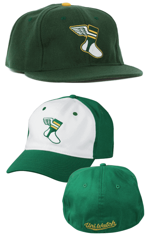
Heads up! Big cap savings on tap: Paul here, with news on how you can use your head and save some dough on some quality headwear.
First, our friends at Ebbets Field Flannels are offering free shipping this weekend with the checkout code SHIPIT. You can use that on any of their products, including our Uni Watch Classic Cap, which you can order here.
In addition, in case you missed it on Friday, we’ve lowered the price on our flex-fit Uni Watch Alternate Cap back to $19.99. You can order yours here.
While we’re at it, you can see all the rest of our Uni Watch products, including some that you may have forgotten about, here.
We now return you to your regularly scheduled Phil-fest.
Uni Watch News Ticker
By Phil

Baseball News: It was reported the other day that new Cardinal Paul Goldschmidt will wear 46 with the team (his old 44 is unavailable and the team has a lot of retired numbers, so 46 was “closest”). Here’s how the new jersey will look. … Chinese investors have their eye on Louisville Slugger — the all-American bat brand favored by legends like Babe Ruth and Jackie Robinson — which is poised to get scooped up by a Chinese conglomerate (from Tom Turner). … Check out this pic of John Lennon (who was murdered 38 years ago yesterday) sitting in a Mets locker in Shea Stadium before performing! “Love his jacket” says Michael Malnicof. … Looks like the formerly-named Las Vegas 51s will be getting a new nickname (from Minor League Promos). And here’s a look at the caps (from sesaee).

NFL News: Keeping Big Blue…Blue? “I’ve been tired of seeing my favorite team’s uniforms for a while then I read your critique about too much red on the Giants road uniforms,” writes Anthony Paul. “It’s not much but just photoshopped a bit more blue without removing all of the red entirely.” … Very cool bit from Kenn Tomasch who writes, “I know the Rams’ red unis from 1949 have been discussed and few color pics exist, but here is a clip from the LA Times in preseason that year referencing the new duds and that the coach designed them himself.” He adds, “Just found it interesting, even if it’s not in color.” Kenn also found another section with even more description of the unis from the LA Times. Awesome! … Nothing uni-noteworthy here, but just feast your eyes on this December 1979 tilt between Houston and Cleveland (from 216 Sports History). Those colors just POP! No way is that December (and therefore not 1979) though. The Browns did wear orange pants between 1975 and 1983 so the timeframe is right. However, the Oilers didn’t get red facemasks until 1981, so that narrows it down (h/t MrMichael: Travelin’ Man). … Good observation from Frank McGuigan who notes, “So @pizzahut fixed the @Bengals and @buffalobills division placement error from earlier this year on their box. However, it remains incorrect on this cardboard advertisement standing in the restaurant.”
College Football News: Superb uni watching from Alex Bolton (via Dez Caught The Ball) who notes, “Was excited about this shirt until I realized helmet stripes are backwards going white-purple-white instead of purple-white-purple. Sometimes wish I didn’t notice details like this, but I really wish someone @UW licensing, @GearforSports1, or @ubookstoresea would have caught it.”

Hockey News: The Anaheim Ducks and Carolina Hurridanes wore color vs. color (both home unis) on Friday night (from Dan S. Walker). Our pal Chris Creamer has a good writeup on how that came to be. … As SRP91 said in yesterday’s comments, “During warmups the Canes came out in their red home uniforms and Anaheim came out wearing orange jerseys, then for the game the Ducks switched to their traditional black home jerseys. Pictures and video can be seen here. … On December 8, 1980, John Lennon was assassinated; Bruce Menard posted a photo yesterday of him holding a Montreal Canadiens sweater. I still remember hearing about Lennon’s death as a 14-year-old via Howard Cosell on MNF. … Yesterday, the Detroit Red Wings Jonathan Bernier broke out this cool holiday-themed mask (via Paul). … Rob Caplette (who many of you know as the “Tattooed Enigma”) reports, “Not sure if you guys have seen or mentioned this, but Anthony Stolarz has a dual-colour cage on his mask. Noticed it (yesterday) during the Flyers/Sabres game.” … The Pensacola Ice Flyers wore green/yellow elf outfits as uniforms and the goaltenders attired as Santa Claus for Saturday’s Christmas Celebration Night at the Bay Center against the Knoxville Ice Bears.

NBA/Pro Hoops News: We don’t give the G-league much attention (and probably rightfully so), but check out the holiday themed unis the Canton Charge wore last night (from RDUB).

College Hoops News: St. John’s will honor the late Hall of Fame basketball writer Jim O’Connell of The Associated Press with a patch on game uniforms Sunday at Madison Square Garden. … Hmmm, is Memphis’ Kareem Brewton Jr trying to start a new trend with the one leg rolled up look (from Jacob Boughter? … Yesterday, Northwestern wore purple at home (via Paul). … Yesterday the Xavier Musketeers and Cincinnati Bearcats engaged in a little color vs. color action (from B-Dubya and Jason Greenberg respectively). … HOLY WAR on the court: nice color vs. color matchup between Utah & BYU (from Trevor). … Are brown shorts in the works for Valpo? (via Paul). That’s affirmative. … More color vs color as it was Red v. Blue last night in Lincoln for Creighton-Nebraska (from David Durgo). … Kansas broke out a new “Winter White” uni last evening (via Paul). … In a move sure to make Jimmer Vilk ecstatic, looks like UCLA is moving back in the short shorts direction (from Matt Shevin).

Soccer News: Liverpool’s Adam Lallana wore a blank jersey to finish the match yesterday thanks to a nasty head gash (nice spot by @CoachKT). … According to Daniel Weimann, there is a vintage replica uniform on tap for VfB Stuttgart. … “This is pretty cool — the tunnel (players from both teams go through it to get from the dressing room to the pitch) at FC Schalke’s stadium is coal-mine themed,” says Josh Hinton. … Here’s a pretty cool look at the Portland Timbers heat pressing yesterday’s date onto a jersey before the MLS Cup (via Paul).

Grab Bag: South Africa’s rugby sevens team will wear a special jersey at this weekend’s tournament in Cape Town to pay tribute to former President Nelson Mandela, who would have turned 100 this year.
In the ticker, hockey, the Carolina panthers play football…. should be the Carolina hurricanes
Yikes! Fixed.
Typo… First article in Hockey section you have Carolina Panthers, not Hurricanes.
Good read today!!
In the Oilers – Browns game I recognize RB Rob Carpenter before he got traded to the NY Giants early in the 1981 season. Therefore, with a little help from Google, this game was played on September 13, 1981.
It’s Bill the Goat, not Billy.
Fixed
Babycakes feature intro should include the context that the franchise is relocating to Wichita for the 2020 season (or maybe 2021, depending).
Obviously the Baby Cakes name juiced merchandise sales, but it doesn’t seem as if the New Orleans team benefited in any appreciable way at the box office. Wonder if attendance was important to the owners. Not sure it matters what the Wichita team is nicknamed; people will flock to a new ballpark and gobble up hats and T-shirts with the cache of having an affiliated ball team returning to the city.
#44 on the Cardinals isn’t retired. Currently with by Luke Gregerson. Post-Dispatch said he never asked for it.
I didn’t say it was retired. I said it was “unavailable”. And I’m also surprised Goldy didn’t try to work out a deal for it, as is the custom.
Would have been much better if Army’s uniforms were none more black.
The red Nike logos were just disgusting and ruined the look. It was even worse on the coaches hats.
Where did they get the facemask for that Washington Rose Bowl helmet? I haven’t seen that since the 90s
I just got done reading We Want Fish Sticks (I’m not an Islanders fan anymore but I lived through that era from semi-inside), and all I can say is this: Everyone associated with the New York Football Jets needs to read it and take it to heart before jumping head-first into what I fear will be a similarly-disastrous, ill-considered and ill-advised rebranding that they’ve told us is coming next year. The parallels are just too scary. I don’t know precisely why, but every day I get more and more worried that the Jets will come out in 2019 wearing something like link.
I am cautiously optimistic the Jets not screw it up. However, I notice a lot of lime green used in their graphics on their website. I hope this is not a subtle sign of them going with a double green colour scheme in the future. Not that this colour scheme is bad in general, but this could be part of a Nike influenced screw up for the Jets (see Bucs, Browns just to name a couple). They need to go with just kelly green and white for the new uniforms.
Just one guys opinion, but those Navy helmets are the most beautiful helmet I have ever seen.
Agreed – they were absolutely gorgeous.
Browns vs. Oilers was just one of many good looking Oilers games in 1981.
That was the the second (and last) time that season that the Oilers wore their blue jerseys.
Pity.
In the article about Joe Jackson, it should be “Phillie Gavvy Cravath”, not “Gaavy”.
His real first name was Clifford.
From his SABR Bio
It was during his semi-pro days that he gained the nickname “Gavvy.” There are many stories about its origin, but it’s apparently a contraction for the Spanish word gaviota, which means “seagull.” During a Sunday game in the early 1900s, Cravath reportedly hit a ball so hard that it killed a seagull in flight. Mexican fans shouted “Gaviota.” The English-speaking fans thought it was a cheer and the name stuck. It’s pronounced to rhyme with “savvy,” so sportswriters of the period added the extra “v,” but Cravath himself spelled it G-A-V-Y. The Southern Californian also had another nickname, “Cactus” (because of his western background and prickly personality), but he apparently didn’t care for it and never included it in his signature.
Las Vegas Aviators -looks like the guy in the logo is wearing a turban
Two of my favorite games of the year are Army-Navy and the Bayou Classic (Grambling vs Southern), because of the spectacle and pageantry. I also like that the Big Ten bands still play the opposing school’s fight song before playing their own at every pregame show.
Phil, though I have never been much of a football fan, I used to always watch MNF as a kid. I too remember being informed about Lennon’s death while watching that broadcast in our little apartment in Ketchum, Idaho. I was a huge music fan and loved the Beatles (though now I am a diehard fellow Dead Head). Although I was only 11, that remains one of the more sad and surreal moments of my life as a fan. Just so weird to be informed by Cosell and have them go right back to the play call. I still have yet to meet anyone who recalls that being how they learned about JL’s murder.
I also heard of Lennon’s death from Cosell. It started a fascination that has led me to be a great Beatles fan and expert.
Interestingly enough, I met Howard Cosell a few year’s later. My brother and I wanted to see the NY Rangers play the Canadiens at the Garden. My father bribed the ticket booth and got two prime tickets. They had written on the back “to JHK from DAW.” When we got to the seats, in the row in front of us was Cosell, his wife Emmy, David A. “Sonny” Werblin (CEO of the Garden) and his wife. We were in the seats of Jack H. Krumpe, a Garden exec. Cosell was a bit goofy, continually yelling “give the puck to Doogie” (Ron Duguay). Doogie eventually scored and Cosell was very proud of himself. The thing I will never forget was his cologne…he smelled like money.
Great job Gene! You could sell those for sure.
I loved Army’s and Navy’s Uniforms yesterday. The Clarendon numerals on Army’s togs was my favorite part.
In the Oilers-Browns game the baseball infield dirt is visible in the background.
What is the white under armour pad on the back of the helmet shell for Perry, #10 on navy?
As pointed out by a previous post, the BabyCakes may have sold a lot of merchandise, but it wasn’t sold to the local fanbase. Attendance the past two years have been the worse in the 25 years since the team relocated. And, unlike what the front office may say, the name “Zephyrs” does have some lore here in the New Orleans area: it was the name of the beloved wooden roller coaster at the local amusement park (Pontchartrain Beach).
But, the new name was forced upon the fans by an out of town front office that had/has no idea of the local culture of this town. Call them the King Cakes, and I’m thinking it would have been accepted.
It’s all moot at this point. The team is leaving. But, ownership says we can keep the name. That’s not going to help any new team that may come…