More than two and a half years ago, I wrote that 2019 would probably be an epic year for anniversary patches. We’ve already seen the beginnings of that wave with the unveiling of the NFL’s crummy centennial logo. And yesterday came word that college football teams will wear a 150th-anniversary patch next season.
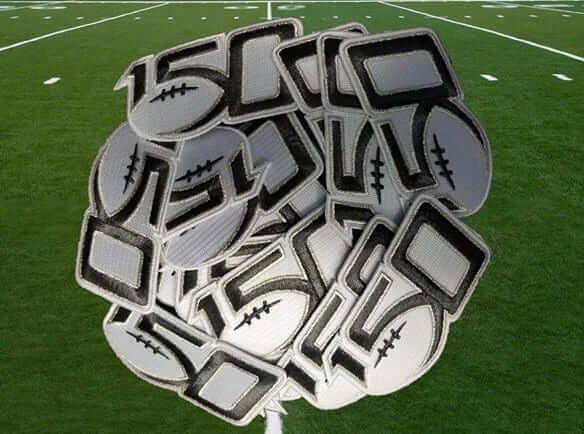
The patch, which is shown above (nice to see that it’s embroidered, not plastic), features a logo that’s been public for a while now, although it has had a relatively low profile and most people haven’t been aware of it. Here’s a closer look at the logo on a white background and a dark background:
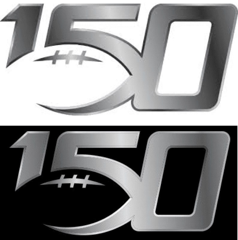
Can’t say I’m in love with it — I don’t like how the football outline truncates the “1” and creates a pointy tip on the base of the “5” — but at least it’s better than the NFL centennial mark. (Update: Reader commenter Dumb Guy points out that truncated “1” actually looks like an apostrophe, so the logo looks like ’50. Ugh — can’t unsee it!)
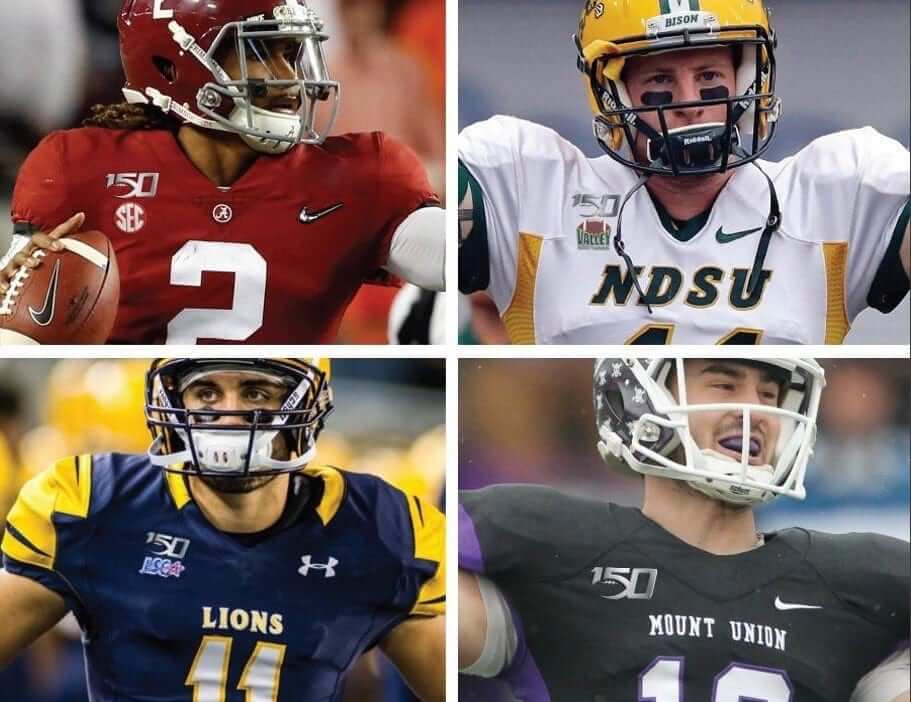
According to yesterday’s announcement, the logo will be worn as a jersey patch by all FBC and FCS teams. It will be on the upper-right chest, above the conference logo patch, as seen in the following Photoshopped images (click to enlarge):
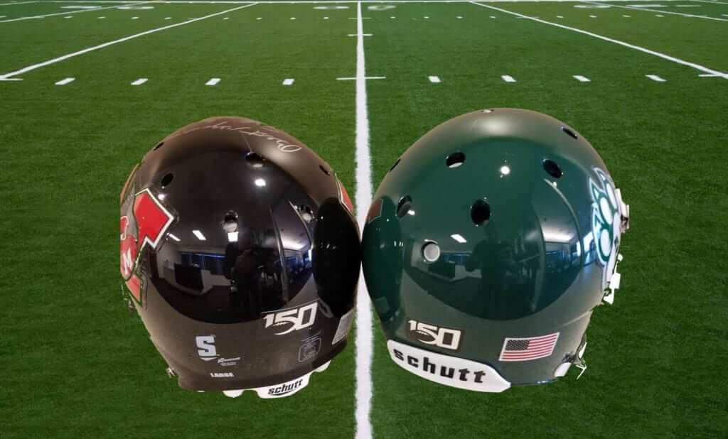
D-II and D-III schools, along with NAIA and junior colleges, have the option of utilizing a rear-helmet decal (click to enlarge):
The logo will also be worn by game officials, and coaches will wear it for the first week of the season.
As many of you are aware, the celebration of college football’s centennial back in 1969 was a more random affair, with some schools wearing a “100” helmet logo but most teams not wearing anything to commemorate the anniversary. (On the plus side, however, several players wore No. 100 that year. It would be awesome if the NCAA would let one player per team wear No. 150 next season, but I’m not holding my breath.) There was also a 125th-anniversary patch in 1994.
Now, I know what you’re thinking. You’re thinking, “So pro and college football have weighed in, but what about MLB? Aren’t they going to have a sesquicentennial logo?” (Okay, maybe you were thinking “150th-anniversary,” not “sesquicentennial.”)
And the answer, I’m fairly certain, is that there will be some sort of MLB-wide program to mark the 150th anniversary. But whatever it is, it hasn’t been announced yet, and I have no idea what it’s going to be. I trust we’ll find out soon enough.
(My thanks to reader/commenter Matt Sampson for reminding me about the 125th-anniversary patch in 1994, which I had not initially included in this post.)
In addition, there was an online-retail leak of the Clippers’ new alternate. It was first brought to my attention by Kev McCarthy and was later confirmed by Clippers beat reporter Tomer Azarly:
The new L.A. #Clippers City Edition jerseys 🔥🔥 (Photo via @LAClippersFilm). I caught a glimpse of a player wearing this at practice the other day with @MirjamSwanson (I’m assuming for a photoshoot), so this is the jersey. Thoughts? pic.twitter.com/7DYrVqjNyN
— Tomer Azarly (@TomerAzarly) November 7, 2018
I don’t know if that chest logo is supposed to evoke the 1984 L.A. Olympics logo or the old L.A. Express (USFL) logo, but it seems like a pretty bad joke from where I’m sitting. Or in the words of Twitter-er Scott Whitt, “That looks like a generic jersey you’d see in a movie where they couldn’t afford the NBA license.” Indeed.
As for the signature at the hemline, it’s from longtime Clippers broadcaster Ralph Lawler, who’s retiring after this season. That jersey element was first reported back in September. (Of course, it’s neither here nor there from a Uni Watch perspective, because the jerseys will be tucked in and the signature will not be visible. Just another retail gimmick. Grrrr.)
There was another purported NBA leak yesterday, but I’m not yet convinced of its legitimacy, so I’m not going to list it here today. The official unveilings will likely all take place by Friday, so let’s wait and see.
Click to enlarge
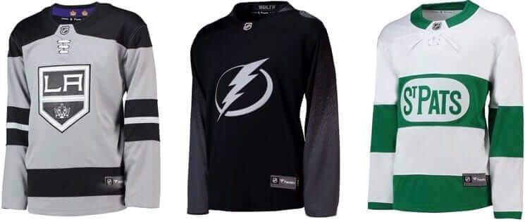
Meanwhile, over on the ice: Icethetics broke the news yesterday that the Kings, Lightning, and Maple Leafs all have alternate uniforms in the works. The Toronto and L.A. designs are both reprises of looks that the teams had previously worn before the one-season moratorium on alternate unis, while the Tampa Bay design appears to be a new one. Full details here.
Click to enlarge
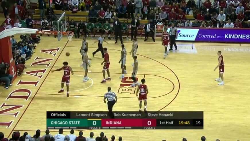
Stop me if you’ve heard this one before: The college basketball season got off on the wrong foot last night in Indiana, where the Hoosiers had to wear their red road uniforms at home because visiting Chicago State hadn’t yet received their road unis for this season.
Chicago State is outfitted by Nike and their primary color is dark green. Sound familiar?
(My thanks to Mike Petry and @NotHotTakes for bringing this one to my attention, and to Chris Howell for the screen shot.)
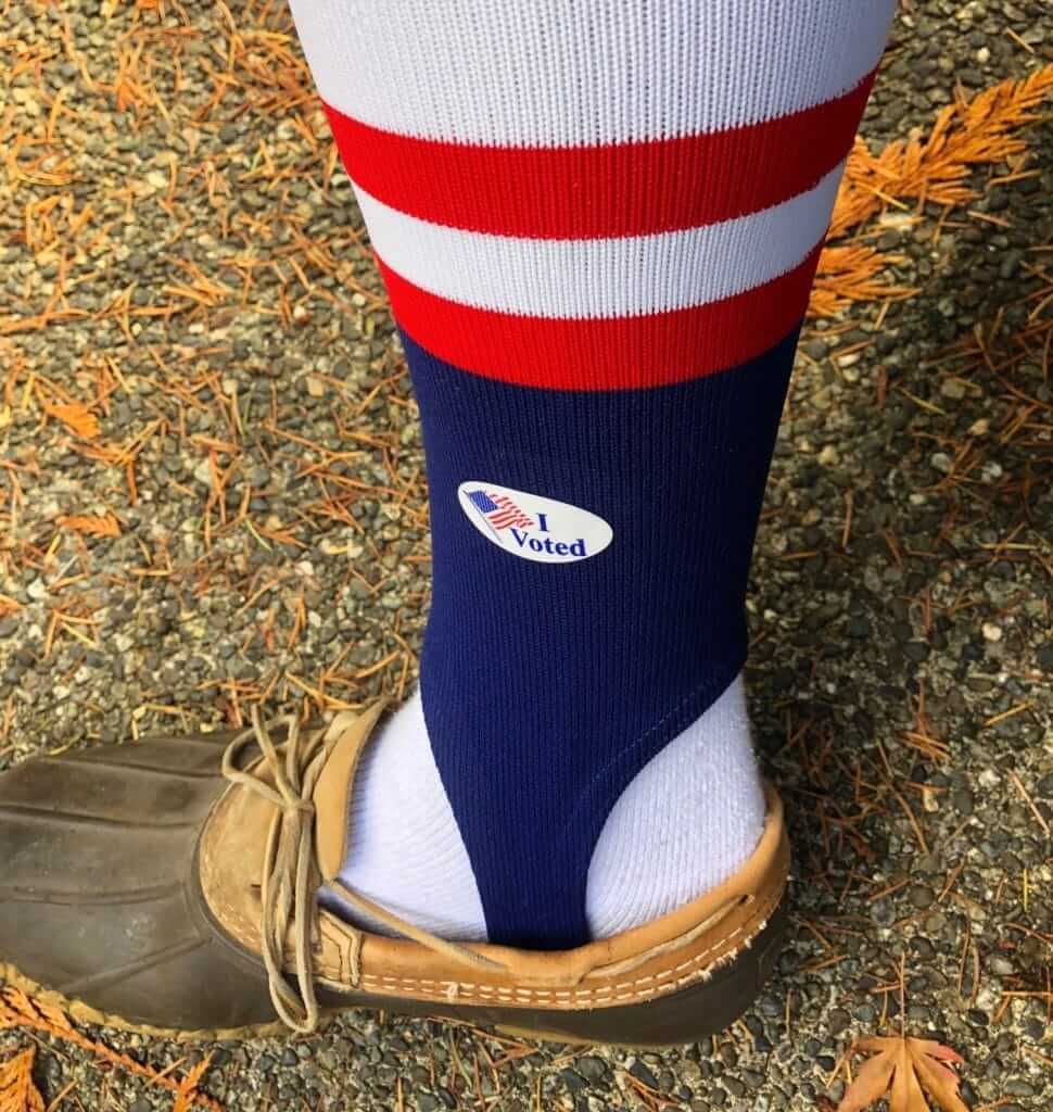
Give me really excellent striped baseball hosiery or give me death: At least one great citizen of this land — longtime Uni Watch reader John Kimmerlein — voted while wearing stirrups yesterday. I’m ashamed to say that it’s never even occurred to me to do this myself. Nicely done, John — you are a true patriot!
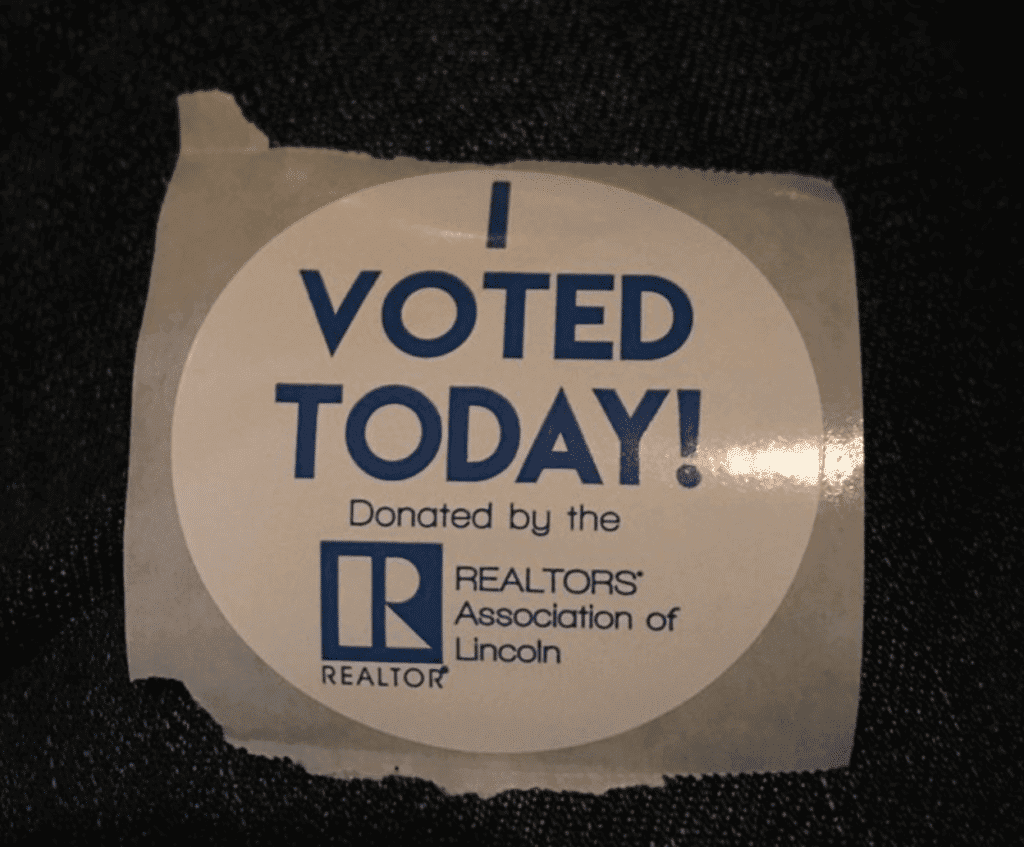
In the “Oh, for fuck’s sake” category, advertising creep has now extended to “I Voted” stickers (as submitted by @squatcheeontop):
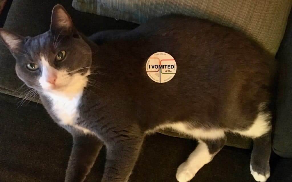
And then there’s this:
In other Election Day news, my thanks to everyone who submitted screen shots of TV reporters wearing nonpartisan purple yesterday. I was also intrigued by this Milwaukee TV crew that achieved the same effect with other colors (thanks to Shaun Meulemans for this one):
Used to be we’d “America Up” Election Day wardrobe with reds and blues. In our contemporary politics, those colors prompted questions of favoritism so here is our apolitical mashup of green, orange and maybe a silver stripe on @BNiznanskyTMJ4 tie. #TheVote @todaystmj4 @susankim4 pic.twitter.com/PCyqzZ8sxC
— Vince Vitrano (@vincevitrano) November 6, 2018
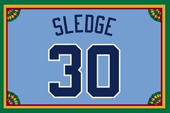
Membership update: A few new designs have been added to the membership card gallery. That includes Micah Sledge’s card, shown at right, which was an interesting request: He specifically asked for the throwback version of the White Sox’s 1968 design, rather than the original ’68 version, which had smaller numbers and larger NOB lettering. So the throwback wasn’t particularly true to the original, but he liked the throwback better, so that’s what he requested.
A few other membership notes:
• With the holidays approaching, here’s how to order a gift membership.
• Remember, a Uni Watch membership card entitles you to a 15% discount on any of the merchandise in our Teespring shop. (If you’re an existing member and would like to have the discount code, email me.) And
• As always, you can sign up for your own custom-designed card here, you can see all the cards we’ve designed so far here, and you can see how we produce the cards here.
By Lloyd Alaban

Baseball News: Speaking of elections, here’s an original ballot for the 1970 MLB All-Star Game. And just for kicks, here’s who actually got to play. You can see more old ASG ballots in this 2015 Uni Watch post (from Tailgate Throwback Sports). … Some gorgeous socks on legendary P Satchel Paige in this photo (from David M. Kerr). … Speaking of hosiery, this shot of actress Tatum O’Neal from The Bad News Bears shows her stirrup socks in Northwestern stripes. Could these have been low-rise stirrups with stripes that were altered to show more of the sannies? (from @philsphan20) … Left over from last week: The WWE presented the Red Sox with their own championship belt in honor of their World Series victory. … Chief Wahoo isn’t dead yet: P Dan Otero is Wahoo-clad in this shot of MLBers taking part in the Japan All-Star Series. Also, as is customary for this series, the jerseys have advertising patches (from Alex Burbidge).

NFL News: Last week we mentioned the Chiefs were going to wear a poppy patch for this week’s game in honor of Veteran’s Day. Here’s a closer look at the patch. … Tony Caliguiri came across these NHL-to-NFL uniform concepts. … Jason Heminger found a Lions hoodie at a TJ Maxx in Lansing, Mich., that placed the club in a division that doesn’t exist.
College Football News: Houston will be auctioning off the throwbacks they’re wearing for this week’s game. Proceeds go to the school’s alumni association (from Ignacio Salazar). … Since we’re on the subject of Houston: They’re using a really old Nike template for those throwbacks (from College Sport Design). … Every Lafayette player has selected a veteran to honor on their helmet for this weekend’s game at Army. … UAB will wear flag-desecration dragons on their helmets for this week’s game (from Tyler Greer).

Hockey News: Ten points for this house: The Toledo Walleye of the ECHL will don wizard-themed jerseys for Wizard Weekend Dec. 7-8. The link also includes a shot of a themed scarf (from Steve Johnston). … Cross-listed from the NFL section: Tony Caliguiri came across these NHL-to-NFL uniform concepts. … Ontario Hockey League club Guelph Storm will honor Lt. Col. John McCrae with a Remembrance Day-themed sweater for their match on Friday (from Wade Pink). … The Cincinnati Cyclones of the of the ECHL will wear these Dark Side sweaters for Star Wars Night on Dec. 15 (from Bill Fenbers). … The Blues still have Dimitri Jaskin’s mouthpiece behind the bench. Jaskin was waived by St. Louis during training camp (from David Tolcou). … The Kings wore white at home last night (from @ColoradoZebo).

NBA News: The Heat will debut their Miami Vice alternates tonight, along with their Vice-themed court. Here’s a breakdown of their new court, and a few photos of it. … Former NBA creative director Tom O’Grady offered some interesting thoughts on the NBA’s City alternates and the state of the NBA’s aesthetics. … Take a look at this Hornets logo from the 1988 NBA Draft next to first-ever Hornet G Rex Chapman. The logo was set to debut during the 1988-89 season but was scrapped due to similarities with the Montreal Canadiens’ logo. It was too late to change the uniforms, though, so the logo remained on shorts and warmups until the 1990-91 season (from Matthew Kleiner and Brad Solomon).

College Hoops News: New black uni for Davidson. … New unis for Northeastern. They switched from Nike to Under Armour during the offseason (from Ben Forman). … New court for UNCG. … Ball State men’s teased their new jerseys on Twitter (from Kyle Martinek). … Might be difficult to see, so watch the video closely: Purdue G Carsen Edwards still had “C. Edwards” for his NOB last night despite the departure of F Vincent Edwards (from @lzyl23). … Virginia put in their student manager in last night’s game against Towson and gave him “Virginia” for his NOB (from our own Jamie Rathjen).

Soccer News: Polish second league club Gryf Wejherowo will wear kits celebrating 100 years of Polish independence (from Ed Zelaski). … US Senate candidate from Texas Beto O’Rourke (D) wore a hat bearing the logo of future USL Championship side El Paso Locomotive yesterday (from Josh Hinton). … PSG, in collaboration with Parisian artist Tyrsamisu, released a new kit font that was only available yesterday and not on the pitch. … Brazilian club Corinthians wore the names of each of the 11 victims of the Pittsburgh synagogue shooting on the back of their shirts for a match last Sunday (from Jerry Wolper).

Grab Bag: For decades, ballet point shoes were made to match the skin tone of white dancers, basically excluding dancers of color. But manufacturers are now starting to make shoes to match the skin tones of non-white dancers. … Cross-listed from the baseball section: The WWE presented the Red Sox with their own championship belt in honor of their World Series victory. … Veterans of Foreign Wars has a new brand identity (from Mark Cavalli).
From a distance (the photos of the patch on the uniforms) the 150 looks like ’50 to me.
Crap, you’re right. Can’t unsee it now!
What I can’t unsee now is that the 5 kind of looks like a mouth, with the stitching as the upper teeth.
The “I vomited” sticker made me laugh out loud. It takes a lot for that to happen.
Glad you got a laugh.
I literally vomited last night.
“Jason Heminger found a Lions hoodie at a TJ Maxx ……”
That’s all I needed to read and I knew something great was in store!
Who are the Zions anyway??
What’s amusing is that the Lions have never been in any sort of “eastern” division since divisional play began in 1933, when the franchise was still in Portsmouth.
1933-1949: Western Division
1950-1952: National Conference
1953-1966: Western Conference
1967-1969: Central Division
1970-2001: NFC Central
2002-present: NFC North
To a couple of the NHL teams with the third jersey news.
Los Angeles Kings 3rd should really just look like this:
link
Tampa Bay Lightning 3rd should really look something similar to this:
link
I need to see the typography on the Lightning’s jersey and the whole uniform to make a proper judgment, but I’m not impressed with what I see in the leak. I hope a little bit of blue and silver will be on there.
Tampa Bay should look like this
link
Personally, I think they should look more like this.
Sorry, derped the link somehow: link
… and I didn’t bother to follow the link to Wade’s comment. XD
It’s been a long day…
That comment thread was haunted by the ghost of Martin Gelinas
Kudos to Jimmy Nutini – that obviously took a lot of work (for something that won’t ever happen).
Interesting that all of his concepts lean towards “traditional” (except for the lightning bolts on Tampa’s breezers). Say what you wish about creativity in unis, proprietary fonts, etc., but this makes me realize how cluttered most new unis look. (and we don’t even need to start chatting about makers marks, league and conference logos, etc.
I couldn’t help but notice that the uniforms were all based on the 2016-17 NHL season and placed on the Nike Elite 51 template. I’d like to see an update using the better-looking Vapor Untouchable template and the changes made in the NHL’s switch from Reebok to Adidas (ten teams changed their uniform colors, striping, and/or numbers, plus there’s the addition of Vegas).
This item is a bit older, hence the reason likely using older designs. It was in the ticker on this website previously quite some time ago.
I figured as much.
Edit – the actress is Tatum O’Neal (not O’Neil)
Good catch. Fixed.
College football teams also wore a 125th anniversary logo in 1994.
On uniform: link
Close up: link
Oooh, good point! Will add that to the text.
That Clippers jersey really does look like it’s from a commercial or movie where they didn’t actually have permission to use the real logo.
The first thing I thought of was the New Balance logo.
Same here.
Or that LA Beer that Bud tried to sell in the 80s.
LA Express Helmet.
And yet, considering how horrible their current visual identity is, this might be the best-looking uniform they’ve had in years.
Reminds me of the link that used the L.A. Express’ “LA” logo on a jersey kind-of-sort-of resembling the Kings’.
What’s funny is that they used actual footage of a Kings-Leafs game, but intercut it with the players in fake uniforms for when the principal actors were on-screen.
They got some mileage out of those fake Kings and Leafs unis, though, as I remember them showing up in a few commercials in the mid-90s.
I thought of LA Gear.
Looks like the old LA Express logo from the USFL, Steve Young
That’s what I was thinking.
LSU added a Wayde Sims memorial patch which is causing some severe upper shoulder overload.
link
Don’t yet know whether it was just for tonight or season-long.
Might be an issue on my end, but all text after “can’t unsee it!” is italicized all the way through the comments.
Refresh the page.
When did MLB teams start wearing gold on their jerseys to celebrate championships? I can’t remember seeing it before the Royals won back in 2015. They did it because gold is actually in their logo. Did KC start something?
link
Although not exactly the same, the LA Clippers jersey made me think of New Balance. link
I’m still holding out hope that the Bolts’ new third jersey is fake. (Wouldn’t be the first time they’d trolled people with a fake leak.) If not, it may be the worst jersey in NHL history.
I like the Kings’ 3rd, although I wish they had kept the gold outline in the logo. (I honestly didn’t like it at the time, but now I kind of miss it.)
Leafs’ 3rd is OK, but if they were going to use one of their old special-event jerseys, there were some better options IMO (2014 Winter Classic, 2017 Centennial Classic, etc.).
I’m holding out hope on the Bolts’ jersey too. In promising news, Tampa’s beat writer for The Athletic tweeted out that the team said the one presented by Icethetics isn’t the real deal; that the jersey is still in design and is yet to be unveiled.
link
Actually, the tweet does not say it “isn’t the real deal.” It does include the phrase “still in design,” but that doesn’t mean that the design will be any different than the leaked image.
I’m not saying the leaked image is definitely legit. I’m saying it’s important not to overstate what other people say, or to round up, so to speak.
Carlos Santana is still wearing his pants Hunter Pence style….
Would it have been so difficult to put a football on it’s end to represent the zero in 150? MLB *should* use a baseball for it’s 150 (which would make the most sense) but probably only if they use Nike Swooshes to create the one and five…
Too bad you can’t get those PSG shirts with the special font. In an Mbappe they’re gone.
Virginia student manager Grant Kersey not only got into the game, but managed to link.
From the looks of where the football is placed in the 150th anniversary patch, they couldve had the bottom piece of the 1 show. Probably doesnt make it a good logo but at least you may be able to tell its a 1 instead of an apostrophe.
I wonder if Rutgers and Princeton will get special patches of some kind — they’re the ones who got college football started 150 years ago.
Why is Mount Union shown with a patch? It’s neither a FBS or FCS school – they’re D3
Also, Texas A&M-Commerce (Lions, members of Lone Star Conference), a D2 school.
D-III schools *can* wear the patch. As stated in today’s text, they have the *option* of wearing a helmet decal instead.
That is not stated
Yeah it is. Between the photos.
D-II and D-III schools, along with NAIA and junior colleges, have the option of utilizing a rear-helmet decal (click to enlarge):
Not talking about the decal – talking about the patch
Perhaps I should have made it clearer: Non-FCS/FBS schools have the option to wear a decal *instead of the patch.*
In any case, those four photoshopped renderings all came directly from the CFB150 people. So if they chose to depict Mt. Union with the patch, then I think it’s pretty safe to say that Mt. Union can wear the patch if they want.
Love the old Ohio helmet in the “100” helmet logo link. I know a lot of people couldn’t make out the letters and were turned off by it when they wore it as a throwback earlier this year, but, I’m in the minority that liked it. The word Ohio jumped right out at me the moment I saw it and it wasn’t until I gave it a second look that I realized they squished the letters together into the shape of a circle. Plus, there’s something I find aesthetically pleasing about the outline of the state of Ohio.
I don’t care what anyone else says. I think it’s a good logo.
also on the note on the Blues’ mouthpieces, Chris Thorburn #22,is playing in the AHL with the San Antonio Rampage, and they still have his backup mouthpiece also
The Clippers City Edition unis are probably a callback to the LA Memorial Sports Arena, especially the logo at half court. The speed lines seem like a callback to the Clippers’ first identity when they were in LA, which was tied to the Lakers (generic Times italic typeface and the generic basketball with speed lines.)
It’s really a variety of LA sports references rolled up into one (which is impossible for Nike to do with the Lakers because of the Lake Show’s own Lore Series uni theme.)
Oh— and the stars on the side could be a callback to the Los Angeles Stars of the ABA. Again, lots of LA basketball references rolled up into one.
Way to go all out Tampa. The work really shows. *woof*
And lo and behold, WWE’s marketing championship belt. To be the brand, you gotta beat the brand!
I miss the Big Gold Belt.
My kingdom for the return of the Winged Eagle.
Yes! Loved the Big Gold Belt. Found memories of it for during the those days it had nWo spray painted on it.
Winged Eagle was great too.
For current belts, New Japan’s IWGP Heavyweight Title is a pretty good looking belt.
link
The IWGP Heavyweight Title belt is the best belt in the business.
I’ll bet there is one team in FCS and FBS that won’t wear the 150th-anniversary patch.
Harvard.
That’s because they recognize the 1874 game between themselves and McGill as the first collegiate football game. It is reflected on their 1974 helmet that said on it “The Real Football Centennial, 1874-1974.”
Late to the party but regarding yesterday’s mention of the 1971 NFL serving tray with the 1972 Washington helmet; I have the the tray with the R logo yellow helmet that they wore in 1970 and 71.
Vince Lombardi implemented that helmet color scheme and design before he died. He wanted the team to look more like his Packers.
Indiana looks like they’re wearing a red version of the alternate uniforms mentioned last week. Whole new set then?
Apparently.
After Googling a litte more, it looks like these are both alternates rolled out by Adidas late Fall 2017 for post season wear. Lame.
re: Detroit Lions “Eastern Division” hoodie….. could be an unofficial knockoff that found its way into TJ Maxx. I once found a “Philadelphia Penguins” togue in a similar type of store.