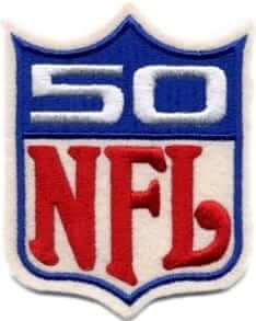
The patch shown at right was used to celebrate the NFL’s 50th anniversary in 1969. Teams wore it on their shoulders.
It’s a great logo — simple, effective, attractive, a great riff on the league logo. And now that it’s nearly 50 years later, with the NFL’s 100th season set to unfold next year, people have been wondering: Will the league come up with a similarly excellent logo to mark the centennial?
And now we have our answer: No — not by a long shot.
Last night the NFL posted a half-minute video promising a “historic and unprecedented year-long national celebration” for the league’s 100th season. And here’s the logo they’re apparently going to be using to mark the occasion (click to enlarge):
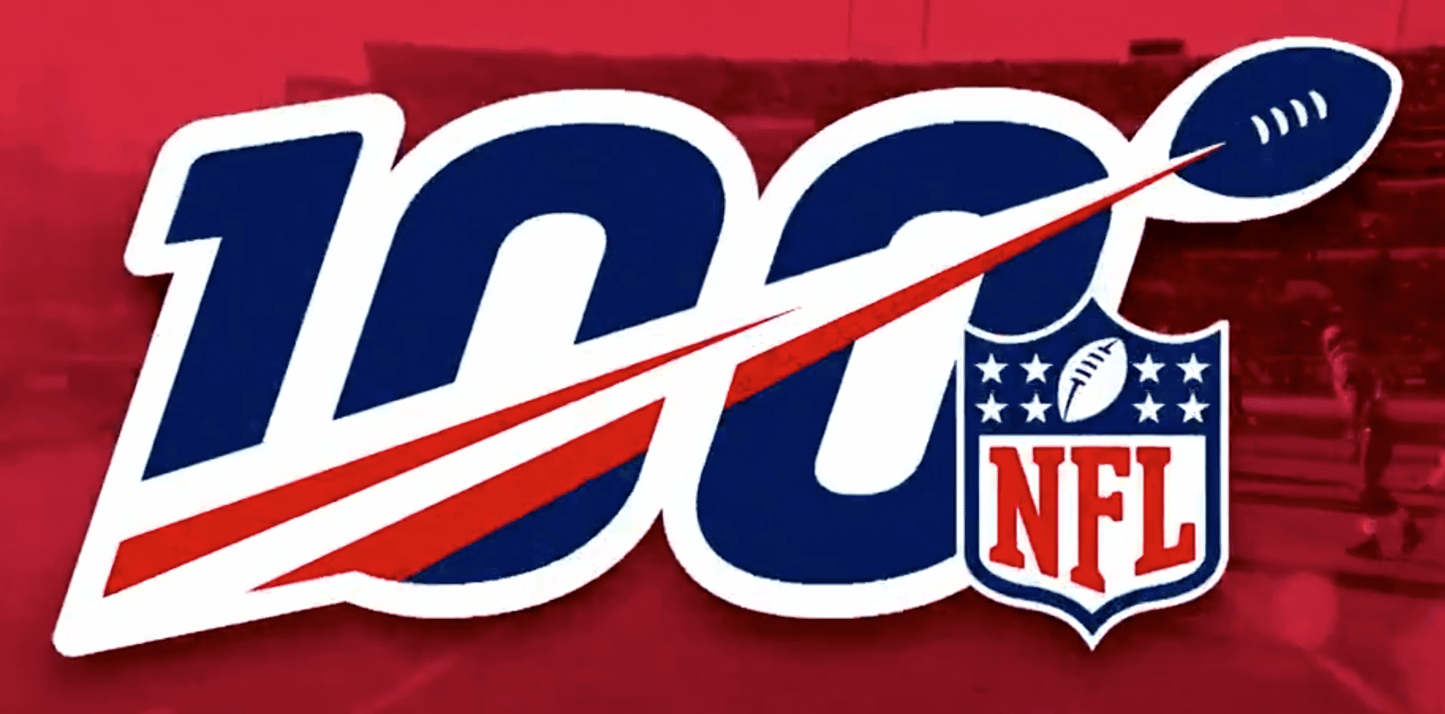
Oh, man — what a mess. It’s too busy, it’s unwieldy, it conveys zero sense of heritage or history. A lose-lose-lose.
The video also provides a hint of how the logo might be rendered as a patch (click to enlarge):
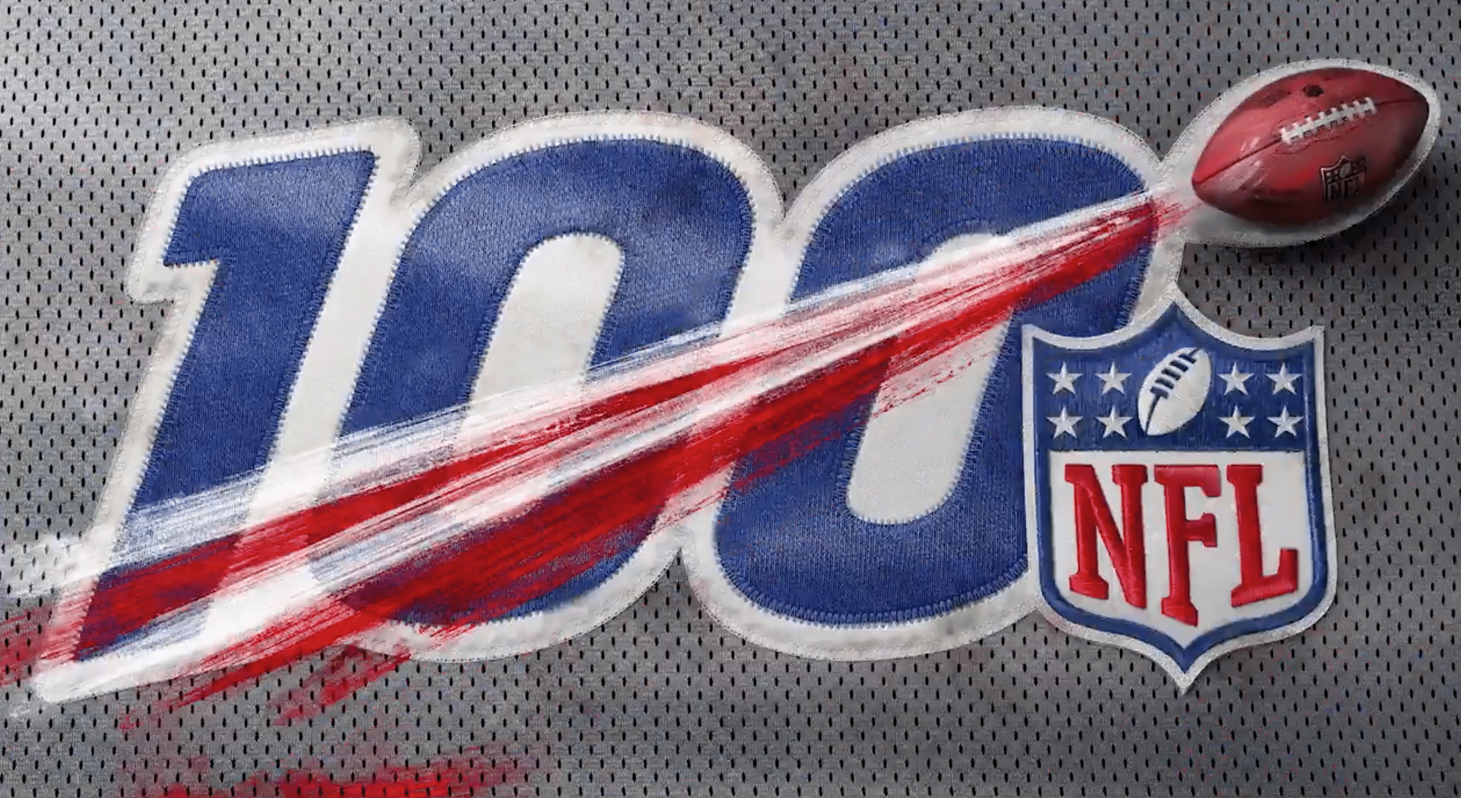
It’s funny that they put it on a faux-mesh background, because today’s jerseys aren’t mesh (well, except for the Packers’ and Panthers’ jerseys). Also odd that they chose grey for the fabric — a color that almost nobody in the league wears.
Anyway: The ball with the bloody comet tail looks like it’s superimposed over the patch, so maybe that won’t be included as part of the patch design. But they kinda have to include the ball, right? So maybe they’ll include the ball but not the bloody comet tail..?
Then again, they’re showing this as an embroidered patch, and we know by now that the NFL likes plastic patches for special occasions, so this digital rendering is probably as close as we’ll get to a real embroidered patch. The real thing will likely be plastic, and I bet it includes the bloody comet tail after all.
That brings us to the final version of the logo that’s shown in the video — this 3-D rendering (click to enlarge):
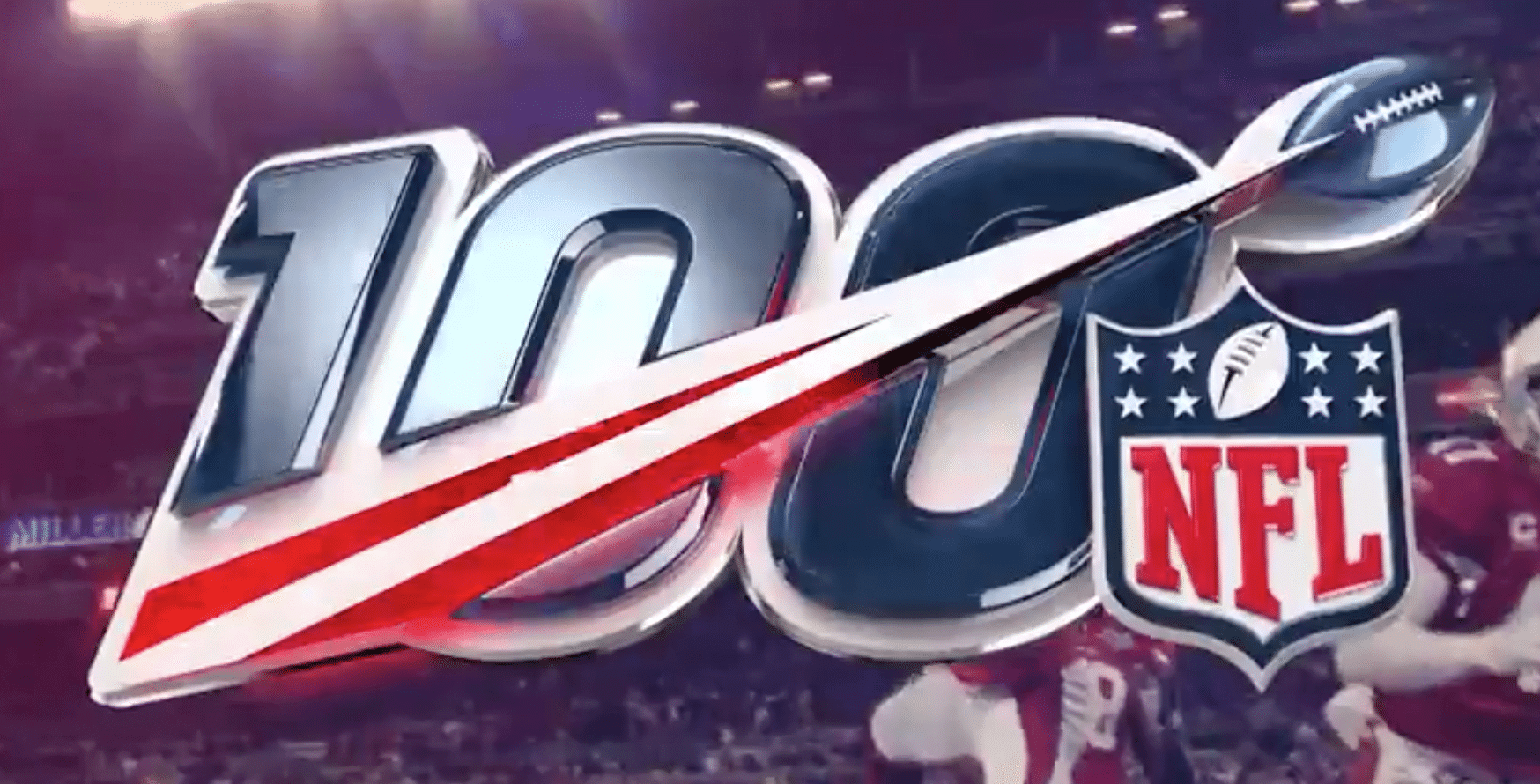
This is probably closer to what the real patch will look like — a plastic patch with a 3-D feel.
If the run-up to Super Bowl 50 a few years ago is any indication, the NFL will likely be carpet-bombing us with the centennial-season campaign, which means we’re going to be seeing a lot of this logo over the next 14 months or so.
Let’s avoid the rush and start hating it now, shall we?

NBA leaks coming fast and furious: The photo shown above, which began circulating last night, might be the Warriors’ new City alternate. Or maybe not. But probably yes. If so, it’s the latest in a long run of excellent Golden State designs.
It’s also the latest in new spurt of NBA leaks, including this one which may show the Rockets’ new alternate:
#Rockets City Edition Jersey? @UniWatch pic.twitter.com/GOOlvsUTHW
— Captain Kangaroo Pimp (@mccauley318) October 17, 2018
And then there’s this new Celtics design, which someone spotted at a Dick’s Sporting Goods outlet:
.@sportslogosnet any chance this is the new #Celtics “Earned” jerseys? saw these tonight at Dick’s and can’t seem to find them online pic.twitter.com/emIhPUKl7e
— JD (@tweetsbyJD) October 18, 2018
According to SportsLogos.net, the Celtics design will actually be their City alternate, not their Earned alternate.
Click to enlarge
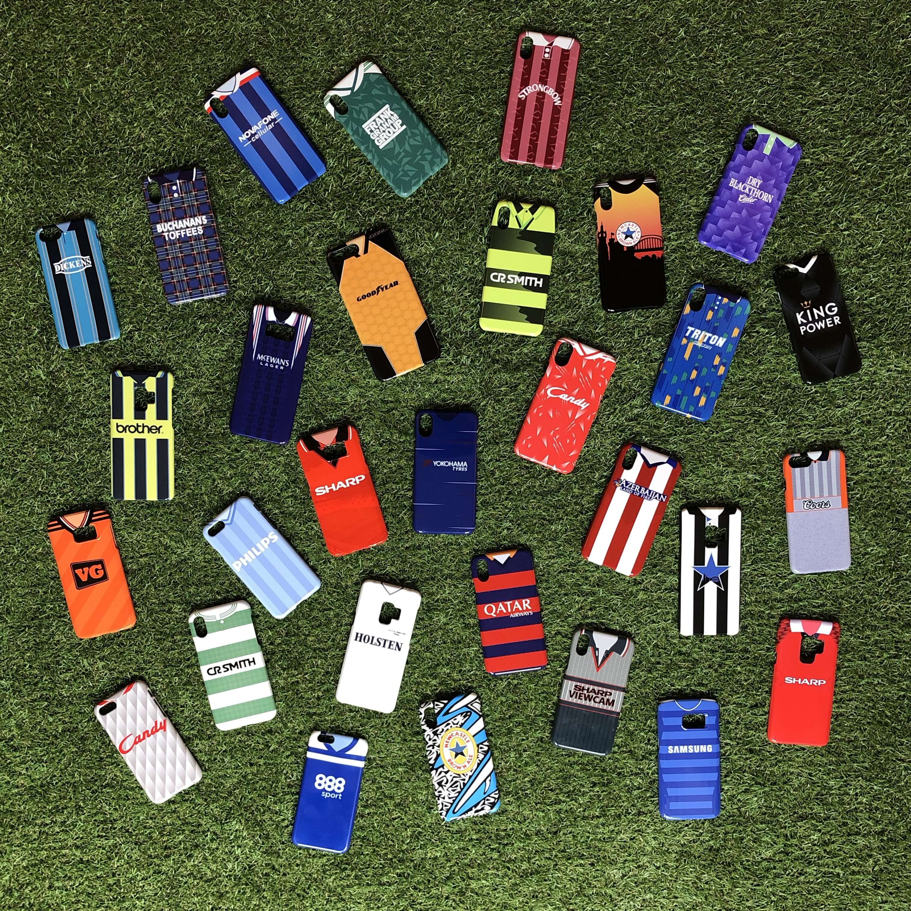
ITEM! Discount for Uni Watch readers: We recently had a Ticker item about Nostalgia Cases, a company that sells smartphone cases with designs based on old soccer jerseys. They have over 650 designs to choose from, each available for over 100 phone models, and worldwide shipping. If you want a kit design that they don’t currently offer, you can request it and they’ll produce it at no extra cost.
Now the good folks at Nostalgia Cases are offering a 10% discount to Uni Watch readers for the next week. To get the discount, just go to their site and use the checkout code UNIWATCH by the end of Friday, Oct. 26.
The Ticker
By Yianni Varonis

Baseball News: For the second consecutive start, Red Sox P David Price, who usually goes squatchee-free, wore a sqatchee on his cap. But during the postgame celebration, he was squatchee-less (screen shot from @goldburgerla). … Also from last night’s ALCS game: Astros 3B Alex Bregman, who usually goes low-cuffed, wore picture-perfect stirrups. Here’s another shot. … A local reporter tweeted a leaked image of what might be the Marlins’ new logo embroidered on a cap (from Dan Ducasse). … For the first time ever, Big League Chew will feature a female player on its packaging (from Mike Chamernik). … The Winston-Salem Dash, a White Sox minor league affiliate in North Carolina, appear to have a new alternate logo (from Will Lawson). … Reader Jay Braiman was recently in a theatre production of Pippin and designed baseball jerseys as mementos for the cast and crew.

NFL News: The Cardinals went mono-black last night. … The 49ers will unveil “The Catch” statues of Dwight Clark and Joe Montana before this week’s game, during which the team will wear 1994 throwbacks in recognition of the franchise’s last Super Bowl win (from our own Brinke Guthrie). … The Ravens have a page on their website that indicates which color jersey they will wear before each game. Reader Will Shoken wrote to the team to suggest that the page also indicate the pants color the team will wear but was told that that determination is made separately, “only a night before [the game] based on what the players wish to wear.” … Here’s an amusing article from 1975 in which former Vikings RB Chuck Foreman opines that he’d like his team to wear white shoes.
College and High School Football News: LSU officially unveiled its color-changing helmet and uniform commemorating fallen World War I solders. More information here. … In a great gesture, UAB players will wear the NOB of Alabama children fighting diseases (from Kyle Burger). … Here are the uniform combinations this week for Colorado and Colorado State (both from Kary Klismet), Utah, Utah State (from Ben Jamin), Houston (from Ignacio Salazar), Stony Brook, and D-II Lindenwood (from David Leezer). … Blaise D’Sylva has helmet updates for Oregon State, Arkansas State, and Arizona State. … Players from Lee High School in Jacksonville, Fla., have begun wearing shoulder pads with a cooling system meant to protect them from heat stroke. The pads were donated by the family of a former player who died last year after collapsing during conditioning drills. … Arizona State QB Manny Wilkins bashed his helmet in frustration against a sideline storage unit during last night’s game, leaving a visible mark on the helmet.

Hockey News: A good piece about the equipment managers whose jobs it is to quickly replace players’ broken sticks in the heat of play (from John Gagosian). … Cool black-and-white photograph of musician Carlos Santana in a North Stars sweater. … 3-D helmet logos, much like we’ve seen on baseball batting helmets and football nose bumpers, are now appearing on the Sharks’ helmets (from Danny Pedroza and Spencer Cooper). … The Kings wore L.A. Galaxy jerseys for pregame warm-ups last night. Here’s another view.

NBA News: LeBron James, making his Lakers debut last night, showed up at the arena wearing a T-shirt of himself. During the game, he wore a compression sleeve with an animal print pattern in the first half but later switched to a plain white sleeve (from Mike Chamernik and C. Duncan). … In that same game, the Trail Blazers debuted their Paul Allen memorial patch. Contrary to early reports, it’s a band, not circular. … With this being Heat G Dwyane Wade’s final season, the future Hall of Famer gave an autographed jersey of his to Magic C Nikola Vucevic (from Mike Chamernik). … The Wizards are the latest NBA team to provide their entire 2018-19 uniform schedule on their website.

College Hoops News: A reporter tweeted out a tongue-in-cheek look at Mountaineers HC Bob Huggins’s career as a “fashion icon” (from @VerbDC). … New road attire for Butler (from Sean Dunham and Josh Billman). … And a new set of uniforms for D-II
Saint Edward’s (from Jameson Adams).

Soccer News: According to a reporter, MLS teams will be permitted to have ad patches on their sleeves next season (from Josh Hinton). … Also from Josh, kit problems for the Peruvian national team after switching to manufacturer Marathon.

Grab Bag: Apple will unveil new products during an Oct. 30 event and has designed new logos for the occasion. … Caterpillar has modernized its logo for several of its products. … If you haven’t already, it’s worth checking out the online Sports Memorabilia Museum (from Kary Klismet). … Here is further evidence that Pitt might return full-time to a color scheme featuring royal blue and yellow (from Joel Coggins). … Major League Lacrosse announced that it will soon “undertake a comprehensive rebranding initiative.” … The Gaelic Athletic Association, based in Ireland, unveiled the jerseys that will be worn next month in Boston during the 2018 Fenway Hurling Classic (from Phillip Santos). … A judge ruled that political operative Paul Manafort will have to wear an inmate’s uniform instead of a suit for his next court hearing. … A special-needs teenager who is fighting a terminal illness has been given a flight-attendant’s uniform by American Airlines to wear on her flights to a children’s hospital for treatment. … Here’s an interesting look at the process by which New Mexico State created a new uniform for its mascot, “Pistol Pete.” … Multiple women’s volleyball teams in Japan unveiled new uniforms that are clearly too large for these promotional photographs (from Jeremy Brahm). … New academic logo for South Florida.
That logo looks like the NBC the more you know logo. Or like a logo that would be used for the “Punt, Pass, Kick” competition. Between these and the bland Super Bowl logos, it’s like the league has forgotten how to keep it classy.
Every year I have found myself closer and closer to just not following the NFL anymore and this logo might just be the final straw for me to just go ahead and give it up.
If you choose not to watch a sport over a anniversary logo they are using for one season, then no offense buddy, you weren’t a real fan anyways. (Same with people who don’t watch over what the players do during a 2 minute song before the game)
You don’t seem to understand the concept of “final straw”.
Stevie’s choice not to watch the NFL is specifically NOT over the anniversary logo in and of itself.
Lee
I’m with you. I casually watch if it is on when I am out somewhere, but I have replaced it with college football. Between the absurd rule changes, the blatant greed, the debacle of the Charges leaving SD for LA where they are doomed to fail (and yet the NFL was blind to it), to the way they trip over their own feet at every turn when there is a controversy, be it Elliot, Rice, Kaepernick, etc. The game just is not what it was, it is purely packaged as a product now, and a poor product. I remember spending every second of Sundays glued to the tv, from 1 pm, through ESPN’s formerly great NFL primetime recap show, through the end of the Sunday night game. Now I am completely indifferent to it.
Greg, I feel the exact same way. YOu perfectly summed up my thoughts. I was an NFL fanatic 25 years ago. Now I am completely indifferent….and you’re right. It’s just a bad product. I actually had the Denver/Kansas City Monday Night game on last week while I was doing things around the house. Joe Tessitore must have called the game “great” about 27 times. “We’ll be back to a great one here in Denver tonight”. I think the league thinks if it keep telling us these games are “great”, we will believe them. You and I (among thousands of other fans) know better, though. I turned it off once Booger McFarland called Patrick Mahomes an NFL Legend! (That was his fifth career start). I guess having someone named Booger commenting live from the sidelines in a rolling easy chair is all you need to know about the current state of the NFL.
I really don’t understand what the function/purpose of the chair is other than blocking the view of fans in the stands.
You guys not liking the NFL these days, eh? I invite you to jump across the border for some CFL action! Quality football with long traditional rivalries, exciting games, no team relocating, no NFL issues. The more fans the merrier!
Here is your ESPN2 schedule for you guys south of the border. Those playoff games in November will be epic:
link
I’d actually never seen that 50th anniversary logo, though I remember seeing the 75th anniversary patch everywhere. Both of them are infinitely better than that gaudy abomination of a patch we’ll see everywhere next season.
There’s an inconsistency with how the NFL shield logo falls across the last 0 in 100. In the first image, the left and center “points” line up with the right vertical line of the last zero. But in the patch and 3D logos, the shield is shifted to the right more.
I’m sure the NFL has a corporatespeak explanation for that dynamic, synergistic repositioning.
The NFL 100 logo is horrible. It looks like it belongs at a NASCAR race.
Yes! NASCAR or, for some reason I feel, a box of cereal.
Feels like the logo of a political candidate who’s definitely going to lose to me.
Wow that is an awful anniversary logo! I remember the 75th season, probably at the height of my sports and NFL fandom as a 12 year old. That anniversary logo was amazing. At the time jersey sales werent what they are today, but I saw a catalog with authentic jerseys, running close to $300, I begged my parents for a Colts Marshall Faulk jersey and was so pumped when I got one for Christmas and it had that sweet 75th diamond anniversary patch. Still cherish that gift to this day.
With regards to the 1st image of the 100th Anniversary logo (I think it’s the logo image, not the patch ones), is anyone else bothered by how one of the red parts of the comet tail appears to go behind the line between the zeros while the other goes in front of that same line? Or is it just me?
the discrepancies between the NFL shields in the three versions bug me more – different weight to the letters and different details on the football on the shield. I can’t imagine why those weren’t consistent.
The design of the Dwight Clark “The Catch” statue denies fans the chance to see him from the angle most of us are used to: from the back of the end zone. link
ticker item about the Montana to Clark statue made me wonder if the 49ers were wearing a uni-memorial for Clark. Don’t recall seeing anything posted here and a quick image search didn’t reveal one.
Has definitely been covered here. They’ve been wearing it all season:
link
Thanks. Remembered it as soon as I saw the picture. There can’t be too many silhouettes in sports that are so recognizable as a specific play.
For the first time in years, I can tell that Butler is wearing navy on the road. For the last few years, it looked like BFBS with navy trim, which is a terrible idea. Upgrade, Butler.
I’m an LSU alum, and I’ll just say the story about the uniforms tying into fallen WWI soldiers sounds great until you realize Nike is selling replicas of these jerseys. At that point, I take it as we’re going to make money by tying it to fallen WWI soldiers. Then it doesn’t sound quite so noble.
I wish everyone involved would just cut the crap and say “Hey, we wanted to wear alternate uniforms because we can sell more jerseys.” Even the tired trope of “It helps recruiting” goes away when you realize Alabama is No. 1 every year in recruiting wearing the same two uniforms.
As for LeBron James wearing a t-shirt with his own likeness, of course, he did.
Okay, but tell me as an LSU alumni, honestly exactly, okay, not exactly, but give me a semi precise number of how many of these WWI jerseys you expect will be bought? 100? 1,000? 10,000? 100,000?
I know that we now live in the EVERYONE IS OUTRAGED ABOUT SOME BULLSHIT THAT ISN’T WORTH BEING OUTRAGED ABOUT!!! and that’s fine (okay actually it isn’t fine, it’s what got us Trump as President) but I expect that this is gonna be a loss leader for Nike. They won’t make a penny off this, but rather will lose money. This of course is taking into account all the ancillary things that went into the making of these unis that did in fact actually cost Nike money, but which I’m sure you will just handwave away.
Which is fine (actually it’s not.)
But you go bengal Tigers!!! You go get your doors blown off by Alabama.
That embroidered new Marlins logo looks to be using the same colors as the Dbacks Sedona red & Teal alternate cap.
Does that Celtics jersey have black and gold lettering and numbers? IF so is it meant to be a shout-out to the Bruins?
Green and gold.
I hope the MLL redesign includes a return to white at home. Also, the league would be wise to let each team fully design its own uniform, rather than having all teams use the same template.
I liked the diamond anniversary logo from 1994, and the 50th from 1969 is elegant in its simplicity. I’m running with the consensus here – the new one is crap.
I hope that MLB will be a little smarter and have a classier logo for their 150th anniversary next season…
“Bloody comet tail” sounds so very British.
Any word on throwbacks to commemorate the 100th? That’d overshadow this lousy logo.
How is it that the 100th anniversary logo is more 1994 than the 75th anniversary logo, which was in 1994?
You summed it up perfectly!
That Marlins hat makes it look like we aren’t getting any pink after all. Lame!!
But it does make it look like the Marlins will be wearing even more black. Jeter!
Still, fans of the Brewers ball-in-glove logo should love the new Marlins cap. Color on color with bright outlines and slightly ambiguous nickname-civic-initial iconography for the win!
When news of the Marlins re-logoing became official, I threw together a joke image of a Yankees uniform with the navy bits turned black and an old Marlins M-with-fish logo in place of the NY to represent what I expect of Derek Jeter’s taste and decisionmaking. link
Turns out I may have been overly generous! A black-on-black cap suggests that the new uniforms will be even worse than I imagined, and not even an upgrade from the dreck the Marlins wear now.
I had the same reaction , too much black. Not enough contrast. Also, not very Miami. The neon Miami thing can be overdone, but there has to be a classy way to at least nod to it. Or at least recognize some Miami baseball tradition.
Personally I actually do think the black-on-black with only color outlines do evoke neon signage so I like it for that reason. But the lack of pink when it looked like we might be getting that makes me so angry. The insane popularity of the Heat’s “Miami Vice” alternates should have made that the obvious move, but Jeter would never.
The neon thing is the one idea that could salvage the black-on-black for me. And the leaked cap photo almost works with that paradigm, but the bright lines need to be thicker and a little less sharp in their angles to sell “neon” to me. And the fish needs to have more “fill” to look like a neon sign.
Love the use of the word dreck!!
That Marlins hat looks like it was made at a mall kiosk
Couldn’t agree more. Horribly lazy effort if that is indeed the new Marlins logo. The original uniforms were so good. If they had an ounce of sense they’d go back to that style. No more black. Horrible!
On another note, the NFL 100th anniversary patch made me wonder, has there been any word yet of an MLB 150th anniversary patch, or any other recognition of that anniversary next year?
How does MLB identify the year they started?
Per Wikipedia “For professional baseball’s founding year, MLB uses the year 1869—when the first professional team, the Cincinnati Red Stockings, was established.[54]”, which would make THIS year their 150th.
Also per Wikipedia “In 1876, the National League of Professional Base Ball Clubs (later known as the National League or NL) was established”.
I know they celebrated 100 in the 1969 season, so I too would expect them to celebrate 150 next season.
Lee
Seems right- they celebrated 125 in 1994
MLB did 125th anniversary patches league-wide in 1994. Beautiful patch, though not necessarily the most successful year-long celebration in sports history.
link
Anyway, 1994-125=1869, so at the most recent meaningful anniversary, MLB was still using the “birth of professional baseball” thing, rather than either league’s founding in 1876 or 1901, for dating its anniversary.
Wow, that 100th Anniversary logo looks like it’s straight out of 1992. Is there a “Stay In School” logo to accompany it? It should be rendered in teal and purple. I totally agree with the first commenter about the NBC “The More You Know” logo too.
The NFL cares only about spreading it’s “brand” to everyone on Planet Earth. Which of course brings them money. I get that sports leagues are businesses, but the more you cram your “brand” down our throat, the less likely we are to support your “brand”.
I was hoping they’d do a straight copy of #50, making it #100. But nooooooo.
Dick Butkus wore it the best. How intense is this photo? I remember where I WAS reading it back in 1970. In our station wagon (didn’t everyone have a station wagon in 1970?) coming back from Sunday lunch post-church.
link
Use the current shield, but yes, substitute in 100 for the 50 from that logo, that would have been the way I went.
No one asked though. Again.
Lee
Is the NFL logo a play on the 100% emoji?
“crummy”
perfect word.
Paul, any idea if the NFL has a change in their in house design/graphics people, of they have a new firm in recent years? Between this, the standardized Superbowl logos, and many other things they are putting out, it just seems substandard compared to what they did 10+ years ago. They are just bad attempts, but it is like they have a whole new idea of what looks good.
Interesting question, but I don’t know anything about that.
I’ll say this much: This logo definitely wasn’t designed by Nike!
On PFT, they said it looked like a variant of the Play Football logo, which is true.
A comment suggested it looks like an energy drink. That’s it!
the Cardinals’ black alt is the worst current NFL uniform excluding only the Falcons. woof.
That 100 year/season/anniversary logo for the NFL brings up something I’v been ruminating on, which is what besides a logo will the NFL do.
As Lukas pointed out for the 50 year thing we got a patch which was worn on the shoulder.
For the 75th year thing we got a patch AND teams wore throwback/new unis, some of which were and still are awesome, like the Chargers/Raiders/Broncos and some of which are garbage and sucked shit, like the Cardinals/Eagles/Packers/bears/Redskins/Bills/Jets.
For the 50 year thing for the AFL the league again went with retro/throwback unis, some of which were awesome and cool like the Chargers/Raiders/Oilers and some of which sucked shit and were garbage like the Titans and Bills. It still boggles my mind how so many of the people who post here went so apeshit over the broncos vertical striped socks.
For the 50 thing of the Super Bowl the NFL changed the color of the logo to gold and brought back every Super Bowl MVP to the actual Super Bowl, (which meant they had to pay Joe Montana over $5,000,000 to show up. He doubled his price from Super Bowl XL, when he demanded $2,500,000 to show up. Guess that endorsement deal with Mizuno never really paid out, eh Joe? EH??!!)
But I digress.
For the 100 thing I’ve been hoping that the NFL would do the throwback/retro uni thing again, with each team choosing two unis from their history/past, one home (dark) one away (light).
Of course there are teams whose unis have changed so little that this exercise is pretty pointless, like the Cardinals/Packers/browns and of course then ewer franchises like the Texans and panthers/Jaguars have made minimal changes, yes I Know the Texans haven’t changed anything.
For instance I would love to see the Redskins using the spear era unis from the 1960’s as a home throwback and then for the away uni I’d like to see them use the yellow helmet with the R and feather logo.
I think this would be awesome and cool and this time the NFL would get it right like they did with the 50 year thing for the AFL.
But they won’t because of this dumb policy about teams and players only being allowed to use one helmet the entire damn season supposedly for ‘safety’ reasons, which I think has been debunked as utter bullshit.
Which is a really roundabout way of asking you, Lukas if you have any inkling or info about special unis to celebrate the 100 thing next season. I’m not talking about a complete overhaul like the Jets, just special stuff like the AFL 50 or NFL 75 seasons. And if it’s embargoed or whatever, fine, just say whether or not there is something in the pipeline.
Well?
I haven’t heard anything about throwbacks. Doesn’t mean it won’t happen, but I have no intel on that.
Thanks Paul.
Would you like to see throwbacks? Done right of course, like they did for the AFL 50 thing.
I also have a rant about the Naming wrongs line of shirts, but I’ll save that for next week. ;D
I almost always like throwbacks.
Uni Watch redesign contest for NFL 100th anniversary logo coming soon?
Love this idea!
That’s a motion and a second, all in favor?
– A Celtics jersey with bright yellow on it? Heresy. They’re just a bit of purple trim from looking like the Lakers.
– Did Paul Allen typically go by the name Paul G. Allen? Because that memorial patch makes it appear that the Blazers newest sponsor (sorry, advertiser) is the Professional Golfers’ Association.
– Jerseys for a professional hurling competition in Boston? You can see amateurs do it for free on the sidewalks outside of Beantown bars any night of the week.
It’s really ironic that there’s going to be a hurling tournament at Fenway, because the GAA generally forbids sports other than its own from being played at its stadiums, but is apparently quite happy to play in other sports’ stadiums.
As the other-sports rule is written, exceptions can only be made for Croke Park in Dublin, which is why college football has been played there (as well as rugby union and soccer). This caused a huge fuss last month because the association wasn’t going to allow a benefit soccer match to be held at the GAA stadium in Cork:
link
(Also, the GAA is entirely amateur.)
I don’t think the PGA has ever used a rose as a part of their logo, as the Blazers have in their logo. By the way, the empty seat with a rose on it was very cool.
His Philanthropic efforts are the Paul G. Allen Philanthropies
link
The Celtics current City jersey is a vast upgrade over their original City jersey, the design of which never made sense to me (the Celtics don’t use gray or silver even as a secondary color).
Did you see the World Series Hats for Boston last night?
A Big WS with a Boston B inside a black Home Plate.
link
Yawn…
Yawn is exactly right. Which makes these a thousand times better than the terrible caps that were put out for the DS winners.
Navy blue home plate. As in, the Red Sox cap color.
USF unveiled its new institutional logo back in the summer and it’s being rolled out during homecoming week. I like the bull in it, but I’m not a fan of the font that “USF” is in. I’m not surprised that most of the on-campus Follett bookstore has the Bull “U” and Bull “USF” on it because that’s more popular with USF’s students, employees and fans. To further illustrate that point, even USF’s new license plate has the Bull “U” on it!
The Bull looks very similar to the Merrill Lynch logo.
That’s what so many people have said! That’s gonna dog the people who created that logo for a long time and I would have no problem with that. There was nothing wrong with USF’s previous institutional mark and I feel that we downgraded.
I love that in 1969 the Viking wore the “NFL 50” and the Chiefs wore their “AFL 10” patch in Super Bowl IV.
link
From the ticker link, I find it unfortunate that Alex Bregman spoiled his nice stirrups with white shoes. Not a good look.
Good grief. The more I come here the more I wonder if “for those who get it” is going a bit too far. We’re bitching about a stupid anniversary logo now? Seriously? I used to really enjoy this site but good lord we’re reaching ‘get a life’ levels of criticism here. There really isn’t much wrong with that logo other than you simply don’t like it… which is fine. But you also don’t like ads on walls of stadiums, ads on jerseys, manufacturer logos on hats and jerseys, anything purple, pizza from a pizza chain, limited/special uniforms (like color rush) and I’m sure a boat load more. Just change the name of the site to bitch fest.
When I think things are good (like the Warriors design in today’s NBA sub-lede, for example), I say, “That’s good!”
When I think things suck, I say, “That sucks!”
Simple. Sadly, I can’t control the ratio of good things to sucky things. (If I could, the world would be a much, much better place.)
If this process doesn’t meet your needs, feel free to look elsewhere. But complaining that a site about uniforms is assessing the centennial logo of the country’s most popular league — a logo that will likely be worn on every single one of the league’s uniforms in 2019 — seems a bit odd.
Contrary to your assertion, I actually gave specific reasons for disliking the logo (but feel free to ignore that part since it seems to suit your purposes). And if you look at today’s comments, you’ll see that many, many readers appear to agree with me. That doesn’t automatically mean I’m right, of course, but maybe — just maybe — it means today’s content wasn’t as ridiculous as you seem to think it was.
Just maybe.
You don’t get it.
Start your own site.
Bitchfest.com appears to be available.
What, exactly, do you think this website is for?
Asking for a friend.
One of the things I love about Uni Watch is that literally no detail is too small or insignificant to be above analysis or at least mention.
I don’t think the “NFL 100” logo is that bad. Maybe a little “stock” if anything.
It’s certainly less busy than the NFL 75 logo and probably will be easier to read as a jersey patch than that one.
Am I the only one who noticed that the second “0” in the “100” is a different color in the third version?
What’s up with that?
You know what would be cool?
If LeBron wore a T-shirt with a picture of LeBron wearing a T-shirt with a picture of LeBron wearing a T-shirt with a picture of LeBron wearing a T-shirt…
I know Paul would like that!
That new Marlins logo is horrible. Looks like clipart.
I cannot overstate how much I dislike the new Marlins logo. There is no contrast in colors. The design is almost amateurish. It looks like clipart