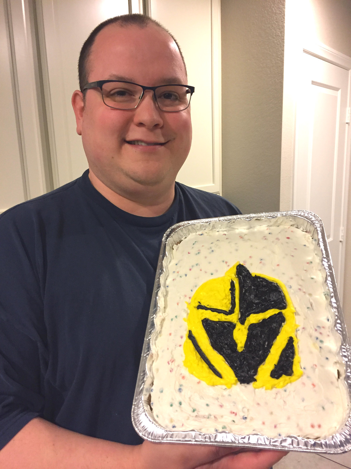
[Editor’s Note: With the expansion Vegas Golden Knights making it all the way to the Stanley Cup Finals — and facing elimination tomorrow night — today we have a guest entry from Thomas Roddy (that’s him at right; click to enlarge), who recently celebrated his birthday by making himself a logo-themed cake. — PL]
By Thomas Roddy
My wife and I moved to Las Vegas five years ago. With the Golden Knights debuting this season and playing so well, I decided to make my own Golden Knights cake. After looking at the logo, I figured this would be easy, since the Knight’s helmet is essentially a series of triangles.
Boy, was I wrong! As a high school history teacher with zero artistic expertise, I soon realized I was in a bit over my head. Here were my early attempts at drawing the logo [for all photos, you can click to enlarge):
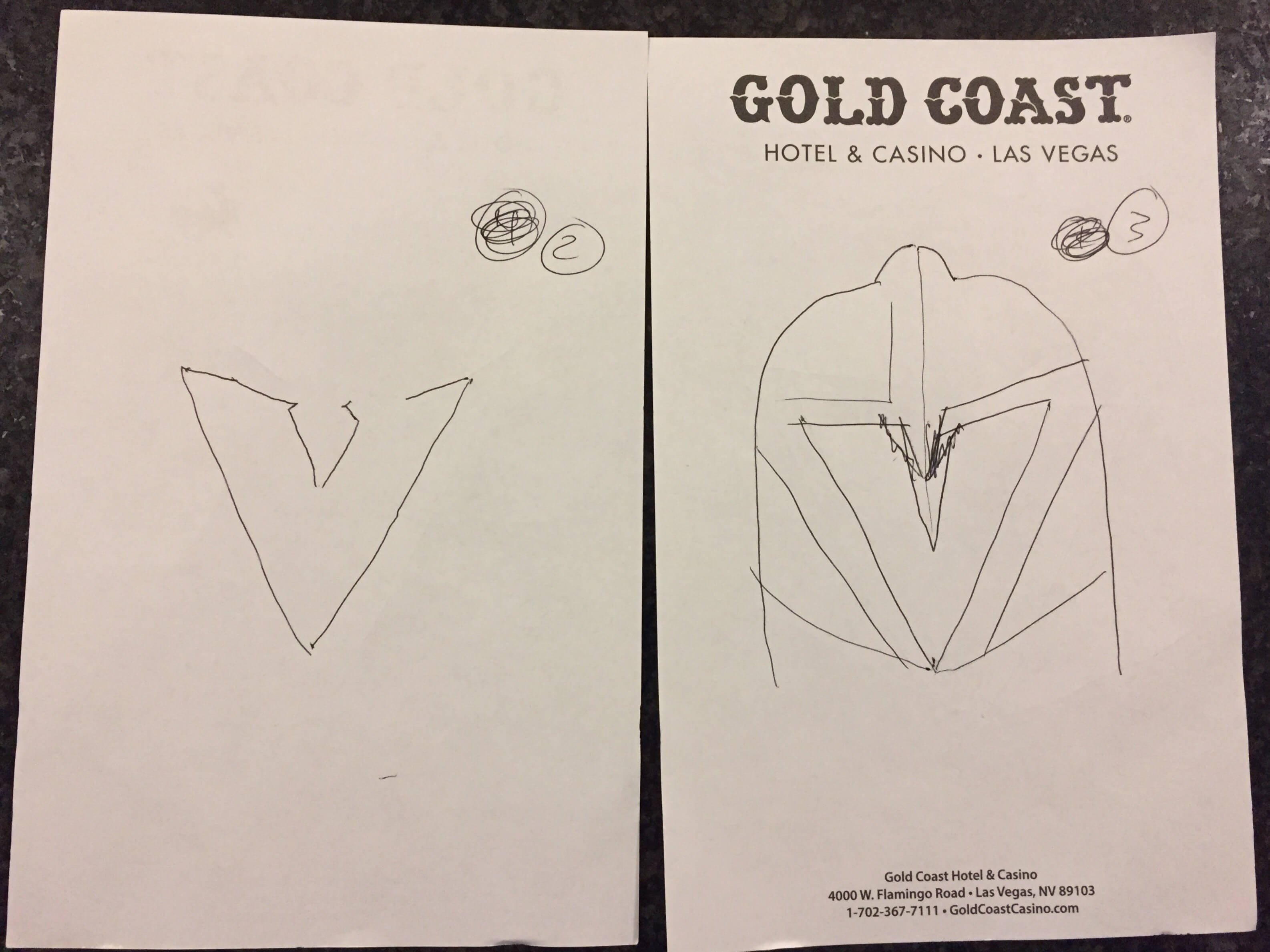
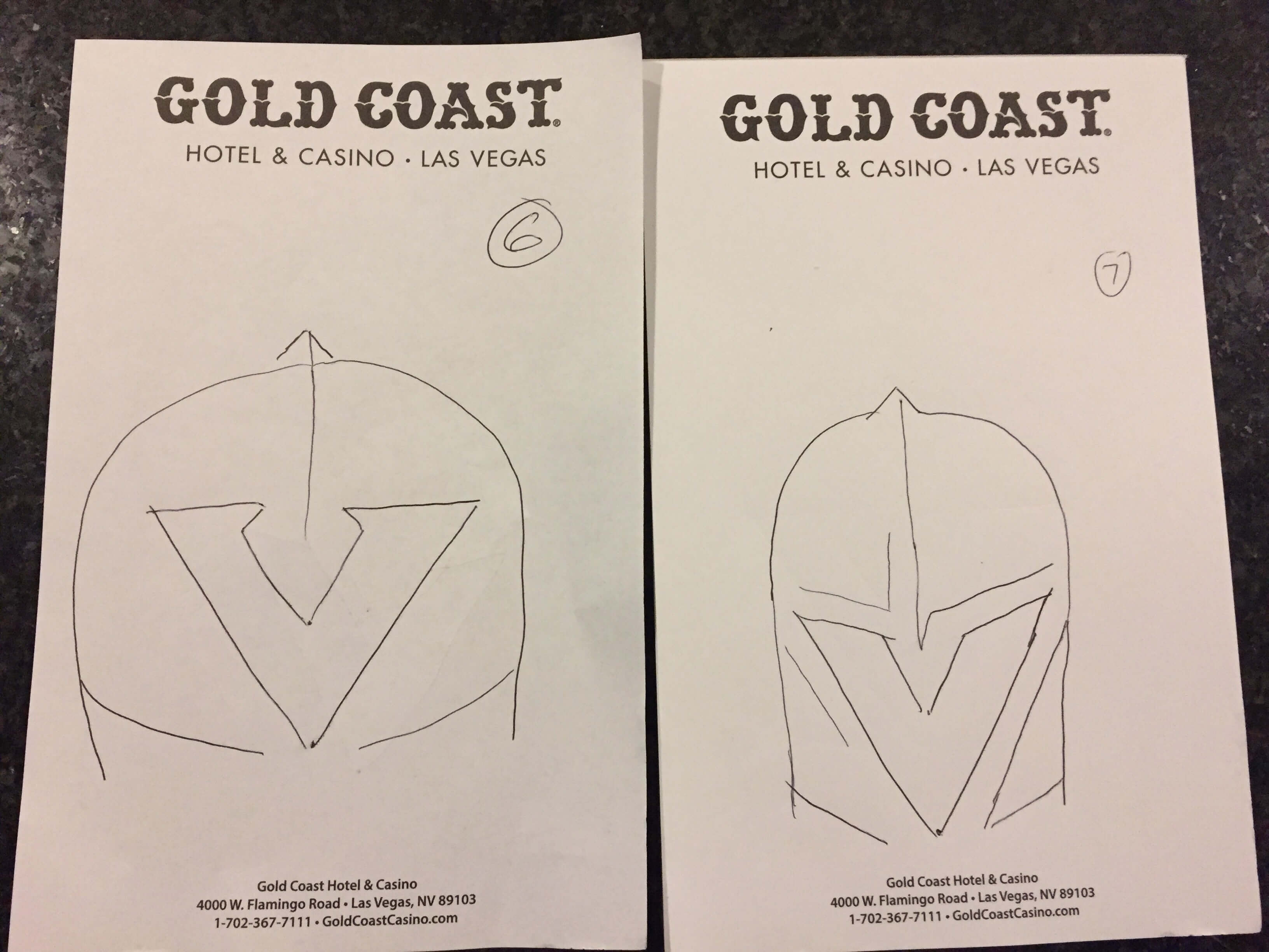
I eventually figured it out. Then it was time to bake, frost, and design. Again, I am a history teacher, not a baker, so I used a store-bought box mix: gluten-free Pillsbury Funfetti. Here’s how the unfrosted cake turned out:
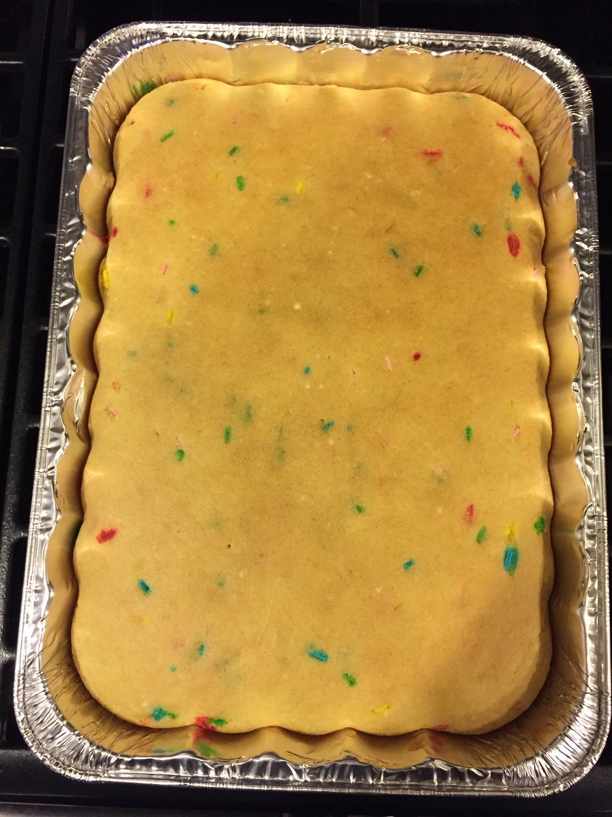
As you can see, the cake is oriented vertically. I made that choice because the Golden Knights’ logo is taller than it is wide. When you think about it, most cakes are oriented horizontally, so I liked the uniqueness of this stylistic choice.
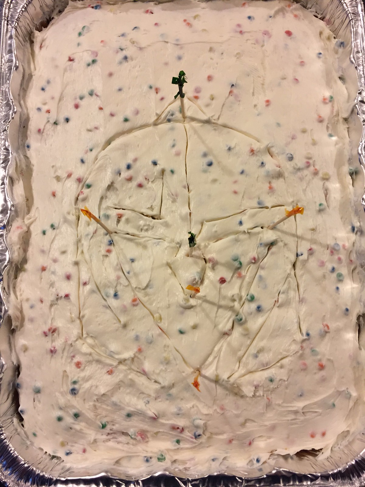
Next, I applied a base coat of white rainbow chip frosting and then used toothpicks to trace the logo:
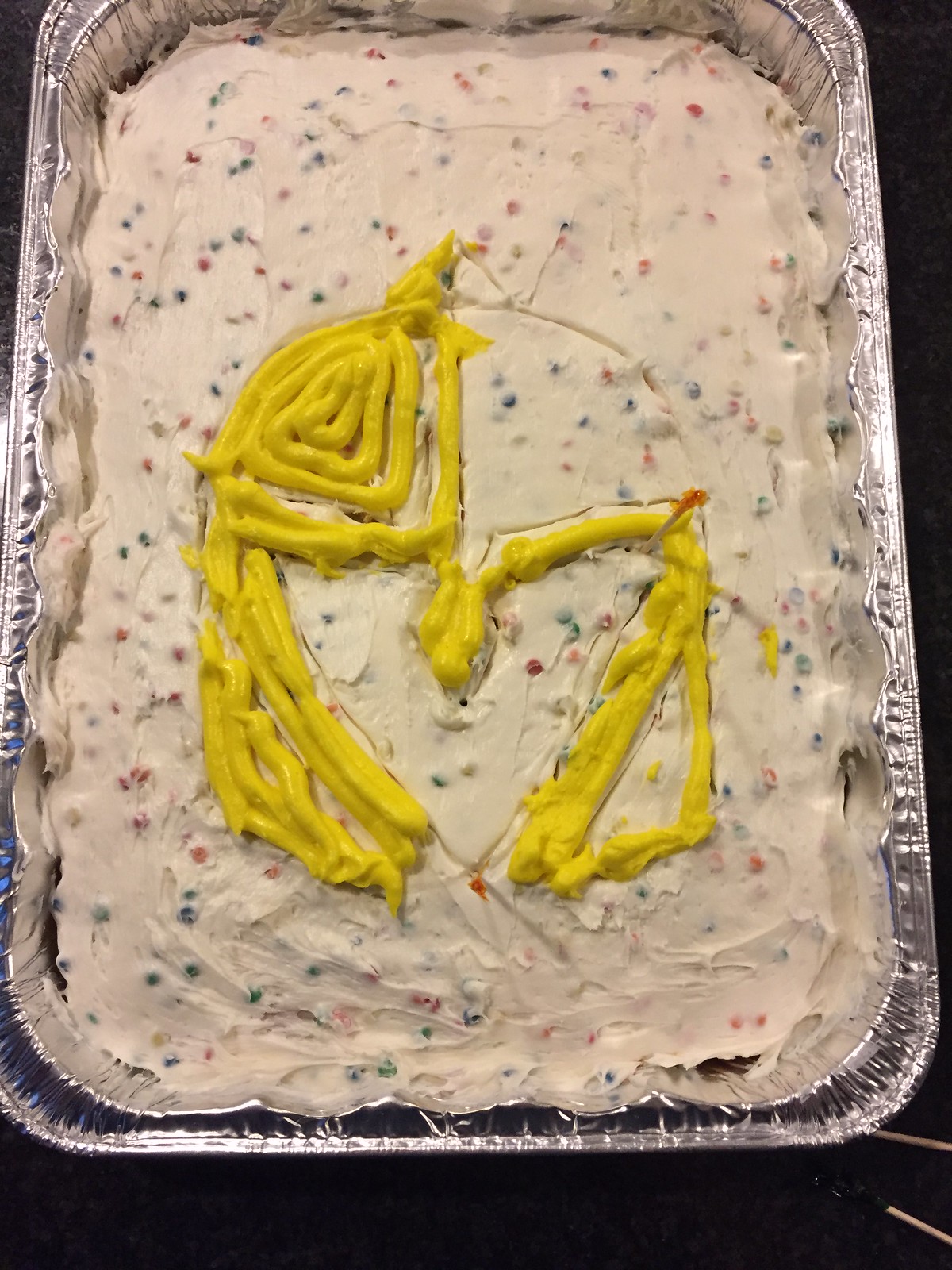
Now it was time to add the logo. The Golden Knights’ official team colors are steel grey and gold, but when I tried to achieve those colors by mixing food coloring into the white frosting, the results were disastrous. (Have I mentioned that I’m a history teacher, not a baker?) So I just used black and yellow — yellow first, because I figured it would be more forgiving if I messed up, and then the black:
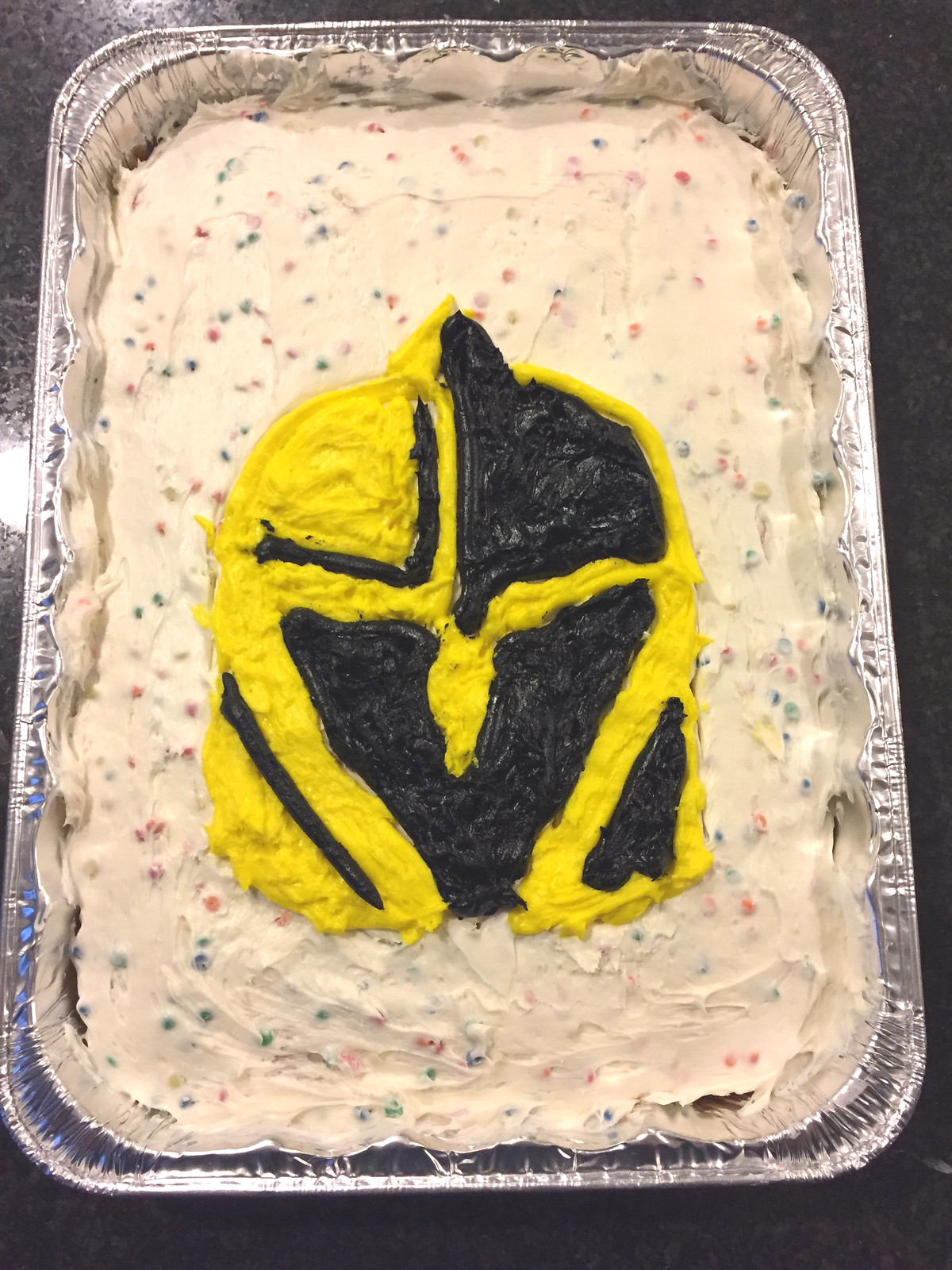
Considering this was my first cake project, I’m satisfied with the results. The entire process took about three hours and it was an oddly calming experience that allowed me to reminisce about my childhood birthdays and how my parents always sacrificed to make it a special day. A sweet way to celebrate my 35th!
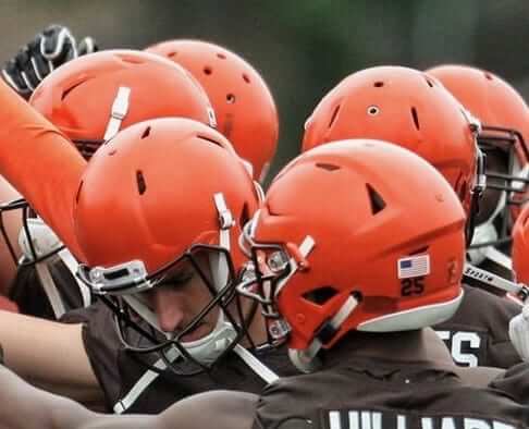
Browns find way to make helmets even plainer: For many years, there have been two pro sports teams that have a different look for the preseason (well, aside from MLB, which uses those ridiculous spring training unis): the Pittsburgh Steelers, who omit the front helmet numbers during the preseason, and the Detroit Red Wings, who use a block NOB font during the preseason.
Now there’s the third team that will have a distinct preseason look: the Cleveland Browns, who announced yesterday that players will not wear stripes on their helmets until they’ve made the 53-man roster. That means their shells will be stripe-free during OTAs, minicamp, and the preseason, right up to the final roster cuts (which at the very least should make things easier for the equipment staff, which won’t have to deal with striping tape).
With coach Hue Jackson saying that the players have to “earn their stripes,” this feels like something that could have major copycat potential. Will other teams follow? Hmmmm.
(My thanks to Cleo Macin for letting me know about this one.)
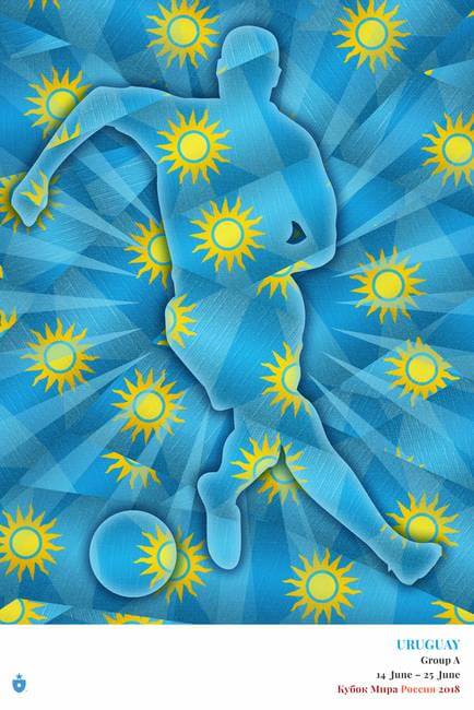
Getting ready for the World Cup: Designer Mark Willis, who’s done a lot of really cool soccer-related work over the years (like the great Soccer Out of Context series), has a new project that I think you’ll like. He’s designed T-shirts and posters for every World Cup team (that’s the Uruguay poster shown at right), with one unifying theme: Each design is based on a simple ribbon graphic that Mark has created for every nation.
To understand what I mean, check out Mark’s explainer for the project here — good writing, excellent supporting graphics. Then you can check out his designs for Groups A, B, C, D, E, F, G, and H.
I strongly recommend reading the individual group links, where Mark explains his creative process and how he arrived at his various designs. But if you want to skip that and just see the finished work, here are all the T-shirts and all the posters.
Click to enlarge
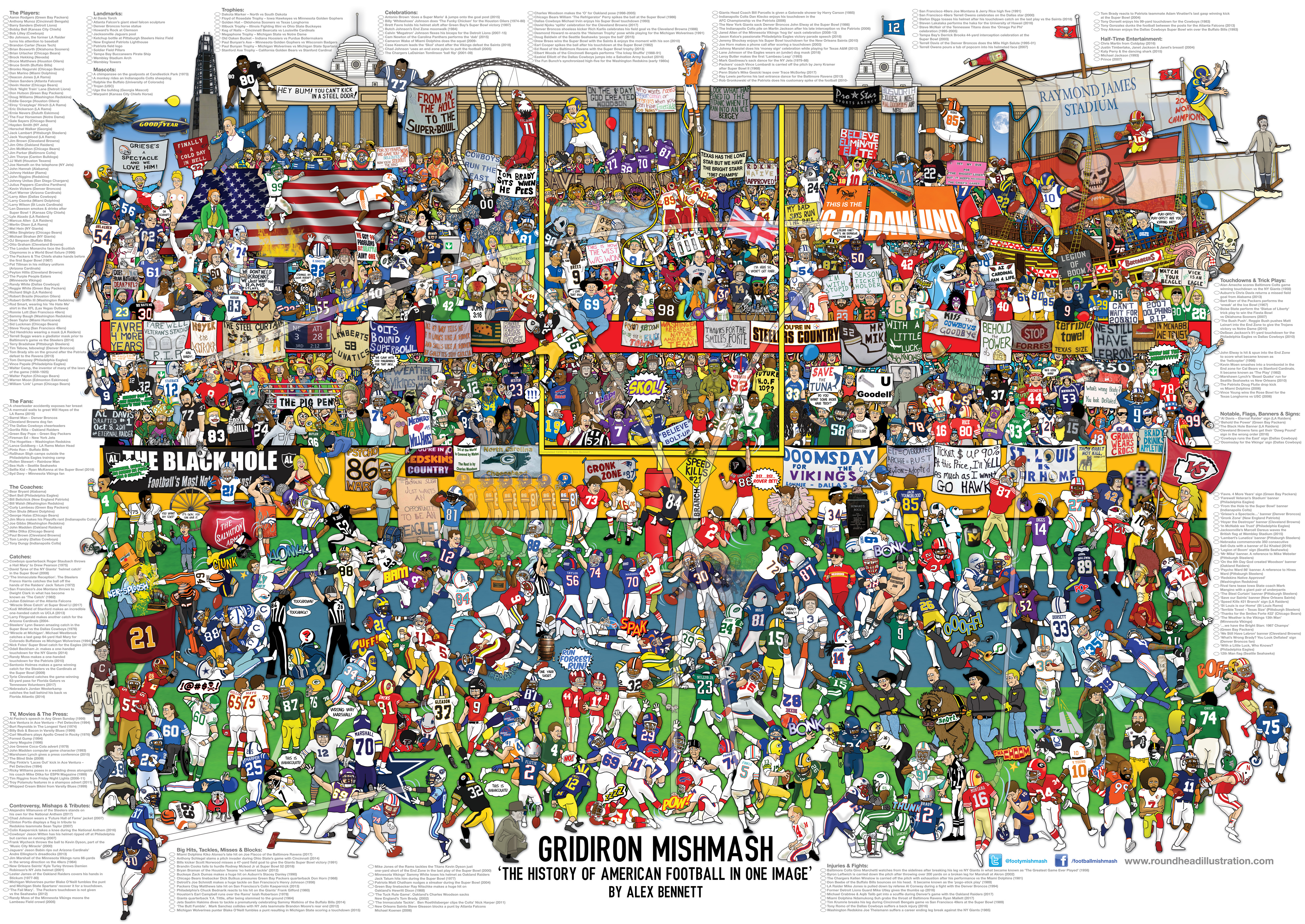
Raffle reminder: Illustrator Alex Bennett is currently raffling off two of his new “Football Mishmash” posters (shown above) to a pair of lucky Uni Watch readers. full details here.

And wait — another raffle! You may have heard of Vintage Brand, which sells all sorts of products using vintage sports graphics. Their canvas prints are particularly nice, and would be ideal for Father’s Day. Here are a few of their more than 3,000 canvases:
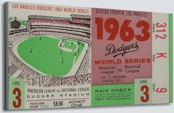
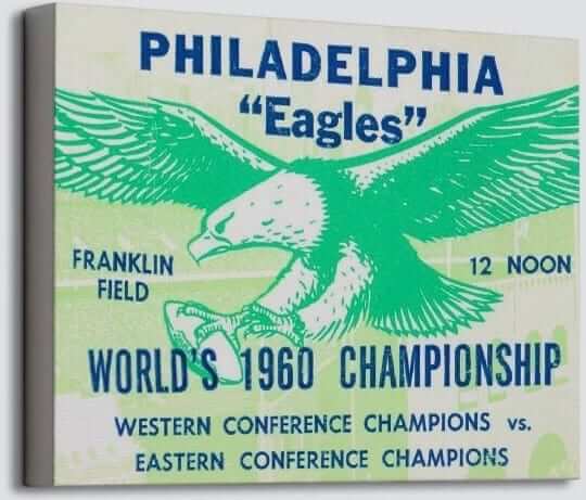
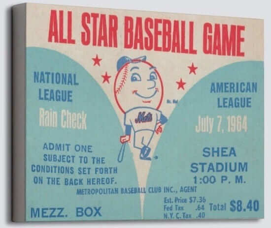
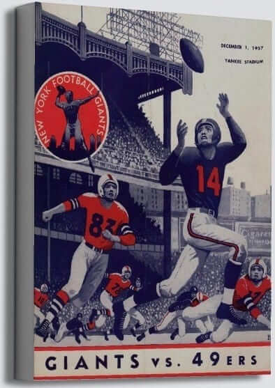
The good folks at Vintage Brand are letting me raffle off two of their canvas prints to a pair of lucky Uni Watch readers. To enter, send an email with your shipping address and your preferred canvas design (you can choose any design from their website) to this email address by 7pm Eastern this Sunday, June 10. Please note that this is NOT the same raffle address being used for the NFL Mishmash poster raffle — two raffles, two different email addresses.
Feel free to enter both raffles, but one entry per person per raffle. I’ll announce the winners for both raffles on Monday.
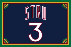
Membership update: A few more designs have been added to the membership gallery (including John-Peter Struzzieri’s card, shown at right, which is based on the Knicks’ early-’80s road jersey; too bad John-Peter went with a nickNOB instead of his full surname, since those Knicks jerseys had some serious vertical arching).
I have one slot left on the current sheet, which means the next person to sign up will get his or her card very quickly.
Remember, a Uni Watch membership card entitles you to a 15% discount on any of the merchandise in our Teespring shop. (If you’re an existing member and would like to have the discount code, email me.) As always, you can sign up for your own custom-designed card here, you can see all the cards we’ve designed so far here, and you can see how we produce the cards here.
The Ticker
By Alex Hider

Baseball News: The Twins and White Sox played their Jackie Day make-up game yesterday, with all players wearing No. 42. … Rawlings, the equipment manufacturer that makes MLB game balls, has been sold to a group that includes MLB (from @mrmichael21). … When Giants P Derek Holland entered the game on Monday, ESPN forgot to input his last name onto an on-screen graphic (from Mike Chamernik). … Speaking of last names, reader Gordon Blau points out that if new Mets draft pick Simeon Woods-Richardson reaches the majors, he would set the record for the longest surname in MLB history, beating Jarrod Saltalamacchia by one letter (and two characters, if you count the hyphen). We may have to establish separate records for hyphenated and non-hyphenated names. … A fan at Monday’s Giants/D-backs game switched jerseys between innings to try and get a baseball from players in the bullpen (from Brinke and Mike Chamernik). … The Chicago Dogs of the independent American Association will wear special uniforms for “Weiner Wednesday” today (from Steve Johnston). … There are plenty of well-dressed teams in the Cape Cod League this season (from Joe Giza). … Major League Lawn & Landscaping in Milwaukee uses a Jerry Dior-inspired logo (from a reader who did not give his name). … Westview High School in Oregon wears 1980s White Sox-inspired uniforms (from Kevin Soon). … Todd Radom was promoting his new book, Winning Ugly, on the MLB Network yesterday. Here’s a great video clip of him being interviewed by Brian Kenny (from Daniel Trivinos). … Reds INF Alex Blandino has been experimenting with a variety of lower-leg stylings lately, from socks with Hunter Pence-level pants to low-cut stirruprs to spectacularly high-cut stirrups (from @bitterRedsfan).

NFL News: The 49ers will honor Dwight Clark on their uniforms in some way this season (from Phil). … Speaking of Clark, the Niners all wore No. 87 shirts at practice yesterday in his honor (from Brinke). … During his rookie year in 1975, Chargers DL Gary “Big Hands” Johnson went FIOB, with the initial following his last name (from David Steinle). … Apparently, Nike messed up some of the early orders for the Steelers’ new throwback jerseys and rendered the NOB in the team’s current font, instead of the proper throwback font (from Patrick Moreland). … In 1979, the Los Angeles Coliseum grounds crew wrote “Good Bye” and “Good Luck” in the Rams end zones as they played their final game in the stadium before moving to Anaheim (from Pro Football Journal). … Looks like there were some kerning inconsistencies on the ’80s Giants NOBs (also from Pro Football Journal).
College Football News: Iowa’s Tigerhawk logo has been added to a water tower near Kinnick Stadium. … One observer has deemed Wyoming to bet be the worst-dressed team in college football (from Jason Hillyer). … The 1963 Indiana Hoosiers were wearing taped stripes on their facemasks long before Sean Taylor made it cool (from Bill Kellick). … Speaking of tape on the mask, Kenny Stabler apparently decorated his facemask while at Alabama (from Brett Baker). … Michigan is allowing students to vote on the design of the school’s official fan football T-shirt (from Teddy Tran). … The city of Akron, Ohio, will tear down the Rubber Bowl, former home of the Akron Zips and former site of some high school football championship games (from Jim Vilk).

Hockey News: Capitals RW T.J. Oshie rode the subway home after the Caps won Games Three and Four of the Stanley Cup Finals. Yesterday, the Washington Metro tweeted it would feature him on an upcoming card design if the Caps close out the series (from William F. Yurasko and John Muir). … Rangers C Mika Zibanejad posted an Instagram photo of himself wearing a 1947 Prague game jersey yesterday (from Aaron Scholder). … 3 Stars Brewing Company in Washington worked their name into the Capitals logo for the Stanley Cup (from @bryanwdc). …Here’s a good feature video about Sonia Scurfield, the only Canadian woman whose name is inscribed on the Stanley Cup (from Ted Arnold).

Basketball News: Mike Muir of the SoCal skate punk outfit Suicidal Tendencies, sported a Sydney Kings jersey in a recent photo shoot. The Kings compete in Australia’s National Basketball League.

Soccer News: Reader Josh Hinton is back with a few notes: Arsenal has signed a new kit deal with Adidas for the 2019-20 season; Greek club AEK Athens has singed a kit deal with Capelli Sport (also from Ed Zelaski); Louisville City FC wore their road jerseys at home in a US Open Cup game against the New England Revolution; and here’s a look at some Liga MX jerseys without advertisers. Finally, the 2018-19 jersey font for the EFL (England’s Championship, League One and League Two), has been revealed. … Nike will boycott Iran’s World Cup players, citing US sanctions against the country (from Phil). … FC Porto of Portugal’s Primeira Liga has new first and third kits (from Jamie Rathjen). … Also from Jamie: New uniforms for Scottish League Two team Clyde. … One more from Jamie: The top three tiers of English women’s soccer have new logos and the second and third tiers have new names. … Here’s another article looking at every World Cup jersey (from Ted Arnold).

Grab Bag: The Huffington Post published a gallery of old flight attendant uniforms earlier this week (from Jason Hillyer). … In a related item, Delta’s new preflight safety video shows the evolution of the airline’s flight attendant uniforms. … New logos for Grace College, an NAIA school located in Indiana (from Phil). … “I Voted” stickers, like everything else, are flashier in Las Vegas (from Thomas Roddy). … A Chicago-area credit union is offering its customers the chance to get credit cards with a Moris High School (Illinois) design. Anyone else know of anywhere else where you can get a credit card with a high school design? (From Scott T. Holland.) … This listicle takes a look at some crazy vending machines (from David Firestone). … This story investigates the origins of the nicknames of a number of colleges in North Carolina (from James Gilbert).
Typo at end of MLB: “spectacularly” spelled wrong.
I really like the Browns helmets without the stripes actually.
Got it.
The new Newfoundland Growlers seem to have a hidden Golden Knight in the negative space in the mouth of their logo…(given the color scheme is the same, maybe a future affiliation?)
link
UPDATE: Argentina canceled the friendly v Israel so there will be no Messi-related burning.
Thanks. Now removed from Ticker.
“The helmet that Clark wore while making The Catch …”
I don’t think that is Dwight’s game-worn helmet. I think it says it is just a signed helmet (with “the catch” play diagrammed on it).
You’re right. I totally mis-read that tweet. Now removed from Ticker.
Still pretty cool.
Ah, Cleveland ain’t fooling nobody. Them’s cost cuttin’ measures. They’s saving money on stripes!
Typo: L.A. grounds “grew”?
Fixed.
some kearning inconsistencies on the ’80s Giants NOBs ..
and FONT issues as well. WTH?
UPDATE: The friendly between Israel and Argentina, scheduled to be played in Jerusalem, will not take place:
link
I had a double take when I first saw the Cleveland Browns item to make sure it wasn’t the Bengals, which would make way more sense.
Why hasn’t Cincinnati gone the Hydrographics route for its helmets? I think it would look great.
Ditto on that Clark helmet. The pic is of a standard TB 49ers Riddell ProLine helmet.
CLARIFICATION: The 49ers helmet has a diagram of the play that resulted in “The Catch” and is signed by Montana and Clark. I don’t know, and I didn’t see it in the original tweet, that it was a game-worn helmet at any time.
Yup, my bad, already removed from Ticker.
Couple of things:
1. T.J. Oshie was riding the Metro to, not from, Caps games 3 and 4. At least, that’s what the article is about.
2. Man, I beat Footy Headlines to the EFL NOB font by like a week because I got it in the Ticker when it showed up on Ipswich’s new kits. A Uni Watch scoop, as it were.
Also, that “Prague jersey” Mika Zibanejad is wearing sure looks like a Sweden jersey, no? The 1947 World Championship was in Prague so it seems like it’s a jersey from that tournament.
As for other teams copying the Browns “earning their helmet stripe.” The Browns themselves are copying Ohio State. Freshman Buckeyes have a black stripe on their practice helmet until they’ve earned it’s removal. Urban Meyer first did that at Bowling Green in his first head coaching job.
Further to a previous ticker item, CFL preseaon already on and the Montreal Alouettes players need to “earn their wings” this year.
The Alouettes are unconventionally wearing a different logo from their past to present for each month this season. The first logo set is the vintage red wings, hence the “earn their wings”:
link
Strange though, the Als are wearing their usual helmet striping in the preseason without a logo. We would expect the helmet with wings not to have stripes on it when the season starts:
link
Dallas Cowboys Rookies don’t have stars on their hats until they make the club. The wonderful magnificent Duane Parcells started that when he was the head football coach.
Jumping Jesus on a pogo stick tons of college teams do this kind of silly stuff and now incompetent franchises like the Cowboys and Browns are copycats in the NFL.
It is just sad supposedly professional athletes need this kind of thing for motivation.
Part of the reason why football and the NFL are becoming less and less relevant now.
It’s really embarrassing.
Maybe Hue Jackson should have to wait to wear Browns merchandise until he wins a game.
This isn’t a new practice.
The Saints have omitted the fleur-de-Lis from the regular helmet for minicamp and training camp for as long as I can remember. For the last decade players also have their last names (even vets like Brees) printed on a white P-touch label in 2” letters then slapped across the front of the helmet above the face mask. Unlike the Browns, the Fleur does appear for the preseason games.
Whoever that Alabama player is with tape on his facemask, it ain’t Kenny Stabler. It is his teammate, here is the full photo; link
Thanks for the full photo.
In the smaller photo, I thought it might be Jackie Sherrill but I think he was already gone by the time Stabler was the quarterback.
Its FB Les Kelley. He was #32. Coincidentally, was the very first draft choice in New Orleans Saints history. He as a FB and the Saints promptly tried to turn him into a LB.
Alex, those Giants jerseys with the odd letter kerning (and different fonts!) are from the ‘70s. The dead giveaway is the white and red stripe on the helmet. The Giants changed to their LT-era uniforms in 1980.
I’m pretty sure that is a 1979 photo. The Giants wore blue pants with white jerseys from 1975-1978 before switching to white pants in 1979.
I was wondering about that. Makes sense. It was the year before I became a Giants fan so I’m more of an expert on the iteration they had from ‘80-‘99.
The Browns’ “earn your stripes” program seems like it has some potential pitfalls. Very few players are truly 100% safe on the roster until the season starts. If a player earns stripes, but then is cut or traded, that could sow distrust among the other players. But if the Browns are literally honest about it, very few players will earn stripes until the end of the preseason.
Not sure if players will “earn” stripes before the final 53 man roster is announced after the last preseason game.
The “Football Mishmash” artwork strikes me as a little too pro-[native american racial slur] for my taste.
There are three signs depicted in print:
“REDSKINS NATIVE APPROVED”
“WASHINGTON REDSKINS – NATIVE AMERICA’S TEAM”
“YOU’RE IN REDSKINS COUNTRY”
If the artist wanted to illustrate the controversy surrounding the team name he ought to have replaced at least one of those signs with one of the many “WE ARE NOT YOUR MASCOT” or “‘R’ WORD IS = TO ‘N’ WORD” signs that protesters bring to Washington games.
I only counted 11 other instances of team nicknames appearing in the print, meaning 20% of all nicknames displayed are Washington’s. No other team’s nickname appears more than twice, unless I’m missing one. Seems a little heavy on the R-word to me.
Probably unintentional and I’m probably reading too much into it.
I’m actually interviewing the artist today. I’ll ask him about that.
I like that the Browns are doing this, but I’m surprised the league would allow them to go stripeless during the actual preseason games.
The Knights are not the first NHL expansion team to make the playoffs. They’re also not the first expansion team to make the Stanley Cup Final in their first year. The expanison St. Louis Blues were swept by the Canadiens in ’68.
I’m not really a hockey follower…
I’ve been hearing all over the radio lately that they are the first expansion team to make it to the finals. Thank you for correcting it.
They are the first to win a Finals game however.
Well, 1968 was kind of a special case. The league expanded from the Original Six to add six new teams. However, all six original teams were placed in the East Division and all six expansion teams were placed in the West Division. So an expansion team was guaranteed to make the Stanley Cup Final that year. It happened to be St. Louis, but if it hadn’t been them it would have been another expansion team. So it is hard to give too much credit to them for accomplishing the feat of making the Stanley Cup Final as an expansion team. Vegas had no such guarantee of a slot in the Final being reserved for an expansion team.
Special K, I agree that it’s a more impressive feat for the Golden Knights since they weren’t guaranteed to make it, unlike in ’68 when 4 expansion teams were guaranteed to make the playoffs and 1 expansion team was going to be in the Final no matter what. However, that doesn’t mean Vegas was the first to do it.
The Toronto Arenas also won the 1918 Stanley Cup in their first year of existence.
This is true….however a little different as back then the entire Western division were expansion teams so it was automatic that one of them were going to the Final
I don’t think high school debit cards are that uncommon for locally-owned banks or regional credit unions — especially if the institution offers some sort of cash back donation program or something. For instance, one in my area (Tulsa Teachers Federal Credit Union) offers more than 50 high school designs. link
link
This credit union goes further by having actual branches at high schools
Does anybody else find the Browns’ “earn your stripes” tactic as kind of patronizing/insulting to be used for professionals?
It seems like a more appropriate motivational technique for college or high school.
I mean, these are grown men trying to earn six or seven figure contracts, do they really need additional gimmicks?
I have a feeling that if you’re playing for the Browns, the team’s motivational techniques are probably the least of your concerns.
…especially from an organization that has “earned” a single win in 2 years.
I don’t even appreciate those tactics in my own company.
I may have this wrong, but don’t the Steelers players have to “earn” the numbers on their helmets during preseason? I may have the team wrong or it’s possible that I’m making this up in my head, but I feel like I remember something about a pro team that doesn’t put numbers on the players’ helmets until they make it through preseason.
Hi Judy,
You are correct on that.
link
Hi Judy,
That is true about the Steeler.
Well, yes, that’s mentioned in today’s lede.
Don’t the Cowboys have a ritual where the back of the helmets start out nameless, and players have to earn the little Dymo strip with their name on it?
Parcells had them earn the Star. They might still do that.
They do!!
Such a joke!
The Nuggets seem to indicate on their website that they’re going to put out info on their uni changes sometime today (The “Evolve 06.06.18” in the upper left corner of their site)
Anyone have clue as to the when today?
6:06.18 PM?
Update on the Chicago Dogs’ Wiener Wednesday jerseys.
link
The ESPN baseball gaff reminds me of playing Tony Larussa Baseball II on PC and some unnamed players were simply listed as “Empty”
1st: that is not Ken Stabler at Bama.
2nd: Cowboys had to earn their helmet stars.
3rd: Not a Prague jersey, it is team Sweden.
Giant’s NOB – That is called “Tracking” not “Kerning”
-Tracking involves adjusting the spacing throughout the entire word.
-Kerning is the adjustment of space between pairs of letters.
There’s a theory that the Browns are actually trying to get the fans prepared (and gauge reaction) for the uniform change in 2020. I have heard rumors that they’re wanting to go back to a plain white helmet, or plain orange.
Makes sense. Any sources to back this up?
Proofreading (in the Editor’s Note): “facing elimination tomorrow tonight”
The game is tomorrow night (or I suppose late tomorrow afternoon in Las Vegas).
Fixed.
The regional development blog Greater Greater Washington (ggwash.org) has a story today about how the Washington Capitols could have been named the Metros, and are having a logo contest for what a Washington Metros logo might have looked like. Seems like something readers here would be interested in.
link
Arkansas’s (bottom article about the apostrophe non-catastrophe) own First Security Bank has the Natural State’s high schools well represented with assorted card designs.
link
link
Thomas Roddy,
A cake well done! Thanks for sharing!
Hue Jackson,
Treating millionaire athletes like a bunch of dipshit school children earning a stripe will be the nail in your coffin. You have only won one game in 2 years, why dont YOU earn a stripe, moron?
Good luck in the CFL next year!
Thanks!
The high school that I work for has their own debit card. The nickname “Firebirds” refers to the incident where Lawrence, KS was burned to the ground by Missouri ruffians. Pretty cool!
The picture under College Football News isn’t of Ken Stabler. The jersey and helmet number is 32 or 30something, not his number, nor would a quarterback wear a neckroll. And from the facial features, that simply is not the Snake. Really isn’t that important, but it’s simply incorrect. Thanks.
Can’t believe nobody else has commented on Mark Willis’ work. It’s just absolutely gorgeous stuff. Always interesting to hear about the creative design process too. Not much of a t-shirt buyer as I have lots from volunteer stuff – but the Uruguay shirt is tempting, as is the Nigeria poster. And I don’t actually like soccer (association football).
That is definitely NOT Ken Stabler.