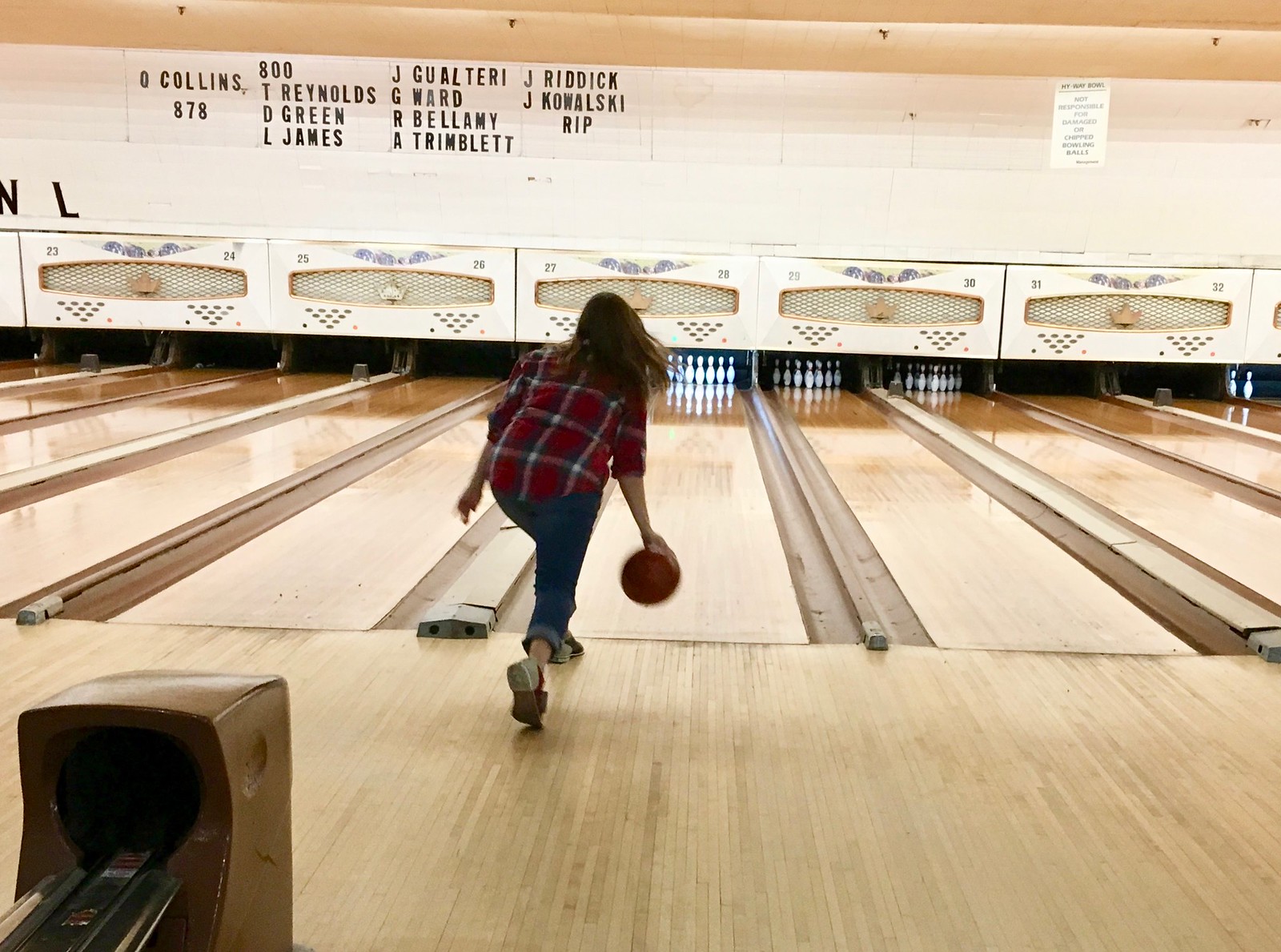
For most of the summer, the Tugboat Captain and I had been meaning to check out this bowling center in Union, N.J., called Hy-Way Bowl. After a few false starts, we finally went there on Saturday afternoon.
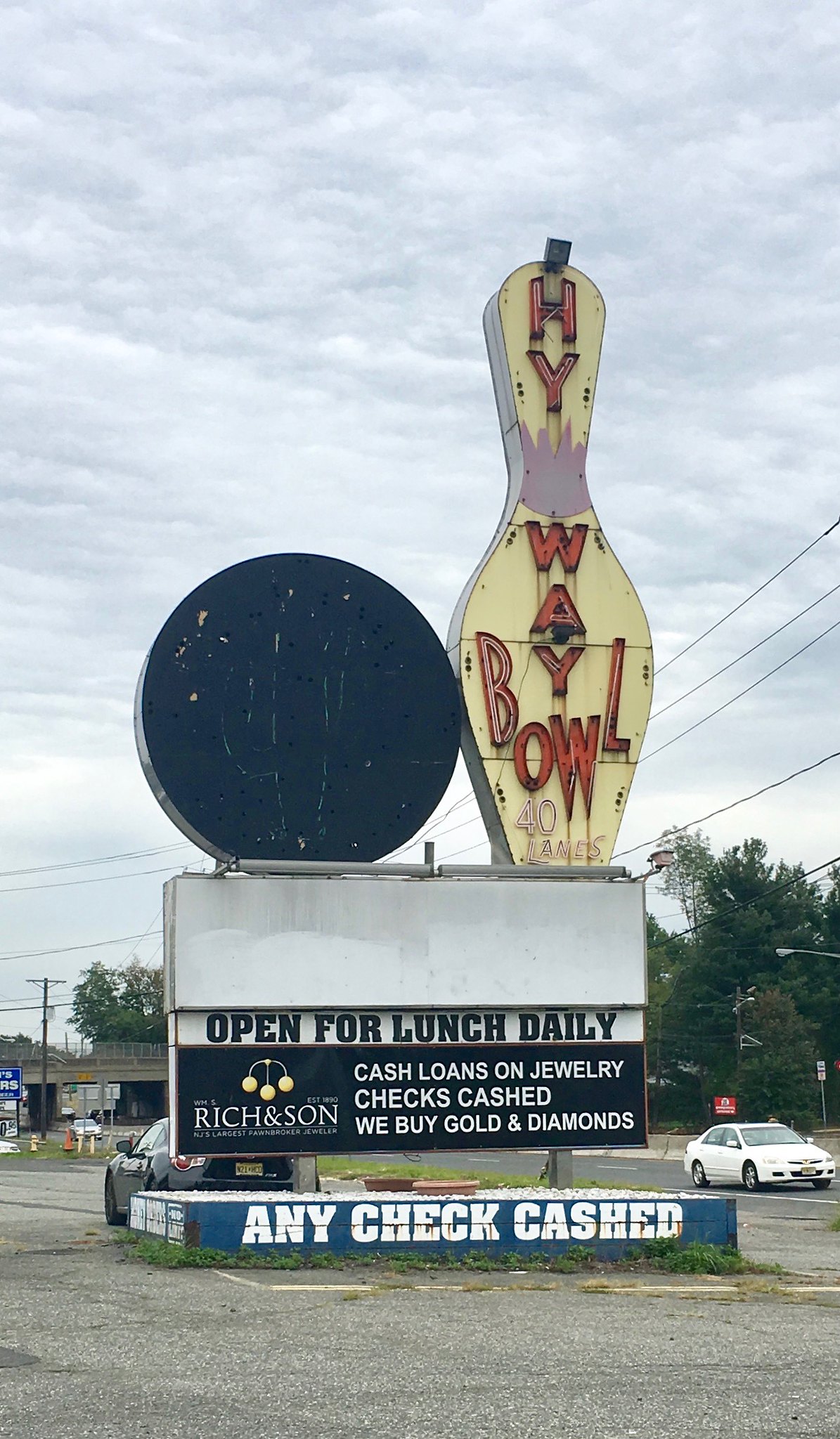
Hy-Way’s roadside sign has seen better days, but it’s still pretty spectacular. Imagine how it must have looked when it was new, especially at night (for all photos, click to enlarge):
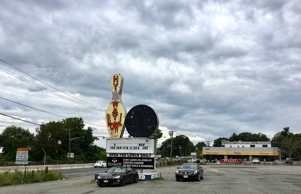
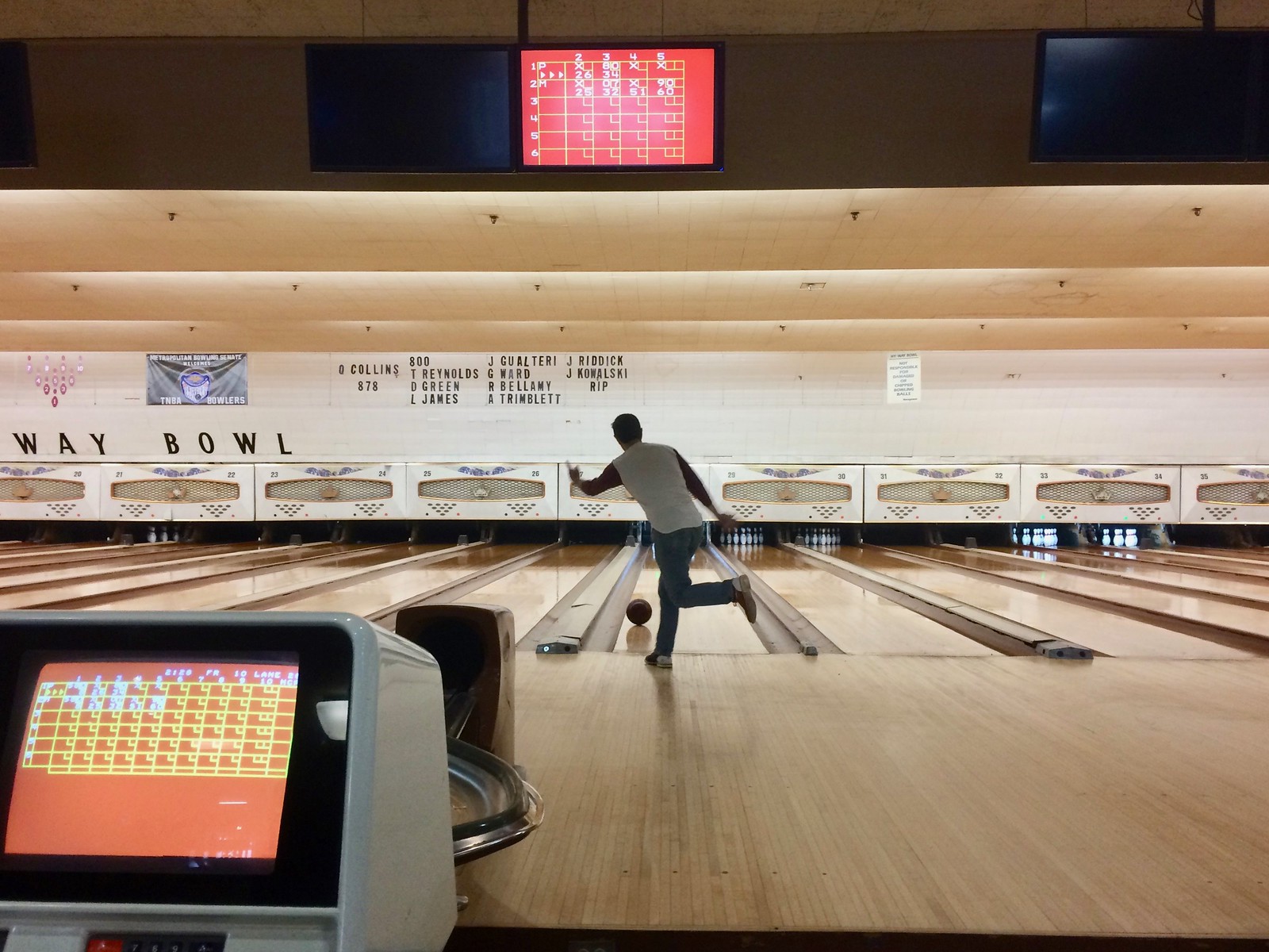
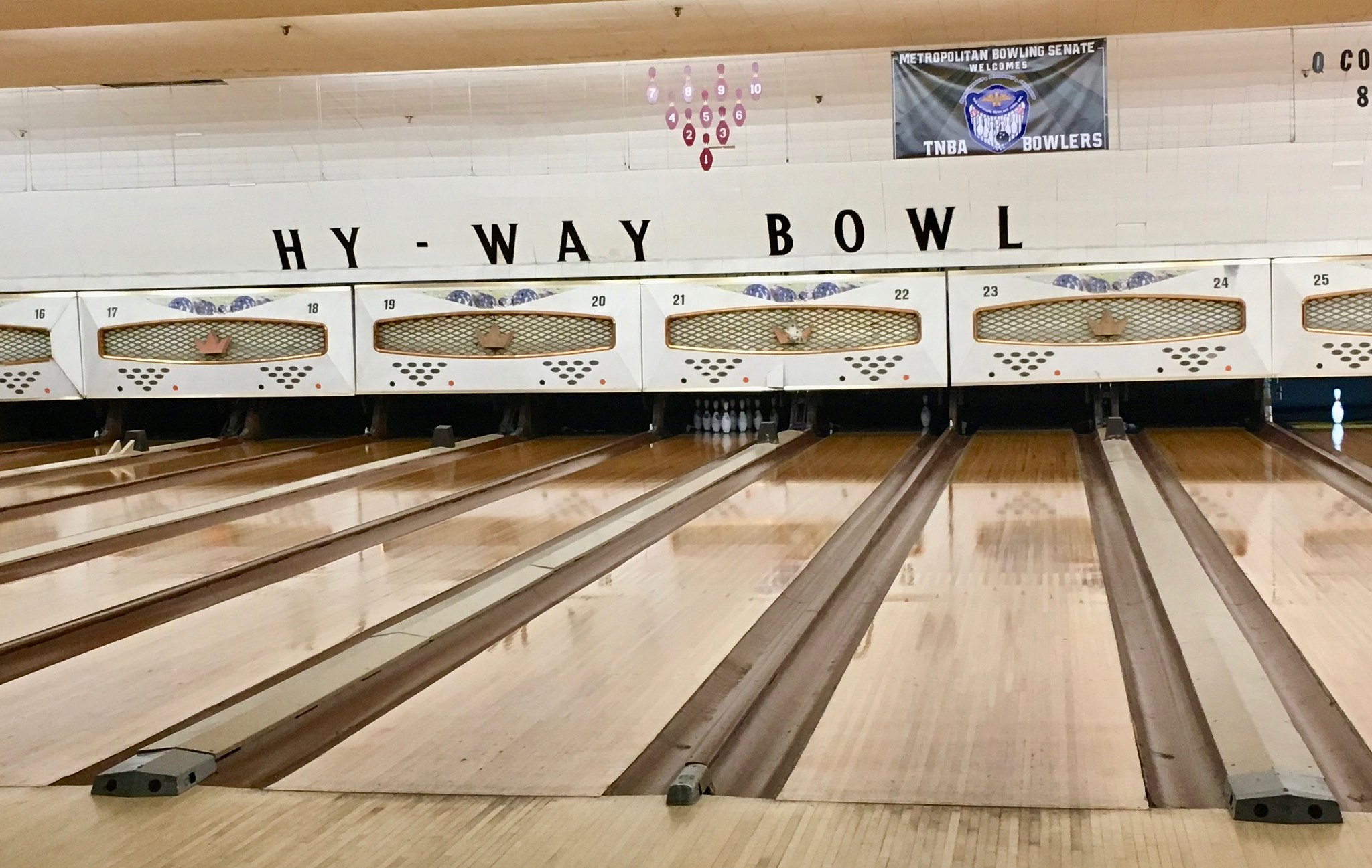
Inside, the Hy-Way is a perfectly nice semi-old-school bowling center. I say “semi” because they have electronic scoring, but it’s from the first generation of auto-scoring systems — the bowling equivalent of a Pong video game. The rest of the fixtures were really nice, and I had no complaints about the lanes.
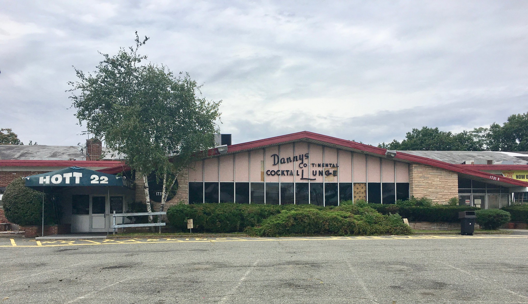
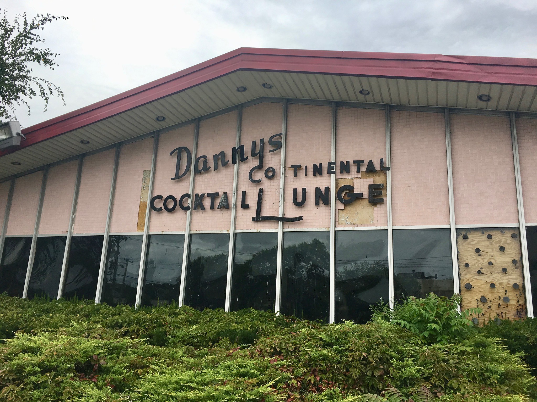
The bowling center is attached to a bar, which used to be called Danny’s Continental Cocktail Lounge. These days it’s a titty bar called Hott 22. It wasn’t yet open for the day, but we could see a sign inside that said, among other things, “Members must not be offended by the female human form in any state of dress or total nudity.”
After bowling, we went to Rutt’s Hut, New Jersey’s (and hence the world’s) greatest spot for deep-fried hot dogs. The dogs were great, as usual, but I found myself intrigued, as I always am, but some of the pricing peculiarities on the rest of the menu:
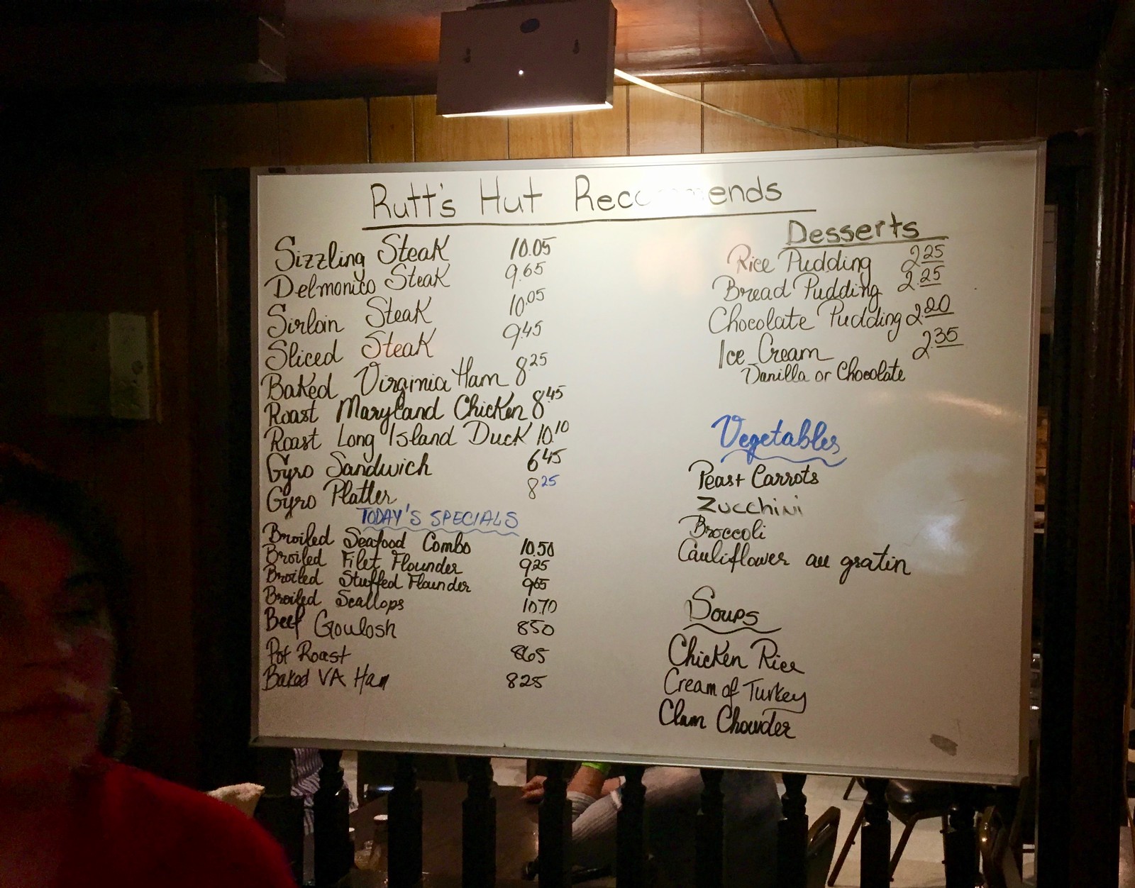
Why are sizzling steak and sirloin steak priced at $10.05, and roast duck at $10.10? Wouldn’t it be better to make them $9.95, so you don’t crack the $10 price point? Also, why are rice pudding and bread pudding $2.25, but chocolate pudding is $2.20? What kind of cost factoring went into that nickel price difference?
There’s also the question of who the hell would order a steak or roast duck at a place that specializes in deep-fried hot dogs, but that’s another question for another day.

Click to enlarge
Almost time for kickoff: Don’t look now, but the NFL season kicks off on Thursday night. That means it’s time for my annual NFL season preview column over on ESPN.com, which runs down all of this season’s uniform changes (including the Bengals’ 50th-season patch, shown above). Check it out here.
Click to enlarge
Collector’s Corner
By Brinke Guthrie
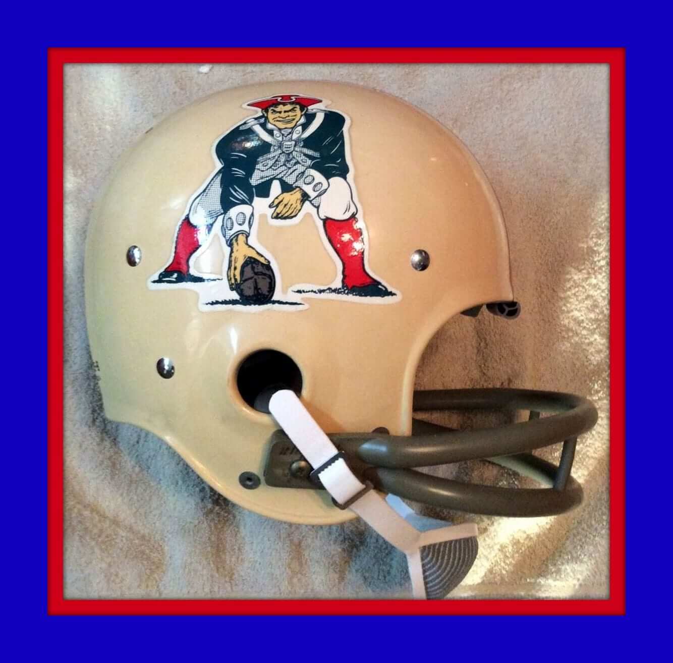
The NFL season opener is in a couple of days, as the defending champion Patriots take on the Chiefs. And right here, we’ve got a nifty looking vintage Pat Patriot helmet. This is the Riddell Kra-Lite model, from 1969 according to the seller. It sure would be nice if the NFL would scrap the one-shell rule so Pat could make a comeback. Until then, stick this one on your Pats souvenir shelf.
Now for the rest of this week’s picks:
• Back in the 1970s, your friendly State Farm agent had these NFL mugs to give away.
• Never seen one of these for MLB teams! This is a Collector Reflector for bicycle wheels, this one featuring the Chicago White Sox. From 1979 or so. And here’s one for the KC Chiefs.
• Straight outta the Sears boys department, we’ve got this Minnesota Vikings jacket.
• This 1970s Cowboys Soap & Wash Set has never been opened!
• How about a 1970s Houston Astros switchplate, still sealed in the original packaging.
• We’ve got your official 1970s NFL wood burning kit right here.
• Are you a jacket size 42? Then this 1960s double-breasted NFL number from Curlee is just for you.
• Here’s a 1970s St. Louis Football Cardinals helmet plaque/blanket set.
• This 1970s Steelers helmet bank has the decal on the proper side, but they added a gray outline, and that stripe is a bit too thick.
• Broncos fans will like this 1970s helmet coat rack by Hutch.
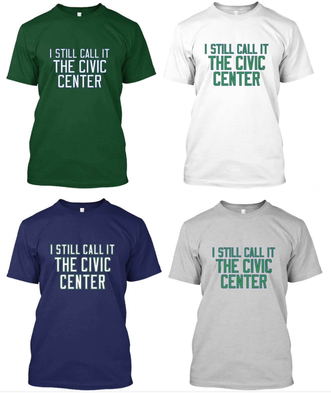
ITEM! New raffle: As most of you are probably aware by now, we recently launched a line of “I Still Call It the Civic Center” shirts aimed at Hartford Whalers fans (click to enlarge):
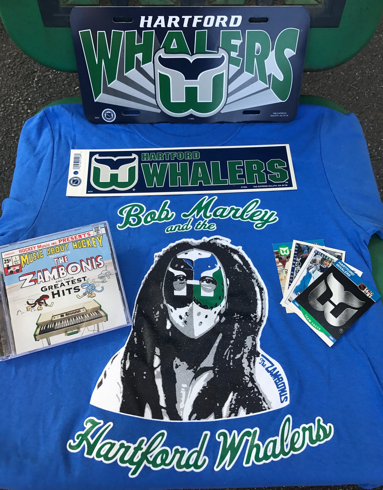
Now, thanks to Connecticut’s favorite hockey-rock band, the Zambonis, anyone who buys a Civic Center shirt over the next two weeks will be entered into a raffle for some cool stuff, as follows:
1. One lucky first-prize winner will score a vintage Hartford Whalers license plate, a Whalers sticker, assorted vintage Whalers cards, a CD of The Zambonis Greatest Hits, and a “Bob Marley and the Hartford Whalers” T-shirt, all of which are shown here (click to enlarge):
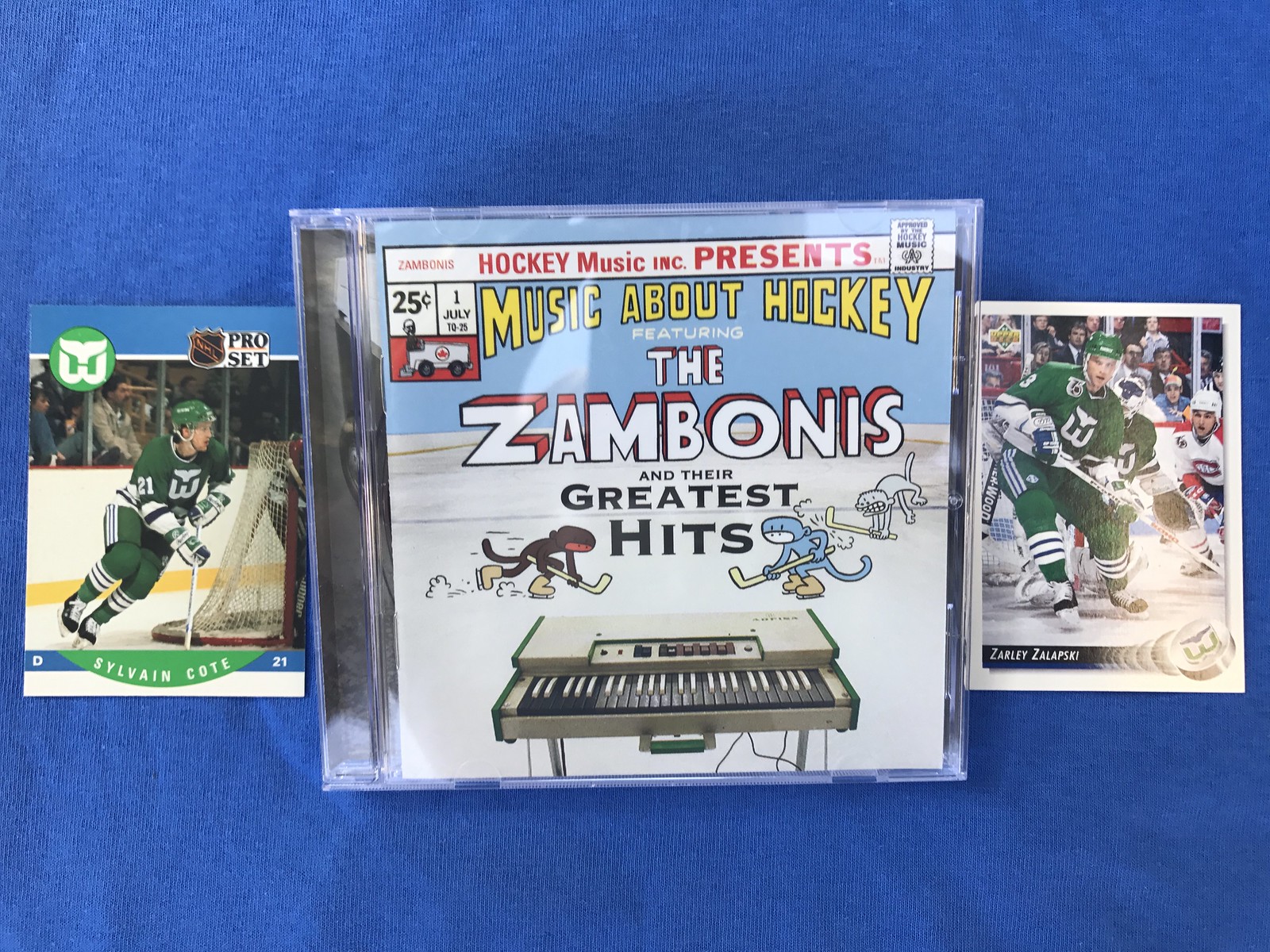
2. Three slightly less lucky second-prize winners will win the CD and more Whalers cards:
To enter, here’s what you do:
• Sometime between now and Sept. 19, purchase an “I Still Call It The Civic Center” shirt (available in green, navy, grey, and white).
• When you receive your “Thank you for your order” email from Teespring, forward it to me at plukas64@gmail.com. I enter you in the raffle.
3. You’re already a winner! Everyone reading this can download the Zambonis’ song “Bob Marley and the Hartford Whalers.”
That’s it! Big thanks to Dave Schneider and the rest of the Zambonis for making this happen.
The Ticker
By Paul

Baseball News: The Mariners will wear “Los Marineros” jerseys this Saturday, and the lettering will include the country names for each of the team’s Latin-born players (from Colin O’Keefe). … D-backs P Robbie Ray is wearing a protective cap insert (from Mike Chamernik). … In the wake of Hurricane Harvey, the Astros have added a “Houston Strong” jersey patch. Here’s a breakdown of all the patch elements from the guy who designed it. … Twins OF Byron Buxton has the Flash on his bat knob decal (from David Fleming). … Not sure what the Frederick Keys were wearing two nights ago, but it didn’t look good. … New 10th-season logo next year for the Bowling Green Hot Rods. … Looks like Red Sox OF Jackie Bradley Jr. was wearing his undershirt backwards on Sunday night. … Our own Phil Hecken was interviewed for the latest Hall of Very Good podcast. … Interesting look yesterday for the Corpus Christi Hooks, who went grey over powder blue.

Pro Football News: I’ve never seen the Seahawks logo shown on this cap. It’s not listed on SportsLogos.net’s Seahawks page, either. When I posted it on Twitter last night, someone said it’s part of a new merch program slated for Week 4 of this season, although I haven’t confirmed that (good spot by Bryan Moss.) … CFL news from Wade Heidt: On Sunday the Saskatchewan Roughriders broke out their fauxbacks for the first time this season. And the officials’ red striped jerseys, which were originally worn in Week 2 to mark Canada’s 150th birthday, were worn again this past weekend for the Labour Day Classic games.
College and High School Football News: Check out this 1992 Kentucky shot. See the “DC” on No. 59’s left sleeve? That’s for “defensive captain.” Never seen a captaincy designation quite like that before (big thanks to Michael Kinney). … Maryland was penalized for having two players with the same number on the same play. Because of the large roster sizes, college teams often have multiple players with the same number, but they’re not allowed to line up on the same side of the ball on the same play (from Tim David). … In a related item, USC had two players on the field wearing No. 46. Not sure how they got away with that (from Kristopher Terrell). … Miami players who force a turnover get to wear a big, tacky gold chain on the sidelines (from Mike Chamernik). … TCU’s new field design has “spit blood” on the goal line (from Ivor van Esch). … USC has added a meander pattern to its pants striping (from @BasikAli). … Duke now has four players wearing the captain’s “C” (from Michael Stein). … Middle Tennessee State is also using captaincy designations, but they’re using NFL-style patches). … Maryland’s roster includes a pair of twins: Elisha Daniels and Elija Daniels. Elisha was wearing a sort of modified FNOB on Saturday. Coudn’t find a shot of Elijah from that game, but here’s what he wore last year (from @colepessolano). … Purdue added a memorial decal for former coach Bob DeMoss. … Baylor has added Texas outline helmet decals with each player’s home area code. … Good piece on how LSU’s uniform has changed over the years (from Travis Quick). … Florida State has a Kidz 1st Fund helmet decal on Saturday. … Biker shorts were supposedly banned this year, but USC LB Porter Gustin didn’t get the memo. … If the colors looked a bit off during the Alabama/FSU game, it’s because the new Atlanta stadium, where the game was held, has unusual lighting (thanks, Alex). … Looks like this high school team has its team name, “Wildcats,” running running up the sides of the jerseys. Never seen that before (from Matt Newbery). … Looks like West Virginia had a player wearing an upside-down 2 instead of a 5 (from Russ Levine and David McDavid). … New alternate helmet for Air Force, with several more side decals to be unveiled this week (thanks, Phil). … Tennessee is another team going with raised neck bumper lettering (from Chad Fields). … Purdue will wear a new chrome helmet this Friday (thanks, Phil).

Hockey News: The Bloomington Thunder of the USHL are changing their name to the Central Illinois Flying Aces — that’s a mouthful, eh? (From Brian Kerhin.) … Blackhawks backup goalie Jean-Francois Bérubé’s new mask features a salute to former Hawks great Tony Esposito (from Marc-Louis Paprzyca). … Jets goalie Michael Hutchinson’s new mask has a tribute to Leonard Kropioki, who was a serious Jets fan who recently passed away (from Gord Reid). … New uniforms for Louisville. “They’re going with the university crest, rather than the athletics logo, on the front of the jersey,” notes Lucas Stoller. “As an alum, I love it.” … Here’s a good video of the Stars adding the graphics to their ice, including a new 25th-anniversary logo at center ice. … New all-star logo for the Superior International Junior Hockey League.

NBA News: Anyone have any idea why Mr. Met’s face would be hanging in a locker in the Cavaliers’ locker room? (Good spot by Jim Borwick.)

Soccer News: 1860 München released their 2017 Oktoberfest kit (from Ed Żelaski). … The New Mexico women’s team uses grey jerseys with grey numbers — ugh.

Grab Bag: Most people around the world prefer blue as their favorite color (from my pal Rob Walker). … Competitive eater Joey Chestnut was in Buffalo over the weekend for the National Buffalo Wing Festival. He was wearing his Nathan’s Famous shorts from their July 4th hot dog eating contest (from Mike McBride). … Excellent story on how Guinot, the French cosmetics firm, buys space on the shirts of long-shot tennis underdogs just prior to when they face a big-name opponent. Highly recommended (from Ed McGrogan).
A major dude: In high school I got very into Steely Dan. I bought every one of their albums, the first time I’d done that for any artist. The musical values they embody — the high-gloss studio perfectionism, the elevation of technique as an end in itself, the audiophile fetishism, the marriage of rock and jazz into something neither particularly rocking nor particularly jazzy — are all things that I now disdain, but for some reason Steely Dan still sounds good to me. The songwriting’s rich cast of miscreant characters and Donald Fagen’s bitingly cynical vocal style, both of which I love, apparently outweigh all the other, more problematic stuff. (It’s also worth noting that the Steely Dan song “Deacon Blues” hinges on a uni-related metaphor: “They got a name for the winners in the world / I want a name when I lose / They call Alabama the Crimson Tide / Call me Deacon Blues.”)
Fagen’s longtime musical partner, Walter Becker — the “other half” of Steely Dan — died on Sunday. Becker did a lot of drugs and was a fairly opaque figure, at least to me (Fagen was the more public face of the band, although they were both famously reclusive), so I don’t have a strong conception of who he was or which parts of Steely Dan were his as opposed to Fagen’s. When I think of him, I think of his 1994 solo album, 11 Tracks of Whack, which actually had 12 songs. The 12th one — the one that was non-“whacked” — is “Little Kawai,” a love song Becker wrote for his young son (here are the lyrics). It’s simple, playful, and straightforwardly charming — in other words, completely un-Steely Dan-like. I’ll always love Steely Dan, but this is the song by which I’ll remember Becker. RIP.
Proofreading:
“the Sear’s boys department”
Byron Buxton item ends with “(from )”
“the same play.(from Tim David).”
Tagging between the Purdue and Baylor items is slightly messed up
“Blackahawks”
The NFL probably doesn’t care during exhibition season, but there was more than one occasion in the last couple weeks where I saw two guys with the same number on the same special team.
Fixed.
I have grown accustomed to seeing the copy edits stylings of BurghFan in the first comment of the day. No disrespect to Paul, as he is wearing a plethora of hats managing the Uni Verse these days, but we are all pretty lucky to have this kind of QC work every day from a fan site.
You know I wish I had a “BurghFan” to proof all my copy work. The man is a machine of consistency, quality and on-timeyness.
Tip o’ the cap
we are all pretty lucky to have this kind of QC work every day from a fan site.
Couldn’t agree more. I’m grateful for Jerry’s help (although I’m embarrassed by some of the whoppers he spots).
Thank you, Larry.
Great item on the bowling center. The prices in those places are always unique.
I happened to catch this video on Cornell football, and noticed they were wearing matte helmets (and without a center stripe). Anyone know if this is a new thing, or have they been wearing such and I just missed it?
link
Appears to be new, at least based on the Helmet Project:
link
Thanks. Ivy League stuff seems pretty static, but I believe they are a Nike school now, so who knows.
The NFL preview is now up:
link
It’s always interesting to me to compare the reader comments on ESPN versus the ones here.
Do you read the ESPN comments? I don’t think you’ve ever replied, that I have seen.
I read them, but very very rarely engage over there.
Lee
I read a little, engage v-e-r-y selectively.
Hy Way Bowl brought back so many home town memories. When I was a kid, you still had to score by hand, but the score sheets would get projected overhead of every lane. Did you see the world’s tallest freestanding water sphere while in Union? That is Union’s other claim to fame.
No, didn’t know about that! Will check it out next time (and there will definitely be a next time).
I went to the Hy Way Bowl dozens of times on Cub Scout trips in the 70’s! Great post, Paul. Thanks!
Went there plenty of times, too. I wasn’t the sort if kid to appreciate it, but, yeah, that sign was pretty amazing.
This song by Horace White? may have had a bit of influence on Rikki Don’t Lose that Number
link
Sorry Horace Silver.
Glad to have you back, Paul. My sincere sympathies for your loss of boy-mascot Tucker.
also, the Becker solo album came out in 94, not 04.
Fixed.
Hey Paul, welcome back! Just wanted to confirm the Wildcats are from Harrisonville, Mo., High School. Thanks again for all you do.
That Pats helmet looks like the Riddell helmets that are made now and can be had for about 130 new.
I have that Walter Becker album in my collection but I have no idea how it got there. I don’t remember buying it or anyone giving it to me. Weird.
Los Marineros. Why can’t the NBA do heritage games with actual Spanish words like MLB does (or Polish like the Brewers)? Is it that hard to turn the Suns into Los Sols? Or the Bulls into Los Toros?
Anecdotal evidence suggests Latino fans use the English names of American-based teams, I suppose for economy’s sake.
You don’t like “Los Lakers” or “Los Spurs”? :-P
In the preview you mention how the Panthers are the last team on the Reebok template. Packers are too.
Yes, I mentioned the Packers. I meant the Panthers were the last one to be discussed in that column.
Not sure if both of USC’s #46’s were actually on the field for a play together. In that picture they’re celebrating with blind long snapper Jake Olson. He’s a pretty great story.
Eight years ago Olson was 12 and had eye cancer. He bonded with Pete Carroll and was a visible part of the program that year. He even went to a USC practice the day before the surgery that left him cancer-free but totally blind.
link
Yeah, I saw the same thing. Finally got around to watching the clip last night. I noticed the two 46’s together celebrating. One definitely came off the bench while other was on the field.
And even if they were on the field at the same time, I’m sure even the refs were focused on the bigger story about this great kid.
Regarding raised letters, tell your equipment folks to use good glue.
starting to come off: link
gone: link
(I’ve tried to find a pre-game / earlier in the game photo of same player, but can’t find a good one — here’s another player for comparison: link )
The college football rule requiring knee pads OVER the knees was delayed a year to allow schools more time since uniform purchases are made so far in advance.
UNC had a player on defense who went with biker shorts and did not get penalized.
I am pretty certain that the 5 is just how WVU does their numbers. Ugly to be sure but not upside down. I may be wrong.
Rutt’s Hut is awesome. It’s a shame it’s at the wrong end of the state…
Pricing differences on menus are sometimes meant to give the diner a sense that the restaurant/chef has really thought about the subtleties of one dish v. another.
But sometimes it’s all about the nickels!
RE: Kentucky “DC” designation:
I believe it was Bill Curry who Alabama-ed UK’s uniforms with extra emphasis on defense — and for a short time introduced the Black Watch black striping around the helmet “K” and stripe…can’t find the image readily…
RIP Walter Becker. As a very, very amateur guitarist I used to read the guitar magazines (back when print was king). Walter used to pen occasional columns in the granddaddy of the USA mags, Guitar Player. Like Donald Fagen Becker had a biting wit that came through in his writing.
If he didn’t coin the term “G.A.S.” (“Gear Acquisition Syndrome” then he certainly popularized it. GAS is when you suddenly wake up with 7 guitars, 3 amps, a keyboard, and 20 effects to jam along with the stereo in your basement, and you still feel compelled to buy the latest and greatest new model when it hits the streets.
I’m inclined to have a protective attitude toward Walters in pop music. By my census, we’re down to Walter Egan (“Magnet and Steel”) and Walter Parazaider (the Chicago saxophonist). Godspeed, Mr. Becker.
The Polka King, Walter Ostanek, is still with us.
link
Nicest guy ever.
In the NFL preview I don’t think you mentioned that the Steelers also updated to the new collar from a previously flywire-free collar.
West Virginia’s “upside-down” 2 is simply a case of a viewer not familiar with the team’s wild font.
I have unique distaste for West Virginia’s font.
I was thinking that as well. This photo (I think from last year, but not sure) illustrates pretty well the subtle difference between the 2 and the 5. Any way you look at it, though, it’s a horrific font.
link
I (re)discovered Steely Dan as a sophomore in HS when “Eye Know” by De La Soul came out, which is built on a loop of the guitar lick and horns from “Peg,” a Steely track that is quintessential backseat-of-Mom’s-jeep-AM-gold-on-the-way-to-elementary-school. I quickly discovered some of my favorite late-80s/early-90s beats were built on Steely Dan loops.
From that point on Steely Dan became a guilty pleasure that remained out of place next to my hip hop 12”s and indie rock tapes. Steely Dan’s epic darkness, funky basslines, and biting lyrics still get me. Even their big hits like “Reeling” have started to sound good…Rest in Power Walter Becker.
Rutt’s Hut pricing. $10.05 and $10.10 are weird, but steak, duck, and scallops all seem to connote “expensive things” which in turn make the less expensive things seem even less expensive. And invariably more profitable. As surprised as I am that a hot dog institution would sell duck, it’s probably >$10 because the supply is small, the demand is small, and the profit margin is even smaller. Almost like a sucker tax.
As for the puddings, Rutt’s is telegraphing that chocolate pudding is more profitable than rice and bread puddings, but once again, you need to have your desserts all in the same price range (ish) but if you make them all the same price, you accidentally sell less chocolate pudding (once again, connotations of Hunt’s Snack Pack cups versus “gourmet” sweets) and forgo easier profits.
My girlfriend’s mom’s boyfriend told a story of one summer on Cape Cod where there unusually too many lobsters available for catching. This really screwed restaurant economics because (1) lobsters are generally about as expensive as steak in order to successfully market the surf and turf, and (2) you need a kind of expensive lobster to successfully market lobster bisque, which is found money to the restaurant. With dirt cheap lobster, you can’t go too much above market price because the customers will just go to the restaurant next door, and you can’t sell much of anything else.
TL;DR : Restaurant pricings are never accidents, tell you hidden messages about the food, and — in this case — do indeed look a little amusing.
It is just bizarre to see anything with a price ending in .05 or .10 these days, though.
– That bowling lane looks amazing. As always, love the side-trips and etc content Paul.
– Maybe because there are so few sports logos that feature an animal head on, but I really like that Seahawks logo.
Paul,
Prior to last baseball season, I purchased the SST insert (double sided) for my 11 year old son who pitches for his travel ball team. You can’t tell that it is inside the hat. Other than purchasing some velcro and ordering the next hat size up, we did not have to do anything else. I have seen many balls hit back at the pitcher and especially with these new bats, it gives me a little comfort knowing that he is protected. Thankfully he has not had a ball hit back to his head to confirm it’s strength. I suggest anyone with kids that pitch to get one.
It sure would be nice if the NFL would scrap the one-shell rule so Pat could make a comeback.
It sure would be nice if the NFL would require players to wear only current production models, and stop grandfathering in out-of-production models, thus removing the reason for that rule to exist.
link
cc mr met and the cavs
No picture but I did notice that Maryland also has raised neck bumper lettering on their helmets, looks good
Again encouraging Whalers fans, who circle like vultures over the team down the block from Paul. No. Stop it.
What strikes me about the new Atlanta football stadium’s lights is the game looking like a daylight game, even at night. Something with the shadows on the turf. Same for the new Minnesota stadium, although daylight games there look wild (greenhouse glare).
link
Look at the shadows of the guys running by the “2.”
Typo?
“The dogs were great, as usual, but I found myself intrigued, as I always am, but some of the pricing peculiarities on the rest of the menu:”
I think you meant “by some of the pricing peculiarities…”
The Lions’ grey numbers on the blue jersey have an anthracite outline, which I appreciate from a detail point of view; however, I think it makes them hard to read.
So, I used to frequent Hott 22 when I was in my early 20s with a buddy of mine, and that is a titty bar that’s been at the center of a contentious state statute for many years. NJ has a law that says you can’t open a sexually oriented business within 1000 of a residential area. The club falls in that radius if you do an as-the-crow-flies measurement, but not if you count the distance getting there by public streets. There has been legal wrangling between the club and the township since the place opened in the 90s and it’s been shuttered more than once. I guess they’ve won the battle temporarily if it’s still open.
Also, it is pretty amazing to see a bowling alley still look like an old school place from the day. Not a lot of them left.
And lastly, in regards to Rutt’s Hutt, if you add in the tax to those prices, it comes out to an even quarter number (i.e., ending in .25, .50, or .75). Their numbers behind the counter are the same, as that’s the only place I’ve ever gotten rippers from. I’ve never been in their dining room.
From the NFL Preview – “the Chiefs have stuck with Arrowhead Stadium’s origninal moniker. . .seeking a corporate partner to rename the stadium. Let’s hope that doesn’t happen.”
Native American imagery vs. Corporate douchebagery? Am I wrong, or does this feel like a bit of a rock and hard place for Paul?
Nice swagger after the strike, Paul. Good to have you back.
I’m on board with Lucas Stoller: Louisville’s academic seal looks terrific on the Cardinals sweater. As would most collegiate academic seals. There’s just something about a hockey sweater that invites more intricate designs on the chest.
But it’s a shame Louisville went with such distractingly clashy numbers. The academic seal includes numbers in a type that would work on the jersey; if not that, then straightforward block numbers would have been better.
“These days it’s a titty bar called Hott 22. It wasn’t yet open for the day…”
Aw, man. Afternoon strippers are the best! And by best, I don’t mean best.
“Let me tell you Tuesday afternoon is not exactly their ‘A’ squad, I actually saw bullet wounds.”
~ Stewie Griffin
Steely Dan. Just a bit underrated. In my top 20 all-time artists.
I had no idea where steely dan got their name from until a few years
The Saskatchewan Roughriders wore throwbacks not fauxbacks on Sunday. They wore that uni from the 60s to the 80s.
Hi John – it is very similar to their past uniforms but not a true throwback. Allow me to provide some detail to clarify.
Used the term fauxback as the uniform is not fully true to the one worn in the past, but gives the modern appearance of the old uniform.
Past Riders jerseys had the double white stripes around the shoulders and at the bottom of the sleeves. These only have it around the shoulders.
In years when they wore the logo on the sleeve with this model (1980-84), there was the 2 white stripes at the sleeve bottom and the TV numbers on the shoulder.
The 2 green stripes on the pants were always wider on the true throwback uniforms.
link
Wade, I realize that there are some small (to me, anyway) differences from the actual Lancaster-Reed era unis but, to me (again), a fauxback is the totally fictional Tampa Bay Rays 1970s style uni.
Potayto, potatto, I guess…unless there is a firm definition of fauxback that I somehow missed in reading this column for the last 10 years.
Gonna ruffle some feathers on this take, but I’ve always preferred “The Hot Grill” on the other side of town.
Mobile site working beautifully. Thanks for the quick fix.
They should just go ahead and get rid of the “TA L” in the Danny’s sign.
Soccer (you might have missed):
FC Cincinnati of USL wore unis with orange backs Saturday night.
The National Soccer Coaches Association of America rebranded in August as United Soccer Coaches:
link
The Boone County (KY; southwest of Cincinnati) High School Rebels announced they would drop their Confederate mascot but drop the name.
Tuesday
Not that it has anything to do with Uni-Watching but the pawn shop advertised at the bottom of the bowling alley marquee is my grandpa’s old store. Not a particularly interesting logo though.
Good to see Hy-Way Bowl is still alive and kicking! I grew up in Union, NJ in the late 80s/early 90s and went to more bumper bowling parties there then I can remember. My mom bowled in a Ladies Weekday League there. Later, in 2000, my family had moved to nearby Scotch Plains and our school bowling team would bus to Hy-Way Bowl for matches. The place would be filled to the last lane with every team in the Division, which included schools from Union and Essex counties. Was always a run down place that you would avoid after nightfall, but certainly more interesting than all the generic AMF or Bowlmor centers. My favorite childhood bowling alleys of Union County- Clark Lanes and Echo Lanes- unfortunately didn’t make it into this century.