[Editor’s Note: “Only the good die young” usually doesn’t apply to sports uniforms. But sometimes a beautiful uniform is mothballed long before its time. Today we kick off “Gone Too Soon,” an occasional feature by Alex Hider that celebrates underrated uniform sets worn for fewer than five seasons. Enjoy. — PL]
By Alex Hider
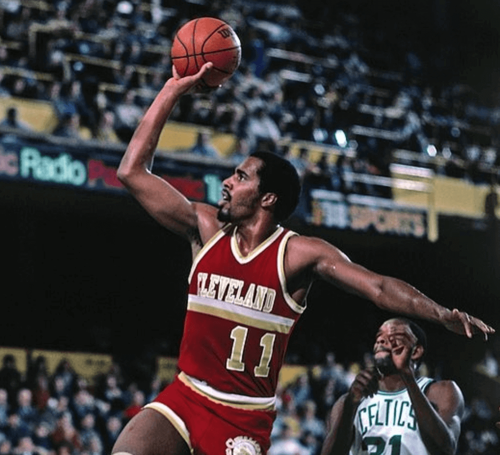
In about 50 years of existence, the Cleveland Cavaliers have made eight major uniform changes and introduced countless tweaks and alternates. But of those eight distinct eras, none was shorter lived — or better looking — than the set the Cavs wore from 1981 to 1983.
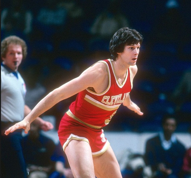
The early-’80s Cavs didn’t have a white uniform, instead opting to wear gold at home. (This was consistent with every Cavaliers uniform up to that point — the team wouldn’t wear white at home until the 1983-84 season.) And unlike some teams that just wear yellow and call it gold, the early-’80s Cavs really did wear gold — the home jerseys had a metallic sheen:
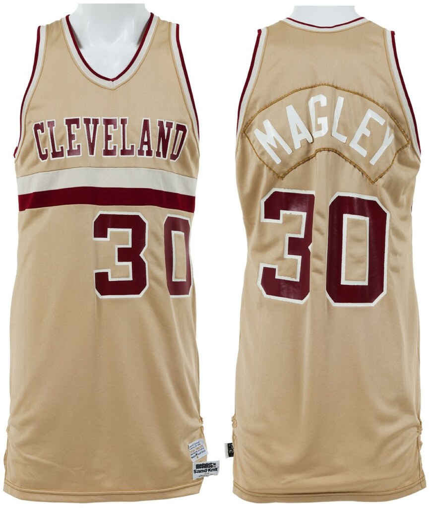
Sometimes, a metallic-like fabric can be really distracting and ruin a jersey (think the Mavs early-’00s trash bag unis). But muted gold works really well with the deep-red wine numbering and lettering, and the white outlining makes those letters pop.
The only downside? The white NOB lettering was sometimes almost illegible against the light-gold fabric, as you can see in this video:
That’s not the only quirk with this set. “Cleveland” appears on both the home and road set — not “Cavaliers.” It’s actually the first time the Cavs ever wore “Cleveland” on a jersey: Both of the previous home and road sets used “Cavaliers” wordmarks.
The simple shorts design contained nothing more than the Cavalier silhouette logo and some leg-hole piping.

But the defining feature of the jersey — the double stripe that underlines the wordmark — really ties the whole uniform together. It may not seem like much, but those two simple stripes turn a very plain jersey into a unique and bold set. It’s a design that hadn’t quite been seen before and hasn’t been seen since.
Horizontal stripes can be dangerous on basketball uniforms — between numbers, letters and limited real estate, things can easily get cluttered. The Cavs avoided this problem by using off-center numbers underneath the stripe.
In my mind, a uniform design is at its best when the elements are simple, bold, and innovative. Clearly, the early-’80s Cavs set checks all those boxes.
The Cavs’ owner at the time, Ted Stepien, was wildly unpopular among fans and the league. In 1983, he sold the team to Gordon Gund, and the Cavs took the court the next fall wearing orange and blue — a redesign many thought was necessary. Wine and gold would stay on the sidelines until 2003.
In recent years, the Cavs have gone all-in on throwback uniforms. Thanks in part to their “Cavfanatic” jersey program that mixed and matched color schemes and designs throughout the team’s history, uni elements from every other era of Cavs basketball have made it back onto the court — except for the 1981-83 set.
Every time I see the Cavs in black, it baffles me that that beautiful metallic gold continues to be mothballed. And the Cavs’ current uninspired wordmark has nothing on the double stripe.
The ’90s Cavs never advanced past the first round of the playoffs when they went BFBS, but black has continued to live on in the Cavs uniform program. If that logic holds true, why shouldn’t the Cavs bring back one of its best-looking uniforms?
The early ’80s were one of the darkest times in Cavaliers history — but at least they looked damn good in defeat.
If anyone has any suggestions for future “Gone To Soon” pieces, send them my way via https://twitter.com/alexhider”>Twitter or email. Thanks!
The Ticker
By Alex Hider

Baseball News: The Phillies announced yesterday they’ll wear their throwback road powder blues for select home games this season. … Red Sox P Eduardo Rodriguez is changing his uni number from 52 to 57 in honor of fellow Venezuelan Johan Santana (from our own Anthony Emerson). … County commissioners have voted to save the Astrodome, though it will be converted into convention space (from Ignacio). … The Rockies will reportedly wear Denver White Elephant unis in a Negro League throwback game against the Brewers in August (from John Gagnon). … Yesterday Paul had a rundown of MLBers who’ve worn pins on their uniforms, but he missed Pirate and Royal Jose Lind and Luis Sojo — teammate of fellow pin-wearer Joey Cora, who’s also visible in that photo (from Andy Chalifour). … Speaking of pins, does anyone recognize the pin that Frank Robinson is wearing in this 1983 baseball card? It doesn’t quite look like the Croix de Candlestick pin (from Andy Chalifour). … New uniforms for Bryant University. … Lots of new gear for North Carolina (from James Gilbert). … Here’s what Villanova will be wearing this season (from Michael Geddes). … Southern Illinois unveiled their new uniforms as well (from David Tolcou). … Northern Colorado also got in on the new thread action (from Marc Gustafson). … Mississippi State softball will wear teal-trimmed jerseys during midweek games this season in solidarity with those fighting ovarian cancer (from Parker Lee). … The Miami Hurricanes will wear camouflage caps for Saturday games this season (from @LI_Matt).

NFL News: Remember that colorful, glittery, Sultan-style outfit that Jason Kelce wore during the Eagles’ Super Bowl parade? Well, Tim Golden was searching YouTube and found this clip from the 2008 Mummers Parade — that’s the New Year’s parade, for those not from Philly — that featured members of the Avalon String band wearing the exact same outfit. … Hard to tell anything from this photo, but the Titans may have teased their new jerseys a bit in their season ticket holder package (from Eric Wright). … We missed this from the Super Bowl: Eagles RB LeGarrette Blount gave a shout-out to his high school on his cleats. The 850 is the area code for Taylor County, Florida (from Steve Cook). … A couple of Vermont radio hosts discussed which teams have the ugliest jerseys yesterday. Uni talk starts at about 13:38 (from Brady Farkas). … If you search on “Mets,” you’ll find that Google is using Todd Radom’s updated Mets logo concept. More on that here (from Shannon Shark). … Ben Agajanian, who pioneered the use of square-toed kicking shoes after an accident severed four of his toes, has died (NYT link) (from Tom Turner).
College Football News: It really is striking how much lighter Florida State’s current shade of gold is when set next to the current helmet next to an older helmet (from @broc1984). … Ohio’s current logo set is almost 20 years old, so a designer decided to freshen it up a bit with a redesign.

Hockey News: The Golden Knights still don’t have a logo on Google’s Feed Topic page (from Sam McKinley). … Following up on yesterday’s Ticker item about colored ice, Kub sent along shots of the Toledo Walleye and the Kalamazoo Wings playing on green ice for St. Patrick’s Day. … More colored ice: This video shows blue ice at the old Cap Centre (at the 5:49, 6:33, 10:50, 13:20, and 20:50 marks) and Boston Garden (10:40) (from David Abraham). … The Minnesota Fighting Saints entry in yesterday’s post reminded Will Leslie that the Spruce Grove Saints of the Alberta Junior Hockey League have a very similar logo.

NBA News: The Rockets wore their Chinese New Year unis last night against the T-Wolves (from Tyler Mason). … This LA artist makes insanely luxurious basketball hoops with stained glass backboards and crystal-stringed nets and sells them to NBA players (from Jason Hillyer). … The Erie BayHawks, the D-League affiliate of the Atlanta Hawks, will wear black-and-yellow uniforms for Pittsburgh Night on March 2. … Whoops: A Chicago TV station used the logo of the Bulls’ D-League affiliate on their Bulls gamer the other day (from Andrew Bowen). … Sixers PG TJ McConnell wore a version of the Mavs logo in high school when he played for Chartiers Valley (Pennsylvania) High School (from Korch).

College and High School Hoops News: Virginia Tech will wear pink-trimmed uniforms on Feb. 24 against Louisville for breast cancer awareness, per a graf about halfway down the page in this article (from Andrew Cosentino). … The North Carolina women will wear pink for cancer awareness on Sunday (from James Gilbert). … Repost: Ohio’s current logo set is almost 20 years old, so a designer decided to freshen it up a bit with a redesign. … Kevin Tucker found a color-on-color high school basketball game being played in Virginia yesterday.

Soccer News: Ross County FC of the Scottish Premiership is letting fans vote on their away jerseys for next season (from Ed Zelaski). … Here is a good look at San Jose Earthquake jerseys through the years (from Brian Begley). … Looks like Atlanta United’s new second jerseys have leaked (from Elijah Newsome). … Yard Sale Pizza, a small pizza chain in England, is selling soccer scarves with their logo (from Matthew Klimberg).

Olympics News: Xfinity mistakenly used an old version of the Union Jack — like, a 200-year-old version — in a graphic of upcoming curling matchups (from Michael Wilson). … American curler Tyler George [who helped teach me how to curl eight years ago — PL] has worn the same pair of beat-up Sketchers (NYT link) for every competition for eight years (from Tom Turner). … I think we’ve shared this before, but it’s relevant now that the Olympics have started: Speedskaters feel that blue suits are fastest (from Chris Costello). … American lugers Chris Mazdzer and Erin Hamlin appear to have blacked out a logo on their suits during their runs. Luckily, there’s a partial shot of the logo before Hamlin marked it up, and it appears to be the logo for Yetti Apparel. … Good piece on the Norwegian skiing team’s wax technicians (NYT link). … Yesterday’s Ticker had a piece about the Great Britain skeleton team’s high-tech suits. Now other teams are questioning the suits’ legality (from Mark Coale). … These last three are from Kary Klismet): Russian curler Anastasia Bryzgalova looks remarkably like Angelina Jolie. … Polish luger Mateusz Sochowicz misplaced his protective helmet visor, but made his run without it. … Here’s why Olympic medalists in Pyeongchang receive stuffed animals immediately following competition rather than their medals.

Grab Bag: South Eugene (Oregon) High School will change its nickname from “Axemen” to “Axe” in order to be more inclusive to all students (from Alex Allen).
Careful with that axe, (South) Eugene!
It’s never too early for a Floyd reference.
Also, great work today Alex!
Yea, you can’t tell anything from that Titans photo, but if that’s the numeral/lettering font, I think I like it.
When I heard “gone too soon” I immediately thought of a different Cleveland set, the cream-colored set with the block “INDIANS” they used for a few years recently. Although while googling for an image, I see I might not have a universal view:
link
I love those cream jerseys, and not because of the cream color (make it ice-white and it’s just as good), but because of the timelessness of the design. We need more NNOB jerseys in baseball!
We need more NNOB jerseys in baseball!
But then you’ll complain that the numbers aren’t vertically centered properly!
;)
“But then you’ll complain that the numbers aren’t vertically centered properly!”
I will never stop complaining about that, but it’s only become a problem since NOB jerseys started predominating. It wasn’t like this link!
My one issue with those uniforms was the single-layer navy “block C” on the red cap. It needed an outline.
Fun fact, those jerseys were originally worn with the navy blue cap with the red “C” that is now the official road cap.
Indeed the fauxbacks were the first time that cap ever appeared.
link
So the fauxbacks gave birth to what is now the official logo of the Cleveland Indians.
I agree on the Cavs uniforms. “Gone Too Soon” promises to be an interesting series.
Alex, are you taking suggestions for future entries, or do you already have some in mind?
Thanks Daniel! I’ve got a few in the hopper, but I’d love suggestions.
The Oakland A’s white button-fronts from 1982. Probably too traditional for the A’s, but it deserved a better fate than being mothballed after one season.
link
here’s some more on how Jason Kelce came to wearing the Avalon String Band’s Mummers costume.
link
The Avalon String Band loaned Jason Kelce the uniform for the parade. Here is a link to the NBC Sports Philadelphia story about how Kelce got in touch with the band. link
The Cavs, more than any other team right now, is obliterating the time dimension aspect of the word “uniform”. It truely is becoming just clothes, with a different outfit for each day of the week.
The teammate in the Luis Sojo is Joey Cora, not Alex.
Right. Fixed.
I thoroughly enjoyed the Gone Too Soon post. Keep them coming!
Love the organ music in the Cavs video. A charming simpler time. Boy I feel old saying that.
“Russian curler Anastasia Bryzgalova looks remarkably like Angelina Jolie. ”
I don’t see it.
The lovely Russian curler struck me as having more of a Mila Kunis vibe. Watching the OAR and Swiss semi-final my wife and I were kept in stitches at the bitching and barking between the two Russians. when we found out they were married to each other it all made complete sense…
Great work Alex – Looking forward to the next entry!
2000-04 NY Giants white jerseys were definitely “gone too soon!”
Ah, this post warms my heart…I have very fond memories of those Stepien-era uniforms.
Unfortunately, you’ll probably never see them on the court. During the Gund era the team wanted NO reminders whatsoever of the previous regime. They even thought of ditching “Cavaliers” for just “Cavs.” Don’t know Gilbert’s (or the next owner’s) mindset on this but if I had to place a bet it would be on them keeping those great uniforms stuck in the past.
“805” is the area code for San Luis Obispo county in California; Blount’s cleats show “850”.
Fixed.
Sixers PG TJ McConnell wore a version of the Mavs logo in high school when he player for Chartiers Valley (Pennsylvania) High School (from Korch)
Apparently that was from his freshman year, but TJ’s so baby-faced in that pic, he looks more like a 6th-grader!
Great idea for a series, guys.
Re: Ross County’s away shirt poll, the tartan option is pretty similar to the away shirt being worn by Greenock Morton this season:
link
In finding a picture I just learned that Morton’s shirt is to be worn until the end of next season, so the two shirts could possibly coexist.
Also, just pointing it out, but the Atlanta United shirt was also in the Ticker last week. It appears to have been floating around the Internet since December.
“Northern Colorado also got in on the new thread action ”
What?? No maker’s mark on the stirrups??
(I notice it is prominent on every other item in that photo!)
Sorry, Northern Colorado. You’re NOT UNC. Seems odd to try and brand that way on the uniforms.
There are only so many letters/combinations.
what would you suggest?
Except they are. You use the first letter of the word. It’s how acronyms work.
Regarding MLB players wearing pins, does anyone recall a New York Mets player also wearing the yellow Sunshine Kids logo on their hat on occasion?
I cannot recall for certain but think it was Pete Harnisch? In my searching it appears Harnisch worked with Biggio on the Sunshine Kids initiative while with the Astros. Via this link you can see a Harnsich Astros baseball card where he is wearing the pin:
link
Cannot find a photo where Harnsich is wearing the pin with the Mets but am almost certain he did at some point. Does Paul or anyone remember this?
I have no memory of this. Doesn’t mean you’re wrong; just saying it would be news to me.
Thanks, Paul. My memory is not what it used to be but I can definitely picture a Mets pitcher with this pin (again, I think it was Harnsich but it could have been someone else). They may have also only wore the pin on their non-pitching days? Maybe this will jog the memory of another Met fan! I will keep searching to see if I can find a photo.
Still cannot find a photo but did find this link and the last entry alludes to Harnisch and the pin. They seem to think that he did not wear it on pitching days (as I surmised above) so it would not meet the criteria of a player wearing a pin on the field. Still would be interesting to hunt down a photo (or video) but at least this reinforces that my memory is not shot just yet!
“On days when Pete wasn’t pitching, you would see him in the dugout and he would have some sort of pin on his hat that looked like a sun or star or something. Never when he was pitching though. MLB probably wouldn’t have allowed it. Anyone remember this and know what that pin was for?”
link
Good work!
I really like the “Gone Too Soon” post. It’d be nice to see the Cavs bring back that design as a throwback option. Their current set is just a disaster, though it’s pretty incredible that they managed to include two alternate uniforms without using either of their secondary colors, so bravo? I always thought that the C with the sword on their last set should’ve been block font, but now they’ve completely removed the sword.
I was disappointed to find out that the medalists at the Winter Games would be receiving stuffed animals in lieu of flowers. I always thought that the flowers gave the Olympics a distinct look, with different arrangements for each specific Games (remember Albertville?) The stuffed mascots look like something you’d get for winning skee-ball, not skiing.
Proofreading:
“(from Shannon Shark)” although he may appreciate the name
“in graphic of upcoming curling matchups”
To Kristopher, who posted the other day: Would this be a better post if I added a lame comment?
Shannon Shark is his correct name. Other item fixed.
Sorry about that.
The Cavfanatic idea is one of the coolest and most creative in sports. I wish more teams with similarly muddy uniform histories (Padres, Astros, Canucks) would do something similar.
Excellent post, by the way.
The whole NBA uniform program is a disaster this season. There’s no consistency. Teams are wearing uniforms that don’t match their color scheme (Heat and Jazz for example). Either every team should wear white at home (preferred) or color at home and all road teams wear white. Just be consistent. And throw in the bizarre Nike uniforms where the stripes don’t loop around all the way. Just a complete and utter disaster.
No ore white at home/color on the road (or vice-versa) mandate please! I like color v color.
I tend to agree with you about teams not wearing team colors though.
Lee
Thanks for the kind words, y’all. Really appreciate it!
I forgot to include this in the post, but if anyone has any suggestions for future “Gone To Soon” pieces, send them my way: @alexhider on Twitter, or link via email.
I’ll add that to the end of the post, Alex.
AJHL Spruce Grove Saints just recently returned to that logo. I think they may have returned to that logo just this year. Had previously worn it during their time as the St. Albert Saints.
Spruce Grove Saints had recently been wearing this for a logo:
link
link
To say Stepien was wildly unpopular is an understatement. They had to make a rule to stop him from trading every #1 pick for the next 20 years. He was eventually forced to sell the team.
I always thought his period in Cleveland would make an excellent documentary.
Pete Franklin, host of “Pete Franklin’s Sportsline” talk show that aired from 1972-87 on then WWWE (now WTAM) in Cleveland, couldn’t bring himself to call Ted Stepien by name; it was either “T.S.” or “Too Stupid.”
I’ve seen the pre-1800 Union Jack* used anachronistically a lot lately. Including prominent use throughout the second season of “The Queen.” Very odd, as it’s not a common Google Image search result for terms like UK flag or Britain flag or Union Jack.
*Technically it’s the Union Flag, not the Union Jack, but the latter is what everyone calls it.
*The Crown
and yes, it drives me up a wall. It seems like such an easy thing to get right, especially in a show as prominent as that one. Though aesthetically, I much prefer the pre-Ireland Union Flag. Even own one myself to fly for tailgates.
Between “The Crown” and “Victoria,” I’m just lucky if I can remember what century I’m watching, much less the title of the show. Especially with both shows sharing actors in secondary roles playing similar characters.
I’m with you entirely on the aesthetics. I have a pre-1800 Union Flag that I fly for a day as part of a sequence in the run up to Independence Day each year. Looks much better with the Scottish saltire unadulterated by the St. Patrick’s saltire.
It’s only the Union Jack when it’s on a boat.
It is commonly held that it is only the Union Jack when on a boat, however, British flag historians dispute that claim.
Per Wikipedia:
According to the Flag Institute, a membership-run vexillological charity,[12] “the national flag of the United Kingdom, the Crown Dependencies and Overseas Territories is the Union Flag, which may also be called the Union Jack.”[13] The institute also notes:
it is often stated that the Union Flag should only be described as the Union Jack when flown in the bows of a warship, but this is a relatively recent idea. From early in its life the Admiralty itself frequently referred to the flag as the Union Jack, whatever its use, and in 1902 an Admiralty circular announced that Their Lordships had decided that either name could be used officially. In 1908, a government minister stated, in response to a parliamentary question, that “the Union Jack should be regarded as the National flag”.[9][14]
link
what a great idea, the “Gone too soon” series is. Excited to see more
Have there been previous installments?
Proofreading
“Sixers PG TJ McConnell wore a version of the Mavs logo in high school when he player for Chartiers Valley (Pennsylvania)”
Should be played
Fixed.
Proofreading:
turn a very plain jersey into unique and bold set.
– a unique
Florida State’s current shade of gold is when set the current helmet next to an older helmet
– the current helmet is set next to
Sixers PG TJ McConnell wore a version of the Mavs logo in high school when he player
– was a player
As a tip of the cap to BurghFan, obligatory lame comment added.
Fixed.
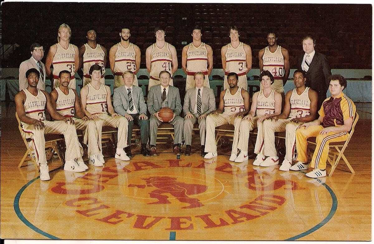
Great article, although the Cavs started wearing that set in 1980.
Also, check out the guy in the team standing next to Laimbeer in that Cavs team photo – numberless jersey!
I’m guessing the “numberless jersey” guy is John Lambert, who was the only player left from the Miracle of Richfield team (1975-76). Another player of note is former Buffalo Braves All-Star Randy Smith (#9, seated, second from left).
Do the Nordiques wolf uniforms that never saw the ice count for ‘gone too soon’? I actually thought they were pretty nice. Of course, they were nothing compared to the classic Nordiques unis, but they were still nice.
That uniform would fall into the category of so way 1990s.
Oh my.
Ummm no.
link
Lee
I’m a bit late to the party, but great stuff today, Alex! Loved the spotlight on a forgotten uni gem, and the “Gone Too Soon” concept. Looking forward to future installments!
I love the irony that on the right side of the article on high-end stained glass backboards with crystal nets, there is a listicle of the Top 15 ways NBA stars went broke. Like by spending money on high-end stained glass backboards with crystal nets…
The Axemen/Axe high school story reminds me of an historic castle in the town where I grew up, Tarrytown NY. From the 1940s through the 1980s the castle was known as Axe Castle, after the Axe investment company who owned it (and the actual last name of the couple who owned the company). I thought that was the best possible name ever for a castle. It conjured up so many images in one’s mind of battles and knights and all things associated with castles. The company moved out around 1990 or so and the building later became a luxury spa which decided to take a more generic, localized name. I should get the shirt – I Still Call It Axe Castle.
I tweeted at Paul that Todd Radom Mets logo last Thursday…
I read uni-watch everyday but never comment. Recently rec’d a shipment of old yearbooks from my, now defunct, high school. Books date back from 1958 until 1980 with some years missing. Found some old sports photos with my Dad in them. Was wondering if anyone would be willing to try and colorize them for me? If you’re interested, my email is link Thanks!
Great lede today and “gone too soon” is a great idea.
In regard to the “Gone too Soon” article and the team picture, I kind of get a kick out of the fact that some equipment dude is in the picture wearing the previous color scheme of wine and gold, “no, we can’t be bothered updating your look, but get in the picture anyways.” The color scheme in the “Gone to soon” – was sort of white wine, red wine.
Do the present-day Jacksonville Jaguars uniforms fall into the “gone too soon” category? ;)
No, but their original uniforms from 1995 certainly do.
And their current helmet falls into the “Gone, and good riddance!” category!
I might count the Mets’ 1993-94 road jerseys (road only) as Gone Too Soon, if the 1995-97/2012-present road jerseys weren’t so frickin’ awesome. That cursive “New York” had possibilities.
I sense they’re about to rise again
Sorry meant to have that comment against the original Jags uniform, which was both getting it right the first time and gone too soon.
I see from a close look at one of the photos that Sand Knit was responsible for those short-lived early-80s Cleveland Cavaliers uniforms that used an early form of what is now generically known as “Vegas Gold.” I wonder what label Sand Knit gave that color in its early-80s catalogs?