Good Saturday morning, Uni Watchers. I hope everyone has had a good week and you’re looking forward to a LOT of NFL Playoff Action — specifically “Super Wild Card Weekend” (or whatever the hell the NFL is calling it this year) — with two full days and one night of NFL Wild Card games. There are two games today (Seabirds at Niners, Bolts at Duval), three games tomorrow (Dolfish at Buffalo, G-men in Minnie, and Blackbirds at Tigers), and the MNF finale with the ‘boys heading to Tampa, on Dr. Martin L. King, Jr. Day.
Wild Card Weekend also means it’s time for me to contunue my annual exercise in futility ritual of picking the winners of all Wild Card games in the only way that ever makes sense on this particular website: by better uni, of course. I usually break (but barely) the 50% correct barrier for the entire post season, and last year I actually went 8-5 over the playoffs when predicting winners this way. If you want to see my WC picks for 2022 or 2021 you can. I’ll continue to pick the winners through the Super Bowl, although this will be the only time you have to suffer through a whole article time I do so as a lede.
What makes a “better” uni? Well, that’s all in the eye of the beholder — you may (and probably should) disagree with some of my selections. Feel free to do so in the comments below.
I picked these games late Friday. As of then 10 of the 12 teams had officially announced their uniforms, with the Chargers
Let’s get started!
SATURDAY, JANUARY 14
Seattle Seahawks at San Francisco 49ers
Time: 4:30 pm ET
TV: FOX
SPREAD: SF -9.5
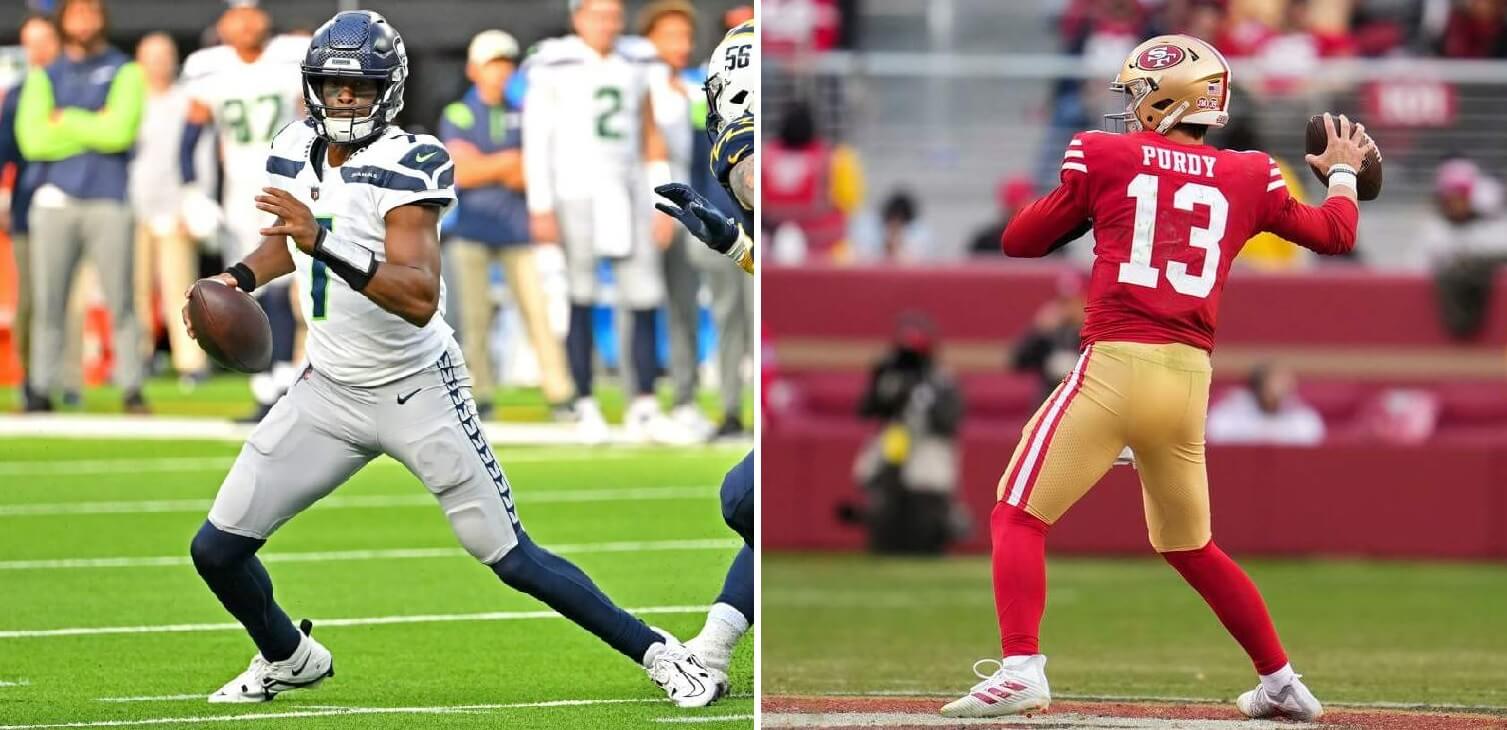
We begin Wild Card Weekend with one of the easier choices. San Fran continues to sport one of the best looking home uniforms (and the road is pretty sweet too!) in the NFL. They made a great uni even better by tweaking their shoulder cap stripe pattern prior to this season. SF also have both a home and road “1994” throwback — which I know a lot of people love, but I’m not as fond of, since the helmet isn’t even close to the red one worn in 1955 — which is what those 1994 unis were actually throwing back to. Seattle’s uniforms have grown on me since they were Nike-fied when swooshie scored the NFL uni contract back in 2012, but they’re still not in the same league as San Fran’s standard home and away. We do luck out with the seabirds wearing gray pants today — easily their best road look. With both teams playing out of the NFC West, they’ve already met twice this season: once with the Niners wearing their gorgeous homes, while Seattle went white over blue; they met again in Seattle in a brutal matchup — SF in their all-white alts and Seattle going neon snot over blue. We’ll get the best matchup possible today, but it’s still not enough for the ‘hawks.
THE PICK AGAINST THE SPREAD: San Francisco giving 9.5
Los Angeles Chargers at Jacksonville Jaguars
Time: 8:15
TV: NBC
SPREAD: Jax +2.5
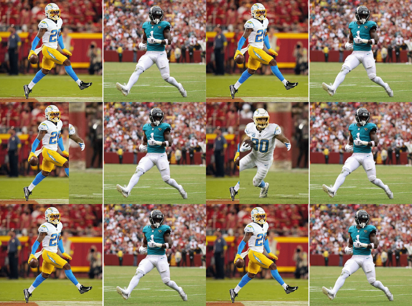
Jags/Chargers doesn’t usually make for a particularly good-looking matchup, but no matter which pants the Chargers go with (white or gold), this game will look pretty good — thanks to the Jags wearing their best uni: black hat, “teal” jersey, and white pants. When Jax debuted their current uni set, I was pretty happy with it — simply because of what it replaced, but over the years, I’ve become less enamored with the plain, stripeless pants. When they keep it simple, it’s a nice look. When they start with mono black or mono teal, or even worse — mix and matching solid colors — they lose me. But black/teal/white is fine. Unfortunately for the Jags, both options for the Chargers — white jerseys/white pants or white jerseys/gold pants — are still better looking than the Jags’ duds. With the Jags wearing white pants, I hope the bolts go with gold pants, but either way, LA will be better-attired. The two teams met once in 2022 — with the game in Inglewood — and both teams wore white pants. I hope that changes today. Still, LA has the better look and will cover the less-than-field-goal spread.
THE PICK: Chargers -2.5
SUNDAY, JANUARY 15
Miami Dolphins at Buffalo Bills
Time: 1:00
TV: CBS
SPREAD: Buffalo -13
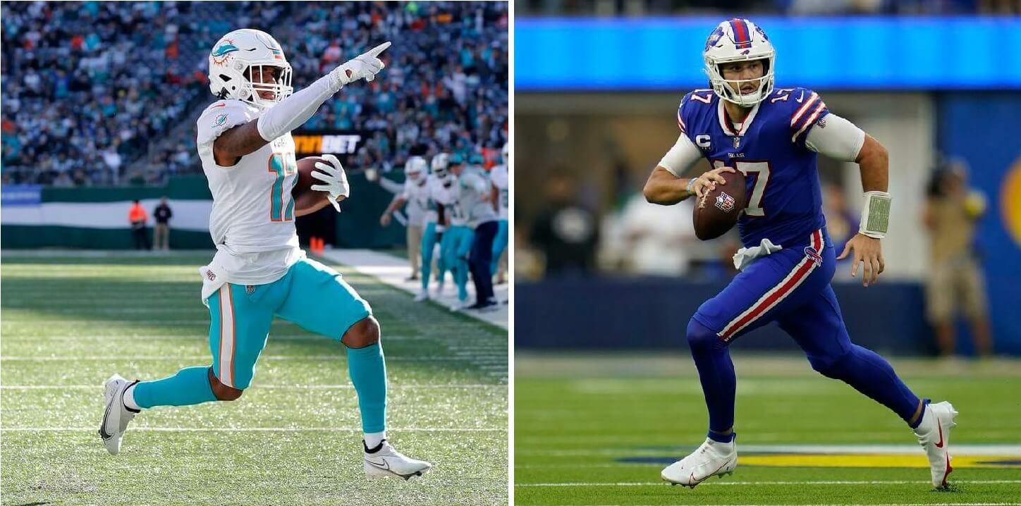
For some reason, Buffalo has a hard-on for their all-blue-below-the-neck uniforms, wearing them EIGHT times this season, and will don them again on Sunday. Why they wear this so often is a mystery, at least to me, since their royal over white is SUCH a great look (one of the best in the NFL). Not so when they decide to break out their superhero costume look. To make matters worse, while the team went 8x mono, they didn’t even wear their “Standing Buffalo” throwbacks a single game! Of course, they did manage to wear their all-red color rush unis once. When I began this writeup, it wasn’t known which pants the Dolphins would wear, but they since announced they’ll wear aqua pants and socks. I much prefer the Dolphins in white pants (especially with aqua socks), but their white over aqua isn’t bad. Of course, their white throwbacks would have been incredible. With both teams in the AFC East, they played each other twice: once in Miami (Miami won 21-19), and the other in Buffalo (Buffalo won 32-29). Sunday’s game will not repeat either matchup (I’d have taken Buffalo going blue/white, but Miami when Buffalo went red/red). With the Bills in mono-blue (below the neck), I will take the Dolfish.
THE PICK: Miami +13
New York Giants at Minnesota Vikings
Time: 4:30
TV: FOX
SPREAD: Minn. -3

Yowsa. Minnesota announced on Friday they were going mono-purple, and that threw a wrench into the betting works. Before the mono-grape was known, I was going to have a hard time picking the game. I may be more of a fan of Minnesota’s unis (at least their standard purple/white) than most, especially since they fixed their helmet color and finish back in 2019. I still hate their ridiculous “sail” number font (used on the first digit of a two-digit number), but other than that, no real complaints. But that mono-purple look is too much. Unlike Paul, I don’t hate purple, and the Vikings have a pretty decent shade, but the mono-purple — at least when paired with their standard jersey…the color rush is fun once a year — just doesn’t look good. Then we have my Giants. They have a top 10 home uni, a really well done “Legacy” uniform, and a sharp road throwback. All top-notch. Then there is the road kit. Yecch. C’MON! YOU’RE BIG BLUE. The only blue on that uni is on the helmet. The ideal Giants road uniform would be either their throwback (seen above) or the much-less-red-dominate unis worn from 2000-2004. Anyway, Sunday’s game won’t be the best looking NYG/Minn game. Interestingly, the teams met earlier this season (Minnesota was the home team), and the Vikings busted out an all-white getup. I’d take that matchup tomorrow over what we’ll get. Anyway — had the Vikes just gone with white pants, I’d have taken them, but the “better” uniform tomorrow will be, almost by default, worn by the G-men.
THE PICK: Giants +3
Baltimore Ravens at Cincinnati Bengals
Time: 8:15
TV: NBC
THE SPREAD: Cincy -9.5
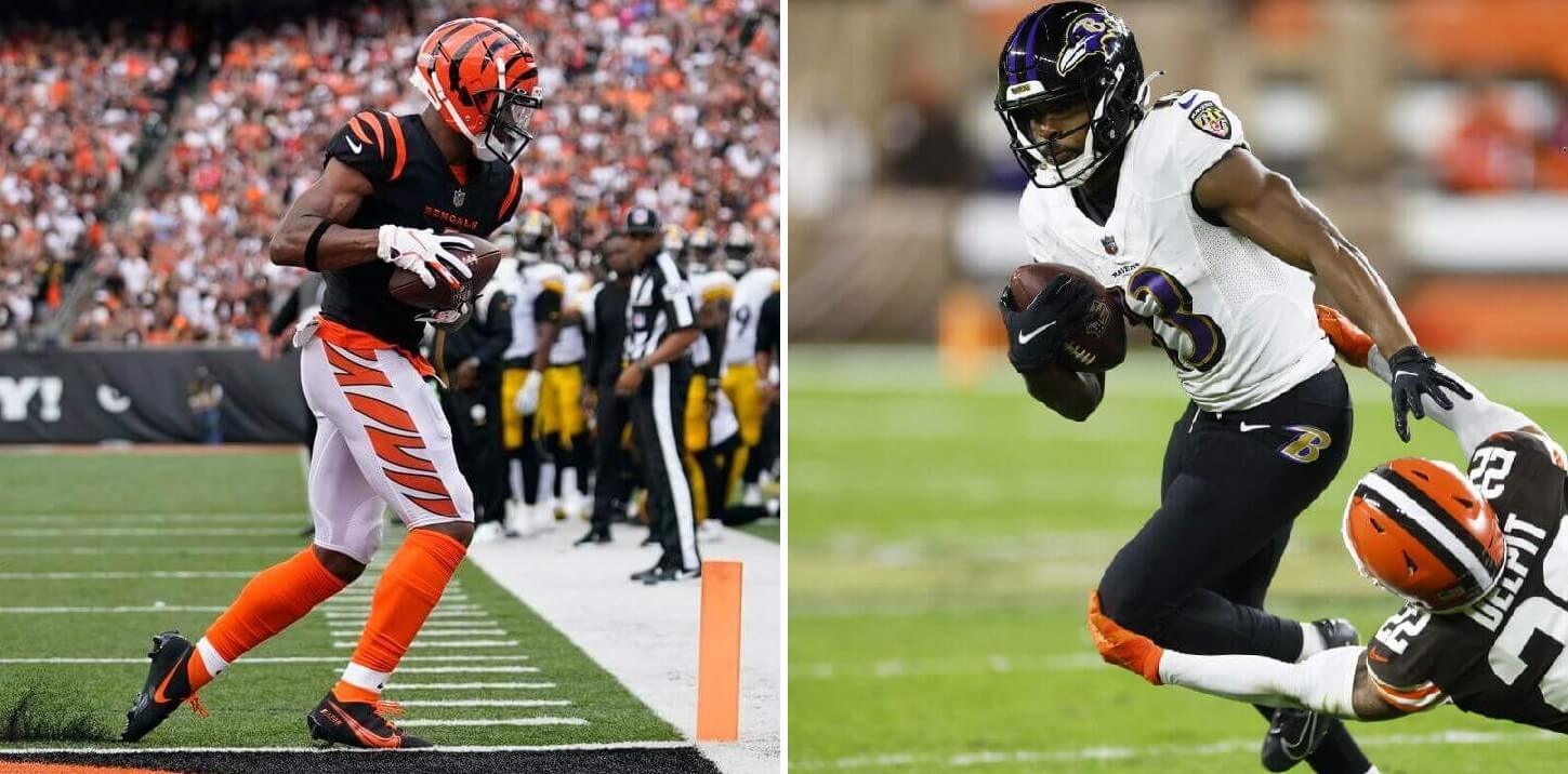
This is going to be another tough call. And it will be a pretty good looking game too — both it could have been so much worse, so we can count ourselves lucky in this regard. The Bengals will be arguably wearing their best looking combo: orange/black/white/orange. Considering they could have gone with black pants, or orange over black, this is a good choice (it’s also the combo in which they lost last year’s Super Bowl). And while I absolutely lovelovelove “White Tiger” look, I’ve grown quite fond of the orange/black/white/orange combo. On the other hand, Baltimore could have gone with white pants or purple pants (both of which have stripes, as opposed to their solid black ones), it’s still a pretty good look for Balto. The two teams met twice during the regular season, and in both of those, the home team wore black jerseys and pants. This will be the best looking matchup of the three. It’s a tough call, and if the Ravens had picked either white or purple pants, I’d side with them. But this will be a Bengals uni-victory.
THE PICK: Bengals -9.5
MONDAY, JANUARY 16
Dallas Cowboys at Tampa Buccaneers
Time: 8:15
TV: ESPN
THE SPREAD: TB +2.5
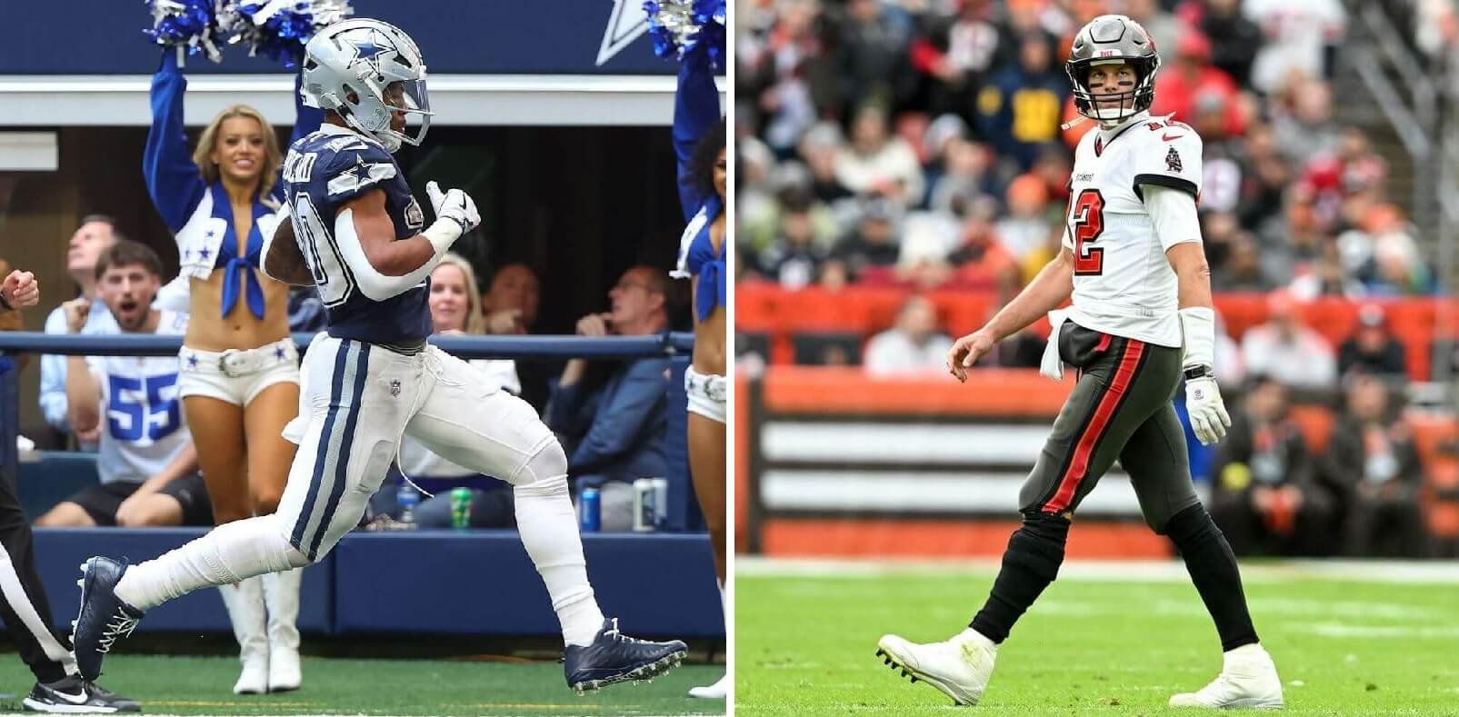
Normally, you’d expect a game involving Dallas to have them in their standard white/blue uniforms, but Tampa is the home team, and they chose to wear their pewter/white/pewter combo (which they won Supe 55 wearing). That forced Dallas to wear their blue jerseys. It wasn’t that long ago Dallas would pair those jerseys with their silver pants (which perfectly match their helmets). I actually think this is a better combo than their regular home/road white/blue pants. But of late, the Cowboys have also paired the blue jerseys with white pants, giving a somewhat disjointed silver/navy/white look. They had originally paired those pants with a white “double star” jersey (and silver helmet) to good effect. Even more recently, with the lifting of the single shell rule, the Cowboys reintroduced their white shell (which they wore on Thanksgiving this year). But they didn’t stop there: they added a “double star” to their new white shells and busted out an “Arctic Cowboy” look against the Titans on New Year’s Eve-eve. The teams met once this year, a Week 1 thrashing by the Bucs. Those white pants look fine with the white jerseys, but not as great with the blues. And that’s the tipping point here: ‘boys in blue/silver, I pick ’em. But navy/white? The edge goes to Tampa Bay.
THE PICK: Bucs +2.5
And there you have it. My picks for Wild Card Weekend, based on the better uni. I’ll continue picking “better uni” winners for the remainder of the playoffs and through the Supe, but this is the only time I’ll make you suffer through do so as a lede.
Feel free to disagree in the comments below.

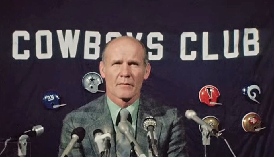
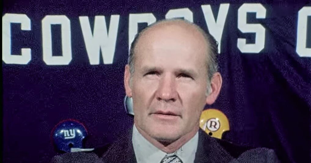




I’ll cast one contrarian vote in favor of the Giants’ road uniforms. in my case, I enjoy the callback to the team’s late ’50s / early ’60s look, when they similarly went very red-centric below the helmet in their white jerseys. When I discovered that twist (in a rare color photo in a Sports Illustrated NFL season-preview issue), it gave me a lifelong appreciation of teams that would surprise you with a shift in focus from their home uniforms to their road uniforms.
Agree. I love the Giants road unis as well. Throwback to the glory days of the 50s and early 60s. This nonsense that because some gave them the nickname ‘Big Blue’ so everything needs to be blue is silly. That is an example of the tail wagging the dog. I would not mind, though, if they went to their late 60s white jerseys with the solid blue numbers. Also a solid look, but a reminder of their dreariest period, so I doubt the Maras would go for that. Their throwbacks always seem to be from winning seasons.
Guys. I am WELL AWARE of the New York Giants uniform history. I know how prevalent red once was (and with their road unis still is) in their uniforms; I just don’t happen to like it. (I also love the malaise-days unis sported by Fran Tarkenton, et. al link, but agree that was a nadir in terms of success). I don’t mind *some* red on the unis, particularly the roadies, I just don’t want the ENTIRE uni below the neck to have no blue at all, which is currently the case. It just looks disjointed. All I’m asking for is some blue. What they wear now doesn’t evoke that “old school” look, though my OCD does appreciate the matching Northwestern striping on the sleeve caps and pants. But that’s about all I like.
YMMV
Completely agree with this assessment of the Giants current road uniforms. But I’ll go the extra mile and say that I absolutely hate Northwestern stripes on pants. I never minded the gray pants with the red/space/blue/space/red stripes that were an update of the piping they actually used from the mid-50s through 1961 (some but not all players in ‘61).
I’ve always been a big fan of the Giants’ red below the neck unis, but especially with gray pants and black cleats. I admit that I’m old enough to remember those from my childhood, but it’s always been a much more interesting look than the ones that followed later in the ’60s and beyond. On another note, the Bills in all red with white helmets and the Cardinals in all darker red with their helmets both look like an outbreak of zits on the field.
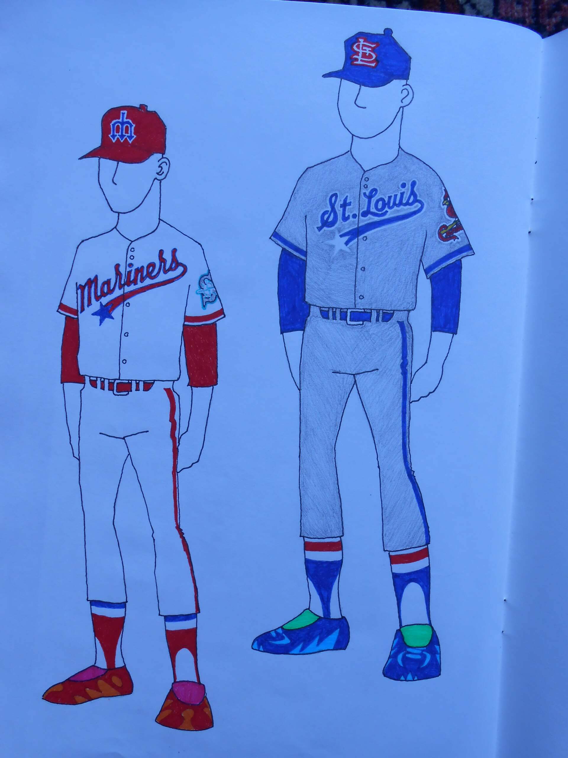
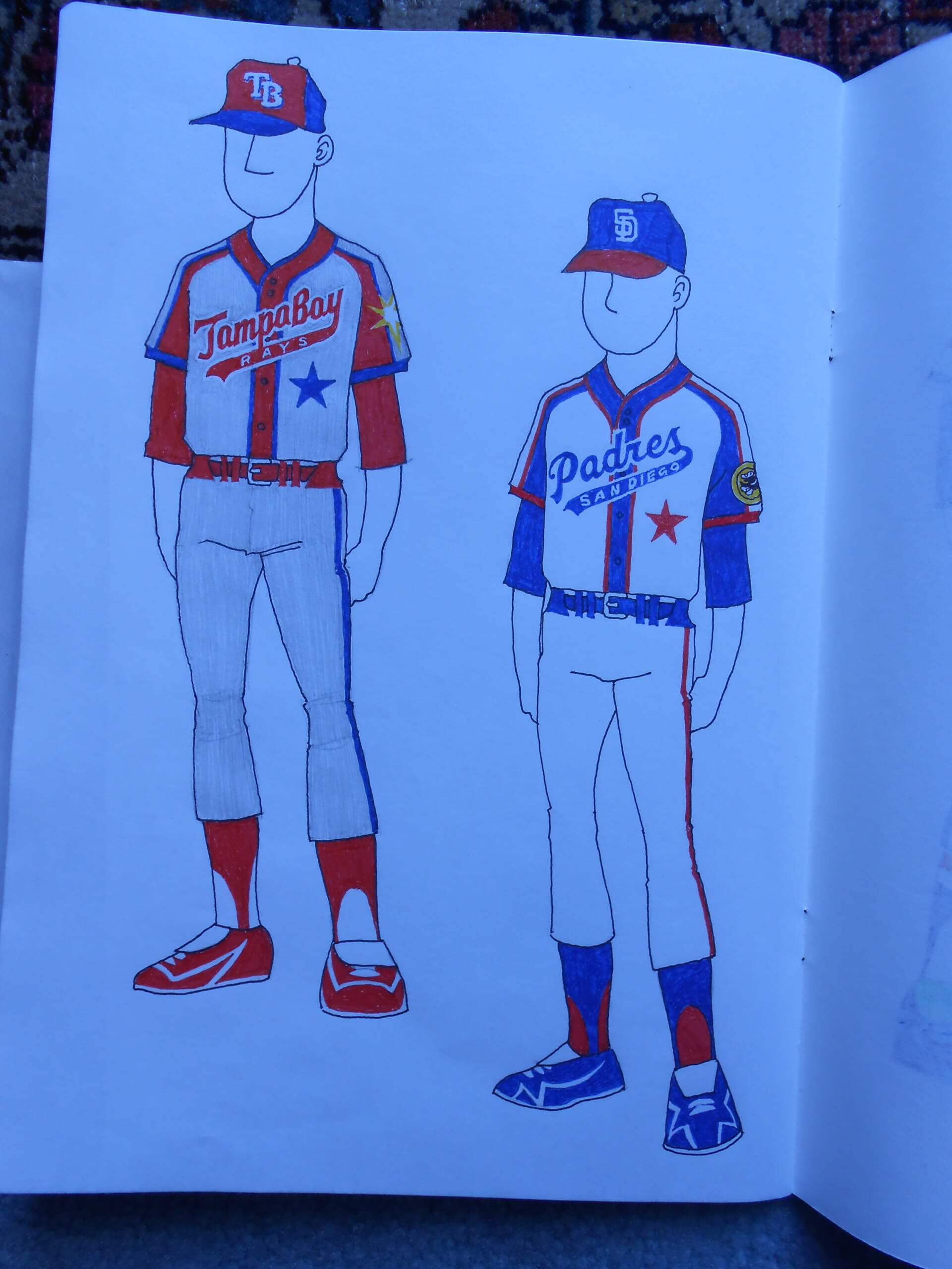
Excellent all-star game concepts by Howard — really like the full use of each team’s uni elements, but in the standardized colors of NL blue and AL red. Probably the 2nd and 4th versions are my favorites.
Thanks, Tenz. I’ll admit my proudest accomplishment is spelling out the entirety of DIAMONDBACKS on a jersey front.
Agree!
Particularly like the Tampa and San Diego treatments…a homage to Negro League uniforms?
Yes, I am a fan of the contrasting placket treatment. I like the uniforms of the Kansas City Monarchs.
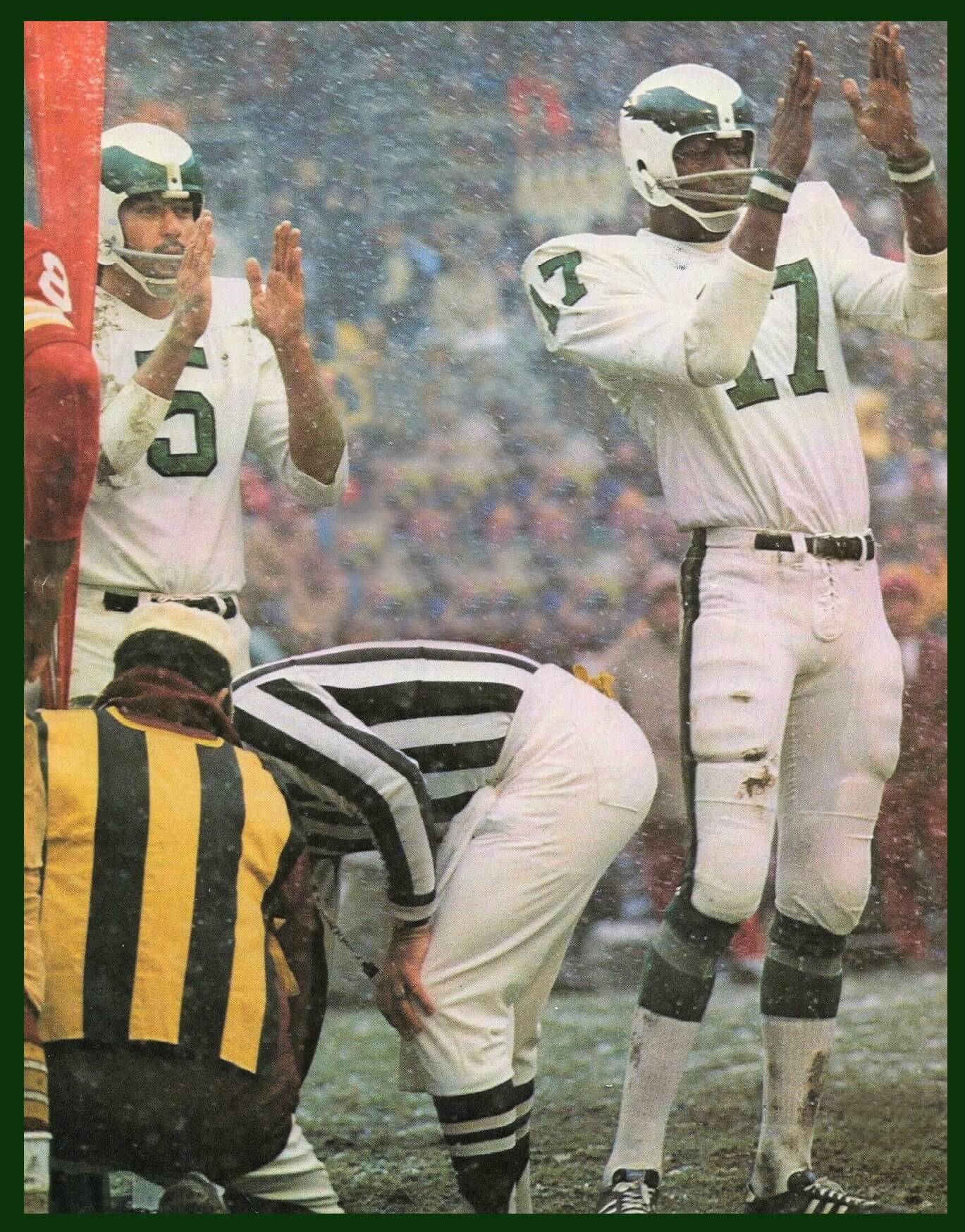
GTGFTU: 9/23/84 – Texas Stadium. That was thr only year Tony Dorsett wore that facemask. It was during the Hogeboom Epoch. Dallas won, 40-14 I think.
Elements of the Packers uniform unique to the Forrest Gregg coaching era: G on the sleeve (carried over to Lindy Infante’s first year), number on the hip and yellow stripe on the pants.
Love the hip numbers for both teams!
Of course you do.
Hats off to William…I totally missed the facemask aspect!
A rare game where both teams had hip numbers… not easy isolating a shot featuring those which didn’t also did play the ‘Boys 25th anniversary chest patch.
Kinda thought you and Phil would appreciate this entry-had you both in mind since you wrote about hip numbers a while back.
Jimmer’s a much bigger fan of those than I.
Even though the combo that the Bucs are wearing is their best, I’d pick the Cowboys even with their white pants. I agree that the silver pants with blue jersey is their best combo, but the stripe on the white pants has a nice thick silver to still look good.
Only thing better than what the Cowboys are wearing is if they went back to silver helmets, royal jerseys and whatever you call the pants color.
I believe the NFC is the home team in the Super Bowl, which is too bad. I’d like to see the Cowboys make it there, be forced to wear the blue jerseys and win anyway so people will stop talking about the silly blue jersey “curse.”
“I believe the NFC is the home team in the Super Bowl, which is too bad.”
Easy way to remember: NFC (or NFL then) was first designate home team in the Supe (Packers, then), so every “odd” Supe/year (I, III, LVII — or 1967, 1969, 2023 — etc.), NFC will be designated home team. Every “even” Supe/Year, AFC.
For years, I have called the Cowboys among my least favorite uniforms in sports – which is odd for me because I’m typically a huge traditionalist. But I just can’t get over the obvious mismatched blues on the light and dark unis. There’s also the black outlining the blue sleeve stripes on the white jersey, which doesn’t appear anywhere else, and the fact that the white and blue jerseys are different styles (floating numbers and word-mark on blue jerseys only). All that said, I don’t really mind today’s combo…it just doesn’t work with the rest of their look.
I am still waiting for the Cowboys to go back to the serif font numbers as the Colts did. It is a much better look. That seemed to be one of the first things Jerry Jones got rid of.
I wholeheartedly agree!
I agree that those numbers need to return. But Jerry didn’t get rid of them; they were dropped first from the original navy jersey/silver pants set in 1981. Then the serifed numbers were dropped from the white jersey starting with the 1982 regular season.
The current helmets are pretty close to the original shade from the 1960s- only slightly more silver do they can go with either the blue/green/whatever color they really are pants and the “pure” silver worn with the navy jerseys. I would love to see them return to using that shade for the pants and bring back the darker royal blue for the blue jersey and the numbers/stripes on the white jersey.
The Bills in blue pants situation this year has been historically strange.
For the past 3 seasons (2019-2021), the Bills have had some of their most devastating losses in their blue pants, and by the end of 2021 had moved to white pants only for luck in the playoffs.
This year they’ve lost both times they went blue over white, and thus the mono blue look is the lucky look in 2022. I don’t love it aesthetically, but I’m not one to mess with a hot streak either.
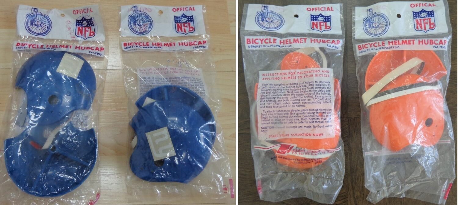
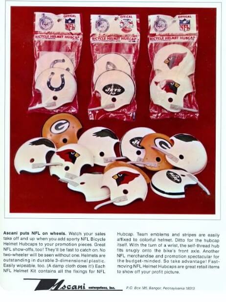
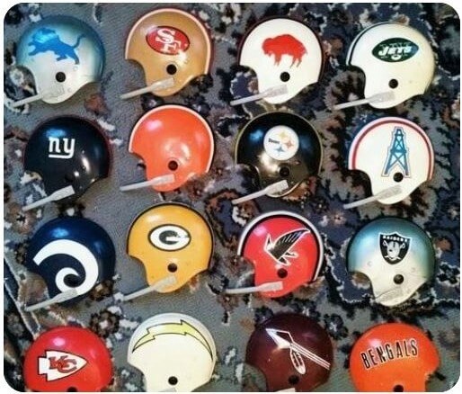
I agree with all the picks. The Falcon on the hub helmet is flying upside down. Love these helmets, never seen them before.
Falcon hub cap looks about right for this past year…going backwards and straight down….
Do you notice on the image of the hubcap helmets in the original bags above, that the word “Official” was misspelled as “Offical”?
Seattle looks better today. They’d also look great if they went blue/gray/gray.
Santa Clara needs to tweak their logo to an SC. Even better, how about GS for Golden State.
They’re much closer to San Jose, which is the biggest city in the Bay Area. Enough of this San Francisco nonsense.
Chargers only look good in yellow pants. Jags look good in any combo other than monoblack or black/white/white.
Dolphins look good with aqua road pants. 50 years ago they looked good in monowhite, but not anymore. Bills are fine.
Giants should just call themselves Big Blue & Red and be done with it. I agree with Phil in that I prefer the Tarkenton-era road look, but this uni is good.
I knew I wouldn’t get a repeat of the Ravens’ purple pants from last week, unfortunately. I’d still pick the Bengals even this game looked the same.
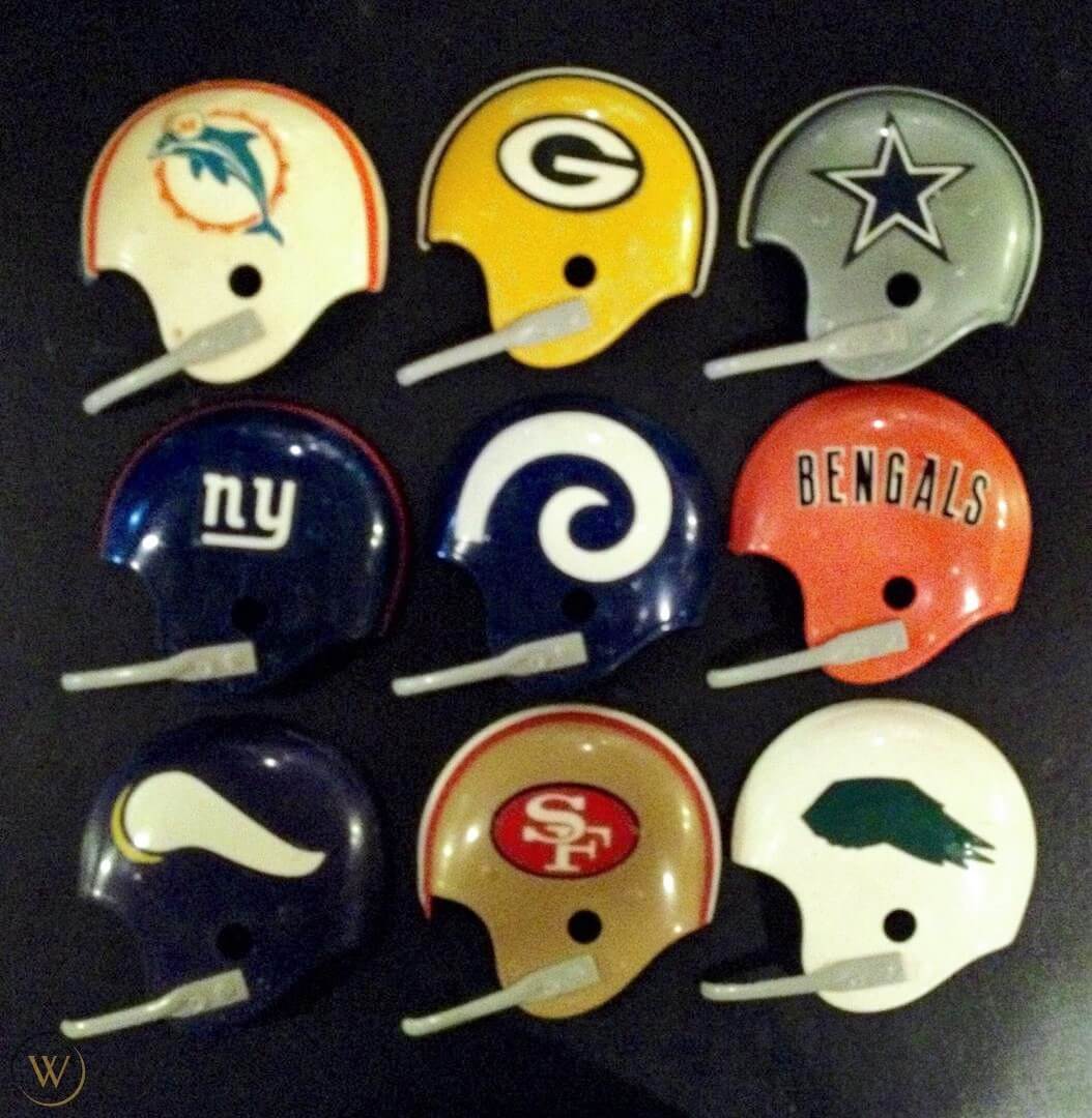
Is it me, or is the Rams’ horn backward in the hubcap helmet?
Don’t like that Chargers are wearing white pants…with most of them wearing all white socks, it is not a good look.
Yeah, I’m not a fan. Still look better than the Jags (with their white stripeless pants AND white socks/sleeves/tights). Waaaay too much white (shirts, pants, hats, socks) in this game, but the icy-white tight look is brutal.
1/16/83- Cowboys 37 Packers 26 at Texas Stadium in the NFC playoffs. The game would mark the 20th and final playoff win for HOF coach Tom Landry.