Click to enlarge
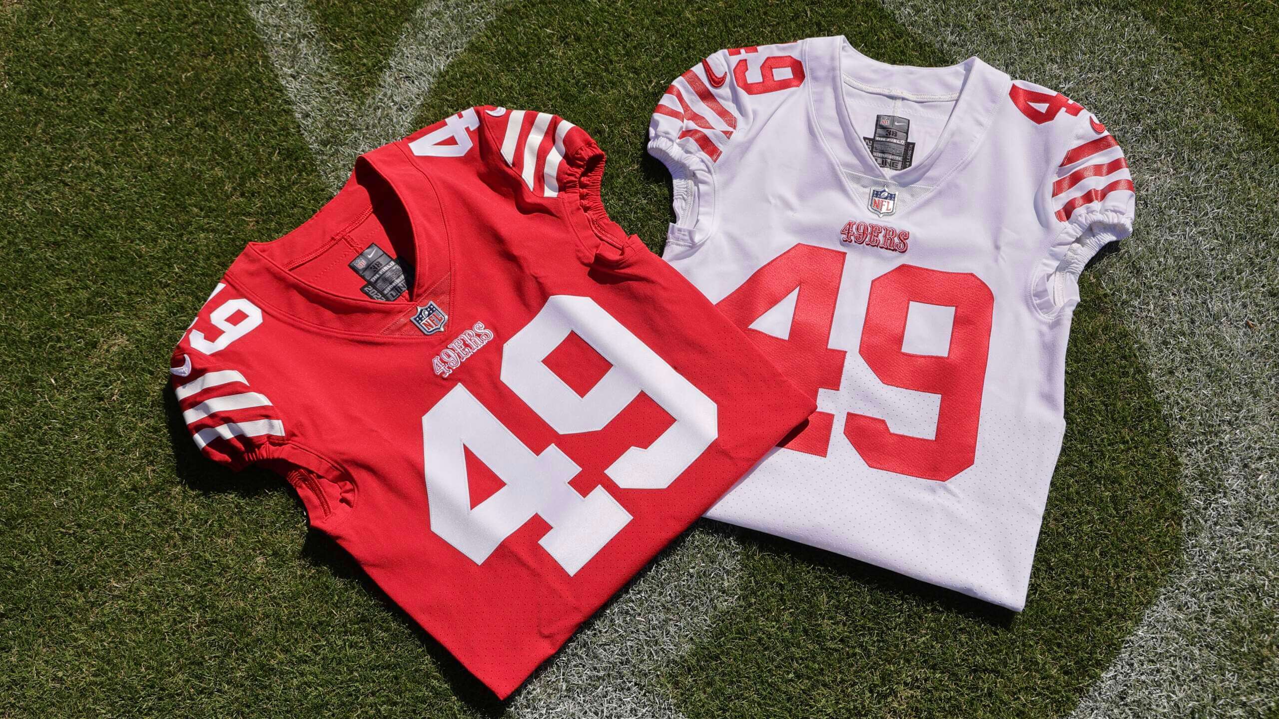
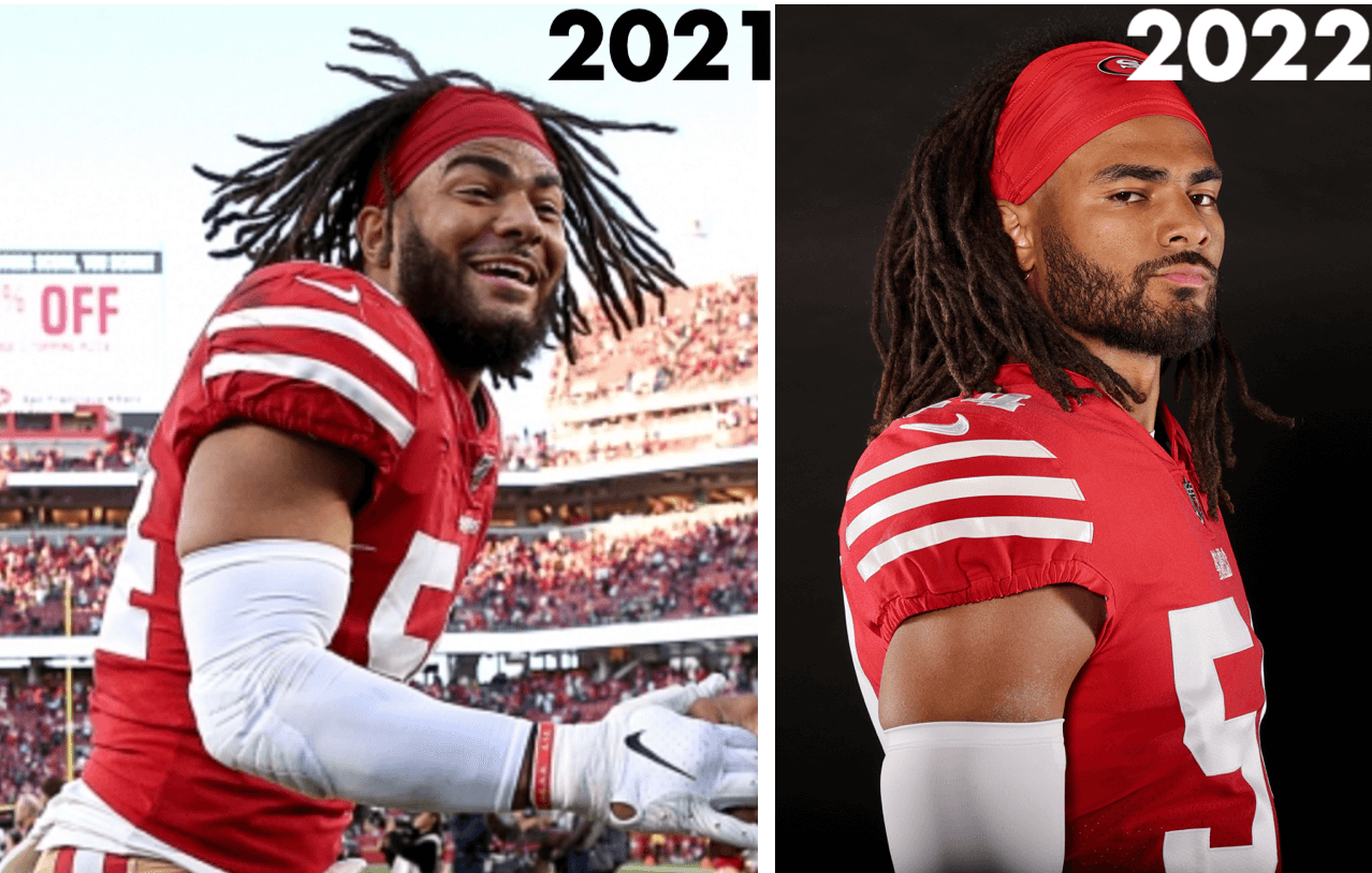
With the NFL draft set to commence this Thursday night, the 49ers yesterday announced a few tweaks to their uniforms. First, as you can see above, they’ve restored the third stripe to their sleeves and are also using their “Saloon font” logo as their chest mark.
They’d already been using three stripes on their throwbacks, so there was no reason not to do so on the primaries. An obvious upgrade — the only question is what took them so long:
There’s a good recap of the evolution of the team’s sleeve striping in this thread.
The new wordmark replaces the one that’s been in use since 2009, when the Niners went back to their current design motif:
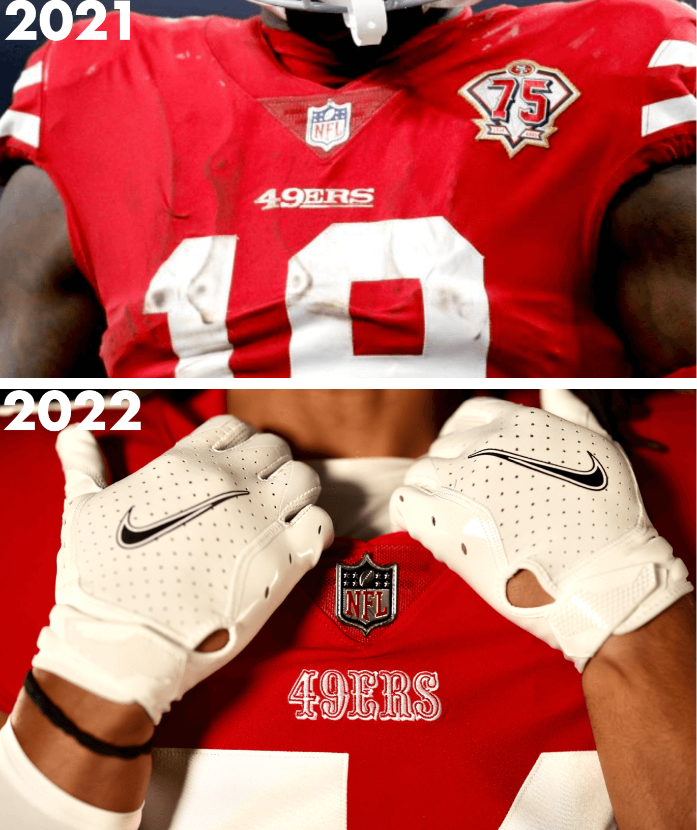
I’m slightly less enthusiastic about this change, especially on the red jersey. I like the Saloon font, but I don’t think it looks so great in white — I prefer it in red and/or gold. Speaking of which, it will now appear in red on the team’s neck bumper:
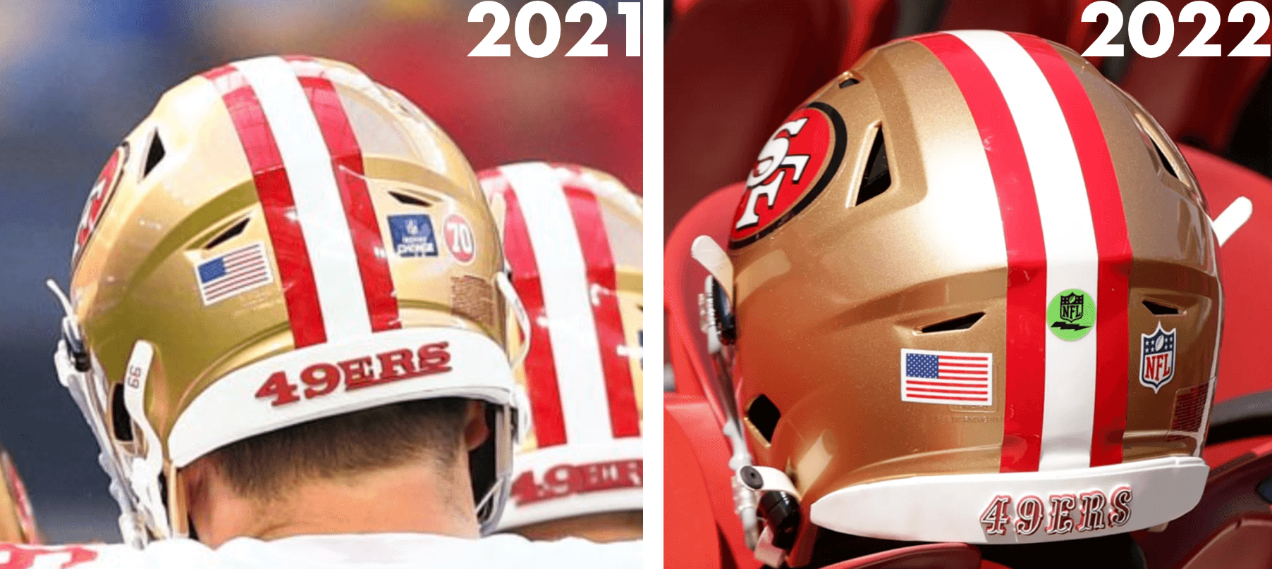
Meanwhile, now that the one-shell rule has been lifted, there’s also a chance that the Niners could go with a red helmet for their throwbacks this season, which would be historically accurate. Team exec Alex Chang mentioned that possibility last summer, although he didn’t commit to it. We’ll have to wait and see.
I’m not sure if any other NFL teams are planning uni changes for this season (I didn’t know these Niners tweaks were coming until a few days ago, when a team employee tipped me off), but if so, we’ll presumably see those changes announced in the next day or two, so they can have the proper jerseys on hand for the draft.
Click to enlarge
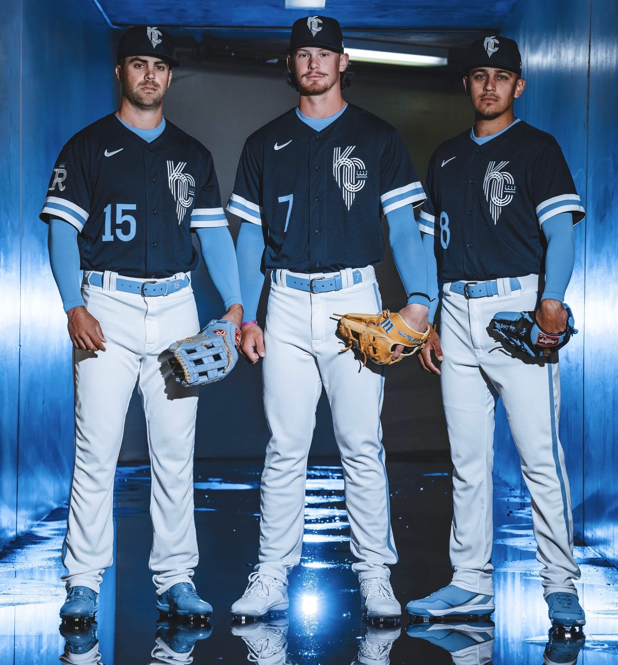
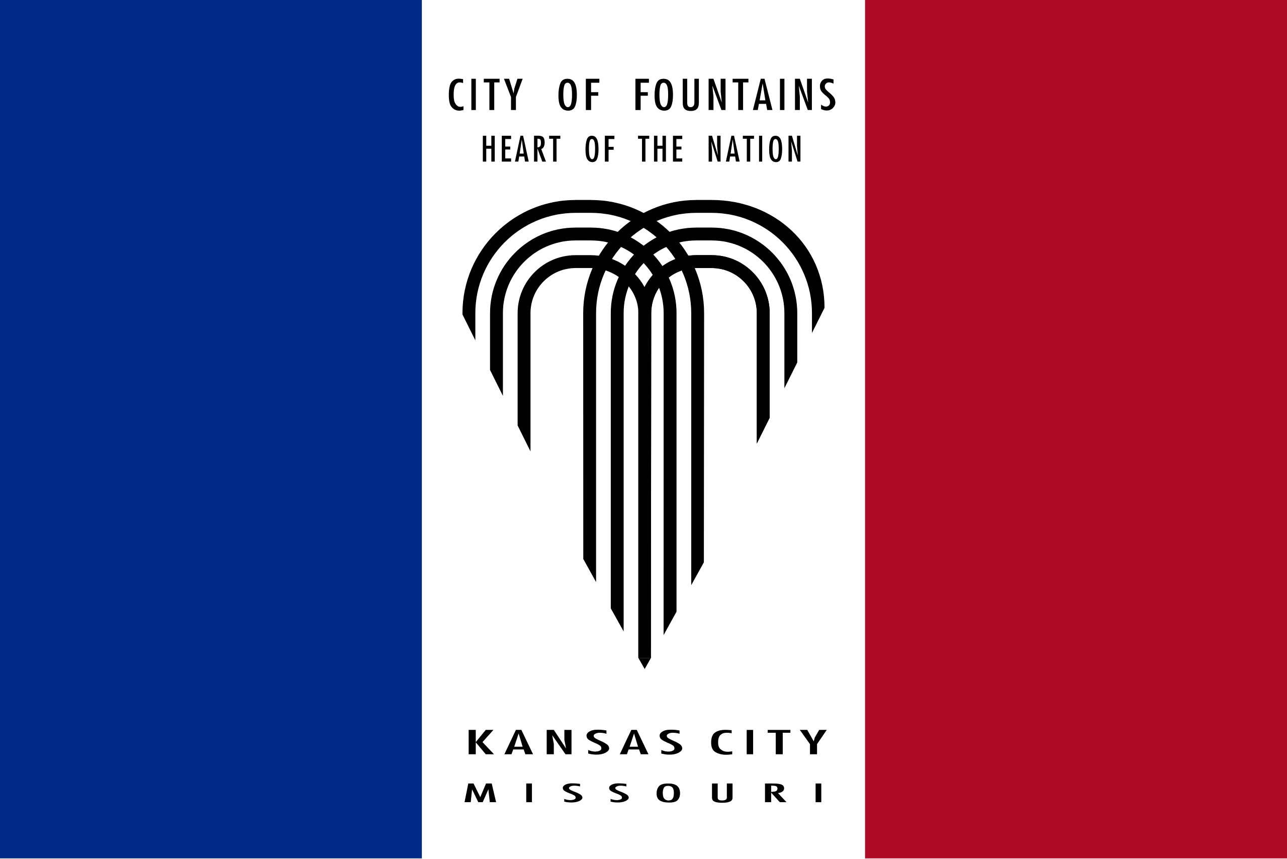
CC in KC: The Royals finally released their City Connect “City of Fountains” alternates yesterday, confirming earlier leaks. As we discussed last week, the cap and jersey logos are based on Kansas City’s flag:
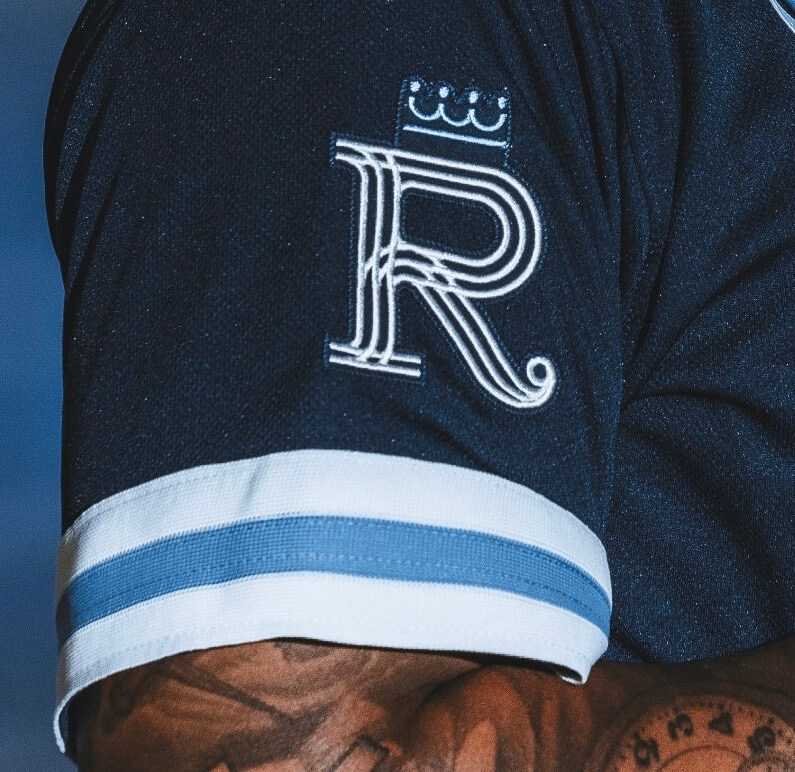
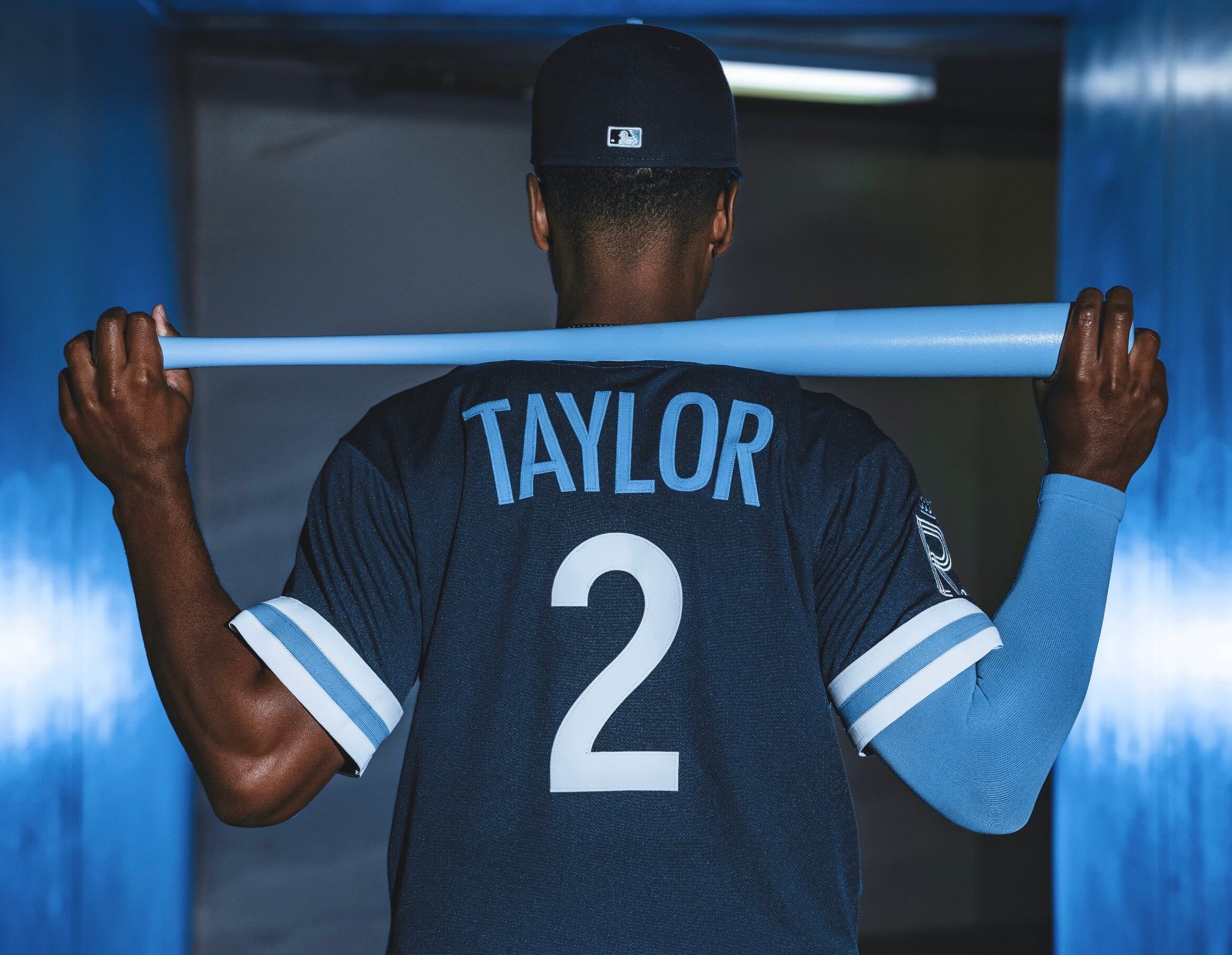
Here’s a closer look at the sleeve patch, along with the rear view:
Some thoughts:
• I really like the cap and would love to see a royal version of it (instead of navy) to be worn with the rest of the team’s uniforms.
• I also like the sleeve logo.
• I’m not nuts about the mix of blue shades. For me, powder blue looks much chalkier and less pleasing when worn against navy, so the jersey numbers, NOB lettering, and even the belts don’t work so well for me. (I feel the same way about the Blue Jays’ navy/powder alternate cap). I’d rather see white — or at least some white outlining — for the chest number and NOB.
• The trim on the sleeve cuffs looks too thick.
• Pants piping also seems a bit thick.
Overall: One of the better CC designs. Fun municipal concept, good logos, mostly cringe-free. I’m not nuts about the colors, but that’s just me — I have a hunch others may feel differently. The uniform will make its on-field debut this Saturday, April 30.
The next team unveiling a CC design will be the Rockies. Their CC uni is set to debut on-field on June 4, so the unveiling will presumably be a week or so prior to that.
For each row, click to enlarge
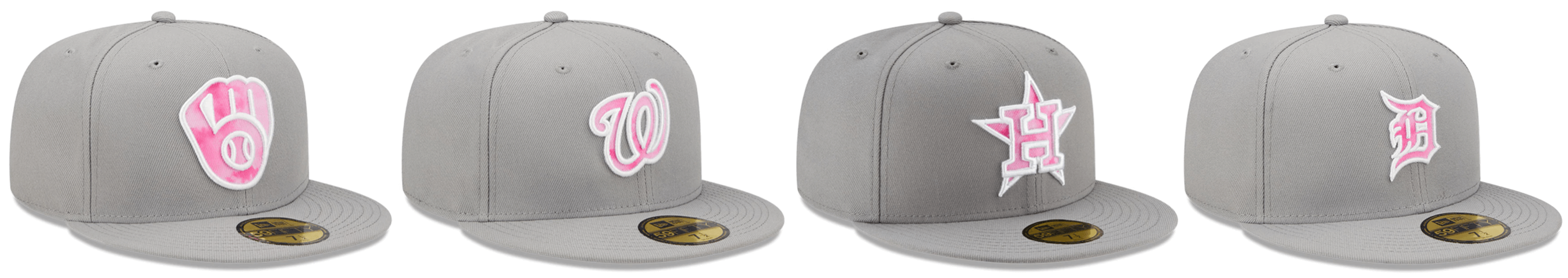
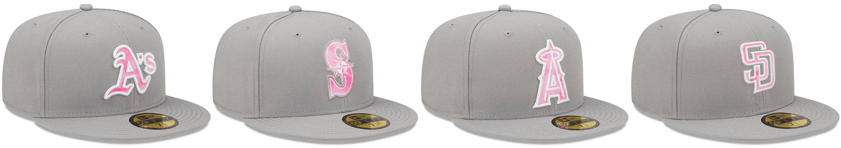
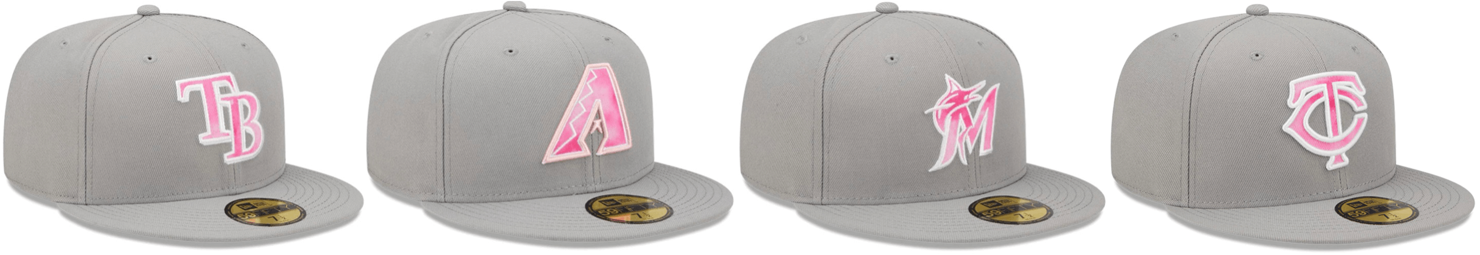
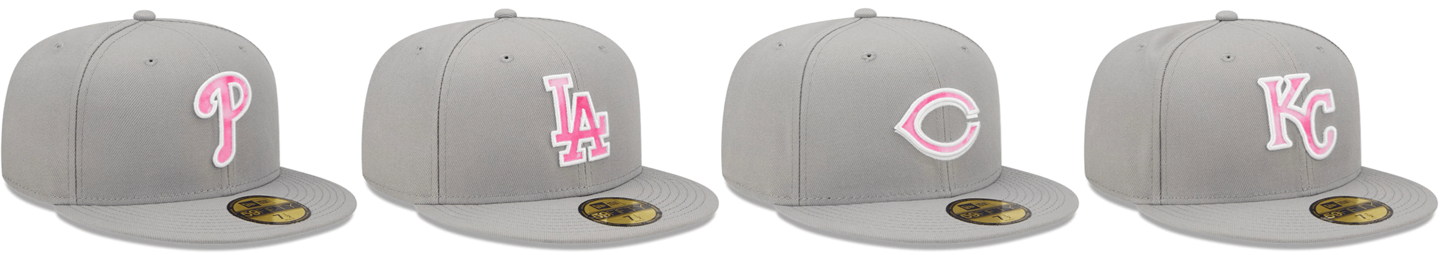
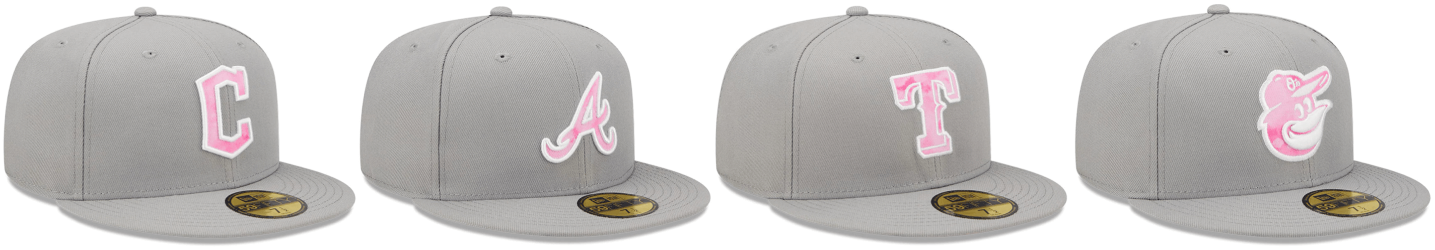
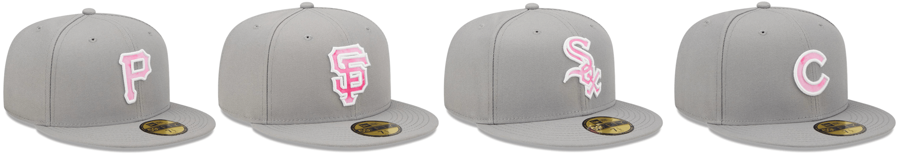
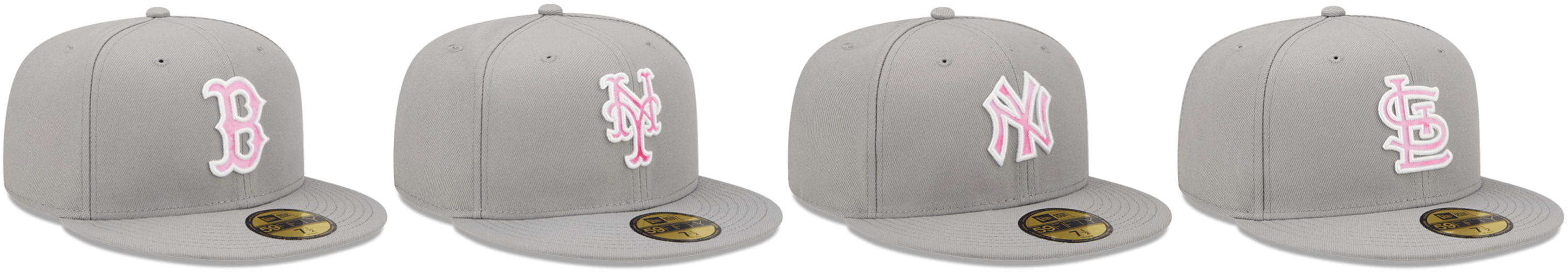
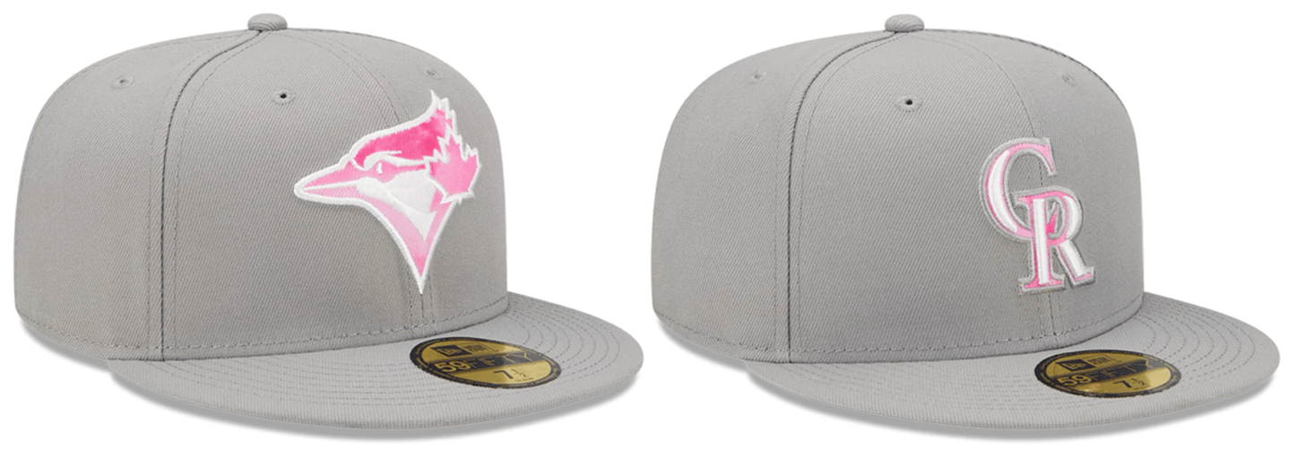
The usual slop: MLB’s Ma’s Day caps were unveiled yesterday. I don’t have much to say about them except (a) they look awful and (b) they’ll look a little less awful for teams wearing their road greys that day, since the grey caps will coordinate a bit better.
Mother’s Day is early this year — May 8. The caps will be worn only on that date, not for the full weekend. To my knowledge, nothing is planned for the jerseys except for the usual pink ribbon.
Click to enlarge
Collector’s Corner
By Brinke Guthrie
Follow @brinkeguthrie
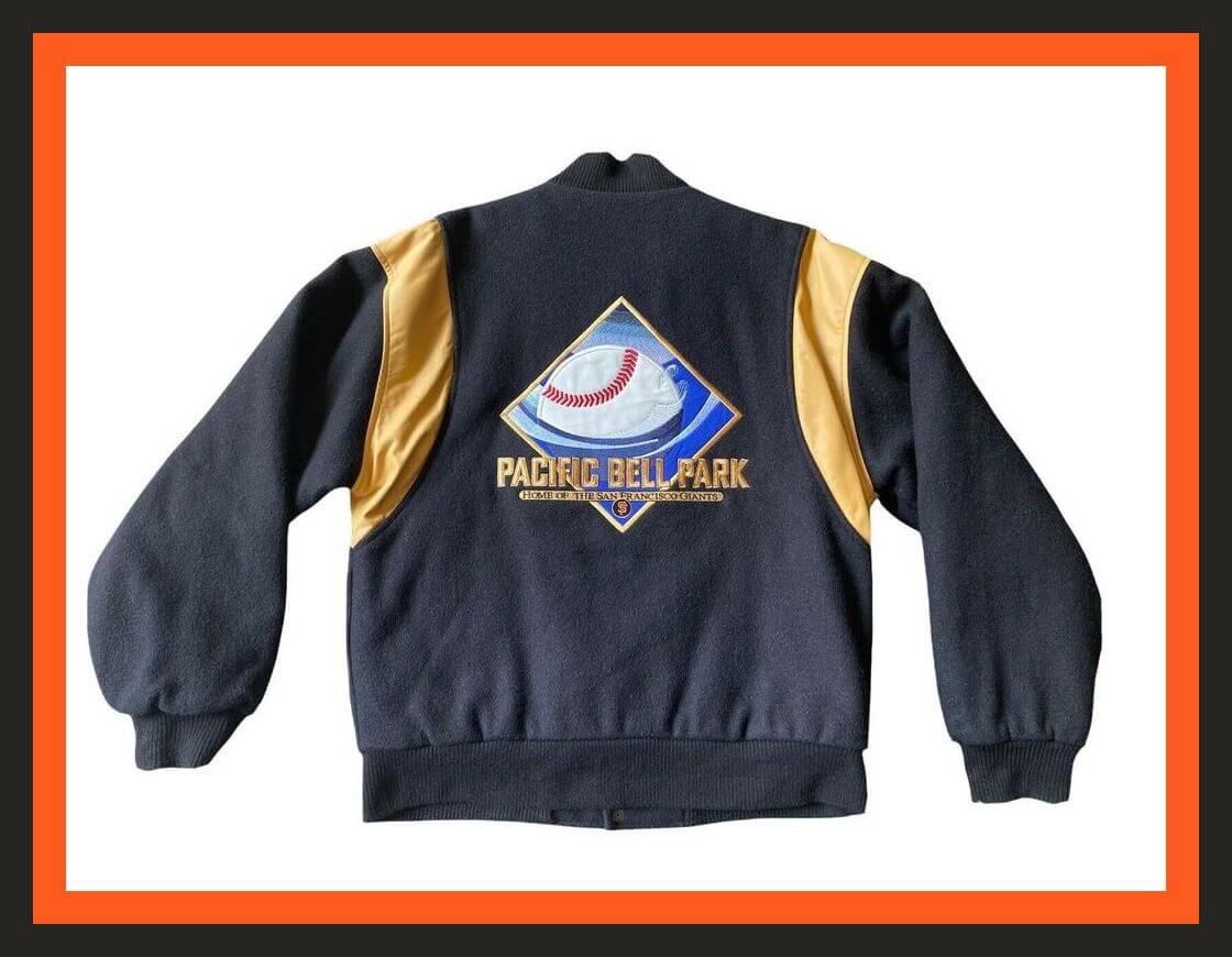
We all know I love a good varsity-style jacket, and here’s one from circa 2000, for the then-new home of the San Francisco Giants, Pacific Bell Park. I had this jacket! Great detailing, too — all wool, that patch on the back is all embroidered leather, the sleeve inserts are leather, and there’s an embroidered PBP logo on the front. (Got a deal on it, too — stopped by the park after work and it was on sale at a great price. Otherwise, it was prohibitively expensive. ) Here I am wearing mine with my wife at a Giants game, in 2002.
Here’s one more for that ballpark: a promo snowglobe sponsored by the ill-fated Enron energy company.
Now for the rest of this week’s picks:
• Back in 1971, there was this series of excellent MLB stamp albums. Each edition was called “Today’s 1971…” and then the team name. (Paul wrote about them two years ago.) I had one for the Reds — I’d remove the stamps and line then up on a table in their positions. Here we have one for the Detroit Tigers. Just 39 cents! (Also: See the pose of the baserunner and the catcher in the cover illustration? I stole those for this 1972 drawing I did of the Texas Rangers, who had just moved to the Dallas area. Amazing — it’s been 50-plus years!)
• This five-page Look magazine article about Chargers receiver Lance Alworth starts out with some classic writing of the 1960s era: “Charger Goes Groovy: San Diego’s Wide Open Receiver Plays His Own Swinging Game.” Sample quote from his coach, the legendary Sid Gillman, who was apparently disdainful of long-haired athletes of the time: “I object when you can’t tell the male from the female, and I hate beads.” Hmmm — I think he meant beards.
• Be the coolest kid on your Pittsburgh block with this 1977 Steelers BMX bike from Sears.
• Terrific box cover art on this 1973 Munro Pro League “Hot Shot Hockey” game. It also says “PRO-LEAGUE HOCKEY” on the side in that great block-shadow font you used to see.
• And speaking of block shadows, that’s Hugh McElhanney of the 49ers wearing one on the cover of the book The Golden Age of Pro Football: A Remembrance of Pro Football in the 1950s, by the great writer Mickey Herskowitz.
• You too can look like an NHL goalie, with this set of eight mid-1990s punch-out cardboard goaltender masks, sponsored by Kraft foods.
• You probably know that the great Lou Brock lent his name to the stylish Brocca Brella, but did you know he also endorsed Brocca Pop? It was his “favorite red pop!” (These two cans come without the soda, sorry.)
• Celtics fans, you’ll want this record album, Havilcek Stole the Ball, packed with “Exciting Highlights of Celtic Championship Playoffs, 1956-1957 and 1965-1966.” By the way, that Johnny Most 1965 Eastern Divison Finals call is noted here as being the “most famous radio call in basketball history.”
• This 1970s carry bag is white with green and just says “New York,” along with photos of current Jets players.
• Here’s a Kent brand football helmet that has been “modified” to “look like Green Bay.” I’ll give it an A for effort.
Click to enlarge
ITEM! Pin sale: I’m trying to clear out my remaining supply of Uni Watch pins. With that in mind, I’m running a sale for the rest of this week as follows:
- • One pin
• Any two
• Any three
• Any five
• Any 10 for $30
If you want more than 10, email me and I’ll give you a price.
Full ordering details here.
Click to enlarge
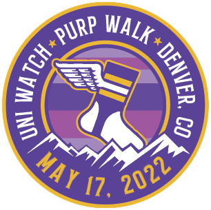
Purp Walk update/reminder: Plans continue to shape up nicely for this year’s Purple Amnesty Day (which which is three weeks from today!). Remember, if you plan to attend the Purp Walk party in Denver on May 17 and want to receive a T-shirt with the bonus logo on the back, you must pre-order your shirt by this Thursday, April 28.
If you have no idea what any of this is referring to, you can get the full scoop on Purp Walk 2022 here.
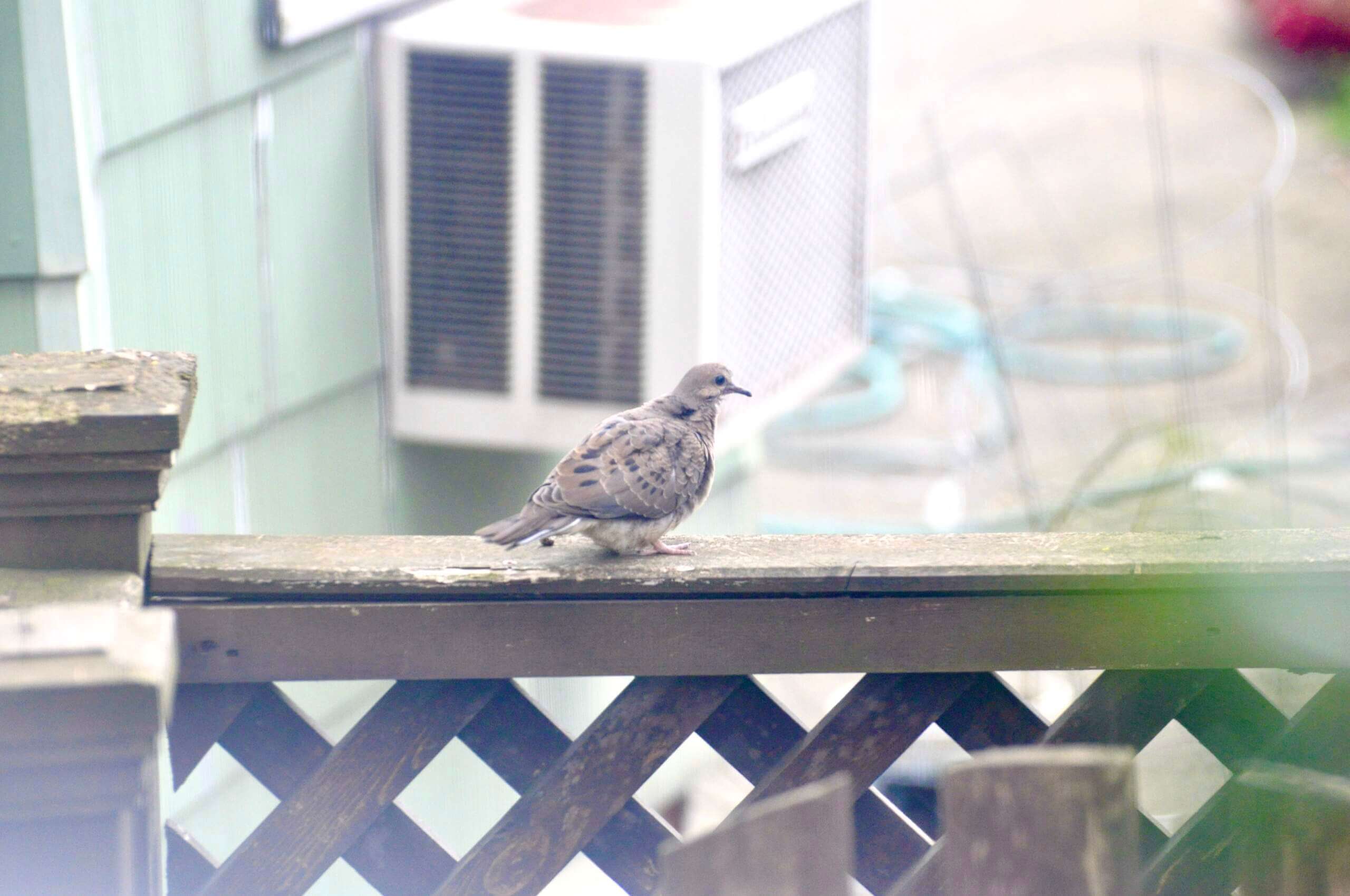
Click to enlarge
Surprise dove update: Turns out that the dove saga isn’t over yet! Yesterday we spotted one of the two fledglings perched on a fence in our backyard. Mary managed to get these pics:
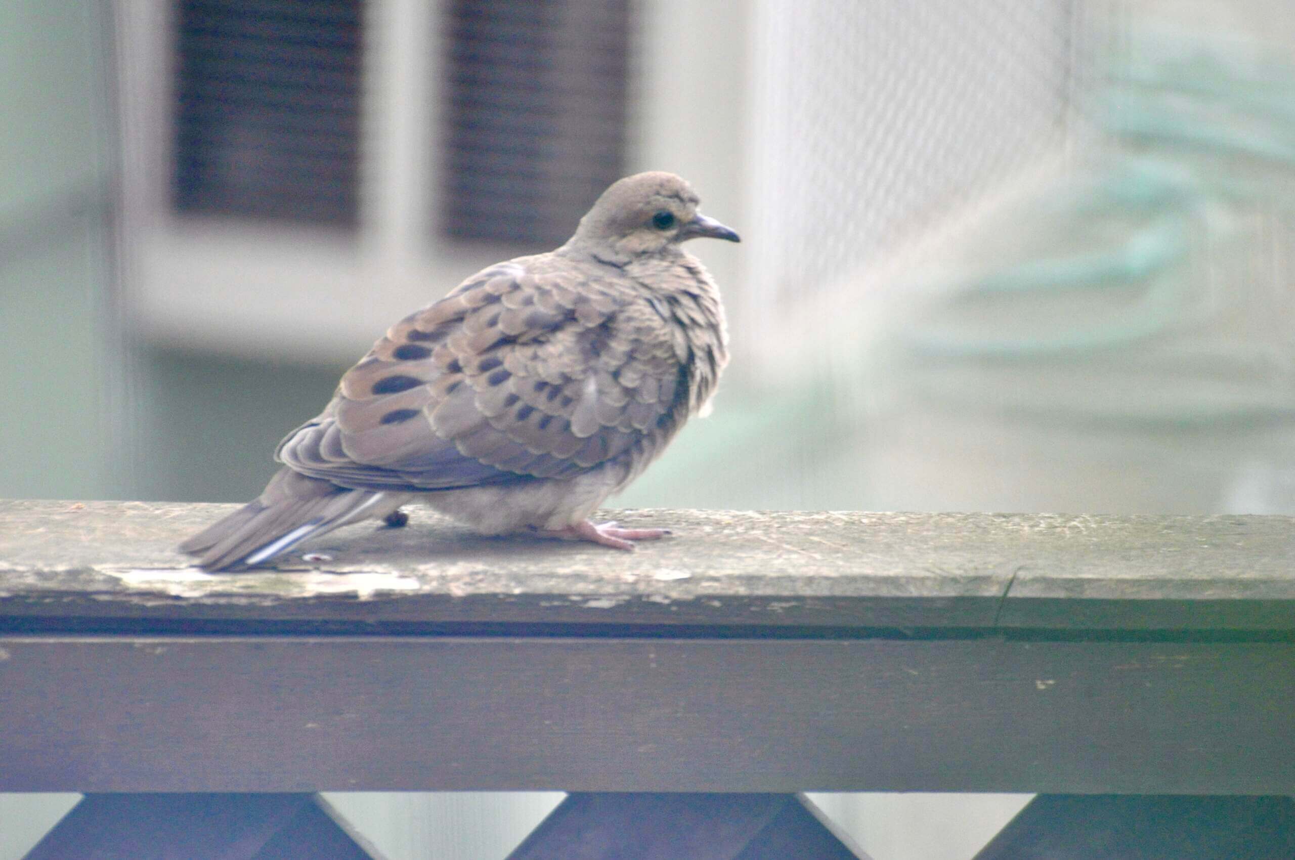
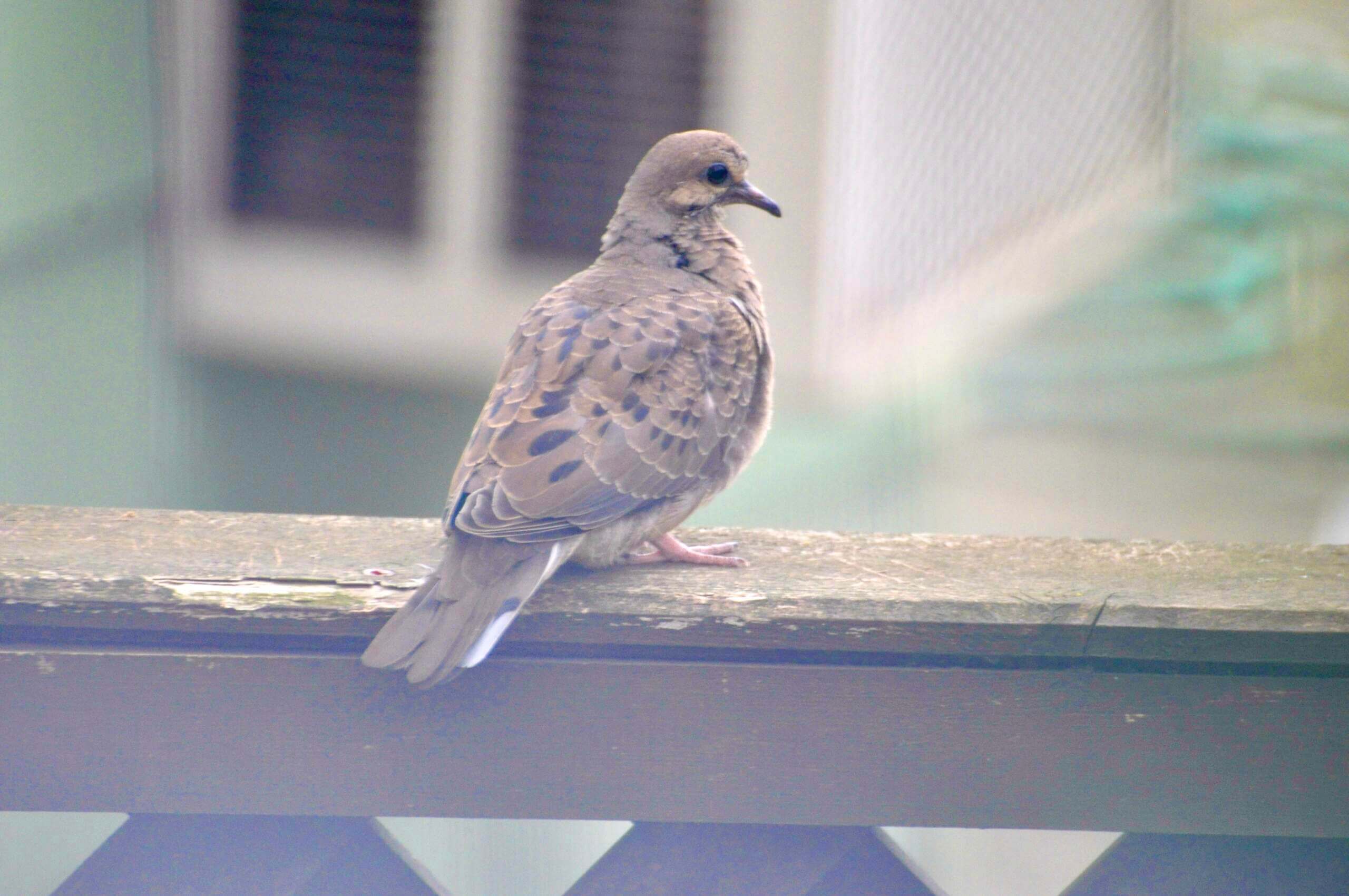
We’re usually not supposed to go into our backyard (we have the porch, the landlords, who live upstairs, have the yard), but I figured this was a special occasion, so I snuck back there and shot a bit of video until the fledgling flew away to a nearby utility wire:
So exciting to see it in flight! Feels like a nice bit of closure.
We’ve taken down the feeder for a few weeks because we don’t want the adults settling in for another brood. Had to be done, but we do feel bad about the fledgling coming back to its old neighborhood only to discover that the house where it grew up no longer exists. That’s life, kid.
The Ticker
By Alex Hider

Baseball News: Mariners OF Jesse Winker wore stirrups with four stripes on Sunday, while SS JP Crawford wore stirrups with just three stripes (from David Butler). … Reader Jim Gumm notes that back in the sansabelt era, the Orioles’ pants striping was inconsistent — sometimes black-white-orange and sometimes orange-white-black pants striping. … Matthew Blinco has a friend who picked up a T-shirt at an Atlanta record store with a Reds-inspired logo. … Trevor Williams has a Guardians pennant that he says appears to be rendered in dark grey and orange instead of red and blue. “Have seen some baseball cards that had orange instead of red due to ink issues. Production error or unused colors?” Trevor asks. … Here’s an early-season breakdown on the Red Sox’s record by uniform (from @ASFreed). … The Altoona Curve, the Pirates’ Double-A affiliate, will wear “Mountain City” jerseys every Thursday as a callback to the club of that name that briefly played in the Major League Union Association in 1884 (from Robert Brashear). … The Sugar Land Space Cowboys, the Astros’ Triple-A affiliate, will give away pink replica jerseys for Mother’s Day on May 8 (from Ignacio Salazar). … New mascot for the Regina Red Sox of the collegiate summer Western Canadian Baseball League (from Wade Heidt).

Football News: A Lions blog is asking fans what they would change about the team’s uniforms. No fair saying, “The players wearing them” (from Phil). … Some new uni number assignments for the Broncos . … The next two items are from Kary Klismet: Pikeville High School in Kentucky has unveiled its 2021 state championship rings. … Nebraska’s Memorial Stadium has new turf.

Hockey News: The Canucks will wear their black Flying Skate unis tonight (from Wade Heidt). … Twitter has a new emoji for tweets tagged with #StanleyCup (from @tommy_cubillas). … For some reason, the Predators refer to their season ticket holders as “citizens” (from Shawn Hairston). … Here’s more on the lawsuit that alleges Adidas used false advertising practices by marketing some of their retail jerseys as “authentic” (from Phil).

Soccer News: The Washington Spirit of the NWSL have unveiled their 2021 championship ring design after posting a teaser over the weekend. The team also announced plans to unveil a championship banner at their home stadium during an upcoming game (from our own Jamie Rathjen). … The next three items are from Kary Klismet: New away shirts for Shanghai Shenhua FC of the Chinese Super League. … New third kits for Hungarian side Ferencváros. … New 100th-anniversary jerseys for AC Trento of Italy’s Serie C. … Chicago Fire FC are giving away replica basketball jerseys at their match on Saturday (from Seth Foster).

Grab Bag: I think this made the Ticker a few months ago, but in case it got overlooked: After the Space Force unveiled its uniforms late last year, the branch promised to better tailor guardians’ pants (from Jon Vieira). … F1 racing team Williams has tweaked their cars’ liveries this season to replace some blue paint with carbon fiber in a bid to make the car a bit lighter (from Brad Dooley). … New test cricket uniforms for England (from James Welham).
Space force personnel are called GUARDIANS?
So they are taking cues not only from Star Trek and Battlestar Galactica but from The Handmaid’s Tale as well?
Same as the baseball team, yo: Margaret-Atwood-inspired dystopia in Cleveland.
Re: Niners Red Helmet Throwback.
In this case the fauxback with the gold helmet is actually a throwback to its original use as a fauxback during the NFL’s 75th season (and SB winning season for the Niners), so it does have a weird sense of legitimacy. And given how synonymous the gold helmet is with the Niners now, I think I’d rather them keep it that way.
Re: Royals Alternates
Probably one of the best city designs simply because they avoided over designing it. Agree that the stripes are comically large, and that the navy really doesn’t fit. There are no reasons for navy other than: 1 being more notably different than their usual sets and, 2 navy having more contrast to baby blue than royal blue does.
There is a reason for the navy. The Athletics wore navy when they first came to KC. The KC Blues minor league team also wore navy. So I think it’s a nod to the baseball history of KC.
“Turns out that the dove sage isn’t over…”
FYI.
Thanks. Fixed.
“Brocca Bella” I though he was in Montreal as John Boccabella! #Expos
Re: the Mother’s Day caps, either the Twins are adopting the A’s logo, or their cap is missing from the graphic. Curious if they’ll revive the 90’s ‘M’ logo they used for Spring Training, or stick with the ‘TC’ logo.
Good catch. Third row of caps now fixed.
In the Mother’s Gray section, you got the A’s cap twice with no Twins. Thank you for sparing us Minnesota fans!
Fixed.
49ERS: 3 stripes coming back is a plus, never should have changed and I never understood the argument about space on the sleeve caps. Just admit that it was an unpopular idea and leave it at that. I like the historical wordmark but I think the current wordmark is clearer, especially without the shadowing.
ROYALS: Meh. The sleeve stripes are thick but it is a slight homage to the Sansabelt Era. I like the navy/light blue but this team should be royal blue. The NOB font and number font don’t match, which is odd – say what you want about the Steelers and the italicized Futura font (instead of Block Varsity), but at least they were consistent with a unique font. The Royals went with 2 untraditional fonts that are kinda-close-but-not-close-enough to be used together. Like the “KC” monogram as a one-off but it isn’t good enough to replace the usual KC monogram.
MOTHER’S DAY CAPS: Yawn.
DOVES: Nice epilogue, just when it looked like the story was over. Maybe THIS is what it sounds like when doves cry…?
I’m personally not a fan of the 49ers saloon font, so take these two comments with a grain of salt.
(1) The saloon font is hard to read when it is small. It works better in an end zone than on a chest mark or neck bumper.
(2) The SF helmet logo is not in saloon font, so why have two different serif fonts on the helmet?
Accident of history? I mean, the Bears and Giants helmet logos are a different font than their wordmarks, and it works for them. Perhaps the 49ers see the “SF” not as a word, but simply part of a logo they’ve had on their helmets for 50-plus years, and aren’t going to change it because NFL Properties came up with the Saloon Font wordmark in the 70s (and which they have also decided to return to due to it’s history).
I’m a big fan of the Canucks flying skate uni, but I wish they’d fix the logo they currently use. From 1978 to 1997 (as well as a 2016 throwback), the area above the “S” in Canucks was white, not black. The white should run the length of the word. I’d heard they were fixing it for this season, but then they didn’t.
2022: link
2016 throwback: link
Just a clarification… The Canucks have worn the incorrect logo for 2 seasons now, 2021 and 22.
Also, The URL of the 2022 photo looks like it’s dated 07/2017 but it’s not. The photo was taken during the 7-0 victory over the Calgary Flames on February 24, 2022.
Yes true it has been the 2 seasons. The Canucks did take a break from the Flying Skate in 2021 during the year they had Reverse Retro. The other season with logo as you mention with these Adidas jerseys was 2019-20.
Of note on the 1985-89 Canucks jerseys with the V on the shoulders, the area above Canucks in the logo was in yellow.
link
link
Yeah, I got a bit wrong. I’ll blame it on writing first thing in the morning, lol. Thanks for the corrections. I of course meant they have worn the wrong logo the 50th season (19-20) and this year (21-22).
I was aware that the Canucks wore a yellow background in the uniform logo from 1985-89 but should have mentioned that. In any case the (yellow) line extends over the S even in that version of the logo.
The team did actually still use the white-backed logo during 1985-89 on the ice and in other media, just not on the uniform. I followed them even then and noticed this. They did use the yellow-backed logo on some media guides.
White-backed logo on the ice during a 10/13/86 game: link
“I feel the same way about the Blue Jays’ navy/powder alternate cap”–link goes to image with the words “image coming soon”
Fixed.
KC CC – “Chest Number”?? More like stomach number. If the number were on the same plane as the logo, I would like the jersey better. As it is now, it’s a C+. Outline the number in white and put it on the same plane as the logo, then my grade changes to a B+.
Graphic Design 101: The chest number should rest on the baseline of the team insignia. That’s why the Reds’ number is high up, and the White Sox’ number is low down.
Proof Reading: “Some new uni number assignmnts for the Broncos”
Was glad to see yesterday that the fledglings returned, ever so briefly. As you said, great closure to a neat story.
Got it.
Those mothers day hats all in rows like that look like when something is sold out online and greyed out to show you can’t click on it.
On a related note, my lukewarm take for the day: I would rather a whole bunch of crazy City Connect uniforms than these league-wide holiday promotions. Give me wild designs over every team looking exactly the same.
Instinctively I moused-over the image to see if the full-color photo would show. LOL.
It reminded me of an old TV set with some burnt-out part that needs replacing, but that’s also a good one!
49ers should put the chest logo and Nike checks in gold.
If I were the owner of the Lions and as incompetent as the Ford family is, any day that the fans aren’t in revolt trying to run me out of town would be a good day.
I think beads is correct, as in love beads.
So glad the 49ers have returned the 3rd stripe to their jerseys.
If the red helmets are used for the throwbacks, that would be good…but I’d rather they retire the ’55-’56 look and replace it with the ’57 road set.
The IIHF U-18 World Championship (which, I guess, is different from the World Junior Championship) is starting up this week in Germany. The IIHF, as per usual, is allowing the national governing body logo of hockey federations on the front of their jersey rather than generic wordmarks or flags which were seen during the Beijing Olympics
World Juniors is U20.
Ok…That Criminal Records T-shirt is great!
I applaud the Niners’ changes, but wish the would’ve used some gold on the wordmark for the red jersey. I also would’ve liked to have seen the sock striping make a return.
Kudos to KC. While it does have some flaws, the CC uniform isn’t bad at all.
Early look at the armed forces hat design
link
Sigh. So a combination of both stolen-valor cosplay and flag desecration. I guess it’s a useful reminder that no matter how bad a thing is, it can always get worse.
I’m just happy the 49ers have finally settled on using one wordmark. It’s always bugged me the last few seasons seeing them using the saloon wordmark painted on the endzones and the “modern” 49ers wordmark on player jerseys, hats, sideline apparel etc.
I’m glad to see SF bring back the 3 stripes on the sleeves. In my eyes they’ve always had a classic uniform even with all the little tweaks over the years.
I’m surprised about the comments in that Lions link in regards to the WCF perma-memorial. I know a lot of fans who would like it gone as well as the Ford family ownership. That was the second-worst thing to happen on November 22, 1963.
I like that the KC CC uni didn’t go overboard. It’s simple enough with minimum storytelling. I really dig the cap and will probably add it to my collection.
Interesting development for Vancouver Canucks game tonight. Whenever the Canucks wear black Flying Skate uniforms, the goalies have matching masks and equipment.
Tonight, due to unfortunately circumstances, the Canucks needed to call up their AHL goalies. Spencer Martin staring tonight. Going to see the goalies with blue and green masks/equipment while wearing the black/yellow/salmon uniforms.
What took them so long? (49ers’ jersey changes):
A: the NFL’s policy on forcing teams to wait 5 years in order to make changes to jerseys, no matter how subtle/small (the Niners last changed to 2 sleeve stripes in 2017)