
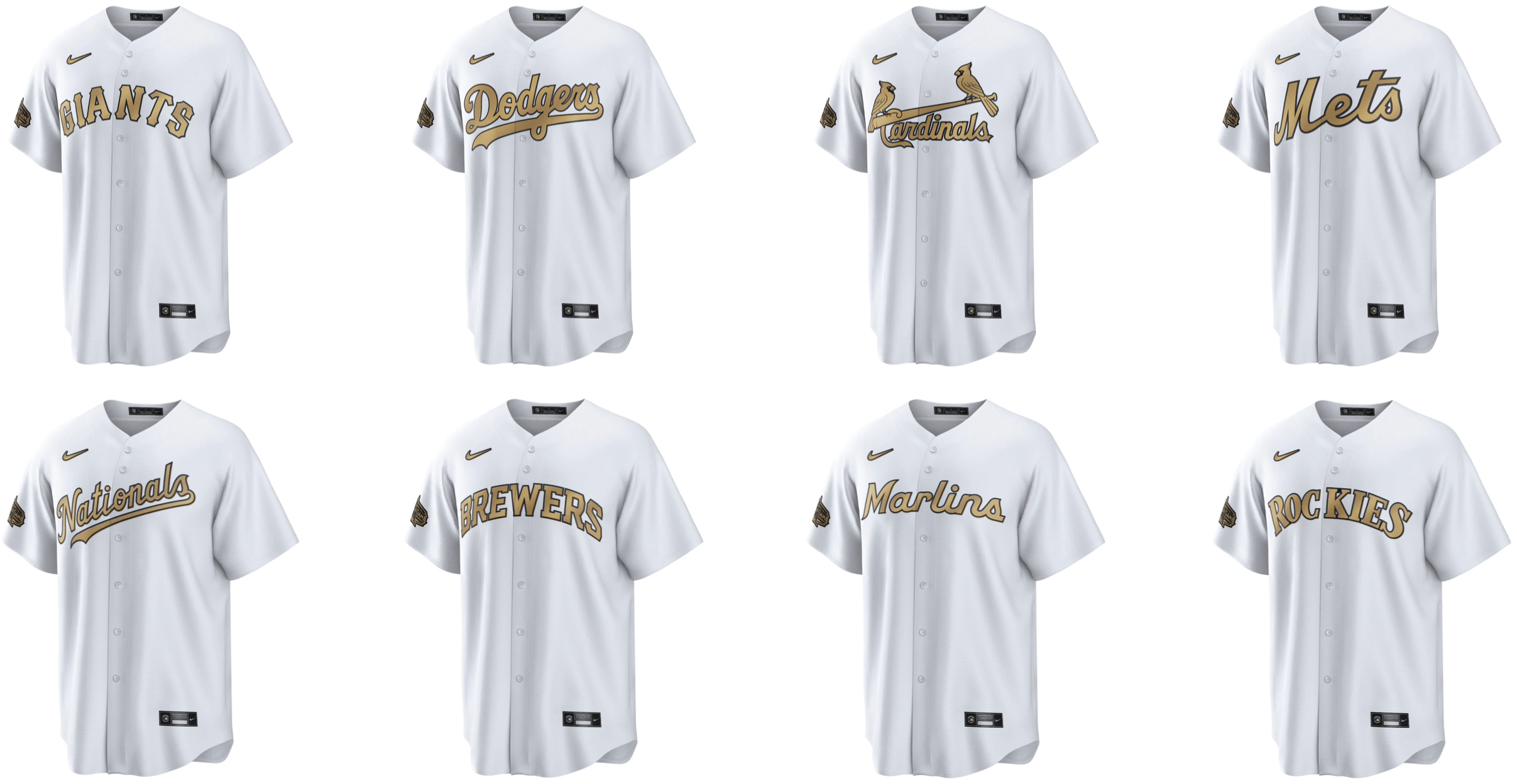
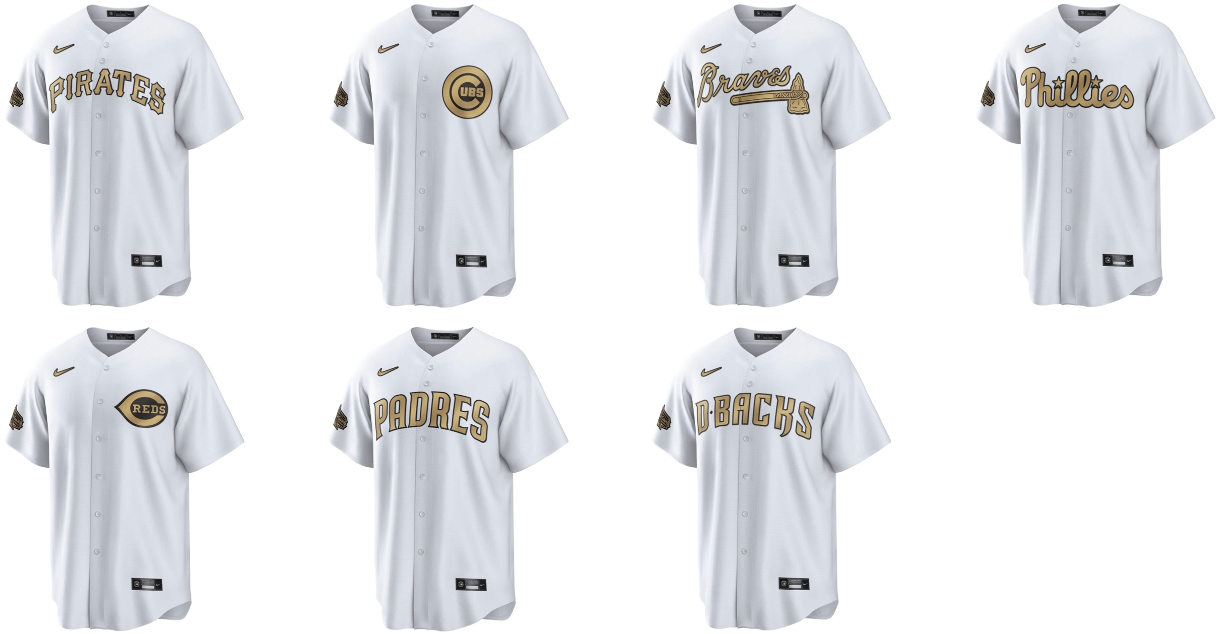
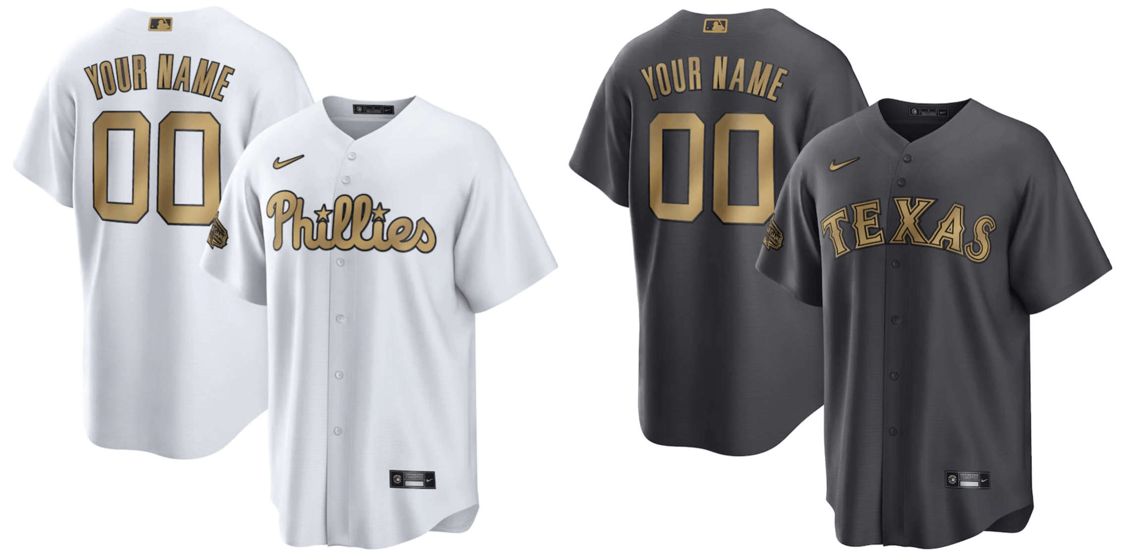
After a series of leaks and teases, MLB finally revealed the full set of All-Star Game jerseys yesterday. (The caps, as you may recall, came out about two weeks earlier). The game is being played in Los Angeles this year, which means the National League is the home team, so they’re wearing white:
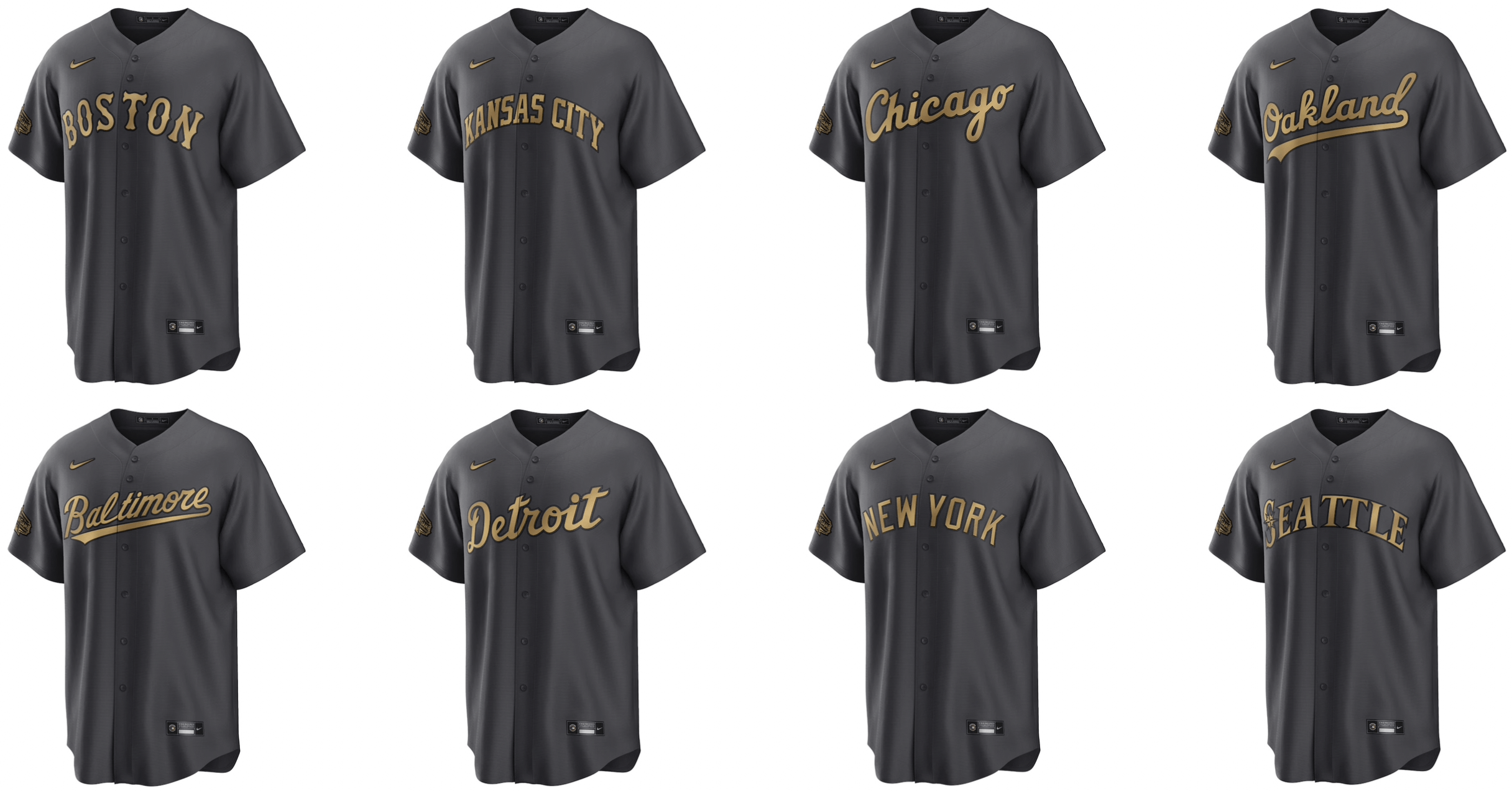
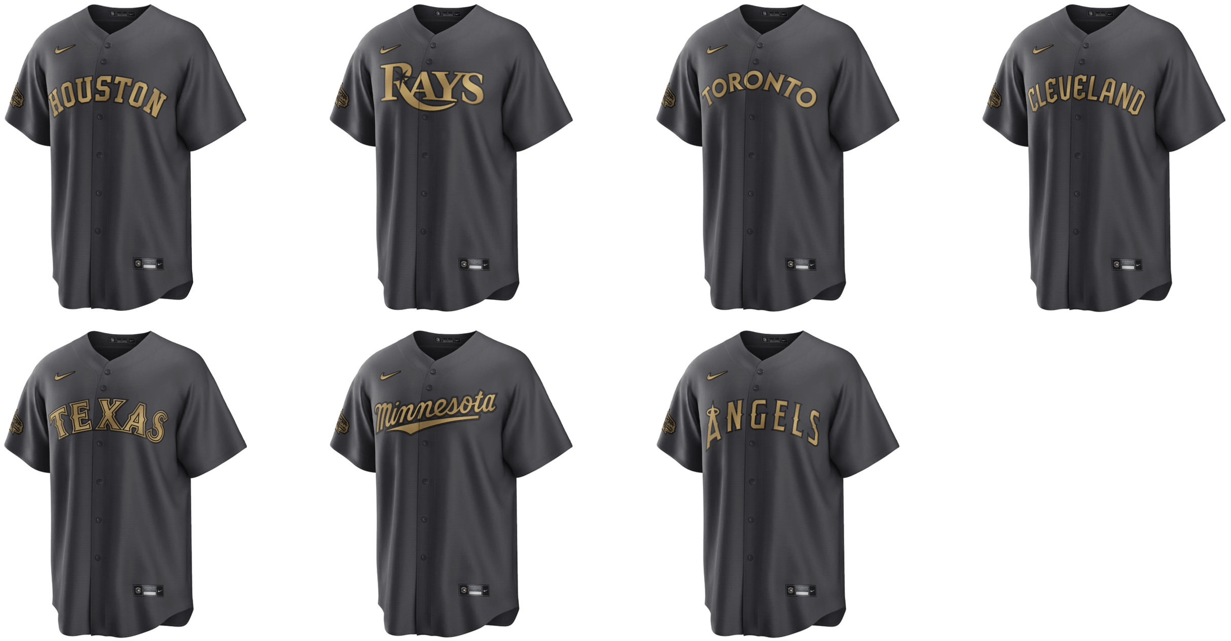
As the visiting team, the American League is wearing grey BFBS:
Is this better than last year’s costumes? Sure, but that’s really just another way of asking, “Are they total shit?” The more relevant question is: Are they good? Personally, I don’t think so. Here are some reasons why, along with a few other observations:
• I hate, hate the AL’s BFBS jerseys. Even worse, SportsLogos.net says the pants will match the jerseys, so this will be a mono-BFBS uniform. Woof!
• As I mentioned last week when the Marlins’ All-Star jersey leaked, I don’t like the use of gold here, because it’s too close to the gold-trimmed jerseys that defending World Series champs wear. Here, for example, is a comparison between the Giants’ 2011 championship jersey (on the left) and their new All-Star jersey (on the right):
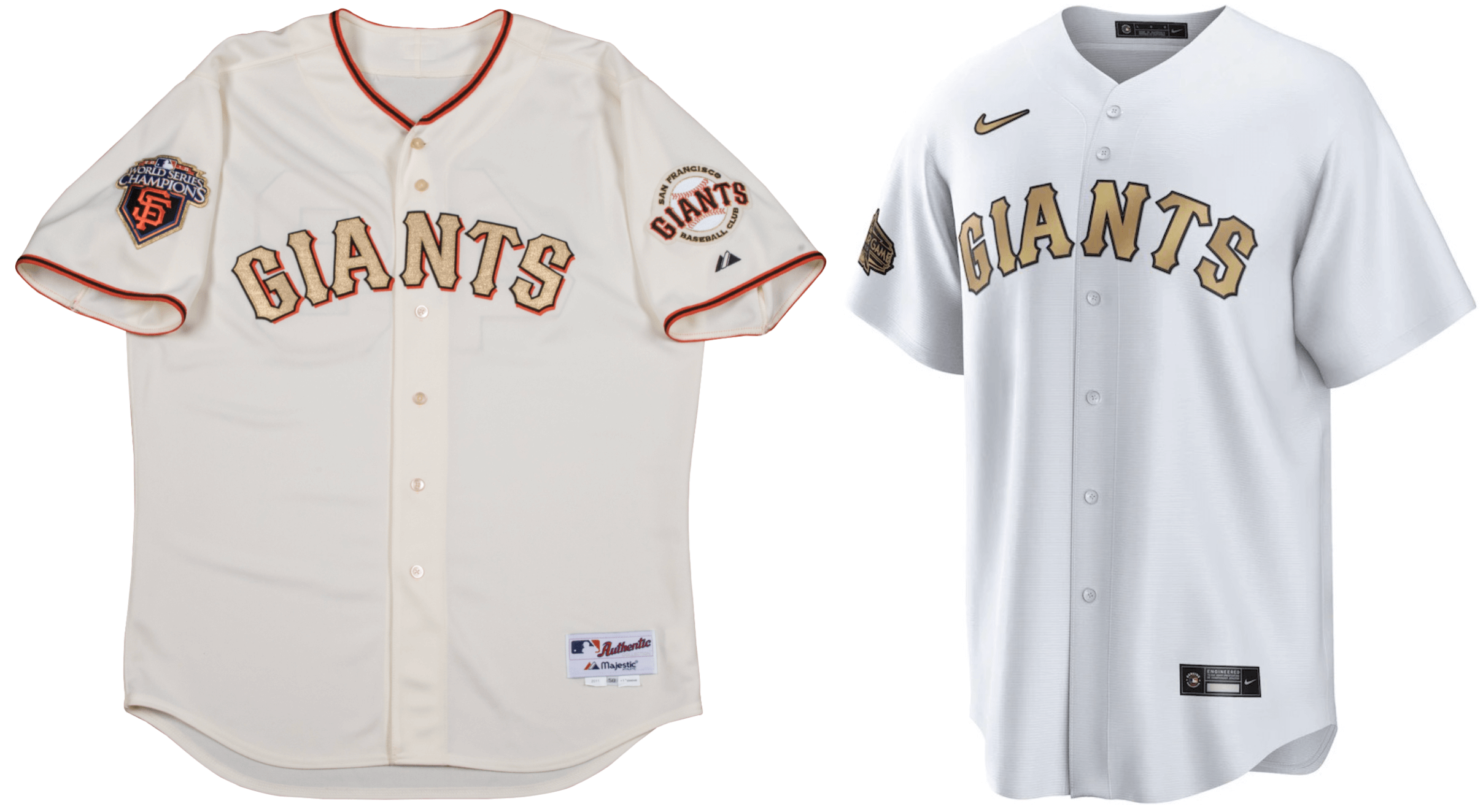
Obviously, they’re not exactly the same, especially to people with practiced eyes like ours. But they’re way too close, because the concept is way too close. Save gold for the World Series champs.
• No pinstripes, even for NL teams that normally wear them (Mets, Cubs, etc.).
• The Blue Jays’ distinctive split lettering isn’t split.
• The Rays’ sunburst is now more of a black hole.
• Little contrasting details, like the stars on the Phillies’ script, are no longer contrasting.
• St. Louis’s gold cardinals look ridiculous, like a bronzed statue or something.
• The mock-up images don’t include front numbers (grrrrr), but I think it’s safe to assume that the Dodgers’ front number won’t be red, which will look really weird.
• Will the Yankees’ All-Star jerseys have NOBs? this replica jersey has one, but so do some regular Yanks replica jerseys, so it’s hard to be sure. (If we could look at an All-Star retail authentic, that would be more definitive, but they don’t appear to be selling those, or at least I couldn’t find one.)
• Similarly, all the jerseys are shown with the same rear-number and NOB default fonts, instead of the team-specific fonts — but again, maybe that’s just a replica thing:
———
So, all in all: An upgrade from last year, but still nowhere near as good as just letting the players wear their regular team uniforms.
Click to enlarge
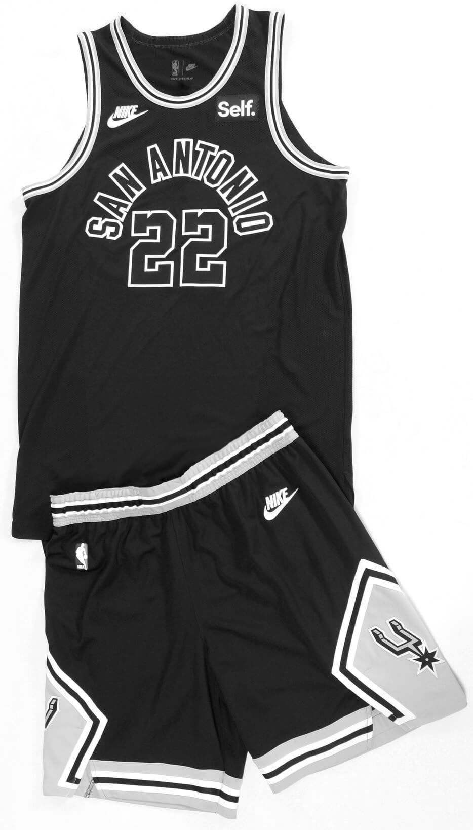
New Spurs throwback: One of the NBA’s worst-kept secrets became official yesterday, as the Spurs announced that they’re adding a new throwback this fall as part of their 50th-season commemoration.
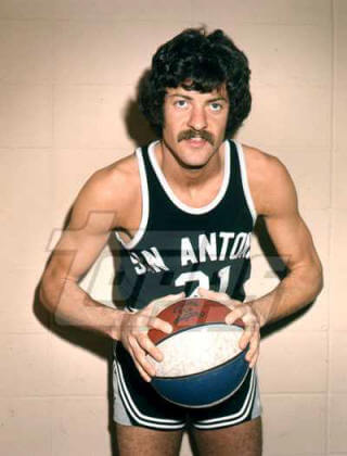
Interestingly, the Spurs didn’t wear this design for their 1973-74 debut season (back when they were still in the ABA and had just moved to San Antonio after playing the franchise’s first six seasons as the Dallas Chaparrals). For that first season as the Spurs, their road jerseys had white lettering:
They didn’t move to the black-on-black lettering until the 1974-75 season, but they kept that design for eight seasons, including the George Gervin glory days, so it tends to be more fondly recalled than the inaugural white-lettered version. That’s presumably why the black/black version is getting the throwback treatment.
Click to enlarge
Collector’s Corner
By Brinke Guthrie
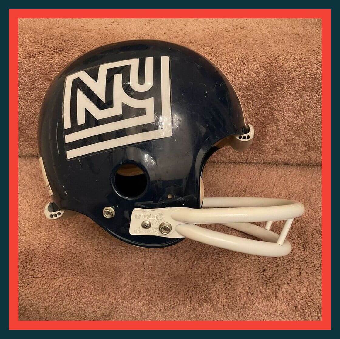
As we edge closer to the start of NFL training camps, it’s a good time to revisit the New York Football Giants’ “disco logo,” as seen on this vintage Trojan helmet. They wore this logo for only one season — 1975 — before switching to the better-known “Giants” logo the following year.
Now for the rest of this week’s picks:
• Is this cover art for the 1995 New York Jets media guide really the best they could do? Seriously? I’d love to see the art that didn’t make the final cut!
• Hey, Jets, here’s how it’s done: Great artwork on these Atlanta Falcons guides from 1982 and 1977.
• Another Jets-related item here: Franklin was the maker of this 1970s Joe Namath T-shirt “shirsey”/helmet set.
• The great Mickey Mantle and fitness expert Bonnie Prudden endorsed the Isometric Minute a Day Gym. “Just one minute a day will give you the muscles and physique of an athlete!” Sure, sounds reputable.
• Herbert Garrett Jester was a “Bona-Fide White Sox Rooter” for the 1951 Go! Go! White Sox! club, as shown on this membership card.
• Bonilla, Mattingly, Ripken, and Biggio are the players featured on this set of 1992 plastic baseballs. For Mattingly, that means you get a Donnie Baseball baseball!
• Moxie soda (not root beer, as the seller mistakenly claims) sponsored this 1920s baseball scorecard.
• This 1938 tin of Sport-Grip contains “hardened pine tar-like contents.” Seems like the kinda sticky stuff that MLB umps currently check for!
• Check out this set of National League Green Books from 1977, 1978, 1979, 1980, and 1983.
• From 1970, this Dunkin’ Donuts bumper sticker features Cubs catcher Randy Hundley.
Next-to-last day: The deadline to enter our latest design contest (to create MLB All-Star uniforms that don’t suck) is tomorrow, so get those entries in while you still can! Full details here.
The Ticker
By Alex Hider

Baseball News: Atlanta was doing another World Series replica ring giveaway last night, so they once again wore their gold-trimmed uniforms. … Miami is one of four cities that will host the 2023 World Baseball Classic, so the Marlins celebrated by putting the WBC logo on the mound for last night’s game (from @nrkastroll). … The New Jersey Jackals of the Frontier League are giving away a bobblehead of team mascot Jack the Jackal on Saturday. The mascot is wearing five rings to celebrate the Jackals’ five championships in their 25-year history (from John Cerone). … Good work by reader Christopher Geis, who designed the uniforms and came up with the nicknames for a North Carolina T-ball league. … Here’s a profile of a man who’s donating what he believes to be the world’s largest collection of Nolan Ryan memorabilia to Stockton University in New Jersey (from Andrew Franklin). … Johnny Garfield spotted at least one member of the 1979 Phillies wearing a jersey without the usual piping running down the sides. … Jordan Mayblum was watching highlights of the 2001 All-Star Game and noted that Yankees OF Bernie Williams appeared to be wearing an autographed jersey. Anyone know who may have signed his jersey? … Spotted on eBay: A cap celebrating the Mariners’ phantom ALCS win in 2000 (from @brennanbobpaul).

Football News: Following up on an item from yesterday, the Steelers have made it official and announced their new stadium-name advertiser (thanks to all who shared). … This fun 1972 film shows Cowboys players — including QB Roger Staubach — playing a flag football game, sans helmets and shoulder pads in Texas Stadium. Bonus: The classic blue jerseys making an appearance! (From Clay Hervey.) … This 1910 photo of Minnesota high schoolers shows a great look at early football shoulder pads (from @FoFStrife). … One of the largest brewers in the U.S. will pay Texas for the right to serve its drinks at Longhorns games for the next five years. The deal means that folks in Texas will soon see “UT-branded packaging in 16-ounce aluminum bottles and 12-ounce cans” starting this fall (from @PhillyPartTwo).

Hockey News: Over the weekend, the Canucks drafted D Elias Pettersson in the NHL Draft, which made headlines because the team already had an Elias Pettersson on their roster. Development camp opened yesterday, and the newest Elias Pettersson debuted wearing No. 32 and FIOB (from Patrick Johnston and Wade Heidt). … Brothers Brett and Brady Berard are both currently in the Rangers’ system and are wearing FNOB during offseason camp (from @brianspeaksnow).

Basketball News: For the first time ever, the NBA says it will give away championship rings to players on the team that wins the off-season Summer League. … Speaking of the Summer League, Pistons summer coach Jordan Brink has taken to wearing shirts with the team’s ’90s-era colors and logos (from @JGbaseball98). … Veteran boy band-ers New Kids On The Block took the stage in bedazzled Celtics jerseys on Sunday — but reader Derek Reese noted one member was wearing an older jersey with an outdated ad patch. … A high school court in Indiana was converted into a house, which is now for sale (from Jason Collins).

Soccer News: Liverpool and Manchester United’s men’s teams will square off in a friendly in Thailand later this week. One Liverpool fan in Bangkok was spotted wearing a custom jersey that commemorates Liverpool’s two big wins over Man U last season (from Steve Kriske). … New home shirts for Polish clubs Piast Gliwice and Zagłębie Lubin (from Ed Żelaski). … Also from Ed: New kits for third-tier English side Sheffield Wednesday

Grab Bag: A Milwaukee news site profiled a local resident nicknamed “Orange Mike,” who wears orange every day of the year except St. Patrick’s Day, when he wears green (from Trevor Williams). … A group of men in India managed to swindle a few thousand dollars from Russian gamblers by livestreaming cricket games under the guise that they were Indian Premier League matches. The scheme included having “laborers pose as players, sporting jerseys of real IPL teams, with a bogus umpire instructed to signal a boundary or wicket” (from Greg Franklin). … The iconic Hollywood Bowl in Los Angeles celebrated the 100th anniversary of its opening yesterday and debuted a new logo to commemorate the occasion (from John Cerone).
I have no intel or knowledge, but I wouldn’t be surprised if the All-Star unis had no front numbers at all, similar to what often occurs on Jackie Robinson Day.
Orange Mike reminds me of a law school classmate of mine who went to TCU, so he wore something every day that was purple.
I would bet it is Cal Ripkin Jr.’s autograph on Bernie Williams jersey. That was Ripkin’s last All Star game.
I kinda like the Rays blackhole look…like the NegaRays or something.
When did black/old gold become “LA colors”? Maybe it is just LAFC and Angel FC but now this hot on their heels. It seems like we’re just doing some Art Deco homage and calling it a day. Lazy and uninspired. And MLB keeps leaning into this black/white aesthetic, like baseball has to be Spy Vs Spy.
Angel City FC is not gold, more like a rose color or pale pink.
I like to think Angel City is Rose Gold a unique spin that unites them with their roommates LAFC.
Anything is an improvement over last year’s ASG jokestumes. I don’t mind these so much.
Definitely a marginal improvement–at least these mildly resemble the actual team uniforms.
Why do ASG jerseys need to resemble “the actual team uniforms” ?
Because optimally there would be a 100% resemblance with team uniforms :)
I agree. As much as these All Star unis stink; anything beats the clown outfits from last year. To me, so much of the charm of the Mid Summer Classic was seeing all those different “identifiable” uniforms on the field at once. Apparently that has gone out the window for good. All for the sake of more merch to peddle to fans.
The first thing that occurs to me on seeing those AL road jerseys all together? Shame on you, Rays and Angels. Get your houses in order…
Thought the same thing. Given the nature of the all star game and these specific uniforms it makes it even worse that Tampa and Anaheim don’t use their city/locale on away jerseys. Given that they don’t and the AL’s uniform design cannot be, well, uniform, I’d question why they’d not just go with the nickname for all 30 teams.
Of course if they just had all the teams wear their usual home white or road gray, with the rainbow of colored hats and jersey graphics, it would not be nearly as obvious of a problem.
The only team I can forgive not wearing the city/locale on their road uniform is the Phillies, given the combination of their nickname being so similar to the city, and the city name being pretty long.
Nice to see a Ticker item with my alma mater mentioned (the Nolan Ryan collection). Go Ospreys!
I think baseball writer Craig Calcaterra had it right when he described the ASG Uniforms as what MLB would get if it hired Zack Snyder to film a gritty reboot of the All Star Game. You can almost see an AL and NL player wearing these unis shouting to one another after an out on the basepaths, “Martha, why did you say that name?”
That said, gray isn’t black. The use of dark gray, as a color, is among my least-unfavorite things about these uniforms. Too many teams wear a light gray for their road uniforms that’s so light as to appear barely off-white in bright light, which wouldn’t be a problems except that road teams commonly play against home teams wearing white under sunlight or bright stadium lighting. If this ASG encourages more teams to adopt darker gray road uniforms, then it will almost have been worthwhile.
I don’t have the same problem distinguishing the usual MLB road gray color, but I would agree with you that that dark gray is certainly the least of all the faults of these uniforms (though I still dislike it).
And yes, once you mentioned Snyder’s name I can no longer not think of these uniforms as the Snyder Cut All Star game. Something about the darker gray, and the only other colors being black and metallic gold echoes his visual style and preferred color palate in filmmaking.
And since you brought up the topic, I’d encourage you to look up the color-fied (for lack of a better term) version of Man of Steel online. It is truly amazing how just switching to vibrant rather than muted colors can change the entire tone of a film.
AL unis remind me of the D-Backs from a few years back, as well as the Blue Jays prototype from around ‘04. Seen some college teams (Vandy) do it as well as Team USA. Thought we were passed it but I guess not.
The Phillie in the side-stripeless shirt is Dickie Noles.
Is the screenshot from the 8/11/79 game vs the Pirates?
link
At 12:49 you can see there’s something off with Noles’ NOB…and when he got the hook at about 1:43 he was replaced with Kevin Saucier, whose jersey was also missing the body stripes.
Pete Rose as well…same season, different game:
link
Just bought that Mariners AL Champs hat from the ticker. I’m a Reds fan but I’m a sucker for fun niche stuff like that where nobody’s gonna know why my hat is funny.
Nothing nice to say about those All Star jerseys. Mom was right.
The color combinations are interesting, in and of themselves. And it’s somewhat interesting to see if the teams’ brands are strong enough to be rendered this way.
It reminds me of Stella McCartney’s designs for the British Olympic Team’s London 2012 uniforms. The Union Flag was the dominant design element across the board, but rendered only in shades of blue and white (if memory serves, red was used sparingly as a trim color). Her thought was that the flag was so identifiable, you could play with the colors.
I thought she was right about that (although I wasn’t a big fan of the uniforms). As to the MLB brands….I think they need their proper colors. And I also prefer that they go back to wearing their regular uniforms at the ASG.
That story about T-Ball in East Winston-Salem totally made my day. Those pictures are beautiful as well. Really touching to see this community trying to teach young kids the values of teamwork, standing together and accepting eacht other through baseball. And they seem to enjoy it very much. This is what sports should be about. We can (and we should in this particular place named Uni Watch) discuss ASG uniforms and Spurs retro threads all day, but the love that radiates from this story is what truly matters.
Anyone see this Tiger Woods winning shirts feature on ESPN? This is right up the Uniwatch alley.
link
Had not seen. Thank you!
I noticed last night that the New Era logo was gold as well for the Braves.
Was this also the case to open the season?
Yes.
I agree that the use of gold is too close to the gold-trimmed jerseys that defending World Series champs wear. That said, this may be the closest some of us get to a gold-trimmed champs jersey. Signed, Reds fan.
That’s why the Cubs All-Star Jersey looks so weird to me – no pinstripes.
It looks like a smock.
Re that Cowboys clip: yet another example of how much better they looked when their pants were grey (instead of the stupid sea green and now baby blue-ish crap) and how great their unis are when they wear the blue jerseys instead of the mismatched/inconsistent white ones.
I like white and gold, and I like dark gray and gold (not sure why you keep calling them black), so I like them.
I wonder if anyone buys the stock 00 with “Your Name” on the back?
Those of us in Seattle believe there should be Mariners #23 (France) #36 (Gilbert) in addition to #44 (Rodriguez) for the ASG.
That 1982 Atlanta Falcons media guide is totally bizarre. The lowermost player, carrying the ball, has #84 on the front of his jersey. But the TV numbers on his left shoulder pad are upside down. And his right shoulder pad appears to have #58 on it!
Nice picture of the 1977 (1976, actually) Falcons’ uniforms, my favorites of theirs.
Love those San Antonio Spurs uniforms. Doing the ghosted numbers when it was a signature look to them and owning it.
Seconded. One of my favorite basketball uniforms.
I want to hate the All Star unis, but for some strange reason, I love them!
Me too!
Houston Texans unveil their new ” ̶B̶u̶l̶l̶s̶h̶i̶t̶̶ Red” I mean “Battle Red” helmets to be worn week 9 against the Eagles. link
Nevermind the fact that grey isn’t black, this is a classic case of “BFBS” being applied inappropriately.
Not every usage of black is BFBS. I will repeat this ad infinitum. White, black and gold is a pretty classic combination and certainly seems appropriate for a game showcasing the league’s “stars”.
Agree.
To me, these All Star combos should have been the default all along: white and gold for home, light gray and gold for away (lightening the gray is the only change I’d make).
I don’t care that they too closely match what WS Champion teams are doing to their uniforms, because this is a recent trend since 2009 (sans Yankees) and have typically only been accents. The Giants example is a cherry-picked example that fits the narrative.
Actually, since 2005, not 2009.
I’m a big White Sox fan and I don’t remember them doing it in ’06. I could be wrong, but maybe they’re one of the exceptions too.
Yes, there have been a few exceptions. But the whole idea started in 2005 with the Red Sox — not in 2009 as the previous commenter said. That’s all.
The thing that shocks me is that not only did (presumably) a paid professional design these uniforms but some person or group had to sign off on them. A 5th grade Art class could do a better job.
The Rockies font doesn’t look terrible as all one color. Make it all purple with no outline and it’s much better than what they wear now.
Well, it’s official. I will not be watching this year’s MLB All-Star Game. It’s a meaningless exhibition game with unappealing uniforms, pretty much like every other professional sport’s all-star game. The one thing that made it unique from the others has been stripped away in another crass money grab that does nothing to benefit the fans. And, based on the last two seasons’ worth of evidence, that change is here to stay. It holds nothing for me anymore, so I’m moving on.
The one thing that I always loved about watching the ML all-star game growing up was seeing all of the different uniforms on the field at the same time. I understand that this doesn’t quite work in the NBA, NHL and certainly not in whatever the Pro Bowl has become. But it does in baseball. So the only reason that I can figure as to why we now have uniforms for the ML all-star game is that it’s another shirt to sell in the team store. That is enough for me to dislike them, no matter what they look like.
I honestly wonder if it would have been possible for MLB to come out with all-star game uniforms that Uni Watchers would like?
I’m hoping the players all wear their own team colors for the other elements and accessories. If they do, I think these might pop nicely on the field and give us a cool array of colors, even if it’s not as good.
I decided to break out my Uni Watch TATC shirt today. I would like to thank the gentleman in New Rochelle who came up to me today and said, “I Get It!”
I loved what someone Tweeted yesterday: “Did Nike run out of colors?”
For such a kaleidoscopic, vibrant area & stadium—the seat colors were chosen to mimic the sea, sun, sand & ocean—these unis are a creative K.
Who’s behind these? A multitude at Nike or just one or two individuals? And who or how many sign off on such disappointments at MLB?
MLB Tweeted yesterday “The 2022 Nike All-Star Game jerseys just dropped.” Right, dropped like an easy fly when you take your eyes off the ball.
File under baseball:
The Reds are wearing their red alternates tonight. They usually wear them in day games.
Because the Pirates normally wear black and “athletic gold” (yellow), their ASG Unis aren’t too bad. You could see us wearing something similar if we ever win the WS again. But like Brian says above for the Reds, this is the closest we are likely to come for a while!
I know I bang on about #RespectThePlacket, but in the renderings above some teams whose jersey names normally don’t violate the placket have ASG that now do! I am hoping that this is just the renderings and the actual things will be OK.