
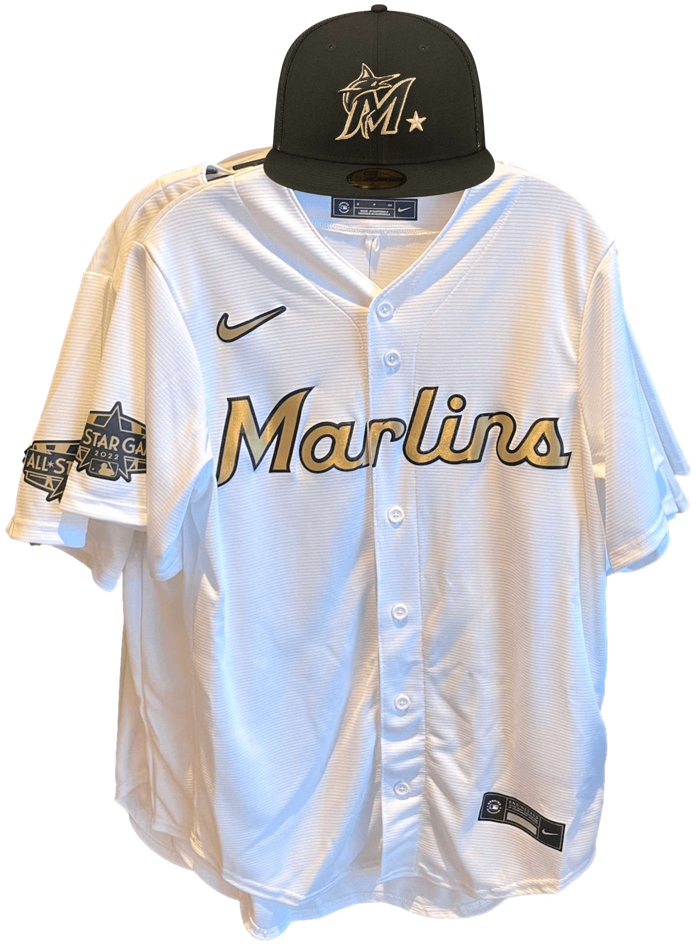
A photo of what’s purported to be a Marlins All-Star replica jersey began circulating yesterday afternoon. I contacted the guy who tweeted it to learn more about the photo and the “sources” referred to in his tweet. He was able to convince me that this leak is probably legitimate.
A few thoughts:
• The gold script with black trim makes sense given that they’re going with black All-Star caps with gold logos. Here’s how this jersey would look with the Marlins’ cap:
———
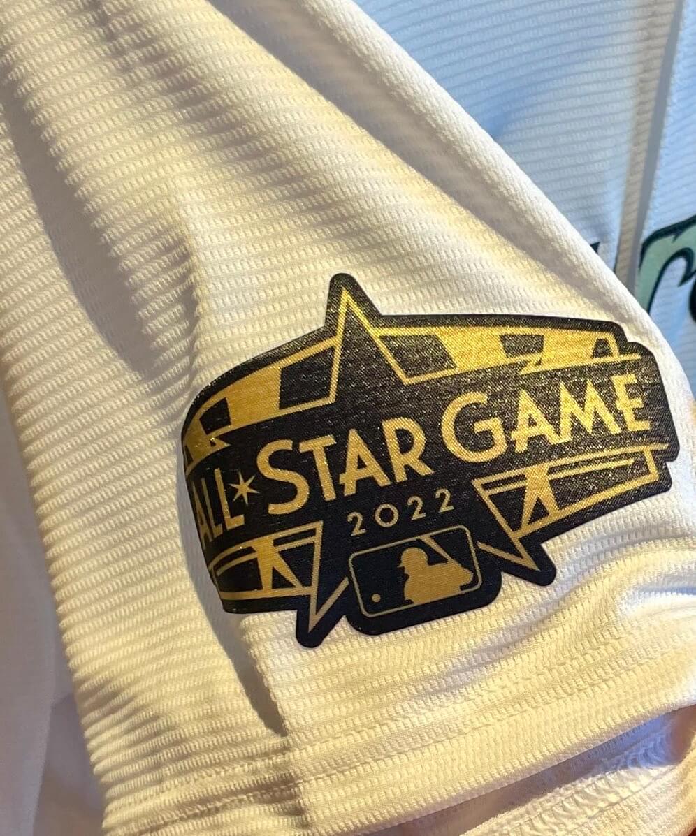
While we can’t say this with 100% certainty, it seems highly likely that the other teams’ All-Star jerseys will also feature gold chest lettering. If that turns out to be the case, would it be an improvement over last year’s All-Star costumes? Definitely. But is it the right approach? I don’t think so. Fifteen of the last 18 World Series champions have celebrated their titles by wearing gold-trimmed uniforms to open the following season. Bringing that same basic design style to the All-Star Game cheapens the championship uniforms a bit, at least to me. (I know, I know — “But this is the only way the Marlins will ever get to wear a gold jersey!” Ha-ha. Okay, now we got that joke out of the way.)
The gold All-Star approach may also lead to some difficult choices. The Giants, for example, have worn three different gold-trimmed championship jersey designs, so how will MLB handle their new All-Star jersey? They have a choice of repeating something that the team has already worn or scraping the bottom of the creative barrel.
Also, why does everything have to be gold? I get that it’s the color of champions (gold medals, gold trophies, etc.), but is it really the color of All-Stars to boot? Seems like a lazy choice. So yeah, this is a step up from last year, but it’s still a long way from the top of the ladder. Just go back to having the players wear their regular team uniforms already.
Click to enlarge
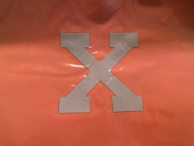
“X” files: On Oct. 25, 1997, Boston University’s board of trustees voted to terminate the school’s football program at the conclusion of that season. Players protested by removing the numbers from the sides of their helmets for the final two games of the year, leaving them with blank shells. But they originally planned for a different protest gesture, as reader and BU alum Bill Abbate explains:
I recently found this “X” helmet decal that I purchased at the final Boston University football game back in 1997. The players had planned to wear the “X” on their helmets for the final two games, but once the administration got wind of this, the rumor was that the players would lose their scholarships, so they chose not to go through with it. The decals were then sold for charity at the final BU home game.
Faaaascinating. Never heard that before!
Click to enlarge
Collector’s Corner
By Brinke Guthrie
Follow @brinkeguthrie
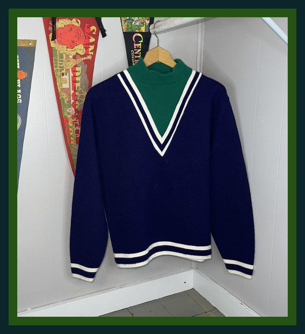
Check out this 1960s blue/green Jantzen sweater, “officially endorsed by the National Football League.” (Jantzen had some type of marketing deal with the league.) It’s from an apparel line called “the eXpandables.” The seller says it’s a Seahawks sweater from the 1960s — obviously those two things can’t both be true. In any case, no Seahawks branding but still a very nice sweater!
Now for the rest of this week’s picks:
• Believe it or not, we’re less than two weeks away from the start of NFL training camp. With that in mind, check out this NFL gumball helmet standings board set. The seller calls this “1980,” but if you scroll through the photos, “Kick-off Bubble gum — 1982” is written on the back, so let’s just say early 1980s. Nice-looking set!
• Here’s an item from 1990 called Major League Baseball in Stamps. This 65-page stamp album contains “9 Sheetlets of Postage Stamps.” A “sheetlet”?
• From 1992-93 comes this binder featuring full-color NFL player bios. I like how the cover has helmets of the various players, with their name and uniform number.
• Gotta like the design of this 1953 World Series ticket stub between the Dodgers and the Yankees.
• Los Angeles Lakers star Jerry West (“L.A. 44”) is looking rather slender on this 1969 growth chart (not a ruler as the seller suggests).
• Milwaukee Braves second baseman Red Schoendienst offers tips on the “Fine Points of Infield Play” in this 1958 Union 76 sports booklet. Teammate Warren Spahn does the same thing for pitching in this 1962 booklet from Rawlings.
• Also from 1958, this Topps baseball card trade magazine ad is described as “Another Profit Maker from … Topps Chewing Gum Inc., Bklyn. 32, N.Y.”
• This 1937 Wheaties cereal bowl includes silhouettes of the great athletes of the time, including Bob Feller and Red Grange.
• You simply will not find a vintage New York Mets bobblehead in better condition than this one. Would look great at Uni Watch HQ!
Bulletin preview: For last week’s Bulletin column, I looked at the best throwback uni option with a non-primary helmet color for each NFC team. This week I’ll be turning my attention to the AFC.
My premium subscribers will receive this article in their in-boxes tomorrow morning. If you haven’t yet subscribed, you can do that here (you’ll need a Facebook account in order to pay). Don’t have or want a Facebook account? Email me for workaround info. Thanks!
By Lloyd Alaban

Baseball News: Guardians OF Myles Straw, who’s been in a huge slump, tried using teammate Jose Ramirez’s bat on Monday (from Andy Zare). … White Sox P Dylan Cease wore a disc golf-themed T-shirt based on the Dodgers’ primary logo when arriving at the ballpark the other day (from Julie Streeter). … The grounds crew at Riverfront Stadium in Wichita, Kansas, mowed an airplane pattern into the outfield. Wichita is known as the Air Capital of the World (from @PhillyPartTwo). … The Dayton Dragons, affiliate of the Reds, will wear Captain America-themed jerseys this weekend. … New mono-black unis for the Yomiuri Giants of Nippon Professional Baseball (from Jeremy Brahm). … New unis for the Boulder Collegians of the Mile High Collegiate Baseball League (from Paul Warne). … Blue Jays C Danny Jansen, who’s on a rehab stint with the the Triple-A Buffalo Bisons, wore his striped Blue Jays pants instead of the Bisons’ non-striped pants on Monday. You can see Jansen’s striped pants at approximately the 30-second mark in this video. Reader Patrick McQuillen, who was at the game, says Blue Jays P Yimi Garcia, who is also on a rehab stint with the Bisons, also wore his Toronto pants. … Speaking of the Bisons, their first base coach, Devon White, has a mispositioned “9” on his uni number. … The Nippon-Ham Fighters’ new stadium, set to open next year, will include Japan’s largest playground.

Football News: The Cowboys are taking some criticism after announcing a promotional partnership with a gun-themed coffee company a day after Monday’s mass shooting in Illinois (from our own Brinke Guthrie). … Arkansas is changing the midfield Razorback logo on its practice field from red to white. Old logo on the left, new logo on the right (from Taylor Crabtree).

Hockey News: The Oilers could be bringing back their McFarlane “oil drop” logo (from Moe Khan). … Here’s the story behind Wayne Gretzky’s rookie card (from Andreas Papadopoulos). … Here’s a look at the WHL’s Moose Jaw Warriors’ new logo and new sweaters (from multiple readers). … New 10th-anniversary logo for the AHL’s Iowa Wild (from Anthony Scandiffio). … Penguins equipment manager Dana Heinze is retiring after 33 years with the team (from our own Jerry Wolper).

Basketball News: The standard cover for the video game NBA2K23 has leaked, and it looks like Suns SG Devin Booker will be on the cover (from our own Anthony Emerson). … Here’s the court design for the NBA’s Salt Lake City Summer League (from Adam Rainbolt).

Soccer News: The NWSL’s Washington Spirit wore a new second shirt on Saturday. It looks really similar to the previous one but there is a pattern on the sides that is also used on some of the other NWSL shirts (from our own Jamie Rathjen). … Also from Jamie: The Premier League wants its clubs to vote on banning gambling shirt ads to avoid them being banned through legislation. That would require some teams that currently have gambling ads to vote for banning them. … Speaking of the Premier League, Everton is on schedule to move into its new stadium for the 2024-25 season. … Philadelphia mayor Jim Kenney wore last season’s Real Madrid away shirt on Monday night while standing outside the hospital where two police officers were treated for gunshot injuries (from Trevor Williams). … New shirts for Bochum of the Bundesliga and Paderborn of the 2. Bundesliga (from Ed Zelaski). … Also from Ed: New shirts for Bologna of Serie A. … New corporate name for the home arena of the San Diego Sockers of the Major Arena Soccer League (from John Flory).

Grab Bag: Here’s a ranking of all the shirts at the ongoing Women’s Hockey World Cup field hockey tournament. Of note is that Australia brought a new version of their Indigenous design, which is primarily red, as a second choice (from our own Jamie Rathjen). … New athletic logo for Hillsdale College (from @stadium_fire). … Yikes: RFK Stadium in Washington caught fire yesterday (from our own Anthony Emerson). … Pro golfer Ian Poulter appears to be cutting down on the number of ad patches on his shirt (from @burkeman78).
Though that looks like a Jerry West growth chart in that Collector’s Corner item, they were and are called rulers. Those were folded inserts in packs of 1969-70 Topps basketball cards. Actual size was 2 1/2 x 9 7/8 inches.
Regarding the MLB All-Star jerseys; seeing all of the gold makes me think that they are trying to tie them to the Hollywood Walk of Fame? I haven’t seen anything specifically stating that’s the direction they were going with, but it definitely makes the gold motif make more sense and a little more tolerable to me (but far from my ideal All-Star game uniforms. Give me the regular uniforms and hats back with just a patch on each. Same goes for the NBA. All of the different team colors out there make it awesome.)
To be fair to the Marlins, over their 28 season history only the Yankees, Red Sox, and Giants have more championships.
Paul, based on your inference it sounds like this black/gold all star uniform is going to be continued going forward. I was under the impression this was just a one and done and the designs would change year to year, presumably with some sort of hosting city theme to them.
Paul, based on your inference it sounds like this black/gold all star uniform is going to be continued going forward.
I certainly didn’t mean to imply that, Greg.
Thanks for clarifying. I took the comparison of them to the WS championship uniforms to mean having both on an annual basis would cheapen the special championship design.
I did a little research. Black Rifle Coffee Company is a veteran owned company. I have heard rumors that the company does support right wing causes. In my area they apparently supply coffee to Royal Farms-a convenience store based in Maryland that has moved into my area (New Jersey near Philadelphia).I will stick with Wawa coffee when I am out and about.
I’ve bought BRCC coffee for years, mainly because they’re veteran owned, and as a veteran, I do my best to support veteran owned companies. And their coffee is damned good.
Assuming that you like the concept of the special color uniform, what color would you choose? The black and gold works, but I agree that it should be used for a more special occasion like a World Series victory. Maybe platinum? I am sure Nike can spin a backstory about how our all-stars are valuable and sustaining to the traditions and quality of the game, just like platinum.
RE: the Oilers’ oil-drop unis, it’s (Todd) McFarlane, not McFarland.
Thanks, Rob. Fixed!
seems like the gold is a hollywood theme more than an “all star” theme.
Seconded
I’ll always be in favor of the players wearing their team unis in the All Star Game, but with the game being at Dodger stadium, and the Dodgers having some of the best unis in the league, I’d be 100% in on a each player wearing a Dodgers uni with their home team name in the Dodgers jersey font.
Neat idea.
I second that
Always prefer distinguished silver to the in your face and gaudy gold as a team or uniform color (exception being Notre Dame).
I have a feeling MLB/Nike will go back to wearing their team jerseys next year, except it will be all City Connect.
Sure there will be a lot of color overlap, but the Jays and Rays both wore blue the other day. I don’t think it’ll matter in an exhibition. It would certainly look…interesting
Just when I thought this dystopian nightmare we live in couldn’t get worse… you present this horrifying new vision of the near future.
The Cubs and Indians wore blue against each other in the World Series in 2016, so it’s not just exhibition games.
link
To your point about the gold all-star jerseys being too similar to the ‘championship’ jerseys WS winners wear early the next season, it seems likely that these all-star jerseys will JUST be black/dark gray and gold, and not contain any team colors anywhere. I’m certainly not suggesting that’s a good thing, but it’s at least a slight differentiation to the championship uniforms. All 3 examples you gave for the Giants at least had orange trim SOMEWHERE on the wordmark/jersey/hat. The Braves still had plenty of red and blue in their championship uniforms earlier this season.
To parrot some other people’s points though above, I do agree that it seems likely that the gold is more of a ‘Hollywood’ theme’d decision, rather than an All-Star theme’d decision. I don’t expect we’ll see the gold used this liberally for ASG uniforms going forward, if at all.
Every attempt to make MLB teams conform to a single color palette has failed. Mother’s/Father’s Day, patriotic holidays, camouflage, and now the All Star Game — throw them all into the sun. The only reason I would ever watch the All Star Game is for the novelty of seeing the smattering of colors across the field.
I actually DO remember that Boston U football “X” thing. Not really sure why, but I do!
New unis for the Boulder Collegians of the Mile High Collegiate Baseball League (from Paul Warne).
Y’know, a lot of teams could do worse than calling themselves the “Midville Professionals”. In fact, that’s not all that different from the Oakland Athletics.
“Here’s the story behind Wayne Gretzky’s rookie card”
I’m not meaning to “gotcha” this description, but it really undersells the story. Its not really the story of the card, its the story of the photographer who captured the photo at a game in Springfield, Mass of all places and how the photo ended up on an iconic card. And what happened to the photographer’s collection and to the original slide.
The new jersey for Moose Jaw Warriors a big upgrade. Look forward to seeing the full uniform.
The old uniform was the template of the old New York Islanders 2015-17 black and white alternate. Minimal striping. Was hard to see the red stripes on black uniforms. The white uniform was so plain with minimal black stripes. Of course, we were aware it was just a matter of time until the Warriors changed primary logos.
link
Wasn’t Jantzen the company that Don Meredith was making all those sweater ads with back in the late Sixties / early Seventies ? I remember a rather awkward NFL Films video of the photo shoot…..
Re: the Salt Lake City Summer League court. The keys now have a rainbow paint scheme.
link
I have the Topps version of the Gretzky rookie card. Bought it in a pack of cards when I was a kid at my local Stationery store in Brooklyn.
It’s interesting to see Devon White use WHITE on the back of his jersey. In 2003 he changed the spelling of his name to WHYTE.
It’s referenced in his baseball reference page:
Name Note: Since 2003, he has used the original spelling of his name, Devon Whyte
link
As well as his Wikipedia page:
link
The ASG leak makes me that much more excited for the redesign contest.
I hope you’ll be submitting an entry, Marc!
Of course I would love it if MLB would use straight up team uniforms for the All-Star game but this year’s edition isn’t too bad. Then again, I really want to see a team use gold like that in their unis. Sort of like when the Astros did that in the late 90s. Remember the gold-billed cap? I think I still have one of those.
As for that Boston U “X” decal, I can’t not see those arrows ala the FedEx logo.
Re: Utah Summer League. The Salt Lake City Summer League design is far away better than the redesign for the Jazz! How does that happen?! I still don’t understand why they say “we’ll forever have purple on our chests”, but primarily wear yellow, black, and white.
maybe now referring to some initiation that causes chest bruises ;)
Wonder if Poulter’s diminishing sleeve sponsors might also have to do with him jumping to the LIV golf tour.
Possibly! I know of one major sponsor of a leading player whose marketing leadership recently said that if they hadn’t previously dropped their sponsorship for other scandalous behavior, they would have done so when he jumped to the LIV tour.
So will the AL team be wearing black with gold trim…or be all decked out in shiny gold? I’m picturing nine giant Oscar statues roaming the field…
I figure the (supposed) MLB All-Star Game unis are simply a function of what’s likely to sell. Would you be more likely to buy a $400 jersey that says “AMERICAN” or “NATIONAL,” or a $400 jersey with your favorite team’s logo, albeit in all gold?
I’m guessing the vast majority of purchasers (a group I’d never be a member of, incidentally) would choose the latter.
Re: This year’s All Star “jersey”. Has to be the cheesiest piece of $400.00 crap ever, even by current MLB’s low standards. Printed-on graphics. But, wait! It’s GOLD!! Hats off, again, to Mr Manfred for lowering standards even lower. How much does the PLA pay him?
A note on the Boulder Collegians uniforms in the Ticker: the new unis were designed by MLB.com writer Thomas Harding!