
Greetings and a good Sunday morning to all. Hope everyone had a fantastic Saturday.
Now that all fourteen teams for 2021-22 have unveiled and worn their City Connect (CC) uniforms, I’m pleased to bring back Matthew Drake, who has been featured many times on Uni Watch with uniform concepts in all the major sports. Matthew is here today to give share his tweaks to the 14 CC jerseys we’ve seen to this point. In some cases, the tweaks are minor, whereas in a few, he has made some serious changes.
He approached me with this after the Padres became the final team this year to unveil their uniform and wanted to share his ideas — (unfortunately) they were already completed when he did so, as I had hoped he’d have created caps and pants to go along with the jersey reimaginings. Alas, the template he used for these was “jersey” only one, so rather than send him back to the drawing board, I asked if he could give us an idea as to how the uniforms would look (ie — pants and caps), and those are all contained in the writeups below.
Last summer, after all the first round (2021) CC unis had been unveiled, I ranked them, and I’ll be doing another of those rankings (I will likely rank the 2022 unis against one another, with a full 14-team list as well) down the line.
Here’s a quick refresher on those first 14 CC unis (graphic created by our pal, Chris Creamer):

And now…let’s see what Matthew’s revised CC jerseys look like.
Reimagining the City Connect Jerseys
by Matthew Drake
Arizona Diamondbacks
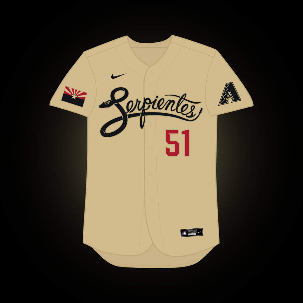
This is the one jersey where I didn’t change anything, not necessarily because love the design, but more-so because it didn’t really offer much to work with. The cap and sand pants would remain the same.
Boston Red Sox
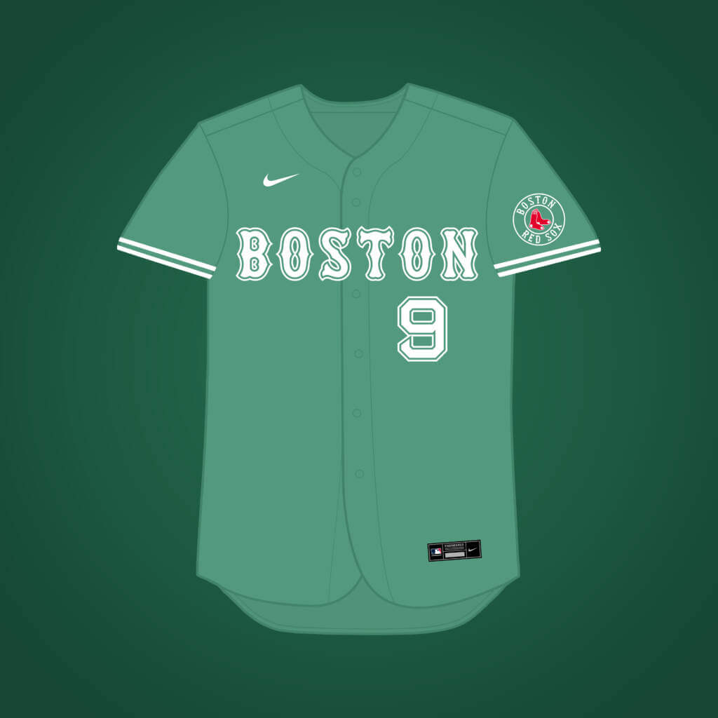
I don’t mind the Sox actual City jersey at all, but it simply doesn’t feel like a “Red Sox” jersey, so I went with a Green Monster-inspired design in order to keep more in line with the team’s history. The cap would be the same shade of green, with a white “B” logo & an extra white outline. They could probably just use the regular home pants with this one too.
Chicago Cubs
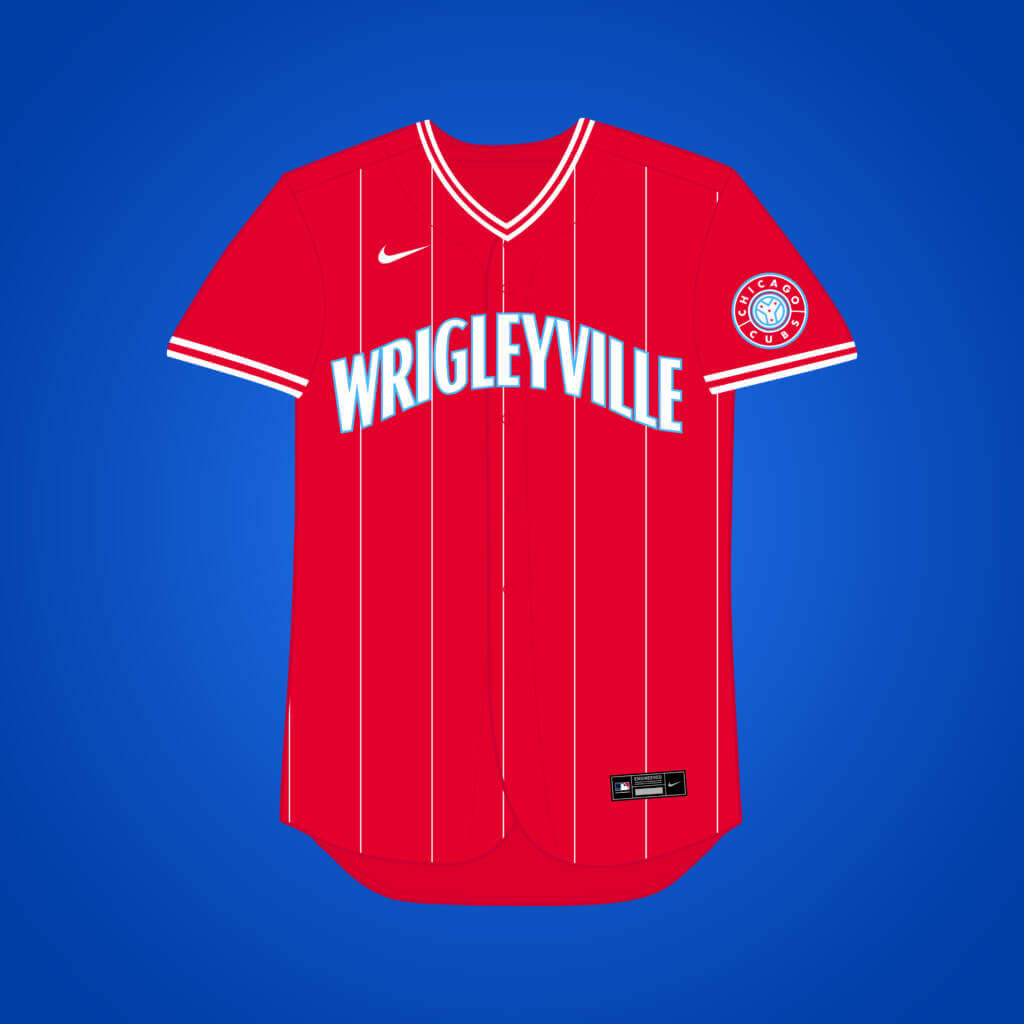
I realized that the Marlins’ City Connect might actually work better for the Cubs, because the red with white pinstripes reminded me of the classic Wrigley Field scoreboard outside of the stadium. Add a little light blue to that & you get the city flag’s colors, as well. For this one, I imagine the cap would be light blue, with a red brim, & a white “C” logo with a red outline.
Chicago White Sox
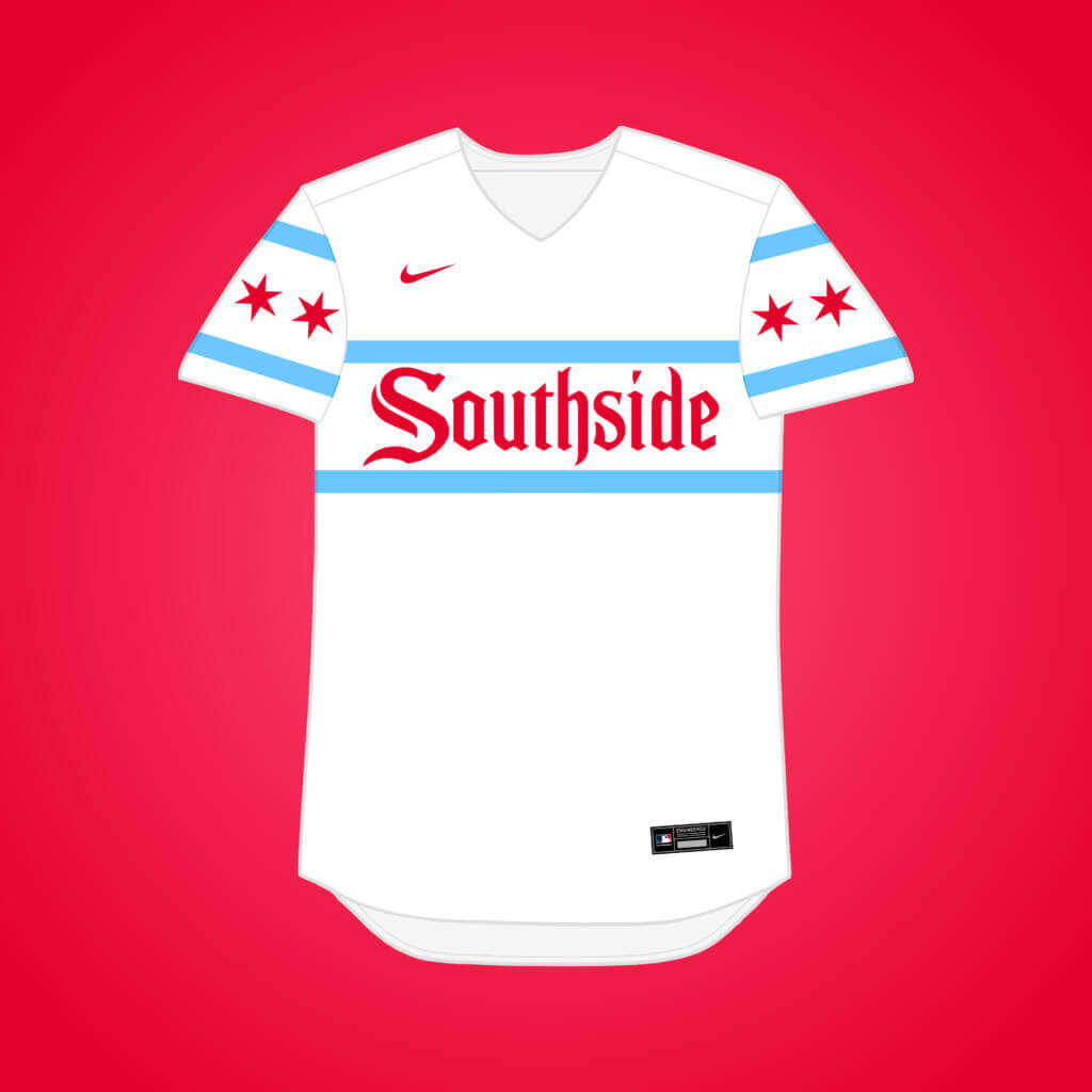
Since I added a black pinstriped alternate to the regular rotation in my concept for the Sox (@MJD7Design on Twitter to check it out), I went the city flag route for this, while keeping the Southside wordmark & using the flag’s stripes as a reference to the 80’s SOX uniforms. The cap would have a light blue crown, a white front panel, & a red brim, with the classic Sox monogram for the logo.
Colorado Rockies
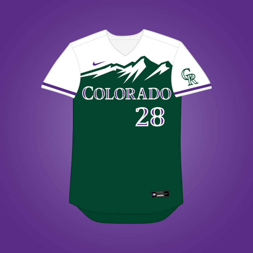
The Rockies were among my favorites of the City Connect jerseys, so I just swapped their regular logos & wordmarks in to coincide closer with the main identity. The cap would be the same as real life, forest green with a white front panel, it would just have the Rox regular “CR” logo in purple.
Houston Astros
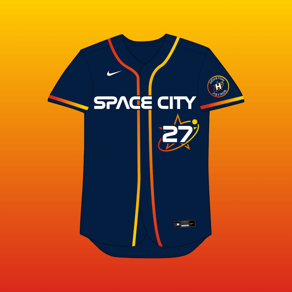
I made the wordmark white to stand out more, and added a “shooting star” around the front number. The hat & pants would remain largely the same.
Kansas City Royals
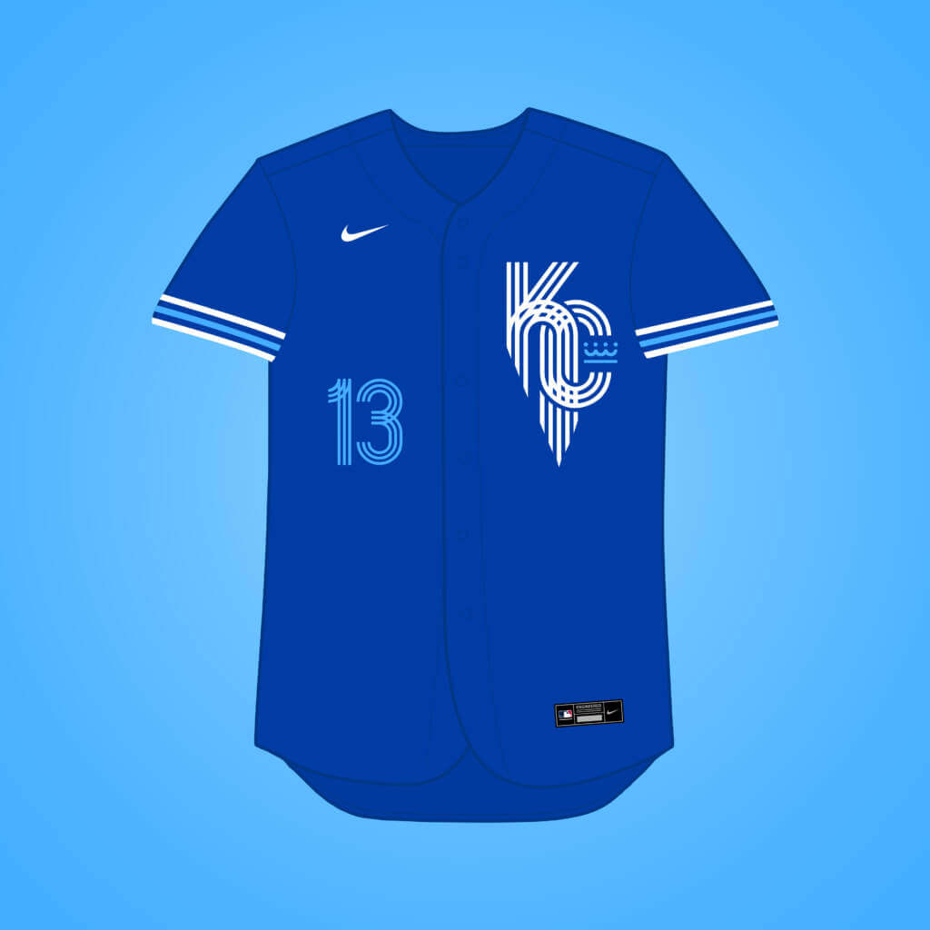
Navy felt like an odd choice for the Royals to me, so I went with their classic royal blue, while adjusting the stripes & number font to match the logo better. The cap would be royal with a powder blue brim, & the same logo as the jersey.
Los Angeles Angels

The Angels probably have my favorite jersey of them all, so the only changes are swapping silver for athletic gold, & putting the cap logo on the sleeve patch roundel. The hat would be identical to reality save for the gold halo.
Los Angeles Dodgers

I feel Dodgers’ City jersey was pretty much a dud, so I went with a design that came directly from one of the Dodgers’ celebrity softball games. The hat would be Dodger blue with a white brim, & the LA star logo from the jersey. They’d also probably go with the regular white pants.
Miami Marlins

Since the Cubs got the Marlins’ original red design, I couldn’t help but go with a basic South Beach neon lights theme here. The cap would be all black with the marlin logo seen on the sleeve. The pants would be black as well, with stripes matching the sleeves, blue down one leg, pink down the other.
Milwaukee Brewers
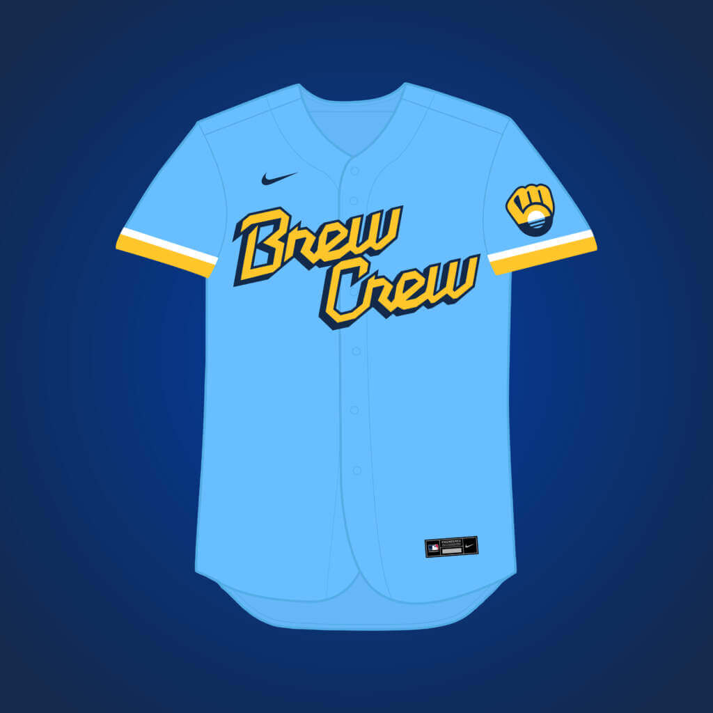
Much like Arizona, I didn’t really love the “Brew Crew’s” design, but couldn’t really find much to change with it, either, so I just got rid of the grill logo (too Minor League, in my opinion) & added the People’s Flag of Milwaukee within the BiG logo. The cap would be navy with a powder blue front panel, utilizing the same logo seen on the sleeve, and the pants would be matching powder blue (obviously).
San Diego Padres
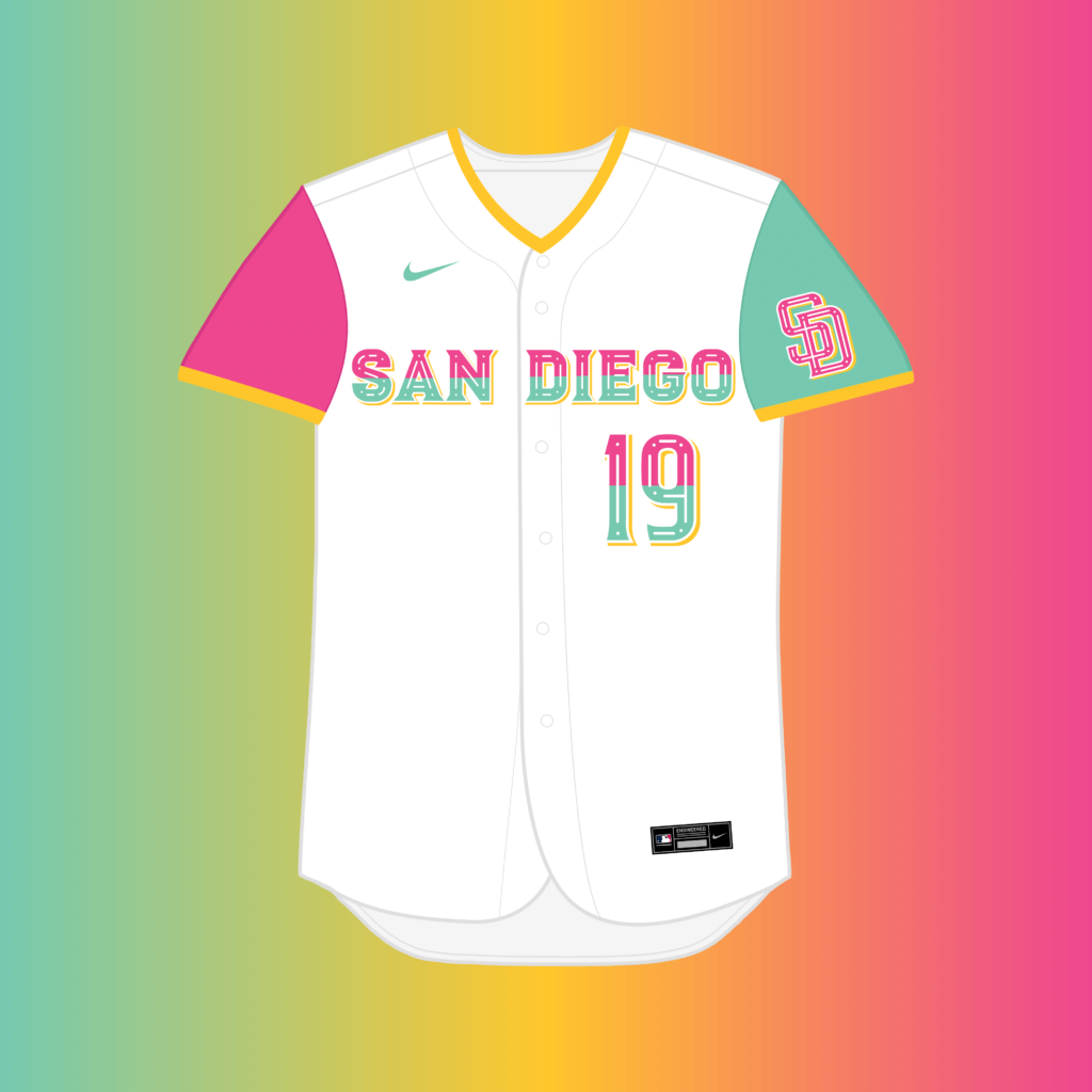
I was hoping the team’s reveal would shed light on why they chose such bright colors, and while the connection with Mexican culture is a cool direction, I wish they embraced it more in the actual design, which is what I tried to do with the wordmark & logo. I’m envisioning the hat having a white crown, a sea foam green right panel, a pink left panel, and a yellow brim.
San Francisco Giants

I tried to give the Giants a more classic design by going with an off-white base like their regular home jersey, darkening the orange to “International Orange” to better match the Golden Gate Bridge, removing the “fog,” & finally adding their elegant “San Francisco” script onto a jersey. The cap would be International orange with an off-white “SF” logo.
Washington Nationals
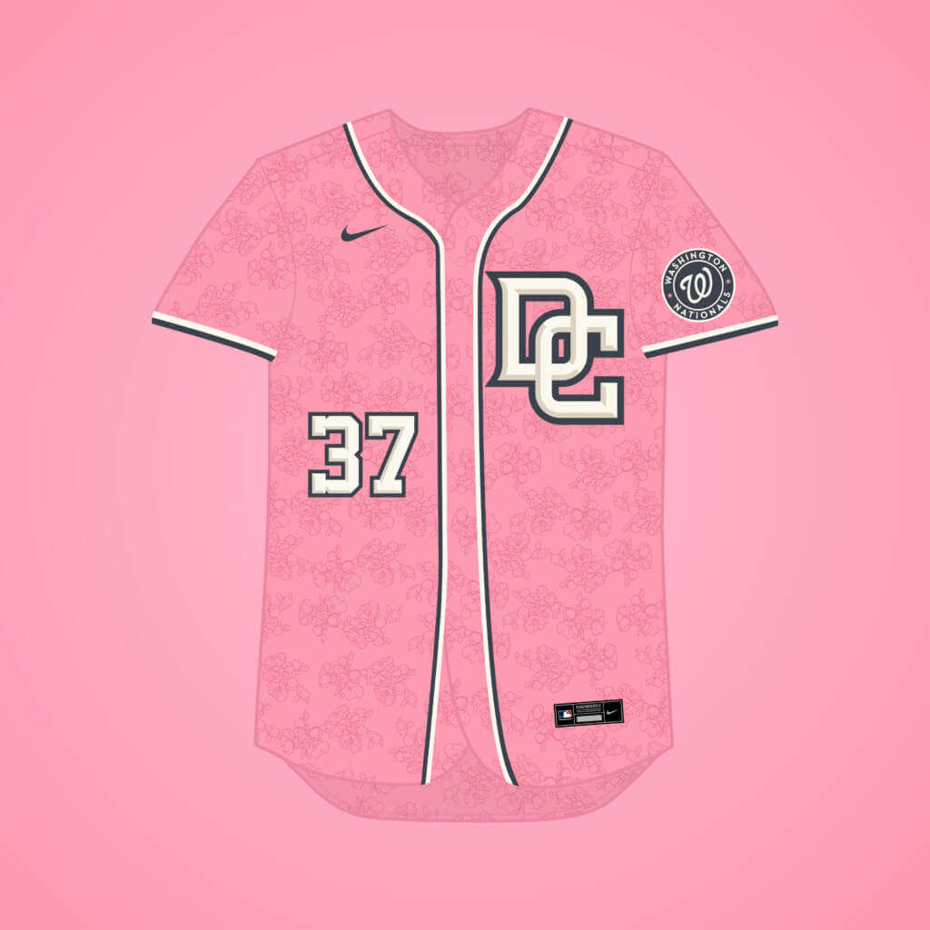
It was weird to me that the Nationals’ City jersey was inspired by the cherry blossoms but the pink was barely visible, so instead I made the whole jersey pink, while adding some striping reminiscent of the Nats’ main jerseys. I think an off-white cap with a pink brim, & a pink “DC” logo, would look good with this.
Thanks Matthew! I think we can all agree that the CC program has been hit-or-miss (and how many hits and misses depends on personal opinion — I’m sure many of you disagree with the ones I like and dislike), so Matthew’s tweaks offer a nice new perspective. Love to have your thoughts on these in the comments below!

A Uni-Centric Summary of the Colorado Avalanche’s Stanley Cup Parade
[Editor’s Note: Today we have a guest sub-lede from Colorado resident {and ticker stalwart} Kary Klismet, who will bring you up to speed on the Stanley Cup Parade recently held for the Colorado Avalanche — PH]
by Kary Klismet
It’s been an eventful couple of weeks in the Denver area since the Colorado Avalanche won the Stanley Cup last week. And it’s been equally eventful from a uni-centric standpoint for those who Get It™. As a Denver resident, Avs fan, and avid uni-watcher who took part in some of the celebrations, I’ve collected all the uni-related news I could find to provide a report. (Perhaps it’s a bit after the fact, I’ll admit, but my travel schedule over the 4th of July weekend and a busy work week afterward pushed this back several days. And besides, we here in Colorado are still in the afterglow of the championship, so it feels timely to us!)
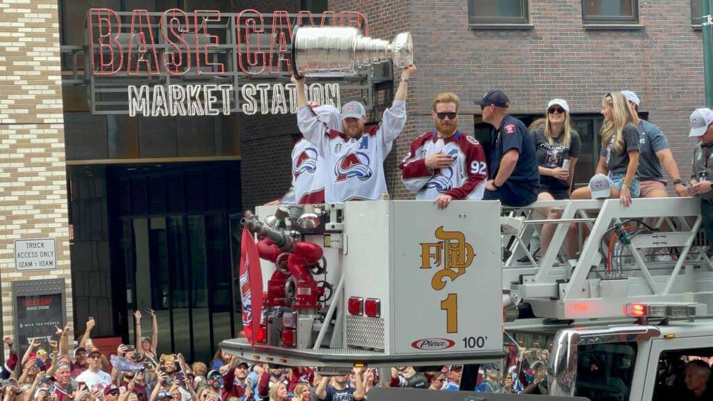
The city of Denver, which had already decked itself out to cheer on the Avs during their playoff run, gussied up its downtown even further in preparation for a parade and rally on June 30th to honor its newly crowned champions. City officials put up temporary street signs commemorating the Avs’ title, painted burgundy and blue lines on the streets to mark part of the parade route, and hung a huge championship banner from the City and County Building.
The Avs’ own celebration started a few days before the parade. It included a stop by Coors Field on June 29th, where Avs captain Gabriel Landeskog threw out the first pitch ahead of the Colorado/LA Dodgers game while wearing a Rockies jersey with his name and number on back. Meanwhile, a Denver couple got an unexpected opportunity to celebrate with the Stanley Cup when it was inadvertently delivered to their house instead of Landeskog’s nearby address.
The parade and rally included plenty of uni-notable moments. The event attracted a vast throng of approximately 500,000 Avs fans bedecked in jerseys and other team apparel, turning downtown Denver into a sea of burgundy and blue. Among those fans were Colorado governor Jared Polis and Denver mayor Michael Hancock, both of whom wore Avs jerseys with the number 22 on them. Meanwhile, Tampa mayor Jane Castor made good on a bet with Hancock and donned an Avs jersey to acknowledge their victory over her hometown Lightning.
The players mostly wore either their white road jerseys or their locker room championship t-shirts to the parade. With so many fans similarly outfitted, it created an interesting moment when Avs defenseman Bowen Byram jumped off the firetruck he was riding on to high-five fans. Police mistook him for a fan and tried to escort him back into the crowd until spectators convinced them he was part of the team.
One player whose attire deviated from most of his teammates was center Nazem Kadri. He wore a t-shirt with the phrase “Too Many Men,” a reference to his controversial game-winning goal in Game 4 of the Stanley Cup final.
In addition to the Avs and their fans, the city expanded the parade to include several other local teams who brought home championship hardware of their own recently. The University of Denver (who won the NCAA Division I men’s hockey title in April), Denver East High School’s boys’ hockey team (who won state and national championships this spring), and the Colorado Mammoth (who just won the National Lacrosse League title), were all invited to participate in the festivities.
All in all, the celebration lived up to expectations and matched the city and region’s jubilation at the Avalanche’s first Stanley Cup championship in 21 years. Considering the Avs have already dropped the trophy twice since winning it, let’s just hope it survives to be given to next year’s champions! (For more photos of the festivities, click here and here.)
OK, So It Wasn’t “Perfect”
Last weekend — the middle Sunday of a holiday weekend, so many of you (understandably) didn’t read — I ran a post on what I considered the most patriotic uniforms for the three major sports, plus hockey.
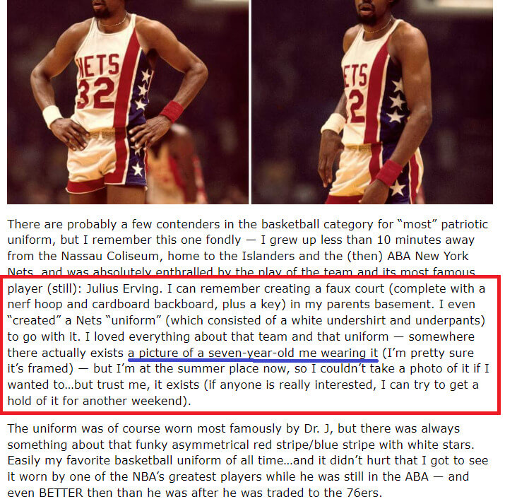
One of the uniforms I selected, for basketball, was the 1972 New York Nets, and in that section I mentioned that somewhere there existed a photo of me wearing a uniform I “created” — as a seven year old.
Well, sure enough, in the (few) comments, one reader did say he’d be interested in seeing that photo.
And, sure enough, with some digging, I found it:
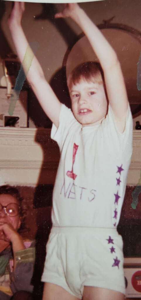
I’m pretty sure I’m about seven (which would put that photo in the 1973 range, and the 1973-74 season is when the Nets added Dr. J. to their roster), and as you can see, I didn’t *quite* get the uniform correct. I don’t remember what happened last week, much less almost 50 years ago, but I am fairly certain my mom wouldn’t allow me to add the full red stripe or the blue panel…but clearly the effort was there. I have no idea why I chose #1 (then or now), but I knew no player wore it. So I didn’t want to be Dr. J. — just a member of the team!
How’s that for some UWing bona fides!
I know we occasionally run photos of us as kids in our unis, but did anyone ever “make” their own? If so, what team and did you model it after any particular player? Love to hear from you (in the comments below or in an e-mail).

Guess The Game…
from the scoreboard
Today’s scoreboard comes from Chris Taylor.
The premise of the game (GTGFTS) is simple: I’ll post a scoreboard and you guys simply identify the game depicted. In the past, I don’t know if I’ve ever completely stumped you (some are easier than others).
Here’s the Scoreboard. In the comments below, try to identify the game (date & location, as well as final score). If anything noteworthy occurred during the game, please add that in (and if you were AT the game, well bonus points for you!):
Please continue sending these in! You’re welcome to send me any scoreboard photos (with answers please), and I’ll keep running them.
“Colors” of the B1G
Got an e-mail earlier in the week from reader John Marmet, who made the following observation/statement…
Phil,
I’m not a designer and don’t know the proper terms, but the introduction of the 2 new schools to the B1G appears to be the addition of uniforms of a different color palatte. The Gold pants are seen on Minnesota, but the USC red is different than the 4 or 5 other red schools and the UCLA blue is nowhere to be seen.
I don’t know if anyone has intelligently discussed this, but the new schools’ uniforms are just not B1G colors. The addition of Rutgers, Maryland, and Penn State oddly enough had B1G colored uniforms.
Do you see this too? Is there a greater discussion of conference colors and styles generally (SEC vs B1G vs Pac12)? The Big12 uniforms maybe closest to the B1G? Is this due to midwest simplicity? Ha!
always the best,
-John
John attached the following graphic (a mix of Ethan Dimitroff and Dennis Bolt’s templates from our SMUW Power 5 trackers):
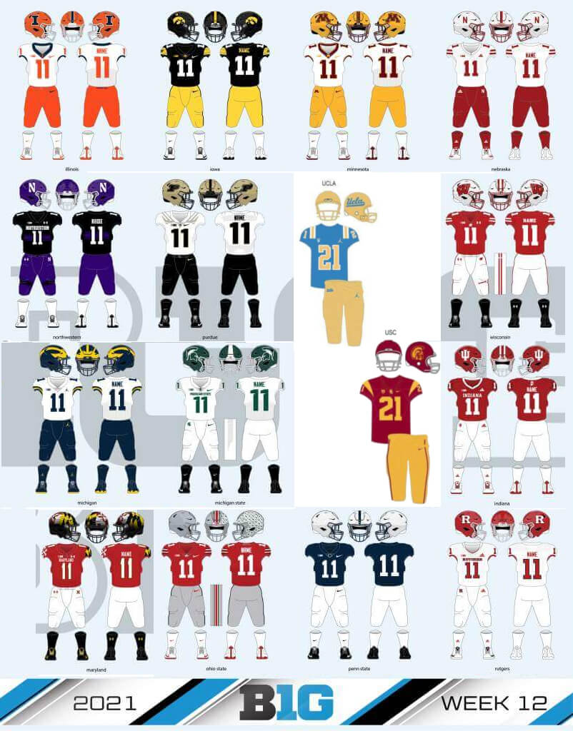
John brings up some interesting points. While I’d always thought of the SEC in particular as having a lot of dark red colors (maroon, burgundy, crimson, etc.), I never thought of the B1G as having any semblance of color-congruity, unless you count the large number of schools with red (but that’s not just a B1G thing, many schools wear red). In fact, red may be one of the sole unifying colors of the conference. After all, you have Sparty with green, NU with purple, and Illinois with orange — all unique colors to the conference. Illinois and PSU may share navy blue, but no one would ever confuse them. If anything, I’d say USC (cardinal and gold) are actually colors closer to what other teams in the B1G predominate in, and the metallic gold worn by UCLA is at least somewhat close to that worn by Purdue. Only the “UCLA blue” seems to be an outlier.
John definitely raises some fun uni-related questions though, perhaps worth further exploration down the road. Until his e-mail, I’d never given much thought to a “conference color” (other than my SEC example), but now he’s got my mind reeling. Do any of the other conferences have a “color”? Have you ever pondered something like this?
Design contest countdown: Paul here, reminding you that the deadline for our latest design challenge — which is to create a set of MLB All-Star uniforms — is this Wednesday, July 13. Full details here.
Okay, now back to Phil with the rest of today’s content.
Uni Watch News Ticker
By Phil

Baseball News: Well, it’s official: The ASG jersey “leak” I reported on yesterday has been confirmed. Of course, since teams don’t sell pants, we still don’t know what color(s) each squad will wear, but I’m sticking with my call of white for the NL (home) and anthracite for the AL (road). … A local Pittsburgh brewery using the Buccos pillbox design for their merch (from Troy Caldwell). … If you think MLB’s ASG unis are bad, CPBL unveiled the uniforms for the 2022 CPBL All-Star Games (from CPBL Stats). … Here is the home plate marker for Griffith Stadium, home of the Washington Senators from 1911 to 1960, lies in a hallway inside Howard University Hospital (from Pasttime Co.). … The New York Mets retired Keith Hernandez’ Number 17 yesterday. They mowed it into the outfield grass, put a huge logo on the home run apple, raised it to the rafters, and wore a very meta sleeve patch to mark the festivities. Here’s a bit more on Hernandez and what he meant to the Mets. Even Mr. Met got into the spirit (from Mr. Met). … Here’s how he came to choose #17 following his trade from the St. Louis Cardinals (h/t Texas Trev. … In honor of Hernandez, Pete Alonso went full stirrup. … You can watch the entire whole retirement ceremony here if you really want. … The Twins’ Devin Smeltzer knows how to wear a uni (from Squatchee on Top). … Juan Soto has a new good luck charm-chain. … Tim Dunn notes that Mariners pitcher Paul Sewald was forced to change to a different colored glove in Friday night’s game, because the glove he took to the mound originally was deemed to be gray in color by the umpires, gray being a color which is not allowed by rule. He adds, “Sewald was forced to use a different (color) glove. He has used this Gray glove on many occasions before. The Mariners had claimed that the glove was blue.” … We’ve seen old letters written on team stationary before, but this one, from a former player may be the funniest (from Brian Spiess). … The Brewers honored the 8-year-old boy who was paralyzed in the Highland Park shooting earlier this month at their game Friday night. The Brewers hung a No. 22 “Roberts” jersey in their dugout. … Texas Trevor notes, “Through the Astros mesh jerseys, you can see ‘ALLSTAR’ on Craig Biggo’s undershirt and what looks like ‘Practice makes perfect’ on Art Howe’s undershirt”. … Oh, check out this 1957 All-Star Game Program, which took place Busch Stadium, St. Louis (from Bruce Menard). … Love these!: Myers Park Trinity Little League’s (Charlotte, NC) all star teams have a look similar to the Braves of the mid 70s (from Brian Weingartz).

Football News: It being the off-season, there isn’t much NFL uni news these days, so ForTheWin has decided to do a ranking of all 32 NFL home team uniforms. In a (misguided, IMO) bottom of the list, the New York Football Jets sit at #32. It might be hard to argue with the Chargers at #1, but there’s some serious shade being thrown at what we all consider the “best” (Packers at Number Seven? C’mon man). … Another article takes a look at every team’s best and worst uniforms (historically), which is much better (relatively speaking), but even that contains some head-scratchers.

Hockey News: Here’s a cool old ad for Emery Worldwide, featuring 21 teams in the NHL, including the Nordiques, the original Jets, the Whalers & the North Stars. Submitter Paul Allan adds, “I’ll say this, the Canucks sweater from this era has grown on me & NYR, MTL, CHI, BOS, NYI should never deviate. Is Emery Worldwide still in business?” … ICYMI: the Moose Jaw Warriors (love that name) have a new logo (from Mark Samcoe).

Basketball News: Believe it or not, there was once a time when WNBA players had signature shoes. That hasn’t happened for over a decade. But that’s all about to change now (WaPo link, soft paywall), with Elena Delle Donne and Breanna Stewart about to have their own signature shoes (from Tom Turner).

Soccer News: It was color on color at the Netherlands v. Sweden match Euro 22 (from Victory Cheeseballs). … There is a new home shirt for Legia Warsaw (from Ed Żelaski). … The Portobello Football Club have introduced a new away kit (from Portobello Football Club). … Mexico’s World Cup green jerseys pay homage to Aztec deity Quetzalcoatl. … Michael Zoid asks, “Any idea what the logo is on this pride flag (seen at the @HoustonDynamo game)? [Twitter says its a “Surge supporters” group]. … Apparently Cristiano Ronaldo’s uncertainty has delayed a Manchester United kit launch video (from Texas Trev).

Grab Bag: Here is a very cool thread about the Ferrari logo Scuderia Ferrari will be running this weekend (from Russ Flynn). … Poland Men’s Volleyball player Lukasz Kaczmarek’s name was already falling off when he entered the match in the second set yesterday (from Jeremy Brahm). … Here’s some photos of a Russian helicopter with a logo of what looks like a gator in a baseball cap. Submitter L.J. Sparvero adds, “Could this be a squadron insignia? It looks more like a minor league baseball logo. I have no idea what it is.”
Uni Tweet of the Day
I’m not sure if this is good or stupid…
“They should never have given us uniforms if they didn’t want us to be an army.” @MargaretAtwood #ATLUTD pic.twitter.com/OT8dQTs5su
— Terridactyl ⭐️🖤♥️🖤🤍🦡 (@terrinh73) July 9, 2022
And finally… that’s gonna do it for me for today and for the weekend. Big thanks (again) to Matthew Drake for sharing his CC jersey tweaks.
Everyone have a great Sunday and a better week and I’ll catch you right back here next Saturday.
Peace,
PH
Couple of things about the Hernandez retirement yesterday…
It’s too bad the Mets didn’t wear 80’s racing striped uniforms. Especially with how the game ended.
Would have liked to have seen the players wear “Hernandez 17” jerseys during the ceremony. Especially since it looked like they were all in the dugout watching and with the handshakes along the blue carpet at the end.
Nice work, Matthew!
The Marlins concept is the most intriguing because it would be a far better primary jersey than their current set. The way you used the white to create the neon effect livens their bland look, and the contrasting dots over the eyes add visual interest. I’d love to see this concept carried over to their whites and road grays!
Thank you, Todd!
Using white to create a neon effect was an idea I’ve had for a little while, so I was glad to have been able to implement it here. I hadn’t considered carrying over the design to white & gray jerseys, but I could give it a shot!
In regards to the identifying colors of a conference, I’ve always enjoyed that the B1G has so many unique colors. I think that’s why I like the pseudo rainbow pinwheel logo they use for the B1G conference basketball tournament link
That sums up my feelings. I don’t think of it in terms of a “conference color”, but more what gaps (if any) in the spectrum exist. B1G had a pretty complete palette already, and adding UCLA blue helps. (Unless a conference adds Brown, St Bonaventure, Wyoming or Western Michigan, I am excluding brown.) The ACC and Big 12 were pretty complete as well, and this is not the time to break it down by conference. The SEC is almost unique because of the huge gaps in its color palette – it lacks green and purple but has 3 different shades of orange, light (Ole Miss, sometimes), royal (Kentucky, Florida) and navy blue (Auburn, Ole Miss sometimes) and every shade of red or maroon available.
As far as the reimagined CC uniforms – top-notch, no real argument on any of them, none are downgrades, most are substantial improvements.
The SEC is almost unique because of the huge gaps in its color palette – it lacks green and purple
LSU would like a word with you…
Oh man, I missed that one. Big whoops.
All of these concepts are amazing, Matthew!
I particularly like the Cubs one. I have been saying ever since they trotted out that navy that it should have been red, and I am SO glad that someone agrees! I also like what you did with Miami to accommodate that change for the Cubs. Both new jerseys fit in with the teams’ current branding SO much better now.
I personally would have kept the White Sox more or less unchanged—their City Connect already seems to match perfectly in my opinion—but that’s really the only big thing I would consider changing.
Phil, seeing you in that makeshift Nets uniform is one of my favorite things on Uni Watch ever! You were Uni Watch when Uni Watch wasn’t cool! (And didn’t exist, for that matter…)
Whoops! That was meant to be a stand-alone comment, not a reply to Ian. Sorry, Ian!
Thank you, Ian!
Yeah, the Cubs’ City jersey came across to me as pretty bland when it released, and not as clearly inspired by the city or anything in it as other designs have been, so going with red inspired by the stadium sign was an easy choice.
As for the White Sox, I liked their actual City jersey so much that I incorporated elements of it into their main set I did for them (check out @MJD7Design on Twitter or go to mjd7design.myportfolio.com if you would like to see it!). This time around, I wanted to try something a little bit different, even though I really like their actual City design.
Proofreading: In the title of the Stanley Cup parade piece, “Avalnche’s” should be “Avalanche’s.” D’oh! (It looks like the misspelling was in the draft I sent. Sorry about that!)
D’oh! How did I miss that — now fixed. Sorry Kary!
It seems like the Soto chain link (see what I did there) is a dead one
Hmmm. Should work now. link so you don’t need to scroll back up.
Phenomenal job, Matt, on those City Connect redesigns! Pretty much every single one of them is a vast improvement over the original. It’s amazing how much better they can look when the foundational principle of the project is good design rather than finding a way to sell a bunch of schlocky merchandise to non-baseball fans.
Thank you, Kary! Honestly, if it were up to me, I wouldn’t have implemented the City program into MLB at all, but I still did the best I could to make it a bit more palatable.
Sorry, but the reimage Red Sox jersey does nothing for me, because I do not see the Green Monster, but a St. Patrick’s Day jersey instead. Outside of it being green, there are no elements to the Green Monster what so ever.
What I think needs to be done with the design, minimally, is to at least is for the wordmark and uniform number to match the fort of the scoreboard.
After that, you can have fun adding one or two, but not all of these elements to make it feel more like the monster. Adding all of these would be complete overload of the jersey, so, a mix and match of a couple of these would work.
– Add a “Jimmy Fund” patch
– Add the Morse Code into the stripes on the sleeve
– Sublimed stripes match the look of the Green Monster above the scoreboard where it looks like panels.
– A single dark green ladder on the left side of the jersey.
Those would evoke the Green Monster better.
Hello Sean,
It seems we simply have different visions of what the Red Sox City jersey should be, as I wanted to avoid making the design look like the literal Green Monster in jersey form, and instead wanted to still keep some of the Red Sox preestablished & iconic brand elements intact.
Using the exact shade of the Green Monster and adding an extra white outline around the wordmark (inspired by signage on the wall) accomplished enough visual reference to the Green Monster, for me personally.
I do like the idea of adding subliminated stripes to reference the panels on the wall, though, so I’ll probably try that out. It might end up looking somewhat similar to the Cubs design if I did that, though.
First day’s take on the 3rd day…
For what it’s worth, when I saw the drawing I instantly knew it as Fenway Park green, not a St. Patrick’s Day reference. (Not that there’s anything wrong with the Red Sox using an Irish-American cultural reference.) I might have also changed the font, but perhaps to echo some other Boston landmark like Citgo sign or Prudential building – but this plays better for me than the yellow & blue “thing.”
Regarding Emery Worldwide company history:
link
link
link
I miss my days at EWW. Started in Kansas City in their customer service centre, then I went to Los Angeles and loved them. Great folks.
Whoops! That was meant to be a stand-alone comment, not a reply to Ian. Sorry, Ian!
*Sigh* I give up!
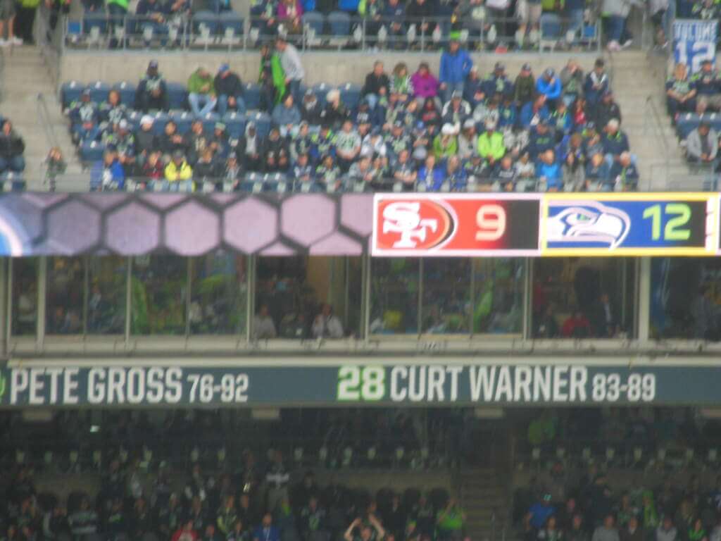
GTGFTS: Niners at Seahawks, September 17, 2017
We both made t-shirt jerseys as kids, Phil…mine was a generic all-star football shirt with stars on the shoulders and the number 11 on the front and back, all done in black magic marker. No photo exists, though.
As for yours, I’d wear that.
Phil, seeing you in that makeshift Nets uniform is one of my favorite things on Uni Watch ever! You were Uni Watch when Uni Watch wasn’t cool! (And didn’t exist, for that matter…)
Phil, I also attempted to make a Nets jersey when I was a kid! This was in the mid-90s before throwback jerseys were really a thing, so I just got a plain white tank and painted the details on with fabric paint. It turned out terrible, and I never finished it.
I ended up finally making myself jersey about a decade ago. Same plain white tank with twill lettering numbers and stripes, turned out a lot better!
The S logo mentioned in the Soccer ticker is for The Surge, a Dynamo supporters group.
Sorry, Matthew Drake makes the same mistake MLB made: in Chicago, the White Sox play on the South Side, not the Southside. But I like Matthew’s concept.
Regarding the discussion of B1G colors, am I wrong? UCLA and Purdue, for instance, wear gold. USC, Michigan, Minnesota, Iowa, and Maryland wear yellow. Further, teams like Boston College, Notre Dame, and Washington Huskies wear gold. Meanwhile, LSU, Cal, and Arizona State wear yellow. Yes, the yellows do seem to come in slightly different hues. My opinion. Others?
I like the Boston one, but I would have changed the font away from the standard Boston font to the font used on the Green Monster scoreboard. That would be epic. As much as I love the current Royals design, I think the royal blue was much nicer.
I’m not sure if this is good or stupid…
If you don’t recognize it as a political statement by the Atlanta United supporters section (1) by the banner itself, which combines a Margaret Atwood quote with a picture of fans — all female, and 2) by clicking on the tweet itself and scrolling down, to learn that the Atlanta supporters made a deal with the visiting Austin supporters to remain silent for the first 7:30 minutes of the match to protest both clubs’ silence on the recent Supreme Court decision, then I’m not sure if it’s good or stupid.
Re: Emery Worldwide NHL Stanley Cup ad.
I like the concept of the Canucks’ jersey depicted there, but would love to see it in their current blue, green, and white color scheme.
Wafflebored made one. Moose out front should have told you.
He got laid off when they closed that asbestos factory, and wouldn’t you know it, the army cut his disability pension because they said that the plate in his head wasn’t big enough.
Phil, my NBA uniform project was a white t-shirt made into a 1977 Bill Walton Portland Trail Blazers jersey. I thought it looked great, but the black trim was done with a Sharpie Pen whereas the red parts were rendered in water-based Magic Markers. Thus, after it came out of the wash, only the black remained. I redid the red parts two or three times before throwing in the towel.
The Yardbarker poll of NFL uniforms absolutely nailed it on the Cardinals, Saints, Bucs, Pats, and Lions.
When Uni-Watch runs concepts that feature jersey ad patches it helps to normalize ad patches and thus hasten the arrival of even more of them
Coachie…
There are no ad patches on the jerseys. If you’re referring to the makers mark (of the beast), I agree I’d prefer concepts be without them. Matthew had already created these — in the past he actually removed, at my request, the swoosh from the jersey. While I prefer makers mark-free concepts, I understand the need for authenticity; it’s not like the actual jerseys are without them. I can promise I you this, once teams (NBA now, MLB & NHL soon) get actual ad patches, I won’t run any concepts that have those.
Yes there are two new WNBA signature sneakers coming out, but please note that Candace Parker already has a signature sneaker with Adidas and is coming out with the 2nd one soon – just was noted this weekend. This will make at least 3 players with complete signature sneakers, and potentially more soon
A day late on this, but I wanted to comment on the CC concepts. For the most part I think they are better-to-much-better, though I prefer the actual CC for a couple.
BIG IMPROVEMENT: Dodgers, Nats, Astros, Cubs.
MEDIUM IMPROVEMENT: Padres (the wordmark), Royals (color)
NOT SURE: Giants. Getting rid of the fog is good, but the wordmark feels too busy with the sleeve bridges.
NEUTRAL: Dbacks, Rockies, Angels, Brewers
DOWNGRADE: Marlins (one of my faves), both Sox. All mostly due to the color changes.
I appreciate the pinwheel. I wasn’t trying to point out red, blue, I just thought that the powder blue and deep red were a bit out of the regular Penn State blue or multiple Red that existed already. Maybe my eyes deceive me!