Click to enlarge
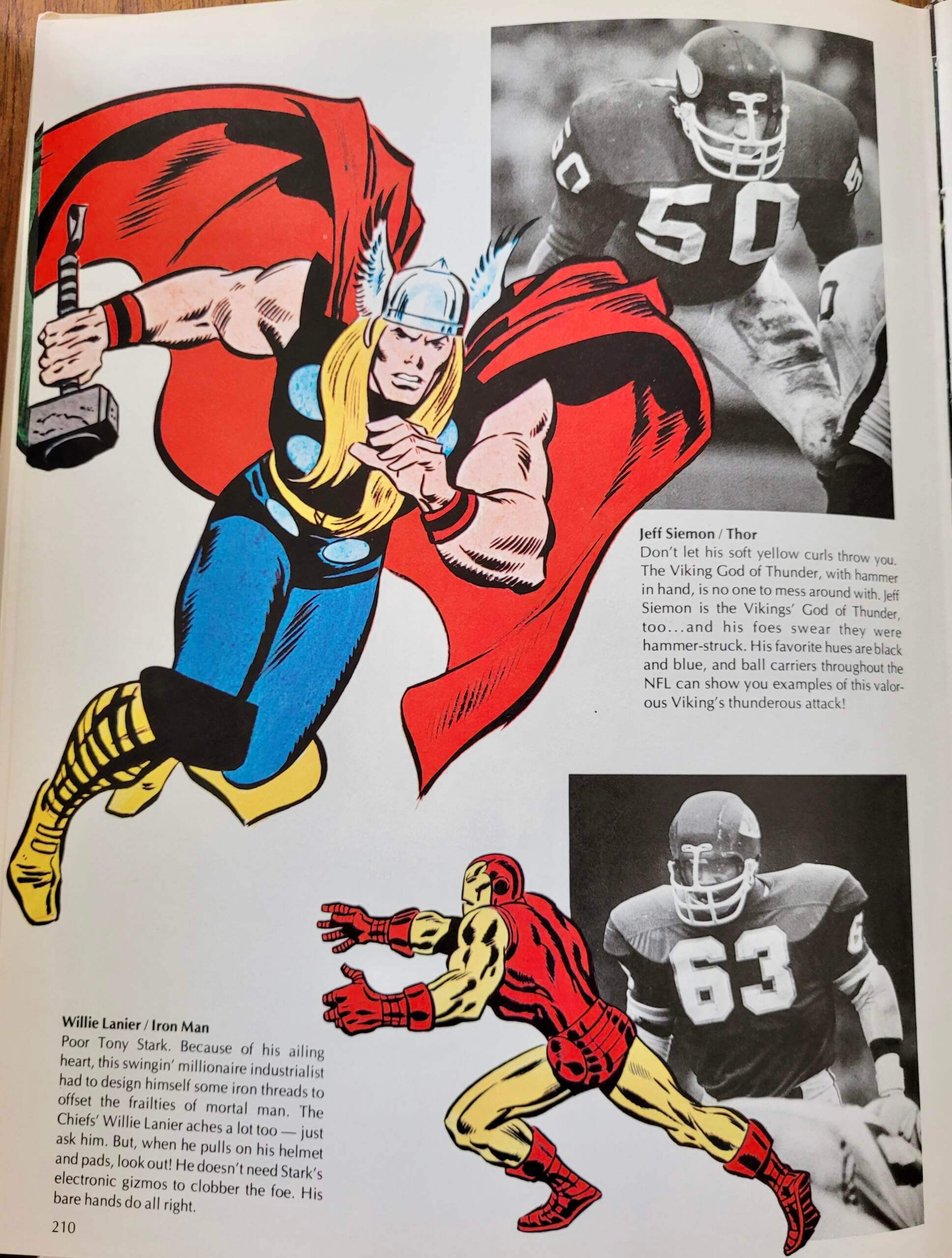
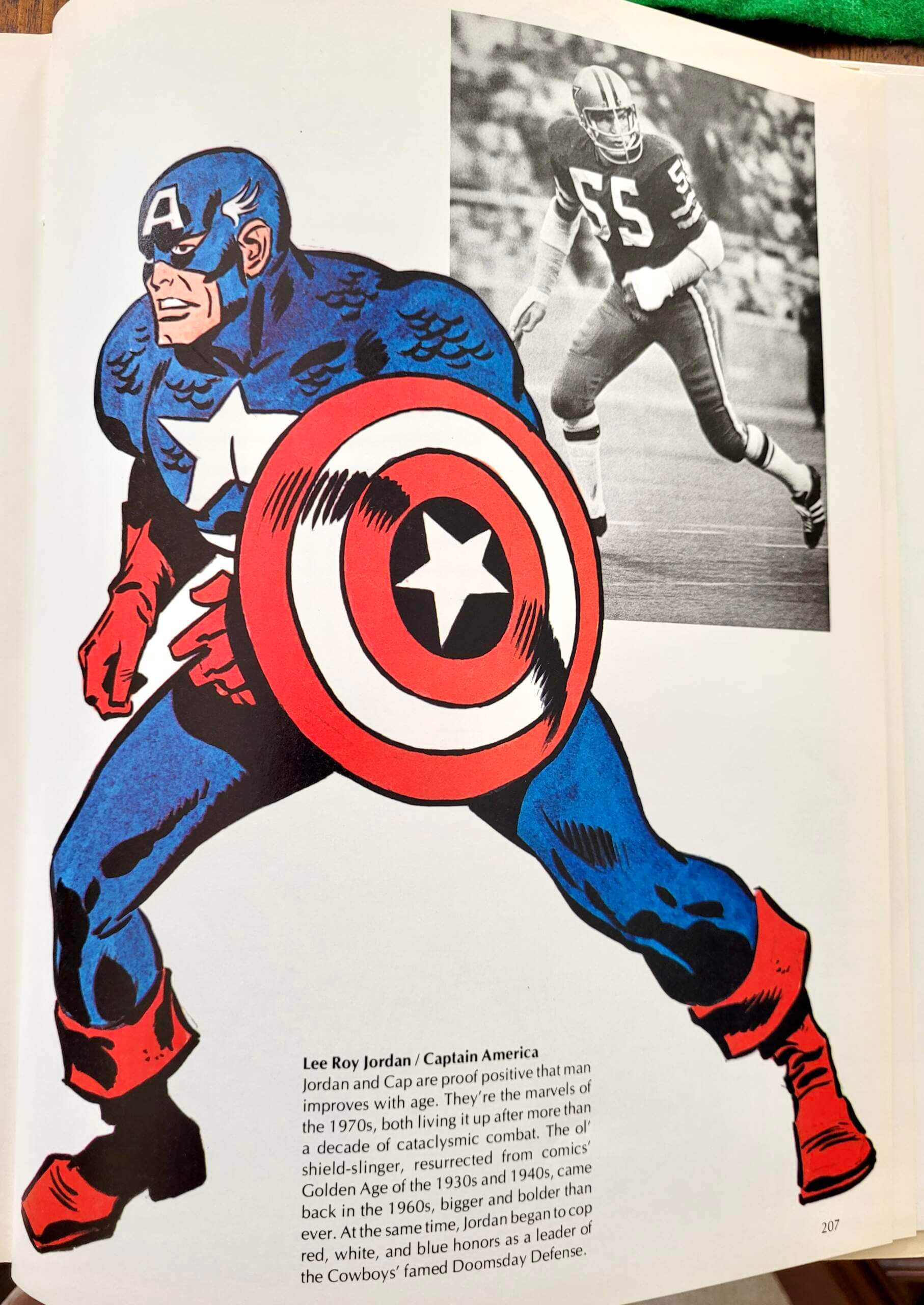
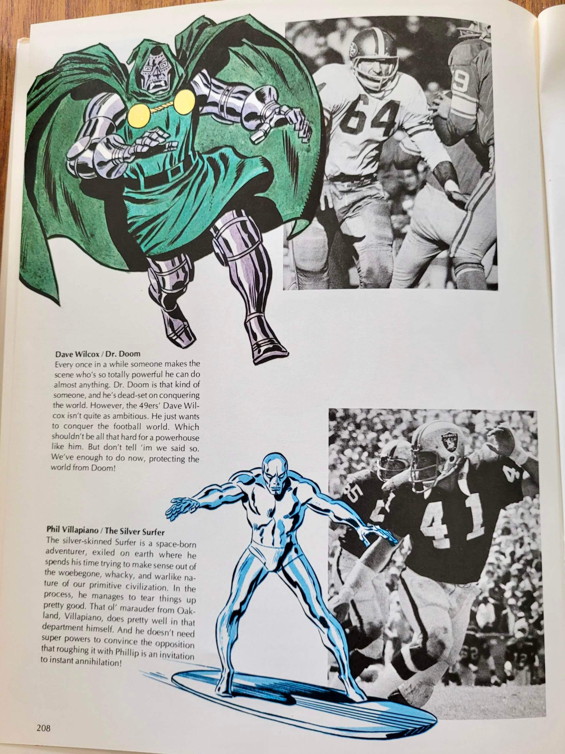
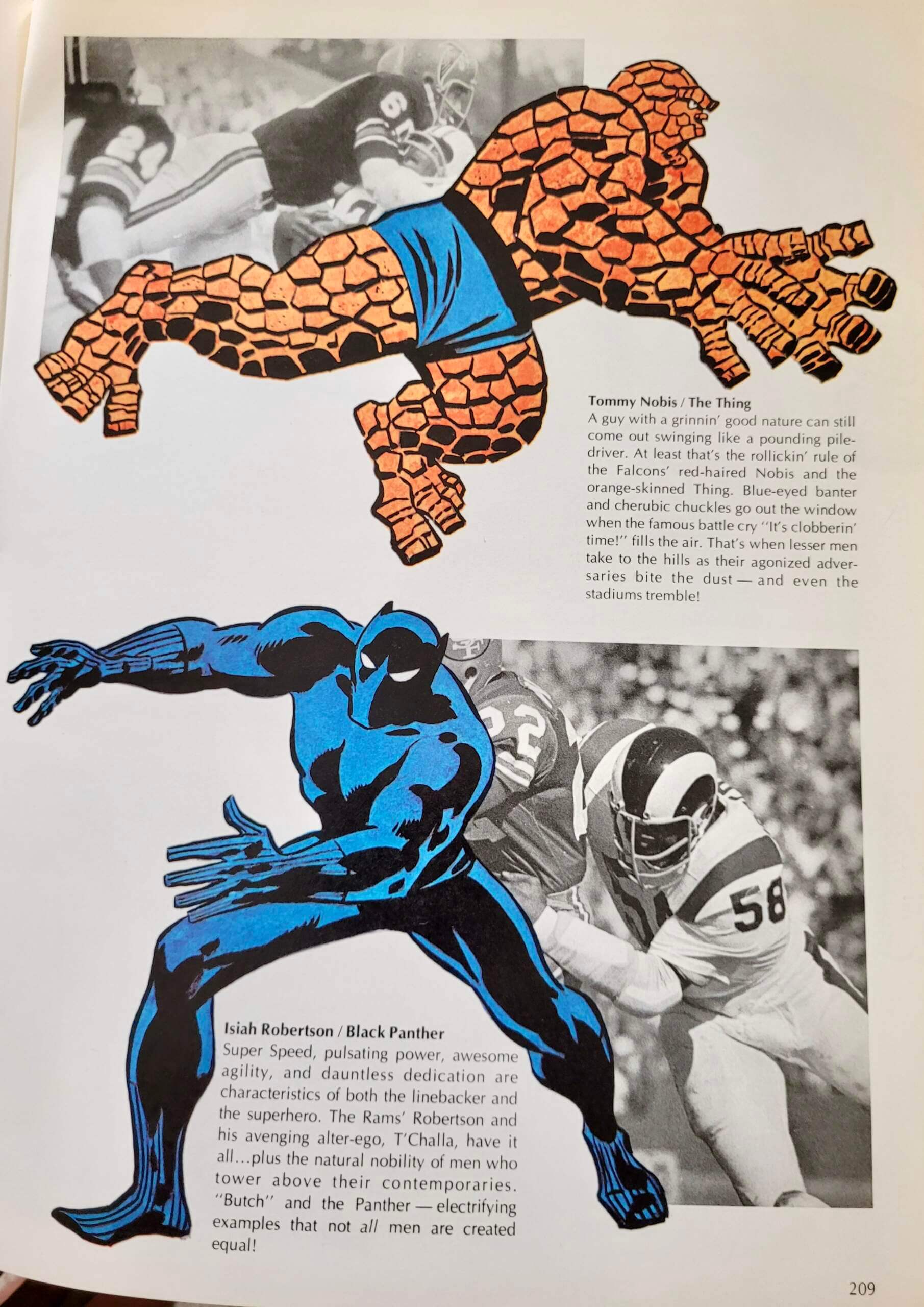
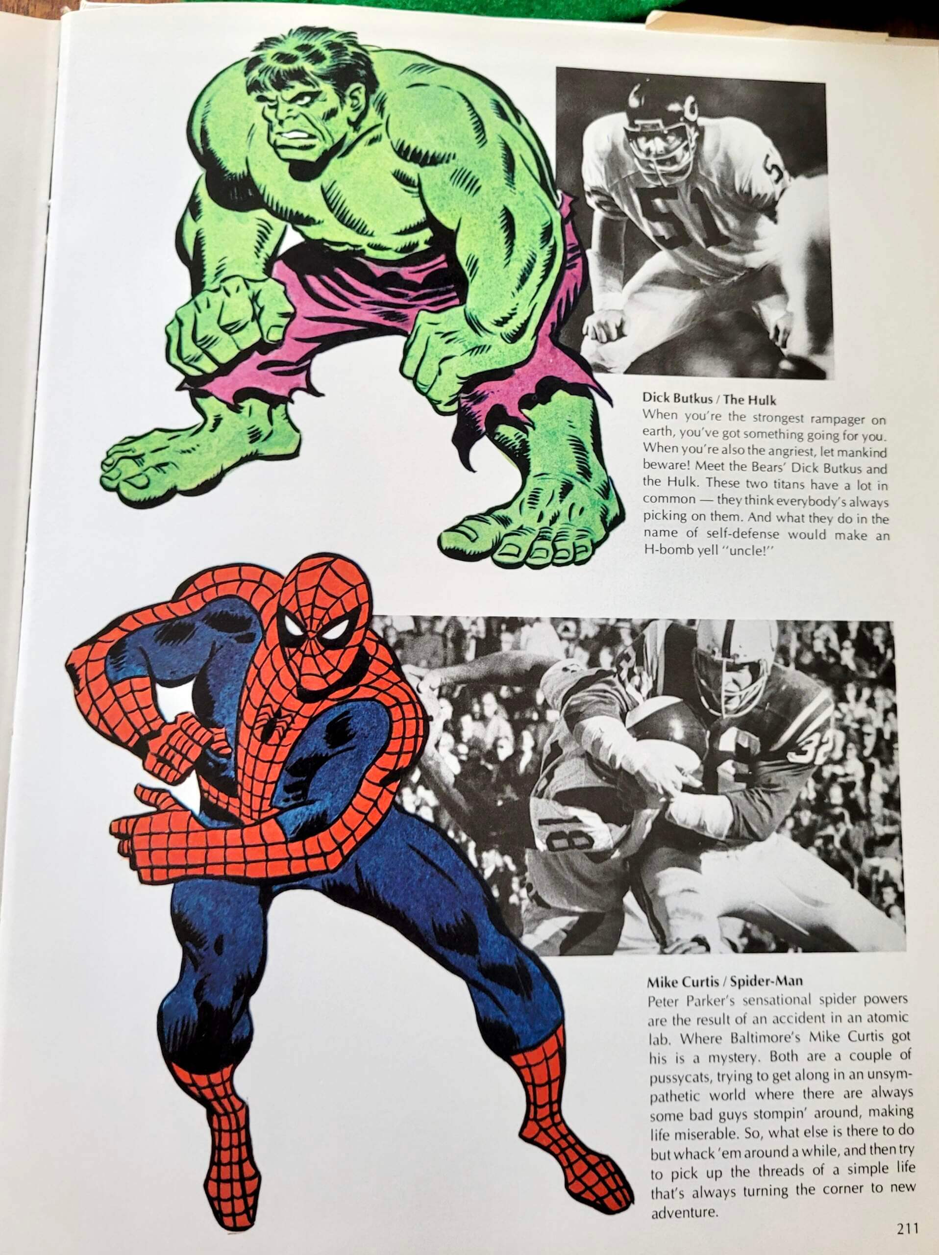
The cultural overlap between sports and superhero comics has really exploded in recent years, but you can find traces of it going back at least 50 years. Case in point: The 1974 NFL book More Than a Game (an anthology of content that originally appeared in Pro! magazine) has a section called “Beware the Linebacker!,” which compares various ’backers to Marvel Comics characters — complete with text by Marvel founder/prexy Stan Lee (rendered in the classic 1970s font Optima) and illos by Marvel’s then-foremost artist, John Buscema.
It’s not clear why they choose linebackers for this feature, as opposed to some other position, but I guess LBs have a good mix of speed and strength, so you can project a wide variety of superheroes onto them. Here are the remaining pages for that section:
I learned all of this from reader John Philips, who has a copy of the book and provided those photos. He says he was prompted to pull the book off the shelf by my recent post about The Great NFL Fun Books. “As I read that entry, I was convinced I had seen some of the Fun Book illustrations before. I finally realized that some of them were from More Than a Game. I’ve had the book for over 45 years, and while I read it cover to cover, the uniform articles didn’t register until I saw the Fun Books post.”
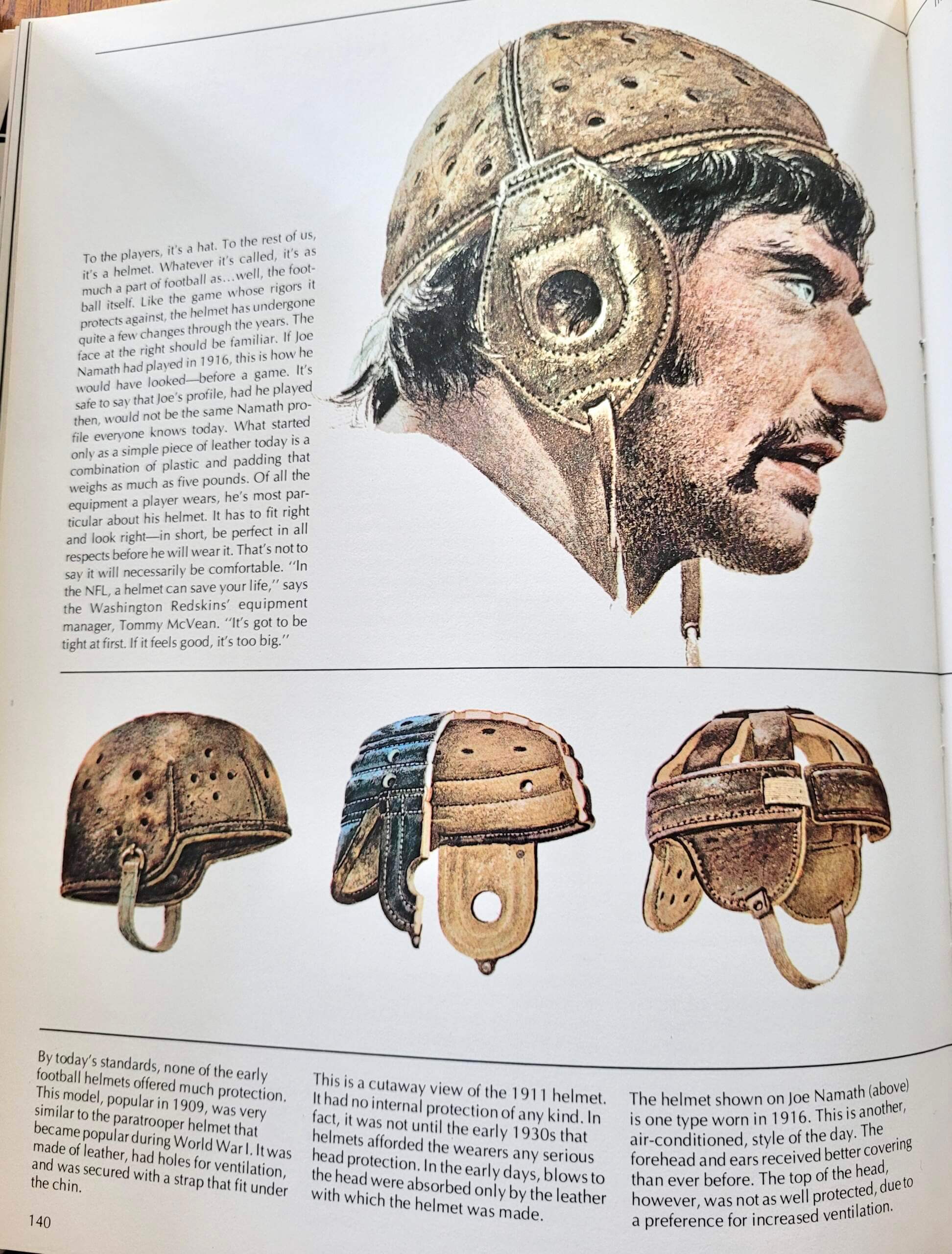
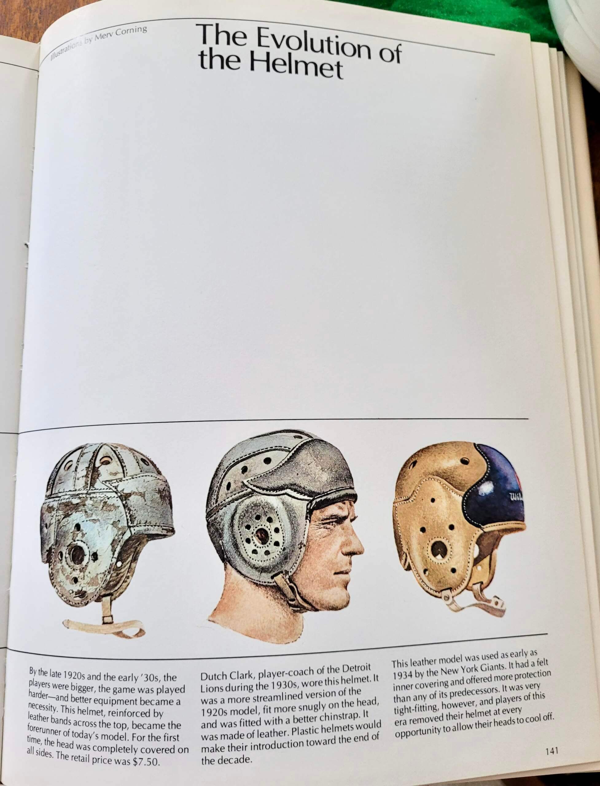
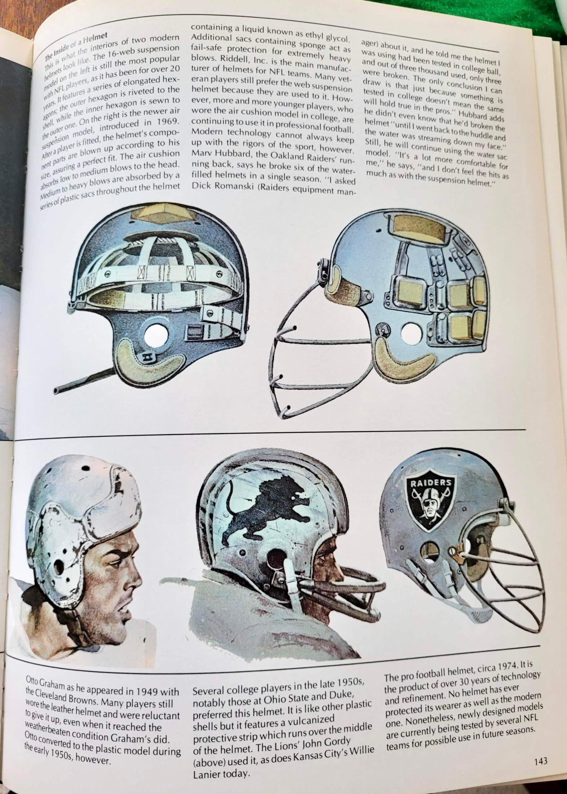
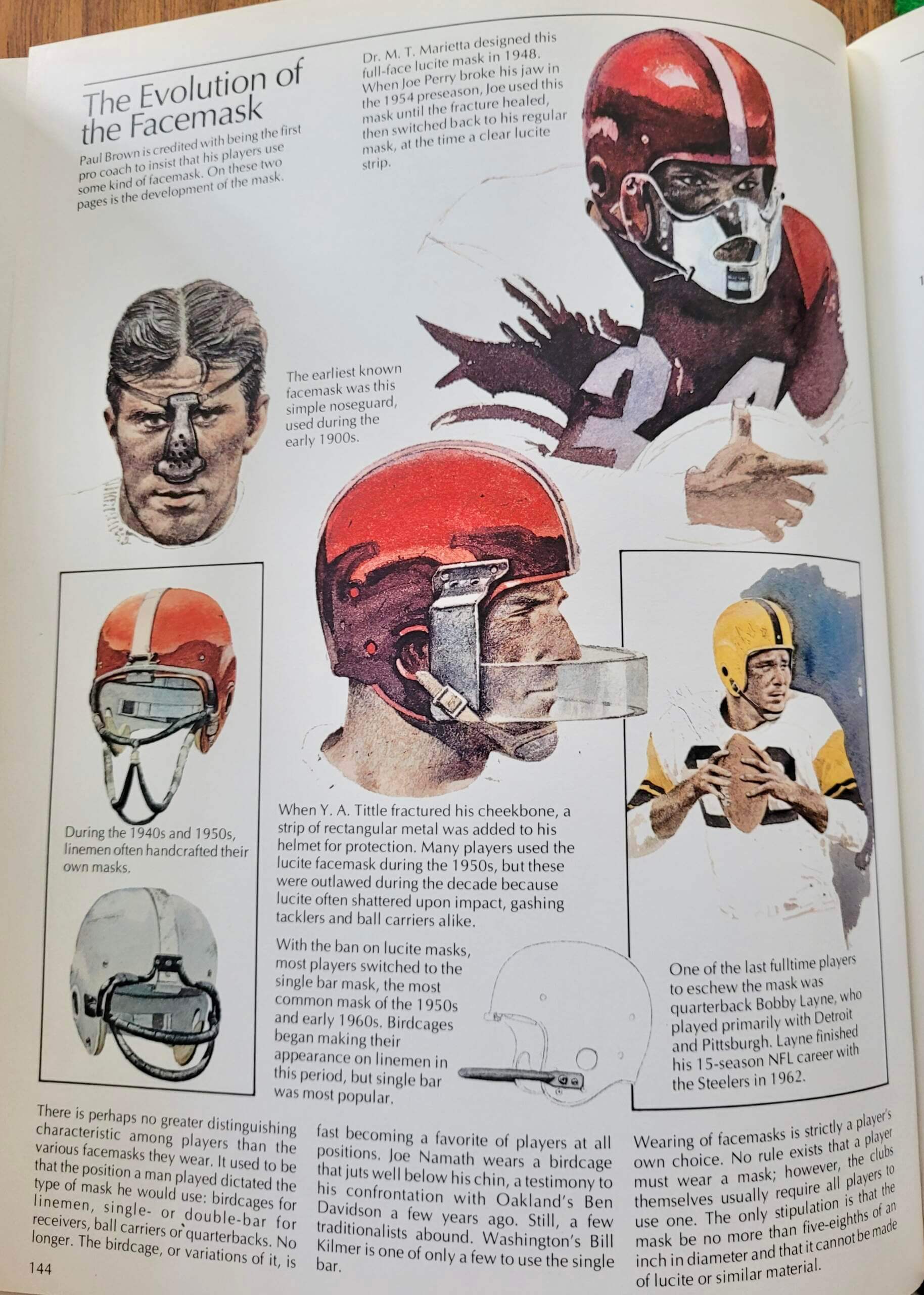
Interestingly, many of the black-and-white Fun Book illos originally appeared in color in the book, as seen here (note that the first page includes an illo showing Joe Namath wearing an old-fashioned leather helmet — something that did not appear in the Fun Books):
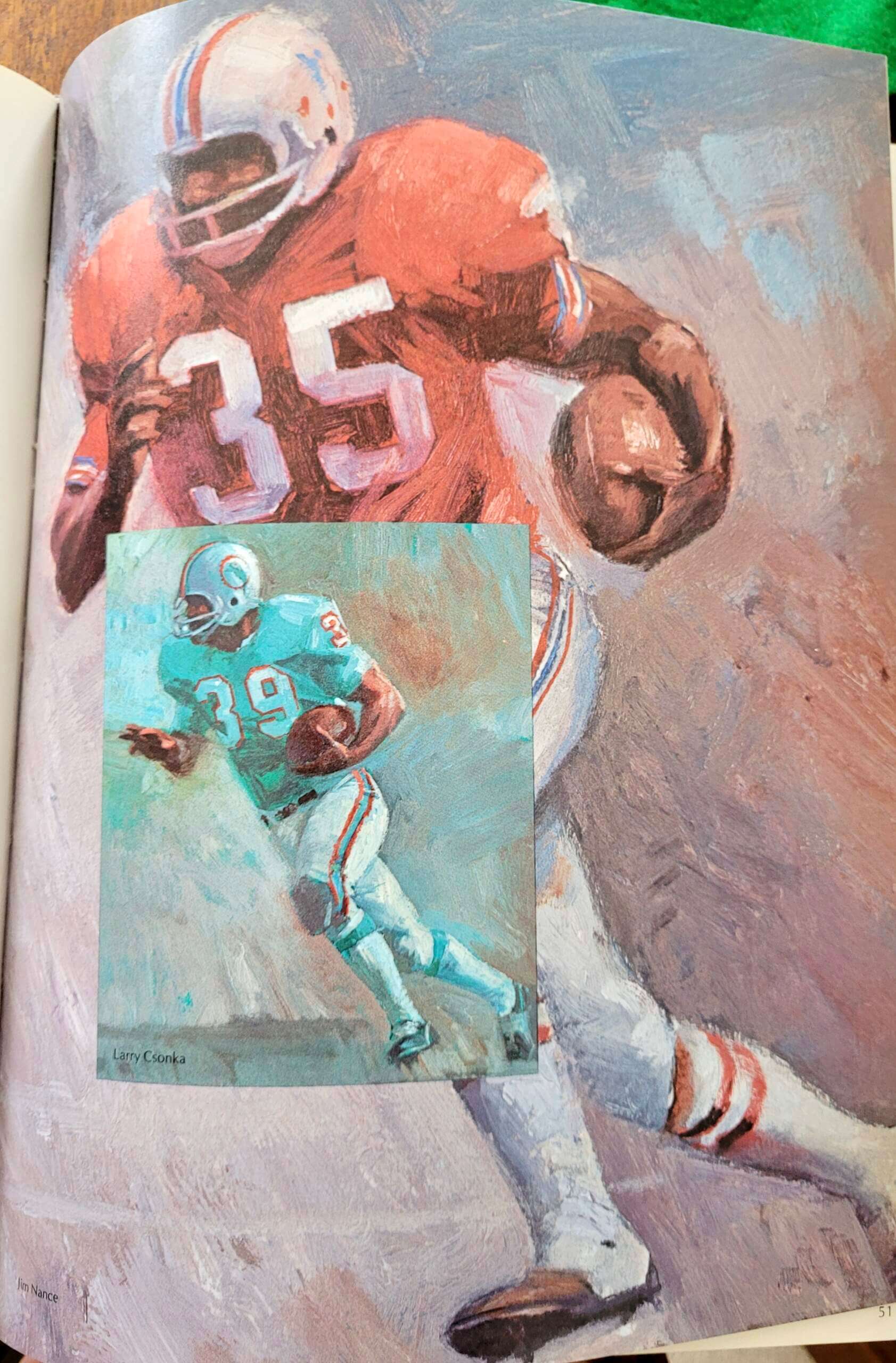
John also sent along some classic paintings of NFL running backs from the book. Maybe they were running short on pages, because they inset some of the images onto other images — a weird format:
Good stuff — I may have to pick up a copy of this book!
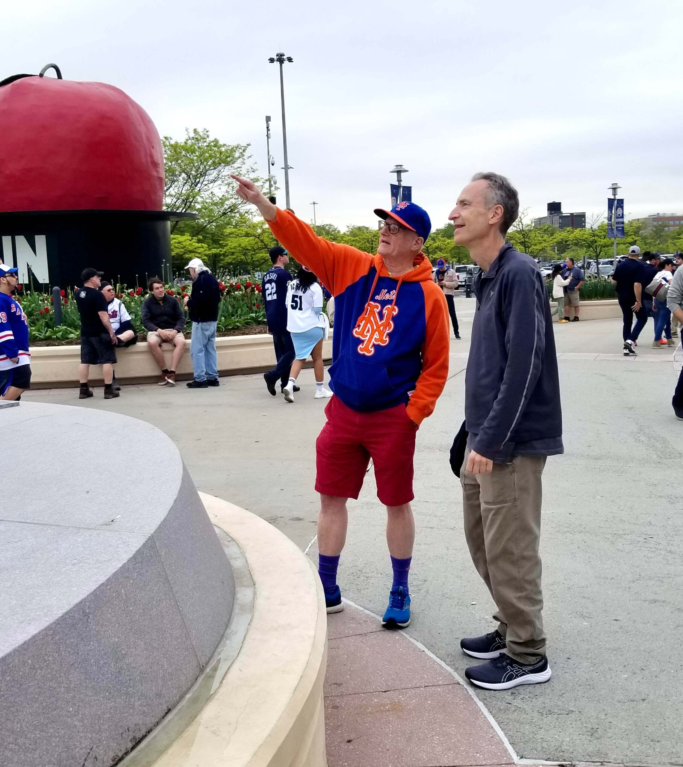
Seaver statue update: Friday was the Mets’ first home game since my article about the Seaver statue’s design error was published, so reader Steve Dodell — the guy who spotted the error in the first place — went to the game, arrived early, and hung out around the statue to see if fans were chattering about it. He took the photo shown above, of a fan pointing out the error to his friend.
“Multiple people were talking about it — usually one person trying to explain it to their friend,” says Steve. “It was a pretty constant stream — at one point about five security guards came out en masse just to see it.”
Steve says he interacted with some of these folks to explain the situation but didn’t identify himself as the guy who first noticed the error.
Steve also got a shot of something I hadn’t seen before — sculptor Will Behrends’s signature, which appears on the back of Seaver’s right stirrup (click to enlarge):
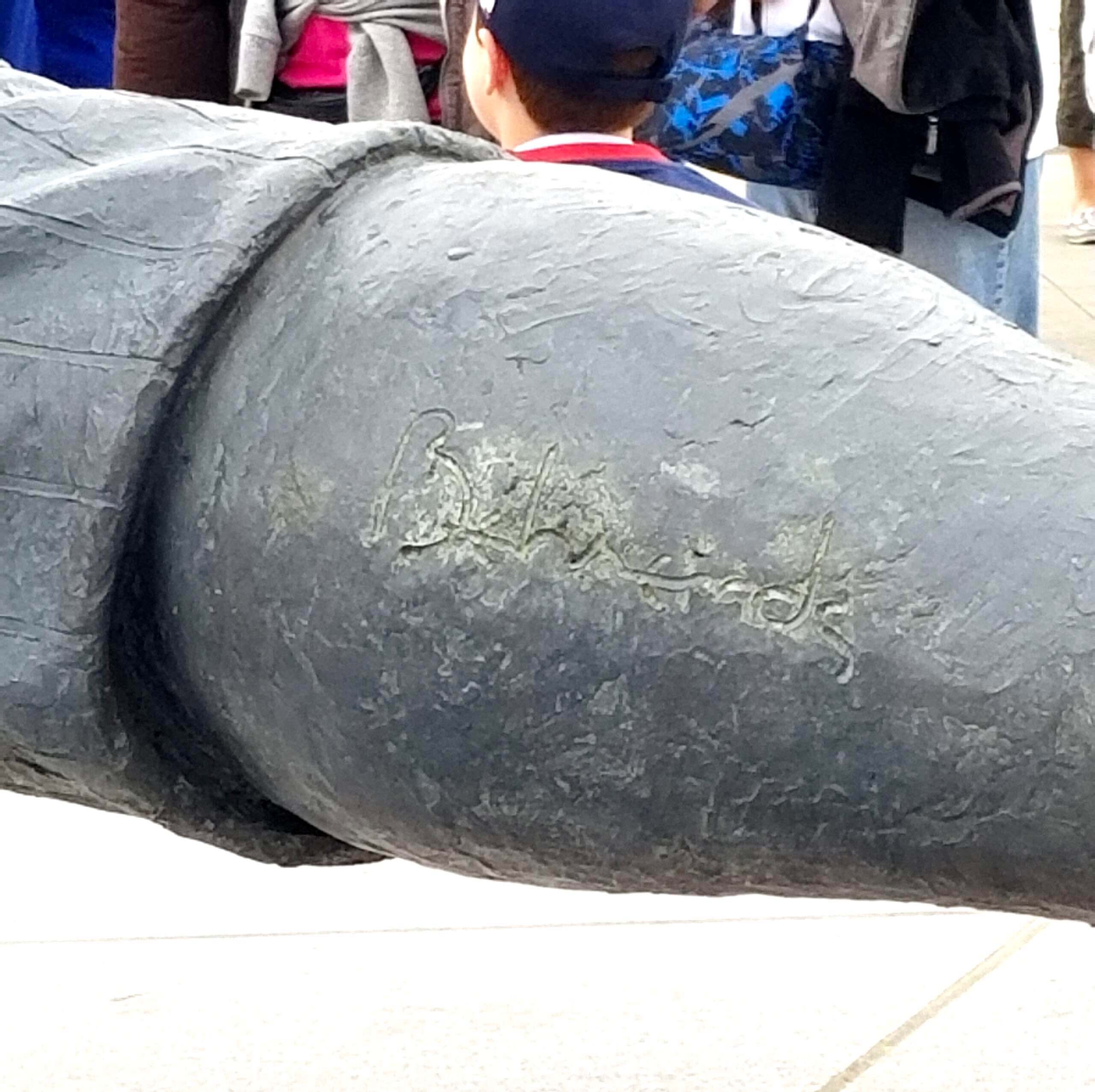
As I mentioned in my article, Behrends has done lots of other baseball statues. I wonder if he always puts his signature in the same place, or if varies from statue to statue. Something new to investigate!
Click to enlarge
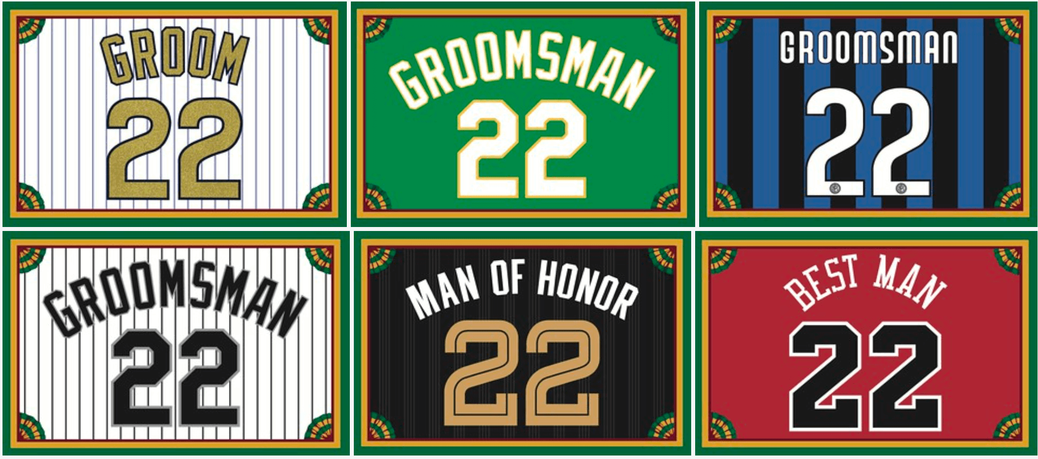
Membership update: Reader Samuel Patti is getting married next month, so he ordered a bunch of membership cards for himself and other people who’ll be part of his wedding. Isn’t that cool? There’s one more groomsman’s card that includes some purple, so we’ll be taking care of that one tomorrow.
Even if you’re not getting married, ordering a membership card is a good way to support Uni Watch, and fun to boot. And remember, a Uni Watch membership card entitles you to a 15% discount on any of the merchandise in the Uni Watch, Uni Rock, and Naming Wrongs shops. (If you’re an existing member and would like to have the discount code, email me and I’ll hook you up.)
As always, you can sign up for your own custom-designed card here, you can see all the cards we’ve designed so far here (now more than 3,200 of them!), and you can see how we produce the cards here.
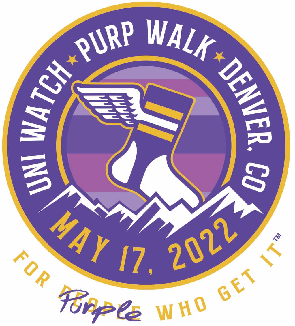
FINAL Purp Walk countdown: Tomorrow is the 2022 installment of Purple Amnesty Day. Here’s what that means:
1. Tomorrow’s blog post will be published at midnight Eastern tonight (give or take). It will feature plenty of purple-centric content, including an all-purple edition of Brinke Guthrie’s “Collector’s Corner” column.
2. Tomorrow’s post will also include links that you can use to order this year’s Purp Walk T-shirt and the first-ever purple Uni Watch baseball bat, both of which will be available for only 24 hours.
3. If you want to order a purple-inclusive membership card this year, you’ll have exactly 24 hours to do it, beginning at midnight Eastern tonight.
4. I’ll be flying to Denver tomorrow morning, arriving in the early afternoon. After I decompress for a bit, I’ll head over to the Purp Walk party at the Blake Street Tavern, which begins at 4:30pm. If you pre-ordered a T-shirt and/or won one of the free tickets to the Rockies game, you’ll be able to get your shirts/tix at the party. I’m excited to see all of you!
One more day.
The Ticker
By Jamie Rathjen

Baseball News: Mets mascot Mr. Met doesn’t have a period in his NOB, but Mrs. Met does. I’m not sure we’ve mentioned their NOBs on the site before, but Paul also once found a picture of Mr. Met where he’s wearing “Mr Met” as his front script (from _@RF30). … Phil had this in yesterday’s Ticker, but in case you missed it: The Rays are reportedly scrapping their grey road jerseys next season.

Football News: Here is an overview of Colorado’s helmets since 1969 (thanks, Phil).

Basketball News: In this interview, the designer of the updated NBA trophies explains some of the symbolism he built into the hardware (from Matthew Wolfram). … Yesterday was the 25th anniversary of the Wizards’ renaming and recoloring, so the team changed their Twitter picture for the day to the first Wizards logo and posted a jersey mashup (from @realRosebud). … The WNBA’s Minnesota Lynx were planning to wear black for Saturday’s home game — the “new threads” text is referring to the players pictured, not the jersey — but after their opponents, the Chicago Sky, also brought their black uniforms, the Lynx wore white instead. … Meanwhile, the Indiana Fever wore a pin on their warm-up shirts supporting the Phoenix Mercury’s Brittney Griner, who is still being held in Russia.

Soccer News: New first shirt for Germany’s Borussia Mönchengladbach, which was worn in their Bundesliga game on Saturday. … New first shirt also for Poland’s Górnik Zabrze (from Ed Żelaski). … New third shirt for Sweden’s Djurgårdens IF. … USL League Two’s One Knoxville SC also has a new shirt. “I’m loving the font and coloring” of the numerals, says Jake Thompson. … MLS released its pride warm-up shirts for this season yesterday (thanks, Phil). … The blog Museum of Jerseys has a graphic on the numbering of FA Cup final winners since 1993, when English men’s teams started numbering players in the same way as other sports instead of starters being numbered from one to 11 based on their position in a given game. The site also has a series on what those teams might have looked like if starters were restricted to one to 11, the title being a reference to the Coupe de France, which actually does do that. … New home shirt for Real Madrid (from Ed Zelaski).

Grab Bag: Virginia men’s lacrosse is once again wearing orange helmets for the NCAA tournament. … Rutgers men’s lacrosse memorialized former coach Tom Hayes by wearing his FNOB during their first NCAA tournament game (from Max Weintraub). … Australian Football League club Port Adelaide revealed its new Indigenous design. … Two games in Australia’s Super Netball this weekend, Collingwood/Queensland Firebirds and Sunshine Coast Lightning/West Coast Fever, were pride games, with both teams wearing rainbow-lettered bibs. … Utah’s former Dixie State University started a process to rename itself to Utah Tech last year and revealed its new logos yesterday (from Taylor Acton).
That’s it for today. See you back here at midnight for Purp Walk 2022! — Paul
Backstrom wearing his numbered hoody with a Kraken hat. link
It’s an Old English “S,” not a Kraken logo.
Re: the one inset image in the NFL book.
We all know that the Cleveland player in the main pic is the immortal Jim Brown. But is the inset player also Jim Brown or is it meant to be Ernie Davis (who wore the 44 shirt for Syracuse)?
Pretty sure that image says “Ernie Davis” at the lower right of the inset.
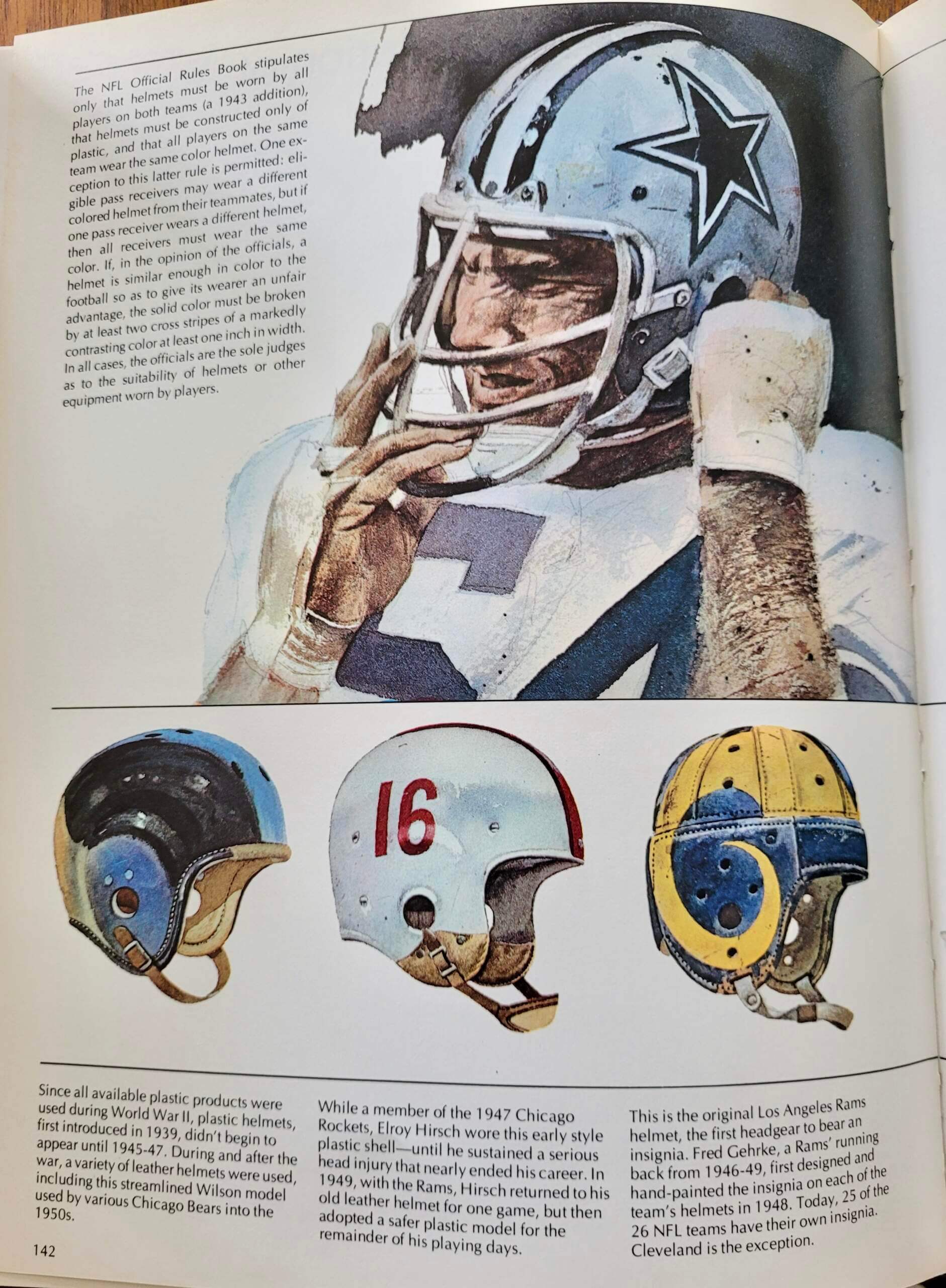
The color picture of the helmets from the book shows a Bears helmet with a blue middle stripe and a blue earpiece. The caption says these were worn “into the 1950s.” The Gridiron Uniform Database doesn’t show any blue on any of the helmets used by the Bears during the leather-helmet era. Same to assume this is an error in the book and not in the GUD?
I particularly appreciate how most of the Marvel characters were drawn to mirror the poses of the players in the photos. Does anything in the text we can’t see identify the artist or artists?
Thanks for sharing these pages!
Legendary Marvel artist John Buscema did all of the drawings.
As noted in my text, the artist was John Buscema.
Thanks! And d’oh for missing that.
When I think of football/superhero crossover images, it makes me think of Geroy Simon.
This is more of a CFL/DC Comics crossover. Geroy is the CFL all-time career leader in receptions and receiving yards. Known for the Superman pose signature to his touchdown celebration.
I have seen way too much of the Superman pose in BC Lions orange, so let’s take a look at it in Roughriders green. Geroy’s final game. 2013 Grey Cup.
link
Growing up a Marvel kid and not a sports kid, I’d have to say those are original drawings for the book, and not just recycled images. Definitely the last four mirror the image of the linebacker. This is such an amazing revelation! A cross promotion before it was passe.
The purple UW logo cap won’t be offered for purchase tomorrow?
No, unfortunately. Supply-chain issues! (Really.)
We’ll bring it back next year, I hope.
The book says receivers can wear different colored helmets than everyone else. Is that still the rule? Did anyone ever do that?
With the Rays scrapping their grays, it’s probably a sign yearly/matching All-Star Game uniforms are here to stay. Otherwise they’d stand out like a sore thumb, being the only team out there in a colored jersey.
Not necessarily. Padres haven’t had greys for the past few seasons.
They haven’t officially had a primary road gray since 2020…the first year, there wasn’t an ASG, so no data point, and last year they wore the matchy-matchy stuff. Not only that, but SD could theoretically wear their ‘alternate’ sand/tan uniforms with the rest of the NL road uniforms and fit in about as much as the Giants do when the NL is the home team. I’d say the Rays ditching the road grays entirely brings up a pretty interesting point about future ASGs, all-in-all.
“Otherwise they’d stand out like a sore thumb, being the only team out there in a colored jersey.”
I refer you to any “visiting” team photo of any ASG from the 1970’s to refute this assumption.
link
I know this is probably hoping for too much. If Rays wearing their Columbia blue jerseys as regular road jersey, we need them in blue pants to match the jersey. Maybe putting that foot in the door to get teams back in powder blues as a regular road uniform again (Twins, Blue Jays, Royals I am talking to you).
It’s Ernie Davis. The paintings were taken from an article on Syracuse running backs in the NFL. There was also a very small illustration of the late Floyd Little.
Safe travels tomorrow Paul! I’m really looking forward to Purple Amnesty Day as always and have a doozy of a card request.
So I’m stuck in Austin Texas because my flight to Denver got canceled. I’m going to miss the entire event. Paul if you get this message go ahead and give away my tickets. If anyone else gets this message and is going to the party, please let Paul know that you saw this. I have no other way to reach him at the moment. Sorry, looks like it would be a lot of fun.
Regarding the Rockies’ uniforms, I would actually like to see more purple on their home uniforms: replace the black numbers and lettering with purple (perhaps trimmed with black).