By Phil Hecken
Follow @PhilHecken
Good Saturday Morning, Uni Watch nation. I hope everyone has had a good week!
Once again, I’m back with Chris Diamond, who in March brought us a couple terrific think pieces about what might have happened had the USFL & NFL merged thirty five-ish years ago. They were quite well received. If you missed either one, or want to re-read, you can check out Part I here and Part II here.
Part III looked at the uniforms for the first 20 teams from Chris’ 40 team league. He now returns for his look at the final 20.
Here’s Chris!
A 40 Team NFL: What if the NFL and USFL Merged in 1987? (Part 4)
by Chris Diamond
Here is Part IV of my NFL-USFL merger what-if piece, this time looking at
the remaining 20 teams’ uniforms. Same rules as before apply: No BFBS,
Uni-momentum and no wishful thinking! Here we go…
Los Angeles Rams
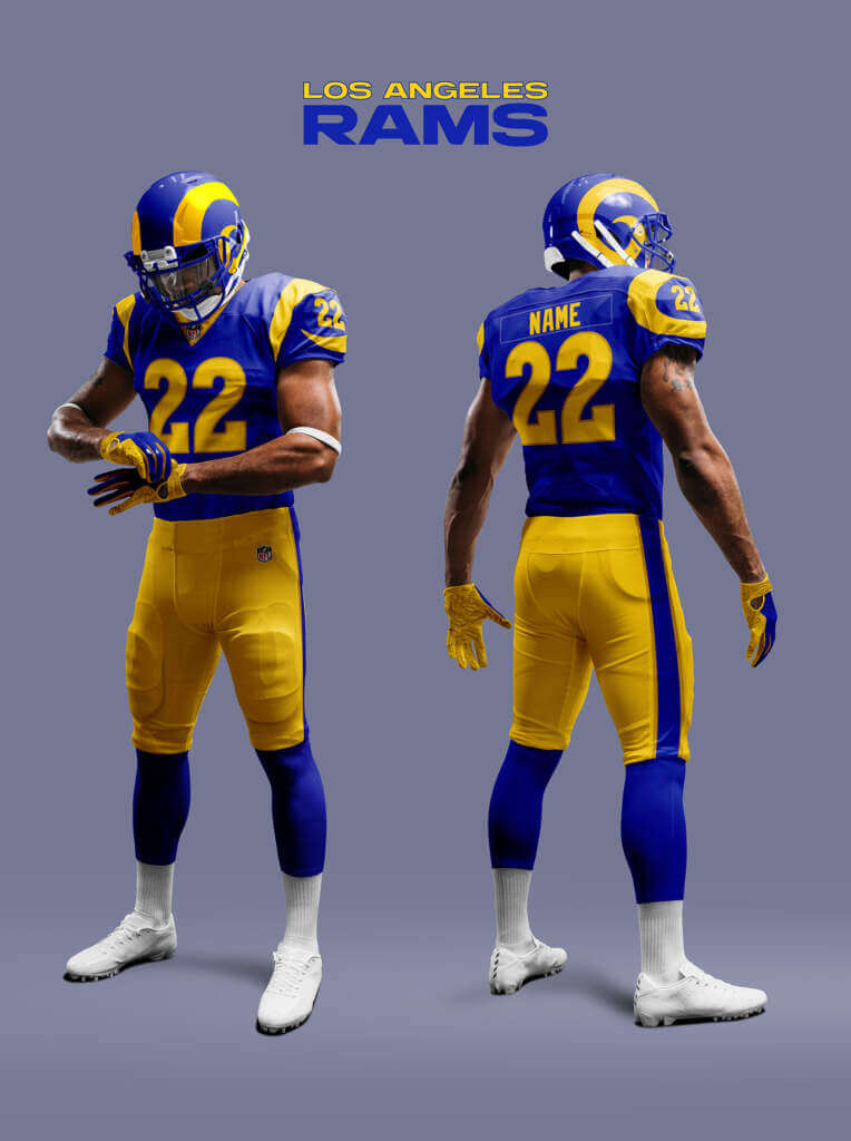
The Rams’ 2020 re-design in our Reality has divided opinion. Most people who GetIt™ seem to agree that the designs themselves are pretty poor, from the split horns to the gradient numbers and dishwasher road jerseys. But the updated blue and yellow color scheme with consistency across the jersey and helmet is less controversial. In this Alt-Reality the Rams never left LA, so never felt the need for such a sweeping re-design. But the mismatch between helmet and jersey colors while charming to some, would likely have been fixed. So here they go with the new colors, but essentially stick with the iconic Ram’s horn sleeve design (with minor updates to the stripes and numbers).
Memphis Showboats
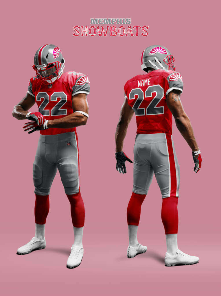
The original Showboats uniform was a bit plain. I think at some point they would have had an overhaul to make them more unique. So the helmet and pants striping have white added to fit better with the logo. The sleeves are changed to silver and the logo is added at the seam as it fits so perfectly there!
Miami Dolphins
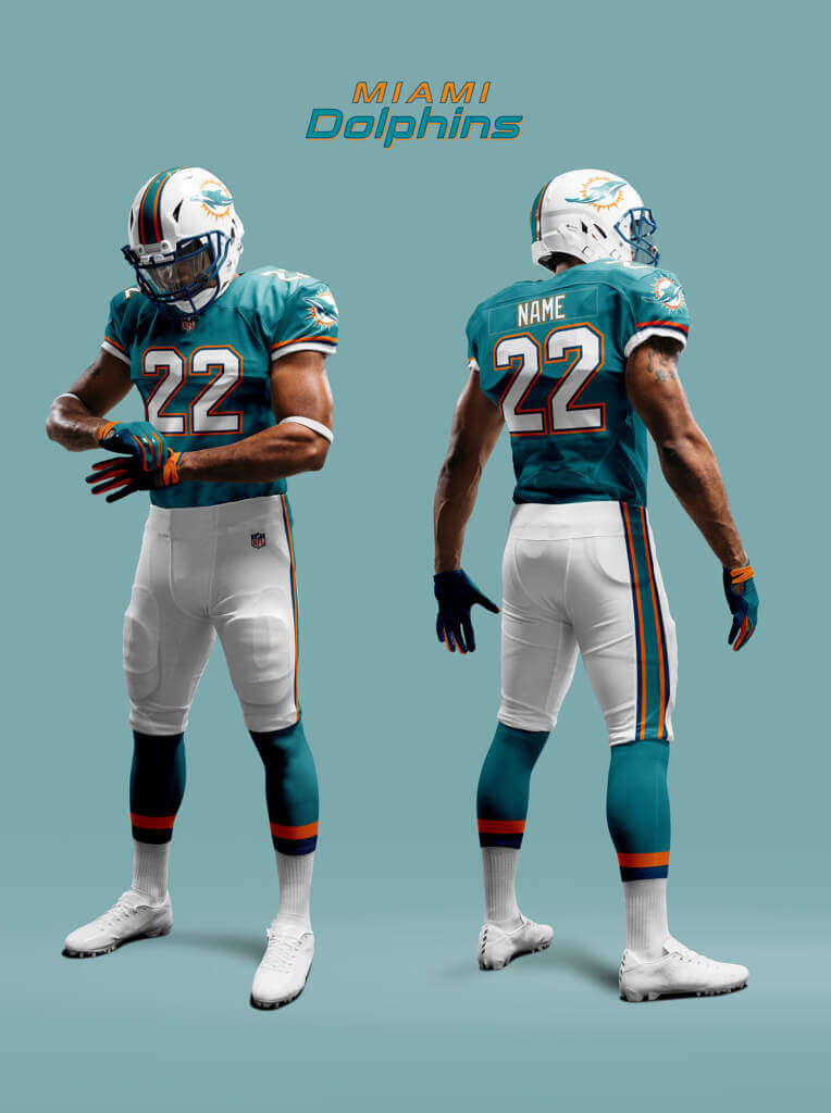
Our Reality Dolphins updated and modernized their look in 2013. Like all modernisations of classic looks this one, although well executed, has divided opinion. In 2015 they introduced a throwback to their classic look and in 2020 they removed Marine Blue from the scheme making it more like the classic scheme. So if the team keeps playing badly we can maybe imagine a Colts or 49ers style nostalgic full reversion to the throwback style along with the mandatory grey facemasks! This sort of misty-eyed Blame-The-Uniform™ doesn’t happen in the Alt-Reality and the Dolphins go all-out for the new look, making full use of the Marine Blue and Aqua of the logo.
Minnesota Vikings
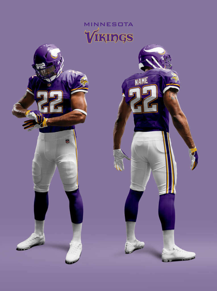
Like the Rams, the Vikings got a makeover in 2013 where they updated and harmonised the shade of purple (good) but added over funky numbers and some #BFBS (bad). The Alt-Reality Vikings go with the new purple, but don’t fall into adding the over Nike-ified features.
Nashville Pioneers
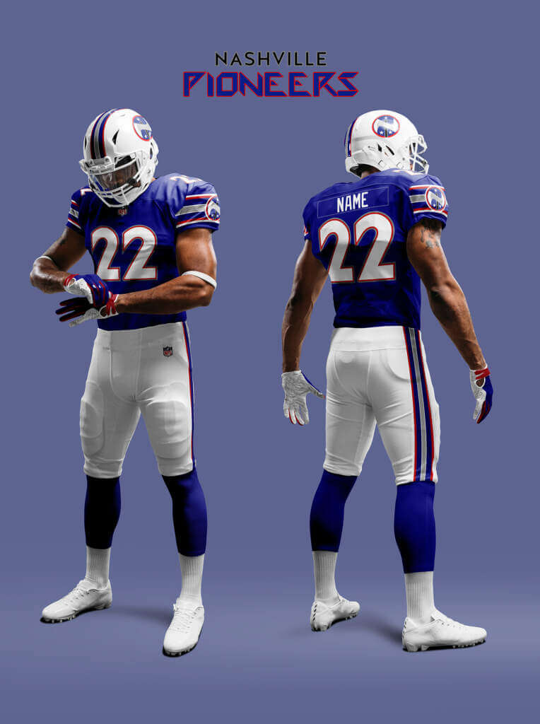
The Pioneers are the team the Nashville Renegades changed to. They keep a similar look to the old Renegades but add in red as a highlight color as well as updating the numbers. The logo represents a stylised axe head letter “N”.
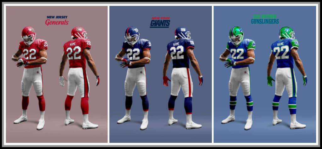
New Jersey Generals
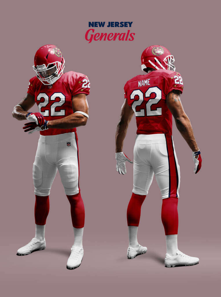
The Generals Uni was pretty classic right from the get-go. Even the USFL2 Generals uniform has hardly changed. So I think given the Uni-momentum it’s unlikely to be hugely different. The USFL2 Generals added a ring of stars on the shoulders, but I think they look better on the sleeves. I did toy with a DJT memorial patch for Donald Trump (presuming he had passed away in this Alt-Reality). But I think DJT in any reality plans to live forever!
New Orleans Saints
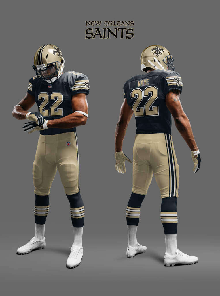
The Saints’ black and gold is such a beautiful look. One that in our Reality has been sadly neglected in recent years with the team preferring total mono-black (aka the full Max Wall look). Here the Saints stick with the black and gold and bring back the old-skool sleeve and sock
stripes.
New York Giants
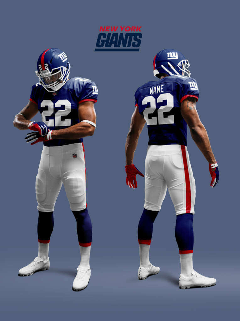
In our Reality back in 1994 the Giants throwbacks brought back the classic NY logo. Six years later they went back to it full time and also went back to something based on the pre-1975 uniform. In this Alt-Reality, the Giants moved back to New York in 1987 and also brought back the classic NY logo. But here, rather than just resurrect the old uniforms, they chose to make them a combination of old and new.
New York Jets
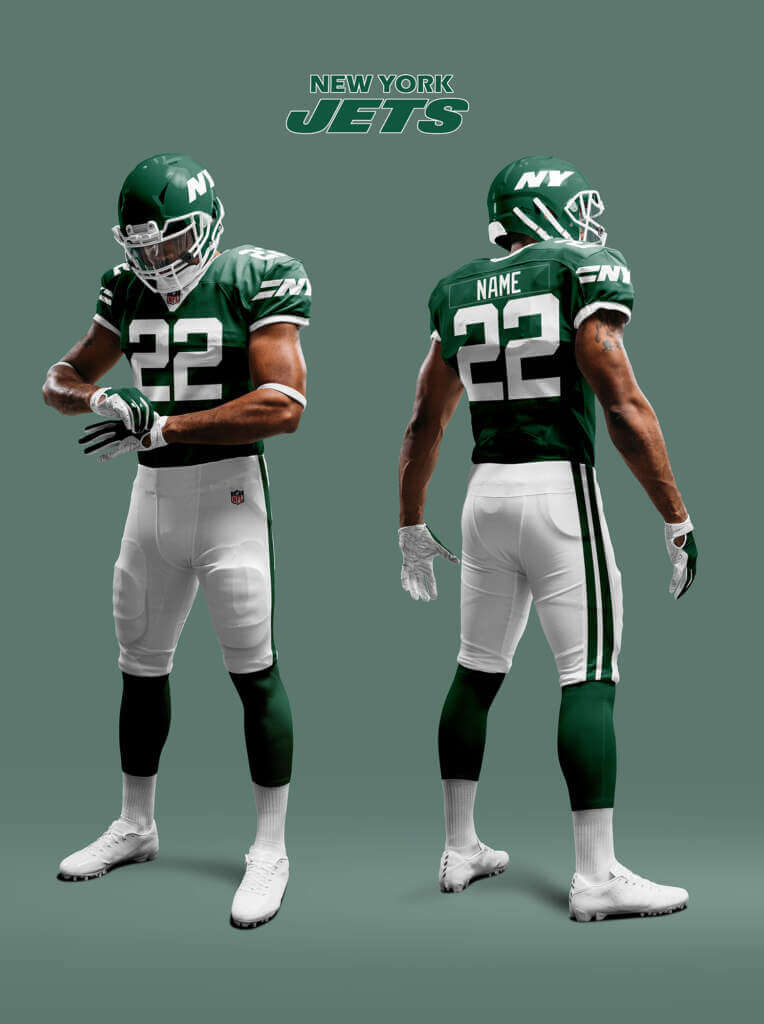
In our Reality, the Jets have been going a bit Jekyll-and-Hyde between variations of the Namath era uniforms and the New York Sack Exchange era uniforms. With a bit of #BFBS too of course. Thankfully in this Alt-Reality they stick with the pure Kelly green and white, only updating their helmet logo to NY to re-emphasize their return to the city.
Oakland Raiders
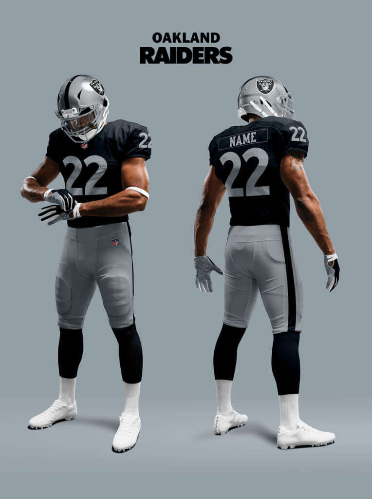
The Raiders probably have the most classic long-lived uniform in football. Breathtakingly simple – silver and black, no embellishments and just a single black stripe on the helmet and pants. Given the long history and Uni-Momentum behind it, it is unlikely to change in most Realities. But the only thing that isn’t unique is the standard college block numbers. So if the Raiders were to change anything, it would most likely be that. So I have imagined they have changed it to one based on the font the team used in its early years.
Philadelphia Eagles
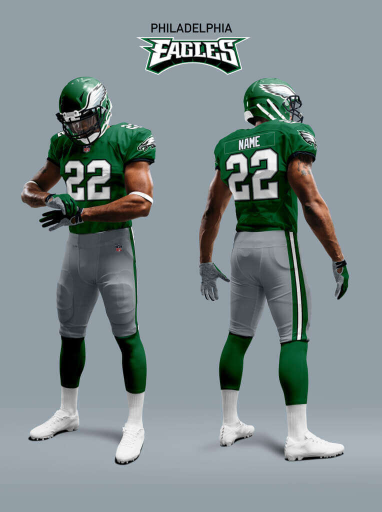
The Eagles midnight green uniforms aren’t bad, but they are definitely a #DarkForDark’sSake creation. And the green and black tend to merge together unless seen under bright daylight. The Eagles are bringing back the Kelly Green throwbacks but there seems to be a growing momentum for the Kelly Green to return full time. So in this anti-dark Alt-Reality the Eagles updated the helmet and the logo but stuck with Kelly Green! Also keeping the silver pants.
Pittsburgh Steelers
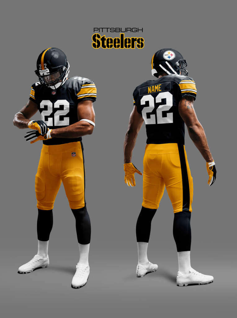
Like the Raiders, the Steelers look has become a classic. Marking the time the team transitioned from perennial losers to six time Super Bowl winners. Teams mess with classic looks at their peril, but of course the Steelers did just that in 1997, going to Futura number font and adding a jersey logo. I am a Steelers fan and happen to like the look, but I think it’s at least equally likely that they could have just stuck with the old design, so I’ve assumed that’s exactly what happened in the Alt-Reality.
Portland Breakers
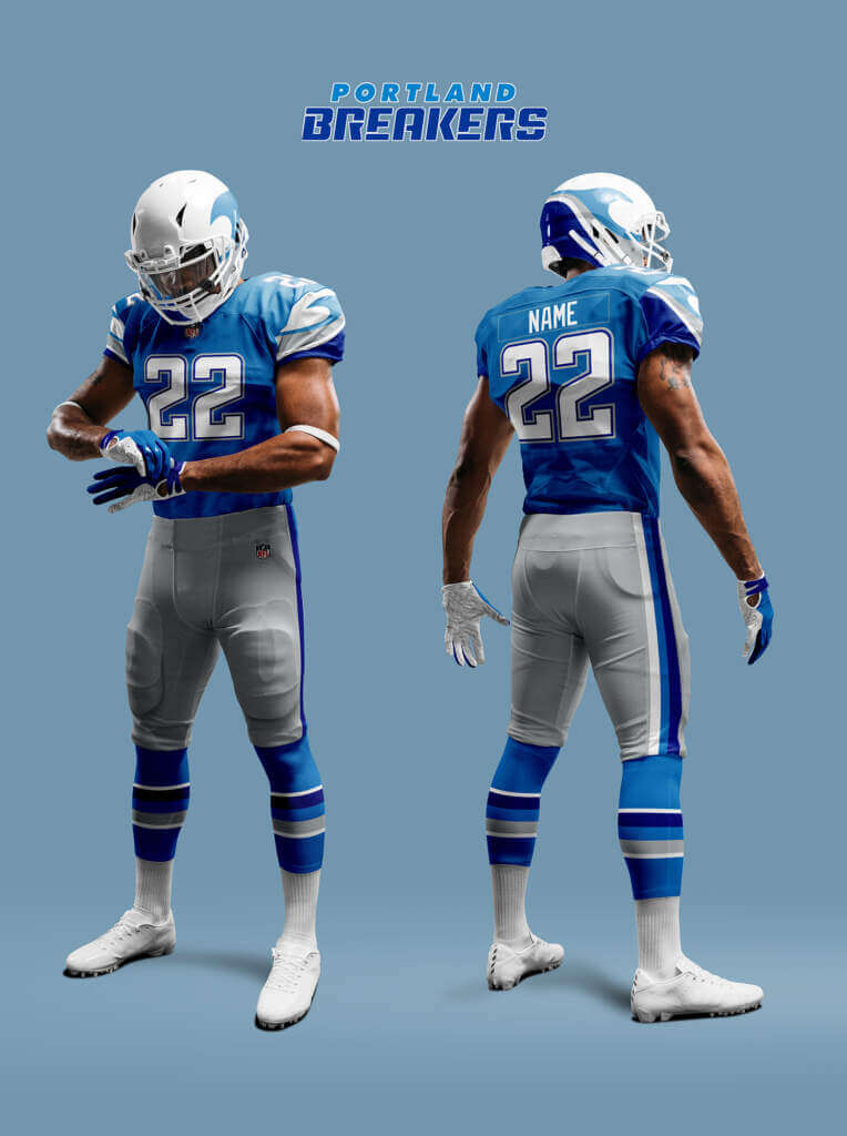
The USFL2 New Orleans Breakers probably have the best uniforms in the league. They are good but they made the jerseys Royal Blue and added a wave pattern to the sleeve that doesn’t quite work. So here the Alt-Reality Portland Breakers update their logo in a similar way, but stick with the Process Blue jerseys and add a more accurate pattern to the sleeves.
San Antonio Gunslingers
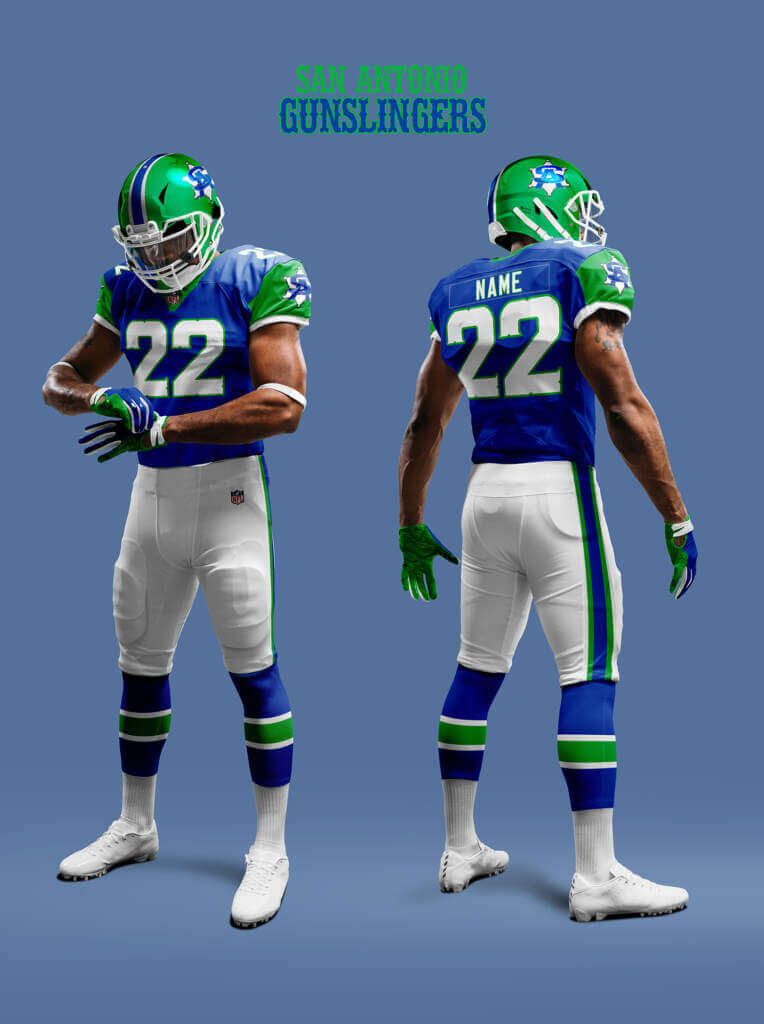
As mentioned previously, the Gunslingers bright green and blue scheme was the idea of maverick owner Clinton Manges. In the Alt-Reality the Gunslingers updated the cartoon logo to a Sheriff’s star based one and stick with the colors, but ditch the silver for a simpler look.
San Diego Rockets
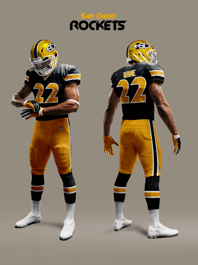
The Rockets are what the Utah Gold became in this Alt-Reality. They keep the same black/athletic gold scheme but change to a metallic yellow-gold helmet and change to a more spacey looking number font.
San Francisco 49ers
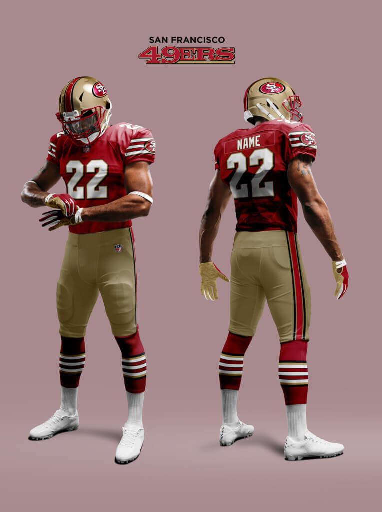
To recap… the 49ers switched to a new look in 1996 based on the throwbacks they wore in the NFL 75th season in 1994. In 1998 they updated the uniform to match the new logo and all was harmonious. But then in 2009 after a few bad seasons they decided to get back to winning ways they needed a change (aka BlameTheUniform™). So they went back to their pre-1996 look (plus classic faux-70s grey mask. But they kept the new logo, which now didn’t match anything! If the throwbacks thing hadn’t happened in ’94, the 49ers might well have just stuck with the classic look, ending up with something like they are going to wear in our Reality in 2022. But instead I assume in the Alt-Reality they double down on the new look and
go all-in!
Seattle Seahawks
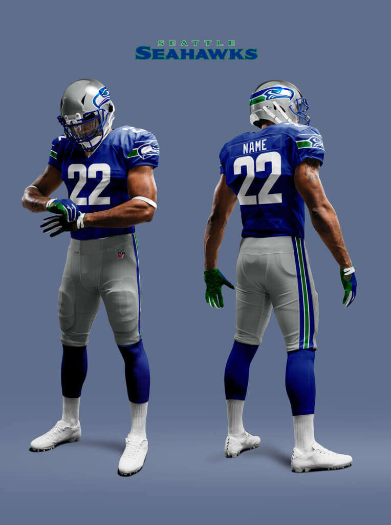
Poor Seattle are the most Nike-fied team in the NFL. Guinea pigs for the mono in 2002, and going mono dark with fiddly patterns in 2012. The navy, silver and bright green color combination works OK for me, but under the no
#DarkForDark’sSake rule it gets flagged with an Un-Uni-like Conduct Penalty and is ejected from the game! The uniforms the Seahawks had prior to the 2002 Reebokfication were darn near perfect, so without the designers’ malign influences they stick with that, only updating the number font and pant stripes order to match the jersey collar.
St. Louis Cardinals
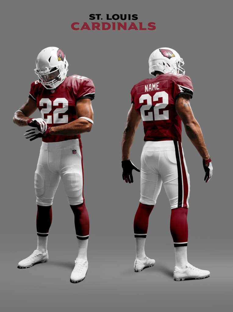
I already mentioned the Alt-Reality Cards have ditched the faux-50s grey facemask finally, but what about the Unis? For the longest time, the Cardinals were defined by their plain unfussy Cardinal Red jerseys. So I think it’s quite likely they may have stuck with the plain jersey, or like the Giants (in our Reality) gone back to it after a time. But I’d like to think they could have come up with something that honors the spirit of the plain cardinal red jerseys but also incorporates the other meaning of Cardinal — the bird. So here I imagine they have the plain jerseys but add a subtle black and white detail at the end of the sleeves based on the Cardinal head crest. The pants and socks also feature cardinal, black and white.
Tampa Bay Buccaneers
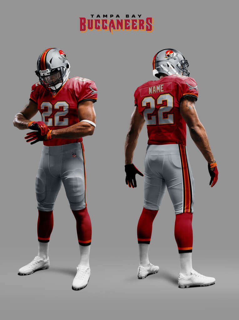
You may remember from the other parts, the Alt-Reality Bucs were a merger between the Bandits and Buccaneers in 1987. So their uniforms since then have been mash-ups of the two teams. I assume that continues with the team adding more Florida Orange and creating a logo that combines Bucco Bruce
with the Skull-and-Bones.
Washington Commanders
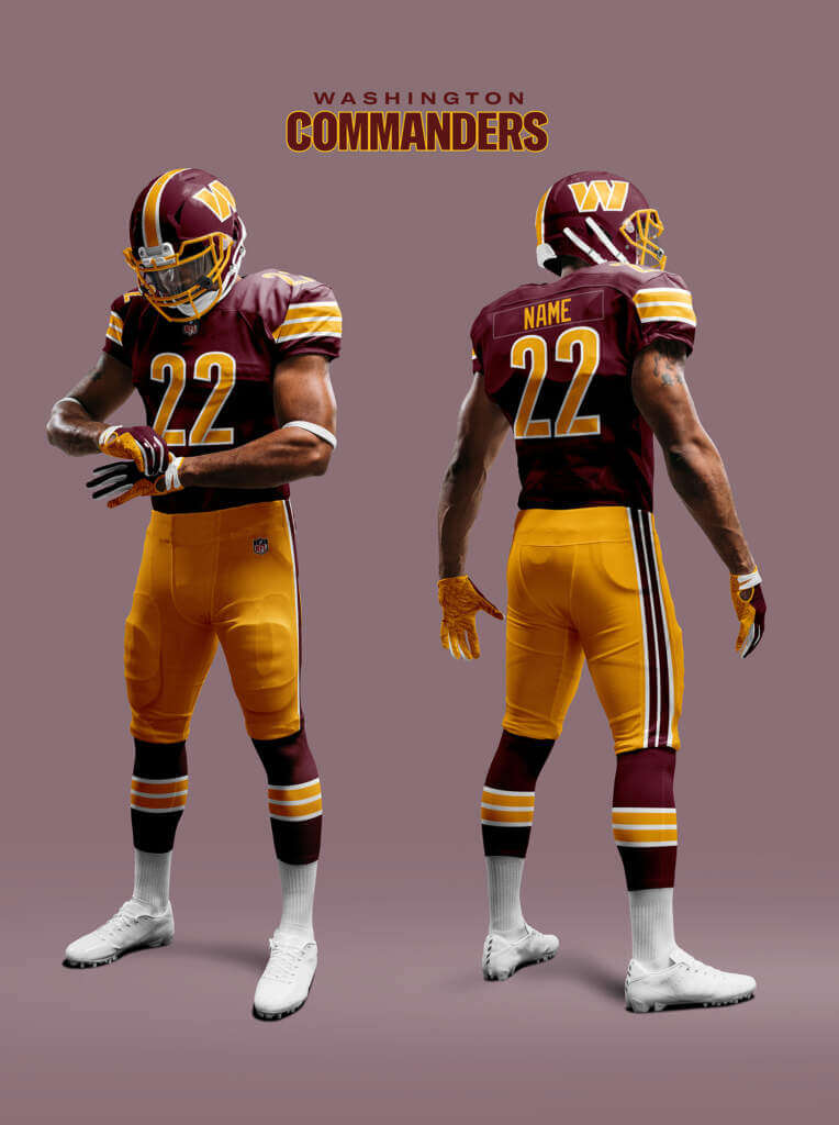
By now we are all familiar with the train wreck that is the new Washington Commanders Unis. The tragic part is that there are some good elements to the design but they are swamped by the overall football tone-deafness of it. It’s almost like they had someone who normally only designs soccer uniforms do it. Thankfully this Alt-Reality isn’t bound by these faults so I imagine they managed to come up with something that is recognisable as a Washington uniform. Without the shouty wordmark or mono-nonsense! And yes that *is* the re-design concept I sent to Phil. In this case I did allow myself a little wishful thinking!
Well that’s it! I really hope you enjoyed reading all four parts of this piece as much as I did creating them. Thanks for reading and commenting and thanks to Phil (and Paul) for publishing it. Hopefully I’ll be back with something new later on this year. I already have a few ideas 😊
Fantastic job, Chris! Wonderful project overall as well. Thank you so much for sharing this great think piece with us. I anxiously await the next project (I’ve seen some of the ideas Chris has in store, and I’m sure they too will be a hit with the readership). Readers? What say you?


Guess The Game…
from the scoreboard
Today’s scoreboard comes from Leo Stotch.
The premise of the game (GTGFTS) is simple: I’ll post a scoreboard and you guys simply identify the game depicted. In the past, I don’t know if I’ve ever completely stumped you (some are easier than others).
Here’s the Scoreboard. In the comments below, try to identify the game (date & location, as well as final score). If anything noteworthy occurred during the game, please add that in (and if you were AT the game, well bonus points for you!):

Please continue sending these in! You’re welcome to send me any scoreboard photos (with answers please), and I’ll keep running them.


Uni Concepts & Tweaks
Time for more Uni Tweaks from the UW readership.
I hope you guys like this feature and will want to continue to submit your concepts and tweaks to me. If you do, Shoot me an E-mail (Phil (dot) Hecken (at) gmail (dot) com).
Today’s concepts come from Trey Gorman:
Phil
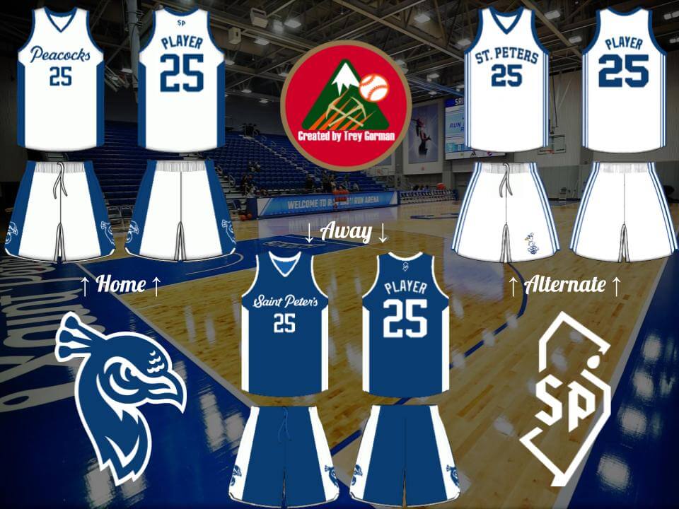
This March Madness, everyone fell in love with the loveable 15th seed St. Peter’s Peacocks. But their unis aren’t perfect, so I reworked them. The GFGS home uniform is replaced with a traditional white, with “Peacocks” emblazoned on the front since it is such a unique nickname. The road remains similar to the current ones, minus a few changes. Other minor adjustments to the main two include an arched NOB, placement of the primary logo on the sides of the shorts, a change to the New Jersey SP logo on the back of the road, and minor adjustments to the collar area. The alternate uni is a throwback to the 1968 NIT team, the Peacocks’ first Cinderella run. A retro logo is placed on the shorts for good measure. Strut Up!
Trey Gorman
OK readers (and concepters). If you have some tweaks or concepts, shoot ’em my way with a brief description of your creation and I’ll run ’em here.


Uni Watch News Ticker
By Anthony Emerson

Baseball News: Pitt softball honored late JMU softball player Lauren Burnett by adding her initials and uni number to the base plates (from James Gilbert). … ESPN has an article about how PitchCom is taking over MLB (thanks, Paul). … Starting last night, the High-A Brooklyn Cyclones will play as the “Brooklyn Amazins” for every Friday home game, a nod to their MLB affiliate (from Mikey Cooks). … The Louisville Bats, Triple-A affiliates of the Reds, will wear Marvel-themed unis tonight (thanks, Phil).

Pro Football News: The Colts and Lions have both revealed their number assignments for their draft class (thanks, Phil). … Also from Phil, the Steelers will bring back the block numbers for select games to celebrate the 50th anniversary of the Immaculate Reception. … The USFL’s Tampa Bay Bandits have inconsistent side panels — note how the lineman has black stripes on his side panels, while the quarterback has plain red (from @Wilds_Lee).

Hockey News: Here’s a cool story about a Toronto artist who’s documenting the Maple Leafs’ season through comics (from David Northrop). … Huge Nike logos on Team USA helmets. Note that those are advertiser logos, not makers marks (from Steven Woj).

NBA News: The new Jazz logo may have leaked via an NBA ad for the Vegas Summer League. … The Spurs have released a 50th anniversary logo. Unknown if it will be worn as a patch. … Nike likely will not extend their shoe deal with Nets PG Kyrie Irving (thanks, Brinke).

Soccer News: French club Stade Rennais have unveiled their 2022/23 home kit (from Ed Zelaski). … Also from Ed and staying in France, new home shirt from Strasbourg. … Italian giants Juventus have unveiled their 2022/23 home jersey. I’m not the only person who thinks the stripes look like tire tracks. Perhaps a nod to their advertiser? (from multiple readers). … New USL League Two side Vermont Green FC have unveiled their inaugural kits (from multiple readers).


Uni Tweet of the Day
Best thing the D-Bax ever did to improve a uni: Adding tan (sand) pants to match their CC jersey. Looks soooo much better…
Fits for the weekend. pic.twitter.com/N7molczHHR
— Arizona Diamondbacks (@Dbacks) May 13, 2022


And finally… that’s all for today. BIG thanks (again) to Chris for the final piece of his multi-part “What if” think piece. Great job with that and looking forward to your next project!
Everyone have a great day and I’ll catch you back here tomorrow.
Peace,
PH
GTGFTS: I get the bonus points for having been there for a great uni matchup.
July 20, 2019, celebrating the 40th anniversary of the Pirates’ last World Championship against Philadelphia. (The 50th anniversary of man on the moon was less important.)
link
I’d link to the next day’s Uni watch, but there’s a lot of link rot in the photos.
Looked like a 3 Rivers remembrance day.
Most of those unis (except the 49ers) are way better than what the teams wear now. Well done!
Thanks GTV. I knew the 49ers one was unlikely to popular with traditionalists! But hey, you have the joy that the real team uniform is closer to what you prefer rather than the other way around :)
Pitt softball honored late JMU softball player Lauren Burnett by adding her initials and uni number to the base plates
It was the Atlantic Coast Conference doing the honoring, at the Conference tournament hosted by Pitt.
My goodness those Eagles and Commanders uniforms are beautiful. Well done all around, but especially on the real-life NFL teams where small tweaks make for big improvements.
Thanks Scott!
I mocked up a very similar Iggles concept years ago — just with silver trim link
The Cunningham unis were the best in Philly history.
Hey WFY, those are very similar I agree! I toyed with the idea of giving them white socks with stripes like you have but in the end went for all green. But I think you’re right, these days sock designs are moot due to the huge number of flagrant uniform violations about now! Unless you are wearing your equipment differently for medical reasons, I find the whole thing a bit childish. It reminds me of my (high) school where we had to wear uniforms (for school not sports!). So many wore the tie in a weird way or shirt un-tucked etc etc!
This whole what if? project has been exceptional and well thought-out. It’s nice to see what would have happened if Nike hadn’t run roughshod over everything.
Hoping that when you say the Eagles, Raiders, 49ers and Saints had silver and gold pants, they’re actually metallic gold and not the matte gray and khaki Nike is passing off as silver and gold.
Logistically – if each team plays its own division home and away, there’s 18 games for the regular season. Top 2 in each division qualify for playoffs, divisions cross over in the first round, then the 2 conference champs meet for the Super Bowl? I know that leaves 32 teams out of the playoffs but 18 games is a long season and the fairest way to see who the best teams are. The math works out this way.
I know that leaves 32 teams out of the playoffs
I have no problem with that. Playoffs have become watered down in every sport…less so for football, but I wouldn’t mind seeing 8 teams now. Best 4 teams in each conference. If you win your division but aren’t in the top four, collect some bonus money and hang a Division Champs banner next season, but you’re staying home for the postseason.
Thanks MJ! Yes rest assured there are no dishwater beige or grey pants in this Alt-reality!
You win!
A most creative and well-thought-out project…great job, Chris!
I do miss the USFL Stars identity and uniforms though.
Geography aside, I always thought that they and the Gamblers were ‘ready for prime time’ and could have been folded into the NFL as-is.
Taking geography into account, I think the Stars and Invaders were a perfect fit in the real world. Two spurned cities with stacked teams coming in…would have been nice.
Great work again, Chris! Love the Showboats in particular. Giants and Generals, too…I really like the five stars around the sleeve numbers.
Thanks Chris and Jim! Yeah, losing the USFL Stars look was one regret I had about choosing the re-Colting of Baltimore as the Alt-history. Of all the re-designs of existing uniforms I think the Giants and Jets were among my favourites because I felt I managed to keep the simplicity without them just being copies of old unis.
Nice job on the entire series! You somehow managed to combine historical elements into new good looking designs. A+
Just one thing: the Dolphins and Vikings have the same number outline and sleeve stripe. Was that intentional, or did you just design them at different times?
Thanks Jayden! It wasn’t intentional, but the sleeves and numbers have the same stripe pattern yes!
Tremendous job by Chris Diamond on all four parts of this NFL-USFL project. Fantastic combination of history, design, & creative speculation. Thanks so much for the obvious time & effort you dedicated to this magnificent project!
Thanks hcm!
In 1987 the Raiders were in LA so wouldn’t the Oakland Invaders have been a consideration?
Also, the Washington football team was known as the Redskins then, so wouldn’t a mock up have been that name?
Hi Richard, you should read the other parts for the full story, but the Invaders were there in ’87 – moving later to Charlotte to become the Panthers. Washington changed their name in this Alt-Reality at the same time as ours and these mock-ups are all for 2022.
Great work on the USFL-NFL project. I know you’re only showing primary, but what would the away Breakers look like? White shirts, royal pants?
Also, sorry for nitpick but I don’t consider the tiny amount of Vikings black trim as BFBS. A black jersey would be. Adding some outline to make colors pop isn’t just for the sake of following a back jersey trend.
Thanks Neil! You are right the Vikings use of black isn’t as gratuitous as some. But the black is too close in tone to the purple so isn’t really adding anything. I think the Breakers road jersey would be white with silver pants.
My only nitpick is the thigh pads down around the knees and no knee pads. I know that’s the “look” but it just ain’t right, coming from a former lineman.
I agree Tim, but I was limited by the template I used. And it was hard enough to find one that showed any socks at all!
How are the Rams old sleeve horns “iconic”? Is everything “iconic” now?
BFBS is overused by the UW community as is… Now you’re trying to make DFDS a thing? Wow.
USA Helmets
24 is wearing a Bauer helmet, while 11 is wearing a CCM bucket. That giant swoosh is god damn awful.