By Phil Hecken, with Jimmer Vilk
Follow @PhilHecken
Greetings, and a good Saturday to all readers!
Last weekend, the USFL (Mach Deux) began its (new) inaugural season, with four games between the League’s eight teams kicking off. In case you missed it, on Easter Sunday I provided a look at the uniforms worn by the Generals and Stallions (you may need to refer back to that post for reference).
Today, I’m joined by quite possibly Uni Watch’s biggest USFL fan, Jimmer Vilk, and he and I are going to review all the uniforms (or at least the eight uniforms worn this past weekend) for the eight teams comprising USFL 2.0. Jim will kick things off by comparing how the unis of the original USFL compare to the “refreshed” versions (I’ll also show graphics of the old vs. new helmets, since in many cases there are big differences from the originals), then we’ll discuss the new unis.
Differences in Unis
by Jim
All uniforms shown below were worn in USFL I (1983-1985)
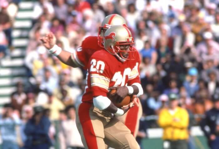
GENERALS
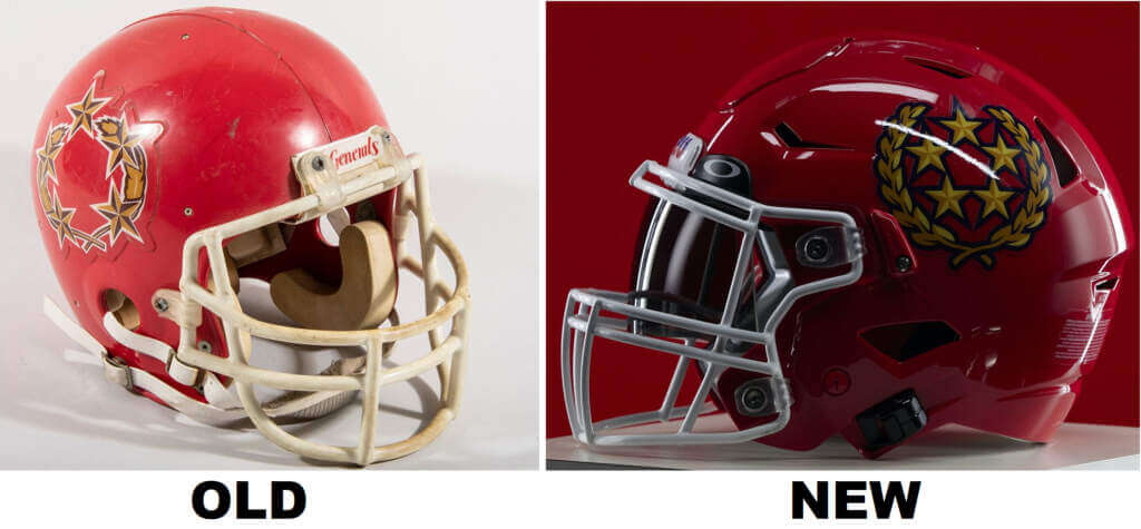
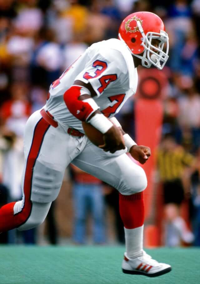
Very similar unis, with the biggest difference being the helmet logo. The five stars are inside the wreath instead of on it, and the stars have been added to the shoulders.
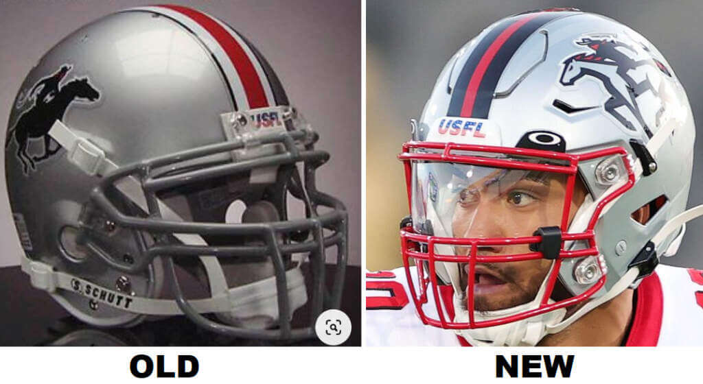
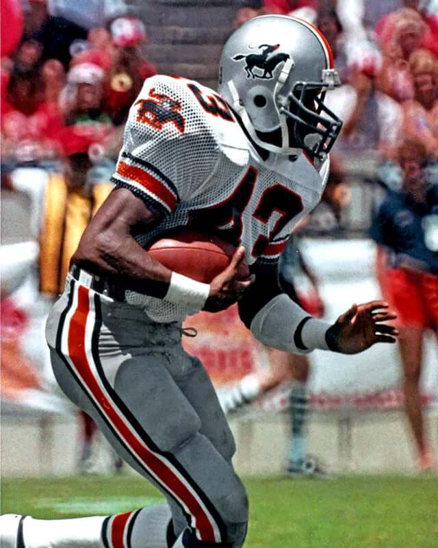
STALLIONS
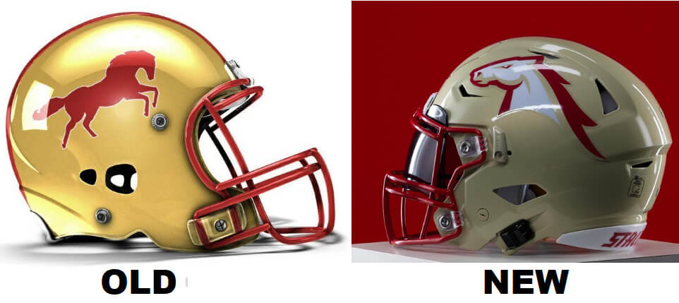
The helmet and pants are more tan than gold. The helmet logo is a white horse head instead of a red full horse, the stripe starts wide in the front then tapers down to almost the back of the helmet, and the jersey numbers have a rectangular block font.
GAMBLERS
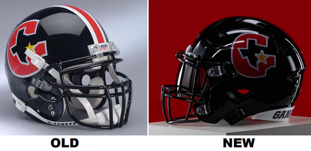
No helmet stripe or sleeve stripes this time. Pants have gone from gray to charcoal, with a solid black stripe that goes up the side of the white jersey (black jerseys have charcoal side stripes).
PANTHERS
Head of the panther is outlined in plum instead of solid plum. Numbers are not outlined and (same as most teams) thinner and non-serifed.
STARS
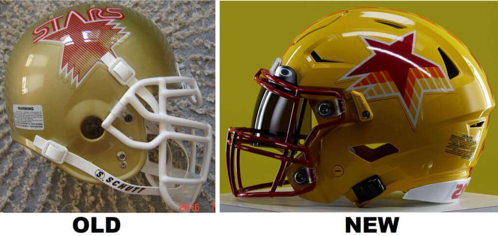
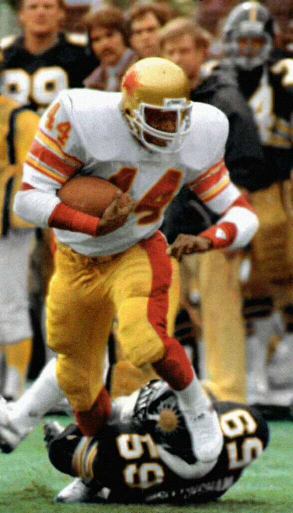
Helmets and pants are a brighter yellow instead of gold, with diagonal tiled red/yellow striping that also appears on the jersey sides. No lettering on the logo, no sleeve stripes and a rounded/angular number font.
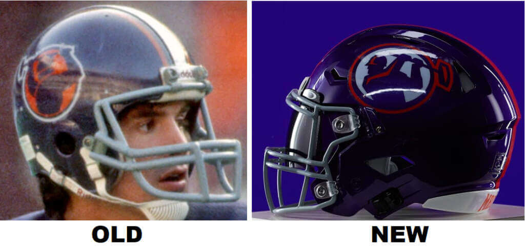
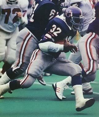
BREAKERS
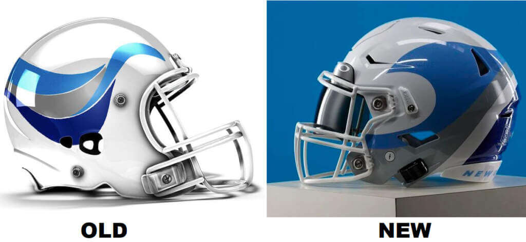

Slightly different helmet logo, with a big light blue wave on the sides and a swell of darker blue in the back. The wave replaces the sleeve stripes on the jerseys.
BANDITS
The horse on the helmet logo is outlined in black instead of solid, with a red tail. Striping is black/red/black, dropshadow numbers are red on the white jerseys, collars are red on both jerseys, facemasks are red and bandit head logos replace sleeve stripes.
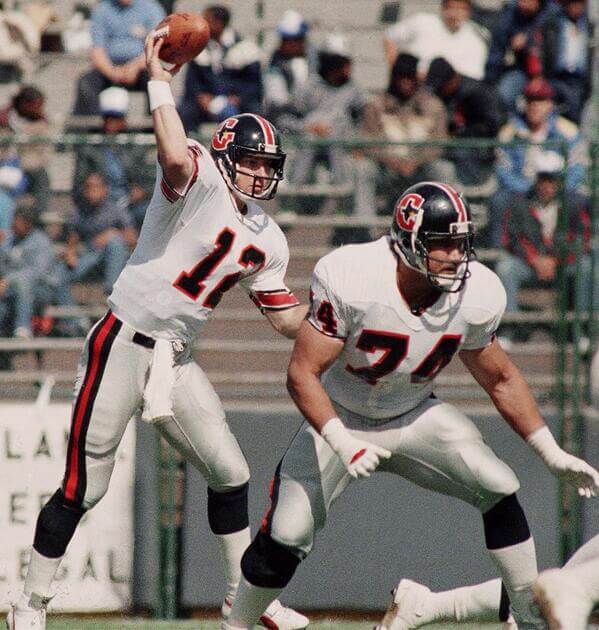
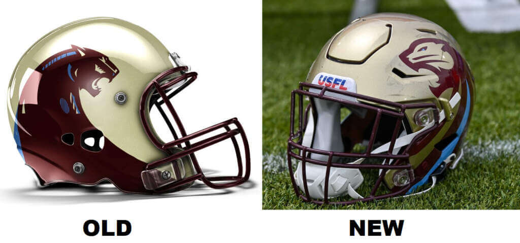
MAULERS
Helmet logo has a smaller mauler with a white background. Same logo appears on the sleeves instead of stripes, jerseys have shoulder yokes (orange on the purple jersey, purple on the white jersey), number font is serifed, and there is a solid purple pants stripe.
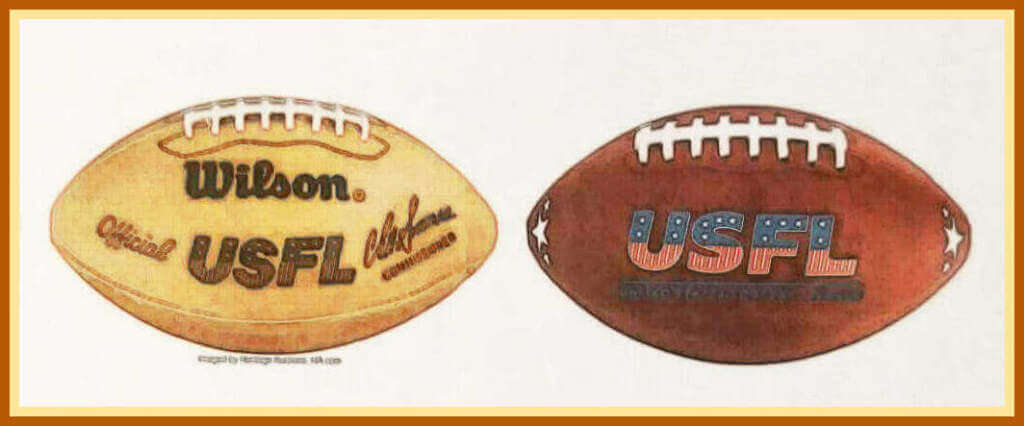
The game ball is also different:
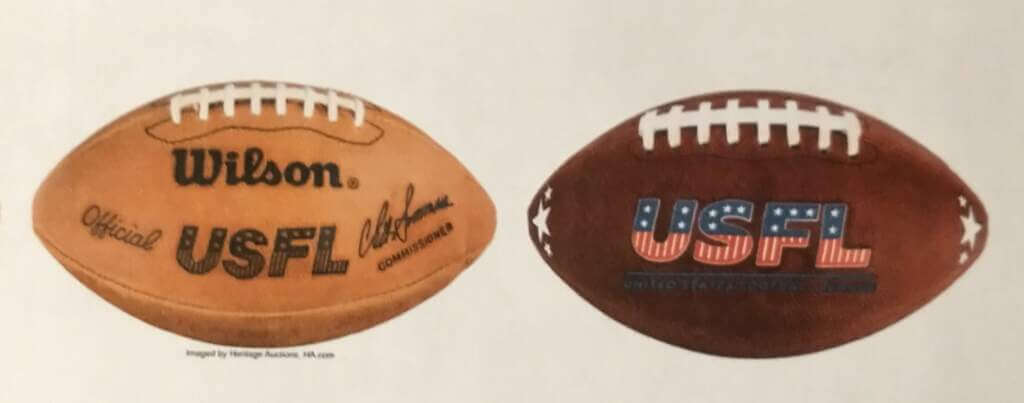
While the original ball had a great lighter color to it, I prefer the starry “stripes” and the colorful logo on the new ball. The Nerf people need to make a version of this so I can kick it around the back yard.
Now that we’ve looked at the differences between the old and new USFL (thanks, Jim!), we’ll go on to the new uniforms. Once again, please refer to this article for pictures of the Generals and Stallions. For those teams, I’ll just include one photo below for reference.
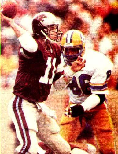
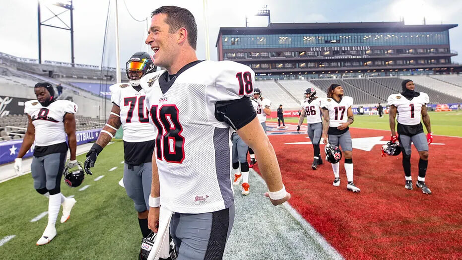
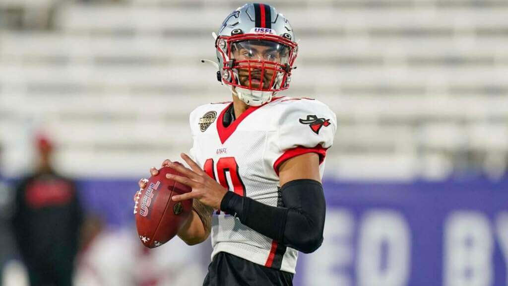
GENERALS:
JV: As with all the teams, the numbers could be bigger. The first Generals had *really* visible sleeve numbers, which I quite enjoyed. I do like the new uncluttered logo and the addition of the five stars to the jerseys.
PH: I love the new helmet, and I’m generally very pleased with the Generals “new” look. I didn’t really have a favorite uniform in the old USFL, but I think this one is my favorite now. Of all the unis, this one seemed to stray the least from the original.
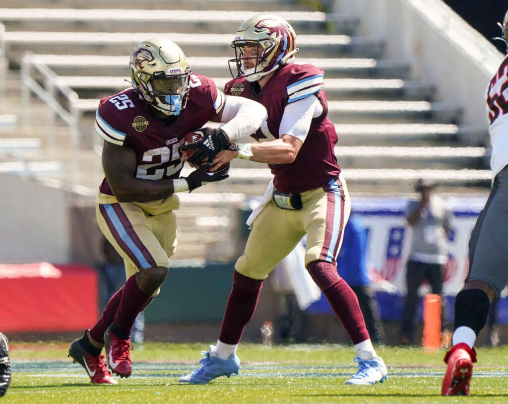
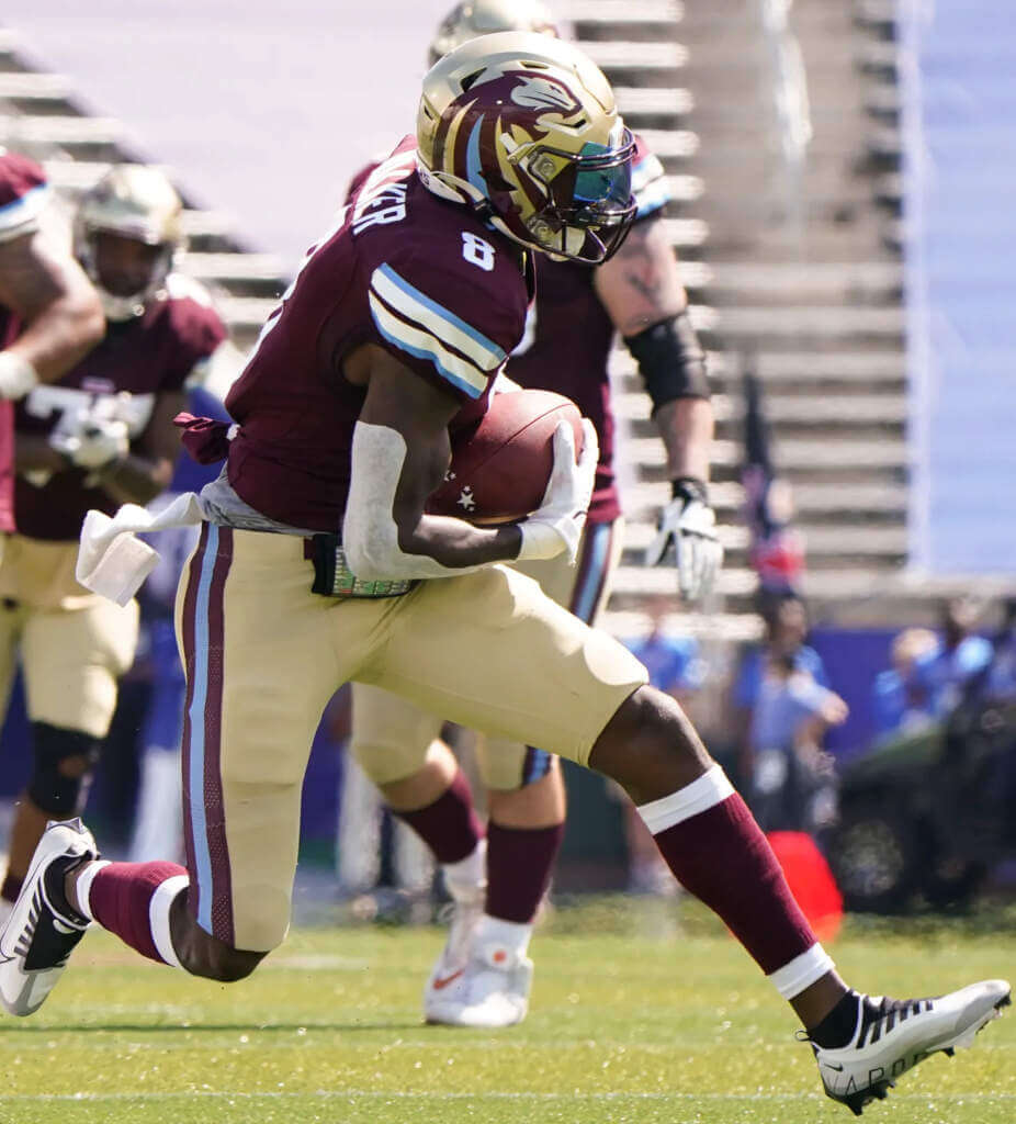
STALLIONS:
JV: I don’t dislike them, however they are the biggest disappointment for me. I do not like that blocky font at all. The horse head brings back memories of the CFL’s Baltimore Stallions, which was nice, but I miss the red full horsey.
PH: It seems all the USFL teams have bespoke fonts, and the Stallions’ squared-off fonts are a downgrade from the original look. The helmet logo is a slight improvement, but that center stripe (which tapers from fat in front to thin in back) is a disappointment. I’m not a big fan of the fat pants stripe, but I do like the Northwestern striping on the shoulders.
GAMBLERS:
JV: The only thing I don’t like is the number font. It’s too squished together, so from a distance I thought the QB was wearing a single digit number (same with the Bandits QB). I really like the pants.
PH: Overall it’s a pretty solid uni: normally I like helmets and pants to match (or helmets/jerseys), but the black hat/blue-gray pants look good. Fonts could be better, but even those are nice. My biggest complaint, and it’s not unique to the Gamblers, is the unnecessary jersey side panel, which seems to neither match the helmet nor pants shade. Those should have stayed in the 90s where they belong.
PANTHERS:
JV: Not an exact copy of the original uni, and just as easy on the eyes. I honestly don’t know which version I like better. The Lions could learn a thing or two about seamlessly updating a classic look.
PH: The helmet is a slight downgrade from the original, as is the uni, but overall it’s still solid. My biggest complaint is the non-matching striping pattern on the jersey sleeves and pants. The maroon/powder/maroon pants stripe is great and the team should have used that on the sleeve and helmet. The fonts could be less squared-off and I wish guys would get their sock stylings more uniform.
STARS:
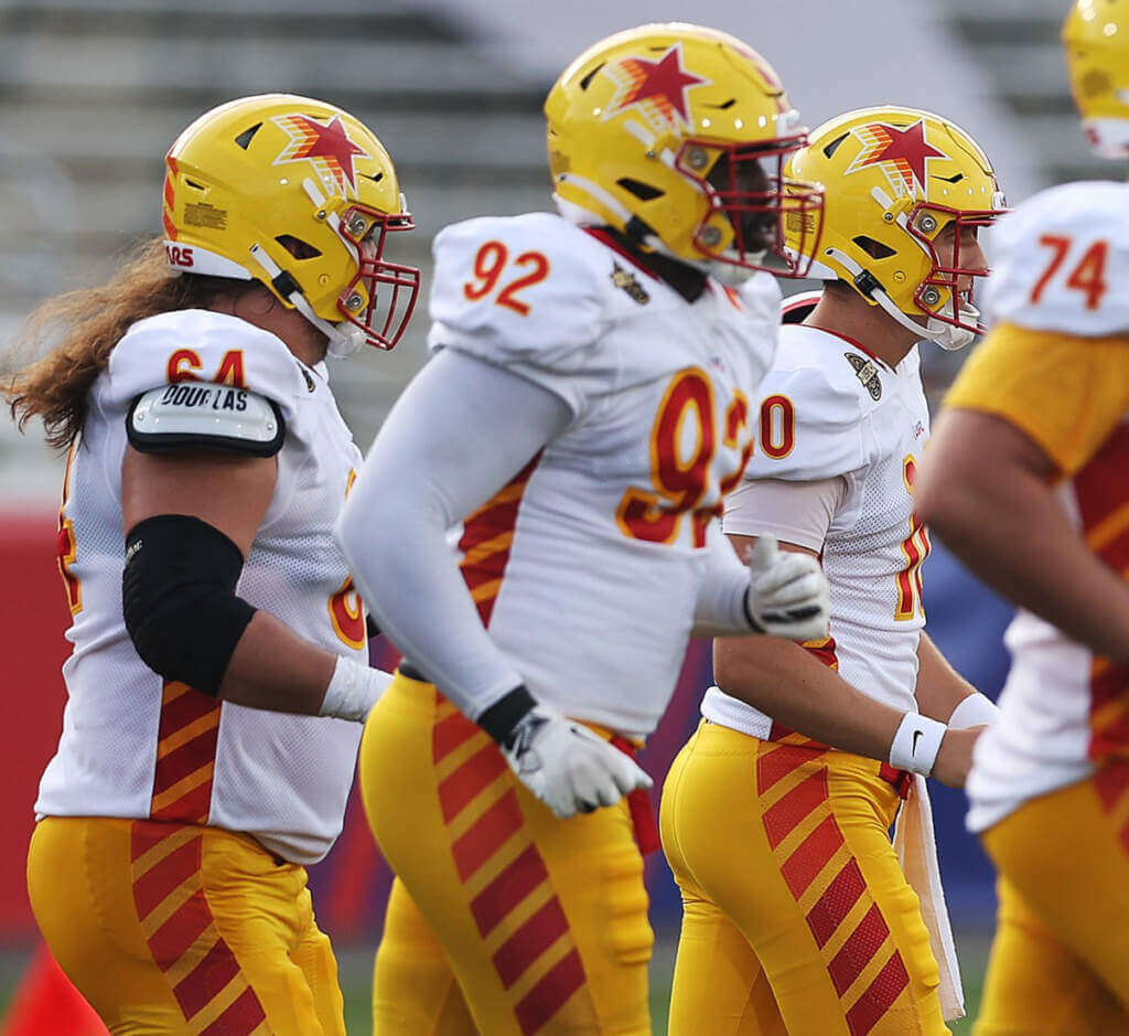
JV: How could they radically change the look of the original league’s most successful franchise? Like this… I was shocked at first, then I quickly realized I like this SO much better. I love the colors and the font and I’m always a sucker for tiled striping.
PH: This came so close to being a great upgrade. They get muy props from me for switching from metallic to athletic gold, and I dig the helmet logo. Fonts are great too (might be the best in the league). But…WHY OH WHY did they did they have to go with a traffic cone-esque striping pattern? I could handle it just on the helmet, but when they added the tiled stripes to the jersey side panel and the pants, they lost me. Another dated look for a league I hope survives more than one season.
BREAKERS:


JV: The original flowing, beautifully-proportioned breaker wave made for one of the best helmets ever (if not THE best). This helmet…well…the light blue wave looks more like a shark fin and the dark blue looks like an automotive headrest. I do like the waves on the sleeves, though.
PH: My favorite jersey and pants combo of the whole league (Generals come close) — I love the mix of royal, powder blue and silver-gray, and there are no unnecessary do-dads (like side panels) to detract from the look. I really like the wave pattern on the sleeve caps. But that helmet. Ugh. If they could just have used the sleeve cap as the helmet logo, it would be perfect…but no…they just had to wrap the wave around (like the original) but for some reason added a giant royal shape that could best be described at the St. Louis arch filled in with solid blue.
BANDITS:
JV: With only two teams having sleeve stripes, I would have preferred this being the third. If the numbers were bigger I’d love the drop shadow even more. I like the collar, facemask and striping, and the new logo is growing on me.
PH: Another uni with so much potential ruined by the stupid side panel. I mean, how good does this look straight on? The block shadow numbers aren’t a deal-breaker, but a simple black outline would have been better. Still, it’s a good overall look. It could just have been better.
MAULERS:

JV: Either the Stars or the Maulers are my favorites when it comes to the unis. I’m glad to see a team with shoulder yokes, and they show off those great colors in a simple way. The serifed font helps keep the numbers properly spaced apart from each other.
PH: Unlike a certain someone, I don’t hate purple and I like the new, lighter shade the Maulers are using. But one thing I really don’t like are shoulder yokes, and this one is almost eye-searing. What makes it worse is the two-color collar (not unique to the Maulers), which reminds me of the Nikelace or “flywire” collar common to NFL unis in the early 2010s, after Nike took over the contract. It never looked good. On a yoke, it looks terrible. It may be my least favorite new USFL uniform — but considering the direction the league could have taken design-wise, it’s still decent.
And there you have it. Apologies on the length (believe me, this could have been twice as long), but I think you get the idea. Of all the post NFL/AFL merger leagues, the USFL was arguably the most poised for long term success, so keeping the spirit of the original uniforms mostly intact was a smart move — and for the most part I think they have succeeded; I’m not sure any individual uniform is quite as good as the original, although there are many individual aspects of the new uniforms that are improvements.
Big thanks to Jimmer for jumping on board for this one. Let’s hope were still talking about the USFL in 2023, when the league hopes to actually play in more than one city (for this season, all regular season games are played in Birmingham, Alabama). Perhaps teams will even get a second pair of pants or alternate jerseys. But for now, we’ll settle for two jerseys, one helmet and a single set of pants.
Your thoughts?


Uni Concepts & Tweaks
Time for more Uni Tweaks from the UW readership.
I hope you guys like this feature and will want to continue to submit your concepts and tweaks to me. If you do, Shoot me an E-mail (Phil (dot) Hecken (at) gmail (dot) com).
Today’s concepts come from John J. Woods:
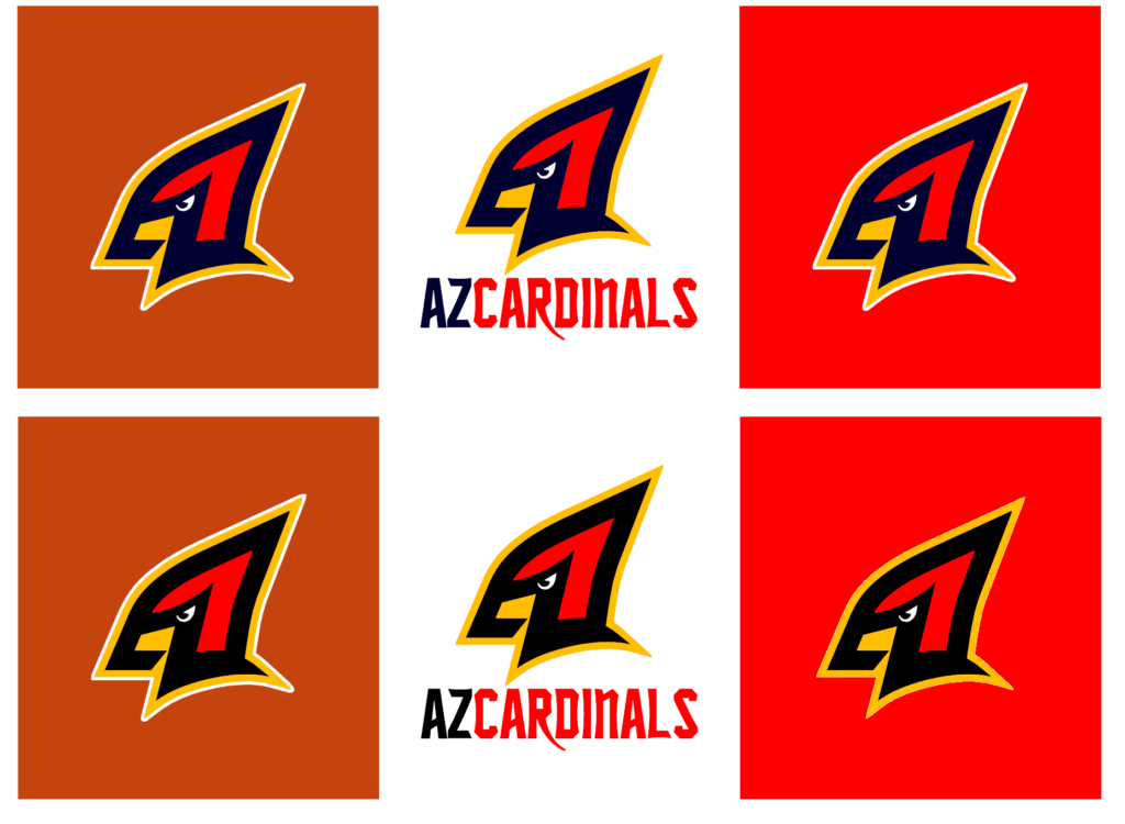
Phil,
I don’t know if you’re getting a lot of Cardinals feedback from last weekend’s post [Editor’s Note — here’s the article to which he refers].
If you are, let me pile on.
The team uses AZCARDINALS as their web address, so I emphasized that.
The profile logo is made up of a navy letter A with a navy letter Z.
The Z not only creates the mask on the face but a shoulder pad curve.
The logo could also use black instead of navy, on either a copper, white or red helmet.
The lower right shows the yellow edge directly on red without the white outline.
This logo customizes the bird logo into AZ instead of using an identity from St. Louis or even Chicago.
I think a lot of designers like copper helmets based on the old USFL Wranglers but the combo of red, black and a copper/tan on a jersey gets close to the Bucs old putty color scheme. Be careful!
– Johnny Woods
OK readers (and concepters). If you have some tweaks or concepts, shoot ’em my way with a brief description of your creation and I’ll run ’em here.

Guess The Game…
from the scoreboard
Today’s scoreboard comes from ojai67.
The premise of the game (GTGFTS) is simple: I’ll post a scoreboard and you guys simply identify the game depicted. In the past, I don’t know if I’ve ever completely stumped you (some are easier than others).
Here’s the Scoreboard. In the comments below, try to identify the game (date & location, as well as final score). If anything noteworthy occurred during the game, please add that in (and if you were AT the game, well bonus points for you!):

Please continue sending these in! You’re welcome to send me any scoreboard photos (with answers please), and I’ll keep running them.
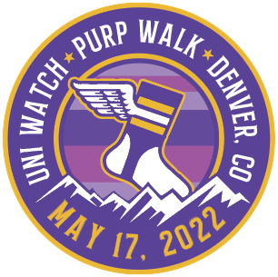
Purp Walk reminder: Paul here. In case you missed it this past week, we have some big plans afoot for this year’s Purple Amnesty Day (which, as always, will be on May 17), including a live event in Denver where I’ll be dressed head-to-toe in purple. If you need to get caught up on the Purp Walk plans, everything’s spelled out here.
Also: Another big piece of news from this week is that our new line of Uni Watch Baseball Bats, produced by the great folks at the Pillbox Bat Co., are now available, and they look sensational. Available in green, yellow, BFBS, and miniature. Check this out:
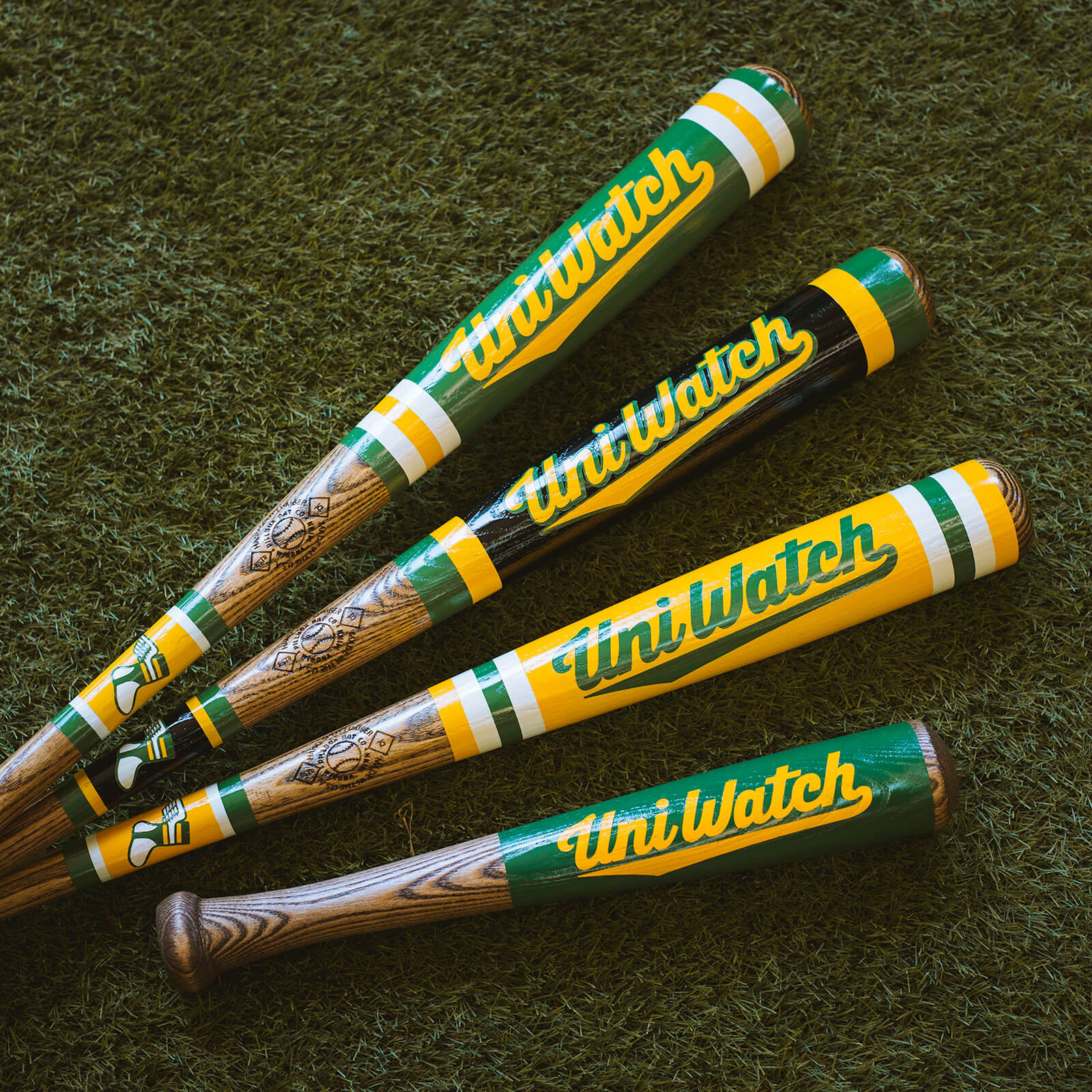
Nice, right? You can order them here.
Okay, now onto the Ticker.
The Ticker
By Anthony Emerson

Baseball News: The Red Sox wore their navy blue away unis last night in St. Pete for the first time this season. Traditionally, the Red Sox wore their alternates on Friday nights only but in recent years the Red Sox have been using their alternates more than their primaries. … We’re probably not far away from this in the majors, eh? (from Paul Dillon). … New logo for the Plattsburgh Thunderbirds of the Empire Baseball League (from John Cerone).

Football News: WVU is the latest team to adopt the rugby scrum cap-style helmet padding for practice (from Dan Matthews).

Hockey News: The Bruins say they’re going to wait for “the right fit” (Boston Globe link paywalled) before signing on with a uni ad. Insert “Dunkin Donuts” joke here (thanks, Phil).

Basketball News: The Jazz’s new unis have leaked, and they’re as boring as they had been previously described. A downgrade from one of the NBA’s best identities to one of its worst.

Soccer News: Here are the first kits for the League1 Ontario’s (Part of League1 Canada) newest club, Electric City FC, based out of Peterborough, Ontario (from Wade Heidt).
Ukraine News: Snooker player Jack Lisowski said he wasn’t allowed to wear a Ukrainian flag at the ongoing world championship in Sheffield, England, since he’s not from Ukraine, even though he has worn one for other tournaments (thanks, Jamie).

Grab Bag: Here are a couple of Anzac Day designs for the Australian Football League: Collingwood, Hawthorn, and Melbourne (thanks, Jamie). … Did you know that the original logo for UT-Arlington after it chose “Mavericks” as its team name in 1971 was a horned horse? Like a unicorn, but tougher, I guess (from Kary Klismet). … In regard’s to Paul’s post yesterday, Aaron Hoak notes that the retro microphone motif isn’t limited to sports, but is also used in tech.
Uni Tweet of the Day
This would probably look better than their future “City Connect” uni will…
Next Friday: Reds unveil new uniforms to remind fans of better times. pic.twitter.com/Q5n2Rhd5wb
— Josh Ewald (@ewald_josh) April 21, 2022
And finally… that’s it for today. Big thanks to Jim Vilk for his contributions to the USFL section!
Everyone have a good Saturday and I’ll catch you back here tomorrow.
Peace,
PH
Great article guys! As another long-time USFL fan I’m also relieved that they have at least tried to keep the teams’ original looks going. I agree with Phil’s comments about the Panthers Uni stripes inconsistency. But I wonder if they are sort of trying to emulate how the uniforms looked on old TV broadcasts? Or at least the designers used them for inspiration somehow? The reason I say this is for the Panthers old pants stripe pattern blue/plum/blue/plum/blue, the outer two blue stripes are invisible on old TV broadcasts so they look *like* the new pants. There is a similar thing with the Bandits numbers, on old YouTube TV broadcasts they look like they have drop shadow numbers due to colour smearing. Likewise the Gamblers pants stripes black/red/black smear into one dark stripe. It’s all probably an accident as you can’t imagine they wouldn’t just have used the original uniforms as reference. But you never know with designers!
Thanks!
I too am relieved at how original-ish these are.
When they announced that the league was coming back I had a brief flash of “be careful what you wish for” dread. What if they screw up the unis? What if they screw up the way the game is played? Was this league better left in the past? Well, after one week I can breathe a sigh of relief. It’s not perfect (I could do without the drones or the highly overrated helmet cam, there’s a little too much tech and analytics for my taste, and as mentioned there are uni tweaks I’d make), but for 2022 it’s one of the best things out there. Obviously the play isn’t NFL caliber, but it’s a developmental league. Aesthetically it’s up there with the NFL and I’d rather watch this over any Manfred League or NBA game.
Watching/taping the Maulers vs Stars as I type this. If I were doing a 3&1 for this week’s games, this is the runaway #1.
I can only see game highlights here in the UK, but most of the games seem to have been close and the Stallions comeback to beat the Generals was pretty exciting. You’re right it isn’t NFL calibre, but it doesn’t feel bush league like some of the previous attempts. Except for some of the uniform violations. When did ponytailing your jersey become a thing?! Eeeuwww!
Great article Jim and Phil! Love seeing refreshed uniforms of the old USFL teams back.
Minor correction on the soccer ticker item. Electric City FC is not in Canadian Premier League. They are in League1 Ontario. Part of League1 Canada which is an alliance of 3 semi-pro leagues. A step lower than CPL.
Thanks Wade! Soccer ticker item fixed.
Was surprised to see the Stars change from gold to yellow as trim colour but I understand the reasoning behind this. Would be too much to have 2 teams in an 8-team league wearing gold/red/gold combo (though the Stallions look is more tan now).
I think the reason the Stallions went with white road pants in ’84 and ’85 was to get away from looking too much like the Stars. I understood it but didn’t like it.
So yeah, I agree that tan vs yellow will be better than gold vs gold.
It’s more than that. It looks like the Stars’ red is much more orangish than the originals.
I think this is a good move. It opens up a whole realm of Tequila Sunrise yellow-orange-red possibilities, like the Astros’ ’80s road uniforms with the sleeve racing stripes. But the Stars’ side panels did not deliver.
Here is the scoreboard:
link
Seeing that Yankees lineup takes me back to my childhood
Did they sell 76 gas in Chicago?
Yes. 200 E Golf Road, Palatine was the sales office (now an office park in Schaumburg).
They also used to advertise on WGN during the Cubs games.
The new USFL uniforms are generally worse than the old ones. Because of course they are. The Breakers new helmets are especially worse.
BTW, I for one hate that all these animal logos have to be stylized now. I can’t think of one stylized animal logo that looks better than a realistic logo.
“The Breakers new helmets are especially worse.”
Do you even know what a breaker actually is? It’s a wave that ‘breaks’ or curls as the new logo does.
The new Jazz unis SUCK. JUST WHAT THE NBA NEEDS ANOTHER BLACK JERSEY.
Silver needs to get the Jazz and Pelicans in a locked room until the Jazz agree to give the name to the Pelicans and then the Jazz can be, I dunno The Utah Salt lake.
Re: The old USFL football. I NEVER saw these on sale in any sports store in the DC area, most of which DID have official NFL balls. In fact the only time I actually saw one and got to hold it was when a classmate of mine, who was also my grade school nemesis, Seth Davis (yes THAT Seth Davis who covers college basketball for CBS) had one for some reason.
I bought a replica USFL ball for $25 back in ’84. Can’t remember where I got it, but it looked and felt like the real thing. I don’t have it anymore though because I kicked it until it burst.
Thanks for the review of the USFL uniforms. Overall, I think the upgrades are due to better materials and manufacturing techniques. I can’t unsee how squished the numbers are now that you mentioned it. It really doesn’t matter much. I live in a minor league baseball town. You really don’t take much time learning who the players are. Just enjoy the game.
Those jazz unis… I hate to complain about a clean simple design because this one is effective as such, but there are already lots of teams using yellow as a primary jersey color, and the red rock gradient unis were the first of their kind in a major US league, and they looked good and they embraced a local aesthetic in a unique way (I know bees factor in to Utah/Mormon culture and beee are yellow and black…).
It’s just another yellow jersey but this one has no personality or history compared to the others out there. And how can you replace the purple/green/yellow or the purple/baby blue mountains, or the red rock gradient with something so basic and uninspired?
I won’t at all advocate for returning the jazz name to Nola, it’s been long enough. If the lakers can be iconic in LA, the jazz can be iconic in Utah. The lakers name makes zero sense in Los Angeles and complete sense in Minnesota, yet here we are.
The previous looks (Mardi Gras, purple mountains, and red rocks) all made sense with the name or the place. The yellow and black could too, but why not own it a little more with some creativity?
I hope what comes of this is that the jazz surrender the Mardi Gras look completely for a while and the pelicans adopt it as their primary look at least long enough to establish it as a notable look in their history.
Unintentionally, something was gained when the old nicknames followed the franchise to its new setting. “L.A. Lakers” is an inspired bit of alliteration; “Utah Jazz” answers an important trivia question— What pro team has the shortest name? (The second shortest is “Miami Heat”). Returning “Jazz” to New Orleans might have made sense when the NOLA team was the Hornets, as the Utah Hornets would have been evocative of the bees that represent the state. That opportunity passed when the Louisiana team gifted “Hornets” back to the Charlotte Bobcats, and redubbed themselves the Pelicans.
I love the red rocks look, thought they should have made that their primary uni, totally unique, and could have taken on a secondary nickname, Hoodoos, which are the tall spire-like rock formations, fitting for basketball player, would make for some good chants too.
These uniforms look like what Nike was trying to do with every team in sports circa 2015, minus the neon orange and anthracite/charcoal/whatever this week’s euphemism for gray is.
Hard to imagine no NBA team wears just black and yellow colour scheme. That is a staple in any league.
The Jazz used to have a really consistent look right up until mid-1990s. Since then there have been multiple primary colour scheme changes. They should have considered changing the name back then if they were going to change their visual identity so much. It is getting worse than even the Vancouver Canucks. Pick a colour scheme and stick with it.
Still feel they should go back to purple, yellow, and green. Everything they have changed to since as their primary colour scheme appears was not built to last.
Yeah, black and yellow tends to be a Pittsburg thing, save for the bruins. But it is a classic color combo. The NBA already has the lakers, pacers, hawks, and warriors with yellow jerseys though, so it would have been nice if the jazz tried something visually interesting to set them apart. I guess “no visual identity” sets them apart from those teams, but not in a good way. It bums me out that the name is almost synonymous with creativity plus it is an unusual name/place combo so they almost owe it to themselves to do something MORE with it than this. I’d even go for it if they essentially ripped off the Steelers bumblebee unis and went with black and yellow stripes to own that bee/Mormon/Utah thing, but it’s too late now. Anyway this is Nike we’re talking about. They’ll change again soon.
Those Jazz uniforms are horrific. Especially the black and yellow ones; they look like school practice jerseys. Maybe they need the wordmark “Property of Utah Jazz XXXL” to really complete the look. Just awful.
Across the board, the USFL did a great job with the uniforms. Every one is an upgrade yet still nods to the original. Nearly perfect…of course there are a few details that i would change if it were up to me, but nobody is going to have my exact same taste.
And no, I refuse to conform to the UW mantra that all football teams should have identical block font numbers! It’s not 1950 anymore!
Loved the original Stars unis. The new ones are hot trash.
I wish the Generals had put the sleeve numbers inside the circle of stars, perhaps overlapping them. It would look much better than the two-tier look they’ve got now.
And yes, every team should have larger numbers. I like the Stars’ smooth font, but it should be bigger.
I… don’t think those Jazz unis are real. link
Loved it boys, but the panthers have got to be number 1, and I like maulers 2, but that is admittedly debatable.
Scoreboard game was Yankees 8, White Sox 6, at Comiskey Park, June 4, 1977. WP Don Gullett LP Bart Johnson. Attendance 35,789. Scoreboard was lighting up for Richie Zisk home run.