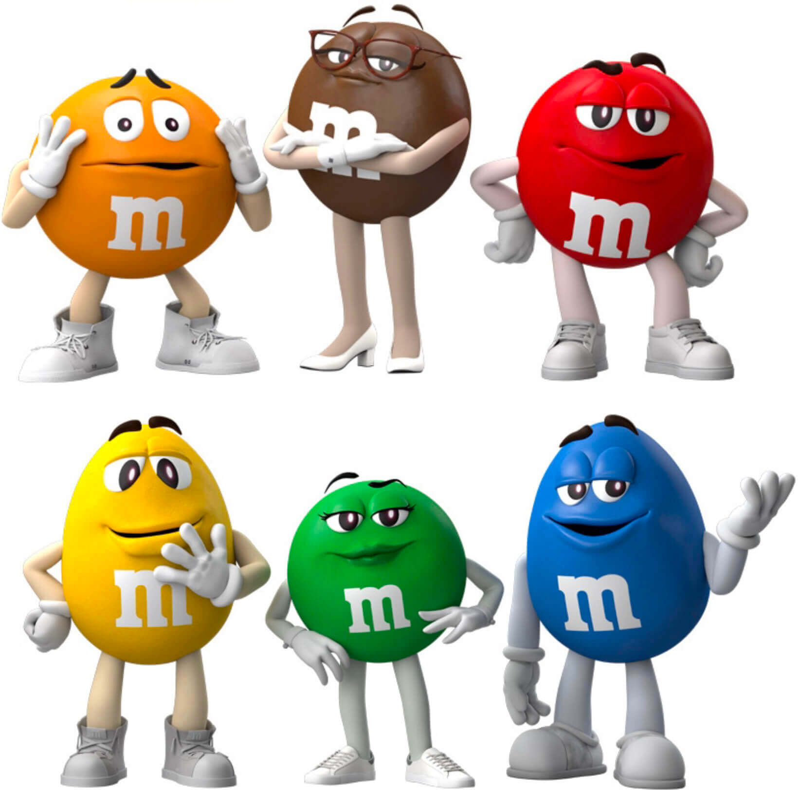
For all images, click to enlarge
Major uni news yesterday on the confectionary front, as candy giant Mars Wrigley announced that the anthropomorphized M&M’s characters will be getting new shoes.
Let’s go one character at a time:
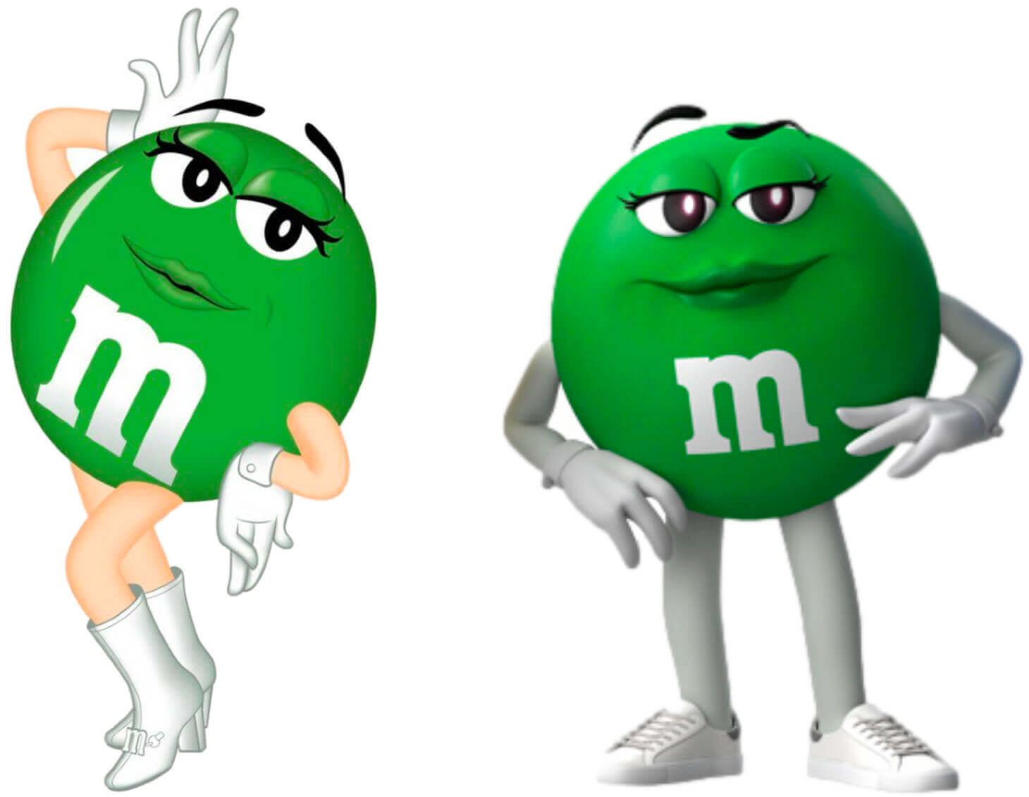
• The biggest change is for Green, who’s trading in her old go-go boots for sneakers (for all of these, I’m showing the old version on the left, new on the right):
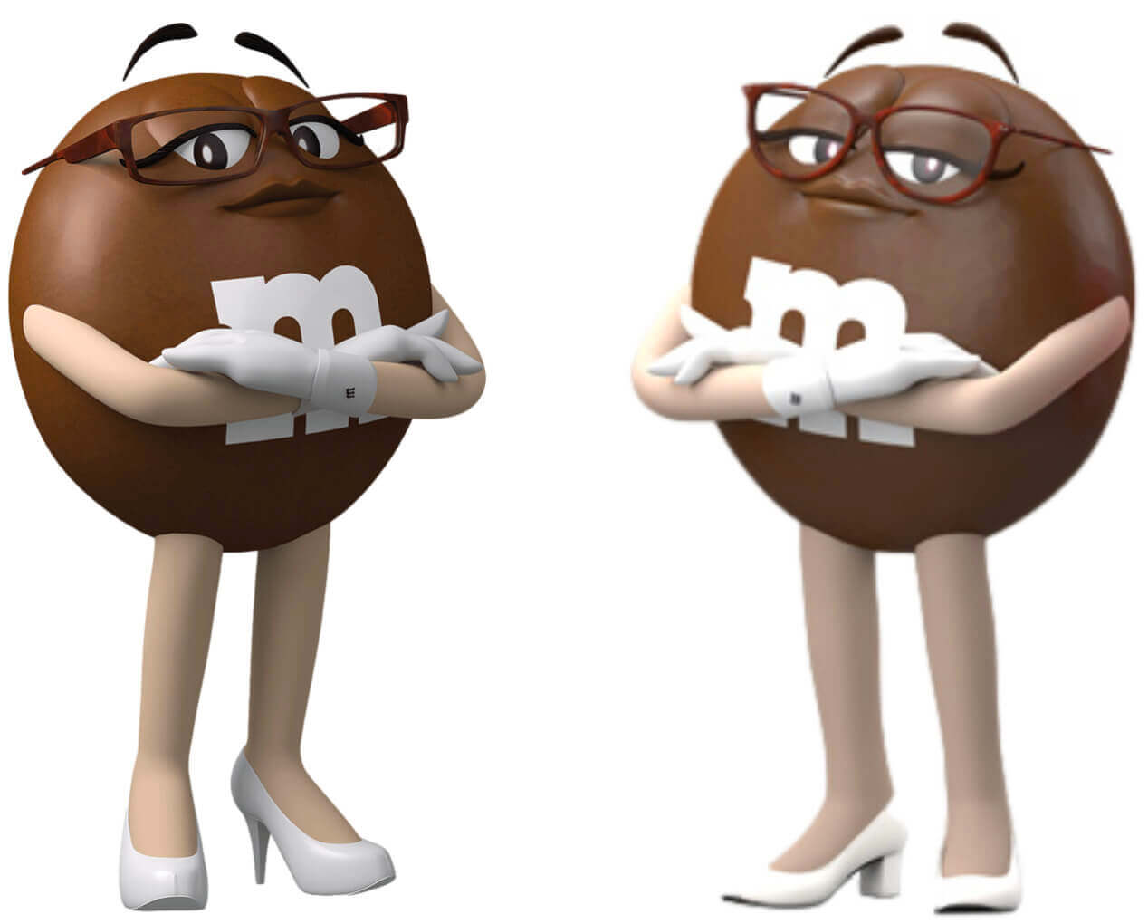
• The other female character, Brown, is still wearing heels, but they’re no longer stiletto-y. She also has a new pair of eyeglass frames:
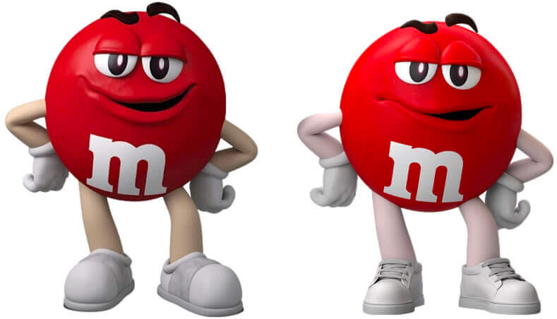
• Red’s shoes now look a bit less cartoony and more realistic, thanks to the addition of shoelaces:
• Yellow’s shoes, which used to look like Red’s, are now high-tops and have also been given laces — which appear to be untied:
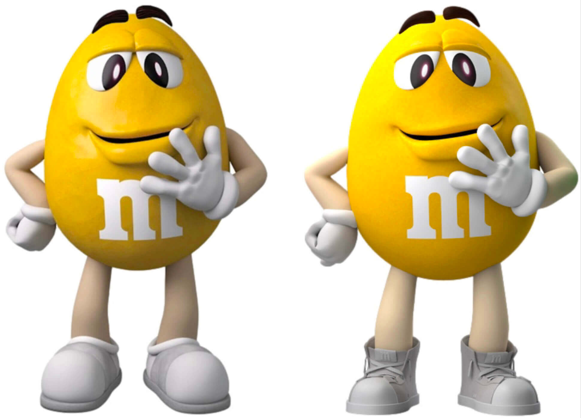
• As for orange, he has the same shoes as before, but now he’s tied his laces:
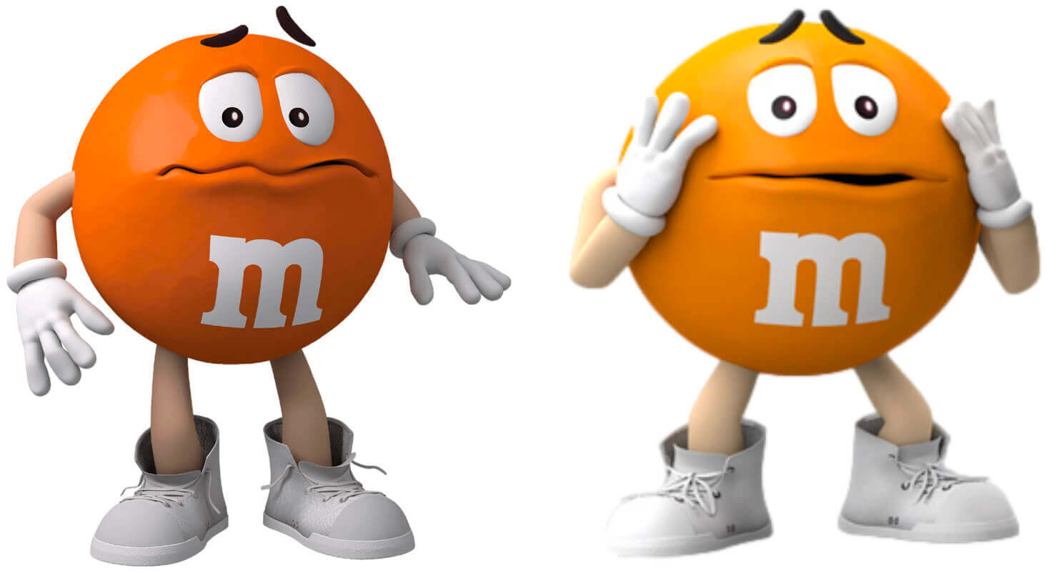
They claim to have made some subtle changes to Blue’s shoes as well, but I’m calling bullshit on that — they appear to be unchanged:
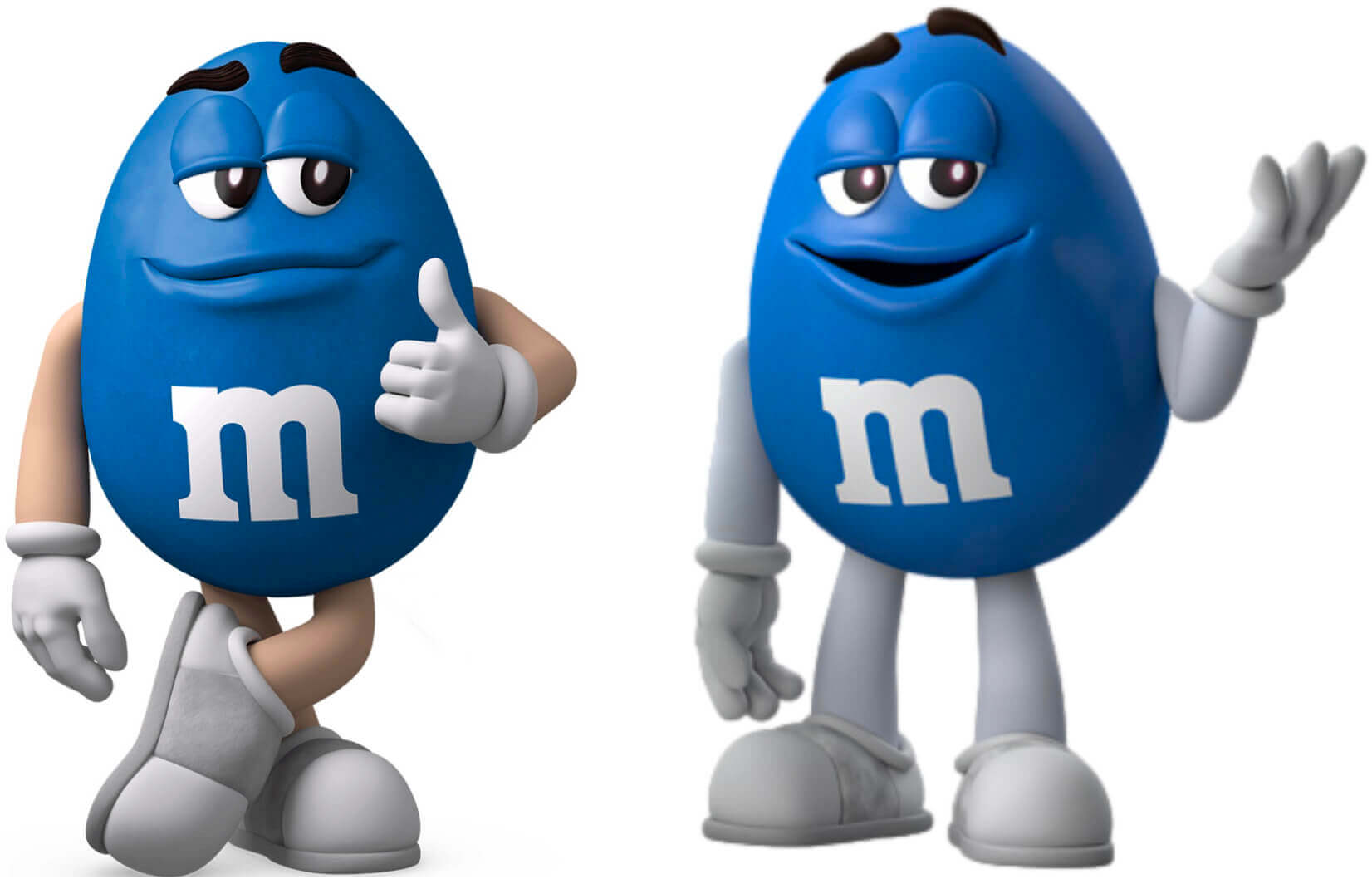
Note that there’s no branding on any of the footwear. Nike could not be reached for comment.
The changes to Green and Brown are obviously intended to make them less gender-stereotyped, while the other changes are, uh, beats me. I guess to give them a bit more street cred..? (The characters will also reportedly be nicer to each other and more welcoming.)
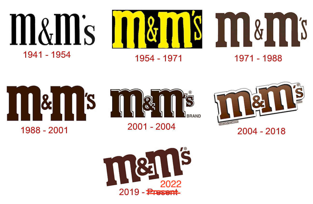
They’ve also changed the M&M’s logo, which was previously diagonal but is now straight:

This change restores the logo to the simple horizontal orientation that it’s had for most of the brand’s history:
In case you’re wondering: Yes, I still totally love M&M’s. I usually go for the Peanut variety, but occasionally I’ll find myself in the mood for Plain (even though I still miss the tan ones, which got kicked to the curb in 1995). Almond should be good, but the candy:nut ratio never feels quite right (plus they don’t put enough of them in the pack). Never liked the Peanut Butter option. A few years back I was mildly (read: completely) obsessed with the new English Toffee Peanut flavor, but I kinda maxed out on it after a while and went back to the regular Peanut.
If you’ve interested in candy history, I super-strongly recommend the book The Emperors of Chocolate by Joël Glenn Brenner, which tells the faaaascinating story of how Hershey and Mars became the industry giants they are today. Tasty!
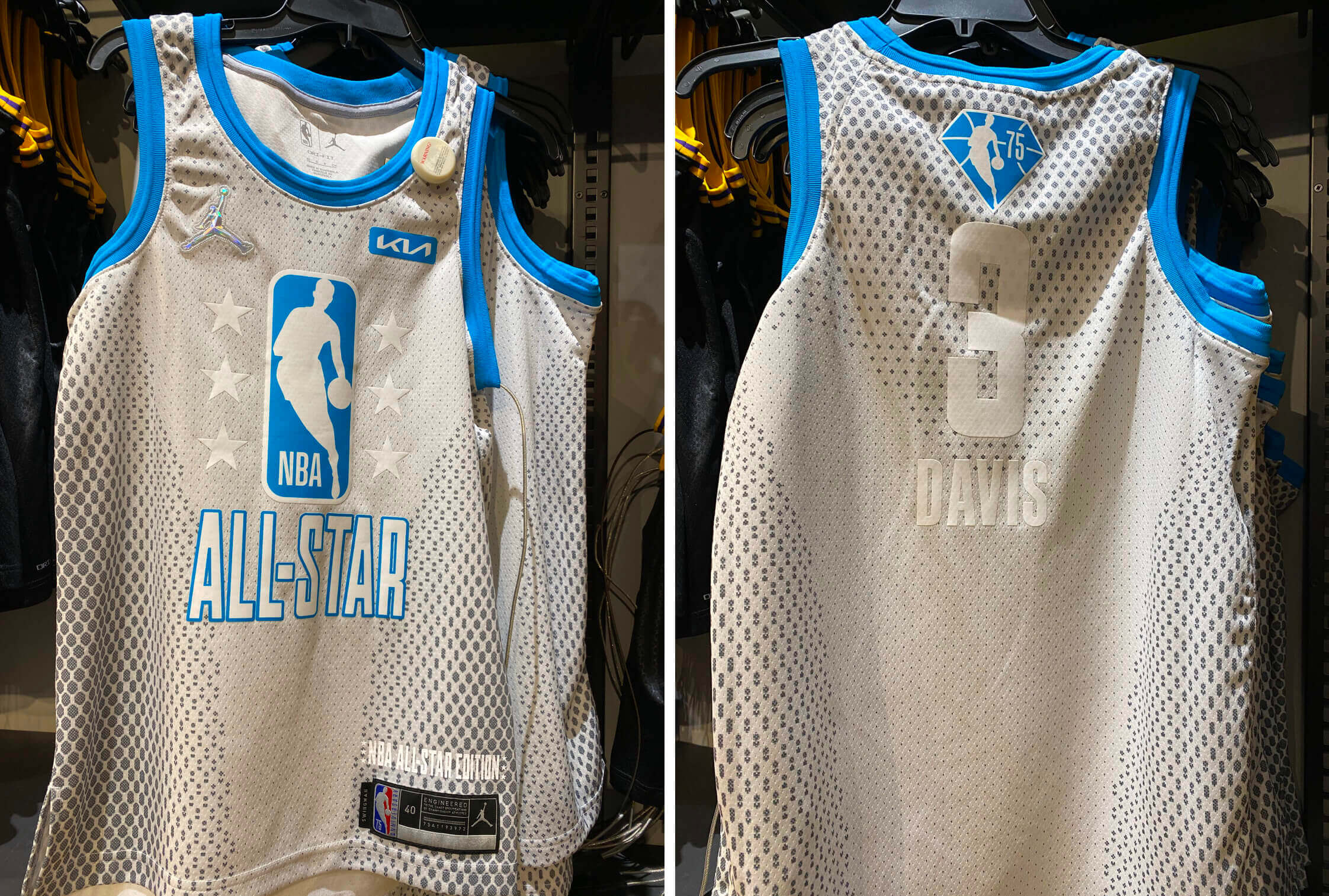
Photos by Matt Moreno; click to enlarge
Possible NBA All-Star leak: The NBA All-Star Game is now less than a month away, and we still haven’t heard anything official about the uniforms. But Matt Moreno, an L.A.-based Lakers and Dodgers writer, spotted the jersey shown above at a local shop yesterday.
Obviously, it’s a terrible design. The more interesting thing, at least to me, is that it has no apparent connection to the Cavs, who are this year’s host team. That’s weird, because the NBA usually tries to connect the ASG uni design to the host club. Could this be a practice jersey instead of the game jersey? Stay tuned.

A bunch of reminders: It’s been a busy week here on Uni Watch. Here are some things you might have missed:
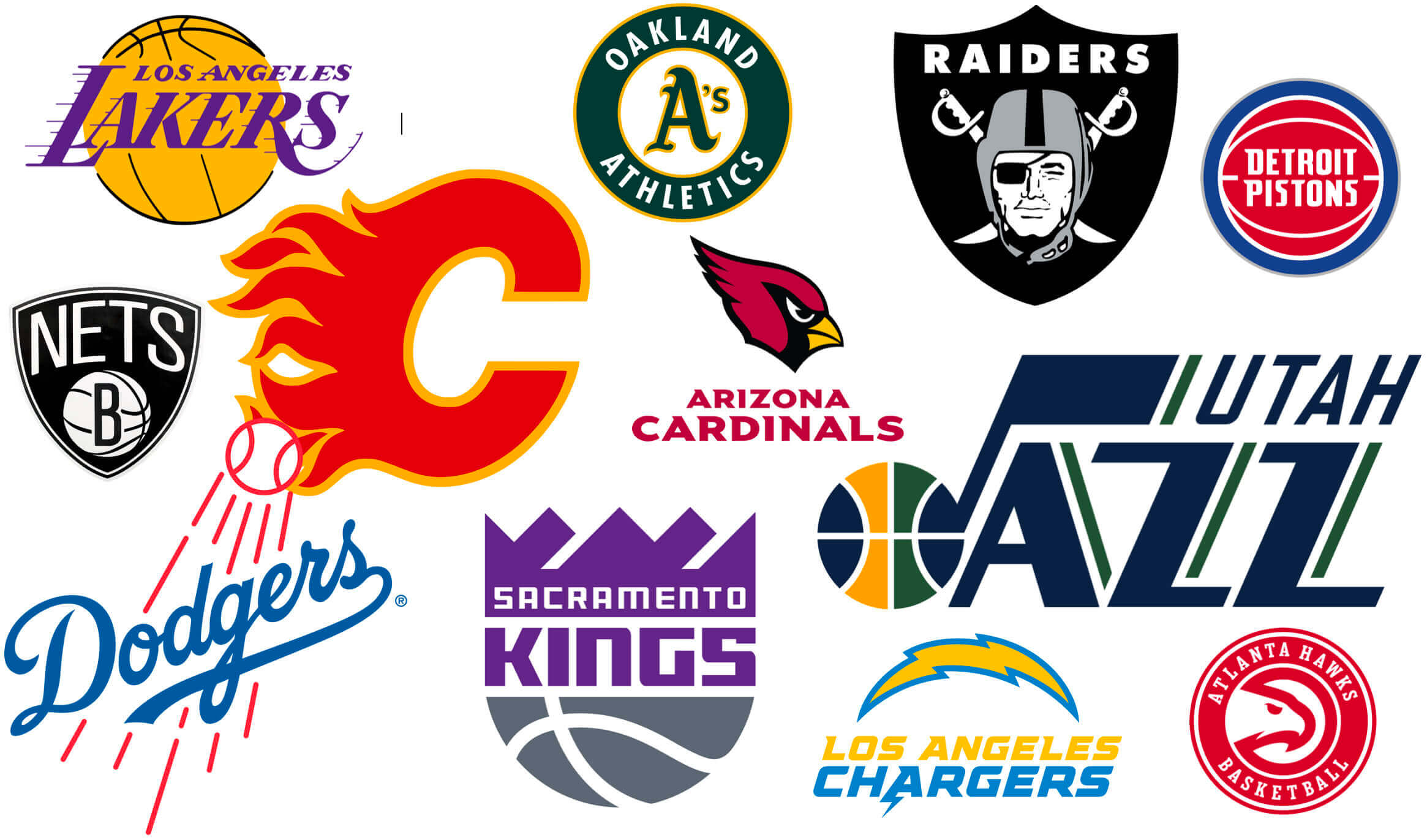
• Last week on Bulletin, I assigned letter grades to teams that changed their names while remaining in the same city. This week I looked at the inverse of that situation — teams that kept their names even when moving to a new city, like the ones shown above. Which ones should have changed their names? You can check my assessments over on Bulletin.
• Speaking of Bulletin, there are some major changes coming over there, including the arrival of my annual season preview columns and the start of a modest paywall. Full details here.
• The remaining Uni Watch Pin Club inventory is now available at lower pricing, with big discounts for multi-pin bundles. Full details here, or just click on this graphic:
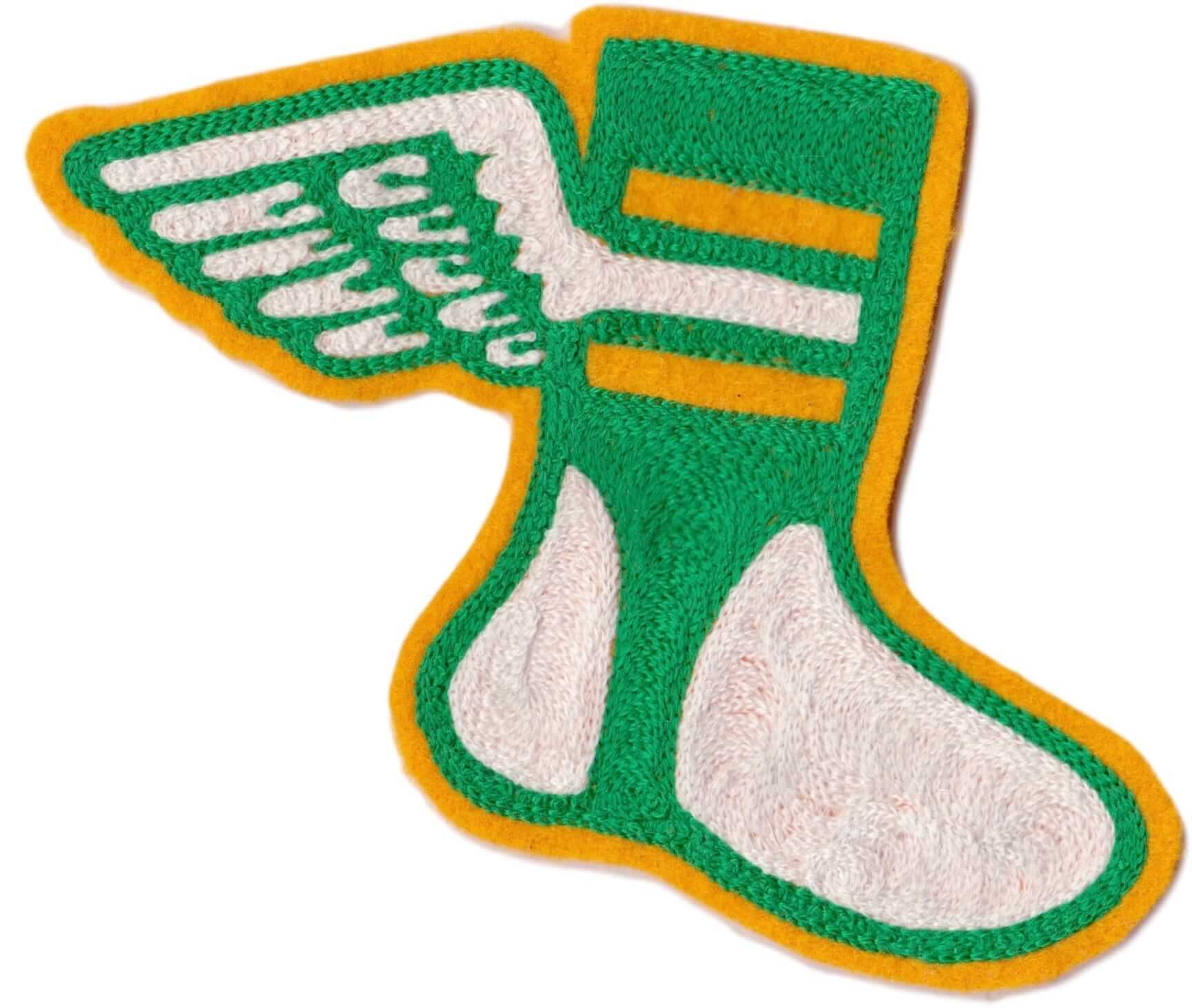
• Our Uni Watch Chain-Stitched Patch (shown at left; click to see it in its full-size highly textured glory) is now sold out. I’m willing to restock them, but my cost on these is nearly $30 a pop, so I’ll only order more if there’s enough demand for them. The patches are roughly 6″ by 6″, and the retail price will be $35 plus $2 for shipping. If you’re interested, let me know. Thanks!
• Prices have been cut on lots of other Uni Watch products, including koozies, trading cards, seam rippers, magnets, and memberships.
Uni Watch Hit Parade: If you watched the amazing 2021 music documentary Summer of Soul, which is about a series of R&B concerts that took place in Harlem during the summer of 1969, you may recall a sequence in which many of the Black concert attendees said they didn’t care much about the Apollo moon landing because they had bigger things to worry about down on Earth.
I thought about that the other day when I heard this hilarious 1969 track by Clay Tyson, called “Man on the Moon.” It’s not the only song to look at the U.S. space program through a racial lens (there’s also Gil Scott-Heron’s “Whitey on the Moon” and Howlin’ Wolf’s “Coon on the Moon,” among others), but it’s definitely the funniest and most infectious, at least that I’ve heard. Don’t miss.
The Ticker
By Anthony Emerson

Baseball News: A Philadelphia sports blog says the Phillies need a uniform revamp (thanks, Phil). … Yesterday we Ticker-linked the name and logo for the Pioneer League’s newest team, the Glacier Ridge Rangers. Kary Klismet has sent along info about their new stadium as well. … The Scranton/Wilkes Barre Rail Riders, Triple-A affiliates of the Yankees, are bringing back the interlocking SWB logo for this season (thanks, Phil).

Football News: It may not be the most comfortable thing in the world, but if you stumbled across this 1970s Dolphins helmet chair at a garage sale, you’d have to pick it up, right? (From John Muir). … All games for the relaunched USFL will evidently be played in Birmingham. As several observers have pointed out, this is likely because the league is more of a platform to encourage gambling than to engage with local fans (thanks, Phil). … Pats coach Bill Belichick’s infamous hoodies were actually worn only five times this season, including three of the team’s losses (from @quinncer412). … New helmets apparently in the works for Houston (from Scott Whitt).

Hockey News: Icethetics has confirmed that the Sabres will indeed have a “Goat’s Head” throwback alternate next season. … Journalist Gillian Kemmerer wrote about the significance of SKA St. Petersburg wearing “Leningrad” jerseys annually to honor the one million Leningrad (now St. Petersburg) citizens and soldiers who died during WWII’s Siege of Leningrad (from Ed Zelaski). … I hope the players on Team USA’s National Team Development Program like Mark Hamill, because they’ll be playing with his face on their chest for Star Wars Night tonight (from multiple readers).

Basketball News: ESPN had a fun feature about the original Hornets uniforms, featuring an interview with designer Alexander Julian (from multiple readers). … Pelicans G Josh Hart tore his jersey out of frustration during last night’s game against the Knicks. But the best part about this clip is the legendary Walt Frazier describing how when he played, the Knicks only gave him two road jerseys for the entire season, and he had to clean them himself. … Marquette’s men’s and women’s teams will wear gold on Sunday to support cancer research, and are encouraging those attending to wear gold as well (thanks, Phil).

Soccer News: The USL has extended its deal with ball supplier Select through 2025. The extension includes the introduction of a new ball for the USL’s women’s league (from Ed Zelaski).
Olympics News: Ralph Lauren and Team USA have unveiled the Opening Ceremony uniforms for next month’s Beijing games (from multiple readers). … Meanwhile, here’s what Team USA will be wearing for lots of other sports (thanks, Phil).

Grab Bag: A high school in Lillooett, B.C., is retiring its “Wildfire” logo out of respect for neighboring communities devastated by wildfires (from Wade Heidt). … New uniforms in the pipeline for U.S. Air Force maintainers (from Timmy Donahue). … The Alfa Romeo F1 team has very slightly modified its name and logo, dropping the Italian flag motif. It makes sense, because while Alfa Romeo is an Italian car manufacturer, the team itself is based in Zürich, Switzerland.
And that’s a wrap for this week. Stay safe, enjoy Phil’s weekend content and the NFL playoff games (Go Niners!), and I’ll see you back here on Monday. Peace. — Paul
Clay Tyson, who does the funky cut in today’s Uni Watch Hit Parade, was a stand-up comic who was part of the James Brown Revue in the late ’60s and early ’70s. Here’s more about him, for those interested: link
The Phillies uniform link goes to a site that’s currently down “for maintenance.” Might be worth adding to the ticker again on a future day.
Regarding M&M’s colors, tan represents the Kansas City A’s of chocolate candies. M&M’s launched with violet in 1941, then switched to tan in the late 1940s, then switched to blue in 1995. Like the A’s moving from Philly to KC to Oakland. Or I suppose like the Braves moving from Boston to Milwaukee to Atlanta, but the A’s have a set of fun color and uniform changes, so they seem the more apt comparison. Whereas red and orange are the Washington Senators of chocolate candies. Orange replaced red in 1976, but then when red returned in 1987, orange continued.
You can see it here, but it’s not worth the trip. Reads more like a letter to the editor than an actual article, full of grammar and capitalization errors, plus the writer refers to the Golden Gate Bridge as the “golden state bridge”. And they weren’t calling for new unis, just a new City Connect flavor.
link
For some reason the history of the m&m’s colors always fascinated me. As did the lack of blue in so many candies (20+ years ago anyway).
Eventually that led me down the rabbit hole to figure out what the heck blue raspberry was, and why that is so common as opposed to blueberry.
Turned out it stems to those frozen tube ice pops, and the abundance of red/pink colored fruit flavors they had vs dye color options, with red and pink already used for other flavors and nothing using blue, blue raspberry was born.
Interesting. Now do pink lemonade!
The second origin story is pretty gross.
link.
The NBA All-Star jersey is listed in both the ticker and the main body, with the body listing it as a possible leak, but the ticker sounding more factual or confirmed. Just wondering if it needs to be listed twice, or if the tone needs to be synced up?
I neglected to remove it from the Ticker — now removed.
Hopefully that Phillies blog will remain down for maintenance because their uniforms are already perfect!
I’d like to see a fresh alternate to the Sunday uniform, it’s perfectly acceptable but has gotten tired for me. Another fauxback in a different style (personally I love the late 30s/early 40s script)would be an idea. Also think the red batting practice/alt jersey has too much red. The powder blues on Thursdays I can live with, though it is more maroon than original. Agree on the white pinstripe and gray. Nothing to change at all.
I’m not a Phillies fan but I always loved the ’70s uniforms. I think the logo is great, the powder blue road unis are awesome and the maroon is a different shade of red than other teams. It is a very distinctive look that the Phillies could own.
As a Phils fan that sort of has me torn. Maroon and baby blue is a great and unique color combo, and I am all for breaking up the monopoly of blue/navy & red in baseball. BUT, their current uniforms are so great, I don’t think I’d change them even for the 70s look.
Additionally the fact that they have gone from one of the few teams without alt uniforms to having an abundance of them over the past decade is depressing. The red tops have to go, and pick between the cream alts or the baby blues, just one of them, and schedule for a specific window; be it weekday day games, Sundays, Thursday nights, whatever. Just give me the regular red pinstripes and road grays for 90% of the season and I’ll be happy. (Also get rid of Harper).
I’m a Phillies mostly-hater, so I’m fine with the Phils continuing to wear their current uniforms. They’re not D-Backs or black-Mets bad, but they’re among the most undistinguished, characterless, and just plain boring uniforms in baseball history. As much as I hate to see a team I love dressed as badly as, say, the Twins, I love to see a team I hate dressed as poorly as the Phils. I’d rate the Phillies right beside the Rays, only I like the Rays so I wish they looked better than they do. Phillies, you keep doing you.
The two things I think the Phillies do badly, as opposed to just sort of meh-level generically, are the way the home uniform tends to look pinkish, like white uniforms washed with new red socks, and the way the road uniform appears almost white. The Phillies could fix the former complaint by widening the pinstripes, or by darkening their red. For the latter, I’m not sure if darkening the red would solve the problem, but adopting powder blue sure would. As would adopting a darker gray fabric, the one thing the modern D-Backs have ever done right.
Though I should admit that the Mike Schmidt-era Phillies were my first-ever MLB home team, so I definitely have a rose-glasses sentimental view of the maroon-era uniforms. But I’ve also experienced 20,000-plus Phillies fans dominating the ballpark in Washington during the Nats’ early lean years, and those fans sure seemed to prefer maroon or powder blue Phillies merch – or Eagles merch – to current Phillies colors.
“…the powder blue road unis are awesome…”
The problem is they are rarely (if ever) worn on the road …and the uniforms don’t fit in at all with the aesthetics of Blankety-Blank Park (or any non-artificial surface yard for that matter).
I’ll give the Phillies credit for having basically the same home uniforms for nearly 30 years now, but I too love maroon and blue and wish they’d go back to that. I also like the link and the Helvetica font that they used to use.
Yes…the cream unis are ‘meh’ and could do with an update. Always thought the gray could do with a PHILA radially arched across the front.
While I realize the Phillies will never completely abandon the pinstripes, I wish they would and designate the cream alts as their home standard. Nothing should change with the road grays.
The Phils have gotten enough mileage our of the ‘Vet-era’ maroon/day-glo blue uniforms, so I’d like for them to move on from wearing those as often as they do (relegate them for the occasional 70’s Retro or ’80 WS Night).
Agree to disagree, the home pinstripes are perfect and shouldn’t change. I’d prefer to see the home creams usage reduced to Sundays only at the most instead of all day games.
Something about the Phillies script wordmark (on their Jerseys) that I just noticed and now I can’t unsee: the round part of the capital “P” overlaps the upper part of the vertical stem of the “h”. I can’t decide whether that is more aesthetic or less than having a little gap. I think that at one time there was a little gap (before the Capital P that looks like a Greek “rho” design).
I *love* that overlap!
It’s been that way at least since the current set was introduced in the early 1990s, and the previous script (before 1970) was different altogether.
Hear! Hear!
Are green and blue now wearing white compression sleeves/pants too?
Anyone else remember a m&m commercial from the ’80’s where there were a few kids playing little league baseball passing around a pack of m&m’s. And if you ate a green one you got a home run. It led to my lifelong favoritism of green m&m’s (still have never hit a home run though).
Tan or no tan, I can’t wait to eat peanut M&M’s in the movie theatre again (they are presently closed in Ontario).
Peanut never had tan — only Plain did.
Fourth paragraph of the story you linked to:
“Anyway, in 1954, Peanut M&Ms were introduced. Initially made only in the tan color, these tasty delights (my favorite variation) sparked the advertising decision to portray M&Ms as sentient beings.”
Ah, my bad. But when they went multi-colored, Plain had tan while Peanut did not. When they eliminated tan in 1995, they did so only for Plain, because Peanut no longer had tan.
BTW…peanut is the only way to go for M&Ms. Your mileage may vary.
Like Paul, I miss the tan M&Ms. I’m one of those weirdos that sorts them by color whenever I open a bag, and there was always something cool about those little tan guys (or gals as it were). It also seemed like there were usually less of them, adding a little mystery.
Follow up: that article Paul linked to regarding M&Ms is really funny. A few things I didn’t know: M&Ms originally included purple/violet as a color and the original peanut M&Ms (love those bastards) were ALL TAN. So, pretty please, bring back the tan in both varieties, and purple??? Get those MFers back in the pack right now (sorry Paul)!
Also, let’s get serious here… the M&Ms should all be barefoot for God’s sake!
Sorting out by color is cool. I sometimes do that and leave blue for last.
On a side note, I once gave some to my 2yo kid (maybe 10) while he was in the stroller, so the M&Ms were in the little in front. I kept strolling and when I looked back, there were only yellow and orange M&Ms left in the tray. He ate all the yellows first and then the orange.
Curious as I am, I poured another bunch and saw him eat the blue ones first, then red, greens, browns yellow and orange. It was fun to watch
With all the sensitivity around depicting a wider spectrum of ethnicities (in this case flesh colors) in advertising and marketing creative these days, it’s interesting that M&M’s didn’t use this as an opportunity to diversify the colors of arms and legs. The only change there seems to be covering up Caucasian-looking tones with white sleeves and leggings (on green/red/blue), which to me looks silly. And where there are subtle differences in flesh color, it has only gotten paler and more washed out looking. A missed opportunity.
They did. If you look closely at each of the M&M’s, their arms and legs are a pastel version of the main color, albeit very subtle.
I’m not sure what the grey “skin” of green and blue is supposed to imply. But I stopped trying to figure out marketing and graphic design ideas years ago.
I don’t think the blue and green have grey “skin.” I think Sean’s correct that the arms and legs are now very faint versions of the main color.
Happy to see the recommendation for The Emperors of Chocolate; it was a fascinating read. I had no idea that M&M’s began as a joint Hershey’s/Mars deal (they were made with Hershey’s chocolate), nor about Hershey’s eventual competing product Hershey-ets, which are also awesome.
Sure that all of you know that M&M stands for Mars&Mars. When the son of the then director of the family company did not want to join his father at first but finally gave in and joined after all it was celebrated with this new candy named Mars&Mars, for father and son Mars. Also, here in Holland during the 70s M&M’s were called Treets (plain) and Bonitos (peanut). Just as Twix was originally called Raider over here in the 80s (in the gold and red 49ers team colors, nonetheless, but I was the only Dutchman finding this odd I guess. I wanted the wrapper to be silver and black and make sense).
Didn’t know that but I do distinctly recall a time when their candies were produced by “M&M Mars” meaning they were branding themselves as mars and mars mars?
I made a mistake. It was Mars 7 Murrie. I mixed up two stories about Mars Senior having a fight with his father and moving to England to make Mars bars and the joint effort of Mars and Murrie (of Hershey) which is M&M…
Regarding the Bulletin article…
“But the saving grace is that Calgary still uses the franchise’s old Atlanta-era ‘flaming A’ logo for its alternate captain patches, which is arguably enough to justify them having kept the name.”
Calgary no longer uses the Atlanta-era A logo for its alternate captain patches. It was used on the alternate jersey, which is no longer being worn.
Oh boy, one of my biggest pet peeves. M&Ms marketing claims that they “melt in your mouth, not in your hand”. This is empirically untrue on both counts. M&Ms do NOT melt in your mouth. They DO melt in your hand. I’ve talked about this to numerous people, and they invariably respond that they do melt in your mouth, if only you wait long enough. I’m sure this is true; if you hold the M&M in your mouth for hours, it will eventually dissolve. Also, one will likely melt if you fall into a vat of molten steel while it’s in your mouth, or if you’re a Nazi archaeologist who puts an M&M in your mouth just before opening the Ark of the Covenant. But try this: Put one M&M in your mouth, and at the same time, put another in your hand. Your hand will quickly turn the color of the M&M as the candy shell melts in your hand, while the one in your mouth will just… be an M&M. It will not melt, you will not taste any chocolate. This marketing campaign is a blatant disregard for the truth, and everyone just accepts it because a major corporation told them it was true. M&Ms melt in your mouth, not in your hand. Iraq had weapons of mass destruction. Richard Nixon was not a crook. All lies. LIES!
But I do like M&Ms and eat them fairly often. Mostly plain, but peanut butter and caramel are both good. I used to eat the cripsy ones in college. It’s good candy.
Correction: The marketing claim is that “THE MILK CHOCOLATE melts in your mouth, not in your hands.” (Emphasis added.)
They make no such claim about the candy shell!
As someone who has 2 kids under the age of 3, I can confirm M&Ms will indeed melt in your hand
Coincidentally, Good Mythical Morning tested this slogan just this morning. The M&Ms segment starts at 6:25 mark: link
Hold on – M&M did not release some hype video explaining the back story of the footwear choices for each color and how the shoelaces talk about the history of the product?
Get with the times, Mars!
I can fill in the back story for at least 3 of them: yellow is an aloof dumbs—t, and can’t tie shoelaces, red is a control freak (and kind of an a—hole) so his laces never go untied, and orange is an angry manic crackhead who didn’t care about trivial things like laces before but now is obsessed with everything being just right. Just basing these on the commercial depictions of their characters.
No hype video, but this article includes a lot of the corporatespeak propaganda that they used to get people hyped for this. Give it a read if you want to scratch your head about how changing their white shoes to slightly different white shoes, and making some of their “skin” even whiter promotes a world of “inclusivity and laughter we can all enjoy” and other such nonsense.
The article:
link
Fun story!
Red M&Ms were discontinued due to the “red dye scare” of the 1960s and 70s, even though they did not contain the actual die in question. Too much panic, just give in and move on, right? Sometime in the early-1980s, a bored University of Tennessee student formed the Society for the Restoration and Preservation of Red M&M’s, which was a petition and letter-writing campaign to… well, read the name of the organization. This was back in the days before social media and the internet as a whole, so it was quite an effort on his part.
As a student, I worked for the UT Daily Beacon for several years laying out the next day’s paper. One night there was quite a buzz in the production office… Red M&M’s were coming back, and the company had given our paper the exclusive scoop on the story. So we made it the lead story on page 1, added red ink to the press run (it was usually only B&W) and history was made. I have a copy of that paper somewhere in my storage unit.
link
That is indeed a very cool story.
It has always bothered me that Ralph Lauren puts their Polo logo on the Winter Olympics apparel. It makes it look like all the athletes are there to compete in an event that’s not being played. For the Olympics version, they should use the same design of the Polo logo but alter it so it depicts the event that the athlete is participating in. They can change it to the Polo logo for the retail version and all the suckers willing to spend $2000 on a jacket.
Also, this quote from from the article is just gross, “There’s nothing that makes me feel more patriotic and proud than wearing Ralph Lauren with all of my teammates from around the country.”
I say play polo in the snow. Spectacular sight!
It’s always bothered me that there’s a logo at all on summer or winter olympics opening ceremony uniforms. Most other countries don’t have any corporate logos on theirs that I could find. Why can’t we do that? It’s not like nobody knows who created the uniforms since the announcers say it, and there’s countless stories and press releases.
The Green & Blue M&Ms seem to have turned to NBA-style compression sleeves and tights
Ow, I stand corrected. M&M means Mars& Murrie, as a joint name of the Mars and Hershey owners. The conflict of father and son led Forest Mars to move for a while to the UK to produce Mars bars for British soldiers. Is what I read on the History Channel site. So I mixed up a couple of stories…but the Bonitos, Treets and Raider stuff is totally true.
You’re forgetting the superior peanut butter m&m’s
Reese’s Pieces > PB M&M’s
I’ll back Alex on the love for peanut butter M&M’s; their easily my favorite.
Reese’s Pieces are good, but the chocolate/pb combo is too good to resist.
Maybe a CandyWatch site should be launched after reading all these nice contributions!
This is the analysis of minutiae I come here for!
Without a doubt though, my favourite M&M is yellow because he’s voiced by JK Simmons in the ads.
Red is voiced by Billy West. That guy’s a voice acting legend.
From Ren & Stimpy? I didn’t know that!
It’s very touristy but the M&M store in Vegas (and other major cities, I would imagine) has like two dozen different varieties of M&M flavors that you can mix and match and buy by the pound. So great. Then again, my favorite mix is a 50/50 split with plain and peanut.
Also, Emperors of Chocolate is fantastic. My favorite food book and business book.
Paul, I always figured you for a Reese’s Pieces fan. I’m not sure why – maybe because they are mainstream, but just different enough to be truly unique. And isn’t tan one of the colors of a Reese’s Piece?
Reese’s Pieces are only orange, tan and brown. They appeared in the movie “E.T.” after M&M’s turned it down.
I wonder if the generic NBA All Star jerseys are an overcorrection from last years last minute location change that resulted in Pacers themed unis in Atlanta?
This design (if real) could be dropped into any venue without anyone looking twice and having the colors misaligned like last year.
I wonder if the NBA All Star unis are an overcorrection from last years last minute move that resulted in Pacers colors unis in Atlanta?
This generic design (if real) could be dropped into any venue without it seeming out of place.
Love the ticker clip about Alexander Julian! Always knew the story of him designing the uniforms, but had not seen all the details shared in this piece.
As far as I’m concerned, the guy designed 2 of the best basketball uniforms – the UNC argyle & the original Hornets pinstripes
Dark chocolate M&Ms are the best.
Of all the Sabres’ jerseys to bring back… Ugh. Sorry, but no amount of time passage is going to make that monstrosity attractive.
I think this is the biggest evidence yet supporting my hypothesis that all uniform designs eventually become viewed in a positive light, once they’re old enough.
I am in agreement. We don’t need to see the Goathead uniform on the ice again. If Buffalo wants to sell jerseys for retail go ahead. Keep the uniform off the ice and in the past. We already have enough NHL teams in black and red. These are not the Sabres’ true colours.
Paul, I like how you refer to them as the “plain” M&M’s. They dropped that nomenclature several years back and are now referred to as milk chocolate, of course. Maybe they did that when they introduced dark chocolate ones. My personal preference is peanut butter!
I didn’t even realize that!
“I Still Call It Plain.”
Aren’t the peanut butter ones just Oompa Loompas?
They’re my fave.
Anybody else remember the M&M’s commercial in the ’80s with the Little Leaguers who said the kind of hit you would get depended on what kind of M&M you ate? The green ones were the home runs, right?