
For all photos, click to enlarge
In March of 2020, just before the pandemic really hit, I wrote about my visit to Buzz-a-Rama, an old-school slot-car racing emporium here in Brooklyn (the photo shown above is from that visit). By that time, Buzz-a-Rama was already down to being open only on weekends, and not at all during the summer. The pandemic shut them down for good in 2020, and then the husband-and-wife owners both died of Covid in 2021.
This past Saturday morning, I got a tip that Buzz-a-Rama’s fixtures and inventory were being sold off. The Tugboat Captain and I didn’t have any major plans for the day, so we decided to go down and check things out. We thought maybe we could get a loop of multi-colored track, which might look cool on the wall.
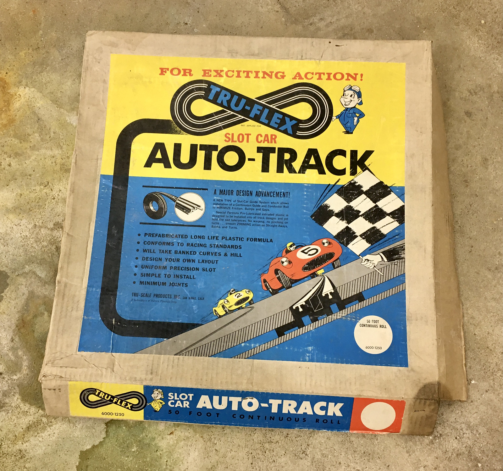
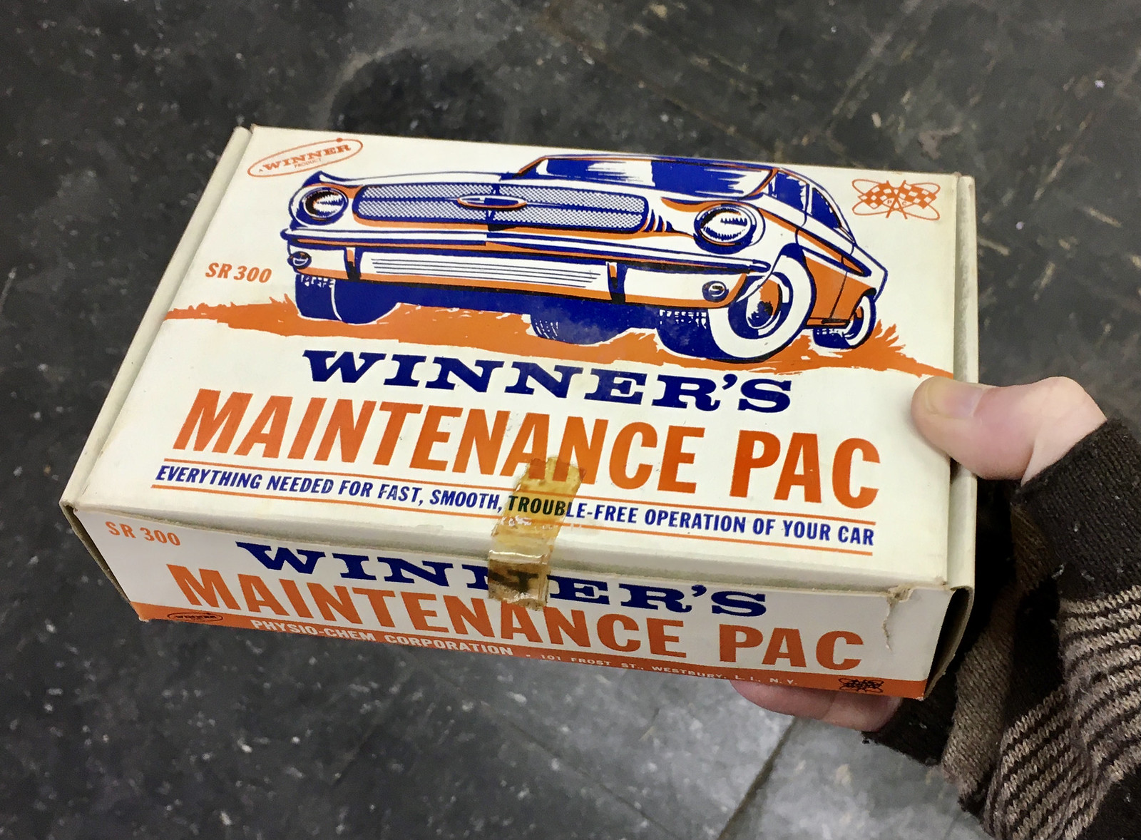
As it turned out, all of Buzz-a-Rama’s “live” track was already long gone. Instead, they were selling boxes and boxes of parts and accessories that had been stored in the basement. This was a gold mine for the middle-aged slot-car geeks who were busily poring over everything (there was a lot of “I’d love to get this, but my wife would kill me”), but most of the stuff didn’t really mean much to us because we’re just casual slot-car fans. We quickly realized, however, that many of the items had gorgeous 1960s and ’70s package designs, so I photographed the ones I liked best, starting with this pack of “Design-O-Graph” markers:

I love the box design for this race car controller — but what’s inside the box is even better:


Similarly, I liked how this next box design was mimicked on the items inside the box:


Mary spotted the beautifully curved “S”es on the packaging of these miniature shrubs:

I like how these next two boxes both show the car from a ground-level perspective:
As you’d expect, lots of the box designs had checkered-flag motifs:

There was also an assortment of retro-styled printed matter — brochures, entry forms, stuff like that:


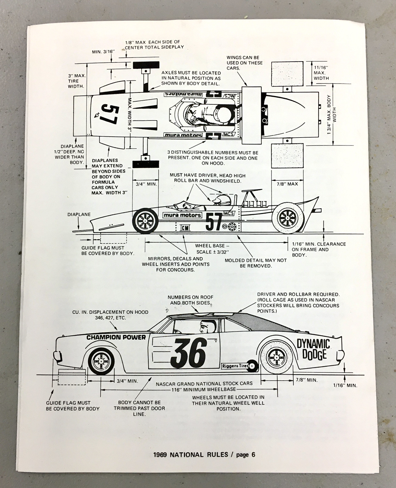
I also liked these sheets that spelled out the official slot-car specs and guidelines for 1969:

Finally, I couldn’t resist photographing a box of A/FX accessories, because that’s the slot-car brand I had as a kid. I still think the diagonal striping and the illustration style are pretty cool:

———
I did buy a little 24-drawer cabinet for $10 (I can put it to good use here at Uni Watch HQ). It’s visually unremarkable — no special graphics or anything like that — but at least it’s a little piece of a special place that’s now gone. R.I.P.
Click to enlarge
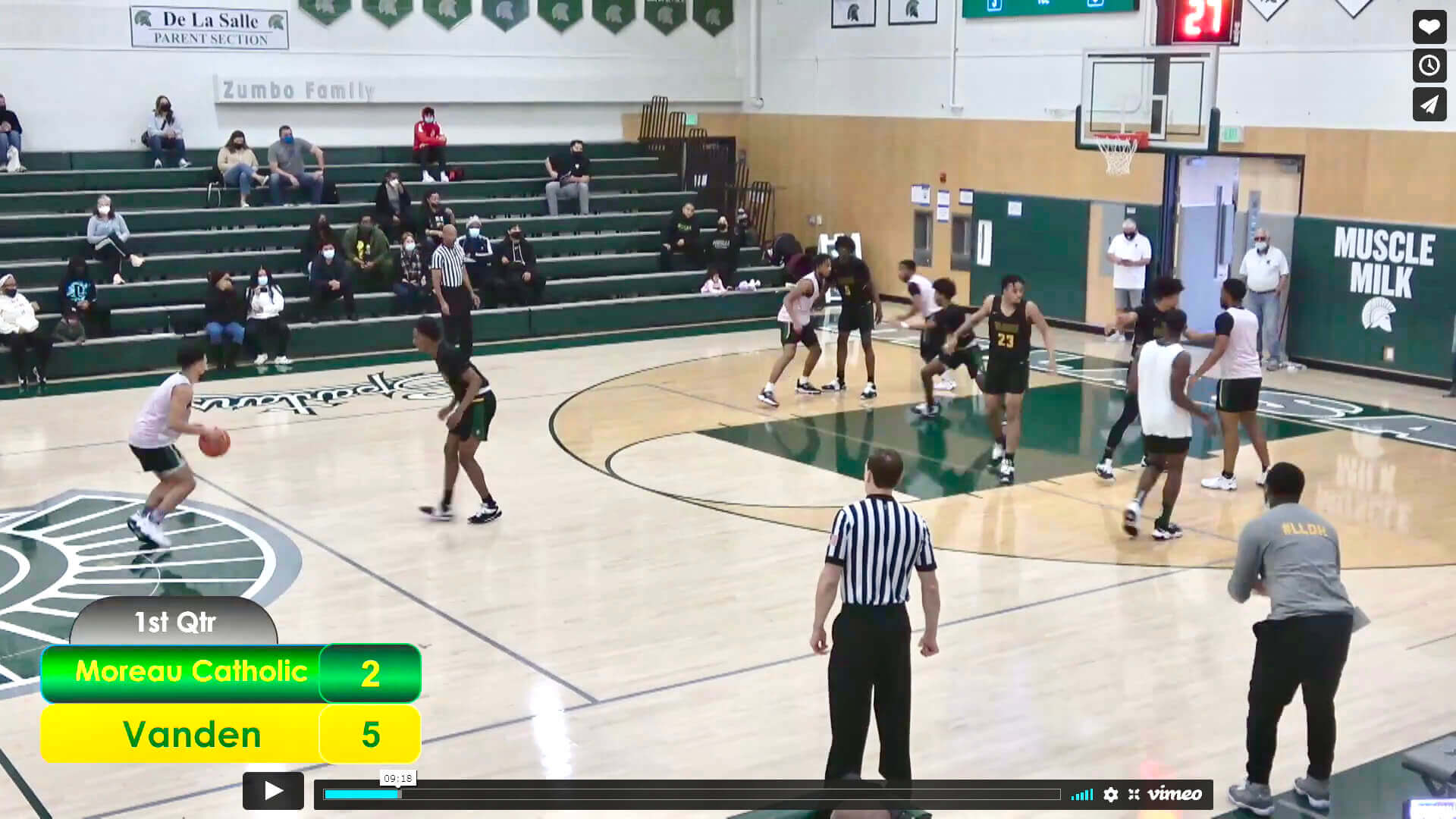
Oopsie: Unusual high school basketball situation last night in the Bay Area. I’ll let reader Ethan Kassel explain:
The De La Salle Martin Luther King Jr. Classic is one of the more prestigious high school basketball events in the Bay Area, and the opening game this year was unusual as both Vanden and Moreau Catholic mistakenly showed up in their black uniforms.
Moreau Catholic was supposed to be the home team (and therefore should have been wearing white), so they were assessed with a technical foul before the start of the game and also had to wear plain white practice jerseys over their uniforms. Each time there was a foul, the referee asked the player to lift up the practice jersey to show his number underneath.
You can see video of the entire game here.
Click to enlarge
Collector’s Corner
By Brinke Guthrie
Follow @brinkeguthrie
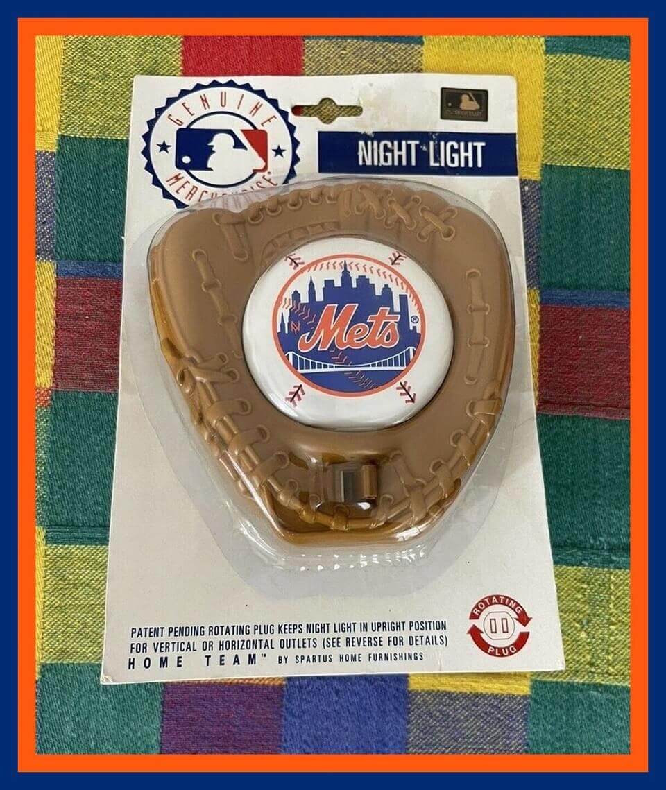
Here’s just the right thing for Uni Watch HQ! Official girl mascot Caitlin will be kept company at night with this New York Mets night light. The seller is also offering Reds and Orioles versions.
Now for the rest of this week’s picks:
• Back in 1973, the folks in the Radaco marketing department must’ve been quite stumped as to what to title their new game. So they just called it the “Officially Licensed Major League Baseball Game“!
• It seems MLB star Richie (call me Dick) Allen at one time had a clothing store in Philadelphia called the Dugout. Here’s one of their clothing labels, featuring a Phillies cap.
• As you can see from this pair of 1985 Nike Air Jordan shorts, the cut was just a bit different back then. No Jumpman logo yet — that came three years later.
• The football player on this 1970 Topps Super Football wrapper is wearing the most unfortunate color combo of neon yellow, orange, and brown.
• Here we have a cute little Miami Dolphins troll figurine!
• Here’s what the seller is calling a 1970s Philadelphia Flyers car window decal. But the background is solid white, not clear , so maybe it’s really more of a sticker, not a window decal.
• Orioles great Cal Ripken Jr. is depicted making a diving stop on the front of this commemorative 1995 Coca-Cola six-pack, but the Ripken illustration is clearly based on this photo of Brooks Robinson from the 1970 World Series.
• No “dishwater” in this 1960s Los Angeles Rams pennant. Just blue and white!
• Packers fans will be interested in this decidedly vintage 9″ Packers doll with felt uniform. The seller says “The only info I have on this rare find is that it came out of an old trunk in an attic.”
• This 1960s Boston Bruins bobblehead is in absolutely perfect shape.
Click to enlarge
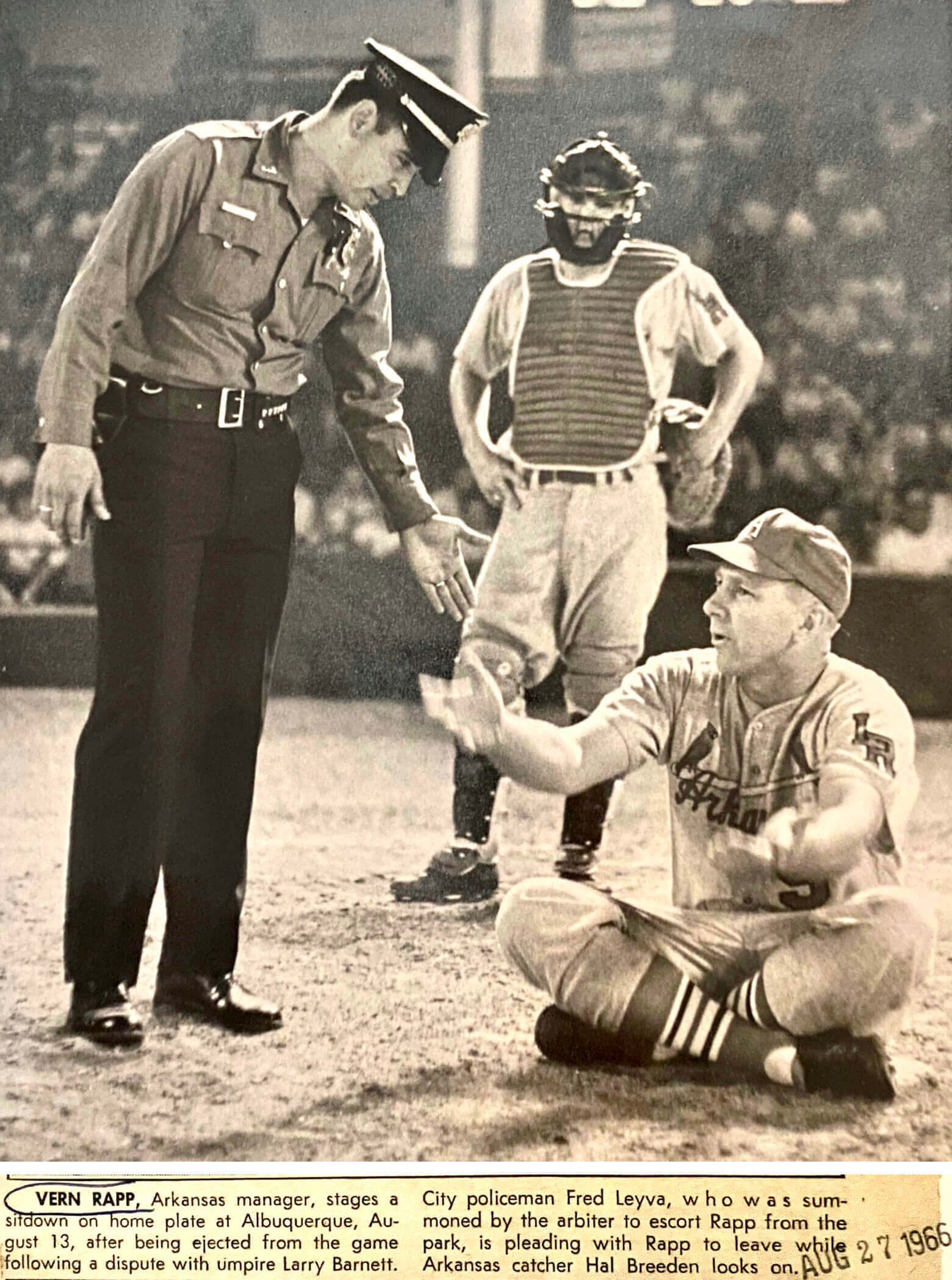
Too good for the Ticker: It’s not often that you see a police uniform on the baseball diamond, but that’s what happened during a 1966 minor league game, as Arkansas Travelers manager Vern Rapp staged a sitdown protest over a bad call and the umps summoned a cop to remove him. Priceless photo!
(Big thanks to Marc Harrison for this one.)
Price cut reminder: In case you missed it on Monday, I’ve cut the prices on a bunch of Uni Watch products, effective immediately:
• Seam rippers, originally $5, are now $3.
• Koozies, originally $5, are now $3.
• Trading cards, originally $6 and then reduced to $3, are now $2.
• Magnets, originally $3, are now $2.
• Chain-stitched patches, originally $35, are now just $20 (which is way below my $28 cost, so I’ll be losing money on them, but I want to get them sold!). are now sold out. If you want to be notified when they’re back in stock, shoot me a note.
• Memberships, normally $25, are now $20.
These items all mail out from Uni Watch HQ, so you can save on shipping charges by mixing/matching items. Email me and I can give you a combined shipping charge for the items you’re interested in. Thanks!
The Ticker
By Alex Hider

Baseball News: Here’s a blog that ranks the Cardinals’ current uniform options (from Phil). … The Twins announced their new international signings by dressing them in older Majestic and Rawlings jerseys (from @Redsunhero). … Great story about a Redditor who’s been spending the lockout drawing a new picture of Angels OF Mike Trout every day (from Trevor Williams). … The next two notes are from Kary Klismet: Here’s a good post about the Cubs’ 1972 road jerseys — the season they wore uniforms with basketball-style centered front numbers. … The Youth Baseball Association in Rochester, Minn., has unveiled new names and logos for its 10 teams, all of which have ties to the Rochester area. … Can’t get enough of this vintage photo of Babe Ruth bowling (from @uniformnerd). … New caps for Newman University (from Blake Cripps). … If you love baseball sweaters — and who doesn’t? — you’ll love the sweaters worn by the 1906 Villanova club (from Alex Cheremeteff).

NFL News: Following up on an item from yesterday’s blog post, the “Be Love” neck bumper slogans worn in last night’s Rams/Cards playoff game did indeed have a circle-R trademark symbol, apparently because the phrase was licensed by the King Center. … In addition, players wore MLK-themed pregame T-shirts. … Heading into Monday night’s playoff game, teams with primarily warm colors were undefeated over those with primarily cool colors during the Wild Card round (Jeff Perilman). … In honor of the 49ers’ win on Sunday, Dave Kuruc sent along photos of some vintage Niners pennants he found for sale online. … Injured Los Angeles Lakers player Anthony Davis wore a 49ers Colin Kaepernick jersey for MLK Day while sitting on the bench yesterday — but the jersey had the Super Bowl LIV patch, and Kaepernick wasn’t even on the team for that game.

Hockey News: The Blues retired Chris Pronger’s No. 44 last night. The team created a logo to commemorate the night, and all Blues players wore white No. 44 Pronger pregame jerseys (from Wade Heidt and Alex Dewitt). … Hockey Day Minnesota is an annual youth hockey event that bounces around to different towns each year. The Wild always set up an outdoor rink and allow local youth clubs to come and skate. This year, the event is being held in Mankato, and these are the jerseys young players get when they come to skate (from Justin Geerdes). … Speaking of Hockey Day Minnesota, these are the jerseys that Mankato West High School will wear during an outdoor game at the rink later this week (from Paul Allan). … Interesting piece about the woman who builds the AHL schedule each year (from John Muir). … Does anyone remember these vintage hockey logo cards and stickers from the ’70s and ’80s? “The thick black outline on the logos does change how you see a few of the designs,” Dave Kuruc said.

Basketball News: The Wizards have a uniform history display at their home arena (from Nicklaus Wallmeyer). … Check out the uniforms worn by the Nativity Social Club in Scranton, Pa., in 1953 (from Adam Vitcavage). … Rough black-vs-charcoal uniform matchup between Newman High School and Zachary High School in Louisiana (from Lenny Vangilder). … Cross-listed from the NFL section: Injured Lakers PF/C Anthony Davis wore a San Francisco 49ers Colin Kaepernick jersey for MLK Day while sitting on the bench yesterday — but the jersey had the Super Bowl LIV patch, and Kaepernick wasn’t even on the team for that game.

Soccer News: The next three notes are from Kary Klismet: Mexican club Tigres UANL of Liga MX have announced plans to build a new stadium. … New third uniforms for Dundee United of the Scottish Premiership. … New uniforms for Vanruare Hachinohe, a third-tier Japanese team (from Jeremy Brahm). … Also from Jeremy: The Japanese J League is holding a “mascot general election.”

Grab Bag: U.S. curler Matt Hamilton recently wore a suit jacket lined with a house ring pattern (from Mark in Philly). … Several notes from yesterday’s NCAA gymnastics tri-meet between Iowa, Minnesota, and UCLA: The Hawkeyes broke out new leotards, Golden Gophers fans got really creative with their Covid masks, and all three teams wore MLK Day warm-up T-shirts (from Kary Klismet). … Also from Kary: A task force at Western Washington University has recommended retiring “Vikings” as the school’s team name. … Nice gesture by the Ashland University track and field team. Not only did they unveil a memorial patch for recently deceased coach Jud Logan, featuring his signature catchphrase, but the program also allowed the athletes to add the patches to their uniforms themselves (from David Wiechmann). … New pride uniforms for women’s Australian rules football clubs Gold Coast, Melbourne, and Fremantle. Ditto for most of the other AFL Women’s clubs (from J.R. Rogers and our own Jamie Rathjen).
.
Ah yes, definitely have to change that Vikings name due to the legacy of colonialism, after all that’s why today we all worship Odin and Freyja and are forced to learn the Elder Futhark in schools.
Also, declaring that the Vikings name is gender-exclusive seems rather ignorant of the shield-maiden tradition in Viking society. The Vikings were more progressive on gender than most societies of their time.
We all saw this coming. -C.
Brothers Hal and Danny Breeden had short Major League careers. Hal was a first baseman and Danny was a catcher.
In 1965, Hal was in the Braves’ Minor League system and Danny was on a Cardinals farm team (Arkansas). So I think the original photo caption mistakenly identifies the bystanding catcher as Hal when it really was Danny. I think. Thoughts welcome.
link
link
(click on SHOW MINORS)
1966 not 1965.
The rest of the information is correct, I believe. 1966.
That photo of Babe Ruth bowling adorned our local ancient duckpin bowling alley – virtually unchanged from the 50’s, complete with overhead projectors and owned by a family friend. Unfortunately, a serious mold problem and resulting dispute with the landlord seems to have closed it for good :(.
More on the St. Louis Blues last night. They wore the Pronger patch on their jerseys during the game. Brought out their 1990s vintage uniforms for the game.
Here is a look:
link
Came here to mention this! The fans have such a love-hate relationship with those sweaters. I thought the patch looked a little odd on them, too.
Okay, what IS the deal with the Rams’ numbers? They (and the shoulder horns) are plastic or something, yeah?
They get all distorted during the game (and, I presume, after repeated wear and cleaning).
I hate to shout at clouds, but was tackle twill not an option? Are we trying to take every ounce of weight out of jerseys by reducing sleeves to almost nothing, shortening the length and now putting cheesy toy numbers on them?
My understanding is that selves have disappeared mostly so opposing players can’t hold onto them, either on the line or when fighting for position on the ball, which is why QBs who don’t really have the issue will occasionally still have full sleeves.
I haven’t seen the game issues rams jerseys in person but I would assume the weight difference is minimal, and that it was chosen for visual reasons, the color gradient and texture likely couldn’t be easily reproduced on fabric.
Correct on the sleeves, but his point on the numbers/material seems somewhat valid. The manufacturers are always spouting nonsense about how its the lightest ever.
That said, most teams seem to still use some sort of synthetic material for their tackle twill numbers without a problem. My assumption is with the Rams is that their numbers/graphics on the jersey are different more out of artistic value than being a different material meant to allow for better performance. They just chose shinny reflective different numbers for the look. And while I haven’t noticed, perhaps they also function different (poorly) besides just looking bad.
That was a trip down memory lane.. My dad was into slot car racing in his younger days and I remember him having a lot of that stuff in his hobby room. I remember a tackle box with slot cars instead of lures. I used to be fascinated with all the different colors and designs of the cars.
Seems to me like the Bill and Patriots have pretty much the same color scheme. Someone is reaching a bit by cherry picking the red and calling them “warmer” than the pats…
But they were on fire during the game so I guess it works! Go Bills!
They said due to a history of conquest, and violence not colonialism. The Vikings did repeatedly invade other people, that’s not really debated. (If that is enough to not name a team after them is definitely a debate). While women in Viking culture generally were better off than other western nations at the time, it was a heavily patriarchal society.
Does anyone know/remember if this argument came up during the process of the University of North Dakota changing their name from “Fighting Sioux”? The Sioux were pretty conquest-oriented and, in fact, took some of their most famous sites (most notably what is now Mt. Rushmore) by force from the Cheyenne who previously lived there.
I’m obligated to note that the Wizards uni history display conspicuously omits the illegible one-year blunder in 1987-88 that I wrote about a few years back. I don’t blame them for burying this one, but here’s the whole story if anyone’s interested:
link
Damn, that slot car thing seems so cool. It was definitely before my time, but I remember having one when I was younnger. Good times.
Article discusses Larry Barnett as Umpire. Barnett would go on to making the Ed Armbrister call in the 1975 World Series.
link
link
Collector’s Corner: Flyers “decal”…
A decal is a sticker but not every sticker is a decal.
My dad had one of those on the back passenger side window of his ’73 Dodge Coronet station wagon. I spent many roadtrips in the 3rd row, so I remember that decoration quite well. It was applied from the inside (graphics on the interior glass) and was non-removable, so I’d say it was (and the Ebay offering is) a decal. Whatever you’d call it, seeing one brought back some good childhood memories. Thanks for sharing, Brinke!
My pleasure!
Potentially foolish question – are Odell Beckham Jr’s socks ever-so-slightly darker than the rest of the team?
I suspect you don’t see too many photos of police on the field because most umps would never let it get that far. They’d never call the police to remove a manager who won’t get up off the field, they’d forfeit the game.
The only thing I remember about Vern Rapp is that the Reds fired him to bring back Pete Rose as player-manager.
We Cardinals fans remember Rapp for his requirement that Al Hrabosky shave his Fun Manchu. Hrabosky complied, but subsequently demanded to be traded. The Vern Rapp years were not a shining moment in Cardinals history.
I just love how Rapp is explaining his case to the cop, as though the cop cares. Poor guy had to be hating his job right at that moment.
Not the last time Vern Rapp made people around him miserable, according to many accounts.
There is an interesting story about Rapp and how he got his last managerial job.
He had been a first-base coach for the Expos and announced he would be retiring from that job after the 1983 season, which was also the last season for Carl Yastrzemski. A couple of Boston radio guys, as a tongue-in-cheek response to the grand sendoff Yaz was getting that year, did a “tribute show” for Rapp one day and interviewed a Reds’ executive, who praised Rapp greatly. The exec went to an after-season front-office meeting and talked about the Rapp thing he participated. The Reds’ GM heard about that, not realizing Rapp was retiring, and ended up hiring him as Reds’ manager for 1984, and of course he was replace by Rose later that season.
The story is included in this article: link
“Drawing Mike Trout every day” is the kind of content that makes me a Uni-Watch fan. I love seeing how people express their creativity in such random ways.
Regarding the 1972 Cubs’ grey jerseys, I recall a picture of the Mariners’ Tom Paciorek having a centered number on his blue Seattle uniform. Perhaps seamstresses optically centered the player’s two-digit number, and then moved the digit in the tens’ place to outside the digit in the ones’ place (to make it look like “baseball”). I don’t recall the Pirates having this problem when they introduced the pullover, but their front number isn’t flushed all the way right, either.
I kind of like that number placement on the pull-over jersey. It’s too bad that they didn’t hang around longer. It’s weird that we accept it on a basketball jersey but it looks out of place on a baseball jersey and vice versa.
link
Getting a “Sorry, this page isn’t available” on the first item under Grab Bag – curler’s suit jacket.
Hey Paul,
Great stuff at Buzz-a-Rama! A Gothamist article reported they had “old New York City shop signs,” signs for sale. Did you see any signs and what kind were they (Storefront signs or smaller interior signs). Thanks.
Saw a few beauty parlor signs, but nothing beyond that.
Thanks.
No mention of the Arkansas Travelers’ birds-on-bat word mark? Is that common knowledge?
Found this: link
Also, the LR patch, likely for Little Rock despite not being part of their official team name?
Lots of Cards farm teams did this, like the Portland Beavers:
link
Sure, but they put a beaver, not a cardinal! Should’ve been a traveler on bat!
Those two details were my make-the-day takeaways too. Such beautiful jersey details!
Regarding the “Oopsie” item about the two high-school teams showing up in black, it was nostalgic to see Vanden High of Fairfield, Calif. get a mention here. I attended Vanden in the early 1970s when my dad was stationed at the adjoining Travis Air Force Base (I even did the P.A. announcing for Vanden’s JV basketball team). Just sorry to see the old green-and-gold Vikings now wearing BFBS.
If you were a Baltimore/Washington area sports fan who went into cryo-sleep in the summer of 1971 and woke up after 2-2-2022, you would still recognize the Orioles, but you would have to have it explained to you what happened to all the other nicknames you remembered for the local teams.
Rip Van Winkle: But we still have the Nats, right?
2022 resident: Well, yeah, but it’s short for Nationals, not Senators.
RVW: Nats has always been short for Nationals.
2022: But they were the Senators.
RVW: Exactly.
Man, stories like today’s about the Buzz-a-Rama blinking out of existence brings on the feeling of melancholy. I’ll spend the rest of the day living inside one of my favorite song lyrics, “Well we knew we had the good things, but those never seemed to last / Oh please, just last.”
It’s sad, but I prefer to celebrate the against-all-odds miracle that the place lasted as long as it did. A gift!
The “Maintenance Pac” and “AFX Racing Accessories” photos are killer!
I think the NFL needs to rethink some of those helmet bumpers. It was a little odd last night watching guys wearing “Stop Hate” across their neck while trying to punch guys on the other team and rip the helmets off their heads.
The Rawlings Twins jerseys are likely spring training jerseys for the minor league camp, or the jerseys that their Rookie level team in the Florida Complex League wears.
Ackchyually… All the teams wearing color-jerseys won in the Wild Card Round. (5 home teams and SF, which, of course was wearing color-jersey in Dallas).
Actually, Tampa won while wearing white.
Great post about the Buzz-o-Rama. Your pop-ins to olde time random places are always some of your best posts, because you’re nostaglic and into retro stuff.