For all images, click to enlarge
Last winter I wrote about how a Baltimore artist had inspired people to repaint and decorate the city’s yellow salt boxes, thereby transforming a drab street fixture into an entertaining civic art program. Now longtime reader Omar Jalife has informed me that something similar is going on in Houston.
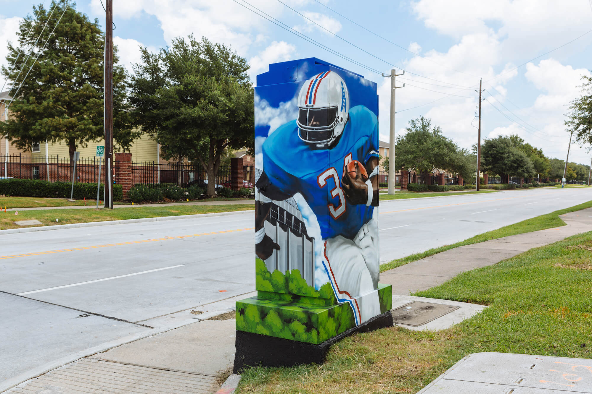
The Houston program is called Mini Murals and involves having local artists repaint traffic signal cabinets and other utility consoles with decorative artwork. Since the program began in 2015, more 300 Mini Murals have been painted in Houston. (There’s also a much smaller version of the program in Austin.)
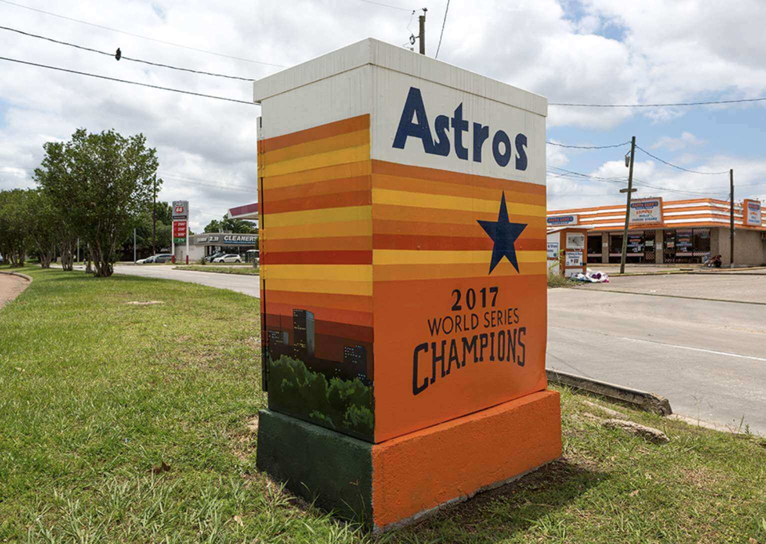
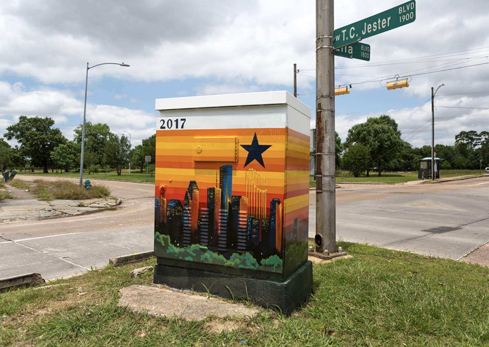
A few of the Mini Murals are sports-related. In addition to the Earl Campbell design shown at the top of today’s post, there’s also this Astros design, celebrating the team’s 2017 championship:
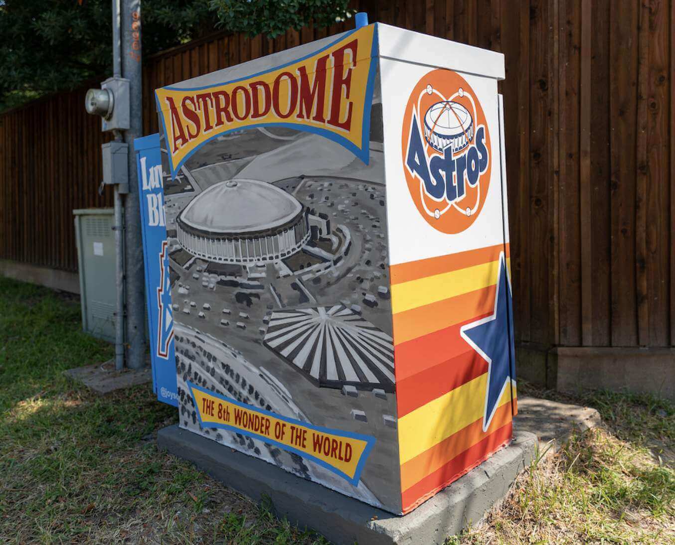
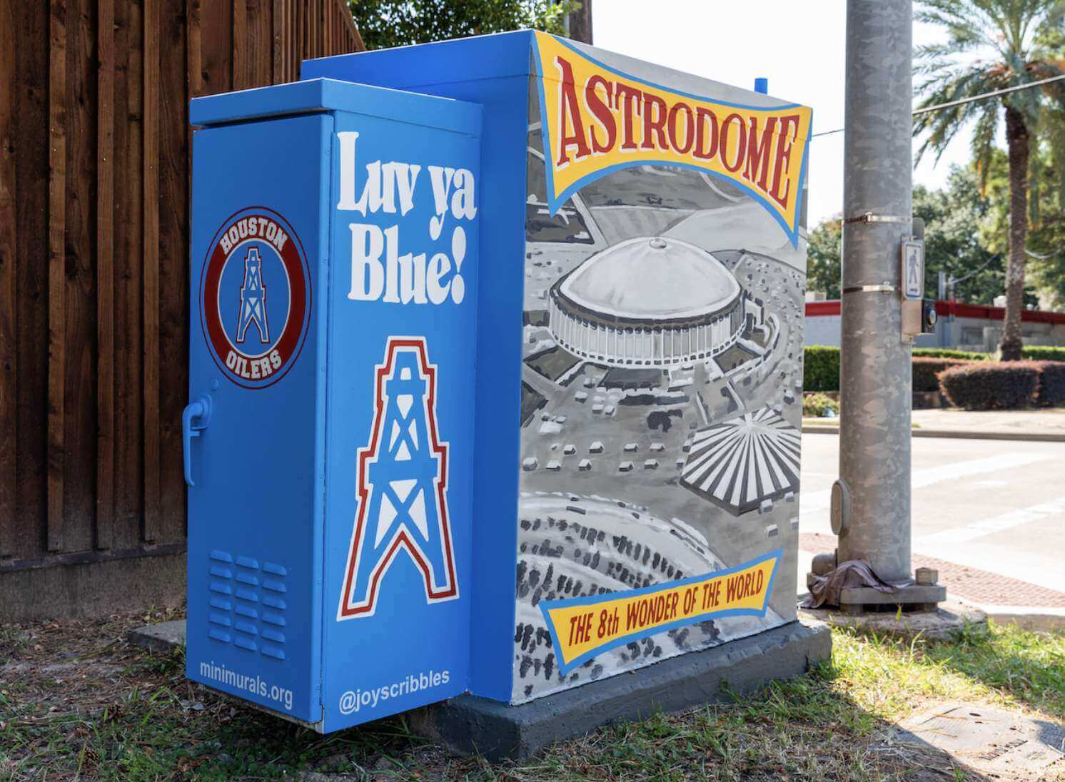
Here’s one that celebrates the Astrodome, with nods to both the Astros and the Oilers:
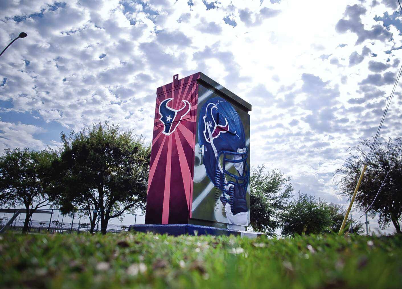
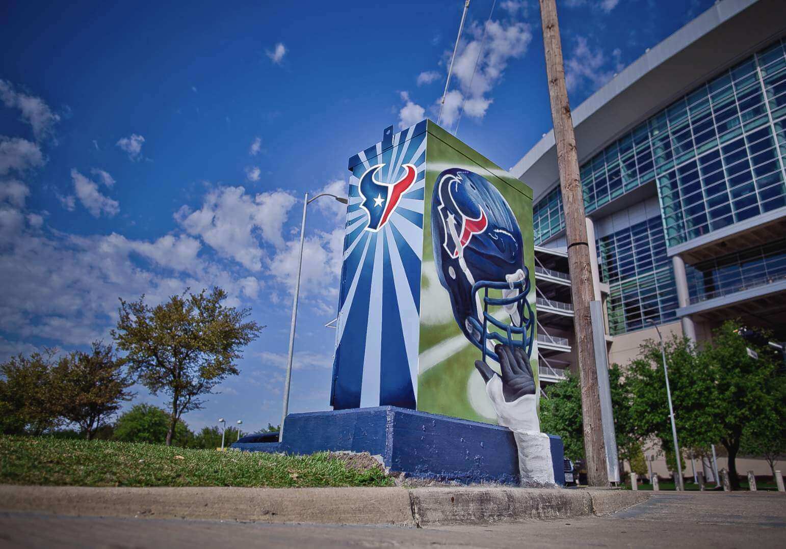
There’s also a Texans-themed one (although it’s at their stadium, so that seems a little more obvious and less of a fun surprise):
Here are two golf-themed designs:
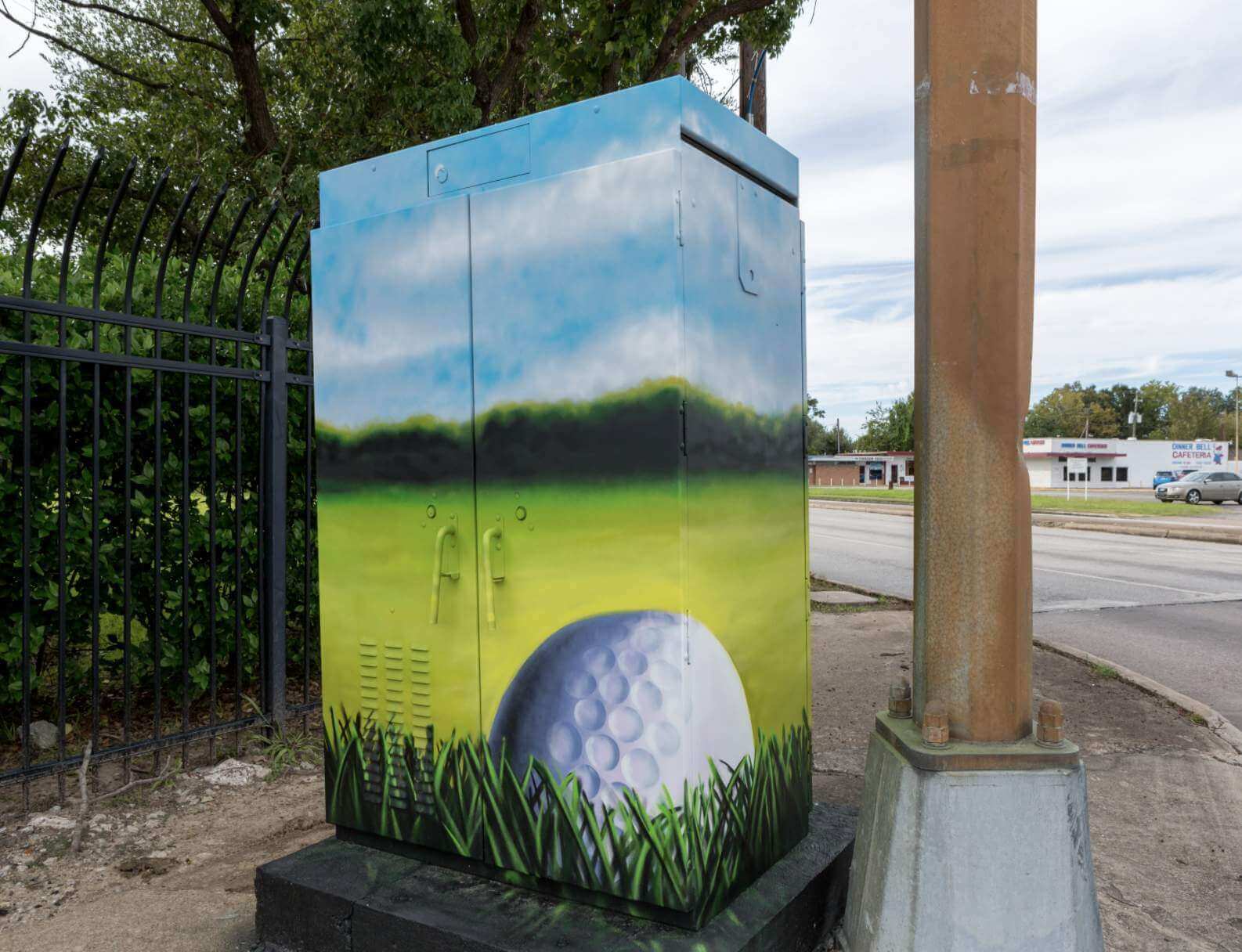
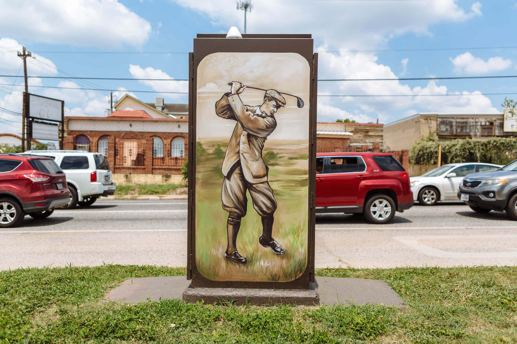
The golfer depicted in that last photo is, I believe, Gus Wortham, a Houston businessman who’s the namesake of a local golf course.
And then there’s this one, which just shows a bunch of balls from various sports:
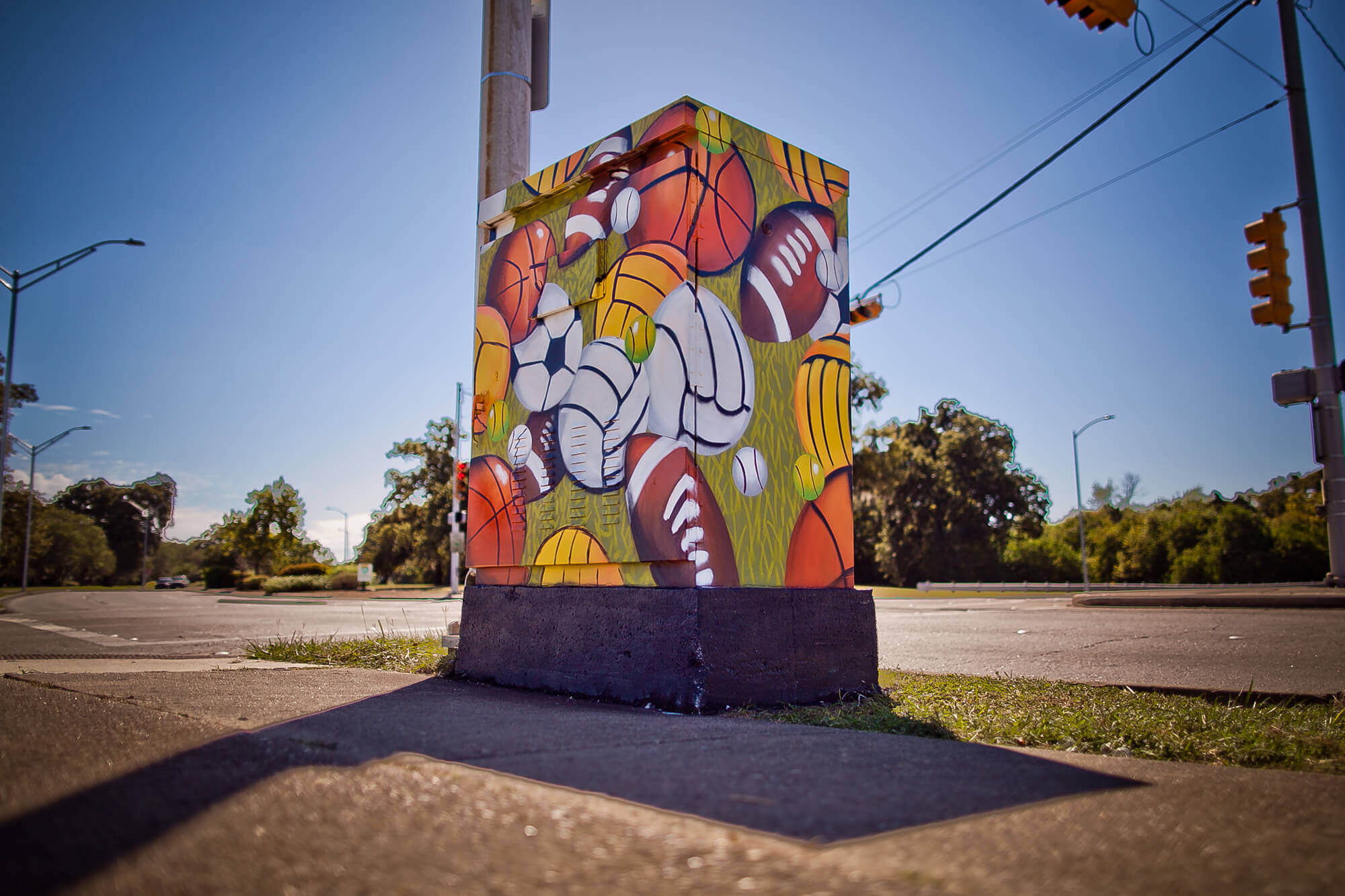
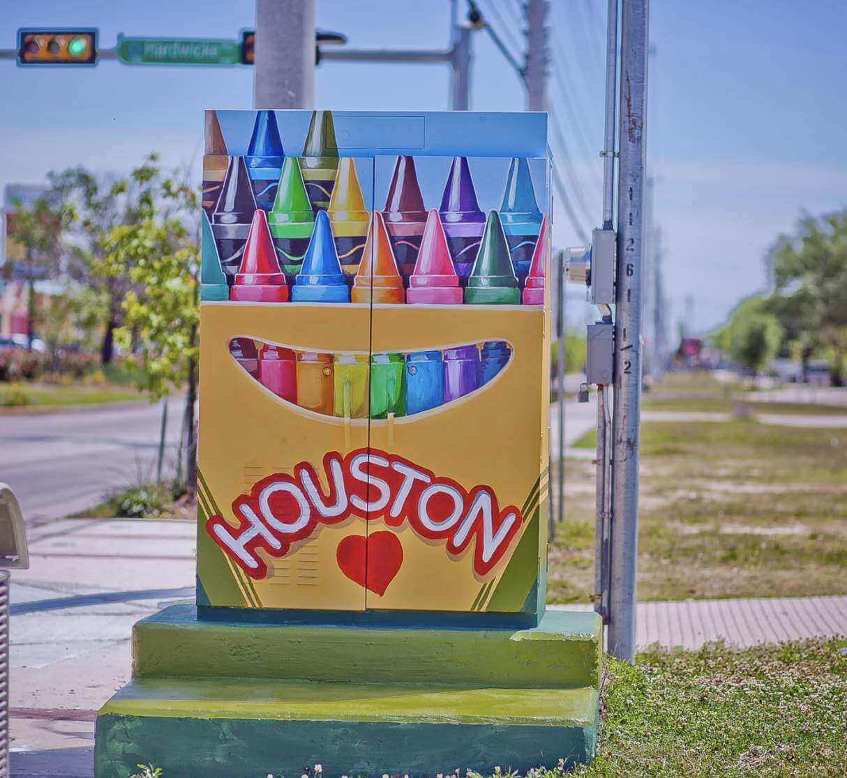
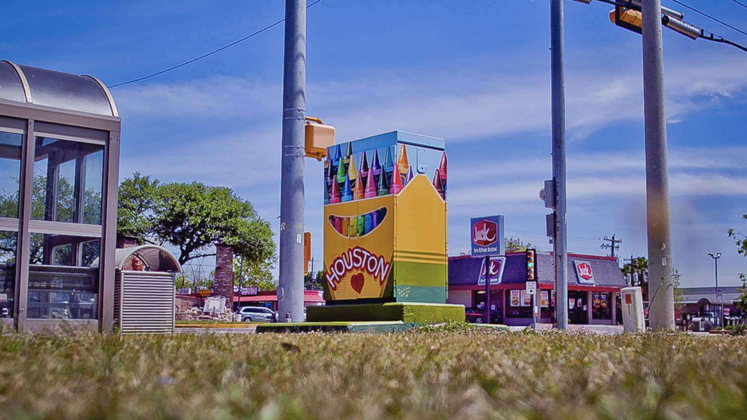
There might be a few other sports-related ones that I missed. But a lot of the non-sports designs are really fun too. I especially like this one:
———
Isn’t that great? There’s a lot more info, including maps, suggested walking tours, and so on, here.
One footnote: While working on this entry, I discovered that a few other cities have started similar programs of their own. Over in South Carolina, the city of Goose Creek promoted its program in 2019 by posting an article on the city’s website with the following headline: “Artists Give City Color Rush with Traffic Signal Cabinet Project.” Probably the first time Nike’s Color Rush term has been used in that type of context!
(Big thanks to Omar Jalife for letting me know about this wonderful civic art program.)
Click to enlarge
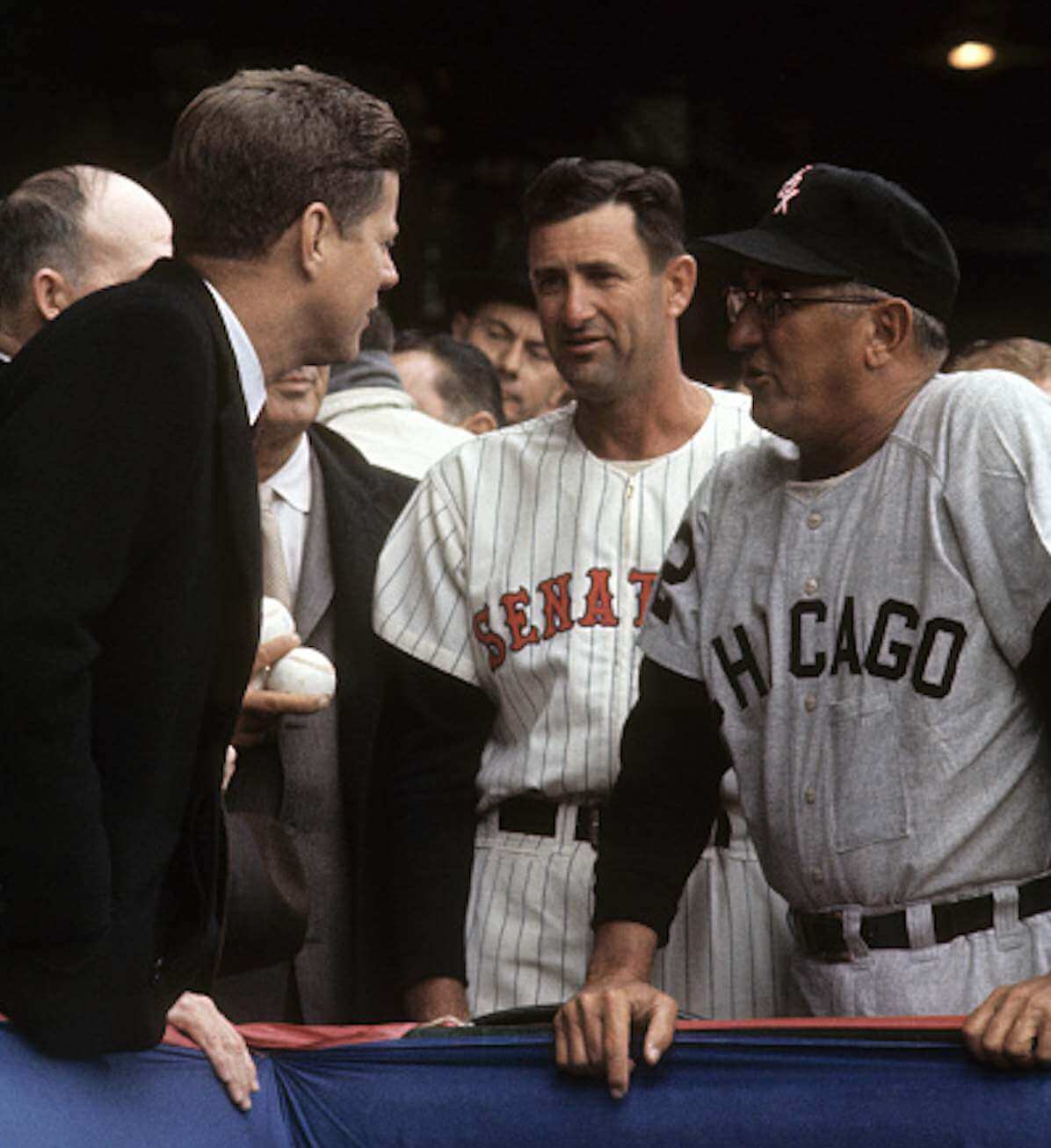
Too good for the Ticker: While looking for additional examples of pants-pocketed managers and coaches, reader Chris Hickey stumbled upon something fascinating: White Sox manager Al Lopez (shown here on Opening Day, 1961, alongside Senators manager Mickey Vernon and JFK) had a pocket on the front of his jersey!
I’m a bit confused by the visual evidence, though. On the one hand, the pocket itself clearly appears to be on the outside of Lopez’s jersey. But you can also see the outline of something long and thin in the pocket — a pen, maybe? — that appears to be on the inside of the pocket. Anyone have any ideas about this? (Orioles skipper Earl Weaver, of course, famously had an inner jersey pocket to hold his cigarettes, but Lopez’s pocket looks like it was on the outside, at least to me. Hmmmmm.)
Meanwhile, if you look closely you can see that Vernon also has the extra pants pocket, so we can add him to our pocket pantheon. For that matter, so did Lopez, as you can see in this shot. And they’re not the only ones — Chris has also turned up photos of several other pants-pocketed MLBers, including A’s coach Albert “Chief” Bender; A’s manager Jimmy Dykes; and White Sox manager Eddie Stanky (also, look at plate ump Marty Springstead’s sensational jacket patch!).
In addition, reader Joanna Zwiep has found two Reds managers who wore the pocket: Rogers Hornsby and Bill McKechnie. The McKechnie shot is from 1940, making by far the earliest example of the pocket phenomenon that we’ve seen so far.
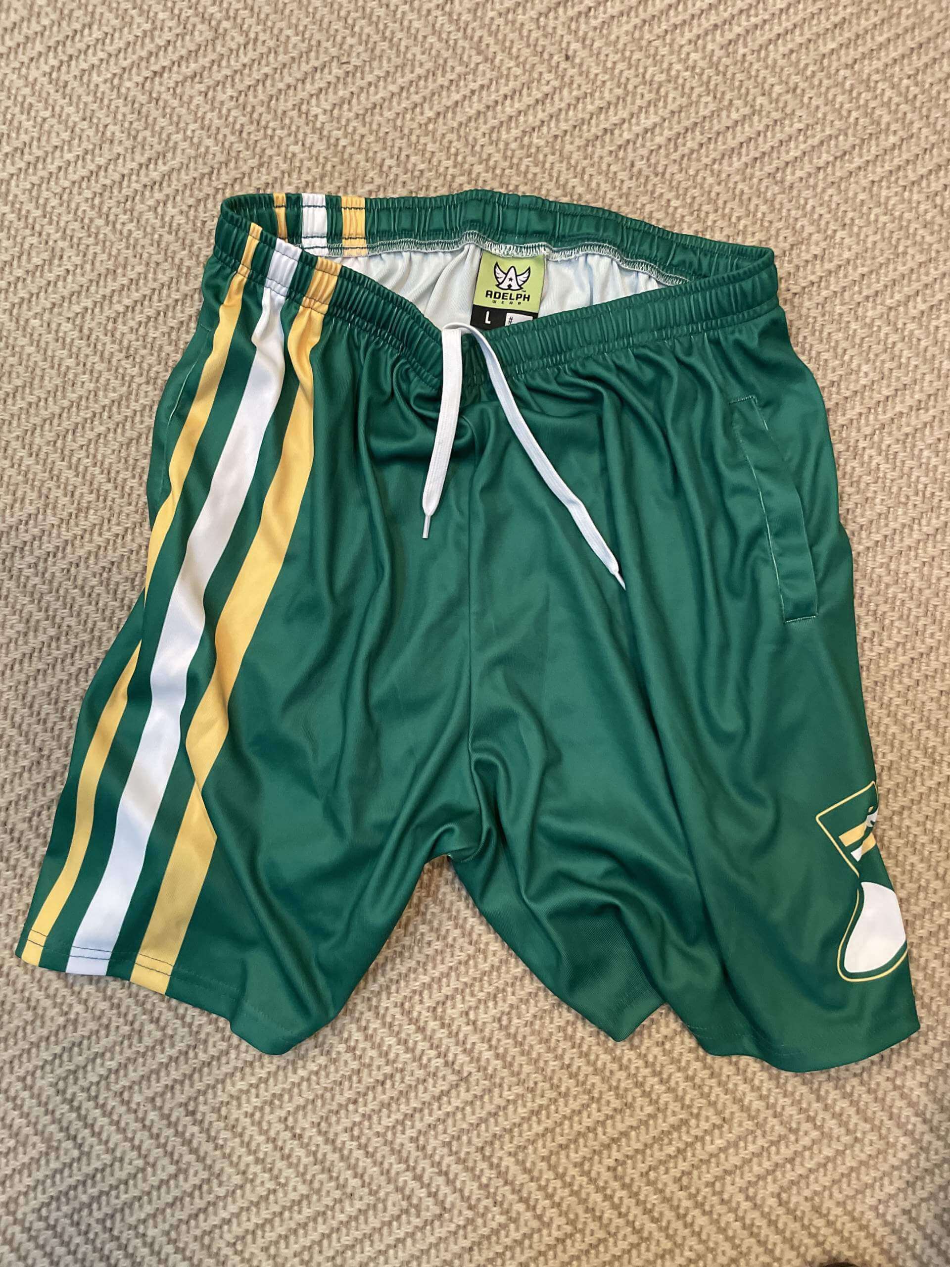

ITEM! Another raffle: A few years ago, when we were offering Uni Watch basketball shorts, reader Matt Sanderson bought a Large pair and found that they were too big for him. They’ve sat in his drawer, unused, since then, and now he’s decided to let me raffle them off.
This will be a one-day raffle. USA shipping addresses only. To enter, send an email with your mailing address to the raffle in-box by 8pm Eastern tonight. One entry per person. I’ll announce the winner tomorrow. Good luck!
Meanwhile: The winner of yesterday’s raffle for the copy of Stanley Cup quarters is Matthew Simpson. Congrats to him, and my repeated thanks to Will Scheibler for making that one possible.
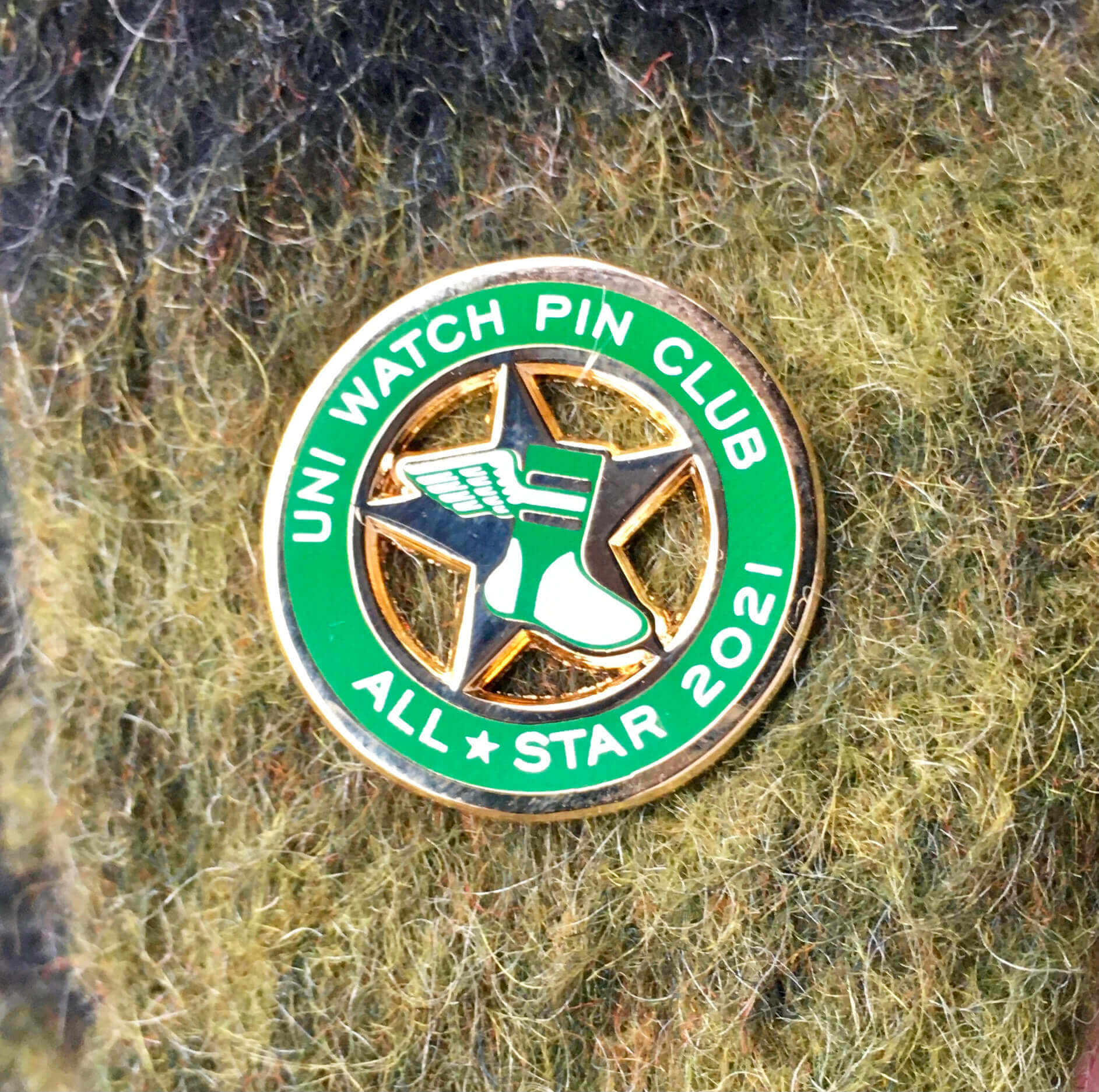
Pin Club update: In case you missed it on Monday, Todd Radom and I are no longer doing monthly pin designs, but there’s still one important order of Pin Club business remaining: sending out the 2021 All-Star pins.
I’m happy to report that those pins arrived from the factory two days ago (much earlier than I expected!). They’re all packed up and ready to go, so I should get them mailed out today to everyone who presented proof of having collected ’em all.
Also: Last year some people created display boards for their pins and shared the templates that they used for the displays. If you have a design you’re willing to share with the Pin Club comm-uni-ty, let me know. Thanks.
Thanks again for your support of this project. Todd and I have really enjoyed working on it.
Click to enlarge
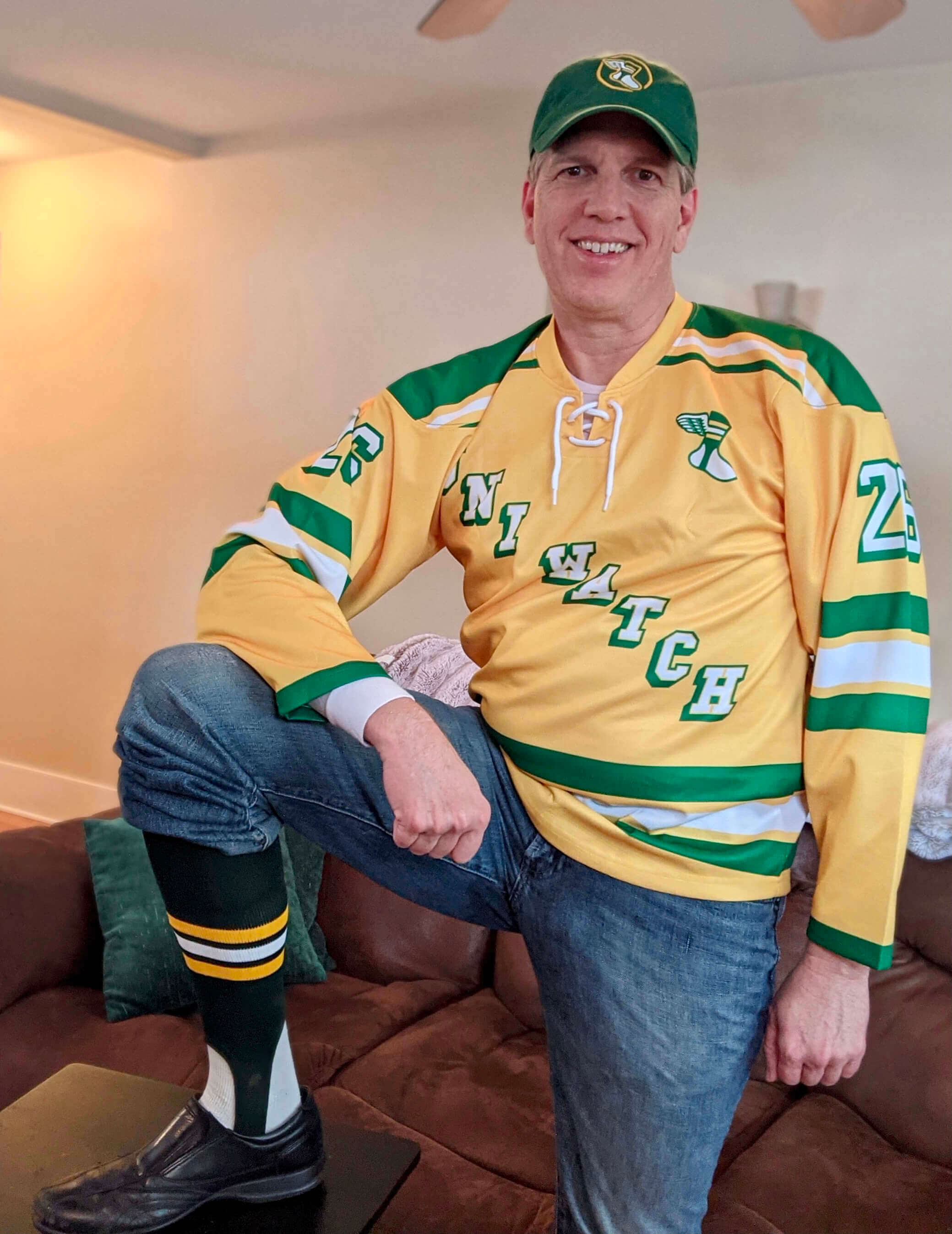
He definitely Gets It™ Who’s that in the mix-and-match Uni Watch ensemble? None other than longtime reader and Ticker stalwart Kary Klismet. He won the stirrups in our year-end raffle and thought he’d model them with other items from his Uni Watch wardrobe. Lookin’ good, Kary!
The Ticker
By Paul

Baseball News: Nice story about Yankee Stadium’s Monument Park (from Kary Klismet). … The women’s hockey teams for D3 schools Adrian College and Trine University played an outdoor game on Sunday at the Toledo Mud Hens’ ballpark (from Kary Klismet). … Juan Francisco, who plays for Gigantes del Cibao in the Dominican Winter League, wears No. 111 (from Robert Flores).

Football News: Riddell has launched a new helmet model called the Axiom. I’m scheduled to interview several Riddell execs today, so I’ll have a thorough rundown on this helmet soon, probably next week. … Remember how I wrote about treDCALs — those custom-designed thigh pads — four months ago? Now ESPN has its own story about the company. … Here are this weekend’s uni combos for the Broncos and Bengals, plus the Lions might wear throwbacks (all from Phil). … Next month’s Super Bowl is slated to take place in L.A., but the NFL is exploring alternate sites in case Covid forces a relocation. … A guy who finished last in his fantasy league had to paint his pickup truck with an “I Came in Last in My Fantasy League” message (from Trevor Williams). … Bills QB Josh Allen has his own limited-edition cereal, Josh’s Jaq’s [sic] (from Trevor Williams).

Hockey News: Reprinted from the baseball section: D3 schools Adrian College and Trine University’s women’s teams played an outdoor game on Sunday at the Toledo Mud Hens’ minor league baseball stadium, with Adrian going G.I. Joke for the occasion (from Kary Klismet). … Penguins Equipment Manager Paul DeFazio worked his 1,500th professional regular season game last night and received a No. 1500 jersey to mark the occasion (from Steven Schapansky and @CantankerousRex).

Basketball News: A photo of Celtics PF Jayson Tatum, currently appearing on a bag of Ruffles potato chips, shows his jersey’s maker’s mark but not the ad patch (from @Finerific). … The Mavs retired Dirk Nowitzki’s No. 41 last night. … New court design for Montevallo High School in Alabama (from Kary Klismet).

Soccer News: New ball design for the Africa Cup of Nations (from Jeremy Brahm). … Here’s a piece on English club Queens Park Rangers’ 1974-75 season, during which they wore nine (!) different shirts, counting all the variations of their blue/white hoops pattern (thanks, Jamie). … Also from Jamie: Brentford’s men’s team has not worn its first shirt for 30 consecutive away league games, dating back to September 2020. … The upcoming World Cup in Qatar will feature a transportable stadium that can be dismantled and reassembled (from @bryanwdc). … New home shirts for second-tier Japanese side FC Ryukyu (from Jeremy Brahm).
Olympics News: New Winter Olympics uniforms for Russia and Australia (thanks, Phil).

Grab Bag: French president Emanuel Macron’s white Covid mask has one blue strap and one red strap, creating a visual effect that mimics the French flag (from Jen Hayden). … An eBayer has been selling off a huge collection of really beautiful milk bottle caps from Western New York dairies. Additional info here (from Brad Loliger). … The official seal for St. Francois County, Mo., got so much negative attention online that the county is now planning to replace it. It’s not that the existing seal was offensive or derogatory — it’s just a comically bad piece of design (from John Chapman and K.C. Kless). … Two cycling items from Kary Klismet: The Union Cycliste Internationale has banned Spanish team Bizkaia-Durango’s uniforms because they looked too much like the UCI Women’s WorldTour leader’s jersey, and an Australian cycling team’s uniforms have been criticized for being sexist because the male riders wear blue while the women wear pink and purple. … A U.S. Navy sailor has invented and patented a device that keeps his uniform’s nametag stiff, with no puckers or curls.
Signal flare: If readers Mark Cartman and Marc Rivlin see this, please drop me a line. I’ve been trying unsuccessfully to reach you. Thanks! — Paul
Our town did something similar with our electrical boxes. It was women’s history themed and in an alphabetical walking tour- highly recommend.
link
@Kary- I wish I had the title ‘Ticker Stalwart’!
Thanks, John! Let’s just say it’s a labor of love. Or quirky obsession. They may be more or less the same thing.
Could the pants pockets be for stop watches that some coaches used to keep on them all the time?
Yes — that was addressed in yesterday’s post:
link
Haha yesterday the one day that I skimmed the text and just looked at pictures! My bad.
In and around Rochester, NY they have also have decorated traffic cabinets.
My favorite which is near the cemetery is of a emergency zombie station link
You can see more of them here: link
I think the Montevallo story might be about Montevallo High School, rather than University of Montevallo
You’re right! Now fixed.
They should paint Astros murals on the public trash cans in Houston. Hiyoo!
Here are some mini Astros trashcans ready to go :>)
trashcantributes.com
Can we stop saying that cycling kits are being “banned”? In both the Bizkaia-Durango and Andy Schleck cases, the designs were submitted for approval and denied for legitimate reasons. This is not a new process. At least Bizkaia-Durango didn’t order a bunch of gear before being approved.
Maybe I just missed it, but have you written about the WFT’s announcement of the new nickname coming on 2/22/22 and CBS Sports report that it’ll be Admirals?
Based on comments from team president Jason Wright, it appears they’re going to release a new uniform design with the same burgundy and gold color scheme.
Yes, I have written about it. It was the 2nd item on Tuesday:
link
Also: CBS has *not* reported that the name will be Admirals. They have reported (as many others have) that several factors seem to be pointing in that direction. On the other hand, Admirals wasn’t even on the list of eight finalists that the team released earlier. We’ll have to wait and see.
Did I miss two? I thought that they only released six finalists (Armada, Presidents, Brigade, Redhawks, Commanders, and Defenders).
Red wolves & Football team were eliminated
Not throwing away my pre-2020 WFT apparel if it ends up being “RedHawks”.
López’s pocket is long and narrow; perhaps it was to store a pencil or pen. As manager, he might want one handy to take notes or make changes on the lineup card.
He wears glasses, so maybe it’s to hold his glasses, or sunglasses?
My hometown of Mt. Juliet, TN has also had the painted electrical boxes for years. The only sports-related ones I can think of display the local high school teams. Others represent the library, Charlie Daniels, and other local fixtures.
Wonder how long before someone sits a trash can next to the Astros WS Champs box or paints a trash can on it. Just sayin’ . . .
Lopez’s pocket is for his glasses which is genius. Instead of wearing a glasses lanyard, I’m sewing front pockets on all my tshirts. genius.
Love the Houston utility box art, their logo and uniform history should be shown in every city it’s so hot. Tequila Sunrise and the Oil rig? forget about it…tough to find a city with two better. Who you got? Celts and Pat Patriot? Steelers, Pens, and Frank Gifford Pirate logo?
Also, I don’t see any sign of anything in the pocket. Just folds that line up with the folds of his jersey.
Oh, we hadn’t covered Josh’s Jaqs yet? My father-in-law from Buffalo sent me two boxes a couple months ago. I ate one and saved the other for posterity, by which I mean the next time I get hungry and don’t have any other cereal on hand. They’re pretty good – like Froot Loops, but with only the red and blue flavors. I would add them to my normal rotation.
The spelling is actually an acronym, _J_osh _A_llen _Q_uarterback = JAQ.
Writing this, it has occurred to me that my wife and I may have more Buffalo ephemera than anyone outside of WNY. Uni Watch’s featuring of Oxford Pennant hasn’t helped that. A nice Christmas surprise for my wife, and then she turned around and ordered something for her dad’s birthday too.
The spelling is actually an acronym, _J_osh _A_llen _Q_uarterback = JAQ.
Yes, it says that right on the box. But that still doesn’t justify the apostrophe.
As a lifelong Dodgers fan, my first thought when seeing the Astro’s 2017 World Series Championship* (asterisk intended) cabinet art was that it should have been painted on a trash can instead….and then thrown in a dumpster fire. Cheaters.
Question for those who are knowledgeable about soccer. When looking at the new ball design for the Africa Cup of Nations, I thought about why do soccer balls have different panel patterns on them? Some have pentagons and hexagons, not all the same pattern, and some have curved panels. Seems like they wouldn’t perform the same. The only other example of this I could think of is the international basketball being different from the NBA ball.
I’m by no mean a soccer expert, but you’re right the different panels do change the performance of the ball. I’ve read in the past that teams have to a adjust, at the start of tournaments, to the “new” ball’s aerodynamics and feel.
They don’t perform the same. A very famous example is Adidas’ Jabulani ball, supplied for the 2010 World Cup in South Africa.
FIFA only regulates the overall shape, material, circumference, and air pressure. Otherwise it’s up to the supplier (with the approval of the respective competition body). The justification from the brands is always along the lines of better performance, aerodynamics, etc., but at this point it’s clearly marketing crap.
Sorry to nitpick, but I’m quite certain that the team with the “sexist” jerseys, Team BikeExchange-Jayco, is Australian (and not Canadian as the Ticker states).
No need to apologize. Now fixed!
FYI, today is Mark “The Bird” Fidrych Day! Check out the Detroit Tigers Facebook for some cool, old school photos!
link
Steve, are you related?
I discovered the phenomenon of murals painted on utility boxes thanks to playing Pokemon Go. In a lot of urban environments, painted utility boxes are everywhere, but also very easy to pass right by and overlook. Also I think that many that I come across are guerrilla art, so it’s nice to see the Houston story of officially sanctioned murals.
I’m pretty certain that’s just a wrinkle in the fabric of Lopez’s pocket and that there’s nothing in it.
Also, a Bible and cross on an official county seal? Isn’t that a huge First Amendment violation? I realize that in rural Missouri nobody is likely to complain, but still.
The shapes on the ball for the Africa Cup of Nations look more like South America than Africa. Anyone else thinks so?
It’s not supposed to be Africa. It’s simply an abstract triangle shape, which is a common feature on soccer balls.
My town did it with local art, nothing sports related.
link
They look to have worked with a company that claims they have patented wraps for traffic boxes
link
The Riddell copy editor did a lousy job – the 2nd line of the subhead beneath the splash video says “A SMARTER HELMATA CLEARER VISION”, when it should have said “A SMARTER HELMET, A CLEARER VISION”.
Just this past summer my city had some local artists design art for 12 traffic signal boxes:
link
City art here:
link
I hope that Navy sailor didn’t go to too much trouble with his invention. We have a much simpler solution in the Air Force…name tags are sewn onto a fairly stiff leather backing, which itself has a velcro backing to go onto the uniform.
Dude should have taken it to Shark Tank for funding…he has a patent.
:-P
I wish my city would get in on that utility box art. All I ever see is graffiti and stickers.
I may be a bit more on the conservative side than many here, but I think it’s problematic that atheltes/coaches/leagues who want to pay tribute to military members or veterans are mocked (“G.I. Joke”, “General Cosplay”) while uniforms that promote other causes or memorialize/honor non-military people are not.