Our story so far: In 2019, I wrote a blog entry about how Casey Stengel had a little pocket added to his uniform pants when he managed the Yankees and Mets in the 1950s and ’60s. I thought that was a Stengel-specific thing until two weeks ago, when I learned that Expos coach Duke Snider had the same type of pocket added to his pants in the 1970s. That in turn led to the discovery a few days later that several other Expos coaches and managers had also worn the pocket, including Gene Mauch, who also wore the pocket while managing several other teams from the 1960s through the 1980s.
Today I’m here to tell you that the floodgates have opened. A bunch of Uni Watch readers, apparently as obsessed with this topic as I am, have found a bunch of additional pocket-clad coaches and managers from the 1960s and ’70s, making it pretty clear that this uniform element was fairly common among skippers and coaches during that period. The list of new discoveries includes some fairly big names and also includes several figures from my favorite team, yet I somehow missed the boat on this uni detail until now.
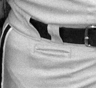
Here are the new additions to the front-pocketed pantheon, listed alphabetically by surname, with photographic evidence for each one. In some cases, I had to use watermarked photos because that’s all that was available; in other cases, the pocket is a little hard to see, so I’ve supplemented the initial photo with a close-up; and in almost all cases, you can click to enlarge.
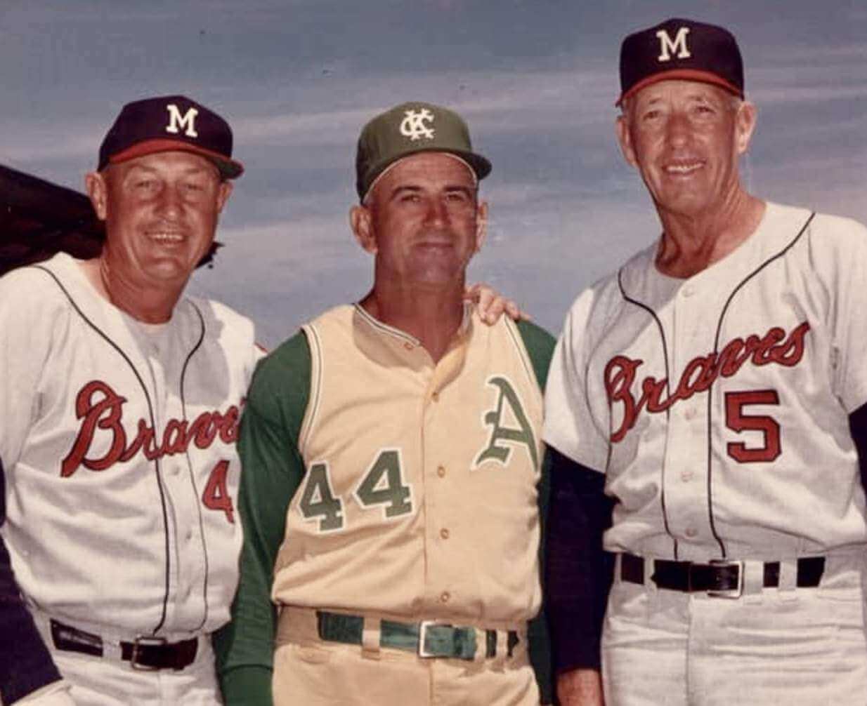
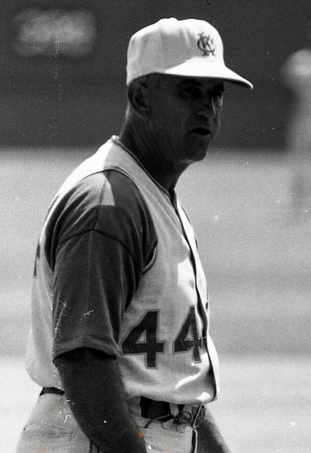
Luke Appling
Appling wore the pocket while coaching for the Kansas City A’s in the 1960s. In the second photo that follows, you can see that he had a stopwatch strap tied to his belt loop, with the watch in pocket:
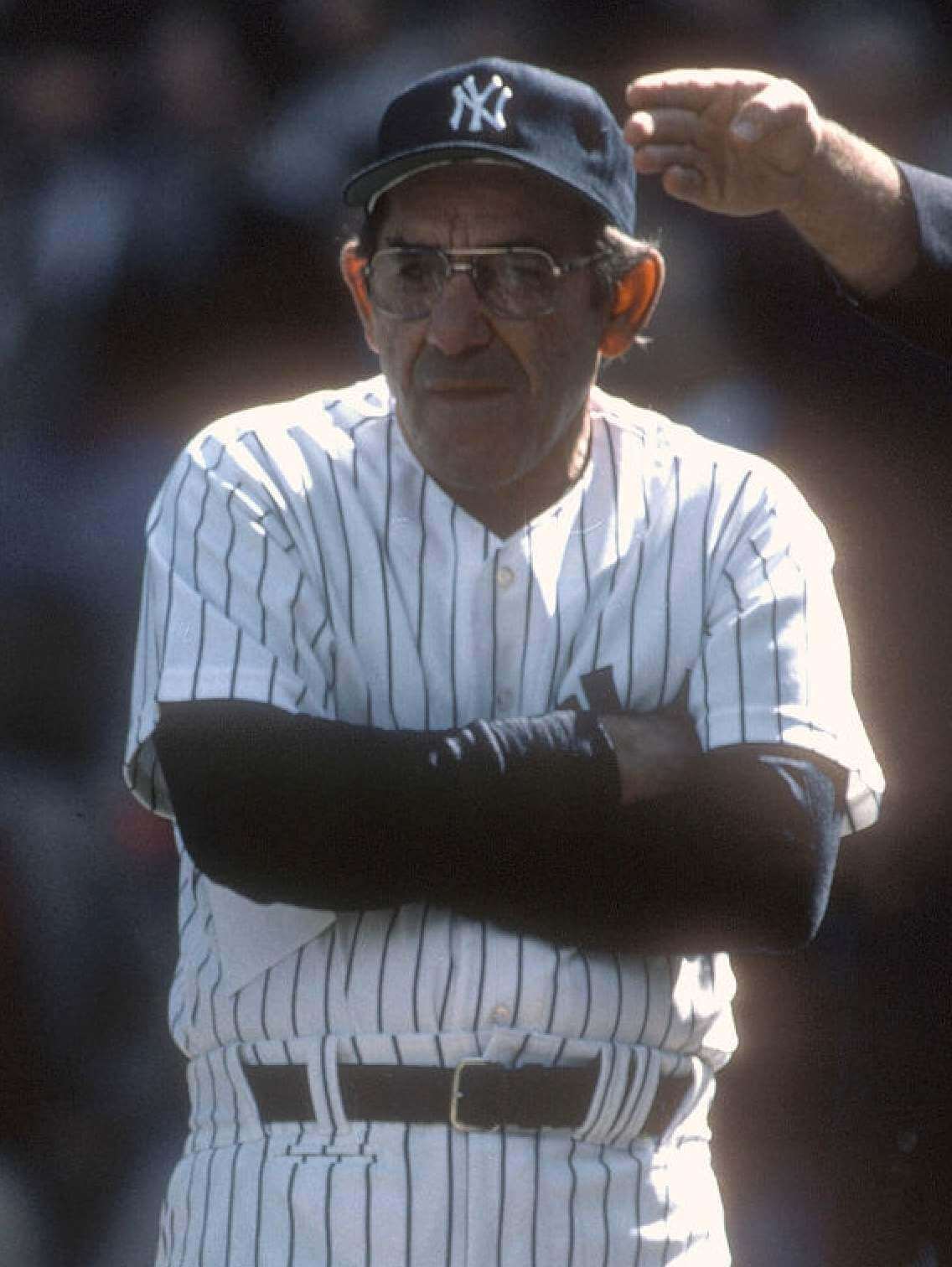
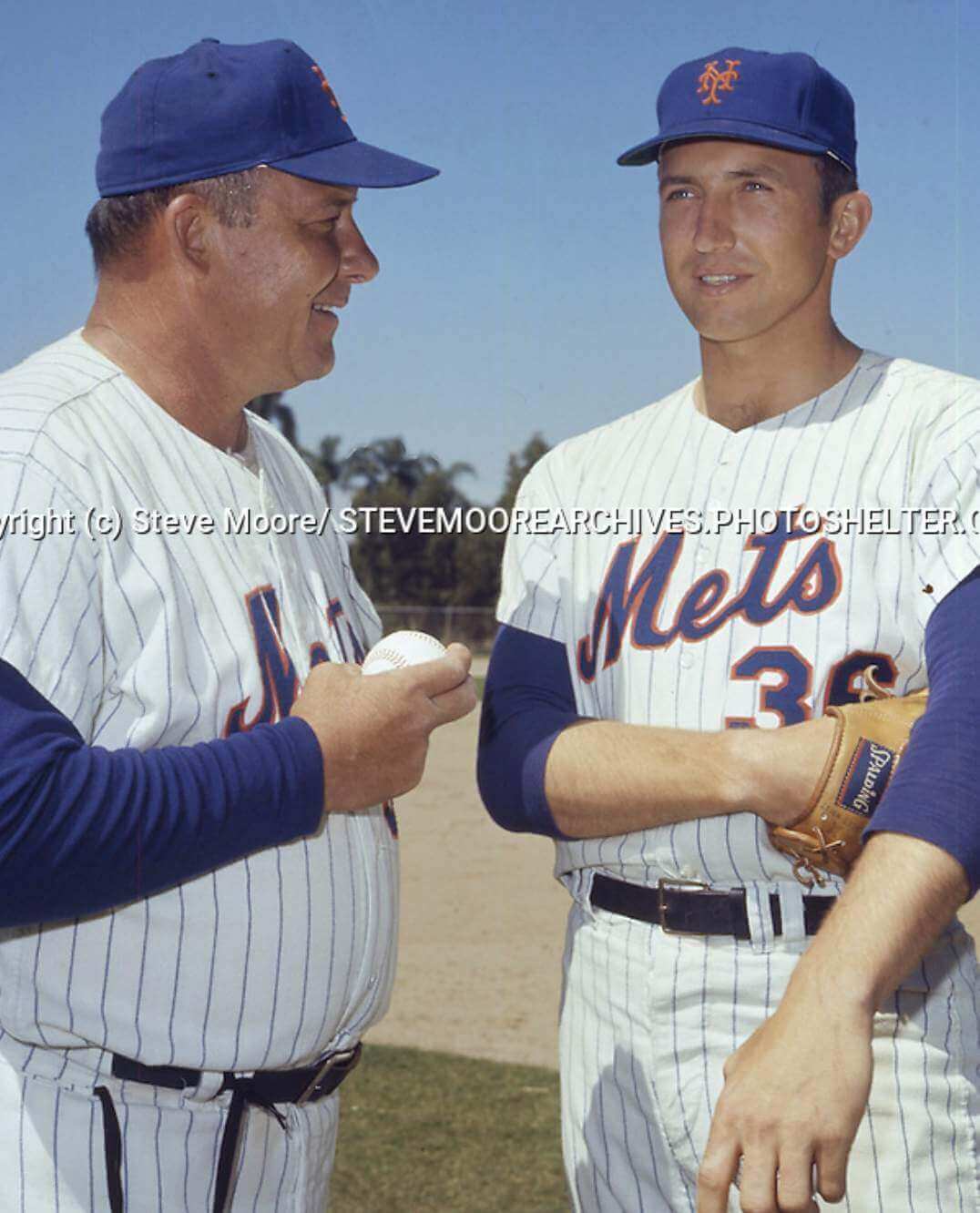
Yogi Berra
Yogi wore the pocket while coaching and managing for the Mets in 1960s and ’70s, and while managing the Yankees in the 1980s:
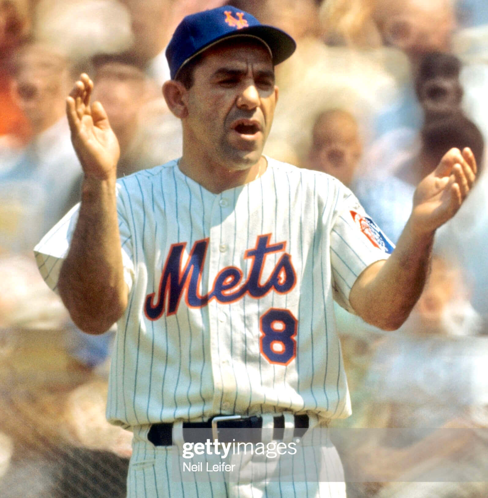
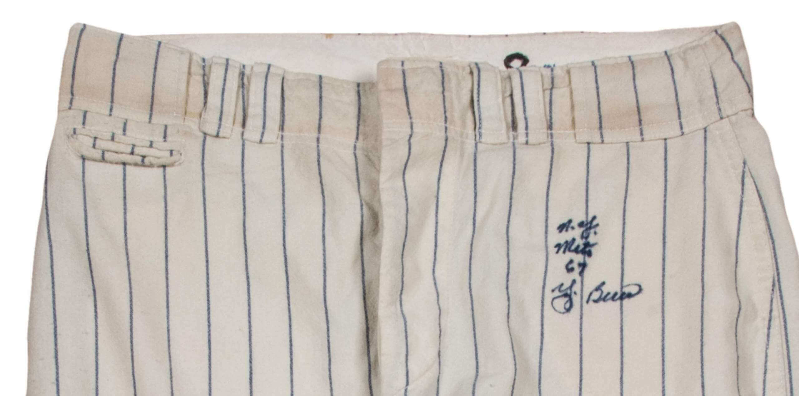
In this next shot, you can see that Berra was doing the stopwatch thing, just like Appling:
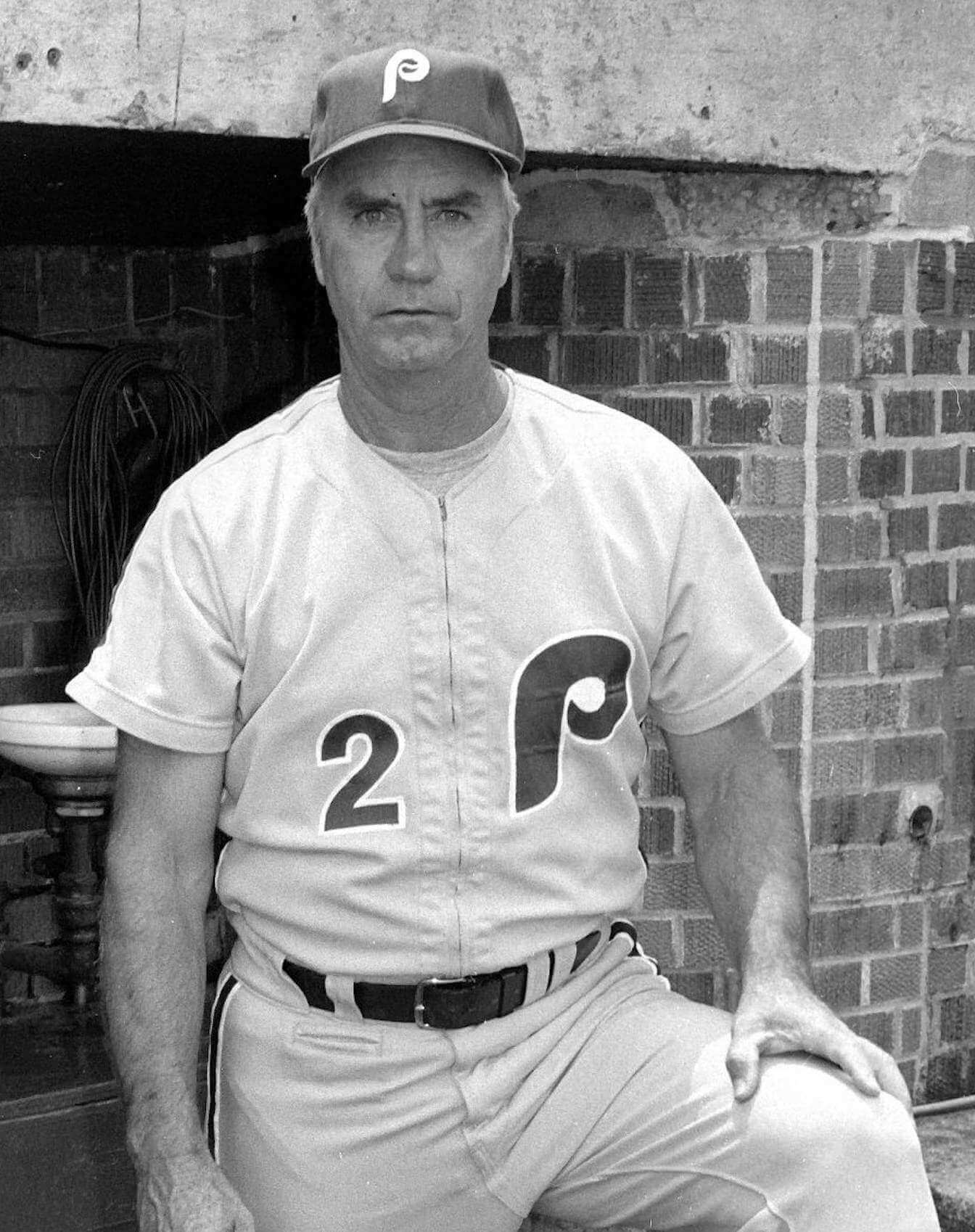
Billy DeMars
DeMars coached for the Phillies for 13 years and wore the pocket for at least part of that time:
DeMars also coached for the Expos (!) and Reds in the 1980s, but I haven’t been able to find any good photos of his pants from that part of his career.
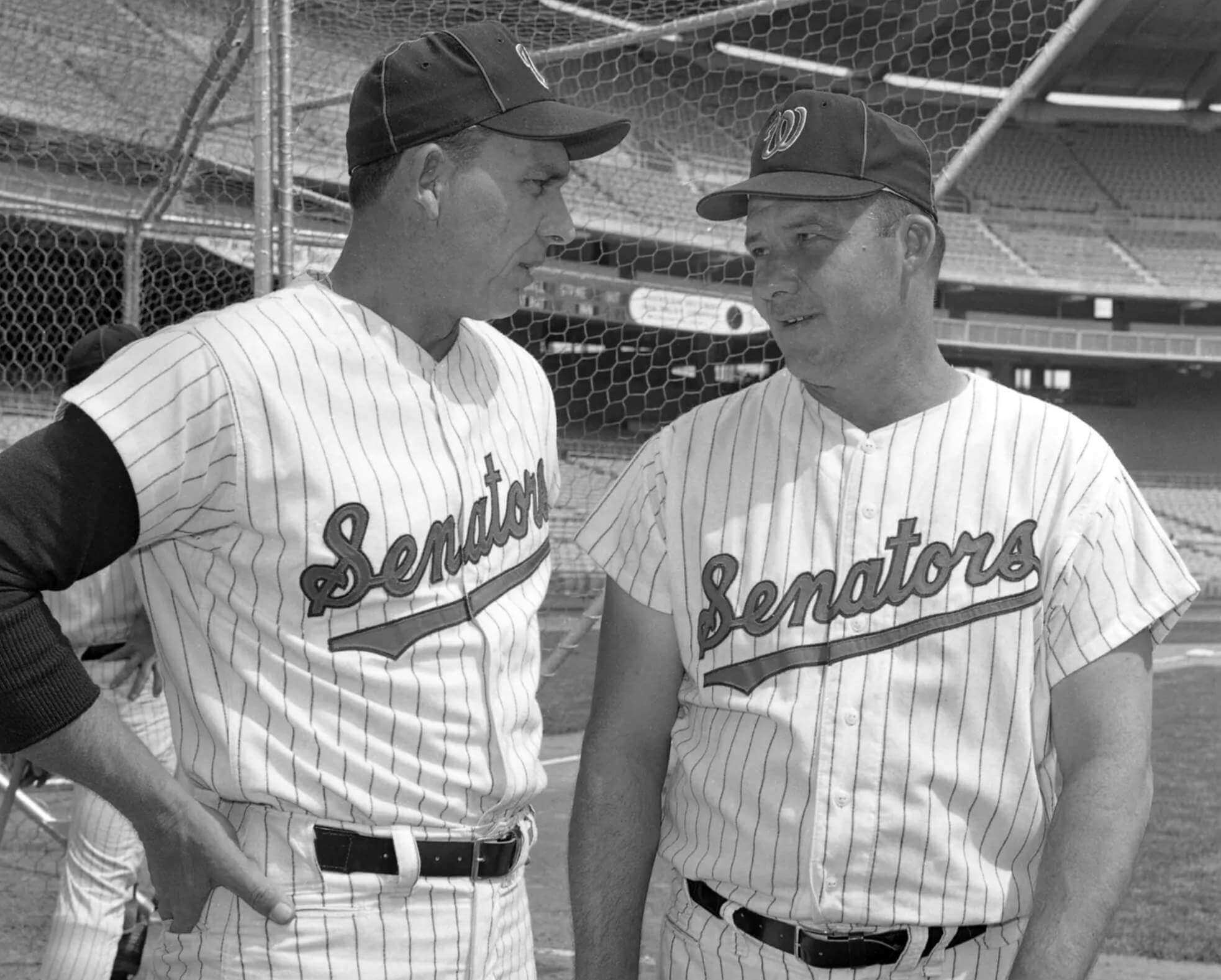
Gil Hodges and Rube Walker
Hodges managed the Senators before being traded to the Mets (one of the rare times a manager has been traded), and he took pitching coach Walker with him. Here they are while still with the Senators in the mid-1960s, both wearing the pocket:
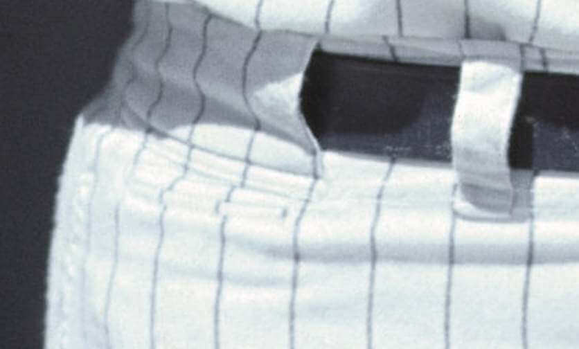
Hodges brought the pocket with him to the Mets. In this next photo, the pocket is a little harder to see because it’s closer to his hip, but it’s there:
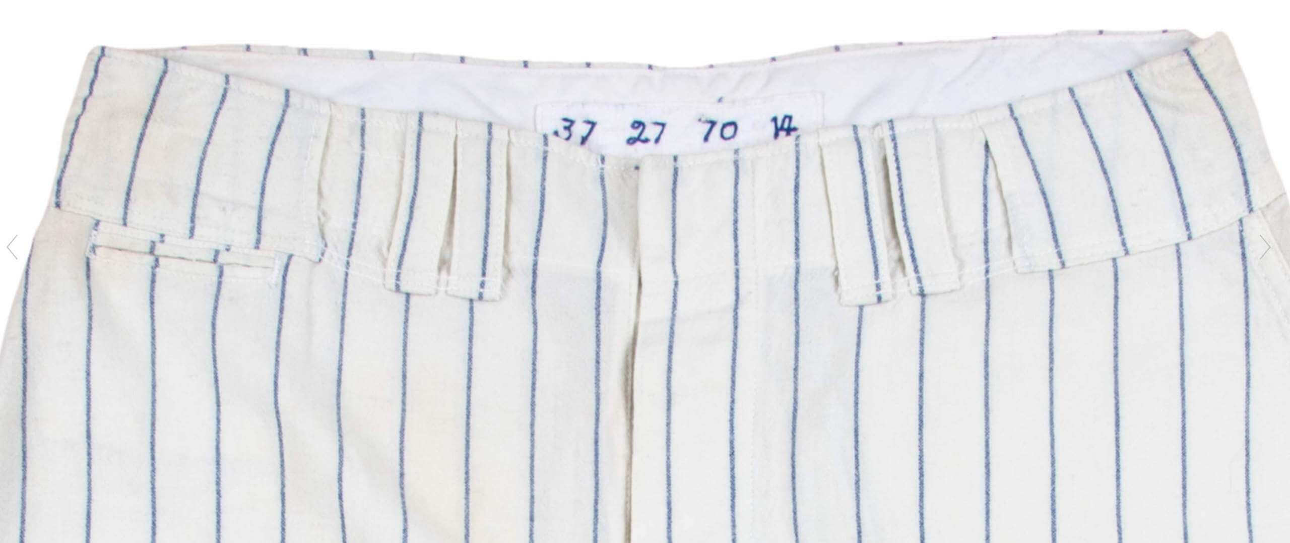
You can also see the pocket in this pair of game-used Hodges pants from 1970:
As for Walker, he also brought the pocket with him to the Mets. Here he is doing the stopwatch thing:
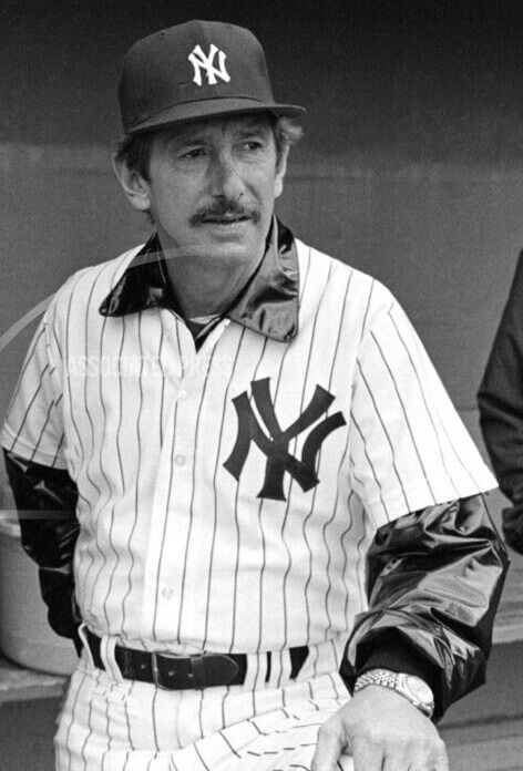
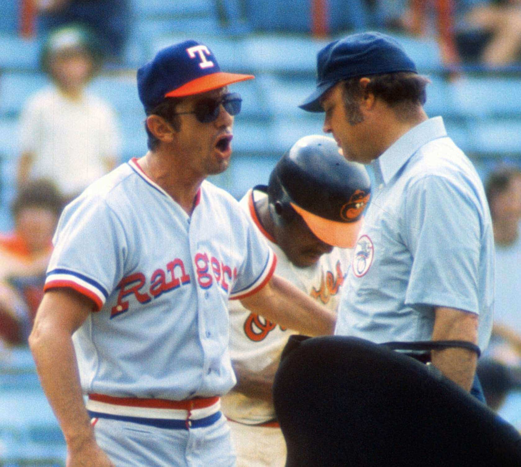
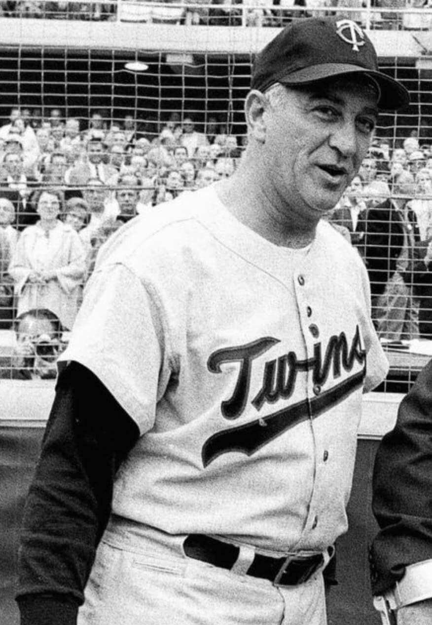
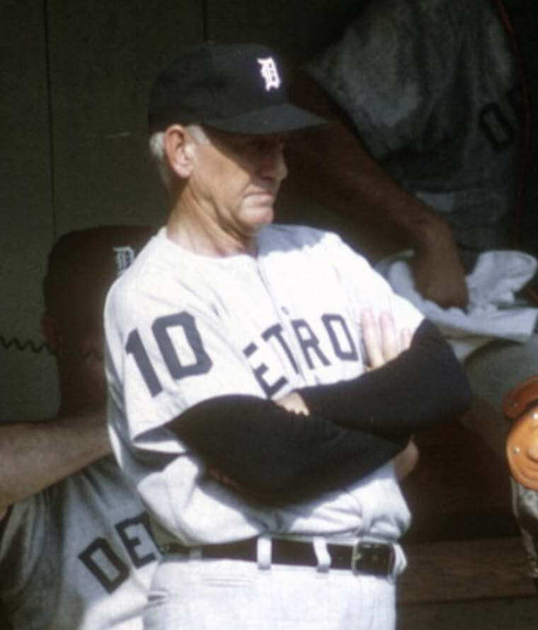
Billy Martin
Martin managed a slew of MLB teams and wore the pocket for at least four of them — the Twins, Tigers, Yankees, and Rangers. Let’s start with the Twins:
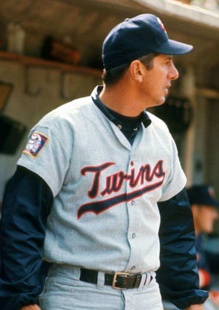
Now the Tigers (belted and sansabelt):
Next up are the Yankees:
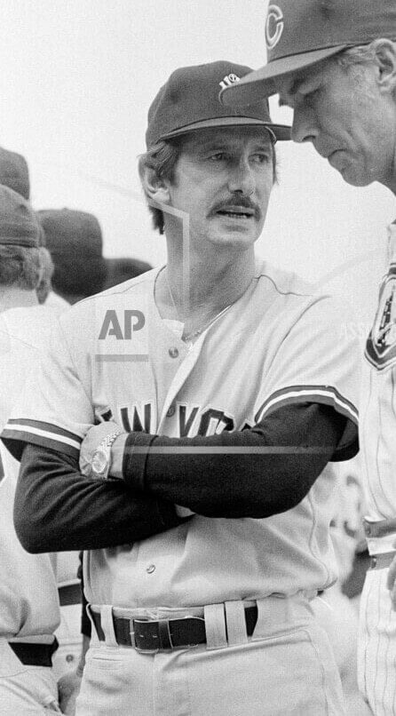
And now the Rangers:
Martin also managed the A’s, but I couldn’t find any evidence of him wearing the pocket with them. (That was confirmed by longtime A’s equipment manager Steve Vucinich, who said the only request he ever had for a front pocket came in 1976 from first base coach Al Monchak, who liked to keep a pen in the pocket.)
Sam Mele
Mele managed the Twins to the American League pennant in 1965 and wore the pocket while doing so:
Joe Nossek
Nossek coached for a bunch of teams from 1973 through 2003. The only pants-inclusive photo of him that I could find from that period is this 1976 shot of him in a Twins uni — with the pocket:
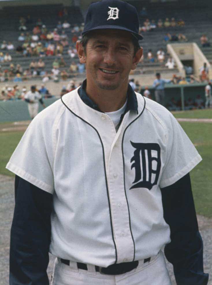
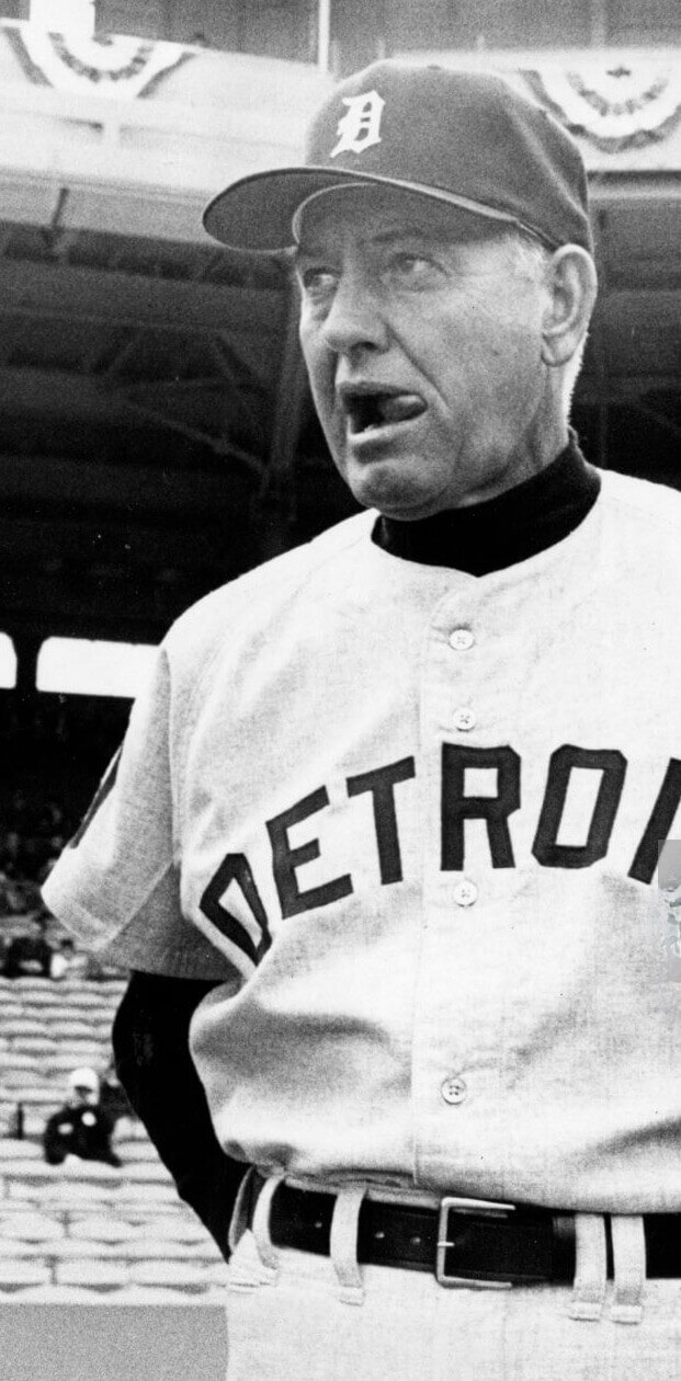
Mayo Smith
Smith managed the Tigers to the 1968 World Series championship, all while wearing the pocket:
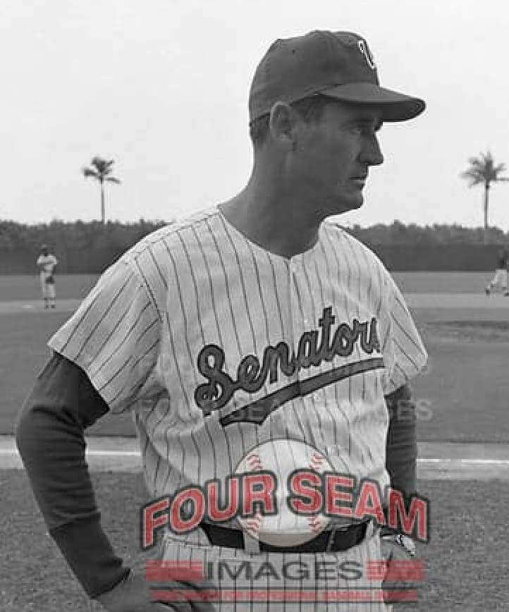
Ted Williams
That’s right, Ted Williams himself — the Splendid Splinter, the Kid, Teddy Ballgame of the Major Fucking Leagues — wore the pocket while skippering the Senators (look just above the “M” in “Images”):
———
So what have we learned? Here’s a summary:
• We now know that front pockets were worn by well over a dozen big league managers and coaches. That’s a lot more than I originally thought, but it’s still a really small number. I’m fairly certain most coaches and skippers didn’t wear it, so it was a niche thing at most.
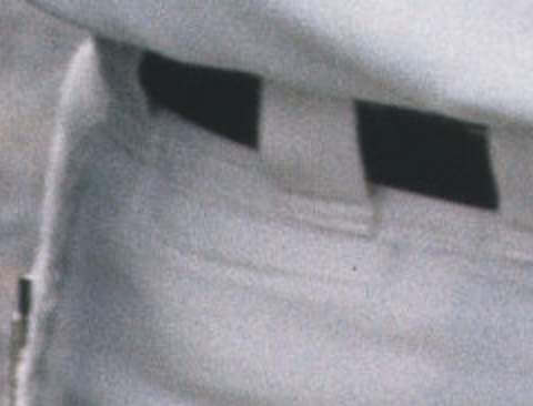
• We’ve so far turned up only one player wearing the pocket — Expos pitcher Clay Kirby. At this point I’m pretty sure he was wearing repurposed pants that had previously been worn by a coach. In other words, this appears to have been just a coach/manager thing, not a player thing.
• As several of the photos in today’s post attest, many coaches used the pocket to hold a stopwatch. This appears to have been the pocket’s primary function.
• I’ve been wondering all along if the pockets were typically added as aftermarket modifications by team equipment staffs, or if they were offered as an optional feature by the uniform manufacturers. Steve Vucinich says that the one pocket he dealt with was added to the pants by McAuliffe, which was Oakland’s uni supplier at the time. On the other hand, I have a lot of vintage uniform catalogs, and I don’t recall seeing this feature being offered, but I’ll take another look through my catalog library soon.
• The earliest pocket example I’ve found so far is still Casey Stengel, from his time managing the Yankees in the 1950s. (He’s also the only one I’ve found to have had a flapped front pocket.)
• At the other end of the timeline, the most “recent” pocket photos I’ve seen so far are from the late 1980s. It’s not clear why the pocket died out after that.
I grew up watching many several of the managers featured in today’s post, so I’m not sure how I missed the pocket. It definitely seems like the kind of thing I would have been attuned to, even as a kid, but somehow I whiffed on it. It’s good to know there are still more things to learn about!
Most of you will be glad to hear that this will likely be the last time I write about the pocket as part of a lede entry. If we turn up any additional examples, those can just go in the Ticker.
I’m super-grateful to the Uni Watch readers who were enthusiastic enough about this topic to do their own photo research and come up with the examples shown in today’s post. I was sometimes able to build on their efforts by finding better photos than the ones they initially turned up, but they deserve all the credit for identifying these pocket-clad managers and coaches in the first place. So please join me in thanking Steve Dodell (who spotted the pockets worn by Yogi Berra, Gil Hodges, and Rube Walker); Mike Barnes (Billy Martin); Chris Hickey (Billy DeMars and Joe Nossek); and Brent Bouldin (Luke Appling, Sam Mele, Mayo Smith, and Ted Williams).
Click to enlarge
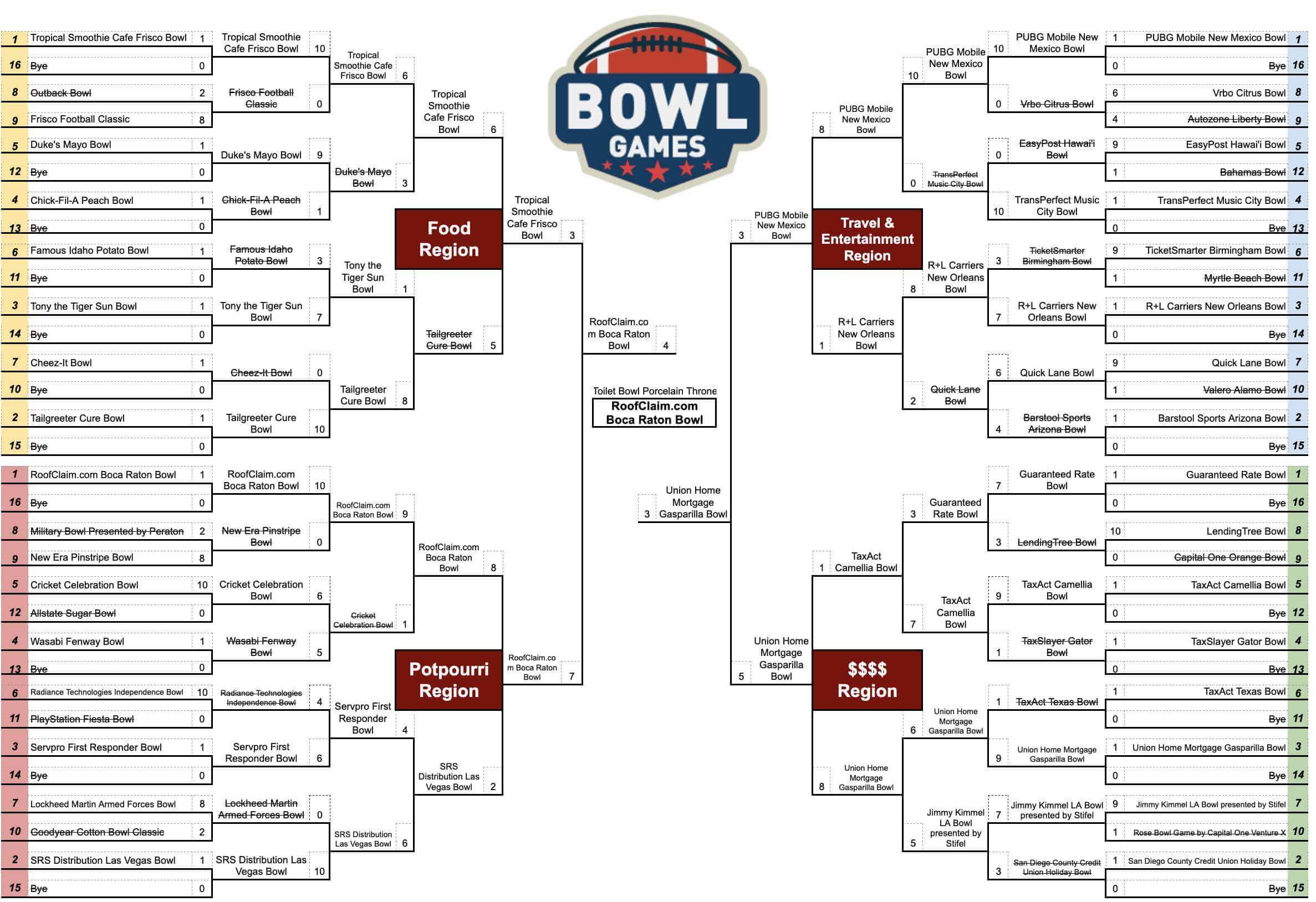
Billy’s Bracketology, continued: A few weeks ago, reader Billy Ballas told us how he and his friends had made a bracket to determine the worst corporate-advertised stadium or arena name. Now he’s back with a similar bracket for the worst college football bowl name. I’ll let him explain:
I was able to get all 43 of this season’s bowls in the bracket. I began by splitting up the bowls into four regions, based on their naming sponsor/advertisers: Food; Travel & Entertainment; Money; and Potpourri. This means that bowls like the Orange Bowl and Sugar Bowl were not in the Food region (because their sponsors are not food-related), but the Chick-fil-A Peach Bowl was appropriately in the Food Region (because of Chick-fil-A, not because of peaches). Then I loosely seeded the bowls within each region.
Our group voted on each matchup, with the worse bowl advancing. Voting was completely subjective. I tend to prefer names that at least have a traditional bowl name, even if there is a sponsor in front of it. Even though it is officially the Tony the Tiger Sun Bowl, most people still refer to it as the Sun Bowl, right? There is no avoiding the sponsor name in the Guaranteed Rate Bowl or the LendingTree Bowl. Each voter, however, had his own criteria. I think my favorite was one friend who said he’d hypothetically ask a woman on a date to a bowl, and he would gauge their laughter/confusion in saying the bowl name out loud.
Ha! Love that. You can see the full bracket here.
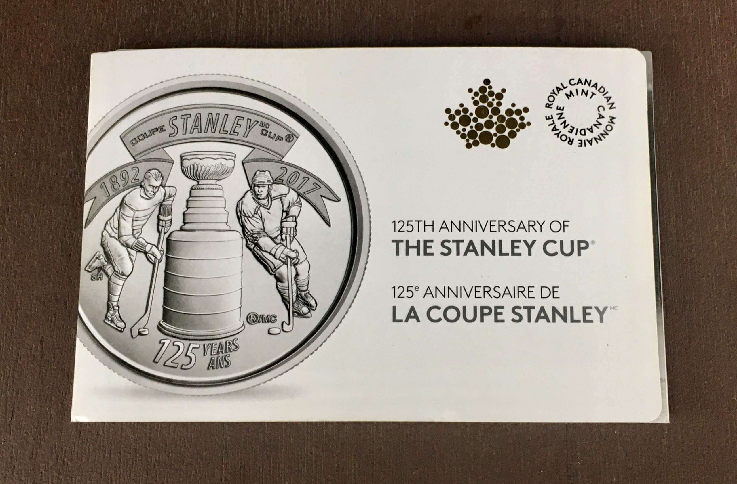

ITEM! Another raffle: Reader Will Scheibler has generously sent me many fun gifts over the years, including this 10-pack of quarters that the Canadian mint released in 2017 to mark the the Stanley Cup’s 125th anniversary. Here’s what it contains:
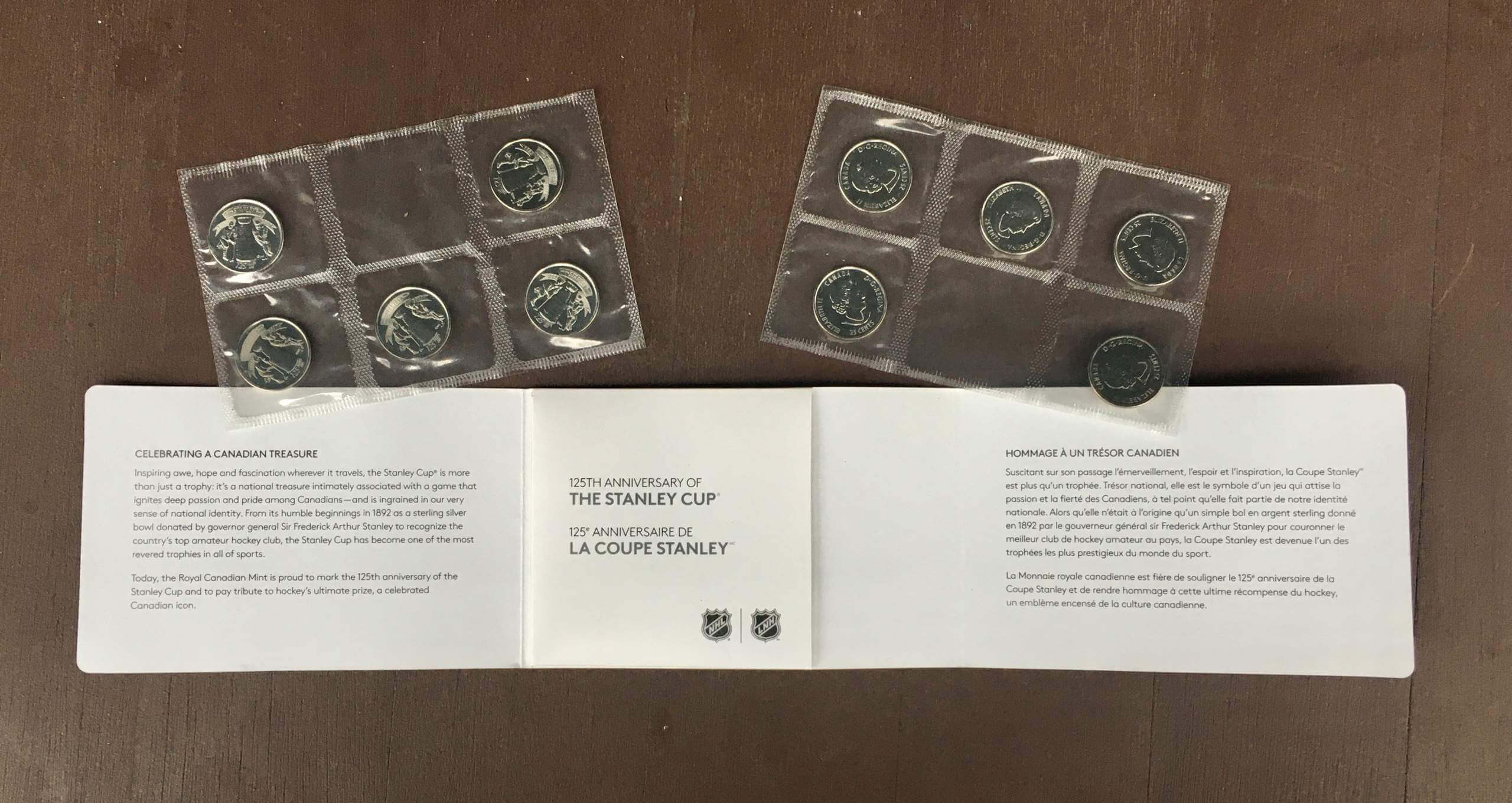
It’s a lovely gift, but I’ve enjoyed it long enough and am ready to part with it now, so we’re going to raffle it off today.
This will be a one-day raffle. No entry restrictions. To enter, send an email to the raffle in-box by 8pm Eastern tonight. I’ll announce the winner tomorrow.
Meanwhile: The winner of yesterday’s raffle for the copy of Chris Creamer and Todd Radom’s Fabric of the Game book is Robert DeCorte. Congrats to him, and my repeated thanks to Mike Engle for donating the book.
Love this! A seemingly simple execution with a beautiful and surprising result pic.twitter.com/N9bmHmRlNM
— Laura E. Hall (@lauraehall) December 10, 2021
Too good for the Ticker: The video above has nothing to do with uniforms or sports, but it’s a really, really cool piece of design that’s totally worth your 20 seconds. Trust me.
(Big thanks to the Tugboat Captain for this one.)
The Ticker
By Lloyd Alaban

Baseball News: The Orioles officially released their Camden Yards 30th-anniversary logo. A patch version had leaked back in September. Here’s a look at the 20th- and 25th-anniversary patches (from David Cline). … It makes sense that Craig Biggio ended up with the Astros, because he had already worn a blue version of the tequila sunrise design at Seton Hall (from John Turney). … Check out this old shot of Elton John playing cricket in a Cubs hat — and what appears to be a Jetsons T-shirt! (Fun find by John Muir.)
College Football News: New personal logo for Oklahoma QB Dillon Gabriel (from Bryan Beban). … Kansas State wore jersey patches and helmet decals for last night’s Texas Bowl, to honor former head coach Bill Snyder’s longtime friend and K-State mentor Joan Friederich, who died last week (from David Wiechmann). … Speaking of the Texas Bowl, all Texas Bowl Gridiron Legend inductees received a commemorative belt buckle (from Ignacio Salazar). … EA Sports plans to have a new college football video game by the summer of 2023.

Hockey News: The Bruins went G.I. Joke for pregame activities last night.

Basketball News: The Mavs will retire Dirk Nowitzki’s No. 41 tonight (from our own Phil Hecken). … The University of Minnesota is bringing back an old set of benches (from Ben Hagen).

Soccer News: The Coupe de France, France’s top-level cup championship, has some pretty strict kit rules (from Johnny Jatt).

Grab Bag: Ever wonder how companies make their signature sounds, also known as “sonic logos”? This podcast episode takes a look (from Andrew Cosentino). … Here’s a look at the fonts of some of the world’s most famous brand logos (from our own Brinke Guthrie). … Lexus is replacing the rear logo on its cars with a Lexus wordmark. … The Republican National Committee has told a local Republican group in Nevada to stop using the national group’s logo.
As I’m slowly scrolling and reading, that photo of Gil Hodges with the Mets fooled me into thinking it was a NY Giants uni when all I could see was the cap. That blue sure looks very black in the photo!
The helmets in the background definitely have a blue tint, though.
I just saw a potential WFT new uni tease which got me thinking that we are probably going to overall like the design but hate the new team name. And then I started wondering how many teams uni designs would be better if they had a different team name, and how many would be worse? Is there potentially a different team name that could redeem the awful cardinals uni set or that could ruin a set like the niners? Fun to think about!
Also can’t believe they ruled out red wolves or red tails. I bet the “go commando” lol. So stupid.
Not sure about that. It looks like the jersey won’t be awful, but there are already some troubling signs of overdesign. Appears there is black trim. Definitely a BFBS thing, not to mention black and burgundy are going to clash and be hard to distinguish from a distance.
Second, some sort of circle logo on the back collar, more unnecessary bells and whistles.
The stripe on the sleeve/shoulder appears to be one of these Nike concepts where they try to redesign the stripes for the modern jersey cut, but it just looks wrong. Not certain on that, but the stripe definitely doesn’t appear to the traditional format.
Lastly, both the numbers and the stripe on the jersey seem to have a weird pattern to them.
All in all I don’t know that it will be an awful uniform, as they seem to be hinting they want to stay close to a traditional design, but it does appear to have those awful unnecessary little design elements Nike likes to bake into their uniforms. They could very easily have kept the jersey and pants, just with a new helmet logo, and I think they’ll eventually go back to that after bad response to the new uniforms, similar to the Browns and Buccaneers.
Release date is February 2. GroundHogs? After what we had in 2020-21, anything can happen. Just saying.
It bothers me beyond words that WFT has apparently jumped on the BFBS bandwagon. I’ve always loved their unis. Now I’m afraid I’m going to hate the name and the uni. Considering how bad this team is, that doesn’t leave a lot to hang on to.
Did I see asymmetrical striping on the helmet?
I think it is just the lighting. If you look closely there might just be some reflection that creates the appearance of asymmetrical. However, given the that for years they have had a simple yellow and white stripe on their jersey, if it was consistent with that the asymmetry wouldn’t be awful. Then again based on the rest of what we saw it looks like they are abandoning that stripe design, which seems to further indicate that it is just a solid yellow stripe with some glare on it.
Arizona Cardinals could be named the Arizona Phoenix. Named after the Firebird rising from the ashes, and not the city. Probably not available, since the soccer team is name the Phoenix Rising. Also Firebirds would be good, but a number of teams have used this name.
Well, I’m happy that a team that visually defines itself in its local sports market as being the one team that doesn’t wear the color red will not adopt a name that includes the color red.
Given that Redwolves was by far the single worst potential name for the team that I’ve heard bandied about, I suspect that the final name will strike me as somewhere between OK and pretty good, and that the uniforms will fall on the more positive side of that range. Even stuff that I don’t like in principle, like black accents or asymmetric stripes, I’m willing to give a chance. The uniform looks overdesigned, sure, but not as risibly as is Nike’s typical wont.
Look at the AP photo of Billy Martin when he was with the Yankees…am I seeing things or is there something between the Y of the NY on his cap?
From our own Paul Lukas…
“Whoa — Billy Martin wore a cross pin on his cap for years (not just with the Yankees, but also with the A’s, Tigers, and Rangers). But I don’t think I’ve ever seen him wearing *multiple* crosses until now.”
link
It’s a little Christian cross pin, which he wore on his cap for many years. You can see it more clearly here:
link
link
link
link
You could do a t-shirt poking fun at it that says “We’re going commando” if they pick that name and I’d buy it! Haha
Sorry if this has been asked, but is the pocket for cigarettes?
As noted in the today’s post, it appears to have been mostly for stopwatches, although at least one coach used it for a pen.
Doesn’t seem good for cigarettes, since it’s too small for a full pack and loosies would get smushed, but it would be good for a lighter.
Anyone else love that they had special pockets mainly used for stopwatches, in a sport that isn’t timed.
How about the pocket being used for chewing tobacco? It is too small for a lineup card.
You probably already knew this but Earl Weaver had a cigarette pocket in his jersey. Which was included on his statue at Camden Yards.
link
link
Earl Weaver famously had a cigarette pocket in his jersey, which made it onto his statue at Camden Yards
How about the pocket being used for chewing tobacco? It is too small for a lineup card.
Lineup cards were a lot smaller in the past and Paul did show Gene Mauch possibly using it for that purpose.
link
“As several of the photos in today’s post attest, many coaches used the pocket to hold a stopwatch. This appears to have been the pocket’s primary function.”
Is this the reason for the mini pocket on a pair of Levi’s?
Sometimes I use my mini pocket to hold my Chapstick.
I always used that for change (or sometimes a “cube” of gum that seems to be popular nowadays). Because of my OCD, I always put my ChapStick in my *left* pocket, so there is generally no extra pocket there. Interestingly, I own a couple pairs of what are basically link, and they have a tiny pocket on BOTH sides, so I slip my ChapStick there!
I also use it for chapstick, but it never seems to completely fit, being too long.
Perfect for a guitar pick
re: pants pocket
Stopwatches and lighters make the most sense and I saw the pic of Match with the lineup card.
If I remember correctly, stop watches were used to time the pitchers delivery and even to roughly estimate the balls speed before radar guns came into play.
I also thought the classic Bike coaches shorts had the pocket at one time, but I couldn’t
find a picture.
I’m old.
Another pocket-man…Eddie Stanky:
link
Good one!
One more…Al Lopez (Stanky’s predecessor in Chicago):
Home:
link
Road:
link
And here’s one with Lopez wearing a jersey with a pocket:
link
In that last photo, Mickey Vernon has a front pants pocket too!
Looks like my contribution in 2019 has a lasting legacy! lol
Thanks to everybody for their hard work finding these pics and to Paul for putting it all together.
Happy 2022 everyone!
The use of a lanyard for a stopwatch ended the pocket, maybe?
I love Oriole Park at Camden Yards, but does anybody else find it ironic that 30 years ago, it was said to be the ballpark that broke the “cookie-cutter” mold of the round dual purpose stadiums…but it basically became the new “cookie cutter” for most (but not all) ballparks built after it?
A couple of pocket examples from the ’51 Philadelphia A’s:
Albert “Chief” Bender:
link
and possibly Jimmy Dykes:
link
Didn’t know the A’s wore zippers in 1951.
Hard to tell for sure, but looking into Reds coaches with pockets, it appears we may have Bill McKechnie (in 1940!)
link
and Rogers Hornsby
link
Link seems to be broken for the Too Good For The Ticker segment?
Disregard… I refreshed. Fun video too!