Click to enlarge
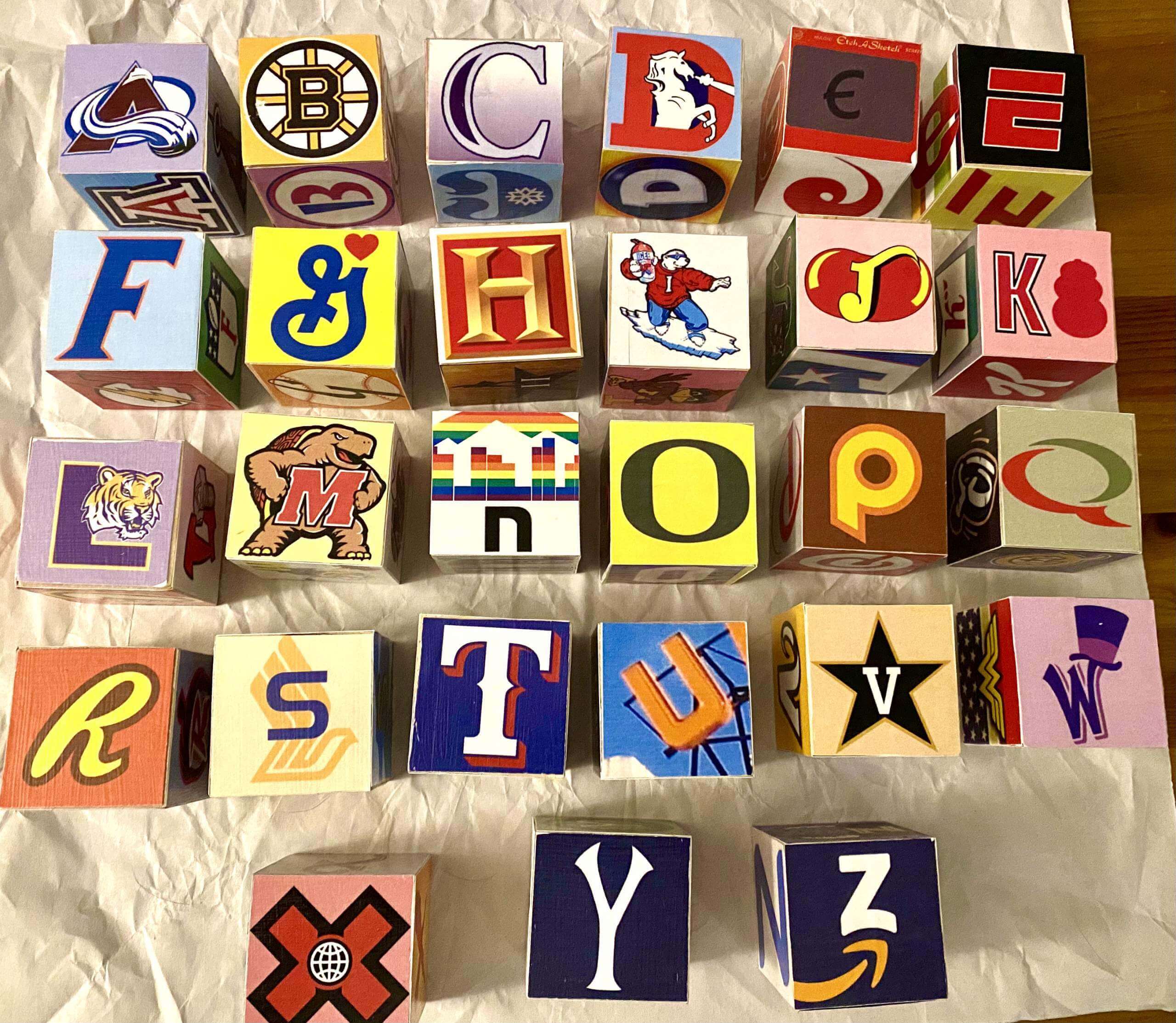
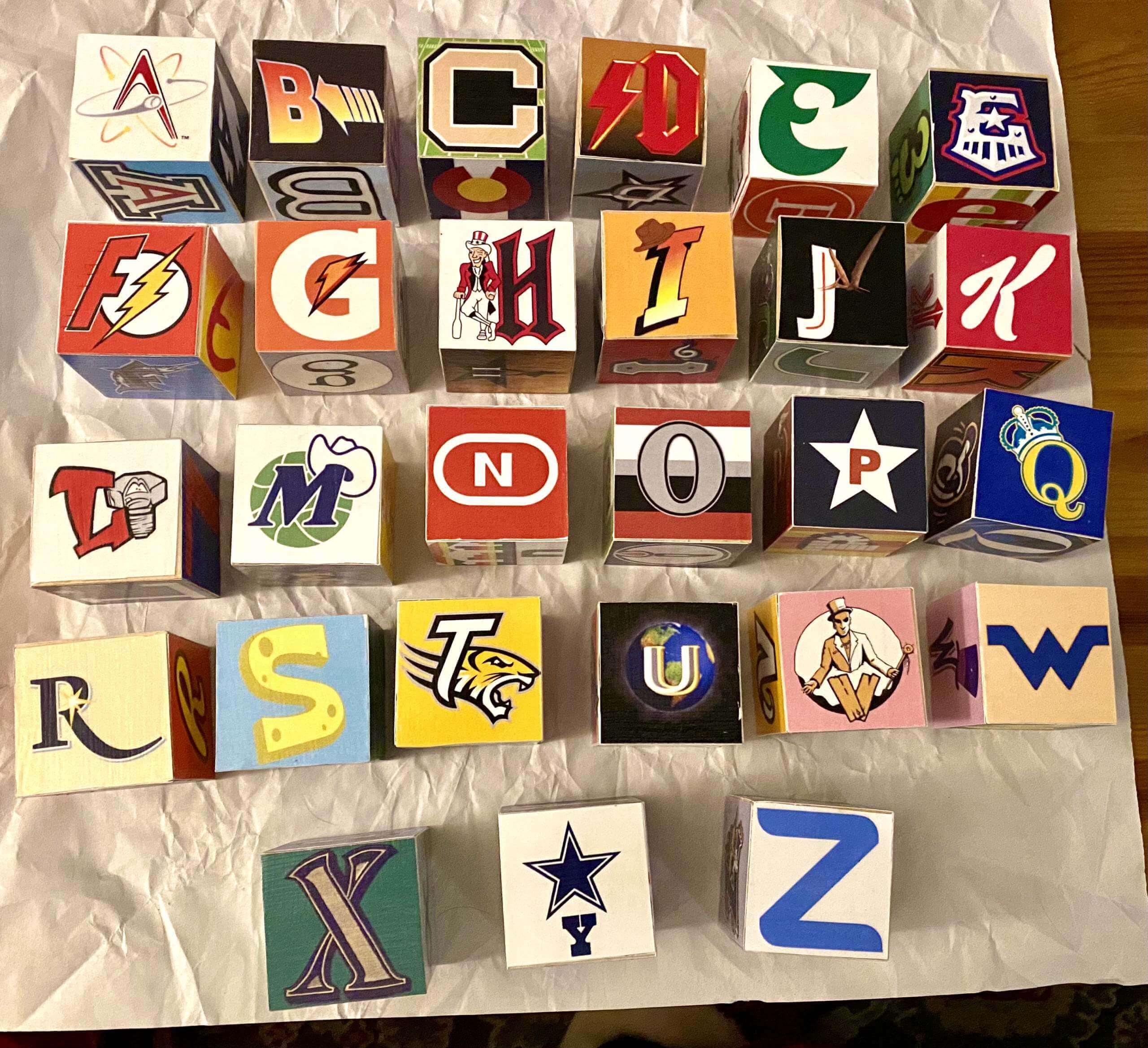
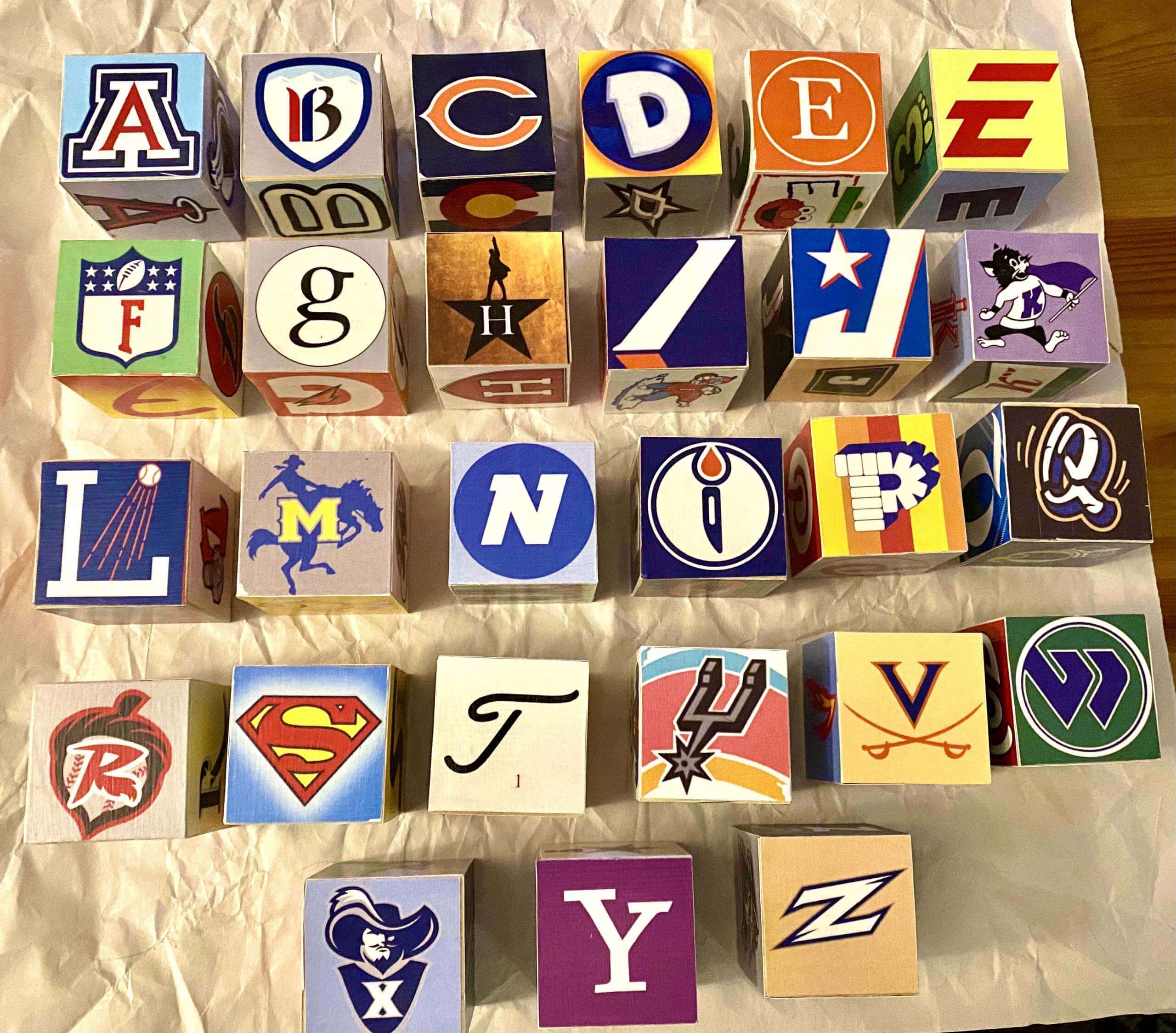
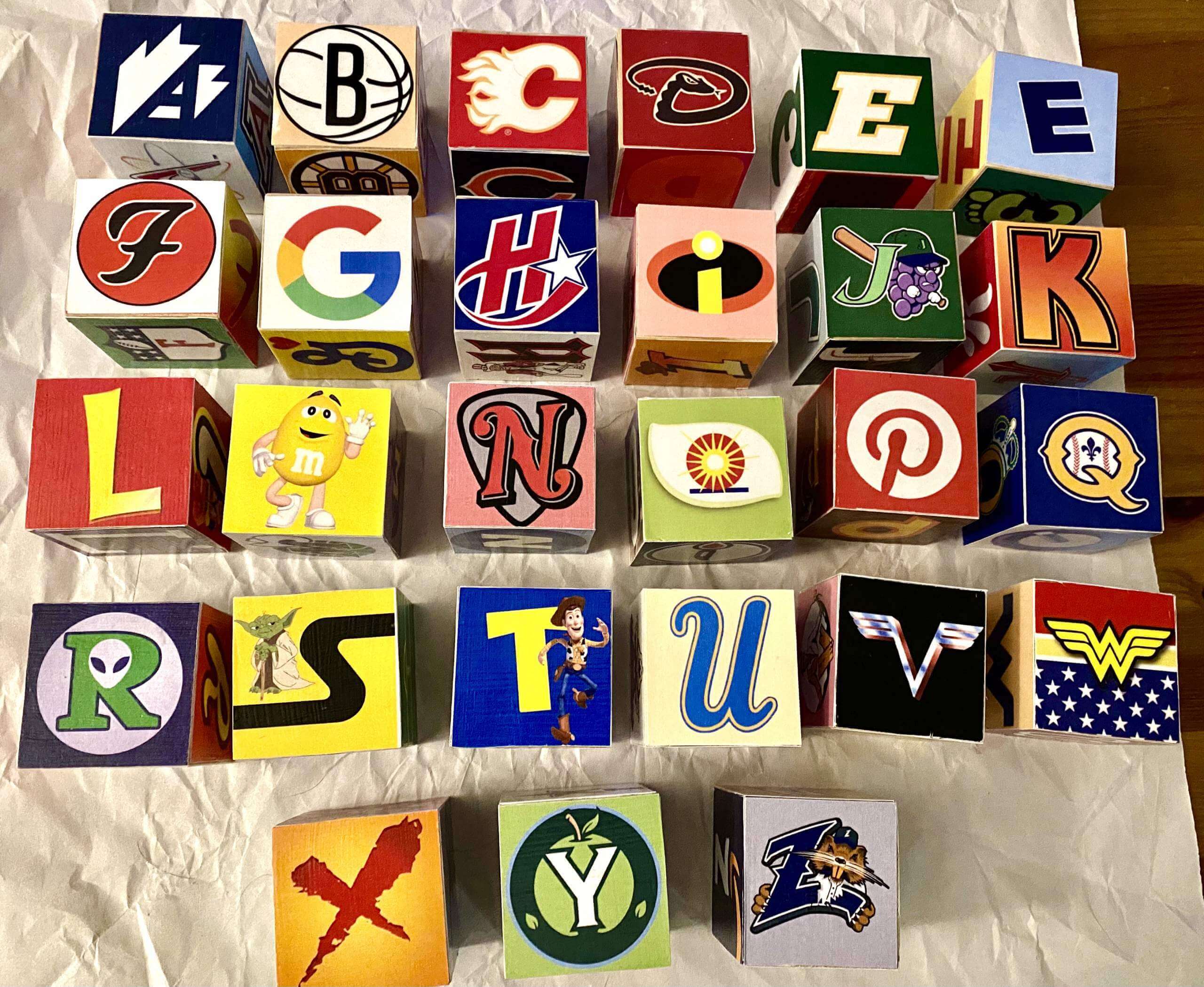
Two winters ago we had a guest post from reader Loren Southard, who created a set of awesome sports logo-themed building blocks for his new child. That inspired fellow reader Eric Wall to create a similar set of building blocks for his own newborn about a year later.
Our latest block-head is longtime reader Judy Adams, who wanted to create a set of blocks for her nephew’s baby boy. She thought she might need a bit of help getting started, so she recently asked if I could put her in touch with Loren and Eric, which I happily did. With their help, Judy was able to complete a great set of blocks. Take it away, Judy!
My DIY Block Set
By Judy Adams
My nephew and his wife are big sports fans who live in Denver. But he’s originally from the DC suburbs and she’s from Dallas, so I relied heavily on colleges and teams in those areas, even to the point of including logos from minor league sports (which I never would’ve been able to do without SportsLogos.net).
I also included a generous assortment of pop culture references that I thought would appeal to the two of them. For example, they’re both avid skiers, so I included logos from some Colorado ski resorts. Also, they had Voodoo Donuts instead of cake at their wedding, so that was my source for one of the “V” logos.
Here’s a chart showing how it all broke down [click to enlarge]:
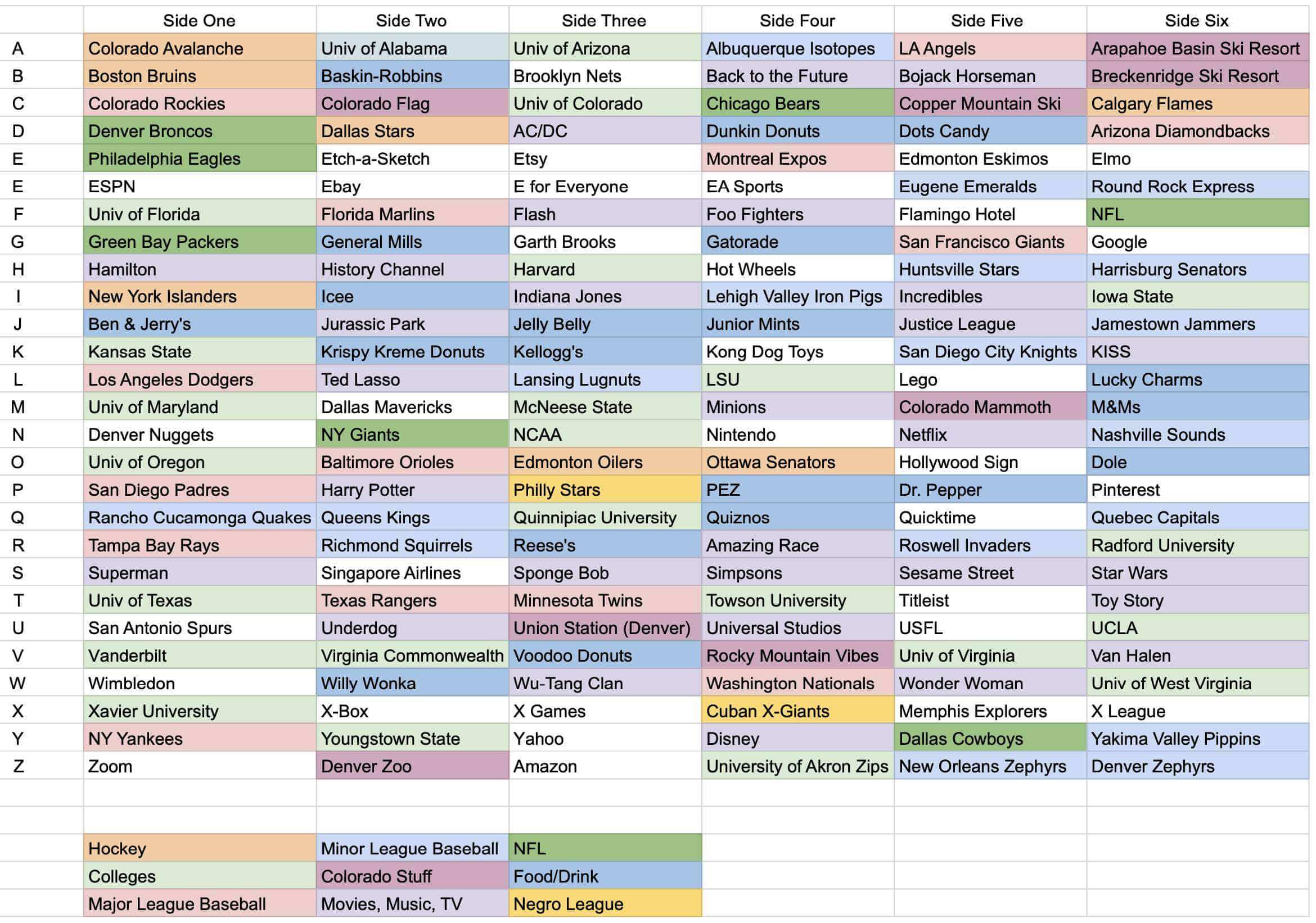
I tried not to repeat too many of the same letters that Loren or Eric used, although I did use a few of Loren’s designs (with his permission, of course).
My grandnephew’s name has two “E”s, and I wanted him to be able to spell his name with the blocks, so i did two “E” blocks. I had to dig deep enough to find enough “E” logos!
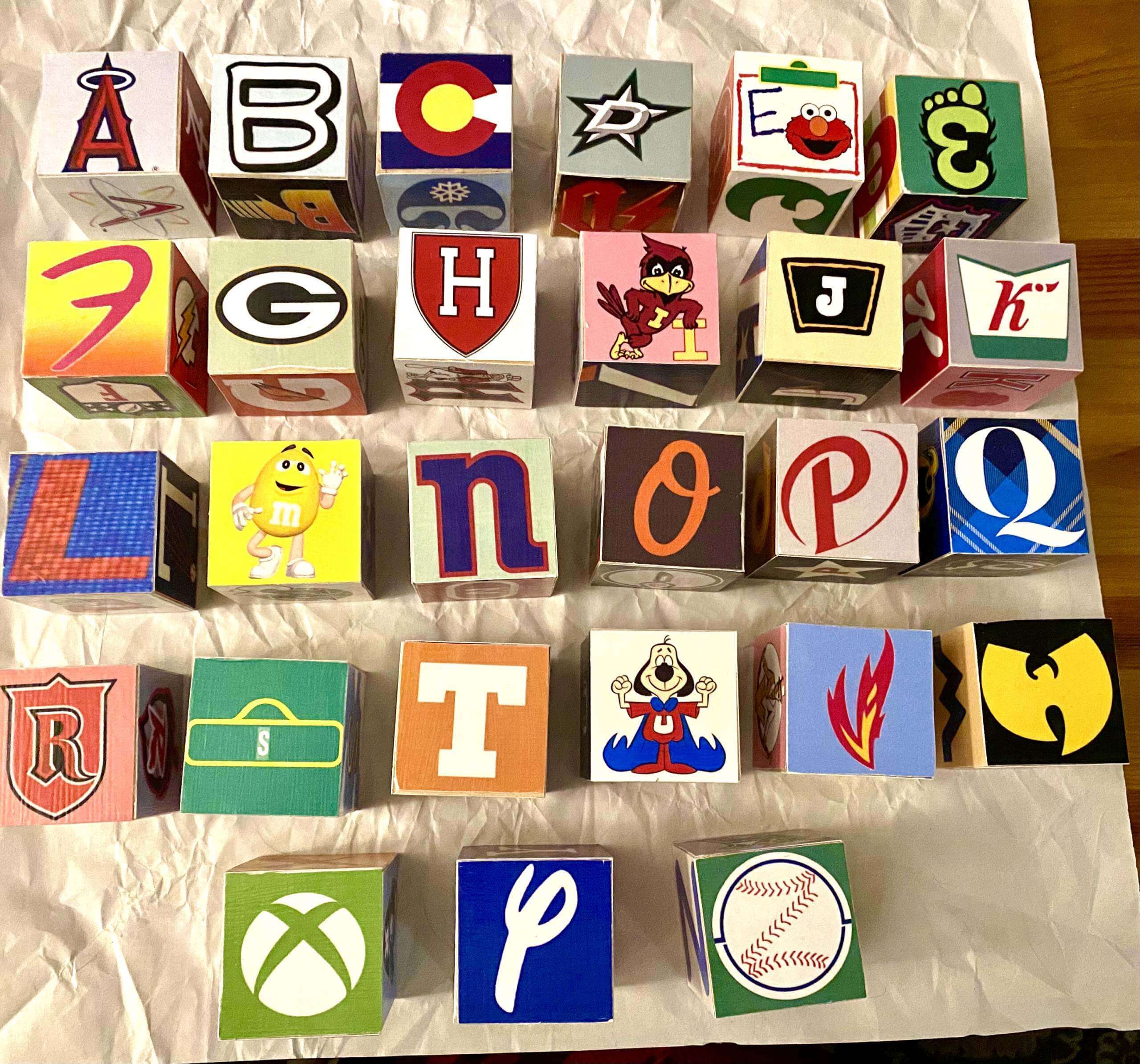
One of the biggest challenges — aside from not having Photoshop experience — was printing the letters themselves. I have a cheap home printer that would’ve run out of ink after only a page or two , so I had to print everything at my local FedEx Office location. They have a feature that lets you email documents to their cloud and then download them to the printer, but I even can’t tell you how many times I’d get to the FedEx store and realize I’d sent the wrong page of letters or forgotten to bring card stock with me, and then I’d have to drive back home and re-do everything.
The other big challenge: trying to find teams that start with the letters X and Z!
My grandnephew is just now starting to play with the blocks (I’ll let you know if I get any pictures), but his parents were delighted with the gift. I’m grateful to Uni Watch for inspiring me to take on this project, and to the comm-uni-ty for helping me realize it.
———
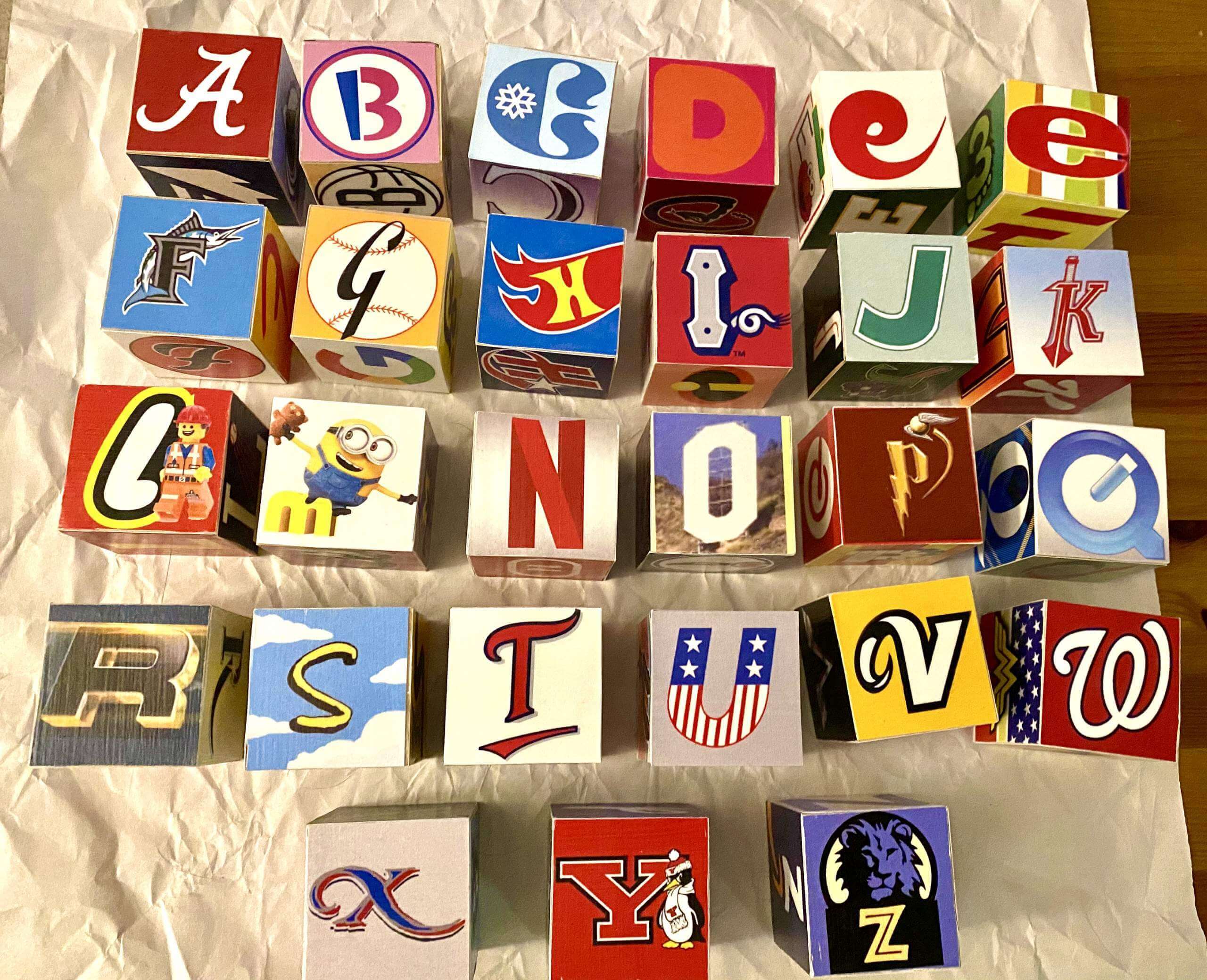
Paul here. How awesome is that? I love how the building blocks concept is spreading throughout the Uni Watch readership. Here are the remaining sides of Judy’s block set:
: | @Vistaprint
We've got an update on a popular name option, a sneak peek at the jerseys and a confirmed announcement date pic.twitter.com/IeSnetFebq
— Washington Football Team (@WashingtonNFL) January 4, 2022
New WFT identity to be revealed soon: The Washington Football Team announced this morning that they’ll reveal their new team name and branding on Feb. 2 (that’s four weeks from tomorrow). A few tidbits from the video embedded above:
• The new name will not be Wolves or RedWolves, which were popular with fans but deemed untenable by the team’s legal department due to other teams’ trademarks.
• There will be more than one helmet design (not surprising, since the one-shell rule is being lifted next season).
• The video includes several teaser glimpses of the new uniform, starting at the 5:18 mark. The new look will apparently include black trim, stars on the inner jersey collar, and a non-block number font with a faux-mesh treatment. It also looks like they’re adding a logo to the helmet’s nose bumper (the team has used blank bumpers for years), although it’s blurred out in the video.
More info to come soon, I’m sure.
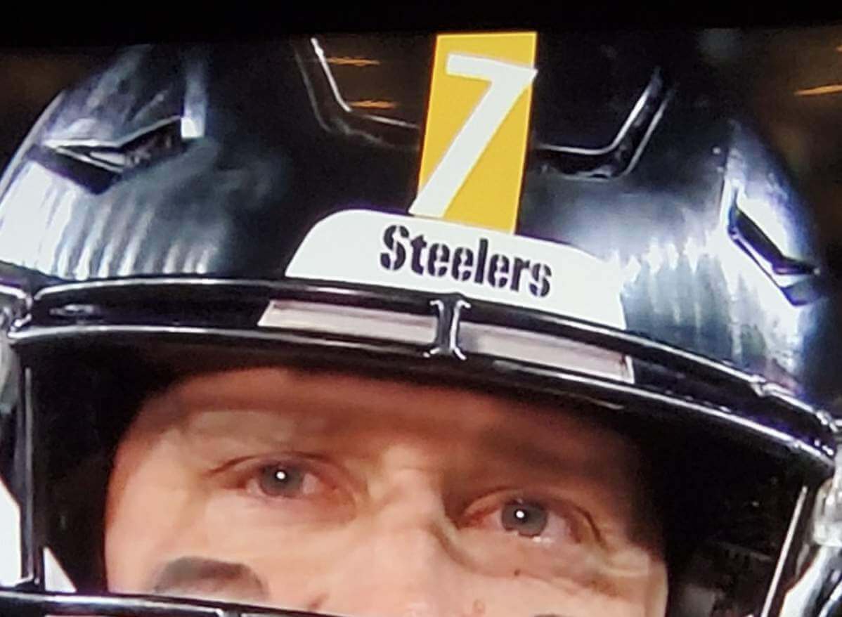
Grrrrr: Steelers quarterback Ben Roethlisberger played what is expected to be his final home game last night. In all the years he played, I don’t think I noticed before that his front helmet number doesn’t quite sit within the confines of the yellow stripe. Very frustrating!
I looked at a lot of Roethlisberger photos from various seasons before posting this item, and here’s what I’ve concluded: While it’s true that the number sometimes fit within the stripe, it seems like it more often extended outside the stripe. Surprising that we never noticed it until now!
(Blame Twitter-er @J771980 for this one.)
Click to enlarge
Collector’s Corner
By Brinke Guthrie
Follow @brinkeguthrie
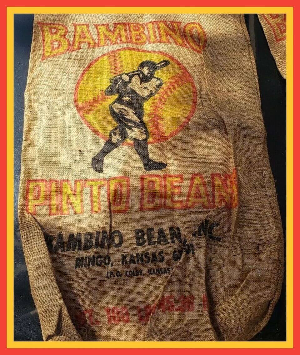
Here we go with the first Collector’s Corner of 2022, and without a doubt the first time I’ve ever featured … pinto beans. But not just any pinto beans — this is a burlap sack for Bambino Pinto Beans! According to Mears Online Auctions, these were “burlap sack(s) dating to circa the 1960s. Apparently the Ruth family did not grant the company permission to use the Babe’s likeness and as such the bags were pulled from [the market] after a relatively short time frame.”
And there you have it! Now for the rest of this week’s picks:
• For some of us, NFL gumball helmets will always be rememberd as iHop giveaways. (A complete set there — wowsers.) Turns out that Bonanza steakhouses also took part in this campaign — here’s one from 1970 for the Rams.
• Got a couple of items from Pittsburgh here. First, an empty pickle jar (another CC first, I should think) for Darius Kasparaitis Krunchers, “premium ‘Russian-style’ dill spears” from the former Penguin. Also, this 1991 Pittsburgh Pirates-Blockbuster Video pin commemorating Harvey Haddix’s 12-inning no-hitter from 1959.
• Here’s a 1972 “Pour It On” promotional hockey puck signed by hockey legend Bobby Hull. The seller says this was for some type of motivational film.
• It was an April to remember: The 1987 Milwaukee Brewers started off the season with a 13-0 run that month. Here’s a poster commemorating that feat from George Webb Restaurants and WTMJ Radio 62.
• Getcha hot drinks heyah, 25 cents! That was the cry of the vendors at Yankee Stadium wearing this 1964 concessionaire’s hat.
• Here’s a pair of 1970s Wilson baseball cleats. They may be for baseball, but the guys I remember wearing these were NFL quarterbacks Kenny Stabler and Bob Griese.
• Speaking of shoes, Walter Payton was, to my knowledge, the only NFL guy who wore KangaROOS cleats (so named because they had a small pocket on the side). Here’s a Sweetness in-store display for them.
• According to this 1982 print ad, Gold Medal Sporting Goods was the place to get your Phillies merch.
• Check out this Seattle Seahawks medallion from their inaugural 1976 season. Don’t you miss those colors?
• If you like the old sports merch catalogs Paul’s been writing about over the past few months, you’ll love this 1992 Starting Lineup Sears catalog featuring licensed gear from the NFL, NBA, and MLB.
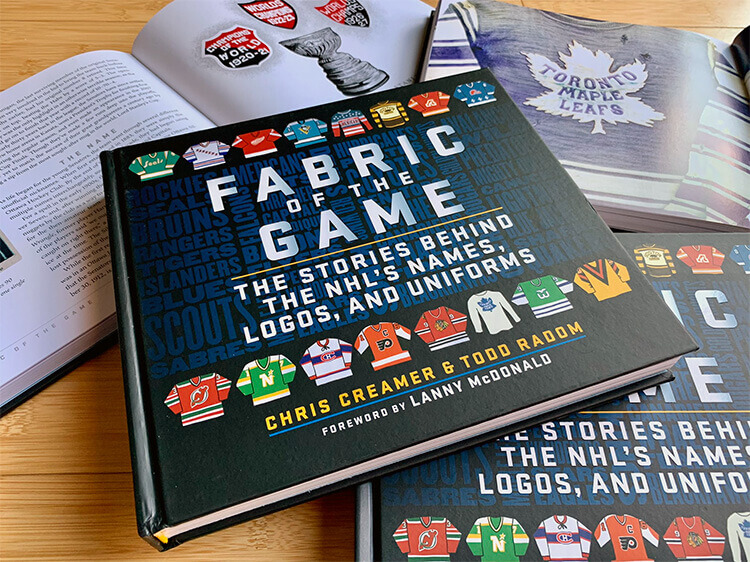

ITEM! Our first raffle of 2022: We’re going to have a new raffle for each remaining weekday this week. The first one is courtesy of longtime reader Mike Engle, who has an extra copy of Chris Creamer and Todd Radom’s Fabric of the Game book and has generously offered to make it available to a lucky Uni Watch reader.
This will be a one-day raffle. USA shipping addresses only. To enter, send an email with your mailing address to the raffle in-box by 8pm Eastern tonight. One entry per person. I’ll announce the winner tomorrow. Good luck!
The Ticker
By Alex Hider

Baseball News: The end of an era: Topps is being acquired by Fanatics. … This piece from The Athletic (hard paywall) offers a fascinating look at the modern baseball bat and why traditional ash wood is no longer a viable material. It also leads with an incredible scene in eccentric Reds 1B Joey Votto’s garage, which is now full of ash bats that he hoarded by the dozen last year (from webmaster John Ekdahl). … In a 1989 Red Sox/Rangers game in Texas, Sox OF Jim Rice was wearing an older model jersey (circa 1986) where the letter spacing was split BO-STON at the placket, while the rest of the team was wearing the typical BOS-TON jerseys (from Joe Kuras). … This 1990s cover of the Giants’ team magazine featured P Bud Black wearing home whites while pitching to himself, wearing road greys in the batter’s box (from @Spesh98). … This story recaps the oddest stadium quirks in Major League history (from Kary Klismet).

Pro Football News: Browns DE Jadaveon Clowney was flagged last night for taking off Steelers WR Chase Claypool’s shoe and tossing it aside. … Paul noted yesterday that Raiders WR DeSean Jackson paid tribute to John Madden with his cleats on Sunday. However, Jackson later wrote on Instagram that he was told to remove them during the game (from Phil). … The NFL often shares a player’s weekly statline on social media by posting a jersey template. For Bengals QB Joe Burrow this week, they used a NNOB jersey to commemorate him losing his nameplate (from Nicklaus Wallmeyer). … A TV producer mistakenly used a Browns logo instead of a Raiders logo on a graphic (from Jorge Cruz). … We have a couple of notes from Sunday’s episode of The Simpsons: The Winnipeg Blue Bombers got a mention, but the team pictured isn’t even wear blue uniforms. That episode also featured an NFL Draft scene that featured several clever team names (from Johnny Garfield). … ESPN used a four-year-old photo of RB Derrick Henry in an old Titans uniform in a graphic yesterday (from Taylor Crabtree).
College/High School Football News: This blog ranks the uniform combos BYU wore this season (from Phil). … Michigan wore five different uniform combos this season. Their best record came when wearing their traditional blue-on-gold uniforms (from @uofm_graphix). … Funhouse spotted some serious uniform inconsistencies in an old episode of The Brady Bunch.

Hockey News: The Salmon Arm Silverback of the Junior “A” British Columbia Hockey League wore their BCHL 60th-anniversary throwback-inspired uniforms on Saturday night (from Wade Heidt). … A Florida youth 3-on-3 team called the Ice Cubes wears sweaters featuring rapper Ice Cube’s face (from @burkeman78). … Spotted in The Hill in St. Louis, the city’s historically Italian neighborhood: a Blues logo-Italian flag mashup mural (from @stlthrowbacks).

Basketball News: NBA numerologist Etienne Catalan is staying busy with the latest transactions. Check out his Twitter account to see the latest number updates from throughout the league. … Louisville will retire No. 2 in honor of Russ Smith on Jan. 22 (from Phil).

Soccer News: AC Milan and Inter Milan of Italy’s Serie A have unveiled their new stadium design (from Kary Klismet).
.
Olympics: The uniforms for the medal ceremony volunteers at this year’s Winter Olympics in Beijing have been unveiled, and one Korean writer thinks they look a little too much like the uniforms from the 2018 Winter Games (from Kary Klismet). … Here’s what Australia will be wearing in Beijing (thanks, Phil).

Grab Bag: Couple of cycling notes from our own Jamie Rathjen: New uniforms for women’s team FDJ Nouvelle-Aquitane Futuroscope and men’s team Quick Step-AlphaVinyl. Also, women’s team Andy Schleck-CP NVST-Immo had their new jerseys banned by the UCI for being too similar to several other teams’, so they’re selling them on Facebook. … USA Volleyball has signed a new apparel deal with Mizuno. Per volleyball expert Jeremy Brahm, the team left Mizuno to sign with Adidas in 2017. … Also from Jeremy: This behind-the-scenes shot of cameramen filming a Formula 1 race in 1969 is wild — that guy is just a few feet from an oncoming car! … Here’s a feature story on the fall and rebirth of French sportswear brand Le Coq Sportif, which produced many iconic soccer uniforms from the 1980s (from Ed Żelaski). … … The newest edition of the Catwoman comics will feature a new logo for the superhero (from John Cerone). … New uniforms are coming for India’s army (from Kary Klismet). … A bit of irony from Scott Rogers: An Army recruitment center near his home got a new sign installation, thanks to a company called Make Signs Not War.
1. The WFT video specifically says it won’t be Wolves or variations like Redwolves, but doesn’t specifically say it won’t be “Red Wolves” (unless I missed that.) It would be dumb to swerve people like that, but I wouldn’t put anything past that organization.
2. Any idea if Fanatics will keep the Topps brand alive, or will the card branding actually be Fanatics? As a kid in the ’80s who used to eat the rock-hard sticks of gum in the wax packs, it would really suck for that brand to go away, even if it exists only as a logo on someone else’s product.
That Brewers George Webb poster has some cool local color behind it; George Webb restaurants have had an ongoing promotion since the Braves were in town that if the team won 12 straight games they would give away free burgers. 1987 was the first time it happened, and they would repeat the feat in 2018. Came close last year but just missed it!
Here is hoping after a few years Washington made all the right moves and got the Tuskegee Airmen on board to have the team named in tribute to them as the Redtails. They could carry over the majority of the branding, and even use the old script R logo (link) inside an air force roundel as their logo.
It looks like there is a singular logo on either side of the helmet instead of those Iowa Barnstormer-type goggles which I’d love to see.
Seeing three stars on the neck makes me wonder if there is a military theme of some kind.
Sounds like it won’t be Redtails, but would be military themed based on an ESPN article today, also quoted these as the finalists:
Armada, Presidents, Brigade, Redhawks, Commanders, RedWolves, Defenders and Football Team.
Redwolves is seemingly out. Hopefully it isn’t Armada or Brigade, as I am not a fan of singular sounding names. Can’t imagine they keep WFT. So I guess I’d be for the Defenders or Commanders? Though that would make for some interesting play by play:
“The Defenders had 7 defenders in box.”
“Some powerful offense by the Defenders today.”
Seems strange to me Defenders is an option. Just because the XFL team recently there had the same name. DC Defenders.
Sorry, I’m not a fan of the Tuskegee Airmen connection at all. No disrespect to them, but that should be the name of a team in Alabama. I’m hoping for a name with a connection to DC.
I think the new Washington helmet shown in the video has a solid yellow stripe. It appears to be two-colored in that one shot due to glare. Also of note, the helmet appears to be satin-finished, and the numbers have a vintage “faux-mesh” look that has been seen on some college teams recently. As a fan of the team I cam cautiously optimistic.
I’m pretty certain that Ben’s “7” decal does in fact fit on his helmet stripe (or at least comes very close). It appears that it was simply more misaligned than usual with the stripe this week.
link
I looked at a LOT of photos from multiple seasons before posting that item. It seems to have been a constant (or at least near-constant) thing.
link
I’m not saying it *can’t* be done; I’m saying that, more often than not, it *hasn’t* been done.
Oh gotcha. I thought you were saying the number didn’t fit inside the stripe, like the number was too large for the stripe. I was just illustrating that the number size isn’t the issue. The number does fit if applied correctly.
I think Vendetti is correct. That doesn’t mean it wasn’t applied crooked in the past as well. That would explain why sometimes it fit and sometimes it doesn’t. A little bit crooked will put 2 opposite corners outside of the stripe.
It’s weird that it seems to be so often applied crooked. If you start by aligning the top left edge of the 7 with the left edge of the stripe, everything else should fall into place. You’d think the equipment managers would have higher standards for these types of details.
Collector’s Corner:
“Speaking of shoes, Walter Payton was, to my knowledge, the only NFL guy who wore KangaROOS cleats…”
A good number of Payton’s team mates on the defensive side also wore them:
link
Oh no! An item from the Seahawks’ inaugural season gets mentioned ;)
In the early- to mid-1980s many USA professional athletes wore ROOS football and baseball shoes as well as shoes for running and training. Notables included Clyde Drexler (Basketball), Walter Payton, O.J. Anderson, William (the Fridge) Perry (football), Ozzie Smith, Vince Coleman and Ron Darling (baseball), Kenyan, Irish and Welsh track stars as part of Team KangaROOS (running).[3]
I pass that Italian flag/Blues logo dang near every day going to and from work and it never occurred to me to send it in. Well done!
It was the Springfield Atoms getting on the Winnipeg Blue Bombers bus to go try their luck in the CFL.
We don’t want anymore American teams! :) Been there, done that.
Correction; it was the Atoms’ opponent, the Barleyjacks, getting on the bus.
It looks like Stabler and Griese had deals with Wilson for both cleats and helmets. I know the Snake wore the Wilson helmet in the mid-late 70s and it certainly looks like Bob is wearing one also – although it’s possible Bob just put a Wilson bumper on his Riddell helmet. But since I don’t see any Riddell rivets I’m assuming it’s the Wilson helmet – the rivets for it would be hidden under the logos.
That quick glimpse of the stars when they showed part of the WFT jersey leads me to believe they will go with a military name/theme, like Defenders or Armada.
Or not.
The three stars are a nod to the DC flag. However, based on some of the imagery and language used in the hype video it does appear that they have chosen a military theme. There is a bunch of chatter on social media surrounding the name “Commanders”, which I hope is not true. We shall see.
Any chance the 3 stars represent the 3 Super Bowl wins, similar to soccer jersey’s and World Cup wins – throwing us off as military elements?
I think it might be “or not” because the other DC sports team (Caps, Nats & Wizards) have stars in the logo.
The Caps have three stars on their jersey, to acknowledge DC, Maryland and Virginia.
Caps need more stars on their jerseys. Like the good old days.
While I’d love the Redtails name and significance, after the Vegas Golden Knights’ issue with the Army (and that one college team), I doubt WFT will go with it. In fact, I hope that they do not since then ppl will associate the airmen with all the negative WFT issues on and off the field (including thr rail incident).
Man, no one seemed genuinely excited by the WFT uniform/helmet reveal.
Regarding the WFT: We shall see what we shall see in February 2nd.
However I think they have done this right so far. This whole video explained their approach with little to no marketing BS about how the shade of red reflects the spirit of DC and the yellow is the shade of yellow that reflects off of the washington monument, and the font was inspired by the sound of the fans in the legendary tailgating section of the parking lot, etc etc. The section about legal and intellectual property felt like a nice proactive approach to why certain names weren’t chosen as well as assuring fans that there won’t be any Cleveland Guardians nonsense. And the time played as the generic Football Team makes it feel well considered. So that even if they are the Washington Red(whatevers) wearing basically the same uniforms, it won’t feel so much like Cleveland cutting corners or rushing and people complaining that not enough has changed (re: colors, fonts, design, syllables in the name) or that they didn’t do the new identity justice because they just wanted to change the problematic name and get back to selling merch.
Again, the proof is in the pudding, but so far, we’ll done (at least compared to Cleveland).
(Apologies if this sort of thing has been covered here already.)
Looking at the rosters for the Browns and Steelers, we see that Cleveland has Richard LeCounte III, John Johnson III, and James Hudson III, while Pittsburgh has Presley Harvin III and Ulysses Gilbert III. That five thirds in one game! Some sort of record?
In addition, the Browns have Greg Newsome II.
While I have no problem with the Redskins name, of the new options floated by the team, I’m partial to the Brigade. It would be refreshingly different among the lexicon of sports franchise names. It would also be an effective choice by the franchise in distancing itself from its previous identity. Using Redwolves or Redtails will only end up being a reminder, defeating the goal of severing ties in the first place. Looking forward to Feb. 2 and the discussion to follow. -C.
The new WFT “main helmet” appears to have an asymmetrical center stripe of white-gold. Asymmetry drives me nuts, but I love the look in this context. The jersey looks over-designed in typical Nike fashion, from the hints we see, but the helmet looks like a winner.
“This whole video explained their approach with little to no marketing BS about how the shade of red reflects the spirit of DC and the yellow is the shade of yellow that reflects off of the washington monument, and the font was inspired by the sound of the fans in the legendary tailgating section of the parking lot, etc etc.”
No offense intended…but doesn’t that sound exactly like the sort of “marketing BS” that is always ridiculed here?
That’s exactly the kind of “marketing BS” that’s ridiculed and the point was that if you go back and watch the video, there isn’t any of that nonsense. We’ll see if they come out with a bunch of marketing-speak when they finally unveil the name, but the video was refreshing free from it.
Once the unis are unveiled we will be at the whim of Nike in terms of how much marketing jargon they want to squeeze in about the unis, logos, colors, etc. and I expect there to be some. But seeing that the sleeves are simple stripes, and the colors are the same, and the helmet seems to be a basic stripe and logo template, I have hope that it will be limited more to the choice of name than the design elements. That said, the rams went back to royal and yellow and there was plenty of “storytelling” there. So… I await February 2nd.
Oh, my bad, I totally misunderstood the comment. I didn’t feel like watching five minutes of a video about this, figuring that it would entirely marketing BS.
As others have pointed out online, around 5:43 in the WFT hype video you can clearly see the unblurred helmet in the reflection on the window behind Ron. It features a large yellow “W” logo.
The intellectual property defense of not choosing Red Wolves sounds kind of BS to me. If you read the text of the “President’s Brief” it says that the problem is not with Red Wolves or RedWolves but just Wolves, and “without Wolves, variations like RedWolves wouldn’t have been viable either for these and other reasons.” That… doesn’t make sense? He’s saying that it would be absolutely essentially for a potential Washington Red Wolves to also be able to market themselves as just the Wolves? I don’t see why.
I’m happy to accept at face value any excuse for WFT not choosing Red Wolves. I finally have high hopes for the team’s new name now that the worst-case option is off the table.
But specifically, I find it plausible that Wolves was an issue. Part of the reason that two-word Adjective Noun names are usually a bad idea is that fans, and eventually teams, inevitably adopt the noun as a nickname. So to be Red Wolves on the field, the team would need to be able to use Wolves in promotion, sales, and merchandise.
And the other reason I find the justification plausible is that the NFL’s in-house office of legal counsel is notoriously one of the best, most effective, and most aggressive legal shops in the country. If the NFL looks at a potential legal dispute with profit on the line and backs away, that’s a good sign that the potential legal dispute is either unwinnable or can only be won at too high a price.
In watching the video, my take was that it would be a challenge to create a wolf logo that doesn’t look too much like another team’s wolf logo.
I also thought about the Phoenix coyotes. If the WFT is going to be primarily maroon and have a wild canine logo it might be pretty reminiscent of the coyotes logos when seen in usage outside of uniforms.
Using USPTO’s TESS Trademark search I find active wordmarks for 49 trademark applications (both in a live and dead state) that use “Washington” and “Wolves” and “Football”. A good number seem to be listed to the same applicant, most applied for in 2020/2021.
So they’ve had to research wordmarks on all options and find the least costly (e.g., the one that’s not going to cost them and arm and a leg to buy out a squatter on the wordmark) and one that has some sort of prior public support.
Blue and gold? We aren’t Notre Dame. It’s “Hail! Hail! To the maize and blue” for a reason ;)
The hockey puck in Collector’s Corner has Bobby Hull’s sig, not Bobby Orr’s.
Thanks, John! Fixed.
The longer I watched that video, the more convinced I became that I’m going to be disappointed by the new name.
I went outta my mind seeing all those logos, especially the Underdog. Love those DIY pieces. Keep ‘em coming PL.
I’m so glad somebody not only recognized but appreciated the Underdog logo. Honestly it was one of my favorites.
WFT Video: “ We have and always will be Washington.”
* Except when they were Boston
If it were my team, they’d be the Washington Firebirds. Perfect colors, and “firebird” is a nickname for the indigenous orioles.
If it were my team, I’d consider Red Pandas. I know it sounds stupid, but there’s a long association with the giant pandas at the National Zoo, and red pandas are actually a thing. And if a penguin is fierce enough for an NHL team, a red panda is fierce enough for the NFL. And the colors work, more or less. I mean, burgundy and gold make as much sense for a panda as mono black does for cardinals.
That Formula 1 racing photo reminds me of the movie Rear Window – James Stewart’s character has a broken leg throughout the movie due to getting hit by a stray tire while shooting a car race!
Looking more at the 7 on Roethlisberger’s helmet – are we sure this is wrong?
The top of the 7 looks to be parallel to the nose bumper.
I’m thinking the 7 is just wider than the stripe. In addition, because of their odd italic font, the bottom of the 7 is further left than the top of the 7, which makes the number look crooked.
A quick sketch of a fan jersey with a vertical stripe superimposed.
link
I’m thinking that this is the correct setup (even though it looks weird) and the ones where it fits entirely on the stripe its been rotated a bit to fit.
Excellent point. After some quick research though, it appears that the Steelers helmet numbers are routinely applied without any italic lean to them. Which begs the question of whether they have been presenting their jersey numbers and helmet numbers differently all this time…and whether that’s intentional or not. Pandora’s box has been opened.
Ok, I’m deep in the rabbit hole here. There is precedent (albeit decades ago) for the number font to be wider than the helmet stripe:
link
More recently the widths seem to have been adjusted to be roughly equal to allow the numbers to fit more neatly into the stripe:
link
To Paul’s point, it does appear that Ben’s 7 *could* be made to fit the width of the stripe, but it more often than not is not applied that way.
Lastly, there is a case to be made that the slight italic lean of the uniform numbers is not replicated on the application of the helmet numbers.
Glad to hear all the TOPPS folks will still have jobs. Just saddened to know that another independent company has been taken over/bought out by Fanatics.
Glad to hear the Topps logo will still be on the cards too. Or at least that is what the tweets seem to say. Did not stop me from running out and grabbing two boxed sets of 2021 just in case, though.
Interesting that in the Blockhead story, no sports teams were used for the letter S.
Good S Options:
The S from the Seattle Kraken.
link
The S from the Seattle Mariners
link
Block S from Stanford
link
Saskatchewan Roughriders logo
link
Syracuse Orange
link
Stetson Hatters
link
These are all great options! I hadn’t realized that I didn’t use any sports logos for S. The Stetson Hatters logo is great and I nearly included it. But in the end I went with letters that hadn’t been used by the other Uni-watchers who served as my inspiration for the project OR were logos that my nephew and his wife had a particular connection to.
Awesome job Judy!…those blocks look awesome!
So glad to see you chiming in, Loren — you got this whole ball rolling! (Well, blocks don’t really roll, but you know what I mean.)
Haha…I know what ya mean!…this is such a great community.
Thank you Loren! Couldn’t have done it without your help.
You’re very welcome Judy…it was the least I could do to pay it forward to the help I received.
So tell me again why Italian-Americans in St. Louis made a Hungarian flag on the Blues logo?
Maybe we should start a Uni-Watch pool as to the new name of the WFT. I’m going with Commanders. I’m thinking Nike will have the usual story BS about the Commander-in-Chief but I actually think it’s a good name.
Good job Judy on those blocks. It was fun trying to figure out the logos without looking at the cheat sheet. I thought the Etch-A-Sketch E was from Elias Brothers restaurants. So similar!
I put my money on Washington Generals. But Commanders would be ok, too. Go Commies!
That Simpsons’ episode reminded me of a Minor League baseball team I conjured up for the New York hamlet of Southeast; the “Northwest Southeast Catdogs”.
Late night proofreading…
The Winnipeg Blue Bombers got a mention, but the team pictured isn’t even wear blue uniforms.
Any chance the 3 stars represent the 3 Super Bowl wins, similar to soccer jersey’s and World Cup wins – throwing us off as military elements?