For all photos, click to enlarge
Good morning! Welcome to the last week of September. We’re having a run of near-perfect weather here in NYC — hope things are nice where you’re located as well.
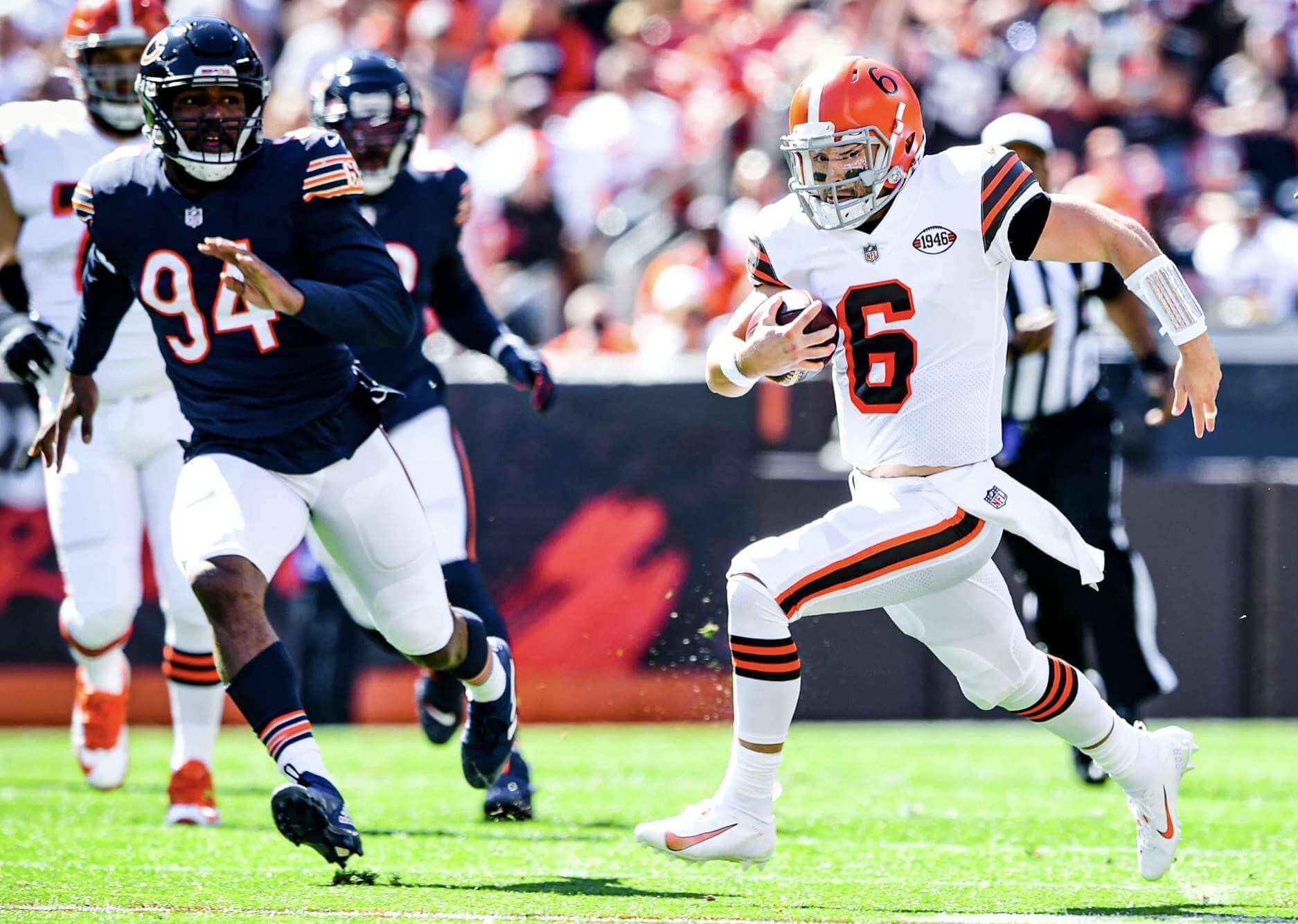
Now then: The Browns debuted their 75th-anniversary throwbacks for yesterday’s game against the Bears (lots of additional photos here, here), and here). The good news is that the uniforms generally looked very good, as did the uni matchup between the two teams (the rare game featuring both teams in striped socks!) The bad news is that several Browns players had some quality-control issues with their helmet numbers:
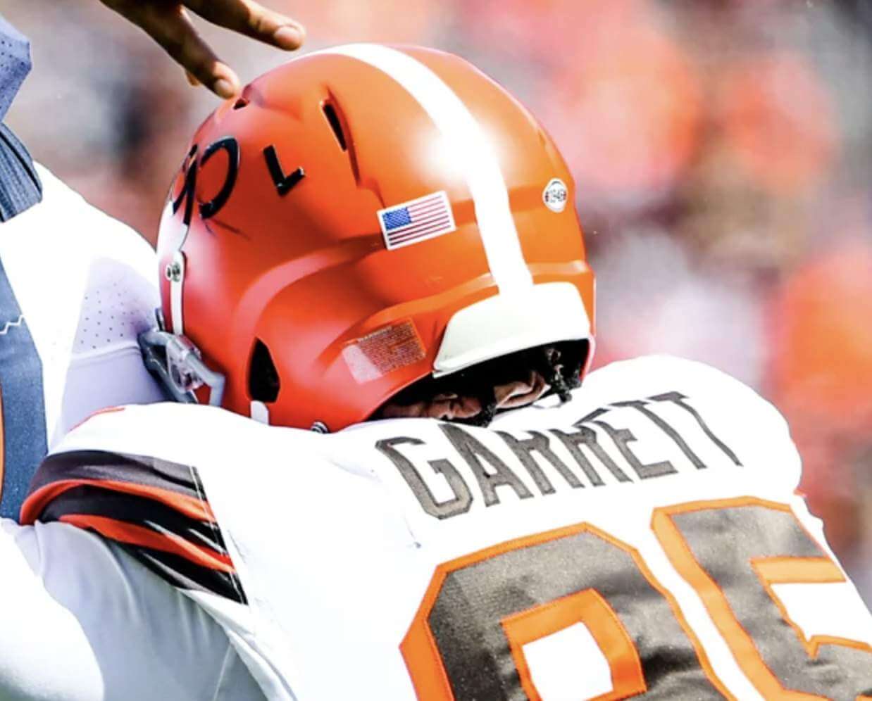
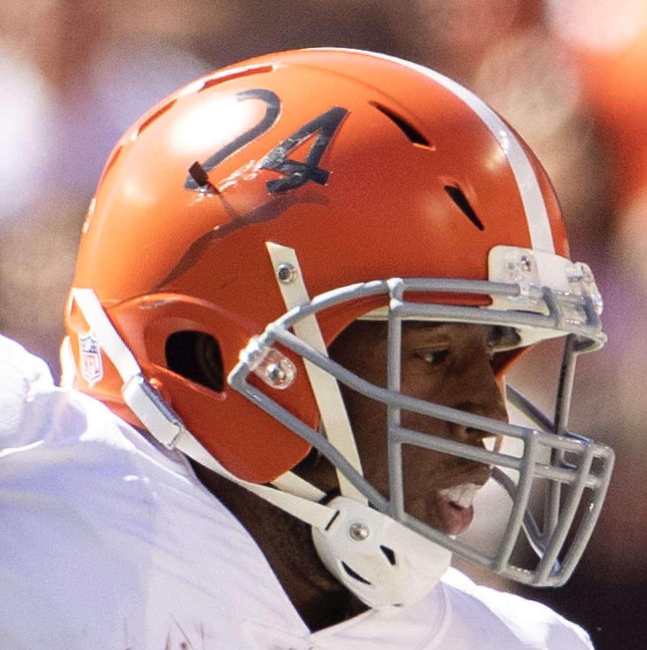
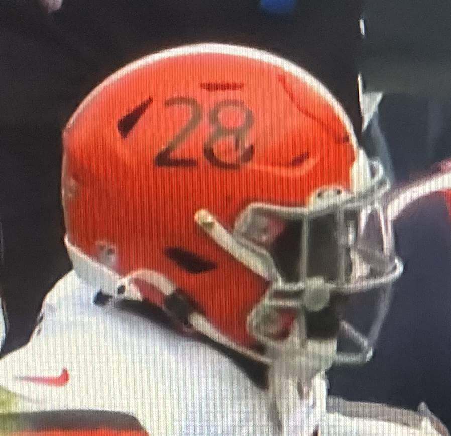
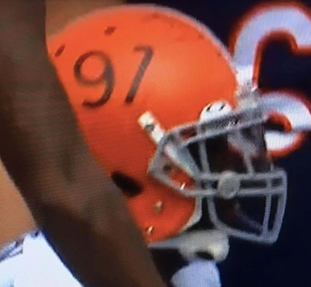
There were other players besides those four, but you get the idea. The Browns might want to consult with the Chargers, who have a bit more experience with helmet numbers.
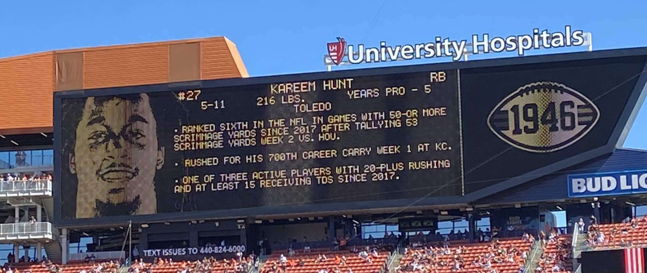
Cleveland also used some old-fashioned scoreboard graphics for the throwback game:
In other news from around the league yesterday:
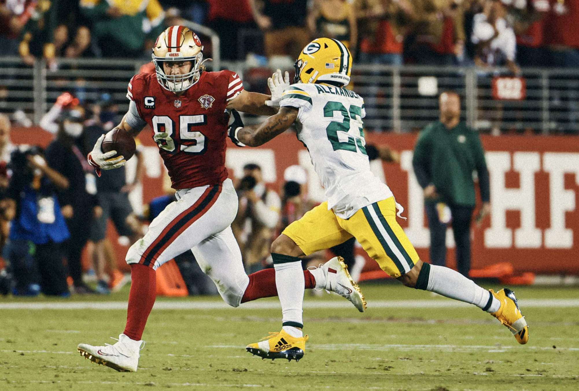
• The Browns weren’t the only team debuting a 75th-anniversary throwback. The 49ers wore their block-shadowed home throwbacks, making for a very nice uni matchup against the Packers (additional photos here and here:
In an interesting little nuance, the Niners use red captaincy patches for their primary red and white jerseys, but they use black patches for their two throwback jerseys (including the red ones than debuted last night). Here’s a comparison — primaries on top, throwbacks on bottom:
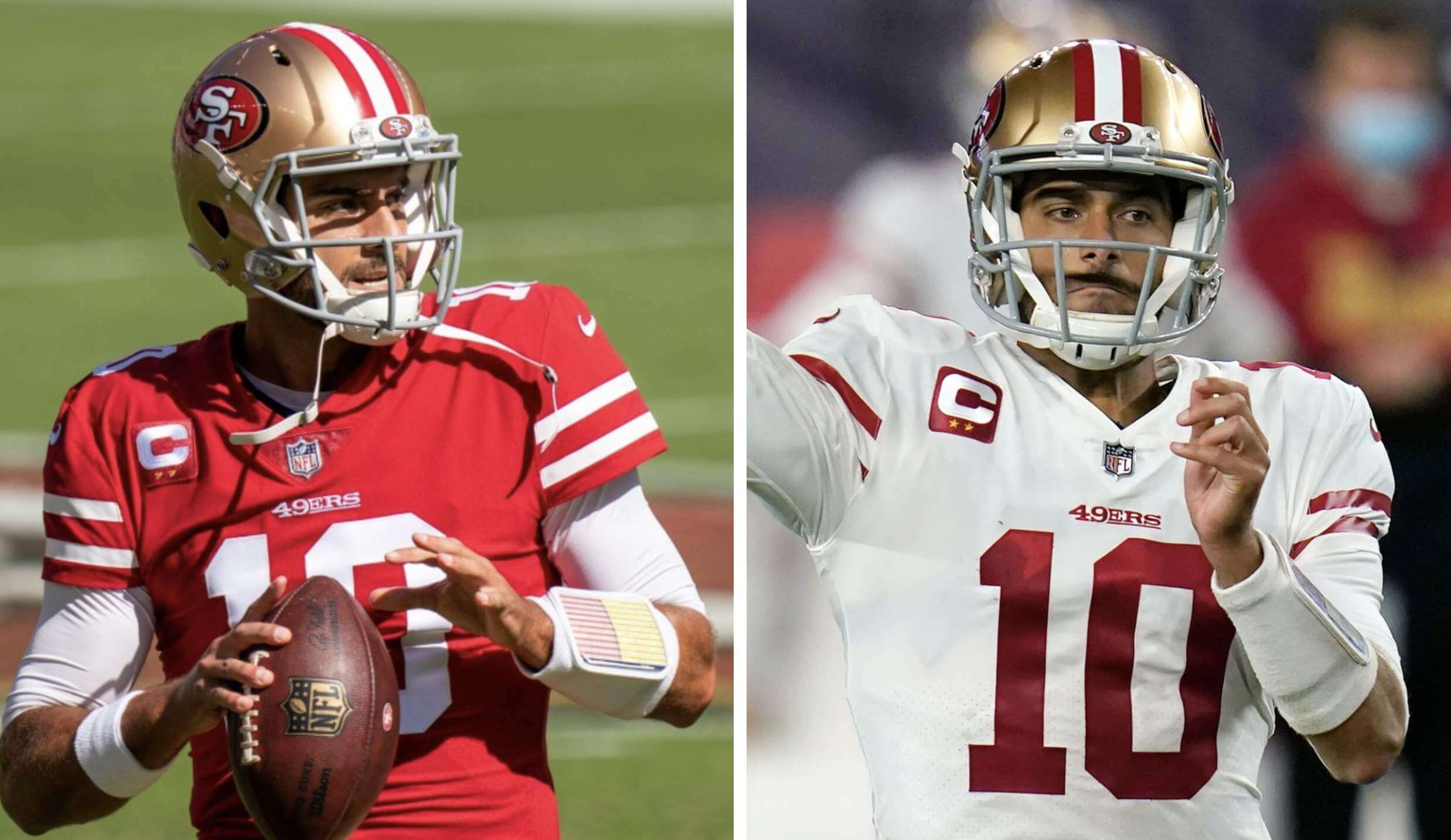
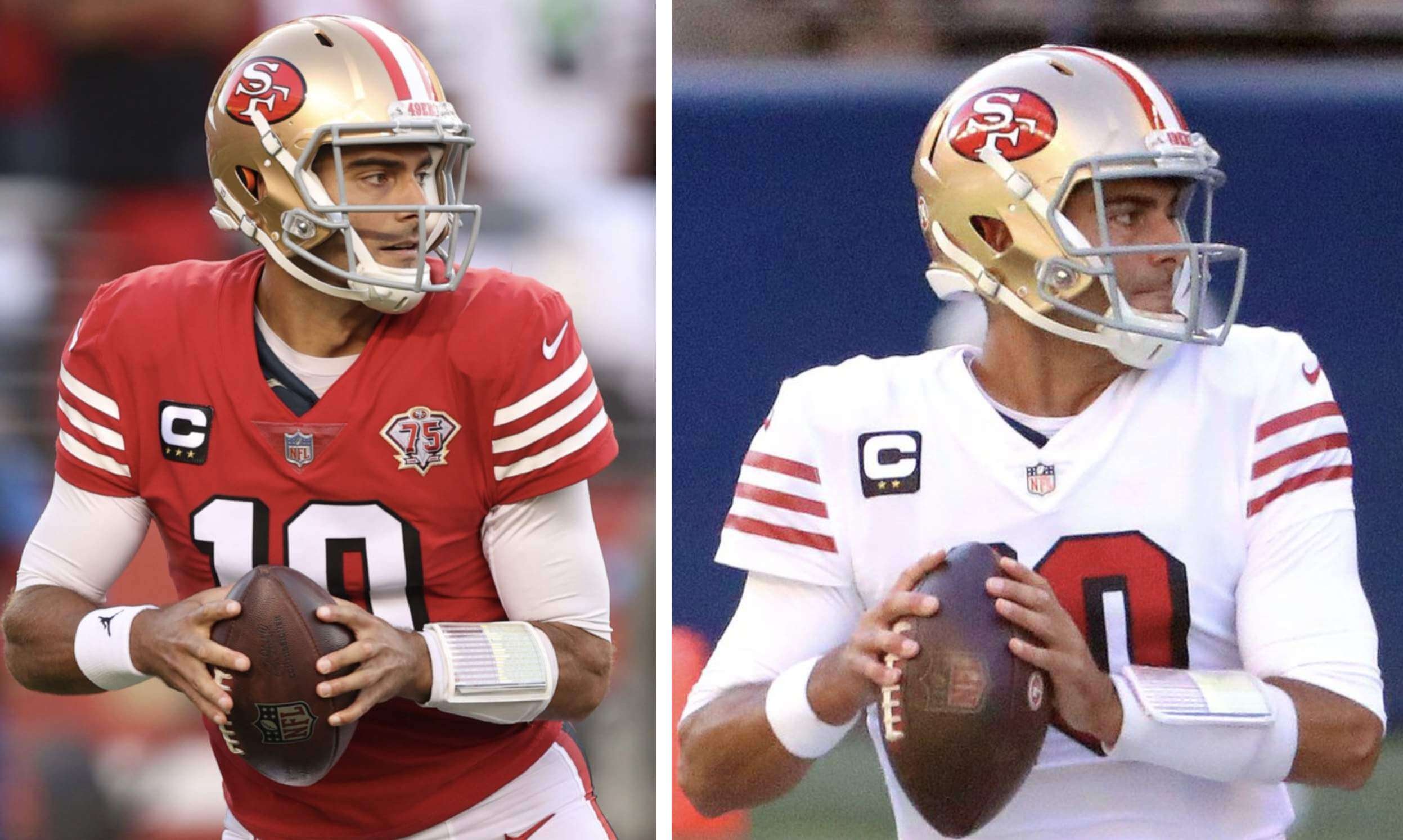
I get that they’re probably doing this to match the black block-shadowing on the numerals, but it still feels like a gratuitous use of black to me.
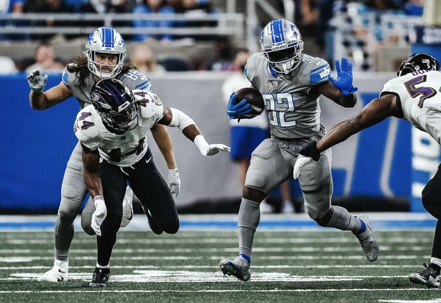
• Ewwww — the Lions went mono-grey:
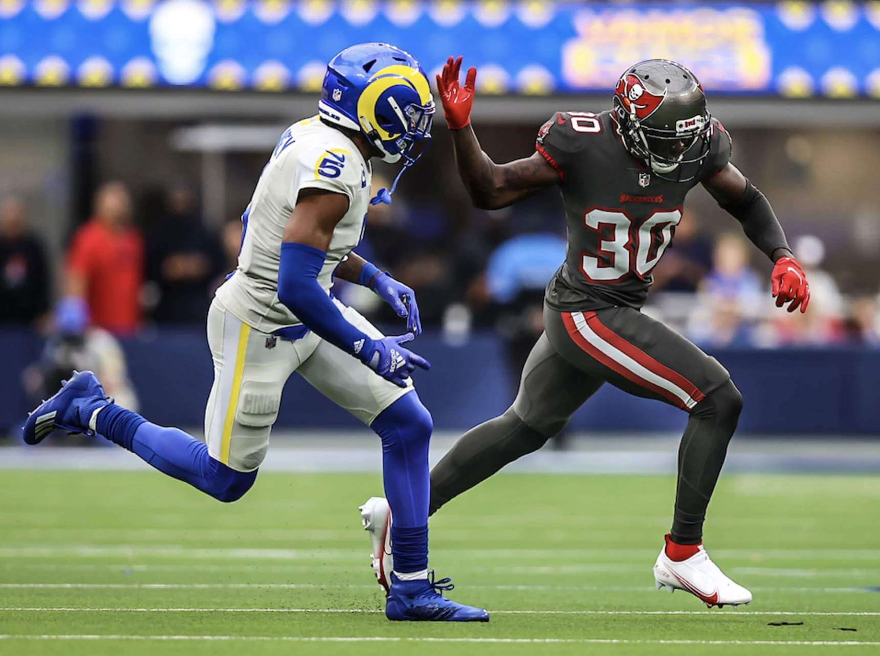
• Double-ewwww — the Bucs and Rams went mono-pewter vs. mono-dishwater:
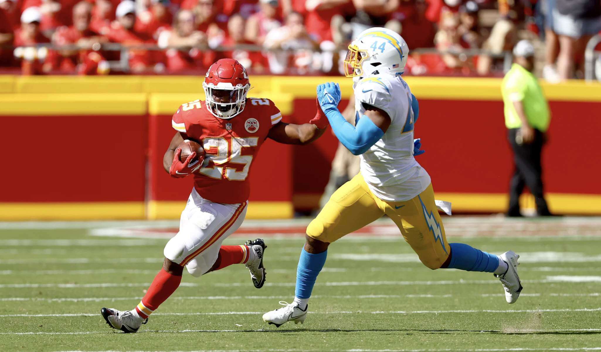
• KC’s arrowhead helmet logo notwithstanding, their game against the Chargers was a very good-looking uni matchup:
Third turnover of the first half by the Chiefs 😳
(via @NFL) pic.twitter.com/yrNyMxwRrX
— NFL on ESPN (@ESPNNFL) September 26, 2021
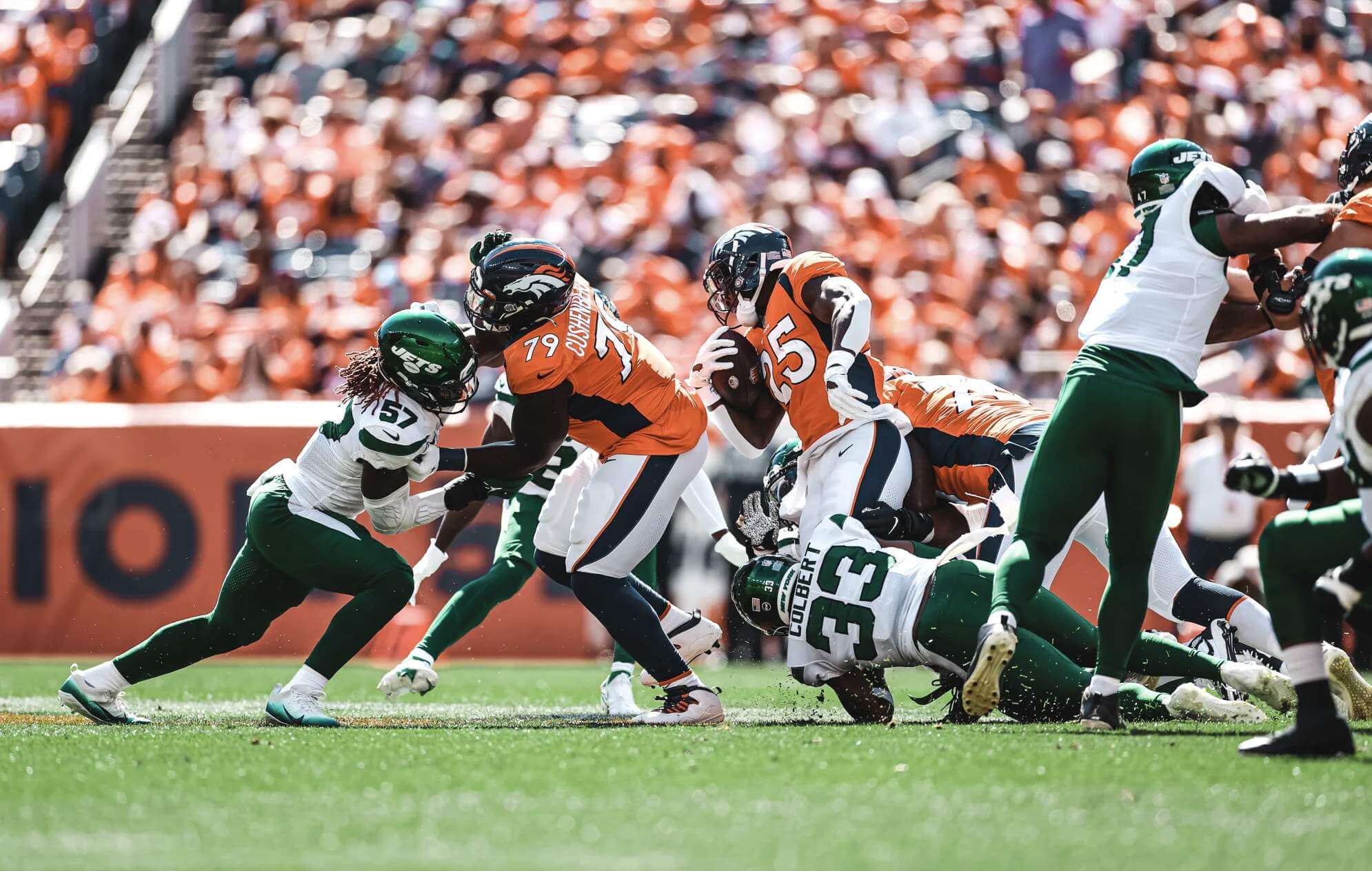
• I don’t like the Broncos’ or Jets’ uniforms, but I do like the chromatic collision of orange and green that their game provided yesterday:
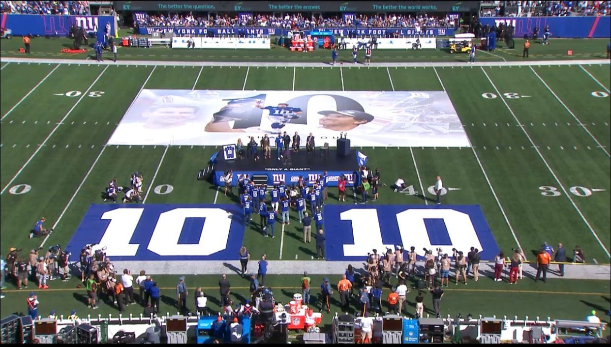
• The Giants retired Eli Manning’s No. 10 during halftime of their game against the Falcons:
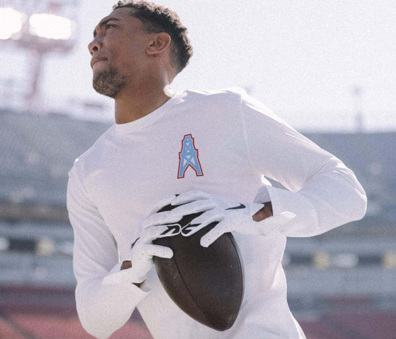
• The Titans wore Oilers shirts for pregame warm-ups:
• Only two teams wore white at home: the aforementioned Browns and the Jaguars (plus the aforementioned Rams if you count dishwater as white).
(My thanks to all contributors, including K.C. Kless, Mark Morgan, Brandon Rudolph, Ignacio Salazar, and our own Alex Hider.)
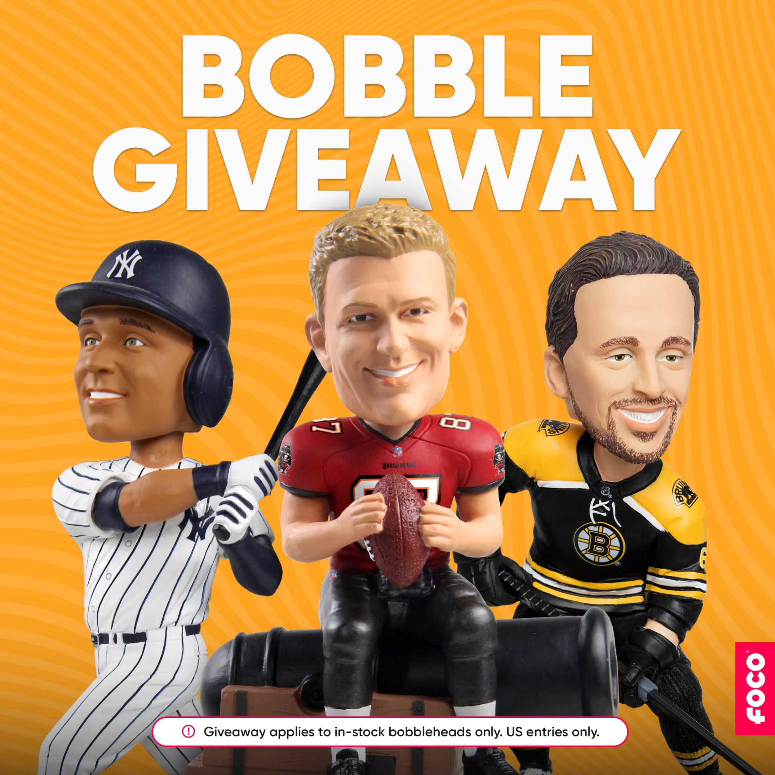
ITEM! Bobblehead raffle: The good folks at FOCO, who are among America’s premier designers and manufacturers of bobblehead dolls, have generously invited me to raffle off one of their bobbles to a lucky Uni Watch reader. The raffle winner will be to choose any bobble shown on this page (well, except for the ones indicated as Sold Out, obviously).
This will be a two-day raffle. USA mailing addresses only. To enter, send an email with your mailing address to the raffle in-box by 8pm Eastern tomorrow. One entry per person. I’ll announce the lucky winner on Wednesday. Big thanks to FOCO for sponsoring this one!
Click to enlarge
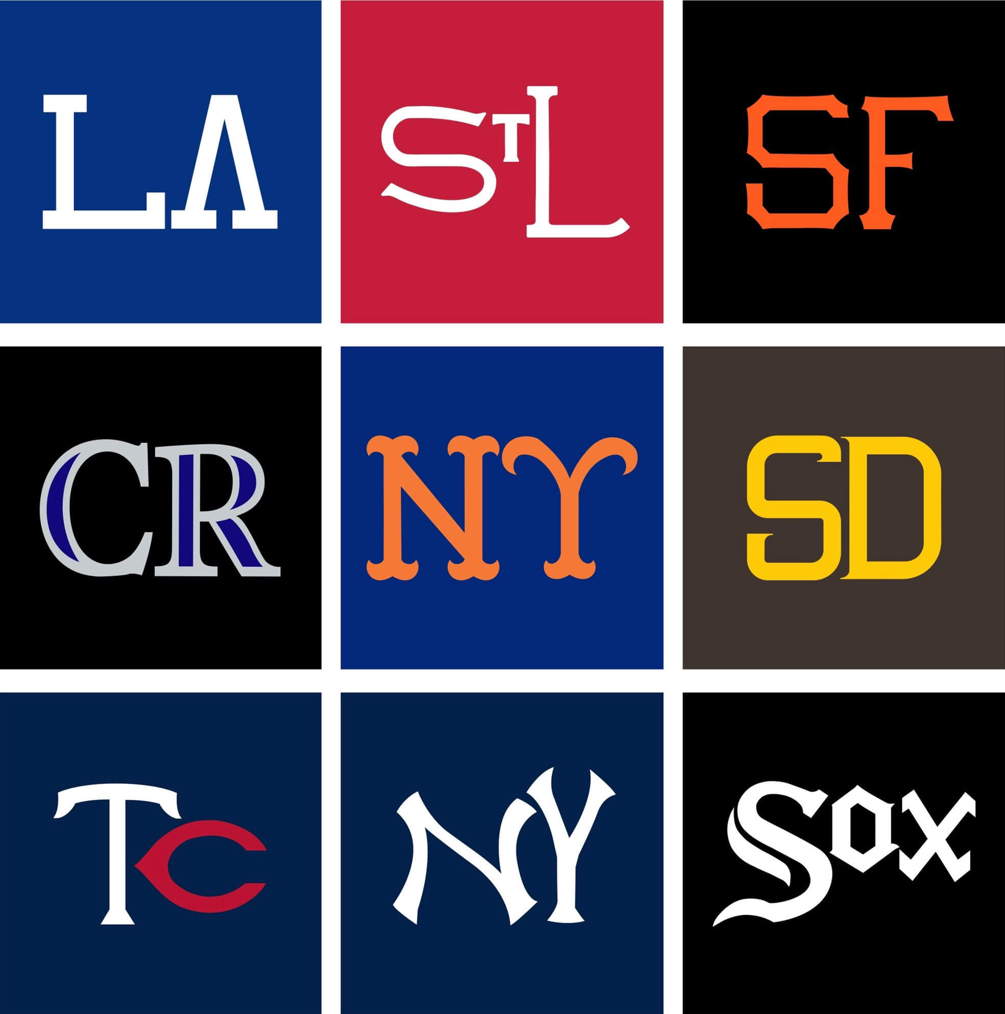
Too good for the Ticker: What you see above are MLB’s nine interlocking-letter cap logos, each deconstructed into its constituent parts — a really fun exercise from Twitter-er Renzon Sanchez.
Wondering why the Rays’ cap logo isn’t included? That logo’s letters don’t quite interlock!
(Thanks to all who shared this one.)
Click to enlarge

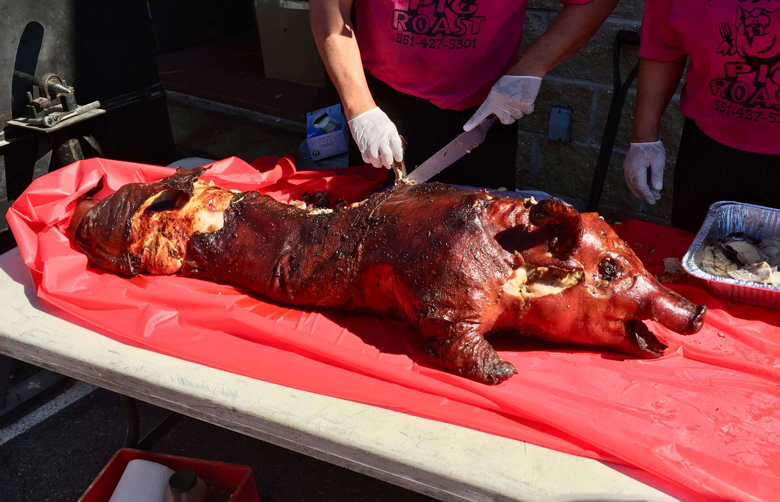
Culinary Corner: If there’s one thing I love, it’s a good volunteer fire department mass-feed fundraiser. I grew up attending the annual chicken barbecue at my hometown fire department, and I’ve attended many a firehouse eat/drink event since then. So when Mary and I learned that the Carlstadt Fire Department in New Jersey would be doing a pig roast on Sept. 25, we grabbed our friend Emily and went to check it out. The guest of honor is shown above.
As excited as I was about the pig roast, I was also a bit concerned — what if they overcooked the pig? There are few things worse that dried-out pork. So I thought it might be wise to bring some barbecue sauce, just in case. And I decided to whip up a batch of South Carolina-style mustard-based sauce — something I’d never made before.
After looking at a bunch of recipes, I sort of merged them into this: a cup of yellow mustard; 1/3 cup each of cider vinegar, brown sugar, and smoked maple syrup (the recipes all call for honey, but we had the smoked syrup in the house and I thought the smokiness would be very barbecue-appropriate, so I swapped it in); a tablespoon each of ketchup and Worcestershire sauce; some generous shakes of garlic powder, salt, pepper, and cayenne; and a few splashes of hot sauce. I put all of those in a saucepan and blended them over low heat for a few minutes. The resulting concoction was very good but not quite spicy enough, so I added a bit more cayenne to give it more of a kick and then put the sauce in a squeeze bottle to take along to the pig roast.
I needn’t have bothered — the pork was juicy and excellent, with lots of shards of crisp skin cracklins (and I even ended up with the tail!). But the sauce turned out so well that we used a bit of it anyway, and we have plenty left over for future use. Recommended!
The Ticker
By Jamie Rathjen

Baseball News: The Brewers celebrated radio announcer Bob Uecker’s 50th anniversary on the job by putting his signature in the outfield and also marked Ryan Braun’s retirement by putting No. 8 on the mound, which was also Uecker’s first number as a player (from multiple readers). … On Saturday, the Rockies gave away a bobblehead of former RF Larry Walker wearing the Turn Ahead the Clock jersey, except it had a normal rear-jersey name/NOB treatment instead of the TATC jersey’s vertical NOB (from Billy Cole).

Football News: The Buccaneers/Cowboys game that opened the NFL season used a 2016 silver dollar for the coin toss, instead of the usual NFL coin (from David Firestone). … If you remember Paul’s posts from earlier this year about Baltimore salt boxes, there’s now a black Ravens-themed one (from Andrew Cosentino). … Left over from Saturday: An official in the Florida State/Louisville game casually partook from a bag of Skittles (from Timmy Donahue). … Oregon State RB B.J. Baylor had his NOB falling off (from Casey Lute). … The white facemasks Auburn wore last week might return (from Kary Klismet). … The next two are also from Kary: The Chargers and Snoop Dogg got a youth team in California new uniforms. … It’s the 68th anniversary of Tennessee adopting a live dog mascot. … The amateur Canadian Junior Football League’s Langley Rams have three new jerseys (from Wade Heidt). … Wade also has Canadian college uni tracking in yesterday’s comments.

Hockey News: The first three items are from Wade Heidt: The Kraken are playing their home preseason games at WHL arenas in Washington, so they have warm-up jerseys for the occasion. … The Maple Leafs didn’t wear a helmet ad on Saturday (also from Mike Guterman). … Two Avalanche goalies, Pavel Francouz and Darcy Kuemper, have new masks. … Here’s a cool video showing the Ducks’ ice being painted for the new season (from Brandon Weir).

Basketball News: NBA numerologist Etienne Catalan has more new and changed player numbers. … The Kings are apparently getting a new ad patch (from @Zimfroi). … Ohio’s men’s team has new white and dark grey uniforms (from multiple readers). … Wisconsin’s men’s team is retiring the No. 24 jersey, but not number, for Michael Finley (from Kary Klismet). … Also from Kary: NAIA Northwestern (Iowa) College has a new basketball floor.

Soccer News: The NWSL Players Association got players in all games this weekend to wear “No More Side Hustles” warm-up shirts, as they’re close to getting their first collective bargaining agreement. What the shirt is referring to is that player payments are so low that many have side jobs in the offseason (WaPo link) or even during the season, or go to play in other countries in the winter. … NWSL supporters’ groups also brought banners with the same messages. Your humble Ticker assistant sat near the ones Washington’s Spirit Squadron put up. … Eintracht Frankfurt center-back Martin Hinteregger had the polo collar on this season’s first shirt modified. He did the same thing with last season’s second shirt (from Trevor Williams). … Tottenham Hotspur’s women’s team wore black armbands in memory of striker Jimmy Greaves. … A Scottish Women’s Premier League match between Celtic and Hibernian saw both teams wearing second kits. … The Republic of Ireland’s men’s team is to wear a blue shirt for their association’s 100th anniversary Oct. 12 against Qatar. The united Ireland team that existed in 1921 did wear blue, but it was the predecessor of the current Northern Irish national teams. According to Historical Football Kits, the Republic only wore blue shirts one time, at the 1924 Summer Olympics, which appears to be the basis for this shirt. … Meanwhile, Conn Rangers, a club in County Mayo, want to promote the League of Ireland by getting kids to wear the league’s shirts while practicing.

Grab Bag: At least one member of the U.S. Ryder Cup team, Patrick Cantlay, wore an NOB yesterday (from Shaun Meulemans). … New kits for the second-tier Japanese men’s volleyball team Veertien Mie (from Jeremy Brahm). … College field hockey teams that wore something gold for childhood cancer included Dartmouth and Iowa. … “The World Dairy Expo’s signature colored wood shavings for the central display floor have finally arrived and were revealed for the 2021 event,” says Bryan Martin Firvida. … The next three are from Kary Klismet: This article profiles the first Marine to wear a turban in uniform. … Radnor (Pa.) HS has a new sports logo. … Brisbane Pride doesn’t want Queensland Police Services officers to participate in their pride march in uniform.
Hi Paul,
Quick typo:
“There are few things worse that dried-out pork.”
I’ve never seen a barbecued pig’s tail like that… can you eat the whole thing? around it?
Typo fixed.
You can eat almost all of the tail. There are some tiny bones (basically the tip of the pig’s backbone), but they’re easy to manage.
Just another reminder this week that the Browns should use helmet numbers full time.
And ditch the helmet-as-logo for Brownie.
I realize this negates the throwback for SF, but it would look so much better IMHO if the 49ers would wear gold pants with the throwback jerseys. You could leave the black striping on the pants, which would work nicely with the black elements on both the jersey and helmet. There’s something about the white pants with the gold helmet that I just don’t like. I have the same reaction to all teams with gold/yellow/gray/silver helmets. I always think (*can’t think of an exception) the pant color should match the helmet, a la the Packers. I don’t feel the same way about red/blue/green/purple/etc. helmets. With those, white doesn’t bother me (exception: the Browns should ALWAYS wear orange pants).
The San Francisco throwbacks actually have more black than gold. I find that interesting.
How did the Brewers put Bob Uecker’s signature in the outfield grass? Is it mowed?
I much prefer the narrower, variable-width striping on the Brown’s throwback pants and wish they’d restore it permanently to the pants and helmet, which also has three even-width stripes now, whereas the brown stripes used to be narrower than the white.
Careful with those uninterlocked hat logos; they could wind up on the City Connect unis.
I also saw an image of captain Steve Stricker’s wife wearing an NOB sweater as well.
“…the chromatic collision of orange and green…”
Love it!
It’s been a long time coming for that combo…hasn’t been seen at (I Still Call It Mile High) for over 2 decades!
Hope the Titans are setting the table for an on-field Oilers throwback once the shell rule is dropped…Fingers crossed.
Today is the last day that the Cleveland baseball team will play at home under their outgoing nickname. As their road jerseys feature the city name, today will also feature the last appearance of the script nickname on a MLB jersey.
To mark the occasion, the club has, understandably, absolutely nothing special planned for today’s game.
Two crappy looks for the Lions in two consecutive weeks = two embarrassing losses. Perhaps if they just wore their standard uni set, or even better a late 1960s/early 1970s throwback, it would result in….another loss.
Cycling related: rainbow bands remain with Alaphilippe for another year.
Aside from Belgium and maybe the Netherlands, national team cycling kit is pretty blah
I thought the Slovenian kit was okay: link
There was actually a good deal of Uni-Watch-type interest in this race, because the cyclists wore the kits of their national teams, but riders on the same team wore different helmets and rode different bikes according to their trade team. So when more than half of the lead group was made up of Quick-Step riders, even though they were on different teams, you could tell because they all had Specialized helmets (and bikes). And when Alaphilippe’s French teammates all hugged him after the race, they all had different helmets.
Dang, I didn’t realize that was this weekend. Bravo, Julian!
My initial reaction to the de-interlocked letters was that only the Rockies, Giants and White Sox do it “honestly” —no stretching or shrinking parts of the letters to make it work. Not that it is an actual ethical concern or anything.
The Giants’ gymnastics to interlock the “S” and the “F” have always struck me as the most sophisticated twisting in baseball. And if the “K” and the “C” on the Royals’ cap are attached, is that considered interlocking?
“KC’s arrowhead helmet logo notwithstanding”
Uh… Why? Please tell me this isn’t a politically correct thing? Are we now petitioning the Chiefs to remove that aspect of their branding?
I’ve always thought they had one of the more ambiguous brandings, considering all humans were tribal, used stone-age technology and had what would be considered a “chief” or leader but these days I don’t even know anymore to be honest.
Uni Watch has been opposed to the use of Native American iconography on sports uniforms, including KC’s, for more than a decade now — not because it’s “politically correct” (a meaningless term) but because Uni Watch is opposed to cultural misappropriation.
If you feel differently, that’s fine — no need to re-hash this debate, which has already played out countless times, so let’s please not go down that road. Just answering your question. Cheers.
Definitely on board with Uni Watch’s stance here. A few people have pointed out a perceived hypocrisy that Uni Watch uses a logo about cultural misappropriation that arguably is cultural misappropriating in itself. I’d love to hear the reasoning of why you think it doesn’t do that. The people were pointing out that the logo uses the old Washington logo with the red-skinned man but in a disapproving pose. But it’s still using that imagery.
I’d suggest using anything else that doesn’t involve images like that. Perhaps a red circle with a diagonal line through it (the standard “no” sign) with the words “cultural appropriation” behind it would suffice.
I’ve asked people to suggest a different logo. You are the first to do so. Thank you!
“and also marked Ryan Braun’s number retirement by putting No. 8 on the mound…”
There was a ceremony honoring Braun’s retirement from baseball, but his number wasn’t actually retired.
Good call. Fixed.
The NWSL players want more money, the fans support this. Looking at the crowd in the supporter section with the support banners, more money is going to shut the whole thing down. I’m all for people making whatever they can, but if there’s no income there’s not going to be much salary going back out.
I have to comment this: the Lions all gray is absolutely horrendous, the Buc all pewter the same, and dammit, Rams just wear white like you should.
I read yesterday that no MLB player wore facial hair on the field between 1914 and 1971. Can that be true? Surely there must be some exception.
Never heard that one, and I find it almost impossible to believe is true. I am pretty sure that the Yankees and Reds at least had (or still have) team rules against it, but never heard there was a MLB rule.
The closest I could find was this line from the Wikipedia article on the Yankees policy: “Until 1972, many MLB players did not have facial hair due to fashion dictates at the time.”
So if correct, it might be generally true but not universally.
Whoa…
I looked it up, and there doesn’t seem to ne even ONE MLB player with facial hair from 1914-71.
Thats crazy.
Lee
It was newsworthy when the A’s started growing moustaches in 1972 but I don’t recall a reference to 1913 as being the last year that someone had facial hair.
The facial hair of Gossage and Munson may stand out because of the notoriety of the Yankees, but this wouldn’t be the case if not for the daring expeditions of Reggie Jackson and the Oakland A’s. In 1971, Jackson showed up at Spring Training with a moustache. This had been done before. But then, Opening Day came around and he refused to shave it. In doing so, he became the first MLB player to have facial hair in a regular season game in five decades. Wally Schang, also of the Athletics franchise, is said to be the last to have worn a ‘stache in-game, way back in 1914. Since that time, there was an unwritten rule in baseball that all players and staff should be clean shaven. Once the real season began, everyone always complied. But not Reggie. He did things his way, and thus the shaving streak was snapped.
link
I remember hearing that the Dodgers’ Frenchy Bordagary, a rather eccentric sort, wore a mustache during the ’30s. I looked it up and the story was he arrived for spring training in 1936 with a mustache he grew for a bit part in a movie filmed in the offseason. Here’s a quote from Bordagary about it, with a funny line from his manager Casey Stengel.
“After I had it about two months, Casey called me into the clubhouse and said, ‘If anyone’s going to be a clown on this club, it’s going to be me.’”
When I saw Bordagary saying he had it for two months, I thought he meant two months after showing up in spring training was when Stengel told him to shave, but now I realize he probably already had it for two months when Casey gave him the order in ST, so he apparently didn’t wear it for the regular season.
I could not believe what I was seeing when I turned on the Bucs/Rams game yesterday. I absolutely knew you would mention it today Paul. Because of the double mono matchup, but also your previous criticism of both teams uni pairings. One of the most anticipated games of the season & of course they would both make a terrible uni-decision.
I know the bone (or dishwater) is an off-white shade, but on screen it often appears as very pale gray, while Pewter is a very dark shade of gray.
Did we have the first ever Gray vs Gray game?
Interesting exercise with the interlocking logos. However, I noticed he missed the hidden “P” in the Padres logo.
As a lifelong Cleveland Sports fan, it’s with some bittersweet feelings we say goodbye to the “Indians” name appearing in Cleveland. Their next home game will be with their shitty new name.
I know many are happy this day has come, and I understand why it’s happening and I am OK with it…but it does feel like a little piece of my childhood and adulthood memories are gone and there’s a sense of loss as a fan.
I am sure nobody feels sympathy nor am I asking for it, but it is a tough day for Cleveland fans.
Obviously, you know my position regarding the team name. But as I wrote link (almost to the day):
“To longtime Indians fans: I realize that this is hard for you. I totally get the emotional connection that forms between fans and their favorite team’s visual identity — hell, that connection is a big part of why Uni Watch exists — so I understand that you may be mourning a bit about the name change, even if you were in favor of it happening. Please accept my condolences — I feel for you.”
That goes double today.
Cleveland baseball fan here. Knowing this day would come, I bought some souvenirs with the old name to keep in a drawer, and periodically take out and reminisce about the time we fans had with the name; nobody can take the memory from us. Those are forever.
Appreciate the understanding. I know you’re very much against names/iconography like that but at the same time taking the time to understand that some are “sad” and being cool about it.
(granted, in this world, there’s worse things to be sad about than a baseball team changing it’s name – so i don’t want to suggest that I am truly “sad” in the sense of important things in life to be sad about)
What was odd about Patrick Cantlay’s “NOB” sweater was that it was only on the long-sleeved sweater that he was wearing. Underneath the sweater he was wearing a standard polo shirt in the exact same design, but without the NOB. Two nearly identical shirts, but one with a NOB and one without.
Were the Oilers warm up long sleeves made exclusively by the Titans? Didn’t see a Nike logo. BTW, they’re great!
Maker’s mark on the sleeve:
link
I wish makers marks could always be placed on the sleeves (like Majestic used to do with MLB for instance). There is nothing more jarring than seeing that damn swoosh on a classic MLB jersey like the Yankees or the Cardinals…or on the Negro League throwbacks. In the NFL, with so many teams getting rid of the TV numbers, why not put the makers mark there? (I know, that makes too much sense!)
Maybe those Maple Leaf helmets did have an ad on them but it was all in blue. The ghost of Ballard strikes again!
Something that will always bother me. Why can’t the 49ers put the 3 sleeve stripes on their regular jerseys? They do it with the throwbacks. It belongs on their regular jerseys instead of the 2 stripes. Urgh!
I posted this yesterday but it’s worth repeating because it’s, uh, strongly uni-related.
I had three early games in my market yesterday and they were all glorious uni-matchups. It just doesn’t get any better than KC in their red jersey and the Chargers in their white jersey with yellow pants. The Bears in navy and Browns in their white fauxbacks and the WFT in white over burgundy and Bills in blue over white also looked great. The SNF game was also a good looking game.
I was super excited that the Niners wore their proper red socks. There was no indication that they were going to change the socks, as they’ve worn their white socks with their white ‘94 throwbacks every time since their 2018 inception. Even in the press images for the new red throwbacks… they wore white socks, leading me to believe they were just going to continue doing the same thing. I’d love to also see the triple-striped socks be worn either alongside or replacing the solid red socks, but seeing as they ended up wearing the solid socks more often that year anyway, I’m happy regardless. They looked great out there. Too bad they didn’t play like the ‘94 Niners though..
I always enjoy watching the ice rinks get painted, but did the Ducks really put Honda ads on their boards just to paint?