By Phil Hecken & the SMUW Crew
Follow @PhilHecken
Good morning Uni Watchers, and welcome to Week 4 of the Sunday Morning Uni Watch!
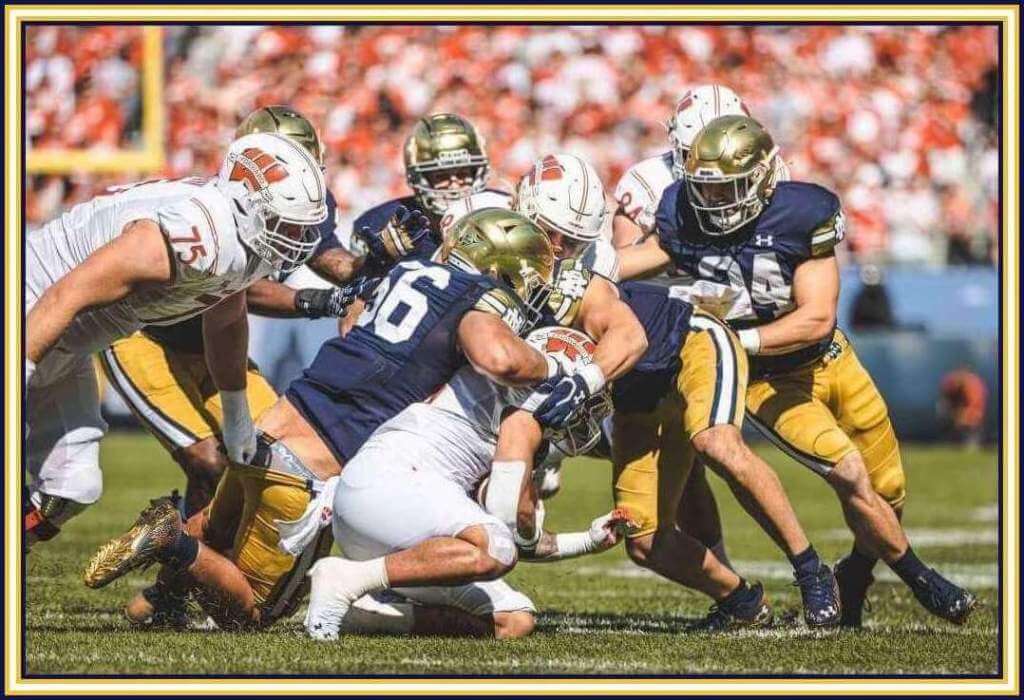
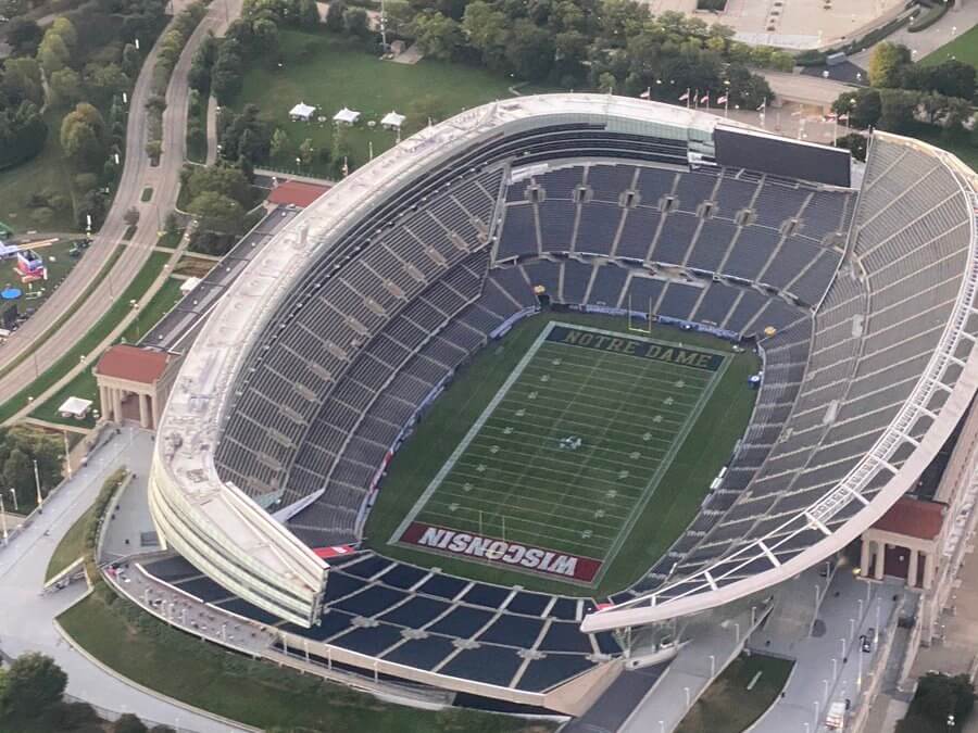
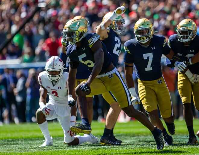
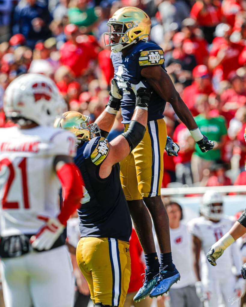
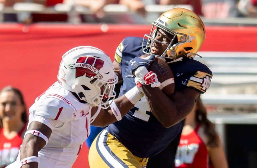
The Fighting Irish of Notre Dame and Badgers of Wisconsin hooked up yesterday in a spiffy looking game, played as part of the continuing “Shamrock Series” for the Irish, with the game being played in Chicago’s Soldier Field (home of da Bears). The grounds crew did a fine job turning an NFL stadium into one for two top college teams.
This being a “special” game, of course both teams had to trot out alternate uniforms. But unlike many “special” games, this one actually featured some pretty great looking unis for both squads.
If you looked at Notre Dame’s uniforms, and they reminded you ever-so-slightly of Packer unis, that wasn’t unintentional. Why not da Bears? Well, there’s a reason for that.
I actually really like the Irish duds — I know they traditionally wear stripeless britches, but adding that blue/white/blue stripe really made the normally drab-gold pants pop. I was less of a fan of the striping and “ND” logo on the sleeve cap, but in fairness, they were trying to mimic the sleeve cap of the Pack. They wore their normal gold hats.
Wisconsin, too, wore special unis — and one of the biggest differences was the “FORWARD” wordmark (rendered as a ribbon) on their helmets. There was, of course, a reason for that as well. I don’t normally like wordmarks on top of logos, but this one seemed to work. About the only thing I didn’t like about ‘sconnie’s kits were the number fonts.
But all in all it was a pretty good looking game on a beautifully sunny fall day, with special one-offs that not only didn’t suck…they were good!
OK, now onto TJ and the rest of your…
Sunday Morning Uni Watch
by Terry Duroncelet, Jr.
From Friday:
• Why must teams choose violence at every opportunity?
From Saturday:
• I’ve said it before, and I’ll say it again: Colorado State is up there with Michigan State as one of the very few teams that can make all-white not look like barely-seasoned baked chicken, and it’s a perfect visual complement to Iowa’s classic –albeit “familiar”– look. The Rams should make those bone horn helmets a permanent fixture, with a green shell and gold horns to go along with it.
• Um, Baylor… I think you guys might be confused as to who the Golden Bears of college football are.
• The C H A N T S need to make this helmet decal permanent.
• Y’know, for the 100th meeting between these two, I’m kinda bummed that TCU didn’t wear jersey tops that said “FORT WORTH” on the front.
• I love it when Army West Point lives up to their team name.
• Throwback uniforms for Purdue. Game didn’t look half-bad either.
• Sweet digs from Utah.
• Now this is what I call putting your heads together.
• Contrast Matters: Post-Labor Day Edition. I call it this because this is the one time where wearing white pants after Labor Day is a blessing, because forget trying to tell who’s who otherwise.
• Arizona State needs to make these permanent if they haven’t already. Love the field detail as well.
• Michigan State went the Blank Flank route on the left side of their helmets, and block ‘S’ decals on the right side against Nebraska.
• Red trou for Kansas.
• Oklahoma wore their Rough Rider/Bring The Wood uniforms against West Virginia (seems to be a habit of theirs).
• UTEP’s Texas Western uniforms finally hit the field, and this is an example of what I call a Good Scrambled Eggs uniform, or a GSE uni. What I mean by that there’s an underlying beauty and charm to a plate of food that’s simple, but done well. Eggs, maybe some toast and basic fruit, but the ingredients are quality, and there’s love put in the food. That’s the vibe I get with these unis. It’s literally just orange and white with two things on the side of the helmets: jack, and shit. And yet, it works.
Thanks, Terry! Now for the rest of today’s SMUW…

Jimmer Vilk’s 5 & 1
After more than a decade in hiatus, the original “5 & 1” decider, Jim Vilk, has returned! Jim began doing the 5 & 1 many years ago, followed Catherine Ryan, Joe Ringham, Michael “Memal” Malinowski, and several guest pickers. Once again, Jim will pick HIS 5 best looking/1 awful matchup, and occasionally have some honorable mentions (both good and bad). You may agree and you may disagree — these are, after all, just opinions and everyone has one. Feel free to let him know what you think in the comments section.
If you have a game you feel is “worthy” of consideration for the 5 & 1, please either post it in the comments below or tweet Mr. Vilk @JVfromOhio.
Here’s today’s 5 & 1:
I had this big preamble about pants stripes, but I’m going to shorten it because I have another point to make. Basically, I believe every school’s uniforms would look better with pants stripes. Just try them and see. Also, longtime readers know I have been very hard on my alma mater, and I am no fan at all of the biggest school in my state. So imagine my surprise when I finalized this list…
Honorable Mentions to:
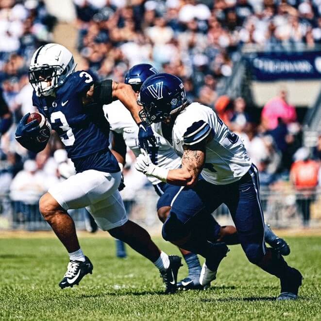
Vilkanova/Penn State
My favorite basketball school looked great on PSU’s gridiron this week.
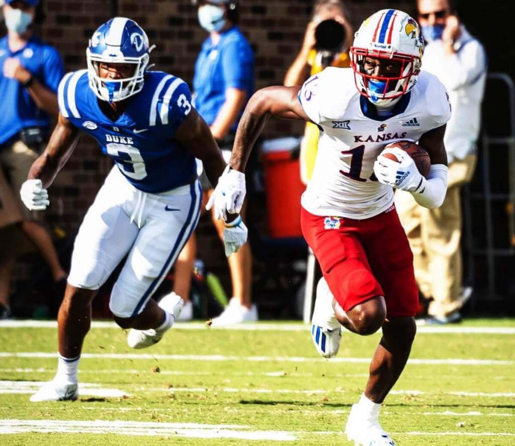
Kansas/Duke
Speaking of hoops institutions…those red pants made this game look better than any of their March Madness matchups.
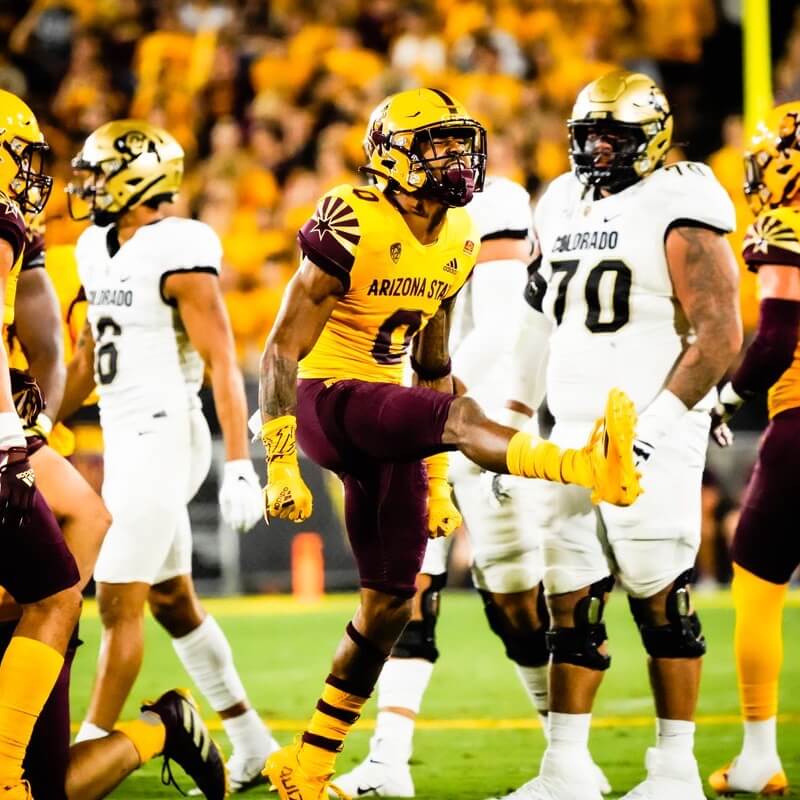
5. Colorado/Arizona State
Not a fan of Sparky, and yet That. Is. The. Best. Uni. ASU. Has. Ever. Worn.
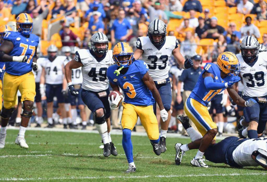
4. New Hampshire/Pitt
TV numbers always look better on the sleeves, especially on contrasting sleeves!
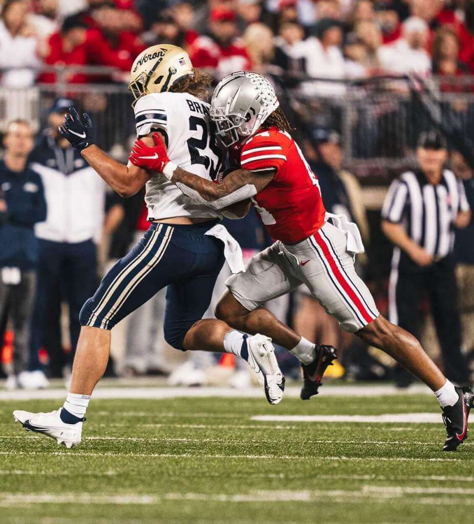
3. Akron/Ohio State
My Zips haven’t looked this good in a loooong time, and the dreaded Buckeyes paired very nicely with them.
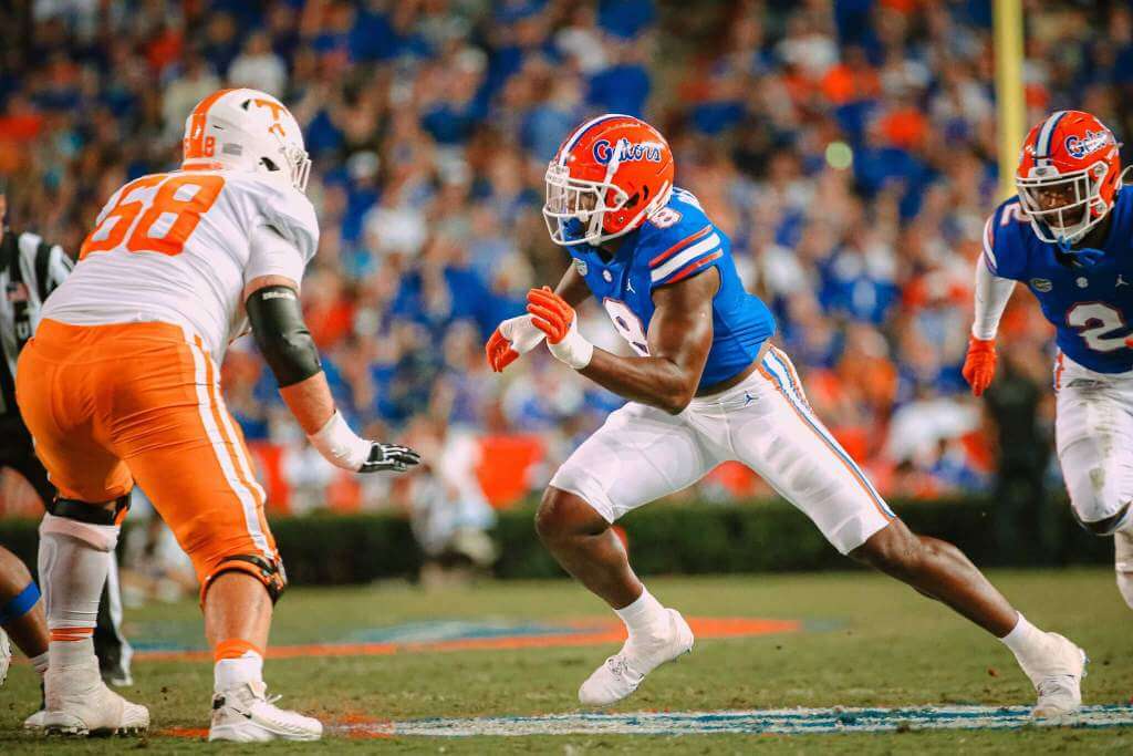
2. Tennessee/Florida
They almost didn’t need the stadium lights for this bright night matchup.
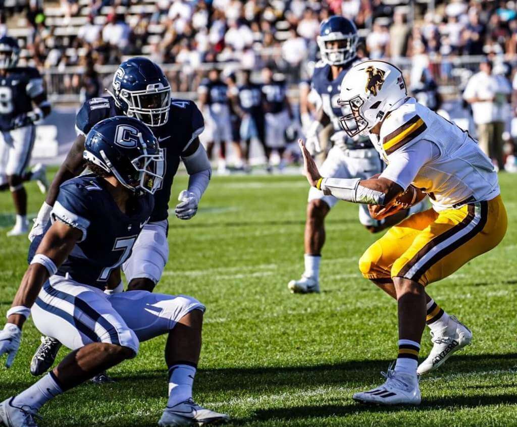
1. Wyoming/UConn
Yeehaw, Cowboys… it’s finally your time in the sun!
An extremely Dishonorable Mention to
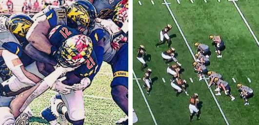
Kent State/Maryland
To the usual taunt of “Kent read, Kent write, Kent State,” I add, “Kent understand contrast.”
&1. Middle Tennessee State/Charlotte
Properly sized numbers don’t mean squat if you can’t see them from distance!
Thanks, Jim! OK readers? What say you? Agree or disagree with Jimmer’s selections? Let him know in the comments below.
NCAA Uni Tracking
Uni Watch will again track the uniform combinations worn by the “Power 5” conferences. All of the 2020 trackers are back!
We’ve got Rex Henry (tracking the ACC), Dennis Bolt (tracking the PAC-12), Kyle Acker (tracking the B1G), and Ethan Dimitroff (tracking the Big XII AND the SEC). Rex, Dennis, and Kyle and are all returning from 2015, and Ethan is back after joining the NCAA Uni Tracking a couple seasons ago. Ethan will continue to track the SEC, and has swapped the B1G for Big XII (with Kyle).
Here are the Uni Trackers for the Power 5 Conferences (along with each tracker’s info):
Rex is up first today (ACC):
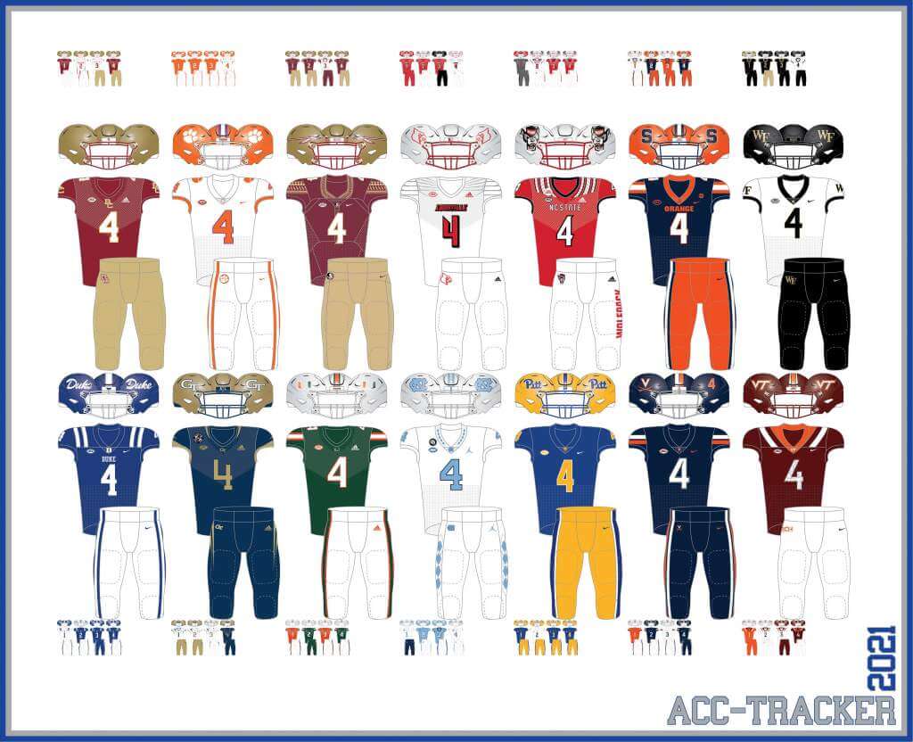
ACC
More Here.
Follow Rex on Twitter here.
And now, here’s Dennis with the PAC-12:
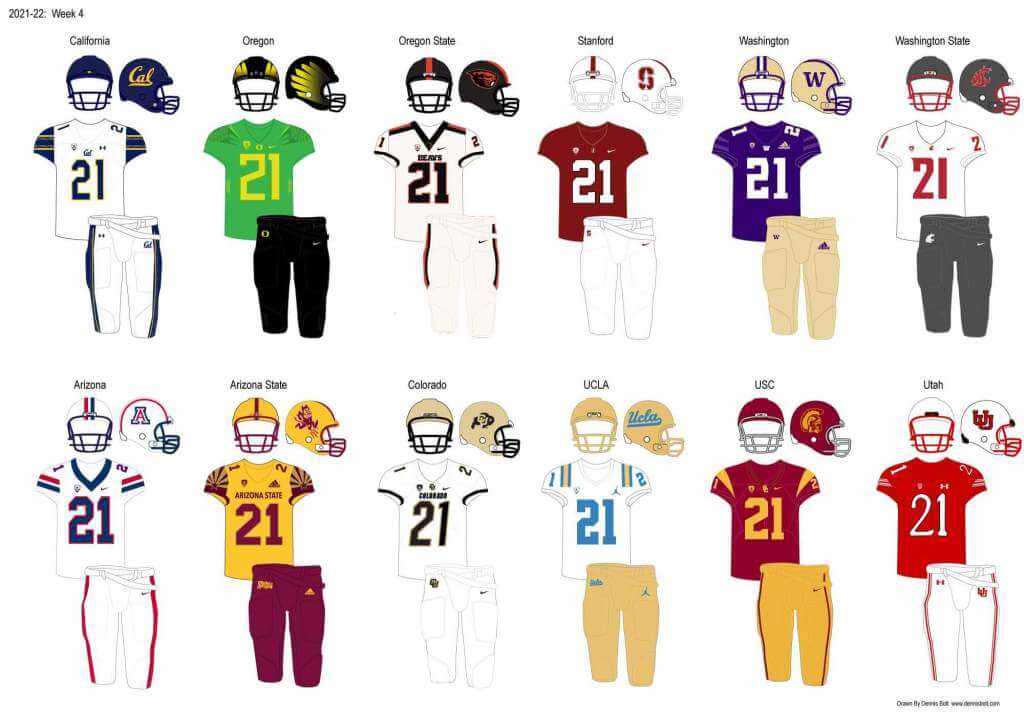
PAC-12
More here.
Follow Dennis on Twitter here.
And here is Ethan, with the SEC:
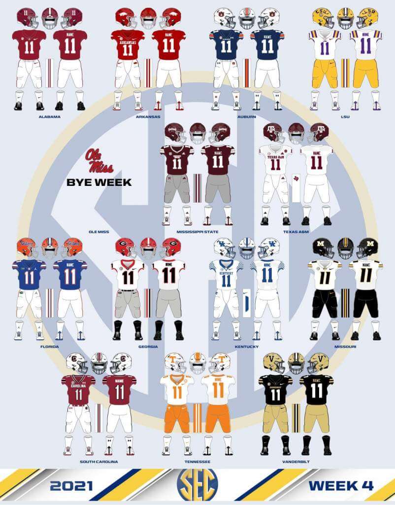
SEC
And be sure to check out Ethan’s WVU Mountaineer Tracker.
Follow Ethan on Twitter here.
And here is Kyle with the B1G:
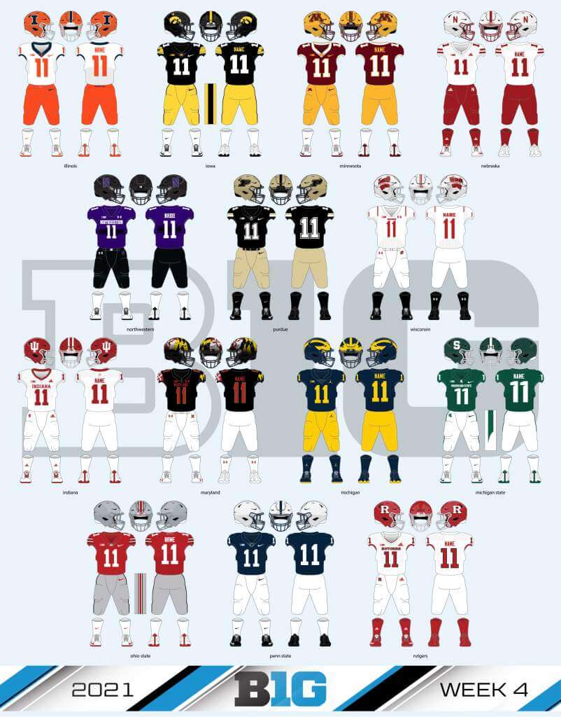
B1G
Follow Kyle on Twitter here.
And here’s Ethan with the Big XII:
Big XII
Welcome to the 2021 Oregon Ducks Uni Tracker. This little project was originally begun way back in 2008-09 by Michael Princip, who retired after several seasons, whereupon the project was continued by Tim E. O’Brien. He, too, retired from the tracking, but the project has been ably kept up by the man who also tracks the Pac12, Dennis Bolt.
Here’s this week’s Uniform Combo for the Ducks (you can click to enlarge):
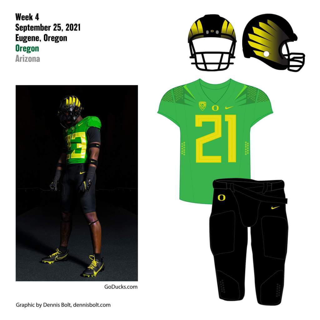
You can read about this uniform, and MUCH MORE, by checking out the Duck Tracker here and the color combo spreadsheet here!
Thanks Dennis!

“Ask Me Anything” reminder: Paul here. In case you missed it on Friday, my latest Bulletin article is an “Ask Me Anything” installment where I answer dozens of reader-submitted questions. You can read it on my Bulletin page. Enjoy!
Also: If you use an RSS reader, like Feedly or Inoreader, you can now subscribe to my Bulletin content via RSS. Just plug “https://paullukas.bulletin.com/rss” into your reader and you should be good to go.
Now back to Phil!
Uni Watch News Ticker
By Phil

Baseball News: Wowsa! Check out this color, incredibly crisp, 1947 film from 74 yrs ago shot at Yankee Stadium for the Old Timers Game. This footage was purchased by a friend from Frankie Crosetti. Includes a gravely ill Babe Ruth, Cy Young, Jimmie Foxx, George Sisler & so many more baseball HOF’ers (from Sean Walsh). … Oooooh, a league of their own! Take a look at this wonderful photo of the AAGBPL (from SABR BioProject). … Tampa Bay gets a decent amount of mileage out of the Devil Rays fauxbacks. So much in fact, they clinched the AL East last night while wearing them (from John Sabol). … Brian Dawkins appeared at the Phillies game yesterday to throw out the first pitch and do a book signing, notes Marc Rosenberg. “His jersey with his soon to be retired and Mike Schmidt’s already retired #20 is excellent. BTW, that’s Schmidt in the shot,” he adds. … With the Red Sawx loss to the Yanks on Friday (and a 7 game win streak), the team said they’d stop wearing the “lucky” CC alternates. So yesterday they wore their other alternates. … Scranton-Wilkes Barre’s Ryan LaMarre had a bit of a wardrobe malfunction yesterday (from Artimus Naugin). … Reader Carl Schneeman writes, “The Twins “Fan Appreciation” give away on Friday was a super great stocking cap but Orange and Royal?” … … If you’re an adult male above age 20 or so, and you decide to bring a glove to a game, you may as well have a really HUGE one (from Tony). … The Tampa Bay Rays are planning to hang a Montreal sign at Tropicana Field during the MLB post-season, fueling reports of a future shared custody between the two cities for the club (thanks, Brinke).

NFL/Pro Football News: ICYMI: The New York Jets will wear green/white/green today in Denver. … The Seattle Seahawks will go blue/white/blue in Minnesota. … The Buffalo Bills will sport white/blue/white against the Washington Football Team. … The Cincy Bengals will wear orange/white/white (but with black socks) vs. the Stillers. … The Jacksonville Jaguars will be wearing black/white/blue at home vs. Arizona. … The Miami Dolphins will wear white/white/aqua in Vegas. … During telecasts, the CFL has virtual ads on the field and some teams have their logo virtually at midfield, which are not painted on the field and you would not see it if you are live at the game. Wade Heidt notes, “The (BC) Lions are one of the teams with their logo virtually at midfield during telecasts. For Friday’s game, they had the special stylized version of their logo show at midfield for the telecast.” … Here’s some good video of the Browns staff preparing the 1946 “throwbacks,” which Cleveland will wear today. … I’m not sure who did this mockup, but if the Lions actually wore Honolulu Northwestern pants stripes and blue socks with their white pants, that uni has potential. … Check out Marshawn Lynch wearing a 24/7 “Seahawks” jersey in an ad for a Seattle plumber (from Mark in Victoria). … Most of you probably know this, but the Detroit Lions have a perma-memorial — the initials “WCF” — on their sleeve caps. Here’s some background on that. … Check out this Green Bay football player flying to California wearing a Dallas Texas hockey sweater (from Lee Wilds). … Tennessee may still not want to recognize much of their Oiler history, but it was Oiler homecoming weekend in Nashville. Bum Phillips is being inducted into their Ring of Honor (from Ignacio Salazar).
College Football News: Alabama-Birmingham will open its new stadium on October 2nd. The stadium’s official website has a cool aerial view of what it looks like (from Kary Klismet). … Coastal Carolina has unveiled a sculpture of its rooster mascot, Chauncey, outside of its football stadium (also from Kary Klismet). … Canada West conference started in U Sports. No great photos yet but some nice new uniforms for Manitoba Bisons. More classic striping compared to old white unis with gold side panels. An upgrade (from Wade Heidt). … Also from Wade: Every team in Ontario conference of U Sports football will wear this decal on helmets for rest of season. “In honour of Ottawa Gee-Gees DL and student Francis Perron. Perron died unexpectedly after last Saturday’s game.” Wade adds, “Article from CTV News Ottawa with more detail. Perron’s framed jersey on the Ottawa sideline during game.” His jersey was placed on the field yesterday in the formation before kickoff at Queen’s in Kingston.

Hockey News: With their first full scrimmage yesterday, we are now able to get a full look at the new Seattle Kraken uniforms. Here are a few more looks. I think these are growing on me. … The Rum River Mallards, a junior team in the United States Premier Hockey League from Minnesota, have new uniforms and colors (from Kary Klismet).

NBA News: Did you know the Orlando Magic are the only NBA team that hasn’t retired a single jersey number (I didn’t). This article makes the argument they should begin doing so.

Soccer News: Wait…what: Mattia Destro scored his second goal of the match with a WATER BOTTLE in his hand. Anyone ever seen anything like this before? (from AC). … Here’s a news story about how fans are rebelling against the proliferation of retail jerseys with which European professional soccer teams have flooded the market (from Kary Klismet).

Grab Bag: Looks like the LSU Ultimate Frisbee team has new uniforms. Not sure if they are all “69” however. … For the curling fans among us, Rachel Homan’s rink has new uniforms. … Seton Hall has renovated its historic Walsh Gymnasium, the former home arena of the Pirates’ men’s basketball team and current home of the women’s basketball and volleyball teams (from Kary Klismet). … Also from Kary: Simpson College in Iowa has a new costumed mascot. … There was an unusual pairing in yesterday’s Anthony Joshua / Oleksandr Usyk heavyweight title bout, as both fighters wore white trunks (thanks, Paul).
And finally… that’s all for this fine first Sunday of fall. Big thanks, as always, to the SMUW crew for all their efforts!
Everyone have a good Sunday and a better week, and I’ll catch you back here next Saturday.
Peace,
PH
Time for some College Football Uni Tracking – Canadian Rules Style!
First, we would like to offer our condolences to friends and family of Francis Perron. The 25-year-old passing away shortly after his game with the Ottawa Gee-Gees last Saturday. Unexpected and cause of death still being investigated.
Canada West was the last conference to get going. We will look at their opening games.
-The Calgary Dinos wore their new uniforms. New red jerseys and they also now have black pants. Going red/red/black combo. Pretty nice! Visiting Saskatchewan Huskies wore a green/white/grey combo. Can’t recall them wearing a white jersey with grey pants anytime recently.
link
link
-As mentioned in the Ticker, the Manitoba Bisons went white over white at home in Winnipeg. The new white uniforms trimmed in brown and gold looked great. The Regina Rams went green over gold. We have not seen them wear this combo much with this current uniform set. It is usually green but sometimes white pants.
link
-In Edmonton, it was fairly standard. The Alberta Golden Bears going with the yellow/forest green/yellow combo. UBC Thunderbirds wearing white over navy.
link
Bonus! Will throw in one Atlantic conference game.
– Bishop’s Gaiters went purple over purple at home in Lennoxville, QC. Mount Allison Mounties wore white over garnet.
link
Great coverage, Wade! Thanks for enlightening those of us south of the border!
Love the choice for number one. Wyoming has a great set.
What can brown do for you? And the Tuscan numbers totally slap!
Kraken not Kracken
perhaps the spelling was a thematic choice, based on the topline photo.
Yes. Kracken. To be supported by the Krack-Heads.
What an awful name.
How could this not be in the NFL Ticker? 49ers will wear their home 94 throwbacks for the first time this season on SNF against the Packers.
Your Big Ten tracker has Wisconsin wearing black shoes and socks. Yet the multiple game photos show they wore white.
I was sure I would open the 5&1 and see the Christmas in September game of Nebraska vs Mich State. Great contrast and good game to boot.
Jags wear teal not blue
I know what they wear. Look at the link. I’m calling it blue.
I’ve just spent far too much of my life trying to come to an objectively definable conclusion for this debate, and this is what I’ve come up with:
On the RGB scale, green and blue, of course, are (0,255,0) and (0,0,255), respectively. Teal, according to Wikipedia, is (0,128,128).
The Jaguars’ color is (0,98,113), which is thus 270 total color increments away from green, 240 total color increments away from blue, and 45 total color increments away from teal.
So there we go. I’m gonna call it teal.
(As a side note, one issue that comes into play here is that the word “blue” is probably applied to a broader range of actual hues than any other color term in the English language.)
Regardless of what anybody calls them, we need to see more of them. Great addition to the Jags look.
Canaan Smith-Njigba of the Indianapolis Indians wears only “Njigba” on the back of his jersey. His brother plays football for Ohio State and wears both names hyphenated on the back of his jersey.
link
Someone get a memo to the Tennessee Titans…
The Toronto Argonauts have been blue on blue forever and always had a great look!
The Seattle Kraken in one attempt just nailed 2 logos and excellent uniforms! Keep in mind this is all my opinion please. The Titans have a great color scheme but keep crapping the bed on uni’s and which logo to use on their helmets. You can do better!
The Kraken have uniforms that resemble late ’70s Penguins with their shades of blue. Pittsburgh’s dark blue uniforms were underrated; a good look.
What makes Seattle’s work so well is that home uniform has no white whatsoever. All shades of blue with a tiny hint of red.
I was hoping that Wyoming/UConn game would make the 5. Pleasantly surprised to see it at the top! Great choice!
Why is Joe Tippmann trying to cobra Howard Cross in the header photo? Is that a move now in football, or did Tippmann find Cross’s secret stash of snacks?
Phil—it’s the “Shamrock Series” not “Stadium”
DOH! Holy crap; my bad — can you tell I wrote the lede at 1:30 am?
Now fixed.
apropos of nothing, it’s really an abomination what has become of Solider Field.
You’re talking about the link and not what they did for yesterday’s game, right?
Affirm
I always thought the idea was good, but the execution was really poor.
I would love to redesign the LA Coliseum, leaving the arches and torch end as is, and rebuilding the rest to have all the modern amenities, but still incorporating the classic arches and overall look into the new facade.
What USC have done to the south side is a band aid, most of the stadium is pretty decrepit, and needs to be torn down and re-built.
Thanks, Phil, Terry, Jim, and everyone on the SMUW Crew! Fantastic work, as always! I appreciate the time and effort all of you put into keeping us updated on the sartorial styling of the college football world every Sunday.
A few thoughts on the Notre Dame/Wisconsin game: fist off, Notre Dame’s uniforms looked great! They definitely fell right in line with my classicist design preferences. The symmetrical striping on the pants and sleeves in particular was a nice touch. And even though I usually prefer outlining on uniform numbers, the plain white numbers worked well because the gold striping on sleeves gave the jerseys the pop of color they needed.
I liked the “Forward” banner on Wisconsin’s helmet decals. It jazzed up what I consider to be a fine but not particularly interesting logo. The rest of the Badgers’ uniforms, though, would have greatly benefitted from a more generous use of red. The striping pattern on the shoulders was too thin to give it the needed extra pop of color, and the pants definitely could have used some red striping. And Sconnie needs to stop it with the white facemasks and stick with red. With their uniform set, at least, the white-facemasks-on-white-helmets thing looks totally washed out.
All of that said, it was still a decent-looking game. But it raises my continued ambivalence about alternate uniforms. I don’t hate alternates, and I generally alternates that still allow you to tell which teams are playing in the game. When the teams stick with team colors, that’s certainly a bonus! But if you’re alternates don’t look all that different from your normal uniforms to the point where the casual, non-uni-watcher type of fan probably wouldn’t have noticed the difference, why bother? Come on, Notre Dame! That matte blue lid with the chrome gold shamrock and facemask would have looked sharp with this uniform combo.
As for Wisconsin, how about a red helmet with these alternates to mix things up a bit? Again, I guess I don’t understand the need for alternates if they don’t look all that, you know, alterate.
“The C H A N T S need to make link permanent.”
The Coastal Carolina logo, especially with that color scheme, reminds of the logo of one of my link from my childhood. And I do not mean that as a bad thing.
Loved those crackers as a kid
TB’s “fauxbacks” not really faux as they actually did wear these unis. For once, these are throwbacks.
The D-Rays wore that design with black as the dark color element; the Rays wear a version with light navy blue as the dark color element. The modern fauxbacks are very much not the same uniforms that the team used to wear. They’re better.
I’m calling Kent State out for fumbling a potentially great identity. WHAT THE HELL IS A GOLDEN FLASH?!? You can be LIGHTNING!! You can be THUNDERBOLTS!!! You can be SPARKS!! You can be THUNDER!!! And you chose none of these, in favor of the most underwhelming synonym. AND your uniforms suck rubber donkey lungs. It’s yellow and dark blue, but you chose the coloring of a cardboard box. Hide your heads in shame.
Three gorgeous early games in my market today; Chargers-Chiefs, Bears-Browns and Bills-WFT. All six teams look absolutely fantastic in what they’re wearing.
That Chanticleer statue looks like Foghorn Leghorn on steroids!
Are we in a parallel uni-verse? You finally made Wyoming #1?
GO POKES!!!
Hardly. Jimmer loves (and has always loved, even when their uniforms were atrocious) Wyoming. It’s the brown/yellow thing.
My high school colors were Brown and Yellow. And I sent my boy to Wyoming…thus my affinity for the scheme!
UTEP’s Texas Western throwbacks were flawless!
As a Kent State alum, I applaud (and embody) any mention of “Kent read, Kent write, Kent State”. Kudos!