[Editor’s Note: Paul is on his annual August break from the site. Deputy editor Phil Hecken is in charge from now through the end of the month, although Paul may be popping up here occasionally.]
By Phil Hecken, with Wafflebored
Follow @PhilHecken
Greetings Uni Watch readers and a good Monday morning! Hope everyone had a good weekend.
If you’ve been reading Uni Watch for any period of time, today’s artist is well known to you (especially you weekday readers) — the pseudonymous “Wafflebored” is back to share yet another fantastic project with us. There’s a lot to get to, so let’s get started straight away. BTW, I love the product placement below. Wafflebored…take it away!
Durene Capitals Jersey Project
by Wafflebored
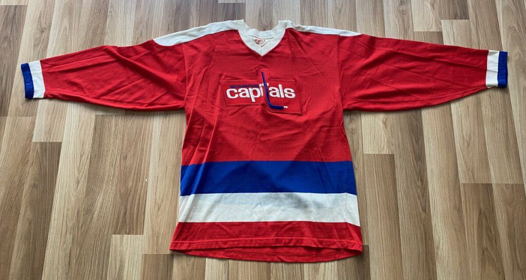
I have always aspired to make complete, scratch-made jerseys for most of my projects. However I recently got interested in the idea of working on existing vintage jerseys. I’m a big fan of Bill Henderson’s amazing baseball jersey restorations, so when I acquired this nice durene Washington Capitals replica jersey I thought it would be the perfect project to experiment on — albeit with much lower stakes than some of Bill’s museum-worthy pieces.
The jersey itself is an example of retail replica jerseys you could buy in the ’70s and early ’80s before they switched to polyester. It’s in nice condition, and is sized large, which are getting harder to find (jerseys from this era fit about one size smaller, so it’s more like a medium which is my size).
But, as you can see, the cresting leaves a lot to be desired. While the real Capitals jerseys from the ’70s featured all-sewn on cresting, this one takes a few shortcuts — the one-piece crest and lack of stars were all cost-cutting measures to work around the extremely detailed nature of this design. So, I decided I would turn this retail replica into something closer to what the team actually wore.
The Capitals wore durene jerseys from their inception in 1974 through to the end of the 1978-79 season. If you’re not familiar with durene, its a very special fabric. It combines rayon and cotton to produce a material that feels good in the hand, and wears extremely comfortably. It just feels good in your hands and feels much higher quality than the polyester that followed.
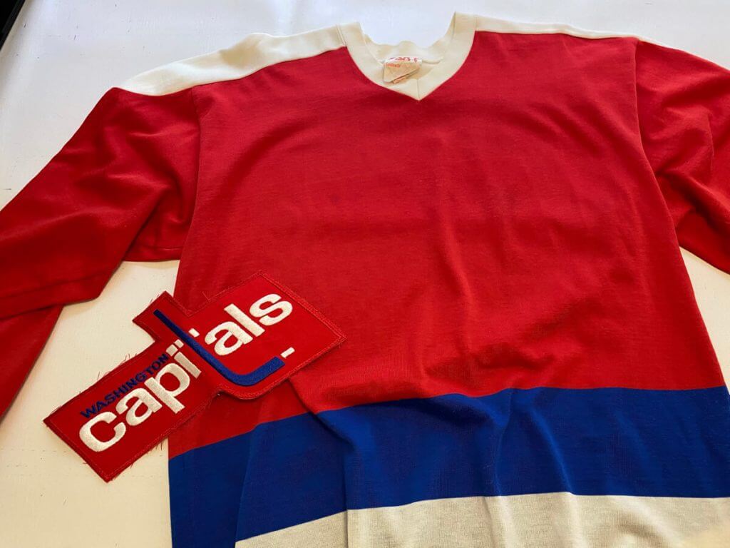
The first task was to remove the crest. Normally a new crest would cover the old one, but since I was planning on sewing all of the lettering separately, it needed to come off cleanly. I unstitched it and found it was held on for sewing with a few spots of glue. It was some kind of older style glue that resembled rubber cement, and I was able to remove the residue with some solvent. With a clean front, I was able to proceed with the project.
I created paper stencils of all of the cresting on my computer. I studied many photos of older caps jerseys to try to get everything as close as possible. For the most part I used trial and error, but the reality is there was a lot of variation on these jerseys even in one year as everything was hand positioned. There are more resources online than ever before, which greatly assist in getting things accurate. In particular auction websites and game worn collector sites provide high res images that provide detail than many of the old game photos don’t.
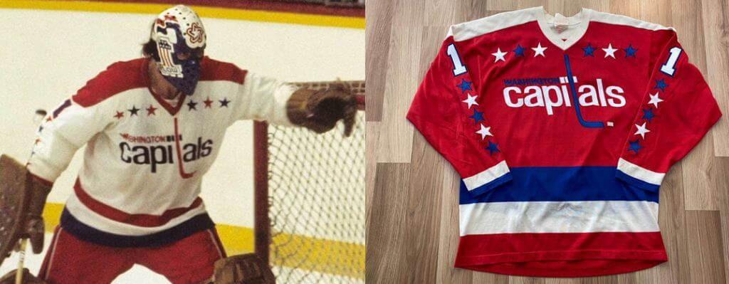
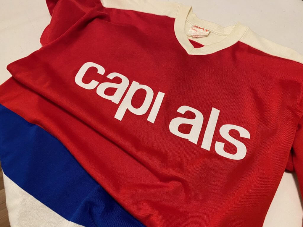
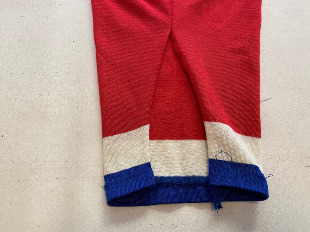
One thing I noticed in this era is the Capitals name is positioned higher than you would expect. This side-by-side comparison gives you an example, and is what I based the positioning on. By contrast, in the ’80s this positioning was quite a bit lower than what you would expect, below what you might consider the centerline of the jersey.
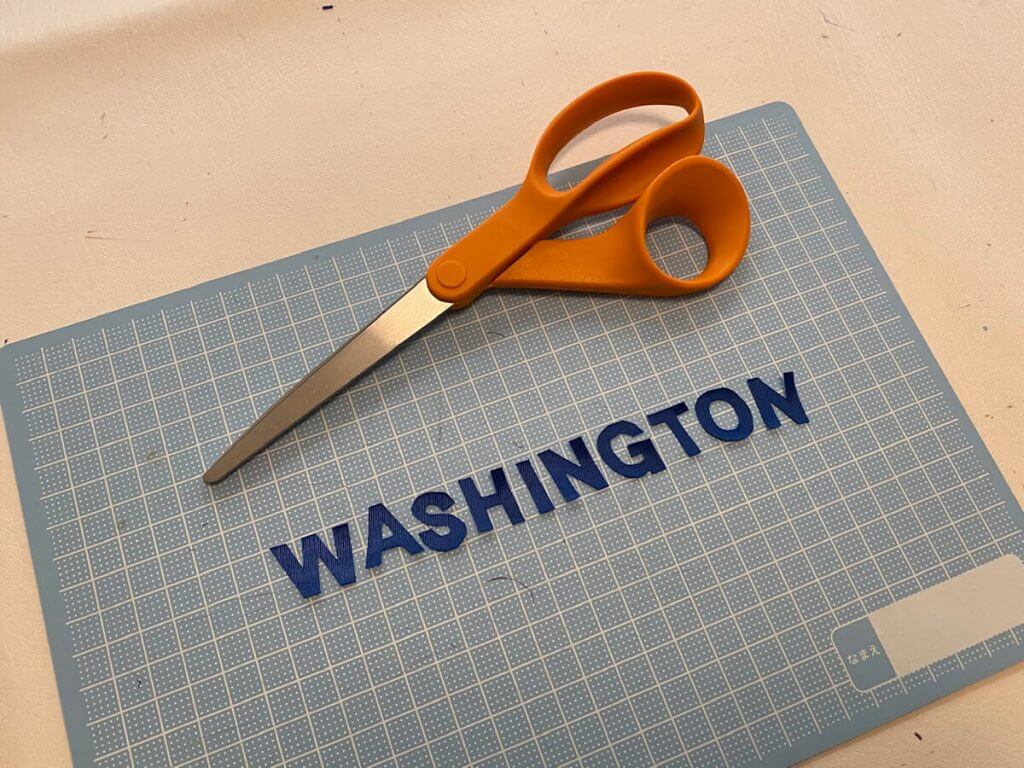
To get an idea of how much work was involved in this project, I had to create the large Capitals lettering, the tiny Washington letters, plus the stars on the front and sleeves. Once that was done I would also need to create the numbers and name plate.
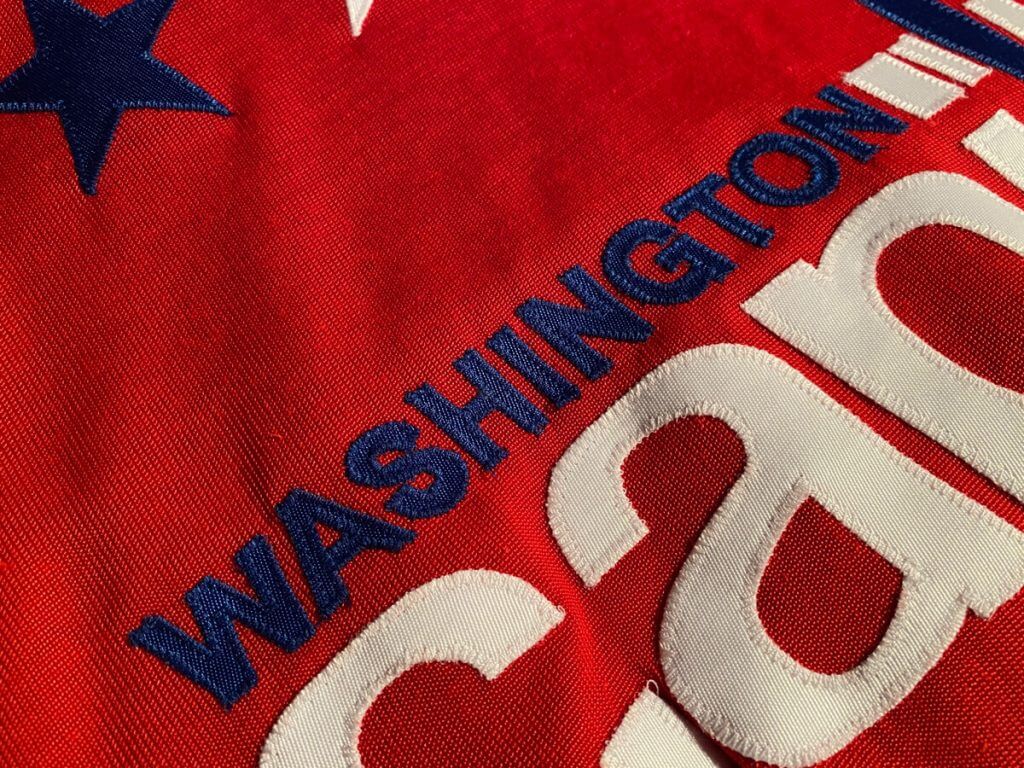
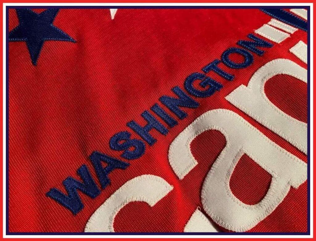
The small Washington letters proved to be extremely challenging. You can really only go so small with twill, and of course sewing all of it directly onto the jersey is difficult. I wasn’t sure I’d be able to do it but it turned out well. All of the tiny letters were hand-cut and sewn directly onto the jersey.
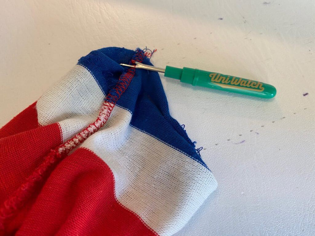
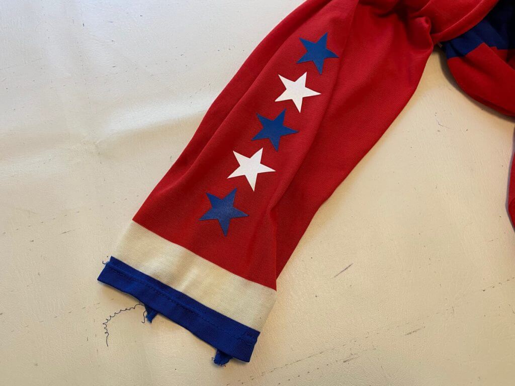
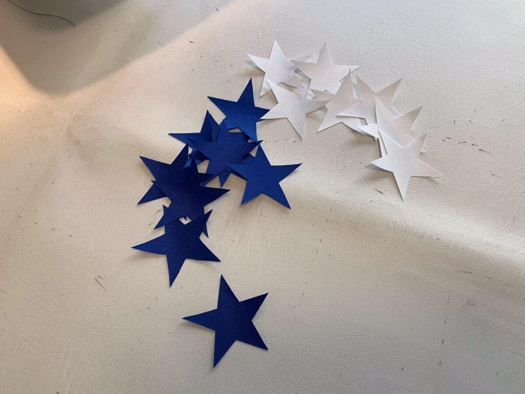
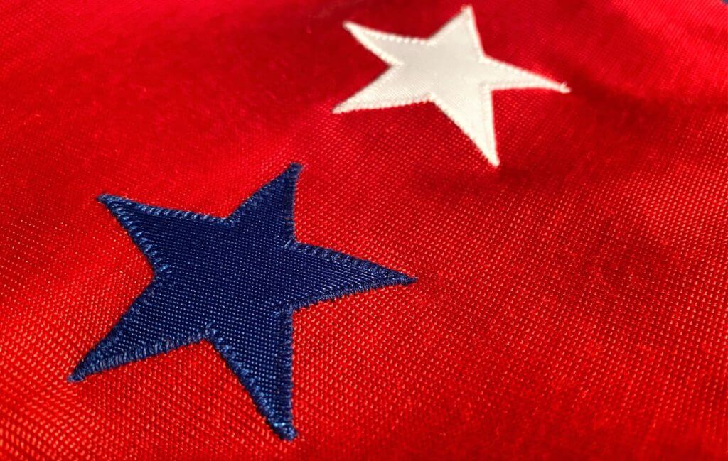
The stars of course are an integral part of the design. As with all of the pieces, these were hand cut and positioned based on photo research. One problem: I just use a regular home sewing machine, which can’t sew appliques onto a narrow sleeve. The base of the machine is too wide. The only solution was to open up the sleeve a bit with my Uni Watch seam ripper, which can create problems as sometimes you lose a lot of material in the process. Fortunately the sleeves were loosely sewn with a thick thread, so it was easy to open them up a bit to add the stars. I sewed the sleeves back up after the stars were added.
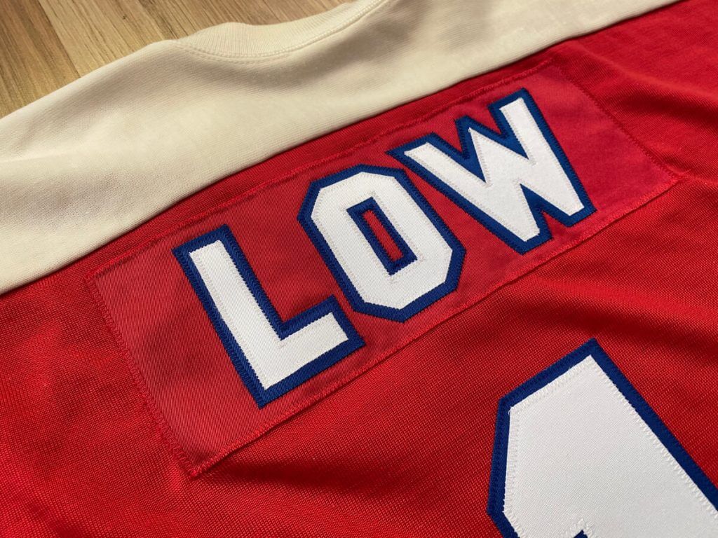
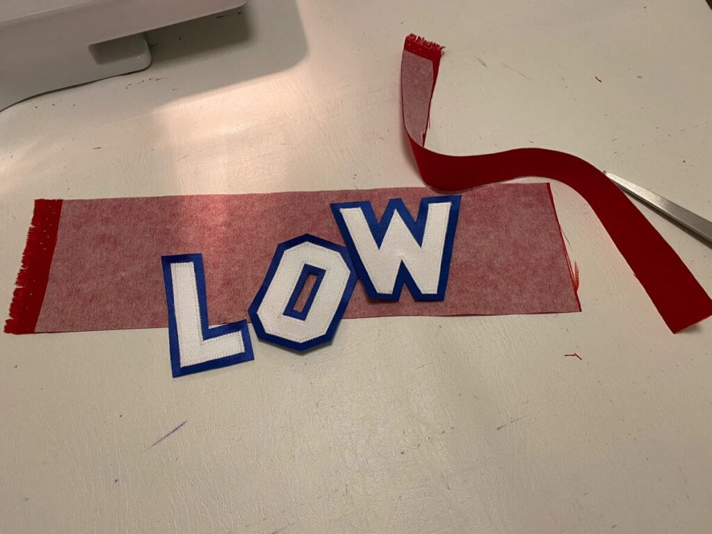
Once everything was done, it was time to do the numbers and name. I considered a few different players, but ultimately chose goalie Ron Low, as I love all things goaltending related, plus he was known for his great mask. After all of the small detail work, it was a bit of a relief to have a simple number 1 and short name to sew.
The Capitals only added nameplates on the red jerseys for the 1976-77 season, so I wanted to make sure I picked a player who would have worn the jersey in this season.
A big problem that is common to jersey cresting is getting the correct nameplate material. I contacted some game worn jersey collectors to confirm what nameplate material was used by the Caps during this era. Durene fabric is no longer available, so getting the exact matching stuff would not be possible. A couple of collectors confirmed the Caps used twill nameplates, which was common in the durene era and made things easy for me. I used uncoated twill backed with a stabilizer, and it wound up looking really good. Using modern coated twill for nameplates usually results in unsatisfactory appearance, but the uncoated stuff resembles the materials they used to use.
The Caps also used a really odd name font during this time. Most font sets will design wide letters like a W to fit in better with the rest of the letters, but in this case the W was really wide. I really loved this bold style and was able to replicate the name using images of each of the letter from various jersey photos.
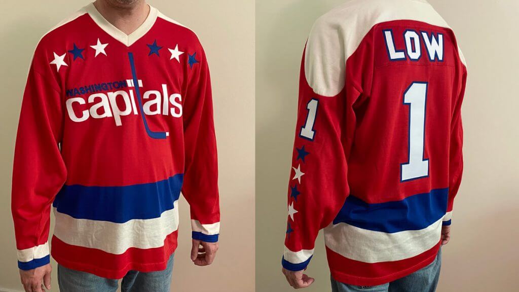
The final jersey wound up looking really good. The durene fabric does most of the work in making this a nice-feeling jersey, but all of the small details add up to make it look really great. This might be the most accurate ’70s Caps jersey short of a real game-worn example. I enjoyed the project but suspect this will be the only all-sewn Caps jersey I will ever do!
Wow! Tremendous job, as always, Wafflebored! I was never a Capitals fan (nor, as an Islanders fan, can I ever be), but I always LOVED that first generation red jersey … and learned to hate it, too ;). But seriously, that’s another incredible DIY project from the one and only Wafflebored. Thanks for sharing and allowing me to bring to the readers in August!
Readers? What do you think?
Field of Dreams Uni Update
As you’re all probably (hopefully) aware, last Thursday, the Yankees and White Sox revealed the uniforms they will be wearing for this Thursday night’s “Field of Dreams” game (if you missed it, I covered it here. What I didn’t know at the time (and haven’t seen covered anywhere else), because I hadn’t seen any hi-res photos, is that both teams will be wearing jerseys in Nike’s new template. If you’re not familiar with what that entails, Paul had a really good article a few months back on the new template. I recommend giving that a read if you didn’t see it at the time (or just need a refresher).
Over the weekend I happened on this article, which contains 10 good hi-res looks at the Field of Dreams uniforms jerseys and caps. Like I said, I didn’t notice it at first, but these are definitely in the new template, so the game Thursday night will mark the first time any MLB clubs will wear the new template in a regular season game (if you read Paul’s article, you’ll note the Royals wore the jerseys in a spring training game, but the no team has yet worn the new jerseys in season).
Here’s a couple photos I found showing better looks at the new throwbacks:
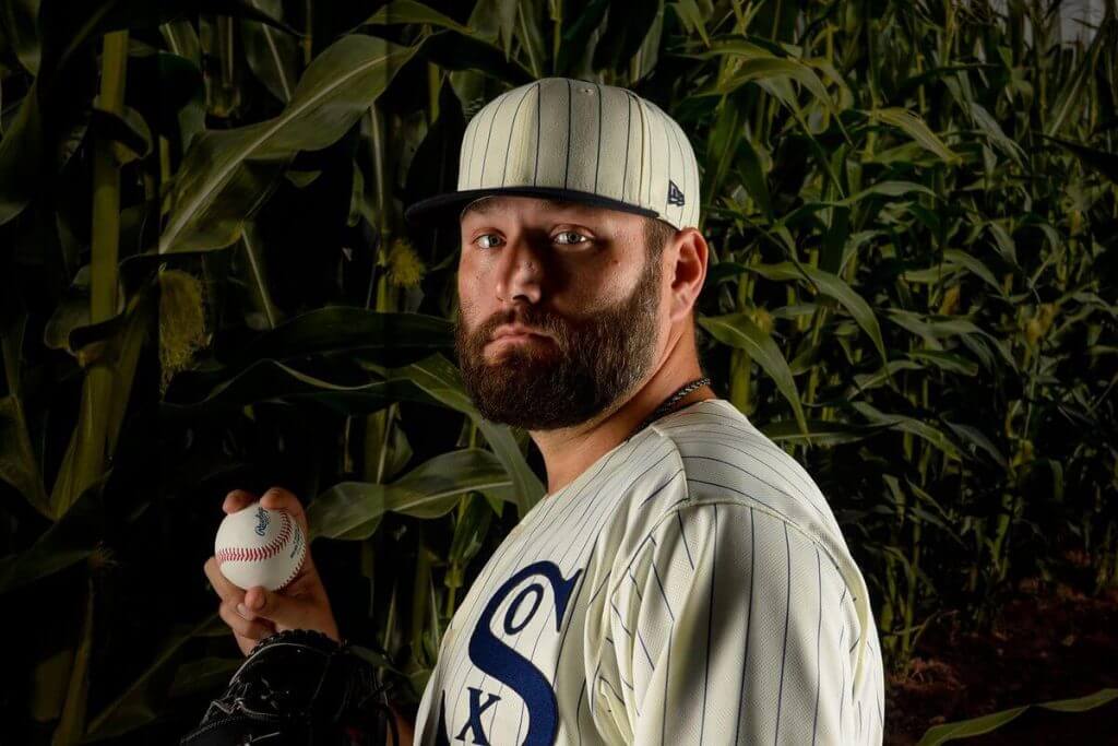
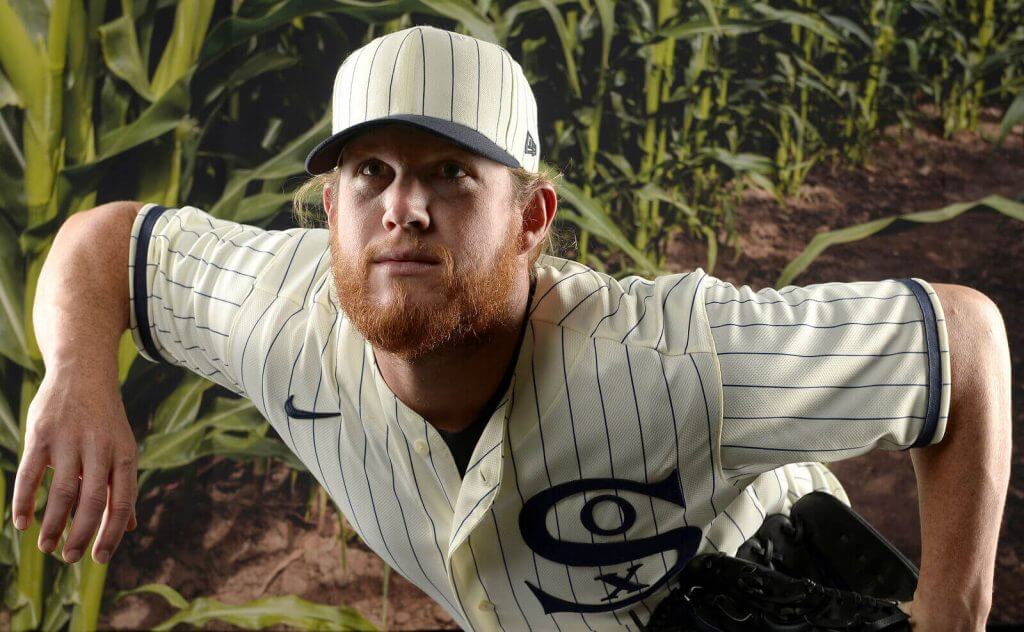
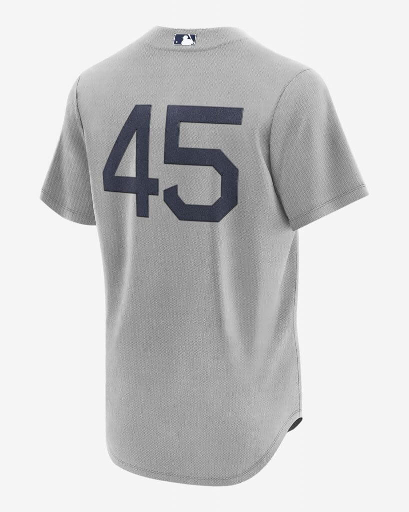
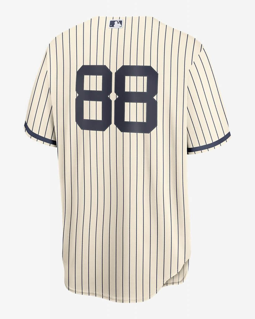
The second photo gives a really good look at the Nike template. I can’t tell (yet) whether the numbers on the back of either team’s jersey will be in the “mesh” style (we’ll probably have to wait for the game itself) but the tell-tale sleeve pattern and placket are both present. If you looked at the article I linked to above, you might have been able to discern a faint sublimated pattern present on the Yankees jerseys (I can’t tell if one is there for the ChiSox).
Several readers also pointed out that both teams are using #OB (which didn’t exist in 1919) in the McAuliffe font (several teams throughout the years have used this font, but only the Red Sox still do). Nice catch to those who spotted!
The other thing I noticed about the new Nike jersey template — the Yankees normally wear raglan sleeves (which is very noticeable on their iconic home jersey), not so much so on the road grays. But the Nike template (at least thus far) shows the traditional cut, where sleeves are sewn onto the jersey at the shoulder. The raglan sleeve is a sleeve that extends in one piece fully to the collar, leaving a diagonal seam from underarm to collarbone. I am wondering if this new Nike template will require the Yankees (and other teams who wear the raglan pattern) to adapt to the new style. The White Sox do not wear a raglan sleeve, so it’s not such a dramatic difference from their current cut.
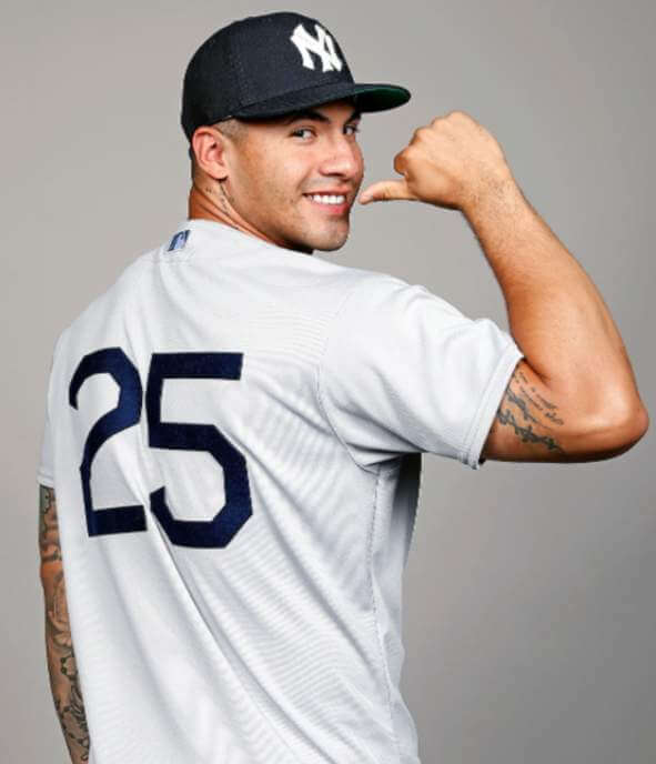
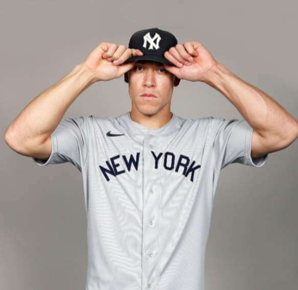
You can get some idea of what the teams will be wearing by looking at these Authentic jerseys:
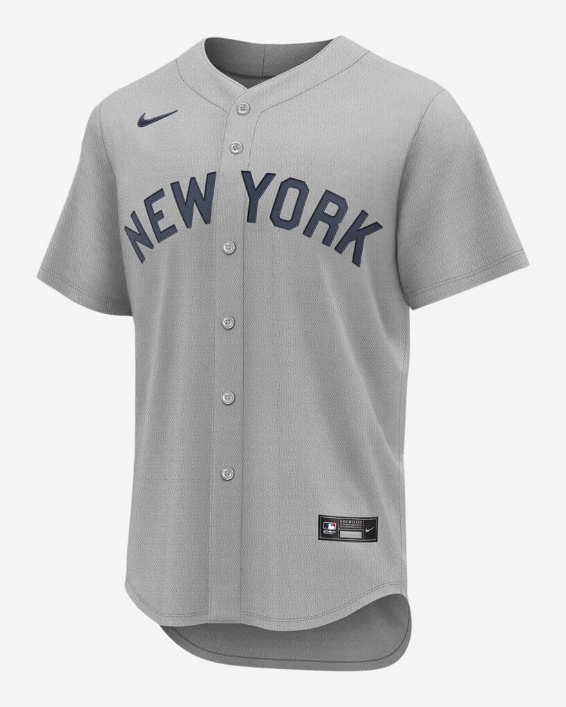
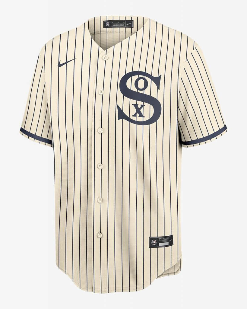
One final thought: in Paul’s review of the Nike template, he noticed teams with pinstripes have that pattern stop just before the hem, but it appears as though the White Sox’ jersey will have pinstripes that extend to the to the hem. I’m wondering if this is a kink Nike worked out or if the Rail Riders (the pinstriped team pictured in Paul’s article) had a different version of the template.
So — we’ll get our first on-field, regular-season look at the new template this Thursday. I’m curious if the Yanks will get a raglan sleeve cut when they wear the new jerseys next season, or if teams who have this pattern will now be forced into wearing the “regular” cut.

Guess The Game…
from the scoreboard
Today’s scoreboard comes from Kasey Ignarski.
It might be difficult to figure out, as Kasey writes,
HI Phil. I have a scoreboard picture for you. Here is a picture I took of the Wrigley Scoreboard before the game on [redacted]. This was a Sunday night game, that’s why the clock is 6:35. It had rained really hard and just stopped a little before I took this picture and got this great picture of a rainbow ending at the scoreboard. Hope you like this picture and it has enough clues as to figure out the game.
The premise of the game (GTGFTS) is simple: I’ll post a scoreboard and you guys simply identify the game depicted. In the past, I don’t know if I’ve ever completely stumped you (some are easier than others).
Here’s the Scoreboard. In the comments below, try to identify the game (date & location, as well as final score). If anything noteworthy occurred during the game, please add that in (and if you were AT the game, well bonus points for you!):
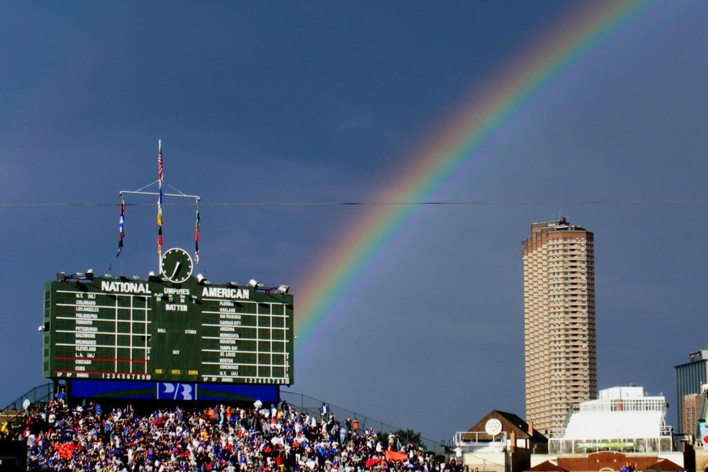
Please continue sending these in! You’re welcome to send me any scoreboard photos (with answers please), and I’ll keep running them.
Click to enlarge
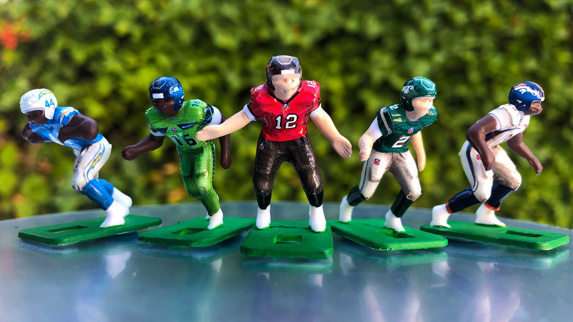
Bulletin reminder: Paul here. In case you missed it on Friday, my latest piece for Bulletin is an exclusive about a new product that’s going to revolutionize the uniforms in the classic game Electric Football. It’s a really fun story — you can see it on my Bulletin page.
Meanwhile, as long as we’re talking about football-themed games: In case you haven’t already seen, our latest Uni Watch pin is a salute to Tecmo Bowl, complete with 8-bit graphics (quit to enlarge):
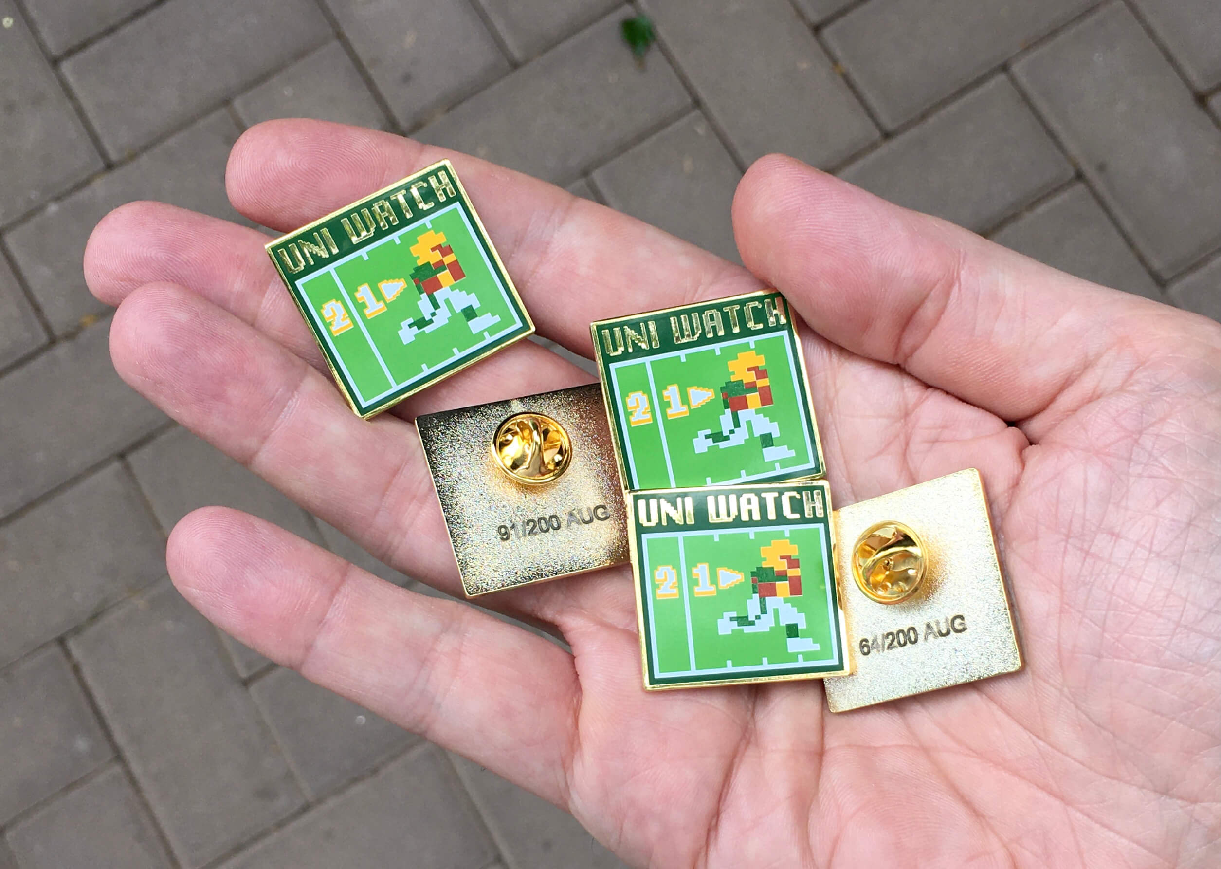
This is a numbered edition of 200 pins. As of this morning, there were about 50 remaining. You can order yours here.
That’s it from me. Now back to Phil!
The Ticker
By Jamie Rathjen

Baseball News: The Phillies retired P Roy Halliday’s No. 34 yesterday and wore a sleeve patch for the occasion (from multiple readers). … The White Sox have a new memorial sleeve patch for Mertyl Reinsdorf, the wife of team chairman Jerry Reinsdorf (thanks, Phil). … Brett Phillips was wearing a double flap helmet yesterday. The odd part is that he’s a left handed (not switch) hitter (from Andrew Cosentino.

Football News: North Carolina has new front helmet bumpers for this season. This is apparently a change from a required ACC logo (from multiple readers). … Reader Wade Heidt has some CFL items for us, starting with the newly-renamed Edmonton Elks, who have a new field design, antler-themed entrance tunnel, mascot, and a helmet memorial decal for locker room attendant Joey Moss. … The Ottawa Redblacks now have a golden ball to give to players who get interceptions. … Toronto Argonauts coaches were wearing the previous primary logo, which was replaced and became a secondary logo last year. … The Calgary Stampeders wore their 75th anniversary helmet, which does have black trim, with their retro-style uniforms, which don’t. Thanks to everyone else who also sent in one or more of those items. … Division II Indiana University of Pennsylvania has a new home uniform (from Zane Heiple).

Hockey News: A men’s beer league team in Texas is called the Texas Dreadnoughts because its advertiser is actually the foundation that maintains the U.S.S. Texas, the last remaining World War I dreadnought (from Duke Soto).

Basketball News: NBA numerologist Etienne Catalan has more new and changed player numbers. … The NBA 75th anniversary logo appeared on the court at Summer League games (from multiple readers).

Soccer News: In the Netherlands, Ajax’s men’s team wore pride-themed warmup shirts on Saturday. … New second shirt for Real Madrid. … Two new shirts for the Scottish women’s team Glasgow City. … New third shirts for Germany’s Hertha BSC (from Ed Żelaski) and Hamburger SV. … The Swedish women’s team FC Rosengård look like they’re going to wear rainbow numbers and a “You Are Included” hashtag in the usual ad space. … Australia’s Western Sydney Wanderers have a 10th-season crest for the next A-League and W-League seasons. … No picture, but the most recent episode of the show Ted Lasso had players from the show’s AFC Richmond covering their shirt ad, a fictional Middle Eastern airline, with black tape in a protest of the airline’s parent company (from Thomas Juettner).

Olympics News: Thousands of pins are created for each Olympics, and there’s a large collectors’ scene (from Jason Hillyer). … The Japan House in London has a new exhibit on the 1964 Summer Olympics (from Jeremy Brahm).

Grab Bag: British Columbia’s indoor lacrosse Western Lacrosse Association held some scrimmages for new draft picks and recently-graduated junior players on Saturday. Everyone got one of three jerseys in white, black, or gold (from Wade Heidt). … Australia’s Super Netball’s New South Wales Swifts wore their original yellow and blue color scheme, instead of red and blue, twice last week. … Japanese men’s volleyball’s Sakai Blazers have a new third kit (from Jeremy Brahm). … Also from Jeremy: A Japanese artist made baseball- and tennis-playing astronauts.
Uni Tweet of the Day
Back when uni unveils weren’t a thing — and you found out when your copy of SI arrived in your mailbox. Also, it’s hard to imagine the Dolphins actually wore a jersey in that shade…
#DolphinsDidYouKnow OTD in 1966 @SInow featured the #Dolphins on their cover for the first time. LB Frank Emanuel, the team's 2nd round pick, was chosen to do the honors. It was the first national reveal of the team's new uniforms. pic.twitter.com/q3VjUJjo88
— Columnist, Phins com (@PhinsChris) August 8, 2021
And finally… that’s it for today — big thanks to Wafflebored for sharing that wonderful Caps DIY sweater! He just keeps getting better and better!
I’m back at home base again, but Friday night yielded one of the reddest sunsets I’ve seen in a long time — unfortunately the photo below doesn’t do it justice, but it was almost surreal.

Everyone have a good Monday and I’ll catch you fine folks here tomorrow.
Peace,
PH
I was never a big fan of those Caps unis growing up. They were a bit too gaudy for my taste. But absolutely phenomenal work by Wafflebored. I always enjoy reading about people doing things that I cannot in any way fathom myself ever being able to do.
Beautiful work, Waffleboard! Thanks for sharing the detailed report and photos.
I can’t hear anything about Olympic pins and not think of the Simpsons episode where I believe Lisa makes it a point to collect a bunch of them! I think it came out around the Vancouver Olympics.
Brett Phillips has been wearing a double flap helmet all year. When it was brought up on Reddit a few months ago, someone said it was because it fits on his head better, but I don’t know where Phillips said this or if it was just speculation.
A 3-letter surname with a single-digit number seems like a good call after applying all those other individual elements on the Capitals jersey. Stellar work by Wafflebored as always!
It appears that this is the merciful end to those pinstripe-disrupting side panels on MLB jerseys. If I’m seeing things right then I am very pleased. Given that baseball jerseys are full button front, they ought to go back to a single-piece body that wraps around and is stitched at the shoulders or that wraps over and is stitched at the sides. Not two pieces stitched at sides and shoulders. But what do I know about how seams affect elite performances?
There’s no way to construct a shirt this way and have pinstripes be fully vertical on the front and back. If the pinstripes are vertical on the back, they’ll make a V shape on the front. If they’re vertical on one side of the front, they’ll be diagonal on the other side and on the back. Also, you’d have to start with a larger bit of fabric and you’d have more wastage.
But I’m with you when it comes to eliminating underarm side panels.
Guess the scoreboard — I’m going to go with June 22, 2008, Cubs vs. White Sox.
“Florida” is on the scoreboard, so it has to be pre-2012. They were playing Oakland, a rare interleague matchup. Just had to go back a couple years to find a time those two played on the same night of a Cubs night game. Confirmed the weather, as well!
Beautiful work by Wafflebored as always!
Phil, based on the jerseys worn by the players in the promotional photos for the Field of Dreams Game, the jerseys look to be fairly “standard” to me — they didn’t look like the new Nike template (MLB logo above the headspoon stitching on Gleyber Torres’s jersey) unless I’m missing something?
The jerseys look standard to my eye as well – similar to the Majestic/Nike “Turn Back the Clock” jerseys of the Flex Base era, which use the Flex Base material cut in the double-knit style. The differences in cut (and it looks like, the material) with the new Nike template examples (Royals, SWB) are much more apparent, compared to this.
Can’t quickly find a photo, but it would be a closer look.
Great work Wafflebored on the Capitals jersey! Looks great. Lots of sewing on this one. Good thing Mr. Low has a short last name and only wore a one-digit number.
Nice looking jersey, Wafflebored!
The Capitals are a team that Got It right from the start …well, the jerseys anyway.
I read that after the away-game white pants were quickly abandoned, the Caps went mono-red for a brief time on the road…any pics?
The picture of the authentic Yankees Field of Dreams jersey doesn’t have that “sublimated” pattern, but it does have an almost woven mesh look to the material. I think the jerseys in those shots of Torres and Judge picked up a moiré effect in however many rounds of uploading and cropping and JPEG re-compression and whatnot they’ve been through. (And if those came directly from somebody’s PR department, *yikes*.)
That’s definitely a moiré or aliasing artifact.
This. It happens often when you take a picture of a picture.
Yes, looks more like a polarized pattern to me. To me, the Yankees (and nearly all of MLB) is missing out by not having a heather gray look on these. Even if it’s sublimated, the flannel look here would be the topper.
What is #OB? (In the Field of Dreams piece).
Number on back. Baseball players did not have uniform numbers prior to 1929.
Thanks!
I wonder why they didn’t keep it authentic and leave the numbers off those jerseys? The Jackie Robinson tribute where everybody wears #42 has proven that a baseball game doesn’t require players to be numbered.
Numbers really do make it easier to quickly figure out who’s who, especially when you’re watching highlights after the fact, rather than the full game (where you have more time to process who everybody is). Trying to watch a highlights package of a team you’re not super familiar with when everyone is wearing 42 (or nothing at all) is a disaster.
Re: the color shade of the Dolphins jersey, Year One.
Any number of factors could have led to the representation being more blue than aqua, whether it is the development of the film or the way the pic was composed for printing.
I was thinking the same thing. In fact, that Dolphins jersey looked almost “Houston Oiler blue”.
Before I saw the helmet, I thought that was a picture of a Buffalo Bill.
My guess has been that someone at Sports Illustrated was assuming a blue-and-red color scheme was intended so developed the photo to bring out those hues rather than the correct aqua and orange (even though, as I recall, the story itself described the jersey color as aqua and quoted a team official as saying the players charging down the field would resemble waves crashing on the beach). I well remember as a kid believing for the next year or so that the Dolphins were a blue-and-red team and extremely close in uni design to the Buffalo Bills, and I only very gradually figured out they were actually aqua and orange.
I looked up the article and I see I was somewhat misremembering the details but wasn’t too far off. The story itself opens with a description of the team’s “bright new blue-and-white uniforms laced with orange trim.” I’m surprised to see I still perceived the cover photo to be depicting red instead of orange and went a long time before realizing the trim was indeed actually orange. But one can see in the article the confusion about blue vs. aqua among the SI staffers. Here’s the full passage…
“Swinging around end in their bright new blue-and-white uniforms laced with orange trim, the Miami Dolphins actually did give an impression of tropical water surging around a reef — which was highly gratifying to the owners of the American Football League’s newest team, because they had hoped for some such effect out of the color scheme. Then, suddenly, a tall linebacker wearing the number 50 on his shirt lowered his shoulder and barged directly into the current. Down went the blockers, defenders, the ballcarrier, an equipment manager and an assistant coach, and in an instant all that blue-white-and-orange wave looked like a collapsed Howard Johnson’s.”
Beautiful work once again by the legendary Wafflebored. The Caps would do well to go back to this uni design. The only complaint I have ever had with it is the white shoulder yoke on the red sweater. It always seemed gaudy and unnecessary to me. Straight red, perhaps with stars going all the way up to the collar, would look cleaner to me. The red shoulder yoke on the white sweater never bothered me.
Good on Edmonton for just going for it with their new name and identity. Looking forward to how it gets fine-tuned.
A little mystery around the mascots for the Elks still. We have the the new mascot Spike as seen in the Ticker. What about the 2 old mascots Nanook and Punter? They are still listed as the team mascots on their website. Have they been fired? Did they punt the ornery walking football Punter?
link
I’m guessing Nanook might not have survived the rename.
I got to say I disagree with you about these filed of dreams jerseys being the new Nike template. They don’t have sleeve cuffs or the narrower headspoon and neck cuff (which you alluded to) shown in Paul’s earlier article. Now these field of dreams jerseys don’t have the vent material down the sides or at the rear hemline that the current jerseys do, but are all cool base material with otherwise the current tailoring. Almost like current replica jerseys. Yankees current road jerseys have sleeve cuffs, so that is a bad comparison, but compare the Yanks field of dreams jerseys with the current Dodgers road alternates:
link
Is it just me, or do those McAuliffe Numbers look off?
link
It does look a little off to me, as if they were trying to make the numbers a bit taller (perhaps the 8″ of most teams; the standard McAuliffe digits are slightly shorter than that) while sticking to a single layer.
Why is Durene fabric no longer available? Is it just no longer made or (thinking nefariously) was it pulled from the market for causing cancer?
Stop the presses…Ebbets Field Flannels seems to be able to source it.
link
The White Sox have been wearing those memorial patches for weeks.
Excellent work Wafflebored – cutting out twill applications by hand is hard work! Wafflebored, I get the impression from your work that you prefer traditional techniques, but have you ever wondered about getting a computer-controlled cutter like the Cricut Maker? If you’re not familiar with these, you feed them vector graphics and your material on a mat and it cuts them out for you, neat as you like. I have used one successfully to cut twill numbers and NOBs, even modern authentic jersey NOBs with the tricky very thin colour edging. Note: for those that aren’t aware, traditional multi layer twill applications are done by the edging colour on the bottom and the inner colour on top giving a double thickness. On modern applications, instead of this the outer colour is a very thin strip of twill on top of the inner colour. This means most of the letter is single thickness, saving weight. It’s hard to tell with NOBs but on #OBs (or team graphics) you can see the tell-tale double row of stitching on the edging rather than the single row on each layer.
I actually thought the numbers were another proprietary typeface that perhaps was inspired by the McAuliffe font.