[Editor’s Note: Paul is on his annual August break from the site. Deputy editor Phil Hecken is in charge from now through the end of the month, although Paul may be popping up here occasionally.]
By Phil Hecken
Follow @PhilHecken
Good Friday morning, Uni Watch nation. We made it. Got a big post today, so be sure to read through (this includes a link to Paul’s latest Bulletin piece, which I think you’ll love). If you’re wondering why it’s a bit later (8:30) than usual, that’s to ensure that the link for Paul’s new article is live.
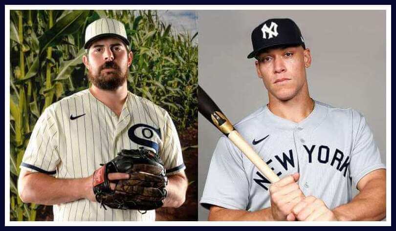
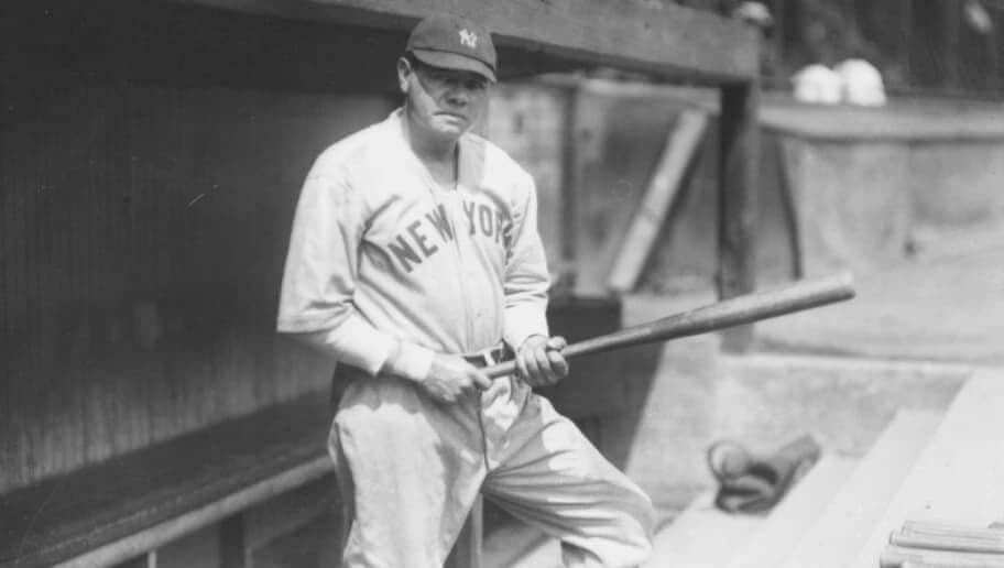
I had one final Olympics-related post all ready for your lede today (but it’s now a sub-lede), because yesterday morning, the Yankees and White Sox unveiled the “uniforms” they will be wearing for their “Field of Dreams” game to be played this Thursday, August 12th, in Dyersville, Iowa. In case you’re not familiar with that location, that was the real-life setting for the movie, Field of Dreams, a fantastic movie with some of the most quotable lines ever. If you’re not familiar with the movie, I urge you to rent download it and watch it if ever you need a good escape from everyday life. Or not.
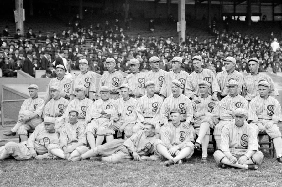
Anyhoo, the Yankees and White Sox will be playing a game in a field specifically constructed to try to replicate the corn field field from the movie. To play along with the real-life fantasy, both the Yanks and ChiSox will wear 1919 throwback uniforms for the occasion. 1919, if you recall, was the year of the infamous “Black Sox” scandal, in which gamblers conspired with players to throw the 1919 World Series. (As an aside, “Eight Men Out” is a pretty good movie which pretty much gets all the facts right … with Hollywood license, of course … in depicting that World Series. You may want to view that one if you haven’t seen it too.)
Because there wasn’t much “flair” or fashion back in baseball in the nineteen-teens, the uniforms the teams will be wearing are both staid, but beautiful. The Yankees have been designated the road team, so they’ll wear the 1919 Yankees road unis. The White Sox will sport the “alternate” pinstriped home uniforms of the 1919 squad. How did those unis look?
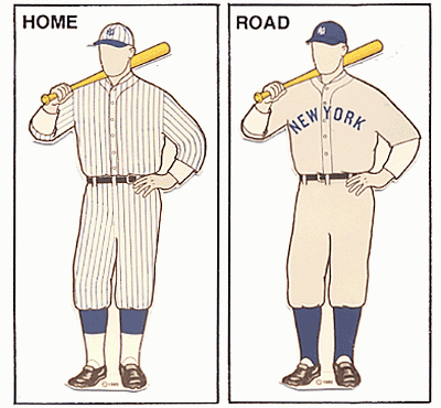
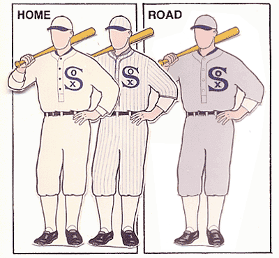
You’ll note in the Marc Okkonen graphic, those Chicago alternate pinstriped unis were depicted with a navy headspoon, but the photographic evidence shows them simply with a plain front placket. Also, there doesn’t appear to be any hem striping.
Here’s what the teams will be wearing for the game:
Yankees
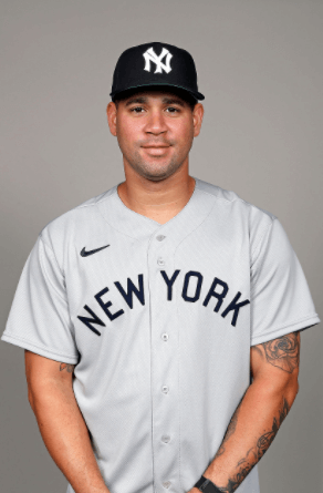
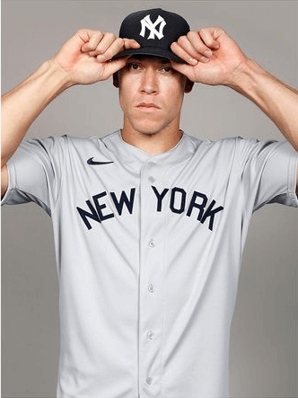
The Yankees’ jerseys are gray with “New York” in midnight navy blue lettering radially arched across the chest. Like the original, there is no sleeve stripe or outlined “New York” like the team’s current road unis. The Yanks caps will have a slightly different version of the current interlocking “NY.” And there’s also the fucking swoosh, which obviously the originals didn’t have. Disappointingly (and this applies to the White Sox as well), all promotional photos show the cap and jersey only, but not pants, and more importantly, hosiery. I wonder why…
White Sox

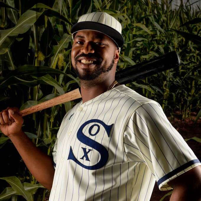
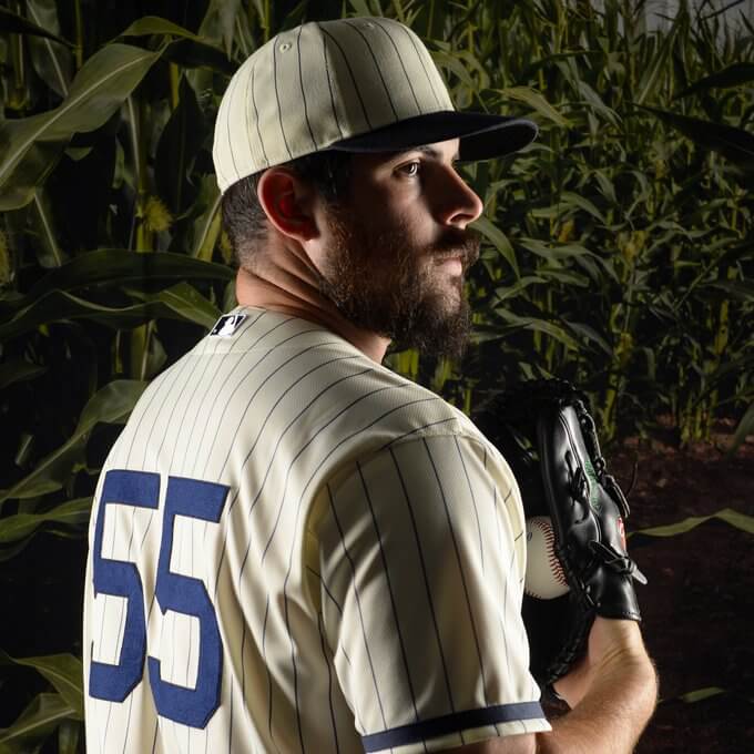

The White Sox jerseys are white with navy blue pinstripes, with a vintage bold “SOX” monogram on the left side of the chest. You’ll note the sleeves have a navy blue stripe at the end of the sleeve (which I’m not positive was present on the originals). The White Sox’ caps mimic the jerseys: white with navy pinstripes, and without any cap logo. The team is scheduled to wear a different cap in batting practice which will feature the SOX logo.
Obviously, both teams will wear “modern” uniform cuts, but it seems Nike has gotten most of the details for the uniforms correct. It’s interesting how the teams today don’t look that much different from that which they wore 102 years ago. The White Sox uniform for this game is based on what was depicted in the movie, so that at least explains the sleeve stripe. As you can see from the above photos, both teams will be wearing uniform numbers on the back, which is an anachronism — neither team had uni numbers in 1919.
As you guys know, I love throwbacks, so I’m excited to see these on the field of play. More importantly, I’m excited to see the pants and hosiery — and how many players will go high cuffed for the game. I *hope* Stance doesn’t give the White Sox anything other than, ya know, actual white socks, and the Yankees better be in solid midnight navy socks. It’s probably expecting too much for actual stirrups — and back then, the stirrup loop was worn so low, the sanitary sock beneath was often barely or not at all visible. So, plain solid socks for each team will be fine.
The game will be aired on national TV (FOX) at 6:00 (central) this coming Thursday, and apparently Fox will be having some fun with the broadcast. I’ll have a full review of the game next Friday.
Finally, if you’re interested in the “Field of Dreams” field facts, this article has a good rundown (you need to scroll down, so I’m just reposting them here):
Dimensions: 335 feet down the lines; 380 feet to the alleys; and 400 feet to dead center.
Nods to Old Comiskey Park: The bullpens, located behind the 12-foot high padded wall in center field, are designed to resemble old Comiskey Park.
Building the Ballpark Has Required: The moving of 30,000 cubic yards of material. The installation of 4,000 tons of sand and 2,000 tons of pea gravel under the Bluegrass blend (legend, blue note and bolt cultivars).
A Game in a Cornfield: A “corn maze” adorned with MLB’s iconic silhouetted batter logo is located beyond the right field fence, near the Field of Dreams Movie Site – part of an immersive fan experience. Iowa-based Musco Lighting is providing a first-of-its-kind LED system that will also spotlight much of the 159 acres of corn that surround the ballpark.The right field fence has a unique design that accentuates the corn through a fine mesh seven-foot high green chain link fence with offset vertical support posts – meaning the posts will actually be in the corn. The stalks that produce field corn will grow 10-12 feet high. A manual scoreboard will be in the corn just behind the right field fence.
What do you guys think of the unif..er, caps and jerseys? How about creating a field in the corn? Love to hear your thoughts.
Olympic Wrestling and the Singlet
This was originally going to be today’s lede, but instead (because of the ChiSox/Yankees uni news) I’m running it here, as it’s the final look at Olympic attire for the final week of the 2020/1 Tokyo Olympics. I’m pleased to introduce reader Ross Bendik, who answered my call for Olympic Correspondents back in July. He has a really fun piece on a sport many of us were forced to play participated in back in middle school, wrestling, but all the wrestlers in the Olympics are the cream of the crop. Here’s Ross, and enjoy!
“Am I really going to wear a singlet?”
by Ross Bendik
That was the last question I had to answer before I committed to joining my high school’s wrestling team in the early 90s. I was a self-conscious freshman and wearing a tight, one-piece uniform did not seem like an easy path to popularity. Not that wrestling was the most popular sport in my high school — few of my classmates knew much about the sport, beyond the uniform. It’s probably the sport’s most identifiable component — see the icon ESPN uses for wrestling on their mobile app – and the most ridiculed.
Given that, it is no surprise that the singlet has been under fire for decades as a barrier to the growth of our beloved sport. Some feel we would see greater youth participation if we had a more modern uniform. Others feel wrestling is losing merchandizing dollars on replica or throwback uniform sales to fans. The two-piece uniform, compression shirts and shorts, started making an appearance in NCAA wrestling in 2005. In 2019, the NCAA approved fight shorts and the anti-singlet momentum continues to grow.
Regardless of the momentum, when the greatest male and female wrestlers in the world took to the mat in the Tokyo Olympics over the past week, they wore singlets. Let’s take a quick look at the history of Olympic singlets and the current rules that dictate the styles worn on the mat.
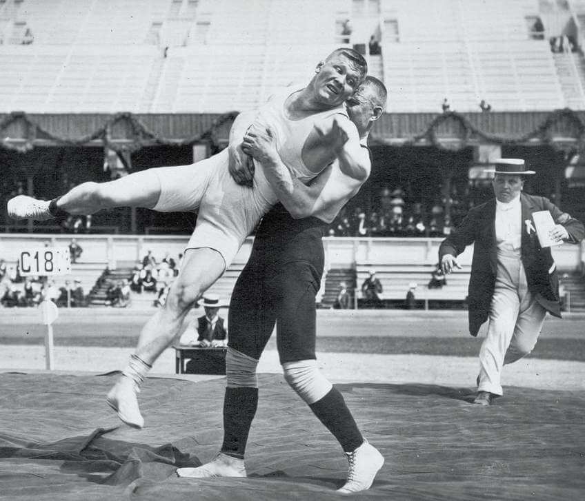
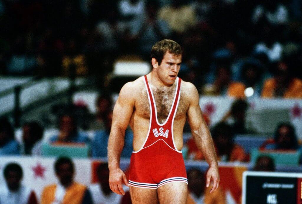
After combing through the photo archives of the National Wrestling Hall of Fame, the singlet appears to make its Olympic debut in 1912. In the prior modern Olympics, most wrestlers wore tight fitting t-shirts and shorts, which is ironically the style that the sport is slowly moving back to. This debut is almost 60 years before singlets became the mandated style of collegiate wrestling. Dan Gable, one of the icons of the sport of wrestling, did not wear a singlet while he competed at Iowa State, but did wear a singlet when he took gold in the 1972 Munich Olympics.
From a style perspective, the style of the singlets (fabric excluded) worn in Stockholm in 1912, are not that different than the style of the singlets worn on the mats this summer in Tokyo. However, there has been a range in styles in the century between Stockholm and Tokyo.
Singlets became consistently smaller throughout the following Olympics. The inseams grew shorter and the torsos became more narrow, less resembling a tank top. This trend continued in to the 1980s, when singlets began to look more like a pair of short shorts with suspenders than the modern-day singlet. For my generation, this was the first style of singlet that many of us saw. After the 80s, inseams reversed trend began to increase again and the upper half began to look more like a tight tank top. Singlets hit their modern cut and proportions at the 2004 Olympics in Greece, coinciding with the introduction of women’s Olympic wrestling.
United World Wrestling (UWW) provides the guidelines for Olympic singlets. The guidelines outline the maximum length of necklines and arm cuts and minimum length of inseams. These maximum measurements prevent the return of the low-cut singleton the Olympic stage. The guidelines also require the three digit National Olympic Committee (NOC) country code and wrestler last name to be printed on the back of the singlet. That a rare combination of NOC and NOB for those who get it™. However, the guideline that might have biggest impact on the look of singlets is the Color Marking requirements
Wrestling scoring distinguishes wrestlers by color. One wrestler is blue, one wrestler is red. To facilitate this scoring system, Olympic singlets are required to have three red or blue markings, or more specifically, Pantone 2347C and Pantone 299C. These three marking consist of one 7 centimeter band on each leg and one 7 centimeter band on the back below the name and country. The markings are “uninterrupted sport-specific design components which must remain untouched from any graphic, logo or third party identification.”
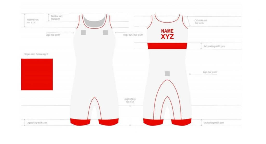
These markings create a potential design challenge as counties have to incorporate a red or a blue into their singlet identity. Some may even have to drop a core color — think about the challenge of a blue singlet for Canada. In the Tokyo Olympics, this has been addressed through a few approaches:
• Markings Only: In a markings-only singlet design, a country creates a singlet design true to its national flag colors and does not add any red or blue elements to the core of the design. The red or blue is only visible in the markings.
• Blue-ing / Red-ing: This isn’t quite blue for blue sake because it’s a requirement to have blue, but countries will create a mostly red or blue singlet style with their national colors as accent colors, if red and blue are not a national color. See India’s Blue singlet.
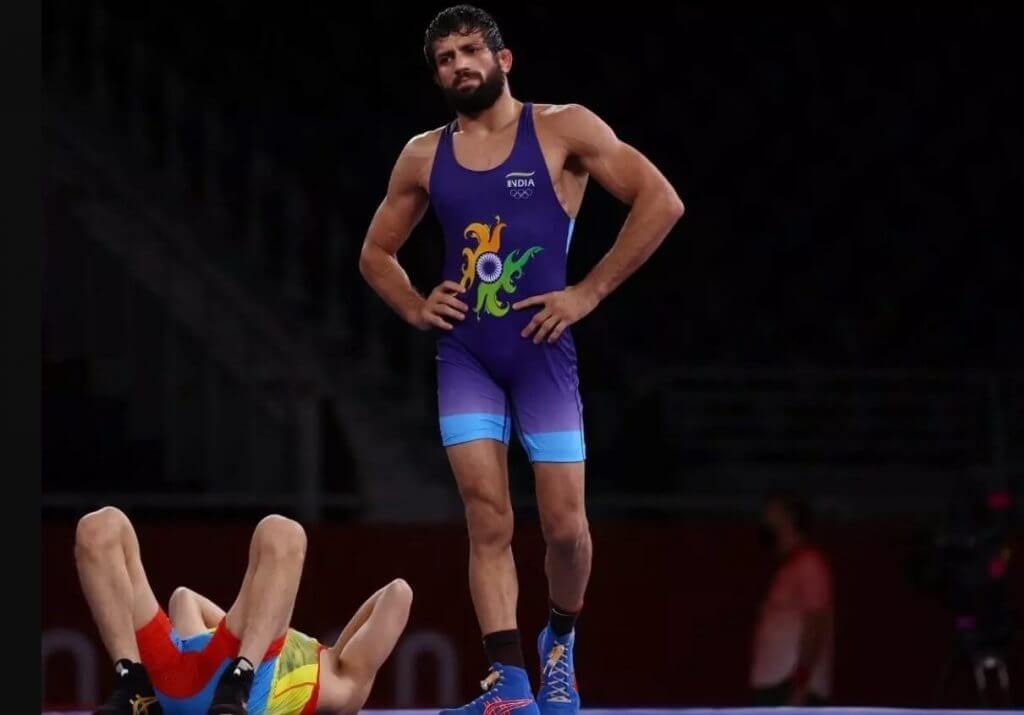
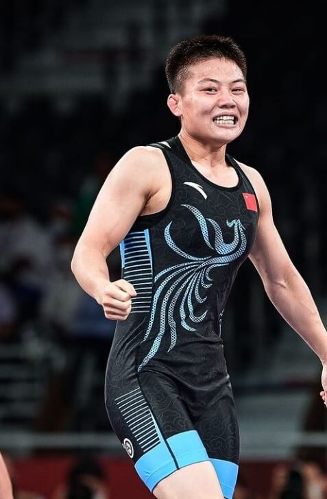
• Combination Colors: The UWW has a list of combination colors that can be used as primary for both red and blue. Some countries will use combination colors with country colors to create their singlet design. See China’s Blue singlet, where black is an approved combination color.
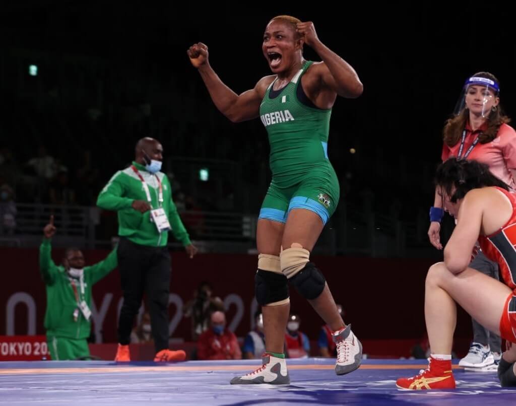
After looking at all the trends this year, stripes are definitely in. Many singlet designs have stipes in their designs. One of the most talked about style elements from this Olympics is the common horizontal stripped Nike style. Multiple countries wearing Nike singlets have the similar horizontal stripped singlet style, including the United States, Canada, Serbia, and Estonia. This has been a bit confusing for those of that initially assumed their country would be the only country in that style. Fortunately, the regulations don’t restrict all creativity. The Krygystan’s men team has a shark on their singlets, based on a nickname of one of their top wrestlers — not because the landlocked country is associated with sharks.
Looking forward to future Olympics, we may eventually see wrestling move away from singlets. Wrestling is known for being very traditional, but after wrestling was briefly dropped form the Olympics in a 2013 vote, the sport has made quicker, bolder moves.
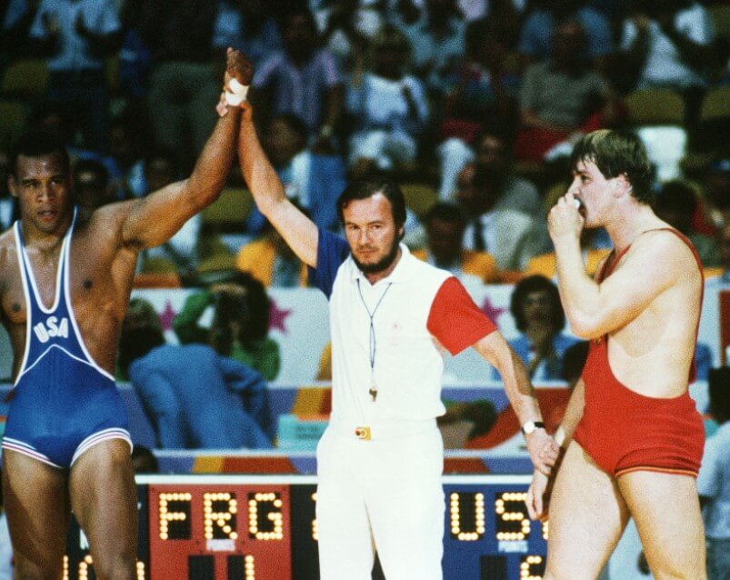
There has also been a fascinating evolution in the uniform of the other person on the mat during a wrestling match — the referee. Like many referees, wrestling referees have to make judgement calls and their decisions are often challenged by loud, sometimes aggressive coaches and fans. Wrestling referees have to convey authority, trust, and unbiased infallibility. Wrestling referees also have to be mobile – sometimes quickly diving to the mat to check control and shoulder positions.
In the early Olympics, the referees uniform spoke to authority and trust. They wore sports coats and hats. As the Olympic moved indoors, the coat and hat were dropped. In 1948, referee uniforms went all white, using the color to convey the pure, unbiased infallibility of the referee. During the white era, the uniforms became slightly more casual over time, from a very preppy look in 1948 to a more casual look starting in the 1970s and running through the 2000 Olympics. My favorite uniform from the white era is the red and blue color blocked sleeves of the LA 1984 Olympics. However, I have heard that the all-white uniforms did not hold up well during long day of wrestling matches.
After the white era, there was a short return to the formal era. Sports coats returned in 2004 and a tie was added for Beijing 2008 and in London 2012, conforming to the formal Olympic staff uniform. The tie was definitely peak formality for referees. The tie may have also been a little too much as there was a drastic change in style for the following Olympics in Rio in 2016. Referees work the casual staff Olympic uniform, which was clearly more about mobility than formality. Wresting referees wore khaki cargo pants with green piping on the pockets and a polo shirt with an asymmetrical design.
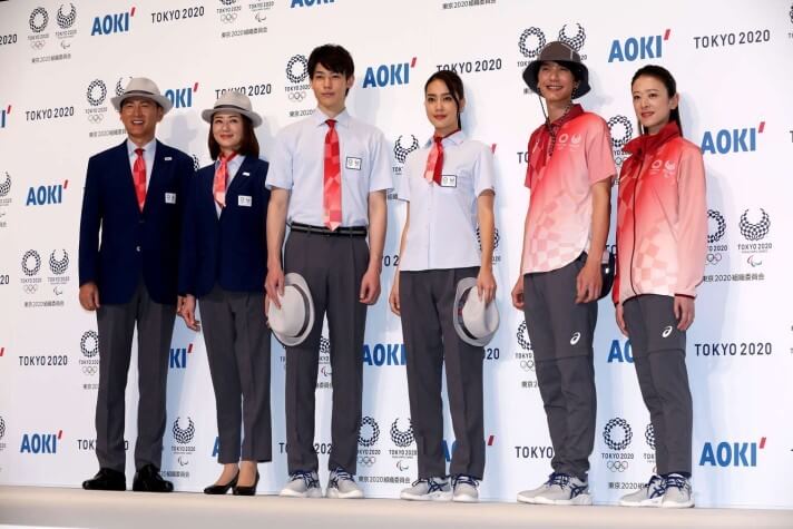
After going from sport coat and tie to piped cargo pants, I was very curious what we would see referees wearing in these 2020ne Olympics as both a formal and casual uniform were released. Wrestling referees took the mat in the casual uniform. The uniform consisted of slim fit grey pants that have zippers around the knee to convert to shorts. The top is an untucked polo with a gradient, asymmetrical design based on the Olympic logo. This is by far the most casual of any Olympic wrestling referee uniform.
With the Olympic wrestling referee uniform at one end of the spectrum, it will be interesting to see what the referees are wearing in the 2024 Olympics. Will they stay casual or will the pendulum swing quickly back to formal? And will the return of the Olympics to LA in 2028 bring back those great white with color blocked sleeves wrestling referee uniforms from the 1984 Olympics in LA?
Thanks, Ross! Great stuff, and a nice way to conclude our week of looking at some of the uniforms of the different disciplines of the Olympics! Please give Ross a nice virtual clap (and a shout in the comments) for all his work here!
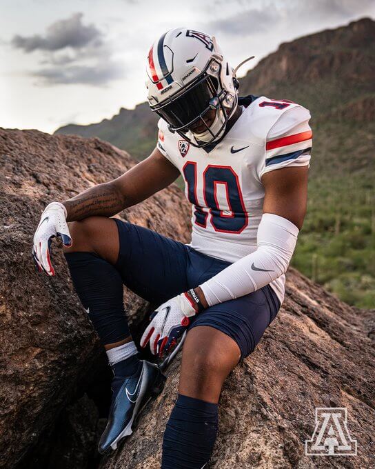
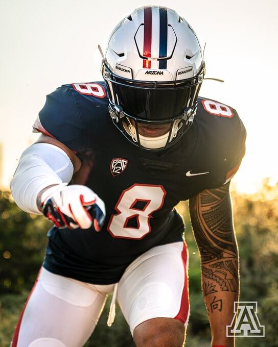
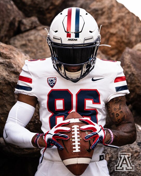
Arizona Wildcats Retrofy Their Uniforms
Inspired by the Past, Built for the Future.#DesertRising #ItsPersonal #BearDown pic.twitter.com/p3HOUeIcc6
— Arizona Football (@ArizonaFBall) August 4, 2021
This was just a ticker item yesterday, but I wanted to briefly expand on the new football uniforms — which are really more like throwback uniforms — for the Arizona Wildcats, which were released on Wednesday (and following this is a partial history of Arizona unis, by my pal Jimmy Corcoran).
As you can see from the hype video above, the Wildcats released a blue and white uniform (which can yield four different combinations) and which is reminiscent of the 1990’s “Desert Swarm” uniforms on which these are based. They’re pretty accurate to the originals, and they look fan-fuckin-tastic! Arizona has for years (and in several different templates and styles) had awful uniforms, and players, alumni and fans had been clamoring for a return to this style. And they hit it out of the park.
Here’s a few shots of the new uniforms:
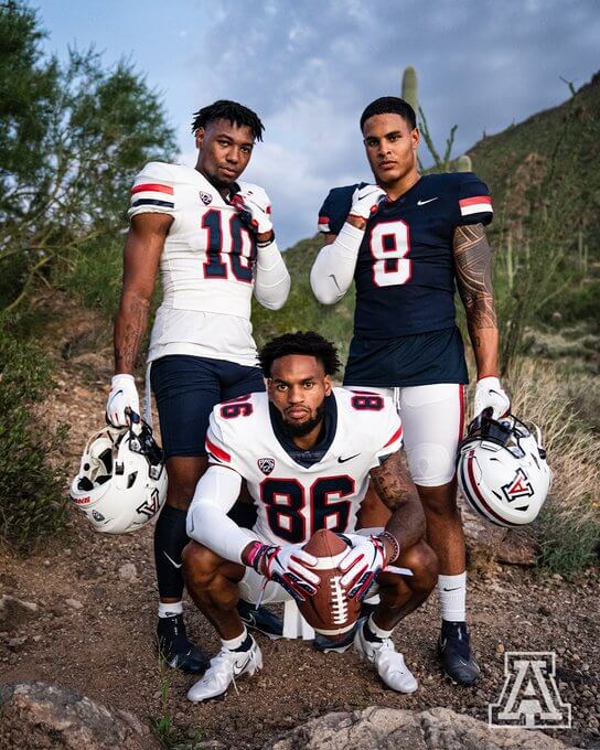
Thankfully the team did not show a blue jersey/blue pants combo (and hopefully such a combo won’t be worn), but there is that mix/match possibility. These new/old uniforms aren’t a complete surprise, as there had been some hints (and recruits sharing pics on social media), but now that the retro unis are confirmed, I think everyone is going to be pleased. Arizona has finally returned to uni-respectability!
Unprompted, my buddy Jimmy Corcoran (an alum), sent me a writeup with photos of past Arizona uniforms, which I want to share with you below. He writes:
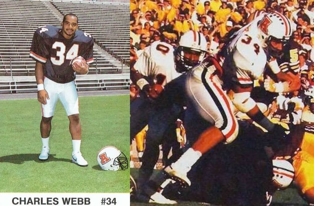
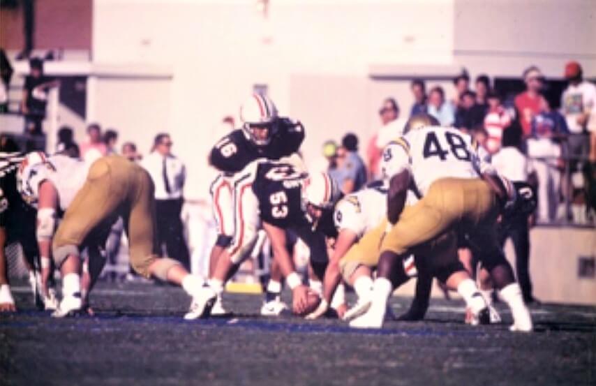
Phil, I am sure you will cover Arizona’s new uniforms, I wanted to give you a history of some of the past uniforms. Though I didn’t get to Tucson until 1984, I always liked the red uniforms they wore in the late 70’s with the over sized slanted A. You may recognize the red fishnet jerseys from the movie Revenge of the Nerds that was shot on campus in 1984. They used these jerseys when the players had the jock itch and the coach cancelled practice. The last season they wore this helmet was in 1979, they now had new jerseys with sleeve stripes, these jerseys were also used in Revenge of the Nerds when the girls did a skit dressed as football players. This picture was the last game they wore this style of helmet, it was a Bowl Game loss to Dan Marino and the Pittsburgh Panthers.
When Larry Smith arrived at the U of A they again wore the red fishnet jerseys but changed the A, this was a one year style pictured here in a game against ASU. In 1981 they went with new uniforms and a white helmet, this was a two year style. The helmet, jerseys and pants all had three stripes. In 1983 they changed the uniforms slightly, the helmets, jerseys, and pants now had a red stripe and a blue stripe, the opposite on the blue jerseys. I always thought they made this combo to go with the fight song “Bear Down Red and Blue” These uniforms stayed for the rest of the 80’s and into the 90’s. number 34 was my best friend at Arizona Charles “Choo Choo” Webb, the photo in the white jersey was his last game as a Wildcat, the 1987 ASU game. In 1986 Charles gave me his entire uniform, including the team issued turf shoes that said Cats on the back. I still have the helmet and pants, I don’t know what happened to the turf shoes? and I gave him back the jersey. Being a bit of a football historian and knowing my Father regretted not keeping more from his career I gave him back the white jersey, told him to give it to his son someday.
In 1989 Arizona made slight modifications, the sleeve stripes were now much higher up and they were now cuffed, this picture of number 16 against UCLA is Stu Betti, he went on to play in Europe and won a Championship there. Stu is still a close friend today and he is an avid Uni Watch reader, he sometimes scoops me on a Uni Watch update!
After I left Arizona they continued with this uniform style for several more years, I think the best look is when they added the blue pants, and as seen here on Trung Canidate. The white socks with matching stripes were a one year style, I thought this look was clean and complete. After this Arizona just got worse and worse until the mess they have worn the last few seasons. I know they still have to win games, but so glad they went back to these traditional classic uniforms.
BEAR DOWN ARIZONA
Jimmy Corcoran
Thanks, Jimmy — and here’s a look at the photos he sent to accompany his story:
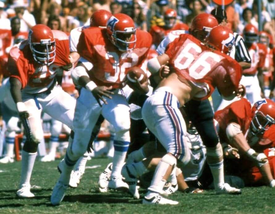
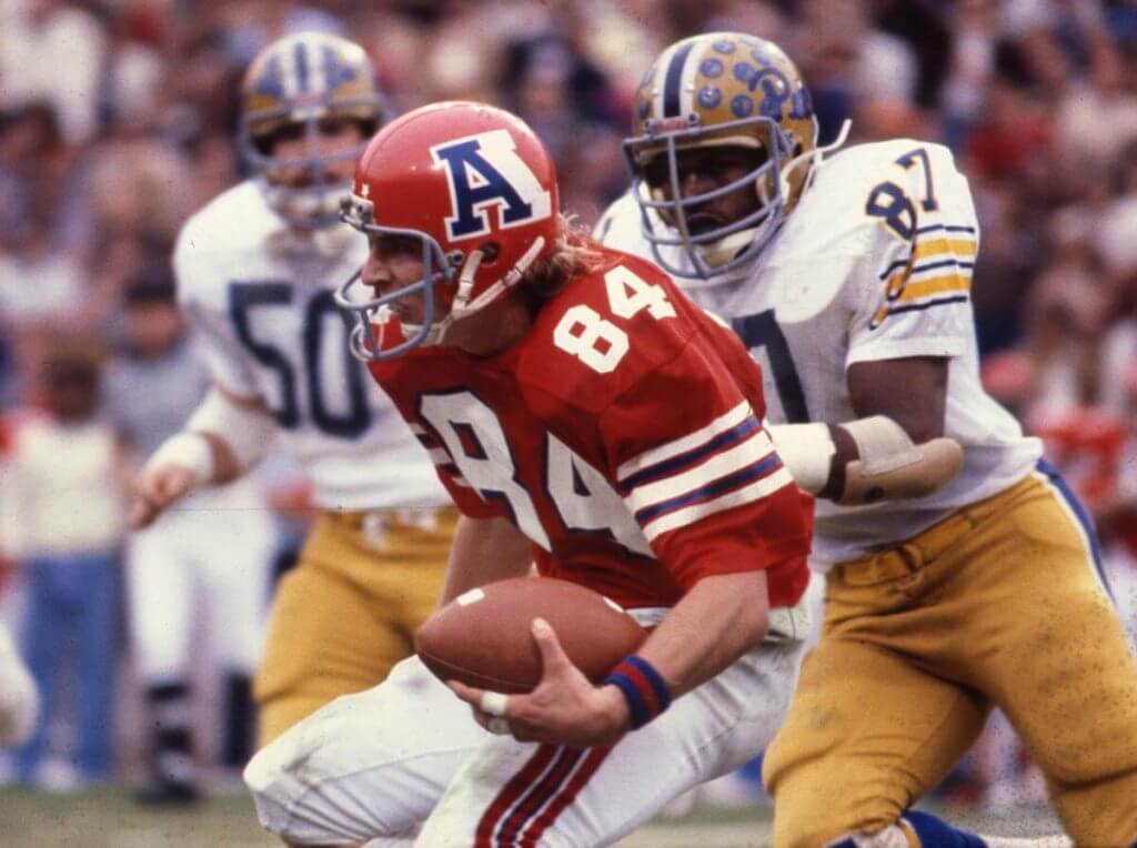
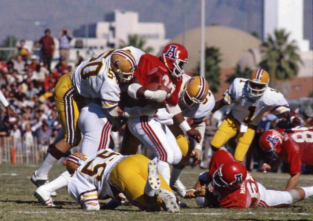
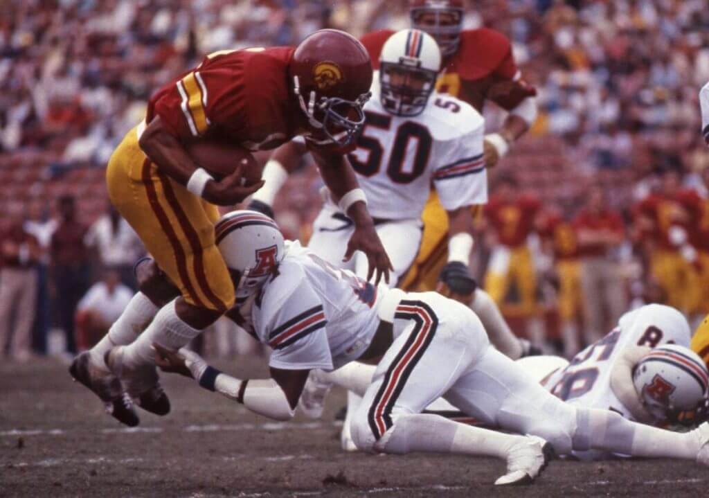
Great photos (and history) Jimmy! Thanks for sharing!!!
Click to enlarge
And now a few words from Paul: Hello! My latest piece for Bulletin is an exclusive about a new product that’s going to revolutionize the uniforms in the classic game Electric Football. It’s a really fun story, and I think you’ll enjoy it even if you haven’t played the game in decades (or ever, for that matter). Those of you who’ve subscribed to the emailed versions of my Bulletin content should already be seeing this article in your in-boxes. Everyone else can see it on my Bulletin page.
Meanwhile, as long as we’re talking about football-themed games: In case you haven’t already seen, our latest Uni Watch pin is a salute to Tecmo Bowl, complete with 8-bit graphics (quit to enlarge):
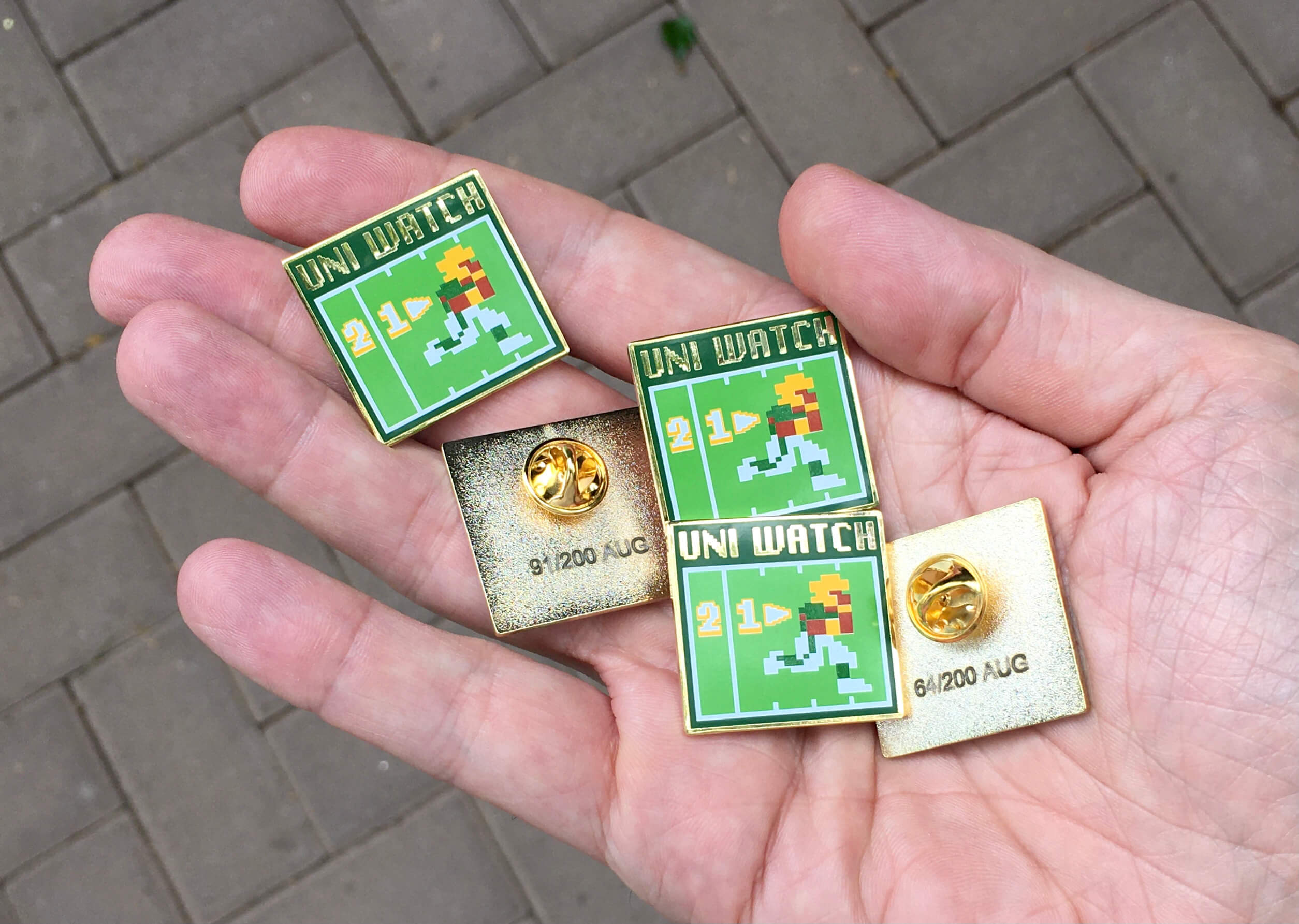
This is a numbered edition of 200 pins. As of this morning, there were fewer than 60 remaining. You can order yours here.

Also: It’s rare that we get a membership card order that includes a request for a number with a fraction, but that’s what Andy Brodie wanted for his card. “I’m a film guy,” he says, “so it’s a reference to Fellini’s 8½.” Pretty sure that’s our first Fellini-inspired card!
Andy’s card is one of several that have been added to the membership card gallery. If you want a card of your own, ordering one is a good way to support Uni Watch, and fun to boot. And remember, a Uni Watch membership card entitles you to a 15% discount on any of the merchandise in the Uni Watch, Uni Rock, and Naming Wrongs shops. (If you’re an existing member and would like to have the discount code, email me and I’ll hook you up.)
As always, you can sign up for your own custom-designed card here, you can see all the cards we’ve designed so far here (now more than 3,200 of them!), and you can see how we produce the cards here.
That’s it from me. Now back to Phil!

Guess The Game…
from the scoreboard
Today’s scoreboard comes from Chris Hickey.
The premise of the game (GTGFTS) is simple: I’ll post a scoreboard and you guys simply identify the game depicted. In the past, I don’t know if I’ve ever completely stumped you (some are easier than others).
Here’s the Scoreboard. In the comments below, try to identify the game (date & location, as well as final score). If anything noteworthy occurred during the game, please add that in (and if you were AT the game, well bonus points for you!):
Please continue sending these in! You’re welcome to send me any scoreboard photos (with answers please), and I’ll keep running them.
The Ticker
By Anthony Emerson

Baseball News: It is August 6th, and the Boston Red Sox have worn their primary away jersey just 14 times this season. … A Philadelphia Inquirer writer thinks the Phillies should change their name, for some reason (from @PhillyPartTwo). … The Durham Bulls, Triple-A affiliates of the Rays, rebranded as the Durham Bull Sharks last night (from multiple readers). … The Pensacola Blue Wahoos, Double-A affiliates of the Marlins, have soft-launch their “Crabzilla” unis, which they are hoping will be among the worst unis in sports history (from multiple readers).

Pro Football News: Cowboys K Hunter Niswander had a very odd pants and socks situation during last night’s Hall of Fame Game. Never seen pants that short and socks that high (from Frank McGuigan). … The Ottawa RedBlacks have released their jersey schedule (from Wade Heidt). … Believe it or not, this isn’t a FNOB situation in the CFL. That’s Hamilton Tiger-Cats RB Sean Thomas Erlington — his last name is Thomas Erlington, unhyphenated (from @valleyshook). … Our pal Chris Creamer has released his new CFL unis and logos preview.

Hockey News: It appears the Avalanche are switching to blue numbers with burgundy outlines and burgundy NOBs (from Alex Jones and Wade Heidt). … KHL’s Spartak Moscow has unveiled a really nice throwback uni (from Wade Heidt). … New logos — including a 20th anniversary logo — for the Superior International Junior Hockey League (from Kary Klismet).

NBA News: Hornets PG LaMelo Ball wants to change his number from 2 to 1 (from Tim Baker). … The Pistons will have a new court design for the upcoming season (from Kary Klismet). … Etienne Catalan once again has a whole bunch of uni number changes on his Twitter page.

Soccer News: Serie A’s Fiorentina have unveiled some gorgeous new kits. … Rubin Kazan had some printing issues with their kits, forcing them to draw on numbers (from multiple readers).

Olympics News: USA’s David Taylor won wrestling gold with a ripped singlet (from Devin Meyer). … Our own Jamie Rathjen mentioned in his field hockey piece that India’s men’s team had nine players named Singh (which is fully half the team) and both teams wear first name on back, but that’s actually not a record because the 1968 men’s team had 11 of 16 named Singh! … This story explains why volleyball players who play the libero position wear different-colored uniforms from their teammates (from Kary Klismet).

Grab Bag: Every F1 driver has their own personal logo (from Michael McLaughlin). … New logo for the Taranaki Community Rugby Trust, an amateur rugby organization in New Zealand (from Kary Klismet). … Check out this video of Benny Parsons discussing some asbestos racing shoes he used to wear (from David Firestone).
And finally… that’s going to do it for today — apologies for the length, but there was a LOT to get to! Hope you can read and enjoy (and comment on) it all. Big thanks to Ross for his wrasslin’ piece, and to Jimmy for the Arizona uni history. Thanks to all you readers for sticking with UW through the Olympics uni stuff this week, but I think it was a nice look at the unis of sports we don’t normally cover here on UW. My sincere thanks to all the “correspondents” who wrote pieces this week.
I’m out at the summer place, and in a reversal of recent weather patterns (full sun all day, but clouds obscuring a sunset), yesterday was the opposite: cloudy and rainy all day, but a slight break in the weather at the end of the day yielded another gorgeous sunset (and post sunset):


Sometimes those photos in the “gloaming” are even nicer than the sunset itself! The colors were outstanding.
That’s it for me for this week — webmaster Johnny Ekdahl will be bringing you two posts this weekend — and I will catch you back here again on Monday. Everyone have a great weekend and enjoy the end of the Tokyo Olympics!
Peace,
PH
Were the Red Sox navies just a FRI alternate at one point
Friday road games.
Thank you
My only issue with the Field of Dreams game uniforms is that the Yankees cap logo is just ridiculously large to the point of looking silly. Other than that I love it.
The Yankees’ uniforms kind of look like a kid created a DIY version of the current road grays.
Comparing a design by saying what it “looks like” just shows you’re incapable of evaluation. Especially the old “a kid can do that” comparison.
That’s just what uniforms looked like back then, what do you expect?
Not sure what you mean by me being “incapable of evaluation”, I was just noting that the Yankees look is similar enough to what they usually wear that the subtle differences like the large hat logo and lack of white outlines and the odd number font give it the appearance of a knock-off or DIY version.
I guess I’m just kind of done with throwbacks in general, there was a reason most of these designs were done away with in the first place.
Yeah, I don’t get the super-sized Yankees cap logo. Maybe a small, period-correct NY won’t appeal to the “kids,” which Nike is such an expert on.
I imagine recreating both unis was so horribly boring to Nike designers that the sleeve stripe on the Sox jerseys just had to stay, mostly to keep the Nike people from falling asleep.
I like the back numbers, both in McAuliff-like fonts, but each a bit different (as far as I can tell.) The 5 for the White Sox has a mid-way downward curve that the Yankees number 5 doesn’t.
Looks like that sleeve stripe on the Sox uni was on the 1920 version.
link
Nice find! We got the stripes but not the crossed white socks – too bad!
Adding to the Red Sox (I am tracking what jerseys they wear, but not their records in each). They’ve worn their primary home “Red Sox” jersey 24 times, and an alternate (red, yellow, or the white “Boston” alts) 31 times.
Overall, home and road – primary jerseys 38 vs 72 for some version of an alternate.
I noticed this trend in late May, but they really picked it up in June and July – Primaries were worn a total (home and road combined) of 8 times in June, and 5 times in July.
“Eight Men Out” did not get most of the details right: link
link
I’m probably in the minority on this, but the movies “The Natural” and “Field of Dreams” infuriate me, as does “Eight Men Out.”
One of the things I’ve noted in all of the PR surrounding the game in Dyersville is the conspicuous absence of the phrase “W.P. Kinsella.” I hope he gets at least gets a cut of the revenue.
Both the “Eight Men Out” book and movie were wayyyyyy off what actually happened. Calling the book a novel is probably the right reference.
And don’t get me started on the “Field of Dreams” movie. Joe Jackson a right-handed hitting wisecracker with a Jersey accent? GTFO.
>Calling the book a novel is probably the right reference.
And here I thought I was being subtle.
I’m with you regarding The Natural movie version for sure.
I know they did it last year but I’d just like to mention how much better the Cowboys’ pants look after they removed the green. No, they still don’t match the helmet but the true silver/blue look actually looks very cool and unique.
Totally off-topic, but it bears mentioning that the baseball gods are clearly punishing the Mets for reviving the stupid black jerseys. Counting the game in which the monstrosities ignominiously reappeared, the club has lost five of seven, including three of four to the last-place Marlins, lost a third consecutive series for the first tine all season, and lost three games in the standings.
As a fan of good uniform design, I was sad to see the BFBS plague reinfect the Mets. As a Phillies fan, I hope you’re right – in which case, I welcome back the BFBS with open arms.
Stupid opinion piece about the Phillies name being lame, especially when the “writer” suggest the much more lame “Jawn” nickname (and I am from Philly and have never liked that term, even from the 90s and loathe the widespread use of it the past 10 years)
Rather than owing their name to an animal, occupation, or Native American, the Phillies (and the Angels) owe their name to a tautology. “Philly” is an informal shortening of Philadelphia; nothing more and nothing less. Considering the pitfalls that may await other teams and their beloved identities, Philadelphia baseball fans ought to consider themselves lucky.
The guy isn’t even a regular writer for the Inky. After reading the piece, I can see why.
You forgot the most interesting thing about the Yankees’ unis… the return of McAuliffe numbers!
While I disagree with Jimmy’s opinion on those red Arizona uniforms, I do appreciate him including a shot against those old Pitt unis!
Just to be clear, I liked the red fishnet jerseys with the slanted A helmet, the red jerseys with the stripes against Pitt weren’t as good to me because the sleeve stripes didn’t patch the pants stripes, and I thought the sleeve stripes were too thick. I should have been clearer about that. I always liked those 70’s fishnet jerseys, Auburn used to wear them too.
I talked to a couple of the Avalanche staffers last season on their first regular season trip to play VGK. They mentioned that the team was not happy with the way the white jerseys went with the blue pants, helmets, and gloves and were trying to figure out how to make it look better. Changing the numbers from black to blue was already being discussed at that point.
Would think for sure changing the numbers on the white jersey was being discussed. It looked so out of place after they switch to the blue equipment. Thought they may have been restricted from changing the jersey last year? This because it was so apparent the black number did not work after ditching black equipment and should have been changed then. The new number and nameplates works much better.
The simpler the design of the uniform, the more obnoxious the Nike logo.
I second that observation.
Third
Fan-fuckin-tastic!
I couldn’t have put that any better Phil!
Re: Avalanche road jersey.
I like the blue numbers with the burgundy trim and I hope the team will extend the concept to the NOBs and well as swapping out the silver trim for blue.
Multi-colored jerseys don’t work that well, with some notable exceptions (Astros’ rainbow being the classic example).
In my view, a three color palette works the best so more burgundy, blue, and white for the Avs’.
I know that money is an overriding factor in so many decisions and they would open the door to more and more exceptions being requested but I REALLY wish Nike had left the swoosh off the Field of Dreams uniforms.
No takers for GTGFTS?
I always thought wing tips were the preferred footwear of NASCAR drivers of the 1960’s-1970’s.
That clip of BP is a great preview of his skills in the broadcast booth after his time behind the wheeI…I miss his color commentary.
OK.
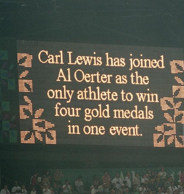
July 29, 1996 in Atlanta. Carl Lewis wins his fourth consecutive long jump gold medal.
I liked the story about liberos wearing a different color than their teammates (I never knew why before), but the article mentions other sports where a player dresses differently, such as ice hockey goalies? I don’t think so! (the article claims hockey goalies wear different colored jerseys, they weren’t talking about helmets)
Yeah, I remember that happening only once, in an NHL All Star Game. Sloppy research.
GTGFTS:
July 29, 1996
Centennial Olympics
Atlanta, GA
Carl Lewis won Gold in the Long Jump to match Al Oerter’s record of 4 Gold medals in one event.
The Cincinnati Reds are wearing their camopander unis tonight (it’s Military Appreciation Night).
Paul – regarding your electric football article, it was great! I own an NFL version and a Rose Bowl version. Yes, when Tudor lost the NFL rights, they produced a limited number of collegiate teams. The version that I have is with USC and Penn State from the late 2000’s. The article made it sound if they didn’t produce collegiate teams but they did. Outside of USC, the rest were SEC teams. I have LSU and a couple more teams. If I remember right, the set was made by another company other than Tudor.