For all photos, click to enlarge
Back in spring training, at least one MLB team appeared to be testing out a new Nike tailoring template — presumably the one that will be introduced for the 2022 MLB season. Now it appears that a minor league team is also testing out that template, giving us a clearer picture of how MLB uniforms might look next season.
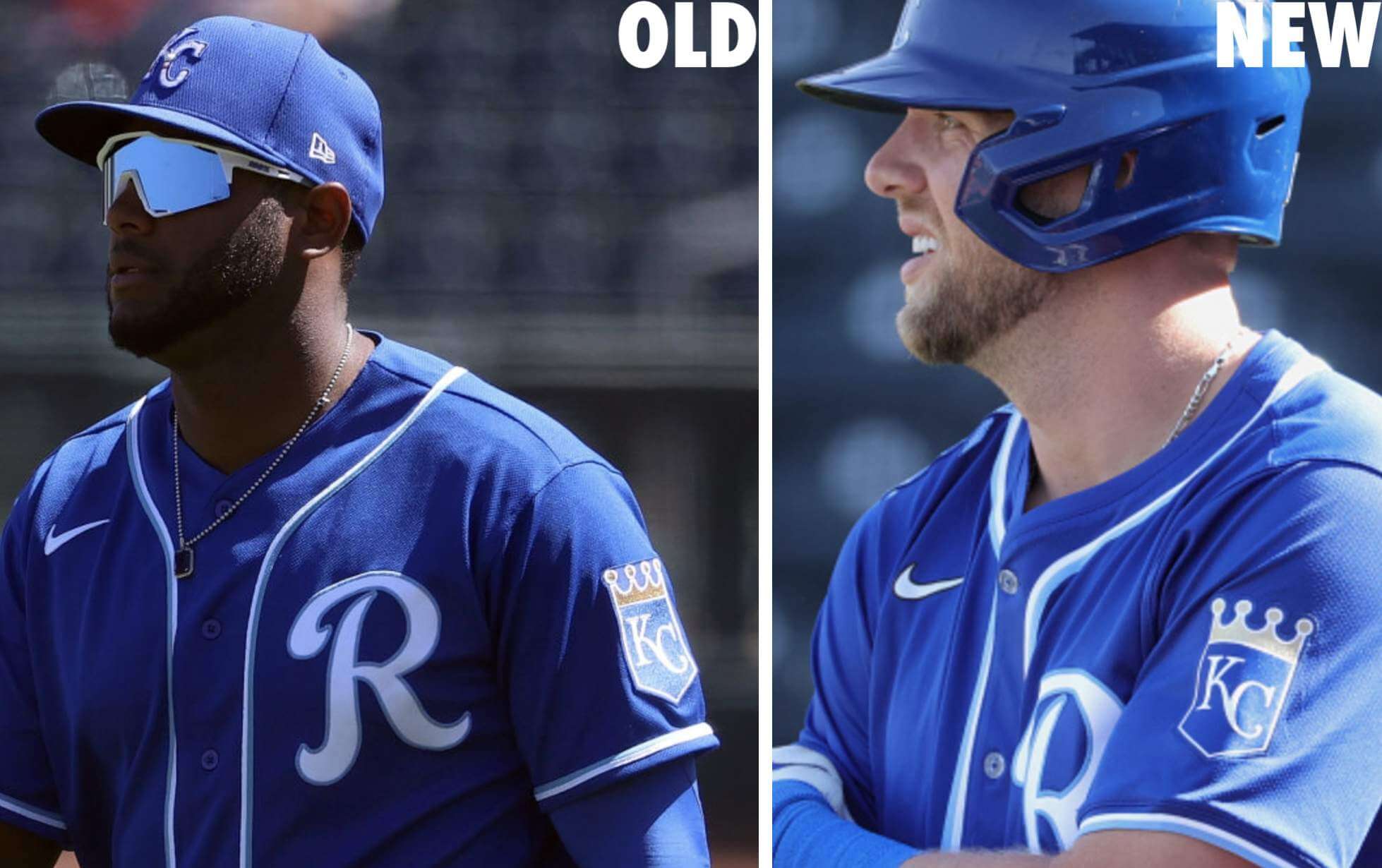
Let’s start by going back to mid-March, when MLB teams were playing spring training games. At the time, several people noticed that some Royals players — but not all of them — appeared to be wearing a new jersey style. It had a new seam around the collar, mesh numerals (presumably more lightweight), and a weird sort of reinforced ribbing just above the sleeve cuffs. In addition, the headspoon piping was a bit thicker and appeared to be positioned closer to the edges of the placket and the collar, so that the MLB logo was positioned below the headspoon instead of above it. Here are several examples:
Although it’s hard to be 100% certain, it also looked like the new jerseys were using a thinner, more flexible sleeve patch:
Word I heard through the grapevine was that this was basically a test drive for next season’s MLB jerseys. I’m not sure if any other teams were doing it, and it appears to have been strictly a spring training experiment. I’ve seen no evidence of the new template during the MLB regular season.
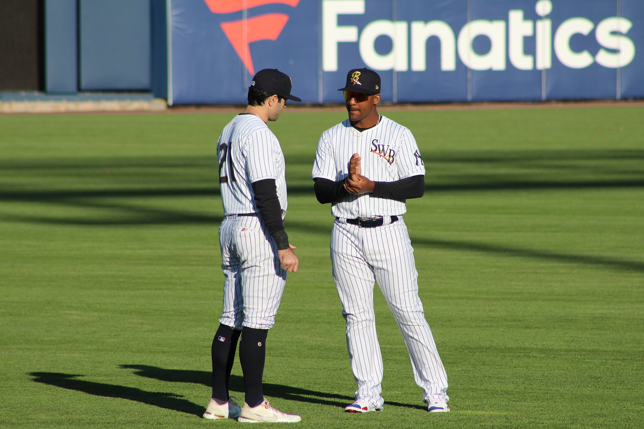
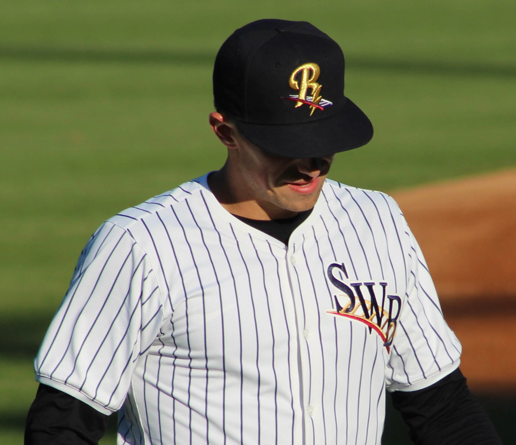
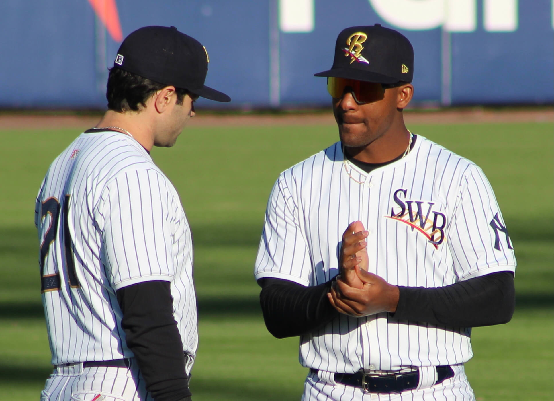
But it turns out that at least one minor league team is also trying out the new template. That would be the Yankees’ Triple-A affiliate, the Scranton/Wilkes-Barre RailRiders, whose season began earlier this month. Just like the Royals’ spring training jerseys, the RailRiders’ jerseys have mesh numbers. But since the RailRiders have pinstriped uniforms, the pinstripes are visible through the mesh, and they stop at the new collar seam:
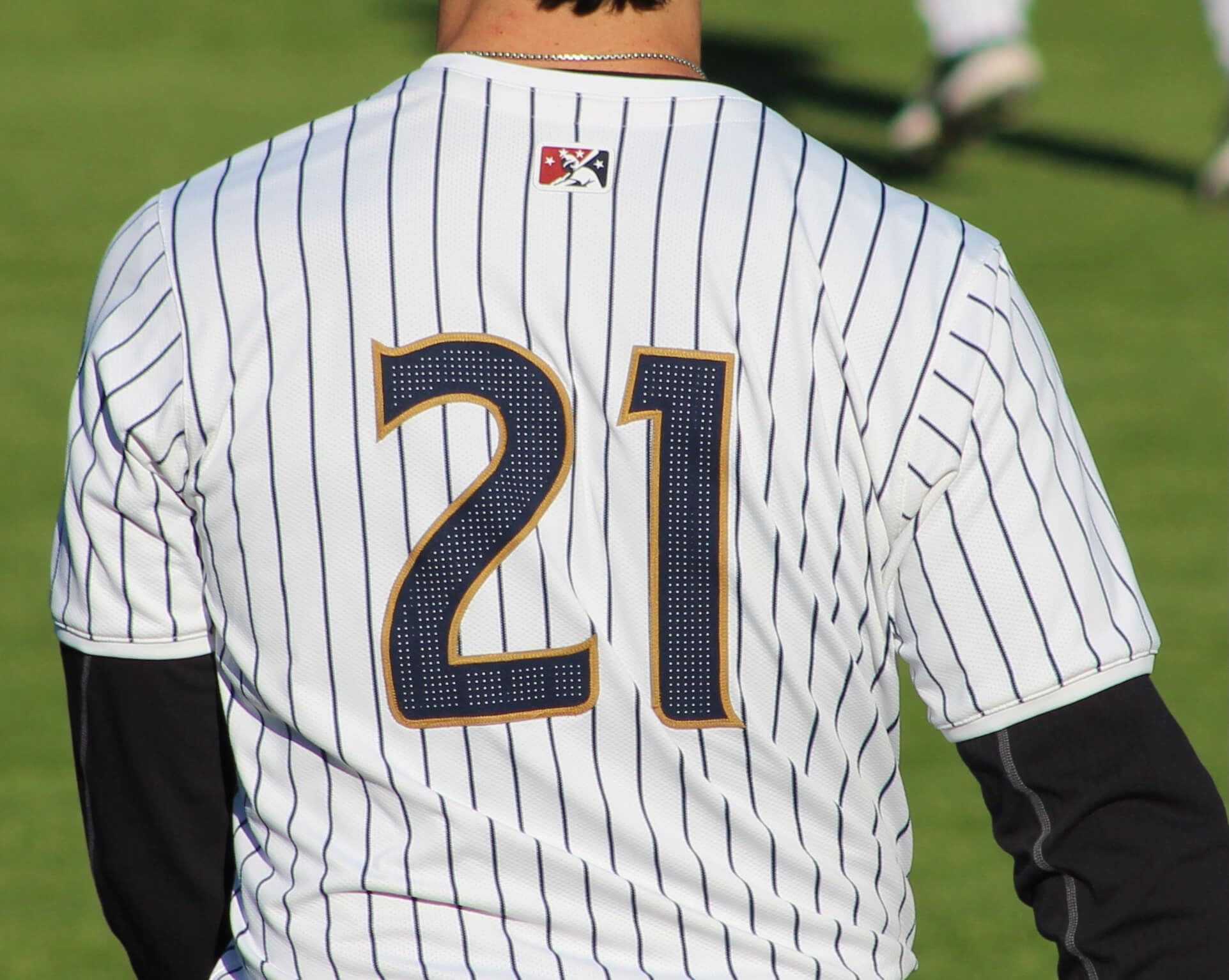
If you look closely at that last photo, you can see another change: The pants pockets have snaps instead of buttons!
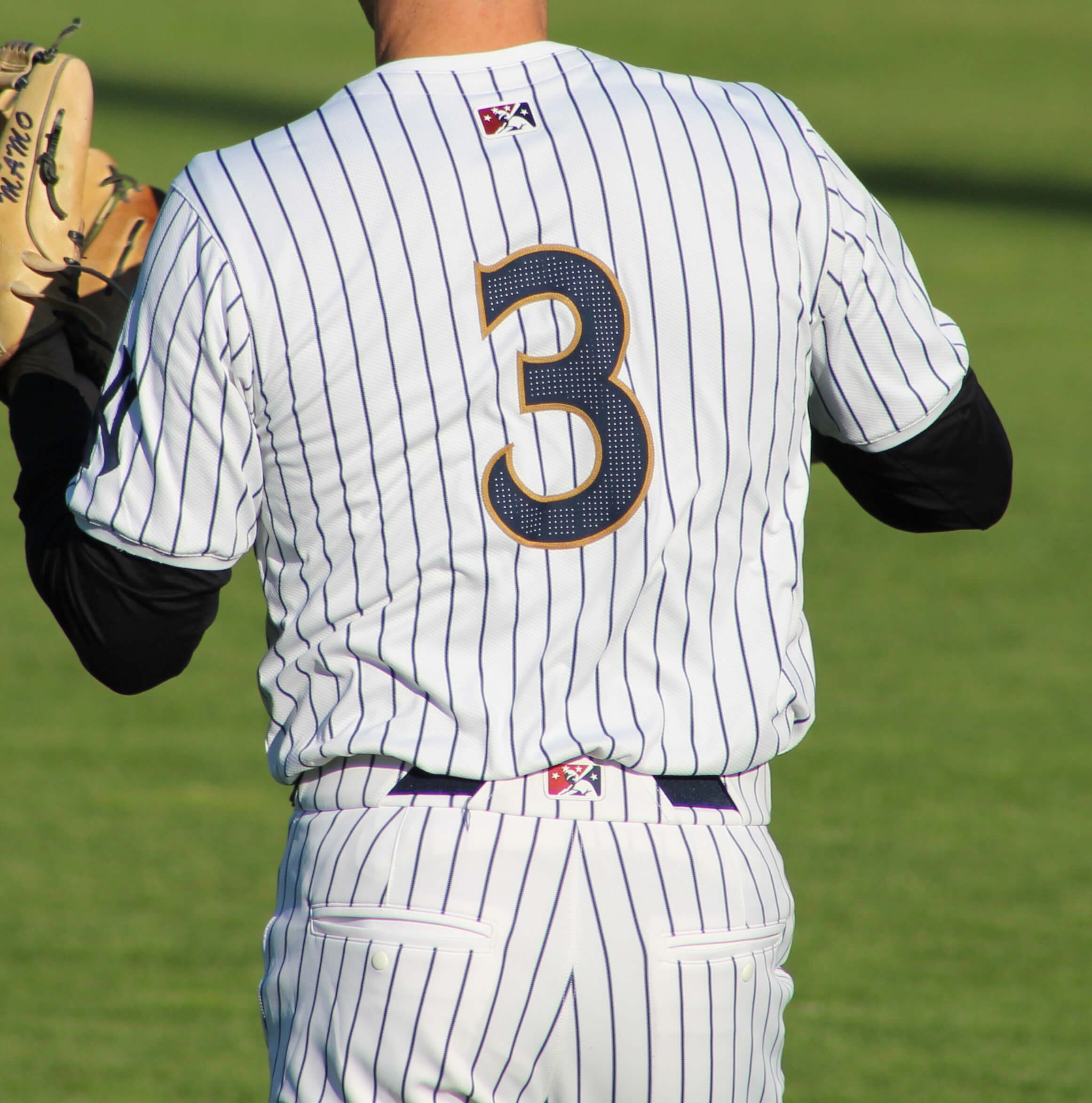
Here are some front views. You can see how the pinstripes don’t go all the way to the edge of the collar or the sleeve cuffs:
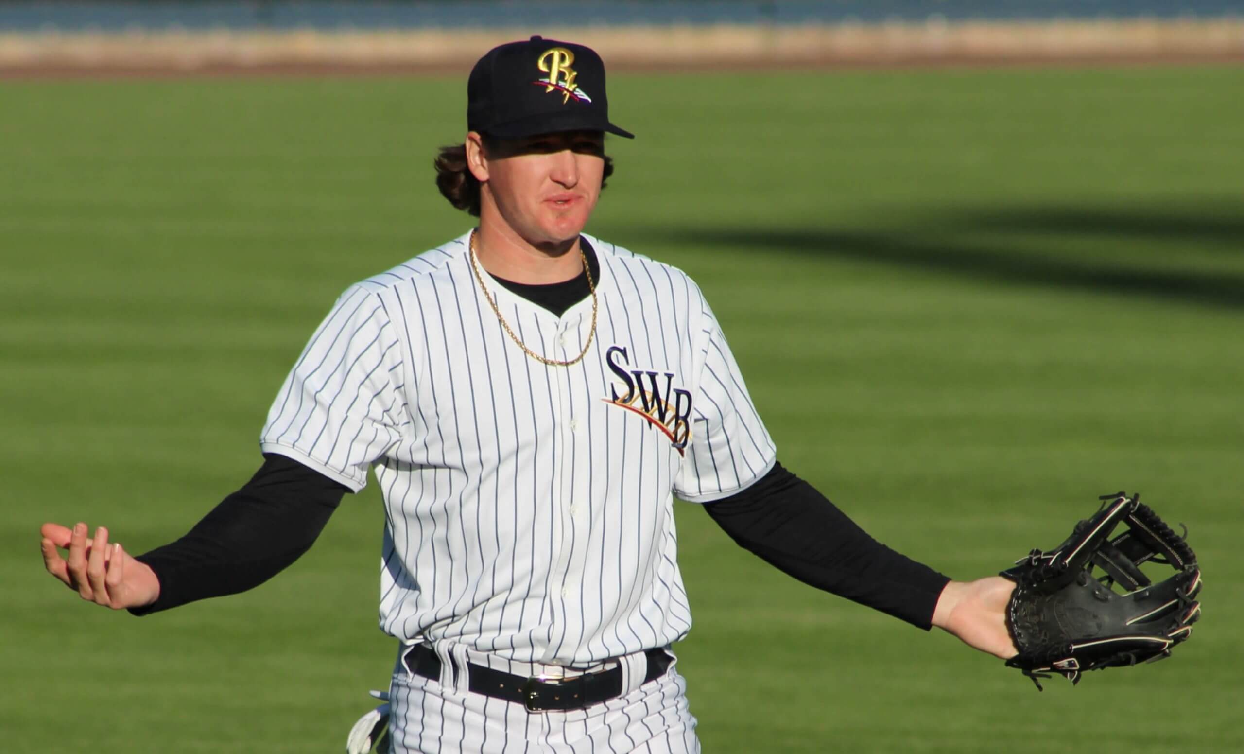
Those photos were all taken by Uni Watch reader Michael Slesinski, who attended a RailRiders game last week and noticed the unusual uni details. When he sent the photos to me, he didn’t realize that those details had also shown up on some Royals players during spring training. But as soon as I saw his pics, I recognized the similarities to the KC jerseys.
Notice anything else unusual about the RailRiders’ new unis? No maker’s marks! I wanted to know more, so I contacted the RailRiders. A team spokesman confirmed that these uniforms are indeed made by Nike and that the team is indeed testing out the new tailoring template. The spokesman didn’t know why there was no maker’s mark, but I’m wondering if it might be because Nike doesn’t have an MiLB on-field license. (Are there any MiLB teams outfitted by Nike? Off the top of my head, I can’t think of any that wear the swoosh.) Whatever the reason, it certainly makes for a better-looking uniform.
As for the other elements:
• Mesh numerals: Not ideal, especially when paired with pinstripes, but I’m hoping the mesh pattern won’t be visible from a distance.
• Collar seam: I kinda hate how the pinstripes will no longer go to the edge of the collar. Also kinda hate that the MLB logo will now go below the headspoon. For teams that have neither pinstripes nor headspoons, no biggie.
• Sleeve cuffs: No biggie. For some reason I’m not bothered as much by the pinstripes not going to the ends of the sleeves.
• Pants pockets: I can see how snaps would be easier to deal with than buttons, but why have any closure mechanism? Why not just have pockets with no snaps, no buttons, no Velcro, no nothin’? Aside from maybe Tim Raines protecting his crack vials, has any player in the history of the game ever put something in his back pocket and then buttoned it closed? (True story: When I had a suit custom-made 10 years ago, I told the tailor to omit the buttons on the back pants pockets. He looked mildly horrified but did as I asked.)
(Of course, I’m sure we’ll also be hearing that the fabric is eleventeen percent lighter, that the pants zipper is made from a new space-age polymer, blah-blah-blah, but none of that matters from an aesthetic standpoint.)
Are any other MiLB teams wearing this template? Keep an eye out for the uni elements I’ve highlighted here (including the lack of a maker’s mark, which is probably the biggest and most obvious tell) and maybe we can learn more about this new style, which will likely be coming to the bigs next season.
Update: Reader/commenter Patrick R. reports that the Single-A Hilsboro Hops appear to be wearing this same template. But unlike the RailRiders, the Hops’ uniforms have the Nike maker’s mark on the sleeve and the back of the pants:
Flight 23 pic.twitter.com/KpyHrRMSXR
— KEV (@VisualsbyKev) May 19, 2021
(Kudos to Michael Slesinski for spotting the RailRiders’ uni anomalies, and my thanks to him for sharing his photos with me.)
Click to enlarge
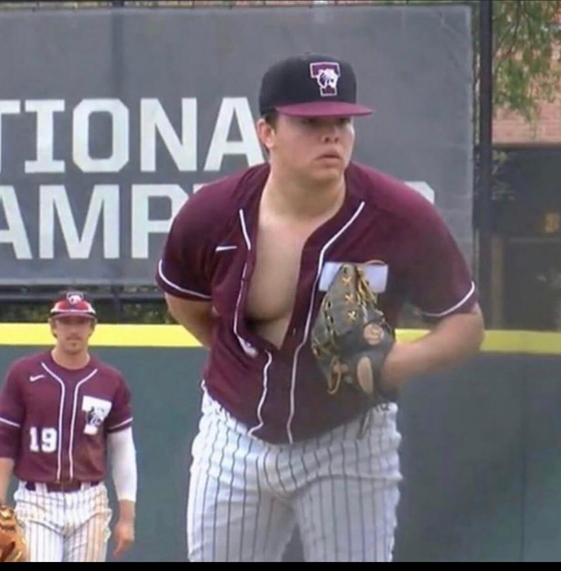
He’s tossing a one-titter: It would be safe to say that this Trinity University pitcher has not embraced the new trend of having one’s jersey sewn shut. Yikes!
(Thanks to all who shared this photo yesterday.)
Click to enlarge
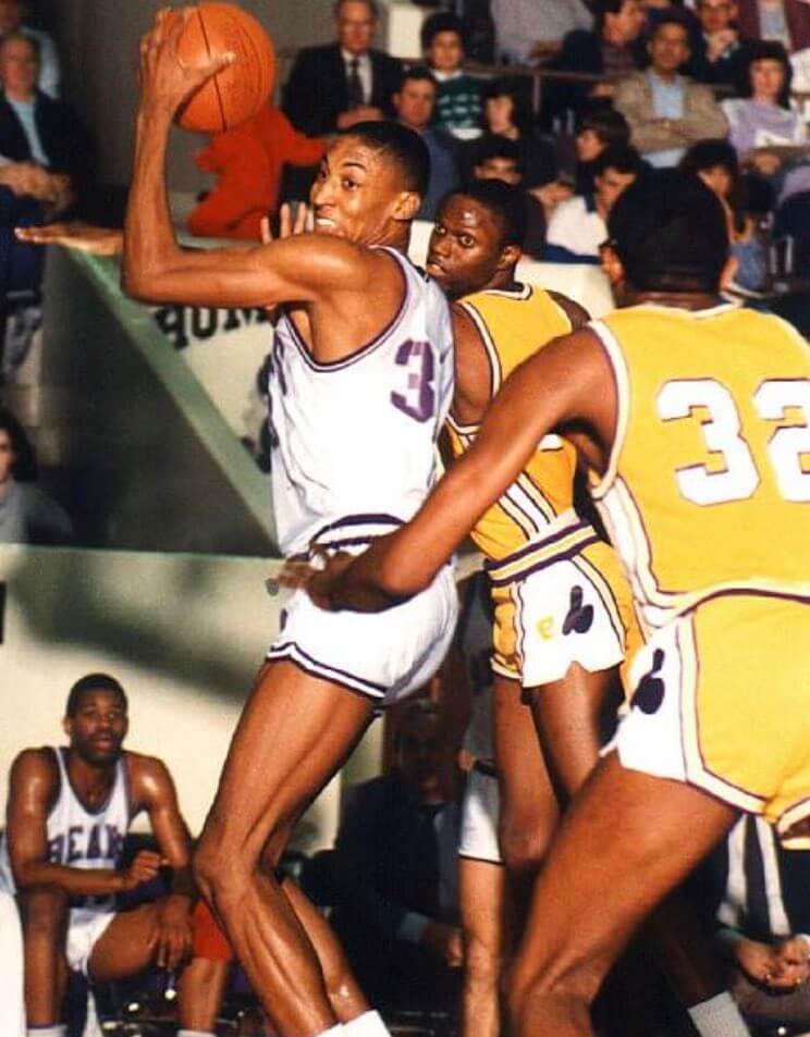
Too good for the Ticker: The photo above shows a young Scottie Pippen playing for Central Arkansas in 1987. I don’t know the identity of the opposing team, but that appears to be the Montreal Expos’ logo on their shorts! Anyone know more?
(Big thanks to Twitter-er @uniformcritic for this one.)
The Ticker
By Paul
Indigenous Appropriation News: Back in March, a video game suggested that the Cleveland MLB team had considered going with a white “Cleveland” home jersey, and a team rep later confirmed to me that they had been thinking about it before ultimately scrapping the idea. Looks like they also made some retail jerseys of that design. … A committee has recommended that a new high school in Lincoln, Ne., be named for Chief Standing Bear of the local Ponca tribe. Key quote: “The recommendation comes with a pledge that the district continue to work closely with the Native community if the name is approved — especially when it comes to deciding on a mascot and school colors.” … Here’s a really powerful, deeply reported story on how the controversy over a high school’s “Savages” team name divided a Missouri town. Very strong work here by reporter Briar Napier — recommended reading. … Weirton High School in West Virginia will keep its “Red Riders” team name but is dropping its Native American-based logo. … The rest of these are from Kary Klismet: The school district in Clinton, Mich., has changed its team name from “Redskins” to “Redwolves”. … Amesbury High School in Massachusetts has formed a committee to consider whether to retire its “Indians” team name. … North Haven High School in Connecticut is retiring its Native-themed team name and visual identity. … Wisconsin Indianhead Technical College has changed its name to Northwood Technical College and introduced a new logo and mascot. … The Native American Guardian’s Association, a national group advocating for “increased education about Native Americans,” has sent a letter to Rutland High School in Vermont, urging the school to revive the “Raiders” team name and Native imagery it recently retired. … Buried within this story is the news that a new Nielsen poll shows more Americans now support retiring Native American team names and mascots than object to it.

Baseball News: The Lexington County Blowfish — a summer wood-bat team — will wear jerseys with the names of local towns instead of NOBs (from Joel Mathwig). … A man charged with stealing the Chattanooga Lookouts’ mascot’s uniform turned himself in. … Dodgers 2B Gavin Lux tore his lucky pants and had to make an in-game switcheroo (thanks, Brinke). … Here’s Mets P Noah Syndergaard, who’s still rehabbing after last year’s arm surgery, in a St. Lucie Mets uniform (from John Ronello). … Iowa softball P Sarah Lehman received a framed jersey with vertically arched lettering as part of the softball team’s Senior Day celebration, while the rest of her fellow seniors received jerseys with straight horizontal lettering (from Kary Klismet). … Also from Kary: Here’s a thread featuring photos of particularly distinctive college softball batting helmets. … After Reds P Wade Miley tossed a no-hitter while wearing a temporary Hulk tattoo, other Reds pitchers have been wearing temporary tats of their own (from Brice Wallace). … A college summer league in Indiana will feature new uniforms for a bunch of new teams. You can see the uniforms by scrolling through this Twitter feed. … Here’s something I didn’t know: The Phillies’ famed Saturday Night Special uniforms were worn on Photo Night. … Not an ideal photo, but look at the brutal uni combo worn last night by the Lehigh Valley IronPigs (from Chris Velardi). … Classic bit of blue collar cosplay at Oregon State, where players who exhibit “hard work and sacrifice” get to wear a hard hat in the dugout and during pregame activities (from Kary Klismet). … Orioles 1B Trey Mancini’s batting helmet could use a new paint job (from Eric Starke). … A Cubs groundskeeper had to replace first base during last night’s game after Nats manager Davey Martinez tore it out of the ground and threw it during an argument (from Max Weintraub). … Mets 2B Francisco Lindor’s green-dyed hair was poking through his batting helmet last night. … New uniforms and logo for the Evansville Otters of the Frontier League.

Football News: Lions rookies explained their uni number choices. … Ravens WR Marquise Brown is changing his uni number from 15 to 5 (thanks to all who shared). … New uni numbers for some U. of Washington players.

Hockey News: The QMJHL is retiring No. 4 league-wide in honor of Guy Lafleur (from Wade Heidt and Mike Engle). … An Arizona plumbing firm has poached the Sharks’ logo but has the shark biting a wrench instead of a hockey stick (from @lizardfingers25). … Pretty cool goalie gear design for Canada’s Michael DiPietro for the IIHF Men’s World Championships (from Wade Heidt).

Basketball News: The Philippines’ men’s national team has unveiled new uniforms for FIBA’s 3-on-3 Olympic qualifying tournament (from Kary Klismet). … You’ll soon be able to dress Fortnite characters in NBA jerseys. … ESPN for some reason showed a clip from last night’s Lakers/Warriors play-in game paired with L.A. Rams and Baltimore Ravens logos (from Nicklaus Wallmeyer).

Soccer News: New fiesta-style shirt design for San Antonio FC (thanks to all who shared). … The rest of these are all from Ed Zelaski: New away shirt for Bayern Munich. … New home kit for Liverpool. … New home and away kits for fourth-tier English side Forest Green Rovers

Grab Bag: McDonald’s has found a clever way to spell out words using only its logo. … You can now buy paint in official Dunkin’ Donuts colors (from Jason Hillyer). … Western Michigan University is rolling out a new logo (from Kary Klismet). … Also from Kary: Cool story on how FedEx recycles old uniforms. … A new exhibit in London looks at the rise of global sneaker culture (NYT link) (from Tom Turner). … New Aussie rules football guernsey for Port Adelaide (from Ash Norris).
That pitcher is from Trinity University based on uniform and logo.
Thanks! Will adjust text accordingly.
Hey Paul, do a Ctrl+F search and find “RailRidgers” in your article to fix a typo
Done. Thanks!
Psst – wonky link about Rutland VT in the 2nd to last item in the Indigenous Appropriate section…
Thanks. Fixed.
Thanks Paul – that was a very interesting article that was linked to: the irony of the NAGA organization not talking to the local tribe before weighing in…
The Native American Guardian’s Association, a national group advocating for “increased education about Native Americans,” has sent a letter to Rutland High School in Vermont, urging the school it recently retired.
There seems to be something missing in this sentence.
Already fixed.
The photo of the pitcher from Trinity University is from 2018. It shows up on Twitter every few months as a meme. Not sure why it made it as a sub lede here today.
It made it as a sub-lede because I’d never seen it before and thought it was new/current/etc. Thanks for setting me straight.
North Haven High School in “Connectucut“ ***
Vowel error.
Keep up the good work.
Paul –
“Classic bit of blue collar cosplay at Oregon State, where players who exhibit “hard work and sacrifice” get to wear a hard hat in the dugout and during pregame activities (from Kary Klismet). … Orioles 1B Trey Mancini’s batting helmet could use a new paint job (from Eric Starke).”
Looks like it’s supposed to be two links, not one.
Yup, already fixed.
Fixed.
That plumbing logo is definitely Sharks-inspired, down to the colors and everything, but it’s completely redrawn to be more cartoony, so it’s not a straight poach, at least.
Ugh Nike.
I can sort of get why they are constantly trying to come up with the best fit for football, given the equipment underneath and the nature of the sport (though their corporate speak on it is all nonsense). But a baseball jersey and pants are just about the most basic thing there is, with little to no need for technological innovation on the fit or material. It seems purely for the corporate speak promoting the material and to have a specific notable cut that will scream Nike.
The Hillsboro Hops (High A, ARI) have worn Nike uniforms in recent seasons, and continue to be outfitted by Nike this season. If you look at photos from this year, they appear to be wearing the same MLB prototype template as the SWB RailRiders. The difference is Hillsboro wears Nike-branded uniforms, while SWB does not (because of proximity to Nike HQ?) link
Great info, Patrick — thanks!
To amplify Patrick’s observation, Nike World Headquarters, in Beaverton, is about a 10-minute drive from Hillsboro Stadium, where the Hops play. Hillsboro and Beaverton are adjacent to one another in the western suburbs of Portland. We should continue to keep an eye on the Hops uniforms.
Wow, that might be the first time I have seen a boob on Uni Watch.
Dude looks like a boob even if he buttoned his shirt like a regular human being. It’s like he took the mound hoping to go viral.
Everything I have searched today makes me think the opponent in the Scottie Pippen photo is Southern Miss, but I haven’t found a second picture that shows that logo.
link
The picture of Pippen is purported to be from his final season at Central Arkansas; 86-87. Southern Mississippi did not play Central Arkansas in 86-87, they played them in 85-86. link
If I were to guess, the opponent in the picture is Arkansas-Pine Bluff, which was in the same NAIA conference as Central Arkansas that year and had those uniform colors.
Nope. I’m wrong. They did play Central Arkansas during Pippen’s last season.
The Arkansas-Pine Bluff colors do match, but from the pictures I can find, they had dark numbers on their yellow jerseys, not the white numbers in this picture.
Here’s video of Southern Miss in white unis playing La Salle in the 1987 NIT title game. On these shorts, it looks like a sort of diamond-shaped USM logo. link
Possible Southern Miss had different logos on the yellow shorts of course.
This newspaper credits the photo to Central Arkansas. Perhaps the SID could say who the opponent is. link
No proof here, either, but these unis have got to be inspired by the look in that photo, right? link
The design, the colors, the schedule? The fact that the letters in the logo could spell out “Eagles Basketball Mississippi”? This can’t be a coincidence. I’m going to Twitter to ask Jay Ladner if this is his team. We’ll see how that goes.
… though going through the discussion on @uniformcritic’s post, it looks like someone is campaigning for University of the Ozarks (which was College of the Ozarks through the 1986-87 season). Maybe we’re wrong.
My best guess is that it’s from a game against the Southern Arkansas Muleriders. The Muleriers wear blue and yellow today and were members of the defunct Arkansas Intercollegiate Conference of the NAIA.The only other team in that conference with an “M” in their name or mascot was Arkansas-Monticello, but they wear green, black and white.
Also, the AIC had the greatest concentration of awesome mascots in addition to the Muleriders and Boll Weevils. Don’t forget about the Arkansas Tech Wonder Boys, Lyon College Scots, and the Henderson State Reddies.
No one’s brought up John Brown University as a possibility in the Pippen photo. Remember the Jeux de Baseball theories for that Expos logo? UCA did also play Ouachita Baptist, but I don’t know if that’s the one. Here’s UCA’s 1986-87 schedule. link
Central Arkansas played at John Brown that season, so I think JBU would wear home whites. I spent a lot of time looking at the Ouachita Baptist uniforms. Around that time, they were using an interlocked O-U logo, so I don’t think that’s a match.
Can someone tweet that picture to Scottie and ask him if he remembers?
I think this is their schedule from that season: link
Missed James’ comment above with the schedule already…
Man, as a Bengals fan, I really wish the fans on Uni Watch could run the team. Your guys and gals are the best.
• Mesh numerals: Not ideal, especially when paired with pinstripes, but I’m hoping the mesh pattern won’t be visible from a distance.
As you say, bad uniforms make for good membership cards, so look for this request to come your way soon!
The college summer league in Indiana has several white uniforms with white lettering. Brutal. Should be illegal.
Hey so. . .body shaming this college athlete is a really weird look. A shirt coming open is funny but to comment on his body is just a bad look all around.
If this happened to a femme athlete would you post it?
Disappointing.
I understand where you’re coming from, but this has nothing to do with his particular body. I don’t want to see *any* baseball player’s body exposed by his uniform like that. Button up your jersey! Full stop.
But you called it a “One Titter”. It is literally a comment on the shape of their body.
Yeah, but not necessarily in a *shaming* way. He could be jacked and have big pecs! Can’t really be sure from the photo.
I’m not shaming his body; I’m shaming him for not wearing his uniform correctly!
As a fat kid myself and a person who has been body shamed a great deal. It brought up some bad vibes. Just something to think twice about before posting.
I hear ya.
Honestly, I’m not so sure he’s fat — maybe just does a lot of lifting and has big pecs (that was my first thought). Fat, skinny, jacked, whatever, it’s all the same to me: Button up!
I feel the same way, Kodiak. I immediately found this icky and body-shamey.
I’m a fat guy that cracked up at the “one-titter” line.
Human chests are referred to as tits. He has a tit hanging out. Where is the shaming? He didn’t call the kid fat, ugly, or anything of that nature. He didn’t say “look at that big saggy man-hooter”. Honestly the kid looks like he probably benches pretty well.
Lighten up, Francis.
I was randomly wondering if the Railrider uniforms were using that template, good to see someone else was on the case! Oddly enough these Nike uniforms are an improvement over the previous version; their jerseys were last manufactured by Majestic and had the Flex Base side panels that broke up the pinstripes.
I wonder if the team Pippen was playing was McNeese State? The colors are right and they played each other that year,but don’t recall that logo.
I don’t see any record of McNeese State and Central Arkansas playing in 1987.
link
Re: New Nike Template… No comment on the diagonal cuts in the belt loops? It’s seen on some of the RailRiders players (they seem to have a mix of old and new on-field), but are very prominent on the Hops player.
We saw those diagonal cuts on some players last season — not new.
Notice the Rail Riders jerseys don’t have a raglan sleeve like the Yankees. Could it be a limitation of the new fabric?
I would be highly skeptical of any manufacturer claim that a fabric dictates that sleeves be set-in instead of raglan. A fabric would have to be very fragile along one but not both axes for that to seem plausible to me. But it will necessarily be cheaper for a manufacturer to use a single sleeve style across an entire product line than to use two, so I don’t doubt that Nike would prefer to move the Yanks and others to set-in instead of raglan sleeves. But if that happens, I’m gonna need to see detailed evidence of any claim that the change has to do with fabric, rather than saving money on the production process.
I don’t think it’s a limitation, I think this could be more of a preference by the Railriders.
FWIW – The linked article on Weirton High says their nickname is “Red Riders,” not “Red Raiders. A quick search for the school web site indicates the school is on Red Rider Road. Interesting, as I’ve seen the nickname Red Raiders plenty of times, but can’t say I’ve seen Red Riders before.
Thanks. Fixed.
Orrville High (Orrville Ohio) is the Red Riders, although their logo is a cowboy with a red hat. Not sure what it looked like pre-PC
I grew up in Orrville. To my knowledge the logo has always been a cowboy with a red hat and chaps. They actually have some of the coolest football uniforms ever, red jersey and pants with a black helmet and white skull ☠️ crossbone merit stickers. Go Red Go!
Very cool. I grew up one town over, wearing the green and white. Go Smithies!
Hey Paul, any chance at a revival of Key Ring Chronicles…it would quite interesting if people rediscovered something old or new
Would love to, but submissions dried up!
Rico Carty used to play games with his wallet in back pocket. He didn’t trust leaving it in the clubhouse.
Yes, I’ve mentioned that quite a few times over the years because it was mentioned in Ball Four.
But that doesn’t mean he *buttoned* the pocket!
The Nike prototypes that the Railriders and Hops are wearing are pretty similar to the ones that the Arizona Fall League teams wore back in 2019:
link
link
Interesting! Didn’t know that — thanks for that info!
The iron pigs are wearing this template too