For all photos, click to enlarge
Let’s start with some context: All-Star events, in any sport, are just exhibitions that don’t really matter — they don’t count in the standings, they don’t count toward the players’ stats. And that’s as it should be. When the MLB All-Star Game determined home-field advantage for the World Series, as was the case from 2003 through 2016, that was ridiculous. An exhibition should be just that — an exhibition. The amount of time we spend talking about these meaningless games — and about their uniforms — is way out of proportion to how much the games themselves matter.
That said, baseball’s All-Star showcase has always been different from those of the other sports in two crucial ways. First, the level of play is higher. In the NHL and NBA All-Star Games, and in the NFL Pro Bowl, the players haven’t played together enough to gel as an offensive unit, hitting and contact are kept to a minimum, and defense is nearly non-existent. (In the Pro Bowl, the defense isn’t even allowed to rush the kicker!) But because baseball essentially boils down to one pitcher vs. one batter, the level of play is high and the defense is just as effective as the offense. Pitchers still throw as hard as they would in a regular game — even harder in some cases, because starting pitchers don’t have to worry about pacing themselves and just air it out for an inning or two.
And second, MLB All-Stars have always worn their regular team uniforms instead of some ridiculous All-Star costume. I won’t go through all the explanations of why this is a great thing — you all know why this has set baseball’s All-Star Game apart from those of the other leagues.
These two things have always sort of fit together in my mind. The level of play is better in baseball’s All-Star Game, and so it naturally follows that that game would also have better uniforms. It all makes a certain kind of sense that has made the MLB All-Star Game feel more meaningful and important than the other sports’ All-Star showcases.
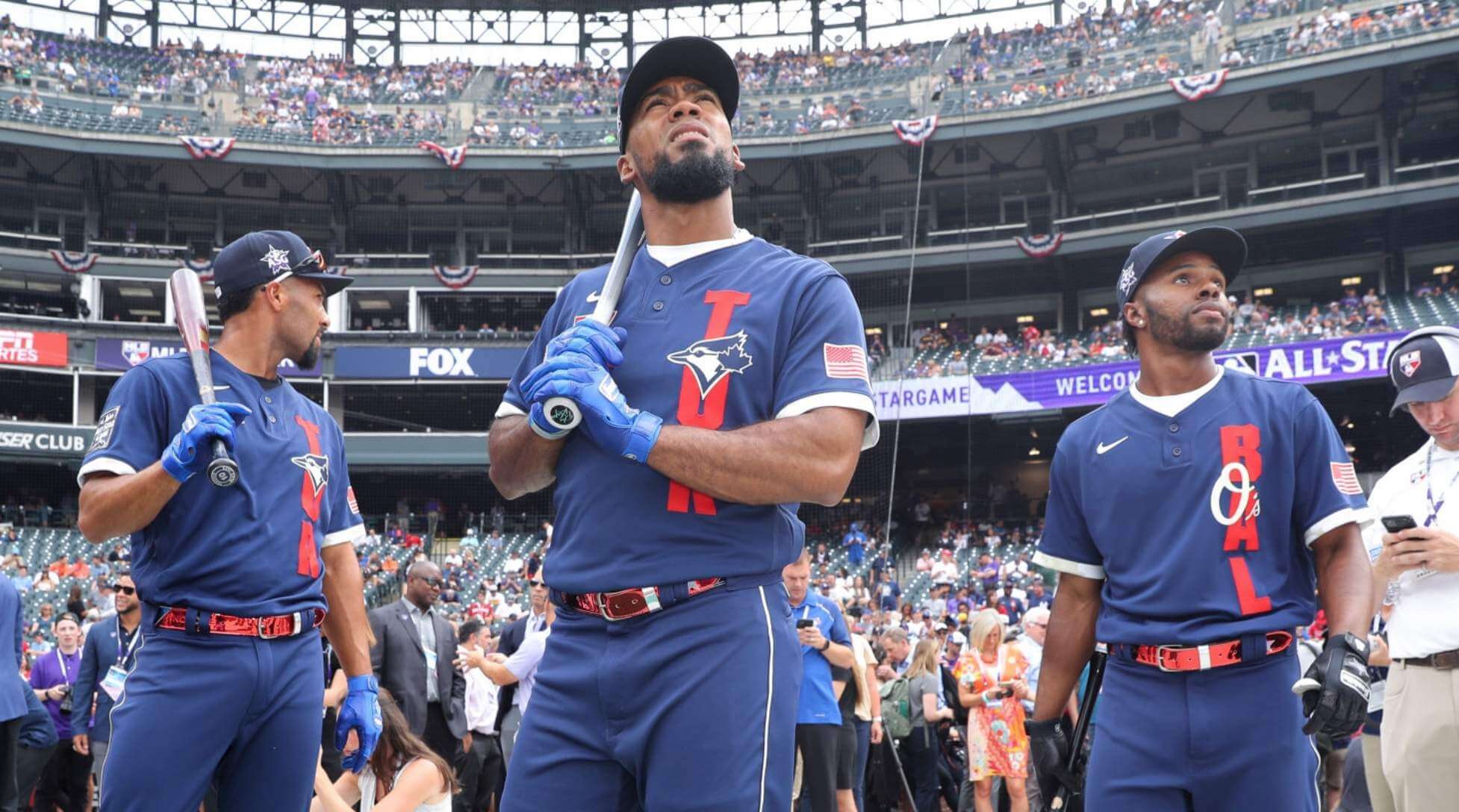
Or at least it did until this year. By switching from the players’ team uniforms to All-Star costumes, MLB is essentially saying, “Yeah, our All-Star event is just another silly clown show, just like all the others.” The fact that the costume designs happen to be particularly dreadful is a side issue — even good All-Star costumes (such things do exist) would send the same message from a baseball standpoint. Very, very disappointing. (If you haven’t already read this LA Times article that was linked in yesterday’s post, I strongly recommend it, as it provides good background on the thinking behind MLB’s decision.)
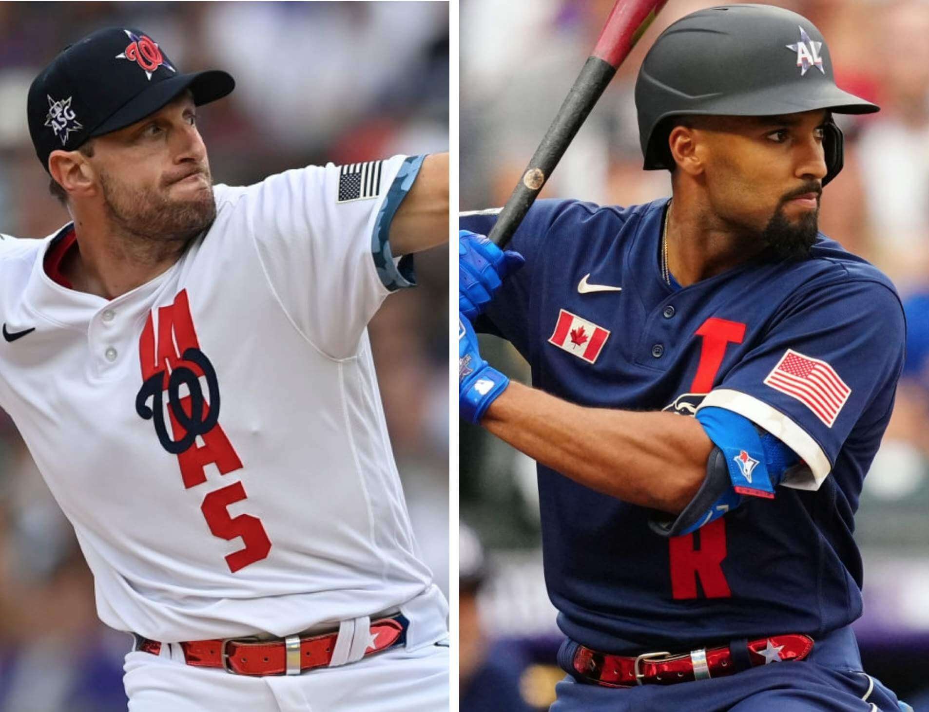
Okay, that’s all I’m gonna say about that. As for the costumes themselves, they were awful, but we knew that already (and I already had my say about them when they were unveiled), so I’m not going to vent about them here. But there were nonetheless lots of uni-notable details from last night’s game — here’s a rundown:
• By far the most important uni-related aspect of the game was that the umps wore ad patches for a cryptocurrency exchange. We knew this was coming, but it wasn’t clear if the ads would be worn on the chest or the sleeve. Both, as it turns out:
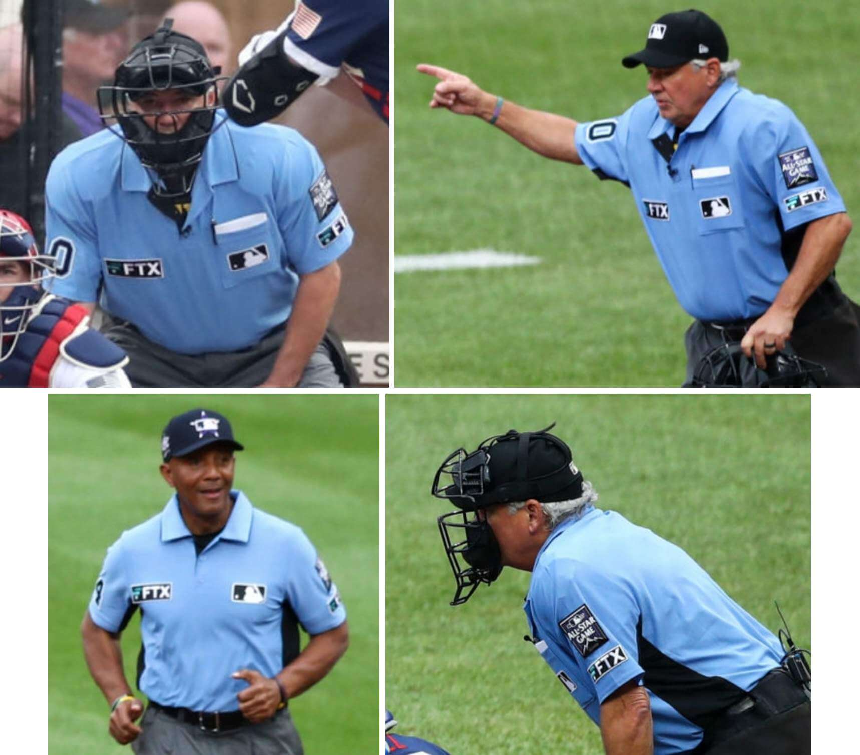
This is not just an All-Star thing. When the regular season resumes tomorrow, the umps will continue to wear these advertisements. The ad deal is for five years. Sigh.
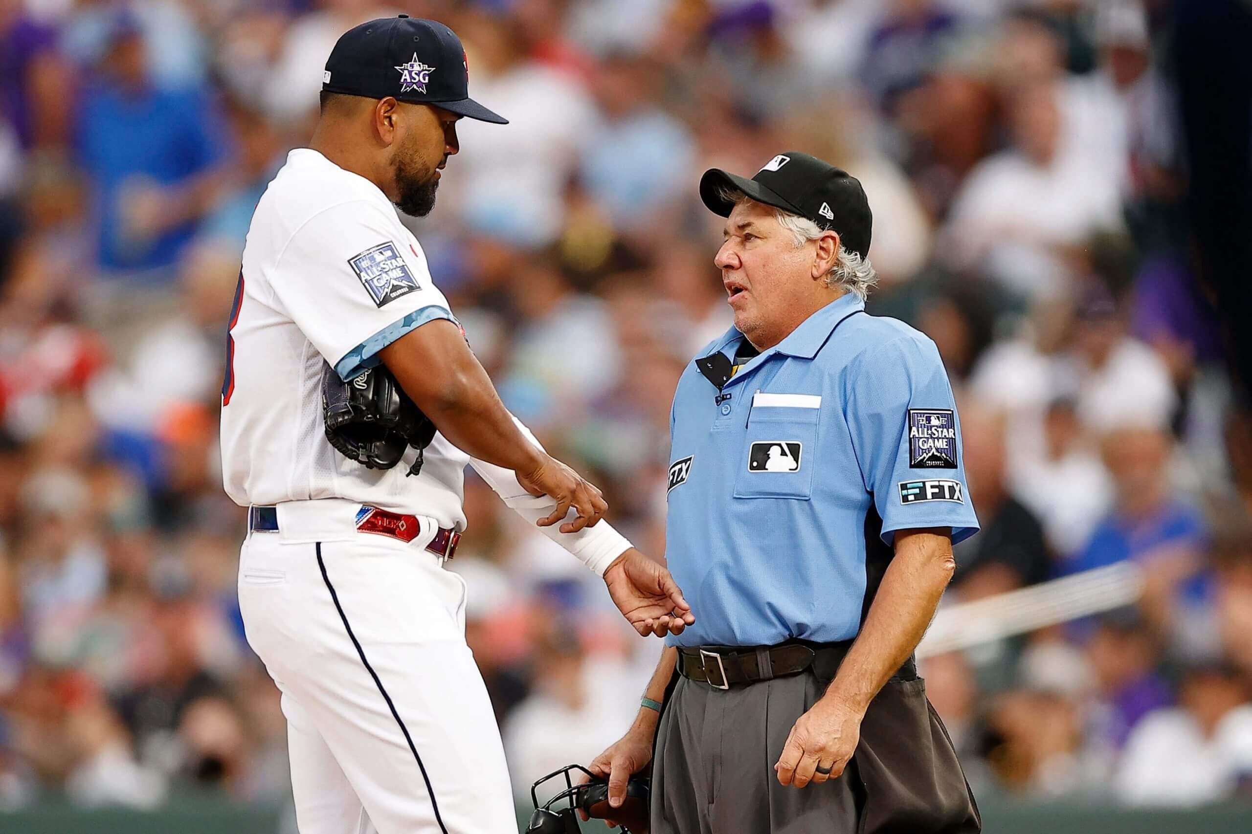
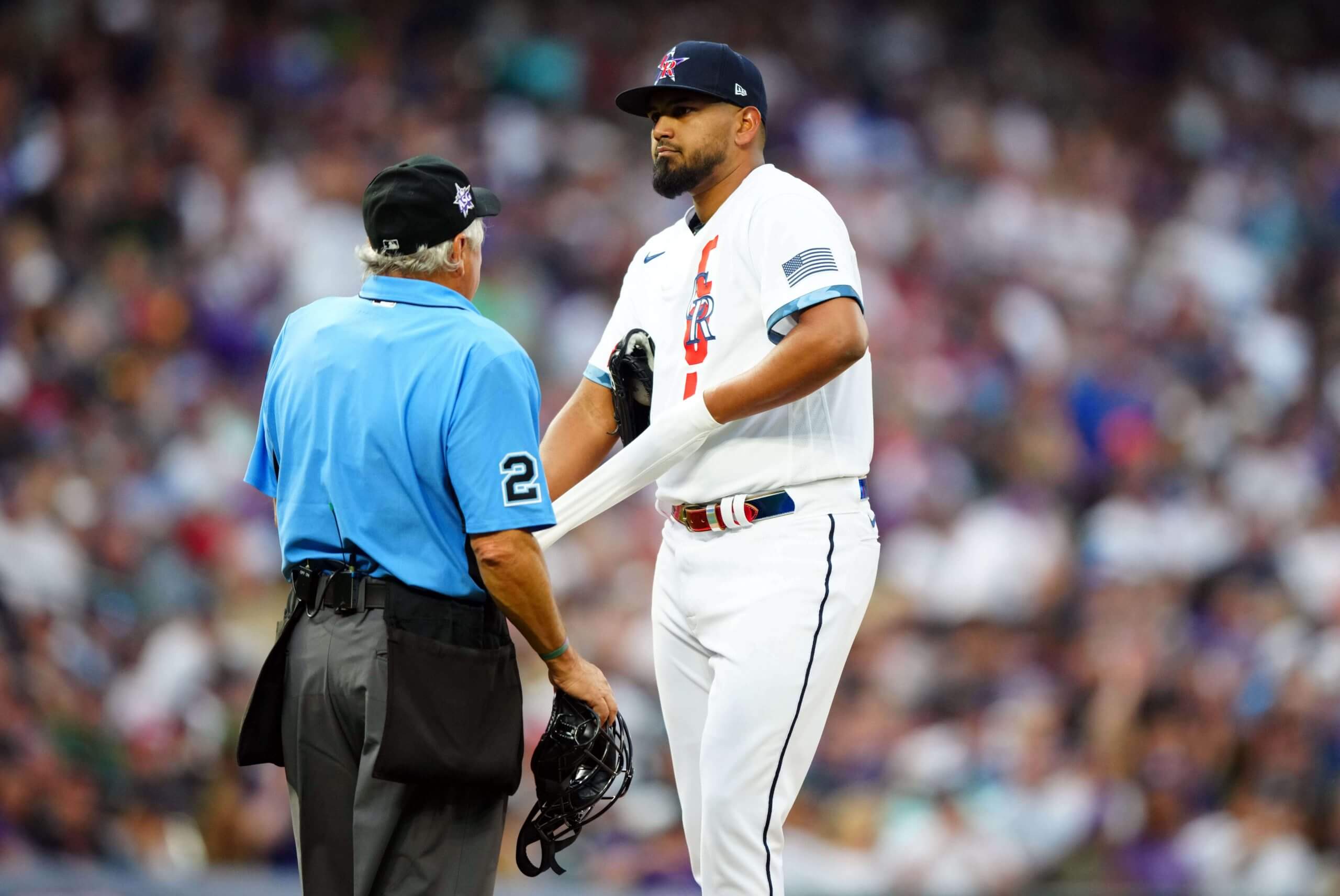
• Speaking of the umpires, plate ump Tom Hallion told Rockies pitcher German Marquez to remove his compression sleeve in the fourth inning:
• It wasn’t clear prior to the game if the players would wear their regular team batting helmets, or if the helmets would match their team-logo All-Star caps. Neither, as it turned out — instead, they wore matte black helmets with sad little “AL” and “NL” logos:
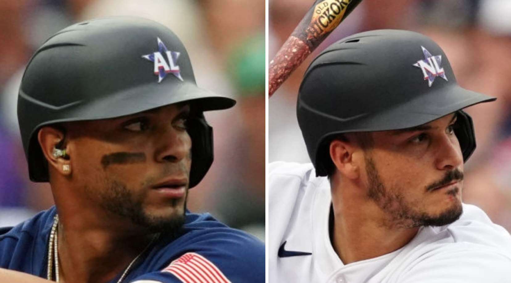
Somewhat incredibly, the helmets were the only uniform elements that referenced the two leagues.
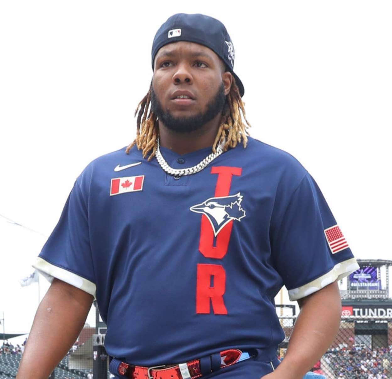
• We knew that all the players, including those from the Blue Jays, would wear an American flag patch on the left sleeve. What we didn’t know was that the Toronto players would also have a Canadian flag chest patch, as seen here on Vladimir Guerrero Jr.:
• Speaking of Guerrero, he had a really great glove featuring a depiction of his dad and himself from years ago, although he apparently didn’t actually wear it in the game:
Like father, like son. (And on one glove!)
Vladimir Guerrero Jr.'s glove for the MLB #AllStarGame 🤩
📸 @MLB pic.twitter.com/5umcdQK4Hv
— The Athletic (@TheAthletic) July 13, 2021
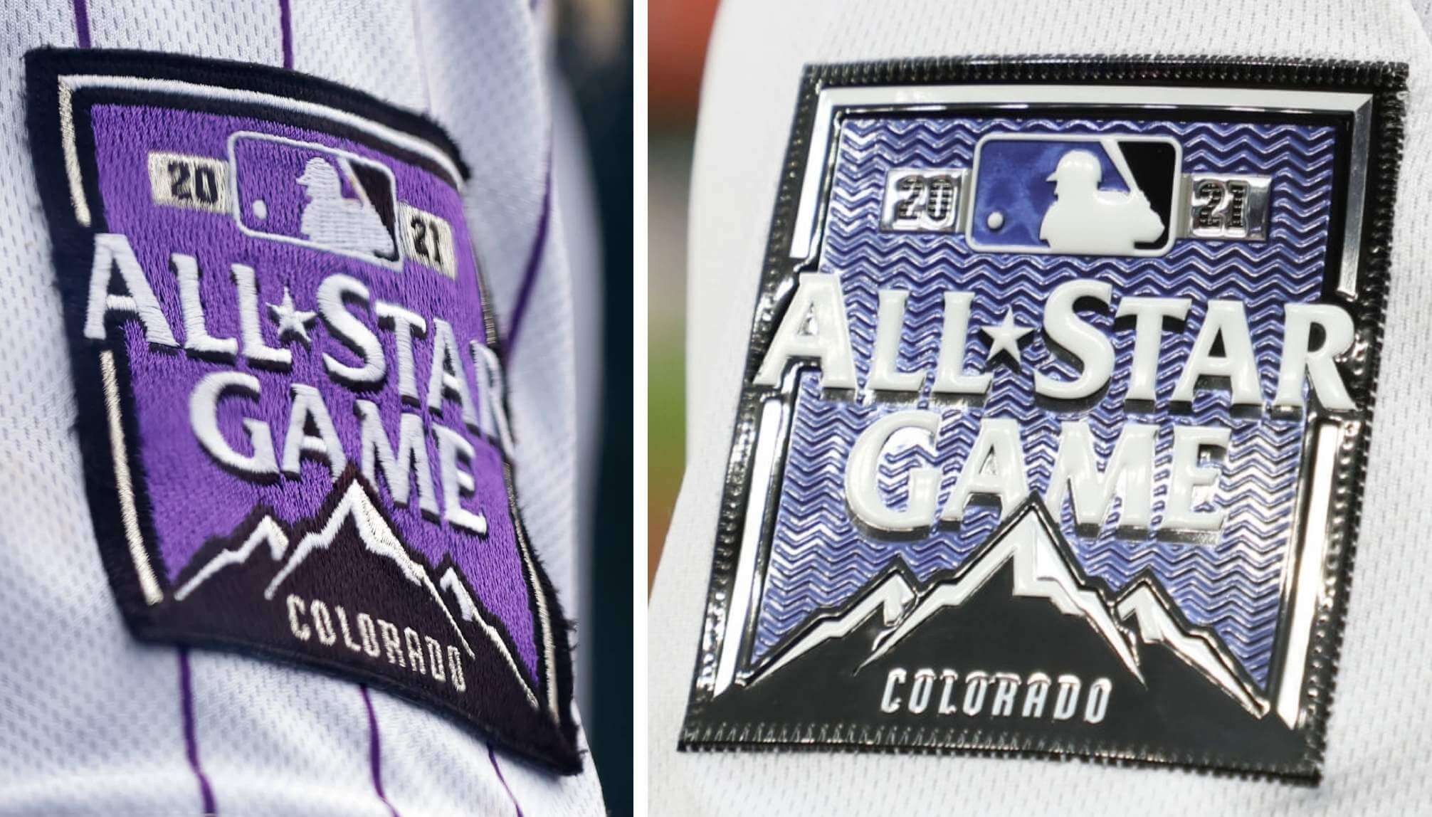
• The All-Star Game patch worn by the Rockies for the past couple of months was embroidered (left), while the one being worn by players last night was plastic (right):
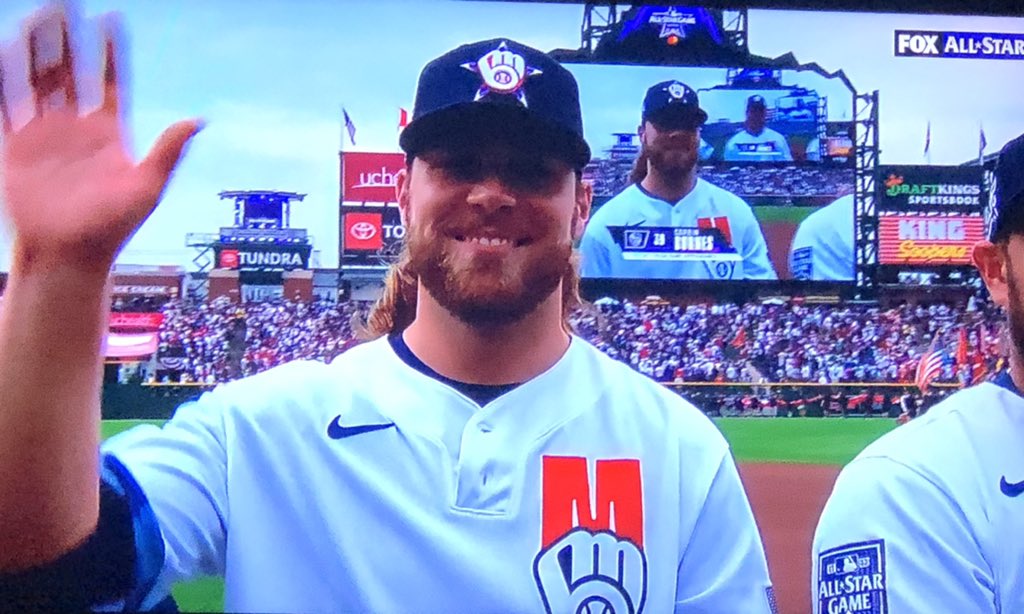
• The kind of detail I like to geek out over: For those two-button jerseys, the top buttonhole was horizontal and the lower one was vertical.
• I predicted in yesterday’s post that the Rockies-themed belts worn in the Home Run Derby would probably be worn last night as well, but I was wrong. Instead, most players wore an All-Star belt design:
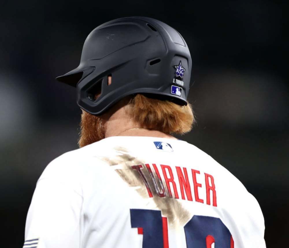
• One visual detail that that even new uniforms can’t change: Dodgers third basemen Justin Turner had his signature pine tar smudge. Dig:
• At least one bit of team-related gear made it onto the field, courtesy of Rays catcher Mike Zunino (and I assume the other catchers in the game did likewise with their own team helmets):
Mike Zunino wore his Rays batting helmet while catching. @UniWatch #AllStarGame pic.twitter.com/YU4jAdCJNa
— Texas Trev (@texastrevor) July 14, 2021
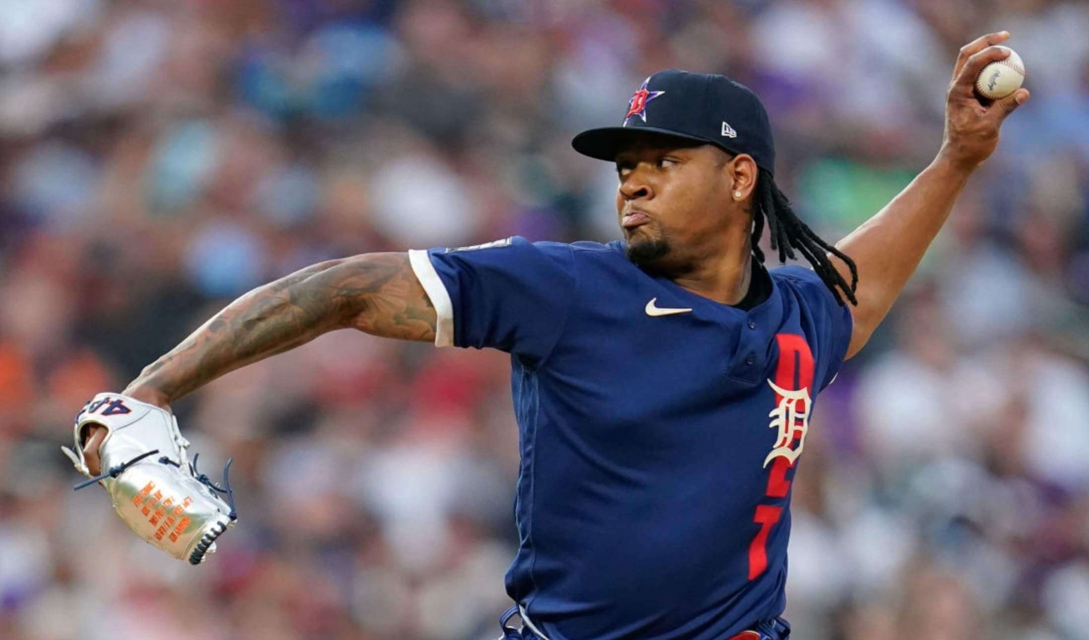
• Tigers pitcher Gregory Soto wore a silver glove — something that I’m sure wouldn’t be allowed in a regular season game, and I’m a little surprised they allowed it in this one (here’s a closer look):
• With protests unfolding across Cuba, Yankees pitcher and native Cuban Aroldis Chapman had a message on his cap during pregame activities (he did not appear in the game):
Aroldis Chapman puts SOS Cuba on cap pic.twitter.com/uKDWtuBkbV
— Bob Nightengale (@BNightengale) July 13, 2021
• Reds outfielder Nick Castellanos arrived at the ballpark wearing a pretty awesome T-shirt drawn by his son:
Nick Castellanos sporting the custom-drawn shirt by his son, Liam. 🔥 pic.twitter.com/jmou7GKyUA
— Cincinnati Reds (@Reds) July 13, 2021
• The first pitch was thrown by former NFL quarterback Peyton Manning, who wore a Larry Walker Rockies jersey:
The first pitch of tonight's All-Star Game was thrown by none other than the legend himself, Peyton Manning 🏈 pic.twitter.com/LYcl23Xskc
— FOX Sports: MLB (@MLBONFOX) July 14, 2021
• All-Star Games often feature a lot of custom shoes, but I didn’t notice any particularly eye-popping footwear last night. Maybe I was just too distracted by the costumes.
———
Meanwhile: Uni Watch reader John Costigan attended the game with his father:
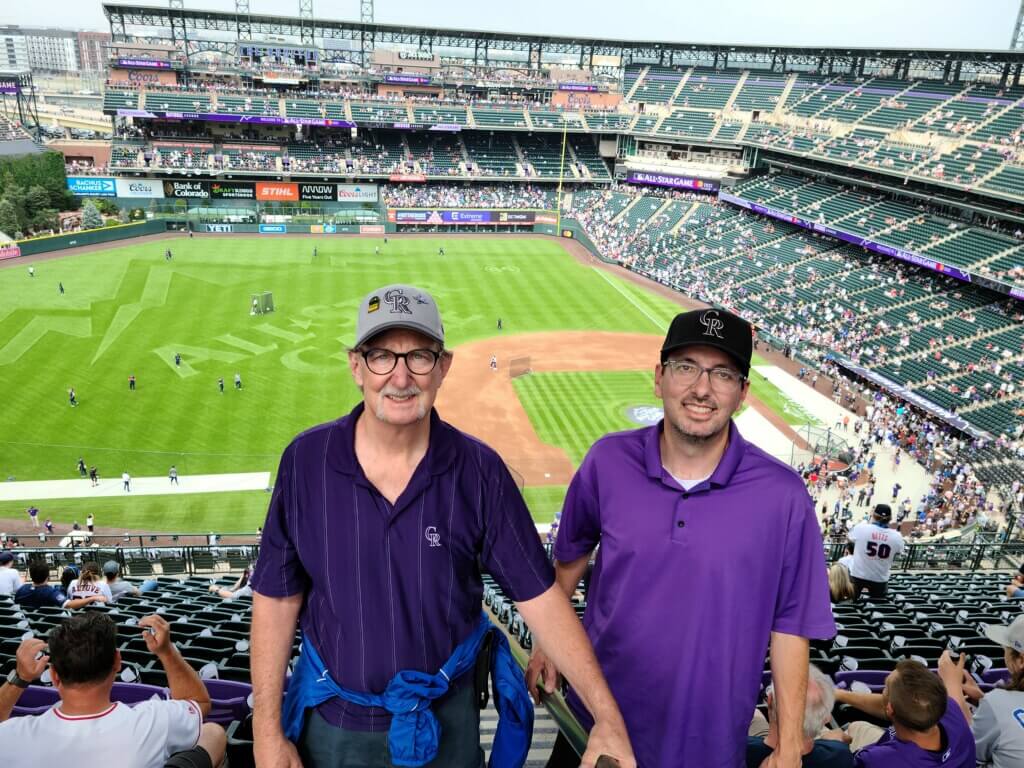
John shared these observations:
The uniforms looked just as bad in person as they did on TV. Hopefully this will be revisited before next year’s ASG.
I was pleasantly surprised to see such a variety of uniforms, T-shirts, caps, and so on being worn by fans. Lots of Yankees, Mets, Red Sox, Cubs, Dodgers, of course, as well as some Nationals, Pirates, Phillies, Mariners, and Marlins team attire. I also saw a couple fans wearing the 1999 Rockies “Turn Ahead the Clock” uniforms and some fans wearing the Giants’ new City Connect design. It was really interesting to observe as a Uni Watch fan, because there was so much variety.
I also saw this member of the Denver and Rio Grande Reds Vintage Base Ball Association:
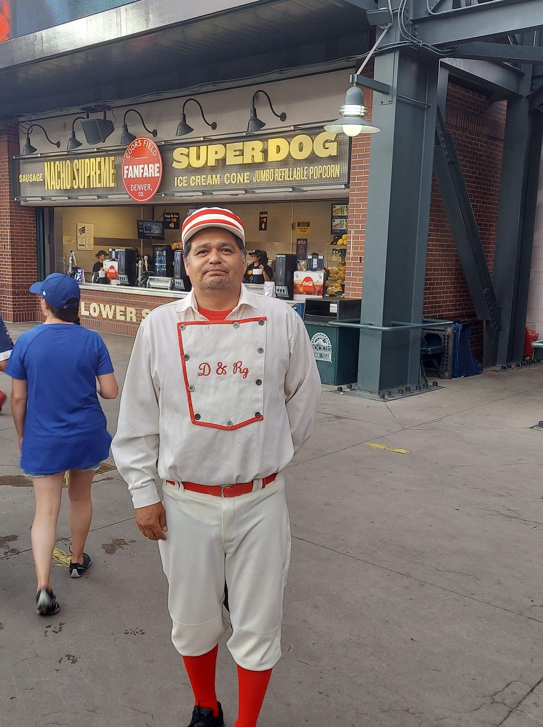
Great uniform, but that one missing button on his bib is killing me!
Final thought: As you all know, I root for the Mets. They had one player in the game — Taijuan Walker, who pitched the sixth inning for the National League. As a Mets fan, I was proud to see him out there — he’s had a very good year but hasn’t gotten much attention because he’s been overshadowed by teammate Jacob deGrom’s unbelievable season (deGrom opted to skip the ASG). Also, Walker is new to the Mets this season — he signed as a free agent during the winter — so many non-Mets fans may not even realize he’s pitching for the Mets this year. Having him on the mound last night in his Mets uniform would have been such a great way to showcase him for baseball fans while also making Mets fans feel proud. Instead, he wore a lame-o costume with barely any Mets branding, so I felt no emotional connection as a Mets fan, and the fact that he now plays for New York probably didn’t even register for most other fans. What a waste. I’m sure many of you felt similarly about seeing players from your own favorite teams.
That’s all I got. Next year’s All-Star Game will be in Los Angeles.
Click to enlarge
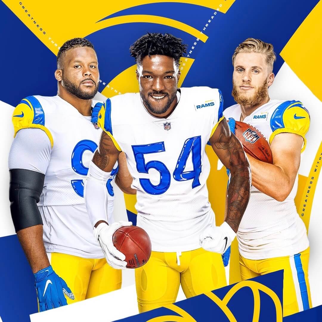
Meanwhile, over on the gridiron: The Rams unveiled their new white jersey yesterday. The new design will be worn for three games this season, including their home/season opener against the Bears.
On the one hand, this is obviously a major improvement over the dishwater jersey. On the other hand, the shiny numerals still suck, the “Hello, My Name Is” patch still sucks, and the rear view still sucks:
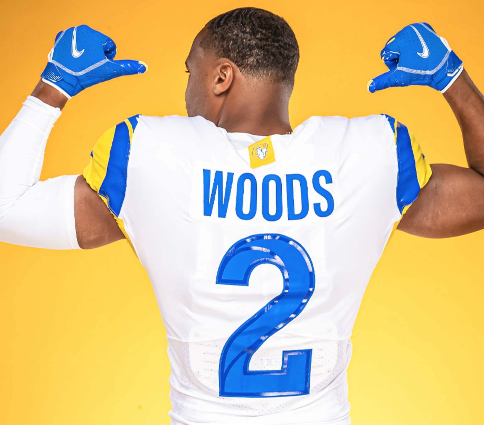
Just to make it clear how far this team has regressed aesthetically, the Rams helpfully provided a side-by-side comparison of this new design and the old one on which it’s based, and it’s sooooo obvious that the original design was better:
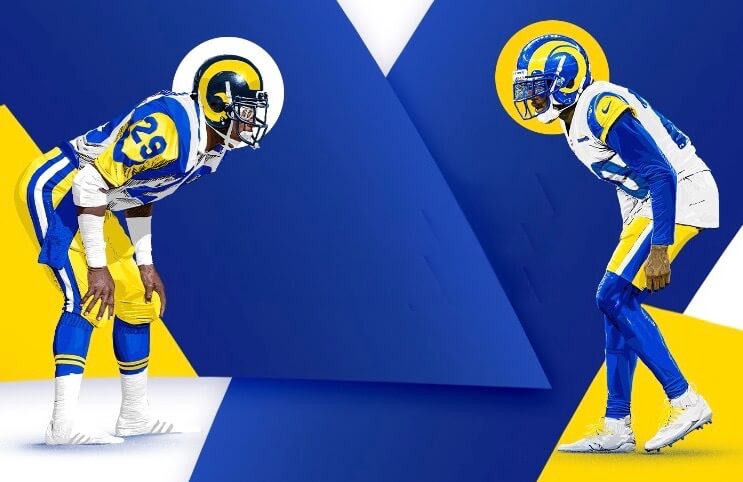
So while white is an upgrade over dishwater, let’s not lower the bar so far that we start thinking of this as a good-looking team — it’s not (especially since dishwater is still in their wardrobe and will probably be worn more often than the white jersey). In four more seasons, they’ll likely acknowledge that themselves.
Click to enlarge
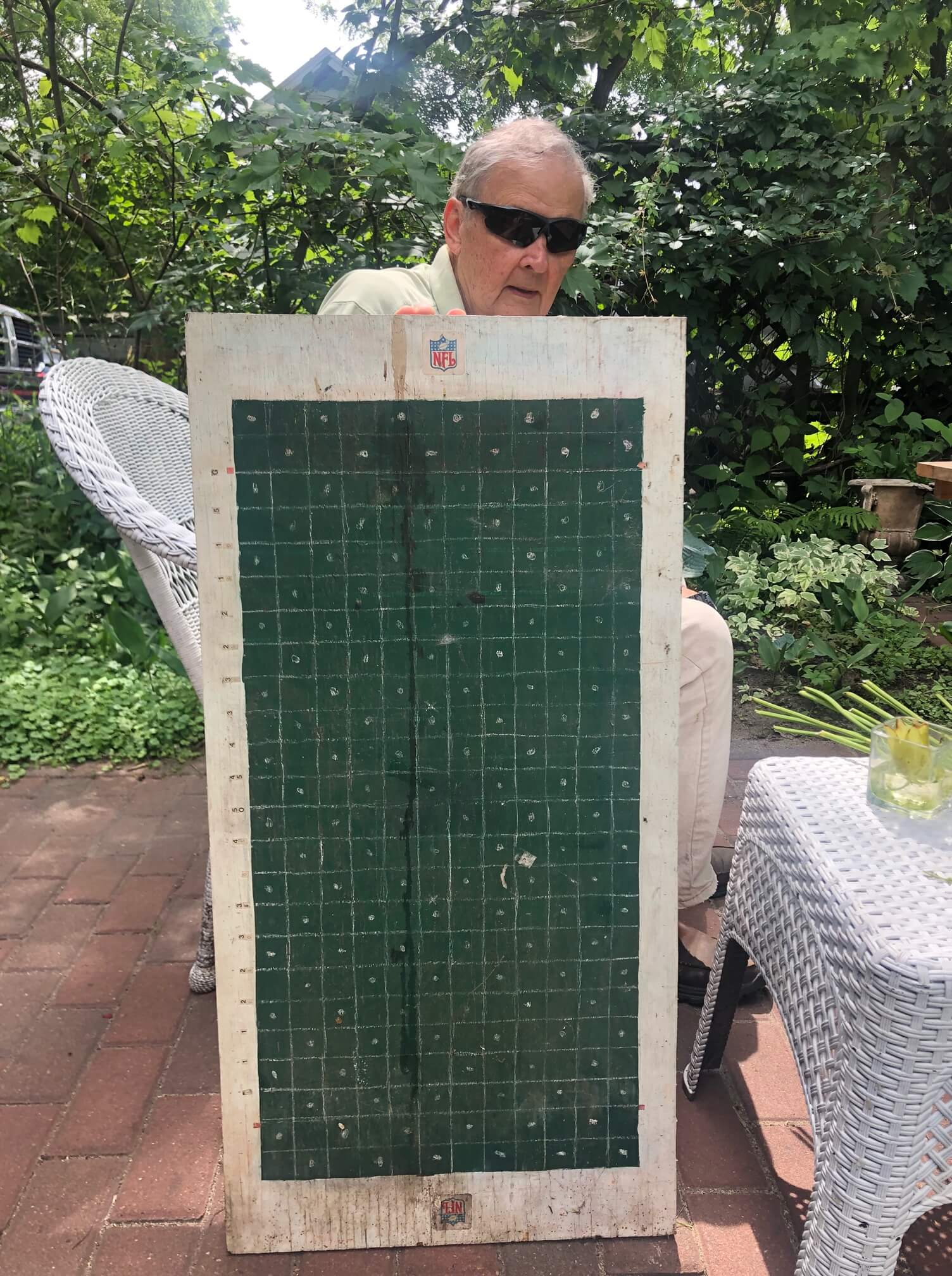
DIY board game: In Monday’s post about that 1970 NFL merch catalog, I referred to a “very rudimentary board game” featured in the catalog. That prompted a note from reader Michael Bialas, as follows:
Au contraire — that game is anything but rudimentary! Each play requires advanced planning and it’s necessary to create a game plan to combat the other coach and their strategy. No other football board game has the potential for a player to actually fumble a real ball and have the opponent recover the ball.
My father and I built our own wooden board to allow for various field conditions. We would sprinkle water on the field when it was raining, add some snow in the winter, and so on. Great fun.
I persuaded my parents to dig out the old board [shown above]. Dusty, but ready to go!
How great is that? Thanks for sharing, Michael!
The Ticker
By Lloyd Alaban

Baseball News: Denver’s City & County Building was lit up in purple yesterday night to celebrate the Rockies hosting the MLB All-Star Game. Ditto for the Nuggets’ and Avalanche’s arena, although the purple effect was less pronounced (from Denver’s own Kary Klismet).

Football News: Will more schools choose to add NOBs to their jerseys now that NCAA NIL rules have been relaxed? (From Patrick Lasseter.) … The BC Lions of the Canadian Football League have put the logo on their helmets for training camp, but have not included the center — ahem, centre— — striping (from Wade Heidt). … New pants for Bowling Green (from Jeremy, who didn’t give his last name).

Hockey News: New wordmark for the Portland Winterhawks of the WHL. … The WHL’s Vancouver Giants have unveiled their new uniforms (from Wade Heidt).

Basketball News: A bakery in Milwaukee has Bucks-themed pastries (from Jeff Ash). … Here’s a closer look at the Space Jam sneaker and console collaboration between Nike and Xbox announced previously (from John Cerone).

Soccer News: New shirts for Atletico Mineiro (from Trevor Williams). … New shirts for Giravanz Kitakyushu based off the Galaxy Express 999 manga. Series creator Leiji Matsumoto is from Fukuoka Prefecture, where the team is based (from Sy Hart).

Olympics News: Here are the USA’s uniforms for the opening ceremonies. The closing ceremony outfits had already been unveiled back in April. … Kyrgyzstan has unveiled its Olympics uniforms (from our own Phil Hecken). … Here’s the Australian women’s soccer team kit (from Germán Cabrejo).
Little name mishap up there.. Jacob deGrom
Yup, already fixed.
I don’t think last week’s leaked Rams jersey looks anything like what they unveiled yesterday. Is it just me?
You would be correct EP. The leak is a white jersey, yellow sleeve horns, and TV numbers. The unveiled jersey is white, but blue sleeve horns, yellow sleeve caps, and no TV numbers.
Not just you. Last week’s “leaked” jersey had a yellow ram horn on a white sleeve. The newly released jersey has a blue ram horn on a yellow sleeve. Not the same jersey. Not even close.
As I look at the side-by-side of the classic version and the new one, there is a lot to like about the new one. IMHO.
(1) You can’t re-create the long sleeves and placement of the TV numbers of the classic design with the current template, so we can’t blame the redesign there.
(2) The helmet color on the new uniforms is a major improvement because it actually matches.
(3) The pants stripe is simpler on the new ones, which is an improvement because the ram horn on the helmet and jersey is already so busy.
Now, Uni-Watch is correct about the plastic numbers and that stupid tag on the back. But the “Hello, My Name Is” patch is barely noticeable.
To point #1. This is why they should have left the last set alone, minus a color swap. Switch the St Louis era navy and gold to the bright blue and yellow and you would be in great shape. It avoided the sleeve length issue by:
A) putting the numbers on the shoulder
B) putting the ram head logo on the sleeve
C) having a smaller shoulder stripe that simulates the ram horn stripe, and divides the shoulder from what is left of the sleeves.
No. Part of the charm of the Los Angeles Rams’ 1980s jerseys was the ram horns on the sleeves. Those ram horns made those jerseys unique; there was nothing else in the NFL even remotely like them. The St. Louis Rams (just typing that makes me feel like I need a shower) ruined that with their jersey design. “Simulating” (whatever that means) the ram horn stripe is not enough; it looks like just another shoulder stripe, which plenty of teams have already. It needs to look like a ram horn and curl onto the sleeve itself. The Los Angeles Rams should have just gone back to their old 1980s jerseys with a third, gold color rush version added and called it a day. Their current set is better than the crap the St. Louis Rams wore, but not nearly as good as their 1980s unis.
It’s not just you. On Twitter there were several similar comments. I believe the photos shown last week on this site were actually the dishwater jerseys the player was autographing, but given the team’s comments about the unveiling in July, it was assumed those shown were the new/alt white ones. The prior pics do look white, at least at first glance. You can tell, however, that the shoulder striping is different (yellow only on the prior photos, blue and yellow on the pics today).
It seems like Paul may be the only one who thinks yesterday’s unveiling “confirms” the leak. He said that in a tweet yesterday too. I just figured he’d only given the actual jersey a quick glance before firing up Twitter. Guess not.
Nobody likes to be wrong but SportsLogos.net, the site that had “confirmed” the leak was the real design, clearly was. Paul too. The autograph company that created those bootleg jerseys already had said they were not the new alternate.
Not only that, but I’m just now noticing that the 2 pics in the post from last week addressing the leak are totally different from one another…I think the jerseys the guy is actively signing down the post are actually the ‘bone’ jersey just with odd lighting…the ram horns around the sleeve are totally different from the one at the top of the post. Which of course are both totally different from the jersey that was officially unveiled.
OK, OK — I’ll change the wording of the text!
Why would the Rams depict one of their players with at least 3 uniform violations? (Guy on right) In a uniform minded release, no less!!!
As is summer tradition on my site, the Auburn Uniform Database has published 14 brand new incredibly silly concept uniforms for Auburn Athletics. Each concept was submitted by Auburn fans just to see how crazy the design could get.
They’re bad on purpose, so don’t freak out haha.
link
A question for the philosophers: if, as in every past MLB All-Star game, the players on each team (mostly) wore totally different designs, do those outfits cease to be uniforms, at least for that one game?
I would say the players are wearing the uniforms from their respective teams, the all star teams themselves have no uniforms.
For instance, I work in the solid waste industry, in the past the industry association has had competitions for the various blue collar positions (front end loaders, etc.) to see who is most efficient at their skill set. All the participants are wearing the uniforms from the companies. They are still in their work uniforms, just participating in special event. The all star game is the same.
Those solid waste industry work uniforms are probably better than anything Nike has ever come up with. Nike ruins everything it touches.
I am undoubtedly in the minority here, but the fact that the AL wore blue pants to go with the pullovers actually made their unis look okay to me. (To be clear, not *good*, and I still don’t like special ASG uniforms in the abstract, but better for me than the lame-o NL uniforms.)
I would agree that while the uniforms were awful, the navy pants were actually not part of what made them awful.
Well put Greg, exactly how I would have expressed my thoughts as well.
Lee
I agree, pairing the navy jerseys with navy pants at least gave a cohesive look. And while the jerseys and caps were both terrible, I do like the full navy look. Seems very old school to me.
Daniel I totally agree–the pullover style jerseys and the navy pants were the most palatable things about these otherwise atrocious uniforms.
I didn’t watch the game, only saw pictures. The presentation looked like two softball teams. Awful.
Indeed, the jerseys themselves were mind-boggingly horrific.
Even if you (needlessly) choose to outfit teams in an All-Star uniforms, how they landed on what they did baffles me.
Lee
Your comments about Tijuan Walker were spot on. As a 53 year Met fan, I set an alert on my computer to turn the game on if and when Walker got into the game. When I tuned in and saw him in the clown suit, I flicked it right off. I momentarily forgot that the teams were even wearing those monstrosities and when I put the game on, it jarred me when I saw Walker waring it. I had to look close to see that it was really him. What a difference from 50 years ago, when I camped out in front of my family’s 1964 RCA console color TV ($750 – a price that my father paid AFTER his 20% discount as an RCA design engineer) for an hour before the game started. With Tom Seaver and Bud Harrelson both starting for the National League and Lindsey Nelson on the field as a between innings reporter. It was a 10 year old Mets fan dream come true. I watched all 9 innings as if my life depended on it. When Harrelson hit a fly ball towards the short Tiger Stadium porch in right field that reached the warning track, I jumped off the coach in anticipation. A half a century later, the game means nothing to me. And such things as these uniforms are to blame. A pox on Rob Manfred and MLB Properties. It is possible to have decent special uniforms – after all the National League wore special uniforms in the first All Star Game in Chicago. At least those uniforms reflected the integrity of the basic uniform – not like last night.
In the pictures I saw, one couldn’t tell who the player was, what team he represented.
Maybe the only thing I did like was the soccer-esque addition of stars to the back of the jersey to indicate the number of all-star appearances for each player.
Agree to a large extent. I had the game on, wasn’t watching closely, saw from the center Foles camera “Walker” was pitching and wondered who that was. I know Tijuan Walker, though I’m not a Mets fan. I just didn’t think he was having a good enough year to be on the All-Star team. If he had been in his Mets uniform, I’d have known immediately who it was. While the uniforms were terrible, I kind of liked the hats. The five pointed star behind the logo was a nice touch.
I forgot the game was on, caught it flipping channels in the second inning, watched a pitch or two, and moved on. Didn’t go back. I consider myself a baseball fan, but interleague play has made it irrelevant. The clown suits just add to my indifference.
The uniforms for the ASG were the final nail in the coffin for my enjoyment of the game, which began diminishing when the DH was added in AL parks in 1989.
The Rams’ current uniform looks like a not-particularly invested or detail-oriented illustrator’s interpretation of what their classic uniform looks like (half-assed pants stripe, ram horn on the shoulder kinda goes around but not all the way, just kinda awkwardly wedges in there, etc.) The side-by-side photo makes this abundantly clear (at least to my eye).
that comparo of the LA unis brings up so many questions/issues. 1. you really don’t see pro football players wearing baggy undergarments, so it’s odd that they would feature one in this image. 2. the thin blue towel on the classic uni is very readable and adds to the look, while the big white towel on the new uni just looks like the uniform is dirty and untucked, and hides quite a bit of the pants. 3. the new pants striping is so awful and only highlighted by this side-by-side look. 4. bicycle shorts. 5. essentially no socks on the new uni. 6. socks replaced by (sequined?) tights. i know they aren’t really sequined. it actually appears to be a pattern made out of that shiny gel appliqué stuff that nike is so high on lately, and that’s just as bad. 7. the scale of the horns (on helmet and jersey) is much smaller on the new uni, and while the shoulder horns on the old jersey were not great imo, they were intimidating in that they were large and bold and looked like horns. 8. richness of color. i’m sure the yellow and blue match up pretty comparably and i don’t favor the navy/goldenrod helmet over royal/lemon yellow retro look (or maybe i do… hmm) but the sheer amount of gloss and sheen that is on the new unis and helmets makes them look much less saturated and less visually appealing.
pictured separately but also of note to me: do all of their uniforms feature the yellow diamond shaped tag with the ram’s head logo above the NOB?
all in all, a pretty weak (not UGLY, just WEAK) uni effort highlighted by an even weaker effort with the publicity images.
The Rams’ current uniform looks like a not-particularly invested or detail-oriented illustrator’s interpretation of what their classic uniform looks like (half-assed pants stripe, ram horn on the shoulder kinda goes around but not all the way, just kinda awkwardly wedges in there, etc.) The side-by-side photo makes this abundantly clear (at least to my eye).
Next year’s MLB All Star game will be in LA, of course only if they don’t do something to piss off the Commissioner’s Office.
Did I notice that the number of stars underneath the number on the All-Star jerseys matched the number of All-Star game appearances for each player?? I really can’t remember if this was noticed or mentioned
Yes, that’s what the stars were for. And yes, it had been mentioned here.
What, no mention of Gregory Soto’s silver glove? Saw that get mentioned all over the socials last night…
link
My bad. Meant to include it and got distracted. Will add it now.
Context for my quick story about last night’s uniforms.
I am an Orioles fan. My family is an Orioles fan. My mom has recently beaten breast cancer. She is, obviously and understandably, a HUGE Trey Mancini fan. In fact she really was already, but this past year has sealed it.
When FOX did the SU2C thing in the middle of the 5th or 6th inning I believe, where they show everyone holding up the signs they made…they showed our CF Cedric Mullins for a second, whose sign read that he’s standing up for Mancini. I snapped a photo of it and sent it to her.
She asked who it was in the picture holding up the sign.
SHE DIDN’T RECOGNIZE CEDRIC MULLINS BECAUSE OF THE UNIFORM.
Hmmm…’my family is an Orioles fan.’ I was trying to go for a clever turn-of-phrase here, and it just ended up looking like a really bad typo. Oh well, you win some you lose some ¯\_(ツ)_/¯
If you’re going to represent the Orioles on a generic uniform, why oh why did Nike use the O’s and not the Bird?
That Nick Castellenos t-shirt needs to be available for fans to buy in time their for next homestand. Fantastic!
Be it the LA Times article talking about why there are MLB all star uniforms now (duh, Nike marketing to youth) or this new Rams uniform, I think it speaks to a pretty specific problem with a lot of the new stuff that comes out.
It is new for the sake of new, it has odd design aesthetics that appear simply to be there for the sake of being different and eye catching. There seems to be this idea by Nike (and others as well) that new, different, and attention grabbing are in of themselves virtuous or good design. Of course that is pure nonsense. The graphic showing the two Rams sets is a perfect example of that. One set is well thought out, you can understand the reasoning for the different parts of the design, and it is obvious what they are. The other clearly wants to evoke thoughts of that classic design, it recognizes it is great and liked, and uses that to start, but just throws a bunch of stuff at it just to be different.
The Rams, if they wanted a great, well liked design, could have very easily just switched back to the classic, but with the brighter blue helmet, etc., or could have even color swapped the navy and gold set to blue and yellow. I know merchandise drives the uniform design now, but I don’t know why different for the sake of different is part of that ideology.
I hated the idea of the players not wearing their normal uniforms. But . . . The uniforms actually grew on me. They looked better with the pants and the back of the jerseys.
Yeah,it grew on me as well. If MLB is serious about this in the future, maybe do one uni solid white, the other a solid color, and do away with those silly logos. If they aren’t going to do the team unis, then I think they should remove all team logos from them. Just make it AL vs NL.
The jerseys looked even worse on-field to me than in the promo photos I had seen before the game. Hats/helmets were terrible as well. Pants tho, those were OK.
Just horrific overall… and sad, frankly, IMO.
Lee
It looked like Brewers catcher Omar Narvaez wore his Brewers gear in the game.
Congratulations, baseball, you finally did it. Your all-star game has jumped the shark and is now as unwatchable as every other all-star game.
And it’s not just the clown suits, as putrid as those are. It’s the stupid in-game interviews and all the other extraneous overhyped b.s. that attends it.
You would think Ohtani’s story would be enough in itself and wouldn’t need endless gushing. Nope, they just had to beat that to death.
Midsummer Classic? Not anymore.
Fox and ESPN, probably together with MLB, just don’t know what makes their product appealing at all. This is what you get when you hand the entire thing over to marketers.
Wondering when Poochie will show up on an MLB broadcast. That’s definitely how out of touch they are with what people like about baseball as compared to what needs to be fixed to make it more accessible to viewers.
Amen, Marty.
Plastic patches are about as bad as it gets.
Au Contraire. The old DIY board is so cool.
“Denver’s City & County Building was lit up in purple yesterday night to celebrate the Rockies hosting the MLB All-Star Game. Ditto for the Nuggets’ and Avalanche’s arena, although the purple effect was less pronounced (from Denver’s own Kary Klismet).”
It looks like the photo of the arena doesn’t capture the effect of the purple lighting quite as well on a computer screen as it did when viewed on my phone screen – or as it appeared in person. Here’s a shot with the filters bumped up a bit to give what I think is a bit more accurate representation of what it looked like to my eyes:
link
And here’s a shot of another part of the arena to give a fuller sense of the purple lighting effect:
link
Of the many things wrong with the AS costumes…it had the effect of making many faceless players (one of the sport’s biggest problems) even more faceless. As a Pirates fan, I know what Bryan Reynolds looks like, but most people couldn’t pick him out of a lineup. Take away the one thing that might distinguish him (oh, he’s on the Pirates) and there’s no connection. MLB teams should want their players shown in their team uniforms as often as possible. This nonsense about “appealing to the youth” is cover for “selling merchandise.” If you want to appeal to the youth, make room for the wide variety of uniforms, and personal expression within those uniforms, to stand out.
Really well stated — a better version of what I was trying to express with my bit about Taijuan Walker.
Paul – what you wrote about him was great, and exactly how I felt as a Pirates fan (I mean, how amazing was it that there were two starters from such a terrible team). I’m just struck that they did something here that’s bad for casual fans, diehard fans, and as some of the player quotes suggested, for the players.
My thoughts exactly, JD! I was trying to formulate a way to say this same thing myself, but you’ve done it better than I could.
Longtime Uni Watch reader and contributor R. Scott Rogers often talks about functionality as the most important aspect of good uniform design and how flashy new uniforms often fall short of that standard of good design because they fail some key component of functionality. The All-Star Game uniforms are bad design for precisely the reasons you point out – the players are virtually unrecognizable because you can’t tell which team they’re representing from anything farther away than a closeup shot on television.
Even in closeup it was still hard to tell which teams the players were representing because the team logos were rendered in such a small size on the uniforms and in non-team colors. Regardless of one’s thoughts on the aesthetics of the uniforms (and I thought they were horrid), the uniforms were an abject disaster from a functional design standpoint.
YES!
As a Pirates fan who was at the game last night, I was SO disappointed not to see the Black and Gold. I thought the unis were worse in person as they had ZERO personality to them. They just looked like plain navy and plain white pajamas.
As has been stated, everyone wearing their own uniform is such as special thing for the All Star Game and I was so disappointed that probably the one and only time I will go to one they wore these.
I was at the game last night also. I did the planes, trains, and automobiles thing to come from San Diego. (My favorite moment was when someone said to me and my buddy, both of us wearing Padres jerseys, “Hey Tatis! We love you but we hate you!”).
I am a major baseball fan, and he is a very new one. We had a good time people watching, and I was giving him a tutorial on what makes a cool jersey (a beautiful vintage Musial jersey) and what is an unspeakable horror (basically any old “fashion jersey” made by Nike before they had the contract.). There are exceptions, if a beautiful woman wants to wear a pink Yankees jersey, the court will allow it.
It was so cool to see literally every team represented in the stands by all these great fans, even seeing Expos jerseys and Monarchs jerseys. I maybe saw a handful of the Ralph Lauren looking unis being worn. Hopefully the sales will be horrible, and like those comical New Era caps, they will go away. I would certainly like to have seen the four Padres that saw action last night to have been wearing their brown. But if they do insist on making them wear uniform uniforms, at least create a good design. I’m glad our seats were far enough away that it just looked like navy vs white.
I actually was thinking about shirt buttons as well and wondered why the top and bottom button-holes are generally horizontal on any buttoned shirts, while the rest are vertical. Is it so you can easily tell which are the first/last buttons without looking, or is there any more functional reason?
It’s because there’s usually more lateral pressure on the top button, so the horizontal hole format helps to prevent the button from coming undone.
On some men’s dress shirts, the bottom hole (the one that gets tucked in) is also horizontal, because the shirttails can get jostled a bit as the wearer moves around, creating pressure on the lower button.
The Canada flag path on the Blue Jays jerseys seems like a total afterthought when they realized or were told that this team doesn’t play in America. It’s a completely different style to the American flag patch they have and looks like it was just slapped in an open space on the jersey.
Agreed.
With all of this ‘baseball is a global game’ statements made last night after pointing out the different nationalities that won, saved and earned MVP. It would be nice if the MLB cooled it with the overzealous USA pandering year round. Cameo unis, American flag patches, GBA at the 7th inning stretch, etc.
Embrace the global game and the international rosters and just be known as the elite baseball league in the world.
If it’s an international game, why not put the flags of the countries from which the player originates?
Agree, I think if we are going to have special all star uniforms, they absolutely should go with the flags from the players’ countries given the international flavor MLB, NHL, and now NBA. If the game is specifically about celebrating those star players (rather than the team oriented nature of the real games) then let the players represent their homes with respective flag patches.
At least the Canadian flag was accurate, unlike the red/white or blue/white American flags Nike deemed were acceptable (and acceptable to MLB also), yet not a peep from the flag police.
As much as I hate jersey ads, the thing that bothers me the most about umpire uniforms are how bad their pants look. They are way oversized/ill-fitting.
Yes, several umps are not exactly in the best shape but their pants are comical at this point and could use a slimmer fit.
The pants are larger to accommodate shin guard when they are behind home plate. I would guess that they don’t have “plate pants” and “base pants” they just wear one type of pants no matter what position they are assigned for that game.
No, @Josh, we have separate pants for plate and bases.
@Zak thanks for clearing that up. I guess I assumed they always wore the same pants in case they had to rotate because the HP ump had to leave the game or something.
That’s actually a weirdly good point. Our plate pants are huge to accommodate shin guards, but even standard pants for the bases are bigger than normal slacks, and there no reason for it. It just looks sloppy. I’m curious when Nike will re-design the umpire’s uniforms since they now have the contract.
Apart from the obvious laziness of the design of last night’s uniforms (the caps and helmets were unduly heinous), the best takeaway is the age of the monochrome uniform is finally upon us. I can’t wait. Especially for solid green and solid gold uniforms on the Athletics. Half-a-player two-toning only works with sansabelts and obvious stirrups.
Also, the numeral treatment grew on me as the game wore on.
“We knew this was coming, but it wasn’t clear if the ads would be worn on the chest or the sleeve. Both, as it turns out.”
I’m worried this sentence will be reusable next year in reference to the player’s threads after the CBA…
Vancouver Canucks relocated AHL team have been named the Abbotsford Canucks and appear to be using the Johnny Canuck logo. link
OUR HISTORY
Paying homage to our roots, and those who have worn this logo before. We’ve brought back Johnny Canuck, this time giving him centre stage, to represent where we’ve come from while looking ahead to what we will become.
I should celebrate this but have a certain level of disappointment. The reason is I have wanted the NHL Vancouver Canucks in a green uniform with Johnny Canuck as their alternate for what feels like forever. The owners have insisted on giving them a blue alternate and staying far away for putting Johnny on as a jersey crest. Then they end up doing it but it is the look for the AHL team.
Vancouver Canucks relocated AHL team have been named the Abbotsford Canucks and appear to be using the Johnny Canuck logo. link
Jersey links:
link
OUR HISTORY
Paying homage to our roots, and those who have worn this logo before. We’ve brought back Johnny Canuck, this time giving him centre stage, to represent where we’ve come from while looking ahead to what we will become.
Cooperalls???
Cooperalls on the logo. Did the team ever wear them?
Unpopular opinion/poll question: if given the choice of seeing the All Stars in these uniforms they wore last night OR just wear the normal team uniform EXCEPT you have ad patches, what do you choose?
I know what I choose!!!
Sophie’s Choice! I’d obviously say neither!
If the choice were between those uniforms from last night with no ad patches and regular teams uniforms with ads, but the teams don’t wear ads during the rest of the season, I’d prefer the latter.
If the choice is the All-Star Game uniforms in exchange for teams wearing ad-free regular uniforms during the season, then give me bad All-Star game unis every time! (I don’t have to watch the game, after all.)
I only met in terms of the ASG for the ads on the regular unis.
Part of the appeal of the ASG is to see players from teams you don’t usually watch. These players are easily identified by their uniforms in most years.
When Trevor Rogers came into pitch, I had no idea who was on the mound. I haven’t watched a Marlins game all year, and his uniform didn’t offer any clue as to which team he played for. I actually had to google who Trevor Rogers was. That shouldn’t happen while watching the All Star Game.
I’m a Rams fan and I’m going to come out with an unpopular opinion here but I like the new white jerseys and hope they will be swapped for the bone jerseys next season and worn more than 3 times. A lot of good memories in those white Rams road jersey…from Youngblood playing the Steel Curtain in the Super Bowl to Dickerson to the greatest show on Turf and Mike Jones’ tackle. I never understood why they never considered that as a throwback but went with the blue jerseys (also a great look)…with the economics of sports and the NFL being what they are, the Rams were never going to go back to the old design when they can sell both the old and the new. There are elements of this look I’d love to see ironed out in the future (the horn, the gradient number on the blue jersey, the bone jersey’s look and disconnect from the other looks) but the look has grown on me over time and I think these white jerseys should have been in the mix from the start.
As bad as the All-Star game uniforms were, they were NOT the worst to ever be donned in Denver.
Google 1978 Caribous of Colorado.
Did Paul reference a predominantly purple design as an example of a good ASG uniform?
I happened to tune into the AS game right when a HR was hit. I couldn’t make out who was rounding the bases cause of the uniform. I couldn’t even tell if it was a AL or NL player at first.
The shade of orange the Phoenix Suns are wearing is relatively unique? It’s not the blaze orange of the Philadelphia Flyers, Cincinnati Bengals etc. Nor is it Tennessee Vols orange. It’s somewhere in the middle of that spectrum?