For all images, click to enlarge
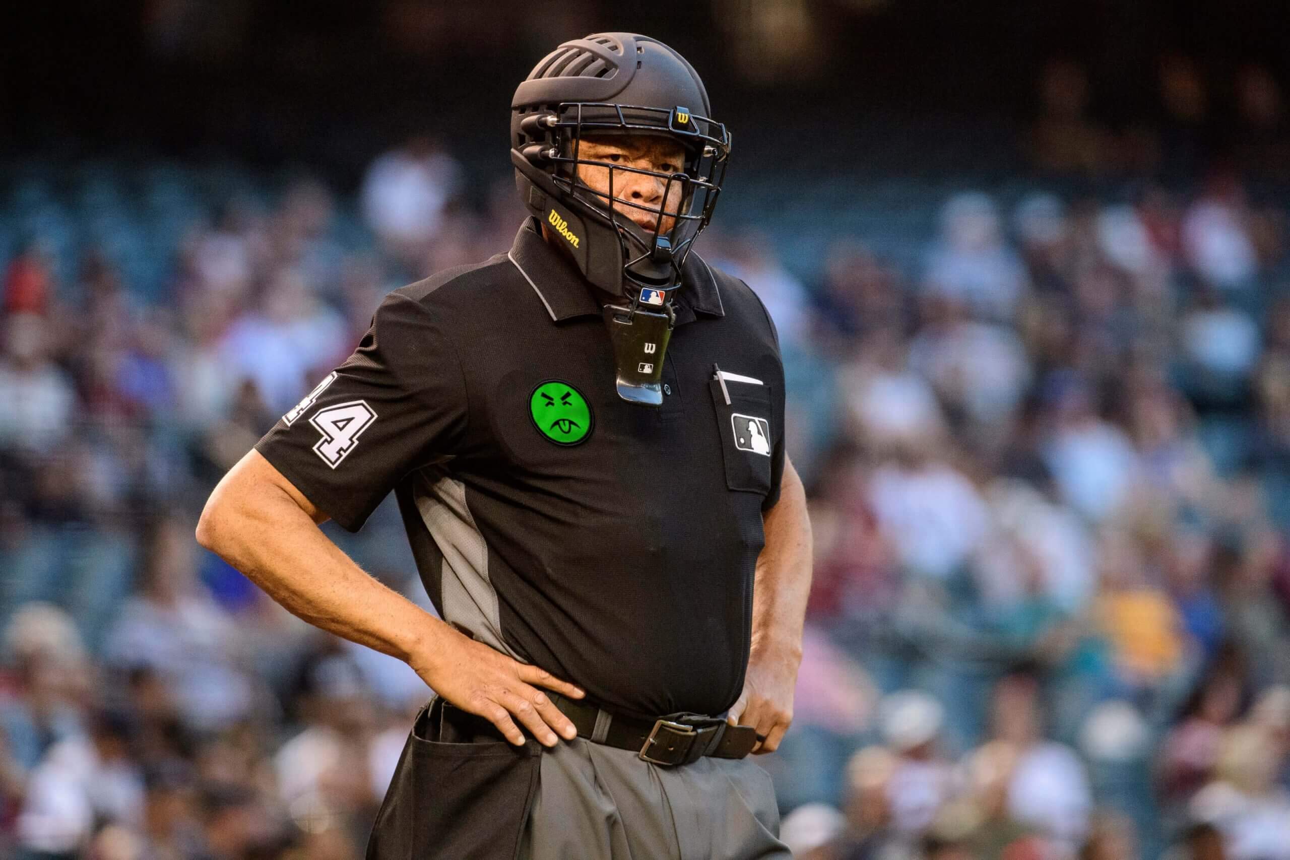
Welcome back to Ump Watch, where we continue to cover the wide world of umpiring attire. Sadly, the latest news on that front is of the gross variety, as MLB yesterday announced that umps will soon begin wearing advertising patches for a cryptocurrency exchange. The patches will make their on-field debut on July 13 at the All-Star Game and will become a permanent fixture from then on. Although not mentioned in that press release I just linked to, various news reports indicate that the deal is for five years.
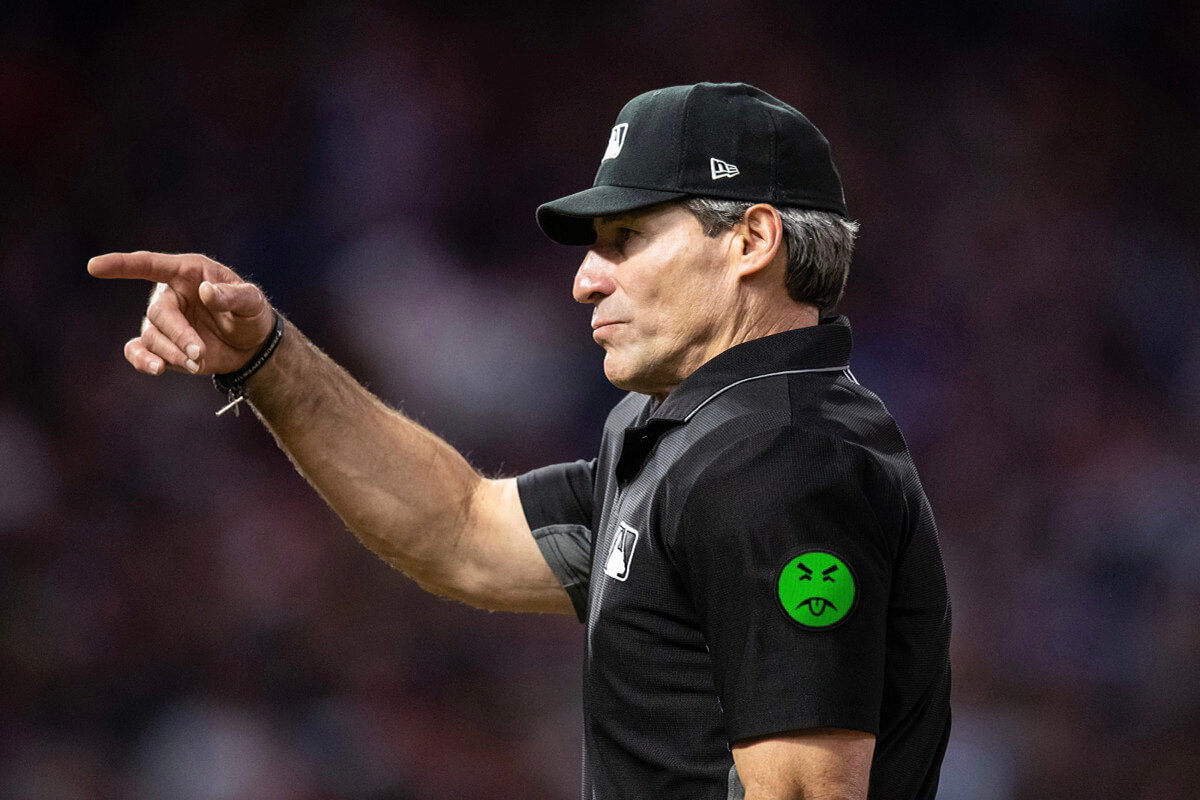
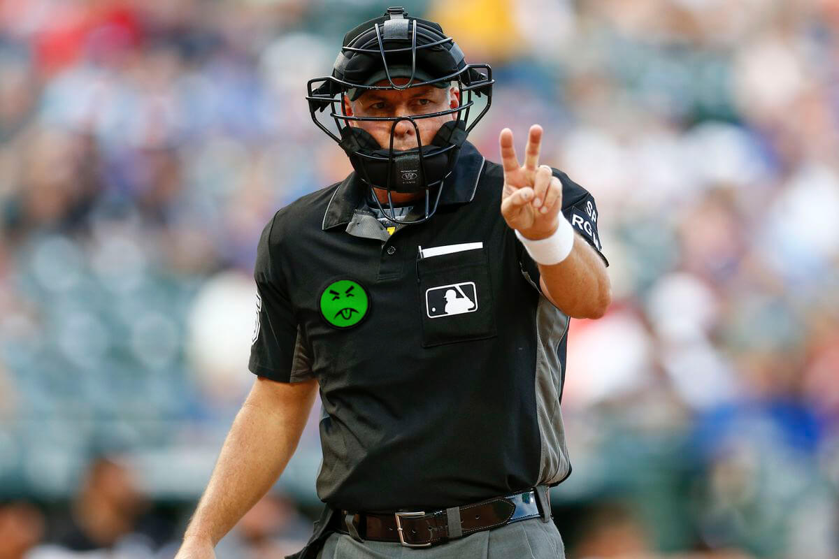
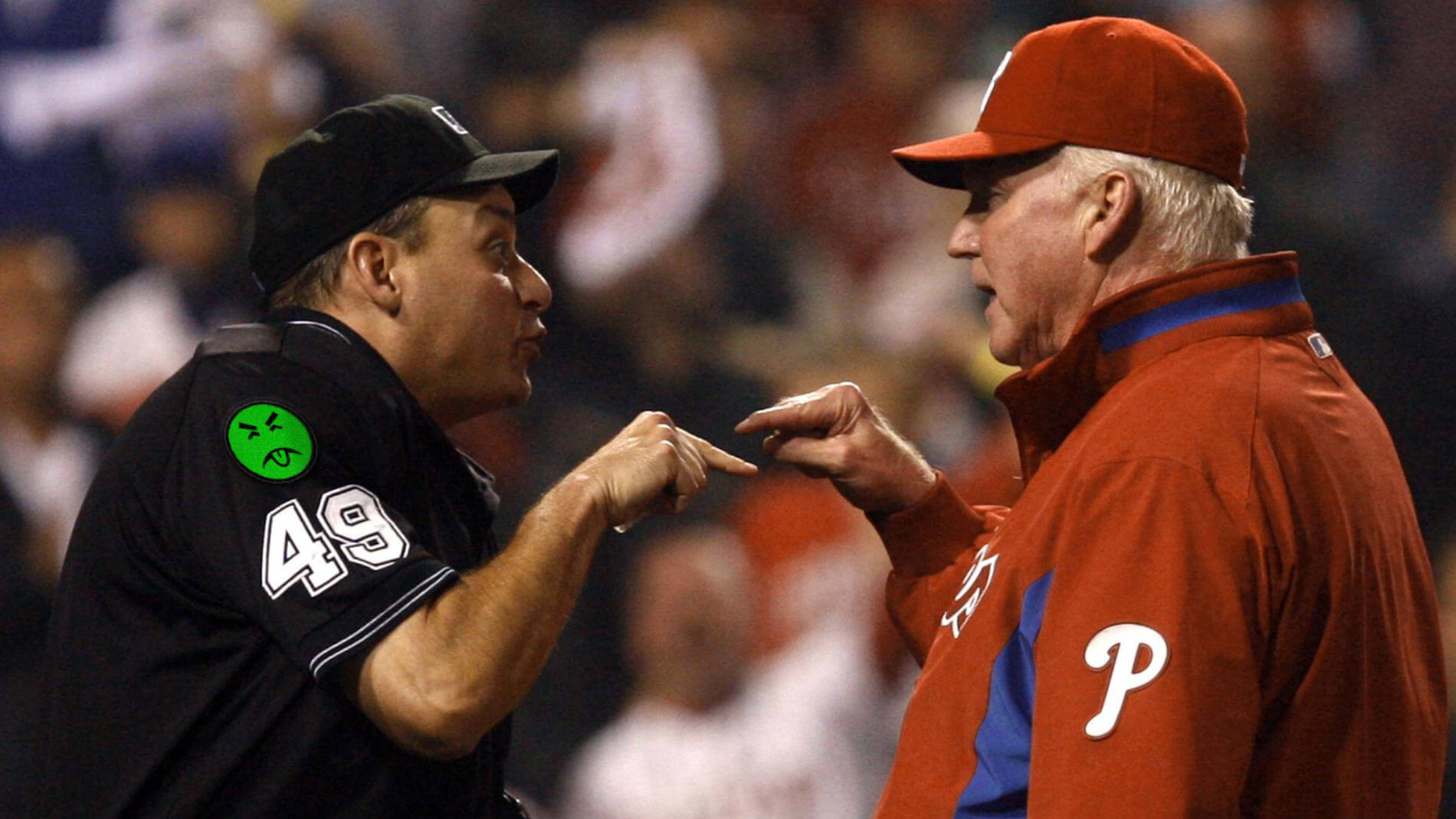
MLB’s announcement did not include a view of the patch design or an indication of where the patch would be positioned on the umps’ uniforms, but you can see some possibilities scattered throughout today’s Uni Watch entry.
A few thoughts:
1.. First and foremost, this is really, really pathetic. I mean, seriously — ads on the umpires? Here’s a measure of how lame-o that is: Even the NBA hasn’t done it (yet). And isn’t it interesting that this development comes just as the umps are getting more screen time due to the sticky regulations. Just a coincidence, I’m sure.
2. Of all the advertisers to choose for this gig, a fucking crypto exchange? For starters, crypto has been tanking lately — great timing, MLB! Moreover, having the umps wear a crypto ad is like saying, “Hey, want an untraceable way to bribe the umps? Here’s how!” The only worse option would be a betting company, or maybe Warby Parker.
3. Naturally, MLB’s press release does not include the word “advertising” (or any variant thereof). Instead, it simply says the crypto exchange “will become MLB’s first-ever umpire uniform patch partner.” Misleading and cowardly.
4. Media coverage also avoided saying the dreaded A-word. Here’s how various outlets referred to the ad patches:
• Coindesk: “branding”
• Yahoo Finance: “sponsorship presence”
• TheStreet.com: “uniform patches”
• Business Insider: “logo patch”
• The New York Times: “a [sponsored] patch on umpire’s uniforms”
• Bloomberg.com: “logo patch”
• Deadspin: “umpire jersey patches”
Why is everyone connected with this story so afraid to refer to advertising as advertising?
5. Does this move foreshadow the advent of ad patches on the players’ uniforms? My usual stance in situations like this one is that we shouldn’t jump to conclusions, but in this case I think it’s fairly clear that the answer is yes. Over the past two years we’ve seen (a) uni ads for games in London, (b) uni ads for games in Mexico, and (c) an abortive attempt to use uni ads during the pandemic-shortened 2020 season. MLB can’t unilaterally impose ads on the players’ uniforms under the current collective bargaining agreement, but it’s widely expected that ad patches and/or decals will be negotiated with the players’ union as part of the new CBA that will go into effect next year. So while MLB is waiting for that to happen, they can set the stage with the ump ads. At this point, I think the only thing that can delay the onset of ads on MLB uniforms is a work stoppage (which was considered increasingly likely just a few months ago but is now thought to be less of a concern).
6. Finally, it’s worth noting that this is just the latest in the long run of uni-ruinous actions taken by MLB commish Rob Manfred, who continues to cement his position as the worst thing that has ever happened to baseball uniforms. History will not judge him kindly, and neither should we.
That concludes this installment of Ump Watch. Here’s hoping the next installment won’t be as depressing.
(Mega-thanks, as always, to Nic Schultz for his Mr. Yuk Photoshoppery.)
Click to enlarge
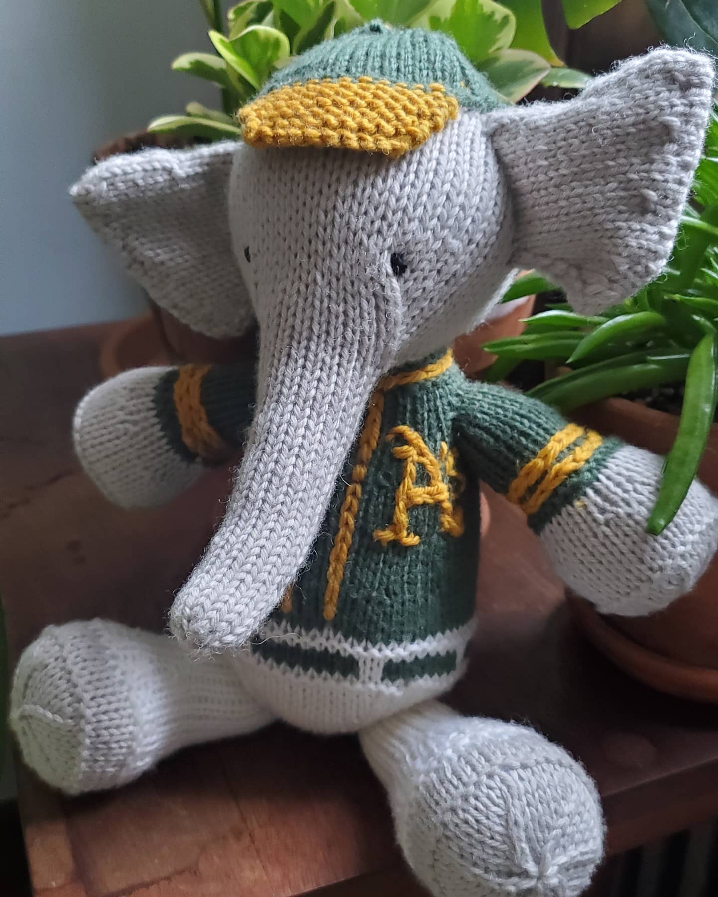
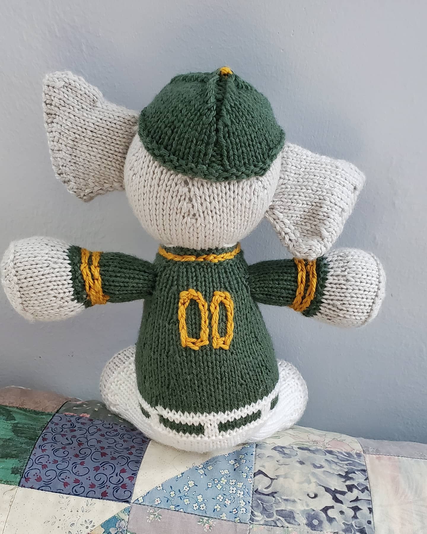
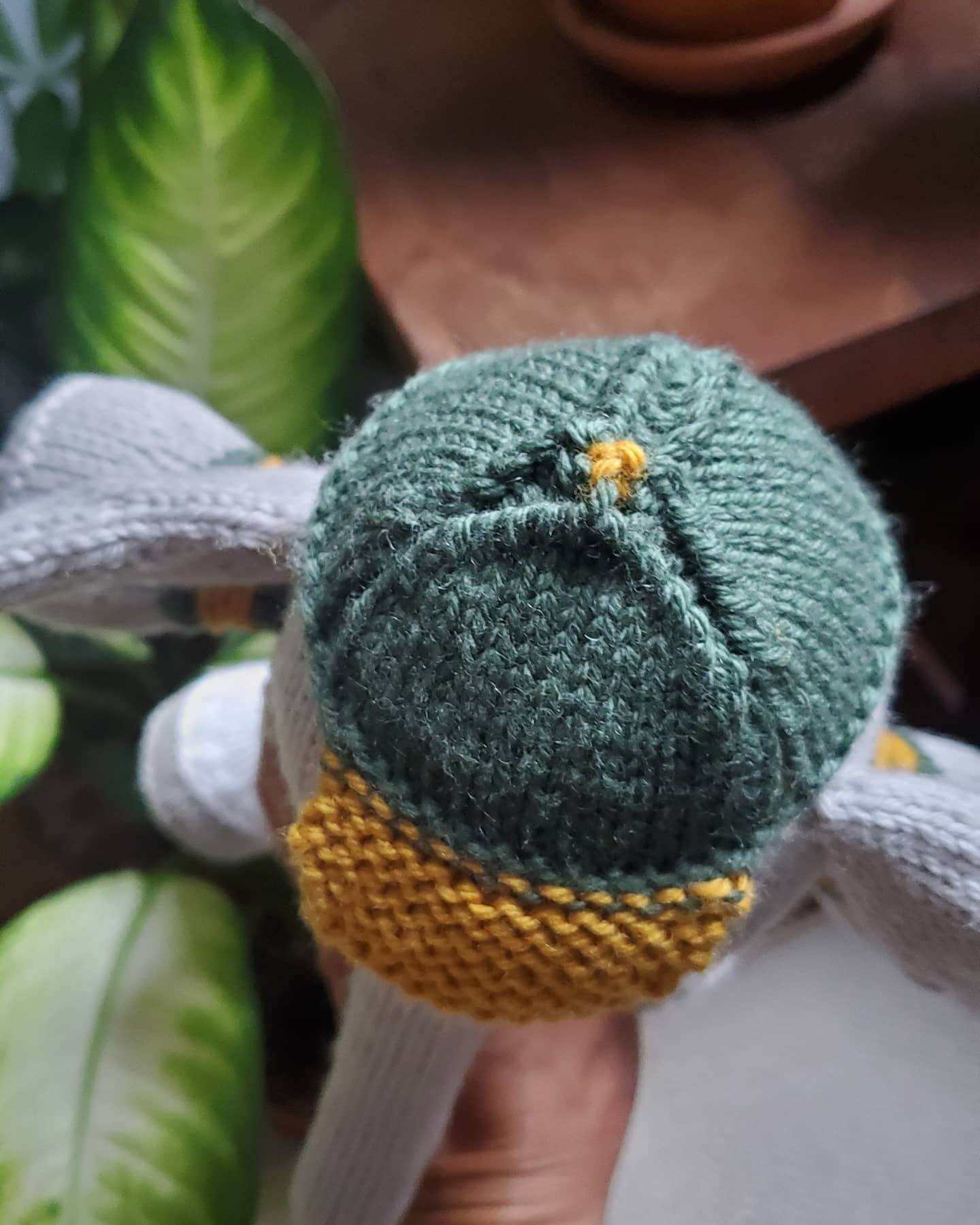
Way too good for the Ticker: My very talented friend Jessica Douglas likes to knit stuffed elephants whenever one of her friends has a new baby, and she recently made one modeled after the A’s mascot, Stomper. She explains:
My friend’s husband is a huge A’s fan and really wanted a Stomper stuffed animal for their baby. Everything they saw out there was super-synthetic, but she knew I’ve knit quite a few elephants, so she asked if I could do Stomper.
I used this knitting pattern and altered it to include the uniform. The challenge was really just figuring out how to make the uniform details identifiable. For example, at first the “A” on the front didn’t have serifs, but I realized pretty quickly that that was important.
I’d say she nailed it. Here are some more pics (including the all-important yellow squatchee!):
Click to enlarge

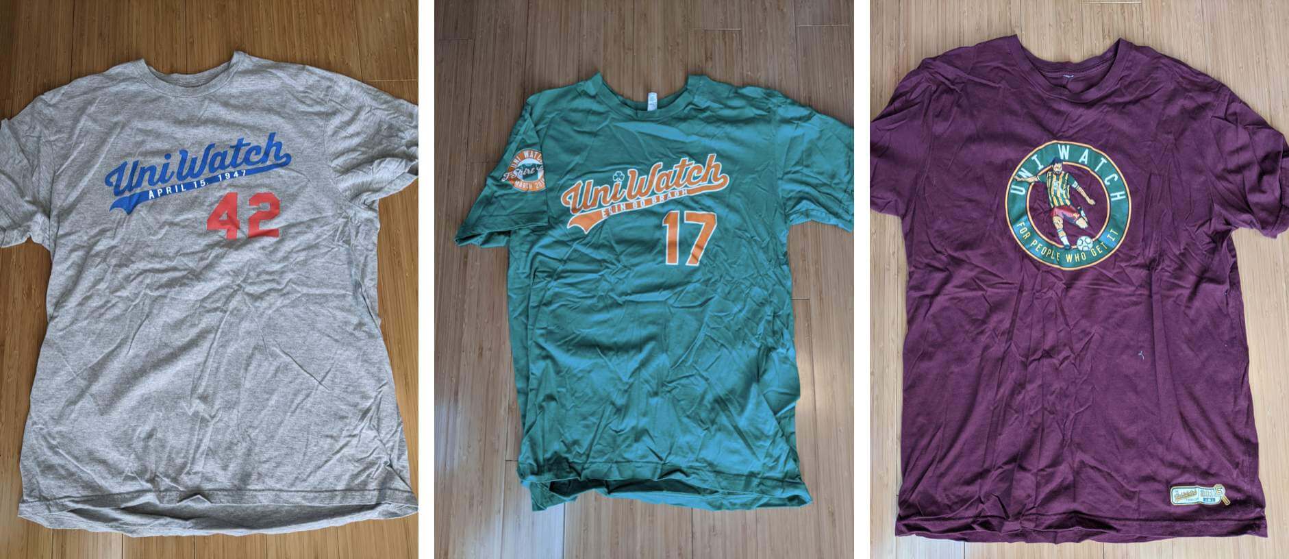
ITEM! New T-shirt raffle: Reader Tyler Kulasza has three Uni Watch T-shirts that no longer fit him — a Jackie Day shirt, a St. Paddy’s Day shirt, and a soccer shirt (you can see bigger photos here, here, and here). “They’re all size Large and barely worn,” he says. “They are very wrinkled from being in the bottom of my drawer, but they are clean.” Tyler has offered to let me raffle these off, so that’s what we’re going to do today.
This will be a one-day raffle. USA mailing addresses only. To enter, send an email with your preferred shirt design and your mailing address to the raffle in-box by 8pm Eastern tonight. If you like more than one of the shirts, list the shirts in your order of preference. I’ll announce the three winners tomorrow. Thanks to Tyler for making this one possible!
The Ticker
By Paul
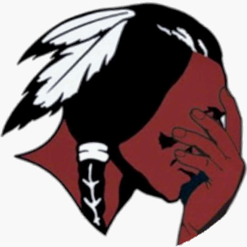
Indigenous Appropriation News: The school district in Parma, Ohio, is considering whether to change its “Redmen” team name (from Bill Gornall). … Following a review, Wayne Valley High School in N.J. has decided to keep its “Indians” team name (from Wayne alum Keith Seminerio). … The rest of these are from Kary Klismet: After consulting with tribal leaders, Totem Middle School in Kent, Wash., will change its school name and “Thunderbirds” team name. … Here’s a good story detailing the history of the team names and mascots used by Jamestown (N.Y.) High School, which recently decided to drop the Native American imagery associated with its “Red Raiders” team name. … The school board for Cedar High School in Cedar City, Utah, is reconsidering its decision to change its team name from “Redmen” to “Reds” after a board member opposing the change invited members from the local Paiute tribe to speak in favor of the old name at a recent board meeting. … Snell Middle School in Bayard, N.M., is changing its team name from “Redskins” to “Miners.” … Cambridge (N.Y.) Central School will no longer call its teams the Indians. … Dartmouth (Mass.) High School is considering dropping its “Indians” team name.

Baseball News: I think we’ve seen this before, but once more won’t hurt: The Rangers’ ballpark has a great jersey-themed mural (from Bo Baize). … Also from Bo: The Double-A Wichita Wind Surge are wearing a Todd Radom-designed memorial patch for their late owner, Lou Schwechheimer. Here’s a clearer look at the design. … The Double-A Northwest Arkansas Naturals will wear fauxbacks tomorrow (from @WoggieMac). … While MLB is supposedly cracking down on sticky stuff, there are ads behind home plate for Gorilla Glue (from Andreas Papadopoulos). … The Double-A Hartford Yard Goats became the Hartford Steamed Burgers last night (from Ryan Spaulding). … Blue Jays manager Charlie Montoyo wore his Father’s Day jersey last night (from Deeks Hightower). … This is interesting: U. of Texas SS Trey Faltine uses one of coach and former MLBer Troy Tulowitzki’s old gloves, complete with the Gold Glove manufacturer’s patch (from @charliehog).

Football News: Here’s how the Cowboys became known as “America’s Team” (from Kary Klismet). … Consider the source: A Redditor claims to have seen a bunch of NFL throwback helmets that will be revealed soon, with the one-shell rule finally being scrapped. Could be true — or not (thanks to all who shared). … Virginia Tech’s “Maroon Effect” game will be on Oct. 16, when the Hokies host Pitt (from Andrew Cosentino).

Hockey News: Singer Celine Dion, a native of Quebec but a longtime performer in Las Vegas, is taking heat back home for appearing in a Golden Knights uniform during the Knights/Canadiens playoff series (from Wade Heidt). … Although this isn’t yet confirmed by the team, the Oilers will reportedly redesignate their navy alternate uni — my least favorite of their looks — as their new home primary next season. That article also says players really disliked the team’s ЯR uni, which is why it was worn only two times this season (from Brandon Weir).

Basketball News: The City of Milwaukee is using the Bucks’ original “Bango” logo — one of my favorite sports logos of all time — as its new Twitter avatar. Here’s a closer look (from Jeff Ash). … Speaking of the Bucks, check out their current logo rendered as an amazing-looking pretzel! (Thanks to all who shared.)

Soccer News: New home shirt, with a very interesting half-and-half design, for Israeli side Maccabi Haifa (from Ed Zelaski). … Also from Ed: New shirts for Belarusian champs Shakhtyor Soligorsk. … Following up on a Ticker item from yesterday: After refusing to allow Munich’s Allianz Stadium to be lit up in rainbow Pride colors, UEFA added a rainbow motif to its own logo. … New crest for the Major Arena Soccer League’s San Diego Sockers (from Kary Klismet). … Kansas City NWSL wore rainbow numbers yesterday (thanks, Jamie). … New away kit for Scottish Premiership side Hibernian (from Ed Zelaski and Germán Cabrejo). … U.S. Customs agents recently seized a shipment of El Salvador jerseys, thinking they were counterfeit. Per standard procedure, they posted tweeted photos of the confiscated contraband. But the jerseys turned out to be real, not counterfeit, which meant that their tweet inadvertently leaked a new design that hadn’t yet been officially revealed (from @AlexSonofJohn). … Here’s an infographic showing all the Euro 2020 kit matchups so far (from Rex Henry). … USL League One club Forward Madison’s new alternate shirt is reversible, so it’s two shirts in one (from @PolishCDN).

Olympics News: Following up on a Ticker item from a few days ago, here’s more on USA hurdler Christina Clemons wearing Doritos earrings during the recent Olympic qualifiers (from John Cerone).

Grab Bag: The design website Creative Bloq has ranked the 10 best sports logos of all time. … Very nice new logo for the National Gallery of Canada (from @Minor_Leaguer). … Shrewsbury (Mass.) High School is considering retiring its “Colonials” team name or changing its associated imagery to be more culturally inclusive (from Kary Klismet). … Australia’s Twenty20 cricket leagues, the Big Bash League and Women’s Big Bash League, are now outfitted by Nike, so all the teams are getting new kits in a few months (thanks, Jamie). … Looking for some unique headcovers for your golf clubs? A company called Cuddle Clones will make headcovers that look like your favorite pet. Additional info here. … The flag for the Dutch town of Diemen has its ducks in a row — literally (from Trevor Williams). … Here’s a fun little slideshow of vintage fast food logos. … Multinational corporations are wrestling with the question of whether to have rainbow/Pride versions of their logos, especially in countries where such a gesture would be more controversial. … Here’s why jeans have that leather patch on the back (from Jon Viera).
Just as a point of comparison (not that the comparison makes ad patches on officials look good), but the Bundesliga and Serie A have advertising patches on the sleeves of referee shirts, and I know I saw it on the sleeves of refs in Copa America for this year’s tournament.
Yes, it’s not uncommon in international soccer. But North American sports leagues that have ads on the players’ uniforms (AHL, G League, MLS, etc.) have not yet sold space on the officials’ uniforms.
MLB: Always innovating!
Actually, MLS/NWSL officials link a few years ago, but now don’t anymore.
Ah, thanks for that correction, Jamie!
Rugby World cup in 2019 proudly advertises Emirates on the front of the officials’ uniforms, but, oddly, didn’t allow any branding on the teams’ uniforms during World Cup.
link
In any other action, much like in Soccer, individual rugby clubs wear about as much advertising as they can fit. National teams usually have one advertiser.
Here’s USA’s Major League Rugby’s kit and advertisers in 2021.
link
Parma, OH link goes to Popular Mechanics.
Fixed. Here’s the proper link:
link
The increasing encroachment of ads on uniforms continues to be depressing but the appearance of Mr. Yuk made me chuckle at least. I’ve never seen any of my teams win a championship and it’s a near certainty at this point that if they do it will be with ads on the jerseys. That doesn’t invalidate the experience, but it’s a bummer nonetheless.
Yes, Alex, I’ve thought about this and I was so relieved my Nationals won the World Series without the gross nike thing. I’ve actually completely lost interest in baseball since they added it – plus the increasing ads on the field, behind home plate, on the umps now, more to come I’m sure. Ugh.
The ads in foul territory along the baseline are, to me, the absolute worst of all the advertising added in recent years. I had already gotten myself mentally prepared for ads on uniforms, but seeing a giant corporate wordmark border the diamond for the first time was like a punch in the face. Apparently I really, really appreciated the image of a plain old baseball field where the grass wasn’t trying to sell me lizard insurance.
I’m not sure what the Creative Bloq list is, but it’s certainly not the 10 best sports logos.
Thanks for putting the pictures of Jessica’s Stomper below today’s anger inducing feature. The adorable-ness of that helps ease the sickness I was feeling about the impending MLB ads.
That said, the current placement of the Nike maker’s mark is essentially an ad, so I guess we’re already being eased into this nonsense.
The Nike maker’s mark, the New Era maker’s mark, the large maker’s marks on the bats and other equipment are all ads in my eyes.
Not supporting in any way — and crypto currency makes me cringe — but you are right there already are a lot of ads on the uniforms that we don’t call ads.
There’s a difference between a maker’s mark and a transactional third-party ad.
There’s also a difference between a team-issued uniform element (which is literally what we all root for) and player-selected equipment.
Not sure I agree.
When an athlete accepts money from, say, Under Armour or Nike to use their gear and there’s a HUGE maker’s mark dead center on the chest protector that can be seen by the viewer for every pitch, that, to me, crosses the line from maker’s mark to a strategically placed ad. And there is a transaction taking place between the supplier and the athlete for the purpose of having him use that equipment so the logo gets that exposure.
I would count the swoosh on the jerseys as an ad, especially if it is true that Majestic is still making the jerseys.
This photo shows Bryce Harper with his Under Armour wristband and batting glove and his personal brand logo. Does that wristband exist for a reason other than to have a place for logos? I don’t know.
link
Again, I’m not in favor of any of these things. But when makers’ marks get bigger and bigger and more and more prominent, and there is a financial transaction to get those marks exposure, I think they are ads.
I didn’t say they weren’t ads; I said there’s a difference. It’s a different *kind* of ad.
Obviously, I’m opposed to maker’s marks and have been for more than two decades. I’m not defending them. I’m saying that a third-party ad on a uniform is in a different (and worse) category. That’s all.
If you prefer to lump it into one big category and therefore think the use of third-party ad patches is no big deal because it’s just more of the same, that’s certainly your prerogative. But I don’t lump them together like that, which is why I think the use of third-party ad patches *is* a big deal, and I’ll continue to cover the spread of third-party ad patches from that perspective. YMMV and all that.
I think you were misunderstanding what I was saying. I didn
t think they were “no big deal.” I’m firmly in the “they are all bad” camp. I would like to see the league crack down on the maker’s marks, which I realize is not likely — and wonder if they get a cut for allowing that equipment on the field.
I am with you on this Paul, there is a big difference between a maker’s mark and an ad. The obvious thing being the maker at least has some direct connection to the uniform.
I am against maker’s marks in general, but they are tolerable if they are put somewhere on the uniform that isn’t so prominent. Given past placement and size of the Majestic maker’s mark in a less noticeable location on the sleeve, compared to Nike’s current mark, the swoosh FEELS more like an ad than a maker’s mark to me.
I suppose there is a “difference” between any two things…for example there is a difference between the actual dictionary definition of a “maker’s mark” and how it is often used here.
But I think the real reason there is no reason to consider the Nike logo on baseball jerseys as anything but an ad is because Nike is paying MLB in exchange for allowing their logo to be worn by the players. It’s not as though baseball teams decided to buy uniforms from Nike that just happen to have a prominent swoosh on the jerseys.
I’m totally on board with everyone here who doesn’t like ads on uniforms from the point of aesthetics. They definitely make them less attractive from a visual standpoint. But let’s not act like this is some new development, or that there is some kind of moral element to all this. It really is just business.
Actually, that is false. The use of third-party ads on uniforms *is* a new development.
And as we’ve discussed many times, “It’s just business” may be an *explanation* for why something has happened, but that is not the same as a *justification* for it. If you need to refresh your memory on the particulars of this point, look here: link
Paul, I was referring to your prior comment that there is a “difference” between a “maker’s mark” and a “third party ad”, which again is true in the sense that there is a difference between any two things you compare. I’m saying that from an aesthetic standpoint there is no difference.
And I do agree with you that “it’s just business” shouldn’t be used to justify behavior that would otherwise be considered immoral or unethical. But that’s not what we’re talking about here. There is nothing inherently wrong with one business agreeing to sell advertising on space it owns to another. No justification is needed here because no harm is being done to anyone.
There is nothing inherently wrong with one business agreeing to sell advertising on space it owns to another. No justification is needed here because no harm is being done to anyone.
Strongly disagree. The encroachment of advertising into every nook and cranny of our world is indeed harmful, and the public debate about where advertising does and doesn’t belong is a crucial part of contemporary civic discourse.
We’ll have to agree to disagree on this point.
It should be noted that Robert Pollard, who is from Dayton, OH, has said in the past that ‘Redmen’ can often refer to what many others might call ‘Rednecks’ in his part of the world. Either way, I’m in favor of not using it for a nickname.
Something tells me that rednecks wouldn’t object at all to a team named for them.
I’d be amazed if there isn’t a minor league baseball team called the Rednecks, somewhere.
I’ve never heard that usage, but I suppose it’s possible. Parma’s logos are unambiguous, though. (And Dayton is nowhere near Parma.)
The uniform decision-making of the Edmonton Oilers infuriates me. It is disorganized chaos at present.
They had the uniform look (primary and alternate) right as recent as Connor McDavid’s rookie year. They have a beautiful, classic royal blue and orange that the team won 5 Stanley Cups in and they have dumped that look not once, but 2 times. They decide to go with lighter orange as the primary with navy blue trim just recently and looks like that is being dumped so soon.
The navy blue Oilers uniform has no staying power as a primary uniform. Many flaws to it I have mentioned before. The lack of white trim is a gimmicky thing these days in hockey uniforms that has no place outside of being an alternate uniform.
It is perplexing a storied franchise wouldn’t wear the iconic uniform worn by The Great Guy.
Fully, fully, fully concur. The current navy blue jersey is brutal.
Fully agree. They can’t seem to decide who they are. Uniform wise they seem to be the Atlanta Falcons of the NHL. Like them they have a great set of original uniforms that they can never seem to get fully behind (for whatever reason). Like the Falcons they can’t seem to decide on what color they are (they Flacons red black, the Oilers navy v royal). And like the Falcons they seem to dive into a new uniform that’s guaranteed to look awful really quickly.
Edmonton needs to decide who they are, pick that lane and stick to it for a decade or two.
The Stomper stuffed elephant is just terrific. Well done, Ms Douglas!
The only thing that would make the umpire ad patches tolerable is if they were all for eyeglass providers or lasik surgeons!
That is a great idea, so of course it would never happen, but maybe the introduction of advertising on umpires’ uniforms will be another argument in favor of robo-umps!
The text for the Celine Dion entry in the Ticker is a bit misleading, since it implies she showed up for the game in a jersey, when what actually happened was that the Knights used a shopped image from one of her album covers on their big screen.
Yeah. Celine Dion has said on her twitter that she had nothing to do with the photo.
link
Jamestown (NY) High School could change their name from Red Warriors to Redheads!! In honor of graduate Lucille McGillicuddy–later to be known as Lucy Ricardo.
Do I need to ‘splain more?
“Hey, want an untraceable way to bribe the umps? Here’s how!” The only worse option would be a betting company, or maybe Warby Parker.”
Absolute worst would be a betting company.
Warby Parker, Foster Grant or Lasik…those would be the most “fun.” If you’re going to slap an ad patch on you, at least poke fun at yourself to deflect from the fact that Manfred League Baseball is becoming more of a joke in the unfunny way.
Last year and the three years before that, English first class County Championship Cricket (the 4-day games where everyone wears white league) had ads for Specsavers, a glasses company. And yes, even the umpires wore the ads.
link
Completely agree. If you’re going to have an ad, let it be jovial.
Australian Football League umpires have had front and back ads for OPSM – a glasses company similar to Specsavers – for a while now. Sports are meant to be a release (except for Mets and Jets fans I guess). Being able to have a chuckle at your own expense is something that’s sorely missing.
link
Nothing wrong with those Edmonton Oilers reverse retro jerseys… what looks bad to me is pairing them with ORANGE pants (breezers)!!
-Jet
Here here! Gorgeous jerseys. Gretzky style gloves and pants, done and done. Missed opportunity!
Oilers should have considered doing the logo with orange lettering/circle and the blue oil drop. Like on the old WHA blue road jersey. Would have met the definition of what Reverse Retro was about on a few levels.
Here’s a fun little slideshow of vintage fast food logos.
Bring back (almost) all of those!
Not Jack In The Box, though…that looks a bit psychotic. And Pizza Hut Pete can stay in the past.
As evidence of Uni-watching spreading further, here’s a brief article from Mental Floss on the history of baseball stirrups: link
New crest for the Major Arena Soccer League’s San Diego Sockers
The Sockers are basically indoor soccer’s equivalent of the Yankees. You really shouldn’t have to change your logo every time you win another title…
“…or maybe Warby Parker?” Literal LOL
Re: America’s Team
NFL Films first approached the Steelers about assuming the moniker, “America’s Team,” but the Chief, Art Rooney, said, “No, we’re Pittsburgh’s team.” It was then offered to the Cowboys to use after they won their second Super Bowl…. or so I’ve always heard as a Pittsburgher.
That sounds right.
Besides, the Cowboys were almost always CBS’ (yes, my children, there was a time where CBS and Pat Summerall covered NFC games) 4:00 showcase. And it was right before 60 Minutes, so yeah…America was watching.
I’ve developed this theory that the main reason the Cowboys have become so popular is because the feature a large, five-pointed star on their helmets. This is a symbol that is universally positive, for example when you’re a kid in elementary school you’d often be rewarded with a star for good behavior or doing well on an assignment. So I suspect that subconsciously, the Cowboys’ logo becomes something that a lot of people want to be associated with as it represents success and prestige.
Or maybe not, who knows really?
The crocheted elephant is one of the cutest things I’ve ever seen. Amazing work, Jessica!
Excluding throwbacks, the Angels All-Star jersey with “LAA” is -to my knowledge- the team’s first contemporary reference to Los Angeles on its uniforms. So that’s something.
Of course, imho, an All-Star jersey probably shouldn’t ‘count’ for such a thing. Nor should it be worn during the actual All-Star *game* of course, but I suppose that’s a sad topic for another day.
That A’s stuffed elephant is amazing. Thanks for sharing.
Just because a sports logo, or any logo, is recognized widely does not make it one of the “best”. Creative Bloq’s criteria wasn’t creativity but seemed to me to be the wealth of the companies or organizations behind the logo.
I just noticed a weird glitch when looking at the NBA standings on ESPN.com
Next to the Clippers is the Cavs logo for the 2020-21 standings. Then I looked at 2019-20 and it’s the Nets logo next to the Clippers. 2018-19 Mavericks logo, 2017-18 Hornets logo, 2016-17 Thunder logo… then I went back to 2017-18 and now it’s the Nuggets logo. So I guess you get a random logo for the Clippers every time you check the standings. All other teams seem to be correct. Someone at ESPN must just rightfully hate the Clippers logo.
Those insidious pop-up advertisements that appear from the bottom of the screen on this site are becoming even more intrusive. They are now taking up nearly half of the screen.
When you try to delete them, they move up and down occasionally, so you’re tricked into clicking on the advertisement. Very annoying.
If patches on players must be collectively bargained what did the umpires union get in exchange for this?
The umps don’t necessarily have the same provisions in their agreement that the players have. MLB may simply be able to dictate what the umps wear without any negotiation. (I’m not saying that’s necessarily the case; I’m just saying that simply because the players have certain rights doesn’t automatically mean that the umps have those same rights.)
Now that the NFL has announced that throwback uniforms will be allowed to wear different colored shells starting in 2022, we can decide how many teams should do it. It’s never too early.
No-brainers-add throwbacks immediately:
New England
Tennessee (should be Houston, but whatever gets us the Oilers throwbacks)
Tampa Bay
Atlanta
Seattle
Less compelling, but still worthwhile:
Buffalo
New York Jets
Indianapolis
Pittsburgh
Cleveland
Los Angeles Chargers
Philadelphia
Not necessary, but the correct color would improve the throwback look:
Denver
New York Giants
Minnesota
Los Angeles Rams
You have alternate options but please don’t bother:
Washington
Dallas
New Orleans
I’ll disagree with New Orleans. I’d love to see them in the 1969 preseason only Black Helmets.
link
Denver is a no-brainer. The wrong color blue helmet paired with their throwback logo, bothers me so much.
Absolutely should happen, but unlike other teams they’ve been able to wear their throwback uniform using their existing shell.
One other note: I have erred in placing the Eagles in the “less compelling” file, because I was considering their white alt helmets. However, they have not worn kelly green throwbacks with their existing shells and those absolutely belong in the first category.
My being a fan of the MLB is hanging on by a thread. Ump patches are gonna be the straw that breaks this little boy’s back. Barf.
No fan of baseball would write “the MLB.”
I wonder if the incoming ump ad deal played a role in those odd measures you documented some umps taking to get memorial patches off *exactly* according to protocol. I could see a league memo being shot off to get the space clear and avoid it looking unseemly when a deal was made and the space needed clearing…though that’s probably giving the league too much credit.
How much GD advertising needs to be plastered on my screen? The awful foul line, pitchers mound nonsense. The other relatively new one that drives me crazy is the PIP ad break during actual game play. All of it nauseating.
MLB is missing out on a goldmine. Threaten to put a companys logo on Angel Hernandez, and they must pay a fee to remove it or else be associated with him
You give corporations too much credit, I think!
I’ve been watching a lot of the college baseball post season the last several weeks and finally figured out what was bothering me about Virginia’s uniform. Isn’t the ‘Virginia’ way too high on the jersey? link
Agreed. It should be at least an inch or two lower.