[Editor’s Note: For the second consecutive day, we have a soccer-centric entry written by another member of the Uni Watch team (because I’m basically unqualified to write about
anything other than MLB umpiressoccer). Today it’s Jamie Rathjen with a look at the kits for the new NWSL season. Enjoy. — PL]
By Jamie Rathjen
The NWSL’s regular season starts this Saturday, May 15. Team changes for this season include an expansion team, Racing Louisville; a name change for Sky Blue FC to NY/NJ Gotham FC; and a move for the former Utah Royals, back to their previous home base of Kansas City.
One league-wide uni-related change is that there is now a common sleeve ad again after a one-year absence. Unlike the previous league-wide sleeve ad, this one replaces the NWSL logo sleeve patch.
The number of new releases for each team this year varies from zero to two, at least for now (a few teams seem to be waiting for the start of the actual regular season before making their release). So while all of the league’s kits are shown in the photos that accompany the following team-by-team breakdown, only the new ones are discussed in this article. Those not mentioned here are addressed in my 2020 season preview.)
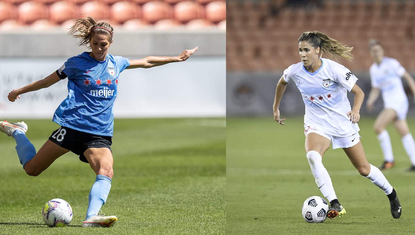
Chicago Red Stars
The Red Stars haven’t made any changes yet besides losing their front ad, but have said over the past few weeks that they’ll be having their release May 22 while also implying that it’s a third shirt, which would be an NWSL first.
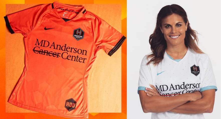
Houston Dash
Not only is the new first shirt basically solid orange, which is the very thing I praised the Dash for avoiding last year, it’s almost as identical to the Dynamo’s new shirt as it can be with different manufacturers. The new second shirt is NASA-inspired, and somehow it’s not the only space-themed NWSL shirt this year, though this design restricts itself to a pattern of starry dots that isn’t visible from distance and doesn’t extend to the back.
The Dash also have a new crest, which is again similar to the Dynamo’s.
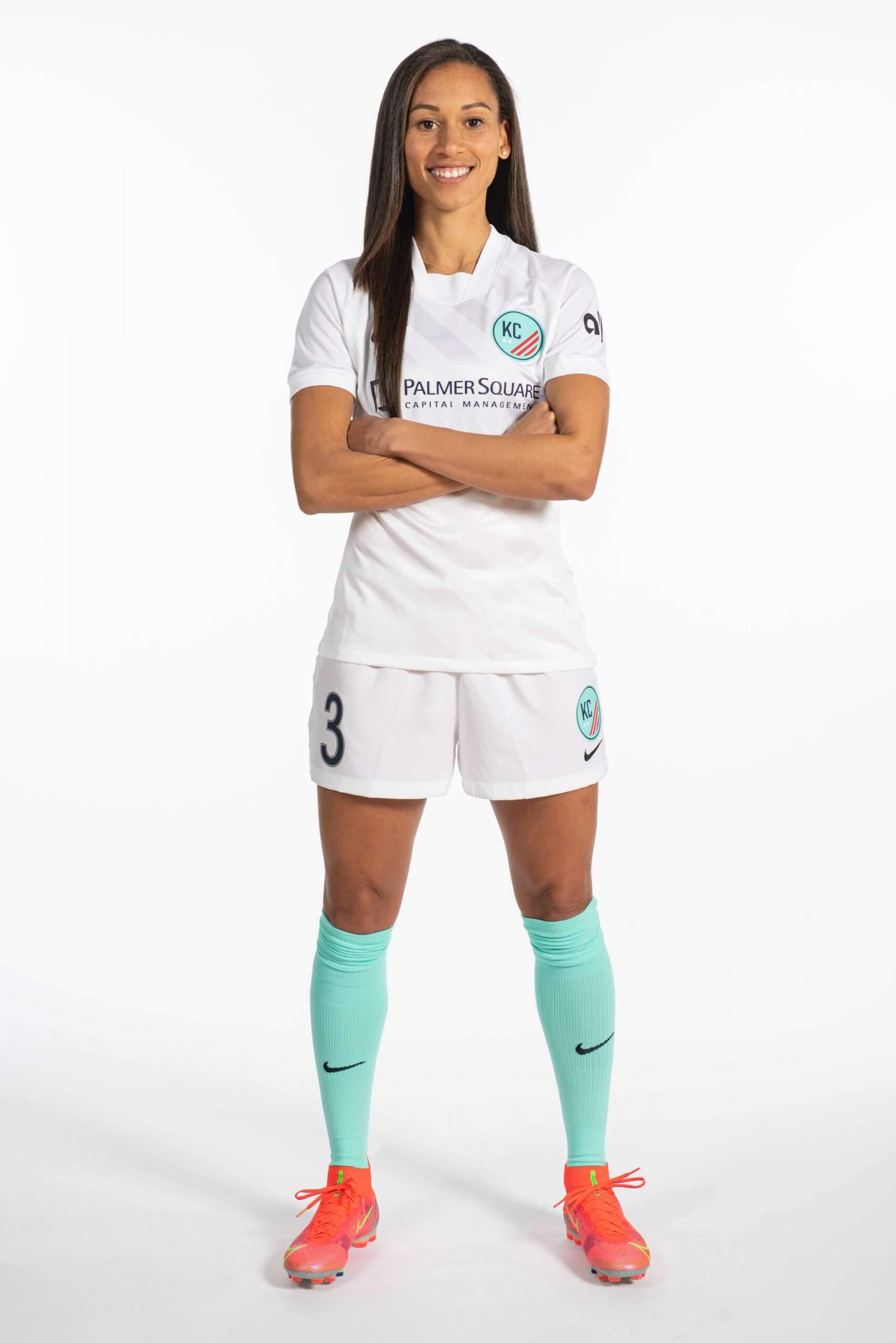
Kansas City NWSL
Kansas City NWSL has a temporary name and crest, along with a single very basic white shirt and white shorts with teal (or white) socks, which may only be worn for the Challenge Cup because the team calls it the “Challenge Cup jersey.” The team was only moved in December, so everything was put together on short notice.
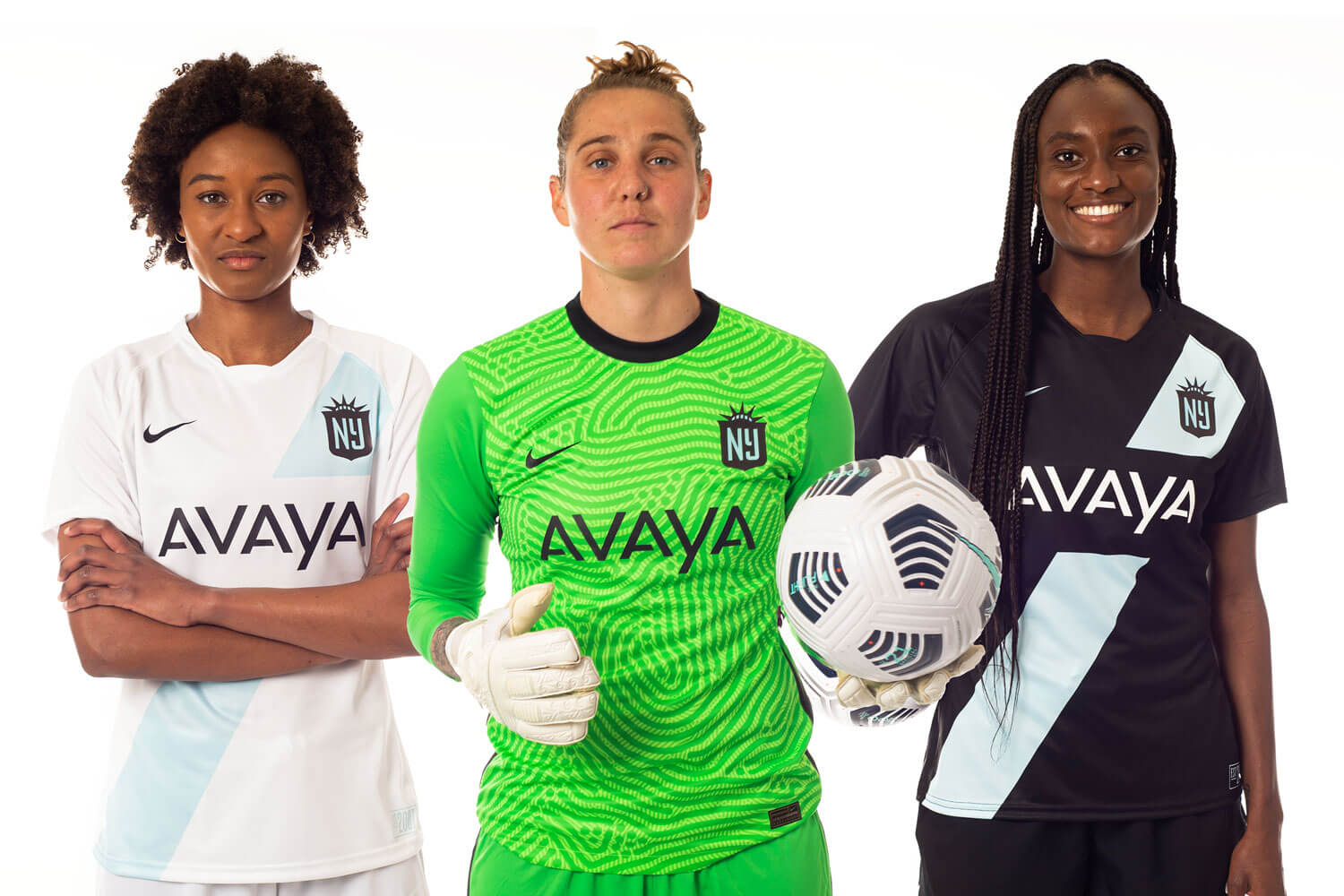
NJ/NY Gotham FC
I’m sad to see the Sky Blue FC name go, because they were one of the last two teams whose name and colors predated the NWSL. (They and Chicago were members of WPS, one of the NWSL’s predecessor leagues.) But the name was also out of place for a few years because a rebrand-in-stages meant SBFC last wore their titular sky blue in 2018. In 2019, Sky Blue wore a dark blue kit at home that never looked anything but temporary, and last year they introduced a color scheme of black and a paler blue, which we now know is supposed to be Statue of Liberty-ish.
This is definitely an improvement on what was not an especially coherent identity — including a crest that, despite the Sky Blue name, had a lot of orange. But Gotham now reminds me of the WNBA’s more-established Liberty, because the two have essentially the same fairly uncommon color scheme and the same ideas for their logo (i.e., various parts of the Statue of Liberty combined with an “NY” or “NJ”). I think Gotham just about differentiated themselves with their two shirts, however, which are simple black and white with sky blue sashes.
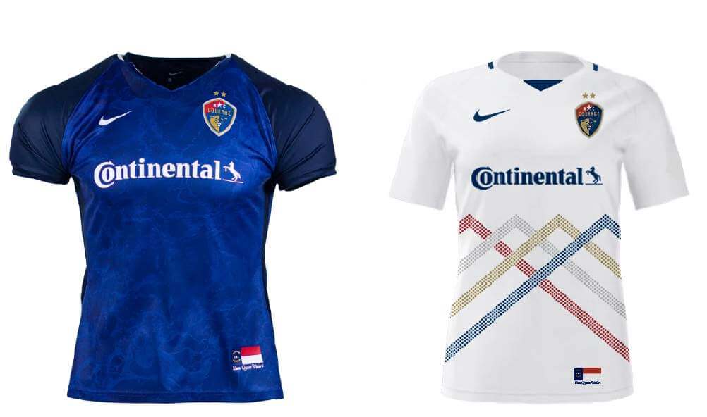
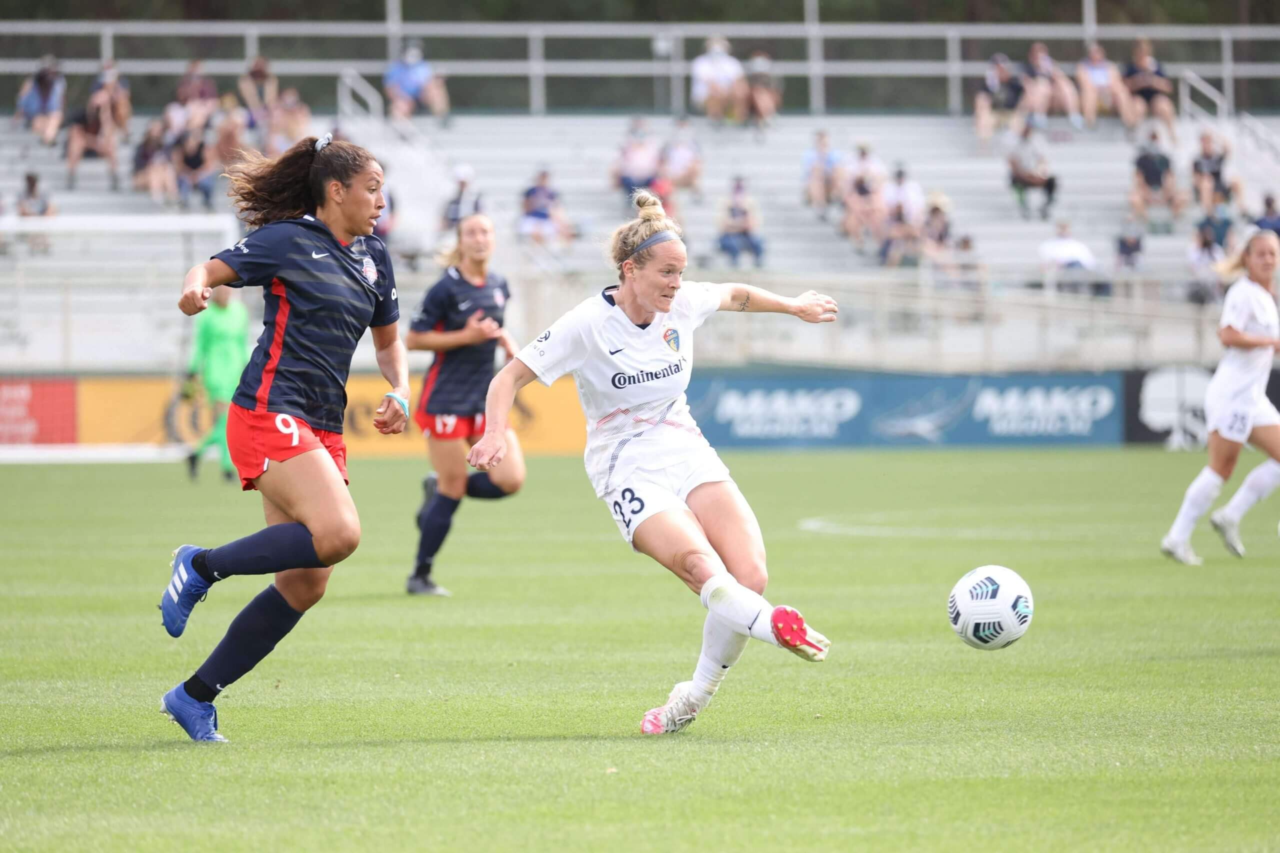
North Carolina Courage
Two shades of blue are better than last season’s one, but in what is a theme for the Courage this year, the raglan pattern was used not that long ago. This shirt is allegedly sea-themed, which is not that visible but is supposed to tie in with the second shirt.
The second shirt has a mountain pattern. I appreciate the effort to avoid a plain white shirt, but this immediately feels familiar because Utah had a very similar idea last year, leaving us with related variations on the same theme like the space-based shirts.
OL Reign
Tacoma, Wash.-based OL Reign’s shirts are similar to last season’s, but blue becomes primary and white becomes secondary. The shirts display more influences from the parent club, Olympique Lyonnais, as the color schemes of both, including the white shirt’s red accents on one side and blue on the other, are close to OL’s first and third shirts this season.
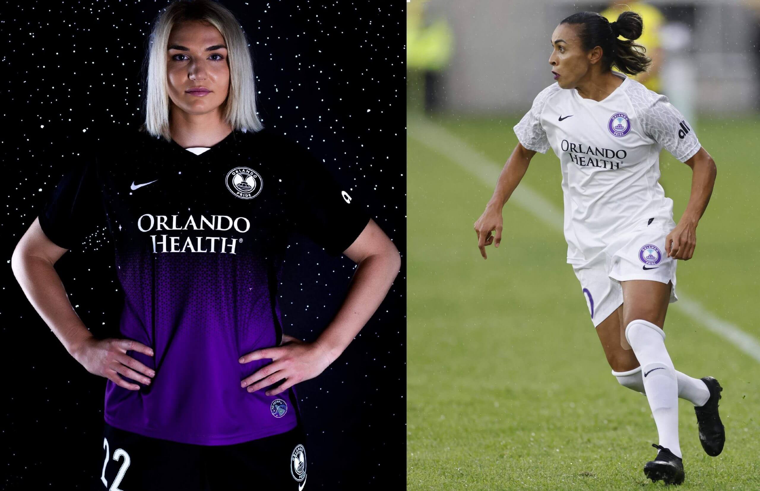
Orlando Pride
Well, that new first shirt sure is something. But that’s not intended to be a knock; I appreciate the imagination with this one. It’s a good measure of how far the NWSL has come from the days of templated lookalike designs.
The shirt partially has a star pattern — a reference to the nearby NASA installations. One shirt actually did go into space along with a ball that’s to be used for Orlando’s first regular season home game.
This is worn with black shorts and socks, which I think is a better, more coherent choice than purple, even if it forsakes the actual team color.
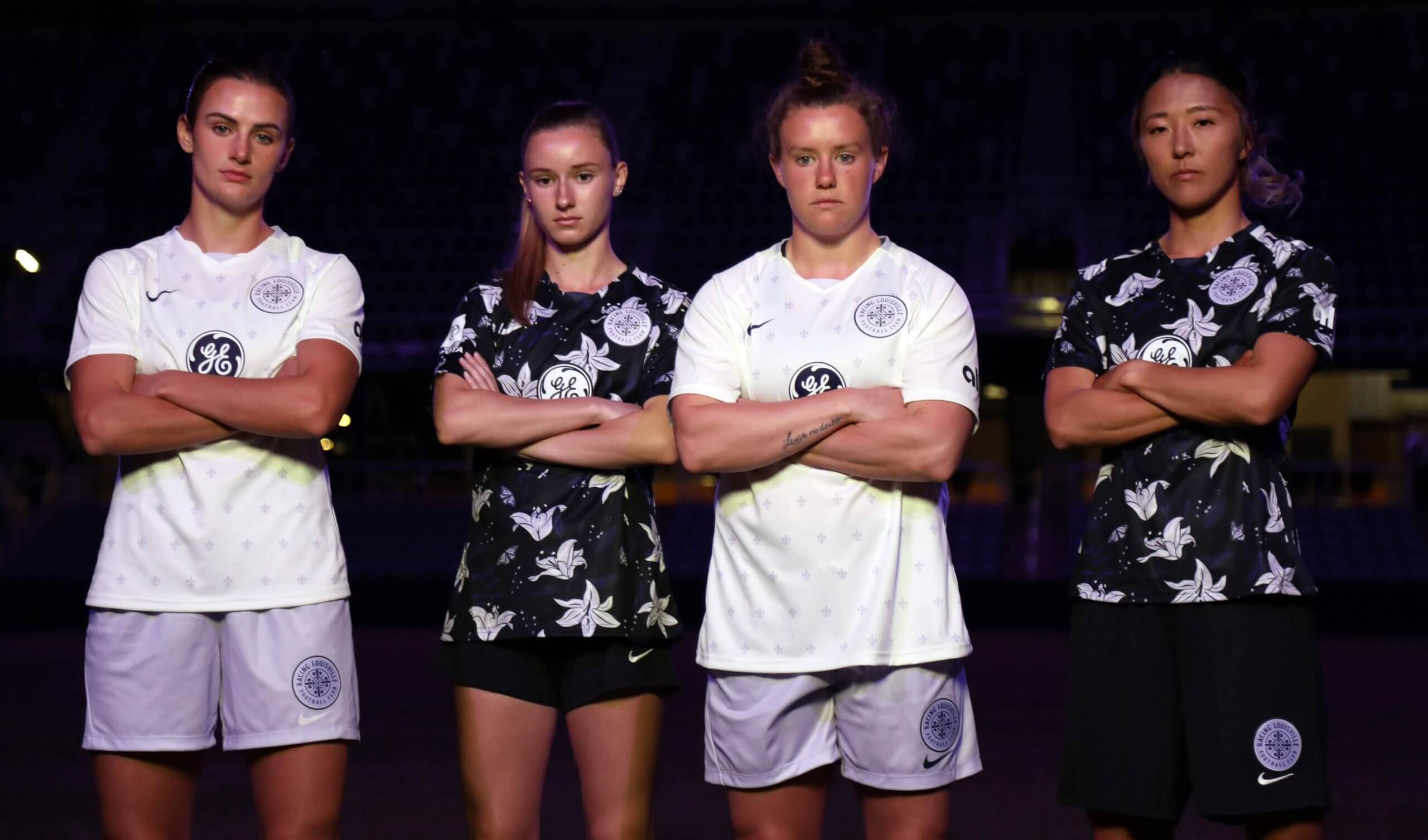
Racing Louisville
Even though the crest is purple with purple accents, the first shirt is very dark, almost black, and has a flower pattern. This feels like yet another multi-team trend, as flowers are lately a growing theme for Nike-outfitted women’s soccer teams (like the Portland Thorns, who we’ll get to momentarily), but a positive trend as I think all those designs have turned out well. The shirt even works in a reference to Louisville native Muhammad Ali with small butterflies and bees between the flowers. Add it all together and we have one of the most well-received designs of this year.
The white shirt has a small fleur-de-lis pattern, laid out similarly to Houston’s white shirt.
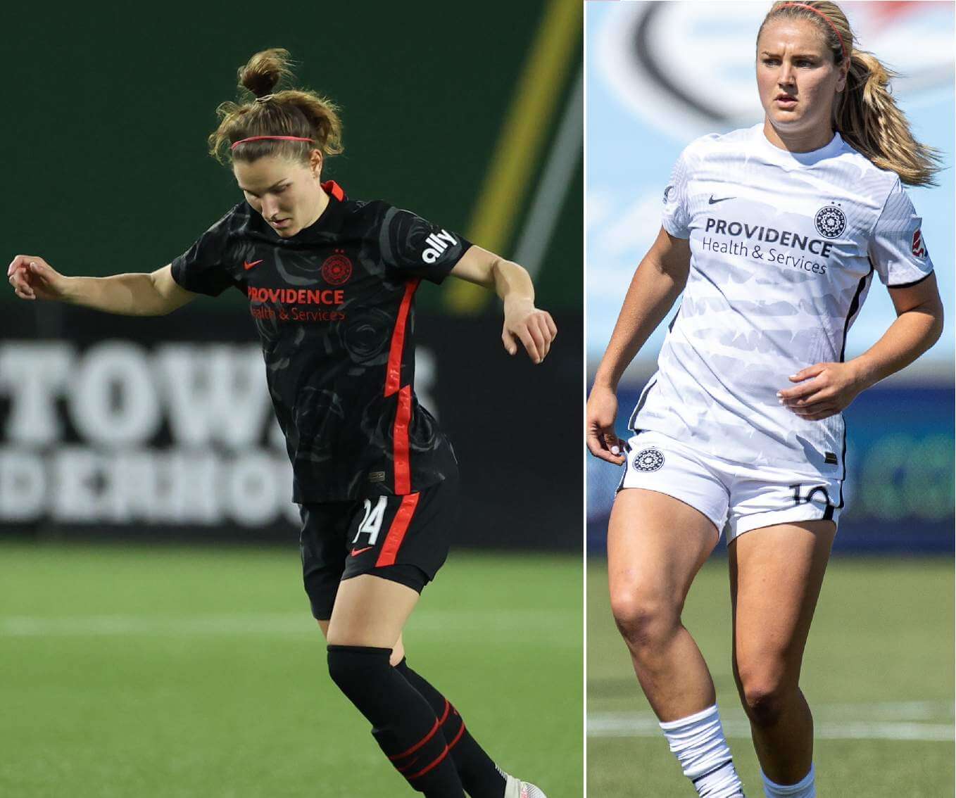
Portland Thorns
No changes for the Thorns, who are keeping both of their kits from last year.
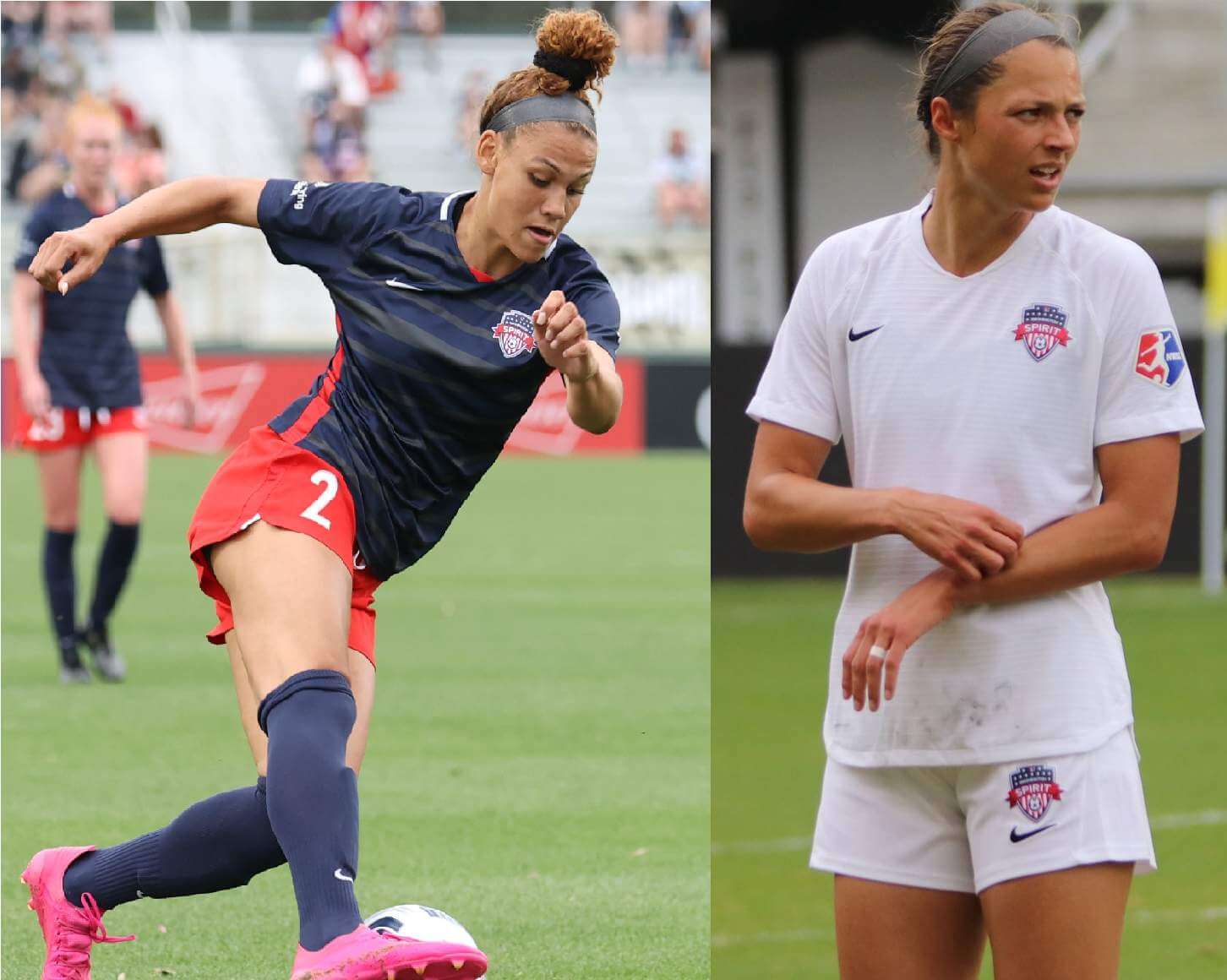
Washington Spirit
The Spirit don’t have any current changes except for starting the season without a front ad, which they also did in 2019, but they may be replacing their mono-white second kit at some point.
One final note: Angel City, the league’s new Los Angeles expansion team, is planning to start play in 2022 but will release shirts this summer. So by the time of their first game, their shirts will already have been out for almost a year — unusual for a soccer team.
Hat tip on @snytv to @UniWatch for the Almora “pullover” jersey style choice. #mets #MetsTwitter pic.twitter.com/po2tMG6HoK
— Manny S. (@MMS0272) May 12, 2021
ITEM! Uni Watch gets on-air shout-out: Back on May 3, I mentioned on Twitter that Mets outfielder Albert Almora, like several other MLB players, has his jersey sewn shut to create a de facto pullover (a phenomenon I first wrote about back in 2016). That tweet apparently caught the attention of SNY roving reporter Steve Gelbs, who mentioned Almora’s sewn jersey placket during the broadcast of last night’s Mets/O’s game and gave credit to Uni Watch — nice! You can see the video in the tweet embedded above.
I’ll admit that it’s a kick to be name-checked during my favorite team’s game. More importantly, it’s great that this broadcast crew cares about small uni details and is willing to discuss them on the air.
Ready for action.
2021 Schedule Release: Tomorrow at 7:45 PM on @patriotsDOTcom & Patriots social; 8:00 PM on @nflnetwork pic.twitter.com/qHsuXm9osX
— New England Patriots (@Patriots) May 11, 2021
Too good for the Ticker: Personally, I think the whole notion of hyping or promoting the imminent release of the NFL schedule is a bit silly. But the video clip that the Patriots used for that purpose yesterday, showing some sort of bobblehead or action figure being designed, is pure gold. Best 105 seconds you’ll spend today, guaranteed. (The video clip is only 35 seconds, but it’s so good that I figure you’ll want to watch it at least three times.)
(Thanks to all who shared.)

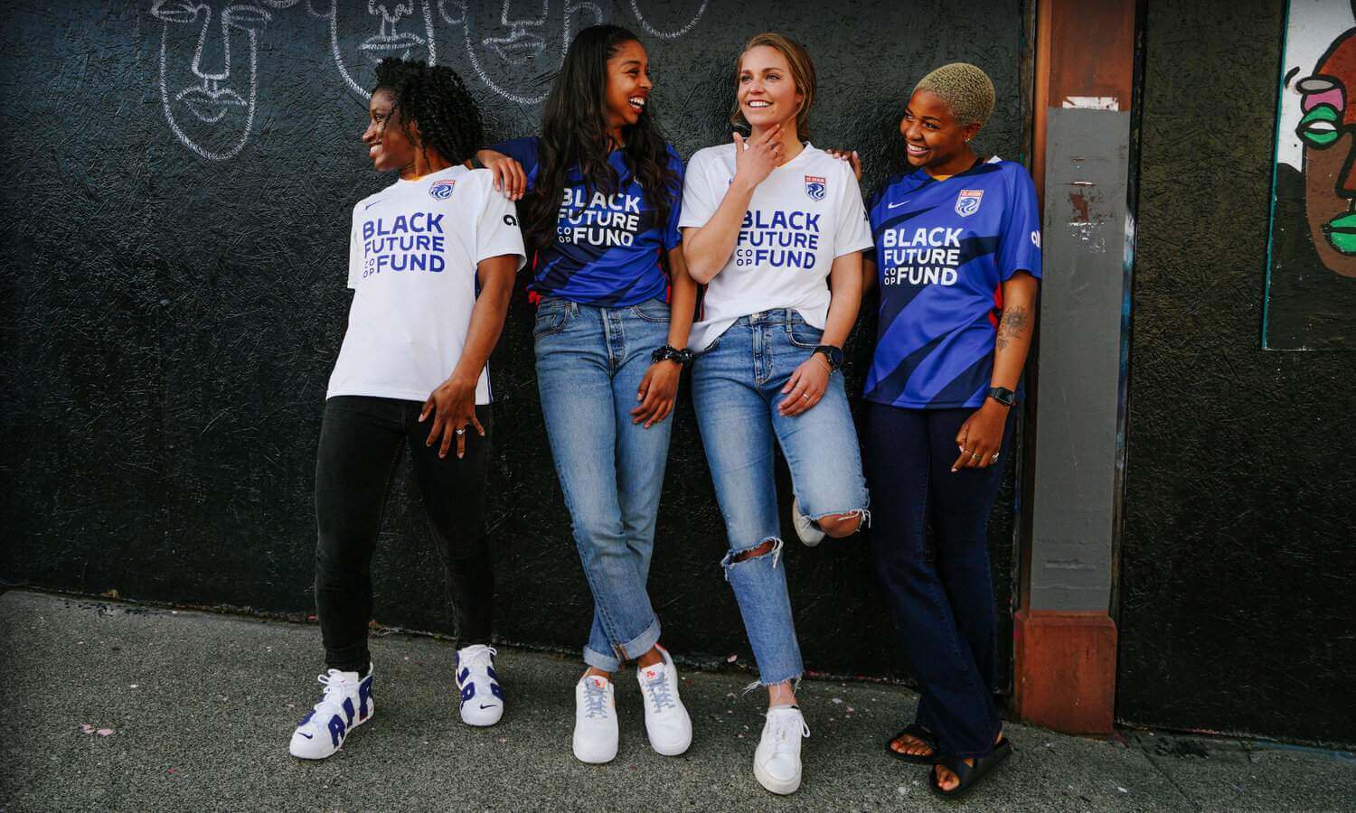
Membership update: A bunch of new designs have been added to the membership card gallery. That includes Teddy Morgan’s new card, which is based on the 1982 Campbell Conference All-Star jersey. We decided to orient it vertically in order to capture the full design.
Ordering a membership card is a good way to support Uni Watch (which, frankly, could use your support these days). And remember, a Uni Watch membership card entitles you to a 15% discount on any of the merchandise in the Uni Watch, Uni Rock, and Naming Wrongs shops, plus the discount also applies to our Uni Watch Classic Cap. (If you’re an existing member and would like to have the discount code, email me and I’ll hook you up.)
As always, you can sign up for your own custom-designed card here, you can see all the cards we’ve designed so far here (now more than 3,100 of them!), and you can see how we produce the cards here.
The Ticker
By Lloyd Alaban

Baseball News: Reds P Wade Miley threw a no-hitter on Friday after his son gave him a temporary Hulk tattoo. Fans now want him to make the tattoo permanent (from Brice Wallace). … Astros CF Myles Straw apparently wore teammate Alex Bregman’s arm sleeve last night. Straw wears No. 3 (from @SteveinLC). … The Yankees are wearing their Whitey Ford memorial patch on the left sleeve this season, but C Gary Sanchez had it on the right sleeve last night. Some quick photo research indicates that he consistently had it on the proper sleeve prior to last night (from Dave Rakowski). … Brewers IF Luis Urias started an at-bat last night against the Cardinals in the bottom of the eighth wearing blue batting gloves. He fouled off a pitch in the middle of his at-bat and then returned to the batter’s box wearing yellow and white gloves (from Andrew Lehman). … Rays OF/3B Yandy Diaz was still wearing his pink Mother’s Day belt last night (from Ryan Webster), and A’s SS Elvis Andrus was still wearing his pink batting gloves (from Samuel Lam). … Speaking of Oakland: The A’s announced they would explore relocation yesterday, and ESPN broke the story using a graphic of the team’s script with a fly on it (from multiple readers). … The Mets will unveil their Tom Seaver statue on Opening Day next season (from our own Brinke Guthrie). … Childhood Cancer Awareness caps for Arkansas yesterday (from Matt Snyder). … P Max Meyer of the Pensacola Blue Wahoos, affiliate of the Marlins, wore a Wilson jersey with Majestic pants last night (from @chriscobos). … The Progressive ad behind home plate at Cleveland’s ballpark shows spokeswoman Flo wearing a red helmet — an odd choice considering Cleveland has never worn a red batting helmet and hasn’t even worn a red cap since 2018 (from Ben Teaford). … A pitcher in the Chinese Professional Baseball League was told by officials to change his cleats after the the opposing team complained that his reflective footwear was distracting batters (from multiple readers). … Ole Miss softball graduates will wear an SEC-themed graduate patch this weekend (from Gray Hardison). … White Sox P Dylan Cease changed gloves during last night’s game (from Mark Kelly).

Football News: WR Robert Woods of the Rams will switch to No. 2 (from Andrew Cosentino). … Giants WR Sterling Shepard will switch to No. 3 (from our own Brinke Guthrie). … Georgia Tech P Pressley Harvin III, who was drafted in the seventh round by the Steelers earlier this month, wore a Steelers-themed graduation cap at his school’s commencement ceremony (from James Gilbert).

Hockey News: The Jets released a commemorative logo for C Paul Stastny’s 1,000th game, featuring the number fonts from the various teams for which he’s played. In addition, Stastney wore a No. 1000 pregame jersey (from Michael Remis).

Basketball News: New court design, banners, and other refurbishments for UTEP (from Mark C. Gutierrez).

Soccer News: Manchester United D Axel Tuanzebe wore a smart watch yesterday (from Jakob Fox). … Celtic will honor MF Scott Brown today with a commemorative warm-up jacket, as he’ll be playing his last home game with the team (from Ed Zelaski). … Dutch side Ajax has melted its 2020-21 Eredivisie trophy and will use the metal to make little stars for season ticket holders (from @stumpty7780). … New home kit for German side RB Leipzig (from Ed Zelaski).

Grab Bag: England is changing the name of its national second XV rugby union team from England Saxons back to England A (which is the nomenclature used by all other nations, with the exception of New Zealand, which calls its second team the Maori All Blacks) to “better reflect rugby’s diversity” (from Eric Bangeman). … The Toronto Rock of the National Lacrosse League is moving to Hamilton. It’s not yet clear what this will mean for their team name (from Wade Heidt). … This past Sunday’s episode of The Simpsons had a subplot of a high school-age Lisa trying to decide which college to attend, with assorted college logos shown in varying degrees of accuracy (from Michael Rich). … New AFL indigenous design for Adelaide (from our own Jamie Rathjen). … New volleyball uniforms for Slovenian men’s team NT (from Jeremy Brahm).

Love the NWSL coverage, thanks!
But does the Patriot bobblehead have the correct number font…
That dude’s got steady hands.
That was crazy to watch!
I find the soccer uniforms an affront to sports attire and a nod to naked commercialism. This blog has taken welcomed stands against the corporate logo creep happening in the major sports and I realize you can’t ignore the soccer world. Yet these deserve a condemnation focus entirely, maybe highlighting the affect of draining just a little more joy from sports. We already deal with stadium names that one can hardly keep up with, the swoosh as a garish addition to classic uniforms and the even more gross logos on NBA togs. Let’s make soccer uniforms the example billboarding great athletes to a sad extreme.
Yet these deserve a condemnation focus entirely
Sorry, why? Because they have ads?
Yes! Thank you for saying this. The acceptance of ad culture on these uniforms is a problem only getting worse. I find when I say anything about it I’m shouted down as being petty or petulant and don’t understand how business works. The only truth we’re bringing up is how ugly it looks to have a filthy billboard more prominent than club crest or name. “B-b-b-but that’s the way it’s done!” they wail. They’re really duped into thinking that’s how it should look, how it should be. I’m just saying it doesn’t have to be like that. In the meantime I’ll just wait till World Cup.
This argument negates the fact that all pro sports exist as for-profit organizations. I don’t especially like looking at ads on uniforms, but the uniforms themselves are billboards… Even the revered Yankees NY logo is just an ad for the Yankees. There’s no difference between the NY and an ad for McDonald’s other than nostalgia.
Here, Noah — read this: link
“There’s no difference between the NY and an ad for McDonald’s other than nostalgia.” That’s just an absurd statement and just wrong on so many levels.
Correct me if I’m wrong, but aren’t all the MLB Logos trademarked as a brand for the team, much the same way as the McDonalds “M” is trademarked as a brand for the company?
Tim, you’re correct, but the fact that an MLB team logo and the McD’s logo are both trademarked doesn’t mean there’s no difference between how they’re used, the separate contexts in which they function, etc. You’ve simply identified one commonality between them.
So what if they’re both registered trademarks? The NY logo represents the team, players, heritage, city, and sport a fan is rooting for. The McDonald’s logo represents fatty hamburgers and French fries and is unrelated to the product on the field.
I agree with this 100%. Without the scrutiny and condemnation uniform ads deserve, soccer uni coverage should be relegated to the ticker. When the corporate advertiser is more prominent than the name of the team, it should be ridiculed for the naked money grab it is. #NoUniAds
Have you seen the gross number of ads on this website?
1) Actually, your question has nothing to do with the discussion at hand and is a classic example of whataboutism. Please don’t engage in bad-faith tactics like that.
2) But since you raised the issue, here, read this: link
It’s completely applicable. Your response is part of the reason I stopped following this website daily 5 years ago. Always here to lecture the readers. When someone is complaining about jersey ads being obtrusive on a site that runs ads that actually make it difficult to navigate it seems pretty relevant.
Quick note on the Ticker: Manchester played Leicester City yesterday not Chelsea.
Manchester United*
THANK YOU for the women’s soccer coverage!!!
N.B about the New Zealand All Blacks. While they are made up of New Zealand national team players, it is more of a representative team than a “second team”. Players must have verified Maori lineage before selection (while this was not always the case in the past). It can be seen, however, as a way for younger players of Maori decent to break their way into the All Blacks.
A bit more about the Toronto Rock move. There is a statement from the team owner in the story linked below. Even though they are moving to Hamilton to play out of FirstOntario Centre, they are not changing the name.
I find it surprising. When I heard this I figured it can’t be really considered. This is not like a situation where a team has moved to a suburb and keeps its metro city name. A team with home games in Hamilton as a regular move should not be called Toronto. There is a long-time sporting rivalry between the cities. The 2 CFL teams an example. Curious how the people of Hamilton feel about this. They should have changed the name to Ontario Rock.
link
The Toronto Rock announced that they would keep their name as-is. They’ll be the Toronto Rock but play in Hamilton, which is ruffling some feathers as the sporting rivalry between the cities gets Hamilton fans riled up. In general, people from Hamilton aren’t fans of anything about Toronto.
link
For those of us who don’t follow the NWSL, it would have been nice to reference where OL Reign is located.
Good point. Now added.
It was weird hearing Gelbs on the Mets broadcast pronounce the “Uni” in Uni-Watch like Unicycle or university. I know Paul originally preferred UniWatch without the hyphen, but now I wonder if anyone else pronounces it that weird way instead of YOU-knee-WATCH.
Yes I found that to be quite interesting as well!
I have never thought about it like that.
This does come up from time to time — people sometimes pronounce it that way. When I’m appearing on radio/TV/podcasts, I usually tell them ahead of time how it should be pronounced. Can’t do anything about a situation like last night’s, obviously!
Even with the mispronunciation, it was still fun!!
Yes! And I considered it while listening to Unified podcasts. I thought they would pronounce it You-nee-fied to accentuate the uni and make it unique sounding. Now that I’m used to the usual unified pronunciation I understand the university-type sounding “Uniwatch” like the one in that broadcast.
Chicago Red Stars still have the best kits in the league and one of the better kits in football/soccer in general. Looking forward to seeing what they do with a 3rd kit.
NWSL is knocking it out of the water with a good number of their kits and puts the MLS to shame over the past few years.
I’m willing to take your word for it. I think most of them look like a parent outfitting an 8-year old’s team. Just about that lack of effort. And these are supposedly professional designers.
IMO the best is probably North Carolina. The worst (and perhaps the worst uniform I’ve ever seen) is Racing Louisville.
You can’t see the details on the jerseys as they are not highlighted well in the lead article.
The blue kit is designed after the map layout of Chicago itself and the white kit is the flag (which is beloved in that city) but the blue strip is actually the names of the neighborhoods within the city.
Portland Thorns black kit feature its rose petal theme? So well done. The white kit with the sublimated thorns across it?
You’re so far off with your “lack of effort” statement it’s hilarious.
Seriously have you looked at the MLS kits? Boring A.F.
The coach being restrained by his players, wearing 44, for the CTBC Brothers is named John Foster, former Atlanta Braves LHP.
New identity for the national governing body of lacrosse.
Instead of U.S. Lacrosse, it’s now USA Lacrosse. I am not sure of any national governing body going from U.S. to USA, or vice-versa, in my memory. Only one I remember was when our ice hockey federation went from AHAUS to USA Hockey in 1991.
Too, the new USA Lacrosse logo looks suspiciously like the soccer logo:
link
Great job on the NWSL uni coverage today, Jamie! Well done!
I have thoughts on the NWSL uniforms as a whole and on several of them individually. Hopefully, I’ll get a chance to elaborate on those if I can find a lull in my work schedule later today.
I will say, however, that I was surprised by OL Reign’s uniform reveal. I’d think jeans would be uncomfortable and restrict range of movement on the pitch. ;-)
Thanks!
One minor critique…I have no idea what NWSL stands for. Including that would have been helpful. I mean, obviously it’s a Soccer League and obviously I can look it up, but I’m lazy.
Hmmm… What do you think the initials of a national women’s soccer league might be?
North West Soccer League? But seriously, Jordan’s right. You start off with the full name followed by the abbreviation in parentheses. After which you’re free to use the abbreviation. That’s what we do at my work in technical writing. This is no different than pointing out a spelling error, which Paul has expressed appreciation for in the past. (And yes I know Jaimie wrote the piece but still, the principle applies.)
While the majority of us may be familiar with NFL, NBA, etc., soccer leagues may be an entirely different matter.
The primary Houston Dash jersey does indeed look like solid orange, especially from a distance, but it does have a sublimated pattern of large orange hexagons that you can see if you look closely. I’m not saying that makes it any better or worse, just pointing it out.
Paul, your intro to today’s lede made me laugh out loud, completely weirding out the woman next to me. Thanks for the laugh
Glad you enjoyed, Sam! And hope the woman wasn’t too spooked.
Am I the only one who thinks the Colonial Pipeline logo looks like the Civil Defense logo?
Am I the only one who feels that while all jersey ads are bad, there are two distinct levels of badness? The worst level is ones that are within a hard border and/or don’t use team colours. They stand out like a sore thumb and destroy the whole flow of the uniform. The better level are simple words or logos that use team colours and while they are an advert they don’t disrupt the look. And from a distance they blend in and become just another detail. In general soccer shirts, at least for the bigger teams, use the better level in my view. But the patch ads now infiltrating the NBA, NHL, CFL while small now, are of the worst level. Once patch ads get established, things generally just get worse and they multiply – look at Formula 1 or English Rugby teams. So while it sounds contradictory, perhaps to avoid future multi-patch hell, encouraging the more integrated (but larger) soccer style advertising might prevent the complete ruination of major league uniforms? The experience here (in the UK) shows the general fan who doesn’t Get It™ really only cares about how the team does, not what they wear. Especially if they believe that the extra money from Ads will improve that, so they are prepared to accept patches, and even buy and wear jerseys with them on. What do people think? I can hear the bonfires being piled up and stakes sharpened so I’ll try and make a run for it!