
Good morning! For this week’s podcast episode (our 10th — double digits!), Chris Creamer and I talked about the Red Sox’s new yellow “City Connect” uniforms, plus we have the second and concluding part of our interview with Dodgers senior design director Ross Yoshida, who gave us a scoop about how the Dodgers almost ended up wearing purple in the late 1990s!
In addition, we discussed the situation regarding the 2021 MLB All-Star Game patch now that the game has been relocated from Atlanta to Colorado, plus the question of the week and more. It’s a really good episode!
As always, you can listen to us on Apple, Google, Stitcher, TuneIn, and Spotify, or just use the player below:
The show notes for this episode, which include photos of many of the things we discussed, are here. Those photos (and some additional ones) also appear in the video version of the episode, which you can see here:
Please consider supporting this episode’s advertisers, Streaker Sports (get 20% off any order with checkout code UNIFIED), Ebbets Field Flannels (10% off, except on NFL items, with checkout code UNIFIED), and Homefield Apparel (15% off with checkout code UNIFIED).
Enjoy the episode, and thanks for listening.
Click to enlarge
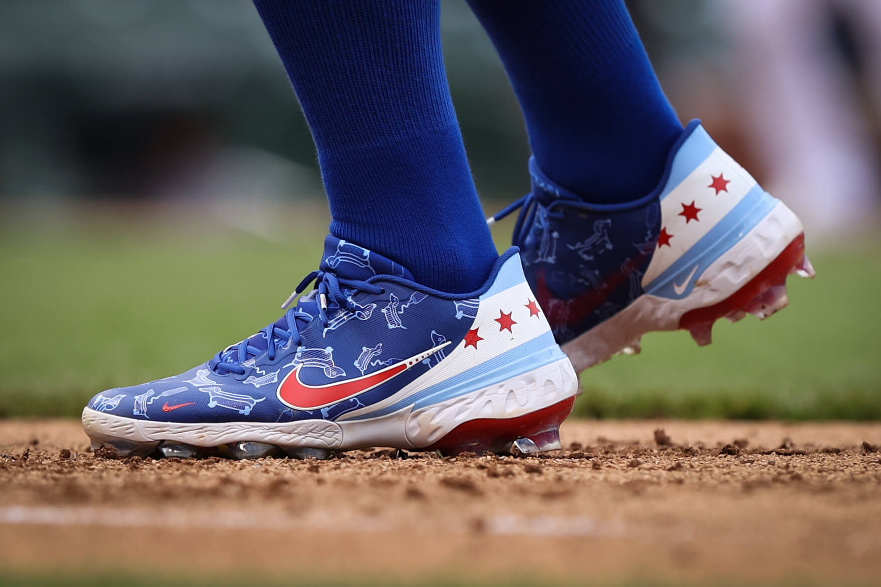
Star time: Last week I mentioned that Cubs outfielder Jason Heyward came onto the field on Opening Day carrying a Chicago city flag with the improper stars. That malady appears to be spreading: Yesterday Cubs first baseman Anthony Rizzo’s shoes featured a Chicago flag theme — with the same improper stars. (And yes, Rizzo’s footwear also had a nice wiener dog pattern, a reference to his dog, Kevin.)
Again, the stars on the Chicago flag look like this:
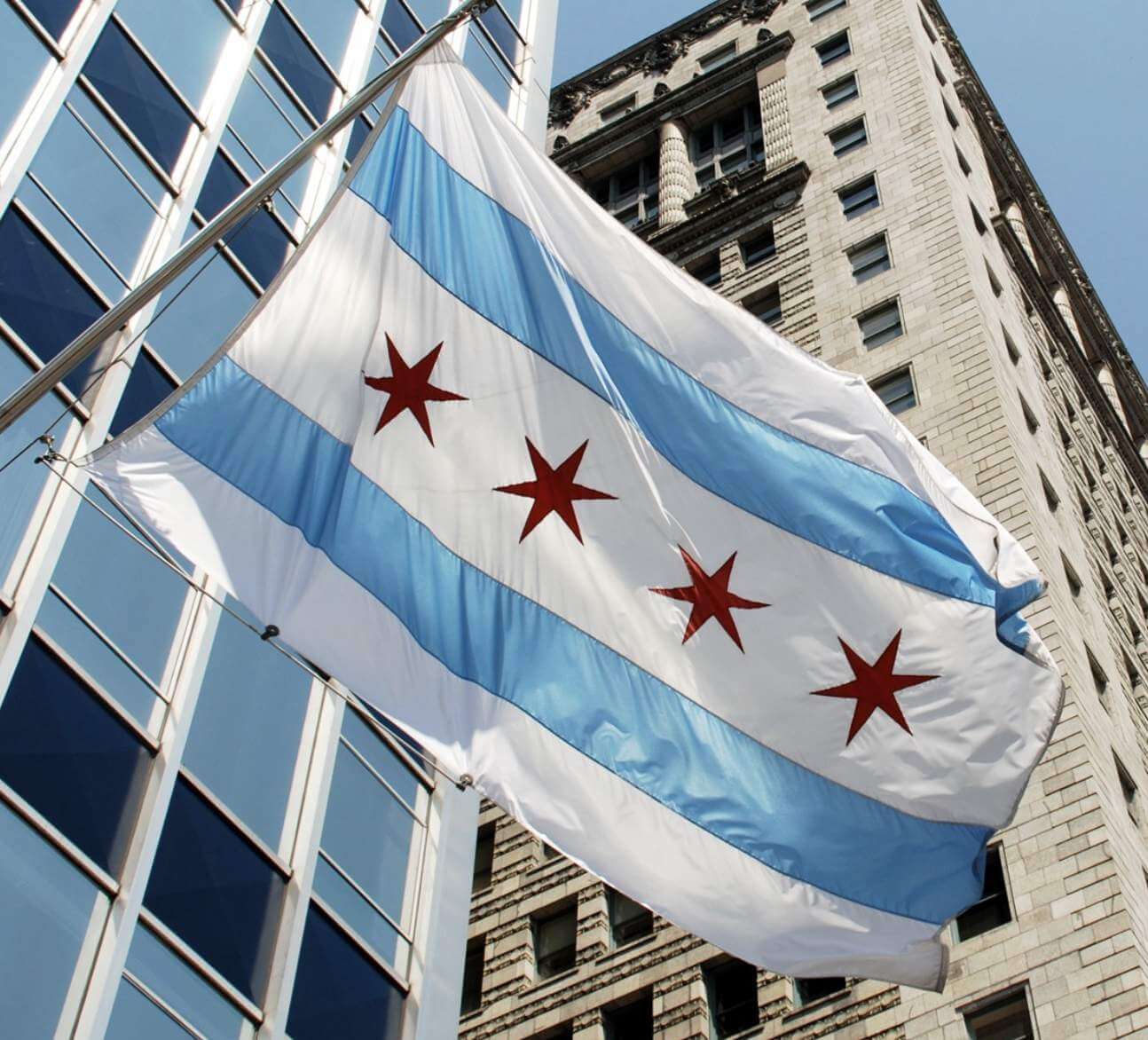
What is it about that shape that the Cubs find so difficult to get right?
(Great spot by Jerry Pemberton on the stars, and my thanks also to Joe Zook for explaining the wiener dog design.)

Membership update: Great job by card designer Scott M.X. Turner to create Greg Morrison’s new membership card, which is based on Darrell Waltrip’s car. Scott really captured that metallic feel — not easy to do!
Greg’s card is part of a new batch that’s been added to the membership card gallery, as we continue to plow through all the orders from last month’s membership drive.
Ordering a membership card is a good way to support Uni Watch (which, frankly, could use your support these days). And remember, a Uni Watch membership card entitles you to a 15% discount on any of the merchandise in the Uni Watch, Uni Rock, and Naming Wrongs shops, plus the discount also applies to our Uni Watch Classic Cap. (If you’re an existing member and would like to have the discount code, email me and I’ll hook you up.)
As always, you can sign up for your own custom-designed card here, you can see all the cards we’ve designed so far here (now more than 3,100 of them!), and you can see how we produce the cards here.

Click to enlarge
Just my type: Back when I worked in book publishing, I was lucky enough to work with a lot of great authors who wrote about graphic design — a tremendous experience that taught me so much. One of those authors was Steve Heller, who has gone on to become America’s (and probably the world’s) greatest design historian.
Last night Steve gave an online lecture called “The New Typography in America, 1920–1940.” I imagine the video will be archived and posted at some point (I’ll share it when it’s available), but in the meantime I took the liberty of making a few screen shots to share, including the one shown above. If you like that (and who wouldn’t?), you’ll probably like the rest of them, which you can see here. Enjoy.
The Ticker
By Paul

’Skins Watch: Colorado is the latest state to consider a ban on Native American mascots and team names. Meanwhile, the Washington state Senate has approved its own ban. Approval by the House is still pending (both of those from Phil). … Camanche High School in Iowa will no longer call its teams the Indians (from Kary Klismet). … Also from Kary: The Philadelphia Cricket Club, which has been featured before in ’Skins Watch for its Native American-themed sign, has now decided to remove that sign after complaints from a neighboring church. … One more from Kary: Newington High School in Connecticut, having previously dropped its “Indians” team name, will now call its teams the Nor’Easters.

Baseball News: The whole point of having Francisco Lindor on my favorite team was that the Mets would finally have a player who wore stirrups every day. But yesterday, in only the third game of the season, he went low-cuffed. What the fuck?! … Although the team hasn’t yet announced it, the Rockies will reportedly retire Larry Walker’s No. 33 on Aug. 21 (thanks, Phil). … I’ve written before about Dodgers 3B Justin Turner’s unusual custom jersey tailoring. It appears that new teammate Trevor Bauer is having the exact same thing done to his jersey (good spot by Matt Sanderson). … Hillsborough High School in New Jersey is making players “earn” their batting helmet logos, because “successes in life don’t come from free handouts” (from Fred Versaci). … New caps for the Hartford Yard Goats. … The Cubs are planning to add a statue of former pitcher Ferguson Jenkins at Wrigley Field (from Andreas Papadopoulos). … New costumed mascot for the Pioneer League’s Missoula PaddleHeads (from Kary Klismet). … Red Sox skipper Alex Cora wore the team’s BP cap during yesterday’s game, although I’m told he later changed it to a game cap (thanks to all who shared). … The WCBL’s Regina Red Sox have released renderings of their proposed 3,500-seat stadium (from Wade Heidt). … Trust me, this is worth the click: FIU’s uniforms are really, uh, something (from Stephen Mason).

NFL News: Nike has suspended its endorsement deal with Texans QB Deshaun Watson, who’s been accused of sexual assault and other inappropriate behavior by nearly two dozen women. … With the NFL considering a less restrictive policy on uniform numbers, the Patriots’ official Twitter account posted mock-ups of what some of their players might look like if they were allowed to wear their college numbers — and, of course, they used the wrong number font for some of them (thanks to all who spotted this — proud of you!).

Hockey News: New “Irish Night” uniforms for the ECHL’s Allen Americans (from Chris Mycoskie).

Basketball News: A USC grad has created homemade trading cards to commemorate UCLA’s improbable run to this year’s Final Four (from Kary Klismet). … Good article on college hoops coaches now going with more casual attire (from Warren Ehn).

Soccer News: Liverpool winger Harvey Elliott has signed an endorsement deal with New Balance. … Inter Milan’s new shirt is the first one to feature their new club badge (thanks, Phil). … Meanwhile, here are several dozen Inter logo designs that didn’t make the cut (thanks, Anthony). … Camila Castilhos created mock-ups of the AFC Richmond Fantasy kits from the TV show Ted Lasso. … MLS expansion franchise Austin FC has partnered with a local animal shelter to feature a new live mascot for each game — a dog that’s ready to be adopted by a good home (from Kary Klismet).

Grab Bag: Reprinted from yesterday’s comments: Chinese TV is blurring out the logos of Western companies (from Peter, who prefers that his last name not be used). … Colorado is auctioning off a series of marijuana-themed license plates (from Max Weintraub). … Here are some thoughts on the logo for the 2026 Milan Olympics. … Microsoft marked its 46th anniversary by reviving its original 1975 logo, which was definitely a a product of its era. … Aussie football team Brisbane Lions are asking for public input to name their new lioness mascot (from Kary Klismet). … New athletics logo for D2 school Humboldt State. … I’ve previously written about my visits to the Neon Sign Museum in Las Vegas and the American Sign Museum in Cincinnati, so I’m super-excited to learn that there’s a new neon sign museum opening much closer to home — in Philadelphia (big thanks to Rob Riegert for the tip). … Here’s a pretty cool video clip showing the evolution of Ohio Roller Derby jerseys (from Dan McGowan). … This is pretty funny: an article on why so many comic book villains wear my favorite and least-favorite colors — green and purple (big thanks to James Poisso). … The @Super70sSports Twitter account asked people to name their favorite uniform and got lots of great responses (from Erick Kriewaldt). … New maternity uniforms for the U.S. Marine Corps. … New uniforms for Nashville police officers (from Timmy Donahue). … Even without fans, sports owners got richer last year. Tell me again why we need all those new ads that were added during the pandemic?

Click to enlarge

What Paul did last night: Our neighbor Hunter is a Phillies fan, and he knows I’m a Mets fan. So with the Mets getting thumped by the Phils yesterday afternoon, he moseyed over in the Phillies cap, just to give me the business. I like that he even wore the proper blue cap, which is what the Phils wore yesterday because it was a day game.
As always, you can see the full set of daily Pandemic Porch Cocktails™ photos — now well over a full year’s worth — here.
I approve of Hunter.
Paul-
The Marine Corps has had maternity uniforms for some time, may be better to state “updated” maternity uniforms-
link
Thanks. Wording now adjusted.
Having been a Uni-Watch reader since the very beginning, I feel strongly that the best membership cards are the most unusual. I vaguely recognize the name Darrell Waltrip, and have no idea what his car looks like, but I really love the way it looks on a membership card. Great work Scott!
An excellent choice by Greg and outstanding work by Scott!
Well done, men!
Boogity! Boogity! Boogity!
Speaking of your Phillies fan neighbor, I sometimes wish baseball teams had a “clash kit” to avoid matchups like yesterday’s. In the late afternoon shadows, Blue over cream and Blue over Grey looked pretty similar. The Phillies should have just worn their red pinstripes, but if they insist on wearing those Cream unis (which should be paired with blue shirts/stirrup, not red, but that’s a whole other rant) …if they want to wear the blue and cream, it would be nice if the Mets had an orange uni to wear for more contrast, or if that’s a bit much, maybe grey caps or something? I guess I just don’t like everyone wearing the same color hats is really what it comes down to.
Maybe have the home team wear white and the road team wear gray?
Careful! That makes too much sense!
Paul,
I got a notification the podcast was available on the apple podcast app just before 8:30 this morning. It’s there and I’m able to listen to it.
Absolutely loving the podcast by the way!
oh shut up Hunter
According to Chicago municipal code, the stars on the flags being used by various Cubs is not wrong. City law defines the flag as having four six-sided red stars with “sharp points.”
link
That’s it. The words “sharp points.” No graphical definition, no specification of proportions, even though the blue stripes are defined in terms of precise proportions.
Now, I happen to agree that the more common and traditional stars are both a better design element given the purpose of a six-pointed star in a non-national flag and just more visually appealing. But the alternate stars still have sharp points and are therefore not wrong. At least not until the city government of Chicago updates its municipal code to specify the shape of its flag’s stars in greater detail.
Great research. Would also just add that the “Star of David” Chicago Flag is very common beyond the Cubs. Here is a look at the vinyl from the Sufjan Stevens single, “Chicago”
link
I’ve also seen that star in bars and signage throughout the city.
Actually, the city explains how the star should be drawn:
link
Also: Look at that page’s favicon.
I agree that “sharp” could be defined better, but I think the intent is clear–why call it out if the typical design is what’s meant?
And while it, of course, doesn’t have the force of law, the flag’s designer’s intent was explicit in his letters:
link
It’s common to see the thicker stars on Chicago flag products. Less common but also a regular sight is a more royal shade of blue.
Here’s a blog post I found of someone who sounds like they Get It, assuming they’re a sports fan: link.
Seems like there’s always been a bit of drama about the star, kind of like some sports logos in history!
Paul, thanks for capturing those slide from Steven Heller’s lecture. The new typography was such an incredible explosion of new ideas. I look forward to watching the whole presentation if and when they post it.
Just a quick addition to the Boston “City Connect” uniforms. I have seen a lot of commentary floating around the sports sights that run along the lines of “I don’t like them, but they are not made for me”, meaning this is aimed at younger folks.
For whatever this is worth, my son plays on a 14u baseball team, and from what I heard at a recent practice, those young teens think the yellow and blue Bosox unis look terrible.
Love the phrase you used to describe why the Phillies fan came over. “Give me the business”. Such a Wally and Beaver Cleaver saying
Ben Dreith!
link
Great interview with Ross. I totally agree with him that teams shouldn’t change their colors. I thought of the Diamondbacks when he said this. Also thought of them when he said Fox was considering changing the Dodgers xcolors to purple, since purple was such a hot color in the late 90s. It would have been a complete travesty if the Dodgers had, but since the Diamondbacks originated during this time period, they should embrace it rather than distance themselves from it.
Will there be a patch for the tenth podcast?
Congrats, guys. Keep them coming!
I haven’t listened to the podcast yet, but seeing the Dodgers in purple gave me a thought. Since most people here in LA are Dodgers and Lakers fans ( to the point that my Clippers get booed when they appear at Dodger Stadium), they may be accepting if the Dodgers’ city design end up purple and gold, say to honor the Lakers. I feel like any other color combination may lead to a revolt, they’re very particular about their blue. Now my team, the Angels, might have more leeway due to their more “ loose” uniform history. If the Halos go with something crazy, I won’t like it but I’ll probably reluctantly accept it, s long as it’s just for one or two games. Now if USC football ever goes with anything other than their traditional unis I’d lose it. Crazy how that works.
In New York, fans are inclined to fall into two camps: Original teams- Giants, Knicks, Rangers, Yankees; and Expansion teams- Islanders, Jets, Mets, Nets. (I had a college roommate who rooted for the Yankees and Islanders, but he was definitely the exception). In Los Angeles, do the same rules apply? That is: 1. Dodgers, Kings, Lakers, Rams; and 2. Angels, Ducks, Chargers, Clippers. Obviously, the time constraints are compressed for the left coast: an old team in LA means 1960-ish, whereas that date means a “new” team over here.
Our outlier is the New Jersey Devils, which were considered a “kinda” NY team by dint of their sharing the arena with the New Jersey Nets. I was hoping a similar circumstance would arise when the Sacramento Kings contemplated a 2011 move to Anaheim, renaming themselves the “Royals” in the process. My opinion of the move was, “Man, those Angelenos really like themselves some NBA Basketball!”
It’s a bit more of a mix here in LA, the 2 constants are Dodgers an Lakers, most Southern Californians are going to be fans of those 2 teams (regardless of where they live). Most Angel fans are in Orange County, where they play in Anaheim, Im definitely the rare Angel fan that lives within the actual Los Angeles city limits. Clipper fans are scattered around. As far as football teams I’d say it goes Raiders and Rams on top, very few Chargers fans around here.
I was puzzled there was such a mad dash to be one of the LA Football teams in 2016. Success was far from guaranteed, and all three of those teams had failed in Los Angeles before. As far as the gridiron goes, I think of LA as Bruins and Trojans turf.
Nice to see another LA based Angels fan! I’m one of those weird exceptions who’s a Lakers/Angels/Rams fan haha my dad is a die-hard Dodgers fan, but the first World Series I remember watching was 2002, Angels vs. Giants, and the Angels victory solidified me as an Angels fan for life!
I’d agree to a certain extent with Walter’s NY loyalty inclinations. But I also think it depends on where in NY one lives (and also how much, at least in baseball, one could consider oneself a “NL” or “AL” fan). There weren’t that many Brooklyn Dodger/NY Giant fans who suddenly became Yankee fans in 1958, for example. Once the NL returned to NY in 62, many of those former Giant/Dodger fans immediately embraced the Mets. As far as where one lives — I live on Long Island, and Shea was a much closer jaunt than Yankee Stadium, so I was basically “born” a Mets fan and really tried to like the Jets…thankfully I bailed on them even before they moved to Jersey and became a Giants fan. Isles was a no-brainer, especially since the Coliseum was literally 5 minutes from where I grew up and all they did was win Stanley Cups when I was a young teen. Initially I liked the Nets (they played in the Coliseum in their ABA days), but became a Knicks fan when they left; now that they’re back in Brooklyn, I’ve questioned my Knick loyalty. But anyone who grew up in NYC or west, they probably don’t have the same attachment to the Mets/Nets/Jets/Isles. While it’s true all four of these teams are “expansion” teams, let’s face it, they’ve all been around close to or more than 50 years, so I can’t attribute expansion to fandom, per se. I think it’s still more location. You grow up on LI, I’d say at least 50% of the fans are NYG or NYR, despite expansion, but way more LIers are Mets fans than Yankee fans. The current LI Yankee fans are (in general) much younger, and became fans when the Yanks had their incredible run from 96-00 (and were in the playoffs every year for more than a decade). But yes, in general, I’d agree with Walt’s statement but it’s more of a general observation; of course, few fans will ever admit to dual-fandom, but there are definitely Mets/Yanks, Giants/Jets, Knicks/Nets and Rangers/Isles fans (much less so the latter two since they play in the same division) than will admit to it.
I’ve questioned my Knick loyalty.
That’s something every Kinick fan should do… ;)
*Knick
I need better glasses…I had it right the first time.
As I dated a Giants/Mets fan who is a Brooklyn native and my friends from Staten Island are also Giants/Mets.
My rule of thumb absolutely applies chiefly to fans of a certain age. There’s an inclination of younger fans I meet to root for both the Yankees and Jets, but I find that a weird pairing.
Guy in my curling club (50) is a Yanks/Jets/NYK/NYR fan. No idea how he’s a Jets fan, with those other allegiances.
And I too am a Rangers/Isles fan:)
Growing up in Southern California, Long Beach, I was a fan of both the Angels and Dodgers. I don’t remember people being a fan of one and not a fan of the other. Yes everyone had their favorite team, usually the Dodgers, but they were also Angels fans. Of course back then, mid 60s thru the 80s, besides being in different leagues, they never played each other. At some point I believe after the 1980s, it became more of a thing to like one and hate the other, but I don’t see it to the extent like in say NY. Also the Rams and Raiders didn’t “fail” with the fans, they only failed with getting their own stadiums built. LA is definitely a Raiders town, at least before the Rams moved back. It made more sense for the Raiders to move back to LA than the Chargers. The Chargers should have never moved from San Diego.
And my daughter, who now lives in Northern Cal where her husband grew up, said most fans are 49er/Giant fans, or Raiders/A’s fans, at least before the Raiders moved. Makes sense being what side of the bay you lived on. They were the exception, living in the East Bay area, being 49er/A’s fans.
The Chargers will ultimately rue their decision to move north. Leaving San Diego was dumb.
Growing up in the 80’s I was a Raiders, Lakers, Kings, Dodgers fan. The Rams and Ducks were practically on another planet down in Anaheim. But I had a fondness for the Angels because my dad grew up as a Brooklyn Dodgers and Los Angeles Angels fan. That made sense at the time when there was no major local team.
Also, as far as I can tell the Chargers are maybe the 4th favorite team for Angelinos behind the Raiders, Rams, and Cowboys (who do summer practice up the road in Oxnard).
Seeing a lot of photos today of Henry Aaron on the day he hit his 715th home run (April 8, 1974), and I feel compelled to come here and note just how great that era’s Atlanta uniforms were. They contain two things it’s a shame no team currently uses as a uniform design element: Contrasting raglan sleeves; and using the sleeves as a canvass for team-identifying visual elements other than patches.
Most teams nowadays wear set-in sleeves, and a few rendered them in contrasting colors (1997 Angels, 2001 Blue Jays), but I’m all-in on raglan sleeves. If any team were to experiment with Braves-like sleeves, it would likely be as an alternate, because most people think of them as a ’70s accessory. I also associate them with the Negro Leagues, since the Negro League uniforms were colorful riffs on what was being worn in MLB, then.
Don’t forget the Diamondbacks experimented with raglan sleeves with the sublimated diamond pattern. Of course, they splashed that pattern over other parts of the uniform, unsuccessfully. But that counts as a uniform design element.
If I were Commissioner, raglan sleeves would be mandatory for any team with pinstripes, and raglan would also be the default in the overall uniform manufacturing contract. Non-pinstriped teams could opt for set-in, but if they didn’t express a preference, they’d get raglan. Players just cut a more striking profile with raglan sleeves.
And agreed on contrasting raglan as having a bit of a Negro Leagues vibe. (They also make me think of pre-1960 minor league teams too.) Which is a virtue! The Royals are an example of a team where the visual not to Negro League uniforms could be a great addition to the team’s identity.
As a shade-tree mechanic, the Dinamo-Azari book spine bothers me because they didn’t use castle nuts.
I instantly thought of you when I saw that article, Paul.
It’s a bit more of a mix here in LA, the 2 constants are Dodgers an Lakers, most Southern Californians are going to be fans of those 2 teams (regardless of where they live). Most Angel fans are in Orange County, where they play in Anaheim, Im definitely the rare Angel fan that lives within the actual Los Angeles city limits. Clipper fans are scattered around. As far as football teams I’d say it goes Raiders and Rams on top, very few Chargers fans around here.
Trust me, this is worth the click: FIU’s uniforms are really, uh, something
Oh my… I like!
And Yankees fans, it’s most likely a glimpse of your Nike-fied future.
Since today’s podcast addressed pullovers and sansabelts (or “cummerbunds”, if you prefer) I propose a poll of MLB’s Greatest Pullover & Sansabelt Hits. A caveat: I don’t qualify uniforms such as the Royals, Reds or Cardinals since those were traditional designs interpreted on a pullover template. Top Three Pullovers: 1977 Toronto Blue Jays, 1983 Chicago White Sox, 1977 Houston Astros. Top Three Sansabelts: 1977 Houston Astros, 1973 Oakland A’s, 1980 San Diego Padres.
The only reason I don’t vehemently advocate for the early 70s Pirates pullovers is because they weren’t v-necks.
Of the three you mention. I’d go with the Jays.
You’re absolutely right about the V-Neck; perhaps the most eyecandy-worthy element of the pullover. Maybe they should get points for being first, but I’ve never especially liked the 1971 Pirates’ uniform.
Another thing to love about Sansabelt uniforms is the dark jersey/white pants look. Does not translate at all to the current template.
I believe the original Cardinals pullovers were also round necks.
Always liked the ‘84 Mariners…I nominate them for both categories.
They also had one great looking BP jersey back then-they deserve an honorable mention.
anyone else losing their love of uniforms because of all the DUFUS – Doing uniforms for uniforms sake….?
Enough already! Lets go back to home & away and that’s fucking it!
With every pro sports league adding these new uniforms for shits and giggles it’s becoming boring.
New uniforms revealed by teams used to be so exciting.
These merchandise reveals pushing their symbolic uniforms are ruining my daily visit to this site.
Imagine how I feel about *my* daily visits to this site!
Costumes. Almost as if the sport is secondary to the marketing of merchandise.
Given that baseball does something uni-related for most major holidays that occur during the regular season, I kind of hoped Nike would use their creative machinations to address how consistently awful those uni elements have been. Alas, it was not to be. I am actually excited foe the city connect jerseys, if only because of its novelty, but if it was one project or the other, I’d much prefer they improved the holiday uni programs.
I don’t think many sports get the holidays right. Basketball’s Christmas unis occasionally being a bright spot. I think baseball would do better to stick to a patch (sleeve, chest, or back of the collar), or a single hat for the league for that day (ie: design a Mother’s Day logo, put it on a pink hat, and make everyone wear that hat). Of course an overpriced patch will still make less money than an overpriced hat or jersey, and I’m guessing there’s more people that would buy a Yankees hat with a pink logo than a Mother’s Day hat with no Yankees logo. Although plenty of people buy MILB hats with anthropomorphic food on them, so who knows?
Nike just needs to fix what’s broken first. That’s all.
Can see some Bauhaus-influence in the typography book and subsequent pictures.