Click to enlarge
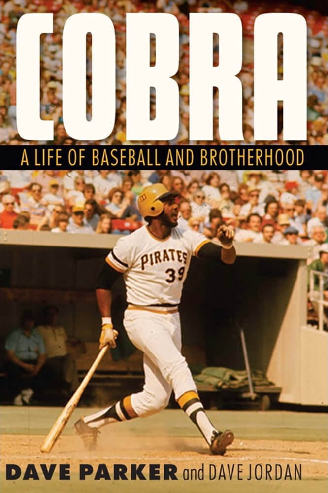
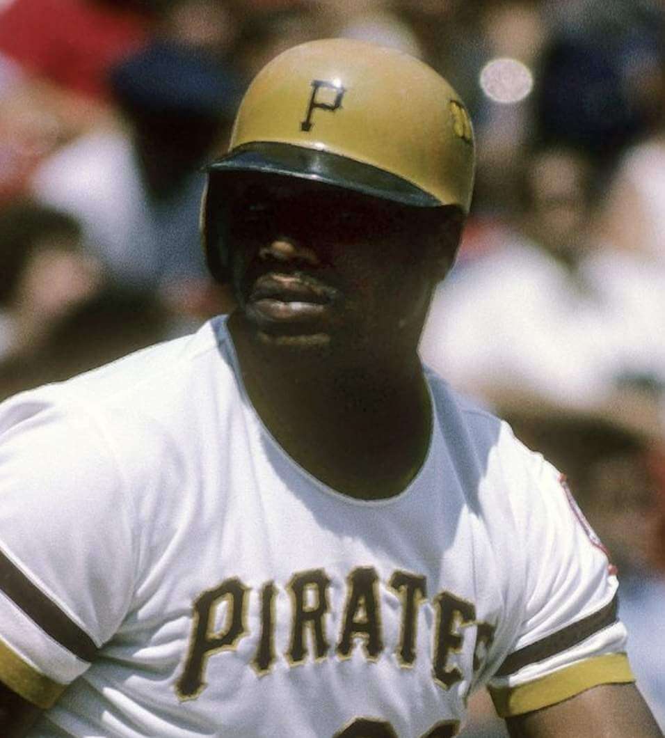
The start of baseball season is traditionally when new baseball-centric books are published, and one of the new titles this year is former MLBer Dave Parker’s autobiography, Cobra: A Life of Baseball and Brotherhood, which was published last Thursday. The cover design is shown above, and it’s surprising on multiple levels, so I want to talk about that today.
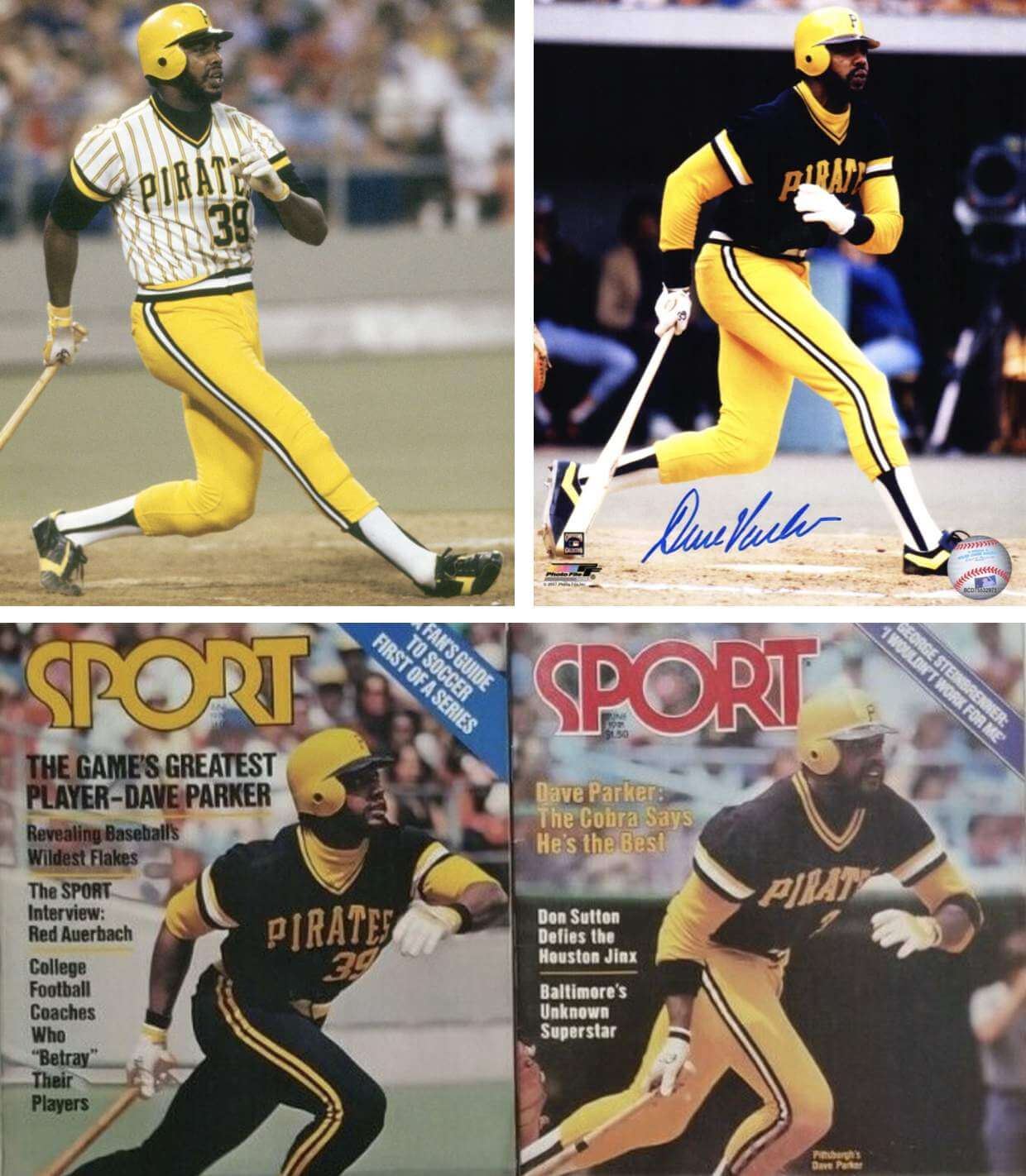
The photo they chose is a beauty — oh man, those stirrups! — but it’s an odd choice to represent Parker’s career. The final year that the Pirates wore that uniform was 1976, while Parker really became a superstar in the years following ’76. When I think of him — and, I suspect, when most fans think of him — I envision him wearing the team’s mix-and-match bumblebee set (and a much less attractive stirrups style), not the mustard-accented set:
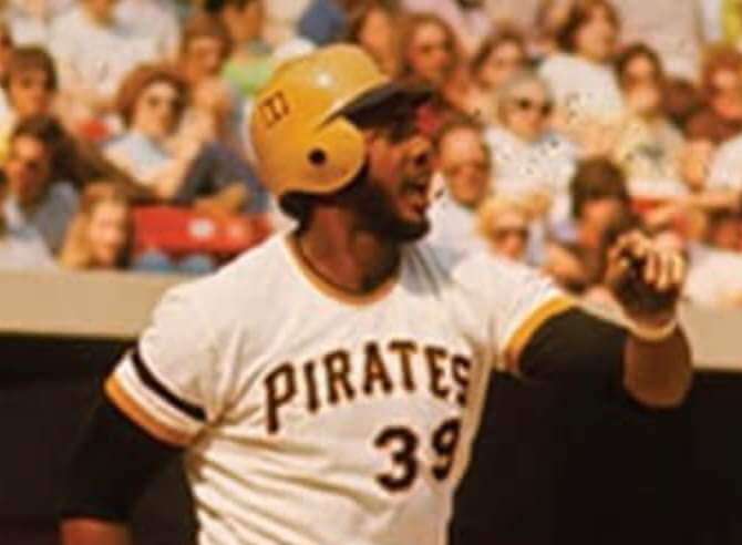
Moreover, if you take a closer look at the photo on the book cover, it appears that there’s some sort of marking on the side of Parker’s batting helmet:
I couldn’t figure out what that was, so I went looking for pics of Parker from early in his career. And sure enough, look what I found:
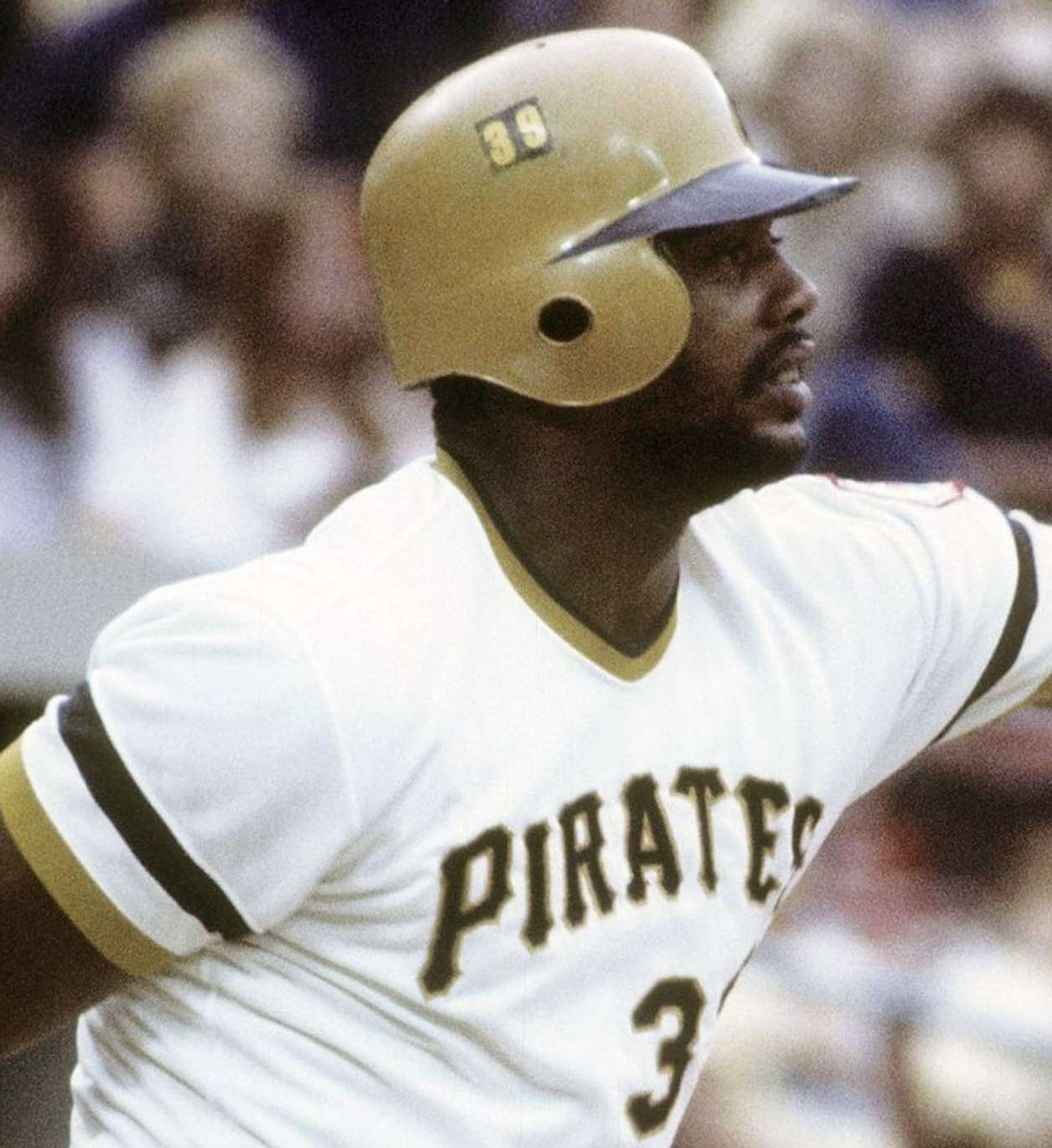
How bizarre! I don’t think I’ve ever seen that on Parker’s helmet before, nor have I seen any other Pirate with a number on the side of his helmet.
That photo is clearly from 1976, because we can see a hint of the National League centennial patch on Parker’s left sleeve. So did he have the “39” on his helmet throughout the ’76 season? Nope:
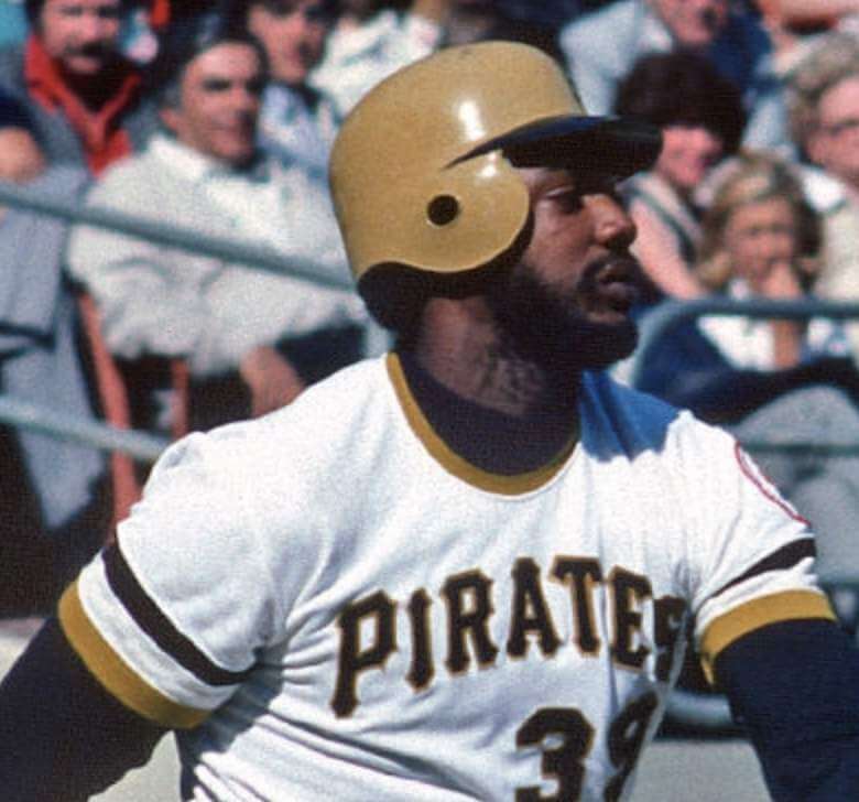
And did any other Pirates have numbers on the sides of their helmets? I was dubious, because I figured I would already have known about this phenomenon if it was more than an isolated one-off. But check out this 1976 photo I found of Pops Stargell:
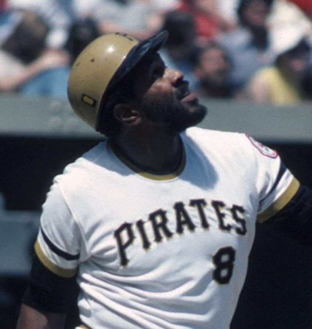
That’s clearly the same kind of decal that was used on Parker’s helmet!
I couldn’t find any shots showing other Pirates wearing this type of helmet decal in 1976. But I did find a pre-’76 shot of Stargell (there’s no NL centennial patch, so it has to be from 1975 or earlier) showing him with the same type of decal on his brim, instead of on the side:
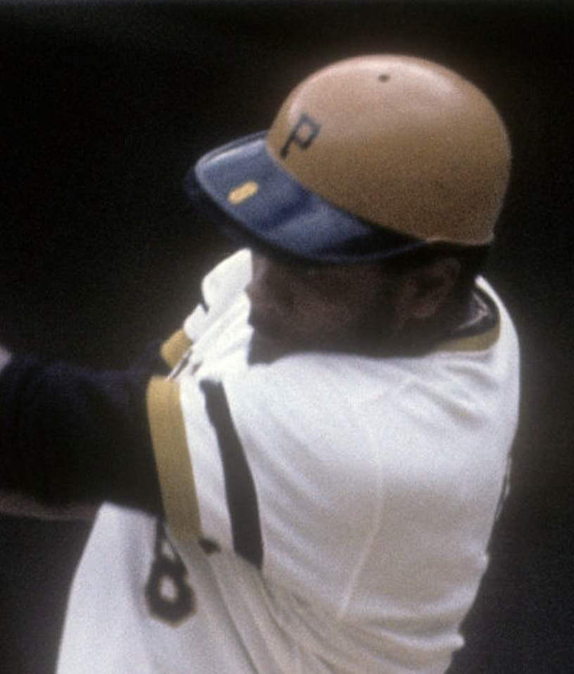
At this point, my assumption was that the Pirates’ equipment manager experimented with moving the numbers to the side of the helmet for part of the 1976 season (although I couldn’t tell for how long, or during which part of the season, or for how many players) and then abandoned the idea.
But there were two people — both named Jerry, by coincidence — who I wanted to check with. The first was former MLB pitcher Jerry Reuss, who played for the 1976 Pirates and is a longtime Uni Watch reader. Perhaps he could shed some light on this phenomenon? I sent him a note and heard back right away, as follows:
This is the first time I recall seeing [the helmet numbers]. I can’t think of a practical reason for placing numerals on a side of the helmets. During the game, they were stored in cubicles, front-facing or back-facing, where identifier numbers on the brim or back were easy to see.
I checked both the 1977 scorebook and yearbook (full of pictures from the 1976 season) and couldn’t find any photos of helmets with the numbers on the side. So I assume the side placement was a brief experiment either by the player(s) or by equipment manager John Hallahan. This isn’t surprising, as the Pirates always seemed to be at the forefront of baseball unorthodoxy (if that’s a word) — the pillbox caps, the mix-and-match uniforms, etc.
The other person I checked in with is Uni Watch proofreader Jerry Wolper, who’s an excellent historical researcher with a particular emphasis on Pittsburgh sports. I fully expected him to tell me that he knew all about the side numbers (or even that he’d told me about them himself many years ago), but he said he didn’t recall seeing them before. When the two Jerrys are both stumped, I’d say we have a major Pirates historical find on our hands.
Jerry Wolper did a bit of 1976 research and found this photo from a May 9 newspaper, so that helps to date the phenomenon:
All this because Parker’s publisher, the University of Nebraska Press, chose a somewhat counterintuitive photo for the book cover. Amazing!
Update: Reader/commenter Chris Hickey notes that Parker apparently had the number on the other side of his helmet as well:
Curiouser and curiouser!!
(My thanks to Jerry Pemberton — yet another Jerry! — who alerted me to the odd helmet marking in the book cover photo.)
Click to enlarge
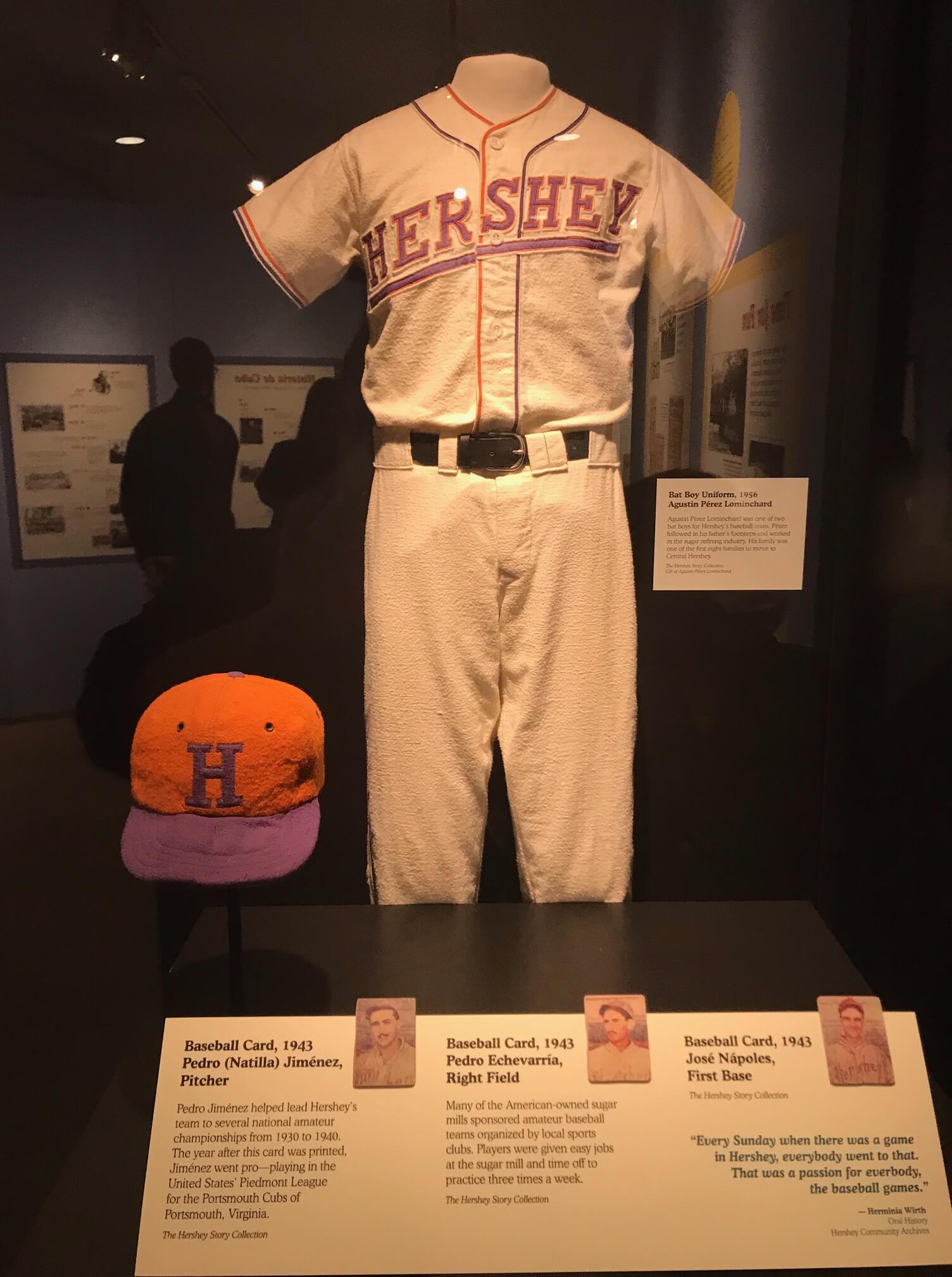
Sweet: Reader Aaron West and his family were recently in Hershey, Pa. “While we were there, we toured the Hershey Story, a museum that tells the history of Hershey,” he says. “While looking through the exhibit on the Hershey-owned sugar cane fields and processing plants in Cuba from the first half of the 20th century, I came across a neat uniform display.”
Pretty nice-looking uniform, right? And check out that bi-colored headspoon piping — not sure I’ve ever seen anything quite like that before!
Click to enlarge
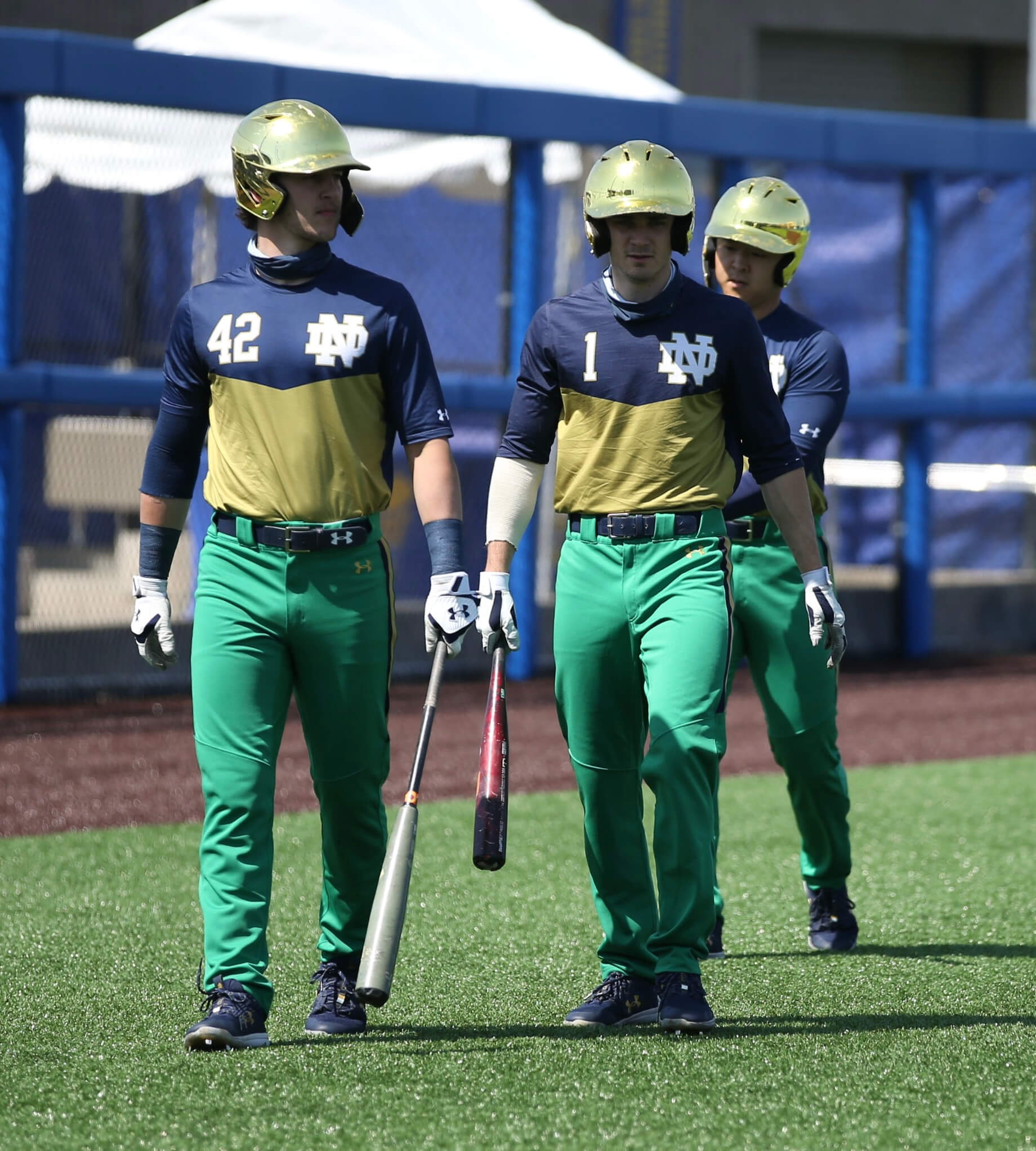
Not so sweet: Notre Dame’s baseball uniforms are, uh, really something, eh? The good news is that the jerseys are just BP tops. But still!
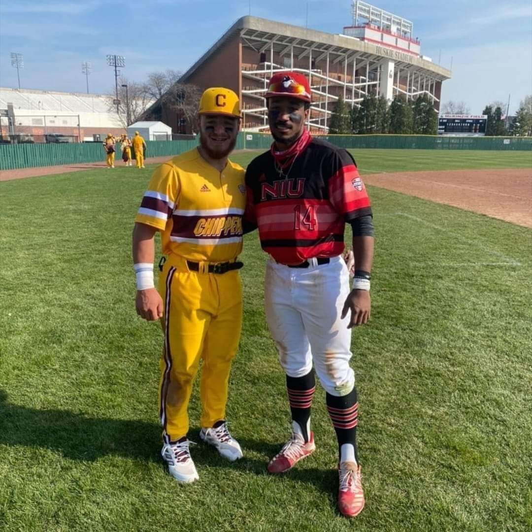
Meanwhile, as long as we’re talking about college baseball, Central Michigan and Northern Illinois had quite a uni match-up yesterday:
(My thanks to @funnybonetweet and Matt Campbell for these.)
Click to enlarge
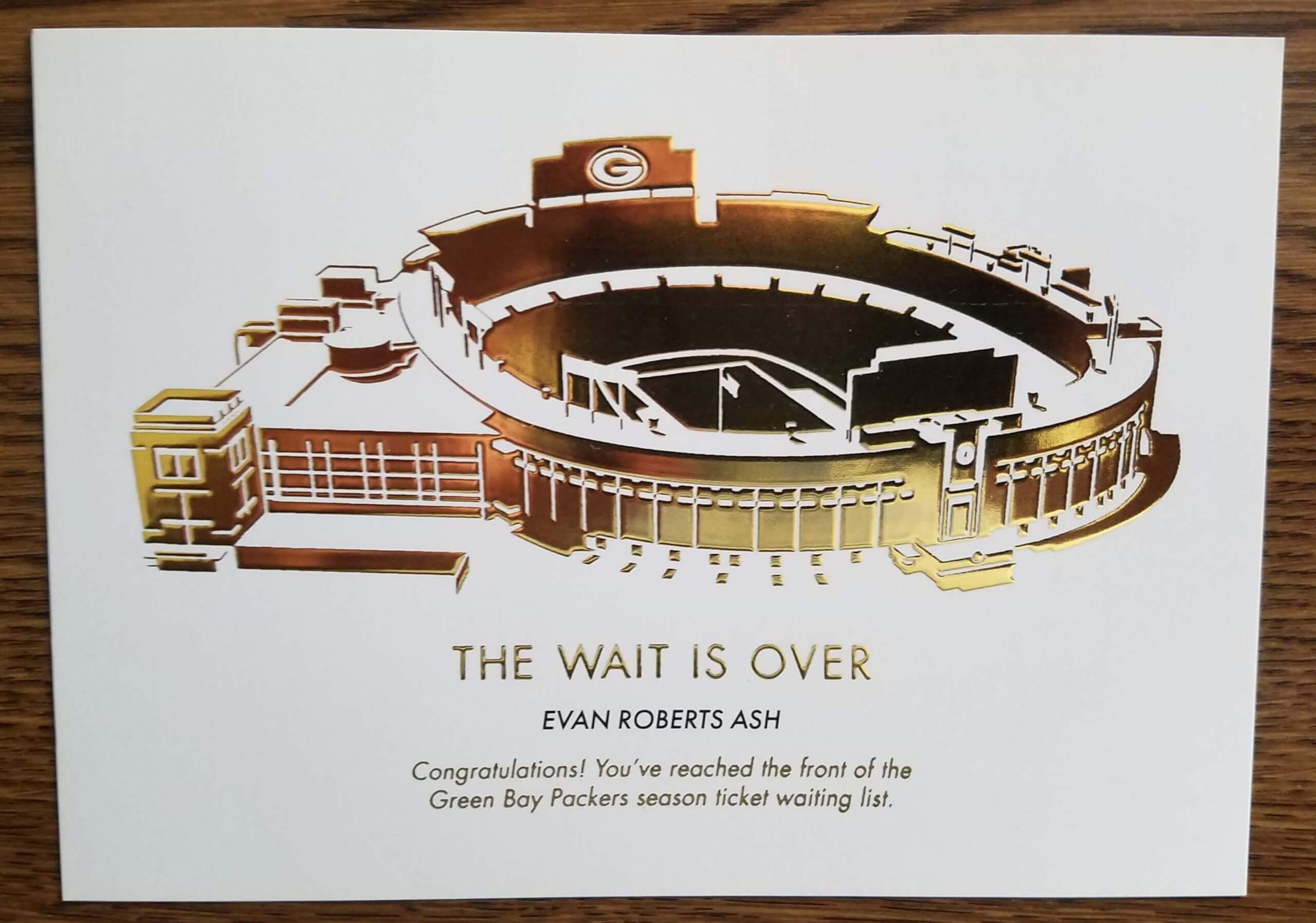
Head of the line: Everyone knows the Packers famously have a looooong waiting list for their season tickets. But what happens when your name finally advances to the front of that list?
Longtime reader/pal Jeff Ash has the answer. The card shown above, addressed to his son Evan, arrived at his house the other day. Pretty cool, right? I’ve never seen one of those cards before.
Here’s how it looks on the back:
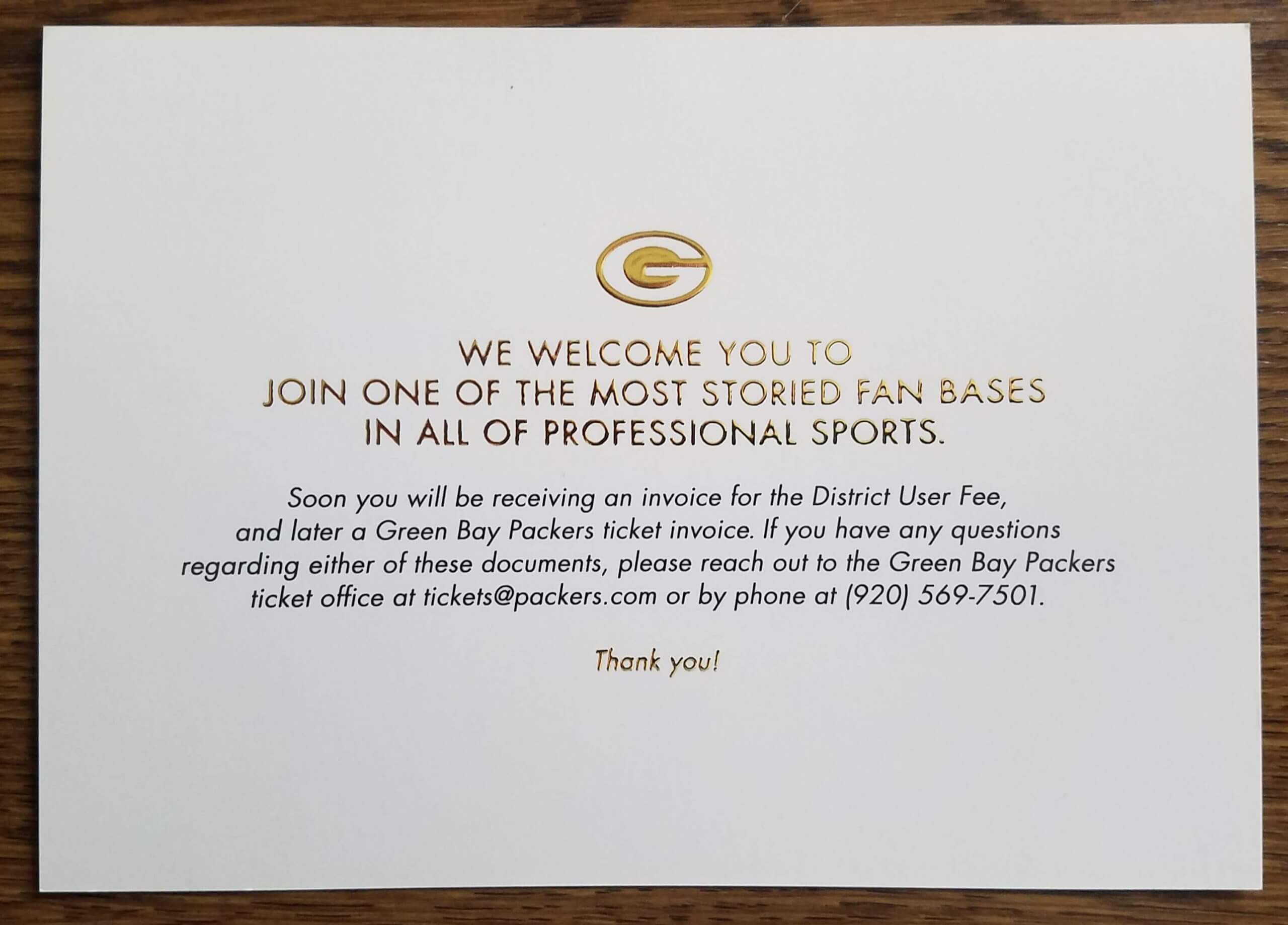
Here’s some background info from Jeff:
When our son Evan was born 26 years ago, we thought it would be fun to put him on the Packers’ season-ticket waiting list. We live in Green Bay, after all.
We put Evan on the list for four season tickets from the “Green” ticket package (six regular-season games, one preseason game). There also is a “Gold” package (two regular-season, one preseason) that was started for the former Milwaukee County Stadium ticket holders the year Evan was born.
The Packers send a postcard every year updating your place on the list. Evan started at No. 18,945. Five years later, in 2000, he was No. 17,658 — slow going. After Lambeau Field was renovated in 2003, adding seats, Evan moved up to No. 13,427. After a second Lambeau Field renovation in 2013 — the year Evan graduated from high school — he made it into the four-figures range, at No. 7,335. In 2017, he was No. 5,857; 2018, No. 5,526.
In 2019, we got a letter from the Packers that pretty much said if you stay on the “Green” waiting list, you’ll probably never get tickets. But if you switch to “Gold,” your chances of getting season tickets may be much better. So we switched. And sure enough, last September Evan was up to No. 34.
And now Evan has finally made it to the head of the line. “One slight problem, though,” says Jeff. “Evan now lives in Maryland and is really into the Ravens.”
Click to enlarge
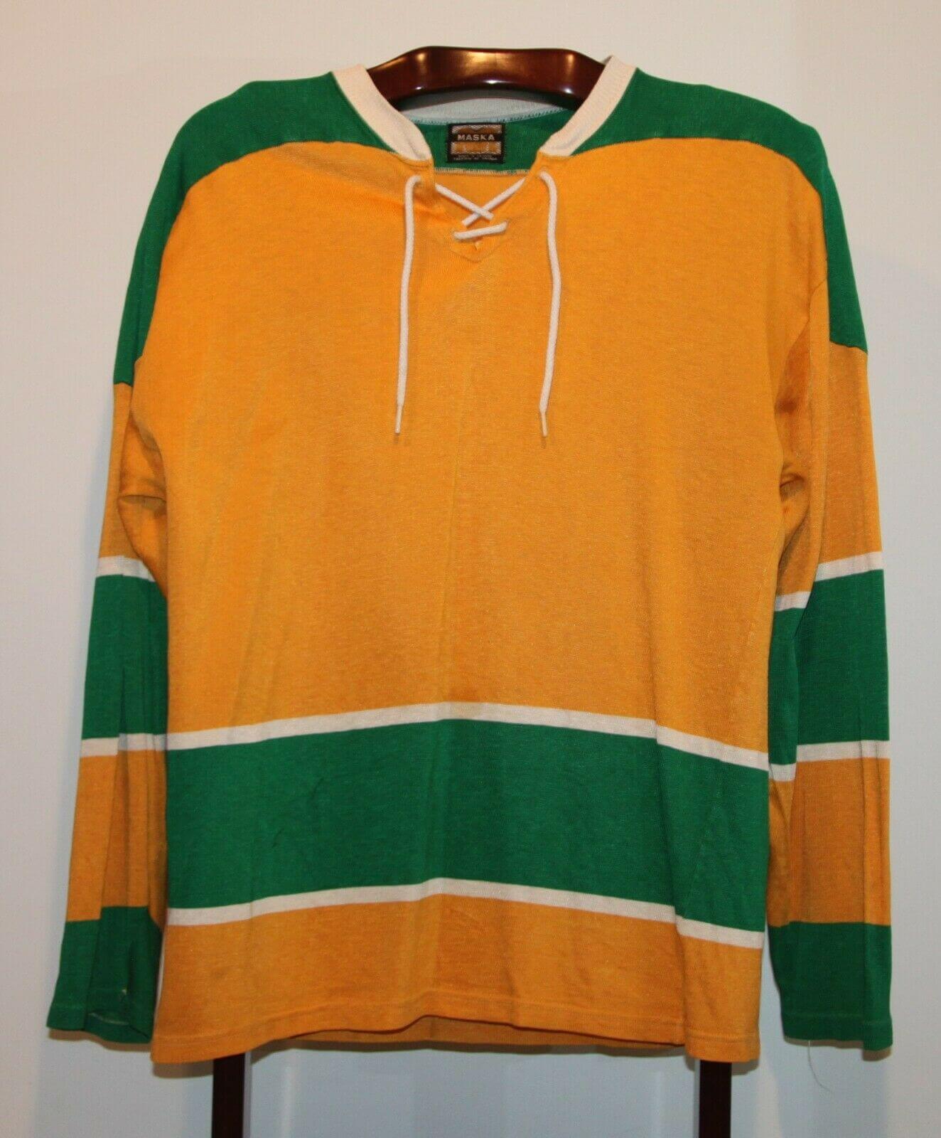
Something to look forward to: I spotted this gorgeous blank Golden Seals jersey on eBay the other day. The listed measurements indicated that it would fit me. Seller wanted $55, I offered $35 — sold!
It would look swell on its own, or maybe even better with a big winged stirrup patch in the center, right? Haven’t decided yet if I’ll do that. Anyway, it’s now on its way to Uni Watch HQ. I’ll share more photos when it arrives!
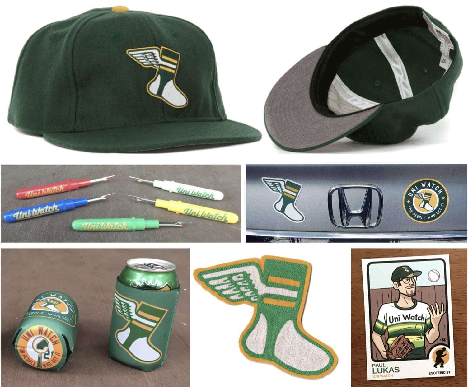

ITEM! New merch raffle: Longtime reader Jerry Kulig has generously donated $50 that a lucky reader can put toward any of our non-Teespring items. That includes our seam rippers, koozies, magnets, chain-stitched patches, trading cards, membership cards, and ballcaps.
This will be a one-day raffle. No entry restrictions, but shipping to a non-USA address will likely eat up a big chunk of your prize credit. To enter, send an email to the raffle in-box by 8pm Eastern tonight. One entry per person. I’ll announce the winner tomorrow. Good luck!
Click to enlarge
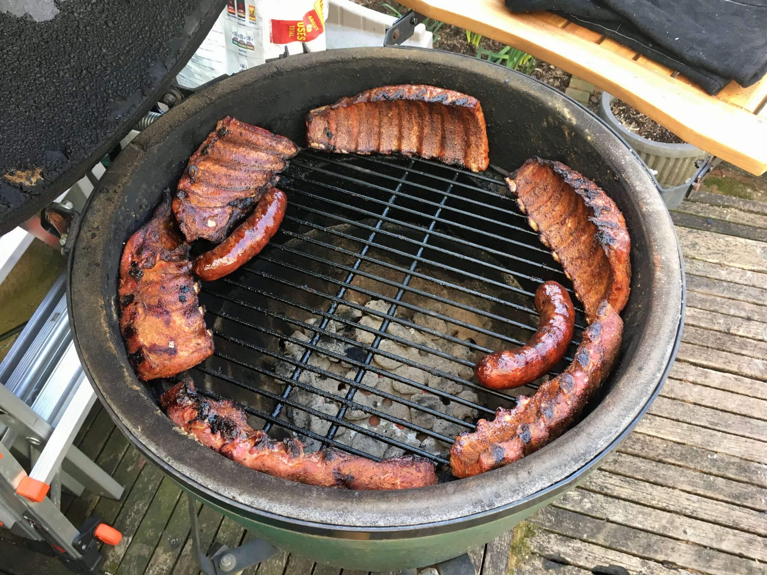
Smoky blast from my past: One of the few downers about moving in with Mary back in 2018 was that I had to give up my prized Big Green Egg smoker, because we don’t have backyard access. So I gave the Egg to our longtime friends Nate and Heather, who promised that there’d still be plenty of Egg-smoked meats in our future.
They’ve been true to their word, most recently this past Saturday, when we gathered in their backyard for some sensational ribs and sausage that Nate cooked up. So good!
We all stayed safely distanced, of course. But since Heather and I have had both of our shots, we decided it was okay for us to hug hello and goodbye. Those were the first non-Mary hugs I’ve had in over year — felt sooooo good! (Mary, to her credit, was happy for me. And she’s getting her own second shot this coming Saturday, so hopefully there’ll be plenty of non-Paul hugs in her near future.)
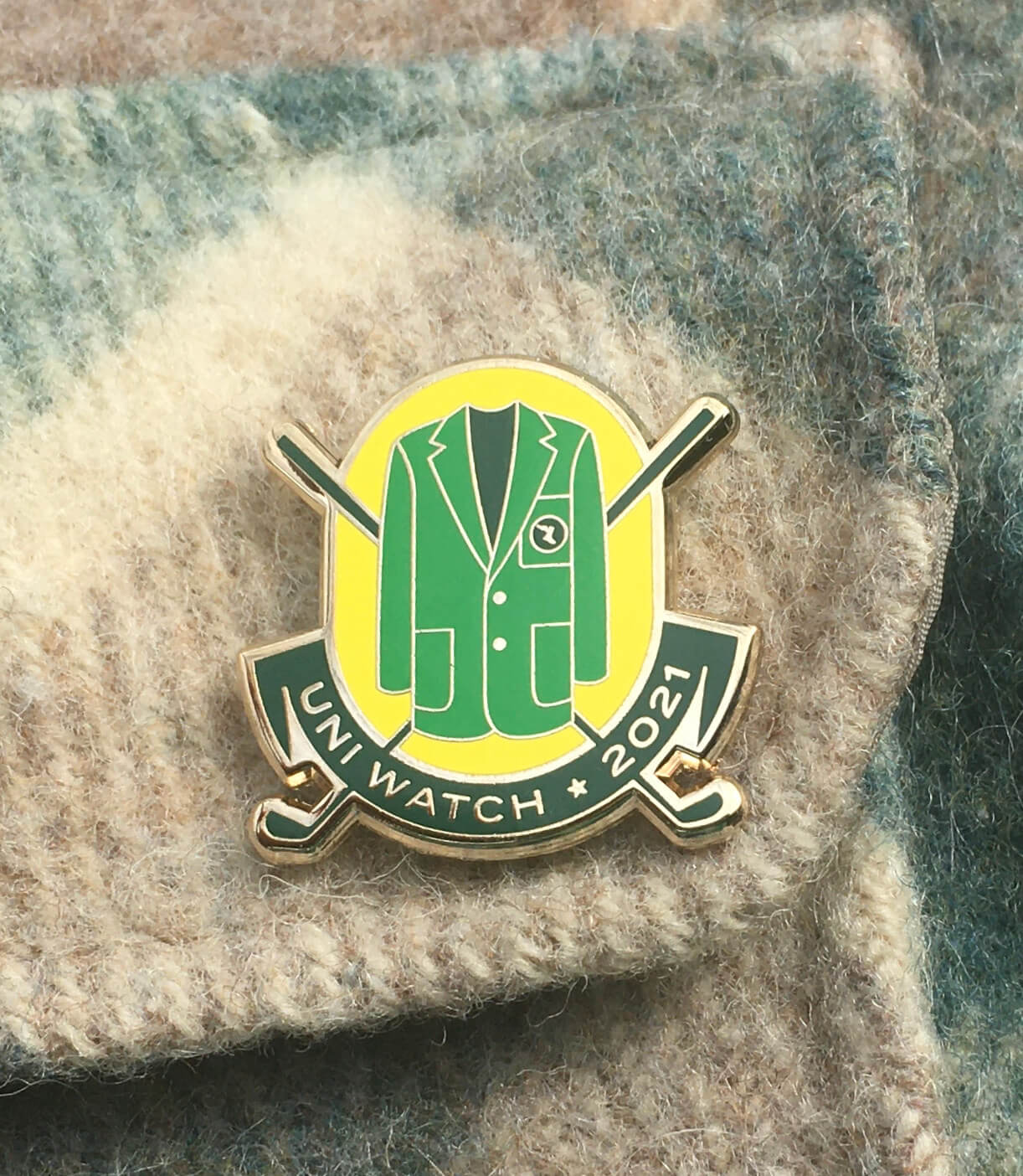
Pin Club reminder: In case you missed it last Thursday, the Uni Watch Pin Club’s latest release has a golf/Masters them. It’s a numbered edition of 200, with each pin individually numbered on the back, and as of this morning about 75 are remaining. It’s available here, and we’re donating all the profits from this one to Fair Fight. (You can learn more about why we’ve chosen to do that here.)
The Ticker
By Jamie Rathjen

Baseball and Softball News: The maker’s mark on Orioles P Matt Harvey’s jersey was very oddly positioned on Saturday. … Alabama baseball added Easter eggs to the pitcher’s mound (from multiple readers). … The next two items are from Brice Wallace: Missisippi State baseball P Will Bednar’s glove had several laces untied. … More MLB teams are apparently widening their TV camera angles — the Reds are just one example — so all the ads behind home plate are visible. “I noticed this trend a few years ago with St. Louis and Colorado broadcasts, but it became standard stuff last season,” Brice says. … UMass softball SS Kristina Day wore upwards of 10 layers for a very cold game on Friday, plus a coat for warmups, and made a TikTok video showing all of them (from Todd Usher). … Two other features of college softball jerseys you might not have seen before include Florida’s football-style numbers (from Moe Khan) and Notre Dame’s Gothic-style trim, similar to white alternates that men’s basketball has or had. … A certain cap brand made it into yesterday’s New York Times crossword (from Andrew Muccigrosso). … A Phillies blog rounded up and made a playlist of all of their players’ walk-up songs for this season (from Kurt Esposito).

Football News: The Broncos posted a graphic yesterday of a helmet painted like an Easter egg (from multiple readers).

Hockey News: Reader Will Schiebler sent us this newsreel clip from the 1938 German championship tournament in Garmisch-Partenkirchen (ignore the “Berlin Stadium” title). The goalie for one of the teams is wearing a cap and has a mysterious “MK” and a bell, possibly, on the back of his jersey, but I believe we can identify him and his teammates with the “SCR” on their jerseys as the current DEL2 club SC Riessersee, who still play in the same arena.

Basketball News: Injured Clippers C Serge Ibaka came to yesterday’s game wearing some kind of suit, but it seems nobody is exactly sure what (from Matthew Wolfram). … More than 20 USWNT players, along with some other athletes, appeared as cardboard cutouts at the women’s Final Four. At the men’s tournament, apparently every Division I school is represented. … Several more WNBA jerseys have apparently leaked (from @TheSkyShowCHI).

Soccer News: In the Premier League, Leeds United wore warm-up shirts in memory of former midfielder Peter Lorimer, and also black armbands for both Lorimer and the anniversary today of the 2000 murder of two fans in Istanbul before a UEFA Cup semifinal first leg against Galatasaray. … Tottenham Hotspur goalie Hugo Lloris stopped play to change his boots yesterday (also from Max Weintraub). … Germany’s 2. Bundesliga’s SV Darmstadt wore checkered shirts yesterday, which were a throwback to those worn for a comeback victory over their rivals, Kickers Offenbach, on Easter 1998. … A game yesterday in Austria’s Frauen-Bundesliga between USV Neulengbach and SKN St. Pölten began with, instead of a coin toss, the referee having the captains pick Easter eggs and tap them to see which one cracked. … The stadiums to be used for the 2023 Women’s World Cup in Australia and New Zealand were chosen last week. … New retro inspired shirt for Polish side Górnik Zabrze. They’ll be wearing it today (from Ed Zelaski).

Grab Bag: Virginia’s lacrosse teams’ players and staff wore T-shirts on Saturday for the charity founded in memory of former women’s player Yeardley Love. … Argentina’s field hockey teams played their first competitive games on Saturday since the death of Diego Maradona in November, so both captains posed with their team’s shirts bearing Maradona’s NOB and No. 10. … Reader Jeremy Brahm has some observations on one Russian men’s volleyball team’s number font. … Several designers remade famous company and movie logos (from Ray Barrington).

RE: Parker helmet decals…. Notice too, that the side number placement is different in a least 2 of the photos. In one it is more above/forward of the ear hole.
So these are either two different helmets, or the same helmet got stickered twice (at least).
Good point!
And Parker may have had the 39 on both sides of the helmet(?):
link
Oooh, good spot — I’ll add that to the entry!
Were those Pirate teams the only to have different color helmets than their caps? I know they went with the black pillboxes quite a bit back then.
Nah, lots of teams have had alternate caps that didn’t have matching alternate helmets.
Back in the day, teams were stingier with their batting helmets than now. One set made do for home and road, or in Pittsburgh’s case, dark or light. At the time, I remember wishing they’d painted the parallel lines the way the Cardinals had done. Nowadays, I appreciate the fact they didn’t match either hat, and their yellow color made them unique.
I remember the decals. When I was a kid, Dad found a set of black numbers with a gold background, so I put an 8 under the brim of my souvenir helmet (which I still have). I don’t remember ever seeing the numbers on the side, though. Curious, indeed!
Auburn Baseball also has BP tops similar to those Notre Dame shirts – link
Did the Pirates have an official name for their mustard color, did they simply call it gold?
The German hockey league footage is interesting, Gretzky wouldn’t nearly have had his space to do his thing behind the net.
I saw on the weekend, the leaves are coming out in Washington DC, you must be getting close, it’s always a big milestone.
Loves me some old Pirates mustard/gold. I feel the same way about the old Saints old gold when it was on the helmet and pants.
It’s a little hard to make out in that photo of the Hershey baseball uni, but I always liked those Hershey color combos (their hockey team comes to mind). Whenever I have a Hershey bar wrapper in my hand, I always think that combination of that brown/somewhat maroon-ish color with silver would make a great uni combo. Somewhat like the Michigan Panthers used in the old USFL.
Paul, congrats on getting some friendly hugs. Getting shot #1 this week, #2 at the end of April. I’m so looking forward to the same thing.
link
When you drill down, the 1971 to 1976 Mustard Color is referred to as “Old Gold”
OLD GOLD
PMS 125 C
#B58500
R181 G133 B0
C0 M31 Y100 K25
I really enjoyed the story about Evan and his wait for season tickets. I personally know of other dads who did the same thing when their kids were born so it’s nice that this had a (somewhat!!) nice ending. Kudos to the Packers as well for sending that lovely card. Most organizations would have just sent an invoice – “welcome to the family, now pay up”. Can Jeff take advantage of those tickets now?
Don, the tickets will be a family thing. The flip side of the card got down to business, saying we’d be invoiced for the one-time seat license fee and then for the 2021 tickets.
That Golden Seals jersey is AWESOME! And for $35, I’d say you got a steal, especially if this was at one time a team-owned jersey.
The Uni-Watch crest will make a fine addition. In fact, the *worst* thing you could put on there would be the official “Seals” lettering, which was lopsided and slapdash to begin with.
Ibaka’s shirt looks like a long kaftan. He is Congolese and though the print and the style don’t look old-school Congolese, the long kaftans are a pretty common pan-African outfit for Muslims and non-Muslims alike. Though they make kaftans that go as long as his, the one I see more often is a bit shorter and worn with matching pants. The ones that are long like his, are usually more flowy and less form fitting. So my money is on it being something he had made at an African shop that specializes in fashionable takes on traditional clothing.
Bednar’s glove laces aren’t untied. They are very clearly tied, but simply are long laces that are not trimmed. That’s not standard, but is also not terribly unusual.
“Notre Dame’s baseball uniforms are, uh, really something, eh? The good news is that the jerseys are just BP tops. But still!”
Unfortunately, the hideousness of this look ruins what I think is a cool feature of Notre Dame’s uniform program – the plain gold batting helmets. With this eye-searing combo (particularly the green pants), the gold helmet just looks like part of the clown suit. But when combined with more conventional uniforms, I think it’s a cool look:
link
link
link
Surprisingly, despite the Irish having worn these batting helmets for several years now, it doesn’t appear that they’ve earned a mention at Uni Watch before. I did some digging and wasn’t able to find anything. Too bad that the site’s first nod to these helmets comes in connection with those eyesore uniforms.
“[O]ther features of college softball jerseys you might not have seen before include . . . Notre Dame’s Gothic-style trim, similar to white alternates that men’s basketball has or had.”
Notre Dame’s baseball team also wears that same Gothic-style trim on one of their many uniform combos:
link
Great deal on the hockey sweater, Paul! Before I even saw your comments, my first thought was UNI WATCH in arched lettering across the chest like:
link
And to be really creative, tiny winged stirrups, instead of stars, in the shoulder yoke.
THIS!!!!^^^^^^^^^^^^^^^^
Seriously, I can’t even imagine how beautiful that would look (especially the tiny winged stirrups on the yoke). I’m just thinking that with the background being yellow, the letters and numbers would have to be green instead of white like they are on the Greensboro jersey.
As for the question of why that particular photo of Dave Parker was picked for the book cover is because he was still young and pretty svelte. IIRC, Parker in his later years put on a fair amount of extra weight. Also the photographer managed to capture an action shot where Parker has a look on his face like he’s very pleased with the result of his swing.
Or perhaps it’s just because that uniform design looks classic while the various “bumblebee” combinations are kind of garish.
If the publishers had wanted to cause a stir, they could have used the famous shot of Parker smoking a cigarette in the dugout, which is kind of badass, IMO.
Oops, on the above post I meant that “one possibility” for the choice of that photo was that Parker was younger. My bad.
they could have used the famous shot of Parker smoking a cigarette in the dugout, which is kind of badass
Nothing badass or cool about that photo.
Remember, kids, smoking is not cool. It’s deadly. And disgusting.
It really bugs me that when someone on social media mentions Dave Parker and/or Dick Allen, reflexively the photos of them smoking in the dugout get posted. They were almost-hall-of-famers for many other reasons than that.
I’m scrolling down and see the Hershey uniform, with its classic styling and lovely colors, and I smile and nod approvingly. I then scroll further and come upon the Notre Dame court jesters. From the sublime to the ridiculous.
There is something very “cricket” about Notre Dame and Central Michigan’s baseball uniforms.
Something very “20/20 cricket” about those uniforms….
Proper four-day cricketers would humbug that comment. ;)
And yet Twenty20 is considered the “future of cricket.” Ugh. Any way we can keep the classic Test kits and just use them in the various types of limited overs matches?
Notre Dames’ baseball uniforms make me think there must be some racehorses out there missing their jockeys.
Not to shill, but that Hershey hat is now available from EbbettS Field Flannels.
Regarding SC Reissersee, their current stadium was finished in 1935 and the stands aren’t nearly as high as in that highlight reel. It also has a roof, but that could have been added later.
Here is video of Parker with the numbers on the side on 8/9/76. Video is grainy. I have watched up until this point. Anyone want to watch the rest and see what else we find?
link
Nice find, Steve!
I did watch some more and Stargell had the number on the back. Could not see any other usage. The numbers look a bit like a Steeler type font. Perhaps the Steelers used those on pads or some other equipment and Parker and or Stargell borrowed some?
The awesome bit is Al Michaels (at the ripe old age of 31) doing a national Monday Night Baseball broadcast with Norm Cash and Bob Gibson. 45 years ago!