For all photos, click to enlarge
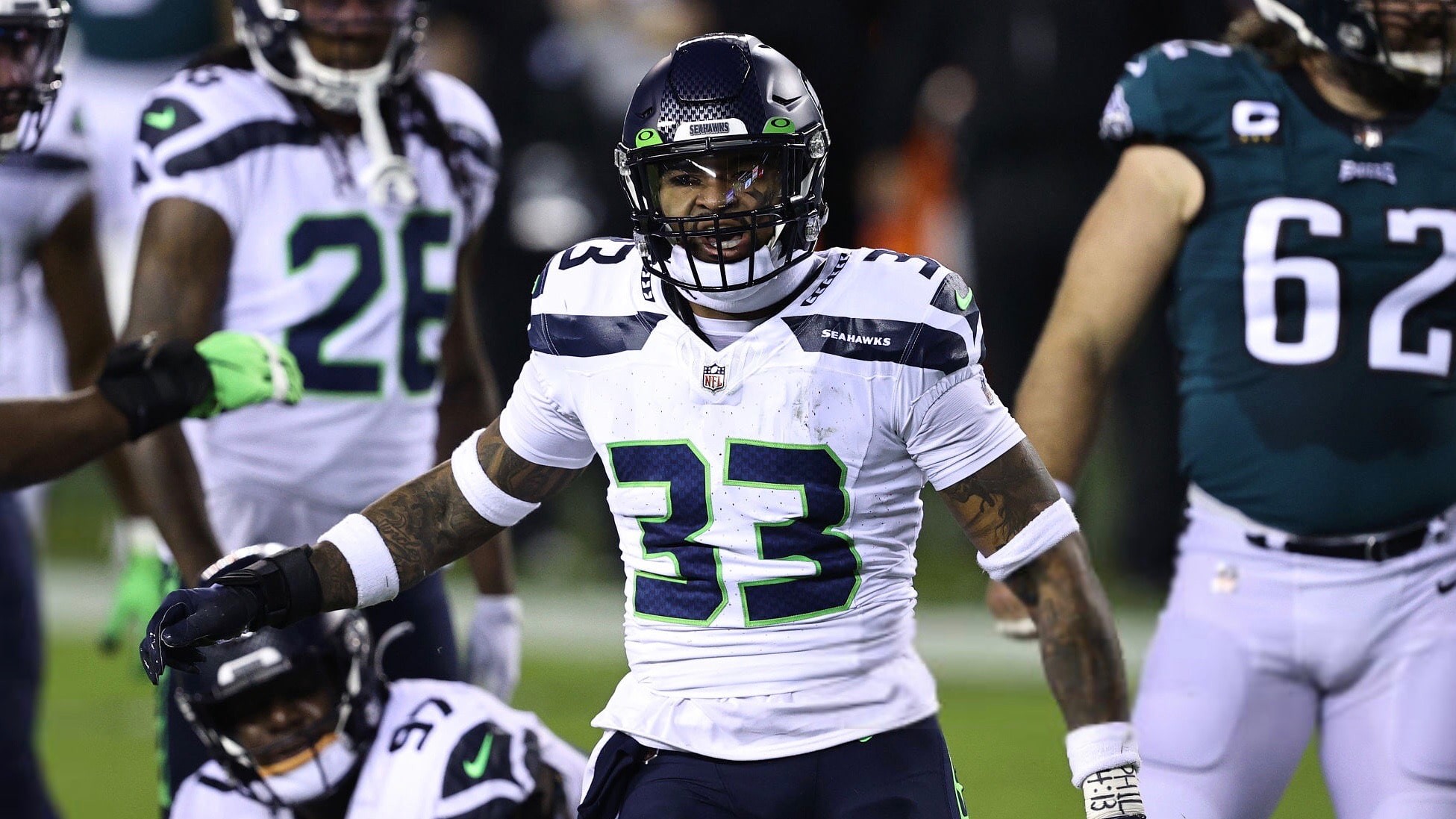
Now then: Notice anything different about this photo (shown above, I hope!) of Seahawks safety Jamal Adams from last night’s game against the Eagles?
Adams was one of at least three Seattle players who were wearing an updated Nike tailoring template that, to my knowledge, had never been worn before in an NFL game. The telltale giveaway is the design at the base of the collar, although there are other differences. Here’s a comparison — old template on top, new on bottom:
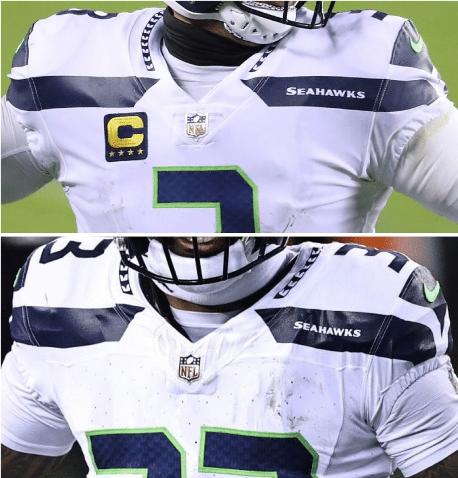
The new collar treatment, however, does bother me. I really liked the little triangle treatment for the NFL logo — simple, understated, quiet. The new winged/cowcatcher treatment calls too much attention to itself. Pfeh.
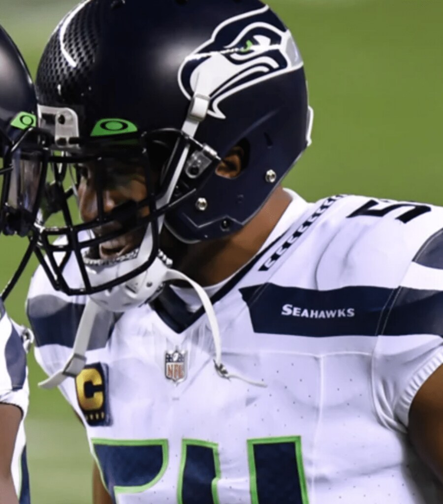
I found photos of two other Seahawks wearing the new template last night — linebacker Bobby Wagner and wide receiver DK Metcalf (who, as an aside, wears No. 14, which somehow feels like the least wide receiver-y number):

Meanwhile, the Colts and Ravens still use the now-ancient Elite 51 template (but without the accursed Nikelace, thankfully), and the Packers, somewhat incredibly, have eschewed all of Nike’s offerings and still use the old Reebok tailoring and fabric. It remains to be seen whether those three teams will upgrade or stick with what they have.
(My thanks to Clifford Baxter and Garrett Beatty, who were the first to spot the new Seahawks jerseys.)

Click to enlarge
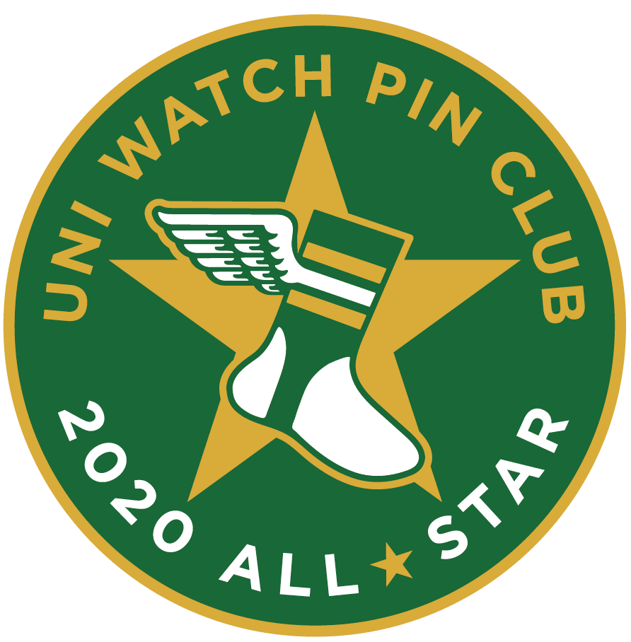
ITEM! December Pin Club launch: As we enter the final month of this very difficult year, designer Todd Radom and I wanted to strike a happy note for the winter holidays. Transforming our winged stirrup into a stocking overflowing with stocking-stuffers, with a wreath to boot, seemed like the right way to go. You can order it here.
This is a limited edition of 200. Like all of the Pin Club releases, each pin is individually numbered on the back:

• If you’ve ordered all 12 pins — including the December design that’s launching today — please prove it by emailing me with some combination of photographic evidence and/or receipts. For example, if you order the December pin today, you could send me a photo of the 11 pins you’ve already received plus your email from Teespring confirming that you ordered the December pin. Or you could wait until the December pin arrives and take a photo of all 12 pins. Or you can simply go to “My Purchases” in your Teespring account and take a screen shot of that. As long as you can prove that you collected ’em all, that’s what I’m looking for.
• That email should also include your shipping address, so we know where to send the bonus pin.
Finally, I’m happy to announce that the Pin Club will continue in 2021. The January and February designs are already in production, and Todd and I have lots of good ideas for the rest of the year that I think you’ll really enjoy. Stay tuned, and thanks for your support of this project!
Click to enlarge
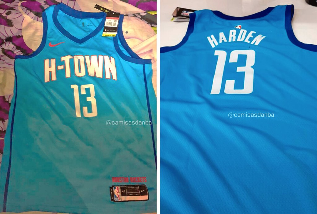
NBA update: S-word.
(Thanks to Brazilian leakmeister @camisasdanba, aka Igor Coelho, for his latest scoop.)
Click to enlarge
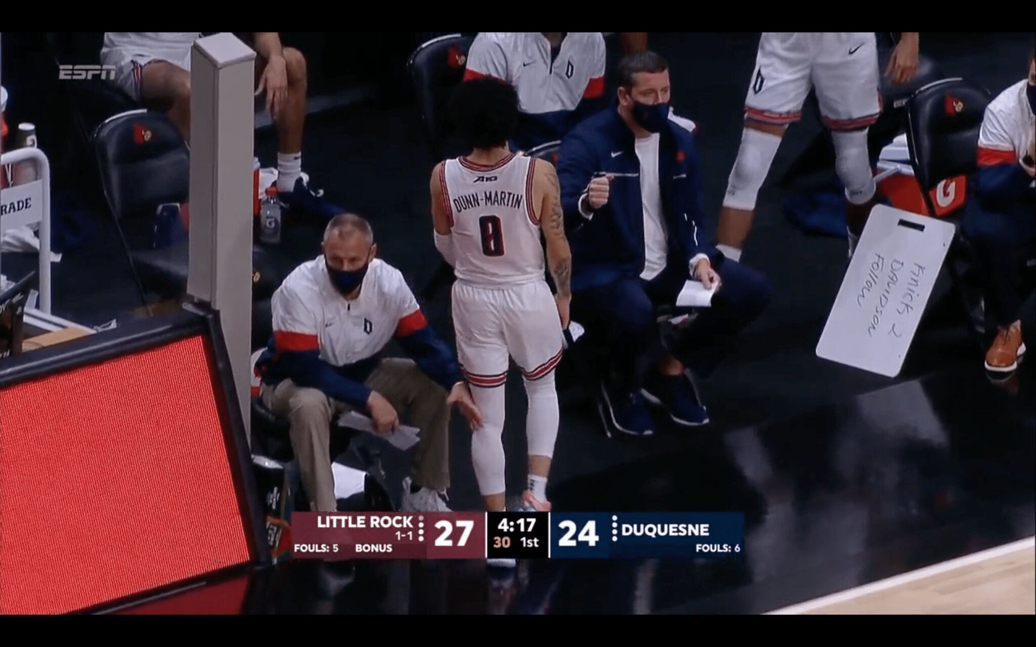
Too good weird for the Ticker: As you can see above, Duquesne guard Tavian Dunn-Martin wears No. 8. But wait a minute — 8 isn’t a legal number in college hoops, so what gives?
Here’s the deal: That isn’t an 8. Dunn-Martin actually wears No. 0, but Duquesne is using an eccentric number font that makes a 0 look like an 8. Here’s how it looks on a few of Dunn-Martin’s teammates, and also on graphic that the team posted on Twitter:


So strange! I’m fairly certain that people are going to be emailing/tweeting me about this one all season long.
(Big thanks to Colton Homan for bringing this one to my attention.)

Click to enlarge
Collector’s Corner
By Brinke Guthrie
Follow @brinkeguthrie
Welcome to December! Just 24 shopping days until Christmas! Leading off is this set of great-looking 1960s Green Bay Packers prints, which were a promo from Mobil gas stations. The size is 11″ x 14″. You get eight prints in this set from artist Bruce Bamberger. It would be perfect to put under your tree.
Now for the rest of this week’s picks:
• This eBay auction is for a set of eight 1940s Dodgers/Yankees/Red Sox scoresheets. Check out the advertising: “Avoid ‘5 O’Clock Shadow’ — GEM Blades.”
• Look at the logos on this 1950s NHL Original Six 8″ cloth patch, from the Toronto Star Weekly.
• Kids, this is how they made sneakers back in the late 1960s and early ’70s, as seen in this auction for a pair of Pete Maravich Keds sneakers. Cushioning? Who needs it?
• Does anybody really know what time it is? You will with this nifty 1960s Roman Gabriel watch. Someone cleverly noticed that there are 12 letters in his name, so let’s just use those on the watch face instead of the numbers, right? Also notice the Rams helmet on the packaging. The seller says this has never been out of the box.
• This auction is for the box only of a 1920s Reach American League baseball. I love the text on the box: “The Official Ball of the World’s Series,” and “I Certify That This Ball Is Identically the Same as Furnished the American League, Of Which I Am President” — signed E.S. Barnard. Ol’ E.S. was A.L. president from 1927 until his death in 1931.
• This matchbook advertises the Henri Richard Brasserie, where they served “Bonne Cuisine!”
• Pepsi was your sponsor for this 1977 set of Pete Rose playing cards.
• If you’re wearing this shirt, it’s pretty clear that the San Diego Chargers and John Hadl are your favorite team and quarterback.
• Not quite sure what an MLB Action Cartridge is. Looks like you popped little film cartridges in, and then this hand-held player showed them on the wall like a little movie projector, but I’m just guessing on that. Whatever it is, this one features the Cubs, Tom Seaver, and Hank Aaron.
• For some reason, this DIY New York Jets helmet buggy sports a reversed Jets logo.
Got an item to include on Collector’s Corner? Tweet submissions to @brinkeguthrie


ITEM! Second part of insane membership raffle: Yesterday we raffled off five memberships that were donated by longtime reader Bert Ayers. Today we’re raffling off another five memberships from him.
No entry restrictions on today’s five prizes. To enter, send an email to the raffle address by 8pm Eastern tonight. One entry per person. I’ll announce the five winners tomorrow. Please join me in thanking Bert for doing this!
As for yesterday’s membership raffle, the five winners are Evan Friednash, Erik Papke, Zeke Perez, Dan Bodurtha, and Greg Morrison. Congrats, guys!
Click to enlarge
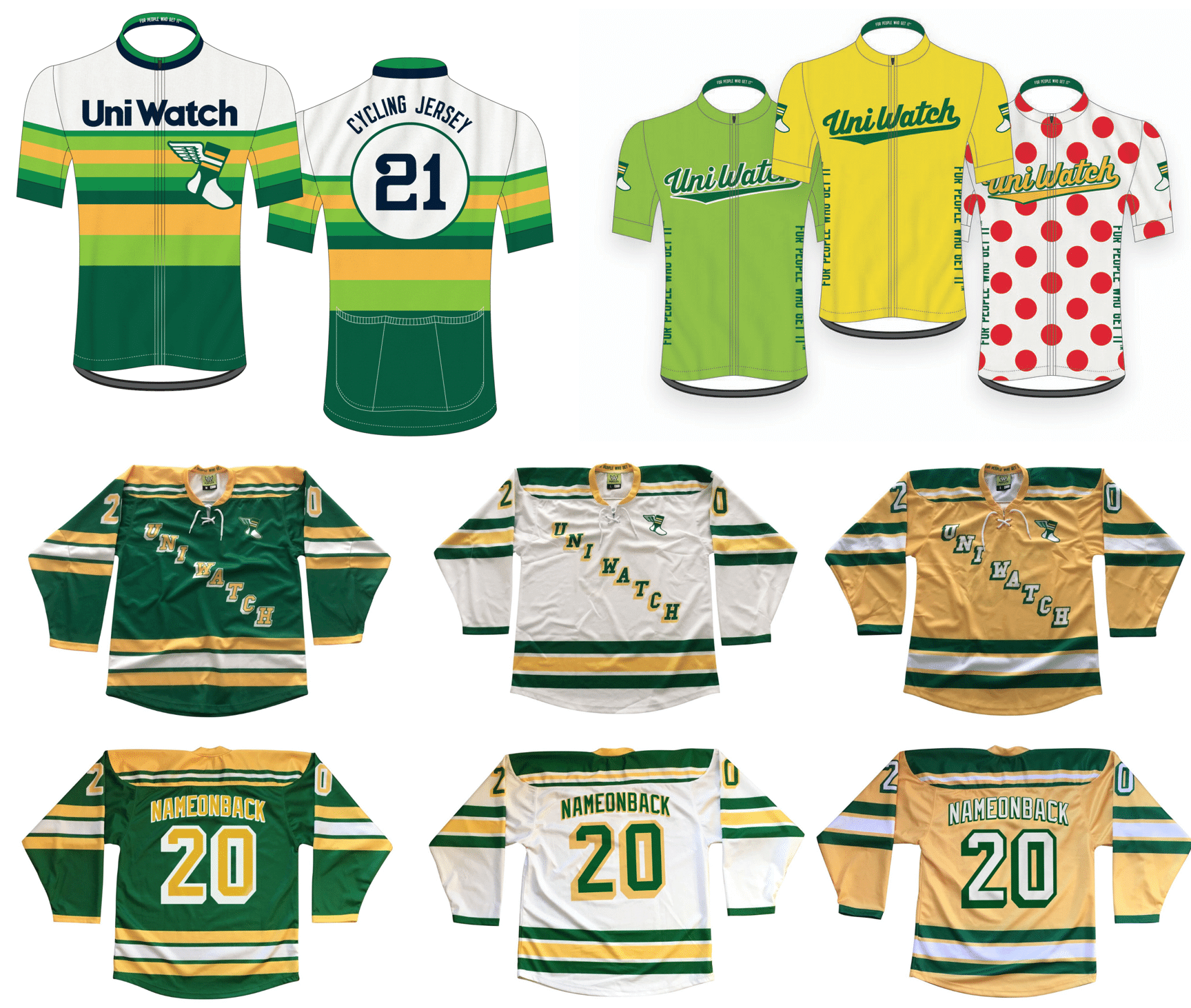
Merch reminders: In case you missed it last week, we’re once again taking pre-orders for another round of Uni Watch hockey jerseys, tequila sunrise cycling jerseys, and Tour de Uni cycling jerseys — all available with your choice of number and NOB.
You’ll need to get your order in by Dec. 11, and they should arrive by mid-January. (Sorry, too late for Christmas delivery — mea culpa on that.) Full details here.
And as long as we’re talking merchandise, keep the following points in mind:
• The Uni Watch Classic Cap, which normally costs $39.99, is now only $35.99 — a 10% break. All fitted sizes are currently in stock, along with the adjustable strapbacks.
• I’ve also reduced the price of Uni Watch trading cards. Full details here.
• You can see our full range of merch offerings here.
My thanks, as always, for your consideration.

Click to enlarge

Culinary Corner: As I’ve occasionally mentioned in the past, I’m a big fan of the “Will it waffle?” school of kitchen experimentation. And one thing that will definitely waffle is leftover Thanksgiving stuffing, so that’s what I had last night.
But! Not all stuffing is created equal — some is semi-solid, some is crumbly. Ours this year was more of the crumbly variety, and it had gotten a bit more dried-out in the fridge over the last few post-Thanksgiving days, so I figured it’d be good to have a binder to help hold it together in the waffle iron.
I started by beating an egg in a bowl. Then I added a bunch of our leftover gravy and swirled it around with the egg. Then I added a bunch of our leftover stuffing, mixed everything so it was moist, and popped it in the waffle iron. As you can see above, it came out really well, and tasted even better than it looked. So good!
By Alex Hider

Baseball News: MLB announced yesterday that it is creating a five-team “draft league” next summer for college draft-eligible players. They also unveiled the logos for the five teams (from our own Anthony Emerson). … The Triple-A Charlotte Knights are renting out luxury suites in their home ballpark to anyone who wants to change up their work-from-home routine for a day (from James Gilbert). … Yesterday was glove day for the Oregon softball team (from Timmy Donahue). … The Marlins’ Triple-A affiliate moved from New Orleans to Wichita ahead of last season. But after the pandemic wiped out the MiLB season in 2020, the team may get demoted to Double-A before ever throwing a pitch in Wichita (from @PhillyPartTwo).

Football News: This is waaaay too satisfying: Check out how the Chiefs and Bucs logos lined up atop PTI’s rundown graphic (from Mike New). … Assumption University in Massachusetts has renamed its stadium after alumnus and current Notre Dame coach Brian Kelly (from Kary Klismet). … Navy is slated to unveil its uniforms today for its game against Army (from Timmy Donahue). … The ridiculously named Tony the Tiger Sun Bowl has been canceled (from Ignacio Salazar). … The Clemson Uniform Tracker has been updated from this weekend. … Reader Jason Walker was watching Missouri high school football championships and noticed one team, Raymore-Peculiar, was wearing uniforms with a maker’s mark he didn’t recognize. I don’t think I’ve ever seen it before either — anyone know more?

Hockey News: The Stars unveiled their full Reverse Retro uniform — not just the jersey — in a video yesterday, which shows the white jersey paired with white pants, gloves and helmets. … Devils blog Pucks and Pitchforks has released its all-time rankings of the team’s uniforms (from Kary Klismet). … We had several unveilings from the National Women’s Hockey League yesterday: New uniforms for the Metropolitan Riveters, the Connecticut Whale, and the Minnesota Whitecaps (thanks to all who shared). … The club hockey team at Air Force has some pretty slick sweaters (from Ryan Black).

NBA News: Here’s more info on the fonts used in that Cavs’ “ransom-note” City jersey that leaked the other day (from Mace Adams and @WesHappy). … The Pistons’ new hype video for the upcoming season features a new team slogan and logo with the city’s area code — 313 (from @MMMMBLT). … For the latest in NBA number assignments, check out Etienne Catalan’s Twitter feed. … This timelapse showing an artist making a LeBron James clay figurine is captivating (from Paul Friedmann). … Speaking of LeBron, hard to imagine him wearing a number other than 23 or 6, but as a freshman in high school, he wore 32 (from William Henry). … The Timberwolves are hinting that their new alternate uni will be unveiled on Thursday.

College Hoops: Samford’s players wore several distinct NOB styles this weekend (from Clint Richardson). … Steph Curry now has his own brand under Under Armour’s umbrella, and Davidson — where Curry played in college — is now wearing that brand logo as their maker’s mark (from Andrew Hayes). … Latest anti-Covid measure: Louisville has installed hockey-style glass in its arena, to protect the fans and players from each other (from @ezbutton11). … LSU wore purple at home last night, with Southeastern Louisiana wearing grey (from Chris Mycoskie). … Good example of bad design: Stanford’s red jersey typography is practically invisible on the team’s black jerseys (from Griffin Smith). … Liberty is using drop-down NOBs — and clownishly huge numbers — this season (from Nute Thompson).

Soccer News: Couple of notes from our own Jamie Rathjen: Scottish women’s team Glasgow City are adding the name of a charity, Scottish Women’s Aid, to their shirts next weekend, and Torino of Italy’s Serie A wore one-off jerseys last night because their advertiser, Suzuki, won the MotoGP team championship. … Romania has unveiled the kits they will wear in the 2021 Tokyo Olympics (from Germán Cabrejo). … Right up Paul’s alley: The Tampa Bay Rowdies once had a green-and-gold hoop-striped sock mascot named Hoops! (From Tommy Gough). … New home shirt for St. Pauli (from Ed Zelaski).

Grab Bag: The logo for the 2021 Indy 500 has been unveiled (from Paul Davis and Brandon Wheatkings). … The Biden administration inauguration logo has been unveiled (from our own Anthony Emerson). … Indiana University Fort Wayne is asking for public input in choosing a new team name after its predecessor, Indiana University – Purdue University Fort Wayne, split into two distinct institutions (from Kary Klismet). … New police badge design for the Argyle Police Department in Texas (from Timmy Donahue). … Fascinating story about college cheerleaders — among the few NCAA athletes allowed to make money on their own likeness (NYT link). … New NASCAR/football jersey crossover from Luis Fernando, this time for Bill Elliott. … Washington Post national correspondent Philip Bump did a bit on CNN yesterday from his home, which is decorated with a gym scoreboard (from Brett Baker). … A boy in England was told that his Adidas-brand Covid mask is against his school’s uniform policy. … Cricket Australia’s Indigenous T20 kit now comes in a long-sleeve version (from Jeremy Brahm).

Click to enlarge

What Paul did last night: As you can see, our neighbor Willie (or maybe Willy — I’m not sure how he spells it), who lives across the street and one house to the right, has put up his holiday lights. It looks better from the porch than it does in this photo — very festive!
The people who live directly across the street are observant Jews, and the ones who live to the left of that house are a mix of Orthodox Jews and Muslims, so Willie’s lights are probably the only ones you’ll be seeing in my Pandemic Porch Cocktails™ photos over the next month or so. Our own house will likely get some lights (our landlords usually put them up in early December), although I’m not sure if they’ll be visible in the PPC™ pics. Wait and see!
As always, you can see the full set of daily Pandemic Porch Cocktails™ photos — now more than 250 of them — here.
Hi Paul! The link for the December pin isn’t working. It goes to a TeeSpring error page in French (I think). I tried searching manually for the pin, but only February, March, and May came up.
Try it now.
Perfect. Thanks!
Yep, I’m stealing that idea for Thanksgiving stuffing next year. Not even for the leftovers – for the main event! I think the waffle iron will impart some necessary textural contrast opposing the usually mushy potatoes and other sides. Also, always looking to get more snaps for a gadget player like the waffle iron!
Yup, mashed potatoes waffle quite well!
MLB announced yesterday that it is creating a five-team “draft league” next summer for college draft-eligible players. They also unveiled the logos for the five teams
I think it’s more about announcing which teams will play in the league – those are all existing MiLB clubs which have been saved from the chop by accepting a spot in this new development league. And I’m pretty sure those are all their previous logos, having seen most of them come through Coney Island with the NY-Penn League.
Speaking of which, does this mean the NY-Penn League is dead? I really hate Manfred.
Hi, Chance. I’m afraid the NY-Penn League (as we knew it) is dead. I think we’re going to see the stragglers either dissolve into the ether of independent baseball or become another collegiate wooden-bat league.
Which is kind of dumb; we already have a number of these kinds of leagues, especially on the East Coast.
The way I see it, the MLB Draft League is a two-stage league — pre-Draft. and after-Draft. I cannot see it working in the long-term.
I’ve always dreamed of owning a pair of short-season Single-A teams and running them out of Cooperstown (the mythical home of baseball) and Hoboken (the actual home of baseball), and run them with vintage-style uniforms with no decreed nickname. Any nickname would come from either the populace or the media (kind of like the way it used to be). Regrettably, there’s no short-season league for new draftees/extended spring training prospects anymore. Oh, well.
I’m not sure if you are aware. You’re describing the Auburn Doubledays
Those NYPL teams (and Trenton) that now make up the new woodbat summer collegiate league have hardly been saved. MLB is eradicating teams from the professional ranks, and those teams join the Appy League teams in ones that have been eliminated so far.
The Wichita MiLB team is no longer the Marlins AAA affiliate. Jacksonville, which was previously AA, will be their new AAA club, and Pensacola becoming their new AA club.
Remember the minors as we knew it are likely gone, replaced by a new minors that has a greater tie to MLB.
Wichita had been the New Orleans Baby Cakes, and all of the incentives Kansas had shelled out for the stadium were contingent on the team being at the AAA level.
Thank stinks. MLBs defacto takeover of MiLB is going to drastically harm some communities, and there was pretty much nothing any of the MiLB owners could do about it. If there was ever a time to stand up to a sports monopoly, that was it.
The only good thing that could come out of Wichita’s demotion back to AA baseball would be the shelving of the Wind Surge name. OTOH, if this were the case, existing Wind Surge merchandise would become instant collector’s items.
Not only was Wichita demoted to AA, they were demoted to the Twins.
Is the Uniwatch Color Remix program still active? Was looking forward to purchasing one of the fall color hats and seeing the next round!
Yes, but Bryan Molloy, who hosts the product, has had some website tech issues. Soon!
That’s great. Thanks Paul!
Interesting. My employer had an IT guy named Bryan Molloy up until his departure about six months or so ago. Surely not the same guy?
Yes.
That Roman Gabriel watch is amazing.
Interesting link on the side of the box. The rough edge on the bottom looks like they extracted link and reversed the color?
That Jets helmet buggy shows the link. It was link from a distance (or on TV) so the colors were reversed and the decals enlarged Ma href=”https://miro.medium.com/max/839/1*clMTtvv1x_snIt_Eg2ka9w.jpeg”>in ’65, although Joe Namath did some link with the ’64 logo after signing.
Here’s the correct link for “in ’65”.
The actual link were somewhat different from (and not strictly the inverse of) the link, although they’re often (inaccurately) link.
I have never seen that!
== ridiculously named Tony the Tiger Sun Bowl ==
And with Thurl Ravenscroft not around to enjoy it …
Happy birthday Anthony!
Here’s more info on the fonts used in that link that leaked the other day (from Mace Adams and @WesHappy)
I appreciate the work, but I don’t think all those are correct. Specifically, Both “e”s, the second “l”, the “n” and “d”. Close, but too many differences between the band logos and the jersey. Not sure why the Cavs would bring over some letters virtually unchanged and make major changes to others.
I think the game goes on.
In the PPC section you have a duplicate “if” when describing if your landlord will put up lights.
Thanks! Fixed.
Happy Birthday Anthony.
Thank you for doing all you do.
Love the Dec. Pin Design.
Excellent job all year on them.
Greetings from Missouri. Ray-Pec’s uniforms were made by Siege Sports. The company’s founder is a Ray-Pec alumnus. I’m not sure they’re still in business, though. Their Twitter account has been inactive since last December and their website doesn’t appear to be active.
Thanks for the info!. Excelsior Springs HS in MO used to have them as a uniform supplier as well but have since switched to Under Armour. I was always curious about the makers mark but didn’t ever get around to looking it up.
In those uniforms the Stars look like storm troopers on skates. Disney owns Star Wars so it might be a concept for Disney on Ice…Princesses and Storm Troopers
Funny enough, I remember seeing pictures of Carson Wentz in practice at some point last season, using a similar-type template (on the red QB jersey). I tried to pull up a picture to show one of my friends, and could never come across it again.
Happy birthday, Anthony!
Southeastern Louisiana in gray, not Southern. Thanks!
Kee-reck! Fixed.
Four years ago, I wrote this Uni Watch feature about the Packers prints featured by Brinke in today’s Collector’s Corner. link
I knew they looked familiar!
Happy birthday, Anthony!
Does that portion of the nike collar serve any functional purpose or is it purely design?
That Devils blog is the rare example of an online uniform rating that gets a list exactly right. The devils have no really bad uniforms in their history, but they have a few excellent ones. Kudos to the Devils blog for knowing the difference!
The vapor fusion (marketing has loooong since jumped the rails) also appears to be ventilated. I guess I’d call it mesh? Anyone else see the pattern of tiny holes? Interesting to see if those will run or tear over time. Thanks for the quality textiles, Southeast Asia! :-(
I wonder if the Packers keep the old template for the Packers seamstresses? I don’t know if they are still around but I always thought that was such a Packers thing. I would imagine the new jerseys use space age tech (an iron) to put all the badges and numbers on, so there isn’t much need for a seamstress.
Wow, that Duquesne basketball font is literally the worst. Fonts have one job: clearly convey information, including but not limited to numbers corresponding to the scorer’s sheet. I’ll admit that some jerseys with same-color numbers and only a contrasting outline (Tampa Bay Rays in navy, Philly Flyers in black) technically work even though I wish nobody would do that. But this is something else. I hate it so much.
Meanwhile, for the Houston Rockets, I just don’t get it. H-Town is stupid, but this turquoise? I don’t understand why that color is chosen. And I just don’t care. I’ve said it before: I hope the NBA is proud of themselves. Literally a new jersey for each team every day and two on Sundays…I can’t follow it, it doesn’t make sense, and I just don’t have the energy to care anymore.
Exactly! And the zero with a slash is really meant to differentiate it from a capital O. Since the large numbers on a uniform are meant to convey only numbers, there is no need to make a zero look different from anything. In this case of overdesigning gone awry, the style is so over-the-top that it actually makes the primary function of the font harder.
Just want to point out that the MLB Action Cartridge generically labeled “Chicago Cubs” in fact features Don Kessinger and Glenn Beckert, an All-Star double play combo of some renown, and – apparently – all but forgotten now.
Fun fact: Kessinger was the last player-manager in American League history, holding the dual role for the White Sox in 1979.
Why is 8 not allowed to be used as a uniform number in college hoops? Retired number?
Numerals above 5 are not permitted. Makes it easier for the ref to signal fouls to the scorer’s table with the fingers on each hand.
You can’t use 6,7,8,or 9. It has to do with the way the ref flashes the numbers to the scorers desk after a foul.
Refs & their fingers… have to be able to show the entire number at once, I believe
And 8 could get confused with 53. So, no numbers with 6, 7, 8, 9 anymore.
At least thats my understanding. I’m sure I will be corrected if not.
I think this has to do with the rule that only digits 0-5 are allowed, because of how refs signal player fouls by holding up fingers (8 can’t be distinguished from 35 or 53).
Re: the Metropolitan Riveters… THIS is “Rosie the Riveter” by Norman Rockwell.
link
Notice the riveting machine in her lap and “Rosie” printed on her lunchbox?
I’m curious to know how the other image usurped Rockwell’s original.
You mean link? It came first, printed months before Rockwell’s Saturday Evening Post cover hit the newsstands.
But “Rosie the Riveter” was a cultural icon before both of them. The name was coined, or at least popularized, a year before link.
Rockwell didn’t create the character, he only painted his own interpretation of her.
But if you’re wondering how J. Howard Miller’s “We Can Do It!” became the definitive image, I think the answer is pretty simple – it’s in the public domain.
Anybody can put “We Can Do It” on a tshirt or coffee mug or a tote bag (and they do). Anybody can repurpose and remix it for a book cover or marketing campaign or hockey logo. That has disseminated the image far and wide, while the cultural impact of Rockwell’s painting is limited to those who can pay for it.
re: Pete Maravich shoes.
It says “KEDS” on the box,
but he’s wearing Adidas
and HOW did that get past Keds?
One thing the closeups on the new Seahawks jerseys brought back to mind was the difference between the TV numbers and the front/back numbers. The main body numbers are outlined, the TV numbers are not. Do any other teams do this? It looks unfinished. I have never been a fan of the current look (give me the Largent Era royal blue and kelly green with silver helmets and britches) but these put so much emphasis on the wrong things.
Changing gears: stuffing waffles are phenomenal.
“The main body numbers are outlined, the TV numbers are not. Do any other teams do this?”
BC Lions do this currently. The effect is different as TV numbers are on a black sleeve while front/back numbers on orange (on home jersey).
link
What you mention reminds me of the original Flying Elvis New England Patriots jerseys.
link
I think the Alouettes used a jersey that had outlined body numbers paired with one-color (maybe silver?) TV numbers before they overhauled their uniforms.
The Packers link for their TV numbers, but that’s not quite the same thing.
I’ve long thought that the Bears should consider eliminating the outlines for their TV numbers; the outline is link as the larger numbers, making the smaller numbers a muddled mess.
Regarding the strange looking “0”s on the Duquesne uniforms, their football team did the same last season. I am the public address announcer for Youngstown State who played Duquesne in football and had to announce a player with, what I thought was the number “48” (I believe). However I could not find such a number on their depth chart. Here it was number “40”, with that silly little swirl inside the “0”. I wish schools and uniform makers would take into consideration those who announce players’ names. I think the players, their families and friends like hearing their name announced when they make a play,
Didn’t Cowboys wear this new template on Thanksgiving?
Not that I’m aware of.
“If you’re wearing this shirt, it’s pretty clear that the San Diego Chargers and John Hadl are your favorite team and quarterback.”
If you’re wearing this version, it’s pretty clear that the San Francisco 49ers and Ken Willard are your favorite team and running back…just like Paul!
link
Being from Australia, I’m not very au fait with college basketball, and hadn’t heard about the numbering regulations. I searched for some information to learn about it, and found an article from the New York times. And who is quoted in? Other than Mr UW himself!
It seems like every day I miss reading Uni-Watch, I also miss a raffle. Good luck all.
Am I the only one that has had the Falcons new jerseys grow on me throughout the season. The gradient didn’t look as bad as I thought it would. I think the black and white look really good as well, if they’d just fix the font and remove side panels it would be a great look.
My wife made stuffing pancakes over the weekend, same concept. They were fantastic and was stunned I’ve never thought of it before.