For all photos, click to enlarge
Good morning! Greetings from Uni Watch HQ, where all three inhabitants continue to be safe and well.
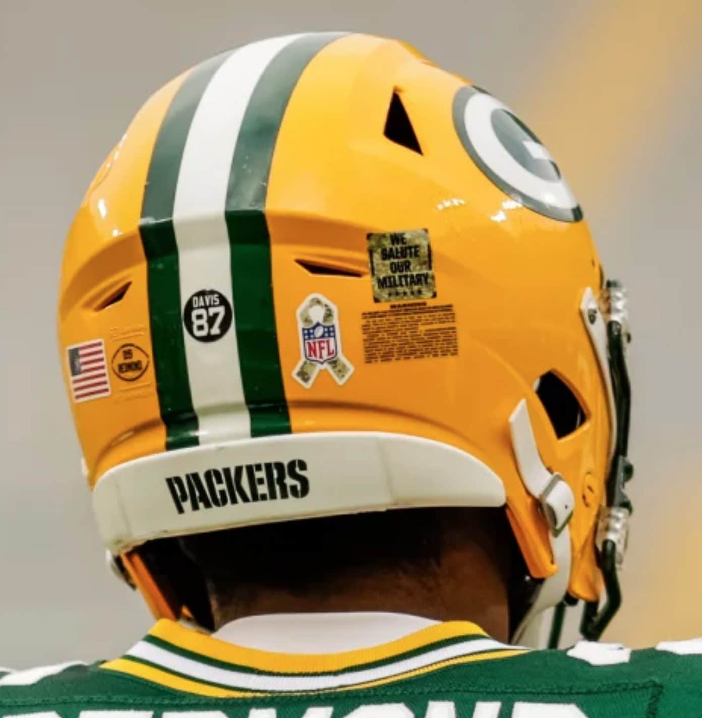
Yesterday was the first day of November, which means it was also the start of NFL’s annual G.I. Joevember virtue-signaling program. As you can see above, there’s a new component to it this year: In addition to the camouflage ribbon rear-helmet decal, teams are also wearing a decal that says, “We Salute Our Military.”
Also, remember how this year’s cancer-awareness program, which ran in October, included new rainbow visor tabs? If so, then you won’t be surprised that G.I. Joevember now features camouflage tabs for the first time:
Only certain games were designated as part of the G.I. Joevember program yesterday, so some teams wore these uni elembents and others didn’t. But all will do so by the end of the month.
Interestingly, though, most of the camouflage accessories that we’ve seen in previous years — gloves, waistband towels, hand-warmer pouches, compression sleeves goalpost pads, and so on — had little or no presence yesterday, so the overall visual effect was definitely less camo-heavy than in the past.
Except, that is, in Philadelphia, where the Eagles wore plenty of camo gear. Speaking of the Eagles, they wore “JJ” and “RT” decals for Jason Jones and Robin Towns, a pair of Eagles fans who died while serving in the military (additional info here):
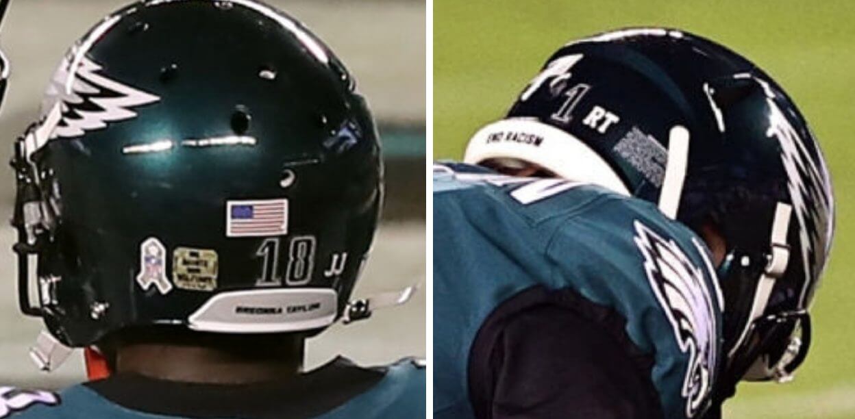
Update: Reader/commenter Tom explains that the offense wore “JJ” and the defense wore “RT.”
In addition, Eagles defensive back Avonte Maddox wore a base layer undershirt with a camouflage ribbon and American flag on the right sleeve:
Not sure I’ve ever seen that before. Looks like it may have been the same hoodie that Eagles coach Doug Pederson was wearing, but with the hood cut off.
In other news from around the league yesterday:
• As you can see in that photo at the top of the page, the Packers did not add a memorial decal for Herb Adderley, who died on Friday. A bit surprising.
• The Bengals wore their mono-white alternates at home:
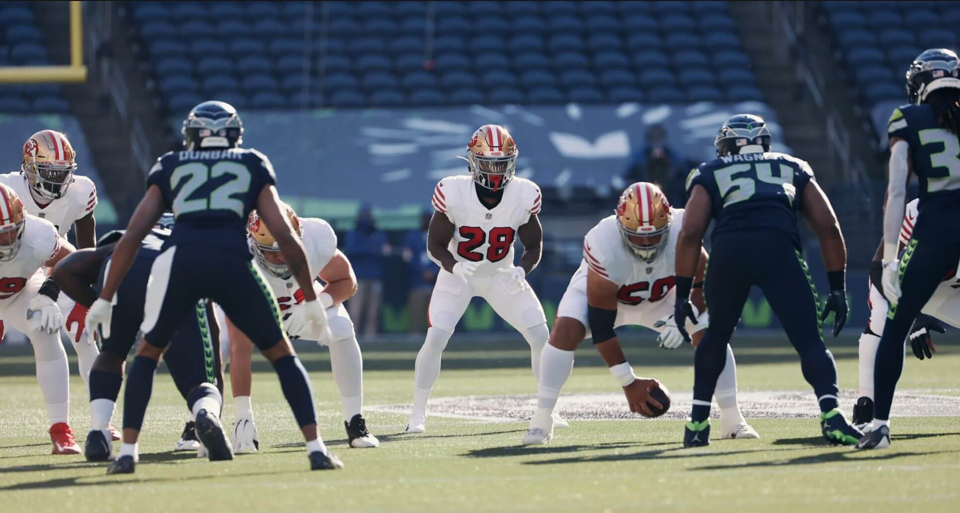
• For the second time in three weeks, the 49ers wore their white throwbacks:
• The Bills and Pats played an inversion game — blue-over-white vs. white-over-blue:
ZACK MOSS! It's a @buffalobills TD! @PresMoss2
📺: #NEvsBUF on CBS
📱: NFL app // Yahoo Sports app: https://t.co/VpbDsNEjOj pic.twitter.com/mg15cjE4g7— NFL (@NFL) November 1, 2020
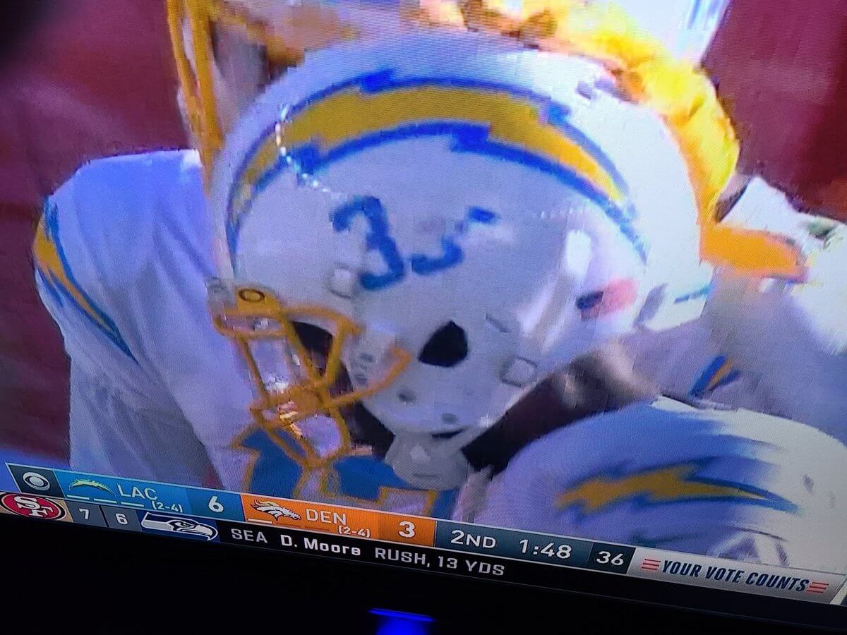
• Chargers running back Troymaine Pope’s left-side helmet number got badly dinged up:
• No visuals, but radio in Bears quarterback Nick Foles’s helmet apparently malfunctioned during yesterday’s game, so teammate Cordarrelle Patterson ran a new helmet out to him. That led a lot of people to ask me how that could be allowed under the one-shell rule. As I explained to all of them, the rule is designed to minimize the use of multiple helmets, not to eliminate them.
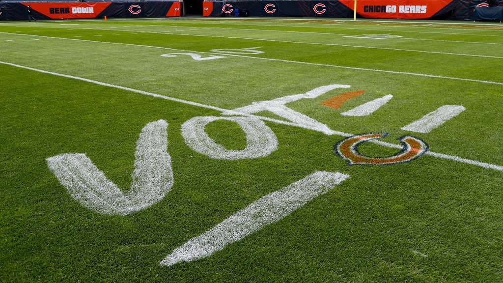
• Speaking of the Bears, the “E” in their on-field “Vote” graphic was styled to resemble the team’s sleeve and sock striping:
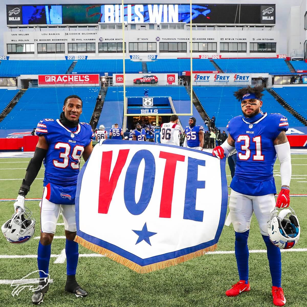
• In a related item, Oxford Pennant’s latest victory banner for the Bills was a pro-voting message:
• In my favorite uniform detail of the day, referee Clete Blakeman, who was working the Bills/Pats game, was wearing a pre-2013 jersey. Here’s a comparison — yesterday’s game with Blakeman wearing the wrong jersey on top, and a game from last year showing him wearing the proper jersey on the bottom:
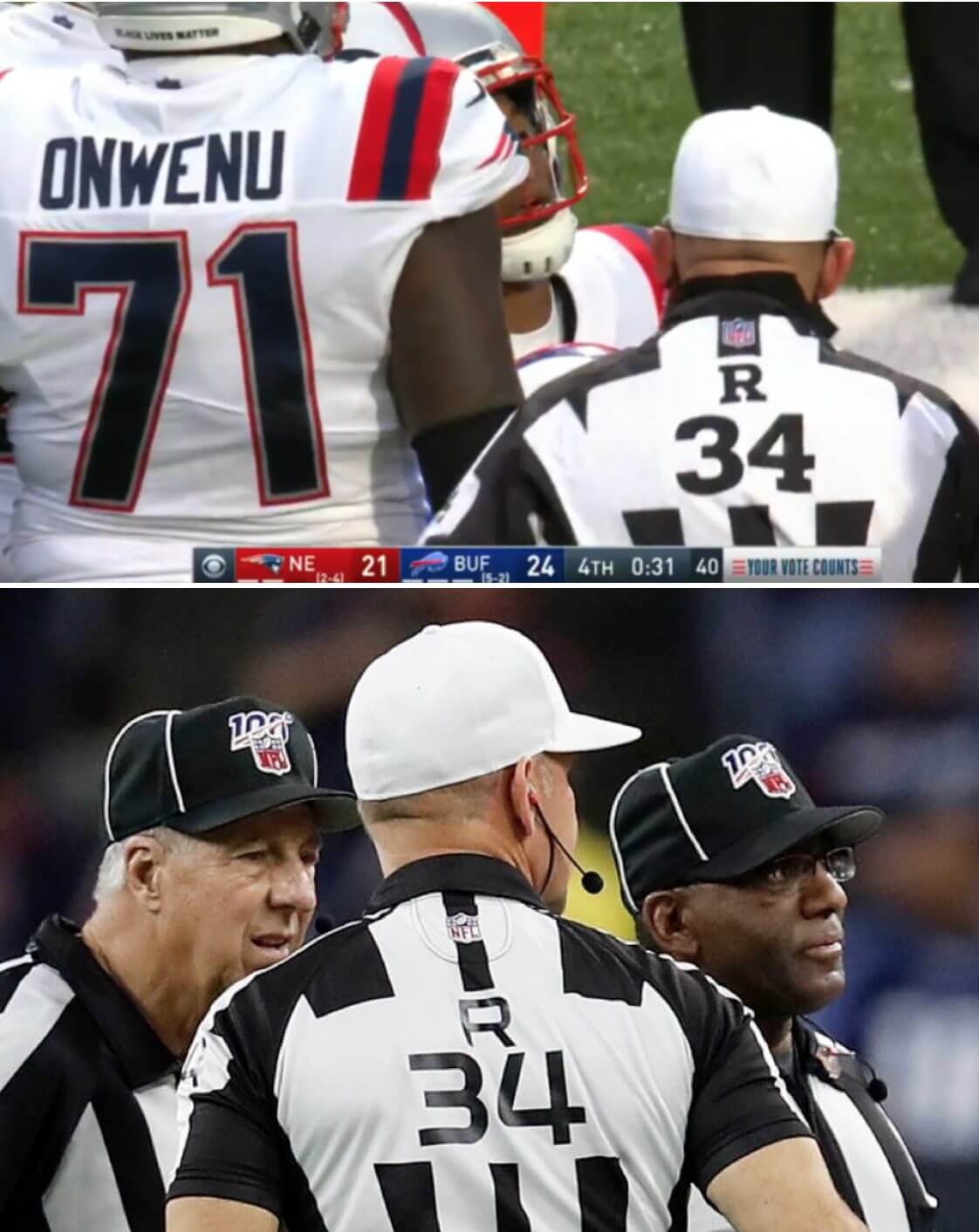
According to the Gridiron Uniform Database, the older style with the serif font, which Blakeman wore yesterday, was last worn in 2012, while the newer sans serif style debuted in 2013. But according to the very wonderful FootballZebras.com site, whose existence I wasn’t even aware of until yesterday, this isn’t the first time since that changeover that an NFL official has worn an outdated jersey:
Former referee Bill Leavy wore his [Reebok-era jersey] on Halloween night in 2013, and former head linesman George Hayward sported his during a preseason game in 2014. [Referee] Mike Carey even adhered his number 94 in black tape to a blank-backed jersey in October 2013.
That is awesome info right there. I need to up my game!
• You know who else needs to up their game? The Fox Sports graphics department:
@UniWatch another rough day for @FOXSports graphics department. Andrew Van Ginkel scores for the Miami Dolphins, Fox awards it to the Rams. Then when Jakeem Grant had a punt return for a TD, they awarded it to Van Ginkel. pic.twitter.com/9Cdvy5OrJ1
— Preston Feiler (@phfeiler) November 1, 2020
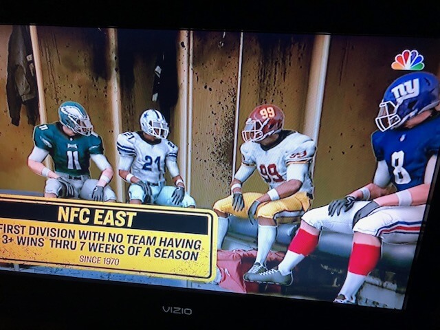
• Meanwhile, NBC ran a little item about the woeful state of the NFC East by showing four generic players — including a Washington player wearing gold pants, which the team hasn’t worn since Week 17 of 2018, and a Giants player wearing the blue home jersey with the red road socks:
• I’m not sure we’ve ever run an item about NFL press box aesthetics before, but yesterday was literally the first time ever that sportswriter Sid Hartman wasn’t alive to report on a Vikings game. The Packers, who were hosting Minnesota yesterday, had a nice memorial setup for him in their press box:
The first game in Vikings history for which Sid Hartman is not alive is today at Lambeau Field. Nice touch by the Packers to memorialize Sid in the press box. pic.twitter.com/DxL1htwtnV
— Ben Goessling (@GoesslingStrib) November 1, 2020
• In addition to the aforementioned Bengals, one other team wore white at home: the Dolphins.
(My thanks to Mike Chamernik, Timmy Donahue, Will Gabel, Kenny Kaplan, and Matthew Wolfram for their contributions.)
Periodically speaking: Here’s something I noticed during yesterday’s Packers/Vikings game, but it isn’t new and wasn’t specific to that game, so I’m giving it its own section. To wit: Packers wide receiver Equanimeous St. Brown’s NOB doesn’t have a period. It’s been like that since he joined the Packers in 2018, but I never noticed until yesterday. (In fairness to myself, he didn’t play at all last year due to injury, and yesterday was only his third game this season.)
On the one hand, the missing period isn’t so remarkable — I’ve written before about how lots of NFL teams don’t bother including the period after “JR” or “SR” suffixes. But it’s rare to have a period in the middle of your surname, as St. Brown does. Omitting the period in the middle of the NOB somehow looks worse than omitting it at the end, at least to me.
St. Brown played college football at Notre Dame, which means he only wore NOBs during bowl games. (The Irish go NNOB for the regular season.) So on those rare occasions when he got to wear his name, did they include the period? Yup, as you can see in this shot from the 2018 Citrus Bowl:
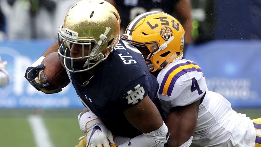
That seems much better.
Click to enlarge
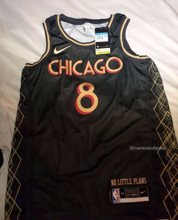
NBA leak-o-rama continues: Brazilian Twitter-er @camisasdanba continues to share what he says are new NBA jersey designs. The latest one is for the Bulls. The design may seem like a head-scratcher, but a clue regarding its inspiration comes from the words “No Little Plans” above the jock tag. That’s part of a famous quote from Chicago architect and urban planner Daniel Burnham, who created the influential Plan of Chicago.
As for the side detailing and lettering, Twitter-er Dave Farmar says, “The side striping echoes [architect] Louis Sullivan’s terra cotta detailing and the font is synonymous with [Frank Lloyd] Wright.” So this design appears to be an ode to Art Deco-era architecture — an interesting approach, although Todd Radom points out that they could have done so much more with it:
One man’s opinion-they came up small with a very vanilla, uninspired take here. If it’s an embrace of Chicago Deco design, why not look to letterforms with authenticity and relevance? My two minute Google image search around an ownable and extendable theme: pic.twitter.com/VouRm7CF9x
— Todd Radom (@ToddRadom) November 1, 2020
As an aside: Louis Sullivan is the man who coined the design truism “Form follows function.” I wonder what he’d say about the form and function of the NBA’s endless alternate uniforms.
This leak’s legitimacy has not yet been confirmed. But several of @camisasdanba’s previous leaks have turned out to be legit, and none have been refuted, so he’s looking like a fairly reliable source.
Whatever you may think of the designs, it’s certainly interesting that the NBA and Nike are referencing people like Jean-Michel Basquiat, Daniel Burnham, and Louis Sullivan in their uniform designs. If they keep this up, people might actually learn something!
Click to enlarge
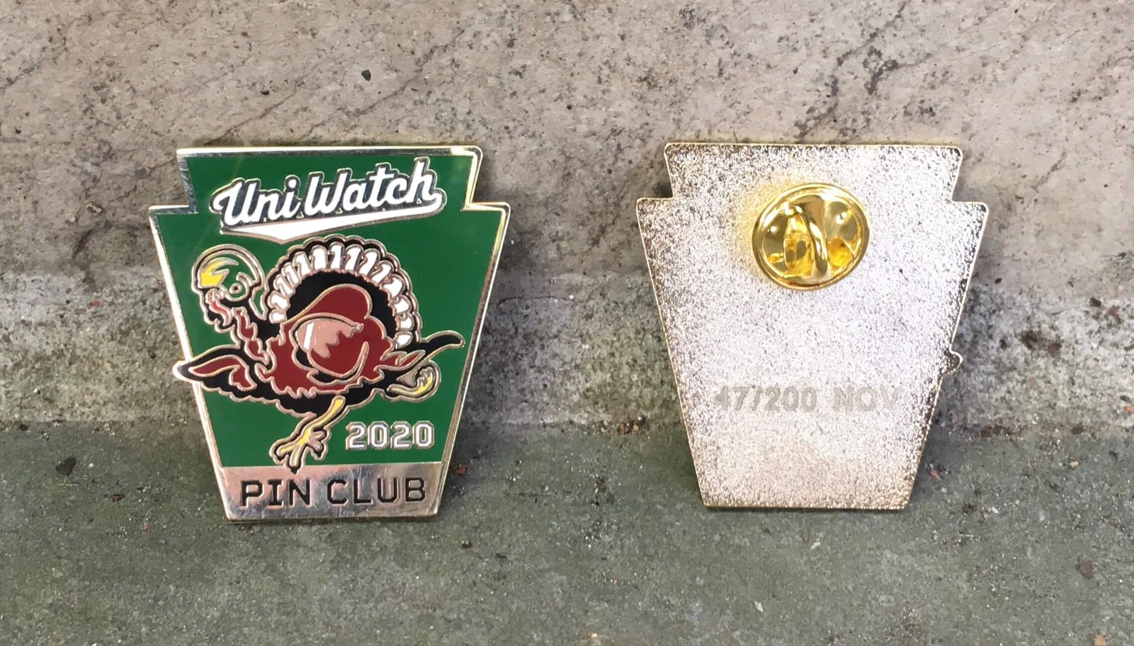
ITEM! The latest Pin Club launch: Gobble-gobble! With Thanksgiving coming up later this month, our latest Uni Watch Pin Club design features a leatherhead-helmeted turkey carrying the pigskin. It’s been produced in a numbered edition of 200, and you can order it here.
Need to get caught up? Here are our January, February, March, May, June, July, August, September, and October pins. (Sorry, April sold out!)
Click to enlarge
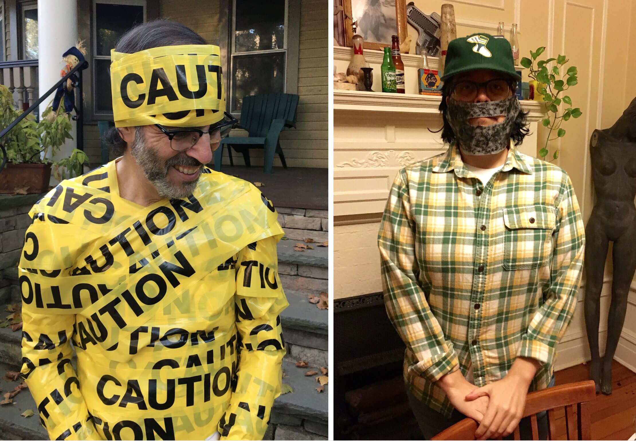
Halloween recap: The Tugboat Captain and I have a video call with a bunch of our friends each Saturday, and it was decreed that everyone had to be in costume for this past Saturday’s call. I’m usually not great at costume ideas, but I this year I had a good one: I dressed up as the pandemic’s most annoying catch phrase — an abundance of caution. (My costume ended up being featured this morning as one of sportswriter Peter King’s tweets of the week, because King is apparently as annoyed by that phrase as I am.)
As for the Captain, she dressed up as me! Our friends all enjoyed the joke.
Hope you enjoyed your Halloween as much as we enjoyed ours.
(My thanks to Jerry Wolper for the Peter King note.)
New advertiser shout-out: As you may have noticed, we have a new advertiser in the right-hand sidebar. That would be the Global League Shop, a fun new venture run by Nick Griffith. I’ll let him explain it to you:
I’m a Uni Watch fan with over 20 years of experience working in the sports marketing industry and a lifelong obsession for sports logos. For years I created fantasy team concepts in my head and worked with professional designers to bring them to life. Now I’ve decided to make T-shirts, hoodies, youth apparel, stickers, and more to share these creations with the world.
Baseball teams are aligned under the Global League Baseball banner, and bowling teams are part of the Mid-American Bowling League, or MABL for short (inspired by my dear Aunt Mabel). New teams are added on a regular basis and announced at @GlobalLeagueShop on Instagram and Facebook. I’m thrilled to promote the shop to the Uni Watch community!
My thanks to Nick for his advertising support, and to Uni Watch readers for considering our advertisers for your shopping needs.
The Ticker
By Jamie Rathjen

Baseball News: The promotional photo for the rock band the Strokes’ appearance on Saturday Night Live this weekend featured them wearing tequila sunrise-themed jerseys (from multiple readers).

Football News: It looks like almost all Big Ten teams wore “#B1GVote” helmet decals this weekend. The only apparent exception was Illinois (from @jffdmrly).

Hockey News: The Blackhawks plan to read an Indigenous land acknowledgement before home games and other team events. I’ve seen Australian teams and leagues do something similar, at least on their websites, but not anything live-action like the Blackhawks are planning (from Mike Chamernik). … Two more Saskatchewan Junior Hockey League teams that have been wearing practice jerseys in preseason games are the Nipawin Hawks (yellow) and Melfort Mustangs (green) (from Wade Heidt). … “The soccer team Toronto FC is currently playing games at Pratt & Whitney Stadium at Rentschler Field in East Hartford, Conn.,” says Andrew Paluch. “Sunday was the first game with fans and they showed a logo that was a cross between the team’s TFC logo and the Hartford Whalers. They even played the Whalers’ goal song, ‘Brass Bonanza,’ when they scored goals.”

Soccer News: Poppy season has begun in England, where all 16 Premier League teams that have played so far this weekend and a few lower-league teams wore the Remembrance Day patches. It didn’t look like women’s or Scottish teams were participating yet, so some clubs like Liverpool had one senior team wear poppies but not the other. … Many of those same teams wearing poppies also wore black armbands in memory of England’s 1966 World Cup-winning midfielder Nobby Stiles. … Manchester United midfielder Nemanja Matić is one of the players that doesn’t wear the poppy for varying personal reasons, in his case since 2018, and once again went without it. … Aside from the above, English Championship team Queens Park Rangers debuted a third kit. … In Brazil, Flamengo midfielder Éverton Ribeiro, who normally wears No. 7, changed to No. 007 this weekend in memory of actor Sean Connery (from @black_bile). … Speaking of Connery, did you know he played for Scottish then-junior team Bonnyrigg Rose in the early ’50s? … Elsewhere in Scotland, Heart of Midlothian’s Bands FC/Frightened Rabbit warm-up shirts that we mentioned on Saturday had an additional Scottish Cup ad patch. … Hearts’ women’s team also wear a mix of Scotland’s new NOB and old number fonts. … A 2001 Bundesliga game saw Bayern Munich wear white training bibs over their shirts because they packed the wrong kit for a trip to 1. FC Köln. … Cross-listed from the hockey section: “Toronto FC is currently playing games at Pratt & Whitney Stadium at Rentschler Field in East Hartford, Conn.,” says Andrew Paluch. “Sunday was the first game with fans and they showed a logo that was a cross between the team’s TFC logo and the Hartford Whalers. They even played the Whalers’ goal song, ‘Brass Bonanza,’ when they scored goals.”

Grab Bag: One of Australia’s Twenty20 cricket teams, the Brisbane Heat, annually wear teal ribbons for ovarian cancer in the Women’s Big Bash League — not a patch, actual ribbons pinned on the sleeve. … The Dutch public broadcaster NOS has been removing its logos from its vehicles to attempt to help prevent its employees from being harassed or threatened. … A competitive fishing team composed of Black women, the Ebony Anglers (NYT link), wears distinctive purple windbreakers.

Click to enlarge

What Paul did last night: Now that the clocks have moved, cocktail hour is likely to be taking place in the dark for the foreseeable future. That will likely require a bit of an emotional adjustment, because we probably won’t see as many neighbors walking by during our porch sessions (and even if some folks do walk by, they probably won’t be as chatty in the dark). But we still plan to hit the porch each evening, at lest for now.
As always, you can see the full set of daily Pandemic Porch Cocktails™ photos — now 230 of them — here.
Something to watch for the Packers — whether they’ll add a second memorial helmet sticker for No. 26, Herb Adderley, the Hall of Fame cornerback who died Friday. You see the Willie Davis memorial sticker in the first picture in today’s post.
Someone didn’t read today’s lede very carefully!
;)
That was me, reading it first thing in the morning. Sigh.
Do visor tab$ $erve a purpo$e other than the obviou$?
I don’t have a photo, but did anyone else notice the patch Doug Pederson had on his sweatshirt last night? It had his last name with a C, which I assume stood for coach.
Typo alert.
In the Clete Blakeman piece: “According to the Gridiron Uniform Database, he older style with the serif font,”
Thanks! Fixed.
I love the keystone shape for this month’s pin! Any special reason behind that shape being used?
Nope. Todd just thought it was a cool shape, and we hadn’t used it before.
Considering that there may be quite a bit of attention paid to the Keystone State this month, it may prove to be a very relevant design choice, intentional or not.
typo:
“I usually not great at costume ideas”
Did you mean “I’m usually not///”
Fixed.
The NBC graphic showing the generic players from the NFC East also shows the Giants player incorrectly wearing red socks with the blue home jersey. The red socks are only worn with the white away jersey.
Right. Will add.
Speaking of NFL referees with the wrong number font, I could swear that long after the referees switched from a Futura/Helvetica-like font to a more athletic-block-looking font in the ’80s, number 9 kept wearing the old style for many years after. Anybody else remember this?
It looked like John Harbaugh was wearing a face gaiter with camo/Maryland flag pattern.
Came to ask about the keystone shape of the November pin, but I see that was already answered. As an aside though, it is widely regarded that the first football game involving professional players took place in PA, so there is that!
Bit on my way here, I noticed a typo in the Pandemic Porch Cocktails section: “But we still plan to hit the porch each evening, at lest for now.” Should be “at LEAST for now.”?
HAHA, I made a typo of my own in my typo statement!!! The word “Bit” should have been “But”!
Info on the first professional football players:
link
I posted on Twitter – today’s article got me thinking about a former player for my Bengals, long-snapper Brad St. Louis. I immediately wondered if he had the period included in his NOB – he did.
link
I wondered the same about former Flyers/Leafs goalie Rick St. Croix…he did as well (and kept the Maine Mariners logo on his mask for at least 1 game in ’78):
link
RE: St. Brown on the Packers
Unfortunately, this doesn’t solve the mystery why ESB doesn’t have a period after the first portion of his surname. But it is a fascinating story on their surname nevertheless.
John Brown, former 2x Mr. Universe changed his three son’s surnames in order to stand out:
“No offense, but Jim Brown, John Brown—what is that? There’s too many of them,” John says. “I’ve got the option to use any name I want, I’m going to pick a slave name?”
There is, of course, an endless spectrum of possibilities between “John Brown” and “Equanimeous Tristan Imhotep J. St. Brown,” “Osiris Adrian Amon-Ra J. St. Brown,” and “Amon-Ra Julian Heru J. St. Brown.” Brown was active in the early 1990s in what he describes as “an underground black consciousness movement” when he learned of the power of traditional African names; Egyptian nomenclature intrigued him even more. With the exception of Equanimeous, a name he plucked from a character in a friend’s novel, the boys’ first and middle names follow a formula: An Egyptian name, a traditional name chosen by Miriam, a second Egyptian name and a “J” for John. (After Miriam delivered Equanimeous, John told her he was also adding a flourish to their surname. “Brown doesn’t look good on the back of a jersey,” he explained. Thus, St. Brown—which John says narrowly edged Von Brown.)
It is interesting to see the treatment of the NOB across his family as well.
His brother, Osiris St. Brown, plays for Stanford. Though they have not started playing this season, in past years, Osiris has also gone with “ST. BROWN” NOB.
link
Their third brother Amon-Ra plays for USC, so no NOB. However, I was able to find this picture from high school where his jersey says “A. ST BROWN”. Interesting to see the period for the initial but not the surname.
link
Their third brother Amon-Ra plays for USC, so no NOB. However, I was able to find this picture from high school where his jersey says “A. ST BROWN”. Interesting to see the period for the initial but not the surname.
That is seriously fascinating. Great find!!
Peeked one more time to see if I could find another view of the high school one, and seems that at some point in their high school careers, both Osiris and Amon-Ra had two periods, one after the initial and one after “ST”. Could just be that Mater Dei equipment changed their minds or did not prioritize consistency for this detail.
link
link
This site’s take on what qualifies as virtue signaling is truly something to behold.
In keeping with my recent treatise on the subject:
link
1. Thank you for explaining the JJ/RT stickers on the Eagles’ helmets. I could not find any explanation, and no Eagles of note have passed away recently.
1a. It seems a little arbitrary to pick 2 Eagles fans who were also soldiers who passed to memorialize on the helmets for a game. I am guessing there are more than 2 people worthy of such recommendation.
1b. The entire idea is arbitrary on its face, and as neither were ever on the team, to memorialize 2 people who never played for the team on the team’s uniform during a game is more than a little pandering. Not to disrespect the deceased, particularly those who fell in the line of duty, but this is a bit much.
2. Fox Sports’ graphics department still hasn’t figured out that Ohio State and Oklahoma State have different logos. It is now 2 years running that they use the OkState italicized “O” when they should really use the tOSU “Block O”.
3. LOVE the bit about the referee numbers. Great work.
Eagles JJ/RT stickers – offense wore JJ, defense wore RT. As described on the 30-60 second video during the broadcast last night.
Ah, didn’t see that. Thanks!
Ha. No one’s suggesting you should have been glued to that clunker last night. I was just verifying my source. :-)
Appreciated, Tom!
Ha. I was actually watching the game and SAW that video and totally missed the offense/defense thing.
Here’s a bit of backstory on the two Eagles fans that were memorialized on last night’s game.
link
Looks like this happened as a result of a collaboration between the Eagles and Tragedy Assistance Program for Survivors (TAPS).
Yes, I linked to that story in the “additional info here” link.
If the one helmet rules ever gets relaxed, would love see see the Bengals where a white helmet with black stripes. Would be a full white tiger look.
Nice Halloween costume. For me the most annoying pandemic catch phase is…”These are unprecedented times.” I liked when Jim Gaffagan referenced this, and said he wanted to “go back to precedented times”.
One other active player that has a St. NOB: Chicago Red Stars right-back Bianca St. Georges has a link, and a period.
I also thought of retired Irish defender Sean St Ledger, who apparently link (link) and no space after it, when you wouldn’t expect it to be spelled with a period.
And of course link.
Speaking of Quebecois hockey players with sainted last names, we also have Frederic St-Denis (or St. Denis). I think he’s in Europe now, but a scan of Getty shows that while in the NHL, the link and link spelled his name as St-Denis (with a dash), but the link spelled St. Denis (with a dot).
That Bulls jersey has * n o t h i n g * to do with Louis Sullivan or Frank Lloyd Wright, so I don’t understand where that tweet-er got their info. Neither of them created buildings in the Art Deco style. Also, Sullivan’s terra cotta was all about organic shapes (includes lots of plants, leaves, etc) as opposed to straight lines, and FLW was known for his Prairie-style architecture. Sullivan died before Art Deco even was much of a thing.
The images in the tweet are from the 1933 World’s Fair, but Daniel Burnham was the driving force behind the 1892 World’s Columbian Exposition. Louis Sullivan contributed the colorful, more modern Transportation Building which contrasted sharply with the white neoclassical style of most of the rest of the buildings. Sullivan later wrote that the classical style of the exposition set architecture back by forty years. Frank Lloyd Wright started out his career working for Sullivan from 1888 to 1893 before starting out on his own. He first encountered Japanese architecture at the 1892 World’s Fair, which greatly influenced his own style. It is a mistake to conflate the classical architecture of the 1892 World’s Fair with the Art Deco style of the 1933 World’s Fair. And it is a mistake to conflate either of those with either Louis Sullivan’s or Frank Lloyd Wright’s architecture.
To be clear, I am agreeing with Steve. The leaked jersey clearly references Burnham with the “No little plans” line. The font may be intended to evoke Wright, but this font link would more clearly and obviously be associated with Wright. And if the detailing on the sides is inspired by Sullivan, it is not a great match. Here is an example of Sullivan’s detailing that is similar to the side panels: link , but as Steve noted, Sullivan used a lot of organic plant imagery in his extremely complex and detailed ornamentation. More examples here: link All three of these very influential architects had ties to Chicago that predated the 1933 World’s Fair by 40 years, and each had distinct styles that differed quite a bit from the 1933 fair. I would love to have more focus on Chicago’s rich architectural history. I don’t have a problem with an Art Deco/1933 World’s Fair inspired jersey, but don’t tell me that it is a tribute to Burnham, Sullivan, and Wright. In fact, I’d love to see a series of uniforms inspired by each of those 3 architects that actually did justice to them individually. I’d throw Mies van der Rohe in that series as well. Could be really cool. To Todd Radom’s point, if the intent of the uniform is to be a tribute to Deco design, it could certainly be better and more interesting. It’s not clear to me if the intent of the jersey is intended to be a tribute to Burnham, Sullivan, Wright, or Deco, but I would say that it fails at all of those points.
This urban planner seconds exactly what Special K and Steve have said.
Still no memorial for Gale Sayers? Tis a shame.
I think we can stop saying this. They’re obviously not doing it.
Thanks for including the usual “Greetings from Uni Watch HQ, where all three inhabitants continue to be safe and well.” I think you skipped it last week, and I was worried!
The font on that purported Bulls jersey reminds me of the font used on Barry Manilow’s first several album covers in the seventies.
“…NBC ran a little item about the woeful state of the NFC East by showing four generic players — including a Washington player wearing gold pants, which the team hasn’t worn since Week 17 of 2018…”
Woeful indeed.
Depending on what is underneath your costume, and Abundance of Caution was probably prudent.
Paul-
Is that a nude sculpture behind the Captain? Might be a good story to dress it up in Uni-Watch gear and make him the winner of a membership card.
It’s a mannequin. We like it the way it is!
I’ve known/seen the Football Zebras site for a few years. Gets you info on new officials, who’s possibly up for White Hats next year, weekly assignments, etc. A great site!
This month’s pin is very Pennsylvania in its design.
Todd just likes the keystone shape and wanted to use it!
The “generic players” shown on the NBC SNF graphic are Carson Wentz, Ezekiel Elliot, Chase Young, and Daniel Jones, from left to right. For someone who writes a weekly column about the NFL, this guy sure doesn’t know much about it!
The Bulls “City Edition” uniform pays homage to the Chicago Theater, according to multiple reports. First mention I saw of it was here: link
A side note: ironically, this guy loves to bash the NBA and MLB for adding advertisements to their products, but has no issue flaunting his new advertiser, not only by adding them to his site, but by giving them a special shoutout in his column.
Actually, Randall, the “generic players” are actors or whatever warm bodies were available, not the real players you mentioned. That’s why I referred to them the way I did.
Regarding advertising, here, read this:
link
Appreciate the Chicago Theater info — thanks!
Yours truly,
This Guy
If it’s a tribute to the Chicago Theatre (designed in 1921 by the Rapp brothers), it fails at that, too. As you can see in that tweet, “CHICAGO” is written in a different font on the jersey from the famous marquee of the Chicago Theatre, and the letters have a block shadow that is absent on the theater. The red and gold colors of the lettering on the jersey does seem to go with the theater marquee, but I don’t see that geometric diamond pattern on the sides of the jersey on the theater.
The Browns vs. Raiders game yesterday looked straight up awesome from a uni perspective!
link
A bit further to the hockey Ticker item about the differing of uniforms in the SJHL. It is interesting to see how the Western Canadian Junior A leagues have been making their adjustments dealing with the pandemic in this exhibition season. BCHL has been going full clear mask for all players instead of visors while the other leagues (SJHL, AJHL, MJHL) have not.
Regarding the Chicago Blackhawks plan for reading an Indigenous land acknowledgement before games… most of our sports teams in Manitoba (including the Winnipeg Jets and Winnipeg Blue Bombers) have been doing this sort of pre-game acknowledgement for more than a year already. The practice is quite common in Canada.
The NFL officials actually switched to the current font In the middle of the 2012 season. The font change happened after the replacement officials left and the NFL officials were in-locked our. It’s was 2-3 weeks after the NFL officials returned that the switch happened. This also was Nike’s first season
Thanks. I *thought* it was 2012 — but like I said, “according to the Gridiron Uniform Database.” They’re usually reliabe.
Thanks for the link to the story on the Ebony Anglers. Interesting stuff- glad they’re getting the attention they deserve.