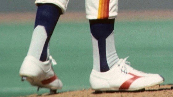
Last Friday I wrote about how the Astros apparently pioneered the use of two-in-ones — in other words, socks with with a faux stirrup pattern knit into them — in 1976 and ’77, which was a huge surprise to me. As I wrote in that post, I had no memory of the ’Stros wearing two-in-ones back in the day, and I had long thought that two-in-ones came into existence around 1990, not in the 1970s.
Today I have some follow-ups on that report, beginning with a major find from uniform designer/historian Todd Radom. After seeing last Friday’s post, he did a bit of research and came up with this item by New York Daily News columnist Dick Young, who was covering a sporting goods trade show. This ran on Dec. 12, 1975 — the winter before the Astros apparently began wearing two-in-ones:
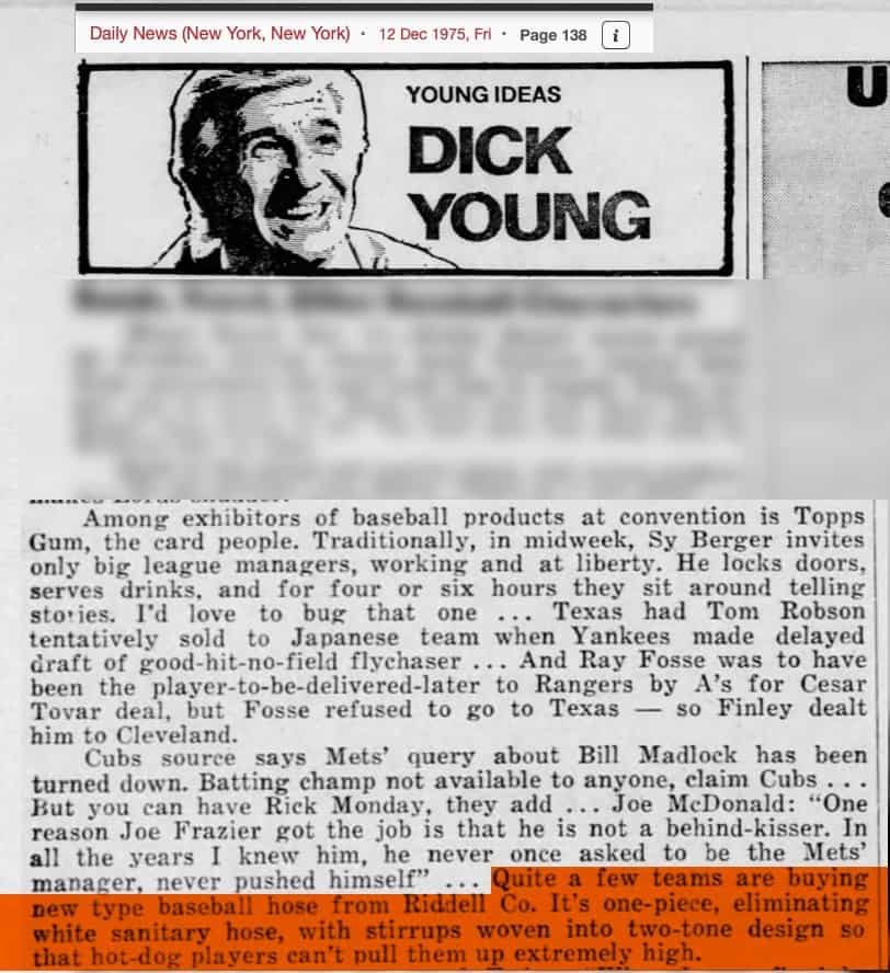
In case you’re having trouble reading that orange-blocked text, it says:
Quite a few teams are buying a new type of baseball hose from Riddell Co. It’s one-piece, eliminating white sanitary hose, with stirrups woven into [the] two-tone design so that hot-dog players can’t pull them up extremely high.
So that explains why the ’Stros began wearing the two-in-ones in 1976 (as opposed to ’75, when the tequila sunrise uniform made its own-field debut) — the two-in-ones weren’t available until then!
Also of note: Young wrote that “quite a few teams” were purchasing the new hose. So did any other teams wear two-in-ones in 1976? If so, I’m not aware of it, but of course I wasn’t aware of the Astros wearing them until just last week. Hmmmmm.
It may seem odd to hear that Riddell — a football helmet company — pioneered a kind of sock. But Riddell was a big footwear company back in the day (shoes as well as socks), so it’s not as incongruous as it may sound today. Anyway, I got in touch with my Riddell contact to see if they had any old paperwork about the two-in-ones, or if there were any old-timers on the staff who might be able to tell me more. Unfortunately, no dice on both accounts. Too bad.
The other key bit of new research comes our way from Jeremy Snyder (aka @QuirkyResearch), who found this wire service article about Astros slugger Cliff Johnson from May 1977 — the second season that the ’Stros wore the two-in-ones (key passage highlighted; click to enlarge):
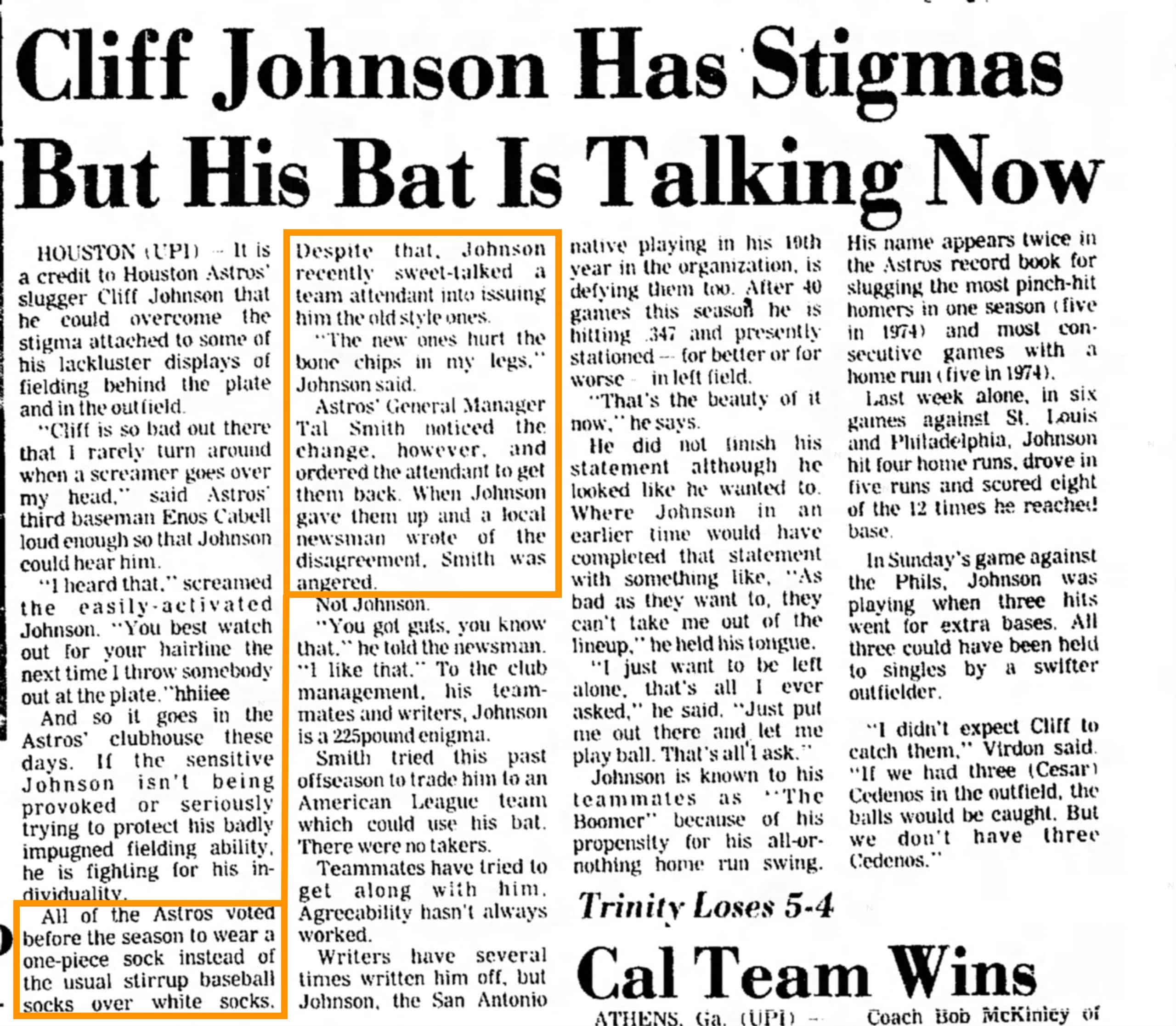
Here’s the transcription of that highlighted passage:
All of the Astros voted before the season to wear a one-piece sock instead of the usual stirrup baseball socks over white socks. Despite that, Johnson recently sweet-talked a team attendant into issuing him the old-style ones.
“The new ones hurt the bone chips in my legs,” Johnson said.
Astros General Manager Tal Smith noticed the change, however, and ordered the attendant to get them back [from Johnson]. When Johnson gave them up and a local newsman wrote of the disagreement, Smith was angered.
There are several nuggets of interest here:
• First, it’s interesting to learn to that the Astros voted to wear the two-in-ones on a team-wide basis in 1977. That implies that the socks were optional in ’76, the first year they were worn.
• Seems counterintuitive that Johnson’s bone chips would be aggravated more by a single-piece sock than by the two-piece stirrup/sanitary combo, no?
• We clearly need to see the article that was written by the “local newsman.” Unfortunately, Houston papers are not included in any of the online newspaper archives I have access to. If anyone out there has a Houston library card, this archive might have what we’re looking for. Anyone..?
I also contacted Astros historian Mike Acosta to see if he could offer any additional insights on any of this. He put me in touch with a longtime member of the team’s clubhouse staff, but that employee has been preoccupied with the team’s postseason activities. Since the team has two days off before the start of the ALCS on Sunday, I’m hoping he can make some time for me in the next day or two — will advise.
As an aside, I went looking for 1976 and ’77 photos of Johnson. Didn’t find much in the way of hosiery-inclusive pics, but I did find this shot in which his NOB appears to be seriously off-center:
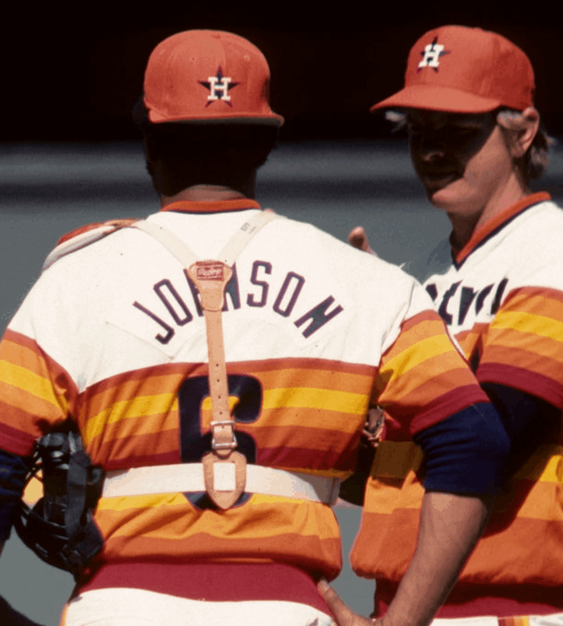
That has nothing to do with his socks, but it’s still an interesting find!
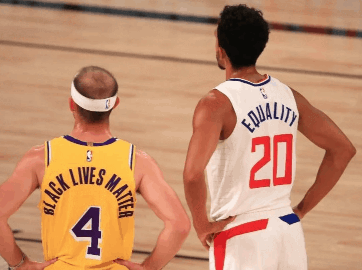
Virtue signaling reminder: In case you missed it, yesterday’s post was a lengthy think piece on the subject of sports uniforms being used as a platform for virtue signaling (i.e., non-sports messaging regarding assorted worthy causes). People really seemed to like it, and I was seriously wowed by all the thoughtful comments that people posted.
The full package — the piece and the comments — is a testament to the great comm-uni-ty we’ve all built there. If you haven’t already read the piece, I hope you’ll check it out — and the comments as well.
Click to enlarge
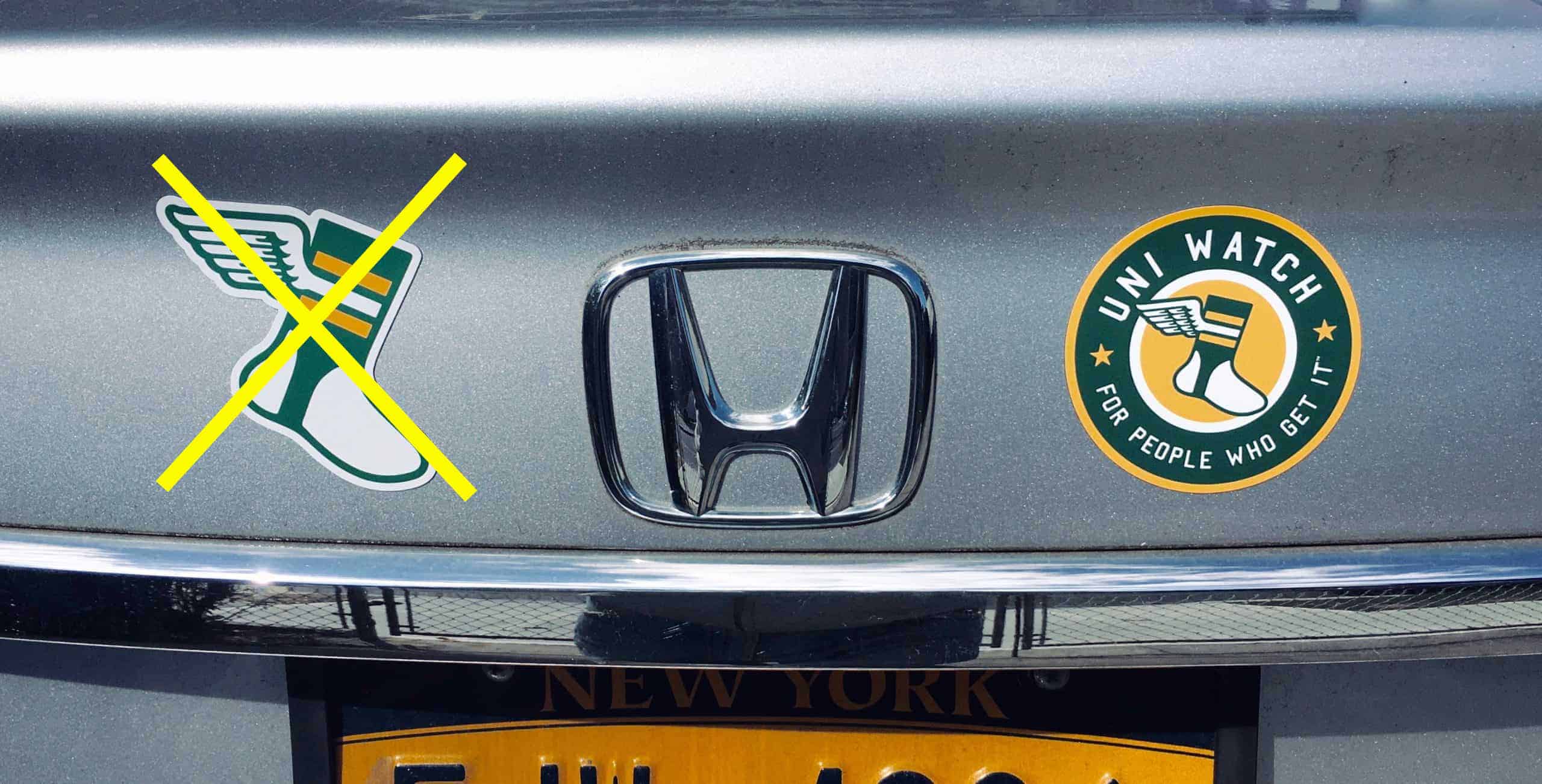
Magnet update: Thanks for the hugely positive response yesterday to the two Uni Watch magnets. The winged stirrup design is now sold out (if you want to be notified when it’s restocked, shoot me a note), but I still have about a dozen of the round design.
They’re $3 plus $1 for shipping. Very limited supply, so just one per person. If you want one, send me $4 via Venmo (use @Paul-Lukas-2 as the payee), Zelle (plukas64@gmail.com), or Google Pay (plukas64@gmail.com). If you’d rather use Apple Pay or a paper check, contact me and I’ll give you the info you need. Sorry, no PayPal. After sending payment, email me with your mailing address.
If you’re outside of the USA, the total price is $5. If you want one, contact me and I’ll arrange an alternate form of payment for you.
If you want to combine your purchase with an order for a Uni Watch key ring, a trading card, a seam ripper, a koozie, or a chain-stitched patch, please email me and I’ll give you a price that includes a combined shipping fee for the whole shebang. (Sorry, these are the only Uni Watch items I can combine into one shipment, because our other items ship from separate locations, not from Uni Watch HQ.) Now sold out!
Thanks!
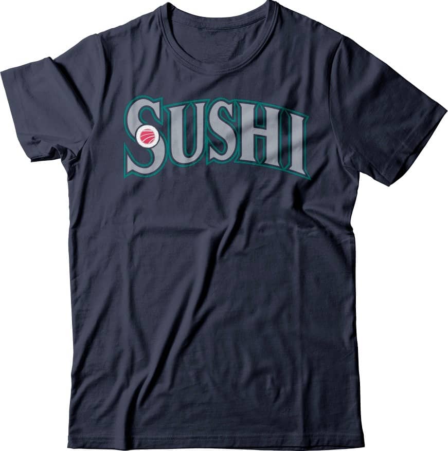
ITEM! New menu addition: As you can see here (and can click to enlarge), a new design has been added to the menu of theoretical T-shirt designs. Wouldn’t it be fun — just, you know, in theory — if it were actually available in real life?
If you’d like to discuss that topic — or any of the other items on the menu — feel free to give me a shout and we’ll have a nice chat about it.
We have another menu item currently being refined in our test kitchen, and I think it’s the best one yet. Stay tuned.
The Ticker
By Anthony Emerson

Baseball News: A Seattle radio host is calling on the Mariners to make wholesale changes to their identity (from Tim Dunn). … On Instagram, former MLB player Nick Swisher posted a childhood picture of himself dressed in a Yankees uniform (from Mike Engle). … Oh my goodness, check out this amazing Phillies letterhead from 1950 (from @Phixated). … Folks, how do we feel about a beer advertisement incorporating a team’s logo to make part of their name? That’s Estrella Jalisco at Dodger Stadium. To me it’s especially awkward because the interlocking LA on the sign doesn’t make the top line read like “Estrella” at all (from Perry Shirley).

NFL/CFL News: Reader Kurt Rozek sends along this shot of Eagles camp in the 1960s, and notes the tan pants the players are wearing. “This obviously isn’t during WW II when they were the Steagles for a year or so,” he says. Perhaps they were surplus from that era, but does anyone have a definitive answer? … Kansas City WR Tyreek Hill was punished by the NFL in the past for mocking defenders with the peace sign, so this year he put the peace sign on his gloves (from Mike Chamernik). … Ted Arnold sent in the season ticket card he got from the Toronto Argonauts, complete with a nice pin. Love the cover, depicting the CN Tower with football laces. … The Patriots are sending out gift bags recognizing New Englanders who go out of their way to help others (from @VictoryCB). … The Ravens are wearing their purple jerseys on Sunday, but their “Gameday Threads” tweet doesn’t actually show all of their gameday threads, so we don’t know about the pants yet (from Adam Marcus). … A mic caught Browns coach Kevin Stefanski commenting to CEO Paul DePodesta about the lack of uni contrast in some NFL games. … Rumor has it the Buccaneers are making plans for a new retractable roof stadium, with ground-breaking to occur in 2022. Wouldn’t be that surprising if Tom Brady is still around to play in the new stadium (from Kary Klismet). … Kary also sends along this article from the Packers’ website about the history of Lambeau Field. … Also posted in the NBA section: For some reason, EA has added the Antetokounmpo brothers to Madden 21. “The brothers wear Greek-themed unis with faux-Greek lettering and a meander pattern on the sleeves,” says Mike Chamernik (also from @NFL_Journal).
College/High School Football News: Virginia Tech RB Khalil Herbert will wear No. 25 this weekend, and the team will go white-white-orange against UNC (from Andrew Cosentino). … UNC itself will go white-navy-white in that game (from James Gilbert). … Miami is going white-white-green against Clemson (from Jason Lefkowitz). … Virginia is going white-orange-white against NC State (thanks, Jamie).

Hockey News: Canada will wear gorgeous “heritage” sweaters for the 2020-21 international season, starting with the World Juniors in December. Hype video here (from Jakob Fox, Adam Peleshaty and Mike Chamernik).

NBA News: This is great: The jock tag on the jersey given to Shaquille O’Neal at his Heat introductory press conference featured a Spurs logo. If it was noticed at the time, heads probably rolled (from Steve Flack). … Cross-posted from the NFL section: For some reason, EA has added the Antetokounmpo brothers to Madden 21. “The brothers wear Greek-themed unis with faux-Greek lettering and a meander pattern on the sleeves,” says Mike Chamernik (also from @NFL_Journal).

Soccer News: Gibraltar’s national team has unveiled a new crest and kits (from Kary Klismet).
.

Grab Bag: Ever wonder why a ton of cassettes and CDs from the 1980s and ’90s had the same red block font on the spine, no matter the artist or genre? This Twitter thread has your answer (from Alex Graber). … Singapore’s postal delivery service is receiving new uniforms (from Kary Klismet). … Also from Kary: A new podcast about collegiate sports logos has just released its newest episode, about the logos of Oklahoma and Oklahoma State. … One more from Kary: ICE has seized a shipment of more than 300 counterfeit championship rings in Indianapolis. … Fresno’s Central Unified School District has a new athletics logo. … The University of Houston’s costumed mascot, Shasta, will now wear No. 27. Shasta previously wore the last two digits of the current year (from Ignacio Salazar). … New volleyball floor design for USC (from Jeremy Brahm).

That’s a wrap for this week. Stay safe, enjoy Phil’s weekend content, and I’ll see you back here for Monday Morning Uni Watch. — Paul
The new Gibraltar FA crest is excellent. Evokes the Rock in such a simple, yet instantly identifiable way. Nothing else cluttering it up. The same lines placed the shirt in the same fashion make for a unique and fairly classy kit. Great design work.
posted this yesterday
link (11:28 mark)
Apparently the orange pants that the browns wore week two weren’t a last minute addition to the uniform set. they were planned the whole time and they wanted to keep them a secret until they were debuted on the field
also includes the part where Stefanski talks about the lack of contrast…
Typo alert: Paul asked Acosta about the Astros, who referred an employee, but they’re busy prepping for the *American* League CS, not the NLCS. Yes yes I know, I still instinctively think of the Houston Astros as a National League team too, and so would any Mets fan who had to get past Mike Scott in 1986!
Thanks, Mike! Fixed.
Any time a UniWatch post has Rainbow Guts vintage pix is a good day!
Kind of shocking to see such a racist new menu t-shirt!
wouldn’t they all be considered “racist” because most of the menu items are based off of food that’s popular in an area due to ethnic makeup of the area.
What would the alternative be? Call the food something else? Avoid talking about it entirely?
On a related (but much broader) note… doesn’t there come a point at which NOT acknowledging something unique to a particular ethnicity is racist?
I don’t know a whole lot about the history of sushi in the United States, but personally I associate it with NYC or LA/California more so than the PNW. So when I saw the shirt my first thought was that it was based less on the food’s unique association with the geographic region and more on the PNW having a large Asian population. Which seems… ehhh. Not cool?
It is, in fact, very popular in Seattle, for the exact same reason that it’s popular in NYC/LA — the large Asian population. There’s nothing racist or even stereotyping about it — it’s just a regionally popular food that, like most regionally popular foods, is popular due to the ethnic demographics of that region. (Why is bratwurst popular in Milwaukee? Because Wisconsin was settled by Germans! Why is NYC famous for pizza? Because of Italian immigrants! And so on.)
A bunch of Seattle readers/residents actually requested this one.
As an Alaskan/Washingtonian, I can assure you sushi is very well represented in the PNW. You probably associate it more with NYC or LA/California simply because a lot more media comes from those places.
Fair enough! I legitimately know very little about sushi.
My very first thought on seeing the sushi shirt was “tread lightly, Paul.”
This original comment is what I would call “virtue signaling” lol
This is the kind of virtue signaling that I think people find so odious, and I don’t think Paul mentioned it in his article yesterday (though I admit I didn’t have time to read the whole thing). There’s nothing wrong with advertising your support for a cause (e.g., on a uniform). But in some contexts (especially on social media) it comes off as self-righteous and self-aggrandizing, even if it’s completely sincere. Instead of sending a message of “Hey, look at this important cause!” it often sounds more like “Hey, I’m better and more moral than you!”
Who cares how someone sounds on social media? A good idea is still a good idea (and a bad one is still a bad one). The message, not the messenger!
Re: Eagles.
My guess is that these are designated practice uniforms for the era. I’d venture that the tops are cotton rather than Durene because camp was in mid-summer.
The numbers are very much reminiscent of the Champion font of the 80s and 90s; I wonder if they had a hand in making them.
The tan pants are likely because they’re easier to clean than white or green pants.
I was going to say the same thing; my guess would be those are practice pants.
The Canada jersey is likely going to be the one used in the Olympics. They can’t use an official logo, but a simple CANADA wordmark and a single maple leaf is OK.
Look for something similar from USA Hockey very soon.
re: Astros 2 in 1’s:
tv technology at the time probably was not advanced enough to clearly show the rough edges and weird angles on the socks. plus, most people were unaware they were even being made.
it also, in one of the pictures, looks like the blue stirrup might have bled into the white part when it was washed.
Boston College going with the white throwbacks at home versus Pitt on Saturday
link
This is the 4th straight game they will have gone wearing throwbacks – hopefully this means that the standard uniform is gone for good.
The Houston Chronicle archives only go back to 1985 it seems. I’m doing some further digging. There used to be a way to access the now-defunct Houston Post (RIP to my first employer) archives but it doesn’t seem to be working anymore.
Looks like young Nick Swisher hadn’t learned about blousing yet – he’s got his pants tucked into his socks.
link
Underwhelmed with the Canada jersey. Don’t care for that stemless leaf. If you’re going to put a CANADA word mark on it at least put more of a curve in it – and maybe choose a different and smaller sized font. Look at the sweaters used in the Olympics in the 1920’s/30’s for inspiration.
Their design uses designs of the past for inspiration, but what they chose was far from the best of those.
Leafs on the cuffs isn’t a great design for the players on the ice; gloves will cover some or all of it. Must be more for merchandise sales.
I always associated the red block font with Columbia label releases. The Twitter picture also documents the use of this font with Chrysalis, Portrait, and SOLAR (Sound Of Los Angeles Records, itself a logo). Public Enemy, on Def Jam, used the font but went NLOL (No Label on Label).
Those were all Columbia-subsidiary or -distributed labels.
Which is why I always presumed it was just the house style.
True story: I once earned an opportunity to chat with a SONY employee after complaining about the poor quality of their cassettes, a flaw I felt was telegraphed by their off-the-shelf artwork. I wondered why cassette tapes were treated like red-headed stepchildren next to their phonograph and compact disc brethren: No liner notes, generic type, concrete-colored cases, while still charging retail prices. The employee gave me an interesting look into the mass-production of magnetic tape, the way that azimuth worked, and a description of the boutique labels under SONY’s umbrella. Soon afterward, I bought “Blue Sky Mining” by Midnight Oil, and all the packaging was unique. So humor me for thinking the squeaky wheel had gotten the grease. And who misses cassettes that smelled like patchouli oil?
No link for the item about Singapore Post. As we say in Singapore, wake up your ideas! B^)
Some classic cold weather NFL footage
link
Cliff Johnson’s explanation as to why he wanted to wear the traditional stirrups makes no sense to me, either. When I was younger I HATED wearing stirrups because of the way the lump of fabric felt under my foot. Sometimes it would actually hurt after a long day on my feet in my cleats. I remember being very happy to get to high school and find out our team wore soccer-style socks. It was such a relief.
My guess is he was fibbing a bit to justify sticking with the traditional set-up.
Yeah, I read this and thought of Paul Lukas’s hypothetical prepared excuse that he’s *cough* allergic to double-knit polyester and requires a special wool flannel uniform. Like a reverse Ken Singleton. ;-)
University of Houston w/some minor changes to their helmets: 3d “UH” nose bumper replaced with “HOUSTON” text; no decal on the rear bumper, added Bill Yeoman and “equality” decals.
link
FYI – Dick Young wrote for the Daily News, not the Post
Actually, he wrote for both. But yes, the column cited in today’s blog entry is from the Daily News. Will fix — thanks!
The Cliff Johnson image in the text showing the offset NOB is cropped. Here’s the original I found on Getty from (per Getty) 1976. Shows him wearing 2 in ones.
link
Right — it’s the same photo that the splash photo of Mel Wright’s socks was taken from.
But that photo is from April of 1976 — the first month that the Astros wore the two-in-ones. What I wanted to find was a photo of Johnson from May-ish of 1977, since he had supposed *stopped* wearing two-in-ones by that point. That’s what I was unable to find.
OK, wait a minute, wait a minute…
“…so that hot-dog players can’t pull them up extremely high.”
So 2-in-1’s were a response to the way Frank Robinson wore his stirrups?
And it seems Cliff Johnson wore his stirrups similarly from a Google search. Maybe the bone spurs explanation doesn’t make sense because it’s not really the explanation.
I’m going to stop connecting dots now before I get accused of virtue signaling…
Knowing Dick Young’s general point of view about most things, I’m pretty sure this was just him doing his cranky-old-man thing and projecting about a potential consequence (and, in his view, benefit) of two-in-ones.
Yeah, that seems likely. But the way Young wrote it reads like it’s a reason 2-in-1s were invented and why teams wanted it, regardless of what he thought about it. That’s what gave me pause. I know of Young’s general crankiness, but I’m way too young to have read him and know his writing style.
I’ve come to appreciate the EstrelLA sign. I just wish they had used the old interlocking umpires’ “AL” logo in Jalisco. I guess that would have created some cognitive dissonance, but whatever.
Am I crazy…or is that tan-pants Eagles look weirdly cool?
Finally got around to reading Paul’s incredibly well-crafted virtue signaling piece and all of the thought-provoking comments that followed…thank you all for the perspective!
“Young wrote that “quite a few teams” were purchasing the new hose (2-in-1’s). So did any other teams wear two-in-ones in 1976?”
Couln’t find anything on that year, but were the ’77 Minnesota Golden Gophers (including Paul Molitor) wearing them?:
link
link
Yes — great find!!
I am shocked that Paul thought 2-in-1s started in 1990. I remember seeing youth baseball players wear them circa 1986 when I was an elementary school Coach-Pitch player. Didn’t know what to call them. I thought they were for cheap kids’ imitation baseball uniforms, just like screen printed numbers and snap-back mesh hats. Of course 2-in-1s were a step up from my plain tube socks. (Maybe Paul means he thought 2-in-1s came to MLB in 1990 and also thought they were a little league/rec-league thing before that.)
I don’t see the logic behind changing the Mariners’ uniforms. If it’s good, keep it! If it’s ugly, change it! There’s nothing wrong with the uniforms; it’s the players wearing them.
I had no idea that Gary Busey with all his acting attributes in 80’s
had time to suit up with Cubs.
Gary Busey also played a high school quarterback in the 1973 movie Blood Sport. At 29 he was a little old to play a high school football player? You have NFL QB’s who are in their 7th season at that age.