Click to enlarge
Seattle’s NHL ownership group finally made it official yesterday: The city’s new team, which will begin play in the fall of 2021, will be called the Kraken.
I’m happy about the name, which is the one I’ve been rooting for all along. Granted, I’m generally of the mindset that team names should end in “s” (or, in MLB, “x”), but Kraken is too much fun not to use.
They released a decent number of visual elements yesterday. Let’s go one major element at a time, beginning with…
The Colors
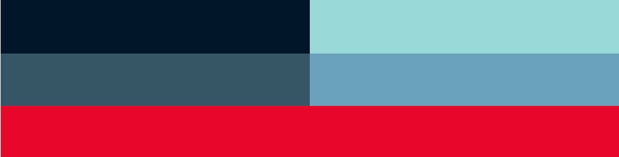
Okay, I get it — they’re going for an aquatic theme here. But still, that’s a lot of shades of blue, no? And did the league (or the uni-verse) really need another team using navy as its primary color?
Also: Surprising to a see a Seattle team not using green (or emerald, or whatever).
The Logos
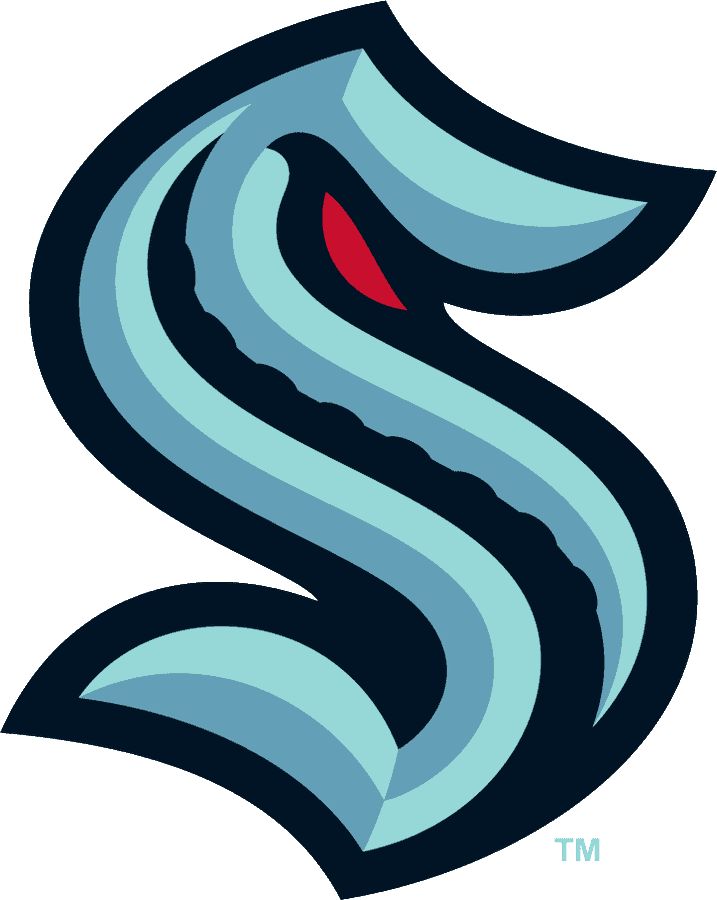
The primary mark, shown above, is an interesting piece of design. The “S” shape is strong, and the eyeball and tentacle are both clever … but I don’t really love it. Needs more tentacles, more color, more something. If they’d gone with a design featuring an actual kraken instead of a letter, this would make a superb secondary logo. But it doesn’t quite work for me as the primary.
Meanwhile, here are the real secondary logos (click to enlarge):
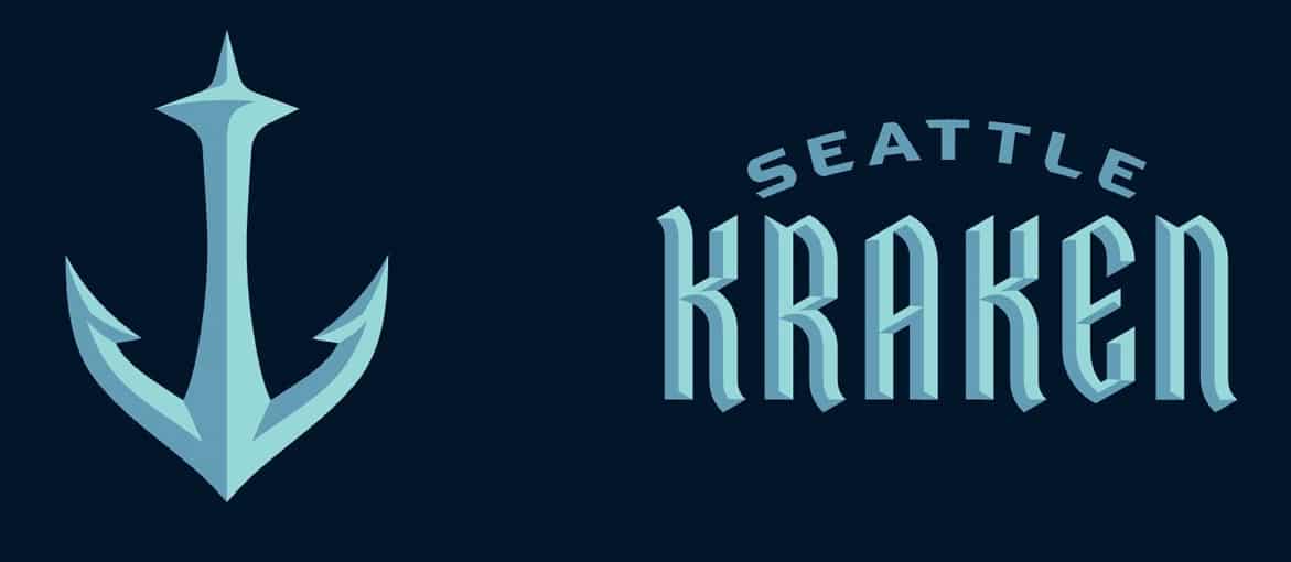
The barbed anchor topped by the Space Needle is fantastic. The wordmark? Looks like the label for a brand of Russian vodka. And too bad about all that beveling.
Question: How is it possible that you name your team after a mythical giant squid and none of your logos show a mythical giant squid? I mean, I get that sometimes less is more, hinting at something can be better than actually showing it, blah-blah-blah, and on some level I respect the restraint they’ve shown in that regard. I also realize they may have decided that the Red Wings have already cornered the market on cephalopod mascots — but if that’s the case, why go with Kraken as your team name to begin with? Having the visual package provide only the barest hint of an actual kraken seems like a missed opportunity.
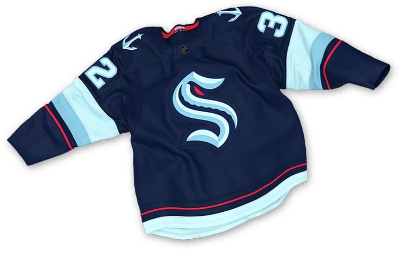
The Uniforms Jerseys
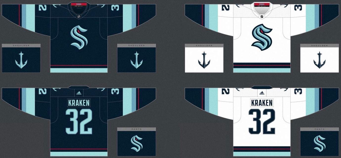
Graphics via Icethetics; click to enlarge
Sigh — yet another unveiling that shows only the jerseys, not the full uniforms. Whaddaya gonna do.
Anyway: As is usually the case with hockey uniforms, I like the white design much more than the colored one (and really wish the NHL would go back to the white-at-home format, but that’s another argument for another day). Overall, they’re not bad, and I think the primary logo actually looks better on the jersey than it does by itself. Pending the unveiling of the pants, socks, and helmets, I’d say this feels like a middle-of-the-pack NHL set — neither awesome nor awful.
A few observers noted some visual echoes of previous NHL designs:
I’m getting a late 90’s Vancouver Canucks vibe from the Kraken myself. pic.twitter.com/n3os108Kna
— Kev O’Content Jr. (@KevOContent) July 23, 2020
I mentioned earlier that it was surprising to see a Seattle team not using green. Twitter-er Brendan Bresnahan apparently had the same thought — he swapped out the red elements for green:
Green would have been better! pic.twitter.com/qlEtVZ39cd
— Brendan Bresnahan (@brezvideo) July 23, 2020
Granted, I love green. But still, I think Bresnahan’s edit looks sooooo much better than the real design. Wish they’d gone in that direction.
———
Overall: Love the name, feel like they could’ve done more with the identity.
There’s a lot more info — much of it wonderfully animated and cringe-inducingly worded — here, and there’s some additional background info on how the team identity was developed here.
Meanwhile, over in DC…: Just as the Kraken thing was happening, word came down that the NFL’s Washington football team will be officially known as, um, the Washington Football Team, at least for now. There was some initial confusion about how long this placeholder identity would be used, but beat writer Ben Standig says it will stay in place throughout the 2020 season (assuming there is a 2020 season, which is still not a sure thing). This temporary name will give the team time to choose a new identity for 2021.
The team’s colors will remain the same, at least for now. The chest wordmark will change from “Redskins” to “Washington,” and the helmet will now carry TV numbers instead of a logo. Here are some rather sloppily Photoshopped images that the team released (click to enlarge):
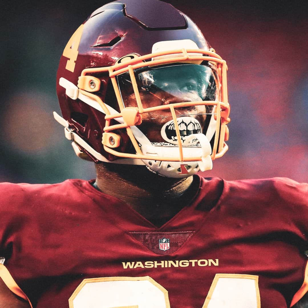
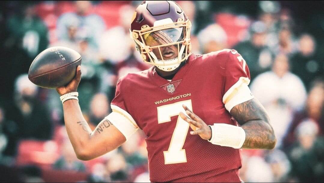
It’s a reasonable solution, although I’m a bit surprised they opted not to retain their very identifiable helmet striping. On the plus side, we suddenly have two NFL teams with TV numbers on their helmets: Washington and the Chargers. When’s the last time that was the case?
Meanwhile, the team’s gridiron will feature the NFL logo at midfield:
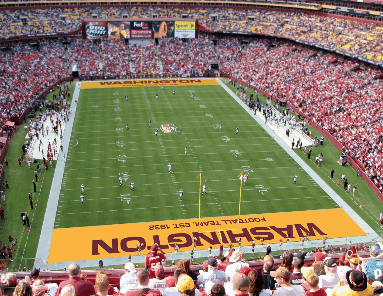
Might be nice if they’d bothered to remove the old logo from the Jumbotron and a fan’s pennant, eh? Again, sloppy work.
Additional info and photos are available here.
For most pics in this section, click to enlarge
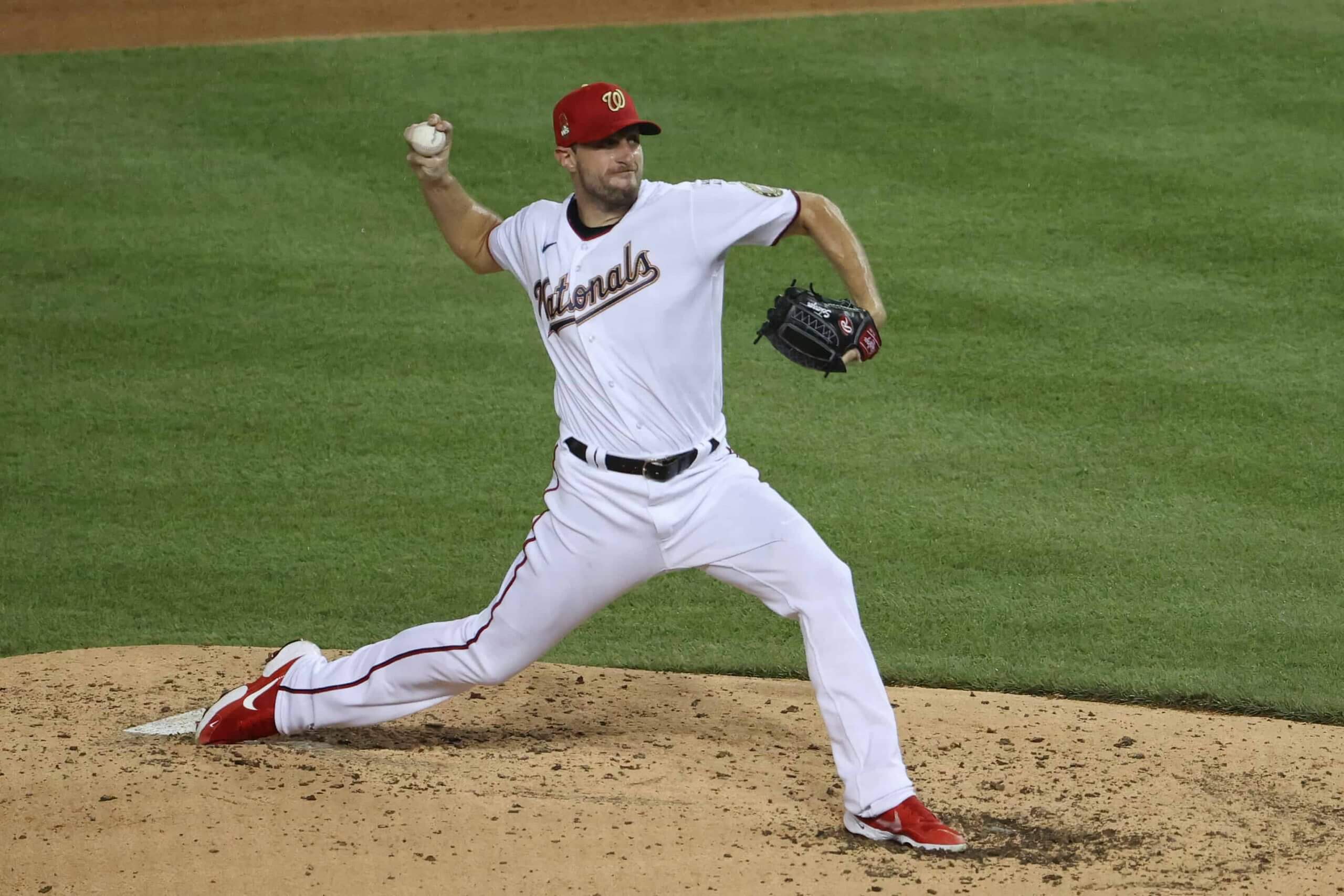
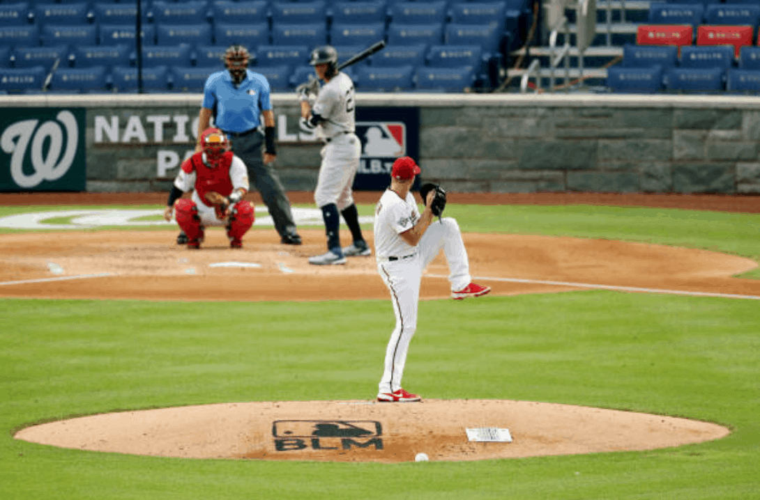
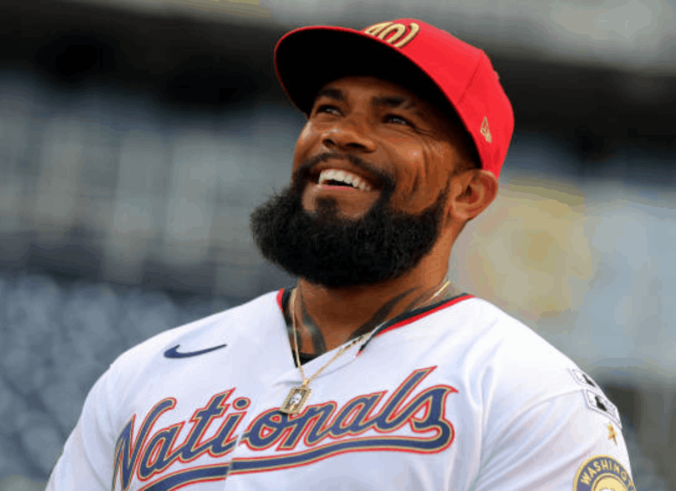
Play ball!: The MLB season finally began last night, as the Nationals hosted the Yankees. Per recent MLB custom, the Nats, as reigning World Series champs, wore gold-trimmed uniforms. The big surprise, at least to me, was that the jerseys didn’t have front numbers. The good thing about this is that the chest script wasn’t slanted quite so severely as on the team’s navy or white alternate jerseys. The bad thing is that the lack of the front number left the jerseys looking a bit empty and incomplete, at least to me.
The lack of the front number caught me by surprise, so I went back and looked at the entry I wrote two weeks ago about the gold-trimmed uniforms. Had I somehow missed the missing number? As it turns out, none of the earlier photos showed the lower part of the jersey, and I mistakenly assumed that it would be there.
In other news from Opening Day Night:
• Players wore Black Lives Matter T-shirts during pregame activities:
Showtime. #OpeningDay #NYYforNY @Giancarlo818 @TheJudge44 pic.twitter.com/pkQPmWWKJr
— New York Yankees (@Yankees) July 23, 2020
• Prior to the national anthem, all players on both teams kneeled while holding a very long piece of black fabric as a symbol of fighting injustice and supporting equality:
Today, and every day, we come together as brothers. As equals, all with the same goal – to level the playing field. To change the injustices. Equality is not just a word. It’s our right!
Today we stand as men from 25 nations on 6 continents.
Today, we are one. pic.twitter.com/vKUGdRfwgQ
— MLB (@MLB) July 23, 2020
The players then stood for the anthem.
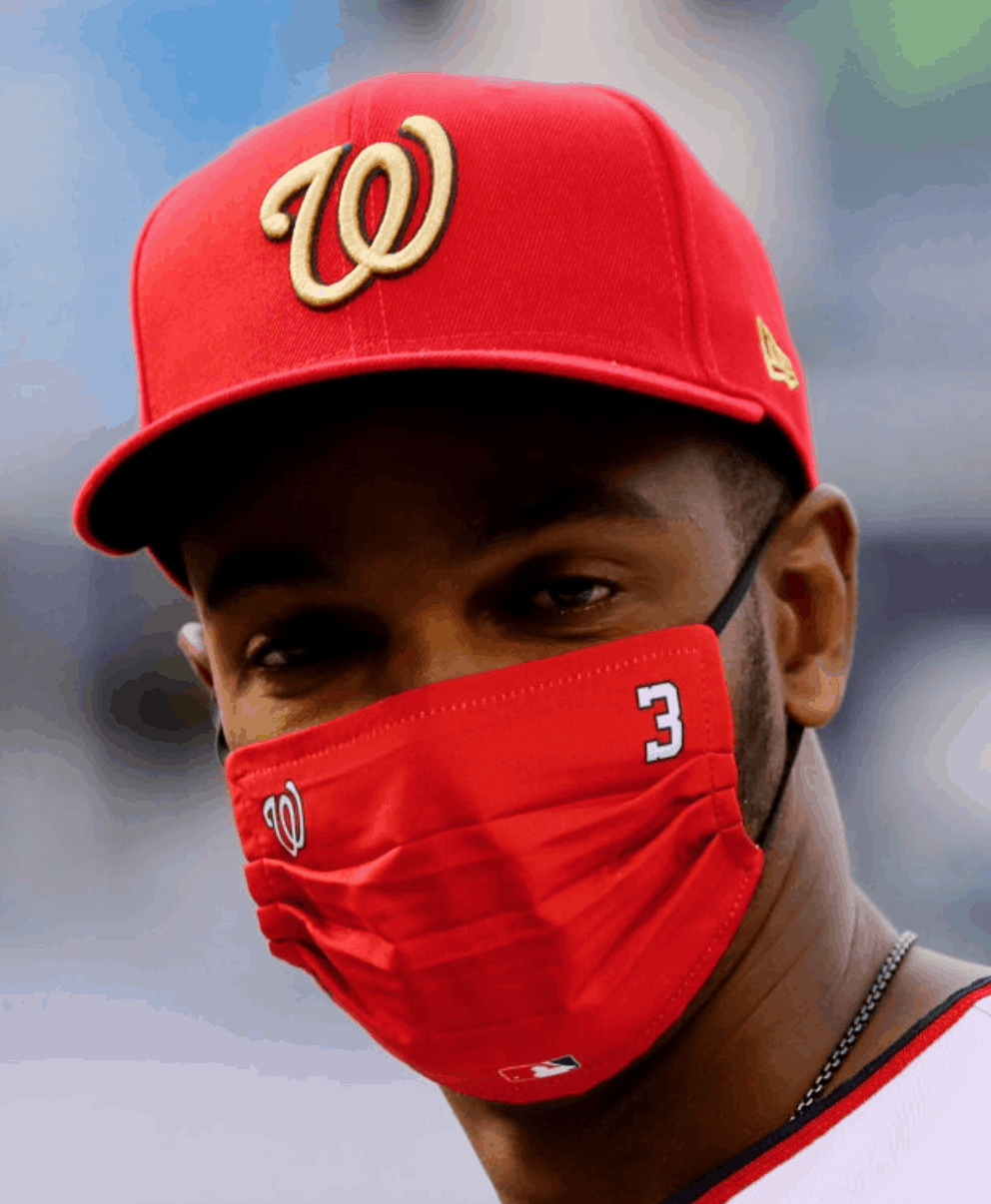
• Infectious disease specialist Dr. Anthony Fauci wore a Nats “World Champions” mask and gold-trimmed jersey and cap while throwing out the first pitch:
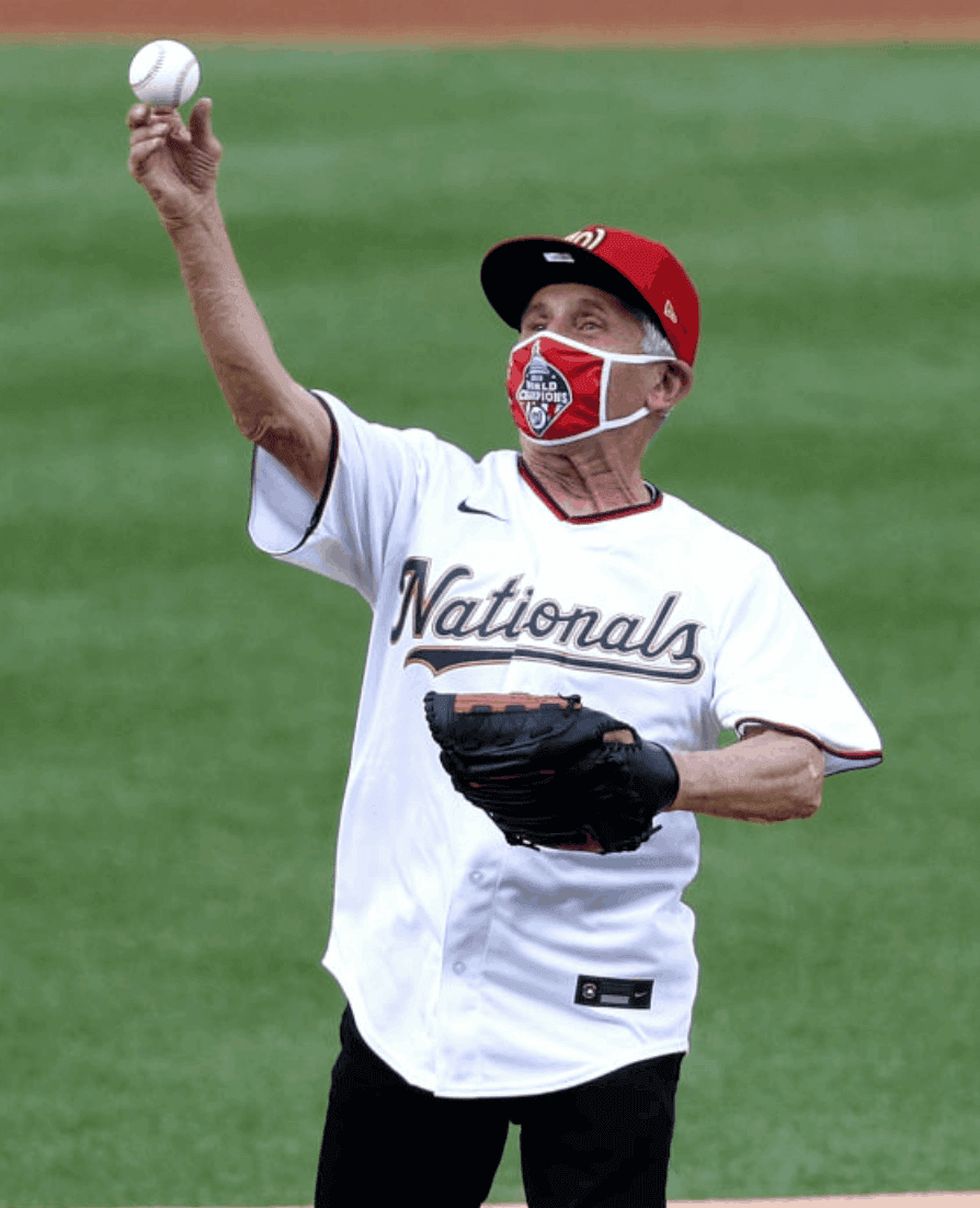
His pitch was terrible. The best joke I heard about this was that he doesn’t want anyone to catch anything.
• Many players wore masks. In what I believe is a new development, some of the masks included the MLB logo, which I don’t recall seeing in any of the summer camp games or scrimmages:
• As I mentioned in yesterday’s post, a Black Lives Matter/MLB logo was added to the back of the mound. No ad printed or projected on the mound alongside it (although there were garish ads outside of the baselines):
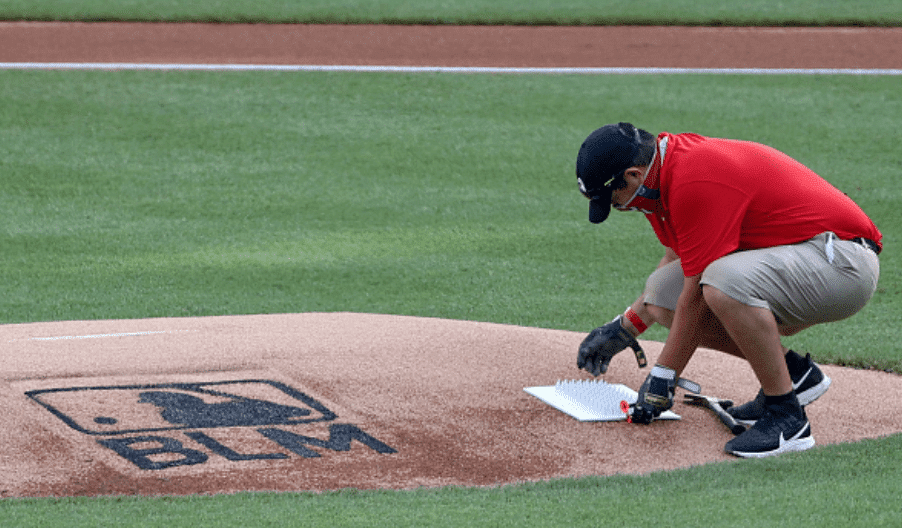
• In that last photo, you can see that the Nats have not gone with the faux-fan cardboard cutouts. I just assumed that was going to be a universal thing. Interesting to see that it’s not.
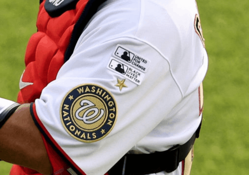
• As mentioned in yesterday’s post, MLB made the last-minute decision to allow players to add either “Black Lives Matter” or “United for Change” sleeve patches. Many players wore both:
• Nats first baseman Eric Thames likes his sleeves tailored a bit short, which had the effect of pushing his social justice patches up onto his shoulder:
Later on, I noticed that both of those patches were missing from his jersey (sorry, no photo). Which leads us to…
• Yankees catcher Gary Sanchez had two social justice patches, then one, then two:
@UniWatch Gary Sanchez with one United For Change or BLM patch in 2nd inning. Has both on for 4th – jersey change or patch added?!? pic.twitter.com/MvPdyzQBGs
— Thom Griffin (@Thom_Griffin) July 24, 2020
All of this suggests that the social justice patches were applied with adhesive, not sewn on. Now, maybe that’s because it was a last-minute thing and they didn’t have time to apply them properly. Remains to be seen if they’ll sew them on for the rest of the season, or if they’re just half-assing it. If the latter, expect players to stop wearing them, because who’s going to bother with a patch that just falls off?
• The Yankees also debuted their new memorial patch for owner Hank Steinbrenner:
• Plate ump Angel Hernandez wore a camouflage mask. In addition, he wore a carabiner on his belt loop with a little bottle of what I assume to be hand sanitizer. This photo also shows his “EC” and “CM” memorial patches for former umps Eric Cooper and Chuck Meriweather, who both died last October. Although it’s not visible in this shot, the umps also had an “RR” patch for former ump Rick Reed, who died last week:
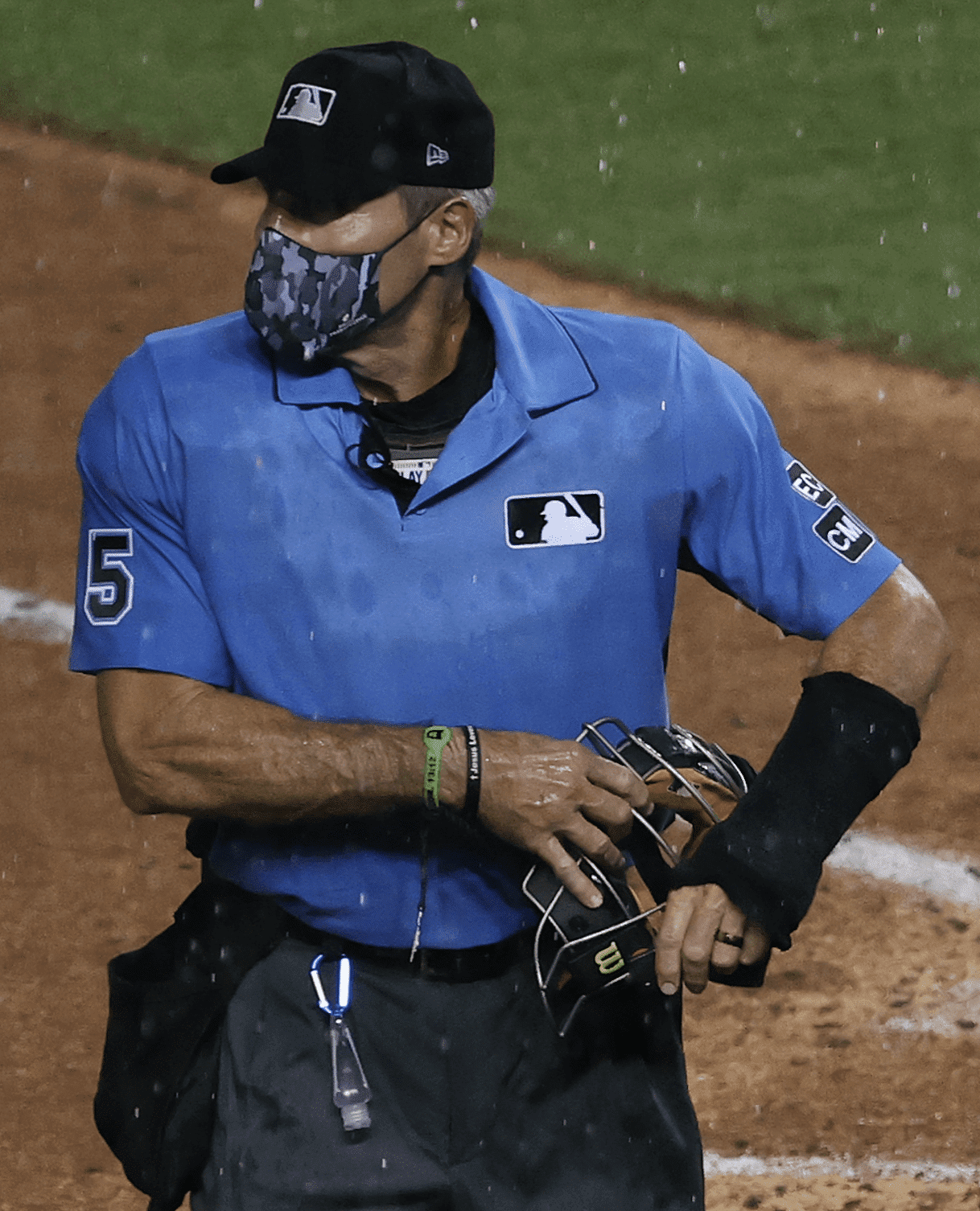
(Yes, we all know Hernandez is a bad umpire. Let’s please skip the gratuitous potshots at him. Thanks.)
• The Nike maker’s marks looked like shit. But you knew that already.
———
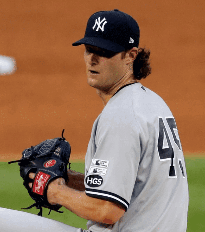
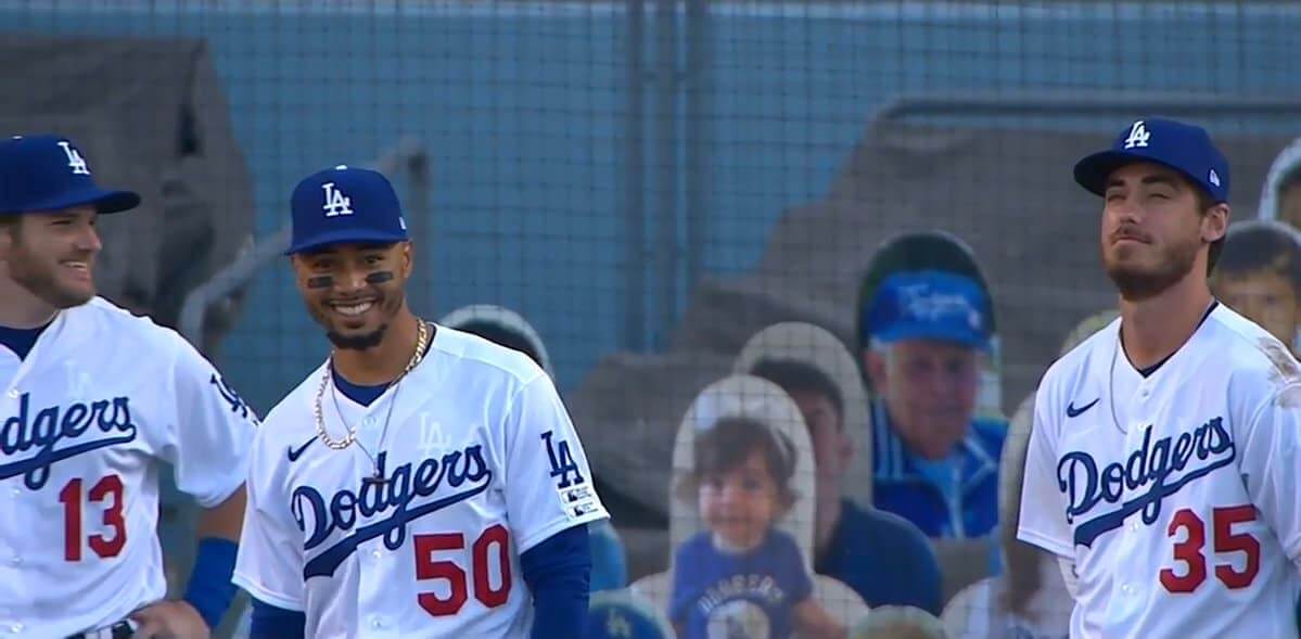
Meanwhile, out in L.A., the Dodgers hosted the Giants. Most of the trappings were the same as for the Yanks/Nats game: the Black Lives Matter T-shirts and mound graphic, the ads outside the baselines, the masks, the social justice patches, the players kneeling with the long strip of fabric prior to the anthem, and so on.
One difference, however, was that some players remained kneeling during the anthem, as you can see in this video clip:
Of all the national anthems I have ever heard…. pic.twitter.com/RA55W2pIgj
— Matt Jones (@KySportsRadio) July 24, 2020
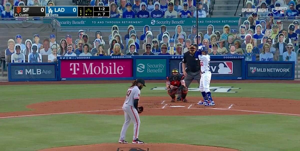
Another difference: The Dodgers have gone all in on the cardboard cutouts. Here’s a standard broadcast shot, followed by a photo that gives a sense of how many of cutouts were deployed:
Other notes from this game:
• Dodgers reliever Adam Kolarek wore the team’s spring/BP cap, instead of a game cap, while pitching the seventh inning:
Hey @UniWatch &@PhilHecken, did y’all catch the #Dodgers Adam Kolarek wearing the BP cap in the season opener against the #SFGiants Giants? #OpeningDay pic.twitter.com/9KeFCL2UYg
— Jeffrey Seals (@theUNLVBigGuy) July 24, 2020
• As you can see in those screen shots of Kolarek, the white graphics on the Dodgers’ blue base-layer shirts were plainly visible through their jerseys. They all had an “LA” logo showing through on the upper chest and a particularly annoying double-swoosh effect:
• As expected, the Dodgers did not wear their All-Star Game patches. A few players had been wearing them during summer camp, but they’ve all been removed now.
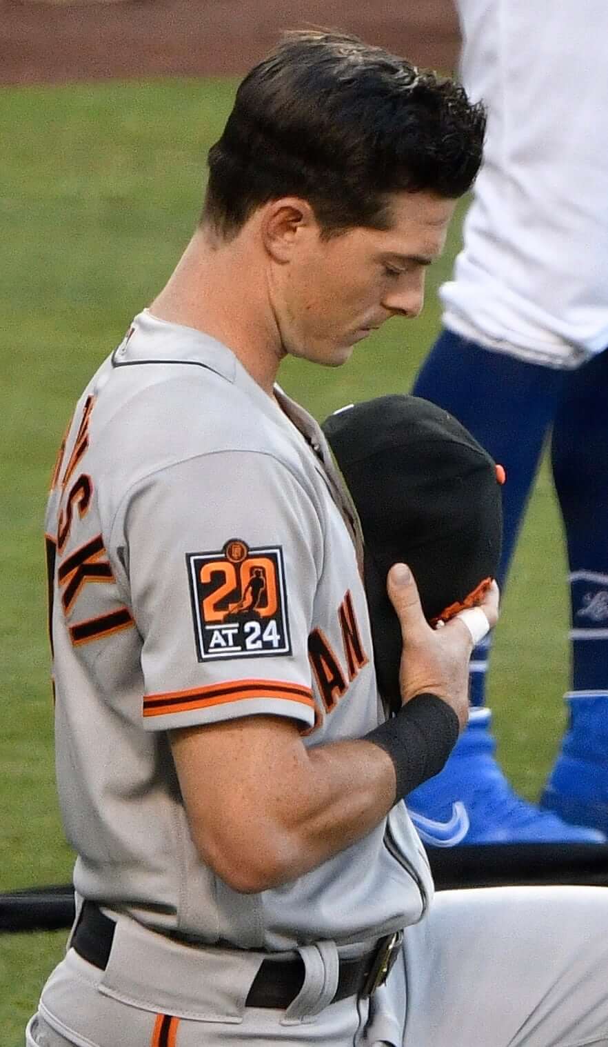
• The Giants debuted the new 20th-anniversary patch for their ballpark. I always think it’s weird for a team to wear something like this on the road uniforms. What’s the point of celebrating your building when you’re in someone else’s building?
• Giants coach Alyssa Nakken became the first woman in uniform for a big league team in regular season game. Although she coached first base for a few of the team’s preseason games, she didn’t do so last night, but she was in the dugout. Here’s hoping she gets some time in the first base coaching box, because she appears to have excellent taste in high-cuffery and striped hosiery:
• The Nike maker’s marks looked like shit, but you knew that already.
———
And there we are. In a non-uni note, Opening Day always means hot dogs here at Uni Watch HQ, even if it takes place in July. Mustard, mayo, and jalapeños for the Tugboat Captain, and mustard, capers, and toasted panko breadcrumbs for me:

Mmmmm — tastes like baseball.
(My thanks to Jakob Fox for spotting Eric Thames’s shoulder-positioned patches, to the Tugboat Captain for figuring out that Angel Hernandez’s little bottle must have been hand sanitizer, and to the many readers who flagged Adam Kolarek’s cap after I’d gone to bed.)
ITEM! Upcoming panel discussion: Back in 2016, I participated in a panel discussion about the the sports world’s use of Native American imagery (you can see video of that event here). Now Baruch College, which sponsored that event, has invited me back for a follow-up discussion on the same topic.
The new event, called “Native American Imagery in Sports: Is this a Whole New Ball Game?,” will take place via Zoom on Aug. 12, from 12:30-2pm Eastern. Registration is free and can be done here. I hope you’ll check it out.

Click to enlarge
LAST CALL for the cycling jerseys: Today is the final day to get in on our new line of Tour de France-inspired Uni Watch cycling jerseys: yellow (for the overall leader), green (Points Classification leader), and polka dot (King of the Mountains).
Each jersey can be customized with your choice of number (there’s a bib-style panel on the back for that) and/or NOB — or you can skip those elements and leave the back blank. Up to you!
You must place your order by today, which should allow us to get the finished jerseys to you by Aug. 29 — the first day of the Tour de France.
Full details, including rear views, a sizing chart, and more, here.
The @UniWatch Pin Club just went next level. If this isn’t the coolest pin I’ve ever seen I can’t recall what would top it. #GetsIt pic.twitter.com/0Zt3NimlP3
— Brett Baker (@BrettSBaker) July 16, 2020
Bobble-pin update: As of this morning, there are fewer than 90 bobble-pins remaining from our numbered edition of 500. They’re available here while supplies last.
Need to get caught up? Here are the January, February, March, May, and June pins (sorry, April is sold out), along with our basic winged stirrup pin.
And remember, if you order multiple pins and/or Uni Watch cufflinks and get hit with multiple shipping charges, give me a shout and I can get you a partial refund on the shipping.
My thanks, as always, for your consideration.
The Ticker
By Anthony Emerson

Baseball News: Yankees P Masahiro Tanaka, who took a scary liner off the head during an intrasquad game, will wear a protective insert in his cap for at least the rest of this season. … White Sox CF Luis Robert lost his glove over the fence trying to rob a home run on Wednesday night. The look on his face after he loses his glove is priceless (from Mike Chamernik). … Speaking of the South Siders, it appears they have a new helmet number font. It looks similar to McAuliffe — i.e., the Red Sox uni number font (from Thomas Juettner). … More Pale Hose: One White Sox fan bought 100 cardboard cutouts of himself at New Comiskey (from Mike Chamernik). … Odd site last night, as ESPN was advertising the same Brewers/Cubs game with the Brewers’ new logo on the backdrop and their old logo on the bottom line (from multiple readers). … In addition to adding fake crowd noise to its MLB broadcasts, Fox Sports will be adding virtual fans (from @KevPKing and Kary Klismet). … Spotted on eBay: a Mary Tyler Moore Enterprises production crew softball jersey, featuring MTM’s familiar kitty cat logo on the chest!

Football News: No link, but during the Packers’ annual shareholders meeting — held online, for obvious reasons — it was announced that the team will have a memorial helmet decal for Willie Davis (from Janet Davis). … A Texas A&M blog has listed the 32 best college football stadiums in Texas. And here’s a shocker: Kyle Field is No. 1 (from Kary Klismet).

Hockey News: New mask for Canucks G Thatcher Demko (from Wade Heidt). … How many Whalers fans became Bruins fans after the former relocated to Raleigh? I suppose they can identify each other with this bumper sticker (spotted by @MattyRen).

Hoops News: This steakhouse in Belgrade, Serbia appears to be run by big Bulls fans (spotted by Ayden Pierce Maher). … In a reply, @messiahthadon sent along a similar Bulls/steakhouse connection they found in Dubrovnik, Croatia. … Faculty with the University of Kentucky’s African-American Studies and Africana Studies departments want the university to change the name of Rupp Arena. Longtime Kentucky coach Adolph Rupp did not sign his first Black player until 1969, three years before his retirement (from Patrick O’Neil and Mike Chamernik).

Soccer News: Odd story out of England’s second tier: Birmingham City just sold wunderkind Jude Bellingham to German giants Borussia Dortmund, and have announced that they will retire his No. 22. This is odd for a handful of reasons: Number retirements are rare in European soccer (but not completely unheard of), Bellingham has just completed his first professional season, is obviously still an active player and is only 17 years old. “This surely makes him a strong candidate for the youngest person to have his number retired by a professional team,” says our own Jamie Rathjen (Ron Allen also sent along this link, as well as his astonishment). … Also from Jamie: Scottish Premiership side Hamilton Academical have unveiled their new kits, as well as a new primary kit advertiser. … Arsenal has unveiled their home kit. … This next batch is all from Josh Hinton: Newcastle United have unveiled their new home kit. … Leicester City unveiled their new home kit yesterday, with a new primary ad. King Power, the travel company owned by Leicester City’s owners, donated the ad space to Thailand’s tourism agency to help the nation’s tourism industry recover from the pandemic. … EFL Championship club Millwall FC has unveiled their new home kit. … Newly promoted Premier League side West Bromwich Albion have unveiled their new home shirts. Dispensing with the traditional stripes is a bold move. … Newly promoted Bundesliga side Arminia Bielefeld have had their new kits leaked. … Mexican side Tigres have unveiled their new kits. … So have Mexican side Pumas. … Turkish giants Galatasaray have had their new home shirts leaked. … Bayern Munich’s new away kit has leaked. … You can catch the rest of Josh’s contributions on his Twitter account. … And now a few from Kary Klismet: Rangers FC have slightly tweaked their logo — not their crest, which is the intertwined RFC monogram. … TheScore.com has listed what they consider to be the best and worst European kits for the 2020-21 season. I actually really like those Manchester City and Inter Milan kits they have listed under “the bad” and “the ugly”. … Columbus Crew have unveiled new renderings of their proposed stadium (also from Wade Heidt). … Hertha Berlin will have a new primary kit advertiser (from Ed Żelaski). … Also from Ed: Dinamo Zagreb has unveiled their new home kits.

Grab Bag: The Women’s British Open is dropping “British” from its name, so now it’s just the Women’s Open (thanks, Jamie). … Roncalli High in Indianapolis will ditch its “Rebels” team name (from Kary Klismet). … The Busy Beaver Button Museum in Chicago is closed during the pandemic, but they’ve put thousands of their buttons online. “Worth an infinite scroll,” says Mike Chamernik. … Robert E. Lee High in Fairfax County, Va., will change its name to John R. Lewis High in honor of the late civil rights hero.

Click to enlarge

What Paul did last night: A fairly abbreviated porch session last night. We got a late start because the Tugboat Captain was busy with a Zoom call, and then we couldn’t stay on the porch very long because we had to go inside to cook hot dogs and watch baseball.
Just as we were getting set to go back inside, our friend Virginia came by. We hadn’t seen her in a bit and it would’ve been nice to chat, but instead I had to say, “I’m really sorry to be rude, but we can’t stick around out here because we have to go in and watch baseball!” Virginia understood (she’s a baseball fan too, but she doesn’t care about any of the teams that were playing last night), but I still felt like a bit of a dick.
As always, you can see the full set of daily Pandemic Porch Cocktails™ photos here.
People, I don’t mind telling you that I worked really hard yesterday. Between the NHL, NFL, and MLB, I basically wrote three ledes on the fly. Posts like today’s don’t write themselves, and our ad revenue’s been in the toilet for months now due to the pandemic, so I don’t feel bad saying this: If you haven’t done so already and you have the means, please consider purchasing some merchandise, ordering a membership card, or making a donation. Thanks, and have a great weekend. Let’s Go Mets! — Paul
THe NHL has a strong culture of “group think”, so when the Kracken’s GM uniforms instructions were:
“We needed a mark that was noble and (Seattle GM) Ron Francis was someone who kept hitting that home,” Corbett told the AP. “It has to be noble, it has to be strong.”
The chances of a unique color being the primary uniform color went out the window (and into the sea)
I’m betting there will be either a red or Light Blue 3rd Jersey at some point.
Great post today Paul. I think it’s disappointing that Washington removed the stripe from the helmet. I wonder if they removed it b/c it might look cluttered with the numbers on the helmet? That doesn’t make sense to me but either way, that’s an aesthetic loss.
That was my first reaction. Since the numbers are made up of a series of lines, they would interact with the helmet stripes in a different way than a logo does.
Especially since Washington had link on their helmets.
I think the Washington football team, if they are going ‘nameless’ for 2020, and helmet stripe less, should go with their darker burgundy throwbacks. They were simple, slightly different and I think would work better with the TV number on helmet look. My $.02.
My wife and I got married in Croatia, and spent a few days in Dubrovnik. I walked by that Bulls restaurant every morning on my way to get coffee and breakfast. On the last day we were there, when I walked by there was a server setting up stuff outside, and I went up and asked “hey man what’s up with the Bulls logo? Is the owner a big fan?” The guy gave me a look like I was an idiot and just said “Toni Kukoč”.
Here are the pictures I took of it-
link
Paul’s Seattle name and uniform review was the exact opposite of the many I’ve read online. The vast majority love the sweater and hate the name.
The first thing that popped into my head when I saw the Kraken primary mark was the Chicago White Sox. Not bad looking, but it seems to be a bit derivative.
That’s what my sister said. I didn’t really think about it until she mentioned it.
One of the cardboard cutouts of Dodgers fans in Dodger Stadium is of comedian Brody Stevens. He died by suicide about a year ago. Aesthetically, I find that anachronism weird and sad.
Compare and contrast a cutout of Dallas Stars player Tyler Seguin in full uniform and equipment at the Texas Rangers ballpark. That’s cartoonishly stupid.
Agree about the green – missed opportunity for city color unity. Also agree that they missed out on logo possibilities with just the single tentacle in silhoutte. A stylized kraken taking down a sailing ship would be great.
They decided to not use green because the Canucks use it.
As part of their pitch, they called their brand “evolving,” which seemed to indicate that some day they might depict the kraken more complety.
The use of red is inspired by local ferry striping.
link
My bad – looks like it is the striping inspired by local ferries – not use of red.
The team said that using an “S” as a primary logo is their homage to the old Metropolitans.
Not only are blue and green the colors of the Canucks, they are the colors of the WHL Thunderbirds.
The Kraken colors match those of the Seattle Mariners.
Washington changed it’s font as well.
They had a great and unique font, shame they changed it up. Fairly generic Nike now.
Nice and pointy! (ughh!)
While they were at it, why didn’t they just tape “Kick Me Hard” signs to the players’ backs?
“He Kick Me”
I suspect that a green third jersey is inevitable for the kraken.
I’m actually happy that they didn’t go with some cartoony sea creature logo. We’ve gone through that in other sports as well as hockey and we certainly don’t need another Raptors-like eyesore.
Agreed. I don’t love the name Kraken, but a cartoony logo would have made a “meh” name even worse.
The “S” is a good, subtle logo. The front of a hockey uniform doesn’t need to look like a comic book.
Did anyone else get a feeling of deja vu seeing those Nationals uniforms with the gold outline? For some reason, I immediately thought of the Astros uniform set just before their current set, like this: link. It reminded me a lot of the ones with black lettering at first sight live… maybe not as much now that I go back and look.
Agree that it is unfortunate we have another navy team out there. If you swap out the navy for a dark green, like uni-watch green, it looks great. And green with teal would be a very unique color combo that would be their own.
I don’t think I’d call the accent colors blue though, they definitely seem to fall into the teal category. And that “lighter” shade, which is the bigger stripes and presumably is the secondary color, is actually ever so slightly more green than blue on the RGB scale according to MS Paint.
As someone who really dislikes the name Kraken, feeling gimmicky and simply used so they can say “release the kraken”, the logos and uniform are good, if unspectacular. Given the name and state of uniforms and logo design today, I think it could have gone A LOT worse, so this is a win.
TNFL’s WFT needs stripes on its helmets.
And yellow pants!!
I agree 100%. Why did WASH remove the helmet stripes? Also, why not just stick a gold “W” on the shell instead of a number? Always preferred the gold pants to white as well.
The NFL never takes my advice: So I exercise my right to call them the “Pathfinders”. Take that!
“…we suddenly have two NFL teams with TV numbers on their helmets…. When’s the last time that was the case?”
2009?
link
Oooh, good one. But come on, throwbacks don’t count!
If you count the AFL in there pre-merger you had 1960, with the Browns and Steelers (NFL), Chargers, Bills, Patriots, and Broncos (AFL). In 1961 you had the the Steelers, Chargers, Bills, and Broncos. After that I think you just had the Chargers through 1973. Per Gridiron Database.
Question—what is the plural form of Kraken? I’m thinking it’s still Kraken, which would make Seattle Kraken a plural team name.
Yes, I think that’s been the idea all along. A bunch of kraken, like a bunch of squid (or deer, or fish, or whatever).
Fans will be Krak Heads…
Or better: what to you call a group of krakens? (Like, a “murder” of crows of a “pride” of lions?)
A rink!
I laughed out loud at this! Thanks, Paul! :-)
A little googling on the subject makes it seem like there has never been a clear consensus on whether the plural of kraken is kraken or krakens. Their hands weren’t tied and they could have gone with krakens if they wanted to, is what I’m saying. I wish they had just to eliminate any possibility of suggesting the name refers to the team being one singular kraken.
Thanks all for the replies. I think Paul should just simply deem that Kraken is now the official plural form of kraken.
The kraken is a mythical sea monster. Isn’t there just 1 kraken?
That’s what they assumed in Jaws. That didn’t turn out well.
Would now be a good time to mention that the “-en” at the end of “kraken” is the definite article in Norwegian (so gutt “boy”, gutten “the boy”), so saying “the kraken” is like saying “the the krake“?
Thanks, Paul, for a great column today. It was a big uniform day and you came through in the clutch!
I respect Paul’s opinion but I really like the primary logo for the Kraken. It’s clever to hide the giant squid (which, after all, is mythical) in the logo. I am more a fan of simpler logos (two of my favorites are the Atlanta Flames and the Michigan Stags), and this fits that bill. Working in the tower into the anchor logo was also a nice touch.
I agree here. The subtle implication of the tentacle and eye lends itself to the mythical part of the Kraken name. They loom within the logo, but are they real? Are they just imaginary? The threat feels real either way. It’s better to keep it foreboding than to end up with some knock-off of Detroit’s cartoony octopus.
Less is definitely more in this case.
I agree with both of you on the subtle/subdued use of the shadowy tentacle to represent the mythical quality of the Kraken. Too much of a straightforward visual representation of the Kraken could have ruined it, kind of like the aliens at the end of the movie Signs.
Really gotta admire their restraint.
That name could have been a dumpster fire, but they leaned into the best part of it and created a top-of-the-list set.
Backstory from the Kraken website is that a Kraken is an Octopus, not a squid.
“What’s the point of celebrating your building when you’re in someone else’s building?”
What’s the point of celebrating a building at all, especially when the Texas Rangers already moved on from the one they built in 1994 (!!!)?
Paul, are you going to acknowledge that you were wrong on sports coming back this year? You were so adamant that they weren’t, and I know you like to hold yourself accountable. So this would be a great time to at least admit that you probably jumped the gun on this one. Thank you. Great column, as always
Actually, Tubby, I never said sports wouldn’t come back. I said I didn’t miss sports.
If you’re going to try to play gotcha, maybe at least get your facts straight.
“I’ve never covered a story as fast-moving over an extended period as this one. Like, literally every 15 mins or so it becomes more and more apparent that there will not be sports this summer or fall.“
Your own words. Not mine. I have my facts. I would just like a little accountability. Nothing more.
Oh. Well, there you go — I stand corrected! Thanks for finding that and setting me straight. My apologies for my previous comment.
I was wrong.
Congratulations, Tubby! You win the Internet Fact Patrol for the day! Way to be a total jag about it.
Seems a bit premature to try to take a victory lap about that because 2 MLB games were played, Tubby.
Actually, sports began a few weeks earlier.
NASCAR, IndyCar, Soccer, Golf.
Mayo, mustard and jalapenos is the exact combo I use on hot dogs. I never expected to find a Frankfurter Soulmate!
Mustard and jalapeños for me, with no mayo.
Mayo on a hot dog. Hmmm… I love mayo, but can’ say I’ve ever tried on a dog. I like the idea of combining it with mustard and jalapenos. Better that ketchup for sure (even though my son loves ketchup on a hot dog). Dirty Harry would be appalled.
Mayo on a hot dog? Lord help us!
So will the Seattle NHL fan base be known as the Krak-heads and their arena will be referred to as the Krak-house?
As a Canadian who no longer has to deal the confusion between the Ottawa Rough Riders and Saskatchewan Roughriders… Now I have confusion between the Washington Football Team and the Edmonton Football Team. #PuntingTeamNamesIsConfusing
Return the job of naming the team to local sportswriters. I guarantee the results will be unusual but distinct; “Suberbas” and “Tip Tops”, anyone?
KJR 950, one the sports radio stations in Seattle, did a great interview with Kraken president Tod Leiweke about the team identity. Re: the name, he said they went with the fan buzz, and it’s true. Folks around here have been saying “release the Kraken” since the team was awarded (thanks in no small part to Sparky Chewbarky’s creativity). Leiweke said when they arrived at the team’s new offices they found a sticky note on the door that said “release the Kraken.”
Leiweke also detailed the logistics around an unveiling and cited the Rams as a cautionary tale for what can happen when “someone at New Era leaks a picture.” Really interesting and thought of you and my fellow Uni-Watch geeks the whole time.
Here’s a link to the podcast page: link
I find it so odd how much support for the team name seems to be based around the “release the kraken” line. I picture a future version of uni-watch 100 years from now, discussing the origins of such a strange name, and mentioning how a silly line from a bad movie that came out 10 years before the franchise was founded, was the driving force behind the name.
“Well, we settled on Kraken because the fans really wanted to say ‘Release the Kraken’ before the start of every game.”
I’ll be honest: Although I know people have been saying “Release the Kraken” in relation to the potential team name for well over a year (two years?), I didn’t know it was a line from a movie until yesterday. I just thought it was a catchy phrase that had caught on.
Was the line in the 1981 movie?
(Also, urgh, I hate having to use the desktop site to post a comment on my phone. Is the mobile version of the site gone for good?)
Soon.
Yes, and said by Sir Lawerence Olivier, no less.
In one of his finest performances.
“I am Zeus. It is my will.”
Ed, thank you! It’s been a few years since I’ve seen it. Loved that film and its Harryhausen stop-motion effects as a kid (but especially Bubo!).
Ugh. Bubo was the Jar Jar Binks of the ’80s.
Anyone know who first proposed Kraken for the team name? I remember seeing Sparky’s concepts but wasn’t sure if he first came up with the idea.
I did get a screenshot of the Kraken uniform elements.
link
Ah, excellent. Thanks!
Augh! My pet peeve! No stripes on the pants!
Ordinarily, I would agree with you. But in this case, I think it works.
There’s link, and there isn’t much distance between the hem stripes and those huge sock stripes to fill. So stripes down the side would look wrong and stripes across the hem would be too cluttered.
Courtesy of the Creamerboards, link
Personally, I love it. Always looks striking when teams can avoid any white on their dark-colored uniform.
Paul, why the gratuitous shot at Angel Hernandez? I know you are better than that! Maybe you should walk a mile in his shoes before making such a flippant comment?
Actually, Ted, I was trying to *stop* people from taking gratuitous shots at Angel Hernandez. I know from past experience that any mention of his name turns into a lame and predictable piling on, so I tried to pre-empt that. And I don’t think I was “flippant” at all. Maybe go back and re-read what I wrote?
Don’t want to get into a battle here (because you will always have the last word) but the concern I have is with the comment “[y]es, we all know that … is a bad umpire…”
That’s your opinion which you are entitled to, it’s your blog after all, but what does such a comment have to do with a blog focusing on uniforms?
Editorially, you chose to use a photo of Angel Hernandez, when you had the choice of using photographs of many other umpires working yesterday. That choice led right into the comment I objected to, when it could have been avoided altogether.
I appreciate you giving me the opportunity to reply. Friendly debate is always good.
1) I chose that photo because (a) he wore the hand sanitizer, which I didn’t see anyone else wearing; (b) he wore the camouflage mask, which I didn’t see anyone else wearing; and (c) it provided the best view I could find of the umps’ new memorial patches.
2) Stating that Hernandez is a bad umpire is neither “flippant” nor a “gratuitous potshot.” It’s acknowledging a reality that most of us have seen with our own eyes. He misses calls (which are often reversed), he seeks and escalates confrontations, etc. That doesn’t make him a bad person — some umpires are better than others, just like some people are better at their jobs than others in every profession. That’s life.
Does that have anything to do with uniforms? No, it doesn’t. But as I already explained, I know from past experience that any mention of his name will nonetheless prompt a bunch of lame and predictable piling on from readers. I dislike that, so I stated the obvious and got it out of the way so we could move on.
But you didn’t want to move on.
I’d say that Joe West gives Angel Hernandez a run for the money when it comes to bad umpiring.
Angel hernandez consistently grades as one of the worst umpires in baseball. That’s not an opinion, that’s a computer measuring how many calls he gets right compared to everyone else.
Its not just Paul and posters opinion
1999 Hernández was ranked 31st out of 36 in the Major League Baseball Players Association survey.[4] He was retained for the 2000 season ahead of 13 of his National League colleagues, which the Philadelphia Inquirer termed one of the “surprises” of the 1999 purge.[5] In 2006 and 2011 he was listed as the third-worst umpire in Sports Illustrated polls[6][7] and a 2010 ESPN survey showed that 22% of major league ballplayers asked identified Hernández as the worst umpire in the major leagues
I know you prefer to avoid political discussion here Paul, and I promise I’m not intending to start any kind of debate here but I do want to make this observation: taking stock of which MLB players choose to wear the “Black Lives Matter” patch (in addition to the “United For Change” one) and which decline to is probably the most clearcut uni-related indication there’s ever been of where a player stands on the political spectrum.
Or it shows the players who do not want to mix their politics with work.
I agree with John. Wearing or not wearing a patch is not necessarily a litmus test on one’s beliefs — only on *publicly expressing* those beliefs in the workplace.
“You must wear the ribbon!”
Nice Seinfeld reference.
Besides everything else happening yesterday, it was probably also the biggest day for soccer releases so far this summer (more of the same today, apparently), so Anthony did a good job with those. A perfect uni-storm…
Thoughts on those Spurs unis Jamie? I’m so disappointed in them. Total step backwards. It’s a real shame the team was so up and down this year, because it’s the best they’ve looked since they switched to Nike.
I guess I’m not that opposed to shoulder stripes, but I liked this season’s shirt better than that one. It seems forced, like they felt like they had to come up with something different.
I like the shade of green in the second shirt, but dark-colored shirts never seem to end up being worn that often. I think sticking to yellow or light blue like this season’s third shirt would work better.
So Seattle should have a Kraken lurking “under the ice” in their rink. That would be coool, eh?
Not very well thought out. How long do you think it will be before the team’s arena will be known as the “Krakhouse” and their fans as “Krakheads?”
When Ifirst saw the logo I thought that the Kraken’s S looked more like a seahorse than anything squid related. Of course, the image I was looking at was fairly small in the article I was reading.
The closeup Paul included does show the tentacle motif much clearer, but I am afraid I am always going to see a seahorse.
And what’s wrong with a Seahorse? One of the best unused mascots in sports. Catchy name, evocative silhouette. A part of me always wished the Mariners would put one on their sleeve.
Amen to that.
The Norfolk Tides have link.
“Might be nice if they’d bothered to remove the old logo from the Jumbotron and a fan’s pennant, eh? Again, sloppy work.”
Also, that clearly is an old photo of FedEx field. Tip offs are the dated Bud Light logo & the fan in an old Jaguars jersey. A quick Googling of Redskins vs. Jags match-ups (not a common game) and cross-checking of uniforms in this video (link) places it in 2006!
If you’re trying to accurately display how your field will look this season, why alter such an old photo?
Someone on Twitter claimed to have figured out that it was from 2006! Strange choice indeed.
They show 4 shades of blue in the color chart, but for the life of me I only see 3 in the logos and uniform. Not sure where they have “boundless blue”, which is what they lamely call the color shown below the navy blue? I also agree that green accent in place of the red would have been better. Even “firefly”, but I’m sure they would have been criticized for copying the Seahawks.
The ice blue reads as white until it is actually placed next to white.
Icethetics link – the “boundless blue” is used for link.
Paul, how rude of you last night. We haven’t seen each other in months and you can’t even chat for five minutes?? And for baseball??? Consider me an ex-friend, dbag.
I just laughed out loud at this comment. Hysterical.
LOVE the championship star over the Nationals logo. It’s a football (soccer) thing. I hope they keep it and start a new tradition
I was thinking the same thing. I wonder if they will keep it or if it’s just for this season.
As someone else mentioned, it’s assumed there will be a strong rivalry with the Canucks, so having a blue and green uniform wasn’t something they would likely do. I do think it’s notable that this uniform has so many shades of blue. We often talk about double blue, or double green, but quadruple blue is really notable. I love it.
I’m also getting a very slight Whalers influence showing, with the nautical theme, negative space logo, bold letter. Probably not intentional but maybe they knew there was a lot of appeal for that uniform. I will say, amongst the many element of this uniform I like, the use of what I consider to be the right kind of logo. I think the best logos tend to have a strong and definable outer shape, not too busy and not too simple with elements that contribute to and overall feel or mood.
I think they really put their work into this design, unlike say the Rams or Falcons recent releases. I sounds like e people at the top really wanted to get this right, which might be the single most important factor in a good design.
Hey Paul, did you happen to notice Buster Olney catching himself on your prediction about Gerrit Cole? “As he makes his … Road Uniform debut”
I sure did!
I’m not sure I’ve ever so strongly disagreed with a Uni-Watch take on a team’s new uniform!
– I’m pretty meh on the name. It’s largely derived from internet meme culture from the 2000’s and already feels dated. However, I certainly concede that history may prove me wrong. There are plenty of weird/goofy names that sound perfectly… right today.
– With a name as goofy as “Kraken”, there were a lot of ways the overall design could have gone off the rails. Instead, they chose a logo set and jersey design that already looks like a modern classic. It’s understated and quite lovely. In particular, I love the choice to not actually picture the Kraken. Just like the mythical beast, it’s lurking beneath the surface. How corny would a cartoon giant squid have looked? A name like “Kraken” with a cartoon squid would have SCREAMED minor leagues. They took a minor league name and gave it a major league identity.
– I can’t say enough good things about the primary logo. Hockey is heavy on letter logos, which I’ve always liked, and many of which are top tier logos. Just off the top of my head, you have Flyers, Canadiens, Bruins, Flames, Canucks, Stars, Devils, and Avalanche. I’d say the Kraken immediately move to somewhere near the top of that list. It’s an instant classic.
– Even though green is my favorite color, they were kinda stuck there. The green/blue color scheme is difficult to pull off given that the Canucks are right next door. Not to mention it would have invited Whalers comparisons. The double or triple blue with bold red accent colors is a look that’s all their own, and a nice one to boot.
I went from rolling my eyes at the name to really looking forward to the team taking the ice after the identity was unveiled.
I’m 100% with you here. I was hoping for pretty much anything other than “Kraken” as the team name, but the colors/crest/sweaters all work very well for me. Can’t wait to see these in action.
Also, kudos to the NHL Seattle team on keeping this under wraps. No leaks in this day and age is quite an accomplishment.
Picking a team name is a fraught exercise anyway, and it has only become more so, now that the vetting process can reveal a heretofore unseen history of racism, or unsavory behavior. I’d like to name a team after the fastest land animal, a beautiful spotted cat from Africa. Only, that cat is known as a Cheetah, and I don’t want people to call my team a bunch of cheaters. A group of Sanskrit (or Hindustani) speakers from eons ago ruined my idea for a perfect name; I could go with Acinonyx jubatus if I didn’t care about being called pedantic. The upshot? There’s nothing easy about naming a team.
“Jubatus” sounds like one of those obscure nicknames from old Eastern private schools, e.g. Georgetown Hoyas, Amherst Lord Jeffs. The Washington Jubatus Football Team…I like it.
I tuned in to the Giants-Dodgers game for an inning last night just to see how it looked visually. I found the cardboard cutouts of people in the stands behind home plate beyond distracting and they made the game unwatchable for me. The cutouts reminded me of the carnival game Whack-A-Mole. I wanted to grab a hammer and pound each one of them into the ground.
1st runner-up: “Seattle Hockey Team”
Not uni-related, but Julio Teherán had a streak of six straight opening day starts that will end today. The notable thing about that streak is that all six starts came for the same team (Braves), but in six different ballparks!
That’s got to be a record…
That Kraken ‘S’ is the best sports logo in decades. The decision to not include a full body kraken is brilliant. They absolutely nailed it.
I love what Seattle did. Is it perfect? No. But it is clean and pretty simple which I think is a plus since “Kraken” could have gone down the road to MINOR-LEAGUE hell looking with an overly vectored cartoon logo. SEE: Minor-League Baseball.
It’s a solid B+ design that I think we will all grow to appreciate. I think it would have been an A- had they chose one of the lighter shades of blue in their palet for the home jersey. Perhaps in an alternate yet to come?
Idk but “Washington Football Team” seems like such a half measure. Just leaves the door open for some fans to keep calling them the “R name,” which kind of defeats the whole point of the name change. *shrug*
I get that. Personally, I’d like to see them release the new name right away and wear placeholder uniforms while NFL Properties works behind the scenes.
But I’m not sure I can complain too much about them taking their time. Just so long as they eventually get it right.
Maybe they could use the XFL’s DC Dragons uniforms in the interim. Nobody’s using those. Much like the 1960 Denver Broncos Brown Uniforms with clown socks.
The Washington XFL Team went by the name Defenders, not Dragons.
And I suspect that some long time/now former(?) fans of the newly-christened Washington Football Team will find more ‘colorful’ names when referencing the franchise.
Dragons…Defenders….
XFL, we hardly knew ye…
To be fair – those fans are still going to call them the ‘R name’ long after the new name is released.
Every time I read about a pitcher taking a ball off the head I immediately think about what can be done to protect the head and face besides just a plastic insert or strange looking padded caps. Does anyone know if a cricket type helmet has ever been proposed for baseball pitchers? They look similar to a baseball cap and obviously have head and face protection. I have never pitched or put on a cricket helmet but I wondered if there is a good reason (other than tired old baseball tradition) that it would not work. I’m just throwing this idea out there to see what people think about it and if it would be a problem for pitchers. I’m not really trying to make a grand crusade to get pitchers in helmets but I just wanted to float an idea that has been sitting in my brain for awhile. BTW-the cricket helmet morphed from my original notion of a men’s LAX helmet. LAX helmet seems more prone to interfere with pitching mechanics and vision so I then started wondering about a cricket helmet. Your comments or crude remarks would be appreciated.
Fast-pitch softball pitchers (who finish their delivery less than 40 feet from home plate) routinely wear face protection. (E.g. link) Believe they’re probably required by many high school associations at this point. I think it’s a fair assumption that they’re using a mask, no helmet, as the sweet spot of protection and performance.
“Kraken” is a fun team name for a city with lots of maritime ties, as Seattle has. But, as I have seen pointed out from a few different commentators well before the official name was announced, the Kraken comes from the mythology and folktales of cultures bordering the North Atlantic (mainly Scandinavia), not the Pacific. From that perspective, it feels a little geographically shoehorned to me.
My preference would have been “Sockeyes,” which would have been a better fit from a regional perspective. “Steelheads” would have been cool, too, if it hadn’t already been taken by a link.
“Kraken” is a fun team name for a city with lots of maritime ties, as Seattle has. But, as I have seen pointed out from a few different commentators well before the official name was announced, the Kraken comes from the mythology and folktales of cultures bordering the North Atlantic (mainly Scandinavia), not the Pacific. From that perspective, it feels a little geographically shoehorned to me.
I’ve read that, but it seems a little pedantic to me. Myths and legends start off in one place, but are adapted and adopted by others. Hell, it was forty years ago that it was co-opted into Greek mythology by Clash of the Titans.
Not to mention that Seattle has had a strong Scandinavian presence. In the early days of the 20th century, link, almost a third of the total population.
Fair enough! I was never opposed to the name in the first place, but your explanation provides additional info that explains why it’s a better fit than I might have originally thought. Thanks, Chance!
You’re welcome!
My “pendantic” comment comes off in print as more snarky than it did in my head – I hope no offense was taken, none was intended.
No offense taken, Chance! I took the comment as aimed at the argument rather than at me directly. And once you mentioned it, it did occur to me that that particular argument might well be something you would hear the Comic Book Guy from The Simpsons make as a reason he disliked the name.
How many Penguins are there in Pittsburgh?
Seriously though, I get your point, but there are some local/regional ties to the area that make sense. Seattle has a pretty strong Nordic history (the National Nordic Museum is here too) and there are supposedly Giant Pacific Octopuses that live in the Puget Sound, especially among the ruins of the original Tacoma Narrows Bridge.
The USL soccer team Tacoma Defiance has an octopus/kraken type theme with their identity as well.
Kraken was not my first choice and I wanted anything but it (or fish names), but I admit I really like the identity. They were going to be my favorite hockey team no matter what, but I am happy with this.
Missed opportunity to not go with Washington Hockey Team.
Nice take on the Kraken brand. I think purple and sea green would have been an interesting combo – something we haven’t seen since the NHL (Mighty) Ducks in the 90’s.
I understand that they want to pay an homage to the Metropolitans with the S crest on the sweater but that secondary logo is going to look great as the primary on a third/alt top.
I guess I’m in the minority regarding Seattle.
Logo with excessive beveling and cartoon angry eye?
Way too many colors, with basically teal and navy as the prominent ones?
Goofy, singular name?
All I’m seeing is a minor league team from the 90s.
Kraken
The name is a meh. Their uni restraint is laudable (it could’ve gone so stupidly wrong)
The colors are fine, especially in the white sweater.
Move that Anchor/SpaceNeedle to the front and the ‘S’ to the shoulders and you’ve REALLY got something.
Come to think of it, nobody does it like the inaugural Atlanta Thrashers anymore. The white jersey had the full bird with stick as the main crest, and the other T logo on the shoulders. The logos flip-flopped on the colored jersey.
I appreciate that sometimes a logo only looks good in one place or the other (those shoulder wings on the new Winnipeg Jets wouldn’t look good as a crest, IMO), and the Vegas Golden Knights don’t even have another logo. But if you have two good logos, why not feature both of them?
Late to the party here. Just wanted to chime in that I really, really love the entire Seattle Kraken deal. Colors, name, logo. I have zero ties to Seattle. Never even visited (though I would like to).
I don’t know… the colors specifically just spoke to me.
And to boot… I’m bored as hell with navy blue.
Anyway, just chiming in.
Meh. The Kraken design is nowhere near as cool as the Seattle Thunderbirds’ logo and jersey, nor the Seattle Metropolitans’ sweater.
I predict the first headline: “Kraken open a cold one at Climate Change (er, Pledge) Arena.”
Surprised by how much I disagree with Paul’s take on the Kraken. Yes the name is terribly cringey and dated, and that is a loooot of beveling. But I for one was incredibly relieved that green didn’t make an appearance. Brendan’s photoshop looks like a Seahawks rip-off. I would have liked to have seen the “S” feature more tentacle details, it’s too easy to miss right now. I also wish one of the lighter blues was the primary with navy as an accent, and there was more red. But the jerseys are simple and well-done overall. The only similarities with the Islanders and Canucks are that it’s a navy sweater with stripes, so I guess they’re accurate in a pretty meaningless way?
Given all the possible cartoony squid/octopus logos we’ve been spared, and the strong group-think in the NHL, I think on the whole these are pretty good.
Random comments re: Kraken.
Not a fan of the name, but didn’t have a strong preference to any of the other options.
Didn’t pick up on the space needle top in the anchor, so perhaps that’s too subtle. But a nice touch.
I’m okay with the S primarily because I didn’t want to see a full cartoony squid/octopus as a logo. The form of the S is a nice “forbidding” shape which is a nice fit. But the tentacle and the eye are disconnected by scale and placement in that they can’t be from the same creature. Is there another logo in sports in which the thing being represented is done so in components, rather than the whole? Does New Jersey count (horns and tail)?
The worry about matching Vancouver’s colors seems short-sighted, since Vancouver has been blue-green, black-red-gold, dark blue-light blue-dark red-silver. Who says they’ll be green-blue forever?
I wondering if the light blue numbers on the dark jersey will just look washed out on the ice. Definitely won’t pick up on the outline color as there is little contrast.
But most of all, as a big fan of the style of northwest coast indigenous art, I was hoping for something in that vein. It’s nice when a regional aesthetic can be used.
Anyone else think that the cardboard cutouts are incredibly lame?
I think they have a certain novelty factor, but I expect that factor to wear off very soon. Like, by tomorrow.
Love most of Seattle’s effort here. Agree with Paul on the beveled wordmark being too much. Also, the lower-case “n” in the wordmark is a miss. Maybe they were going with a tentacle vibe? Capital N is better. White Kraken jerseys are awesome.
White HOCKEY jerseys are awesome!
Teams just look better in a white sweater.
This is racist
Way to flatten the curve, Fauci!
:-)
Love that Seattle was awarded an NHL franchise. Love their team name. Can this place withstand the heat of attendance and popularity within their region and face up to the challenge of keeping a franchise?
History says no.
I hope this franchise remains in Seattle more than 7-10 years. Cheers to you Atlanta…..NOT
Not sure I’m seeing the evidence that Seattle can’t support an NHL team. Pilots were a one-year, totally flawed shit show. Seahawks and Mariners have lasted 45 years and survived the Kingdome experience. SuperSonics didn’t really leave because of lack of fan interest, but a bad time, politically, to complain about the arena situation. Compare to Minneapolis/St. Paul: lost both the Lakers and North Stars, but plenty of support for the current four teams, in a market with Big Ten football, hockey, basketball, baseball, wrestling, and women’s basketball, hockey, and volleyball. Think Seattle is likely to be far more like MSP or Denver than Atlanta.
Did that Washington Stadium photoshop come from the team? If so, surprising it’s so old. That is a Bud Light logo on the Jumbotron left that was retired before 2016 at least.
Although the anchor logo for the Kraken team is nice, I cannot for the life of me understand how an anchor would be a symbol of a kraken. A kraken wouldn’t use an actor nor would it feel obliged to acknowledge it in any way. A Seattle Mariner would use an anchor… but just having a maritime image randomly associated with a kraken is not justified.
For example, a team named the Cardinals may with justification have a bird feeder as an alternate logo, but would it have binoculars (used to watch birds) or some sort of camera used to take pictures of birds? Or since an anchor can be dropped into the sea where krakens live, would the Cardinals have a cloud as a design element? I don’t know… overthink I guess…
An anchor seems so inappropriate IMO
The beveling to me is the biggest misstep in the Kraken design. The S is kinda cool and I agree, it would be awesome as a secondary logo. But in the design world, everyone is going away from beveling/3D and even before that, when teams switched to the beveled look many hated it (see Texas A&M).
link
Not sure what to do with the fantastic bobble pin. I’m trying to move and purge a lifetime of stuff. Still with that and some other new Uni Watch “stuff”, I’m happy to help out Paul and the Uni-verse. It is the great in the world. I love the Pandemic Porch Cocktails™ photos. I feel like I’m still in a society. Rock on, Paul et al.