As MLB teams return to their home stadiums for preseason workouts, it’s been interesting, and sometimes jarring, to see some players wearing masks during their training routines. Obviously, by this point we’re used to seeing our friends, neighbors, and fellow citizens masking up, but it still seems weird — at least to me — to see athletes doing it.
Even more interestingly — again, at least to me — is that some MLB teams appear to have issued team-branded masks to their players, while others have not, at least so far.
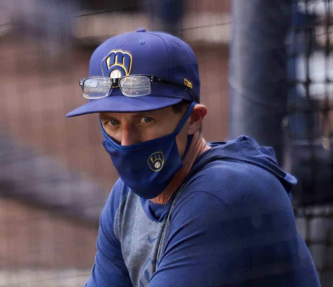
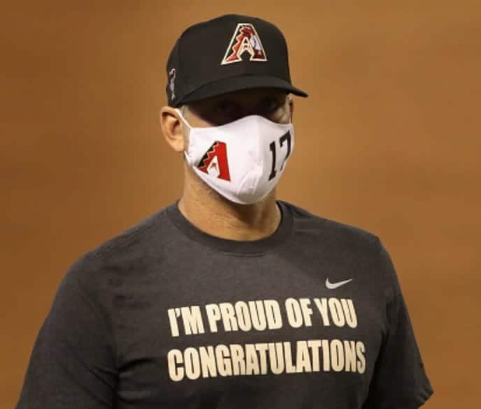
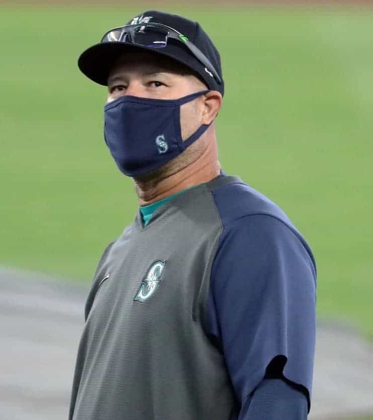
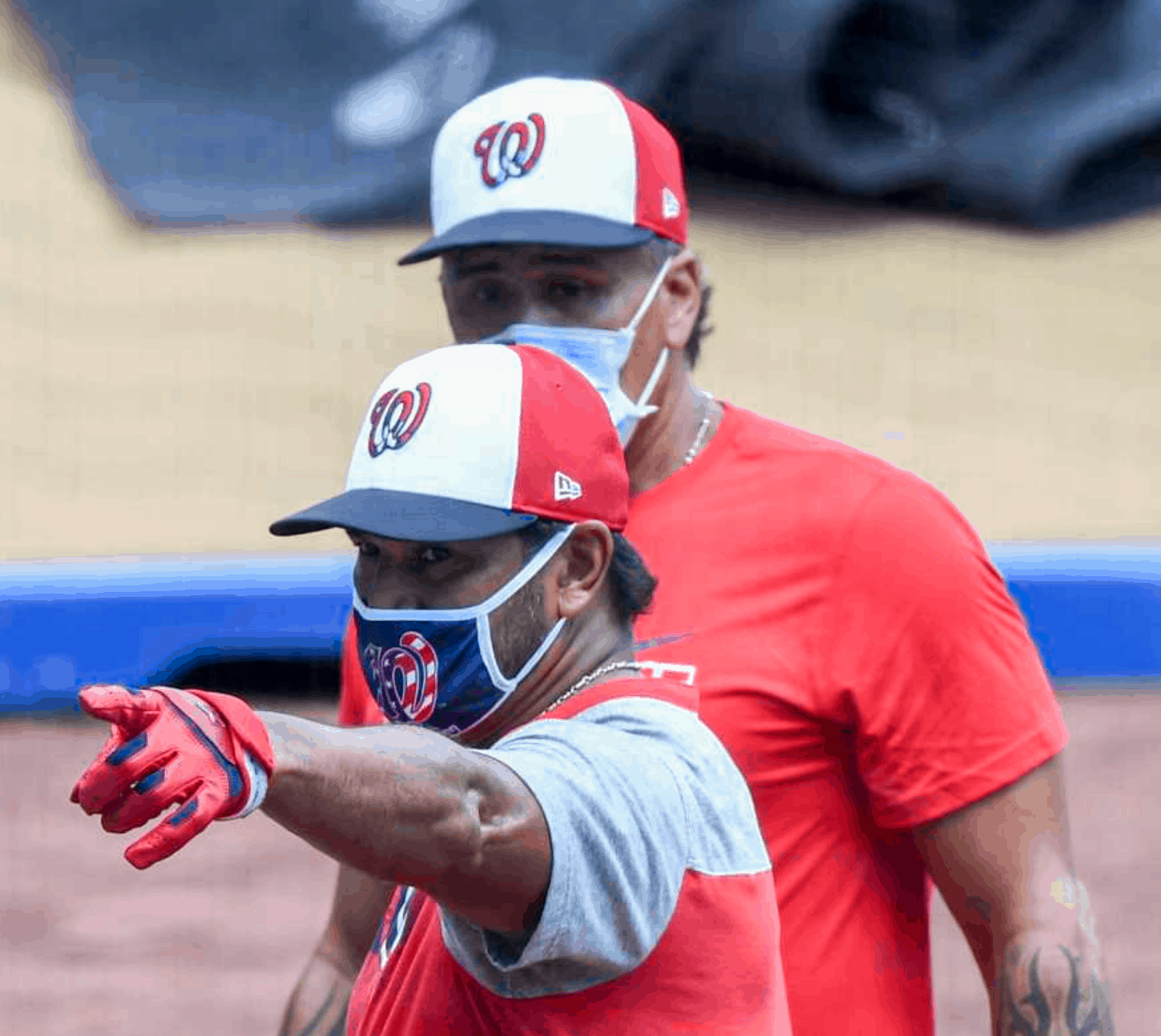
Yesterday I spent some time looking at Getty Images’ photos for all 30 MLB training camps. Here are the teams that had at least one player, coach, or manager wearing a team-branded mask (with the obvious caveat that there could be others that didn’t happen to appear in a Getty photo):
Brewers
Diamondbacks
Mariners
Nationals
Pirates
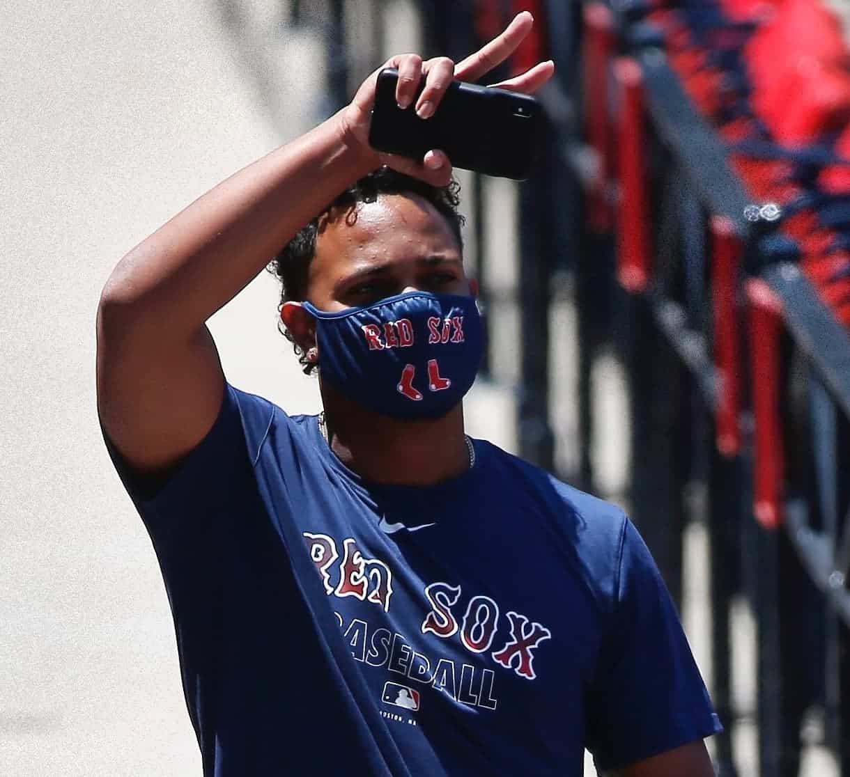
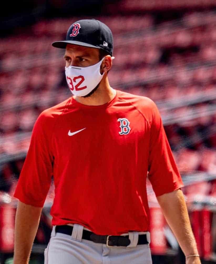
Red Sox (two different mask styles)
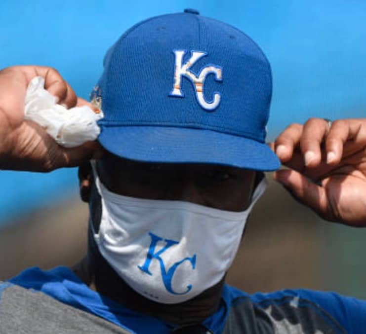
Royals
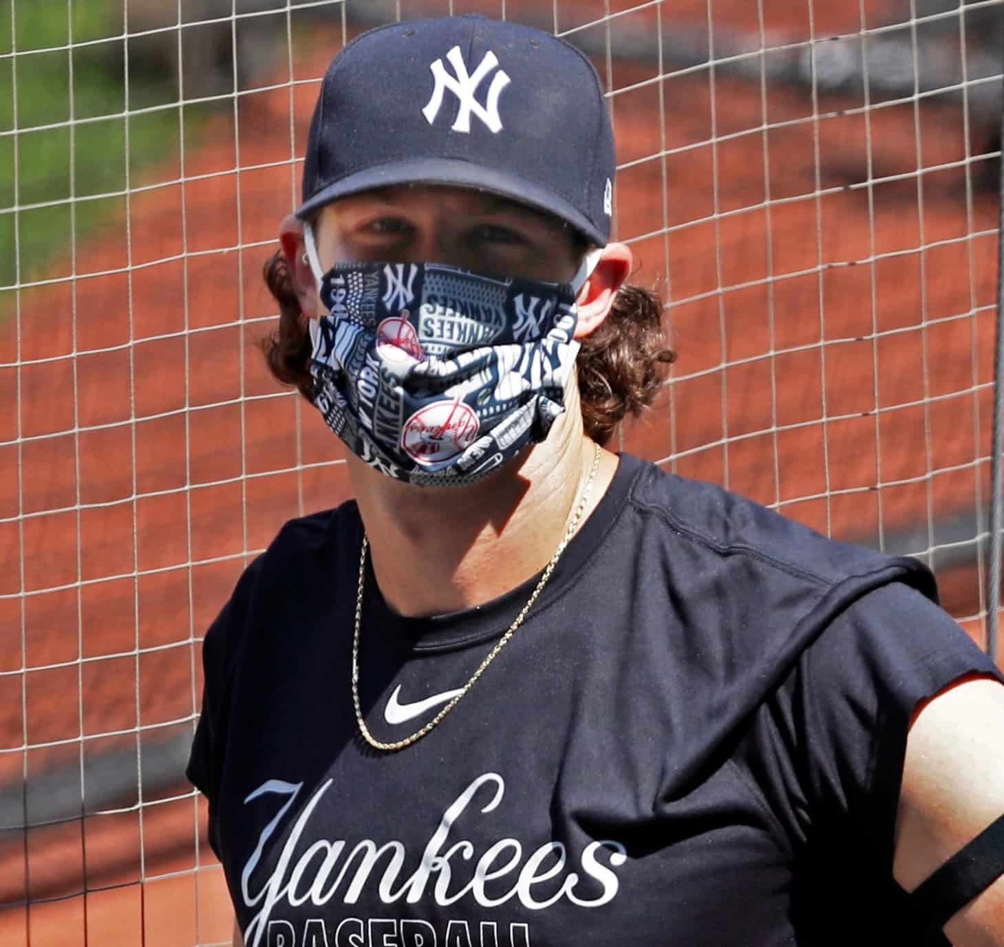
Yankees
———
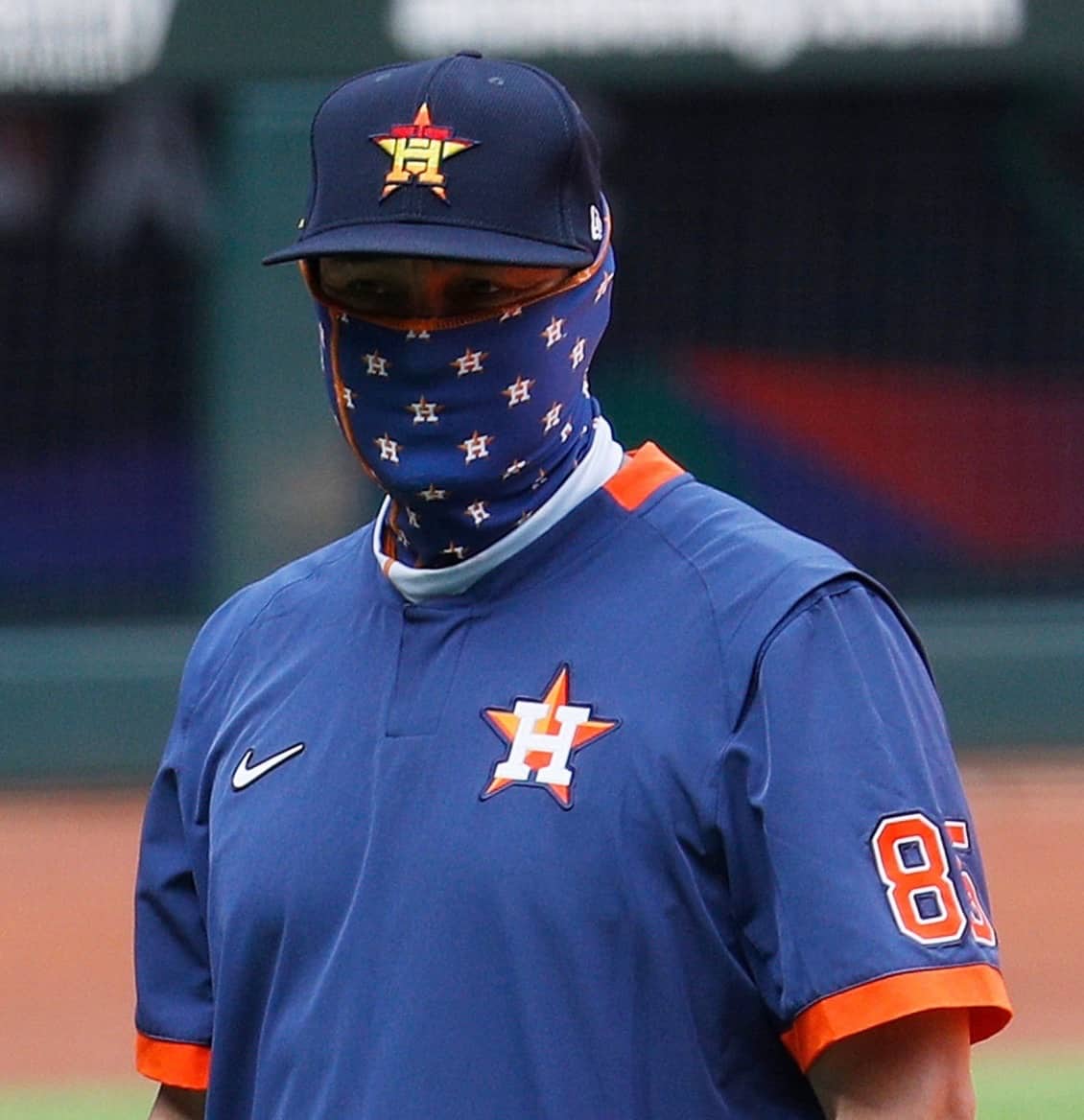
There may be other clubs whose players are wearing team-branded masks. But if so, I haven’t yet seen evidence of it.
A few additional notes:
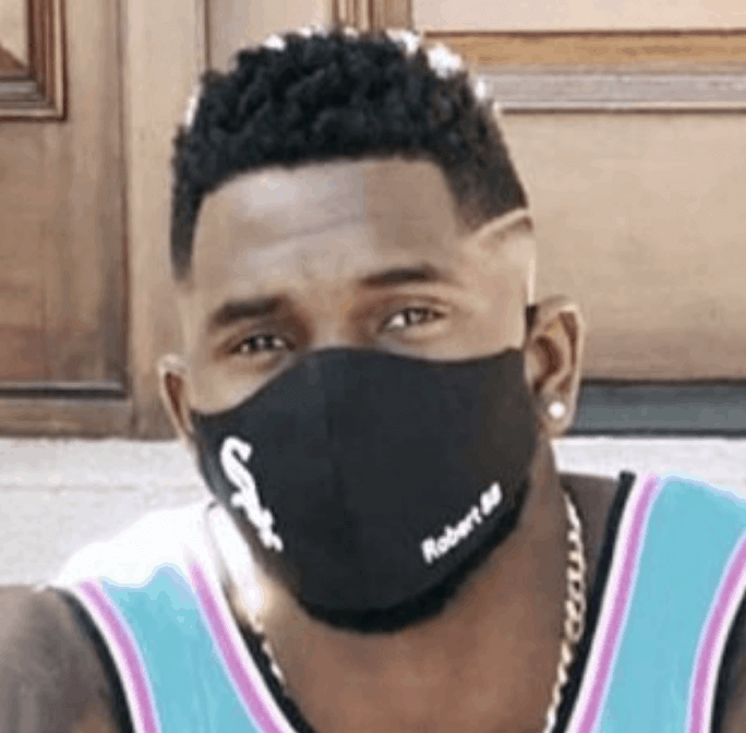
• White Sox outfielder Luis Robert recently posted an Instagram photo of himself wearing a Chisox mask with his surname and uni number, but neither he nor anyone else appears to be wearing this type of mask at the team’s training camp:
• A few teams had personnel wearing team-branded balaclavas or sleeve masks, but I decided not to count those, because they presumably existed prior to the pandemic:
• Although I didn’t see any Rockies personnel wearing team-branded masks, manager Bud Black has been wearing a purple mask. Obviously, I hate that color, but I give him credit for going with the team’s color scheme:
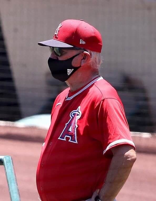
• With one exception, none of the masks I saw — team-branded or otherwise — carried a maker’s mark. That one exception was an Adidas mask worn by Angels manager Joe Maddon:
———
Of course, training camps still have more than two weeks to go, so we may see more teams wearing team-logo masks during that time. And even if that doesn’t happen, the bigger question is whether we’ll see more of them when the regular season starts. Players in the dugout will be required to mask up during games, so it’ll be interesting to see if the mask becomes part of the team-issued, team-branded look.
Home and away Rogie masks. Mesh is probably the worst mask fabric, so it’s lined with canvas on the inside. Brown laces for that vintage goalie pad look.@19Lak11 @UniWatch pic.twitter.com/PAlj09Alvc
— Wafflebored (@wafflebored) June 28, 2020
And speaking of masks…: DIYer Wafflebored has been working on some interesting masks lately. The tweet embedded above shows a pair of Rogie Vachon-themed masks that he recently made, and they’re so cool-looking that I don’t even mind the purple!
Wafflebored also recently made a set of masks with a more complex design. I’ll let him explain — take it away, buddy.
I Am That Masked Man
By Wafflebored
I read a recent study that said denim and canvas make the best materials for DIY masks, because they apparently do a good job of filtering out viruses while still maintaining good breathability. I found this of interest, as I love both of these materials.
I did some experimenting with these fabrics, and also wanted to see if I could come up with a better mask design. Denim and canvas will last a long time, but the elastic is a weak point, especially when sewn in. Also there have been some shortages of elastic material due to high demand, although that seems to be easing up. So I came up with this button design [click to enlarge]:

The folded flap of fabric holds a standard, easy-to-find hair tie. This makes it easily replaceable by the user and also removable when the mask is washed, which should probably lead to them lasting longer.
The one on the left the prototype, made of a really nice hickory stripe denim. I was pleased to find matching hair ties.
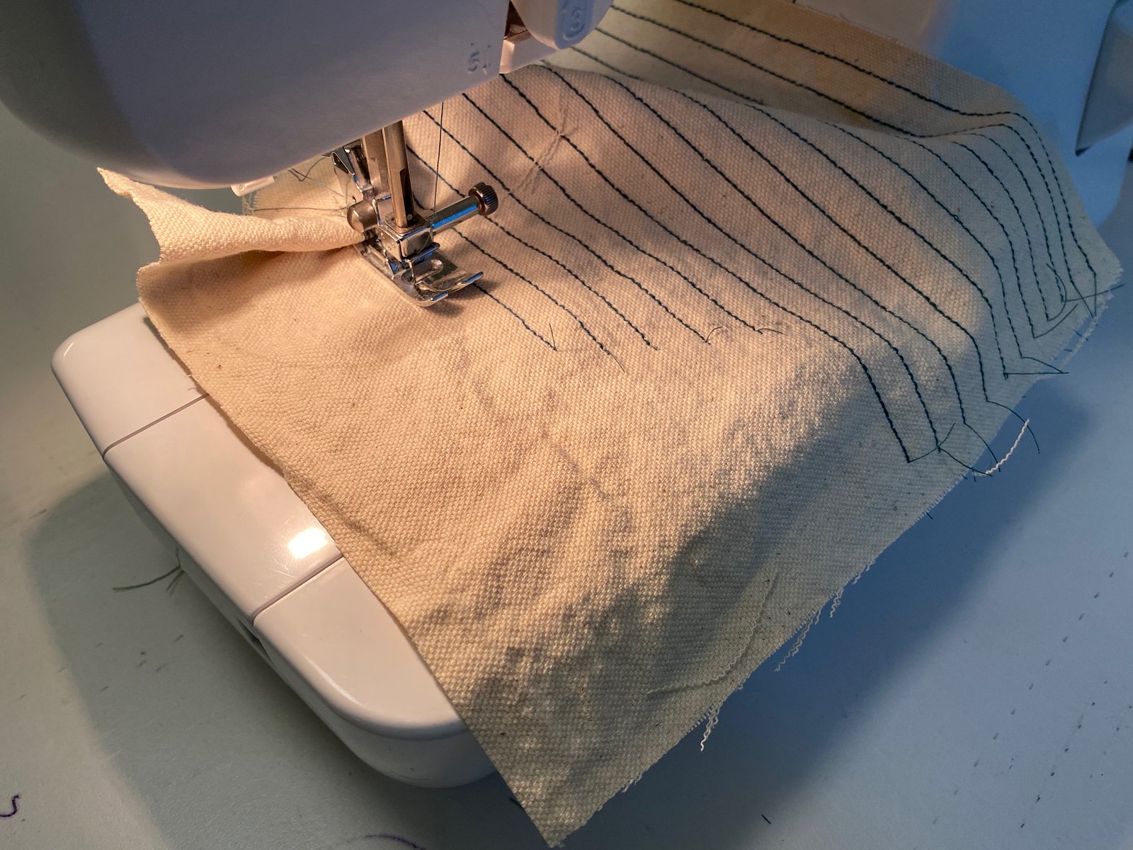
I couldn’t resist trying a vintage baseball theme, so the one on the right is canvas with machine-sewn pinstripes and a vintage-style logo and Art Deco button. Here’s a shot of the pinstripes in progress:
I used green satin lining like a nice wool baseball cap underbrim. The satin lining is surprisingly breathable, although I would probably consider this a novelty mask. One of the most enjoyable parts of making these is deciding what color of hair ties to use — they come in all sorts of styles.
Here’s another vintage baseball-based design. Same specs as the green and red one, but this time in black:

I also made an experimental mid-century modern mask from polyester doubleknit baseball fabric with turquoise canvas lining, plus a nice retro button:

Sports fabric is probably the worst mask material as it’s specifically designed to let moist air through, but when backed with canvas it’s breathable and probably decently protective.
As I mentioned earlier, I’m a minor denim enthusiast, so I thought I would experiment with something that looks like jeans or a denim jacket. I used the button style for the elastic loops and added pocket-style stitching.
This is where the mesh comes in. Since two denim layers would be too thick, I realized sports mesh would be perfect as a liner (the opposite of the Rogie Vachon masks shown above):


The added advantage is that the smooth nylon mesh feels cool and comfortable next to the skin, and stays drier than cotton.
Here’s one that’s sort of a 1970s urban cowboy version:


And here’s one more denim design — pleated, with copper rivets and leather laces:

Finally: I love ’80s shadow stripe fabric. This one is backed with black canvas and reminds me of a soccer goalkeeper’s jersey, like Uhlsport used to make:


———
Paul here. Oh, man — Wafflebored really is the best. So creative! Thanks so much for sharing these projects with us, and for being a constant inspiration.

Virtually speaking: Yesterday’s discussion of how the terms “name,” “nickname,” and “mascot” have become conflated for each other prompted an interesting note from reader Timmy Donahue (who, as you may recall, is our resident expert on military uniforms):
After reading today’s entry, I thought you might be the proper audience for a pet peeve of mine that has sprung up due to social distancing.
I have seen many people write “virtual” when I believe they mean “remote.” It has been bothering me since the NFL Draft, when people kept saying the draft was virtual and all I could think was, “No, it really happened — it was just conducted remotely.” I believe this article about the draft may have been what started the peeve for me. It even has a reference to a “virtual offseason” at the end. I really do not understand that terminology at all.
For example, I conduct arraignments remotely from my house when people are arrested [Timmy works as a defense attorney for the Legal Aid Society. — PL]. The arraignment (which is very real) is conducted in a virtual courtroom — a Skype meeting shows me, the DA, the judge, the court reporter, and my client all on different screens. So while the remote arraignment is done in a virtual courtroom, it is not a virtual arraignment.
This all came to a head for me when I was reading an article about Boy Scouts earning “virtual merit badges” and the picture showed a scout tying a knot in front of a computer screen. Again, that is a real knot being tied for a real badge, but it is being done remotely — not virtually.
My wife told me to let it go. Am I crazy?
I confess that I had not thought about this at all, but of course Timmy is absolutely correct (although he may also be crazy, as his wife suggests). Has anyone else been bothered by the virtual/remote conflation?
Click to enlarge
Collector’s Corner
By Brinke Guthrie
Follow @brinkeguthrie
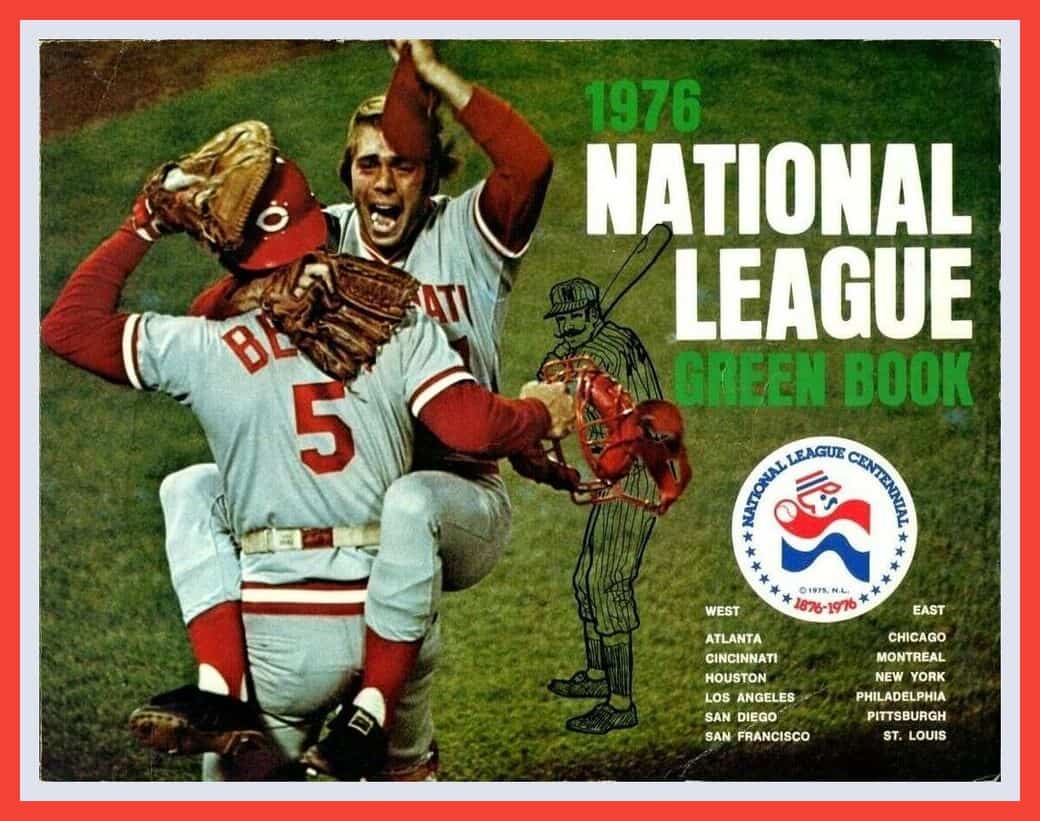
The Fourth of July was just a few days back, so we’re leading this 1976 National League Green Book with that cool red/white/blue 1976 N.L. centennial logo on the cover. MLB produced these for years (the American League’s version was the Red Book) and they were jammed with all kinds of facts and figures for media use. That would be Reds pitcher Will McEnaney and catcher Johnny Bench celebrating their Series win in Fenway the previous fall — the precise moment every player dreams of. [As a uni-related aside, see how Bench’s chest protector has the horizontal strap around his waist but doesn’t have the usual vertical strap. I believe he was the first — or at least the first I was aware of — to wear that style. — PL]
Now for the rest of this week’s picks:
• I firmly believe that the art of copywriting has suffered greatly over the years. In 2020, we just wouldn’t get this coolly dispassionate Joe Namath ad: It starts with “The Dingo Man. He’s No Ordinary Joe.” And then: “He knows just how to wear boots. With style. He knows when to wear them too. Whenever he feels like it.” That’s gold, Jerry, gold! (And look at that groovy chair he’s sitting in! That’s where you kicked back while listening to your hi-fi.)
• Got a selection of stickers here: When I was growing up, our 1971 Ford station wagon (with simulated wood grain paneling, of course) had one of these bright blue/silver foil Cowboys stickers on the back window, but this version also includes the call letters of their radio flagship, KRLD. Not a Cowboys fan? This Buffalo Sabres sticker includes their radio station, too, WGR55. Want to go three-dimensional? Here are some NHL puffy stickers from 1984-1985. And finally, this 1970s Indiana Pacers bumper sticker says “Baby, We’re Due.”
• Here’s a 1970s Miami Dolphins chalk holder. You open the little football, and you … keep your piece of chalk inside of it. Was there really a market for this item? Who used chalk besides elementary school teachers?
• This 1970s-80s all-blue in-store baseball player standee was for some type of unknown product — no identifying marks present. But check out those high-cut stirrups!
• Terrific artwork on this 1984 Elias Brothers Detroit Tigers restaurant placemat, but have you ever seen the team use that tiger before? Looks more like Tony the Tiger to me — grrrrrrrrrreat!
• In 1961, everyone knew who your favorite baseball players were when you wore this cap with the enormous Maris/Mantle/”Cap of Champions” patch on the front. The back has “9” and “7” patches, too.
• A decade later, people knew you were a Pittsburgh Pirates fan when you sported this belt featuring this snazzy Buccos belt buckle.
• Here’s a beautiful-looking 1972 Stancraft Philadelphia Eagles poster done by one of The Three Masters, George Bartell (the others being Dave Boss and Bart Forbes). This is for local Philadelphia pickup only; it’s already framed with glass and ready to hang!
• I guess this blue/yellow Sears T-shirt is supposed to mimic a 1970s Los Angeles Rams jersey. It does have the NFL shield on the sleeve, but the sleeve stripes don’t have the curling-horn effect.
• And one more from Sears — a nice-looking 1960s New York Football Giants wool coat from Stahl Urban.
• And from reader Will Scheibler: Everyone loves former Expos mascot Youppi, so check out this great Youppi coin bank.

ITEM! New membership raffle: Reader Kevin Cearfoss — he’s the one who makes those cool wooden 3D logos — recently purchased a membership for me to raffle off, so that’s what we’re going to do today.
This will be a one-day raffle, with no entry restrictions. To enter, send an email to the raffle address by 8pm Eastern tonight. I’ll announce the winner tomorrow. Big thanks to Kevin for sponsoring this one!

Membership update: What gorgeous design is that? It’s from the old St. Louis Hawks, forerunners of today’s Atlanta Hawks. It’s one of two cards recently ordered by reader Bill Emigh, part of a new batch that’s been added to the membership card gallery.
Ordering a membership card is a good way to support Uni Watch (which, frankly, could use your support these days). And remember, as a gesture of comm-uni-ty solidarity, the price of a membership has been reduced from $25 to $20 until further notice.
As always, you can sign up for your own custom-designed card here, you can see all the cards we’ve designed so far here (now more than 2,800 of them!), and you can see how we produce the cards here.
The Ticker
By Alex Hider

Baseball News: MLB unveiled each team’s 60-game schedule yesterday. With teams playing exclusively within their own divisions and the same geographical divisions in the other league — in other words, the Mets will play exclusively against teams in the N.L. East and the A.L. East — this map shows every team’s travel routes for the year (from Andrew Cosentino). … In social media graphics for the schedule unveiling, only Dodgers RF Mookie Betts was depicted in a Nike jersey (from Kevin, who didn’t give his last name). … Some Yankees players are wearing patches for the 25th anniversary of Steinbrenner Field — the team’s Florida Spring Training home — for summer workouts. The patch was originally worn during spring training (from Jorge Cruz). … The Savannah Bananas of the collegiate Coastal Plain League aren’t allowed to livestream their road games, per league rules. So when the Bananas played on the road against the Macon Bacon, Bananas broadcaster Jared Orton described the action by drawing it out on a whiteboard (from Steve Vibert). … There’s an interesting anthem-related note in a Season 7 episode of Star Trek: Deep Space 9 that features a baseball game. Prior to the game, the anthem for the Federation plays, and only the players who are part of the Federation place their hands over their hearts (from Michael Rich). … Under new social distancing policies, pitchers won’t be able to lick their fingers for moisture while on the mound. That won’t be a problem for Brewers P Brent Suter, who says he goes to his armpit when he needs moisture. TMI? (From Mike Chamernik.) … Phillies OF Andrew McCutchen, who had a brief stint with the Yankees in 2018, criticized the Yanks’ facial hair policy during a podcast appearance on Sunday (from @tierknala). … Mets bullpen catcher Dave Racaniello was walking around camp yesterday wearing a Mets football helmet (from Paul Moehringer and @ddddwhite9). … Senate majority leader Mitch McConnell wore a Nationals mask on Capitol Hill last week. … Players from the Madison Mallards and the Lakeshore Chinooks — two Northwoods League teams that won’t be able to participate in the collegiate summer league this year because of pandemic restrictions — are combining to form the K-Town Bobbers, who will play a 26-game schedule against the Kenosha Kingfish in July and August.

Football News: Dick’s, Target, and Walmart are no longer selling Washington NFL apparel from their online stores. … Although multiple reports have indicated that the Washington rebranding could take place as soon as this season, The Washington Post (soft paywall) looked at some of the issues and determined that the process could drag on for a while (from Tom Turner). … Speaking of Washington, Nate Rathjen reports that some broadcasters at WRC-TV — the team’s broadcast partner — are no longer using the team’s name on the air. … ESPN has published a great piece about the eating habits of NFL linemen and how those habits carry over into retirement (from Mike Chamernik). … According to this piece from The Athletic (hard paywall), the Giants never issued uniform numbers in the 90s prior to 1980. Weird! (From Ted Kerwin.) … Chiefs blog Arrowhead Addict has proposed a few potential team names should the team decide to go in a new direction (from Kary Klismet). … The CFL’s Ottawa Redblacks are replacing the turf at their home stadium and are embedding a 2016 silver dollar under the new playing surface for good luck. The team won the CFL’s Grey Cup that year (from Wade Heidt). … New number assignments for new Oregon State players (from Pat). … Bob Gassel was watching a 1970 Bills/Steelers game at Three Rivers and noticed that most of the midfield logo apparently got swallowed up by a seam in the Astroturf.

Hockey News: Vegas G Robin Lehner has a new pad set (from Wade Heidt). … @KingsUniHistory is holding a bracket-style tournament to determine the best uniform in Kings history. … It had been previously announced that the mascot for the Yokohama Grits — a new Asia League Ice Hockey team — would be a beluga whale. And now the whale has a name: Guruga the Beluga. Cute, too! (From Jeremy Brahm.)

Basketball News: The Pelicans will reportedly have a New Orleans flag-based City alternate in 2021. … Sixers F Mike Scott says it was a “bad choice” for the NBA to provide players with a pre-approved list of social justice NOBs instead of letting the players pick their own (from Mike Chamernik and Aaron Pinto). … When the WNBA begins play, players will wear NOBs of women who have died as a result of police action or alleged racial violence. … The uniforms from this 1925 Young Men’s Hebrew Association basketball team in Harrisburg, Pa., aren’t that remarkable. But the team’s coach is wearing a pretty dapper sweater (from Max Weintraub). … Pelicans G Sindarius Thornwell will wear No. 12 with his new club (from Etienne Catalan).

Soccer News: The font that will be worn by teams in EFL Championship, League One, and League Two has leaked (from Josh Hinton and Mike Miller). … Couple more leaks from Josh: Mexico’s 2020 home jersey has leaked, and German club Union Berlin’s new home jersey has leaked. … Staying in the Bundesliga, Werder Bremen played in a relegation playoff game last night in a new “city” uniform — a concept that appears to have been borrowed from the NBA (from Tim Wünderlich). … Couple of kit unveilings from Ed Zelaski: New uniforms for English League Two team Morecambe FC and a leak from Russian Premier League team FC Lokomotiv Moscow. … The Museum of Jerseys blog is taking a poll to determine Barcelona’s best uniform dating back to 1998. … Players for Atletico Ottawa of the Canadian Premier League have been given team-issued facial coverings, modeled after their vertically-striped home jerseys (from Wade Heidt). … New second shirt for Chelsea and the Chelsea women’s team (thanks, Jamie).

Grab Bag: Schools throughout Virginia are changing their Confederacy-based school names, team names, and mascots (WaPo link) (from Tom Turner). … President Donald Trump says he’s opposed to the Indians and ’Skins changing their team names. … Some Big Boy restaurants will be swapping out their eponymous overalls-clad mascot character in favor of a girl named Dolly in the coming weeks. It’s unclear how long the change will last — the restaurants aren’t changing their names, and the new mascot is tied to the promotion of a new chicken sandwich, not to any social protest (thanks to all who shared).

Click to enlarge

What Paul did last night yesterday afternoon: We usually hit the porch in the early evening. But at about 4:15pm yesterday, we got hit by a pretty heavy thunderstorm. The Tugboat Captain and I both love being on the porch when it’s raining — there’s something very nice about feeling sheltered and dry while everything else is getting soaked — so we went out for a look at the storm. After a few minutes, I said, “Should we just have cocktails now?”
So we did. We hadn’t expected to sit for any length of time, so we hadn’t brought the cushions with us, and we had to sit back a bit from the edge of the top step because of the rain. Just enough differences from our usual routine to make it seem like a fun change of pace.
It was a really good storm, by which I mean that it wasn’t as violent as the one that brought down the branch last week but was still a serious soaker — the kind that makes you appreciate how crazy nature is, and how lucky we are to have places where we can take shelter from it.
As always, you can see the full set of daily Pandemic Porch Cocktails™ photos, dating back to mid-March, here.
Timmy Donahue you’re not crazy at all!
Misuse of terms like that by people who write professionally bugs me a lot.
It only takes a step back to orient oneself to the underlying meanings of the words. And these particular words are at the heart of what the journalist is writing about.
My head literally explodes every time I read something like that!
I see what you did there, Dumb Guy.
That Detroit Tigers placemat logo is likely derived from a short outro that would play after every Tigers victory from the TV station listed on the mat (WDIV). An odd choice for sure.
link
There was also a different outro after a Tigers loss.
link
Not all that odd; notice the “WDIV – DETROIT” just below the image. WDIV probably went in on the promotion.
I had the entire set of those placemats in my younger days. Alas, I lost them in a move years ago. Elias Brothers was the Detroit franchisee for Big Boy restaurants.
Wafflebored, I’m impressed as usual. I love seeing the things you come up with.
Timmy, you’re not crazy. It’s crazy to me that people who use language incorrectly can make those who are using it correctly feel crazy.
Yes, Wafflebored might “Get it” more even than Paul!
Timmy, I am with you. The inability of professional writers and other members / aspects of the media to properly use the English language is disturbing. The fact that “could care less” is slowly becoming accepted as correct, or that irregardless is accepted is crazy. I’m not asking that everyone in the world be a walking dictionary, but at the very least those who write and speak for a living should use words and phrases correctly. In many ways they are custodians of the language, when they start using the language wrong then average folks accept those errors as the proper use.
Greg, many writers were never as strong on this stuff as you might think. But there was a safety net: copy editors. They would catch these types of errors.
Unfortunately, as the journalism industry has gone through an economic crisis over the past two decades, copy desks have been decimated. Laying off copy editors has become a standard cost-cutting measure. The results, as you note, are easy to see.
I learned that an editorial set of eyes is the most efficient way to complete a design/story. This came from my mentors who, back in the day,had to show all their work to Mr. Disney himself.
Assuming the July pins are still not available yet? I was offline for a few days and didn’t see any mention of them as I skimmed previous days’ entries.
Tomorrow or Thursday.
So here’s my deal. I work remotely but as far as my office location goes, my employer describes it as “virtual” since I have no literal office building.
The Savannah Bananas announcer with the white board was Biko Skalla, not Jared Orton (who, BTW, is the GM of the Bananas)
The Green Book link goes to a (pretty incredible) rug for sale.
Fixed.
Waffleboard just created the best accessory to the Canadian tuxedo!
It’s the Federation, not the “Federation Alliance.”
Yeah. Or United Federation of Planets if you want to be formal about it.
Looks like Broadway Joe is wearing his SB ring in the Dingo ad too!
“…although me may also be crazy…”
Agreed, Paul, but only in the best manner. ;)
Ha! Fixed.
I’ve been complaining about the misuse of virtual with no success. Part of the desire for people to use “virtual” is that it sounds cooler than “remote”. A similar situation is with my mother, although it’s probably also a senior moment. She is in assisted living, and when they started to resume some in-person activities a few weeks ago, she refers to them as “social distancing”. She heard the term and just repeats it now. That’s happening with virtual too.
Please have a logo with an anthropomophic fishing bobber… please… And lo and behold, the K-Town Bobbers delivered big time. Whoever devised that logo nailed it. I must have a jersey or t-shirt with that logo!
Also mad props to the Kenosha Kingfish for their fantastic logo. Hey, Marlins, you want to see how to add baseball elements to a fish? Check it out!
link
That’s Mexico’s home jersey for 2020? They’ve moved away from the green
I seriously doubt this is Mexico’s home kit. This looks like a goalkeeper jersey or a training shirt.
Fuchsia does NOT figure into anything in Mexico’s history.
Virtual/Remote.
Oh man, this has raised a question for me.
Timmy Donahue is correct in his example. Someone is being arraigned remotely in a virtual courroom.
But here’s *my* issue.
I write about local government in a UK town. That includes writing about council and committee meetings.
Since March those meetings have been , well, I’ve said they’ve been virtual meetings.
I might be wrong..
Except: are the members really meeting?
No, they’re meeting virtually.
But is the meeting as a thing, a noun, real? Yes it’s a meeting of the planning committee, which has legal status.
But the members are meeting, as a verb, virtually.
And now I’m paralysed as to what I say about the next meeting ‘over the airwaves’
(perhaps I’ll call just that)
Any help anyone can offer?
They are having remote meetings, but meeting virtually. Right? Hahaha! Tough one!
While the pics above show teams wearing a wide assortment of warm up tops (all Nike), I want to point out one I have shown Paul…the Astros and Rockies have a cool top that seems to be a template I first noticed on the Mets. The Astros added sleeve numbers. The logos and MOTB seem to be the “plastic” patches that I am not sure what we call here. I haven’t seen these for sale yet anywhere and actually like them to the point where if it were reasonably priced, I would buy one.
link
Thank you to everyone for validating me on the virtual/remote issue. To be clear, my wife agrees that the terms are being misused, she just thinks that my crusade for recognition is crazy. Let’s be honest, she’s not wrong.
As an English major who coincidentally works in IT, the whole “virtual” versus “remote” thing has been a constant thorn in my side since March now. My co-workers in IT have officially dubbed me the “virtual cop” since I’ve been making the same point as Timmy for almost five months now.
What’s really a little odd about it is that I work in IT for a publishing company, with a lot of copy editors and writers on staff (and no, we’ve not cut editing positions), so you’d think I wouldn’t need to point out the proper use of both terms.
I think my wife could relate to Timmy’s wife’s struggles. Unapologetic pedantry is my drug of choice.
The Arrowhead blog is onto something. The NFL, I think, still retains the rights to the logo of the NFL Europa teams, so I think it is not a leap to rebadge your current Super Bowl champions as the Kansas City Monarchs.
The Rogie masks are brilliant!!!! Waffleboard never ceases to amaze!
The numbers are nice, but if you REALLY wanted a Rogie mask, it should have had the smile on it.
link
Typo in the football section where it says “linemeln” instead of “linemen.”
Thanks, Chris. Fixed.
Gerrit Cole’s Yankees face mask looks like it is upside down as all the logos are inverted.
Cool video of the storm from your porch, and again, you have an awesome porch and street. I completely agree about how great it is to be outside while it’s raining yet being sheltered. Where I live it hasn’t rained in almost 3 months, so I’m envious and really enjoyed the vid.
Who’s gonna be the first person to order a Uni Watch membership card, selecting a mask design as the card design?
Here’s my take on virtual/remote. I could be wrong.
If the meeting or thing has a physical location, and some participants choose to participate over the internet, then remote is the right moniker. The meeting is being held at a physical location with some participants participating remotely.
If the meeting has no physical location, if its taking place solely in Zoom or Teams, then its virtual.
I’m secretary of a couple of boards and we’ve had both kinds of meetings during all this, and I minute them differently – e.g. a remote meeting will be recorded as “held at the offices of XYZ, then list the participants and note who was there remotely. Versus “held virtually via Microsoft Teams”.
Like I said, I could be wrong.
Works for me.
Paul’s neighbourhood does indeed look like a very comfortable place to live.
I love Wafflebored’s Rogie masks. The Kings would do well to go back to their original Forum Blue,aka purple,and gold,aka yellow, colour scheme.
Exactly John. Right on. Now is the time for a refresh. It was a good run with the silver and black for the Kings. Real popular in the Gretzky years but now its time for a change. Plus current logo is not that great.
Many NHL teams have made returns to their original or old colours. If the Lakers can make this colour scheme cool, it is possible for the Kings to do so for a new generation of fans. Many hockey fans feel the same.
Kings just give us back this uni, create a white one in this template, and the yellow one can be a third:
link
WAffleboard. That’s amazing work, man. Simply amazing. You have a gift. Thanks for sharing it with us.
And Paul, I totally agree with watching the rain. Especially on hot summer days. It’s nice to get that brief cool-down in temps with a breeze (or wind) and watch nature do it’s thing. And a good beer sure helps too. It’s very relaxing.
“Has anyone else been bothered by the virtual/remote conflation?”
No, but you better believe I will be now.
Gosh, I do love thunderstorms with torrents of rain. Thanks for letting me share in yours remotely.
Curling Canada has released return-to-play guidelines for the sport. Only one sweeper allowed.
link
These are the same guidelines (as far as rules-of-play changes) that USA Curling has been discussing with regional bodies and individual club leaders. It’s basically turning curling into an individual sport. It’s going to be a tough sell to get a lot of curlers to sign up for league play this season, I expect.
I can attest that the virtual/remote conflation even goes beyond English. I’ll try to be succinct.
I teach at a university in Colombia, and when COVID-19 hit here in March, classes shifted to being on-line; they were calling it virtual.
I ended up getting into disagreements with my department’s administration about the balance between the theory of evaluation in virtual education (them) and the feasibility of completely rethinking a course not designed to be virtual (me).
A couple weeks later a colleague shared an article outlining the difference between virtual education and emergency remote teaching. After that they backed off.
For next semester, the university is very consciously referring to what we’re doing as “remote learning”.
I’m surprised that the MLB hasn’t already consolidated the mask design and manufacturing. I’m sure it will be coming down the pipeline as we approach “opening day.”
What is “the MLB”?
Virtually is to Remote, as Unanswered is to Consecutive. Similar, but definitely not the same, and grossly misused.
To bad MLB didn’t force the Astros and Red Sox to wear CHEATERS on all their masks.
That might have stung more than getting hit by a 90 mile an hour pitch in the keister !
I actually have this conversation with some co-workers a few days ago. We work on a Mexican museum and we’re putting more empahsis on on-line exhibitions (websites that contains the pictures of the artworks displayed in the museum, along with accompayning texts). The official term from the government for all these kind of activities that sprout of the pandemic is “virtual”, but we looked into this and, like Timmy says it means (at least in Spanish, “that appears to be real but isn’t”, so we go fo “digital”, meaning “made or transmitted in digital media”.
I really think is not going to be a widespread use because the official term has taken ground, but at least we (myself and my coworkers) have an answer when they asked why we’re not using the “virtual” term.
Additionally, I’ve always asked myself how does English-speakers solve this kind of issues. In the Spanish-speaking worlw we have the Real Academia de la Lengua Española (Royal Academy for the Spanish Language) an century-old institution that gathers together each year and update terms and publish an official dictionary, and it’s the recognized authority on any related-language controversy. But I haven’t found an English-language equivalent. How do you do it?
Nobody on the Astros wearing an Asterisk facemask??? Maybe we should send ’em a few.