Click photos to enlarge
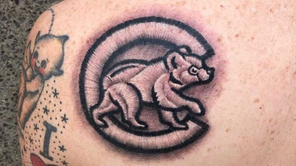
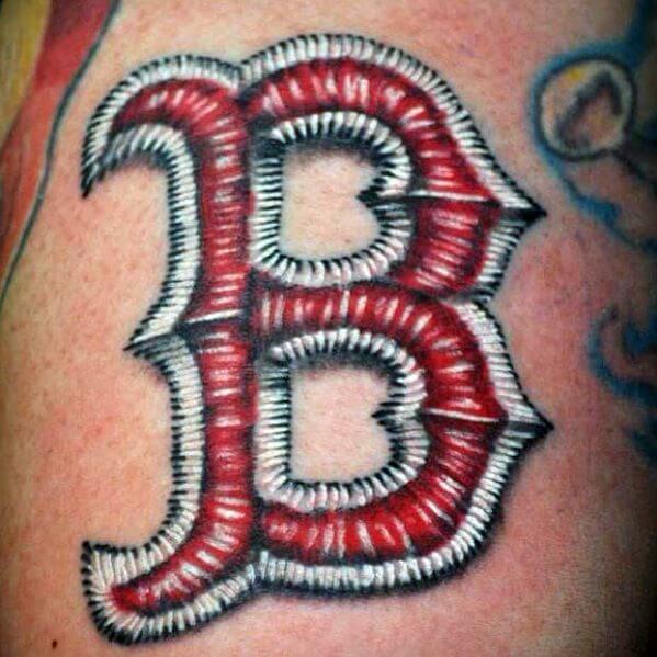
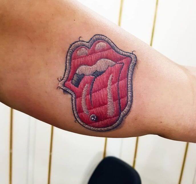
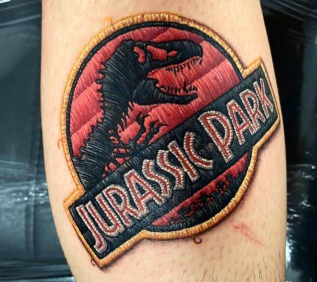
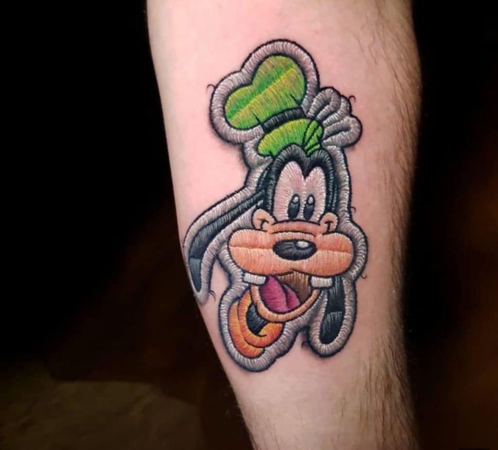
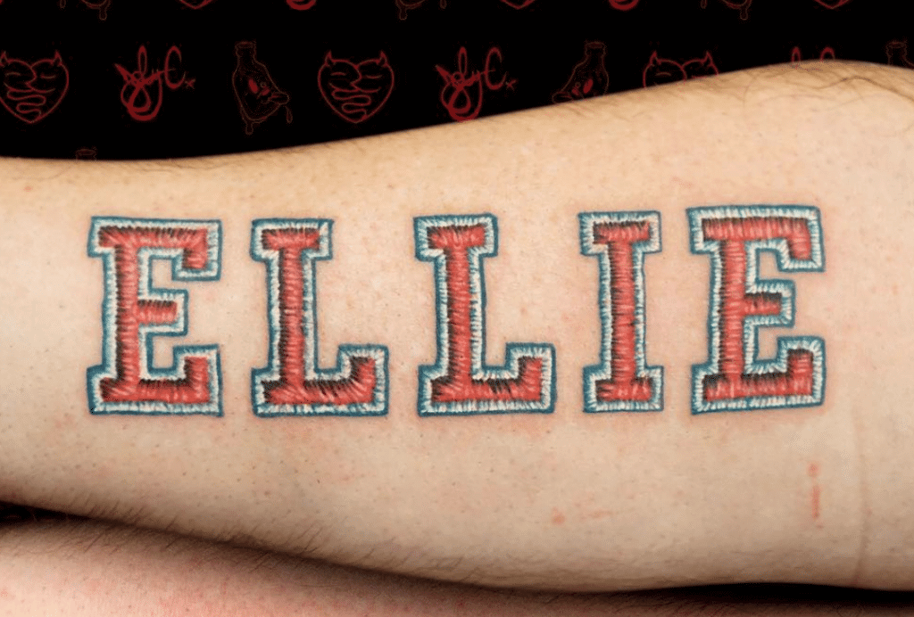
I like team logos, I like texture (or at least the appearance of texture), and I like tattoos. So it makes sense that I’d love embroidery tattoos, an interesting sub-niche that I just found out about.
Tattoos that simulate embroidered texture are not new — they’ve been around for at least a year or two (and I suspect a lot longer than that). But I only learned about them when Uni Watch reader Patrick Bourque recently told me about them. I was instantly hooked by the faux-texture effect:
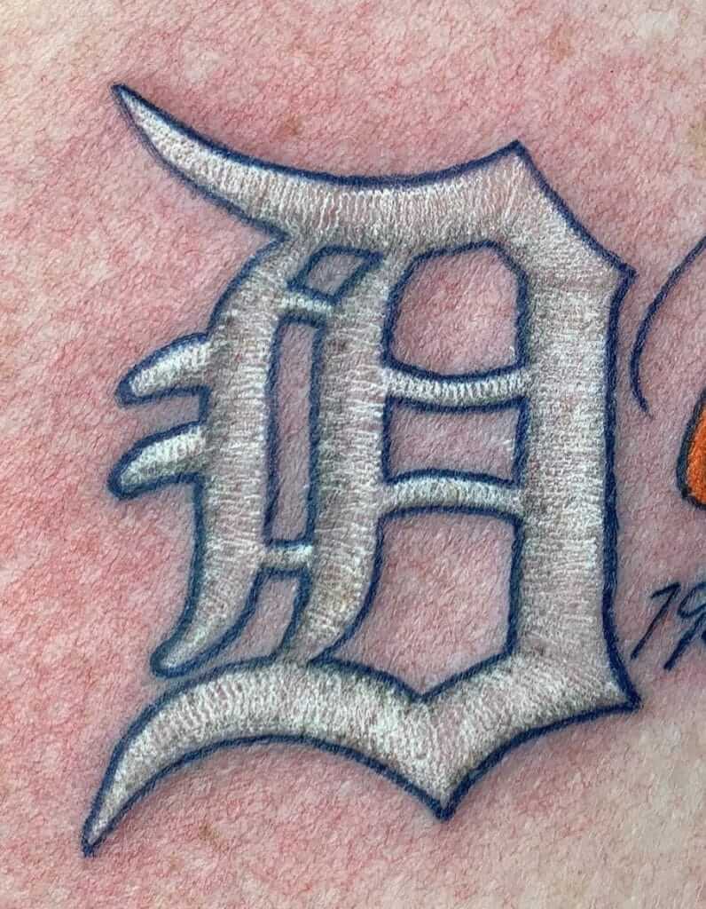
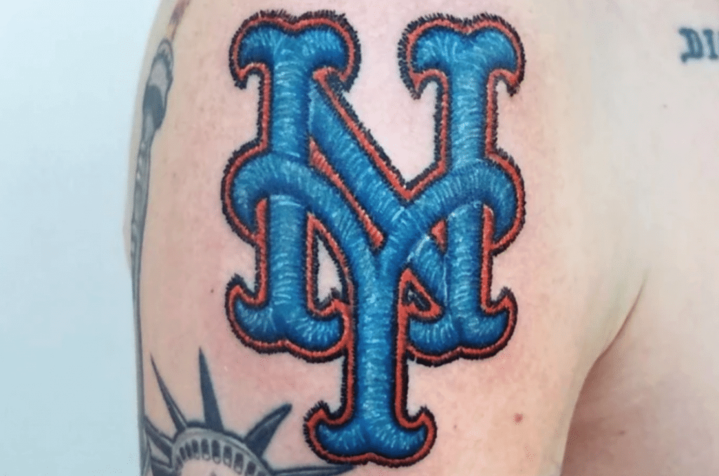
For reasons that aren’t clear (at least to me), the Red Sox logo appears to be particularly popular for this type of treatment, with lots of distinct versions floating around out there:
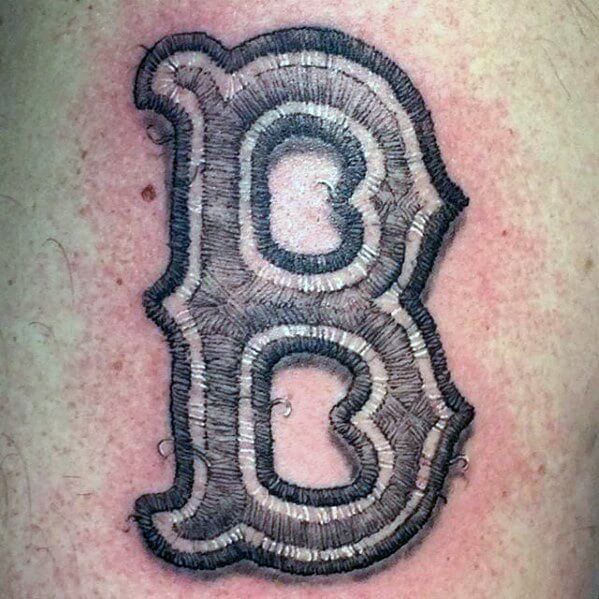
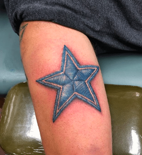
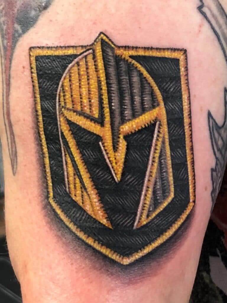
It even works well for team logos that wouldn’t normally appear in an embroidered context, as seen in these Cowboys and Golden Knights tats:
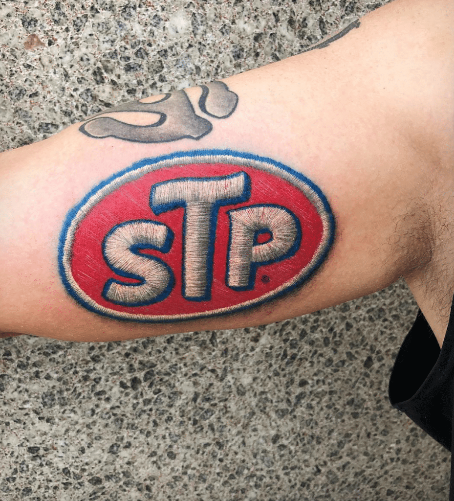
And of course the visual effect works just as well on non-sports logos, or just to simulate the look of a cloth patch, as you can see in the following examples:
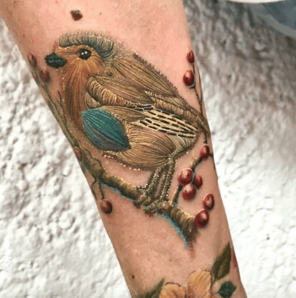
On some level, faux-embroidery tats make a certain kind of sense, at least to me: Embroidery is done with a needle; tattooing is done with a needle. Most of us have had stitches at one time or another. And from Frankenstein to Buffalo Bill in The Silence of the Lambs, sewn skin has had a transgressive presence in our popular culture, so why not?
On the other hand, tattoos tend to lose their fine detail over time — and the finer the detail, the faster it tends to be lost — so I wonder how much of that faux-embroidered texture endures over time. Anyone know more about how these tats hold up?
Meanwhile, here’s a thought: Although embroidery is still the most common choice for uniform patches, we’ve also seen an increasing number of patches rendered in plastic. Would anyone want a tattoo of that? If so, could it even be effectively rendered?
(My thanks to Patrick Bourque for letting me know about these.)
Click to enlarge
Collector’s Corner
By Brinke Guthrie
Follow @brinkeguthrie
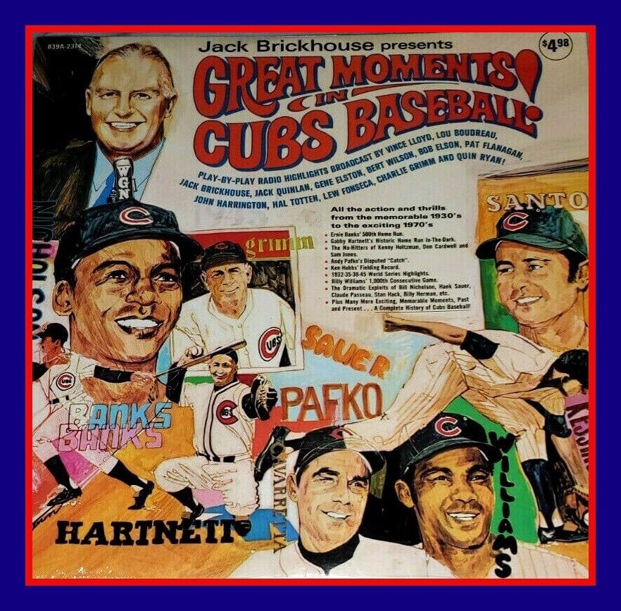
We begin Collector’s Corner’s second decade with Great Moments in Cubs Baseball, a 1971 album of the team’s greatest hits from the 1930s up to the 1970s, narrated by WGN announcer Jack Brickhouse. As the album jacket says, it’s like “having a box seat to over 40 years of Cubs history!” This is a custom recording by “Major Official Productions,” by the way.
Now for the rest of this week’s picks:
• One more for the Cubbies: this great-looking set of Cubs ceramic coasters depicting 1960s game programs. Buy them individually or as a set. Absolutely love that kinda art.
• Now this seems like a pretty good deal: all 32 NFL mini-helmets in one set for under ten bucks!
• Take a look at the artwork on this 1970 Mets baseball card game from Ed-U-Cards. “Try to beat the Mets!” “All the thrills of a real baseball game!”
• I love finding things I’ve never seen before, like this set of 1983 NFL Sticker Trading Wallets, decked out with the “A” or “N” conference logo.
• Here’s a set of 1990s NFL bumper stickers with three college ones tossed in. This is one of those cases where they use the same template over and over for different teams.
• Speaking of bumper stickers, this 1976 Seahawks bumper sticker was brought your way by KIRO Newsradio 71.
• Reader Chris Giorgio sent in this San Francisco 49ers helmet umbrella. (Even though I am a Niners fan, I’ll still go with the original Brock-a-Brella.)
• A couple of CFL items from reader Will Scheibler — a Montreal Alouettes rain poncho and a postcard that shows their jersey history.
• More great artwork on this World Series Souvenir Ticket from 1968, between the Cards and the Tigers. Just the fun. Catch Dodge Fever!
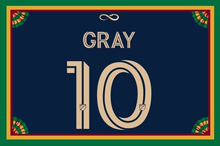
Membership update: I have to say, I really love that new MLS font — looks great on a membership card, as seen on Ryan Gray’s new Philadelphia Union treatment. Ryan’s card is part of a new batch that has been added to the membership card gallery (which now has over 2,700 designs!).
Ordering a membership card is a good way to support Uni Watch (which, frankly, could use your support these days). And remember, as a gesture of comm-uni-ty solidarity, the price of a membership has been reduced from $25 to $20 until further notice.
As always, you can sign up for your own custom-designed card here, you can see all the cards we’ve designed so far here, and you can see how we produce the cards here.
LAST CALL for the Purp Walk raffle: In case you missed it yesterday, reader Matthew (who prefers that his surname not be used) has generously donated three memberships for me to raffle off, but with one caveat — the three winners must choose purple-inclusive membership cards as their prizes, and that means they must order them during this year’s 48-hour window. (As I mentioned earlier, since Purple Amnesty Day’s usual date — May 17 — falls on a Sunday this year, we will also have Purple Amnesty Day (Observed) on the Monday the 18th, and I will accept purple card orders on both days.)
Today is the last day to enter this raffle. To enter, send an email to the raffle address by 8pm Eastern tonight. I’ll announce the three winners tomorrow, and then those three winners will have to claim their prizes on Sunday or next Monday. If they snooze, they lose!
Big thanks to Matthew for sponsoring this one, and for coming up with the idea for it.
Uni Watch Hit Parade: My friend Todd-O-Phonic Todd played a new tune on his WFMU radio show last Saturday. The tune was “Sacre Bleu” by a punk/glam band I’d never heard of called Wyldlife, and it completely blew me away. So I tracked down Wyldlife’s album, Year of the Snake, and discovered that most of it is pretty meh. But “Sacre Bleu” is still a massive, addictive tune. — to hear it, skip ahead to track No. 7 on the player embedded above. Magnifique!
The Ticker
By Alex Hider

Baseball News: Brewers IF/OF Brock Holt indicated on his Instagram page that he will have a new uniform number if and when play begins this season (from @ohhhsourry). … Fanatics made 2,500 coronavirus masks from Royals uniform fabric, and the team donated the masks to local health care workers (from Phil). … The city of Rockville, Md., has installed a wooden statue of Hall of Fame pitcher Walter Johnson (from William F. Yurasko). … The ivy steals the spotlight in Wrigley’s outfield, but the home run baskets deserve some love too! Originally installed to keep “bleacher bums from sitting on the walls,” they turn 50 years old this year (from Mike Chamernik). … The Twins went all out on their 1965 World Series bat boy jerseys — especially the script font on the back! (From M.W.). … Here’s a deep dive on the “Ruptured Duck” sleeve patch that MLB players returning from service in WWII wore in 1945 (from Mr. Budziszewski). … Eric Abneri wrote a piece about the history of the game-used baseballs used during Opening Day. … Craig Wessel is launching a Kickstarter for an item that I’m sure plenty of readers will be excited about: an archive-quality journal that also functions as a baseball scorebook. Click here to visit the Kickstarter page and get a notification when the campaign launches May 15. … Good spot by Andrew James, who noticed that the Astros and the NBA’s Seattle SuperSonics used the same number font in the 1990s. … Here’s a good look at the fake fans at one of this week’s games in South Korea. “The broadcasters mentioned that you can pay to be one of the fake fans,” says Josh Levy.

NFL News: A Rams blog took some guesses as to why the team has not yet unveiled their new uniforms (from Phil). … A couple of notes from Kary Klismet: A Browns blog has published a comprehensive history of the team’s “Brownie the Elf” logo and mascot, and though this article on the Broncos’ “Denver D” logo is a bit old, it offers some rarely seen images of the prototype logo. … Speaking of the Broncos, they used a player wearing an old jersey with a Flywire collar in a new schedule graphic (from Josh Claywell). … Tris Wykes found a 1983 Bucs game program that includes the term “Super Bowl Tournament” on the cover. What a weird way to refer to playoffs. … A biker in Boston used an app to draw Flying Elvis with his route during his 13-mile ride around town (from Jordan Mayblum). … The Eagles are offering a free wedding ceremony on the sidelines of their stadium to frontline workers whose weddings had to be cancelled due to the pandemic (from Timmy Donahue).
College and High School Football News: Check out this Wisconsin prototype helmet from 1990— the same year the Badgers adopted the Action W. Coach Barry Alvarez ultimately determined the design “too Pac-10” for Wisconsin. … A TCU blog is taking votes on Twitter to determine the school’s best uniform — it’s down to the finals, 2011 Rose Bowl vs. 2014 Peach Bowl (from Clint Foster). … Fisher High School in Illinois won a bracket-style tournament on Twitter for the best football helmets in the state.

Hockey News: The Avalanche may wear Quebec Nordiques throwbacks for some games in 2020-21 (from Phil). … The Bad Beaches, an all-female hockey team from Detroit, take their team name pretty seriously. They play in bikini-themed jerseys (from Michael Blake Raymer). … Hockey blog Bar Down is calling on these seven retro NHL sweaters to make a comeback as alternates (from Wade Heidt). … The Topeka Pilots of the NAHL will begin playing in Kansas City and rebrand as the Scouts — just like the NHL team that played there in the ’70s (also from Wade Heidt). … In a related item, the Wilkes-Barre/Scranton Knights are moving to Connecticut and will become the Danbury Jr. Hat Tricks (from Steve Forni). … The Caps are running a bracket on social media to determine the team’s best all-time jersey (from Jamie Rathjen). … The AHL has cancelled the remainder of its season.

Basketball News: The NCAA has unveiled the logo for the 2021 Final Four, which will take place in Indianapolis (from Kary Klismet). … A designer remixed Vermont’s uniforms in the style of classic NBA jerseys (from @hcaneswirl). … Cross-listed from the baseball section: Good spot by Andrew James, who noticed that the SuperSonics and MLB’s Houston Astros used the same number font in the 1990s.

Soccer News: Scottish club Celtic FC among the teams asking fans to pick their favorite uniform on social media (from Ed Żelaski). … Speaking of kit brackets, Devin Mathias is holding a tournament for USMNT.

Grab Bag: Designer Jay Miller has remade 60 sports logos to reflect the wild times we’re living in. … A couple of notes from Kary Klismet: Southern University has new esports uniforms, and Proviso East High School in Illinois is getting new marching band uniforms.
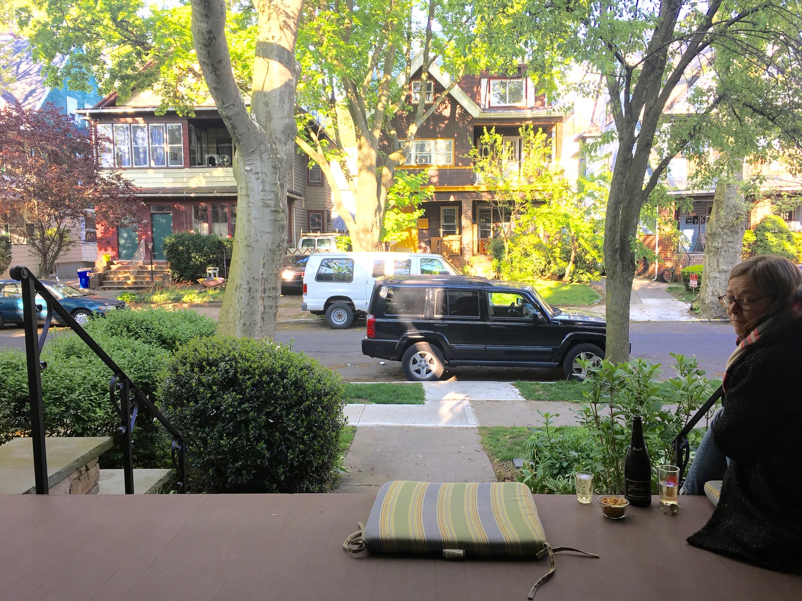
Click to enlarge

What Paul did last night: Yesterday was a special day. At 3pm, Mary (that’s her real name) presented her final project in her final grad school class. So when we hit the porch three hours later, she was, for the first time, an official Master of Library and Information Science.
Due to the state of the world, the latter phases of Mary’s studies have often been bittersweet at best. So I wasn’t sure what sort of mood she’d be in and was happily surprised when she pulled out a bottle of champagne for us to share on the porch. We toasted her new status as a Master, did the raisin trick, said hi to Judy the wiener dog as she walked by, marveled at how red the cardinal in a nearby tree was, and then ordered a pizza. A good day.
The branch is still there.
Other than the Kings busting out the purple (OK, “Forum Blue”… sigh) and gold, all of those other NHL throwbacks can stay in the past. I don’t see any great love for the brief history of the Atlanta Thrashers.
There’s a lot of local initiative to bring back the “Lady Liberty” Rangers’ sweater, but I’d just as soon have them leave off the futuristic chrome-y shield logos from the shoulders. Bad bit of design which didn’t age well. And I’m all in on bringing back the 1977 Kings’ uniforms! Shoot, bring back the 1988 suits, too! Both are miles ahead of the slapdash look they have now.
Forget as an alternate, I’m for the Kings bringing those back as the primary uniform. Create a new white version for the road based on that design. Have the yellow uniform as the third.
Now is a good time for the lowly Kings to hit the refresh button. Run with black and silver was good during Gretzky era.
Now it’s time to make the purple and yellow colour scheme cool for them. If the Lakers can make it cool, so can the Kings. The current uniform and logo is not that great.
link
The reference to “Super Bowl Tournament” (Re: 1983 Bucs program from the football section of the Ticker) was likely in regard to the 1982 playoffs. Due to the strike-shortened season that year, the playoff format was altered, and was referred to as the “Super Bowl Tournament” for that year only.
It is very weird to hear it referred to as the super bowl tournament!! I do know that Mike Tomlin has often referred to making the playoffs as making the tournament and see what happens.
Many hours later, I am here to confirm that Joe is correct, the 1982 NFL Playoffs were in fact called the “Super Bowl Tournament” due to the strike and related changes to the typical playoff structure.
Nice job Joe!
Lee
Waiting for the embroidered look to hit the Membership cards…
Kudos to Mary on finishing grad school! I started taking grad school courses in American History a couple of years after college, but stopped after a year due to work demands and admitted lack of motivation. Congratulations!!
Kudos and congratulations! From what I’ve heard and observed, Library and Information Science seems to be a very difficult course of graduate study. So that’s not just any master’s degree she’s earned, that’s one of the hard ones!
Congratulations to Mary on her graduation. I hope she enjoyed her studies. Welcome to the club.
Congratulations to Mary!
from a lowly Library Tech. ;)
got my Library and Information Studies diploma back in ’95 and “topped it up” to get a B.A. in ’97
Congrats, Mary. . . Well done!
Congrats to Mary on a great accomplishment!
The second thing I noticed, after the amazing detail on all of the tattoos in the lede, is how much white some of them have.
For whatever reason, white doesn’t stay “white” for very long in skin. It usually yellows to almost a cream color, which is why most artists only use it for finishing accents to make a tattoo pop, not as a main color in the design.
And to answer the question about plastic logos, I’m sure someone will want one, and I’d be willing to bet that they are actually easier to do than an embroidered tattoo, because the effect would come from the reflectiveness of it, and that could be done with the same technique as metal or glass.
The Cubs tattoo was done by Tim Beck Of Freedom Ink Tattoo in Peoria, IL. Absolutely fantastic artist and could definitely give more insight as to how well they heal up, as he’s done maaaaany of these!
The player with the Flywire collar that the Broncos used is Noah Fant, who was a rookie last year. He’s never worn the Flywire. That’s odd.
Congratulations to Mary on her advanced academic achievement! Challenging under normal conditions.
Did Jay Miller (Covid inspired logos) provide a link to his work elsewhere?
Congrats to the Tugboat Captain, finishing off any level of schooling is always such great feeling.
That Jurassic Park tattoo looks like it just a patch on his arm. If I saw that picture and didn’t know it was a tattoo I would just have assumed someone placed a patch on there. Kudos to the artist that did that one.
I’ve got a bad feeling that the LA Rams release delay is that they realized they messed up an update on what was one of the NFL’s classic unis; and now they’re scrambling for a revision.
Actually, there is no “delay.” They’ve been saying since March that the unveiling would be in May.
Hello Paul,I heard on local L.A. radio show, Fred Roggin (longtime L.A. sportscaster ) that the unveiling will be sometime in june, my guess is these are going to be Nike hideous uni’s, they should have just stuck to the throwbacks (fan favorites),there was a description of the the uni’s on sundays uni-watch edition from someone on twitter who supposedly seen them (I’m hoping its fake)and the description seems like they are going to be terrible
That is the first I’ve heard of it being pushed back to June. Will try to confirm — thanks.
So dumb the Rams would have these issues. All they have to do is make their throwbacks their standard home/away set. Everyone loves them, they’re beautiful, and it’s timeless. An easy win that they will bungle into an embarrassing debacle.
“The branch is still there” ending is beginning to take on a literary tone (I don’t know which literary device it would be – a euphemism?), like a quiet determination. “And miles to go before I sleep”, and all that.
Yes, it’s begun to feel that way for me as well!
Is it quiet determination, or looming, impending danger?
The Branch of Damocles?
Impending danger
Quiet determination
The branch is still there
Congratulations, Mary!
For us soccer fans, the Celtic FC contest has to go to a home set. I’m thinking the 82-84 or the 2012-13 set – stripes/hoops (as I think of what their uniforms should be) and no advertising.
No big deal, but this is probably not intended for the NLF portion of the ticker: “Here’s a good look at the fake fans at one of this week’s games in South Korea.”
Congratulations, Mary – what a tremendous accomplishment! #LibrariansRock!
“Fake fans” link from ticker probably belongs in the baseball section
THanks! Fixed.
Big CONGRATS to the Master Captain!!!
Congrats, MLIS Tugboat Captain! (MLIS sounds like “Muh-lizz” and rhymes with “Ms.” in my head as I type that out.)
Congrats to Mary from the son of a librarian!
Between Mary and Phil, the noble profession is well-represented among the Uni Watch team.
Congrats to the new Master.
Best movie with libraries: Wings of Desire
Never seen it, but it inspired a seriously underrated U2 song…
Congratulations to Mary! Well done!
Very pleased this morning to see my home town of Rockville, MD repped in the ticker. I have family members who went to Walter Johnson High School. Next time I go home – whenever that may be – I’ll go take a look at the Big Train statue.
That embroidered Golden Knights tattoo is the best of the bunch. I think the look is great, but I’m not sure I could endure the time it must take to get a tat like those.
Knowing the branch is still there is strangely comforting.
First time, very long time. I figured now (covid) is a great time to start contributing.
Regarding the tattoos, I think one of the greatest qualities of embroidery is that there’s perfection in the imperfections. I love how that translates to the 3d effect of the tattoo. Also, makes you wonder if people give stock photos to be tattooed or if they use their own hats/merch.
Also, regarding the NBA logos and the feedback that Paul has received. Does anyone with business/marketing knowledge know whether or not the league/teams are more likely to reduce their price or scrap the program?
Those tattoos are giving me the willies. Something about the imagery of fabric being sewn into skin… GAH. Feels like something out of a horror movie.
You’re not alone. I’m not ashamed to admit that the very idea of getting tattoo’d makes me queasy. LOL Today was the first time I can remember scrolling blind to the bottom of the page and then going back up for the ticker.
So did I.
I’m also a little bit – though not nearly that much! – squeamish about tattoos in general. Some of today’s though were so beautifully done that they didn’t trigger the “tattoo? ugh” response from my lizard brain.
My favorite song involves a tattoo, though, so despite my personal aversion, I do have a ready answer when the topic of what tattoo you’d get if you had to comes up. I’d get a blue wing tattooed on my shoulder, maybe a bluebird, I don’t know.
Congrats to Mary from another MLSer! Welcome to the librarianship club!
We begin Collector’s Corner’s second decade with Great Moments in Cubs Baseball, a 1971 album of the team’s greatest hits from the 1930s up to the 1970s
Look familiar, Paul? You have/had that album.
a 1983 Bucs game program that includes the term “Super Bowl Tournament” on the cover. What a weird way to refer to playoffs
From Wikipedia, but it’s still absolutely true…
“A players’ strike reduced the regular season to nine games. Thus, the league used a special 16-team playoff format (dubbed the “Super Bowl Tournament”), just for this year.”
Congraduations, Mary!
Congratulations, Mary! That’s quite an accomplishment! Now we just have to figure out how to tap into your expertise to find all kinds of uni-related ephemera… :-)
Paul, about a month or two ago you had a quick note about Uni Watch watches for sale. I haven’t been able to locate the post. Are they still for sale and where on the interweb can I find them?
link
scroll down to watches
Congratulations, Mary!
You can tell the fake fans are fake because none of them are holding/using cell phones.
Congrats Mary! My wife has her Master’s degree in that area as well and says it is the best she ever did.
Man that scorecard journal tales me back. To 2011 link
I’m all in on the kickstart
I have an euphus scorebook and LOOOOVE it.
Man that scorecard journal takes me back. To 2011 link
I’m all in on the kickstart
I Still Call Her The Tugboat Captain.
Congratulations, Mary!
Lee
Congrats to Mary! My wife is currently working her way to a second degree and I’ve seen first hand what a monumental task it can be. Onward and upward!