Hello! Before we get started on the topic of the day, it’s worth noting that the Chargers will unveil their new uniforms at 9:45am Eastern (a very odd time, especially for a west coast team). I’ll add a link here once it’s available, and have unveiled their new uniforms. I’ll have full coverage of the team’s new look tomorrow morning.
Now then: I don’t know if it’s the virus or what, but this has been a very strange spring for NFL uniform unveilings. We’ve seen the Colts tweak their helmet logo without telling anyone. We’ve seen the Bucs and Browns unveil new uni sets that are essentially their old uni sets. And yesterday we saw the Patriots unveil a new uniform set with — get this — the wrong pants.
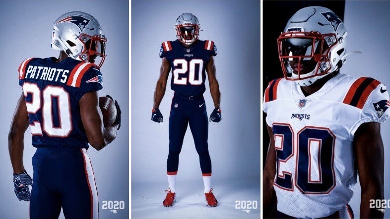
Although that wasn’t immediately apparent. Here’s how it played out: At 8am yesterday, just as I was publishing yesterday’s blog entry, the Pats revealed their new uni set (more photos here). As many people quickly noted, the home and road uniforms both appeared to be using the same pants from the team’s 2018-19 Color Rash set — navy with a wide white stripe, outlined in red.
But then, later in the day, several Pats players began posting Instagram photos of themselves in the new road uniform — and their pants didn’t match the ones shown in the unveiling photos. Here’s a side-by-side comparison, with an official unveiling photo on the left and running back James White’s Instagram photo on the right (click to enlarge):
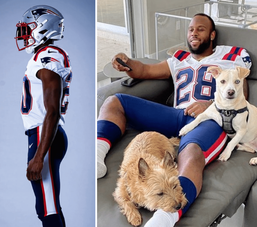
If you can stop staring at those completely adorable pooches, you can see that the pant striping doesn’t match. White’s pants have a narrow white stripe and thicker red stripes, similar to the stripe pattern on his jersey.
White wasn’t the only one whose Instagram pants didn’t match the unveiling photos. Cornerback Stephon Gilmore had the same thing:
Looks like Gilmore got pants similar to White’s as well. pic.twitter.com/fZrCIWVR1S
— . (@AayCeeBeee) April 20, 2020
I asked the Pats about this yesterday afternoon — no reply as of this morning. But while I was waiting to hear back from them, I heard from a trusted source who has access to the NFL Style Guide. He confirmed that the Instagram pants — the ones with the striping that’s similar to the jersey striping — are the real pants that the Pats will be wearing, and he sent me the relevant graphic from the style guide to prove it:
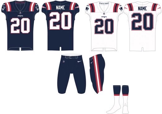
So the Patriots apparently used last season’s Rash pants for their unveiling photo shoot, instead of the real pants they’ll be wearing on the field.
Now, we all know the world is a complicated place right now, and all sorts of things aren’t running like the well-oiled machines they used to be. So I’m not going to criticize the Pats, Nike, or anyone else for not having the proper pants ready in time for the photo shoot. But come on — if your unveiling photos don’t show the uniform you’ll actually be wearing, why not, you know, tell us that? Or better yet, why not just Photoshop the proper striping onto the photos, like the Bucs did with Chris Godwin’s uni number? (As you may recall, the Bucs’ photo shoot took place before the Tom Brady signing, so Godwin was still wearing No. 12 when the photos were taken, but they Photoshopped the pics to give him No. 14 by the time the photos were released.)
I imagine some folks are thinking, “It’s just the pants, who cares?” But the Patriots themselves apparently cared enough to change the design, so why not acknowledge that? I don’t know if they were trying to sneak it by and hoped nobody would notice or what, but the whole thing seems pretty lame-o and unprofessional.
Okay, so aside from that little fiasco, what do I think of the new uniforms? Before I answer that, let’s start with some quick context: I know many people didn’t like the Pats’ outgoing uni set. While I certainly agree that Flying Elvis is a big downgrade from Pat Patriot, I’ve always been mostly fine with that set. The side panels were awful, of course, but that was really the only thing I didn’t care for. I liked the number font, I loved the striped road socks, and I was even okay with the red facemask (although I always thought navy would’ve been better) and the custom NOB font.
So with that in mind, here are my thoughts on the new set, keeping in mind that the pant striping will be changing (for all photos, you can click to enlarge):
The New Home Uniform
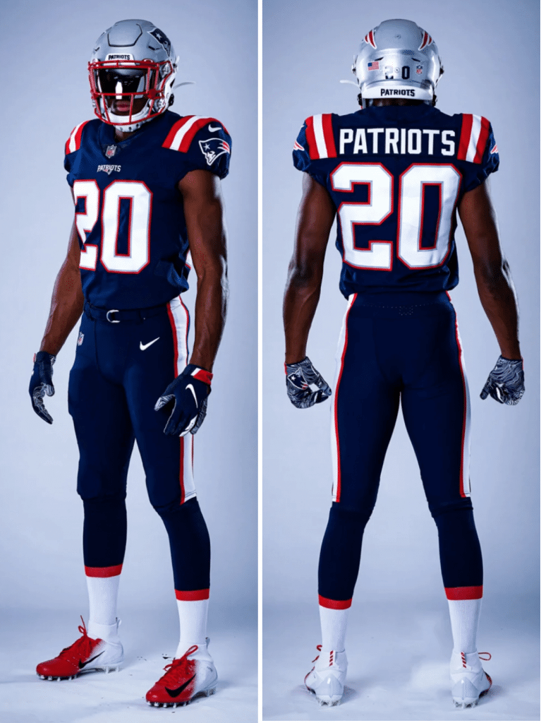
At first glance, it appears that they’ve just redesignated their Color Rash design as the new primary home uni. But a closer look reveals some differences — here’s a side-by-side comparison (old Rash on the left, new home on the right):
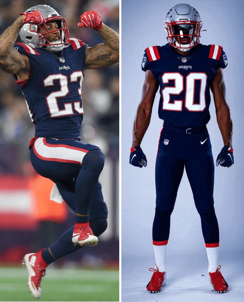
The most obvious change is the socks (although it remains to be seen how many players will wear them as intended, since NFL hosiery is now such a complete free-for-all). They’ve also changed to a more traditional block number font and a standard NOB font.
Okay, some thoughts:
• I’m astonished that they don’t have a silver or white pant option. There are plenty of teams that routinely go monochromatic at home, of course (Seahawks, Saints, etc.), but I believe this set would leave the Pats as the only NFL team that wouldn’t even have a non-mono option for its colored jersey. I’m not a fan of NFL teams going mono, so I really, really dislike this move. I asked the Pats if there are any plans to add silver and/or white pants to the mix, but that was before I’d seen the style guide graphic, which only shows the navy pants, so they appear to be sticking with the one pant color for now. (If I hear back from the team, I’ll post an update.)
• I usually love UCLA striping, but I’ve never liked it on the Pats’ Rash design and still don’t like it here. The striping seems too wide, with the visual result of the red feeling too bold. Instead of changing the pant striping to match the jersey, I would have preferred the other way around.
• It’s one thing to not have TV numbers on your throwback or Rash jerseys. But I believe this set will make the Pats the first NFL team without TV numbers on their primary jerseys since the 1979 Bengals. Current NFL uniform regs require TV numbers, so the Pats presumably got a waiver. I’ve asked the team about this as well and will report back if they respond.
• Personally, I much preferred the old number font, which was distinctive and unique to the Pats but wasn’t overloaded with all sorts of macho/primitivist talons and claws and all the other crap so common in most of the custom fonts we see these days. I’ll miss it.
• As many folks have pointed out, the whole package feels feels a lot like a low-budget stock design, or something created on a standard-issue team builder web platform:
Revere High School, OH pic.twitter.com/EkgyKluC2h
— Mark Balog (@Mpiece_) April 20, 2020
Overall: I hate it — a huge downgrade. Silver or white pants would help, so here’s hoping they add that to the mix at some point.
The New Road Uniform
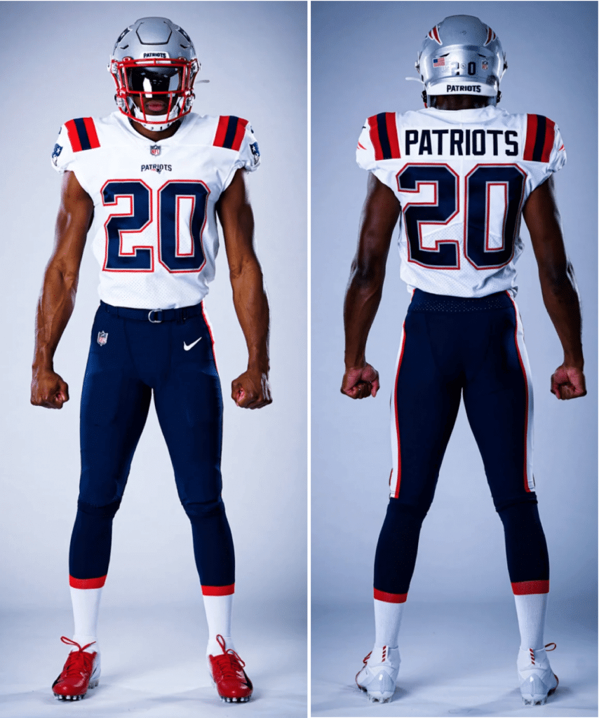
This is better, if only because of the contrast between the jersey and the pants. But the shoulder striping still looks too bold. It would look so much better if they reversed the color sequence on the striping, as you can see in this mockup by Twitter-er @WeberKing — real version on left, @WeberKing’s concept on right:
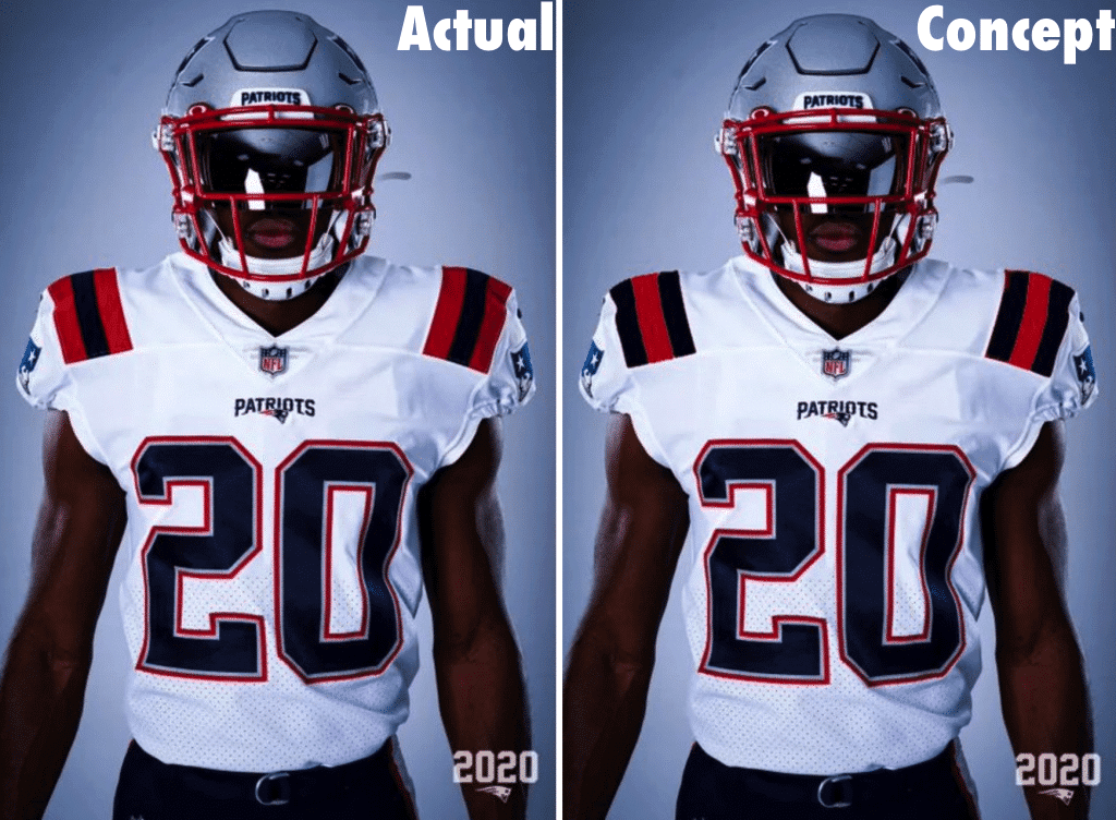
To me, there’s no comparison — the more navy-centric concept is soooo much better.
Meanwhile, they’ve scrapped the triple-striped road socks and are using navy-topped socks with the navy pants. Sigh.
Overall: Better than the home uni, but still a downgrade. I’m not a fan.
I assume we’ll see some sort of alternate released later this year, and they’re talking about a Pat Patriot throwback if the one-shell rule is ever lifted. Until then, this is what we’re stuck with. To me, it all looks very high school. You might say they got pantsed.
Uni Watch Haiku: Here’s the latest from the Uni Watch haiku lab:
Rose as an Expo?
I know it really happened
But it still looks wrong
And there’s more where that came from.
Click to enlarge
Collector’s Corner
By Brinke Guthrie
Follow @brinkeguthrie
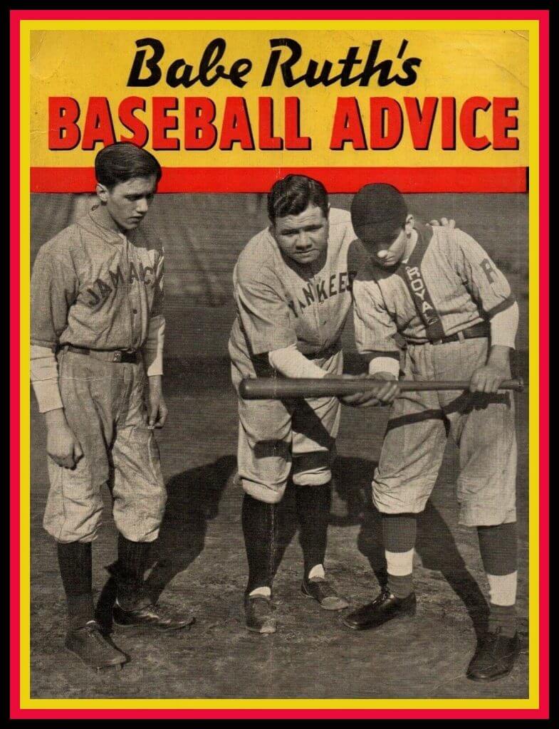
Yes, I know we featured the Babe last week, but he’s probably the most famous player in history, so that’s that. Check this out, Babe Ruth’s Baseball Advice from 1936! Thirty-two pages with some great uniform action there on the cover, and does anyone else find it funny Babe Ruth, of all people, is showing a kid how to bunt? I bet he never got a bunt sign in his life (and if he did, he blew it off!).
Now for the rest of this week’s picks:
• This Oh Henry! candy bar wrapper is around 100 years old! (Double Dip’t and covered with Real Milk Chocolate, mmmm.) The wrapper also included a deal for a Cork Center National League Ball (regularly $1.75) for just 69 cents and seven Oh Henry! Wrappers. Cash or money order only! Don’t send stamps!
• With the Los Angeles Chargers releasing their new look today, here is one terrific-looking deep blue team jacket from their San Diego days, made by Felco. Curiously, no logo on the front. This jacket has a quilted lining and the “Chargers” lettering is sewn (not heat-pressed like they do today).
• Check it out — this little booklet is from 1957 and is called Signals…The Secret Language of Baseball in Finger-Tip Movies. Flip through the book and the “animated” coach shows you how to steal, bunt, take, the whole deal (but I still say the Babe would ignore the bunt sign). That coach might in fact be Paul Richards, who managed the Orioles 1955-1961. Brought to you by Gillette!
• Have you ever seen one of these before? This is a 3D Stadium Table. This eBay seller has one for the Cleveland Indians, and you’ll notice it’s a replica of their stadium that is sunken down into the table top, and even lights up for a night game. The seller also includes a shot of Fenway in there, too.
• The New England Patriots were once called the Boston Patriots, (or more officially the “American League Professional Football Team of Boston, Inc.”), and at one point you could buy stock in the team, as shown on this 1960s stock certificate featuring everyone’s favorite, Pat Patriot.
• Couple of music-related items from the Cubbies here. Let’s start with some 1969 sheet music for the song “Hey, Hey, Holy Mackerel,” and then there’s also this The One and Only More or Less Official Cubs Party Album and Rally Starter cassette. Songs include “Men in Blue” and “Andre’s Army,” and the cassette was from WGN radio.
• This fun-looking Green Bay Packers Snowman and Snowballs set is from 1980, and is done in the proper team colors, but has no team logo. The seller is from Wisconsin, so we’re fine with it.
• This NHL California Golden Seals bumper sticker is in good shape. And you can be sure that Paul approves of the colors!
• Great cover art on this 1965 game program.
• Here’s a set of (presumably) 1960s Baltimore Colts drinking glasses. That sure looks like Earl Morrall at far right, who played for them in 1968-1971.
Click to enlarge
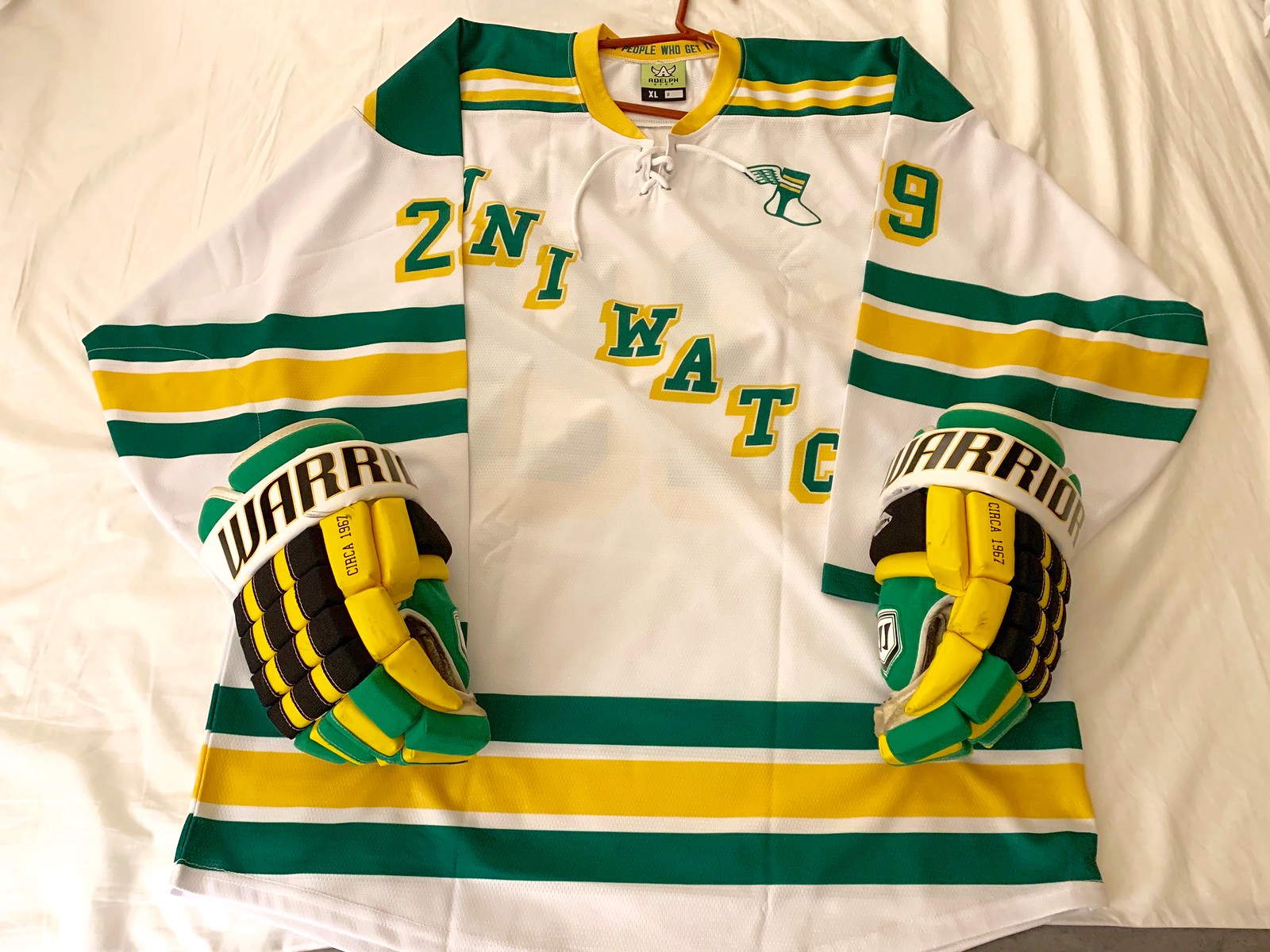
A glove story: People are starting to receive their Uni Watch hockey jerseys. As you can see above, Paul Ricciardi’s goes nicely with his hockey gloves. And fact, all three of the jerseys he ordered pair nicely with those gloves:

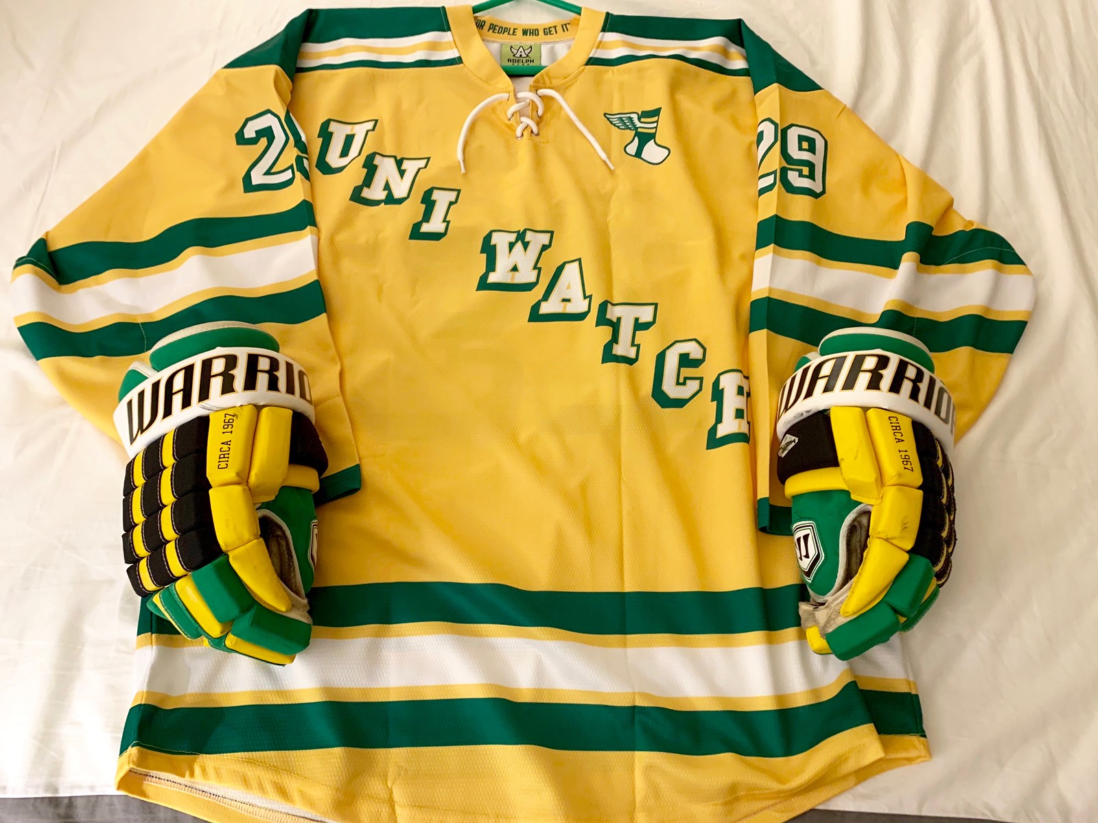
Lookin’ sharp, Paul! Once you’re able to get back on the ice, I hope you’ll send us some action shots.
Meanwhile, reader Harvey Lee may have chosen the best possible NOB — check this out:
Love my Uni Watch jersey! Would go great with my old Cooperalls, circa 1981! @UniWatch pic.twitter.com/1nWbK8wRJT
— Harvey Lee (@harvey_yen_lee) April 21, 2020
Nicely done, Harvey!
Hypothetically speaking: When you’re stuck at home for long stretches at a time, your mind dreams up all sorts of things — like, say, this.
Want to discuss how being cooped up makes a fellow dream up ideas like this one? Drop me a line.


Raffle reminder: In case you missed it on Monday, an anonymous reader has purchased 10 memberships for me to raffle off, with the proviso that this raffle is only open to people are currently working outisde of their homes — health care workers, truck drivers, first responders, grocery clerks, pharmacists, food deliverers, , postal workers, sanitation workers, transit workers, kitchen workers, and so on.
Obviously, there’s no way for me to enforce that restriction, but I have enough faith in the Uni Watch comm-uni-ty to believe that we can do this on the honor system. I mean, really, who would cheat on something like this, especially when we have so many other membership raffles that are open to everyone?
To enter, send an email to the raffle address by 8pm Eastern tomorrow, April 22. One entry per person. I’ll announce the 10 winners on Thursday. Big thanks to the anonymous reader who sponsored this raffle.

Membership update: Always fun to do a “peyote Coyote” membership card, as we recently did for reader Justin Adler. Another great example of a not-so-great uniform that makes for a sensational membership card.
Justin’s card is one of many that have been added to the membership card gallery, as we continue to work our way through the recent spike in orders (thank you!).
Ordering a membership card is a good way to support Uni Watch (which, frankly, could use your support these days). And remember, as a gesture of comm-uni-ty solidarity, the price of a membership has been reduced from $25 to $20 until further notice.
As always, you can sign up for your own custom-designed card here, you can see all the cards we’ve designed so far here (now more than 2,600 of them!), and you can see how we produce the cards here.
The Ticker
By Alex Hider

Baseball News: The Rockies were supposed to retire Larry Walker’s No. 33 last weekend. Even though the ceremony didn’t happen as planned, the Rockies unveiled a logo honoring Walker’s HOF induction — which appears to be based on a photo of him in a TATC uni! (From Ron Ruelle and Tyler Maun.) … The Nationals won’t raise their 2019 World Series banner or distribute rings until they can do it with fans present (from Kary Klismet). … Also from Kary: Baseball blog This Great Game has a series on the history of MLB stadiums dating back to the 1860s, broken down by era. … Former White Sox RF Jermaine Dye said he chose to wear No. 23 with the Sox between 2005 and 2009 because of Michael Jordan. Dye wore No. 24 for the majority of his career (also from Mike Chamernik). … Johnny Garfield spotted someone wearing a white-front Phils batting helmet in this photo of P Tug McGraw during the team’s 1980 World Series celebration. Does anyone know anything about it? … Here’s what happens to commemorative baseballs for cancelled games (from Eric Abneri). … Great video clip of Giants broadcasters Duane Kuiper and Mike Krukow talking about their all-time ugliest uniforms (thanks, Brinke). … Check this out: mono-blue vs. mono-blue in the 1987 Pan Am Games (from Marc Viquez).

Football News: Former NFL LB Mike Curtis, who played most of his career with the Colts, has died. He was the subject of a 2017 Uni Watch entry regarding his unusual chinstrap habit. … The NFL’s annual ranking of helmet safety has been released. Additional info here. … Were the Bucs’ “alarm clock” jerseys based on a fast food uniform from the TV show 3rd Rock from the Sun? Sure looks that way! … NFL prospects won’t be required to wear suits on draft night, but there is a dress code stipulating what they can’t wear (from Chris Ashworth). … Patrick Wieboldt has been replicating on-field helmets. Here’s his work on a Ben Roethlisberger Steelers Super Bowl XLIII helmet. … We often bemoan the fact that the league has taken all the fun out of the Super Bowl logos. It turns out, they’ve done the same thing with the logos for the draft (from our own Anthony Emerson). … According to Jim Weber, ESPN’s Adam Schefter has been rearranging the mini-helmets in his home office to fit the news cycle. He previously displayed Patriots and Bucs helmets to reflect Tom Brady’s free agency. Now, he’s displaying Cincinnati and Washington helmets for the draft. … @GashouseILM built really cool Chargers and Dallas Texans helmet signs to display in his house. … We’ve all seen lettermen sweaters for high school and college athletes, but check out these sweaters given to members of a Pop Warner team in Lima, Ohio, in the 1960s. Pretty good get for those kids! (From George F..) … Sauk Prairie High School in Wisconsin is building a new stadium (from Kary Klismet).

Hockey News: So much weirdness going on in this 1978 shot from the Canadiens’ locker room. … Speaking of the Habs, Frederick Vinet noticed some crest-positioning inconsistencies in this late-’70s team portrait.

Basketball News: The Last Dance, the docuseries on ESPN about the ’90s Bulls, visited Michael Jordan’s alma mater, Laney High School in N.C. The school has a framed Jordan jersey in its trophy case that includes two Air Jordan logos and a note clarifying that it is a “replica jersey.” No shit (from Robert Kahn). … Lyon College in Arkansas is installing a new basketball court in its home arena (from Kary Klismet). … Missouri did their own “only keep three” meme with historical basketball uniforms (from Landon Daniel).

Soccer News: Manchester United’s 2020-2021 primary jerseys have reportedly leaked online (from Jay Stancil). … This is reportedly what French club PSG will wear as their third kit in 2020-2021 (from Josh Hinton). … Bayern Munich signed MF Alphonso Davies to a contract extension. Davies and team officials wore masks for the announcement and made sure to sit far enough apart (from Gabriel Hurl). … Here’s a deep dive on the history of Dutch club AFC Ajax’s crest (from Kary Klismet).

Grab Bag: Ticketphiles will want to check out this thread — the New York Islanders asked fans to share photos of old tickets stubs they’ve saved (from @OlegKvasha). … Fort Hays State University in Kansas is holding a bracket-style tournament to determine the school team with the best uniforms (from Kyle Eilts). … Most regular readers are probably pretty familiar with most of these — “25 things hiding in sports logos” (from Jon). … Readers Max Wastler and Micah Smith have designed an Ebbets Field Flannels cap bearing the image of Dr. Anthony Fauci, the Director of the National Institute for Allergies and Infectious Diseases. A portion of the proceeds from sales of the cap will go to Steps of Faith and No Kid Hungry. … This AV Club piece about the staying power of the band 311 mentions that on March 11 (3/11), fans of the band wear sports jerseys customized with No. 311 (from Michael Fender). … Navy veteran Andrea Robinson, who now works for the Marine Corps, has created posters with a nod to the French resistance in World War II to encourage social distancing (from Timmy Donahue). … Speaking of posters, a University of North Carolina professor made an Uncle Sam concert-style poster encouraging the use of masks (from James Gilbert). … More posters: A look at pandemic posters through the years (from Timmy Donahue). … Brian Johnson’s Twitter thread explores pro sports teams that appear in TV show intros. … Check out this old “Building for Lease” sign in Detroit with the word “for” styled like the Ford logo. Was that a common Motor City thing? (From Sean Butler.)
Click to enlarge
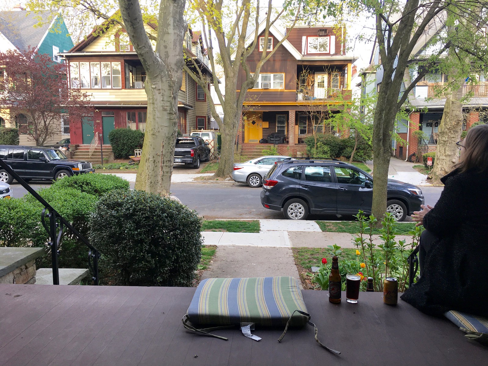
What Paul did last night: One nice thing about being on our porch each evening is that we’ve become much better acquainted with the local dogs, many of which take their people for walks during our porch sessions. We don’t know the people’s names, but we say hi to the dogs. There’s Hector, and Sebastian, and Tillie, and yesterday there was this beautiful greyhound we’ve seen before, but we couldn’t remember his name, so we asked. Baz — his name is Baz. I need to remember that.
Normally we’d get up and go pet the pooches, but we’re not doing that now. Sigh.
Anyway: Brooklyn Brown Ale for me yesterday, and seltzer for the Tugboat Captain. The leftover barbecue afterward was very, very good.
Does anybody else notice how far down the back of the Jersey the UCLA stripes extend? It seems very odd compared to the front side. I don’t think the Colts uniforms have this.
Yes…but the length looks about the same as the Colts’ stripes do. The Patriots will have to trim them for the few last names over 8 letters(like the Colts do and the XFL 2.0 NY Guardians did?)?
I’m surprised that the Pats didn’t take this chance to swap the helmet shell color from silver to white and keep the flying Elvis logo. With no silver in the uniforms anymore the shell will look out of place, and then they would be a helmet sticker swap away from being able to use the throwbacks which would mix in nicely with this set and give them a white pants option.
That’s been an immediate reaction from a lot of people. It doesn’t take much thought to make that leap which is why this whole set feels rushed and lazy.
There appears to be a tiny bit of silver on the jerseys (it’s in the numbers) but that’s about it. Otherwise, I agree: they should have either switched to white helmets or included more silver in the uniform.
Just a heads-up, the 2 entries in the hockey section of the ticker both link to the same tweet.
Wha..?
Two completely different links, at least on my device.
My memory might be failing but when I would go to see the Phillies at the Vet when I was a teenager (late 70s-early 80s) that white faced helmet was either a Helmet Day promotion or they sold them at the concession stands. Our friend Bill Henderson would probably know…
It was. Never worn on the field though.
Born and raised in Philadelphia. MJ is correct, and I can’t remember if it was a promotional giveaway, an item for sale, or both. I had one or two. They were cheap toys with a plastic adjustable ring inside to fit your head. As MJ said, they never showed up on the field.
If it made it sound like the Phillies actually wore them in a game, that’s not what I meant…I only referenced Bill because he grew up around Philly and he saw more games at the Vet than I did. I collected those kinds of helmets as a kid and that plastic adjustable ring always left a mark on my forehead when I took them off.
Yeah, and in the video of the World Series parade it’s a kid wearing that helmet who’s standing by Tug.
Cooperalls! Stellar NOB choice!
RIP Mad Dog Curtis. He was drafted as a running back and switched to defense by the Colts, which is why he wore #32 as a linebacker.
Does anyone else suspect that there might be a connection between the Patriots uniform tweak and Tom Brady leaving the franchise after nearly two decades?
It’s as if the changes are meant to signify a new era for the team without totally changing things from the Brady era.
Would also explain why the changes seem kind of “rushed”.
Given that it takes about two years to rework the uniforms, it seems unlikely.
No. That’s not how these things work. This was in development long before they knew Brady would be leaving.
Maybe a tenuous connection; they might have waited for Brady to leave before changing the uniform. More likely, a coincidence.
People, please stop spreading disinformation thru speculation. Most of you know how these things work — uni changes have to be submitted more than a season in advance. This has nothing to do with Brady. Just a coincidence. Let’s please move on. Thanks.
True. But there is the possibility that they tried to move in a different direction with the pants. If they had originally had silver pants as part of the look, they could have ditched that idea to go with a “new” look with the blue. I doubt that was the case, but it’s possible.
I’m not even sure that it’s all that possible. That’s a narrow window to make changes, even to pants.
Tom Brady came on my show and said that it was obvious to everybody in the organization that last season would be his final one in New England.
Maybe it was just coincidence that the team also decided that 2019 time to give the team a new visual identity. Who knows? I’m just a disc jockey.
I can’t remember where I read it but it was decided a couple years ago – I’ll try to find it
From patriots.com…
“ The switch is a step to modernize the Patriots look, a process that started more than two years ago.”
That’s not the Revere Ohio football team. It’s my wife’s alma mater and they are the minutemen.
This is what their band uniforms looked like 25 years ago:
link
As Revere High in Massachusetts is my alma mater, I can both confirm that it’s Revere (MA) and tell you who lives in some of those houses in the back.
“ I don’t know if they were trying to sneak it by and how nobody would notice or what,“
Did you mean “hope” instead of how?
Yes, thanks. Fixed.
Yep, the Patriots did unveil the uni set with the wrong pants. The pants should be silver. Then the uniform would look much better.
Exactly.
That’s what I assumed the headline meant before I read the story. If only.
IIRC Curtis was a linebacker, not a DB.
Right. Fixed.
ESPN.com has link on its link on the link to an article about the upcoming draft. There’s an anomaly in the chromed-helmet display; the Jets helmet (left side, 1st column, 4th row) has the primary logo on it instead of the secondary (regular helmet) logo. Obviously no one’s heard that the Jets might be considering switching to that, but I just found it odd that it’s the only anomaly. Does anyone else think it looks better that way?
Omg yes. I would LOVE it if they changed the helmet logo. I hate the new one. Boring and uninspired. I really like the almost emerald tone of the helmet, but it’s ruined by that silly logo imho. I think it is the worst part of the whole set, although the black set is a very close second.
Also, would the change even be possible by NFL rules? The uni change rules only allow them every 5 years, but would a lone “tweak” like this be allowed? After all, it’s merely a sticker.
I could be wrong, but I’m pretty sure the 5 year rule applies only to jerseys. Teams can introduce and wear whatever pants they want (remember Baltimore in gold pants for a few games in 2015), changing the decal on the helmet probably wouldn’t be considered a 5 year only change, oddly enough Baltimore is another example, they had an original helmet logo for 3 years when he first moved to Baltimore before switching to their current logo.
Helmet, including logo, and jerseys are definitely part of and governed by the 5 year rule, and they must be submitted in advance – at least 18 months before season they will be worn – in order for Team Logo Apparel Manufacturing, bumper stickers replica helmets, jerseys, jackets, etc. All of the new looks need to be committed to and locked in well before they hit the field, and I believe it is 18 months for the NFL, but certainly not something that is decided upon after one season ends and changed before the very next season.
My understanding is that pants are different. Teams can where whatever pants that they want, but are already VETTED and locked in to any uniform changes submitted and approved for a new uniform set. I don’t believe they can add a new pants option mid-season.
But who knows.
Saints added their White practice pants mid-season this year, and nary a word was said or written prior to their emerging and being worn. The Saints’ White-over-White color Rush (throwback old Gold numerals) were so popular that the team wanted to wear the White Color Rush unis more than the three-game limit, so, the team went regular White jerseys over White stripe less practice (looking) pants, and the League could not prevent that.
Somebody that knows more than me about how soon pants must be submitted and approved by the NFL before being worn – PLEASE HELP!
The first line of today’s haiku has 6 syllables
Oh, no — so it does!
See, that’s what happens when you write these things in your head during a bike ride.
I’ll have to revise that one. New haiku now swapped in!
And you DID publish a haiku yesterday! Keep ’em coming!
Many classic haiku, such as some by Bashō, break the strict syllable pattern. It’s OK to do so from time to time.
At least the flying Elvis uniform looked like someone put effort into them. These just look like something out of ncaa football team builder. Nothing is unique to the patriots and could be any blue/red team.
Nothing is unique to the patriots
Considering the “unique” touches on their last uniform set were side panels, pointless piping, and really ugly numbers, I would say that adjective is very, very overrated.
Anything that doesn’t you the number of the player or what color team they are playing for is “pointless” in a uniform. Everything else is just there so that when you turn on the tv you know which team is playing. In that sense piping can be just useful as shoulder stripes. Their old numbers were fine; they weren’t atrocious as in the old TB uniforms and they weren’t the god awful mediocrity that they have now.
The worst part of their new uniforms is how they were just aiming for mediocrity. At least ugly uniforms can be laughed at. These are just. . . There.
I’m jonesin for Brooklyn Ale and BBQ right about now!
I have a memory of that Phillies white-front batting helmet. I believe you could buy that at the Vet. I can’t confirm that, though. But that photo did trigger a very strong memory so I’m sure they were displayed somewhere (most likely at the Vet).
Justin’s membership card is a beauty, but it includes a fair amount of a putatively prohibited hue. Has the pandemic produced purple permission?
Oh, wow — I’m slipping, for sure. Six syllables in the first line of a haiku, and now this.
No purple is not permitted until the appointed day (which is now just a few weeks away!). But this one somehow snuck thru.
Grrrrrr.
I think a global pandemic is a reason so lift the purple restriction…(signed – A Lakers Fan)
I also agree the pats road white looks better, but I think it’s because in both the road and home the numbers are outlined in silver and red. On the home you can barely tell without close inspection. I believe the numbers would pop more on the home if the outline was navy and red. The road numbers seem to pop a bit more with the navy sliver and red. Creating what appears to be a gap in between the navy and red.
I find myself more and more looking to the picture you post from the porch each day. I love how the trees are getting more green every day. Favorite time of the year for me is those days where you see a little bit of green / leaves on trees and then one day, BOOM, all the leaves are in.
Looks like your neck of the woods is ahead of us in the NE Ohio area. A lot of buds on the trees but no leaves really coming thru yet.
Thanks, Rich. That was one of the ideas behind the Pandemic Porch Cocktails™ photo project — that we’d see everything starting to bloom.
Full photo set, now with 35 entries, here:
link
The 3/21 pic is my favorite…not really blooming yet, but the Sun shining against the houses across the street + the super bright blue sky…those are those days where you know that spring is coming sooner rather than later. These are all taken in the evening, correct? I’d assume if that’s the case your porch is situated due East as the sun is behind you in the pics. Good for taking pics across the way.
You’ve got a great view from your front porch. Love it every day.A mini Painted Ladies Brooklyn style kinda thing going on there. With a little Rear Window thrown in. Do your 3 neighbors across the street know how famous their residences are becoming?
UCLA stripes on modern tailoring rubs me the wrong way. It looks unfinished and that sudden stop of the striping is all I see on these.
Paul, the topic of truncated UCLA stripes comes up a lot here, so I am sure this has been addressed before but I’ll ask again. Is there a reasoning why the manufacturers simply do not have a jersey tailored to properly fit the stripes? UCLA has a very reasonable replication of the stripes on their uniforms, why do the Colts, and now Pats, not get the same treatment? Is it just a matter of Nike refusing to have tailoring that allows for it, and/or refuses to have a custom tailoring for teams with those stripes? Seems so bizarre to me that you’d hire a contractor that refused to meet you design specs.
Good question. I think we may have reached the point where some teams *prefer* it this way, because it’s what people are used to and/or looks more modern. In other words, it’s become a feature, not a bug.
This baffles me, too. Why can Nike get the wraparound stripes done on, say, the Carolina Panthers, but truncates on others. It looks like it can be done.
link
Looking at the tailoring on the new Chargers jerseys…it seem that tapering of the stripes is do-able by Nike.
I think the truncated UCLA stripes might be the thing that really makes me hate this new uni.
Is the haiku blurb a running gag or just a copy/paste error? I distinctly remember a haiku yesterday but i have not gone back to check Sunday, although I thought LIPhil ran Sundays.
Wow, lots of mistakes by me today. Yes, copy/paste error. Now fixed.
I think the average football fan will see no difference at all in the ‘new’ Patriots uni.
“Same color? Same helmet? Same uni.”
Not sure how many broadcasters or opposing teams who watch film would complain about the patriots not having TV numbers, and not sure how many it would take for the league to force the patriots to change. But they could add TV numbers anytime in the next 5 years and stay within league rules by adding them to the helmets. I know it’s unlikely but I find it interesting since they can theoretically add them anytime, like the browns can add orange pants anytime.
I would really like to know more about the actual requirements for TV numbers, and what the process was for the Patriots ditching them. Especially since the Browns also asked but were turned down.
My own thought is that if teams don’t need them on alternate uniforms, they probably don’t need them on regular uniforms either, and it’s time for them to go away.
Paul,
Loved your BBQ odyssey yesterday! Also enjoy the porch segments.
But today’s reminded me of the saddest part of all this for us… Having recently put down our own beloved pooch, now we can’t even pet his best pal/girlfriend, my neighbors dog, who runs over here every chance she gets….
The sports I can live without, but no dogs….?
I do like the Pats’ new away set. The home set needs silver pants with the new striping pattern instead of the navy pants. A nice fauxback alternate would be a red jersey with UCLA striping paired with the silver pants and putting Pat Patriot on the silver helmet.
re: Pats new uni….
few weeks ago this would have been big news….
however, the Pats became pretty much irrelevant with the stroke of a pen 4 weeks ago…except in Buffalo where March 20 is now a public holiday!
But hey! That new Bucs kit is gonna look great when #12 wears it!
25 things hiding in sports logos:
I never realized the Avalanche had a puck in their logo and that the Washington Wizard had a beard, love it. Learn something new everyday.
The Wizard’s beard I get, but link doesn’t exactly seem hidden to me.
There is no way around the fact the new Patriots are a total disaster. Amateurish and embarrassing.
And don’t think for a second they are going with no TV numbers to give them an edge in other teams scouting their film.
I thought about this too. I don’t think it’s the sole or main reason they didn’t add TV numbers. But I think it came up just as a benefit that it may be an inconvenience for opposing teams
Funny how opinions work – I think that the Patriots are now only a pair of pants away from one of the best uniforms in the league.
New Chargers uniforms: link
Another thing going off of memory – I thought the NFL didn’t allow numbers on the sides of the helmet (perhaps for retail purposes?)
Closest thing I can find as of now is NFL rule section 4 article 3 (c)
“ Numerals
(c) Numerals on the back and front of jerseys in accordance with Rule 5, Section 1, Article 2. Such numerals must be a minimum of 8 inches high and 4 inches wide, and their color must be in sharp contrast with the color of the jersey. Smaller numerals should be worn on the tops of the shoulders or upper arms of the jersey. Small numerals on the back of the helmet or on the uniform pants are optional.”
I have never heard anything about TV numbers being prohibited on the helmets. Based on what you quoted, it sounds like the rules are silent on that point.
Now THAT’S what I call a football uniform. Beautiful!
I like those. The Chargers did a good job on their new set.
Well, we know now why the Chargers uniforms didn’t leak. Apparently they don’t exist yet. Strictly a photoshop job. Maybe Nike is still trying to figure out how to make pants with bolts on them? Or they can’t exactly replicate the shade of gold used for the pants yet. The Chargers didn’t screw it up, but that Navy Alt (and since when did rules allow for 2 alternates?) is brutally bad.
Ummm… link
I stand corrected. I guess the strictly photoshop uniform reveal is a byproduct of social distancing? It just seems that as long as they’ve been hyping these, some publicity photos would’ve been ready to roll of the real thing. It’s hard to make a full judgement on these without seeing the actual product.
There’s also this (although I suppose this *could* have been ’shopped):
link
That looks ‘shopped, but it’s hard to tell? Just seems that if they had the real thing on a real player we’d have shots of the back of the uniform to show the NOB font, etc. Of course, the day is young and it’s still barely 8AM on the West Coast, so maybe more is coming as the day progresses. As a Charger fan since the late 70’s, I do like what I’ve seen so far. I’ve been hollering for gold pants and helmet numbers for years, so I got what I wanted on those points.
I’d say those are definitely ‘shopped (a few of them pretty poorly).
Nice to see the Browns and Chargers both getting away from having a wordmark on the chest above their numbers. So much cleaner!
YES! So much better!
Looks like no TV numbers is the new black.
I’ll agree to disagree with you on this one Paul. Like I said in the comments yesterday, as a die hard New England fan, I think this set is a big upgrade for the Pats, particularly the road. I’ve liked the CR jersey design from it’s introduction, and have wanted that to be the primary home since then. I like the road jersey as well, and TBH prefer the actual striping pattern. The set’s glaring issue, and what keeps it from being a total win is the lack of silver pants option. Also, personally I wish they would have gone with a a 1995-1999-era throwback since the Pat Patriot uniforms are still one shell-shelved.
Also, non-uni related, I’m loving the porch photos each day.
Fair enough, Brian. Since you’re a Pats fan, I’m glad you like the new look!
I’m a long-time New England fan as well, and while I like the jerseys (been saying since they introduced it as CR I’d love to see that blue as a primary), I definitely hope they add white or silver pants to the mix, and if white, switched the helmet to white as well to facilitate throwbacks. Still definitely see them as a major upgrade, and makes my Tedy Bruschi jersey an immediate throwback.
Regarding Larry Walker in the TATC uni… one of the memorable moments in his Rockies career was a walkoff homer he hit off John Rocker on TATC day, 8/18/99. I was there even though it was a midweek day game because my boss had given his tickets to a coworker and me and told us to go and to not take it off our vacation time. Must have been a lot of bosses like mine, because it was a full house at Coors on a Wednesday afternoon. Fantastic day.
the Chargers will unveil their new uniforms at 9:45am Eastern (a very odd time, especially for a west coast team).
It makes sense when you learn the reveal was done on NFL Network’s Good Morning Football program. They sent jerseys to the hosts, who teased them on their various social media feeds.
Re: the 311 jerseys:
I attended a 311 show back in Lincoln, NE in early 1998. NU football coach Tom Osborne had recently retired, and 311 (who got their start up the road in Omaha) wore red Nebraska football jerseys with “311” on them in tribute.
I’m not aware of any pictures, and the jerseys went sailing into the crowd fairly early into the show.
RIP Mike Curtis
link
I love the Pats new look. Fat chopped off UCLA stripes? No problem! Block numbers? Love ’em. I think it was a good idea to shelve the silver pants, at least for now. maybe a bit dated, or at least associated with the old look which overall felt a bit out of date. I don’t even mind the mono navy. If you must go mono, the good-sized stripes help a lot. Plus I think navy is more forgiving as a mono than many other colours. I also think the silver helmet looks good.
Also: the Uni Watch hockey jerseys look great!
If my team’s uniform included 6 SB wins, 9 SB appearances, and 19 division titles in the last 20 years, I’d say don’t mess with it. Be as out of date as you want.
Yes. If I was a Patriot fan I’d be demanding the “Brady uniform” in perpetuity. I’d consider it untouchable.
So based on the Chargers reveal I guess TV numbers are going to be a thing of the past? I wouldn’t be surprised if this in some way came from Nike saying there is only so much real estate and we can’t do stripes and also keep the numbers, rather than just making it work. And if you take a good look at both the Pats and Chargers new jerseys they make sure to give plenty of space to keep the Nike logo easily noticeable. With the new Pats set there is no reason they couldn’t slide the stripes down closer to the sleeve and fit numbers on the shoulders (like the Vikings white jersey used to have), but that would crowd the swoosh. Similarly no reason why the Chargers couldn’t have tv numbers on the sleeves (or the shoulders for that matter), but the sleeves are real estate for the swoosh apparently. Lack of tv numbers make these look like bargain bin knock off retail gear.
So based on the Chargers reveal I guess TV numbers are going to be a thing of the past?
Whoa, whoa, whoa, not so fast! Let’s review the facts:
1) There have been six uniform unveilings so far this spring.
2) Four of them (Bucs, Browns, Colts, Falcons) included TV numbers on the jerseys.
3) One of them (Chargers) does not have TV numbers on the jersey but *does* have them on the helmets.
4) One of them (Pats) does not have TV numbers anywhere, but that was based on a Color Rash uniform that also didn’t have them.
So I’d say you’re leaping to a conclusion that isn’t really warranted.
I’m going to try to get answers from the NFL about this. Until then, though, let’s please not make unfounded assertions. Thanks!
Thanks Paul, really curious to hear what the NFL says about this. I can understand an exemption for the Chargers if the reasoning is the helmet numbers adequately replace them. But there is no real reason why the Pats would need an exemption. It is not as though they were the 2019 Browns who actually made their rash uniforms the primary for a year until the new set was revealed. The Pats officially and completely replaced their primary jersey with these, which could have incorporated TV numbers in there somewhere.
Just from a personal reaction, to me uniforms having standard elements across the league, in this case tv numbers, creates a sense of cohesion and professionalism to the look. Abandoning really downgrades both sets in my eyes, and makes the league as a whole feel more haphazard, almost like first step to the NBA’s hundreds of random uniforms.
The ticker item about commemorative baseballs reminded me, I have a baseball from what should have been the final season for Milwaukee County Stadium, but that was delayed due to the crane accident. It says 1953-1999, but the stadium actually closed in 2000. Just a random thought
A couple of comments
1. Of the critique of the Pats uniform – the comment on the shoulder stripe was IMO articulating an insight – that with the more laymen type like myself, didn’t register right away – but now that you’ve pointed it out – makes sense
2. There is the occasional odd silver lining with Covid 19, with this great flush of new NFL uniforms, it seems only fitting that in a period of when it would have been difficult for Paul to travel to the launchings – no uniform wannabees get to travel. That may sound a little mean spirited but I don’t think there any heir apparent on the horizon.
3. The Montreal Canadiens late 1970’s picture of Larry Robinson being awarded the Franke Selke trophy for MVP of the play-offs, reminded me of a odd uniform fact. I was a big fan of the Canadiens, they use to always introduce new uniforms for the play-offs which usually contain a slight adjustment of their look, a slight positioning change of their number on the sleeve , nothing major – just something that made you notice they were new. Saying that I don’t know if one of those changes – resulted in a change to their v-neck design
4. Sound the trumpets – the Chargers new uniforms as expected….. beautiful.
Apologies – Conn Smythe not the Frank Selke
Hard to see from the Chargers debut but it almost appears as if it could be the same font the Browns have now. At least similar?
Pats all navy looks very bland to me personally. It looked much better when they went mono blue with their prior set in 2003 when that was a trend throughout the league. At least the road socks made it pop.
Weren’t the Patriots three-striped socks an Adidas thing? Adidas was their uniform manufacturer in 2000, when those uniforms replaced the Bledsoe-era uniforms.
I never understood those socks. They were so incongruous with the rest of the uniform.
I have maintained this for years and years. finally, someone who agrees.
Seconded haha
‘incongruous’ is the absolute perfect word to describe them.
I was 11 years old in 2000. I remember thinking back then that it’s just too odd of a coincidence that the Patriots got new three-striped socks with a new Adidas-branded redesign. Consulting Gridiron Uniform Database, Adidas also had its logo on San Diego, San Francisco, Tampa Bay, and Washington. So yeah, New England was the only new uniform in the bunch.
The other side of the argument would go like, “Then why would Adidas only give white Adidas socks, and not blue? Then why would Adidas not have given their other teams Adidas socks, especially the 49ers when it’s downright historical for them? Then why would Reebok and/or Nike keep an old Adidas trick on their watch? What if three stripes are just three stripes sometimes?”
Now, I think, why can’t both sides be true? Five Guys, the burger chain, was originally named for the founder and his four sons, but then when Son #5 was born, the dad took himself out of the name. Acronyms like AT&T, the ECHL, and the SAT used to stand for something, but now they’re empty initialisms. Maybe Adidas got an extra three stripes on a uniform, but then it lost the Adidas meaning.
Soooooo many NFL teams have worn triple-striped socks over the years (Bears still have them), and it never had anything to do with Adidas. Pats kept the sock design thru the Reebok and Nike eras — why would they have done that if it was just “an Adidas thing?”
Sometimes three stripes are just three stripes.
Because they were lazy? Pats never had a three stripe look anywhere on their sets, unlike the Bears, who have them on their sleeves.
No idea, but I think it’s a reasonable inference to draw from (1) Adidas taking over as the Pats’ uniform supplier, (2) the Pats’ introducing new socks (coincidentally?) featuring Adidas’ signature look, and (3) those socks matching nothing else in the uniform package.
In any event, I’m not going to miss them.
I’ve never thought they were an adidas thing (sometimes people want to see things that just aren’t there), and while not bad looking in and of themselves, the socks definitely felt very random and out of place.
Lee
The reaction of the new Bolts jerseys appears to be mostly positive. I’m going to assume Paul likes the 4 standard combos and cares less about the two (!) color rush options.
But looking at the new most-of-the-time Chargers, the Raiders, and the Chiefs…the Broncos really stand out in the AFC west, uniform-wise now.
Even before this change I think the Chargers had a great set, it had some modern flourishes, but nothing too crazy, and maintained what was an overall great design with the lighting bolt stripes. The Broncos have always been the ugly ducklings in that division. If they went with their color rash orange jersey, matched with white pants full time they’d be in good shape.
I’ll never quite understand the hate for the Broncos’ current unis. I understand there’s lingering angst because they were a pioneer in the era of flashy, more modern uniforms, and the side stripes kind of look like a Nike logo. But given how the league has gone the Broncos now look pretty sedate — certainly more so than the Chargers, who get points because of the nostalgia attached to their new set. The Broncos look a bit dated now, but I wouldn’t call it ugly.
I think they get blamed for starting the early 2000s side panel/piping/stripe trend in the NFL, which led to some pretty terrible uniforms. To their credit, they at least had the sense to make the sides of the jersey and pants match, and to not try to combine those side stripes with a bunch of other nonsense like other teams did.
The Broncos set hasn’t aged well. Looks dated now.
I think the side panels are just brutal, and the font is meh. It certainly isn’t the worst uniform in the league, but definitely towards the bottom, and in strong contrast how great the rest of their division (typically) looks.
After seeing the Chargers new uni set, the only new uniforms that I really HATE is the Falcons. I really don’t like that the Patriots only have one pants color, but that can fixed with the addition of silver or white pants. I would have much preferred a return to the Patriot Pat era, but I still think the Pats upgraded over their previous uniforms.
I hope the Chargers use the yellow pants with the royal jersey at some point – Dan Fouts era!!!
Hopefully the Rams will not disappoint us with their new uniforms and go with classic Eric Dickerson uniforms full time.
Too bad we have to wait another five years for the Falcons to correct their latest mistake.
Numerals
(c) Numerals on the back and front of jerseys in accordance with Rule 5, Section 1, Article 2. Such numerals must be a minimum of 8 inches high and 4 inches wide, and their color must be in sharp contrast with the color of the jersey. Smaller numerals should be worn on the tops of the shoulders or upper arms of the jersey. Small numerals on the back of the helmet or on the uniform pants are optional.
Back and front numerals “must be” = mandatory
Smaller numerals (TV numbers) “should be” = strongly suggested, but not mandatory.
At least that’s how I understand it.
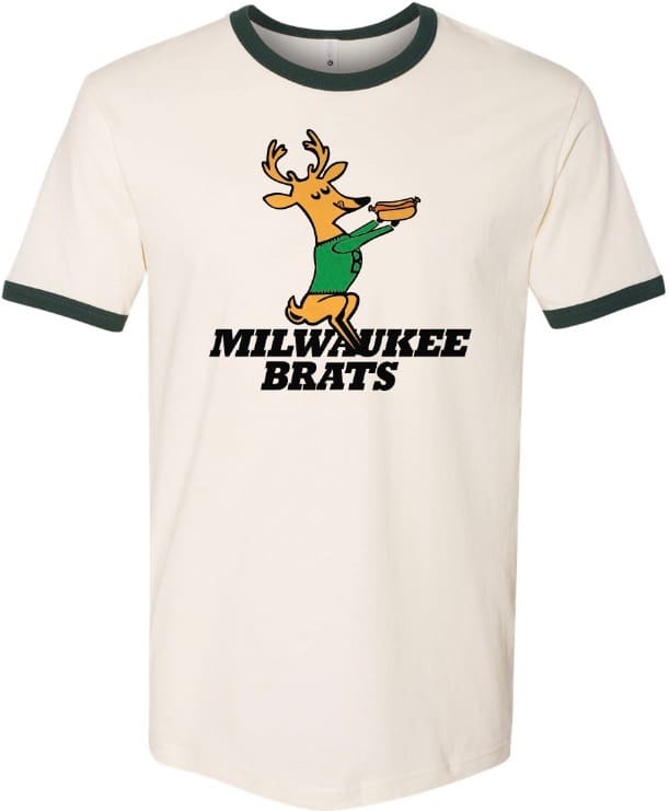
If I don’t have one of those Milwaukee Brats shirts by, say, three weeks from now, I will probably die.
(Effectively) Making the colour rush your new primary uniform is a pretty big deal, is this the first time anyone has done this?
The Giants could do that with their road uniforms and maybe the Saints, those are considered quite nice. That would then make room for new colour rush uniforms to replace them etc and so on.
But wait…the Chargers have unveiled two colour rush unis!! This is getting a bit out of hand now…
Maybe its the start of something – colour rush going mainstream. Hoping not though.
One color rush, one alternate that happens to also be matched with the same color pants to make a mono color rash like uniform. They always had three dark jerseys; navy (primary) powder blue (alt for years, primary last year), white, and royal blue color rush. Other teams have an alternate and color rush too, effectively giving them 4 uniforms; Rams, Ravens, Cardinals, Broncos, Bengals, Texans, Jags, Seahawks, and Browns I can think of off the top of my head. Just that most did not have 4 different color jerseys in their wardrobe. I think Rams, Jags, Seahawks, and Chargers had 4 different color jerseys.
I guess the Patriots are looking to usher in a new era of mediocrity or worse, and this is the perfect way to start that. The only change I like is the addition of silver to the outline of the blue numerals–blue number, silver then red outline–that looks very good. Otherwise, a huge letdown. I agree with Paul, this is like they ordered out of a high school uniform website. And why the leotard look? Why is it so hard to understand this looks terrible?
It should be noted that the Pats basic design of the last 20 years was the most successful uniform in NFL history. Six super bowl titles, 9 SB appearances and I believe 19 AFC East division wins. Apparently that means nothing to the Pats.
Is it me or does the Pats helmet look a lot shinier, more, er, “chrome-y?”
PS shoulda made the helmet white. This would allow for the return of PP.
Glad to hear the pants striping will match the jersey striping. Although I agree that the red-blue-red version of the jersey stripes on the road jerseys looks better, maybe they are wanting to emphasize red. Tying into to the red (eventual) throwbacks?
Weird… was there anyone that saw the Patriots color rash uniforms and said, “whoa these should be the full time set!”?
No. No one said that.
Baffling.
Lee
Paul – you know wearing a mask with a beard negates the mask, right?
Actually, it doesn’t “negate” it. It means I don’t have a perfect seal in that spot (which I also don’t have in other spots). This isn’t an N95 or a medical mask; it’s a cloth “something is better than nothing mask.” And it is indeed better than nothing.
One thing I noticed on the Chargers’ new unis… they fixed something that had bugged me for years. Previously, the helmet logo and shoulder logo were “moving” in opposite directions. If you look at the front top “barb” on the bolt on the helmet, it always pointed backwards, while on the shoulders, it pointed forward. Kind of like sawblades facing in opposite directions. The pants stripes used to go all willy nilly and change directions mid-bolt. Now they match. I also love that the jersey and pants bolts are no longer contained inside a stripe, but roam freely. Huge upgrades from what was already a really nice set.
Just to set the record straight…a year or so ago, I went to Robert Kraft and told him that I was leaving the team and they’d better change the uniforms after I was gone.
Yes, I will now confirm that the fact that we changed our uniforms at the exact same time that the greatest QB to ever play the game was leaving us was in fact totally intentional.
I’m tired of Brady taking all the credit for my genius and while I obviously could care less about fashion, I told Kraft to change the uniforms somewhat so that people would know who was really behind all our Super Bowl wins.
That Golden Seals bumper sticker is sweeeeet!
My all time favorite bumper sticker was seen around San Diego in the early 80’s:
Steve Garvey is NOT my Padre!
Not a word about The Pats mirror helmets?
I always hated their previous uniforms and as plain as these are they are a blend of the old duds w their modern colors. Grey gone.. For this team that’s not a bad choice. Roads should be white top and bottom. But then again I’ve never liked white over solid on any team. Looks like Tshirt and jeans to me.
“Mirror helmets”?
I liked the picture of Babe Ruth teaching a couple of young-uns the fine art of bunting. I am curious how often the Babe would move the runner over via this route. Just wondering.