Click to enlarge
There you go — see how easy it is when you stick to the basics?
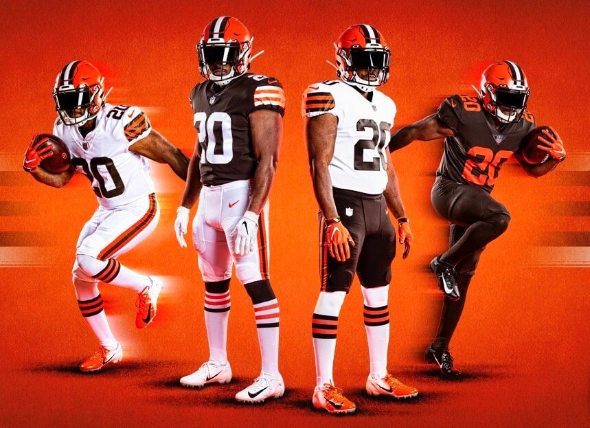
The Browns finally unveiled their new uniform set yesterday. Much like the Bucs’ new set that was unveiled a week prior, Cleveland’s new look is a strong rejection of the Nike aesthetic.
The designs are almost an exact match for the ones I reported on earlier this week. Those designs showed what the Browns were planning as of October of 2018. As I mentioned on Monday, they could have made a few tweaks since then, and they did:
1. They had originally shown brown-topped socks with the brown pants and white socks with the white pants, but now it’s the other way around — they’ve swapped the socks, so now there’s no dreaded leotard effect. Also, the brown-topped socks now have white/orange striping, instead of just orange, so both sets of sock stripes now match the sleeve striping on the jerseys they’ll be paired with — or at least that’s the idea. The reality, as we all know by now, is that many if not most players won’t wear the standard-issue socks. Still, it’s a noble attempt, and an improvement over the 18-months-ago designs.
2. The Color Rash jersey, which was apparently slated at one point to have “Cleveland” chest lettering and no TV numbers, ended up having no chest mark and standard TV numbers after all. Those are both positives, I guess, but it’s still polishing a (mono-)turd.
3. They’re showing white over white as a potential uni combo. That wasn’t depicted in the earlier images.
Everything else — the home jersey, road jersey, pants striping, number font, lack of chest mark, etc. — is exactly as we showed it on our mock-ups earlier this week. You can see lots of photos here.
One other detail that isn’t readily apparent from the pics: The sublimated pattern in the helmet striping has been eliminated. It was rarely visible on-field anyway and was always just a bogus gee-whiz gimmick, so it doesn’t really matter either way.
Another small helmet-related detail: The back bumper, which had been blank, now says, “Cleveland.” No change for the front bumper, which still has “Browns,” same as before. (This move leaves the Steelers as the only remaining NFL club to wear the team name on the front while leaving the back blank. For more info on NFL helmet bumpers, look here.)
As for me, here are my thoughts:
• Still don’t like the brown facemask. Would have preferred white or grey.
• Would have preferred orange pants instead of brown, but the brown ones aren’t bad. (For what it’s worth, there’s a lot of chatter about orange pants supposedly being added at some point down the road.)
• I really like the number font. As I mentioned on Monday, it presents visually as block, but with some rounded corners. So many things are described as a “marriage of old and new,” or words to that effect, but this really seems to embody it — and successfully!
• I’m almost giddy about an NFL team bringing back striped socks. Two different sets of them, even! Never thought we’d see that particular ratchet turn the other way. As noted above, getting the players to wear them properly may be a lost cause, but I’ll be happy even if the kicker and punter are the only guys who suit up properly.
• I don’t like the Rash uni, but I don’t like almost any of the Rash unis, so whatever.
• Overall, it’s a huge upgrade, and my few quibbles are just that — quibbles. Generally speaking, this is how the Browns are supposed to look.
All of which makes you wonder how they got it so disastrously wrong five years ago. Was Nike whispering such seductive sweet nothings in their ear that they just couldn’t resist? Did they honestly believe they could be a Pepsi team instead of a Coke team? Or were they just desperate to distract people from how bad the team was?
Either way, good for the Browns for acknowledging their mistake and correcting it in the shortest allowable timespan. Here’s hoping they stick with this set for a long, long time.
I saw certain reactions to this set being repeated by a lot of people yesterday, so let’s shift into FAQ mode:
Isn’t this basically the same thing they wore in 2014?
Not 100% the same, but yes, it’s very close.
Going back to an old design is lame. They should move forward, not backward!
The 2015 redesign was a forward move, and it sucked. Personally, I don’t care if a uniform redesign is forward or backward (or big vs. small, or modern vs. retro, etc.) — I only care whether it’s good. And this move is clearly a good one.
Seems like a lot of hype and buildup for something we’ve pretty much already seen before.
I agree that all teams tend to overhype their upcoming uni unveilings. But so what? Hype is just that — hype. Ignore it and just concentrate on the new design. Is it good? Is it bad? Why or why not? That’s all that matters.
Okay, moving on: There are now three remaining NFL teams slated to unveil new uniforms in the coming weeks: the Chargers (next Tuesday), the Patriots (sometime prior to the draft), and the Rams (sometime in May). As always, if anyone has solid info on any of those, I’m all ears. I’ll protect your anonymity, of course.
Finally, there’s this: The Browns posted a video interview with their equipment director, Brad Melland, on their website yesterday. It’s not particularly informative regarding the new uniforms, but Melland did drop one bit of news about an upcoming Nike template:
Nike’s going into a new system next year — actually, it’ll be two years down the road, because they just cancelled, with everything that’s going on — called the Fuse, which is recyclable fabric. We’ll make a decision down the road whether we’re going to get into that or not. And if it’s definitely a performance advantage, you’ll see us switching into that system.
A uniform change won’t happen — the design and everything will stay the same. It’ll just transfer over to the new uniform system.
So that’s something to keep in mind.
Meanwhile, over in Indy…: Lots of Colts-related developments yesterday. One at a time:
1. A team spokesman confirmed to me that the horseshoe logo on the team’s helmet has indeed been tweaked. As I wrote on Tuesday, that change was visually apparent but they hadn’t officially acknowledged it. Now they have.
2. I mentioned in yesterday’s lede that the Colts hadn’t responded to my request for comment about the similarities between their new secondary logo and the logo that Jere Kubuske designed a few years ago for Cathedral High School in Indianapolis. Colts communications VP Steve Campbell got back to me yesterday afternoon, so I added his statement to yesterday’s post. But in case you missed that because you had already read the blog and moved on for the day, here it is again:
We have great respect for our friends at Cathedral, and we would never purposefully take an idea from them to use as our own. That’s just not how the Colts do business. The new Colts Indiana logo was an independent creation that was designed by the NFL, as are most team marks and logos, and was not designed locally. The Colts and the league were unaware of the other logo, and we wouldn’t have moved forward otherwise. But we will look into the matter. Nonetheless, both the Colts and Coach Kubuske had the same goals at heart — promoting athletics and paying tribute to our home state.
3. In Tuesday’s review of the Colts’ uni and logo changes, I said that the team’s new number font is the same as what they had already been wearing on their Color Rash jersey. But reader Quinn Siebers, who’s a bit of an NFL font savant, says it’s not quite that simple. He provided this comparison graphic (click to enlarge):
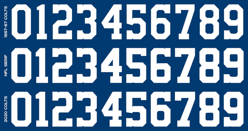
He then added this explainer:
There are some key differences to the Colts’ new [primary] font. The 2019 Color Rush font is the standard NFL serif block used for any serif block throwbacks (Cowboys Color Rush, 2007-11 Jets, 2010 Eagles, etc.). The new Colts block uses the existing serif block for Nos. 0, 2, 3, 7, and 8, but has a new 1, 4, 5, and 6/9. The 1 has a squatter top, to mimic the Unitas font; the 4 adds an extra serif on the top (like Michigan football) and an angle on the sharp angle (like the NFL block), rather than having it square; the 5 adds a Packers notch to it; and the 6/9 has a bigger counter. All these changes are excellent edits to the NFL serif block and make it much more accurate to the Unitas-era serif block.
Also, an important caveat: I have yet to find a promotional or merchandise photo showing a 0 or 8 on a jersey, so what I have is speculation and comes from the NFL serif font.
4. I also mentioned on Tuesday that I found it odd for the Colts to be referring to their horseshoe logo’s nail holes as “grommets.” Several horse-knowledgeable people confirmed to me that they’re never called that. But reader Marcus Myers, who worked as an assistant to a farrier for over a decade, went further:
When looking at the Colts’ logo, I see the nail holes all in the wrong spots that would be normal for a horseshoe. You can see from a normal shoe where nails would be placed — you would never place a nail in the toe or the heel. I know the Colts’ shoe is a logo, but I would not want to be the horse who got a nail in their heel.
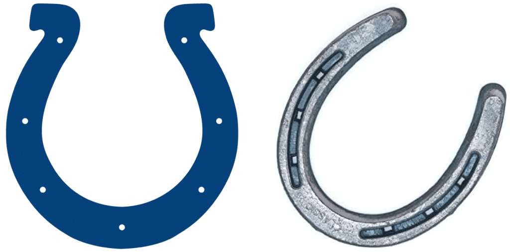
Interesting! I’ve been writing about uniforms for more than two decades now and have never heard that critique of the Colts’ logo.
Man, for a team that just made a bunch of really subtle changes that most fans won’t even notice, the Colts have eaten up a lot of space on my blog and in my brain this week!

Click to enlarge
Sock it to me: There are lots of great DIY uni-related masks floating around these days. But Kevin Kurz gets my vote for the best one yet, because his mask is made from — get this — a sock from his beer league hockey team, the Narwhals, and is tied with skate laces! Check this out:


How great is that? So great that I don’t even mind the purple/teal thing. Nicely done, Kevin!
Uni Watch Haiku: I didn’t publish a haiku yesterday, and I thought lots of people — okay, a few people — would say, “Hey, where’s the haiku?” But exactly nobody said that.
But if you were thinking that would dissuade me from haiku-ing, think again! Here’s the latest:
What I wouldn’t give
For just one NFL game
With real jersey sleeves
And there’s more where that came from.

Click to enlarge
Membership update: We recently made a membership card for reader Chris Spisak, based on an old Cleveland Force soccer jersey. As you can see above, he’s very pleased with the results. Glad you like, Chris — thanks for the photo!


ITEM! Yet another membership raffle: Reader Jay Palmer recently purchased a Uni Watch membership for me to raffle off, so that’s what we’re going to do today.
To enter, send an email to the raffle address by 8pm Eastern tonight. One entry per person. I’ll announce the winner tomorrow. Thanks to Jay for sponsoring this one!
The Ticker
By Paul

’Skins Watch: Land O Lakes butter has quietly removed the Native American woman from its package design. A good move, although it means future generations will grow up without learning how to do the knees/boobs trick (from Patrick Baldwin).

Baseball News: It’s a little hard to see, but the Orioles’ production crew once had its own logo, featuring the team’s cartoon bird mascot hoisting a TV camera. … If you were looking for a ranking of great defunct MLB ballparks, today’s your lucky day (from Kary Klismet). … Since yesterday was Jackie Day, all MLB websites showed all players as No. 42 (from @bosproshops). … Meanwhile, Pirates P Chris Archer hopes that MLB will reschedule Jackie Day if the season ever gets underway (thanks, Phil). … Amazing story from @DisMagicBands: “My Dad has a book coming out in June about the Seattle Pilots. He spoke with the son of the seamstress who removed all the Seattle pilots patches and sewed all the Milwaukee patches onto the Pilots’ old uniforms right before Milwaukee’s opening day in 1970. She gave him [the son] all the Pilots patches for his sandlot team and the team moms sewed the patches onto their T-shirts to wear in games that summer.”

NFL News: Although the format of the upcoming NFL draft will be seriously curtailed due to the pandemic, it will still feature an absurd amount of corporate douchebaggery. Gross (thanks, Brinke). … Newly signed Steelers FB Derek Watt, who wore No. 34 with the Chargers, will wear No. 44 in Pittsburgh (from Dan Starceski). … Ole Miss is the latest school to implement digital-only ticketing (from Griffin Smith).

Hockey News: At the 33:48 mark of this podcast, former NHLer Brooks Laich says his grandfather had a handkerchief pocket sewn into his hockey pants (from @MRWCannon). … Check out this shot from the 1991 Rangers/Kings outdoor preseason game in Las Vegas. Rangers RW Jody Hull’s number doesn’t have the Rangers’ standard block-shadowing, although his NOB lettering does have it. “Looking at video of the game, all the other Rangers seemed to have the same issue,” says @KingsUniHistory. “A preseason quirk?”

Soccer News: Here’s a BBC poll where you can vote for your favorite soccer shirt (from Ted Arnold). … Reprinted from yesterday’s comments: Liverpool’s home kit has leaked. … Marseille’s away and third shirts have leaked. … AS Roma’s new home shirt is rather tequila sunrise-esque. … The Australian women’s national team is encouraging fans to try redesigning the team’s kit (from EP Conrad).

Grab Bag: Pro golfer Doug Sanders, known as the “Peacock of the Fairways” because of his stylish attire, has died (NYT link) (from Tom Turner). … The time management podcast Before Breakfast has an interesting suggestion for keeping spirits high during the coronavirus lock-down: create “team uniforms” for your family (from Kary Klismet). … A Maryland police officer is under investigation for allegedly engaging in religious ministering while in uniform, which would seem to run afoul of First Amendment’s establishment clause. … The city of Sioux Falls, S.D., and several area civic organizations have released a series of closely-related logos as part of a coordinated local branding effort (from Kary Klismet). … A Minnesota newspaper hosted a live virtual happy hour about the ugliest uniforms in sports history (from Nate Wohl).

Click to enlarge
What Paul did last night: So we’re out on the stoop yesterday — Bud for me, just seltzer for the Tugboat Captain, because she had a class at 6:30pm — and we see this guy, maybe 20 years old, coming down the sidewalk, loaded down with grocery bags. We know him from the neighborhood but don’t know his name. And when he’s about one house away from us, we hear the sound of breaking glass, and he stops and wails, “Oh, not again! Why? Why?!”
One of his bags had torn and a jar of tomato sauce had cracked open on the sidewalk. There was something about it — the sad, unmistakable sound of breaking glass, the way he kept saying, “Why?!”, the fact that we couldn’t go over to help him because of social distancing — that was sort of heartbreaking. For a second or two, I wanted to cry. We don’t currently have any tomato sauce in the house, or else we absolutely would have given him some.
Instead, we asked if there was anything we could do to help. He asked for a trash bag, so he could clean up the breakage. I ran inside and got him a bag, along with some paper towels for his hands, and then left them on the sidewalk maybe eight feet in front of him (which felt so weird, but that’s the world we live in now).
He was super-appreciative and gracious, and on some level the whole thing felt intimate. I’m sorry his sauce jar broke, but it provided a very human encounter — I didn’t realize how starved I was for that.
I’ll be talking NFL uniforms on The Dan Patrick Show at 9:45am Eastern. Should be fun! — Paul
FWIW, in the Browns’ daily podcast, Cleveland Browns Daily, team executive R.W. Johnson (I think I have that right) made it clear – without ACTUALLY saying it – that orange pants are coming this year.
link At the 27:57 mark.
Curious, what Color Rash uniforms do you like/don’t mind?
Some of the white ones are OK — Giants, Packers, Bengals.
While I think any but mono-white looks awful, what are your thoughts on the following degrees of mono:
1. solid helmet to toe
2. darker color helmet, mono jersey / pants
3. lighter color helmet, mono jersey / pants
While I don’t like the first two options, there is something I find especially aesthetically offensive about the third option. And in general when teams pants are a darker color than their helmet. It just seems off balance to me.
In general, my least favorite option is the second. Exceptions are the Bears and Vikings. Also the Tarkenton and Simms era Giants.
The Saints are the only good ones!
The Saints, along with the ones Paul mentioned, would actually be good if they had real socks. Or least different colored tights since we’re doing yoga pants in the NFL now.
I only don’t like the color rush uniforms because most of ugly and always go for the mono look, only some look fine like the saints. I just want alternates to go back to where
1) Not every team HAS to have a 3rd jersey.
2) They are just alternate jerseys like the obvious thing for the browns would’ve just been an orange jersey like they had in the 2000s.
I don’t think the Chargers is terrible because of the large white stripe with the bolt inside on the pants. Has enough contrast to avoid the unitard effect. The white helmet over dark mono is kind of hard on the eyes, though.
I like the white over brown and brown facemask – if you are called the BROWNS, wear brown!
In a video (posted by the browns on YouTube) that shows Baker Mayfield, Jarvis Landry, and Odell Beckham Jr looking at the uniforms last year for the first time, it appears the browns head of marketing mentioned a fourth uniform, saying something along the lines of, “We’ll keep these in the closet for now”. The camera then pans to Odell and he very clearly says, “All orange” There might be another uniform coming later this year or next year for the browns. I love the set that was just unveiled, but would be extremely happy if a pop of orange was added with a new pair of pants or jersey.
Some additional great info from Cleveland Browns Radio show yesterday:
1. The ‘1946’ on the inside collar is the same orange hue used in 1946. It’s intentionally a different shade.
2. One of their executives, J.W. Johnson, mentioned he knows fans wanted orange pants. Alluded to “getting Nike to make them” which sounded like orange pants were explored, but perhaps the team didn’t like the outcome from Nike.
3. In the 2015-2017 years, the prior uniforms were impossible to put on some athletes because the numbers and fabrics were so restrictive. Nike eventually changed them, but the equipment staff really struggled with the fabrics.
4. The helmet stripes are now all the same width. They were not always in the past. In the 2006-2014 years, which these uniforms are compared to, the white stripe is wider than the brown stripes.
5. Team exec’s mentioned additional announcements or surprises. No idea what that is, just sounded like they weren’t done yet.
6. expect an new alternate next year. Nathan Zegura alluded to this way back when it was announced that the city of Cleveland would be hosting the 2021 NFL draft.
7. JW also mentioned that the brown pants are actually the ones used with the Color Rush unis last year
Tony C – I see you’re “paying attention to the scores” ;)
I’ll give Beau and Nathan some credit for trying to subtly leak things without getting themselves fired.
that i do my friend, that i do
it’s my go to podcast to listen to while straightening up at night..that or the MORTIFIED podcast
To piggyback on point no. 2. I listened to the Cleveland Browns Daily podcast and typed up exactly what JW Johnson said:
When told that the fans were wondering about orange pants:
“I didn’t even know. Would people like the orange pants? I didn’t realize that. I didn’t know that that was something that was a big deal….awwww man (sarcastic, jokey tone)I guess we missed on that one. Well I dunno that was something that people were talking about”
(hosts say something further about orange, JW continues)
“Listen I know orange pants was part of the Browns Kardiac Kids and a lot of the tradition but I dunno we’ll see just have to stay tuned and see what happens there so, uh, if we can find a way to talk Nike into getting us orange pants we’ll get to work on that so we’ll see what we can do”
(as he was leaving the show)
“Stay tuned maybe some more to come, right”.
Also the host of Cleveland Browns Daily Nathan Zegura stated at the top of the show
“I told you there may be some things in the future that are going to come out as well”
In the interview with the equipment manager he talks about the color rush design, both the new one, the previous design, and also when they once went brown over brown with their classic uniforms. He talks about why they are keeping something like the previous color rush set because it got such a great response, but then notes when they went brown over brown in the classic uniforms people didn’t like it. It is almost as if he / the organization don’t realize (or perhaps just won’t acknowledge) fans responded to the color rush set not because brown over brown is good, but because their nike uniforms were just awful. And that people didn’t like brown over brown with their classic set pretty much confirms it was not something fans liked, just something that was better than the alternatives.
Maybe it’s just me being judgmental, but I thought their equipment manager sounded less knowledgeable about the uniform process than some members of the commUNIty.
The browns definitely upgraded here, but I feel that the uni-verse is strongly in favor of football uniforms being strictly “pick 2-3 colors, select number and direction of sleeve stripes, the end” with a very short leash on number font creativity to boot. most if not all teams look good in this ultra basic traditional look simply because we have all agreed that the template looks good and it’s so basic that there isn’t really anything to screw up. However, while I haven’t seen nike make good with too many of their non-traditional revamps, I think the falcons for example are a major upgrade this year with a non traditional look.
Are there any non traditional unis or uni design elements (Nike era or throughout football uni history) that you guys think are winners? I know there is love for the acme packers polka dot, and the Steelers bumble bees in many circles, and other sports have lots of examples of out there design that is now classic (astros tequila sunrise, white Sox beach blanket stripes, warriors great big logo on front and trolley car numbers, etc)
Discuss…
The font review is excellent. For all the little details we see on sports unis, I learned a few new terms: squatter top and counter. Being from Cleveland, i just know Dan Gilbert’s Comic Sans. No sharp angles.
And very much approve of the new Browns set, but I do miss the stripes on the Rash.
Well done, Browns. The sleeve stripes, striped socks, and the lack of gimmicks, it’s all working. My only quibble is on the number font, there is a mix of curves and angles. Some numbers (1, 4, 5, 7) have to have sharp angles. But they mixed angles and curves where it wasn’t necessary (3 comes to mind). It’s like what Nike did with the Dolphin numbers have: unnecessary curves for the sake of being unique.
That said, this is a MINOR quibble.
Someone pointed out that the numbers match the Cleveland Browns wordmark. link
To add in to what the others have said, I get the impression that the all brown uni isn’t the color rush. I feel that it’s an alternate and the color rush will be the “all orange” that was mentioned by OBJ.
Honestly, the all brown jersey reminds me of the late 90s when the players would cut the excess sleeve off and made it basically looked all brown. Put the tv numbers on the sleeve and it would be a replica.
And wouldn’t the Browns have the opportunity to “throw back” at any time by changing the facemask, or are the facemasks part of the one shell rule?
We also know that pants aren’t part of the 5 year design rule, so they could very well be coming out with orange pants as a “surprise”.
Mask color can be change under the one shell rule.
Looks like the Tarrant Theory is confirmed once again.
I mean, imagine there never had been a Cleveland Browns and then some team came out with these uniforms. Fans on the internet would be outraged. But it’s a “classic” design so everybody loves them!
It almost seems like the Browns just pulled “New Coke” type move, doesn’t it?
Dan, we’ve been through this. Your premise is based on a logical fallacy — the fallacy that context doesn’t matter.
But context — in this case the historical context of this team and its heritage — *does* matter.
Your refusal to acknowledge this reality, and to keep promoting a logical fallacy, is a form of arguing in bad faith. Please stop doing it. Thanks.
I will stop with this theme if you wish, Paul (assuming you don’t mind if I at least can defend myself on this thread), but you’re wrong on your critique of my theory.
Of course the context matters. In fact, I’m saying that the context is pretty much ALL that matters. Over time, people get used to a design, they start to form associations with the team and the memories they develop as a fan, etc. Then, if the team changes the uniform/logo drastically, most fans will instantly claim that the new design is “terrible”. The exception is usually younger fans, who haven’t formed the visual association.
Basically, Jerry Seinfeld was correct. We do “root for the laundry”.
I will add that I’m a little offended at your claim that I’m arguing “in bad faith” simply because you disagree with me. I mean, I’ve given example after example of how my theory has held up. Nobody can give examples of when it hasn’t, even though there are probably some exceptions.
Actually, you’ve simply asserted that your theory has held up, and you’ve largely ignored the refutations of it.
If it’s not based on a faulty premise, then it’s based on a self-reinforcing tautology. Either way, yes, that is arguing in bad faith.
Let’s please move on. Thanks.
Paul, as far as I can tell, the refutations to this general argument, both when I’ve made variations on it and Tarrant has (though I probably wouldn’t think to name it after myself…) have been about the (relatively rare) times when a new design was viewed positively by you/uni watchers generally. I can’t remember a time when a return to a classic design was not held up as a great thing. Am I wrong about this?
I’ve never liked the current Astros design as much as most of the previous ones.
I’m in my 40’s and generally prefer the classics, but I really liked the update from the Oilers to the Titans before the current iteration.
I also prefer the current Elvis Patriot to Pat Patriot uni’s and the Baltimore Oriole’s 1990’s redesign compared to the 1970/80’s.
Good design is good – doesn’t matter if it’s new or old. Typically the reason it lasts in the first place is because it was designed with a purpose in mind and then that becomes part of the zygeist and remains with every new iteration.
“We root for the laundry” has nothing to do w/the uni- iteration at that time.
Is this Thursday’s post? I’ve read this comment before…
…and in the future, you’ll read it again. And again.
Just a theory, no proper name needed.
Naming a “theory” after yourself is deeply, deeply hilarious.
Yeah, I can see how some people might find that off-putting. But it was meant to be tongue-in-cheek, and I wanted a short way to refer to the concept when pointing out an example of it.
I don’t claim to have been the first one to notice this pattern of behavior, and if someone knows of a more official psychology term for it, please let me know.
I liked your theory and the fact that you affixed your name to it was actually kind of endearing. Then i again i’m a guy who liked the “browns” word-mark on the pants so most of what i say is dismissable.
It’s especially dangerous to do so when your theory is so easily and thoroughly refuted.
“I’m Calling It Selfie Syndrome”.
The Browns pulled a “New Coke” move? Uh, yeah, if New Coke was actually better than old Coke. But it wasn’t.
Actually, the “New Coke” uniform was the 2015-19 set. Not saying it was intentional, but the 2015-19 set has undeniably had a New Coke effect.
In 2014, many observers were excited to see if Nike could modernize the orange and brown. They gave it a shot, trying to overemphasize the iconic helmet by enlarging the stripe and exaggerating the same stripe on the sleeves. We all agree it didn’t work, and now they are right back to “Classic Coca Cola,” which suddenly tastes better than we remember.
Quick note: I think the helmet stripe has maintained the larger width, which I prefer.
Nailed it!
If 100 designers were given orange, brown and white I doubt 90 of them would come up with a better design than what the Browns introduced.
I don’t see what you’re saying. The Browns have a classic football uniform and pattern. No more and no less.
For your argument to work we’d have to remove all football uniforms from all time and start from scratch.
Agree, his argument is flawed because it is not about new team uniform vs past team uniform, but it is really an issue of new team uniform vs historic design standards for all uniforms. It is not an issue of “oh I don’t like the new uniform because it is not the old one”, but rather, “I don’t like the new uniform because it drastically deviates from what football uniforms have looked like for decades.”
When the Bucs switched from orange and white to red and pewter they made a drastic change in how they looked, but the overall design of the uniform remained within the standards that had been set. People that rejected that change might have done so because they preferred orange and white over red and pewter (for whatever reason), but if somebody disliked the Bucs change in the 90s it probably wasn’t for the uniforms design elements. When people bashed a lot of these new nike uniforms it is specifically because they are introducing multiple design elements that are out of place.
Agree. There are lot of new designs that simply try too hard (Browns 2015-2019) or don’t try hard at all (Rays). The Blue Jays tried too hard and then they didn’t and they got it correct. Folks of all ages love that uni set. It’s not rocket science.
I don’t know if this falls under your theory, but say the Houston Astros had never worn anything flashier than their 2019 uniforms. …then they unveiled their ‘new’ rainbow uniforms this year. I’m 100% positive they would be ripped to tiny shreds on this message board, and social media in general. One. Hundred. Percent.
But people get downright misty-eyed here over the rainbows. I think what you’re saying is it’s all timeline and context. I think that’s just a fun thing to contemplate.
“Over time, people get used to a design, they start to form associations with the team and the memories they develop as a fan, etc. Then, if the team changes the uniform/logo drastically, most fans will instantly claim that the new design is “terrible”. The exception is usually younger fans, who haven’t formed the visual association.”
And…? Sometimes the new design IS terrible. To flip your “theory” around, any team coming out with uniforms that looked like the Browns’ last redesign would have been criticized for them. They were poorly designed, shitty-looking uniforms. Take that uniform template and render it in Carolina Panthers colors with CAROLINA across the chest and PANTHERS down the pants leg. It still sucks, and not because the Panthers have any nostalgia associated with their uniforms, but because it’s a bad design.
Attempting to deconstruct notions of what a football uniform “should” look like is one thing, but you’re doing a lot of self-indulgent philosophizing about why people react the way they do to specific designs while saying very little about the uniforms themselves. What do you not like about the Bucs’ or Browns’ new uniforms? What would you change about them? Do you honestly think the previous designs were better? If you can’t back up what you’re saying with assessment of the actual designs, then no, your “theory” does not hold up because you can’t prove that people aren’t responding to good vs bad design, rather than old vs new.
It’s just hard to pull off new ideas, both in the uni-verse, and in the actual universe. It’s always easier to stick with old, tried and true, ideas. My contribution to the “Tarrant Theory” is to say i understand it’s basis, and that I hereby offer a generalized salute to those brave souls willing to go out on a limb and put forth something new (at the risk of being shouted right back down). In the words of 90’s era Pearl Jam, “it’s evolution, baby!”
Does the Tarrant Theory say who’s “right”? Those of us living in raelity, or the hypotheticals who are seeing these jersey’s for the first time?
If the Tarrant Theory is simply that the hypotheticals would scowl, then… Sure, the theory is true. The fickle twitteratti would certainly lose their mind. But if the theory is that those people are “right”, then I’d have to call BS.
The Rangers preseason jersey looked like that for a few years after they switched to vertically arched NOB in 1990 iirc.
1991-92 season was the 75th anniversary year, Original 6 teams wore fauxbacks. You can see that’s what they are wearing here: link
It’s true that the original six wore throwbacks for select games that season, but I’m almost certain they were not worn for that game. I also think the Rangers’ unis for that season were legit throwbacks, not fauxbacks (aside from NOB).
That jersey in the pre-season photo is not the 75th anniversary jerseys. The jersey stripes are not the same.
Wouldn’t it be more accurate to say that the socks align with the jerseys (white-topped with white jersey, brown-topped with brown jersey)? Even in the white jersey/white pants picture, the uniform shows white-topped socks. It then follows that the socks mimic the sleeve stripes.
The one thing I liked about the previous Browns uniforms was that they standardized the striping throughout the entire uniform. The new set reverted to non-matching stripes other than the sleeves and socks, and the iconic helmet stripe pattern is found nowhere else on the uniform. That’s my only pet peeve about the new uniforms. Other than that, they look great!
News! I’ll be on the Day Patrick Show at 9:45am Eastern.
I was reading today’s blog while listening to DP live. When I read that you were to appear on the show at 9:45 (6:45 PDT), I went back and listened. Well done!
Thanks!
Thought you were great on the DP Show. I don’t know if you noticed the Mercedes logo positioned next to your picture on the “score bug” during the televised show. Jarring.
Yeah Paul, good job man. I’m always interested in how the interview is going to go with someone like DP (who I love and listen to everyday btw), since I think he “gets it” but only to a certain point. I thought it might get a little weird during the portion of the interview re: the “point” of uniforms, but it didn’t. When he said he wouldn’t drop his team because of ugly uniforms your response was perfect.
Thanks! That particular exchange was really interesting, I agree!
Does anyone know if the orange in the Browns’ new uniforms is the 2015-2019 shade, or the pre-2014 shade?
dont think the oranges were changed. only thing mentioned is that the orange used on the threading of the “1946” on the inside collar is the same orange as used at the inception of the team
They kept the same exact colors as the 2015 change, which I believe they confirmed on the team website in an article about the uniforms. Although I’ve read/consumed so much about this in the last 20 hours I may be mistaken on the source. But it’s the same color.
I have said this when Paul started his Porch Stoop Cocktail segment, that I love seeing the different cars parked in front of his house. I enjoy making up stories of the people who own those vehicles. Why are they there? Where are they going? Kind of like Billy Joel looking out the window searching for a story of the people entering Captain Jack’s house.
The helplessness you felt last night is the way I am sure a lot are feeling these days. I so appreciate the work everyone does on this site. Thanks again for the normalcy you provide to us. Although I still go to work everyday, and not much has changed for me personally, I do feel it still. So thank you again.
The Browns joining the Bucs by making HUGE improvements to their uni’s this season! Unfortunately the Falcons drank the NIKE koolaid and didn’t follow suit. I’m cringing at the upcoming Rams and Chargers reveals. I fear wacky number fonts on the way.
Just so I have this straight… Every good design that comes out now is an example of teams being anti-Nike, and every bad design that comes out is an example of teams drinking the Nike Koolaid?
Nice post Paul, I’m having the same issues, there’s an 85 year old widow in my neighborhood that I occasionally visit, and can only say hello through her screen door now.
I like the all-whites. That’s what Jim Brown wore.
The Browns are one of the few teams I like seeing in all-whites. But I dig the orange/white/brown combo as well. Even more than the old orange/white/orange look.
The sleeve stripes on the Browns’ jersey have a sheen that make them look like some sort of iron on applique. It’s a minor detail, and the rest of the look is a breath of fresht vintage air.
The one noticeable difference is the pre 2015 jerseys had the sleeve stripes sewn on, whereas these is just an ironed on vinyl patch which looks much cheaper.
This is really noticeable on the Cowboys’ sleeve stripes as well.
Quinn Siebers, I love your font breakdown. That’s amazing.
Do you have any insight as to the origins of the various fonts from that era? I presume it has to do with the uniform manufacturers who supplied the teams, but I’ve long been curious about why the link and link had one type of “2” in their heavy-serif font while the link had quite another.
(And yes, I know there are other differences. But that’s the one that always leaps out to my eye.)
They should have kept the sleeve stripes on the color rush. Although I typically don’t care for color rush unis, I liked the browns set because I thought it was funny a team called the browns are wearing all brown and I thought the sleeve striping gave it a bit of a classic football uniform look.
Also, I couldn’t really tell from the pics but is the helmet low gloss/matte orange? I always loved the really glossy orange helmets and I was hoping they would bring that back.
Love how the brown pants striping matches the white jersey striping!!!!!
Yep – I like this too. An updated design element but still has the traditional Browns feel. I also like the brown mask as part of this updated but traditional look.
So happy about the Browns bringing back sock stripes! Most teams have moved away from them and they all have the same drab look. Cowboys and Packers come to mind as teams that look great but looked even better with with sock stripes. New England has kept them on the road sets and it looks great. Hope this trend continues.
The brown pants as well as the CR sets are a dud IMHO. Hopefully they’ll be minimized. To bang the gong with everyone else, orange pants look better and make much more sense. Great looking squads rarely have a lot of options. Bears, Packers, Raiders, Chiefs, Steelers.
White face masks always really popped for Cleveland. Wish they had gone that route; but considering what they’ve come from I’ll take it!
After watching the knees/boobs trick, I am once again completely in awe of the imagination and creativity of the human species.
I don’t know, I think it’s a pretty juvenile way to objectify and sexualize Native American women, and I’m surprised Paul included it, given the purpose of the ‘Skins Watch section…
See, Nike… when you totally go against everything you stand for and stick to the principles of making a functional uniform, you *can* do a good job!
• Still don’t like the brown facemask. Would have preferred white or grey.
Think I said this in the weekend comments… while it probably wouldn’t look good on silver/gold-helmeted teams, I’d love to see mockups of every single helmet with white facemasks. Overall I think it would e a good thing.
I’ll be happy even if the kicker and punter are the only guys who suit up properly.
They’re the only ones who really matter anyway!
Yes, the world we live in, when you mention placing the garbage bag in front of the young man.
Grocery shopping over the weekend (limiting grocery trips to once a week) when a young couple who didn’t have a cart and had arms full dropped one of their items. I stared at it and said, “I’d help you, but I don’t know if it’s the right thing to do.”
They looked at each other and said, “It’s OK, we’ve got it, but thank you for your concern.”
It was odd and genuine all at the same time.
We recently made a membership card for reader Chris Spisak, based on an old Cleveland Force soccer jersey. As you can see above, he’s very pleased with the results.
So am I!
Thanks Jim! Notice the seats in my pic, they’re seats from the Richfield Coliseum!
Pirates P Chris Archer hopes that MLB will reschedule Jackie Day if the season ever gets underway (thanks, Phil)
No thanks, Phil. Do it next year if you *must.* Better yet just come up with a great sleeve patch or make everyone’s NOB “Robinson” for the day.
It sounds like the Browns do have orange pants coming, though nothing is official. The good news about the NFL rule on helmets is while you are limited to one shell, that doesn’t mean you can’t change the facemask. The Chiefs did it in 2019 vs. the Vikings and the Rams famously did it after moving to Los Angeles. You can change just about anything want on the helmet except for that actual helmet itself. So there is still a possibility that down the road the Browns could go back to white or gray without having to go through a bunch of hoops. This was a massive improvement. Sometimes you do need to go backward or in order to go forward. Certain teams have looks that shouldn’t be messed with, although updating them I think would be acceptable: color tweak, number tweak, logo tweak etc.
I am okay without an orange jersey, but hopefully mono-turd only appears once a year. They had it right with the brown pants and orange stripes. Oh well.
Now on to the Chargers. A power blue helmet is making the rounds on the internet that’s actually the “blaze” helmet released a few years ago. If you look at the video and you look at the color scheme, we are going to get something that looks like it came from between 1968-1971. Those are the years where the Chargers had powder blue tops and golden yellow pants with lightning bolts on them. Yes, there are few years where they went with just a 3-stripe look and not the bolt. One other detail that should be noted from the famous throwbacks is they do contain the navy blue that disappeared. The bolt on the helmet and the bolts on the jersey all are outlined in it. So are the bolts on the pants. This could be an intriguing look we are getting.
I applaud what the Browns have done, including the retention of the brown facemask…perhaps a Kardiac Kids throwback will be an option in the future?
As for the Chargers, I’d like to see the shoulder bolts re-configured to a ‘UCLA’ position. And keep the white helmets.
I hope you’re right about the Chargers. The return to power blue over gold pants and *fingers crossed* helmet numbers would be perfect. I personally prefer the Air Coryell look, but understand that Powder Blue is what has become associated with them now. The video gives me hope that the update is more of an updated classic look, but their other video using a Spongebob Meme has me worried. I’m also a little concerned by the players reaction who have seen them. I don’t see a more classic look being described the way they are describing them.
the Browns are in a bit of a different situation than the other teams.. the helmet is their logo and they can’t change the logo…. so it’s got to stay pretty much the same for a while now.
The time management podcast Before Breakfast has an interesting suggestion for keeping spirits high during the coronavirus lock-down: create “team uniforms” for your family
I’ve often thought of designing “mission patches” for our family vacations. If/when we go on another one, I should do that.
I’ve long wanted to make “merit badge” patches for vacations when we’re going new places or doing new stuff.
Back when I was a teenager, I would make a travelogue of our vacations. I would note what time we’d enter a new state, our lunch breaks, pit stops, etc. Very Brett Kavanagh of me! The 1986 trip to Colorado and South Dakota was titled Go West Young Men. The 1988 trip to Arizona and Nevada was titled Hotter Than Hell since we went in July.
The Browns new/old uniforms are still awful. They have a rich tradition of ugly uniforms and colors. These are better than what they had before, but that’s not saying much.
One casual Browns fan’s take:
– Like the jerseys
– Love the sock stripes
– Love that they kept the brown mask
– Hate the brown pants, but might get used to them
Overall, thumbs up.
At least they put striping on the brown pants unlike the previous experiment with this uniform. Those 2012-2014’ish mono brown pants were awful.
Agreed. The stripes help.
Thankfully, in the Browns’ promo videos and photos, I don’t see where they have their regular home jerseys over brown pants. Just the color rush uniform.
Everyone coming after the Tarrant Theory – is this just the Lukas army that will never disagree with PL? Every once in awhile the question is asked why we like older designs more than recent designs & he answers the question. Are we mad because the Tarrant Theory is true & now we have no debate?
Neeko, you often argue in bad faith, and this is just the latest example of it. Has it occurred to you that maybe people sincerely disagree with Dan’s “theory”? Instead of trying to engage with the idea being discussed, you insult other people by calling them the “Lukas army” (which doesn’t exist, btw). As always, we’re more interested here in the idea, not who made it or why. The message, not the messenger. Try to stick to that.
You rarely have anything positive to say about anyone or anything — like, EVER. You don’t make Uni Watch a better place. And that’s why most of your comments are blocked.
This couldn’t be further from the truth. I’m a pre day 1 reader & I’m here for reason. I don’t agree with everything you say or post but I do agree with most of it. I understand why you wouldn’t like what some of my comments are ~ people want to be told they’re right. It’s human nature. Also- I post compliments, especially with the DIY people & artists ~ & I enjoy your travel blogs
Nice to hear! On a day when I’m not as busy, I’ll do a simple comment search on your name and show you the overwhelming preponderance of negative things you’ve posted. It’s not even close. (I know, because I did such a search recently, when you posted something particularly unpleasant.)
But again, the message is more important the messenger, so let’s stick to this: Don’t engage in bad-faith debate by trying to delegitimize an argument with a label like “from the Lukas army.” Thanks.
So… positive comments only? Ok, I can do that,
No, I didn’t say that — see you’re putting words, in my mouth. That’s a classic example of operating in bad faith.
How about (1) don’t argue in bad faith (i.e., try to engage with the idea instead of insulting the person who expressed it; no willfully false apples/oranges comparisons; no personal invective; no straw men; no putting words in my [or anyone else’s] mouth; etc.), and (2) when you’re about to comment, ask yourself, “Is this going to help make Uni Watch a better place? Am I contributing anything constructive?”
There are all sorts of perfectly legitimate critiques that could satisfy both of those criteria, so it doesn’t have to be “only positive.” But it does have to be made in good faith and in a spirit of community-mindedness.
Thanks.
The Browns new uniforms look awesome! I’m glad they went back to the traditional look.
I see what you did there, Andrew.
Actually, that is my real name. It’s just a coincidence that the Browns GM also has that same name. And also a coincidence that I like the Browns too. Of course, I have no relations with him whatsoever.
I love the Browns going back old school (Except for the crummy color rash unis) and betting this throw back look might catch on to other teams down the road. Question: Word has it the Browns might go to the orange pants, does the NFL 5 year rule affect this?
Nah, you can do pretty much anything with alternate pants.
Kudos to the Browns, they got it right,not a Browns fan but I always liked their classic look,just goes to show it doesn’t have to be flashy to look good,Cardinals,Bengals should do the same, the Super Bowl Bengals uni’s were way better than what they have now,the Cardinals as plain as their unis were, actually looked good with the red & black stripes that matched on the pants & the white jerseys, these Arena league/XFL/high school/Nike crap designs gotta go
Not sure if it’s every been covered on UW, but Billy Sims with a funny tidbit about the tape on his face mask:
link
Quintessential Lions.
NEver heard that one before. Great stuff!
Liked the old white face mask look. Wouldn’t it have been fun to see the ill-fated “CB” show up in some form?
Now on to my next Browns quibble: The logo they use for score bugs. An orange helmet on top of an orange background. Because of the tilt angle of the helmet, the stripes aren’t really visible, so all you see is a floating facemask.
Please use a brown background. Ever since Jimmy bought the team it’s orange this, and orange that. We are not Tennessee.
Hey folks…a little background on the Tarrant Theory…I’ve done a few guest columns for Paul here and since I thought that maybe with sports being shut down he might be short on content to run so I offered to write a longer form article about the theory where I could expound on some ideas as to why sports fans, generally speaking, like older designs no matter what and always hate new ones.
Paul told me “no thanks” on this one, but as I have started my own blog, he was nice enough to agree to link the article once I had finished it. So hopefully in a couple of days I’ll be able to give a more complete take on it.
You mean the Nike design team didn’t do their research before creating the Colts logo? Color me shocked.
Actually, it says right there in the statement from the Colts VP that the logo was created by the NFL, not by Nike.
I missed that bit but it would back up my hunch stated previously that the individual who designed the logo probably wasn’t from Indianapolis and thus the similarity was just a coincidence.
And frankly, I don’t blame the designers or the Colts/NFL for not reviewing the logos of every school/team/business in the state of Indiana to make sure nobody had come up with that particular idea before.
Love that Force-inspired membership card. My dad was a season ticket holder for them back in the 80s and he still has some Force memorabilia on display in his sports room.
thank you for sharing the coke vs pepsi article. that article sums up in so many ways my attitude on brand design. im totally a traditionalist whose always favored timeless designs over the latest fad. as a charger fan i sincerely hope their new uniforms have a more classic look with over the shoulder lightning bolts (instead of the current around the shoulder look) and reverting the numbers back to traditional block. those two aesthetic changes alone would make my day. oh i may be in the complete minority, but i like the grey facemask. if we kept the gold, i wouldn’t mind though.