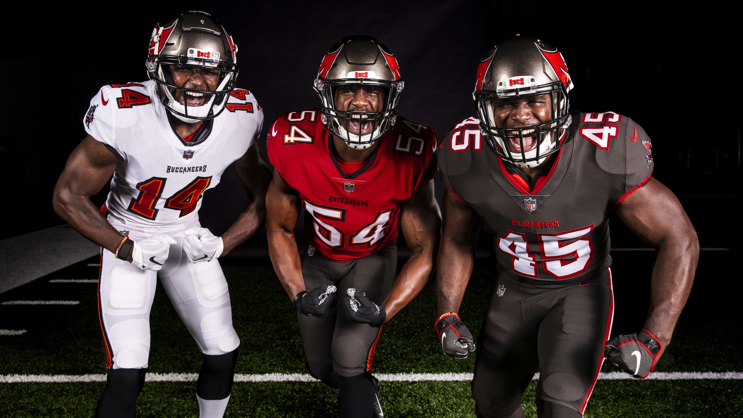
Click to enlarge
The pandemic may have slowed down everything else, but the NFL uni-verse is as active as ever. Yesterday we have the Buccaneers’ long-awaited unveiling along with some Falcons leaks — a crazy day!
Let’s start with the Bucs. Their new uni set (shown above, with lots of additional photos here and here) is pretty much what we expected: a return to their 1997-2013 look, with a few tiny tweaks. Let’s handle this one FAQ-style:
You said there wouldn’t be orange, but these uniforms include the orange trim on the numbers and pants piping!
Actually, what I said — twice, in fact — was that there was no orange trim “at least that I could see.” I was specifically hedging on that point, because the visuals I was shown weren’t 100% conclusive. But I’m glad I was wrong — I much prefer the orange-inclusive design, plus orange is part of the team’s aesthetic heritage.
What about the rest of what you reported last month?
My source and I pretty much got it right: black wordmarks on the chests of both primary jerseys, the modern ship logo on the sleeves, oversized helmet logos, black facemasks, black-topped socks, and a mono-pewter alternate.
One thing we missed, because it wasn’t clear in the visuals: The two primary jerseys have black trim on the collars and sleeve cuffs.
Any subtle things that might not be immediately apparent?
According to this article:
While the Buccaneers are going back to the darker red of their previous [1997-2013] uniforms, they are retaining the shade of pewter used in the most recent [2014-2019] version. The team explored going back to the original pewter pants, but the fabrics used by Nike today are completely different than in the 1990s and therefore it was impossible to re-create the historic pewter color in today’s textiles.
That page also says that the size of the helmet logo “has been reduced to ensure the sword is visible on all helmet types used by players.” So while the helmet logo is still oversized, it’s apparently not quite as oversized as before. Honestly, I can’t tell the difference, but reader Kyle Brenzel says the logo is 13% smaller, based on his analysis of official NFL style guide sheets (which I don’t have access to, but Kyle apparently does). Here’s his comparison of the helmets, along with some color comparisons to boot — new version on top, old version on bottom:
I know it doesn't sound like much, but a 13% reduction in @Buccaneers helmet logo size is a huge deal. Looks WAY better now @UniWatch. pic.twitter.com/gUZvdcisWj
— Kyle Brenzel (@kbrenzel) April 7, 2020
Anything other notable details?
The NOB lettering on the white jersey is black. Back in the day, it was red. (My mock-ups from last month didn’t show the back of the white jersey, because the visuals I was shown didn’t include a rear view of that jersey.)
Can the primary jerseys and pants be mixed and matched?
The photo gallery that the team released yesterday includes a shot showing the white jersey with pewter pants, so that’s definitely an option:
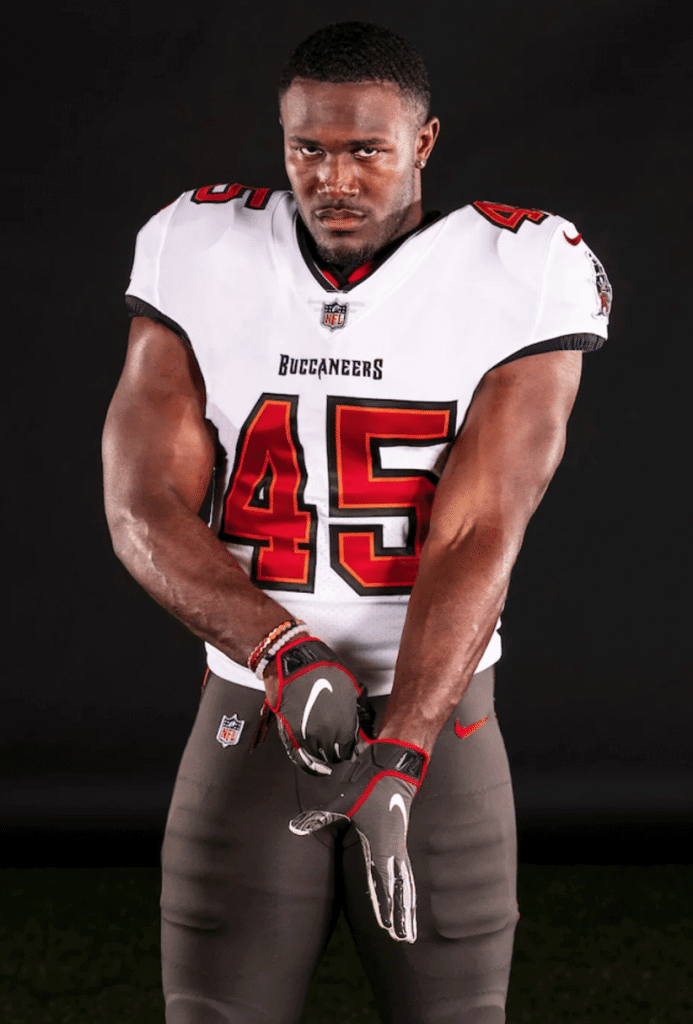
There are no photos of the red jersey with the white pants, so it’s not clear if that’s an official team-sanctioned option. But they occasionally wore that combo back in the day, so I expect they’ll do it again this time around.
Isn’t it weird that they’re using two different sets of pewter pants?
Anyone else find it odd (disturbing?) the new #Buccaneers unis have two different sets of pewter pants (cc: @UniWatch) pic.twitter.com/pQgqA262A6
— Phil Hecken (@PhilHecken) April 7, 2020
The Color Rash era has resulted in several similar situations. The Browns, for example, have two different sets of brown pants; the Texans have two different sets of navy pants; and so on. I agree that it’s odd and feels like overkill.
No Bucco Bruce throwbacks?
They can’t wear the Bucco Bruce design — at least not with its original white helmet — because of the one-shell rule. If the league lifts the rule in 2021, as has been hinted at, I’m sure we’ll see Bucco Bruce back on the field sooner than you can say, “Creamsicle.”
The photo at the top of today’s page shows wide receiver Chris Godwin wearing No. 14 — the number he took after giving his No. 12 to Tom Brady. So the photo shoot must have been done very recently, right?
They apparently did multiple shoots. The first thing the Bucs released as part of yesterday’s unveiling was this video, which showed Godwin wearing No. 12. When people pointed out that 12 is no longer his number, the Bucs followed up with a disclaimer/explainer tweet:
*Disclaimer: Video was filmed before WR Chris Godwin changed numbers.
— Tampa Bay Buccaneers (@Buccaneers) April 7, 2020
But the photos shown here and here show Godwin wearing No. 14, so they were apparently taken at a later date. The Bucs announced Godwin’s number change on March 31, which means the pics were presumably taken within the last week or so. The disturbing thing about that is that several of the pics show Godwin and teammates Lavonte David and Devin White all horsing around in close proximity to each other — a bad violation of social distancing protocols. Update: The Bucs have just informed me that the video and the photos were all done at the same time, in early March, before social distancing practices became common. Godwin’s jersey number was Photoshopped in the photos (honestly, they did such a good job of it that I couldn’t tell), but they couldn’t change it in the video — that’s what accounts for the discrepancy.
So what do you think of this uni set?
I’m fine with the primary uniforms. I’ve never been in love with this design, but it’s obviously way better than what they’ve been wearing for the past six seasons. It looks like a football uniform, not a costume. I particularly like the white-over-pewter combo, so I hope they wear that a lot. Overall: This returns the Bucs to aesthetic respectability, but I wouldn’t rank them any higher than the middle of the NFL uni pack.
The mono-pewter alternate is pretty wretched, but whaddaya gonna do.
Any other thoughts?
With the Bucs basically hitting CTRL-Z on their Nikefied look, and with the Browns apparently poised to do the same, this all seems like an unmistakable repudiation of Nike’s approach to NFL design.
How long until we see the alarm clock design come back as a throwback?
Ha! Give it a decade or so. By that time they’ll have appeared on lots of “Worst Uniforms Ever” lists and we’ll all be able to have a nostalgic laugh about seeing them on the field again.
———
Okay, now let’s turn our attention to Atlanta. A bunch of photos began circulating yesterday — an apparent leak. Ordinarily, I’d be at least somewhat skeptical, especially since I haven’t been able to pinpoint the source of the leak (everyone keeps saying, “My friend sent the pics to me” or “I saw it on a message board,” that kind of thing).
However…
In this case, it turns out that a source showed me a photo of what appeared to be one of the Falcons’ new uniforms a few weeks ago. I was not permitted to share the photo or even mention that I’d seen it. But I can now confirm that this photo I was previously shown matches what’s shown in the photos that began circulating yesterday. So either yesterday’s leak is legitimate, or else there’s a hell of a coincidence involving two illegitimate leaks that happen to match. I’m pretty sure it’s the former, not the latter.
Here are the photos that were making the rounds yesterday (for all of these, you can click to enlarge):
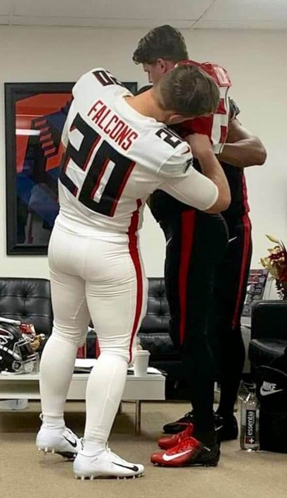
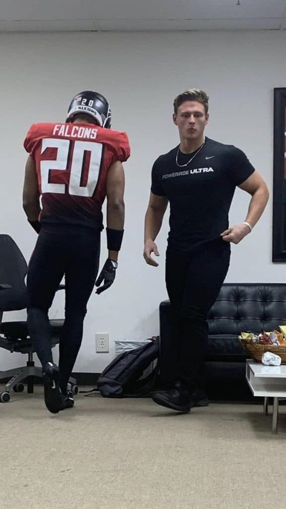
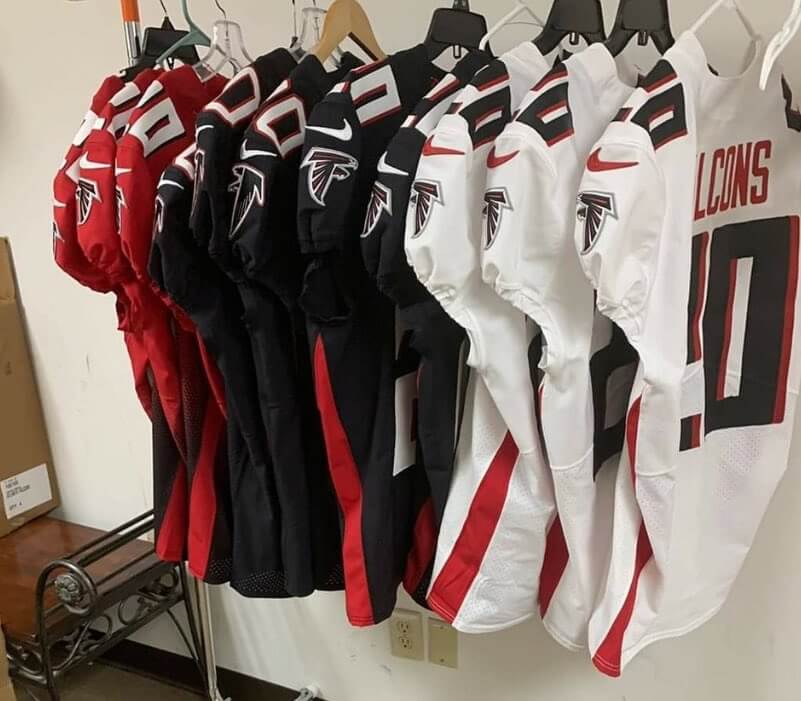
Okay, what can we glean from these photos? Here are a few thoughts:
1. Side panels? In 2020? You’ve got to be fucking kidding me.
2. A red-to-black gradient jersey with black pants? Ugh.
3. I hate uni numbers where the shadow just goes to the right, instead of down and to the right. In this case, it’s compounded by a brutal number font.
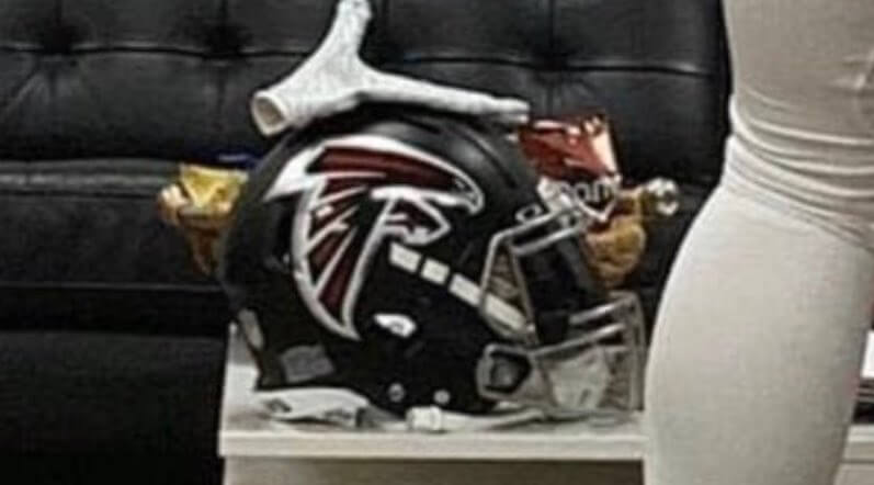
4. If you look closely at the first photo, there’s a helmet sitting on a desk. It appears to have a matte shell and a chrome mask:
5. If you take a closer look at the jerseys hanging on the rack, they appear to have some black throwback jerseys mixed in with the new black jerseys — note the differences in the sleeve logos and the TV numbers:
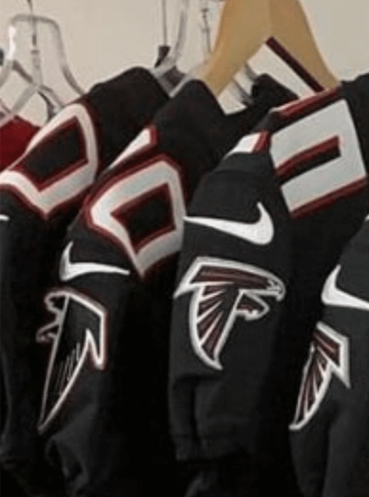
So apparently throwbacks will be part of the mix.
6. You may be thinking to yourself, “Hmmm, these newly leaked photos don’t provide a front view of any of the jerseys.” True enough. But another photo leak began circulating last night, and this one does show the front — or at least it purports to:
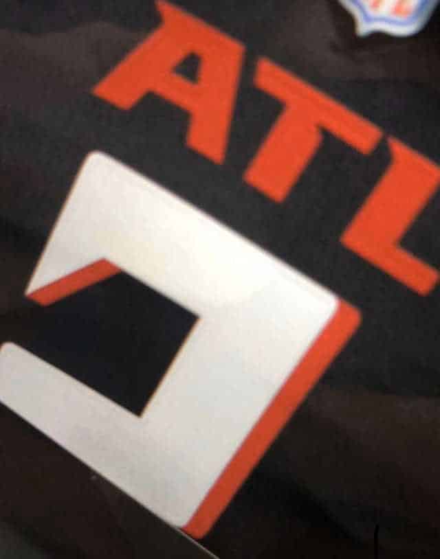
Once again: Under normal circumstances, I might be skeptical. But in this case, this front-view photo matches what I was shown a few weeks ago. Or to put it another way: Yes, it appears that the Falcons will become the first NFL team to have a giant three-letter airport-style city abbreviation plastered on their chest, just like NBA teams were doing eight years ago. Now there’s a distinction to be proud of!
7. On the plus side: No more clown sleeves, thankfully.
All in all: What a disaster. I didn’t think the Falcons had anywhere to go but up, but they proved me wrong.
Of course, there’s always the slight chance that these leaks do not show the real uniform. Shortly after today’s post went live, reader/commenter Patrick offered this analysis:
To me it looks like this could be from a [Nike] presentation to the Falcons with possibilities. First, “Falcons” on the nameplate, not current players. Second, clearly Nike models — NFL tends to use real players. Third, no team socks. I know the rule has changed, but it seems with all new reveals they at least have a sock option and then in games players go tights.
That is all very plausible. It’s not conclusive, of course, but it presents a reasonable alternate explanation for these photos’ existence. Let’s hope Patrick’s right. Otherwise, we’ll be hearing a lot of “They play in a dome, so it makes sense that they look like an arena league team” jokes. Either way, we’ll find out next Tuesday, April 14, when they’re due to unveil.
It’s interesting that the Bucs (and, by all appearances, the Browns) are recovering from the Nike virus, while the Falcons may just now be getting infected. This curve isn’t steep, but it’s long. Teams do tend to recover from the infection, but it takes a while. Now if we just had a vaccine…
UPDATE: The leak was accurate, and the Falcons have gone ahead and released the full uni set:
For our team.
Our fans.
⁰Our city. pic.twitter.com/15e5ZX6EtE— Atlanta Falcons (@AtlantaFalcons) April 8, 2020
Here’s some additional info and a big photo gallery. I’ll have more to say about these uniforms in tomorrow morning’s post.
(My thanks to Luke Easterling for pointing out the black NOB on the Bucs’ white jersey.)

Click to enlarge
Pin Club update: Blake Pass is the latest Uni Watch reader to create a custom display this year’s Pin Club pins. Looks sharp, right? If you want to use the same design, you can download it here.
Meanwhile: The April pin sold out yesterday (in less than a week!), becoming the first of the Pin Club designs to do so. Todd Radom and I are super-happy about the response to this one — thanks so much.
If you want to get caught up, we do still have inventory for the the January, February, and March pins. Remember, you can save 15% by using the checkout code COMMUNITY.
I’m expecting the May pins to arrive from the factory today or tomorrow, so that design will launch on schedule next month. And then we have something very special planned for June — stay tuned.
And remember, the following pandemic discounts remain in effect until further notice:
• The Uni Watch Classic Cap, usually priced at $39.99, is now $35.99.
• Uni Watch seam rippers, usually $6, are now $4.
• And custom-designed Uni Watch membership cards, usually $25, are now $20.
If you’d rather support Uni Watch via a donation, here’s now to do that.
My thanks, as always, for your consideration and support.

Now we just need a big one for Flavor Flav: Longtime reader and all-around swell guy Tim Cox (who actually flew out from Colorado for last summer’s Uni Watch 20th-anniversary party in Brooklyn and then flew back that same night, like a rock star!) has just become one of the very few people on the planet to own a Uni Watch watch. I don’t even have one myself! I’ve had three different watches available on Zazzle for years (in addition to the design that Tim got, there’s also this one and this one), mainly because I think the term “Uni Watch watch” is inherently amusing. They’re listed on our merch page, but I think only one person has ever purchased one before now. “Study, and high-quality materials too!” says Tim. Well, he’d know better than I would — enjoy, Tim!
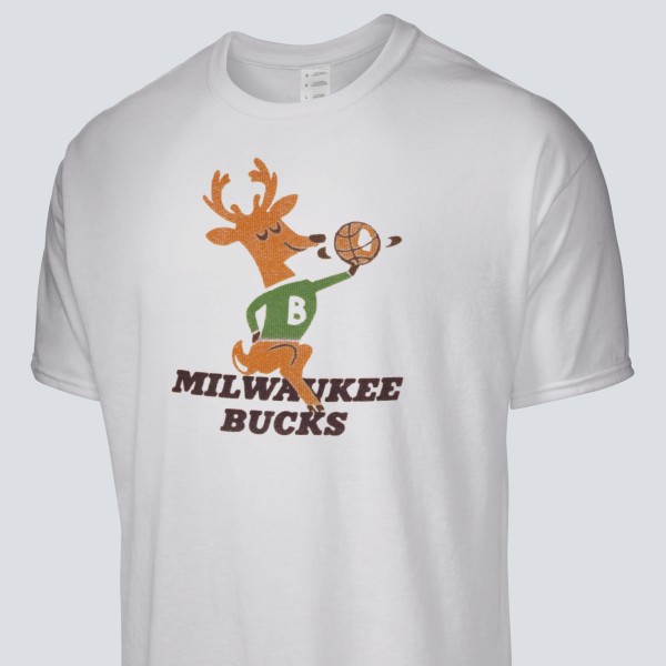
LAST CALL for the Vintage Brand raffle: Our longtime advertiser Vintage Brand is back with this month’s raffle. The lucky winner will be able to choose any item from the Vintage Brand site (including this Bucks T-shirt with history’s greatest NBA logo).
To enter, send an email to the raffle address by 8pm Eastern tonight. One entry per person. I’ll announce the winner tomorrow.
The Ticker
By Lloyd Alaban

Baseball News: Here’s a social distancing-themed Cubs logo that also takes a swipe at their archrivals, the Cardinals (from Kary Klismet). … The Brewers have also released a social distancing logo (from @mikeobs). … This Yankees 1B/OF Joe Pepitone jersey from the TV show Curb Your Enthusiasm has two different number fonts (from Deangelo Vickers). … The Chinese Professional Baseball League will start next week behind closed doors. The Rakuten Monkeys will have robot mannequins in the stands, dressed as fans (from Dan Ukrainetz).

Football News: The Browns’ new uniforms will be revealed on April 15 — one day after the Falcons’ unveiling (from multiple readers). … Here’s a jersey montage of every quarterback that Broncos OLB Von Miller sacked in his career (from Kary Klismet). … As expected, the Rams’ new gradient logo is difficult to reproduce in embroidery. … Someone mocked up every single uniform combination North Carolina can possibly use.

Hockey News: Reader Josh Tremblay found this video of a Bruins/Whalers game from March 1996. NHL teams still wore white at home in those days, but the Whalers were wearing blue at home for that game. Anyone know why? … Here is the Sabres’ social distancing logo (from Ryan Wetstein).

Basketball News: Xavier is letting fans design their shoes (from Jim, who didn’t give his last name). … A sportswriter ranked all the Sixers’ uniforms (from Jack Connell). … A grocery store is using the old Charlotte Bobcats logo (from Nick Doffing, who unfortunately didn’t indicate where the store is located). … Newly elected Basketball Hall of Famer Kevin Garnett doesn’t want the Timberwolves to retire his No. 21 because he’s angry with team owner Glen Taylor.

Soccer News: The Philadelphia Union have released a fauxback logo (from John Flory). … Looks like South Korea and Nike are ripping off the 2018 Adidas World Cup Kit font (from Josh Hinton). … For the latest in kit news around the world, follow Josh’s Twitter feed.

Grab Bag: Here’s a good gallery of all of this season’s Formula One helmets (from Kary Klismet). … Also from Kary: Norman, Okla., is inviting the public to vote on the finalists for its new city flag. … One more from Kary: The Ohio State matching band released a video of its members practicing social distancing with a performance over video conferencing. … North Carolina men’s lacrosse is donating materials to help manufacturers make more masks. … The Chicago Sun Times changed its masthead to promote social distancing (from Mike Chamernik). … Nike will start making gear for front-line health care workers. … In a related item, here’s an article about the various sports companies that are now making medical supplies (NYT link) (from Tom Tuner). … The U.S. Coast Guard has released new guidelines on wearing face masks while in uniform (from @bs_brewer). … UFC is getting around the latest guidelines prohibiting large gatherings by holding an event on tribal lands.

Click to enlarge
What Paul did last night: As the days get longer and our porch daily Pandemic Porch Cocktail™ sessions include increasing amounts of daylight, it becomes harder and harder to take a decent photo. Since the porch is enclosed but the house across the street is in daylight, it’s more or less like taking a photo out a window (which, as anyone who’s tried it knows, is tricky). So I’m faced with the choice of leaving the porch underexposed or having the background all blown out. It doesn’t help that I’m not a particularly good or sophisticated or patient photographer.
Anyway: Bud for me yesterday, and seltzer for the Tugboat Captain. As you can see in front of my beer, the tulips are coming in quite nicely.
Happy Passover to all who are celebrating tonight. I realize it doesn’t seem like the most celebratory time, but let’s be thankful for what we still have. Peace. — Paul
Bucs get it right. That Falcons set is brutally bad, but still better than the set they’re replacing.
Bucs: Needs more orange. Lots more orange. Waaaaaaaay more orange. But at least there’s some, and these unis are good enough that I can go back to rooting for Tampa Bay when I happen to see them in a game. I dislike white helmets for most teams more than I like Bucco Bruce, so I’m on board with the pewter and they’re basically using it well.
Falcons: First pic, I was like, hey, that’s not too bad. Second pic, Ah, no never mind, it’s really bad. I think I could overlook even the gradient if the helmet was red.
Gradient. Ugh…
It didn’t work with the Jags helmets. It didn’t work with the D-Backs pants and shoulders. Why do they think it will work now? Who are the designers that keep thinking that this is going to be the next big thing?
At least the gradients will be only worn at most once a year, less than the throwbacks get worn. Since the front ATL is over the number 2 and all the jerseys are number 20, I’m guessing the front reads ATLANTA. The numbers aren’t too different from what they have been wearing. Hopefully Patrick’s take is correct. I was expecting the worst, but I give these a B. The side-panels won’t stand out (they used to have side-piping and few noticed). Not a fan of one red pants stripe but it’s better then the piping “stripe” they used to have.
David Murphy – that’s what initially thought too. However, the ATL is centered under the NFL shield. If these are the real deal, it won’t be ‘Atlanta’ on that jersey.
Shaftman you are correct – I should’ve spotted the NFL shield. The ATL is too big for my tastes but at least the collar and sleeves are plain. My B grade came before I saw the solid hose and all-black home combo. Perhaps in a year or two they’ll discard the black pants like the last go round. I think the actual ticket-buying demographic will love the new unis, but me not so much. I’m okay with the matte helmet and silver mask, but if you’re going to all black – why change the black mask you had?
The Falcons jerseys are hard to look at it. I went over to the Falcons message board on reddit to see the reaction and it seemed overwhelmingly negative.
This seems like a change for the sake of change. Does anyone know what the other numbers will look like in that font?
Regarding Bucs two different pants, note that the Color Rush all-pewter outfit contains no Orange at all, not on the jersey number trim and not on the pants striping, thus two different pants.
Worst part about this is the fact they can’t wear white pants with the pewter jerseys unless they added a second pair of white pants without any orange. I hate the color rush look but I would think pewter over white would at least look decent. They should’ve added orange to the pewter jersey so it would at least be an option
If that Falcons leak is legit, it’s a downgrade, and a hugely disappointing one given the link. Like the Titans they’ve gone from one bad design to another, bucking the trend. Ych.
It is almost as if they don’t pay attention to the fact that new uniform sets get praised when they go back to traditional styles. Surely in about 5 years we’ll see the Titans and Falcons both dump their Nike uniforms as soon as possible.
I really hope that these are NOT the Falcons uniforms. Those wouldn’t even cut it as high school uniforms. To me it looks like this could be from a presentation to the Falcons with possibilities. First, Falcons on the nameplate, not current players. Second, clearly Nike models…NFL tends to use real players. Third, no team socks. I know the rule has changed but it seems with all new reveals they at least have a sock option and then in games players go tights.
Nike can make a good uniform we know that. But they also have to see that their experiments have failed. Jags, Bucs, Browns…traditional clearly is better in the NFL. Let’s hope that these are just prototypes.
Bucs, I’m bummed they didn’t go Bucco Bruce. These are way too dark for a Florida team. If Nike can’t make shimmery pants anymore then get a lighter color.
This is a reasonable analysis. I’ll add it to the text.
Here’s a photo of four real Falcons players in those uniforms, so I’d say they’re legit.
They are fugly…
link
I really wanted this to be true!
Yeah…I was rooting for you, but unfortunately they are legit. Thanks for giving us a couple hours of hope.
That Cubs logo was made by a Facebook group (diehardbleedblue) and was not released by the team.
Got it. Thanks.
I Love the Bucs return to their best uni. I never understood the Bucco Bruce love as it was ridiculed back in its day. keeping the large logo is good and a return to a darker red is a plus too.
The Falcons look like the Jags old helmet mated with the Atlanta Hawks unis from the 90s. It’s just terrible
I don’t love Bucco Bruce, but rather love the orange and white uniform. Give me the current uniform and logo, but color swapped to the orange and white with red trim of the Bucco Bruce days and I think you’ve got a great set.
That color scheme just felt more Tampa, more tropical.
I am disappointed if these are the legit new uniforms for the Falcons. General rule for me. If a zero looked like a square then the number font sucks.
Falcons set is ugly, but made worse by the matte helmet/chrome face mask. Gross.
Let’s hope the black is the primary jersey and the red gradient is rarely seen. Or maybe like with the last time Atlanta rolled out new uniforms they quickly decide to change which color jersey is the primary. The mono pants / socks is brutal, as are the ATL wordmark and chrome facemask.
The side panels, weird number font with side shadow would all be a tolerable if on their own, especially given they sort of take inspiration from the logo. Don’t like them, but could live with them.
Assuming the red is the primary it also creates another uni problem. Given the gradient design it seems like it will only be worn with black pants. So you have Atlanta and Tampa in the same division, basically with the same uniform look, black/dark gray helmet and pants, with a red jersey. You should be able to easily identify a team with a quick glance at their uniforms. Given the camera angles which are used to show football, some would be hard pressed to instantly discern between the Bucs and Falcons.
I could live with the Falcons wearing black jersey over white pants as the primary. That is wishful thinking. They will probably prefer going mono-black.
I think I actually hate this mono trend more than I hated the neon trend from a few years ago.
Wow, as a Saints fan, the one thing I could count on with the Falcons is that they’d at least look decent when we played them. Not a huge fan of their 2003 redesign, but they weren’t terrible despite the idiotic piping. Was hoping the fauxback’s popularity would steer them back to a more traditional look, but alas, they look high school now. The “ATL” is horrid and the gradient even worse.
I hate the all-black unitard look on the Saints and I’m sure I’ll hate the all-black unitard look on Atlanta. If I wanted to see the all-black unitard look, I’d watch “Any Given Sunday”, not Fox’s Sunday afternoon games.
Judging by Arthur Blank’s taste in suits, I suppose I shouldn’t be surprised he greenlit these costumes.
“I think only one person has ever purchased one before now.”
I’m wearing that watch right now (only the watchband on mine is different from Tim’s). I didn’t realize I had belonged to an exclusive club. :)
I’m glad I bought too.
Whenever this feature runs, surely it should be called “Uni Watch Watch Watch”?
Yes, Matt, With a tote board to add to the number whenever anybody buys one, like at a telethon.
Sorry I misspelled “sturdy” in my original message. I had already taken out my Uni-Watch Disposable Contact Lenses for the night, so I should have used my Uni-Watch Swiss Army Knife, now with Magnifying Glass, to help me proofread.
Thanks, Paul, for the kind words. I don’t think I have ever been called “swell” on the internet Swollen, yes, but not swell.
Turns out the leak was accurate:
Ugh.
Placement of black jersey in the front might mean that is the primary dark jersey. If you pair that with the white jersey and black socks it is not the worst uniform out there.
Actually, team’s website says home uni will be mono-black, and road will be mono-white.
Bummer, but since there is no NFL mandate on this aspect of the uniforms, hopefully they switch to black over white as the primary sooner than later. Given the trend to mono though it probably isn’t likely.
The giant “ATL” on the front is absolutely horrendous. I don’t like word marks on the front above the numbers to begin with, but this is just too much. I don’t mind the matte finish on the helmet. Silver face mask is OK too.
And side panels? Double yuk. A severe downgrade.
The throwbacks should be the primary set.
Not sure what Nike’s fascination is with horrible placement of awful wordmarks on the jersey (or in the case of Miami, even the pants).
Prior to Nike coming on board the NFL seemed to have a handle on how that could work, a small workmark with the teams nickname (not city name) centered below the collar. Wordmarks don’t look good on the sleeves, they don’t look good off centered, they look like a college uniform when using the city name and/or with big fonts, and always look dumb when using airport abbreviations.
So strange that Nike thinks this is part of great football jersey design.
The throwbacks are definitely better, but I still wish they would go back to red jerseys and red helmets from the Steve Bartkowski years.
I agree with you wholeheartedly. The Bucs are the first team in a long time to actually IMPROVE their uniform. ALthough considering the abomination they’ve been wearing, they didn’t have far to go. The Falcons on the other hand are the sh*ts.
The side panels, gradient colored jerseys, stupid number font and gigantic ATL on the front make them look like a second rate XFL or AAF club. I would have preferred they keep their current uni, but just remove those goofy sleeves.
Did the Falcons get relegated to the XFL?
They looked bad in the leaks, but they look terrible on the players in the video.
The amazing throwback at the end really just emphasizes how good they could have gotten this.
Sad day for Atlanta, I mean ATL
…and the red set of pants shown in the photo with all the combinations have a black stripe while the side panels on all the Jerseys are red. That will totally look like crap.
The gradient uniform isn’t exactly “cutting edge”, considering the Hawks had a similar gradient back in the late 1990s (though with black over red instead of the Falcons’ red over black). Hell, I even made a red-black gradient jersey for a custom team in NHL 2000 for the PC twenty years ago (as a third jersey – my regular uniforms were much more tasteful).
That is HORRID. I can’t stand to look at them. The gradient, the NUMBERS. Can’t believe they went that direction.
On the plus side, the Bucs new duds are good. I like the all Pewter.
I love matching bands. OSU’s matching band is OK.
I was hoping the video would be related to the “lighting the matches, pull one away” social distancing videos. But the video was aight.
“I never understood the Bucco Bruce love as it was ridiculed back in its day.”
Well, that’s the Tarrant Theory at work once again. It’s a “classic” simply because it’s old.
“I went over to the Falcons message board on reddit to see the reaction and it seemed overwhelmingly negative.”
There’s a shocker!
As bad as the Bucs’ digital font was, somehow their jerseys seem boring with a “regular” font.
And I do not care for the all pewter look at all. It’s an odd color and there’s WAY too much of it.
New Falcons jerseys look a lot like Texas Tech. Similar number font.
Gradient, too.
link
I think the NHL that year had teams wear white at home first half of season and switch up to color second half of season
The NHL did that in 1991-92 during the league’s 75th anniversary.
I am thinking Boston and Hartford are so close. This was probably a one game road trip for the Bruins so it was easy for them to bring the white unis on the road if Hartford wanted to have a game in the dark unis. This was around the time when some dark unis were being worn at home as the NHL just released regular alternate uniforms for the first time in 1995-96.
I think Wade is on to something. There were enough third jerseys in those days, that if teams were on a road trip and facing one or two opponents wearing thirds, they ask the third team to wear color at home to avoid bringing extra equipment for a single game. I distinctly remember the Senators asking the Avalanche to do this one year when they faced the Ducks in Anaheim, Kings in LA, and then the Avs before heading home. It was actually kind of a nice treat for the hometown fans to see what the Avs looked like in their colors.
The Bucs went a safe route and hit reset to the uniform worn by successful teams. I like the ATL’s new set. The gradient is not my favorite, but it’s pretty subtle. I would have just made the whole jersey red. Still, they simplified things, but kept a little ATL swagger.
On a side note,I think the term “brutal” has been played out in the Uni-community. How can number fonts be “brutal”? I get it (or maybe I don’t “get it”), it’s not your preferred aesthetic. Still, it’s a rather extreme term to be using so casually, and I see it’s infected a lot of reader comments.
Here are some synonyms: savage, cruel, bloodthirsty, vicious, ferocious, barbaric, barbarous, wicked, murderous, cold-blooded, hard-hearted, harsh. ruthless, callous, heartless, merciless, pitiless, remorseless, sadistic, unfeeling. inhuman, heinous, monstrous, abominable, atrocious, vile, infernal, uncivilized.
Actually, “brutal” is perfectly legitimate adjective for something that one finds distasteful. Not extreme at all.
Moreover, if you know anything about design and architecture, then you know this font could also be described as brutalist. You can learn more about that here:
link
I didn’t question the legitimacy of the adjective. I was just observing it’s overuse.
I was already aware of the Brutalist movement in design and architecture. I dove a bit deeper and read about good article about Bruatalist fonts. link
However, it doesn’t seem you were making that reference when describing the new Falcons number font.
It’s all good Paul. I really enjoy your website. I’m a little bored with the quarantine. Sorry for being picky.
Keep up the good work! I look forward to your review of the new Browns uniforms.
Okay in the contecxt of this new Atlanta Falcons set, I find the terms “savage, cruel, bloodthirsty, vicious, ferocious, barbaric, barbarous, wicked, murderous, cold-blooded, hard-hearted, harsh. ruthless, callous, heartless, merciless, pitiless, remorseless, sadistic, unfeeling. inhuman, heinous, monstrous, abominable, atrocious, vile, infernal, uncivilized” work just as well as “brutal”.
Thanks for the reminder.
Lee
As a life-long Falcons fan (I know that’s as hard to type as it is to read) these as a whole are terrible. I’m not a fan of all white or all black. The only acceptable combination is the Black over White and the throwbacks. Side panels I can overlook, the helmet is at best a lateral.
The ATL word mark is an abomination. On par with the Browns pants.
I hope they burn the gradient uniforms like Sherman burned the city!
Like the Titans, they missed too missed the boat. The Titans at least upgraded their helmet changing to to blue and in comparison the Titans at least hit the side of the boat and not belly flopped into open water.
Falcons unis look like Jets 2.0, except worse. Jets 0.2?
I was going to say the same thing. Adding the throwback to these pictures was a mistake…just really sticks it to you on how good those old unis were and how bad they got this one.
Also, drop shadows without a corresponding outline, just look dumb regardless of their direction.
F is for Falcons and also the grade I give their new crap uni.
i agree with most about the bucs. it’s addition by regression for sure. i do like the mono pewter. it fits with their “we wish we were the raiders” team/fan culture, and i much prefer the new shade of pewter. its more of a gunmetal grey than before. the previous shade was always too-close-to-brown-but-not-really-brown for me, and it looked awful when the players were sweating through the fabric.
as for the falcons, call me crazy but i love them. i don’t want to see every team in something like this, but i think nike finally figured out how to integrate their own concepts successfully. other nikified designs like the seahawks, browns, and former bucs jerseys show no cohesion or restraint, and every element of the jerseys were (over)designed. every inch of those jerseys had to have a texture, a pattern, a slogan or a gimmick, and very little thought to how tailoring the life out of them was going to affect those elements. i think the new falcons sets are modern, unique, bold, and simple (not sure why they went with that gradient, but i don’t hate that either).
If you click on the photo gallery link, you see that they will have black facemasks for the fauxbacks; “FALCONS” on the inside collar of the jerseys; pairing the black pants with the white jersey, and also pairing the white pants with the black jersey.
There’s also a red pants option (only shown with the white jersey) as well. Meh…
You’re definitely in the minority on the Bucs’ all-pewter set, Paul. The reaction to that has been invariably positive among the fanbase and I’m pretty sure the Brady all-pewter jersey has been the biggest seller of the new ones by far. I personally love it and it’s the main thing preventing this reveal from being a disappointment for me. (I was firmly in the “get creamsicles back whatever it takes” camp, and I’m skeptical that the NFL will finally scrap the dumb-from-the-beginning one-shell rule as rumored.)
You’re definitely in the minority on the Bucs’ all-pewter set, Paul.
And that should matter to me because..?
As a critic, Thomas, it’s not my job to care whether I’m in the minority or the majority. I just give my honest reaction. If lots of people agree, that’s nice; if nobody agrees, that’s fine too. If you’d rather get assessments by polls or thumbs up/down votes, why even have something like Uni Watch?
If you like the mono-pewter, good for you! I’m genuinely happy for you — no snark, no sarcasm. But I still think it looks like dreck. Would you prefer that I lie and pretend to like it, just because some other folks do?
The Falcons uniforms/costumes are the worst I have ever seen in the NFL.
Brutal is appropriate. So bad I would probably turn a game off when I see them like I have had to do for the Browns the past few years.
Hey Paul…You mentioned that you saw the leak of the Falcons jersey but couldn’t say that you did or anything like that. By any chance have you seen the new Browns unis but cannot say that you have or anything? Feel free to reply with a completely non-confirmation confirmation by way of describing why green is your favorite color or something. LOL.
It seems that no matter what you do these days, there’s going to be outrage over uniforms unless it’s something people are already familiar with. Maybe I’m just happy that I won’t have to look at those irritating circus uniforms anymore, but overall, I think the main home/road look fine. The gradient uniform might be just as – if not more – awful to look at than the circus unis though, and hopefully they won’t be wearing it on every single prime time game.
A few more things:
1) to me, it looks like in the locker room photo, the falcon looks HUGE on the helmet, and it is sloped downward more than usual.
2) I like matte, but I think it’s overdone. I like to see the shine of helmets during night games in baseball and football. The matte trend is ruining that.
3) enough with chrome facemasks
I think the issue that people have are specific elements of new designs that are done just to be different, and when you add them all up, the sum is a total mess.
That is how I view these Falcons uniforms. The ATL wordmark and gradient red jersey are the only parts I think are absolutely horrendous. But the mono looks, the unnecessary side panels, the fonts and side shadows, the chrome facemasks… none are really good or necessary, so why are they there other than to be something different for different sake. And that isn’t bad, but there is no need for ALL of them.
I think the problem is, these seem to be designed under the directive of “what is new and flashy” rather than what should always be the design directive of simply “what looks good”. If they did the later they’d end up with black jerseys, white pants, black socks, black facemask, red outlines of white numbers, a small “Falcons” wordmark, and maybe they still have that red side panel stripe since it matches the design of their logo. It is not a question of trying to incorporate something new into their design, which I think is what they were going for with that red stripe, but rather just overdesigning stuff.
First time,long time! The new Falcons set is not as bad in motion as it looks in a photo. These are way better than the past set. I know this community loves traditional designs, but this is a mix of traditional and modern design works for the most part. It’s not as good as the Vikings or Jags traditional/modern sets, but this isn’t as bad as the Titans, Browns, or Jets sets.
To me, they aren’t particularly traditional or modern, and that’s part of the problem. They just seem like an awkward combination of things that became trendy since the Falcons’ last redesign. A lot of those things are now overused and/or already seem dated. Like everyone else I think the throwbacks are great, but I had no expectations that they would just go back to those in lieu of a new design (it’s semi-miraculous that the Bucs essentially did). But if you’re going to do something new or “modern,” actually make it modern. As Paul said, “Side panels? In 2020?” The 3 letter airport abbreviation thing was cheesy when NBA teams started doing it, and that was at least a decade ago. The whole thing just comes off as amateurish.
I don’t mind the gradient – I was actually hoping the Ravens would try a something like this (purple to black if they stay with the purple jersey over black pants combo).
I don’t mind the numbers either. The “side shadow” is “ok” to me.
Side panels – YUCK.
ATL on the chest – YUCK.
The only combos the Falclowns should even consider: link
Amazing how much better that black jersey looks when paired with the white pants. Not as good as the fauxback, but it isn’t the smoking crater in the ground that the mono-black look is.
Atlanta’s marketing people should have checked with Jacksonville’s and Tampa Bay’s people before letting Nike run roughshod over their branding though.
Bucs. Good.
ATL. Bad
Re: Falcons
Only 2 photos out of 81 show someone in the red pants. Curious…of all the elements to this new uni set of theirs, the red pants seem the most out of place to me. It’s also the only item with a black side panel, meaning no matter what jersey they wear them with, the panel won’t line up color-wise with the panel above it.
I give it 2 seasons before they wear them with the gradient jersey, making it look like they’re wearing black cummerbunds around a red leotard.
Some NFL teams simply can’t learn from the likes of the Colts, Raiders, Bears, Packers… Keep it simple, clean and classic.
That’s why I love my Bills unis….mostly. We need to ditch the navy blue outlines, and the stupid widening stripe on the helmet. But other than that, I think we’ve got Modern Classics!
Not everything needs to be simple, clean, and classic like the Colts/Bears/Packers etc.–variety is the spice of life!–but there’s a big difference between modern/unique/innovative and ugly as hell. The Falcons took a flying leap into ugly as hell and asked us to join them.
It’s gonna be interesting to see if they course-correct in 2025.
Falcons are making a big deal of having an all-black primarily home set, yet aren’t they kinda copying what the rival Saints have been doing for years (minus the helmet of course).
Falcons old set may have been clown costumes, but these are worse.
Good, maybe then Gayle Benson will ditch the all-black look for the Saints in the name of not looking like our hated rivals.
Hey,one can hope!
Read an article today about baseball players basically starting they are against being away from their families for months at a time. Does anybody else find it hypocritical that a league that “embraces” the military would have a hard time being away from their loved ones like I don’t know our military personnel has to sacrifice for our country?
How is that hypocritical? It’s not as though it’s the league which forces the military to be away from their family. The fact that players find it difficult to be away for months means that they appreciate how difficult it can be for military members to have to be away even longer.
It’s almost like saying that it’s hypocritical to pay tribute to people who have died if you don’t want to die yourself.
It’s hypocritical because the league has long stated how the sympathize with the military sacrifice to our country and would love to “give back someday”. What a better time than now to sacrifice some family time to give us some much needed entertainment. Also there has been the numerous war references over the years.
Is it really a tribute when you get tax breaks for hosting these military appreciation days or have been less than transparent with we’re all the money is going from endless jersey and hat sales honoring our military?
Are you suggesting that baseball players (individual people) should come back and play through Coronavirus for our entertainment because Major League Baseball (a business entity who employs said individuals) has partnered with the military?
This is quite a confusing post
The Falcons uniform is an upgrade for sure. But with that font, it’s still a clown costume.Maybe in 5 years they’ll figure it out and wear either what they wore in the 80s or 90s. Before they looked like clowns.
I like both uni changes in that at least they got rid of the puzzle pieces on the sleeves, etc. I’ll take a mostly solid top any day. Now, if the Seahawks and Arizona Cardinals can join the club and get cleaned up…
To Paul and all who observe, a koshern un freilichen Pesach! Saw a beautiful picture with a plate sized latke on flowers that said “next year, in person.” May we all be so blessed this time next year.
The worst part of the atrocious Falcons’ set is the lack of socks. If there was some contrast, between the pants and socks, these could be salvaged. But they’ve gone full yoga pants. I know teams have been unofficially doing this, but I fear this will become the new norm.
The Falcons unis are brutal.
The Bucs … it seems annoying to wait for this reveal, which is basically a reverse back to something similar to what they used to wear. No point in a huge reveal. I felt misled, that something big was going to happen, instead of “hey, we had it right and we’re basically going back to that.”
Well, it *is* a significant uniform change. It just happens that the significant change is back to something they previously wore.
Anyway, come on: *All* new uni sets get big buildups nowadays. It’s mostly nonsense, of course, but this one actually had less hype than most. They didn’t do an endless series of teaser videos, they didn’t do one of those “one hint per day” things on Twitter, they didn’t do a live event (although they might have done that if not for the pandemic). By contemporary standards, this unveiling was pretty sedate.
Michigan State’s alumni band made a similar video.
link
The red and black gradient on the Falcons jersey looks like the mid-1990’s Hawks link
Minority opinion – I like the Falcon’s new unis. I would prefer no mono black, but the black over white and white over red look very good to me. The gradient jersey is awful but that is just for special occasions. And as is often the case, the throwback set looks best of all. Bottom line, these are an improvement over the current unis (minus the gradient one).
I’d be interested in seeing a post revisiting every new NFL design since the Nike takeover. It would be neat to see which ones stuck, which ones were just awful, and which of the awful ones were so bad that the team decided to revert to pre-Nike looks. Of course, it would have to wait for after this current round of reveals.
I concur, that would be a great comparison.
Falcons fans welcome to our world (Rams fans) where nike & so called marketing experts continue to come up with these modern crappy designs, I’m dreading the Rams unveiling when we’ll have to hear another stupid story of what the new uni says, after the crappy logos they released (the colors are fine) I have no doubt the Rams new uniforms and the modern horn are going to be shitty looking
It’s Flavor Flav, not Flava Flav. He has publicly said he does not like his name being spelled wrong.
Thanks. Fixed!
Now, I’m legitimately scared to see the Chargers new set. Just like the Falcons, they’ve spent the last month posting hype videos that harken back to the past. I was thinking that Atlanta, sorry I mean ATL, was going bak to an updated version of a classic look. Instead they traded one of the worst uniforms in NFL history for a slightly better one of the worst uniforms in NFL history.
I would have loved them going with Creamsicle, or some form of it, but IMHO this is definitely very good for the pewter look. Too bad they can’t get the metallic looking fabric for the pants, since this looks like a light shade of brown. And of course the color rash is awful, and again it just looks brown.
Agree with Paul, this puts them in the middle of the pack.
Atlanta on the other hand is a complete fail. Actually the “ATL” wouldn’t bother me if it was much smaller, or just on the helmet bumper.
I agree. This shade of “pewter” looked brown on the last set and I was hoping it would get fixed on this go around. I’m not as bothered by the ATL on the jersey as I am the side panel, the weird pant striping, and the lack of traditional socks. Combine them all and it’s a horrible costume.
A couple quick comments that I just thought. First one is I wonder if the Bucs will wear the color rash pants when they wear pewter pants with the white jerseys, since this pant stripe has white in it?
Also with the trend being these leotard looks with the socks matching the pants, I’d be happy if they just got rid of the colored socks and just went the CFB style with bare calf.
Wow, the Falcons now look like an Arena League team.
ATL? ON THE FRONT OF THE JERSEY?
Also; i like that watch a lot.
Everything wrong with the Falcons redesign:
Matte helmet
Oversize helmet logo
Gray face masks
Side panel on the jersey
Jersey font
Clunky drop shadows
The huge ATL
Tapered pants stripes
Socks the same color as the pants
Other than the colors, I am not sure there is anything about the Falcons redesign I like.
They went from a bottom 6 uniform to a bottom 2 (along with the Titans).
Crud, I forgot to list GRADIENT!
Please add that one.
Lee
The Falcons situation reminds me of when the Phillies unveiled their current uniform set in 1992. The team managed to keep it a secret until the team ran out on the field for the first time on opening day. Of course,there was no internet then. Doing that without a leak would be impossible today.
Re: Atlanta Falcons new uniforms – Is it “5 and done” bad? Then again I would thought the Bengals would be “5 and done” – and we’re now going 20+ years with that mess. I just don’t get how teams with a great color combo – red, black and white want to consistently screw it up. I will say, not to contradict myself, the all white uniforms will be tolerable.
The all black – is so overdone in the sports world – it brings zero excitement, it actually like: “you’ve got to be kidding us” look. How many all black looks can we tolerate, you would think the NFL would be smart enough to limit that look. When the Tampa Bay Buccaneers first came in the league they wanted to wear light green and orange and were told “no” by the NFL because it looks too much like the Dolphins – what happened to that logic? We now have New Orleans, Cincinnati, sometimes Baltimore and many other teams occasionally all wearing black on black – incredibly boring
God I hate these idiotic “hype” videos with varying flashing lights and hard jump cuts in and out of the light. These teams want people to pay attention to the new look, but all the distractions and stupid three second looks at a uniform partially in the dark doesn’t help anyone see the substance. Is it to force people to re-watch it and artificially boost their social media views and metrics? Or do these “marketing professionals” really think it’s a great video? I’ve never been to Atlanta but what would be wrong with a drone clip circling the stadium like a bird, cutting to a clip of an actual falcon hunting or diving, showing the new look in the light and fading to black with red font reading something equally as cheesy like “the new look has landed” or something? All that aside, hate the mono looks and would have been nice to see them bring silver pants back but we all know Nike can’t/won’t do metallic which is a shame. Bucs look would be elevated with metallic pants too.
After seeing the Atlanta debacle, it sure does make me appreciate uniform sets that I officially found to be a bit “meh,” more and more, such as the Texans. They’re not all-time classics, but they sure do get better and rise up the charts with each team’s uniform rebrand/makeover.
Ok, I really like what the Bucs did which was basically hit the reset button on the 2014 disaster. I know a lot of people though really want to see the creamsicles return so hopefully Bucco Bruce the coach is right about 2021. A Brady creamsicle would probably be the hottest jersey we have seen in years. I am fairly sure people remember the last person to wear a creamsicle 12. Here’s a hint: he was the starting QB for the Ravens in Super Bowl XXXV.
Now to the AWFUL ATLANTA threads. My god they did just about everything wrong. The red pants look nice as does the fauxback, which still isn’t quite correct. Either it needs the red helmet from the 1960s or the gray pants from the 1990s. But the rest is just wretched and looks like they came from a college team’s wardrobe circa 2013. The Falcons could have really done something here and completely missed the mark. A red helmet for starters would have been a really nice update and is something the fan base has been clamoring for ever since the silly one shell rule took effect. But piping on the top? BAD. “ATL” on the front? What is this the NBA?!??! Really bad designing. The gradient uniform is definitely different but yikes, if it wasn’t for the fauxbacks I would recommend an immediate dumpster fire.
We know the Chargers will give us something nice because well, when hasn’t the team looked good? Colts will be a tweak. The Browns will erase their mistake much like the Bucs did. The Patriots? I’m guessing we will get a 90s throwback and maybe a red top as well. The Rams… dear god they already messed up the logo so we can only hope they don’t blow it on the uniforms.
I don’t mind the Bucs’ oversized decals. Flags are supposed to be big and wavy so it makes sense. At least with the new unis they made it a teeny bit smaller to cater those who dislike them, I guess.
The Bucs new unis are great. It’s simple and sometimes simple is best.
I really think the Falcons unis are bad. I don’t like the huge “ATL” on top and the shadow drop with the numbers remind me of just how bad the Browns unis are (And hopefully they’ll get rid of that with the new ones). But I actually like the new helmet, though.
Missed some NC uni combos, should be 3x3x3x3 or 81?