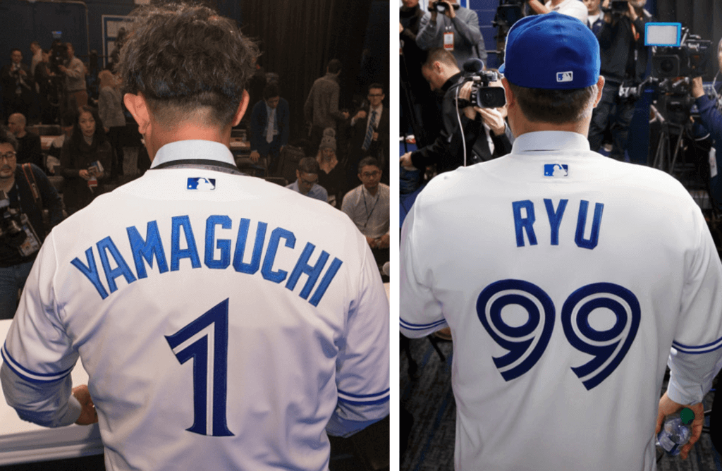
The Blue Jays have a uniform unveiling scheduled for Saturday, but they made a different sort of uni-related news yesterday, as they introduced the newest member of their pitching staff: right-hander Shun Yamaguchi, who’ll be making his MLB debut this season after a 14-year career in Japan. He’ll wear No. 1, which is interesting on two levels: First, it adds another name to the ranks of MLB single-digitized pitchers. And second, last month the Jays signed free agent southpaw Hyun-jin Ryu, who wears No. 99, so Toronto’s pitching staff will run the uni-numerical spectrum from 1 to 99.
Has any other team ever had pitchers wearing Nos. 1 and 99? In an attempt to answer that question, I went to Baseball-Reference.com, where I learned that only 18 MLB players, other than Ryu, have worn No. 99. Of those, only eight were pitchers. From there it was fairly simple to cross-reference the applicable rosters and determine that the Jays are indeed the first team to have Nos. 1 and 99 on the same pitching staff. (I feel like there’s also a comprehensive list of single-digitized pitchers out there, which would have made this task much simpler, but I couldn’t find it. Anyone..?)
The Jays are no strangers to single-digit pitchers, having previously employed Marcus Stroman (No. 6) and Josh Towers (No. 7). They’re also the only MLB club ever to have Nos. 0 and 00 on the team at the same time, a feat they pulled off in 1985 with Al Oliver and Cliff Johnson.
Too bad Toronto’s 2020 schedule doesn’t include any games against the Mets, because the Mets’ roster now includes Stroman, who wore No. 7 last year for New York but is changing to No. 0 this season. A matchup of Stroman vs. Yamaguchi — 0 vs. 1 — would presumably be the lowest-numbered pairing of starting pitchers in MLB history.
It’s also worth noting that the Yankees currently have a No. 0 (reliever Adom Ottavino) and a No. 99 (outfielder Aaron Judge). But somehow there’s something more satisfying about having the numerical bookends both on the pitching staff. But that’s just me — your mileage may vary and all that.
Update: Just as I was getting ready to publish this entry this morning, I discovered that another writer — a Jays blogger for SB Nation who simply calls himself “Minor Leaguer” — had investigated this same question on Tuesday. He also determined that no previous team has had pitchers wearing Nos. 1 and 99, but he went a step further and listed the 10 previous instances of teams with a No. 1 and a No. 99, irrespective of position. That’s some great work right there — recommended!
(My thanks to Toronto’s own Chris Creamer for letting me know about Yamaguchi’s number.)


Hats off to New Era: Hat manufacturer New Era is celebrating its 100th anniversary this year, and they’re marking the occasion by launching a new collection of headwear from throughout the company’s history, including newsboy caps, old-fashioned golf caps, and some familiar baseball caps. It’s an interesting history lesson — you can check out the catalog here.
There’s more info here, and the company has also released a New Era timeline and fact sheet.
Meanwhile, here’s a good article about how a 1980 ad in The Sporting News helped turn New Era into a retail powerhouse.
Click to enlarge
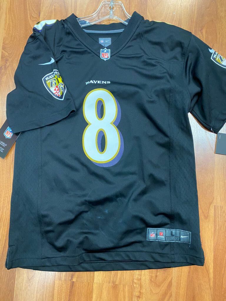
Notice anything different about this Ravens jersey?: I don’t usually write about retail jerseys, but this is an interesting case. Reader John Sanders runs a sports shop in Boise, and he says Nike ran out of black Ravens jersey blanks, so they used Raiders blanks for a batch of Lamar Jackson jerseys. That’s why the maker’s mark is silver, and why there’s no purple trim on the sleeve cuffs.
“I’ve never seen something like this before,” says Sanders. “We have not had any complaints, because it’s not something you’d probably notice unless you’re super tuned-in. I think part of that is how popular Lamar Jackson items have been for us, selling a lot more bandwagon-type fans than actual Ravens fans.”
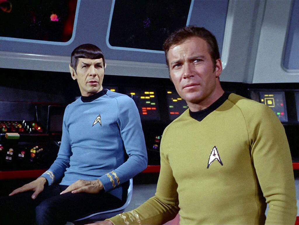

“I’m a doctor, not a logo designer”: It’s not often that we get to see an entire new branch of the military take shape before our eyes, but that’s the case with the U.S. Space Force, whose creation was recently authorized by Congress. Now that the wheels are turning, the Pentagon has been talking to President Trump about logo and uniform options. (My preferred design for the latter is shown above.)
Meanwhile: If the Army has soldiers, the Navy has sailors, and so on, what should Space Force members be called? Personally, I’d vote for space cadets, but that’s not among the options listed in this Military Times article/poll. Key quote, from the Air Force general who’s overseeing the creation of the new branch: “We haven’t really done this since 1947.”
(My thanks to Timmy Donahue for that last link.)

Click to enlarge (it’s worth it!)
Too good for the Ticker: I own my share of green jerseys and green flannel shirts, but until now I’d never seen a jersey that looked like a green flannel shirt! That’s what the Vermont hockey team will be wearing tomorrow for Vermont Night. Very tasty!
(My thanks to Gidal Kaiser and @shief_joe for this one.)
Also too good for the Ticker: This is pretty awesome! A 1970s promo spot showed middle-aged Milwaukee TV sports reporter Earl Gillespie wearing the uniforms of various Wisconsin teams, including the Packers, Bucks, Badgers, Marquette (untucked!), Brewers, Admirals, and more. They even show him curling!
Gillespie (who died in 2003) appears to have been left-handed. He carries the football in his left hand, dribbles the basketball with his left hand, bowls left-handed, and so on. But they show him as a right-handed hockey goalie, presumably because a left-handed blocker and mitt weren’t available.
More puzzlingly, the video also shows Gillespie wearing a right-handed baseball glove on the wrong hand! You’d think a lefty baseball glove would’ve been easy enough to find, no?
They also show him batting right-handed. Obviously, there are no equipment issues there, so maybe Gillespie was the rare guy who threw left but batted right — just like Rickey Henderson, Cleon Jones, and me!
(Big thanks to Mike Chamernik for sharing this video with me.)
The Ticker
By Paul

Baseball News: New primary logo for the Winston-Salem Dash, the White Sox’s high-A affiliate. It’s hard not to see those “WS” initials without thinking “World Series” (from James Wagner and Will Lawson). … This seems like something we would’ve had before, but I don’t recall seeing it previously: Gate C34 at Boston’s Logan Airport is marked with Red Sox-style numerals in honor of David Ortiz. There’s also an Ortiz jersey and plaque on display (from John Gagosian). … Astros OF Kyle Tucker, who has previously worn No. 3, has been wearing No. 30 during fan caravan activities. Sure enough, the roster now lists him as No. 30, so that’s officially his new number. … The Phillie Phanatic appeared on last night’s episode of The Goldbergs, which is set in the 1980s, but his cap was stuck with era-inappropriate logo creep (good spot by Chris Flinn). … Whoa, check out these bats and balls painted with beautiful Australian aboriginal-style patterns (big thanks to @Chrisp2087). … Check out this bizarro play: The Pirates executed what would have been a perfect hit-and-run, but the runner’s helmet fell off between first and second base, and the ground ball, which would have gone into right field, hit the helmet and deflected to the second baseman, who — well, just watch it for yourself (from Jerry Wolper).

NFL News: Reader @dddaveee notes that if the Falcons’ upcoming new uniform set includes a new primary logo, that could have implications for their stadium’s seating design. … Pro Football Hall of Fame prexy David Baker wore blazers with conference-appropriate colors when informing former coaches Bill Cowher and Jimmy Johnson of their forthcoming inductions.
College Football News: The USA and Panama went blue vs. BFBS in the International Bowl. … Here’s a time-lapse video showing the making of LSU’s championship logo (from Ernie Ballard).

Hockey News: Here’s a long and informative article about the equipment-maintenance preferences of various Islanders players. Recommended (from ,Jim Griffin). … The major junior Quebec Remparts will honor the 40th anniversary of the Nordiques joining the NHL by wearing Nordiques/Remparts mashup uniforms on Jan. 24 (from Eric Andrews).

Pro Basketball News: F Tariq Owens will wear No. 41 for the Suns and PF Kyle Alexander will wear No. 17 for the Heat. … New ball design, among other changes, for BIG3. … The Jazz offered to send personalized jerseys to newly crowned Jeopardy! all-time champ Ken Jennings, who’s from Utah (from @VerbDC). … New indigenous-themed uniform for Australia’s Perth Wildcats (from Will Pike).

College Hoops News: Former Villanova PGs Ryan Arcidiacono and Kyle Lowry will have their numbers retired next month. … New Des Moines skyline uniforms for Drake’s men’s and women’s teams (from many readers). … More blue collar bullshit, as Alabama’s student section wore hardhats to support the team’s “blue collar basketball” slogan. I wonder if these college students, most if not all of whom will never work a job requiring a hardhat, realize that a blue collar worker is, by most definitions, someone who doesn’t have a college degree. As I’ve said before, this is the class version of stolen valor (from Timmy Donahue). … Also from Timmy: Auburn G Allen Flanigan had to remove his undershirt during last night’s game against Alabama, apparently because it didn’t conform to NCAA specs.

Soccer News: Real Salt Lake is bringing back the blue shorts (from Taylor Acton). … New away shirt for Drogheda United (from Ed Zelaski). … I don’t usually get worked up over logo-reveal videos, but the one for Ecuador’s new badge is really something (from Gabriel Hurl). … Gross: Apparent new sleeve ad for Atlanta United (from Austin Perry). … The rest of these are all from Josh Hinton: USL Championship club Birmingham Legion FC released their “Sweet Home Alabama” third kit (from Josh Hinton). … New sleeve sponsor advertiser for Dutch side Ajax. … … Dutch side PSV Eindhoven has inked a new kit deal with Puma. … New logo for the Wasatch Winter Cup, a preseason tournament hosted by USL Championship side Real Monarchs. … In 1997, due to a kit clash, Chelsea had to wear opponent Coventry’s away shirt (from Michael Haug). … “The apparent last time Liverpool wore red shirts and white shorts was in January 1974 in an FA Cup third round replay,” says our own Jamie Rathjen. “That piece is also worth checking out to see their opponents’, Doncaster Rovers, purple second shirts with front numbers.”

Grab Bag: New logos for GoDaddy, Gucci, Paramount Television, the Arkansas town of North Little Rock and the Virginia town of Radford. … Arlington, Va., is the latest town whose police department is testing new uniform designs (from Ted Bloss). … The Toronto Wolfpack — the first North American team to play in Super League Rugby premiership — have a new black kit (from @TheBigJamesG). … Colorado College is in the process of updating its logo and is also seeking public input on a new name for its costumed mascot, which up until now has been named Prowler (from Kary Klismet). … Also from Kary: New uniforms for the United Airlines ground crew and new flight crew uniforms for Aer Lingus. … Yesterday was National Hat Day, so the U.S. Army released a video showing the progression of Army headwear (from Timmy Donahue).
Our latest raffle winner is Cris Routh, who’s won himself a Uni Watch membership. Congrats to him, and thanks again to reader Rick Cuzzetto for sponsoring this one. — Paul
As far as I can tell, there are only two bats-right-throws-left players currently in the majors, Steven Matz and … Hyun-Jin Ryu. So naturally, Ryu just joined an AL team and won’t be batting any more:/
When these guys come to the plate, their pitching arm is facing the opposing pitchers and thus more likely to get hit by an errant pitch. I vaguely remember some pitchers being asked to bat from the other side to avoid a possible injury.
I believe the Mets forced Doc Gooden to change from hitting left-handed to right-handed for this reason.
Meh. I throw right, bat left and pitched through college. Never got hit badly enough on my throwing arm to switch sides of the plate.
Also Madison Bumgarner
Who was the last switch-hitter to win the AL MVP Award?
Vida Blue (and I didn’t have to look it up!)
Sorry but the Space Force uni’s should more match TNG uniforms, 2nd season forward
Spacies, Spartans, Saucerdiers, Rocketeers.
Close! Space Force uniforms should be modeled after Starfleet’s Wrath of Khan / Search for Spock uniforms. And enlisted personnel should either be called Technician, given what Space Force personnel will actually be doing (sitting at desks working with computers); or they should follow Star Trek precedent and either be called Crewman (the official title for enlisted Starfleet personnel) or Ensign (what Star Trek writers usually called every background/enlisted character in practice).
If it’s gotta be Trek-inspired, it’s gotta be the “Enterprise” era:
link
Make sure the communications officer has a model of the Stanley Cup sticking out of her ear:)
I think you mean third season. Second season was still lycra jumpsuits.
I don’t mind calling them crewmen / ensign etc., but ranks in TNG were clearly based on navy ranks.
Earl Gillespie was one of my favorite broadcasters, a Wisconsin treasure. he batted left-handed, per Baseball Reference. He was a first baseman in the minors in the early ’40s, so he likely threw left-handed, too. Guess he just went with the flow when they made that commercial. link
Whoa — didn’t realize he had a pro career. Thanks for that info, Jeff!!
In Gillespie’s goalie picture, he has the leg pads on the wrong legs.
Looks like he played for the Green Bay Bluejays and Blue Sox. Seems interesting for a Green Bay team to use a non-green colored team name. Twice!
In the 1940’s, the Packers wore blue and yellow uniforms since those were the original colors of the Acme Packing Company, of which founder Curly Lambeau was an employee. Green and gold didn’t come around until the 1950’s, I believe.
Typo alert: Adam Ottavino not Adom
Sure, but that would be a fitting spelling for his name!
Wrong link here:
“The Jazz offered to send personalized jerseys to newly crowned Jeopardy! all-time champ Ken Jennings, who lives in Utah”
Thanks. Now fixed. Here’s the proper link, so you don’t have to scroll back up:
link
Typically in hockey, a right handed person shoots left handed and left hander shoots right handed. This is to have your dominant hand at the top of the stick. Another factor for goalies could be that when they first played as kids on the frozen pond or the basement, they wore their baseball glove. For a left hander like Gillespie, the glove would be on the right hand, so you’re holding the stick with your left hand, and when you go to play the puck, you are a right handed shot.
Yup. But they show him with the glove on his left hand and the stick in his right — again, presumably because a lefty blocker and mitt weren’t available.
Yikes, Sorry I got that part backwards, I must have been thinking like a right hander.
A goalie playing with a glove on the left hand is said to be playing left-handed, unlike in baseball where the opposite is true. Few goalies play right-handed.
Handedness in sports can be a weird thing. Canadians playing baseball disproportionally bat left – possibly because many play hockey left-handed and learn to hold the bat the same way. link
This is interesting to read because as an American who learned baseball several years before hockey, it never occurred to me (a lefty) to try to shoot right-handed: which hand was at the top of the stick was secondary to which side I was standing on, and I was used to propelling the ball/puck rightward starting on the left, as with batting.
I’d be very upset if I bought one of those Lamar Jackson jerseys.
My thought is the had Earl bat right handed so you can easily see the #6 on the front of his Brewers jersey to coincide with Channel 6. The camera even zooms in on the number. If he was batting left, this wouldn’t be possible.
Ah, good call!
Hey, good for New Era I guess. Don’t forget that they laid off their entire union workforce in New York (as covered on this site) and moved operations overseas, except for a small number in Miami since they are contractually obligated to make MLB hats in the US.
I get the uni relevance of it all, but it’s another company that sold out hard working and well paid Americans for the bottom line. The rich get richer once again.
American pro sports’ commitment to Blue Collar / Working Class Values in action.
But on the catalog, the one highlight for me is an apparently correctly structured Stargell-era pillbox Pirates cap. New Era’s various attempts at 1970s-style pillbox caps have never been quite true to the caps of the era, so I hope this signals a new and improved manufacturing approach to the cap style.
How about some more color vs. colour in the International Bowl from yesterday?
U-18 play. USA vs. Canada. USA wearing some cool chrome helmets with a different logo on each side.
link
I especially enjoy the blue collar mantra when paired with a tweet about a “business trip” on their chartered plane.
Not to take anything away from Earl, but here’s a similar commercial I remember. link
That New Era archive catalog features the most annoying error…
“Led” is the past-tense of “lead”, dammit.
Unfortunate that the New Era catalog notes that the “pillbox” style cap was shown under cloak to MLB owners in 1985 when the cap was actually worn by the Pirates beginning in 1976.
That Ravens/Raiders jersey has to be a reject, right? Even if Nike was trying to supplement the demand, it looks like the left sleeve logo is way off (over the swoosh). Doesn’t look like there’s a fold there.
I grew up close to an old Champion outlet store, back when they used to be stocked with true irregulars. Used to get great stuff there.
New Era can’t even get their own cap information correct. The Pirates pillbox cap certainly want kept under lock and key at the 1985 winter meetings, as they had been wearing pillbox caps for nearly a decade at that point. They also started off wearing the yellow crowned version, not the black one. Sad lack of accurate detail for New Era. They outsource all of their manufacturing overseas, but you would think they could get details of their own history correct. Sad.
“I wonder if these college students, most if not all of whom will never work a job requiring a hardhat, realize that a blue collar worker is, by most definitions, someone who doesn’t have a college degree.”
– Well, I think it is fair to say that many of these Alabama students won’t end up with a college degree.
Today is the Perfect Game of Uni Watch posts. (Although I’m not sure if this is really the correct analogy. Maybe someone else can better articulate what I am thinking.) It has everything from the uni-verse: quirky uniform number history, a fun video expertly dissected, discussion of retail merch, small-time and major league sports, and national news. The ticker was full of some gems, too. This is why I love coming here every day. Thanks, Paul!
Thank YOU, Patrick — glad you liked today’s post!
Hits for the cycle?
Regarding the lead story, there’s also something kinda fun about the longer 9-character name over the number 1, and the short 3-character name over the 99. Just nice aesthetically, with the names and numbers contrasting in opposing ways, when framed side by side like that!
Yeah, that instantly drove me nuts when I noticed it! Can they trade numbers?
Not mentioned in this piece nor the linked article about #s 1-99, and presented with a super huge asterisk – When So Taguchi was with the Cardinals (02-09) any time Ozzie Smith was an instructor his retired #1 would be on the same field as the current #99.
Late in 2009 when So Taguchi was with the Cubs, he was wearing number 99 while fellow Japanese outfielder Kosuke Fukudome wore number 1.
They played in five games together (thanks, Baseball Reference game logs!) on September 16, 19, 20, 26, and October 2. They were in the game at the same time in all of them except 9/26, when Fuku pinch hit for So in a 6-2 victory that clinched a winning record for the Cubs.
I also recall a game being rained out less than halfway through, with the stats erased, in which Taguchi had hit a homer. Really terrible luck for him as he was a 40-year-old playing his last season in the majors. He would go back and play a few more years with the Orix Blue Wave, but it had to hurt to have that moment deleted from the record.
I don’t think the Falcons will change their logo, but here’s to hoping they put it on red helmets
I’d like to see the red helmets return, too.
They’ll probably keep their original logo reserved for throwback purposes.
When the the Panthers tweaked their logo, were the placards with the old logo removed from the end of the seating rows immediately or did that take more time?
link
I feel like I should know that question, as I have attended 3-4 Panthers games per year for the team’s entire existence…but I’m not sure I ever noticed.
I will say that in general, when the tweaked logo was introduced it was not at all unusual to spot the older logo occasionally used in “official” capacities, at least for the first season or so. Probably because the changes were pretty subtle, at least as far as people who Don’t Get It are concerned.
#1 for the Blue Jays should be retired.
As for the space guys, the only logical name is Team America: World Police.
Bob Bailor?
Tony Fernandez. All-time Blue Jays club record leader for games and hits in their uniform.
Also quite interesting, a big part of the Blue Jays building to be back-to-back World Series champions by being traded away to San Diego with Fred McGriff (Jays got Joe Carter and Roberto Alomar back). Tony was able to come back to the team in time to be part of the 1993 champs. Always kept coming back. Had 4 separate stint with the team.
If you’re ever in Mazatlán, Mexico and are looking for some uni-centric time to kill, El Siglo(Mexican sporting goods company) has their HQ there and next to their flagship store is an outlet store that has excess stock on really cheap prices(jerseys $25USD) All sorts of truly random items. Colonia Insurgents is the particular location.
I remember that Gibson helmet play when it happened. He had a god-awful play in the outfield that year, too where he dove and missed a fly ball by a good four or five feet. He hung on a season too long. :(
If it was truly the same year as the helmet play, then he actually played 3 more seasons after that.
Could be, I don’t remember the exact year of the diving missed catch, I just remember thinking he looked like an old man trying to run down the ball. Maybe he played three years too long! Or did he mostly DH those last few years back in Detroit?
why not call them SPACE INVADERS?
It’d probably never happen because of potential confusion, but I’d love to see 0 and 00 on the same MLB team.
Well, as noted in today’s lede, it *has* happened once, on the 1985 Blue Jays.
And it’s happened quite a bit in the NBA:
link
Gah, I totally skimmed right past that.
The Rockies had Ottavino with 0 and Dinger the mascot with 00… does that count?
About the Falcons’ logo being built into the design of the seats of the stadium, do you count the Astrodome, which, after renovations the upper deck had the tequila sunrise design in the seats? It stretched from the tequila sunrise days, through the racing stripe era and through the blue and Vegas Gold period. It always made me laugh that the seats had the old color scheme.
“I don’t get it. Why did they want to wear those caps? This is part of a uniform.”
How quaint.
While I hate to bring corporate douchebaggery into the discussion, did anybody else notice in the Eddie Gillespie YouTube video that the font used for his name, as well as the way his name is spelled, makes it at first glance appear to be a Gillette razors commercial?
The raiders hand me down pisses me off
May 1, 1969, Don Wilson no-hitter.