[Editor’s Note: Paul is on his annual August break from site. Deputy editor Phil Hecken is in charge from now through the end of the month, although Paul may be popping up here occasionally.]
Got a big post today, starting with our own Alex Hider’s review of the 1969 Cincinnati Reds throwbacks, worn yesterday — Alex is a BIG Reds fan and I’m pretty sure these are his favorite of all the Reds 150-ish years of uniforms, so this was undoubtedly a big treat for him (PS: I love these too!). We’ve also got a new feature — the PL Kit Roundup from soccer buff Josh Hinton, lots of news from Paul, and much more. So let’s get started straight away. Please enjoy a look at yesterday’s Reds game.
Reds Throw It Back To The Turn of Baseball’s Century
By Alex Hider
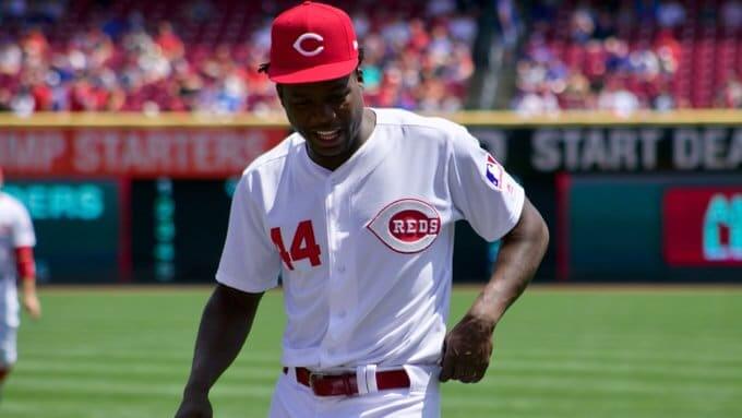
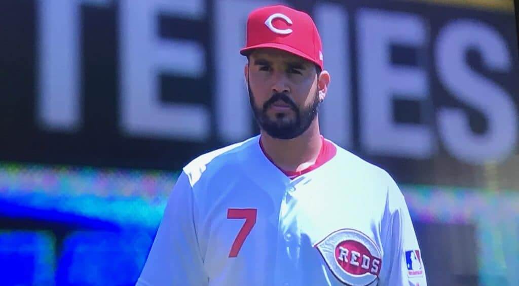
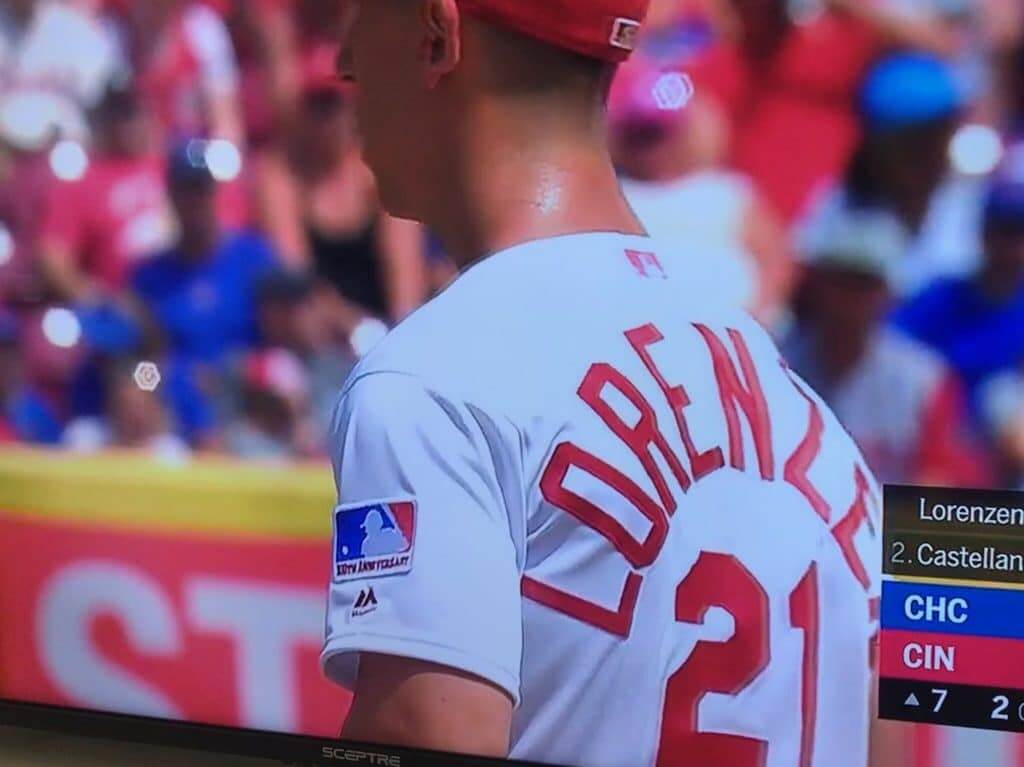
Yesterday, the Reds wore their 11th throwback uniform of the season — the 1969 home whites. I may be biased — last year, I wrote that the team should adopt this set full time — but this is best the Reds have looked all season.
The stripe-less jerseys and pants may seem a bit plain, but it serves the individual elements of the jersey so well. I mean, just look at how the chain-stitched wishbone-C pops against the white background.
Now that’s what I’m talking about.
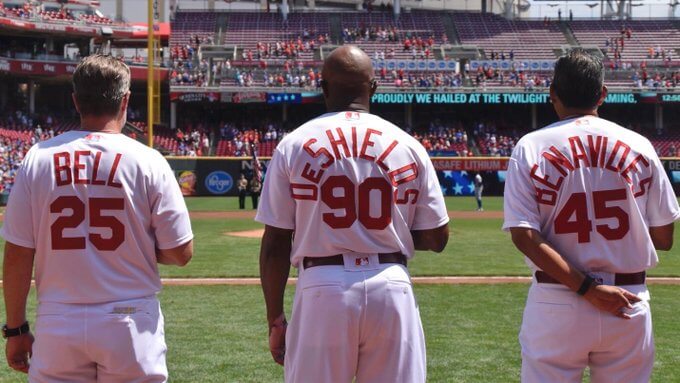
Just as they did two weeks ago with the 1967 throwbacks, the Reds employed their iconic giant NOB font. Here’s a good look at two of the longer names on the team — bench coach Freddie Benavides and first base coach Delino DeShields.
As has been the case with every throwback game so far, all Reds players went high-socked. Unfortunately, not everyone wore stirrups — some simply wore plain red socks. Luckily, I didn’t spot any logo-clad socks.
Oh, you fancy, huh?@kFarm17 | #BornToBaseball pic.twitter.com/17SoQEpfo9
— Cincinnati Reds (@Reds) August 11, 2019
First baseman Joey Votto has nailed the accessories to accompany these throwbacks (he was the only player to wear a sleeveless undershirt under the 1956 vests a la Ted Kluszewski). Yesterday, he was one of the few players to wear primarily-black cleats and fairly low stirrups — staples of the notoriously conservative Reds clubs of the era.
The 1969 baseball centennial patch is one of the best in sports history, so I love that the Reds chose to wear the ’69 version of these unis — even if it was at the expense of celebrating the 1970 National League championship team.
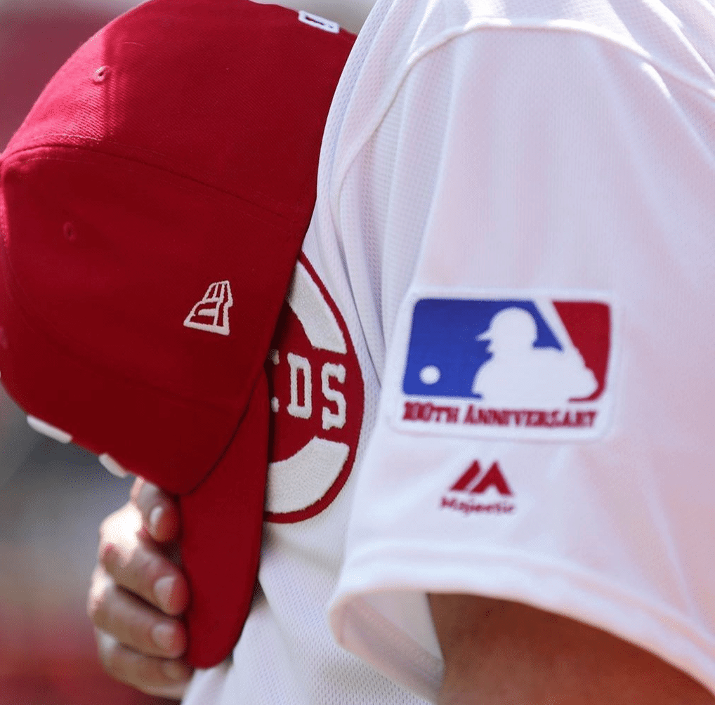
The jerseys also had the MLB logo on the back of the jersey — only that logo was rendered in red and white. It was strange seeing two different versions of the same logo on one jersey.
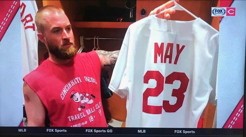
According to the Reds broadcast team, catcher Tucker Barnhart wore a 1969 Lee May jersey to the ballpark ahead of the game. I could do with a bit more spacing between those letters, but definitely a great move by Barnhart.
The Cubs wore their standard road grays, making for one of the best uni matchups in all of baseball this season.
Nobody:
Guys named Kyle: #BornToBaseball pic.twitter.com/uRGEPRa6wH
— Cincinnati Reds (@Reds) August 11, 2019
The Reds will drop the buttons and belts for two more throwback games next weekend — they’ll wear 1976 throwbacks on Saturday and 1990 throwbacks on Sunday.
Thanks, Alex. Great stuff. As I think most of you know, I’ve always thought 1969 was the greatest uni year in MLB, and the unis sported yesterday (and in 1969) by the Reds sure were a fantastic look.


I’m pleased to introduce a new feature here on Uni Watch — the Premier League Uni Roundup. Now, I’m not a soccer guy, but Josh Hinton is, so (at least for the remainder of August), each Monday we’ll have the weekly kit matchup for the Premier League (once I return to weekends, this will likely run on Sundays). Ready? Here we go. Here’s your…
Premier League Kit Roundup
By Josh Hinton
Hello all fellow Uni-Watchers! I am excited to start this new uniform tracking project – much thanks to Paul and Phil for letting me do this! I will be rating each matchup in the English Premier League based on a ten-point scale. Each matchup starts at a five and, based on the aesthetics (lovely/horrendous kits, clashes, the way kits complement each other, etc.) will receive a final rating out of ten with one being very poor and ten being perfect.
Week 1 (8/9-8/11)

Liverpool 4-1 Norwich
There’s always something special about the first match of the season; it’s even more exciting when said match is aesthetically beautiful. Two of the best home kits in the league (I’m a sucker for that Norwich gradient) that complemented each other perfectly. Would be a ten out of ten had Liverpool stuck to only white accents (see 2018/19 home strip), but that is nitpicking. Lovely kickoff matchup! 9.5/10

West Ham 0-5 Manchester City
The Hammers broke out their new home strip and City debuted their Hacienda-inspired away kit, in a match that looked fine but didn’t especially stand out. Would prefer the Umbro diamond to be claret, and I am not a huge fan of those blue shoulders for the Hammers; they could have done better (see the 2018/19 home strip). City’s away kit is busy but beautiful nonetheless and looked good throughout the match, although the players’ sweat is very easy to see (more so on these Puma kits than any of City’s Nike kits). 7/10

Bournemouth 1-1 Sheffield United
That Bournemouth home strip is lovely, but the Sheffield United away kit is standard Adidas teamwear. Granted, it’s better than their home or third kits, but that’s not saying much … Sheffield United lose points for standard teamwear and an annoying sponsor logo, but they gain some back because this particular example of the Tiro 19 strip isn’t all that bad. 7/10

Burnley 3-0 Southampton
That Southampton away strip is … not good at all. Burnley’s home kit is just average – it could be worse, but it does nothing to upgrade this matchup. When done properly (see Southampton’s 2018/19 away kit) yellow is the perfect color for their change kits, but this is atrocious. 4/10

Crystal Palace 0-0 Everton
Everton had to break out their 2018/19 garish third kit to avoid a clash, making for a blue-fest in this tie. The Toffees’ kit is underwhelming, and added no new color to this match. Personally, I would have loved to see them break out the salmon away strip, but the FA deemed it too similar to this Palace home kit. Overall, it was a solid looking matchup enhanced by a lovely Palace home strip; only thing I would change about their kits is the green sleeve sponsor. 6.5/10

Watford 0-3 Brighton
Brighton’s home strip is better with thicker stripes, and the Juventus-esque Watford strip looks far too busy – their multi-colored sponsor logo doesn’t help. Brighton have an unnecessary gold Nike logo; gold is not seen anywhere else on that kit. They also add some darker blue; the Seagulls look better when they stick to a shade of royal or lighter. Both sides downgraded from their 2018/19 home kits, and they could both benefit from revisiting their respective 2017/18 home kits. 3/10

Tottenham 3-1 Aston Villa
Solid kit matchup in the Villains’ return to the Prem; both sides sported classy home strips. Neither kit does anything special, but the colors complement each other. Would prefer the sponsor logos keep with the colors of the kit; that’s the major deterrent in this tie. The new Spurs kit is much improved from last season’s misuse of the gradient. 8/10

Leicester 0-0 Wolves
Solid looking match out of the KP; that Leicester home strip with the sublimated checkerboards and gold accents is exceptional. Wolves look good, in their classic “old gold” and black kits (although I personally prefer “old gold” socks instead of black) but lose points for the Tiro 19 template. 8/10

Newcastle 0-1 Arsenal
Welp … the Newcastle effect is back again in full force! This sponsorship deal with Fun88 really needs to end; sky blue is one of my favorite kit colors but looks awful on white and black stripes. Newcastle are better with a classic stripe pattern, rather than just three stripes with black sleeves. Thicker stripes simply do not look good on Newcastle kits. Arsenal’s throwback away kit is a fan favorite and adored by many, but not me. Odd looking matchup; I would have preferred to see them stick with their home strip (if paired with white shorts and socks, it wouldn’t have clashed). 2/10

Manchester United 4-0 Chelsea
Glad to see United return to their traditional kit combo, sporting red shirts, white shorts, and black shirts; last year, they went red-black-black. I love the badge; enclosed in the black shield and colored gold, it is perfect. Other than the black sleeve hoop with the minutes “90+1’” or “90+3’” (a reference to the goals scored in the 1999 UEFA Champions League Final), this is a nearly perfect United kit. The Chelsea home strip, on the other hand, looks solid from a distance but the shirt pattern is too busy for my taste. I am not suggesting they stick to a plain and dull blue home shirt (see 2017/18) but the club needs to find the proper balance. 6/10
Thanks Josh! Hope everyone likes this new feature!
Click to enlarge
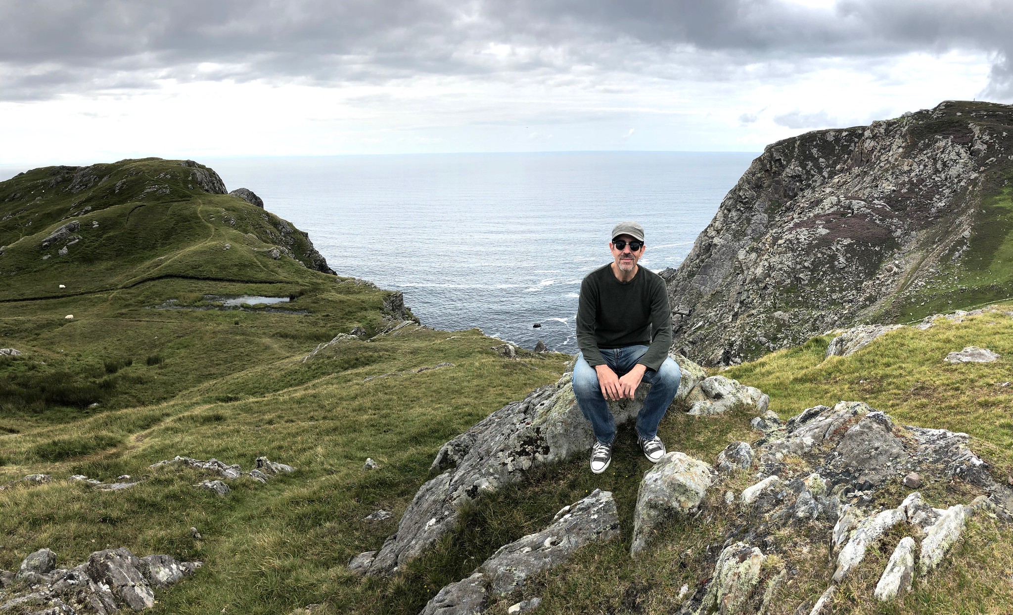
And now more than a few words from Paul: Hey there. Got back from Ireland on Thursday night (about 24 hours later than originally planned, thanks to a British Airways system meltdown that resulted in our original return flight being cancelled, ugh). The photo shown above was taken at the Slieve League cliffs, which were a highlight of our trip. I’ll post a full travelogue sometime next month, but in the meantime I have lots of stuff to tell you about!
(Before I get started: I’m not reading the site’s comments this month, so if you have a question about any of the stuff I’m about to say here, please don’t post it as a comment — I won’t see it. But you can feel free to email me with any questions.)
Now then, one at a time:

1. First day on the job: Today is my first day as a Sports Illustrated staff writer, whoop-whoop! I’ll have an introductory/debut column tomorrow (it will be linked here on the blog, of course). I’ll probably have another column next week, and then my annual college football season preview will run on Aug. 28, with the NFL season preview following on Sept. 3. I’m also working on a non-uni feature that I think you’ll really like, which will likely run on Sept. 6 or 9. More on that soon.
In short: I’m definitely hitting the ground running over at SI! (If you somehow missed the news that I’m now partnering with SI, here’s the full story on that.)
———
2. New advertiser shout-out: As you may have noticed in the right-hand sidebar, we have a new advertiser: the YouTube channel What Pros Wear, which features MLB players discussing what they keep in their lockers.
Obviously, this is a different kind of advertiser for us, because they’re not trying to get you to buy anything — they’re just looking for eyeballs. The videos are fun and informative. Give them a look and see what you think!
My thanks, as always, for considering our advertisers.
———
3. Our monthly Vintage Brand raffle: The folks at our longtime advertiser Vintage Brand are generously running another raffle. The lucky winner will get to choose any product from the VB website.
To enter this raffle, send an email to the raffle address by 7pm Eastern this Thursday, Aug. 15. One entry per person. Phil will announce the winner on Friday.
In addition, Vintage Brand is currently giving away a $100 gift card every day to a random person on their mailing list. To sign up for their list and be eligible for this daily giveaway, look here.
———

4. Teespring sale reminder: Today is the final day of Teespring’s site-wide sale. From now through midnight Pacific time, you can get 10% off of anything in the Uni Watch shop and the Naming Wrongs shop by using the admittedly cringe-worthy checkout code COOL4CLASS.
Teespring will give you a 10% discount but Uni Watch will still receive its full profit — a win-win!
My thanks, as always, for considering our products. You can see all of our merch offerings here.
———
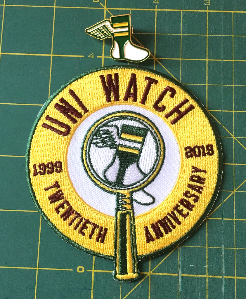
5. Pin/patch combo deal: As you probably know by now, the Uni Watch lapel pins, which I was originally packing and shipping myself, are now being sold by Teespring. But I still have about a dozen of the pins here at Uni Watch HQ, and I also still have lots of our Uni Watch 20th-anniversary patches, so I’ve decided to offer them as a combo deal.
The pin normally costs $8.99 and patch normally costs $9.99. But if you order them together, I’ll knock four bucks off of the combined total, so you can get the patch and pin for $14.98, plus $4 for shipping.
To order, send me $18.98 via Venmo (use @Paul-Lukas-2 as the payee), Zelle (plukas64@gmail.com), or Cash App (plukas64@gmail.com). If you want to use Apple Pay or a paper check, or if you’re outside the USA and can only use PayPal, shoot me a note and I’ll fill you in.
This combo deal will end when I run out of pins (like I said, I only have a dozen of them here at Uni Watch HQ), so move fast if you want to get in on this one.
Once you send payment, be sure to send me your shipping address. Thanks!
———

6. Uni trivia questions wanted: For reasons not yet worth explaining, I’m in the market for uni-centric trivia questions. I’ve come up with a bunch of good ones on my own, but I figure there must be tons more that I’m not thinking of.
Want to help me out? Send me your uni-related trivia questions here. Big thanks in advance.
———
7. New Uni Watch helmet! Remember when the folks at Riddell showed how their Precision-Fit system worked by making me a Uni Watch football helmet two years ago? They have a new interior padding system that they wanted to show me, so they’ve made me a new helmet with an updated design. Check this out (for all photos, you can click to enlarge):


Nice, right? I think the side logos should probably be a bit smaller (and yeah, the striping is slightly off-center), but it’s still pretty sweet. I particularly like the green chinstrap cup — a very nice touch.
Just like the other helmet they made for me, this one is custom-fitted, based on scans of my head. But the interior padding on this one uses a new lattice format:

Those lattice pads were 3D-printed by the digital production company Carbon. You can learn more about this production process here and here.
Now I just have to find a place in my apartment where I can display this new helmet alongside the other one. Hmmmmmm.
———

8. Membership update: Although I’m not running the site this month, we’re still taking and processing membership orders, so I recently added some new designs to the membership design gallery (including Hector Ruiz’s card, which is based on Cal basketball’s 2013-14 sweatback uni).
Ordering a membership card is a good way to support Uni Watch. And remember, a Uni Watch membership card entitles you to a 15% discount on any of the merchandise in our Teespring shop and our Naming Wrongs shop. (If you’re an existing member and would like to have the discount code, email me and I’ll hook you up.) As always, you can sign up for your own custom-designed card here, you can see all the cards we’ve designed so far here, and you can see how we produce the cards here.
———
Okay, that’s it! I’ll be back here tomorrow to promote my SI debut and maybe a few other things, but for now I’ll hand the baton back to Phil (who’s doing a great job in my absence, wouldn’t you say?).
Griffins Jersey Design Contest Reminder
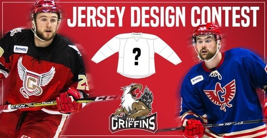
In case you missed it, Uni Watch is again partnering with the Grand Rapids Griffins to allow readers to design an alternate jersey to be worn this upcoming season.
As before, the winner will receive a personalized jersey, tickets to the game when the jerseys will be worn (February 22, 2020), and public recognition at the game.
The jersey is going to be worn on the Griffins’ 90’s Night (with either red or black pants and red gloves/helmets), so for this contest, the team is looking for a “90’s inspired jersey.”
The deadline for submissions for this contest is Friday, August 16th, 2019.
All the details are spelled out in detail here, so be sure to read that.
Good luck to all who submit!
The Ticker
By Jamie Rathjen

Baseball News: The Tigers and Royals wore throwbacks on Saturday to the Negro League Detroit Stars and Kansas City Monarchs, respectively (from multiple readers). … The next two are from Mike Chamernik: A’s 1B Matt Olson had a glove fly off while swinging. … The Giants are to retire No. 22 for 1B Will Clark. Here’s a bit more on that (from Brinke). … Jerry Seinfeld threw out the first pitch at a Mets game last month, but only now are we learning that the sneakers he was wearing were made out of Mets jerseys (from @THEE_GURU_). … This dog in a baseball uniform is the answer to the internet’s ‘how would a dog wear pants?’ debate (thanks, Brinke).

Football News: It was actually the Packers’ 100th birthday yesterday, even though they’ve been doing 100th-season/anniversary celebrations for almost a year and a half. They posted a video with a model wearing reproductions of their historical uniforms (from Kyle Levenhagen and Chris Rucinski). … A billboard promoting Rutgers’s home games this season ties into the team’s 150th anniversary — along with that of college football itself — by using vintage logos for all the teams (from @footballfuntime). … If you haven’t seen it, NC State has a new white/black alternate this season that is to be worn Oct. 10 against Syracuse (from James Gilbert). … A high school in Texarkana, Tex., Liberty-Eylau, revealed new uniforms by having a helicopter land on the field (from @profjimmyc).

Hockey News: It’s the offseason: here is one writer’s opinion on the “best” five Canucks goalie masks (from Wade Heidt).
.
.

Basketball News: The 76ers appear to have changed the logo on their shorts to just the plain “76” logo, instead of the “76ers” in a basketball (from multiple readers). … The Spurs have also apparently replaced their former basketball-shaped shorts logo with their spur logo (from Michael Haug). … You can see Etienne Catalan‘s Twitter feed for new or changed NBA numbers over the weekend.

Soccer News: Spanish striker Fernando Torres, who plays in Japan for Sagan Tosu, is planning to retire and has a farewell match on Aug. 23 for which he designed the shirt. The shirt is based off of one from his first team, Atlético Madrid (thanks, Anthony). … This table shows how many ads are worn by each Liga MX team, ranging from two to 12 (from Josh Hinton). … German 2. Bundesliga team St. Pauli wore a “50+1” patch instead of a sleeve ad for this weekend’s DFB-Pokal first round, in reference to the rule requiring clubs in the top two tiers to be majority-owned by their members. … The Premier League has its own logo for the Video Assistant Referee, which it began using this weekend. … Everton’s women’s team wore no NOBs or numbers for a preseason game this weekend. … Their opponents, Durham, have a new first shirt. … Reprinted from yesterday’s comments: FC Cincinnati and the Columbus Crew both wore black armbands for the Dayton shooting (from Brian Henke). … In the NWSL, Orlando Pride goalie Ashlyn Harris got a No. 100 shirt and captain’s armband for reaching 100 appearances in the league.

Grab Bag: The New York Post did an article this weekend on the guy behind the Super 70s Sports Twitter account that often pops up here (thanks, Paul). … Also from Paul: U.S. fencer Race Imboden knelt (NYT link) during a Pan American Games medal ceremony. … More from the Pan Ams: the U.S. men’s field hockey team had two players named Kaeppeler — brothers Aki and Kai — but not only did neither wear FIOB, they wore adjacent Nos. 14 and 15. … New uniform for Wisconsin women’s volleyball (from G. J. Marmet).
Re: Premier League Recap
Good piece Josh! I’ll look forward to following along to this all season.
I will as well, though there are always between 1-4 PL games every Sunday and sometimes one on Monday (there is one next Monday) so if the column runs on Sunday it would probably have to look at the games from a week previous.
The plan is to have all the Friday (if any) and Saturday games for the current week, and possibly the Sunday games from the week before (this is a detail to be worked out). But for the remainder of the month, while I’m doing the weekdays, it will run Monday.
I enjoyed it to, even though I’m not a big soccer fan. One suggestion: it would be nice if Josh could make it a little more clear up front which kit is which, for those of us now so knowledgeable. Some teams I recognize right away, but some I’m reading it trying to figure which one he’s talking about. I’m still not sure which is Bournemouth and which is Sheffield!
AFC Bournemouth in their home red/black stripes. One think I like about the Cherries kit is that the stripes don’t stop on the back. It makes the numbers a bit more difficult to read, but overall makes the look so much more coherent.
Thank you all for the feedback! Brett, I will make sure to clarify next week, and the coming weeks, which side is wearing which kit.
Seeing that Riddell helmet, complete with UW logo’s on left and right, makes me want a Uni-Watch Batting Helmet sticker to go with my cap. Does one exist?
It’s a shame Paul refuses to wear this new helmet.
LOVE the Reds 1969 throwbacks. As an Ohioian I support the team in Northern Ohio but I love what the Reds have done with the throwbacks this season. I’d love to see MLB adopt weekend throwbacks every weekend or monthly as a going concern. Fans would love it and it would move merch while showcasing the game’s history.
Or just start wearing the throwbacks permanently, and occasionally throw up to 2019.
Arsenal is an homage, not the true bruised banana throwback that we all love and want.
link
The Man City kits are a tribute to the Hacienda nightclub in Manchester.
link
Yup … for soccer, where the kit manufacturers and sponsor/ads change so frequently, true throwbacks are a rarity. You’re exactly right, though: the Arsenal example is more of an homage, than a true throwback.
Will Clark? I don’t think that’s necessary. The Cubs haven’t retired Mark Grace’s number, nor should they.
“…22 has been worn by 22 other players since Clark’s time in San Francisco ended.”
Fascinating!
Maybe it’s a Bay Area thing. They’re retiring KD’s #35 for his whopping 3 years of service to the Warriors. I’m with you though, this makes no sense.
1. Love the EPL recaps, would keep it if the UW higher-ups are OK with it.
2. Everton’s coral/salmon clash kit is precisely why home/away won’t work in European soccer like it does in American sports. Their primary kit is blue, which covers all the home games, so they only really need something when facing other blue teams as visitors (Chelsea, Leicester, BHA). In those cases, coral/salmon would provide plenty of contrast. It apparently does not provide sufficient contrast against red (Liverpool, Arsenal, Man U, Sheffield U, Southampton, Palace) teams. Blue, however, provides great contrast in those games. Is there a sufficient market for clash kits to justify making them de facto “away kits”? I would prefer my team wear their primary kit whenever possible, and if I were buying for myself, I would want to wear my team’s primary colors, rather than a one-off that changes year to year. And Everton has a black/purple 3rd kit for such an event as this week’s opener.
1. Grateful for the wrap ups, too.
2. Away teams do wear their primary (home) kits on the road. Look at that Spurs / Villa game above. Or the Chelsea / Man United game. They look fantastic.
Agreed, which is why the trend toward calling them home/away kits is problematic. And it is marketing driving this, like in the US. I would rather see teams in their primaries and allow for color-on-color, and save the clashes for when needed.
Everton’s third kit hasn’t been released yet, so that’s why they wore last season’s. A few teams (also Chelsea and VfB Stuttgart) have held off on releasing their third kits this summer and have run into the exact same problem.
Yes … Atlético had the same issue this past preseason. I understand that it is for marketing, but imo it is senseless to not have all three kits ready for the season.
If it has not been mentioned, referees were wearing a bright red for Newcastle-Arsenal, necessitating the change kit for the Gunners.
If you have a source for this then I’m all ears, but I’m unsure why the referee a) would have had to have been in red when they have a yellow option which would not have caused any issues had both teams opted for their primary kits and b) would get first dibs ahead of the teams for colour preference. The referees definitely get final say over whether kits are sufficiently differentiated and can order a team to change if needed, but they don’t get to cause a clash with their own choice of kit
The link for the email address to send Paul uni-trivia questions isn’t working for me, i.e. nothing happens when I click on it so I don’t know what the address is. Anyone else?
-Jet
RE: Premier League Summary-
Which team is which? Would be nice in the first line to say Team X (wearing color A/B/C)….
I need to print out a cheat sheet of some sort to make sense of the summary.
Tim, I will make sure to clarify which side is wearing what kit next week. In any case, for a solid recap/visual of all the kits this season, I would recommend the Uni Watch entry on Aug 9th.
Thanks, Josh. The additional help will be great for those of us who don’t routinely follow soccer.
I did see the August 9th entry. Just trying not to have 2 windows open to do the referencing….
As a non-soccer guy, that’s a lot to scroll through with a picture and write up from each game.
What about a uni tracker and a 5 and 1 each week, similar to college football?
I love the EPL entries. I’m a newbie into the whole soccer world, with the Amazon Prime “All or Nothing” series on Man City my entry point. I too, don’t know the other teams well enough to distinguish one from another, so having more details on which team is which would be great.
Steve, I will make sure to distinguish which side is wearing which kit in the future entires. Also, as a Man City supporter, I highly recommend All or Nothing as well as the new Man City docu-series “Fight ‘til the End: The Final 30 Days” that Man City produced, covering the heated title race as well as the club’s performance in the UCL and FA Cup last season. As an unbiased soccer supporter, Ten Days in May is very good (Man United ‘99 Documentary) as are the NBC Sports Specials on the recently prompted sides to the Premier League, coming out in Sept.
Thanks, Josh. It appears that subscribing to Man City TV is the only option to see the series you recommend here. Or, is there another platform where it can be seen?
I’m under the impression that a ManCity TV subscription is the only way, but there could be a stream on YouTube or something. Sunderland til I Die and Juventus are also good documentaries
I’m just now starting to follow soccer and I’m very ignorant about teams and uniforms. Some of these were hard to follow without a mention of the teams colors, since the team names don’t appear on the uniforms. I have no idea what advertiser a particular team is wearing.
Rick, I will make sure in the following weeks to clarify which side is wearing what kit. Also, while the team names are not on the kits, the club badge/logo is, which usually includes the team name. Thank you for the feedback!
Thanks Josh. Again speaking from ignorance, are these club badge/logos recognized by fans? They just seem way too small to make out.
Yup, most Premier League fans would recognize the club badges from those pictures. But it’s not hard to learn, and it really is an exciting league!
I love the EPL coverage. But Aston Villa is Villans. No i. I know this because I bought a shirt off Amazon and an English co worker of mine pointed out my shirt was incorrect. They still sell them on Amazon too.
The Reds could certainly get rid of the drop shadow and the custom font they’ve been using since 2007. Hopefully this season’s wonderful parade of throwbacks ignites some ideas for a long overdue uniform revision.
Love Josh’s writeup on the Premier League kits and hope this continues. A few thoughts:
– The Liverpool top looks incomplete with the stripes only on the body and not on the upper chest/shoulders.
– Brighton has traditionally worn thinner stripes. The 2018/19 kits stood out because of the wider stripes and didn’t visually identify as Brighton as much. Newcastle has been moving toward wider stripes in recent years and I don’t care for those as much either.
– The West Ham kits are probably my all-around favo(u)rites.
– Aston Villa are the Villans (no second “i”).
Yup…I’m afraid my auto correct did that :( sorry Villa supporters, I’ll make it up to you with an “Up The Villa” !
As a Braves fan, I dearly hope they do something similar to what the Reds are doing for 2021. (And oh yeah, the Cubs too, I guess.)
Thanks for the Prem recap, Josh! Hoping you’ll stay on it.
It’ll be interesting once we start getting Monday fixtures included as part of the weekend, and the occasional midweek fixtures, as well.
Will you be bothering with the various cup competitions, as well, or just the league?
Also, since people seem to like the college football 5-and-1, have you considered posting the matchups from worst to first, rather than chronological order?
Ryan, thanks for the kind words! My plan is to stick to the Prem, unless something notable occurs during the cup competitions. I haven’t considered ranking them in a “worst to first” order, but that’s not a bad idea …
That particular Reds uni is nice but just too plain without the red striped head spoon. And, as a HUGE follower of the Prem I applaud the kit round up, if not many of the strips themselves. City, Norwich, Chelsea… Toffees… are terrible this year and Palace usually has beautiful kits but this years is a downgrade.
Nice throwbacks which would have been perfect with the multi-belt-loop pants they wore those years: link
Paul, will you be writing in SI’s magazine? I am a reader an would love to see your work in there.