For all photos, click to enlarge
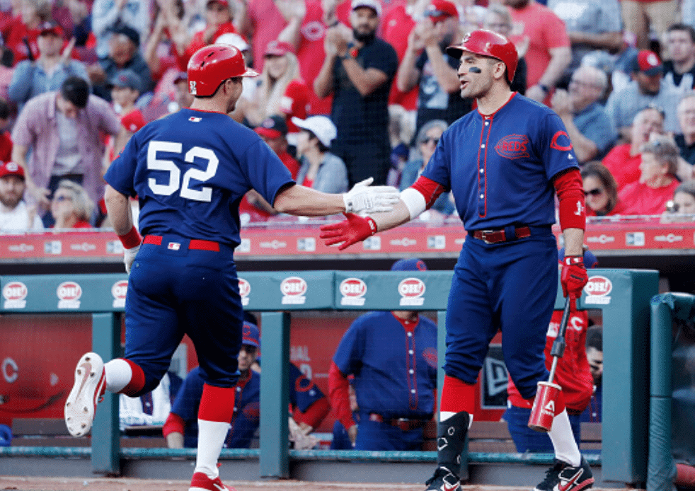
The Reds kicked off their epic 15-installment sesquicentennial throwback program over the weekend. They wore their 1902 throwbacks on Saturday (in case you missed it, Phil had full coverage of that yesterday), and yesterday they turned back the clock to their 1911 road design, which was incongruously but gloriously blue. The photo above gives you a decent sense of the front and back uni designs. The white uni numbers don’t feel quite right when the rest of the trim is red, but of course uni numbers didn’t even exist in 1911, so I guess the Reds felt they could take some liberties with that aspect of the throwback design.
Some other notes from yesterday’s game:
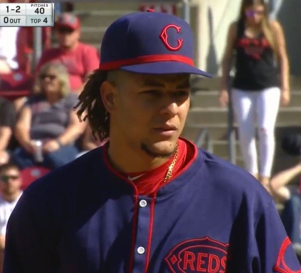
• Second baseman Derek Dietrich got in the spirit of things by using some eye-black to create a faux moustache (although it would’ve been even better if he’d added some handlebar curlicues, no?):

I have to say, I really like that old-school, almost creaky-looking wishbone-C!
• Since Dietrich couldn’t be bothered to button his jersey, here’s a better look at the cadet collar, when properly buttoned:
• The Reds put a blue old English “C” on the back of the mound. It’s nice that it was color-coordinated, I suppose, but it would’ve been even nicer to just skip it altogether for a throwback game.
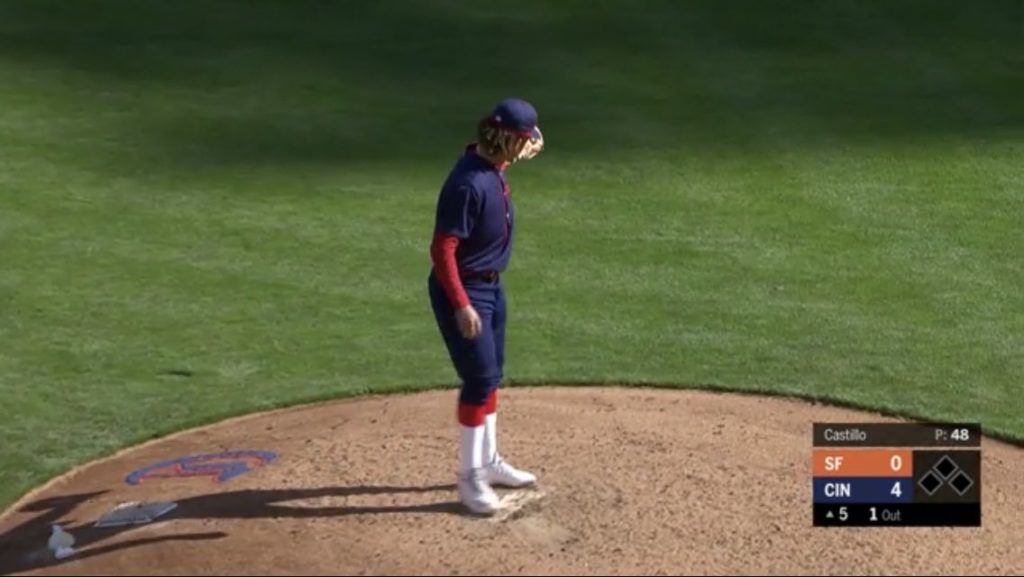
• As you can also see in that last photo, the score bug on Cincy’s TV network showed the Reds in blue — a nice touch.
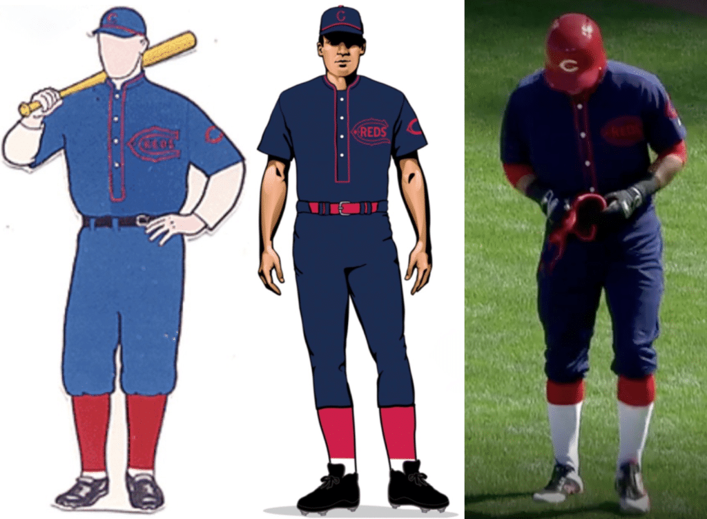
• Dressed to the Nines and the Reds’ own throwback mock-up both showed the socks as being mostly red with a bit of white at the bottom. But the on-field socks turned out to be mostly white:
• Another thing about the socks: For both of these throwback games, it appeared that the socks were blissfully free of those accursed Stance maker’s marks — huzzah! Now if they could just do the same for the caps and jerseys.
• Someone on Twitter mentioned to me that Reds broadcaster Jim Day had said something on the air about the Reds instructing their players to go high-cuffed — or maybe just instructing them how to go high-cuffed — for the two weekend throwback games. So I got in touch with Day and asked if he could explain more fully what he meant by that. Here’s his response:
It wasn’t instructions per se, but they put a mannequin in the clubhouse for the players to see how they wore the uniform in 1902. The mannequin had the high-socks look and the knicker-look pants to suggest that they wear them that way. All the players that I saw wore them the proper way. It was not mandated but suggested with the mannequin, and the players were into it.
They also had a mannequin for yesterday’s game, which player Kyle Farmer took a photo of:
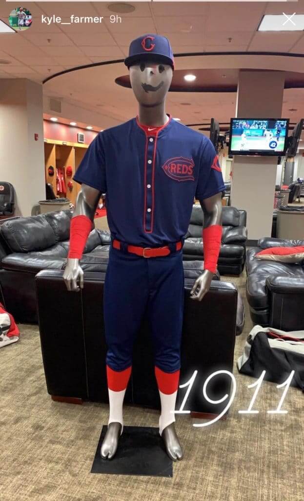
Interesting to see that the socks were actually stirrups! I wouldn’t have guessed that.
———
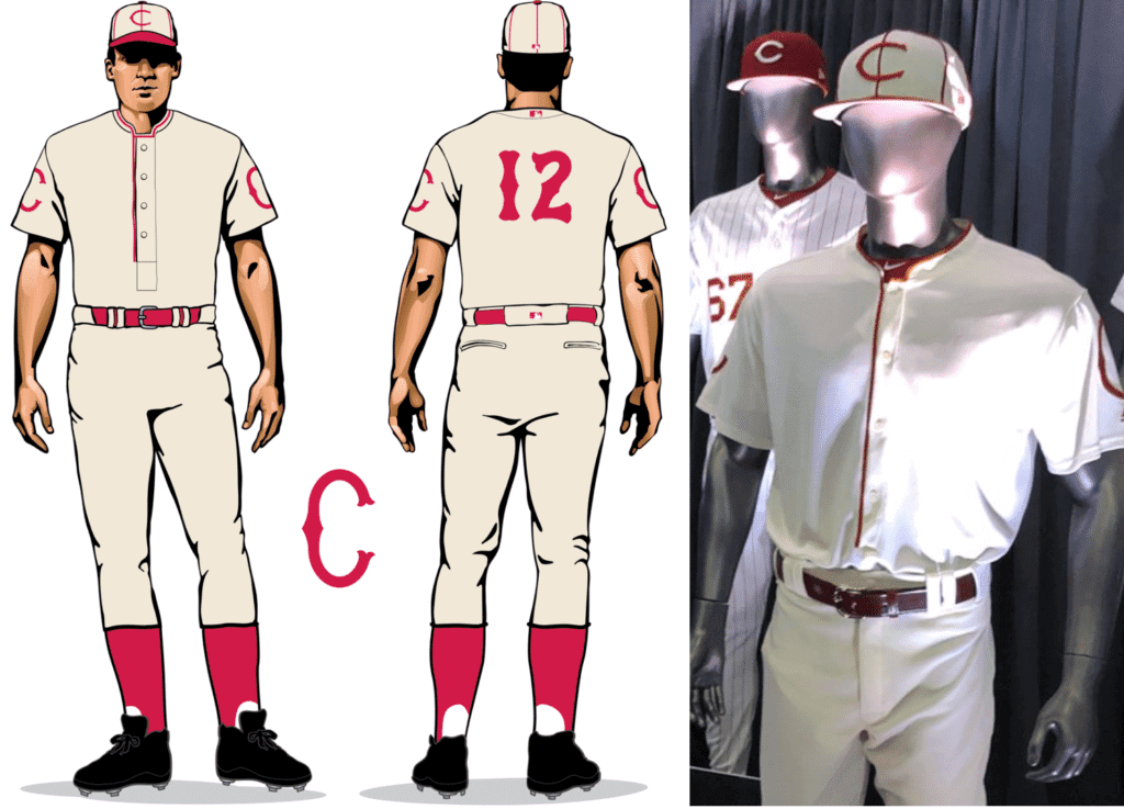
The Reds’ next throwback game will be Sunday, May 19, when they’ll be wearing this comparatively plain 1912 home design:
(My thanks to all contributors including Mike Chamernik, Ken Weimer, Alec Wheeler, and our own Brinke Guthrie.)

Who? From where? Interesting observation from reader Josh Hetzel, who notes that neither uniform in yesterday’s Raptors/Sixers NBA playoff game featured the team’s name or city. How often has that happened before? How many theoretical matchups like this even could happen?
Click to enlarge
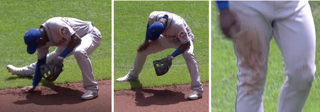
Gelbs scores again: SNY roving reporter Steve Gelbs continues to show himself to be one of the most uni-aware broadcasters out there. Two weeks ago I wrote about how he got to the bottom of Mets second baseman Robinson Canó’s Canópening, and yesterday he reported on a uni-related development involving another Met, newly called-up infielder Adeiny Hechavarria (shown above). Here’s what Gelbs had to say during the bottom of the fourth inning of yesterday’s Mets/Brewers game:
With Adeiny Hechavarria getting his first start for the Mets today, we noticed last night that whenever he comes into a game on defense, he picks up some dirt and rubs it on his right thigh. I asked him about it before the game today. He says he just doesn’t feel like he’s in the game unless his uniform is dirty, so he doesn’t wait for the game to start — he just manually makes it dirty and then feels like he’s ready to go.
That’s some great work by Gelbs. If only every broadcaster could be this uni-savvy.
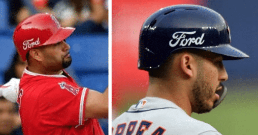
Gross: Phil mentioned this in yesterday’s Ticker, but in case you missed it, the Angels and Astros wore ads on their batting helmets for their two-game weekend series in Mexico. As you may recall, the Cards and Reds did the same thing for their games in Mexico last month, and the A’s and Mariners had sleeve ads for their season-opening games in Japan.
I’ll say this much for MLB: They haven’t trumpeted any of these ad campaigns. There have been no ad unveilings, no press releases announcing “our new sponsorship partners.” Instead, they’ve just sent the ad-clad players out onto the field with no fanfare or even explanation. It’s almost as if they’re hoping nobody will notice, like they’re embarrassed about the whole thing (as, of course, they should be).
Thankfully, there are no further MLB games scheduled in Mexico this season. But the Yankees and Red Sox will be playing in London at the end of June. I expect we will see some sort of uniform advertising for those games.
Click to enlarge
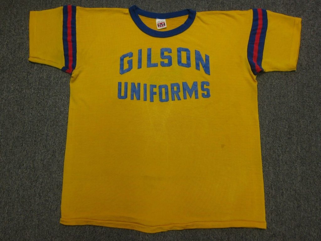
Very meta: I love this — a uniform for a uniform company! Spotted it on eBay. It’s not clear if this was for a team of Gilson Uniforms employees, or if the company was sponsoring a local team. Either way, it makes me smile. It’s not quite my size, unfortunately, or else I would’ve bought it.
However … while it’s nice that the top line used vertically arched lettering, they apparently didn’t have the ability to do negatively arched lettering for the lower line. Not exactly the best advertising for your uniform business!

ITEM! One-day cap raffle: Reader Tim O’Malley has generously prepaid for a Uni Watch Classic Cap and asked me to raffle it off, so that’s what we’re going to do today.
To enter, send an email with your mailing address and preferred cap size (7 through 8, or adjustable) to the raffle address by 8pm Eastern tonight. One entry per person. I’ll announce the winner tomorrow.
We’re currently sold out of size 7-3/8, but we should be restocked around the end of the month. So if the raffle winner wants that size, the prize will be mailed once we have new inventory.
If you’d like to purchase a cap instead of (or in addition to!) trying to win one for free, you can order one here.

Click to enlarge
BFBS invades the condiment aisle: I was at the supermarket the other day and was surprised to see this new black package design for Gulden’s mustard. At first I thought it was some new fancy-ish variety — “Gulden’s Special Reserve” or some shit like that — but nope, it’s just the standard Gulden’s Spicy Brown. The purple accenting makes it even worse.
As the Tugboat Captain quipped when she saw it, “Looks like motor oil.” And it really does! What the hell were they thinking?
Personally, mustard is one of those product categories where I just buy the store brand — which, thankfully, still comes in a clear bottle.
The Ticker
By Jamie Rathjen

Baseball News: The Mets came up with a new rally-cap format during the 18th inning of Saturday’s game against the Brewers. … Minnesota P Ryan Duffy (No. 43) showed similar creativity during another 18-inning game on Saturday by wearing his jersey backwards (from Tom Whitefield). … A’s P Yusmeiro Petit was missing the logo on his batting helmet yesterday (from multiple readers). … Here is the front of the Durham Bulls’ Star Wars jerseys; we had the back in yesterday’s Ticker (from Rodney Walker). … With the Cards getting swept by the Cubs yesterday, someone came up with a clever Cards-got-swept T-shirt design (from @PiRamjet). … The Seibu Lions unveiled their Festival uniforms, which will be worn in August (from @GraveyardBall). … The Yokohama DeNA Baystars unveiled their Yokohama Star Night uniforms, which will be worn from July 30 through Aug. 1 (from Jeremy Brahm).

NFL News: Here’s a great find: Travis Reeves was at a yard sale and found this tremendous NFL/ESPN pin set, apparently dating back to 1989.
.

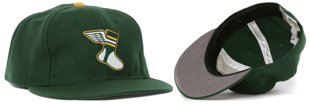
Basketball News: Reader Robert Anderson found this hat with a Wizards alternate logo that appears to be unknown to us.
.

Soccer News: Chelsea wore next season’s first kit yesterday, as Premier League teams are allowed to do in the last home game of the season, but midfielder Jorginho was wearing plain white socks from this season’s kit. The correct ones have red and blue stripes (from Kevin DeVries). … Huddersfield Town striker Isaac Mbenza killed an innocent corner flag after scoring yesterday. Luckily for him, the resulting eight minutes of stoppage time did not see a winning goal for Manchester United (from Griffin Smith). … Sporting Kansas City annually have Retro Night, which includes a fauxback shirt for warm-ups. This year, the program included a kit history (from Adam Yarnevich). … SKC then changed to black at home. The other MLS team to change at home this weekend were the San Jose Earthquakes (from Brian Henke). … Every player on Portuguese team Porto wore “Iker” NOBs this weekend in support of goalie Iker Casillas, who suffered a heart attack in training this week. Casillas himself wears FIOB. … A game in Argentina’s Copa de la Superliga between San Lorenzo and Argentinos Juniors was delayed because Argentinos showed up with black instead of white kit, which would have clashed with San Lorenzo’s red and dark blue. Argentinos ended up wearing black/red/white (from Antonio Losada). … This thread has examples of other incidents of teams bringing the wrong colors (from Antonio again). … Scottish team Rangers had goalie Allan McGregor sent off with no substitutions remaining yesterday, leading to his impromptu replacement by midfielder Ross McCrorie, who put on a goalie shirt over his own.

Grab Bag: Major League Quidditch, the sport’s North American league, revealed this season’s jerseys for six of its teams: San Antonio and Austin; Toronto and Minneapolis; and Rochester and Houston-area League City, Texas. The San Antonio one looks just a tad familiar (from my brother Nate Rathjen). … Here is an update to an item in yesterday’s Ticker: the U.S. men’s junior (under-21) volleyball team successfully received their luggage, including uniforms, for the under-21 Pan American Cup in Lima (from Jeremy Brahm). … The U.S. Army has a new service uniform which throws back to World War II (from Brinke and Phil Rossi). … A British nurse who ran the London Marathon is being denied the world record for the fastest marathon time in a nurse’s uniform because she wore scrubs instead of a dress. … The International Judo Federation will use new tatami colors at the 2019 World Judo Championships in Tokyo, and also at the 2020 Olympics (from Jeremy Brahm). … Also from Jeremy: Here’s a women’s volleyball team with a brutal number and NOB font. … And one more volleyball item from Jeremy, who says, “I don’t think I’ve ever seen a volleyball player wearing No. 0, except Chie Yoshizawa with the 2006-07 Takefuji Bamboo.”
I always think it’s dumb when I see “NEW LOOK!” on a grocery item. Like it’s supposed to benefit me in some way. Of course, they’re just trying to tell me it’s the same good Gulden’s Spicy Brown Mustard I’ve always loved. I get that.
You would think showing me the brown mustard inside would be the best incentive to buy, but no. They must think it looks ritzy, fancy, exclusive or something in the black.
Back when I was the marketing columnist for Fortune in the late 1990s, I wrote about this phenomenon. Often it will say, “New Look! Same Great Taste!,” which is basically another way of saying, “Same shit, new wrapper.”
My favorite was a product — I think it was Thomas’ English Muffins — that actually said, “Coming Soon: New Look, Same Great Taste!”
Companies fiercely compete for retail shelf space and location. Packaging design that differentiates your product from competitors can be beneficial. In a sea of yellow packages, what better to stand apart than black. Gulden got it right.
If you see Gulden’s new packaging as motor oil, I guess a quart of Pennzoil looks like a jar of mustard.
Packaging design that differentiates your product from competitors can be beneficial. In a sea of yellow packages, what better to stand apart than black. Gulden got it right.
Oh, come on. So Heinz should change its ketchup packaging to black, Tropicana should change its OJ packaging to black, Kellogg’s should change its Froster Flakes packaging to black, dairies should change their milk packaging to black, etc., etc.? After all, it’ll help them stand apart!
Standing apart is not necessarily the same as looking good. Meanwhile, someone looking for the familiar Gulden’s packaging won’t find it. Gulden’s has taken a few generations’ worth of brand equity (yes, the term actually applies properly in this case) and chucked it out the window.
. .. but Gulden’s color is already quite different from most of the others out there.
I think this change was in the works for a while because there was quite a spell where I didn’t see Gulden’s on the shelf. after two or three trips where I wanted to get it and couldn’t, I just kept checking to see if it was there and it never was. either there is quite mustard fiend in east Denver or they discontinued shipping the old bottles long before the new ones were ready.
Or maybe the black bottles were there but they didn’t register in your mind as Gulden’s!
Note: Reds’ broadcaster is Jim Day, not Jim Daly. Also, no video (it was an Instagram story), but RF Yasiel Puig has been referring to the mannequin as (Reds LF) “Jesse Winker.”
Fixed!
Holy crap! Jim Day! We went to college together… great guy. Glad to see him getting in on the Uni-verse. I assume he “gets it”.
Even before I read your comments on the Gulden’s, I thought it looked like motor oil. Bad. And as Nestor said in the comment above, the clear bottle for brown mustard just makes more sense.
Just shod the packaging to my wife, who immediately said without prompting, “It looks like motor oil!”
The Reds throwback socks on Saturday actually had a Stance logo but it was black and mostly hard to see on a red sock. I think (mere assumption on my part) the Reds wisely had all the pants tailored with short inseams and elastic cuffs so that no one could go pajama pants this weekend.
I know it’s not uni-related, but that was a monster bat flip in the Minnesota walk-off.
Says 76 (doesn’t have the “ers”) on the Sixers shorts. So technically they do have a team name on the uniform.
OK, then neither jersey has the team name or city. How often has that happened?
First round of the playoffs – Warriors/Clippers – game 2 I think
Not true. The Clips wore their black unis with the “CLA” mark. The Warriors wore their Chinatown alts. Technically speaking, the Clippers did indeed wear a city descriptor.
So is the north by that logic
Was never a fan of the Drake black and gold “North” uniform for the Raptors, but I like this red and white one. Looks good.
Gonna put this on my dog with some capers today!
Certified 5W30 Motor Oil – 1 Quart Bottles – 12 pack (pack of 2) link
I actually bought motor oil this weekend and I thought the picture was motor oil until I read the text.
If mlb teams are instructed of what uniform to wear by a dressed mannequin then why dont the teams always dress the mannequin high cuffed?
I also thought the mustard looked like motor oil.
Boar’s Head Mustard is clearly the best mustard on the market. It puts Gulden’s to shame.
link
Bertman’s is my mustard of choice. And it’s impossible to find in my neck of the woods. Either I have to pick it up when in Ohio, have someone who’s going there pick some up, or if I’m having withdrawal, get some mail order. It’s that good.
I tried Bertman’s horseradish spread on a roast beef sandwich and it was pretty good. I will be on the lookout for their mustard.
The Yellow in Milwaukee, especially in between the two jerseys looks bad. It looks like an added extra yellow fabric for no reason.
The Brewers uniforms in general look bad. Time to get rid of the Miller Lite uniforms.
About that wizards hat, lids sells hats for pretty much all NBA teams that feature an unofficial logo. Here’s the one for New Orleans, link
Thanks for clarifying that for me.
I feel like I’m in some weird alternate reality where caps are worn during basketball games, and Ben Franklin played basketball.
link
Food packaging color influences consumer behavior: link
Paul, I agree with your take on mustard (store brand is just fine), but when it comes to ketchup, I insist on Heinz. Part of it is civic pride, since I was born & raised in Western PA where Heinz is a big part of the culture. Also, because of spending my formative years there, and Heinz being basically the only ketchup I was ever exposed to, that’s what I developed a liking for. When I moved to Rochester and started seeing other brands of ketchup in restaurants (what a culture shock!), I discovered that I could taste the difference, and did not like the others. My wife has no preference, and rolls her eyes when I insist on Heinz! Are there any condiments and such where you do have a specific brand preference?
I like Tabasco, but there’s really nothing else quite like it.
And I like Frank’s when I’m making chicken wing sauce — but again, I’m not aware of anything else that’s quite like it.
I’m fine with store brand mustard and ketchup (although I wouldn’t disparage you or anyone else who chooses to be brand-loyal). Fine with whatever butter is on sale. Fine with whatever capers are available for my hot dogs. ;)
Aside from that, I guess I don’t really use any other condiments. Hate mayo and all its variants. Not opposed to relish but don’t use it. I guess I’m not all that condiment-y.
Heinz is known for Ketchup, but their MAYO is AMAZING!!!
Sorry, Dave, but my life is a mayo-free zone.
Paul, just wondering, do you ever open up a can of tuna? No mayo with that?
I’m not opposed to canned tuna, but I never eat it.
More importantly I neverneverneverneverneverEVER eat mayonnaise.
Ever.
We mix in nonfat plain Greek Yogurt and some spicy mustard or Sriracha instead of mayo. Wherever a recipe calls for mayo the Greek Yogurt is a great substitute.
So, Paul, only butter on your lobster rolls?
Exactly.
I was mayo-free into early adulthood. By 25, I started trying a liking a lot of things. I still have never expressly put it on a sandwich or used it by itself but I have found it to be a key ingredient in my cooking – some salads, slaws and sauces. I have made my peace with allowing a little mayo to creep in but it’s very rare.
Paul, do you eat crab cakes? Nearly every recipe includes mayo to help with cohesion. I nearly never eat mayo, but that’s the prominent exception.
Love crab cakes. Never ask about the recipe.
Then I’m guessing that, like me, somewhere you have bouncing around a pickle pin from the ubiquitary grade school field trip.
I do have a pickle pin bouncing around somewhere (at least I did at one time), but I’m not sure where I got it from, as we never took a school field trip to the Heinz plant. :-(
Since it sounds like I’m talking to a fellow Yinzer, do you mind sharing what part of Western PA you’re from? I grew up in Greensburg (Westmoreland County) and graduated from Hempfield High School.
Yeah, I’m from Oil City in Venango County.
Being from the East Coast, Heinz is all I will buy. My wife, being from the Midwest, only buys Hunt’s. There are always both on hand in our home to avoid sparking a civil war. ;)
It’s hard to tell at a glance that the Reds were wearing white rups and white sanis, but if you look closely at the pictures you can see it.
Does light effect brown mustard?
Store brand mustard!?!?!
It’s Plochman’s Mustard or nothing in my house!
Remind me what BFBS stands for again?
Black for black’s sake.
It’s right there in the Uni Watch Glossary:
link
My brother lives in Cincinnati and sent me one of the Blue/Red throwback hats as a Christmas gift. I must say I really like the look.
Love the new Army uniforms. Also it’s great they offer a leather bomber jacket, but they should also have as an option the shorter “Eisenhower jacket”.
link
Looks to be part of a larger re-branding effort of ConAgra
link
Under the “Sauce is Boss” heading, you’ll find
“Conagra will also launch new non-GMO offerings under its Gulden’s mustard brand.”
Looking at the BFBS mustard, it’s got the non-GMO tag on it.
Interesting that the NFL/ESPN Pin Set from 1989 still shows the Chargers yellow lighting bolt on the helmet. They changed to a white lighting bolt in 1987.
I’m enjoying Condiment Watch today. ;)
I do not think I could handle that black bottle of mustard. It is engrained in my mind that the bottle needs to be yellow or clear.