Click to enlarge
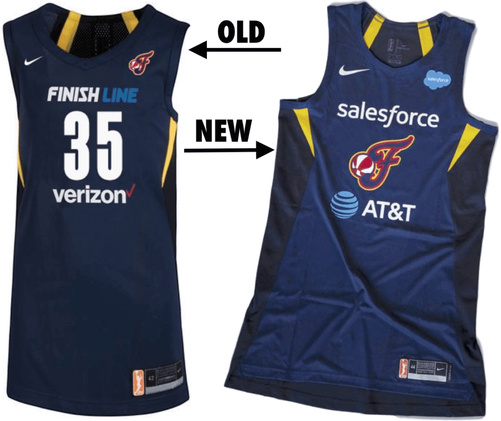
For years now it’s been impossible to take the WNBA seriously from a uniform standpoint because most of the teams didn’t even have their team names, team logos, or city names on their jerseys, which were dominated by advertising.
The league took step toward addressing that yesterday by releasing new jerseys for all 12 WNBA teams. As you can see in the Indiana Fever comparison that’s shown above, the new designs still have a lot of advertising, but at least they now have team logos front and center. Interestingly, they made room for the team logos by removing the front uni numbers, and not just for the Fever — the whole league will now be number-free when viewed from the front.
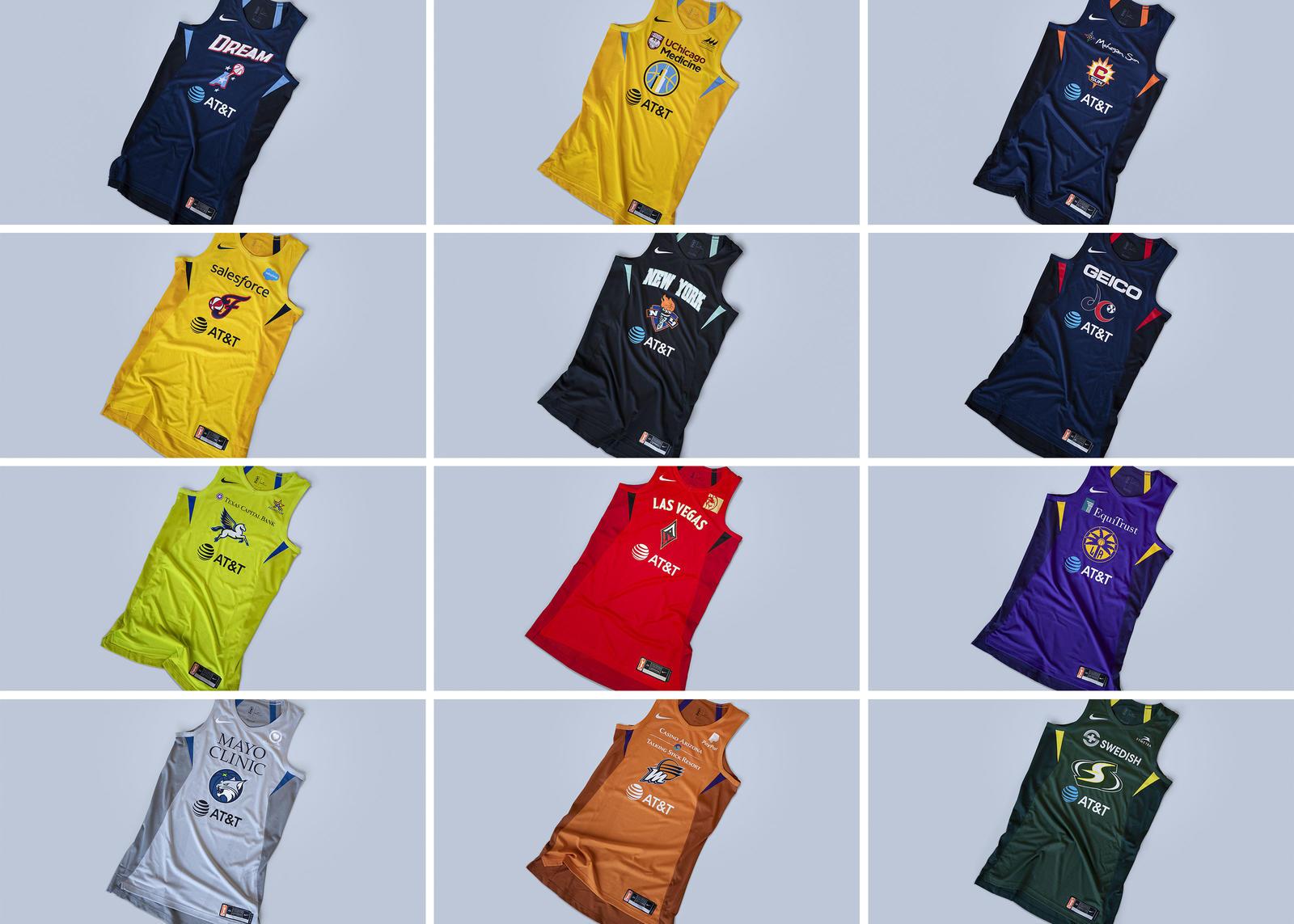
Here are each team’s primary and secondary uniform (click to enlarge):

A few thoughts:
• The repetition of the AT&T ad on every single jersey is pretty brutal. Just change the name of the league to WNBAT&T and get it over with. (Not such a far-fetched idea considering what happened to the D League, right?)
• The lack of front uni numbers is not unprecedented. The NBA tried that for the 2013 Christmas uniforms and again a few months later for the 2014 All-Star Game (there were small TV numbers on the sleeves). For those of you out there who have basketball refereeing experience, would the lack of front numbers create any officiating issues?
• It’s nice that some teams with fewer jersey ads actually have their team name and team logo:
Props to the Aces, Dream, and Liberty, who have made their team name, and not a sponsor, at the forefront of the jersey. (Vegas does have a smaller MGM Resorts patch) #WNBA @UniWatch pic.twitter.com/RDVk3hcRpW
— Geoff Magliocchetti (@GeoffMags5490) April 10, 2019
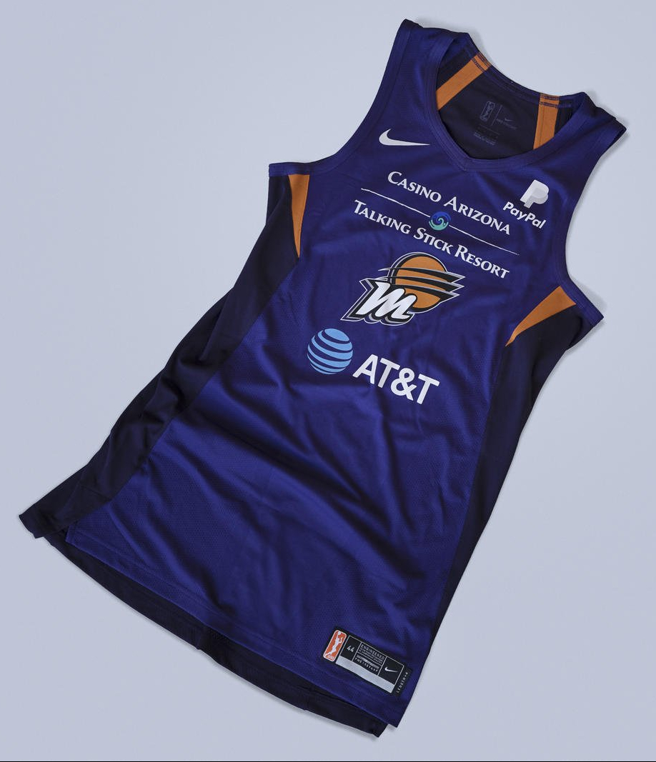
• But some other teams, like the Phoenix Mercury, have so many ads that the newly added team logo just gets lost in the morass (click to enlarge):
• At least four teams — the Seattle Storm, New York Liberty, Connecticut Sun, and Indiana Fever — have new uniform advertisers.
• In addition to the primary and secondary designs, each team will also have a black/purple “breast health awareness” uniform.
• As is becoming the depressing industry norm, there’s no sign of the new shorts — just the jerseys.
• As you may have heard earlier this week, the WNBA has a new logo, but they’ll be using the old logo on these 2019 jerseys (it will appear on the back, same as in the NBA). They’ve been trying to spin this staggered rollout as part of a calculated plan to build branding momentum or some such, but this Chicago Sun-Times article says, “the new garb won’t have the updated league emblem due to lack of production time” (emphasis mine). In other words, it sounds like they didn’t have their shit together.
The new uniforms will make their debut when the WNBA preseason begins on May 9, with the regular season set to tip off on May 24.
Click to enlarge
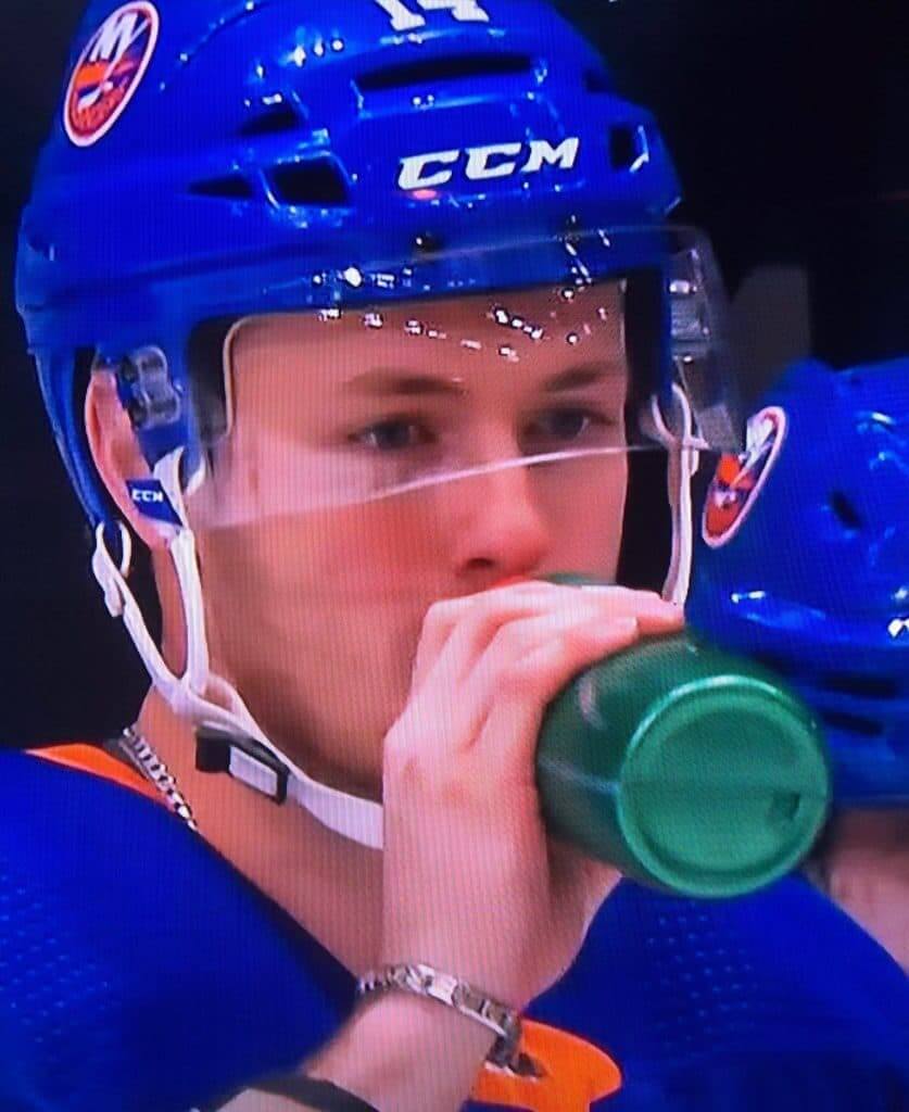
Bling on the ice: Good spot by reader Michael Alper, who noticed that Islanders left wing Tom Kuhnhackl was wearing a metal bracelet during last night’s playoff game against the Penguins (and also a metal necklace, but that’s less remarkable). I’ve never seen that before. Seems like a bad idea on several levels. Is it as uncommon as I think it is?
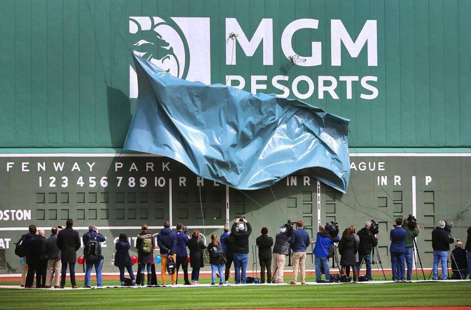
Photo by John Tlumacki, Boston Globe; click to enlarge
Oh, for fuck’s sake: It’s bad enough that the Red Sox have plastered a new gross casino ad on the Green Monster (replacing the old gross casino ad that was there for the last five seasons). But I learned yesterday that they actually had an unveiling for the ad last week.
Now, I can see why you might want to invite the Boston media to come by and take a photo of your new gross casino ad. But an unveiling? With a tarp and everything, to create a sense of drama? For a fucking ad?
And yes, I’m aware that the Monster was seriously ad-plastered 70 years ago. But it’s also had periods when it was completely ad-free, including on what was arguably its most famous moment, and it looked much better that way. Think about it: If it had remained ad-plastered like it was 70 years ago, it never would have acquired the name “Green Monster” to begin with.
I’m also fairly certain that there were no unveiling events for the ads 70 years ago. Wow, talk about progress.
ITEM! Radio update: I was on the radio yesterday, appearing on the Buffalo show One Bills Live. We talked about NFL uniforms — the Bills, the Jets, the best, the worst, and more.
You can listen to my segment by going to the 47:50 mark here.
And as long as we’re talking about Uni Watch audio: In case you missed it over the weekend, Phil did a nice job as a podcast guest the other day. You can check that out here.
Click to enlarge
T-shirt reminders: In case you missed it on Monday, we have a new pair of T-shirts, rendered in the classic Goodyear type font called Wingfoot Sans, and featuring our own winged stirrup instead of Goodyear’s winged foot.
These have turned out to be pretty popular. Here’s where you can order the green one and the grey one. My thanks, as always, for considering our products.
Meanwhile: I’m excited to report that we will soon have a hoodie version of our new sublimated Tequila Sunrise Deluxe shirt. The hoodie will have some design details that I think you’ll really like. I’m just waiting for Teespring to send me a sample so I can get a sense of what the fabric is like (I’ve never dealt with a sublimated sweatshirt before, so I want to see and feel it for myself before making it available for sale).
In the meantime, the Tequila Sunrise Deluxe shirt, with its eye-popping colors and full-wraparound stripes, is still available here.
The Ticker
By Paul

’Skins Watch: The MLB Network’s Quick Pitch show sometimes shows players in outdated uniforms. Just this morning they showed Cleveland Indians INF Francisco Lindor in a Chief Wahoo cap (screen shot by Chris Cameron).

Baseball News: The Double-A Tulsa Drillers, who won the Texas League championship last year, wore gold-trimmed uniforms yesterday. Here’s the rear view (from Jakob Fox). … Knicks star Patrick Ewing in a Mets uniform? Sure, why not (from @bryanwdc). … The “world’s largest jersey” is an inflatable Jackie Robinson model (thanks, Phil). … Reds 3B/C Kyle Farmer’s bat knob decal features a photo of his dog (from Devin Meyer). … The Triple-A Salt Lake Bees will wear Utah Jazz-themed uniforms on June 28. … Mets C Wilson Ramos has a buffalo on his armband. “It refers to his nickname given to him by Ian Desmond,” says Ryan Bower. … MLB ump Stu Scheurwater, who’s from Canada, wears a small Canadian flag sticker on his chest protector (from @minor_leaguer). … The Triple-A Las Vegas Aviators have a bat dog — a dog, named Finn, whose job is to retrieve a hitter’s bat and bring it back to the dugout. Two nights ago the plate ump grabbed a bat and tossed it to the on-deck area before Finn could grab it, prompting a chorus of boos (from my buddy Nate Clesowich). … The Chiba Lotte Marines have a new jersey for “All for Chiba Day.”

NFL News: A Georgia man bid on a storage unit that former NFLer Terrell Owens had stopped making payments on, and ended up with a bunch of Owens’s memorabilia (rare non-UNC-related item from James Gilbert). … Newly acquired WR Adam Humphries will wear No. 10 with the Titans (from Eric Wright).
College Football News: This is weird: Miami of Ohio’s spring practice jerseys have the NBA’s Miami Heat’s wordmark on the chest (good spot by Tyler Johnson). … The football team is the latest Missouri squad to adopt the “Make It Right” NCAA-protest slogan. They’ll be wearing it as a helmet decal for their spring game. … With West Virginia set to unveil new uniforms this Saturday, a local media outlet whipped up some new uni concepts for the Mountaineers.

Hockey News: With the NHL postseason now upon us, here’s a ranking of the playoff matchups by aesthetic appeal, along with a look at every possible Stanley Cup Finals uni matchup (thanks, Phil). … A home-renovation contractor in North Carolina has a logo based on the Rangers’ logo (from Matthew Anderson). … The excruciatingly named Medicine Hat Travelodge Cubs — a Junior B team — have terminated their contract with Travelodge and will revert to being just the Medicine Hat Cubs. … NHL teams don’t wear white at home. So why would the Jets have a whiteout? (From Ben Kravitz and Ewan Williams). … New leg pads for Lightning G Andrei Vasilevskiy.

NBA News: In a move that seems more evocative of antifreeze than team spirit, the Milwaukee River will be dyed green to support the Bucks in the playoffs. The weirdest thing about this is the city of Chicago dyes the Chicago River green for St. Paddy’s Day, and you’d think that imitating Chicago is about the last thing Milwaukee would want to do (from Mike Chamernik and our own Alex Hider). … Cross-listed from the college football section: The Miami of Ohio football team’s spring practice jerseys have the Heat’s wordmark on the chest (good spot by Tyler Johnson). … Cross-listed from the baseball section: Here’s an early-1990s shot of Knicks star Patrick Ewing in a New York Mets uniform (from @bryanwdc). … Ohio State saluted Nets G D’Angelo Russell, who’s an OSU alum, with a video showing every jersey design he’s worn since high school (from Ben Teaford). … Tarik Phillip will wear No. 22 for the Wizards. … NBA stars Stephen Curry, James Harden, and Kevin Durant are reportedly unable to join LeBron James in the new Space Jam 2 movie because of competing sneaker deals. Douchebags (thanks, Brinke). … Cross-listed from the baseball section: MiLB’s Salt Lake Bees will wear Jazz-themed uniforms on June 28. … Hornets C Frank Kaminsky wore The Office-themed sneakers last night. Additional views here (from Mike Chamernik).

Soccer News: What if the U.S. National Team had one basic look instead of changing every few years? … Brazil has released its away kit for the Copa America (from @vicious155). … New England Revolution D Andrew Farrell is getting used to playing with goggles after suffering an eye injury (rare non-volleyball, non-Japan-related item from Jeremy Brahm).

Grab Bag: Adidas will be outfitting the new Premier Lacrosse League. … A photographer who sued Nike for copyright infringement, claiming that the Jumpman logo was based on one of his photos of Michael Jordan, has lost his case. … Speaking of Nike, they’ve made a concession to tennis player Naomi Osaka, who’ll be allowed to wear sponsorship advertising patches on her Nike attire (thanks, Brinke). … The clothing company Patagonia is suing Budweiser’s parent company over a new Patagonia beer. … Golfer Rory McIlroy wore a shirt with an unusual chest logo and lapel pin during his final practice round for the Masters. … Old Glory DC, a new rugby union team that will begin play in 2020, released its inaugural uni set. … MX Sports, a big motocross operator, says riders will not be permitted to wear ads for CBD products during televised events. … The lacrosse team from Ramsey High School in New Jersey will wear purple jerseys this weekend — the color for pancreatic cancer awareness — in memory of the school’s athletic director, who died of cancer last August. … New police uniforms for Chesterfield, Va.. … A new exhibit by artist Andres Serrano features hundreds of Donald Trump-related items, including a row of mannequins dressed in Trump Taj Mahal security uniforms.
From a refereeing perspective, it would be annoying to not have the front uni number. You’d have to wait for the player to turn around before you report your foul to the scorekeeper. However, I would guess at that level the referees know most of the players by name, so if they didn’t know the number, they would probably just tell the table, “Foul on Maya Moore” or something like that.
Never mind refereeing, won’t the lack of front numbers make playing defense much more confusing? When a defender is trying to quickly identify the player she is supposed to guard, does she now have to go by facial recognition?
My guess is that the numbers reappear on the WNBA jerseys for the next season, after enough players complain about it this season.
My guess (and hope) is that numbers move to the shorts, and specifically on one of the front thighs. Totally get that a number on the front is useful for everybody. Should preferably be on the jersey, but the damn ads are in the way. Pfeh. Double Pfeh for failing to showcase any shorts when the WNBA showed off all the jersey tops.
I was always a horrible defender (I hated playing defense), but when I did, I never used the number to identify who I was guarding.
Lee
That’s probably the reason you performed poorly.
I used to referee basketball and just retired from refereeing rugby. Not having a front uniform number is irritating, but really only comes into play in basketball after calling a foul. When reffing church leagues or other games with no front numbers, I’d just tell the player to turn around.
It’s a little bit more complicated in rugby, as there is more communication between the ref and players than in any other sport. We try to manage players out of penalties, and the best way to do that is say something like “blue 8 roll away.” We mainly use the numbers to get the players’ attention, so if the number isn’t visible, the feedback can be less effective.
You *retired* from rugby reffing? Didn’t we once do a design contest to create a jersey for you??
“NHL teams don’t wear white at home. So why would the Jets have a whiteout?”
The tradition predates wearing blue at home. (Wikipedia says it started in 1987.) And it’s not like anybody is going to be confused about who the crowd is rooting for.
There are a couple reasons. First, it was an answer to Calgary (their Alberta rivals) doing a “C (Sea) of Red” for the playoffs. Also has to do with the Winnipeg motto of being the “Great White North”. Great article here: link
The Winnipeg Whiteout is not a response to Calgary’s “C of Red;” if anything, it is the other way around. Winnipeg was holding the Whiteout in the playoffs for the Jets 1.0, well before Calgary rolled out the “C of Red” in the 2004 playoffs. I experienced both first hand.
The C of Red dates back to the 1986 playoffs. 2004 was (I think) the first Red Mile but the C of red was much earlier.
How many t-shirt sales away are we from removing all the annoying ads on this site?
Oh, quite a few. But if you’re looking to buy, say, a few thousand shirts, let me know.
How about you add an ad to your t-shirts. I hear it’s a good way to make some $
Sponsor, not ad. :)
The green side panels of this website would look much better without ads…
That is true. I completely agree.
If ads had always been on the Green Monster, it might then have been called something ‘corny’ instead:
“Ho, Ho, Ho, Green Giant”
I’m still not getting all the grief over outfield wall ads. Didn’t the outfield walls used to be plastered with ads in the old days? Seems to be traditional part of baseball history that was lost. (yes, I get that there was an infancy time before that with no ads)
I could see if Paul were around in 1919 and everyone is up in arms over the White Sox scandal, he’d be more upset over the chewing tobacco ads on the outfield walls.
Could you please identify “all the grief” that you’re referring to? Today’s item was about one wall in particular. You make it sound like this has been a running theme on Uni Watch. That is false.
Also: I notice that you conveniently didn’t address the real issue I was talking about — the unveiling.
Also-also: I notice that you also conveniently didn’t address my point about the Monster having looked a lot better when it was ad-free, and that it never would have gotten its famous name if it had always been ad-plastered.
I gotta agree with Paul on this one, the idea of having a dramatic “unveiling” of an advertisement seems like something that would be a scene in a movie spoofing American culture…
It’s corporate america. They’re spending millions on branding and advertising and want that media shot to put on an 8×11 slick, web page, in the Casino, etc.
I think it’s corny, but it’s a necessary evil these days.
In other words, “It’s just business.”
Sorry, Tim, but that’s a cop-out answer.
Here, read this:
link
We can agree to disagree then. Businesses are in business to make money. I don’t see anything immoral, unethical, irresponsible, or improper in an ad on a wall.
Businesses are in business to make money.
I didn’t say they weren’t, or that there was anything wrong with that per se. What I said, if you go back and read the link I provided, is that not all business practices are equal, and that business practices are not inherently self-justifying.
I don’t see anything immoral, unethical, irresponsible, or improper in an ad on a wall.
Again, I didn’t say there was. If you go back and re-read today’s text, you’ll see that my primary objection was to the unveiling, not to the ad itself.
It’s really hard to have a debate, or even to agree to disagree, with someone who repeatedly mischaracterizes my positions. You’re a longtime reader/contributor Tim, and we’ve had plenty of discussions off-site, so I would never say you’re arguing in bad faith. But I will ask that you please try to do a better job of responding to what I actually say instead of creating straw men. Thanks.
Aesthetically displeasing, then.
I did read your post and used pieces of it in my reply. If that mis-characterized your position in any way, I apologize.
Bottom line a majority of these ads (especially on uniforms) looks like crap.
When I said “Post” I meant your URL
link
The point is more that there was a ceremony to unveil the ad, as if it were a new feature of the ballpark for the benefit of the fans, when it is really a bogus ceremony done only to make their corporate overlords feel good.
I definitely haven’t noticed a big stink over outfield wall ads here. But I have heard and participated in it elsewhere, and I think it has to do with the generation of us who grew up in the (really relatively brief) period where there were no wall ads visible on TV. Near as I can tell, the advent of baseball on TV saw the virtual elimination of wall ads, I think because they essentially outsourced the advertising to their broadcast partners, where it was relegated primarily to the breaks and occasional drop-ins. Sometime in the 90s, broadcasters and teams figured they could all make tons more money working together to get ads all over the place again. Stadiums are infinitely uglier. Fact of life, but it hasn’t always been this way and it’s okay to notice and not like things.
This is the second time the MGM logo unveiling was featured on Uni-Watch. You even used the same “Oh for fuck’s sake” tagline.
Really? When?
I see that the ad unveiling was mentioned as a Ticker item on April 6th, but only with the tag line “yuck.”
The recent “Oh, for fuck’s sake” tag line was used on April 9th for Mahomes’ logo cover up at the Final Four.
Not only is that At&T ad repeated on every jersey, but Nike has given every single team the exact same jersey (and probably the same shorts)!! They’ve been guilty of using the same design for multiple NCAA teams before, but never a single design for an entire league. Yikes.
I don’t watch the WNBA, but after doing a little research, it looks like the use of one uniform design for the whole league has been going for a little while, and is not new for the upcoming season. If anything, that makes it even lazier. The league is “re-branding,” but Nike couldn’t even bother to come up with a new template for the uniforms?
Nike does this for the NWSL, too. Multiple teams have used the same templates over the past few years, sometimes in the same season as one another and sometimes not.
Looks like WNBA is going the way of our friends from Soccer and Rugby…a logo and ads on the front of the jersey with the number on the back. Well, except when it’s the World Cup.
Welcome to the new reality.
Best NHL first-round uniform match up. Islanders vs. Penguins. Good looking uniforms but gets the nod due to nostalgia. Both teams have returned to these classic uniforms after experimenting with other, less attractive looks. Feels like a Patrick Division series that I would have watched as a kid.
The uni matchup ranking is kind of moot because none of these games will be color-on-color
You won’t get to see much of it. Islanders will sweep.
Great appearance on One Bills Live, Paul! Love how one of the hosts said (unintentionally, I assume) “I Get It” right after you hung up
In regards to Kuhnhackl, wearing a metal bracelet on the ice, he’s been doing since his rookie season on the Penguins in 2015-16. I remember noticing it because I never saw anyone playing with jewelry before.
Here’s a shot of it post Stanley Cup win in 2017: link
Great info, Karim. I went looking for another photo to see if he’d done it before, but obviously most photos showed him with his gloves on. Didn’t occur to me to look for a Cup photo. Nicely done!
And here is Kuhnhackl in 2016 with the same bracelet:
link
Rule of Thumb: The WNBA never has its shit together. They’re basically in the same boat as women’s tennis was when it was run by the men’s tour. Everything is last minute, improvised, and second rate. Expect that to continue as long as the NBA is in charge of it.
Not sure I agree 100% with your comparison there. WTA / women’s tennis hasn’t been run by men since early 70’s. Almost 50 years ago.
When Sabrina Ionescu announced she was staying at Oregon for her senior year, instead of going to the WNBA, these were some of the thoughts:
First fan: Why would she want to go to the WNBA? It’s a two-bit operation.
Second Fan: While your comment about the league is valid, the price is inflated.
Third fan: Poor Sabrina, think of all the dozens of dollars she will miss out on by not joining the WNBA.
Fourth Fan: I want to watch a women’s basketball game in the worst way!
Fifth Fan: I’m sorry, but the WNBA isn’t playing today.
Yeah, women’s tennis took off once they got out from under the men’s tour. Within a decade of the separation, women’s prize money had increased to more than 40 times what it had been. The men held the women back in tennis then just as they’re doing in basketball now.
Seattle Storm link is not working
Hmmmm. HTML coding is fine. Here, try this: link
My feeling about the US soccer jerseys is the harder Nike tries to be “creative”, the worse it gets. The BFBS with one red sleeve and one blue sleeve? Yeesh.
They’re best when they keep it simple. Plain white, navy with white sleeves, stuff like that.
My feeling about the US soccer jerseys is the harder Nike tries to be “creative”, the worse it gets.
I’d say that applies to a lot more Nike projects that just the US soccer kits, eh?
Your complaint hints at what to me is the fundamental problem: We don’t have uniforms representing the national team, we have uniforms representing Nike. As Nike uniforms, the radically-different-every-two-years program for the national team work great. As uniforms to represent Team USA and build domestic identification with and global awareness of the US national teams, Nike’s uniforms have been a disaster for more than a quarter century. Until the U.S. Soccer Federation decides to deal with Nike with the attitude that it is the client and Nike is the supplier, we will continue to have terrible uniforms that undermine the growth and development of American soccer.
the fundamental problem: We don’t have uniforms representing the national team, we have uniforms representing Nike.
This problem is really at the heart of so much of Nike’s work. Instead of subordinating their role and identity to the identity of the client, they’ve essentially flipped the script and made themselves the primary player, with the teams just serving as vehicles for Nike’s own self-promotion.
The tragedy is that the teams go along with it.
And the teams go along with it because they get money for the sponsorship AND get, basically, free uniforms. Albeit designed by Nike, who seems to use someone in their design department just of a 3 day bender…
I think the issue goes beyond Nike, the US simply does not have a consistent look through their history. Nike have done bad self-promotional things in the last few years (see: the template shirts in the 2002 World Cup and the 2016 Euro tournament), but through it all England still wear white and navy, Brazil still wear yellow, blue and green, and Holland still wear orange. The US has gone through white shirts, white shirts with sashes, white and blue, white shirts with red hoops, and white shirts with blue stripes.
For my money, the US should wear white with red hoops, though the sash look is also a good one.
I believe Nike specifically doesn’t want US Soccer to have a consistent look. That way they can roll out whatever they think is going to sell this year.
And unlike the NFL (for instance), US Soccer doesn’t have final say on US Soccer uniforms, Nike does.
Lee
I don’t like the Mystics jerseys…either the blue ‘d’ in ‘dc’ blends in with the blue jersey or the red ‘c’ blends with the red one.
Nitpicking: “Miami of Ohio” is unnecessary and a bit silly. There’s Miami University and The University of Miami, two distinctly different universities separated by almost 1200 miles.
Yes, they’re separated by lots of physical distance, but many people get confused by the two names and don’t know which is which. So “Miami of Ohio” helps to eliminate ambiguity.
Also, given the way people often flipflop “university of X and X University” no matter which is actually correct (said as an alum of Indiana University and not the University of Indiana), most would likely presume Miami U. are the hurricanes.
Simple probably to people referring to the Gamecocks as “USC” and most would think they meant the Trojans.
Can someone tell me why the ads disappeared from the ‘Green Monster’ long enough for it to be named that in the first place?
No evidence for this, but wall advertising in parks disappeared in general. There was still some higher up, in home run territory. I have to imagine it had something to do with television. I recall reading that when NHL clubs started adding sideboard ads, TV networks flipped out because they weren’t getting the $$ and it conflicted with many of their advertisers. There was a famous national broadcast where they awkwardly cut around the sideboards. But teams and broadcasters figured out a way for everybody to settle what goes where and who pockets what, and eventually the same thing happened in baseball.
It was the 1999 All-Star Game ad that tested the waters for the monster. Then some charity logo. Once we got used to the markings, it was booze, cars and casinos.
Thanks so much for your answer! I’d always wondered about that.
I think I might be in the minority with USMNT fans, but I still think the 2014 World Cup kits were the best we had. The bomb pops were perfect with incorporating all 3 colors of the flag, and the home whites with the collar looked classic
True, but we could hardly ever wear them as intended since there were so mant kit clashes.
The green monster bums me out as a Red Sox fan. It was such a great presence out there when it was a giant green slate, now it’s just another billboard. I recall reading the account of the lifelong Sox fan who was charged with selling the first ad on it when ownership moved to cash in. They had to convince him he wasn’t committing a crime against his childhood by showing him photos of its Gem Blade days.
Two thoughts today:
1. I don’t think it’s the referees that will have an issue with no front uni number as much as it is scorer’s table personnel, specifically the statisticians. Refs are on the run and are used to having to move a little to see something. I think it becomes instinct for them to check for a number as soon as they blow the whistle. However, for the folks doing other tasks that rely upon numbers — PA announcers and especially statisticians, who are sometimes on the floor and sometimes perched further up — they don’t really have that luxury, and they’re often trying to catch multiple things in a short period of time. Imagine a scenario with a shot, miss, offensive rebound, putback, another miss, another offensive rebound, a block-to-block pass that leads to a basket (an assist) and a foul, followed by a double-technical when two players jaw at each other immediately afterward. The number of the player for everything that occurred has to get entered into the computer, usually along with a code for what it was that happened, either via keystrokes or touchscreen. If you get tripped up on one number … good luck.
I’m a part of a group on Facebook that exists almost solely to give college sports information personnel a place to vent their frustrations. Most of those folks are tasked with statting every sport a school offers, often by themselves or with inexperienced student help, along with doing press releases, maintaining their schools’ athletic websites, coordinating streaming broadcasts and “other duties as assigned.” In other words, they’re all stressed out, overworked, expected to do way more than they’re capable of (a network-quality broadcast “to impress recruits” with a single camera and a freshman who’s never seen the sport played before doing play-by-play), stressed out and unappreciated because coaches, parents and players think all that stuff should happen by magic, perfectly, and only to serve their whims. Perhaps the biggest of many complaints in that Facebook group are teams who, either because their players think it looks cool, or, in the case of some nefarious coaches, want to slow other teams trying to scout them on video, make numbers nearly illegible from distance by making them small, giving them crazy fonts or making them non-contrasting colors. It makes statting games anywhere from really difficult to darn-near impossible if you combine those numbers with poor weather conditions for outdoor sports. They actually have a hashtag for it: #unithorms, named for a SID who has tried to organized campaigns to strengthen rules against such practices (though he fights a lot of the same fights we do here against apparel companies, the power athlete and coach opinion carries and the influence of money in general).
It’s not as much of an issue in, say, the NBA, where most folks know most of the players by name and appearance. But in sports you don’t see on national TV regularly, numbers are a big deal for scorer’s table staff, and it occurs often that you’ll hear the guys and gals at such a table say repeatedly, “Turn, turn, turn, turn,” not because they like the song by The Byrds but because they can’t see a player’s number and have to wait until they turn in order to see it for entry into the stats computer.
So yeah. It’s a definite annoyance for those folks, and yeah, they posted a picture of these uniforms with many hoping this doesn’t become a trend. Though, as I’ve pointed out to the SID group, it makes for a good explanation when a player or parent complains either they or their kid didn’t get more assists or rebounds — something that happens all too often.
2. The MGM thing makes me think about my day job in non-profit work.
In non-profit work, we talk a lot about “stewardship.” It’s essentially a code word for making donors feel like their donation was valued, appreciated and had impact. In cities with a lot of non-profits, it’s important, particularly for donors we call “mid-level” and upward: Ones that give sums many of us hoi polloi would consider a significant investment, like $1,000 and up. Many of those folks are “known” by many, if not all, of the charitable organizations in a region, pursued to make gifts by all of them in one way or another and, often times, make donations to many of them, whether it be because they truly believe in the cause or because they simply need to hit a certain threshold for tax purposes. For better or worse, those organizations are essentially competing for those dollars, as those mid-level-and-up donations tend to account for 80-90 percent or so of the donations to an organization in a given year. Little mailings and pledge drives are still important, but they tend to bring in constant amounts each year and there’s a pretty distinct point of diminishing returns. It’s the big gifts that make a difference, and it’s often the organizations that make such donors feel most appreciated that see the best returns.
At a gala event for one non-profit I worked for, they lined up kids at the entrance to applaud whenever anyone came in or left. I remembered thinking it felt a little weird. Applause just for walking in? Is that applause-worthy? Or is it implied that, merely by entering this event for, admittedly, some of the city’s biggest philanthropists (i.e. richest people), you’ve earned this applause?
So yeah, when I see something like the MGM thing, my mind goes back to that. It’s “stewarding” a sponsor — making them feel like their sponsorship is important, honor-worthy, etc.
That doesn’t mean I’m excusing it. I felt a little skeezed out about the kids applauding, the same way I feel skeezed out about “honoring” a sponsor. It’s “greed is good” gone to an extreme such that we’re now even saying greed is honorable, or that it’s honorable to encourage folks to gamble away their money, as long as you give some of that money to us. But … in a roundabout way, unfortunately, I understand “the why.”
As I often like to say, it doesn’t excuse it. It just explains it.
I said “stressed out” twice. I need an editor for my message board posts.
Dan, to your first point. I completely agree. I was a student intern for the SID at my small DIII college and we often had to write down plays on scratch paper as they happened and then go back and type them into the stat software during the next timeout or after the game. It would be such a pain.
I had to endure dark purple numbers on a black jersey and black numbers on a dark green jersey. Brutal.
The back of the WNBA jerseys: Are they still going with the name under the number, so it’s hard to read on a closeup on TV?
Pleasure listening to your interview on One Bills Live, Paul. I normally wouldn’t listen to the insufferable John Murphy and Steve Tasker. I feel like uniform critique and discussion often gets dismissed by “real” sports personalities, but you come off like a real knowledgeable pro and do Uni-Watch and by extension its fans proud. Cheers!
Thank you!
This comment matches my feeling exactly. I love the Bills and am a regular listener of WGR but I never listen to this show because Murphy and Tasker are just terrible. Listening to those two and their dolt callers discuss Bills uniforms for 15 minutes prior to Paul’s appearance was pretty nauseating. Paul’s appearance was excellent though as Murphy/Tasker at least managed to ask sensible questions and let Paul lead the discussion. Great appearance!
the winnipeg jets have had a whiteout in the playoffs going back to their original team…that’s well known so why question it in the ticker without explanation?
I didn’t know (or maybe used to know but forgot). That’s why.
Connecticut Tigers, the Short Season Single A affiliate of the Detroit Tigers, are having a Name The Team contest. The impetus for the change is two-fold – 1) to celebrate 25 years of MILB in Norwich, and 2) to promote the City of Norwich as the location rather than all of Connecticut. link
Norwich is known as the Rose of New England or the Rose City, but the Norwich Roses sounds… blah.
Norwich Thorns
Norwich By Any Other Names
There was never a need to change the Norwich Navigators name, and fans still love Tater, so just go back to the original name with an updated logo.
Norwich Terriers – preferably with a comical mascot rather than a ferocious one
i was intrigued at the aesthetics article of the Stanley Cup. i made a disgusted face when the top 2 were shown. how…? Caps/Hurricanes? Lightning/Blue Jackets? i… excuse me while i go and sit here, pondering at the author’s choice.
Pants Watch: Oriole Renato Nunez changed his pants from high (showing sock) to low (no sock) mid-way through the game today.
link
Also Pants Watch: At the end of the Orioles’ home opener on April 4th Chris Davis threw his batting gloves and uniform pants into the trash:
link
You can see that shot of Lindor in the Wahoo cap every day on Quick Pitch. They’ve used the same opening since 2017
That’s awesome. I live in Chesterfield, VA. My brother in law and my nieces husband are CCPD officers. Thanks for putting this uni-watch. Mega props Paul Lucas.
Did any of them ever pull over Denny Hamlin for speeding ; )
I’m sure he got pulled over a couple times. My friend grew up with him. They’re best friends but don’t talk much anymore. Funny how that is huh? He’s a douchebag from what I here. My wife graduated with him also.
As a basketball official (in addition to baseball and football), it does slow things up a bit more when reporting a foul. I either have to move around the offending player to view the back of the jersey, or stop to have that player turn around. Even at only a few seconds, sometimes that extra time can make us lose track of the OFFENDED player, or even identify the wrong player, if a crowd or scrum ensues after the whistle was blown.
This generally doesn’t happen with town travel or high school ball, but happens more often than not with in-town rec ball or AAU.