Someone was recently nice enough to send me a few interesting items in the mail. One of them was a vintage booklet called Flags of America. I figured it would feature some fairly obvious, predictable stuff — a 13-star flag, a 48-star flag, “Don’t Tread on Me,” etc. But it turned out to be much more interesting than that, so I want to go off-uni and take a look at it today.
Some quick background: Flags of America was published in 1968 by the Pittsburgh-based Flag Plaza Foundation (now known as the National Flag Foundation) in conjunction with the Allegheny Trails Council of the Boy Scouts “for the patriotic education of American Youth.” It sold for 35 cents. Most of the flags shown in the booklets are American, but some are the flags flown by explorers and colonists of the North American continent, such as this Viking banner and this Spanish flag carried by Christopher Columbus (for all of these page scans, you can click to enlarge):
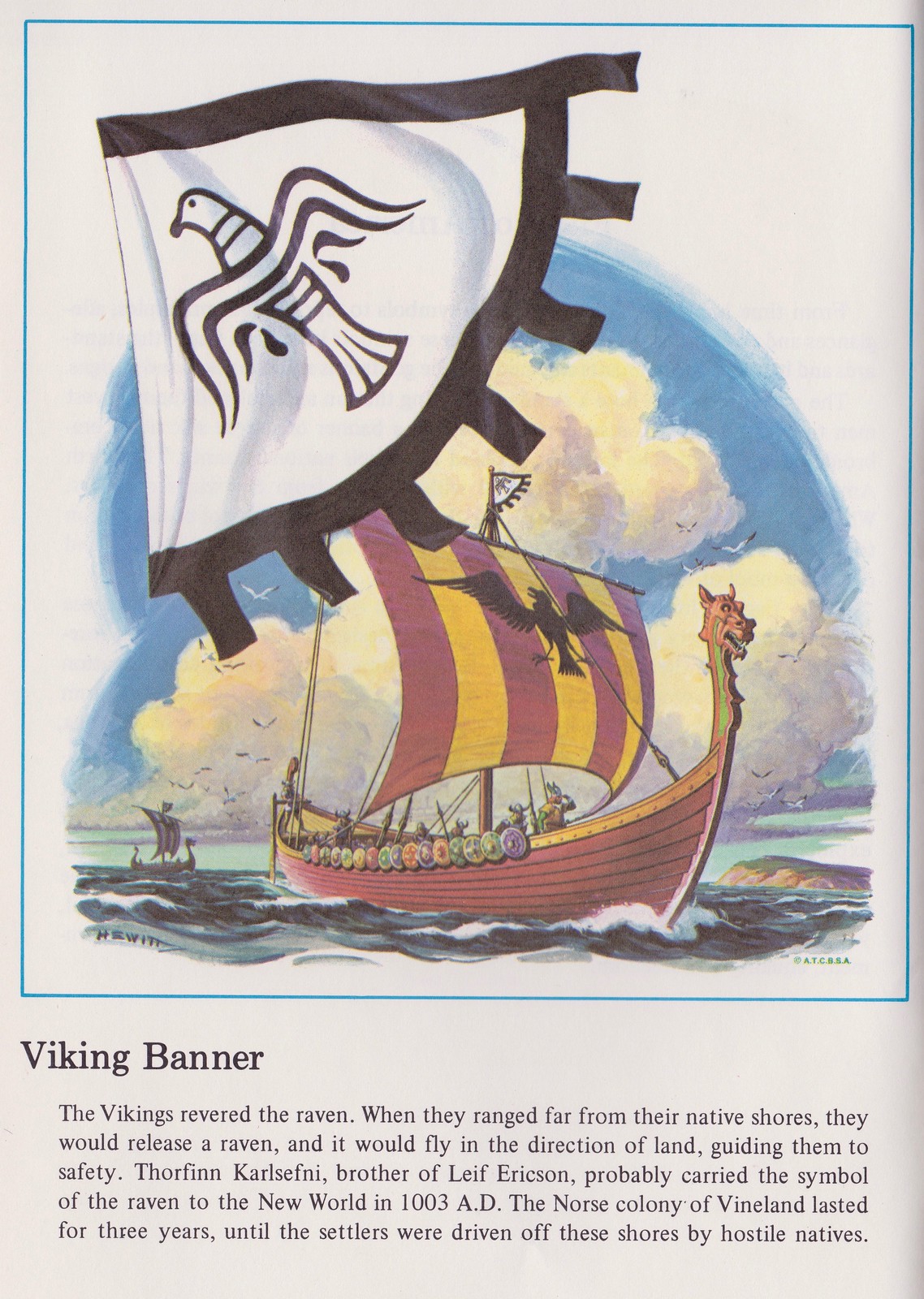

Nice, right? The illustrations are not credited (a really shitty way to treat a visual artist), but most of the carry the signature “Hewitt” or “D. Hewitt” or “DH.” Unfortunately, I’ve been unable to figure out who that was.
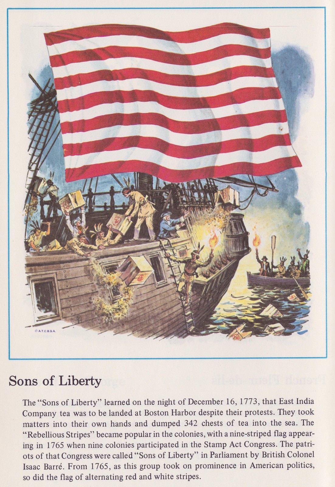
Many of these flags shown in the booklet were either new to me or were designs that I was only dimly aware of. The accompanying text on each page does a good job of telling each flag’s story. Educational!
The most interesting thing, at least to me, is that some of the early flags from the Revolutionary War became the basis for state flags. For example, the Rhode Island flag has its roots in this early design:

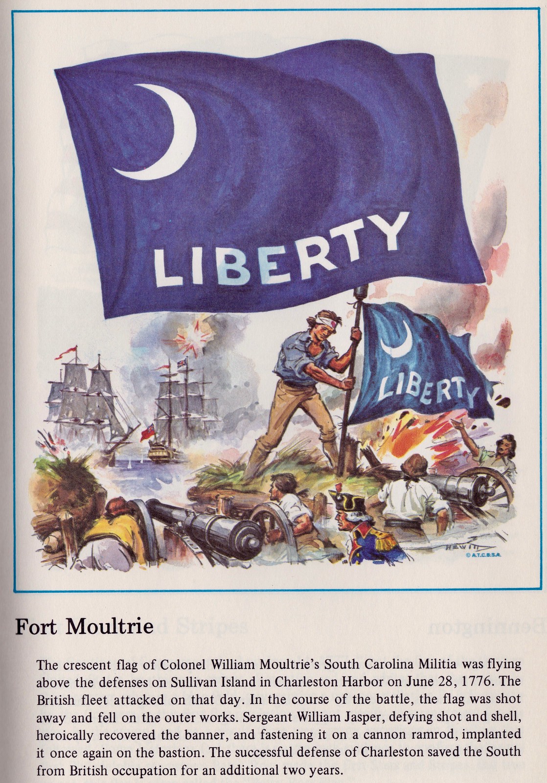
Similarly, the crescent moon on the South Carolina flag has its roots in this design:
And then there are designs that, for whatever reasons, just look cool to me. Here are some of my other favorites — check these out:
Wouldn’t most of those look great as sleeve patches?
Want to see more? You can see scans of the entire booklet here.
Finally: I’m embarrassed to say I can’t remember who sent this booklet to me. Whoever it was, please speak up so I can properly thank you!
Click to slightly enlarge
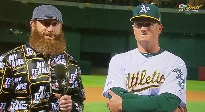
And look, there’s Don Cherry applying for a job at NBC Sports just now: Last fall NBC Sports launched an app called MyTeams. Lately they’ve been promoting it by having broadcasters (like former A’s pitcher Dallas Braden, shown above, who currently works as a field-level analyst during A’s games for NBC Sports California) wear truly repulsive MyTeams-themed jackets. Seriously, who could possibly have thought that was a good idea?
Women have also had to wear the jackets (click to slightly enlarge):

“I am not against bold statement pieces,” says Chris Harris, who brought these jackets to my attention and provided both of the screen shots in this section. “I love the old Monday Night Football jackets. Heck, I’m an A’s fan! But these are just the worst.” Indeed. If NBC really needs to advertise their app, surely there’s a better way than this to do it.
Throwing back to the NFL’s first throwbacks: Reader Joshua Escobar found this old episode of NFL Prime Time Sept. 18, 1994. That was Week Three of the ’94 season, when teams broke out their 75th-anniversary throwbacks for the first time, so the highlight footage is full of juicy retro-style goodness.
Unfortunately, the video resolution isn’t great, but there’s still a lot to like here — enjoy.

ITEM! Yet another one-day membership raffle: It’s pretty inspiring to see how people are purchasing memberships for me to raffle off (and sometimes the raffle winners are paying it forward by doing the same). The latest reader to do this is Tim Walsh, who bought a card for himself — Pats Color Rash — and generously bought another one for me to raffle off.
To enter this raffle, send an email to the raffle address by 10pm Eastern tonight. I’ll announce the winner tomorrow.
Meanwhile, if you’d like to order a card for yourself or purchase one for me to raffle off, that’s a good way to support Uni Watch (which, quite frankly, could use your support these days). And remember, a Uni Watch membership card entitles you to a 15% discount on any of the merchandise in our Teespring shop and our Naming Wrongs shop. (If you’re an existing member and would like to have the discount code, email me.) As always, you can sign up for your own custom-designed card here, you can see all the cards we’ve designed so far here, and you can see how we produce the cards here.
The Ticker
By Lloyd Alaban

Baseball News: A bunch of new MLB sock designs were officially unveiled yesterday (although some had already been worn on the field). Here are photos and a breakdown of the new designs. … Take a look at the Reds’ season ticket for yesterday’s game against the Brewers. The ticket features the 1882 American Association champion Reds posing in uniforms specifically designed for each defensive position. Unpopular with the players, the uniforms were rarely worn (from Jansen Dell). … The Twins wore all-navy caps last night against the Royals. Usually Minnesota wears navy caps with a red bill on the road, and Paul says the red-billed design is still listed as the official road cap in the MLB Style Guide (from multiple readers). … Also from that game: Twins RF Nelson Cruz wore a red belt, while the rest of his teammates wore navy belts (from Michael B. Sticha). … Here’s a possible look at the 2019 World Series logo, along with an secondary 2019 All-Star Game logo via an email from MLB (from Kevin C. Burns). … Yankees C Austin Romine wore an English-to-Japanese cheat sheet on his wristband, presumably to communicate better with P Masahiro Tanaka, who was on the mound last night (from @NYYDJ2). … Speaking of the Yanks: WWE WrestleMania is coming to MetLife Stadium in the New York area on Sunday, so the WWE did some promo shots at Yankee Stadium featuring wrestlers Braun Strowman (No. 99), Natalyla (No. 85), and Titus O’Neil (No. 11) wearing custom Yankees jerseys. Their jerseys had NOBs on them, which of course is not the case with regular Yankees jerseys. Strowman wore his father’s softball number, Natalya had an NOB that read “Anvil,” referencing her late father’s nickname, Jim “The Anvil” Neidhart, and No. 85, referencing the year her father debuted in the WWE, and O’Neil wore the number he had when he played defensive end for the University of Florida (from @Hashalance). … Orioles P Andrew Cashner wore a cap with the MLB 150 patch last night. The patch was only supposed to be worn for Opening Day (from multiple readers). … Yesterday the Nats rolled out their Skittles tarp for the first time this season (from Alex Barfield). … MLB’s Instagram is still using the Phillies’ old logo (from Rob V). … It looks like the Phillies have thinned out their sleeve piping. Here’s a photo of 1B Rhys Hoskins from 2017 and RF Bryce Harper from 2019 for comparison (from Steve Salayda). … The Blue Jays traded CF Kevin Pillar to the Giants right before game time yesterday, so the Jays collapsed his banner outside the Rogers Centre (from Martyn Bailey). … Marlins Park used a July 3, 2007 picture of Mets P Jason Vargas on their scoreboard pregame graphic. Vargas is wearing the black-accented away uniform the Mets discontinued in 2011 (from Tim Britton). … Giants P Reyes Moronta’s locker room nameplate is spelled incorrectly in this photo. His locker is located in the center of the photo (from Chris Schoenthal). … Jerry Reuss took some exclusive photos of the new uniforms of the Las Vegas Aviators, the Triple-A affiliate of the Athletics. Here’s a closeup of the team’s inaugural patch, and of the club’s scoreboard. … The Eugene Emeralds, Single-A affiliate of the Cubs, received their Northwest League Champions rings yesterday (from Josh Claywell). … This sportswriter gives his opinion on the nine wackiest minor league baseball team names (from Tim Dunn). … New 3D batting helmet logos for the Gwinnett Stripers, Triple-A affiliate of the Braves. … New number and letter font for the Portland Sea Dogs, Double-A affiliate of the Red Sox, to match the Sea Dogs’ alternate and away uniforms (from Heath Carignan). … Notre Dame’s library has a very detailed collection of baseball history, including some entries on uniforms (from Nick Werner). … Here’s some beautiful color footage of the 1951 Dodgers during spring training (from Jay Abbott). … Here’s some beautiful black-and-white footage of the Cubs wearing their vest jerseys during spring training in 1940 (from Phillip Santos). … Kansas debuted some gorgeous throwbacks last night. … Virginia Tech went GFGS last night against VMI (from Andrew Cosentino). … Kentucky and Louisville went color vs. color last night (from McKay Jones). … Here’s a Cardinals T-shirt whose chest lettering appears to be inspired by the NHL’s New York Rangers (from Jeremy Boyer). … The Richmond Flying Squirrels’ name was a tough sell at first (from Tom Turner).

NFL News: Yesterday Paul mentioned the Bears’ April Fools Joke: jerseys with three-digit numbers. Now the team is selling a three-digit jersey with an “April Fools” NOB, which was used in the photo shoot for the prank (from Griffin T. Smith). … The Browns tweeted some updated jersey numbers for 2019 (from Erin Ford). … In more Browns news, Browns reporters talk new uniforms starting at the 16:28 mark of this most recent podcast episode, including how silly the big reveal events are (from KC Kless).
College Football News: Delaware Valley University received their Middle Atlantic Conference champions rings this week, and it looks like they’ve poached Alabama’s logo (from Evans Brian). … According to Gators Uniform Tracker, orange end zones for Florida are “highly likely” to return for the 2019 season.

Hockey News: Kings D Drew Doughty has some interesting placement for his team’s 3D helmet wordmark decal. Look at how both sides have two letters in the front and three in back on his new Warrior Covert PX2 Helmet compared to his old Bauer 4500 Helmet. No other Kings player has a decal cut in this way (from Jakob Fox). … In a related development, Doughty’s teammate Jeff Carter keeps having problems with his decal sticking on his helmet (from @ItWas3to0). … Cross-listed from the baseball section: Here’s a St. Louis Cardinals shirt from Major League Baseball with very Rangers-inspired lettering (from Jeremy Boyer). … The State Route 520 bridge in Seattle, Wash., is lit up in red and green this week in honor of the 1919 Stanley Cup champion Seattle Metropolitans (from @lawrep2).

NBA News: Here’s the Lakers’ record by uniform through March (from @PG_UniTracker). … Warriors PG Steph Curry arrived to his home arena for last night’s game in a Andris Biedrins throwback jersey (from multiple readers). … A Texas barbecue restaurant released a “Houston 34” barbecue sauce with a package design based on a Hakeem Olajuwon throwback uni (from Ignacio Salazar).

Soccer News: Here’s Brazilian club Coritiba’s new third shirt (from Ed Zelaski). … Manchester United F Romelu Lukaku obscured the Beats logo on his headphones in this team photo, and so did teammate MF Paul Pogba. Pogba’s headphones look like they’re from last year’s World Cup. Beats By Dre intentionally placed big Xs over their logos as part of a marketing campaign during last year’s World Cup since Beats were banned by FIFA due to advertising rules (from multiple readers). … New away jerseys for the Tallahassee Soccer Club (from Justin Gibbons).

Grab Bag: Cross-listed from the baseball section: WWE WrestleMania is coming to MetLife Stadium in the New York area on Sunday, so the WWE did some promo shots at Yankee Stadium featuring wrestlers Braun Strowman (No. 99), Natalyla (No. 85), and Titus O’Neil (No. 11) wearing custom Yankees jerseys. Their jerseys had NOBs on them, which of course is not the case with regular Yankees jerseys. Strowman wore his father’s softball number, Natalya had an NOB that read “Anvil,” referencing her late father’s nickname, Jim “The Anvil” Neidhart, and No. 85, referencing her father’s 1985 debut with WWE, and O’Neil wore the number he had when he played defensive end for the University of Florida (from @Hashalance). … ESPN’s Daily Calendar app still has Philadelphia Phillies RF Bryce Harper of Major League Baseball and F Los Angeles Lakers LeBron James of the National Basketball Association in their former teams’ uniforms — the Washington Nationals and the Cleveland Cavaliers, respectively (from Christopher Jowdy). … A Denver sheriff’s deputy is accused of using Wingdings font to forge Army orders in order to not show up at work (from Bo Baize). … The BNZ Crusaders, the New Zealand rugby union squad whose team name came under scrutiny after the recent anti-Muslim attacks in that country, are keeping their name for now but have hired a consulting firm to seek feedback and explore the possibility of a name change (from Hadyn Green and Josh Gardner).
Click to enlarge

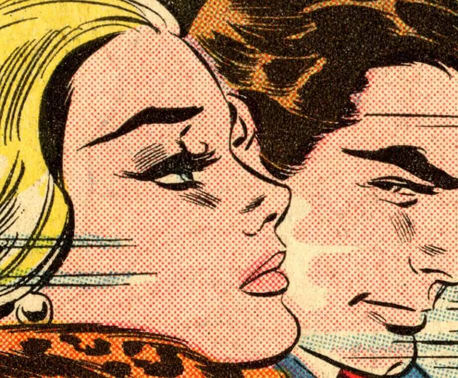
What Paul did last night: As I’ve mentioned several times before, I often attend a Tuesday-night lecture series about comics and graphics at the Parsons School of Design. Last night’s edition was a presentation by a British guy named Guy Lawley about Ben Day dots, which are the little screened dots used to create most of the colors in comics (like in the image shown above). Like a lot of kids who grew up reading comics, at some point I got out a magnifying glass so I could get a closer look at those dots, and I’ve been fascinated by the dot process ever since. The same was presumably true of the great pop artist Roy Lichenstein, who pretty much based his whole career on Ben Day dots.
Anyway: It was a really good hour-long presentation, full of geeky details about four-color printing and comics history (you can see some photos here). My friends Nate and Heather joined me there, and afterward we went out for drinks and tapas at our favorite nearby Spanish bar — a swell time.
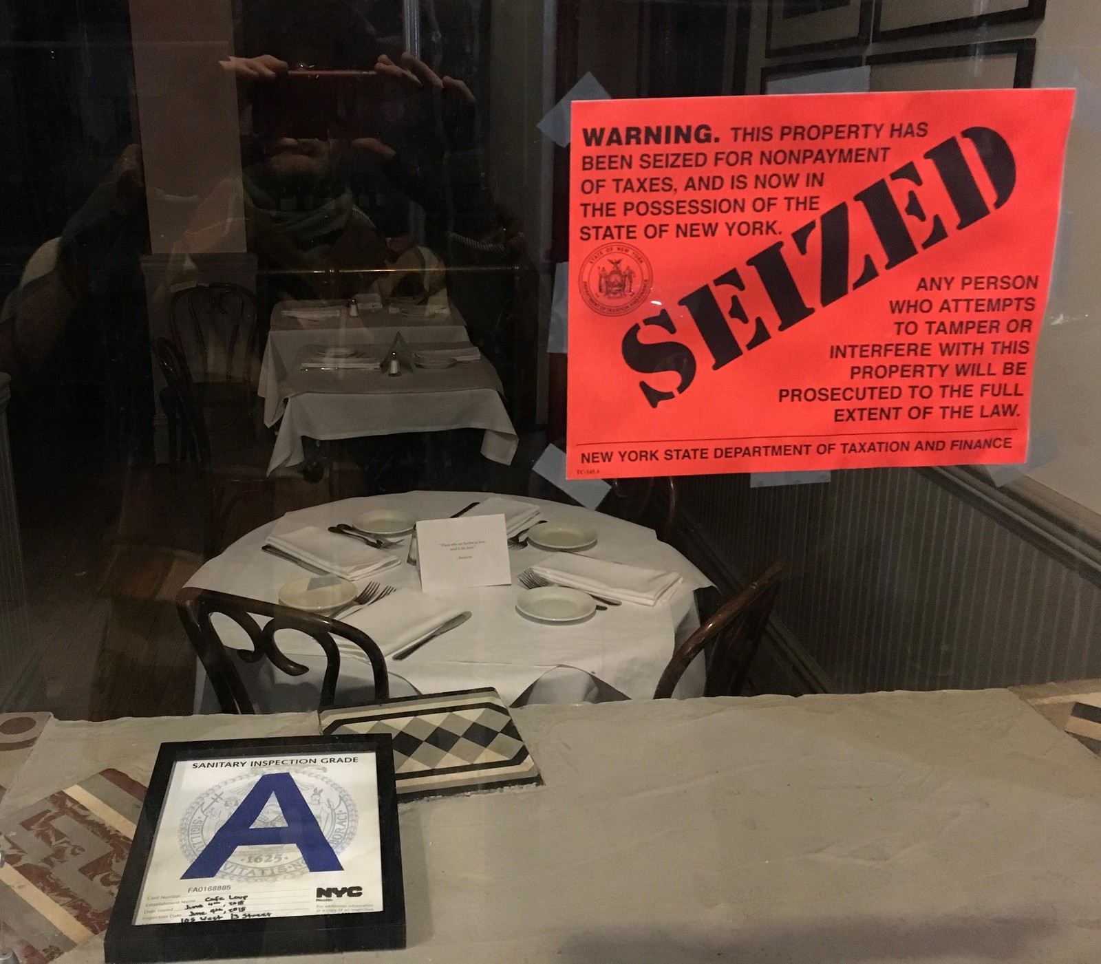
Afterward, we were walking to the subway and passed by Cafe Loup, a French restaurant that was shuttered for back taxes about four weeks ago. I was struck by the juxtaposition of the seizure sign in the window and the sight of tables still set and ready for service in the background, like the place had been frozen in amber (click to enlarge):
So that was my night. Hope yours was fun too.
Big get-well wishes to our own Yianni Varonis, who produces the Tickers that appear on Fridays and had a health scare this week. Feel better, buddy!
Braun Strowman wore 99 because that was the number his father Rick Scherr wore in the 1980s when he was one of the big names and dominant hitters in the world of softball.
Whoops! I forgot to link the photo of Rick Scherr in uniform.
link
Yup! Awesome tidbit I didn’t know about till I started researching. I always wondered why all his sports jerseys and his IG account had No. 99 in them.
There’s no link to the Reds ticket.
Coding glitch. Now fixed.
reds ticket says the uniforms were unpopular with players and were rarely worn. your line says it was the fans.
Fixed.
Is that where the WFL got the idea for position-specific football pants?
link
Great Prime Time clip from 1994. I remember watching that Jets Dolphins game! Later that season was the fake spike game in the Meadowlands.
Those Jets throwback jerseys really looked good. Even with the green helmet, it was a good look.
I remember thinking how lame/lazy it was for them to keep the green shell. Same with the Bills and the red shells.
It was, for sure; the white shell would have looked much better in both cases. The Cowboys and 49ers were also lazy with their helmets.
I remember really liking the Jets’ green shells with old-school helmet logo. Sort of a “capturing present and past” sort of look. I was more excited about the old-school jerseys. I’ve always loved the sleeve design (one they will surely screw up tomorrow night) with the thin stripe and a larger color or white field with the uni number below.
New Jets uni’s revealing tomorrow. My bet is they’re going to be an abomination. I mean has any team improved their look over the past 20 years with these modern reboots?
The Phils sleeve trim is a good change, although I wish they had gotten rid of it altogether. In recent years, the sleeve stripes had gotten too large, and the sleeve trim did not match the trim on the pants. With the changes, they do match. Also, if you look at the Harper picture, it appears his belt has a 34 on it, with the 4 being tucked inside the belt loop.
Your ‘Get Out More’ section today reminded me of my 5th grade Science Fair project that was about Color, Color Separations, the CMYK color model and how images are formed by a series of tiny dots. I had an image display (It was Mickey Mouse and Goofy playing Golf) separated in CMYK layers you could flip and an attached printer’s magnifying glass to view the dots… I got a 3rd place ribbon. My best friend got first place with his “This is Mold” project.
Best lede ever! that really takes me back because I had that booklet as a kid. Got it at the Flag Day parade in 1972 with the scouts. The booklet eventually got damaged, but I still have the 4′ flag on a stick they issued us. FWIW the flickr page mentions 32 pages but i can only see 24 of them. Guilford (a personal fave) is in the lede but not the link
I see 32 images in the Flickr gallery, Gregg. Is it possible that your browser cut off the first page after 24 images and you have to click to a second page of the gallery?
must have been a glitch with my home browser. here at the salt mine it works fine. I had forgotten that nifty Fremont flag
There was a Steak ‘n’ Shake restaurant near us that had a handwritten sign on the door saying “Closed. Sorry for the inconvenience”. There were still clean tables set for guests as well as tables with barely eaten meals. It was like everyone had just evaporated from a thriving eatery.
We later learned there was a fire in the kitchen (though no fire damage was visible at all), so everyone was hustled out of the store mid-meal or not.
It was an eerie sight.
While I agree with Paul as to the ugliness of the “My Team” jackets, I guess the answer to “who thought those were a good idea” would be the person who realized that the jackets would get people talking. The “no such thing as bad publicity” theory and all that.
But that is a fallacy. There *is* such a thing as bad publicity, and this is it.
This isn’t NBC Sports’s first wardrobe-related gaffe. They passed a mandate for all talking heads on all of their studio shows to dress down. Whereas they used to convey some professionalism (suit & tie, dresses), they now look somewhere between “going out to dinner at a fast casual restaurant with my family” and “headed home from the club, decided to get up in front of the camera and talk sports”. As someone who chooses to wear a suit and tie at work daily, I miss the days when people dressed up properly. Not saying we need collared shirts and fedoras to go dig ditches, but it seems like people have sacrificed pride in their appearance for comfort. Rant over.
According to the Reds’ ticket, the uniforms were unpopular with the PLAYERS, not the fans.
Vexillology should be everyone’s hobby.
You just wanted to say “vexillology”! (And I don’t blame you.)
99 Percent Invisible has really indulged in vexillology over the past few years: link
Thanks to vexillology, and to 99PI, when the rest of the nation was asking, “Pete Bootawho?” I knew exactly who Pete Buttigieg was: the forward-thinking Indiana mayor who embraced Roman Mars’ call to improve city flag design.
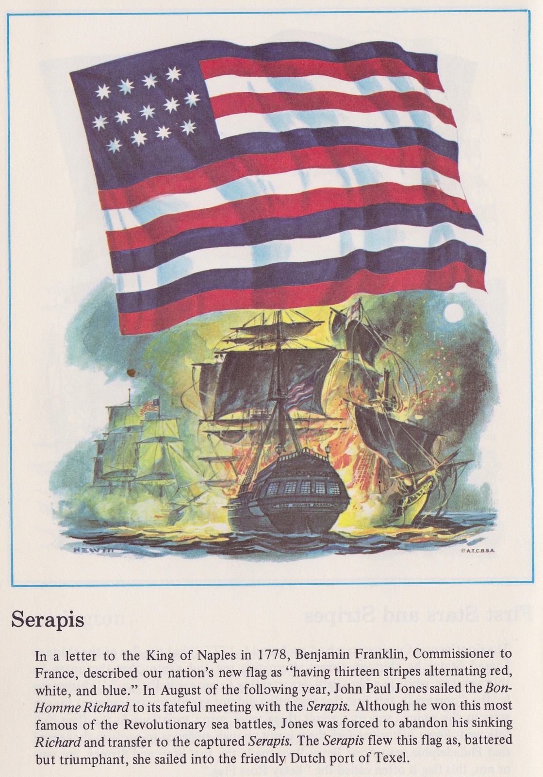
My hometown 30 years ago got suckered into buying enough Serapis flags to cover the Main Street, even though the town had zero connection to it.
The problem was that the flags were too easy to jump up and snatch as the poles holding them would break if you sneezed at them.
They didn’t even last a summer.
Dr. Paul Lukas’ Fun With Flags
:)
Solid Reference!
I have to say–the very minor changes to the Phil’s uniforms make such a huge difference. They look so much better!
Flag illustrator was likely – Donald Charles Hewitt
“His post-war illustration career was devoted to a few advertising clients, such as The Boy Scouts of America. He also created a permanent display of his paintings at Flag Plaza of Pittsburgh, PA. He remained an active member of the New York Society of Illustrators for the rest of his life.
Don Hewitt died in Flemington, NJ, at age ninety-four on December 11, 1998.”
(more at: link)
Good work — thanks!
Roy Lichtenstein basically lifted images from comic books, and passed them off as his own. The swiping of is often blatant, right down to the text. link
Many of the artists he copied from are bitter about it. link
“Here’s some beautiful black-and-white footage of the Cubs wearing their vest jerseys during spring training in 1940.”
I don’t think I see any vests in that clip?
Look more closely. They’re wearing white vests over a white base layer!
I do see Wrigley Field, so I doubt it’s spring training. Since the vests were new for the 1940 season, they probably didn’t appear during 1940’s spring training. The returning Cubs and their prospects would have worn 39’s uniforms during 1940’s spring training.
Those jerseys from that year have a particular variety of the Shepard font that I think was the inspiration for what the Bears have always worn. Look at number 12 in the very last seconds of the video.
(And the backs of jerseys are, in general, really under-researched compared to the fronts!)
Creamer has a possible Jets leak: link
Green/green/white looks pretty good to me
It’s been all over the internet over the past few hours. Quick notes:
1) I have tried to confirm whether the leak is legit and have so far been unable to do so. Could be real, might not be real.
2) I see several things that make me question its legitimacy, although there are potential explanations for them.
3) Some of the players are wearing Under Armour gear. That is *not* a reason to question the leak’s legitimacy. UA is an approved on-field brand and previous unveilings have featured players wearing UA.
We’ll all find out soon enough. The unveiling is tomorrow night.
Wasn’t there a team a few years ago that did a ‘fake’ leak thing, on purpose?
Lee
I recall the Titans’ “Nice Try” teaser image:
link
Without opining as to whether it’s legit, this is more of a throwback to the Kotite era than anything else. Overall it passes the football uniform/clown suit test, but BFBS is inexcusable in 2019. A definite downgrade, but not a start-rooting-for-the-Giants downgrade.
“I would strongly prefer that we not discuss unverified leaks of dubious legitimacy here on the site. Once we have a confirmed design — either via a verified leak or an official unveiling — there’ll be plenty of time to discuss it.”
From Paul on Jan. 25th
Mea culpa.
If this is legit, it’s not awful, but hate the BLACK trim and face masks. Would have been cleaner with white face masks and no black trim. Oh well.
The helmet logo can’t be legit, because even a 6th grade Pop Warner team can do better than that.
Then again, a horse designed by committee comes out a camel. We did a design competition for a place that I was working at and provided over a dozen different designs; the one that every graphic designer I consulted said was the worst, won.
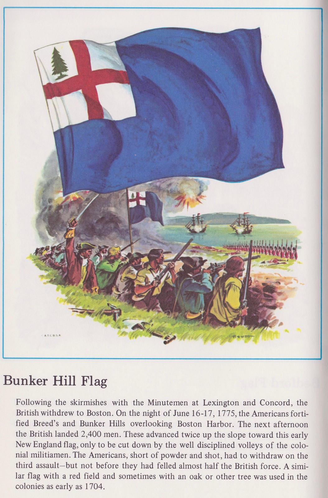
Great lede with the flags! Happy to report that at least one of the better historical ones is still in use. I live in the Charlestown neighborhood of Boston (where Bunker Hill is located) and can confirm that MANY houses have the Bunker Hill flag pictured here hanging above their door. Living history!
Yes, let’s honor the Kotite era. Yikes. More leotard effect. I really hope that’s a mock up and not the real thing. That logo on the helmet it bo-ring. How about, you know, the inclusion of a jet plane somewhere! Liking the lighter green, though.
Regardless, we’ll see tomorrow night.
File under soccer:
Philadelphia Union striker David Accam changed his name on the jersey to his nickname, Titi, after the death of his father last week.
This was in Monday’s Ticker.
That Notre Dame collection is amazing — probably worthy of its own entry.
Not going to lie, I thought the lede was going to be a segue to the MLB Flag caps released yesterday.
Sorry, the NFL hats.
Doesn’t matter. They’re ugly $40 hats.
You saw that we already covered that two days ago, right?
link
Paul,
You use the term “frozen in amber”. Is that a reference to one of my favorite shows, Fringe?
No, it’s just a reference to things being frozen in amber:
link
Ah, very good. I knew I had heard it elsewhere, just couldn’t remember where. Jurassic Park….duh.
Hey Paul, this is Jeff Snedden from Aliquippa, PA. I sent you the flag booklet along with several other items a few months back as a thanks for the Orioles cap I won in your raffle/giveaway. I thought you’d enjoy some of the more obscure flags, and I was right. The illustrations were done by famed artist Don Hewitt in conjunction with the Boy Scouts of America. For a long time, there were large prints of his work at the Flag Plaza in Pittsburgh, not sure if they are still there today. Mr. Hewitt passed away in 1998.
Regards, Jeff
Awesome. Thanks, Jeff, and my apologies for not remembering who sent me what!
Thank you for sharing the book. I really like the Serapis color set.
An additional followup on the flags and the Boy Scouts of America. For several of the BSA National Jamborees, each subcamp was designated with a particular one of the historical flags, including many of the ones shown here (though not the “Viking Banner”). The flags were used in 1981, 1985, 1993, and 1997, and patches were made of the flags in all those years except 1985. I’ve got some of the 1993 and 1997 patches illustrated on a web page at link
In 1981 the patches just had the name of the flag (not the region or subcamp number), and in 1985 they only issued pins. Searching eBay will show a number of these patches.