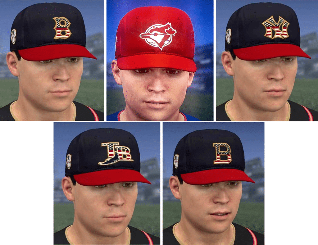
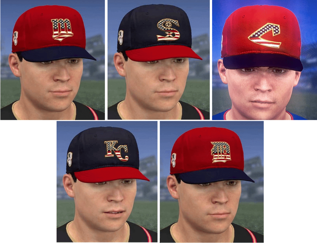
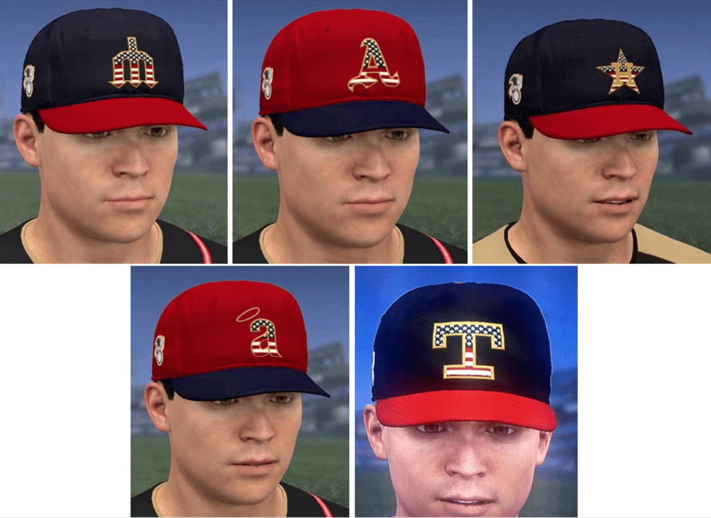
I was going to wait on this, because I’m pretty sure the official unveiling is going to be this week, but there are now so many video game leaks floating around of this year’s MLB flag-desecration caps — the ones that will be worn on Independence Day — that they can’t be ignored any longer. So we’re going to take a look at them today, whee!
Here are the basics:
• Except for the Blue Jays, whose cap is solid-red for Canada Day, all of the caps are either red with blue brims or vicey-versey. As usual, this means that certain teams, most notably the Rockies and A’s, look ridiculous.
• When possible, they’ve gone with throwback logos instead of current logos. (Some teams, of course, like the Mets and Rockies, have had only one cap logo throughout their history, so a throwback mark wasn’t possible for them.)
• Thankfully, there doesn’t appear to be any sort of sublimated waving-flag pattern in the fabric.
• No indication of what, if anything, is on the underbrim. Here’s hoping they don’t create fake history again like they tried to do last year. (They ended up changing the underbrims after I pointed out their error.)
Okay, with all of that in mind, let’s take a division-by-division look (for all division groupings, you can click to enlarge):
National League East
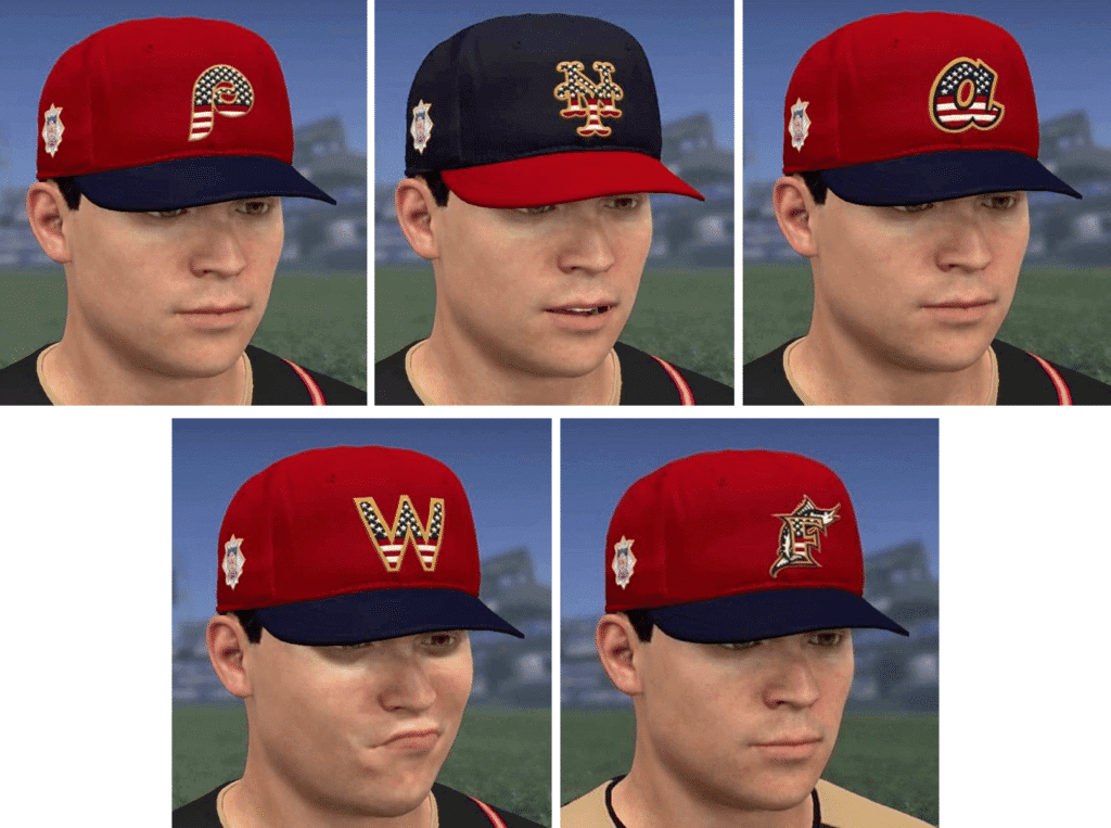
.
National League Central
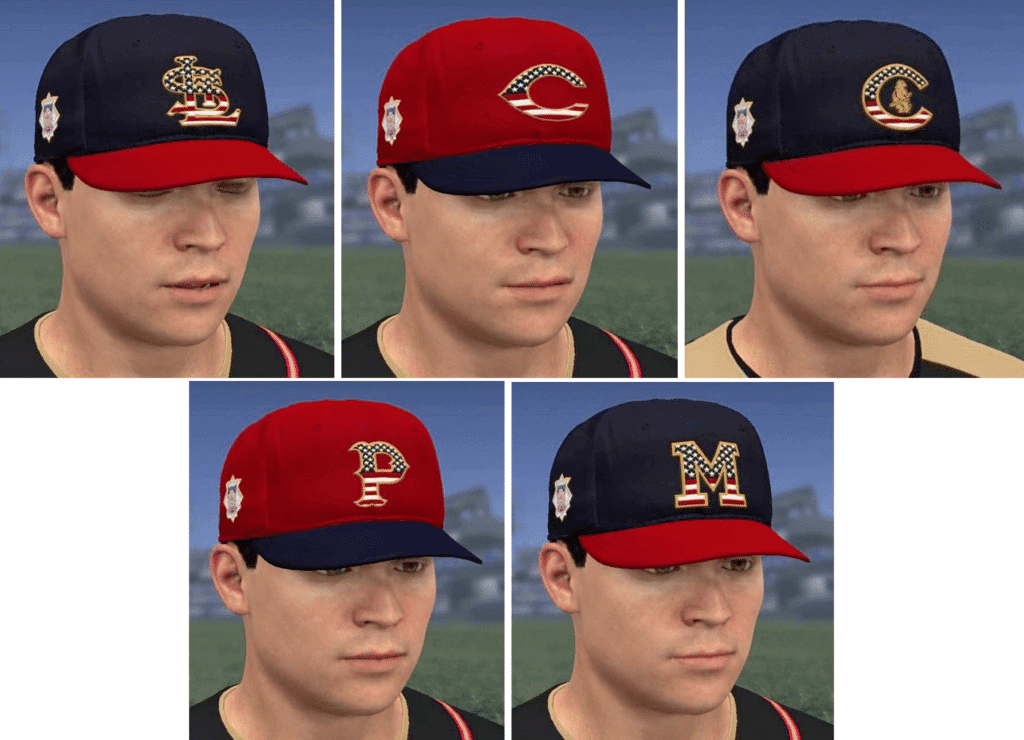
.
National League West
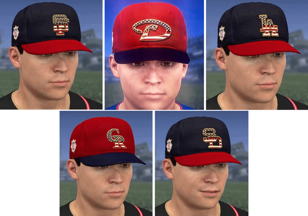
.
American League East
.
American League Central
.
American League West
———
Obviously, some of these are worse than others. But I’m not inclined to rank them or to single out any particular designs, because the designs are largely irrelevant. It’s a rah-rah pandering project, a merch-dump project, not a design project, and these caps have nothing to do with the teams’ own visual programs (if they did, they wouldn’t make the Rockies and A’s wear these colors). If MLB isn’t in it for the aesthetics, why should we assess them on an aesthetic basis?
It’s always nice to see throwback logos, of course. It would be even nicer to see them without the stars/stripes nonsense.
(My thanks to Edwin Brandt and @TheHeelHawks for their video game screen shots.)
Click to enlarge
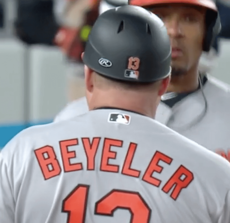
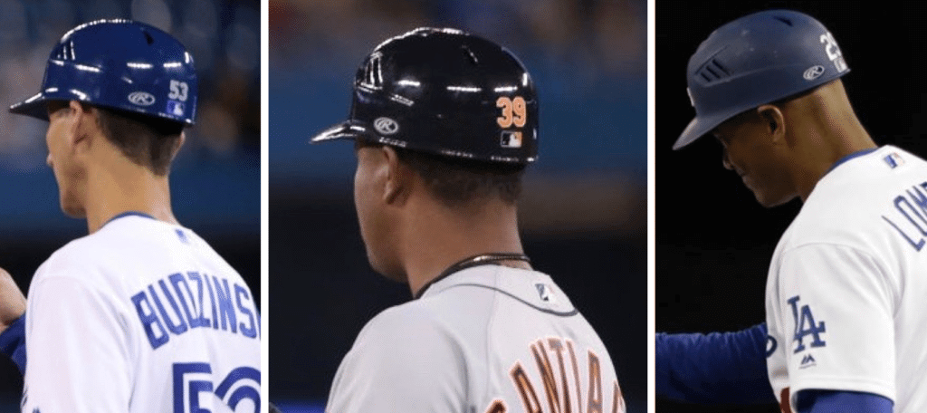
Logo creep creeps a little bit further into view: While watching the latter part of yesterday’s Orioles/Yanks game, I noticed that O’s first base coach Arnie Beyeler had a Rawlings maker’s mark on his flapless coaching helmet (see above). That, I figured, was a no-no — although Rawlings makes the vast majority of MLB headwear, the company has never had permission for on-field helmet logos. So I made a mental note to get a screen shot from the game video, which I did later yesterday evening.
But when I tweeted that screen shot, two of my followers — Eric Abneri and Ciaran Boyle — said they’d noticed other base coaches wearing the Rawlings logo during the past few days. So I did some quick photo research, and it turns out they were right. This is now a thing (click to enlarge):
I found several additional examples, but they were very low-res, so I’m not going to post them here. Trust me, though, it appears to be pretty universal with the base coaches’ helmets.
I emailed Rawlings exec Mike Thompson last night to ask him about this. Woke up this morning to find his response: “Wow, you don’t miss anything. Yes, new for 2019 thru 2028, per our new contract. We do not have rights to [logos] on batter’s helmets at this time.” I may talk to him on the phone today to get a bit more info.
Naturally, I’m disappointed by the further spread of logo creep, but at least it’s just for the coaches.
As an aside: I was trying to remember when they started making the base coaches wear helmets. I couldn’t recall off the top of my head, so I looked it up. Answer: 2008! Dang, time flies.
Click to enlarge
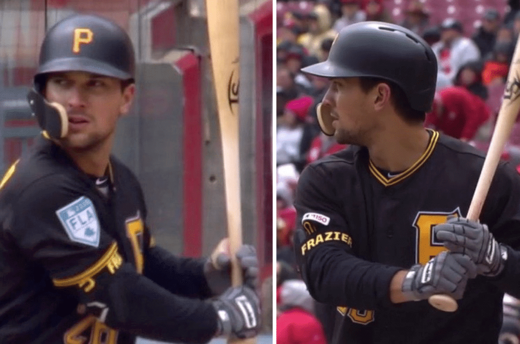
Down goes Frazier! (into the clubhouse to change his jersey): Pirates second baseman Adam Frazier led off yesterday’s game against the Reds in Cincinnati wearing his spring training jersey, complete with the “FLA” sleeve patch (above left). I believe that’s our first uni snafu of the season, right?
Anyway, someone must have noticed — aside from the many Uni Watch readers who called it out, that is — because by the second inning Frazier had switched to his proper game jersey (above right).
Afterward, Frazier himself had a little fun with the situation, suggesting that the Florida jersey was his way of trying to channel some warmth on a cold day.
(My thanks to the very large number of readers who alerted us to this one.)
Click to enlarge
Some stuff you might have missed: Here are two noteworthy items you might have missed over the weekend:
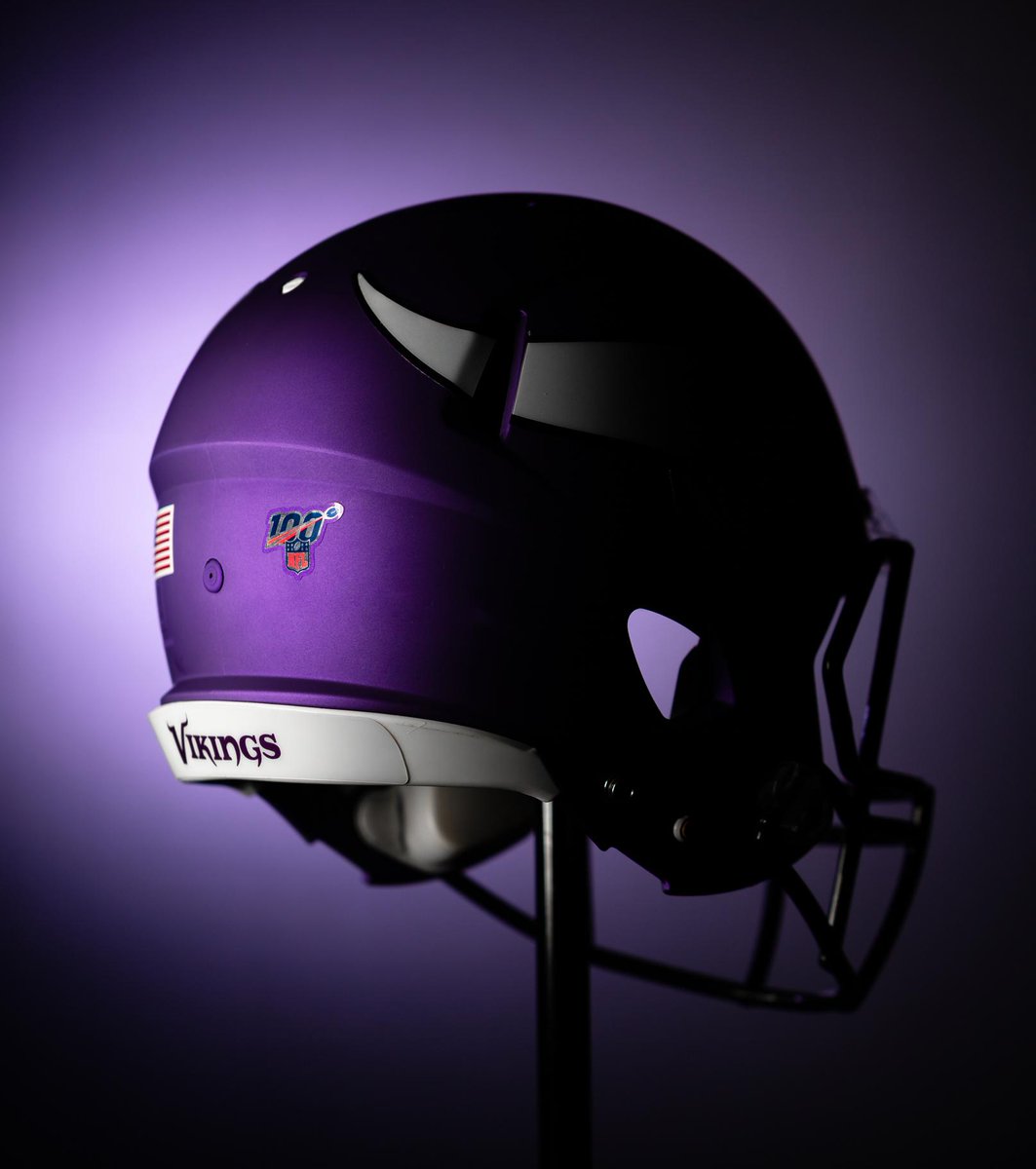
• We learned a couple of weeks ago that NFL teams would be wearing the league’s centennial logo on jersey collars. At the time, I wrote, “I wonder if they’ll also use the centennial mark in place of the NFL logo patch on the pants and the NFL logo decal on the helmets. Probably yes, right?” As you can see above, the helmet decal part of that question has now been answered in the affirmative.
• United Airlines was facing a lot of blowback about their naming rights deal with the L.A. Coliseum, so now they’ve offered to back out of the deal — a rare instance of the ratchet possibly turning back the other way.
A reminder about today’s date: Today is April Fool’s Day, which means we can expect to see lots of playful uni absurdity floating around. At least three pranks have already been launched:
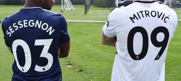
• The Premier League team Fulham has announced that all players will wear double-digit uni numbers.
“One of the Club’s core values is to be pioneers in everything we do,” reads the team’s press release. “And, after much deliberation and consultation, it was agreed that adding a zero to precede every squad number from 1-9 would adhere to and promote that pioneering spirit.”
As uni-related April Fool pranks go, I’d say this one is very good. The concept sounds almost plausible, and the press release is just barely silly enough to give it away. Well done!
• The British theology publisher SCM Press (the “SCM” stands for Student Christian Movement) announced a major sponsorship advertising deal. From the press release:
United Kingdom United, the new international football squad launched in a bid to restore a lost sense of national pride across the whole UK, announced the competition to find a sponsor last year. The deal, said to be worth around £300m, will see the SCM Press logo emblazoned on the team kit, and the Olympic Stadium in Stratford will be renamed the SCM Press Stadium. The club will now be known as SCM Press United Kingdom United.
[…]
Expecting a backlash for participating in a rival national squad, and sensing a further opportunity to drum up interest in academic theology amongst football fans, SCM Press have confirmed that they will be renaming players after Early Church Fathers to protect their identity. Players have already been instructed to mention SCM Press backlist titles at every opportunity during interviews.
This one feels a bit more heavy-handed and obvious. Pfeh.
• Our friend Chris Creamer at SportsLogos.net is reporting that the Ottawa Senators will scrap their jersey crest and just go with stripes in 2020-21. From Chris’s article:
“The Stanley Cup banners that hang over the ice of the Canadian Tire Centre honouring our city’s championship past have no logos whatsoever,” the source told me during a trip I took to Ottawa recently. “If no logo was good enough for those eleven Cup-winning teams, surely it’s good enough for us.”
[…]
Ottawa unfortunately missed the deadline to get their “no logo” change squared away in time for the upcoming 2019/20 season, the deadline for such changes passed several months ago; but as we sit here on April 1st everything is now approved and finalized, giving the team more than enough lead to have everything ready and set for 2020-21.
Good concept. Maybe a little too generous by repeating today’s date at the end.
Anyway: If you hear some hot uni news today, remember to check the calendar and maintain a healthy skepticism before you breathlessly repeat it or retweet it. (And in case you’re wondering, no, none of today’s Uni Watch content is a prank. All 100% legit, seriously.)
ITEM! Should we do another round of socks? It took a little over a week to sell through all 100 pairs of Uni Watch socks that I’d ordered — amazing! The pair shown above was the very last one, which I shipped out on Saturday.
I’ll happily do another round of socks if there’s enough demand. If you missed out on this batch and want to get a pair of socks, and if you’d be willing to pre-order ($13.00 plus $3 shipping), shoot me a note. If enough people want in, I’ll follow up with in on how to pre-order. Thanks.

ITEM! Yet another one-day raffle: Reader Jason Hillyer has very generously purchased a membership for a lucky reader, which we’re going to raffle off today. To enter, send an email to the raffle address by 10pm Eastern tonight. I’ll announce the winner tomorrow.
Speaking of raffles, the winner of the one-day raffle for the tequila sunrise T-shirt is Alan Dotson. Congrats to him, and big thanks to reader Max Weintraub for donating the shirt purchase.
The Ticker
By Jamie Rathjen

Baseball News: Cubs P Randy Rosario, who was sitting in the bullpen, caught a home run using his hat yesterday (from Mike Chamernik). … Also from Mike: The Rays’ new ceiling lights turn team colors after wins. … Readers Justo Gutierrez and Tom Fail tell us that Phillies OF Bryce Harper apparently colored in, or peeled off, some of his personal logo on his arm sleeve, so the “3” is visible but the “4” isn’t. … Even weirder, Harper has been wearing a belt with a standard “34” on it. That’s not his stylized personal logo, where the “34” doubles as a “BH” — it’s just a basic block font. Why would he still be wearing that? (From Adam Vaughn.) … Reds RF Yasiel Puig wore a white belt yesterday, and could also be seen wearing a numbered belt on Saturday before that game was postponed (from Joanna Zweip). … This article on Blue Jays manager Charlie Montoyo separates the sections with illustrations of little pieces of luggage representing all the stops in Montoyo’s career with flags and team logos (from Ewan Williams). … UNC-Wilmington wore non-camouflage “military appreciation” jerseys. … Mumford and Sons lead singer Marcus Mumford threw out the first pitch in Milwaukee yesterday wearing a No. 19 jersey — a number that’s been retired for Robin Yount (from Brian Temke).

Football News: Reader Graeme Peacock sent us video of a summer 1984 USFL exhibition at the first Wembley Stadium between the Philadelphia Stars and the Tampa Bay Bandits. … The CFL revealed the logo for this year’s Touchdown Atlantic game, to be played in Moncton, N.B. (from Wade Heidt). … Packers FB John Kuhn was missing the “G” logo on the left side of his helmet after celebrating with WR Jordy Nelson after Nelson’s touchdown vs. the Steelers in Super Bowl XLV (from Kurt Rozek).

Hockey News: The AHL’s Rockford IceHogs wore Harry Potter-themed jerseys (from @MyBees). … The WHL’s Lethbridge Hurricanes have played at least one playoff game at the very small arena (even by junior standards) at the University of Lethbridge, because their usual arena is hosting the men’s curling world championship (from Wade Heidt).

Basketball News: We’ve had this collection of Bucks gameday posters in the Ticker before, but it’s now been updated for March (from Jeff Ash). … Duke F Zion Williamson’s NOB was ever so slightly cut off by the borders on their white alternates (from Chris Perrenot). … Louisville women’s G Dana Evans memorializes her cousin on her shoes (from Griffin Smith).

Soccer News: Philadelphia Union winger David Accam changed his NOB to “Titi” starting this weekend. His father, who passed away recently, shared that nickname with him (from Wade Heidt). … Expanding on an item in yesterday’s Ticker, many men’s and women’s teams in England wore warm-up shirts for the 25th-anniversary season of the anti-racism charity Kick It Out, as well as captains’ armbands with the charity’s logo. … Yesterday’s Old Firm derby in Scotland between Celtic and Rangers was fairly eventful, to say the least, and ended with Celtic right-back Mikael Lustig somehow having his shirt torn nearly in half after a postgame melee. … The NWSL has a new number font for this season, but it’s really just one that Nike uses or has used for some of its national teams. … MLS’s FIFA esports league has a new trophy for its cup competition (from Ian Gerig).

Grab Bag: New shirts for English cricket club Somerset’s One Day International and Twenty20 teams (from Alex Evans). … A photo of women’s Australian rules football player Tayla Harris, which I had in the Ticker two weeks ago for her club Carlton’s pride guernseys, ended up becoming controversial and is now, in silhouette form, one of the logos for AFL Women’s. … Also posted in soccer: MLS’s FIFA esports league has a new trophy for its cup competition (from Ian Gerig).
Setting aside all the problems I have with the whole stars-and-stripes thing – and I’ve got more problems with it than Clint Eastwood had with his neighbors in “Gran Torino” – this year’s caps appear to use a more attractive than usual style of stars-and-stripes patterning. With the same pattern applied to so many varied logos, each with its own complex shapes and in many cases curves, the complex and curvy stars-and-stripes patterns that MLB has used over the last decade-plus have been way too busy. The more straightforward, linear stars-and-stripes pattern on the 2019 caps work better, and make the cap logos more distinctive and visible in their shapes.
And the contrasting crowns and bills are a nice touch. As are, in most cases, the throwback logos. If you’d told me these caps were being prepared for the Semiquincentennial weekend in July 2026, I’d have given two big thumbs up. But the Astros get the placement of the stars-and-stripes wrong, and the Brewers use the wrong M logo, and a small handful of the throwback logos are just plain wrong, seemingly drawn from faulty Cooperstown Collection graphics rather than from actual historical on-field caps.
The Brewers ‘M’ is brutal
looks too much like the style used in ann arbor
I love it! It’s the original “M” used for the Milwaukee Braves and for the first year as the Brewers in ‘72.
I Second the Motion on your thoughts of the old M !!
No, it’s not the original M. It’s a recent Cooperstown Collection facsimile that gets the shape, the depth of the center stems, and thickness wrong. It looks much more like the Michigan M than the real historical Brewers M. Which was the same as the older Braves M. I’m all for the Brewers wearing the old Milwaukee M. I’m not a fan of the Brewers wearing a Michigan M like these stars-and-stripes caps.
Are you kidding? Not the same & Brewers first season was in 1970
@RS Rogers Right on. Take a bow.
You just wanted to say “Semiquincentennial”
And who could blame him?
How perspicacious of you!
Sorry, those stars-and-stripes caps are just plain stupid and a money grab by MLB.
If MLB wants to honor veterans, let each club donate the gate receipts from their games on Memorial Day and the 4th of July to VA hospitals in their area.
I don’t remember the M on the Brewers cap being that thick back in the 70’s.
You don’t remember that, because it wasn’t. Also, the middle of the M didn’t descend that far down. This M is a monstrosity, and it’s wrong in exactly the same ways that recent Cooperstown Collection versions of the M have been. The original M was a simple block letter that was used by two teams for a quarter-century; it’s well documented with photographs, video, baseball cards, memorabilia, and plentiful surviving artifacts. It’s inexplicable, and inexcusable, that MLB would foist what appears to be a late-1990s fauxback version of the logo on us, and also that the Brewers would permit such an important part of their history to be so badly misrepresented by the league. Shame on everyone who saw this design and didn’t demand a correction. Permitting the team’s cap logo to be so incorrectly rendered would be a firing offense if I ran a team. A baseball team has fundamentally so little intellectual property at the heart of its brand that current and historical cap logos are sacred. You don’t get the wrong, and you don’t settle for almost.
Logo creep question…at what point are equipment logos grandfathered from the logo creep Reign of Terror and purity tests? Should a bat not have Louisville Slugger logo burned into the shaft? This 1950s Cubs uniform is resplendent, stirrups and everything, but the Wilson logo is front and center on what would be considered a vital piece of baseball equipment. And it has been for 70+ years. I’d dare say, other than team loyalty and individual sartorial taste, this is a prime example of a classic baseball uniform that Uniwatchers marvel over. Yet, by contemporary dogma, it’s logo creep.
link
Shouldn’t the logo creep concern be whether a manufacturer eclipses the team identity (of which you have correctly questioned many past examples) rather than some alarmist disdain for mere inclusion of a small Rawlings logo?
Both your premise and your conclusion are flawed.
In fact, I have never applied a “purity test” to maker’s marks on equipment. Only on team uniform elements. So by “contemporary dogma,” the photo you linked to would be (and indeed is) fine.
A team helmet is a uniform element. And I don’t think I engaged in any “alarmist disdain.” My harshest term was “disappointed.” And it *is* disappointing, at least to me, to see additional logos cluttering up team uni elements. The issue is not whether these logos “eclipse” the team identity; the issue is the slow but steady accretion of visible logos — hence the term logo creep.
Perhaps you’d like to walk back your commentary just a bit?
“Slow but steady accretion” is a great phrase…and it, like my commentary, apply to the evolution (or at least my perception thereof) of your logo creep chronicles and feelings through the years, not today’s Rawlings topic. As a daily reader (and sadly merely a content consumer, and never a content contributor, my apologies) since the original ESPN days, the logo creep judgement seems to have become more intolerant and rigid. Even your immediate defense that my thinking is flawed and suggestion of walking back commentary suggests an unwillingness towards open discussion…even just a friendly debate on the spectrum of creep in general. I merely posed a question, and while you did give a clear nuanced answer, you sandwiched it between personal attack and the suggestion of retraction for how dare I question your definitions. That leans towards a bit towards zealotry.
But, I confess, your curmudgeonly zealotry has always made Uniwatch so much fun over the years. Here’s to more days in the future. Cheers.
Even your immediate defense that my thinking is flawed and suggestion of walking back commentary suggests an unwillingness towards open discussion…
I’m sorry, but this is nonsense. You began by badly mischaracterizing my position. When I pointed that out, you’ve now mischaracterized that as a “personal attack.”
Again, the harshest language in today’s post was “disappointed.” Go back and read it yourself! Now let’s contrast that with some of *your* language, all of which you directed at me:
– “Reign of Terror”
– “purity tests”
– “dogma”
– “alarmist disdain”
– “intolerant and rigid”
– “curmudgeonly zealotry”
I’ll leave it to others to assess which one of us is using inflammatory, provocative language.
This whole discussion is ridiculous — a straw man debate at best, trolling at worst. Let’s please move on. Thanks.
Ugh, those hats are brutal looking. Maybe it’s just an error from the video game, but the stripe immediately beneath the field of stars is supposed to be white, not red.
It’s really funny to listen to USC and United excecs try to defend the naming rights deal. Oh, we meant no disrespect. How ’bout we call it “United Field at LA Memorial Coliseum,” because that’s OBVIOUSLY completely different… We kept Memorial in the name because we love the vets and think heritage and history are very important. That’s also why we are planning to put a giant neon corporate logo on a war memorial.
OK, but the deal giving the management of the Coliseum is several years old, right? And the city would have agreed back then that naming rights could be a part of the funding mechanism.
It dates back to 2015, in some form:
link
So, either someone is complaining long after the horse has left the barn – or the city should pay for the renovations instead of leaving it up to someone else.
DING! DING! DING!
I really liked last year’s Stars and Stripes caps and bought a Mets version after they were on sale. It’s been my go-to cap for a while. This year’s caps are really nice, but the Mets version is different enough to consider getting another. The Mets, of course, don’t have a throwback cap deisng since they’ve worn pretty much the same one since 1962.
I do like some of the others — especially the Braves with the Aaron-era A.
Meant to say: This year’s caps are really nice, but the Mets version is NOT different enough to consider getting another.
The CGI player wearing the Stars and Stripes Nats cap reacts for all of us.
I loved that screen shot! Perfect facial expression.
Name change for Battle Creek bombers.
That USFL game from Wembley was a “postseason exhibition” one week AFTER Philadelphia had just won the USFL title. That is funny/crazy… although I guess the NFL Pro-Bowl concept isn’t that much different.
I remember watching that game. If I recall it was unlike the Pro Bowl because I don’t recall them going through the motions. They even had a little fun with it. One of the teams handed off to a pulling lineman who gained a good deal of yardage.
Uni note: the Bandits wore Union Jack patches on their jerseys.
The Bandits wore the Union Jack on the left shoulder…all except Running back Ricky Williams (no, not that Ricky), who had his on his right rear shoulder.
Some players on both the Bandits and Stars were missing nameplates (didn’t watch the entire game but I noticed their absence on TB #45 and PHL#71).
I find it somewhat ironic that batting helmets are barred from having a maker’s mark on them since I believe American Baseball Cap (which was bought out by Rawlings 10 or 15 years ago) was one of the pioneers of “logo creep”. They started putting their logo on the back of helmets in the early to mid 80s IIRC. Rawlings also was allowed to put their “R” logo on batting helmets during their earlier venture as a helmet supplier in the 1980s. Rawlings has not been allowed to put their logo on batting helmets (aside from coaches helmets) since buying out ABC.
As a kid I always wondered what the logo for ABC, each letter with its own helmet, stood for.
It’s good to see the throwback Yankees logo get some love. Too bad it’s on a gross, overtly pandering piece of jingoistic merchandise.
Re: CFL Touchdown Atlantic game. First neutral-site regular season Touchdown Atlantic game in Maritimes since 2013.
We are hoping it is the last Touchdown Atlantic, and that’s a good thing. If all goes right, there will be regular games there soon enough. The conditional expansion Atlantic Schooners would play 2020 season at least in Moncton before moving to the newly completed stadium in Halifax, NS for 2021 or later.
Yes, yes, yes.
The Maritimes should have been in the CFL long ago!
The Schooners would make it truly a Canadian football league from coast to coast, and sea to shining sea!
I’ve always thought that at the very least a team representing the Atlantic provinces could be ‘shared’ among the maritime provinces & play their games in 2,3, or 4 of the largest cities in those provinces, or ones with good university stadiums (keeping in mind that the Als play at McGill)
Redblacks vs. SChooners in 2020? I’ll be there!
Not a done deal yet. I have my fingers crossed. Steps are moving forward but work still to be done.
Recent update on the stadium proposal in metro Halifax. Looking to seat about 24,000 for CFL games (would need the potential to expand with temporary seats for a Grey Cup):
link
Temporary home in Moncton seats about 21,000 with the additional temporary seating.
Would be great potential to move training camps all around the Maritimes to generate regional interest.
Bears link was pretty good.
Probably would have been better if they had waited to post the reveal video until tomorrow, though.
’bout time the Ottawa Senators ditched that silly centurion logo. The 2nd version was an improvement over the first, for what tha’s worth. Never liked the whole roman name/logo thing but kept a large logo on all my trucks for 15 yrs+….
The heritage “O” jersey is way better, but ya get teased that the “O” stands for “zero” and not Ottawa…
and the stripes kinda remind me of prison garb, which is appropriate for the way the team is run…
Interesting that the Tigers’ Stars and Stripes cap utilizes the old chest logo, which has been retired from the chest for several years, and from the cap for…many more.
The CLE hat, with the Stars and Stripes on a C that “captures” a stylized version of Native Peoples’ iconography, is a mess. But I imagine they’ve done worse with Wahoo in the past.
Should have used the block C if going to do at all, though it’s all bullshit, but especially bullshit in the overtly PR way in which MLB eliminated Wahoo while remaining ignorant or indifferent to the parts of our nation’s past and present we choose to ignore.
Interesting take on the Indians PR presentation of the kinder less hate-y logo.
Here is what the editorial cartoonist Jeff Darcy has to say about the Wahoo/Frank Robinson deal. It is a pretty honest and thoughtful story about one who had been drawing Wahoo for over thirty years, and evolved.
link
I am curious as to the video game source. (Maybe the source was omitted as to not appear as an endorsement, which is fine.) I usually play MLB The Show on PlayStation consoles and I wondered if they came from that game.
One image – Four different Shoe/Socks/Pants treatments:
Dee Gordon did a better job with his stirrups/sanitaries yesterday. 2 others on the field (Tim Beckham and Mallex Smith) sported full blue sox, with white/yellow stripes at the top and the S logo on them. Domingo Santana shows the non-bloused option. Don’t know why Smith couldn’t sport royal Blue/white shoes rather than navy. Looks a bit out of place.
link;
The Mets logo that they’re using for Stars & Stripes *is* a different, slightly chunkier version that was worn up until 1990 (not sure exactly when).
It’s the same logo used here in New Era’s Cooperstown Collection: link
Sadly this is not an April Fool’s Day joke.
Not a fan of this Stars and Stripes money grab BUT the White Sox cap does remind me of their 1917 jersey. Not a bad look.
I’m watching the Indians on TV and it looks like the Frank Robinson patch is persisting. Meanwhile, I thought it was only gonna be a thing for Opening Day.
Today is their home opener. They haven’t worn it prior to today, nor will they wear it after today.
We have another uni-related April Fool: The Bears announced they would start issuing three-digit jersey numbers.
link
Whoops, forgot to check earlier comments
Braves are finally wearing the right stripe pattern on their socks.
There are 6 teams with a scheduled day off on July 4, the Mets being one of them. I hope they are not forced to wear them at any other time. Or that makeup game gets scheduled that day.