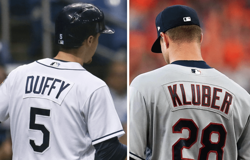
Back in October, I wrote a Ticker item that said, “Chief Wahoo isn’t the only thing the Indians are leaving behind next season. A little birdie tells me they’re going to stop using nameplates and switch to direct-sewn NOB lettering. Ditto for the Rays.”
I had forgotten about that until yesterday, when a series of tips brought the subject back onto my radar. I checked with the two teams’ respective spokesmen, who confirmed to me that both clubs are indeed going direct-sewn in 2019. Done and done.
Here’s why that’s big news: Cleveland and Tampa were MLB’s last two nameplated holdouts, so their switch to direct-sewn lettering means there will be no nameplates on MLB diamonds this season — all NOBs will be direct-sewn (well, except maybe for throwbacks or something like that). Or to put it another way, this part of the uniform will now be uniform.
According to Bill Henderson’s jersey guide, the Indians have been using nameplates since 1986. But we got a sneak peek at their new look last September, when they played a series in Toronto and got new road jerseys that didn’t have the Chief Wahoo sleeve patch. Those jerseys also had direct-sewn NOBs — sort of a dry run for their new 2019 look:
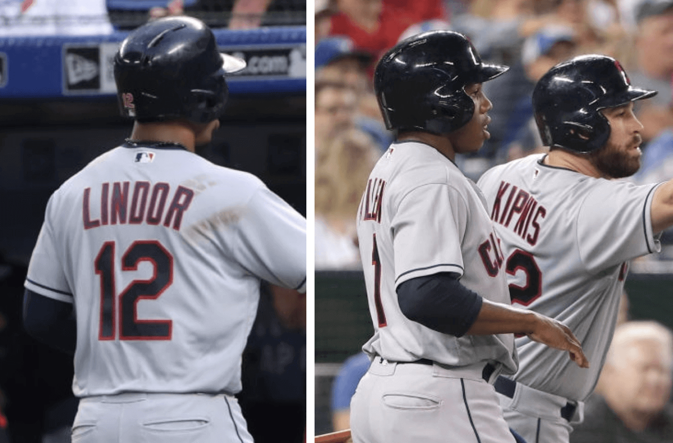
As for the Rays, Henderson’s guide indicates that they’ve used nameplates since their 1998 inception — except oddly, for the retro fauxbacks that they’ve been wearing in recent years, which have always had direct-sewn lettering. So 2019 will be their first fully ’plate-free season in franchise history.
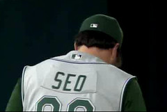
Speaking of the Rays, they once sent a player out onto the field with what is arguably the weirdest nameplate in MLB history. That was on June 28, 2006, when pitcher Jae Seo had an upside-down ’plate that curved up instead of down:
Such amusing aberrations notwithstanding, I’m not a nameplate fan (well, except maybe for cat measuring). They look okay in football, mainly because the NOBs are straight and the jerseys are stretched across the shoulder pads. But for all other sports, I much prefer the direct-sewn approach. Nameplates look clunky and they can pucker; applying the lettering directly to the jersey looks a lot cleaner. So I applaud the Indians and Rays for finally making the switch. (As an aside, the second or third Uni Watch column I ever wrote, back in 1999 for The Village Voice, was about how the Braves were better than the Mets in every respect but one: The Mets had direct-sewn NOBs while the Braves used nameplates at the time. My editor, the great Miles Seligman, came up with the perfect headline: “Those Atlanta Sew-and-Sews.”)
Meanwhile, here’s a burning question: This will be MLB’s first ’plate-free year since — when? I put that query to Bill Henderson, who did some digging and then declared that the last time no MLB teams wore nameplates was 1972! And only 10 of the 24 MLB teams even had NOBs back then — the rest were NNOB.
Bill then added the following:
The nameplate was adopted as a way to quickly reissue a jersey to another player, or to add a current player’s name to a new replacement jersey should his old one be damaged during the season —just pull it off the old one and put it on the new one. But nameplates have now outlived that purpose, because jerseys are almost never reissued today. The ease/speed of sewing a separate nameplate and then tacking it to a jersey that is being made elsewhere has ended with the massive improvements in automation and product movement.
I am told that some of the teams that didn’t use nameplates, especially the Dodgers and possibly the Royals, made the decision because they thought that plates looked cheap and made the players seem transient.
It’s funny you asked about this today, because we’ve been having a nameplate stitching discussion on my Facebook page. Some teams use a two-needle, four-thread style, while others use a one-needle, three-thread style. You can see the discussion, including photos showing the differences between the two stitching styles, here.
Now that, my friends, is a seriously geeky level of detail (which I mean as a compliment, of course). Bill is running a jersey-restoration business these days, and it’s his attention to things like nameplate stitching styles that makes his work so good.
But there will be no nameplate stitching styles of any kind in the big leagues this season, and I for one couldn’t be happier.
(My thanks to Twitter-ers @ajenkinsCLE, @DarrellDawson, and @ThaFamilyJules for their tips regarding this subject, and to Bill Henderson for sharing his knowledge and expertise.)
Click to enlarge
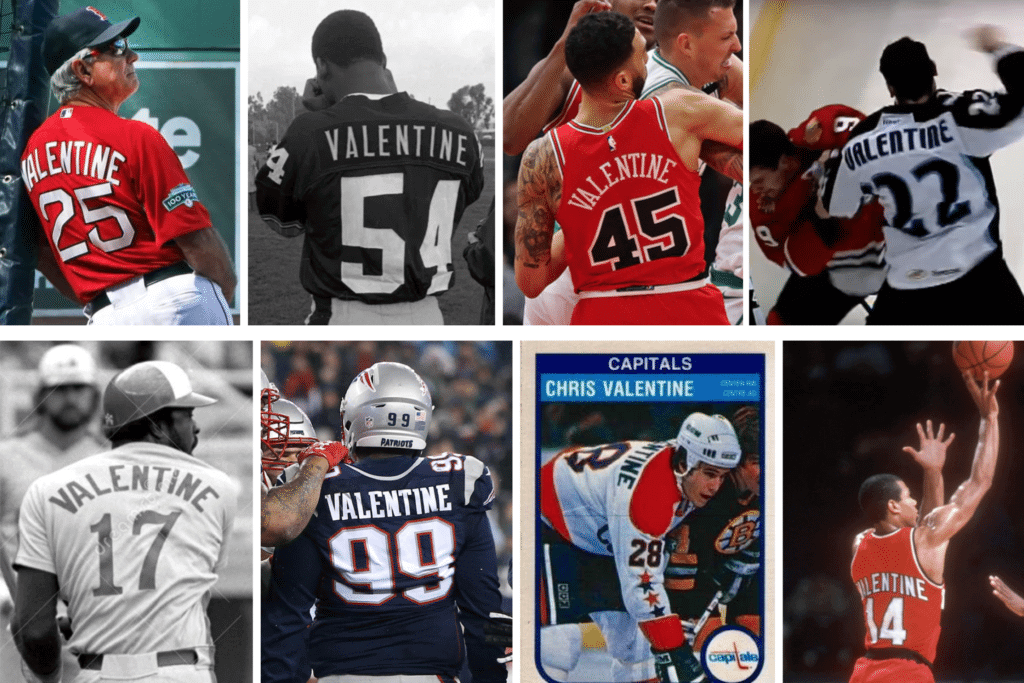
Happy Valentines’ Day: Out of all of these guys, isn’t it crazy that only one of them — Darnell Valentine of the Trail Blazers (at bottom-right) — wore No. 14?
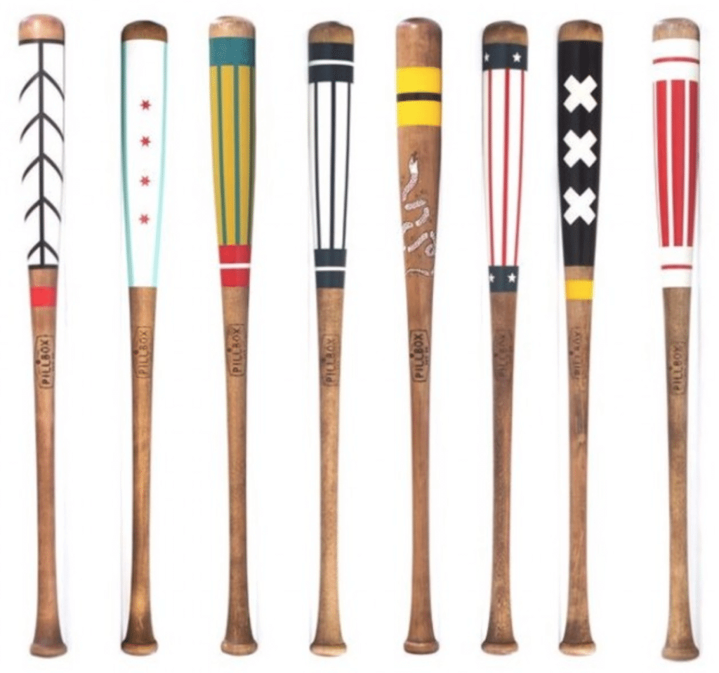

LAST CALL for this week’s raffle: In case you missed it earlier this week, the Pillbox Bat Co., which has been advertising with us for quite a while now, is now offering a free item from their website for a lucky Uni Watch reader. In addition to beautifully painted bats like the ones shown above, they also have a variety of pennants, apparel, leather goods, and more, so the winner will have a lot of options to choose from.
To enter, send an email to the raffle address by 7pm Eastern today. One entry per person. I’ll announce the winner tomorrow. Good luck!
The Ticker
By Lloyd Alaban

Baseball News: Chief Wahoo isn’t just disappearing from the Indians’ uniforms. He’s also been scrubbed from labels of Bertman’s Original Ballpark Mustard (from multiple readers). … Speaking of the Indians: Their 2019 promotional schedule features three bobbleheads and red alternate jersey giveaways (from our own Phil Hecken). … Also from Phil: … You can find a few good photos of the Marlins’ batting practice unis in this article. … Red Sox LF and 2018 World Series MVP Steve Pearce is wearing a Pat Patriot shirt in this video (from Sara, who didn’t give her last name). … Here’s something reader Thomas Juettner can’t unsee, and after reading this, you won’t be able to either: The White Sox’s spring training uniforms feature a throwback batter logo on their cap with a silver dot on the logo’s hands. But the jersey has a red dot for its hands. … The Brewers revealed some shots of their new spring training digs, with some distinctively non-current number and letter fonts (from Ed Abauer). … The Aberdeen IronBirds, Single-A affiliate of the Orioles, are letting their fans choose which cap they’re going to wear for their August 3 game (from @ColonelWill). … New logo for the DuPage Pistol Shrimp of the Prospect League (from Marky, who didn’t give his last name). … Pittsburgh sports fans were unimpressed with Three Rivers Stadium’s name when it was released back in 1970 (from Adam Prince). … New retro uniforms for Hawaii (from Max G.). … ESPN’s score feed went a bit haywire yesterday, as it placed the Orioles’ logo in multiple places and listed expansion teams that don’t exist (from Keith Miller). … Nationals P Sean Doolittle wants to have a say (WaPo link in who the Nats’ next bullpen cart driver will be (from Tom Turner).

NFL/CFL News: Browns season ticket holders will receive a pair of striped socks and gloves (from Cleo Macin). … Cross-listed from the baseball section: Red Sox LF and 2018 World Series MVP Steve Pearce is wearing a Pat Patriot shirt in this video (from Sara, who didn’t give her last name). … Here’s another photo of a Raiders player going FNOB in 1960 (from @QuirkyResearch). … Here’s a photo of what appears to be one of the New Era jerseys CFL teams will wear this season. No Adidas logo on the back, and the body of the jersey is much more perforated (from @CFLUniMonitor). … Patriots head coach Bill Belichick has renamed his boat to reflect the franchise’s latest Super Bowl victory (from our own Brinke Guthrie). … CFL QB Mike Reilly wore a team orange hat as he signed with the BC Lions. Fancy hats are nothing new to Reilly: He once wore a top hat when he received the 2017 Most Outstanding Player Award (from Wade Heidt). … Cross-listed from the baseball section: Pittsburgh sports fans were unimpressed with Three Rivers Stadium’s name when it was released in 1970 (from Adam Prince).

Hockey News: From 1937-44, minor league club Pittsburgh Hornets wore these red sweaters when they played at Duquesne Gardens. Now, the Penguins will wear them tonight for their Night of Assists charity event. The sweaters will are being auctioned off, with proceeds going to Penguins Foundation. … Wild G Devan Dubnyk is wearing green Jenpro calf wraps over his original white calf wraps on his Bauer goalie pads (from @TheGoalNet45). … Here’s a photo of the Predators’ mascot making Valentine’s Day deliveries in an old Reebok jersey instead of the current NHL Adidas jerseys (from Tyler Reeder). … The Adirondack Thunder of the ECHL will wear law enforcement-themed uniforms on Feb. 23 (from Mike Lucis). … According to Sportsnet, Former Ducks GM Brian Burke says his job interview with the club was part of the reason the Ducks dropped the word “Mighty” from its name (from @Ham_Steelhawks).

NBA News: C Enes Kanter will wear No. 00 with the Trailblazers, which makes the Blazers the latest NBA to have a zero and double-zero on the roster simultaneously (PG Damian Lillard currently wears No. 0 with the club). Those teams include the Nuggets from 2015-18 when they had PF Darrell Arthur (No. 00) and PG Emmanuel Mudiay (No. 0) and the Pacers from 2016-17 when they had PG Aaron Brooks (No. 00) and SG CJ Miles (No. 0) (from multiple readers). … Speaking of the Blazers and zeroes: Nick, who didn’t give his last name, found a glitch in the NBA2K19 that renders Lillard’s jersey with a red number instead of the usual white. … Puma and the NBA have inked a multi-year deal, allowing Puma to create officially licensed NBA merchandise (from Griffin Smith). … This basketball court has the old (and dare we say better) Clippers logo at half-court. Ironically, it’s right next to the Clippers training facility (from Jonte Robertson).

College Hoops News: New unis for Clemson men’s (from Scott M. Trembly). … This writer explains the reasons why Syracuse men’s seems to buck the trend of white at home, color on the road (from Rick DiRubbo and our own Phil Hecken). … This writer has ranked what he thinks are the best uniforms in the Big Ten (from Adam Childs and our own Phil Hecken). … South Florida faced off against in-state rival UCF last night, and the South Florida bench decided to alter the UCF logo on one of the sideline chairs by placing tape over it (from @brutebrutebrute).

Soccer News: Here is Toronto FC’s new home shirt (from Gabriel Hurl). … Speaking of Toronto FC: The Las Vegas Lights FC of the USL defeated Toronto earlier this month 5-1 in a preseason friendly. The Lights thought they would have some fun with it by commemorating their victory with a banner (from Josh Hinton). … Tottenham Hotspur of the Premier League usually wears blue shorts to match the gradient on their away colors, but yesterday they wore white shorts against Borussia Dortmund, creating a weird belt effect (from @alwayscromulent). … New shirts for the Earthquakes (from Chris Avila). … Buriram United of Thailand has released their AFC Champions League uniforms (from Ed Zelaski). … Scunthorpe United FC is asking fans to help pick the team’s new home kit (from @the_arakihcat).

Grab Bag: A sporting goods store in Colorado, whose owner stopped carrying Nike merchandise after Nike aligned itself with Colin Kaepernick, is going out of business after 20 years because of declining sales. … Here’s a visual history of Herbie, the mascot of the University of Nebraska athletics (from Brett Baker). … Interesting article (NYT link) on how SportsReference is changing the way we consume sports stats. … An Australian Indigenous All-Stars team will play a Maori All-Stars team this weekend in a rugby league match. Here are the uniforms (from Graham Clayton).
Awful photo, so don’t click to enlarge

What Paul did last night: During our latest installment of Question Time, someone asked me about my favorite podcasts, and one of the ones I mentioned was the Longform Podcast, a weekly series of really good hour-long interviews with interesting journalists. Last night they did a live event here in Brooklyn, and one of the podcast hosts, Evan Ratliff, interviewed the great Taffy Brodesser-Akner, who is generally regarded as the best celebrity-profile writer working today. (And yes, she has an odd name. Whatever.)
You may not care about celebrity culture or celebrity profiles; frankly, I don’t care about them myself, and I think the celebrity-industrial complex is actually a big problem in our culture. But Brodesser-Akner’s writing is so good, and so unusual, she makes you care. Start with her Tonya Harding piece from a year ago — you’ll see.
Onstage, Brodesser-Akner was chatty, funny, thoughtful, self-effacing, self-aware, hilarious. She was as interesting when talking about how she got her start at a soap opera magazine as she was when talking about how she spent four days on Billy Bob Thornton’s tour bus. If she ever ends up as a guest on a late-night show (which isn’t out of the question, since she writes about lots of famous people and also has a novel coming out this summer), she’ll do great — she’s a natural.
The most interesting part came at the end, when she and Ratliff had an exchange that went something like this (I’m quoting from memory, but I think this is pretty close to what they said):
Evan Ratliff: Do you ever think there are only so many ways to do a profile, only so many approaches or angles, and once you use one of them you can’t do it again, and then you’ll run out of ways to do it and you’ll be done?
Taffy Brodesser-Akner: No, I love writing about people and telling their stories, so I don’t think I’ll run out of ways to do that. But I do think about two other things. First, I spend, like, a few weeks or a month really focusing on this person I’m writing about, and it’s intense. You get inside their head, and they’re inside your head, and it’s this really intense thing — and then you finish the article and you move on. And of course you should move on, you have to move on. But that’s hard. It’s draining to be so focused on one person and then just let it go, and then to keep doing that over and over.
The other thing is that when I’m interviewing someone, they have my complete attention. I’m totally devoted to them, and so in some ways they’re getting the best part of me. And I often think that’s the part of me that my husband and my kids should be getting. And instead, I’m often distracted when I’m around them, and it should really be the other way around.
So those two things make me think about how long I want to keep doing this.
Interesting, right? I assume that the interview will be available on the Longform Podcast soon — I’ll let you know if and when that happens.
Re: Cleveland Browns season ticket gift … find it mildly interesting that the sock stripe pattern is that of the old jersey that they ditched in ’14 and not the current brutal set. Have read some rumblings of a return to the old look. Hint?
(Of the current set, I find white-over-white the least offensive look. And I actually like the big ‘CLEVELAND’ on the front …)
I noticed that too. There are a few things from the new uniforms I would take back to the classic look if I absolutely had to, the big Cleveland being one of them.
They’re branding in general lately had been classic despite the gaudy uniforms. End zone designs (script then stripes), plain midfield. Elf branding on website. Safe bet that the 2020 unis will be retro if not a complete reversion to a prior look. Would love stripes socks to return.
May it be so, Joe.
Like I said, I’d keep the ‘CLEVELAND’ on chest – its brash and ballsy.
Contrasting stitching, weird arm extendo-stripes, text on legs, orange jersey – out!
Re: the item about the New Era CFL jerseys from the Mike Reilly press conference.
Based on the recent release of the new Montreal Alouettes uniforms, we expect the New Era maker’s mark to be in the same place as the adidas one. The New Era mark is above the nameplate on the back. There was no maker’s mark on the BC Lions jersey presented to Mike Reilly at the press conference, so I’m not sure that is the authentic real deal New Era jersey.
What was notable though about that jersey? It was missing the small logo on the back below the numbers that the Lions usually wear. I hope this is a permanent change. Meaning the CFL will now be without a team wearing the “tramp stamp” for the first time since 2012.
Saskatchewan Roughriders were guilty of this from 2012-2015:
link
BC Lions have been the new guilty party since 2016:
link
Darnell Valentine also wore No. 14 at Kansas. Rock Chalk!
Further to the Mike Reilly hat ticker item, here is the top hat he wore at the CFL Awards when he won the MOP prize:
link
Fun Valentine composite! Now I wonder, did any ballplayers with the Spanish equivalent last name Valentín wear #14? I only recall José of the White Sox and Mets…I think he was #22, but with Paul Konerko and Gil Hodges, #14 would have been strictly unavailable.
John and Javier unfortunately never wore 14.
Recently, I saw a video of highlights from Chipper Jones’s career on twitter. It was jarring how awful the nameplates on his jersey and the fatter “A” on his helmet looked. It is one of those things that I can’t unsee, which is unfortunate for me as a Braves fan, because it’s always present when I watch highlights from our glory days of the ’90s.
IIRC, Paul may have played a significant role in the Braves’ decision to switch from the fatter A.
[blushes] Yes, that is true. After I spoke to the Braves during my reporting for link on MLB logo inconsistencies, they made the change just a short time later. They never explicitly told me that it was because of that ESPN piece, but it’s pretty obvious that that’s what spurred them to do it.
Interesting! I had not discovered Uni Watch yet when that happened. Props to you, Paul! That inconsistency between the A on the hat and the helmet had bothered me for years. I always felt like I was the only one who even noticed/cared.
Interesting bit about Puma and the NBA. A couple of Puma’s new soccer boots are ‘inspired by the NBA All-Star game this weekend.’ The orange sole color doesn’t seem to relate to the Hornets’ color scheme. The light blue/teal writing on the laces and the outline of a basketball court on the insoles are more obvious. It also helps that Antoine Griezmann, one of Puma’s athletes, is a big NBA fan.
link
To be fair, NBA basketballs are orange.
Haha, I didn’t even think of that!
The orange is likely to honor the Charlotte Bobcats Orange/Blue color schemes. Puma is releasing a basketball sneaker, Uproar, for the All-Star game that is Purple/Teal on one shoe while the other is Orange/Blue.
For some reason I like the look of nameplates. I think direct sewn letter look worse like a screen printed replica. To me name plates look big league. Maybe because in the past a team had a set of jerseys and when you made the team they added your name to the team set. Now it is new jerseys every time so there is no existing set for your name to be added.
First, they deprive us seeing the four-pitch intentional walk. Then they tell us we can’t call it the “DL” anymore. Now they eliminate the nameplate. What beloved baseball institution will they get rid of next? Will there be unorganized stretching in the seventh inning when we no longer have music to guide us? We’re on the slippery slope, folks.
By the way, “Brodesser-Akner” would look great on a nameplate.
“Brodesser-Akner” would look great on a nameplate.
True enough. But “Taffy” might be even better!
Call me indifferent with respect to namebars on straight or radial arches. The namebar helps to ensure alignment. (Well, except for the ridiculous Seo episode!) And a crappy direct sew looks like the tailor was drunk.
Exception there: pinstripes. What, you’re gonna align pinstripes on the namebar perfectly with the jersey, or use a solid bar to break up pinstripes? Yuck. Direct sew there.
But with vertical arches, give me the direct sew. You’re already making custom word art for the player. Might as well treat that jersey as custom for the player. Which they are when you make the big leagues.
Always struck me as the opposite: I prefer a plain nameplate on pinstripes, as it makes the lettering slightly more legible. There’s a reason we don’t print books and newspapers with vertical lines running up and down the page.
link
Though of course with pinstripes, NNOB is superior to either direct-sewn lettering or a nameplate.
Well, the sporting goods store owner has every right not to carry Nike merchandise, and he also has every right to go out of business as a result.
He actually has a lot in common with Kaepernick. Both took principled stands that ended up costing them their respective careers. Not many people would be willing to do that, so good for both of them.
Very true. Another food-for-thought point though, is why does he not protest clothing being made by children in sweatshops which his store no doubt carries?
I wonder how his nine employees (per the LA Times) feel about it?
I believe Tottenham wears the white shorts for European cup competitions, as they were playing in the UEFA Champions League yesterday.
Yep. White shorts for CL home matches. Though I agree that the look is not optimal with the blue cummerbund effect of this year’s tops.
Also, their white CL kits have the Tottenham font for the names/numbers.
All the European kits for the past few years including the Europa League versions had the team font on them instead of the proprietary EPL fonts. This includes their having worn the hideous green alts in a UCL group stage match at Wembley last fall.
Yes, that’s something they’ve always done.
When I first saw the gradient shirt, I thought it would look OK with the navy shorts but strange with the white shorts.
It’s not just home matches. White shorts are worn at away matches too.
This is from their match at Barca – link
Match at Inter – link
Wore our change kit at PSV I believe.
Jim, I’m pretty sure that the road matches at Inter and Barcelona are because they wear dark shorts at home and Spurs need to wear the change shorts to avoid a kit clash.
That was actually a home game for Tottenham yesterday. I don’t follow them closely enough to know what shorts they usually wear, but the white shirt is definitely their home color. One of their nicknames is “Lilywhites.”
Spurs only wear white shorts for European games, so Champions League or Europa League.
I kind of doubt USF put the ‘X’ on the chair out of disrespect to UCF. I’ve seen lots of teams mark the chair that the head coach uses so that no one sits in it. Most coaches rarely sit during the games but I believe they are required to have a spot on the bench.
I don’t have a nameplate preference for baseball jerseys, but for hockey jerseys I consider them part of the look and hope they never go away.
As far as the perforated BC jersey, I thought the same of the AAF jerseys this weekend… Pretty big holes compared to what we’re used to nowadays.
Except for the Packers!:
link
One of my favorite uniform quirks (which got adopted by the Astros) was the Expos use of sewn-on letters instead of nameplates, so I’m happy that they’re getting rid of them. Baseball shirts definitely look better without them.
I enjoyed the Tonya piece from Taffy. I love reading stuff from good writers, I will definitely be making my way through her archive. Thanks for sharing Paul!
She is *so* good. I absolutely could not do what she does.
Here’s some not so surprising news regarding the Nazi rally at MSG documentary that was posted here recently.
link
Cuuuuuurious.
What’s Cuuuuuurious is nobody making the connection between the focus of Anti Semitism in that film and anti-semitism by certain new members of Congress. From the political left.
And that’s enough from both of you, thank you very much.
Proofreading nit:
Missing ‘)’ on the WaPo link at the end of the Baseball section of the ticker.
Paul, have you heard any player feedback on nameplate vs direct sown lettering (or NNOB)? I’d guess with the undershirts nearly all players wear, it’s a non-issue, but I wonder if the stitching in either case is distracting or uncomfortable, or if the presence of solid piece of fabric for the nameplate has any impact (real or imagined) on how the jersey moves or feels that could affect performance.
I have never heard anything, and I’d be very surprised if any player actually cared. Of course, the nameplate does add an ounce or so to the jersey’s weight (or maybe two ounces for long-surnamed players), so I suppose you could argue there’s a veeeeeeery slight performance factor. Maybe that’s the real advantage to the Yankees’ uniforms — no NOBs, less fabric!
Ha! Now I want to see any analysis of surname length vs WAR. Maybe Salty would have been a HOF’er if not for all those letters weighing him down!
:)
I always loved how the Flyers had a “necessity is the mother of invention” moment regarding nameplates that became part of their visual identity.
link
Would be better today if the Flyers had the white nameplates with black letters on both their orange and white jerseys. More authentic nod to the old days rather than manufacturing that black nameplate with white letters for the white jersey.
There is a major junior team that has the similar “necessity is the mother of invention” moment regarding nameplates that became part of their visual identity.
WHL’s Swift Current Broncos did not have nameplates on their blue jersey in 1988-89. Was not mandatory, some road uniforms in the league did not have nameplates. They did have to add nameplates to the jerseys when they made it to the Memorial Cup. They added white nameplates on the blue jersey. As you can see from this 1989 Memorial Cup Final shot, not much room to add the nameplate:
link
When the Broncos decided to change their uniforms a few years back, they brought back the vintage blue and green look. They went with the white nameplate on the blue jerseys. Paying homage to the 1989 Memorial Cup champs:
link
I wonder how much of getting rid of nameplates has to do with getting the uniforms league wide consistent for Nike’s takeover next year?
I’d be willing to bet it has nothing to do with that. And there are plenty of other inconsistencies around MLB (belt loops, button placement, etc.).
Not everything is corporate theater.
Proofreading:
which makes the Blazers the latest NBA to have a zero and double-zero on the roster simultaneously
My high school varsity baseball coach allows us to order mesh softball tops with our names on back my senior year. No teams really had names on back in the mid 90’s so we thought we were cool. Anyway, me and another guy had very similar last names and the printer screwed up and put my name on his jersey and vice versus. We complained to our cantankerous coach so he sent them back. The printer made plates and put mine on the jersey the other guy got and his on mine.
I thought it looked pretty professional (and cool of course) since I was used to seeing MLB jerseys with plates growing up. The plate didn’t affect my performance although we only wore them for a couple games since we didn’t get them until near the end of the season. Our regular set was grey so the splash of blue and orange in the softball tops was an exciting departure.
Funny thing about Scunthorpe United. In some places the team has to be called “Sconthorpe United” due to a peculiar arrangement of letters.
Tape on the college bench chair usually signifies the head coaches seat.