
Welcome to another installment of Question Time, where you ask me stuff and I do my best to answer. Unlike last time, this installment doesn’t include a 1,000-word digression about Billy Joel. You can decide for yourself whether that’s a good thing or a bad thing.
Ready? Here we go:
In recent years, several NFL teams that used to wear striped white socks when wearing their white jerseys and colored pants have stopped doing that once they got new uniforms (e.g., Browns and Dolphins). It would not be a surprise if the Jets do that next year. Is there either a rule or unwritten custom that any NFL team that gets new uniforms cannot include white socks with stripes?
No such rule that I’m aware of. But Nike clearly doesn’t mind the dreaded leotard effect as much as some of us do (indeed, I think Nike prefers it because it accentuates the superhero/bodysuit feel of the uniform). And given that fewer and fewer players are wearing socks these days — many of them are just going with tights or leg warmers — I think the trend now is to focus on having one (colored) set of socks for all occasions. Obviously, some teams still have multiple sock designs — the Bears and Pats, e.g. — but I suspect we’ll see less and less of that as time goes on.
When you travel, you seek out the unusual sights and places off the beaten path. You often stay at older, roadside motels. While I admire your adventurous approach, are you ever grossed out by some of those motels, and aren’t you ever concerned for your health and safety, given the sketchiness of some of those hotel/motels?
Honestly, no. Are these places as clean as a four-star hotel? No, but neither is my own house (and neither, probably, is your house).
I think there are two things at work here. First, I think you’re assuming that these places are much worse than they actually are. I mean, seriously, how exactly would my health be compromised by the typical roadside motel? Most of them are just basic mom-and-pop outlets run by nice people. And second, I think you and I have very different comfort levels regarding this type of thing. And that’s fine — at the very least, it means we won’t be competing for the same room if our paths ever cross on the road. ;)
I know you mentioned Utah was one of the only parts of the country you still wanted to see. Where else in the U.S. do you want to visit?
Hawaii is the only state I haven’t been to, so I definitely want to go there.
Aside from that, I’m not sure I have specific destinations in mind. I’m usually more interested in a road trip over a broad area, not a specific locale. The Utah trip was different because there are all those national parks in the southern part of the state that I’d always wanted to see, so that was more destination-oriented.
I love traveling in America, but I’m woefully weak on foreign travel, so I’m thinking it may be time to finally do more of that.
As a Bengals fan I’ve always been disappointed in the uniforms. The helmet is so good but the jerseys are so bad. How do the Bengals fix their unis into something more respectable while honoring their past?
Good question. I think it’s time we finally had a Bengals-redesign contest. Stay tuned.
In the NFL, monochromatic uniforms are not so common and are often disliked by the Uni Watch community. But in the NBA, monochromatic uniforms are the law (I can’t think of a team with non-mono unis other than the Harlem Globetrotters). Why is this? Is it just that we’re used to one thing in one sport and something else in another sport? Might it be that NBA uniforms don’t (usually) include long socks or leotards and are sleeveless, therefore, there is a lot of contrast provided by the players’ skin?
Actually, there have been plenty of non-mono NBA uniforms. Think of the Pacers’ Hickory fauxbacks, or these Bulls throwbacks, or this Wizards alternate, or any number of other examples.
I think it’s mostly what you said — the different sports have developed their own visual languages and histories, and certain things that make sense to us in one sport don’t necessarily translate to another sport. In hockey, I like to have contrast between the jersey and pants; in baseball, I don’t. And so on.
To date, what is your biggest regret in life?
Some people say life’s too short for regrets, or something along those lines. I disagree. Regrets are how we learn from our mistakes, avoid repeating those mistakes in the future, motivate ourselves to do better next time, and gain insights into our behavior. Or at least that’s how regrets function for me.
So yeah, I have plenty of regrets — some big, some not so big. The biggest one is that I wasted much of my 20s in a period of inertia, lack of ambition, and, consequently, self-loathing. I mean, I had a job, a girlfriend, a social life, etc., but I wasn’t happy with any of them and wasn’t doing anything productive or creative to justify my existence. It wasn’t the life I wanted, and I knew it, and I just settled for it instead of doing something about it.
Aside from wasting that period, I also didn’t get my shit together while my brother and sister-in-law were still alive. It pains me to know that they never got to see the better version of me, and that their final impression of me was probably a poor one, or at least not as good as it could have been.
When I’ve shared these thoughts with certain loved ones, they’ve usually said something like, “Well, you just weren’t ready yet to become the best version of yourself. Everything happens when it’s supposed to.” Frankly, I think that’s bullshit. It wasn’t an “all in due time” thing; it was a failure of imagination thing, a lack of courage thing, a laziness thing. I no longer beat myself up over it or dwell on it, but I don’t ever want to sugar-coat it either. It’s a regret I have to live with.
What’s your high bowling score?
231, on April 19, 1991. I only know the date because I still have the score sheet! As you can see, it was an odd game — an open frame in the first, then seven consecutive strikes, a spare in the ninth, and another open frame in the 10th. Very odd that my high game would have two open frames!
You sometimes get trolled in the comments. Are you ever on the receiving end of anti-Semitic vitriol? If so, how have you reacted to it and how has it affected you?
Occasionally someone will post, “Shut the fuck up, you stupid Jew,” or something along those lines. I just delete those comments as soon as I see them and then block the person from commenting further.
Although I come from a nominally Jewish family, I’m completely non-religious and don’t identify very strongly as a Jew, so this type of trolling doesn’t bother me much more than any other kind. Mainly, it just makes me sad to know there are Uni Watch readers who’d post something like that.
What was the hardest/most significant piece of uni news you had to keep under wraps for a long time?
Hmmmm. Not sure! I usually know about MLB uni news well in advance, and I used to know about NBA uni news pretty far in advance as well (but not anymore). There were definitely lots of big stories involved there, although I can’t think of one that sticks out from all the others. In general, knowing about stuff in advance is just part of my job.
The thing is, I often get more excited about the really little stories. For example, in 2016 the Dodgers became the first MLB team to wear a raised batting helmet logo. I had an exclusive on that, and I was really excited about it, just because it was such a geeky little detail. It wasn’t really “big news,” but it was big to me.
If you could go back in time to see any band live at their peak, who would it be and during what time period?
No question: the New York Dolls, circa 1973-74.
Do you have any podcasts you like/listen to?
I regularly listen to sex columnist Dan Savage’s Savage Lovecast (although I feel like I do this mostly out of habit — the quality seems to have declined) and the Slate Political Gabfest (also somewhat out of habit). I really like the Longform Podcast (interesting interviews with really good journalists) and Trump Inc. (really good investigative work regarding the president’s business operations).
I also loved all three seasons of Malcolm Gladwell’s Revisionist History podcast and am sorry that it’s over. I loved the first and third seasons of Serial but didn’t much care for the second season. I really loved S-Town. And while I don’t particularly like Rachel Maddow on TV, I loved her recent seven-part podcast called Bagman, which took a faaaascinating look at the corrupt vice presidency of Spiro Agnew (the veep of my youth!).
When you write “faaaaaaascinating” about any kind of subject (which I’ve used much more often as a descriptor since starting reading the blog many years ago), do you use a set number of a’s, or just hit the key until you’re satisfied?
Ha — that’s probably the best question of this batch! There’s no set number of a’s. I just go with whatever feels right at that moment.
You sometimes get pretty snippy with people on Twitter. What made you choose that tack instead of ignoring those who you don’t want to engage with?
Twitter seems to bring out the best in approximately nobody. I agree that I would sometime be better served by simply ignoring some of the stupidity and laziness I find there. (Yes, I realize I that sounds snippy.)
For me, any uniform, especially football, that doesn’t use a block number font just doesn’t look right. (Except the Bears. Why is that?) What is your favorite non-block number font? I think we can all agree the worst is Tampa, right?
I agree that the Bears’ numbers look great (probably just because we’re so used to them) and the Bucs’ look awful (and I can’t imagine use ever getting used to them). Personally, I’ve never minded the Steelers’ non-block numbers, although I know many fans feel differently. And it might surprise you to hear that I kinda like the Bengals’ numbers (although everything else about their look needs an overhaul, obviously).
Like yourself, I also live in the NYC metro area. I’m always jealous of all the cool events (exhibits, films, concerts, bars etc.) you attend and write about. How do you hear about all of these events? Are there any specific mailing lists or websites to which you subscribe? I’m always thinking to myself, “Man, that would’ve been something I would have loved to do, if only I’d known about it!”
I subscribe to something called Nonsense NYC, a weekly listing of interesting events. Frankly, the signal-to-noise ratio on Nonsense isn’t ideal (a lot of the events they list aren’t my cuppa), but they’ve steered me to some very, very wonderful stuff over the years.
Aside from that, it’s the usual: Facebook, friends, having my ears open, etc.
When you have a morning appointment, or if you’ll be out and about for the day, you often leave a note admonishing us to “play nice.” That got me wondering — what are some times when we didn’t play nice? What were some of the compelling scandals, controversies, etc.? How did you find out about them? What did you do about them?
Back in the site’s early days, the comments section was more susceptible to trolls, infighting, etc. I’ve tried to police that type of behavior to the point where it’s no longer much of an issue, so I can probably stop saying, “play nice.”
What have been the most and least successful Uni Watch merchandise programs? And do you have any thoughts on why? Success can be defined monetarily, through engagement, or however else you’d like to define it.
In terms of creative satisfaction, I’d say the membership card program and the 2015 T-Shirt Club series (“Home,” “Road,” “BFBS,” etc.) are the most sucessful.
In terms of sales, by far the most successful was the Jackie Robinson-themed T-shirt, which was the April entry in the 2015 T-Shirt Club series. We sold over 400 of that shirt in one week! All of the profits were donated to the Jackie Robinson Foundation, which was another level of success.
As for least successful, I think the 2016 soccer T-shirt was a bit of a washout, and I wasn’t particularly emotionally invested in it because I don’t care about soccer. Pfeh.
We have some Naming Wrongs shirts that have sold only two or three units, but I’m fine with that. Two or three happy people, and no skin off my nose.
Any plans for coming out to the northwest anytime soon?
No immediate plans. But! I have a new project in the works that, if it comes to fruition, will require a fair amount of travel, possibly including to the northwest. Stay tuned.
The NBA is a majority black league. Each year it has plenty of heritage/cultural uniforms to appeal to specific fan demographics: Spanish-language jerseys, St. Patrick’s Day jerseys, Chinese New Year jersey. But with one notable exception (the Grizzlies’ “I Am a Man” jersey, which felt like a tourism pitch more than a cultural one), the NBA seems to very explicitly avoid uniforms celebrating the very culture of the players it employs. There hasn’t been a “Black History Month” uniform worn by any team. Yes, there are BHM warmup tees worn some seasons, but nothing on the uniforms that actually celebrates or accentuates black culture. Minnesota’s Prince uniforms and Brooklyn’s “Biggie Camo” seem like extraordinarily milquetoast attempts to remedy this. Naming an entire G-League franchise (the Capital City Go-Go) after a local music culture was a huge step, but that’s still the G-League. I’d argue that the NBA is the most progressive of the Big Four leagues and also has the youngest and most diverse fan base. Would it kill the Atlanta Hawks to have a Black History Month uniform of some sort? Would the world come to a halt if the Wizards put “Chocolate City” on the front of their jerseys?
I agree it’s a little surprising that the NBA hasn’t done BHM uniforms. But lots of teams do various BHM promotions. And as you yourself pointed out (but preemptively dismissed), there have been several initiatives promoting African American culture and history. You also left out at least one additional example: the Grizzlies’ 2016 MLK alternate uni.
As for the Wizards wearing “Chocolate City,” isn’t that term sometimes associated with other cities besides Washington?
It seems that the Colts (and sometimes the Rams) are the only NFL teams that still put their team helmet as the midfield design. I wish more teams still did that. Which do you prefer at midfield, the team helmet or simply the team logo?
When I was a kid, I had an Electric Football set with the NFL logo at midfield. I always liked that, and I still do. I’m glad that’s the look at the Giants’ and Jets’ stadium.
In the NFL, there are three basic formats for the combination of the jersey color and undershirt color:
1) The same color undershirt both home and away, whether it contrasts with the jersey or not. For example, the Patriots use navy blue for all games, which matches the home jersey but contrasts with the road jersey.
2) Two different contrasting undershirt colors, depending on which jersey is being worn. For example, the Packers use white sleeves under their home green jersey and green sleeves under their road white jersey.
3) A single undershirt color that contrasts with both of the primary jerseys. For example, the Broncos always go with navy sleeves, which contrast with both their orange and white jerseys.
Which format do you prefer?
I think it varies by team. Like, if the Packers wanted to do it the way that the Broncos do, what color would they use — yellow? Ugh.
Overall, though, I confess that this is something I haven’t thought too much about (especially since so many players just go bare-armed, even in winter). But I love that you’ve thought about it — a classic Uni Watch sub-detail!
Who is your favorite comic book artist?
This is the part where I’m supposed to say Jack Kirby, or maybe Steve Ditko. But I always liked John Buscema better than Kirby. He’s my top guy.
And while I love Ditko’s early work on Dr. Strange, I liked Frank Brunner’s 1970s work on that book even more.
We all know your opinion on spending crazy money on expensive replica jerseys to wear. However, what if you obtain said jersey thru a charity sale? I took part in the White Sox garage sale and picked up a game-used jersey for $50 — all money to charity. Is this a better way to buy a replica and show team spirit, or still being a part of the merchandising monster of sports?
Personally, I think the state of the uni-verse — by which I mean the state of what players wear on the field — would be much better if fans just wore normal clothing instead of jerseys. As long as fans play athlete dress-up and conflate consumerism with “team spirit,” teams will continue to come out with uniform designs that reflect passing trends, BFBS, and so on.
But if you’re determined to wear a jersey, I agree that $50 gamer with the proceeds going to a good cause seems like a better way to go.
Given your positions on uniform ads, makers’ marks, stadium naming rights, and similar issues, it’s pretty obvious that you’re opposed to capitalism. Why is that?
Oh, come on. It’s true that I’m opposed to the three things you mentioned, all of which are forms of advertising, but it’s a pretty big leap to go from there to wholesale opposition to capitalism. Is someone who uses an ad-blocker “opposed to capitalism”? Of course not.
As a self-employed entrepreneur, I understand better than most that capitalism has its uses. But I think of it as a tool, not as a religion. And like all tools, its function should be to make people’s lives better. Instead, I think we’re increasingly seeing people being used as tools to make capitalists’ lives better. I’ll continue to oppose that.
There are lots of things I miss about Uni Watch that are no longer part of the blog, but what I miss the most is the “No Service Like Wire Service” entries. It was one of the features that made me fall in love with the site. Will it ever return?
Most of the old wire service photos featured in those entries were unearthed by longtime reader Bruce “BSmile” Menard. At some point he stopped sending them to me and began featuring them on his own Twitter feed (which I heartily recommend). I should really go back to digging up some wire service shots on my own — thanks for the nudge!
The Kinks: thumbs up or down?
Oh, man — way, way up! (Seriously, who doesn’t like the Kinks?)
MLB uniforms like the Dodgers and Yankees have basically remained the same over the years. Looking at the expansion teams of the modern era, is there a team(s) you feel got it right the 1st time?
Wish you had more clearly defined what you mean by the “modern era.” If we go back to the early 1960s, the Mets got it right; in the late 1960s, the Expos got it right.
If we’re taking a more restrictive view of the modern era, I’d say the Diamondbacks got it right (yes, purple and all). Their inaugural set has aged very, very well. Too bad they didn’t stick with it.
Will you hand the reins of Uni Watch to a successor when you decide to retire?
I’m not sure if you mean when I retire from Uni Watch, or when I just retire, period (which could be the same thing but could also be two very different things).
In any case, as I touched upon when discussing the recent unpleasantness, I would not just give Uni Watch away. It’s like a house I’ve built — someone else may eventually get to live in it, but I’m not going to just hand them the keys. Or at least that’s my current thinking.
What is your favorite Tekashi69 song?
I am aware of the gentleman’s existence but am not familiar with his work.
Of the major teams that use purple, which ones most desperately need to switch colors, and what color combos would you choose? Also, which teams would you leave alone?
Obviously, they all need to change.
Kidding (mostly). Honestly, I’d leave most of them alone, or maybe even all of them. At this stage of the game, are we really gonna tell the Vikings to stop wearing purple? Or the Rockies? As you may have seen in my answer to an earlier question, I even think the Diamondbacks should go back to wearing purple.
The one that I do think should change is the Ravens. As many fans have pointed out, the Ravens’ black alternate jerseys look great, and even their mono-black look is pretty good, because ravens are, you know, black. Let them go mono-black. Done and done.
In your opinion, what are the top three daily comic strips of all-time?
Just to be clear, I’m a comics enthusiast but not a comics scholar. That said, I think I’d go with Krazy Kat, Bloom County, and Calvin and Hobbes. (But I also love Pogo, Nancy, Peanuts, Dennis the Menace, Doonesbury, and many others.)
I agree with you on the topic of advertisements not belonging on uniforms, but I’m becoming increasingly sick of the amount of commercials and in-game advertisements during games. In a hypothetical trade, would you take the stoppage of unnecessary TV timeouts and breaks in play, and entirely eliminate TV commercials (minus halftimes), in exchange for ad patches on uniforms across all sports?
That’s a false choice. It’s like saying, “Would you be okay with uni ads if they used the revenue to lower ticket prices” (or sign a top free agent, or whatever).
I simply think there are certain things that should not be for sale, and space on a major sports team’s uniform is one of them, the end.
Does the “Good or Stupid” uniform argument go out the window when the team is successful in the Stupid uniform set? Seattle went to two of three Super Bowls, winning one. The Rams have been on a destructive tear since arriving in LA. While there’s no guarantee of postseason success, the aesthetic doesn’t seem to matter.
I tend to think of aesthetics and on-field performance as two completely different, unrelated things. From 1962 through 1968, the Mets were one of the worst teams in sports history, but they sure looked good. Here at Uni Watch, we only care about the aesthetics. A good uniform is a good uniform, irrespective of how the team plays. Ditto for a bad uniform.
When and why did black SUVs become the chosen mode of transport for dignitaries? Even in Kansas City, Mo, you can tell when someone important is on the road by the parade of black, tinted-out SUVs. It used to intrigue me as I thought it looked cool, but now I just think it looks kind of stupid and pretentious. Why do they have to be black? Why are they the biggest SUVs available? Why are they almost always Chevys?
Beats me! You’ve hit upon a topic that’s never occurred to me before. Sorry!
Besides obsessing over uniforms, I also obsess over beer. I love drinking it, brewing it, studying it, and even obsessing over different styles, names, and label/can design. I’ve noticed in a few Culinary Corner pieces you tend to drink Budweiser with an occasional stout or amber ale. Do you have any interest in the craft beer scene? It’s becoming more and more wild each year, just like uniforms.
While I totally respect the work and, well, craft that goes into the craft beer scene, it’s not something I’m particularly interested in. For starters, there’s only so much time and only so many things one can be obsessed with, and I already have too many. For another, I don’t like hoppy beers, which basically eliminates a huge swath of the craft scene.
And then there’s this: A lot of the craft brands tend to package and present themselves with a very youth-oriented, pop-cultural spin (which isn’t surprising since most craft brewers are young themselves). For whatever reason, I prefer to feel like I’m buying certain products, including beer, from grown-ups. I don’t like buying a beer with a pun-driven name like “Hoptical Illusion” or “Purple Haze,” or that has a cartoon character on the label design. Say whatever you like about Budweiser (and I’m aware that there are many, many negative things that one could say), but at least the basic brand visuals are still pretty classic-looking, and I like that. But that’s just me.
If I remember correctly, you grew up in Long Island, went to college in Binghamton, and have lived in Brooklyn for your entire adult life. Can you envision any sort of realistic scenario where you wouldn’t live in New York?
You remember correctly! I’ve lived my entire life within the confines of New York State.
Like more NYCers, I have escape fantasies. At various points I’ve pondered, with varying degrees of seriousness, moving to Wisconsin, Pittsburgh, Chicago, Toronto, and New Zealand. When my mom dies (she seems eternal, but it’s bound to happen sometime), I’ll have one less reason to stay around here. Hmmmmm.
On the other hand, I just moved in with the Tugboat Captain a few months ago and love our new home. So I’m in no hurry to go anywhere anytime soon.
I tend to be a fan of NFL teams that stick to their “classic” uniform look (Packers, Raiders, Chiefs, Bears, 49ers, Steelers, Colts, etc.) and don’t participate in the new wave Nike designs. That being said, I find myself wondering which of these teams with a classic look you think wouldn’t look completely awful with some new threads.
I don’t think any of the teams you mentioned would look good with a newfangled design, and I sincerely hope they never go that route.
It’ll be interesting to see how the Jets — another fairly classic-looking team — fare with their upcoming redesign this spring. I’m trying to be cautiously optimistic.
When you do the jersey design competitions, is there a software you recommend to do those in? Or maybe a couple? Free would be nice of course but also paid ones too.
I’m not a designer myself, but people seem to like Photoshop and Illustrator. You may also find this site helpful. Have fun!
The uni-verse is changing faster than ever, and often for the worse: uni ads, superhero costumes, brand-speak, and unchecked commercialism. How do you stay passionate about uniforms? And how close do you get to saying “fuck it” and quitting the project entirely?
I still get really happy when I watch a game with a team (or two teams!) wearing well-designed uniforms, and I still get excited about certain stories and developments that I write about.
Is there a lot of crap out there, and do many things seem to be heading in the wrong direction? Yes, and yes. Does it sometimes get me down? Also yes. But I’m still tremendously fortunate to get to cover this beat for a living, and even more fortunate to have a readership that engages with me in various ways (including Q&A segments like this one).
In short: My job isn’t perfect. But it’s still a pretty good job.
I really enjoy your Culinary Corner segments. With that in mind, if you were on death row, what would you choose for your final meal?
Chinese-style pork spareribs. Lots and lots of them. (But what do you think I’d do to land myself on death row?)
You obviously love meat. Have you ever considered giving up meat for ethical reasons?
Yes — in part because of animal-welfare considerations and in part because meat production is a major factor driving climate change.
And yet I still eat meat. It’s a major intellectual inconsistency and is, frankly, just selfishness on my part. There’s really no excuse. It’s not something I’m proud of, but it’s also not something I’m sufficiently motivated to change.
How long do you think the NBA will continue producing the amount of uniforms they’re producing? Changing the City editions every year, in addition to the Earned addition, assorted throwbacks and whatever other additional alts they come up with, seems difficult to maintain. Will they run out of ideas?
I’d say they’ve already run out of ideas, since many of the various alternates are pretty awful. I’ve been saying all along that the whole program seems unsustainable. I suspect they’ll backtrack on certain aspects of it — like, they’ll say that some of the City alternates won’t necessarily change every year after all, or something like that.
Given that the whole point is clearly to sell merch, they don’t really have much incentive to worry about sustainability. They can just throw as much crap out there as the market will bear and then dial it back when they hit a saturation point. All of which is a reasonable (if somewhat cynical) way to run a merchandise program, but a terrible, terrible way to run a uniform program.
On the subject of NASCAR, I know the paint schemes might not technically be a uniform, but the paint scheme designs and color combinations can be very cool sometimes. Has there ever been any thought on possibly including them somewhere on Uni Watch?
I generally don’t cover motor sports because I don’t follow them and know nothing about them. But we’ve had occasional NASCAR and F1 coverage on the site (often guestwritten). I’m certainly not opposed to it. I’m just not very well-equipped to do it myself.
Why can Northwestern put a big stripe across its football uni numbers and any baseball team can wear pinstripes, but bumblebee-striped basketball uniforms aren’t allowed by the NCAA? Still hating on Al McGuire after all these years?
Wait, Marquette’s bumblebee design was banned? Are you sure about that? I thought only the untucked jerseys were banned.
With Adidas and the NHL “allowing” third jerseys this year, do you think it is wise for the Vegas Golden Knights to wait a few years to introduce their first alternate? Many media outlets in Vegas have hinted that owner Bill Foley is waiting until at least year five to introduce an alternate uniform, to make sure people familiarize themselves with the brand. This is the first I’ve heard of any “new” franchise deferring to cash in on the jersey-industrial-complex. Smart move in your opinion, or missed opportunity?
Are you asking me if not immediately “cashing in” is a smart move from a retailing/merchandising standpoint? If so, my answer to that is, as always, “I don’t really care,” because retailing and merchandising don’t interest me except to the extent that they drive the on-field (or on-ice) designs.
There’s certainly no rule that says an NHL team has to have an alternate uniform (the Red Wings, Canadiens, and Devils seem to do fine without them, and several other teams would be better off without theirs). I don’t really care whether adding an alternate uni design is “smart” from a brand-strategizing standpoint; I care about whether the design is any good. If it’s a bad design, then by definition it’s not smart, right?
Anyway: Given that the Golden Knights’ color scheme is so unusual, I think there’s something to be said for waiting a year or two before adding to the wardrobe. And there’s something refreshing about a new team that wants to grow into its look.
What do you currently think are the best uniforms in MLB, MLS, NBA, NFL, and NHL?
I go back and forth on some of this stuff. But as of right now:
MLB: Cardinals
NFL: Packers
NBA: Thunder (because they don’t have a jersey ad)
NHL: Bruins
MLS: No idea
I’m wondering how your annual August break from the site affects the daily traffic Do you see any differences when yours isn’t the primary voice of the site?
Traffic usually stays pretty steady. And in 2017, when a bunch of NBA teams were releasing new uniforms, we actually saw a traffic bump. Phil does an excellent job each August, it’s nice to know that the readers stick around for his content, especially since his great weekend posts don’t get as many eyeballs (which isn’t a commentary on the quality of the weekend content — it’s just the reality that internet traffic tends to go down on the weekends all over the web).
What is the coziest place to get a dinner in Brooklyn?
I guess it depends on what you mean by “cozy.” If you want fancy and are willing to spend some major bucks, go to the River Cafe. Less fancy/pricey, but very nice and traditional, is Bamonte’s, an old red-sauce standby. If you want seafood, try Littleneck, which is more contemporary but very nice and low-key.
The Tugboat Captain is sitting next to me as I type this, and she says, “I don’t think we really go to cozy restaurants.”
Why do you always wear that one hat? It’s in almost every photo you post of yourself.
First of all, I don’t wear a hat in warm weather, so you’ve no doubt seen plenty of photos of me without any hat at all.
But I assume you’re referring to this cadet cap, which I do indeed wear a lot during cool weather. (I actually have several of them in different colors, but I tend to wear the grey one the most because it’s sort of a neutral color that most often goes with what I’m wearing.) I wear it when I’m going out because my head gets cold, and then I tend to keep it on because I get terrible hat-head. Seriously, my hair just looks ridiculous once I’ve been wearing a hat.
What are your favorite sports teams from a fan perspective, not a uni perspective?
MLB: Mets
NFL: 49ers and Giants
NHL: Canadiens and Rangers
NBA: Knicks, I guess, but I’ve pretty much stopped caring
College sports: I have no particular rooting interests
What’s your fave potato dish?
My mom taught me to make this great dish called scalloped potatoes. It’s sooooo good! You can see how to make it by scrolling down to the Culinary Corner entry of this blog post.
What would you consider to be the Mt. Rushmore of college football helmets? By Mt. Rushmore, I don’t mean what your favorite four helmets or the best four helmets, but the most iconic four helmets.
I’d say Michigan, Notre Dame, Penn State, and Ohio State.
Why does college basketball allow players to only wear jersey numbers ending in 0-5?
Because that makes it easier for the ref to signal a player’s uni number to the scorer’s table after calling a foul.
What is the best example of a uniform that “so bad, it’s good,” also the best example of one that’s “so good, it’s bad”?
Just to clarify: I don’t think any uniform ever starts out being so bad, it’s good. Some really bad uniforms sort of accrue nostalgia points over the years and eventually become so bad, they’re good. The best example of that is probably MLB’s futuristic uniforms from 1999, which were (and still are) brutal, but now we can laugh about them and find something endearing about the whole misguided enterprise.
As for “so good, it’s bad,” I have to say that I’ve never heard that one before and don’t really understand it. Sorry.
There has been a movement in some larger urban areas to cluster sports stadiums into a concentrated area near the central business district. What is your take on this?
Funny you should ask, because the Tugboat Captain and I were just talking about that during our recent trip to Cincinnati. We walked across the Roebling Bridge from Kentucky to Cincy, and there were the Reds’ and Bengals’ stadiums right there in front of us, in the heart of downtown. It was, on some level, impressive, and so different from our city, where the two MLB ballparks are in the outer boroughs and the NFL stadium is in another state!
But it was also kinda sad, because both of the Cincy stadiums were empty, so they looked a bit grim. It was almost like they seemed abandoned, which felt like it was sucking a lot of the juice out of the skyline.
A football stadium, of course, is empty most of the time (even during football season), and a baseball stadium is empty for about half the year — maybe not the best look for downtown or the best use of prime urban space. Also, as everyone knows by now (or at least as everyone should know), new stadiums tend to be boondoggles that are usually economic net negatives for their cities. It was hard not to think of that when looking at the Cincinnati stadiums.
I do like the idea of people being able to walk from work to the ballpark, both as a practical matter and a romantic notion. But given the other factors at work, I wonder if it’s really the best approach.
What logo would you say is the most overlooked or underrated in sports?
I’m assuming you mean among current or active logos, right? I know many people disagree with me on this, but I’ve always loved the Minnesota Wild logo. The North Star serving as the animal’s eye — a nice acknowledgment of the old Minnesota North Stars.
Why did it take so long for American football helmets to start using colored facemasks? It seems like grey was used for such a long time.
The helmet manufacturers apparently had trouble producing masks in other colors. In fact, when the Chargers wanted to become the first team with a colored mask, Riddell told them they couldn’t do it! I wrote about that in this ESPN piece.
Why “Tugboat Captain”?
Private joke. Not sexual. Not related to the Galaxie 500 song. Will stay private.
As a professional writer, do you have a particular grammatical pet peeve?
So many! Misuse of “that” instead of “who” (e.g., “We need a coach that can win some games”), misuse of “neither” with “are” (e.g., “Neither of them are any good” — should be “Neither of them is any good”), and of course the apostrophe catastrophe.
If you were the commissioner of any of the big four sports leagues, what are the things (besides uniform ads) that you would outlaw?
Glad you asked! I’d mandate that baseball players must wear stirrups and wear pants that go no lower than mid-calf; that football jerseys must have real sleeves; that football socks must contrast with the pants; that hockey teams wear white at home; that no team can have more than one alternate uniform in its regular rotation; that no team can have a black jersey if black is not one of its primary team colors; that purple is verboten; and so on.
Oh, and no more makers’ marks.
Does Uni Watch have business cards?
Yes, but they’re pretty boilerplate. I should really design new ones.
Do you ever feel “stuck” covering sports? I know your background on covering overlooked details stretches into many areas besides sports, do you ever consider moving on to another topic/category?
For many years, I was a generalist. I wrote professionally about business, travel, food, design, sports, collectibles, music — often all at the same time. I loved being able to do that, and it made for an interesting, diverse work life.
But as I’ve mentioned several times over the past year or two, the internet has changed the media business significantly. One of the many changes it has wrought is that it’s now very hard to be a generalist. Almost everyone is a specialist. I’m lucky to have a specialty — uniforms — that has proven to be pretty durable, and that where I don’t have many competitors.
I still do a bit of food writing, but it’s much harder now, because the food media-verse is filled with all these people who are absolute food fanatics. It used to be enough for me to be reasonably intelligent, reasonably knowledgeable, reasonably curious, and a reasonably good writer — that could get me in the door with a food editor. But now there are all these writers, many of whom began as obsessive bloggers, who know way more about food and cooking than I’ll ever know (just like I know way more about uniforms than they’ll ever know). The same is true in most of the other subject areas.
In some ways, this is good: You end up with the most passionate people covering the things they’re most passionate about. But I think there was something to be said for being a generalist, for being able to cross-pollinate one’s experiences into other topics and interests. I miss it.
So yeah, I try to do a freelance food story here, a freelance business story there, and I also try to stay active with side projects like Permanent Record, Key Ring Chronicles, Grom•It, and so on — in part because I enjoy them, in part because I like speaking to different audiences (the sports readership is overwhelmingly male, which can be limiting), and in part because I don’t want to become overly pigeonholed as “the uniform guy.”
I’ve always been a huge Braves fan, but I think it is time to move on from the Native team name and imagery. I loved your idea of adding a T and calling them the Bravest. My question is what can I do, as a fan, to let the Braves know that there is a large number of fans ready to make the change? I understand that this is a sensitive topic for many fans, and I would like to broach the subject in a delicate way.
Call the team (404-522-7630), ask for GM Alex Anthopoulos’s office, and tell them. Write to Anthopoulos (c/o Atlanta Braves, 755 Battery Ave., Atlanta, GA 30339) and tell him. If you’re a season ticket-holder, tell your sales rep. When you attend a game, tell a fan-relations rep.
You could also consider contacting some of the team’s major advertisers, like the one that holds the stadium naming rights. Don’t say you’re going to boycott or anything like that. Just explain that you think it’s time for a change and that they should be on the right side of history.
And if there’s truly a “large number of fans” who agree with you, encourage them to do the same.
(I hesitate to say you should tweet your message to the team, because that would probably become a social media shitshow in two seconds flat.)
Will any of this work? I don’t know. But that’s how I’d start.
I live in L.A., but I’m spending 2019 in DC because my girlfriend will be there for work. What are the things I shouldn’t miss doing/eating/seeing during my 12 months in the mid-Atlantic?
That’s a pretty broad request — the mid-Atlantic region is huge! But here are a few ideas:
• Eat crabs in Maryland.
• Go see the wild horses at the Chincoteague National Wildlife Refuge, on Virginia’s Eastern Shore.
• Assuming they ever reopen the government, go to the National Postal Museum, one of the more underrated branches of the Smithsonian.
I could go on and on. But instead, I’d encourage you to explore the maps and listings at Atlas Obscura, which has a sensibility fairly close to my own. Poke around and see what appeals to you!
What was your favorite or most memorable college or professional sporting event you’ve ever attended?
In 1978, when I was 14, Pete Rose, who was then with the Reds, was in the midst of a long hitting streak and was on track to match and then break the National League hitting streak record (at the time 37 games, held by Tommy Holmes) during a three-game series at Shea Stadium against the Mets. My father and I decided that if he tied the record in the first game of the series — which he did indeed do — we’d go to the next game, where he’d have a shot at breaking the record.
The Mets really sucked at that time, and I’d gotten used to going to sparsely attended games with quiet, disinterested crowds. But Rose’s streak had gotten everyone’s attention, and the crowd at that game numbered over 38,000 people. The mood was seriously electric — more so than at any game I’d attended up to that point.
Everything went perfectly. Rose broke the record on a line drive over the shortstop’s head in the third inning (I can still see it, and I can still hear the guy sitting in back of me yelling, “There it is!” as the ball left Rose’s bat), but the Mets cruised to an easy 9-2 victory — a win-win. Naturally, I still have the stub.
Obviously, a 38-game streak was nothing compared to DiMaggio, but it still seemed pretty cool. On the drive home, I savored the feeling of having witnessed a record being broken, history being made. I wondered if it would have played out the same way if we hadn’t attended the game. After all, our presence was part of the record, wasn’t it? It all felt very Special.
The next day Rose broke his own record. He did it again in the game after that, and in the game after that, his streak eventually reaching 44 games (still the National League record today). So the game I attended wasn’t really anything special — it was just one step in the long run toward 44. Still, it felt very cool at the time, and it was one of the more exciting games I attended in my youth, even though it didn’t mean much in the standings.
———
That’s it for this round of Question Time. Thanks for all the good queries! You can see the previous QT installments here.
(Also: These questions were all submitted before my announcement of the recent unpleasantness. I realize you probably have questions about that as well. The short answer to all of them is that things are still in flux but I hope to have some news soon.)
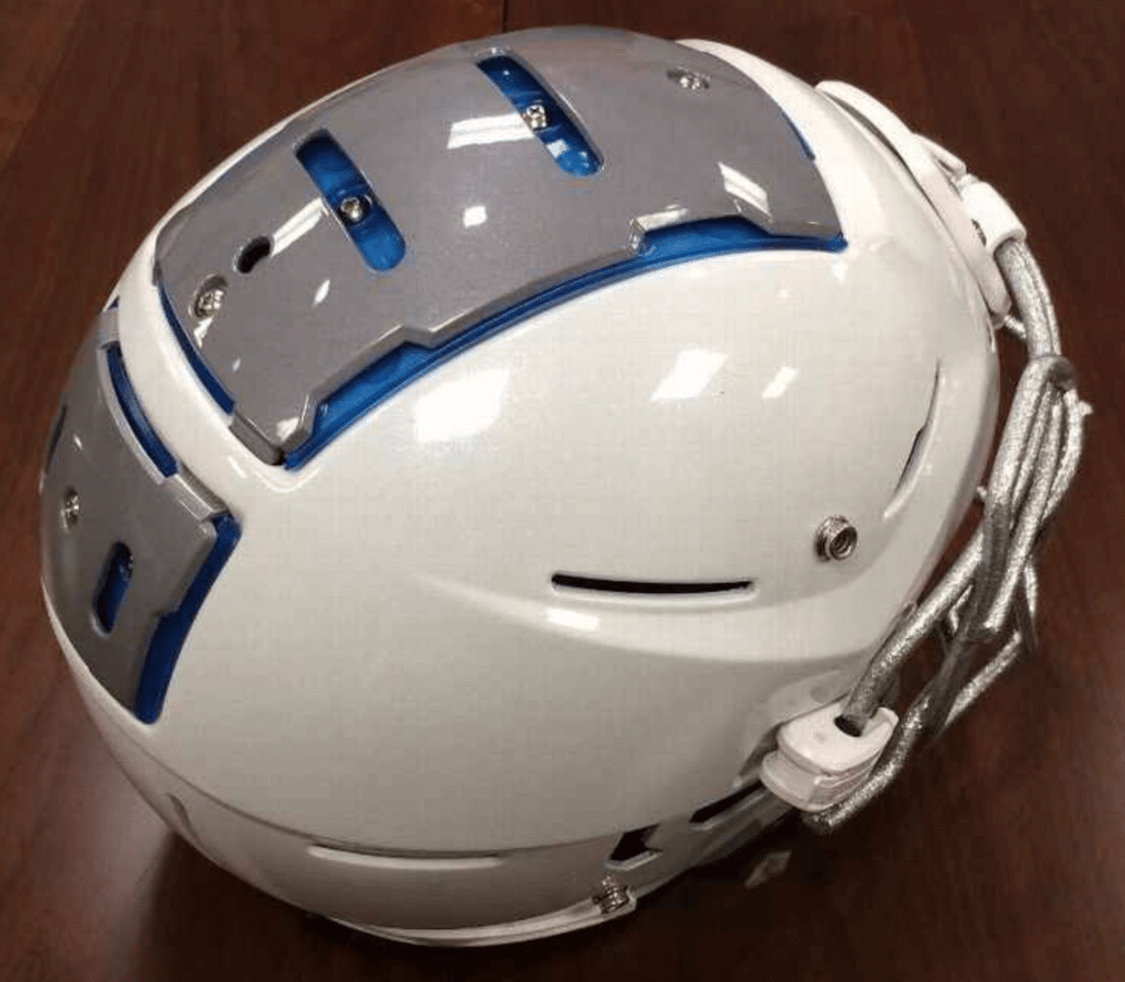
New ESPN column: In January of 2017 I did an ESPN piece about the Schutt F7 helmet (the model with the two flex plates, shown at right). Five months later I did an ESPN piece on Riddell’s Precision-Fit system, which offered a customized fit to each player. Now I have a new ESPN piece that follows up on both of those stories, as Schutt is rolling out a custom-fit verison of the F7.
It’s all pretty interesting, and I think custom-fit helmets will soon become more the rule than the exception. Interesting story to work on.
And for those who are wondering: Yes, I’m still doing ESPN stories during this lame-duck period, which runs through mid-March. (For those who have no idea what I’m referring to, look here.)
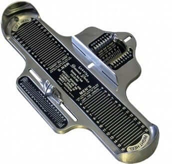
Brannock update: I never got around to seeing the 2015 movie Mad Max: Fury Road, but lots of people at the time told me that it includes a shot of a Brannock Device — my Very Favorite Object — being used as a gas pedal. Now that idea appears to have jumped from the big screen to the real world (or at least to the internet), as the car-centric site Jalopnik ran an article advocating for that very thing.
Incredibly, the Jalopnik author didn’t know about the Mad Max scene, although he was quickly informed by one of his commenters. Uni Watch showed up in the article’s comments, too. Not bad!
I got in touch with Brannock president Tim Follett to see if he’d seen the article, which he hadn’t. He then responded by pointing me toward this local Syracuse TV news clip that ran on Wednesday. It has some good Brannock info and imagery in the first minute or so before devolving into a bit of a shitshow:
So, all in all, a very good week for the Brannock Device, which by extension is a very good week for all of us.
(My thanks to the approximately eleventeen jillion people who let me know about the Jalopnik piece.)
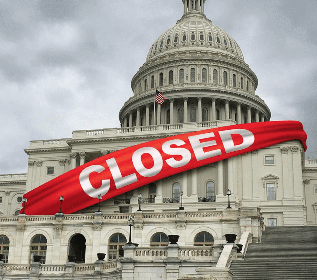
On a serious note: As you’re probably aware, some 800,000 federal employees are going without paychecks today. At least one of those workers — he knows who he is — is a very generous card-carrying Uni Watch reader/member, and I’m assuming there are other furloughed federal workers among the Uni Watch readership.
I don’t care whose side you’re on regarding the shutdown fiasco. However you slice it, it sucks that innocent workers, their jobs, and their finances are getting caught in the crossfire. For all you furloughed workers: Hang in there — the Uni Watch community is with you. If any of you have established GoFundMe campaigns, as many furloughed government workers have done, please let me know and I’ll consider sharing that info on the site next week. Thanks.
The Ticker
By Yianni Varonis

Baseball News: From Phil: Good news out of San Diego, where Padres chairman Ron Fowler has indicated that the team is more likely than not to wear brown by 2020. Key quote from Fowler: ““It’s what the fans want. The reality is we want people to be passionate about the team and they are passionate about brown.” … National Pro Fastpitch has introduced a program to help subsidize player salaries by allowing companies to advertise on a specific player’s uniform (from John Wyatt).

NFL News: In advance of the Super Bowl, an image of the Vince Lombardi Trophy is being added to the Falcons’ stadium, where the game will be played. … You think Chiefs fans like their quarterback? This photograph shows a model tyrannosaurus rex in KC wearing a headband to mimic Patrick Mahomes (from Ryan Atkinson). … New Buccaneers HC Bruce Arians famously wears a newsboy cap on the sidelines. A Tampa Bay reporter used Arians’s hiring as an opportunity to list other noteworthy headwear worn by football coaches. … For his contract signing photo-op, new Broncos HC Vic Fangio wore a navy suit and orange tie to match his new team’s color scheme. Additional details here (from Zeke Perez Jr.). … The Pro Football Hall of Fame is now sensory-inclusive certified, which means guests who feel overwhelmed by the environment — a group that can include those afflicted with autism and PTSD — can request sensory bags equipped with noise-canceling headphones, fidget tools, verbal cue cards and weighted lap pads (from Jason Hillyer).
College Football News: At West Virginia’s press conference introducing new HC Neal Brown, both he and the university’s athletic director (left) and president (right) wore team color-appropriate attire (from David Cline). … Josh Gattis was recently hired to be Michigan’s “Sanford Robertson Offensive Coordinator.” Apparently it’s become common for college football programs to name its coaching positions after donors, as evidenced by Northwestern and Stanford, among others (from Jim Polacek, Dave Larson, and Dave Marler).

Hockey News: The premise of this article is a little absurd, but if you weren’t aware, hockey players apparently have large buttocks that make it difficult for them to find pants that fit well off the ice. … Islanders G Robin Lehner recently opened up about his mental health issues. His new mask incorporates some elements of that fight in its design (from @cannolifactory). … We recently shared that when Senators G Anders Nilsson was with the Canucks, he wore custom pads modeled after the gear he wore as a teenager. Since being traded to Ottawa, he’s still been wearing the pads despite the mismatch in color scheme (from Wade Heidt). … Tomorrow, the Charlotte Checkers of the American Hockey League will wear teal sweaters and auction them off with proceeds going to the fight against ovarian cancer (from @OlegKvasha).

NBA News: Uni number news from French correspondent Etienne Catalan: Newly signed Celtics G R.J. Hunter will wear No. 4, and newly signed Raptors G Patrick McCaw, who was waived by the Cavs after only three games, will wear No. 1.

Soccer News: This is what next season’s ball will look like in the National Women’s Soccer League (from our own Jamie Rathjen). … New kits for Chilean club Universidad Católica (from Ed Zelaski). … New shirts for Japanese side Shimizu S-Pulse, which is dropping the world map from its design (from Jeremy Brahm).

Grab Bag: President Trump accentuated his claim of a border crisis yesterday with his attire, dressing the same way that he and other presidents have dressed at disaster sites (WaPo link) (from our own Scott Turner). … Vatican City has launched an athletics team with hopes of one day competing in the Olympics. This article shows the team’s first members in pretty attractive looking track suits (from reporter Chris Ramsay). … Dover International Speedway has a 50th-anniversary logo (from David Firestone). … Pepsi has introduced a new tagline and can design. … The Australian national ODI team — that’s a form of cricket — will don retro-inspired uniforms against India in their upcoming three-game series (from multiple readers). … We wrote a few months ago that Cuyahoga Community College in Ohio would adopt the nickname “Triceratops” after an online vote of students, staff, and alumni. Yesterday, the school unveiled its new athletics logo (from Phil and multiple readers).
Coaching attire watch: The last two NFL head coach openings are te Dolphins and Bengals. The Dolphins have a challenging scheme, though their recent use of navy could allow for a navy suit and an orange tie. For the Bengals, I’m guessing gray suit and orange tie.
The last time the Bengals hired a coach (Marvin Lewis, 2003), he went with an orange tie and a blue suit.
link
The last time the Dolphins hired a coach (Adam Gase, 2016), he went with a navy suit and a striped tie that did not include aqua or orange.
link
There’s a place I’d like to be
There’s a place I’d like to be
The place I’d like to be
The place I’d be happy
There’s place I’d like to be
The place I’d like to see
There’s a place I’d like to be
There’s a place I’d be happy
No, that’s not it either. (I’ll add a note to that effect.) Good guess, though!
I had guessed this in Sept. 2016 (link).
The fact that it is not the reference does not stop the song from getting stuck in my head whenever you mention the Tugboat Captain.
I think the Vegas Golden Knights will actually end up selling more jerseys by not introducing a third jersey right away.
Here’s an example of what is meant by the world map on Shimizu S-Pulse’s shirts: link
The version of the apostrophe catastrophe that drives me crazy is the use of an apostrophe to pluralize nouns. I noticed at the end of your entry from 2009, that you asked the readers to not comment on that version, because that was not the version that the lede was focused on. However, does using the apostrophe to make a plural noun drive you almost as crazy as the situation discussed in the story, or does that practice not really bother you?
Yes, it bothers me, but that’s a fairly garden-variety form of American illiteracy.
The phenomenon that I refer to as an apostrophe catastrophe is much more subtle and is driven largely by digital typography. As such, I find it much more interesting.
The Chicago Sun-Times had a piece today detailing how Fangio’s orange tie he wore during the Denver presser was gifted to him by Bears Chairman George McCaskey. Fangio was famous for only wearing a gray sweatshirt and matching gray sweatpants during his time in Chicago, and McCaskey gave him the tie has a joke after Fangio asked if he could wear his gray sweatsuit while being introduced!
1. I love that you like John Buscema. His Conan stuff is some of my favorite comic art.
2. Do you see any reason why the NFL shouldn’t allow the wearing of 0 and 00?
No, I don’t understand why those numbers are disallowed. I say make them legal.
Where would you propose 0 and 00 would fit in the numbering scheme? QBs and specialists? Also, would 0 and 00 be two different numbers, or would only one or the other be allowed on a roster?
I say allow them both on the same roster. The NBA does this with no discernible problems.
It’s interesting that 00 was variously used for an eligible receiver (Ken Burrough) and an ineligible receiver (Jim Otto). Obviously, you can’t have it both ways. I’ll leave it to others to decide how it be going forward.
Many of the generic merch lige figurines or jersey shaped things I’ve seen have 00 used (a football jersey without numbers looks odd) which I’ve always thought was used as a way of not having the number of any specific player.
Maybe that’s the reason?
The Rockies have had Adam Ottavino wear 0 while Dinger the mascot wears 00 and no one has complained. Oh wait, they have… lots of folks hate Dinger.
Billy Joel at Miller Park, April 26
Question Time!
One of my favorite times in the Uni Verse.
Fear and Foolishness are the rocket fuel of this town, and yes, things are most definitely stranger than usual here. Despite all the Uber-boobery about, I am confident that we will get through it all, eventually.
To those indirectly furloughed – fingers crossed, genuflects, sujuding, and I ask all the denizens of the Uni Verse to direct all requests for divine intervention on ending this useless shutdown rather than wasting them on the PLAYOFFS this weekend.
I know it is a tough choice,
Praying for teams to stop the run or help a government run again.
Allegiance to a colored polyester shirt vs. real allegiance to the red white and blue, the colors that don’t run.
Help the Patriots, the non-Brady ones – who could use a little Patreon support.
This is a good take. I wish to subscribe to your newsletter.
Is this what they call “purple” prose?
Paul, thanks for the shout-out. I’ll start digging through my files for a new “There’s No Service Like Wire Service” – It’s been too long!
~ Bruce
Wade:
The craftsmen at Brian’s were hard at work making the same pads for Anders Nilsson in new Ottawa colors. They are finished and on their way. (Kris King has to sign off on the pads in Toronto for size compliance before they are forwarded to the team.) No doubt, it’s just too much work to recolor from blue and green to red and black, and those pads are broken in. But check it out:
link
Thanks for the update Mike!
Cool that he is keeping the same design. Anders was still wearing his Canucks mask on Wednesday. Likely will be all in his new gear soon.
In many cases, making a color change isn’t a major issue, because there are products out there (synthetic leather and/or nylon with adhesive backing) that make it easier. But that’s a lot of real estate to cover; the claws, not so much.
On a semi-related note, in the immortal words of Mickey Redmond, holy jumpin’! Look at the gap between his skate and the pad! The NHL established maximum sizes for pad length several years ago; one way that goalies have skirted the rule is to install ‘boot risers’, small pads that sit on the instep of the skate. These lift the pad off the skate, adding to the effective coverage area of the pad (which rarely sits on the foot or leg these days anyway). Normally it’s barely noticeable, but that…. noticeable is an understatement.
RE: NFL jersey/undershirt color. The Eagles had both white and black undershirts with their white jerseys in their game against the Bears this past Sunday.
link
In your opinion, what are the top three daily comic strips of all-time?
The Far Side!
The dodgers may have been the first with a crappy plastic 3d sticker., but the Cubs have had a 3D embroidered logo on the helmet for decades.
Well, yes. And I’ve written about that many, many times. But the Dodgers were still the first to do what they did.
OK, if being second makes you first in your world have it at.
Oh, for fuck’s sake.
If you want to believe that X = Y, be my guest. Back here on planet Earth, what the Dodgers did (and what many teams have now copied) is not the same as what the Cubs had done for decades. Neither is better or worse than the other — and I happen to like both of them — but they’re not the same.
Frank Brunner was excellent on Dr. Strange. Kudos to Steve Englehart as well.
Agreed. I love that period of DS. Every bit as good as the Lee/Ditko period in my opinion.
Weird. I’ve been a daily reader for over 10 years and I never knew that you were a fellow comic book nerd. I suppose I should have guessed.
Ditko or Romita?
Romita.
Just to clarify, my comic book phase ended around eighth or ninth grade. Didn’t save anything except my old Howard the Ducks.
Mine ended at the same age but I started up again 20 years later in the early 90s when one of my sons took a major interest in superheroes. I only collect the stuff I grew up with, mostly Spider-Man.
Agree on Romita.
Romita Sr. or Jr. ?
Senior for me.
Sr.
I know you’re not big on uniform ads, but here’s a slightly different take: A few years ago, when my hockey-playing daughter was in a tournament against a Canadian team, I noticed that the Canadian girls had small ads on the backs of their sweaters, but they almost all referenced different businesses. I asked someone about it, and I was told that in Canada, kids who need money to play ask local businesses to sponsor them. Not a team thing, but an individual thing. In recognition of the company’s sponsorship, the kid puts the name of the company on the sweater. Considering the cost of playing hockey, I thought that was kind of cool.
I’ve noticed it more in the actual businesses since I don’t have kids and rarely see kids hockey.
Often they player will give a small plaque with a picture of them in the uniform and some sort of thanks for the sponsorship engraved on it.
Here’s an example for a team (but have seen similar individual player ones)
link
Way back when I was kid the sponsorships were team instead of player related (of course we weren’t constantly going on tournaments out of town – but I digress)
An example back in the mid 1970’s of the team I was on Pipe Trades 628
link
link
A few years later that changed to the front of the jersey (no longer a league logo in front and nothing but the number on back)
link
Honestly, that makes it worse. You need kids to go around begging for money for equipment? It would be better for businesses to donate to the local youth programs on their own.
Bob, you see that in Junior A hockey and low levels of hockey in Canada.
Same thing in summer Senior A box lacrosse around my area, such as in the Western Lacrosse Association (WLA) with teams in Metro Vancouver and on Vancouver Island.
Though it is a high level league featuring players that play in the professional NLL in the winter, and they do charge for games, it is more a matter of sponsorship for teams to operate rather than advertising. Each player has a distinct company or 2 below the numbers on the back. Not logos – just the company name on a nameplate.
An example here with the New Westminster Salmonbellies:
link
Hiya Paul. Re: Rose hit record. Concur the daily excitement around the chase even in NY area was cool. I was in Eastern LI summer of ’78. We were all Rose fans at that time.
My wife and I saw David Johansen 5 years ago (and I can’t believe my wife and I started dating over 5 years ago) in the small town of Marlboro, NY.
We really were there for the opening act, who I have known through the years.
Johansen just seems perpetually baked. His stories were rambling, his memories were halted and at one point, he said, “Wherever the hell I am. What’s the name of this place?”
It was certainly a strange experience.
When and why did black SUVs become the chosen mode of transport for dignitaries? Even in Kansas City, Mo, you can tell when someone important is on the road by the parade of black, tinted-out SUVs. It used to intrigue me as I thought it looked cool, but now I just think it looks kind of stupid and pretentious. Why do they have to be black? Why are they the biggest SUVs available? Why are they almost always Chevys?
As a former limo driver… Since the classic Lincoln Town Car/sedan has become a thing of the past, the most pretentious, big vehicle available to drive dignitaries around would be some sort of SUV. (Sad, as our fleet of Lincolns were the bomb. Fast, powerful, comfy as all get out.) As for the Chevy question, a black Suburban with dark grey leather feels pretty swank for a fraction of the price of an Escalade. Ford’s SUV’s just don’t have the same swagger for some reason. And the 4WD is great in all weather. And for some other reason, black is just a color that works for all occasions, somber or celebratory. I once drove for a company that had different colored rides and they just didn’t feel “special.” There is even a term in the industry, “black car service” that defines discreet yet noticable importance for the passenger.
This is awesome and insightful, Ron. That was my question and I love the note about “somber or celebratory.” That is an excellent point. I do miss the old town cars, those were a blast to ride in. Thank you!
I also realize there are plenty of reasons to give up meat but haven’t yet. My wife and I have tried to eat less of it, and have entire days sans meat. However it would be harder for me to give up eggs than meat.
not uni related but yeah the Kinks! I hung out with Ray and Dave till the sun came up and then Ray was supposed to come to my apt and cook dinner. Didn’t happen though…very long story. And one more thing. I live in the DC area. So many people are hurting here cause of the shutdown. Govt workers have a certain reputation. I can tell you they are some of the smartest hardest working people, I know many of them
I would have thought there would be a tie-in with the Charlotte Hornets from those Charlotta Checkers teal uni’s
You on Death Row? I’m guessing the people who make Brannock Devices started making them in purple and you blew up the building…
Paul,
I think the four MLB expansion teams in 1969 (Expos, Padres, Royals, and Seattle) had terrific uniforms, even the Pilots with their inspired cap. Admittedly, it doesn’t suit everyone’s taste, but it was a clever cap and uniform.
Probably should have submitted this in the question time, but since we’re talking about ads-
Many historic parks had large, colorful advertising billboards. Then we got to the 70’s and the copycat, multi-use, bland stadiums. Now we’re back to unique ballparks/stadiums with advertising again. Questions would be:
1. Stadium advertising (different than naming rights) OK, Uniform advertising bad?
2. I know there’s a dislike for stadium naming rights (to the extent that there’s “I still call it….” shirts for “corporate” stadiums. I’m trying to figure out why, given that we now ask for private funding and/or public private partnerships for stadium builds. What’s wrong/negative about getting money from these partnerships in return for stadium naming rights? Or selling naming rights to offset stadium operating costs?
Correction …there’s no “I still call it..” shirts
My visceral dislike for selling naming rights has less to do with selling the name, and more to do with two other issues:
1. The stupid names that modern corporations give themselves. I can tolerate a park named after companies that use actual human words/names (Target, Busch, Coors, etc.). What I cannot abide is vile marketers’ portmanteaux such as Comerica, Petco, SunTrust, CenturyLink, or (God help us all!) Fiserv.
2. The rotating door of short-term rights. If you’re going to name your stadium, NAME it. An appellation that changes every few years is intolerable, and actively works against fans’ sense of attachment to a place.
Exactly: case in point, the Giants’ ballpark in San Francisco just received its FOURTH corporate name since 2000. Granted, the first three were corporate takeovers, as Pac Bell was purchased by SBC, which was purchased by AT&T, but four names in less than twenty years?
When the name makes a modicum of sense (Old Kent Park in Grand Rapids, Pilot Field in Buffalo), it’s not that bad. When the corporate name makes no sense (Fifth Third Field?), or one of these made-up names (InfoCision Stadium?), it’s stupid. And it’s salt in the wound when a team moves into a publicly financed facility, and immediately profits from the sale of naming rights (to a company that took subsidies from the same state that built the barn).
Sadly, auto racing content (NASCAR specifically, other series generally) has never gained much traction on UW for any number of reasons.
I’m content with seeing motorsports Grab Bag items from time to time and the occasional ‘big race’ preview/review (Paul’s Daytona travelogue some years ago was terrific); I think an entire dedicated section would more than likely be skipped over by most readers.
Great Q&Q Paul! I enjoyed reading your answers. I heartily agree about Bloom County and Calvin and Hobbes! Nice to see that you have the same appreciation for that humor. I almost fully agree on the uniform rules you would implement too. Except that the makers marks don’t bother me as much. I liked the CCM logo and those of assorted local sports shops (that provided numbering/lettering services) that appeared in the back hem of NHL jerseys in the 1980s. But that was the era I grew up in, so it looked cool to me, at least “normal.” I can’t stand seeing the league marks on the collars, and the makers marks on the chest/back of the neck, now.
It was interesting to read too that you have considered giving up meat – I don’t think you ever mentioned that thought before. I haven’t eaten meat in 12 years, and 13 years ago I wouldn’t have considered that scenario possible. But the thought was in my head, and I tried a week without meat, then a month… And now here I am. It was like a light flip switched in me at one point, and I never considered meat again nor do I miss it, and I have largely give up dairy as well.
The only think I really miss about meat/dairy is the convenience of being on the road and being able to get a slice of pizza on the go, especially when food options of any kind are scarce. Like you, I visit a lot of towns that aren’t exactly “hopping”/heavily populated, so sometimes there just aren’t many eateries to pick from, period. But pretty much every town in the US has a pizza parlor if not several. (I suppose there is always Chinese food too, that’s another thing I find in most every town in my travels, but I’m not always in the mood for Chinese. )
Anyhow, good luck if you ever decide to make the effort to go vegetarian/vegan.
Quick comment to one of the questions.
Why is NCAA basketball limited to numbers ending in 0-5? That’s not technically correct. It’s not just ending numbers but the first number as well.
The answer is correct. It is to make signalling fouls easier for the referee. But as a veteran of countless numbers of NCAA games as an official scorer or stat crew manager, NEVER, in nearly two decades of basketball games did an official use two hands to indicate who a foul was on. Every foul I’ve ever seen call in an NCAA basketball game was, for example, show by two fingers followed by 5 fingers. Never have I seen an official put two fingers up on the right hand with five fingers up on the left hand to signal in a foul on no. 25. Always, ALWAYS a 2 followed by a 5 (it honestly leads to fewer mistakes and they walk over and tell you the number anyway in addition to motioning with the hands).
So an interesting case of a rule existing that doesn’t need to exist.
I attended the UCLA/Oregon game last night and seem to recall the officials using two hands to indicate on each of the fouls called. Could be specific to that crew I suppose, and not something I’ve consciously taken note of in the past, but now I will pay more attention going forward.
oh…and I used to go see the NYDolls at the Mercer Arts Center back in the dayz. In no way shape or form was I a part of that scene. I was the kind of guy the people who were part of it didn’t like..a wannabe be jersey boy. The first time I saw them was their first gig with Jerry Nolan and it was the best rock n’ roll show I’ve ever seen. And those songs all these years later still sound great. Nobody talks bout how they could write…rock on!
I’m envious, David. I’d give anything to see the Dolls in their prime.
I was lucky
Your Mt. Rushmore of college football helmets is the same as my Mt. Rushmore of college hockey helmets
I used to be a college first base coach and I always wanted to tar up my helmet (trying to hang onto the glory days). Also, I never saw anyone do it, so I thought it would be cool to be different. I never did it and have never seen a coach do it, until now! Check this out.
link
I’m a federal employee, luckily my agency is not one of the ones affected. Our budget was approved during the beginning of the fiscal year 2018 for this current period. I did however go through a similar situation during a previous shutdown. It is messy, stressful, and pretty miserable. Issues with health insurance being bad plus just paying billls. My thoughts are with all affected. I’m a regular reader, occasional commenter (?) but would rather stay anonymous regarding this.
Great answer to the regret question
Thanks, Neeko. That was definitely the heaviest lift of this installment.
RE hockey players and their pants, made me laugh a little. In my 20s, I would routinely skate six nights a week, usually as a forward. By the end of the season, at least one pair of the jeans I wore (and they didn’t have the hundreds of options they do now)I had popped an outside seam along the thighs.
The concert to see in their prime? For me, Crowded House, about 88-90.
As for President Trump wearing attire for a disaster zone it’s always made me wonder. I recall seeing something as far back as Kennedy and it may go farther back. Why do Presidents always wear a jacket with the Presidential seal and usually their name on it? Like we don’t know they’re the President? It seems a really silly. “Hey here comes the leader of our country, what’s his name again?”’
Might it make it easier for the Secret Service to keep tabs on him in an emergency?
Did anybody else find it interesting that Paul’s choices for the “Mt. Rushmore of College Football Helmets” featured four helmets that do not feature a logo?
I can’t say I disagree with him, and I suspect that if you expanded the selection to five teams, Alabama would have to go next.
After that, you’d start to see some logos: Southern Cal, Miami, Clemson, UCLA,