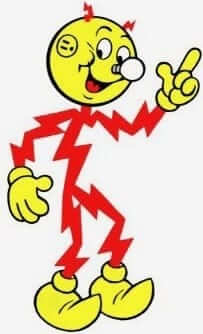
Everyone loves Reddy Kilowatt, the cartoon mascot that debuted in 1926 and spent the next several generations encouraging Americans to use as much electricity as possible. Okay, so maybe that wasn’t the best idea, given what we now know carbon footprints and all, but still — how could anyone resist Reddy’s cheery optimism and goofball anatomy? A lighting bolt body, a lightbulb for a nose, and sockets for ears — brilliant! (Note that the image at right shows Reddy’s ear as a three-prong outlet; earlier versions had him with a two-prong. Reddy adapted with the times!)
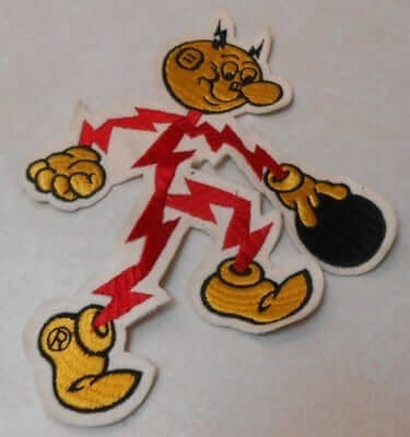
Until now, though, I didn’t realize that Reddy had such a deep connection to sports and uniforms. I discovered that by accident when I was poking around on eBay the other day and stumbled upon this excellent patch showing Reddy playing baseball (click to enlarge):
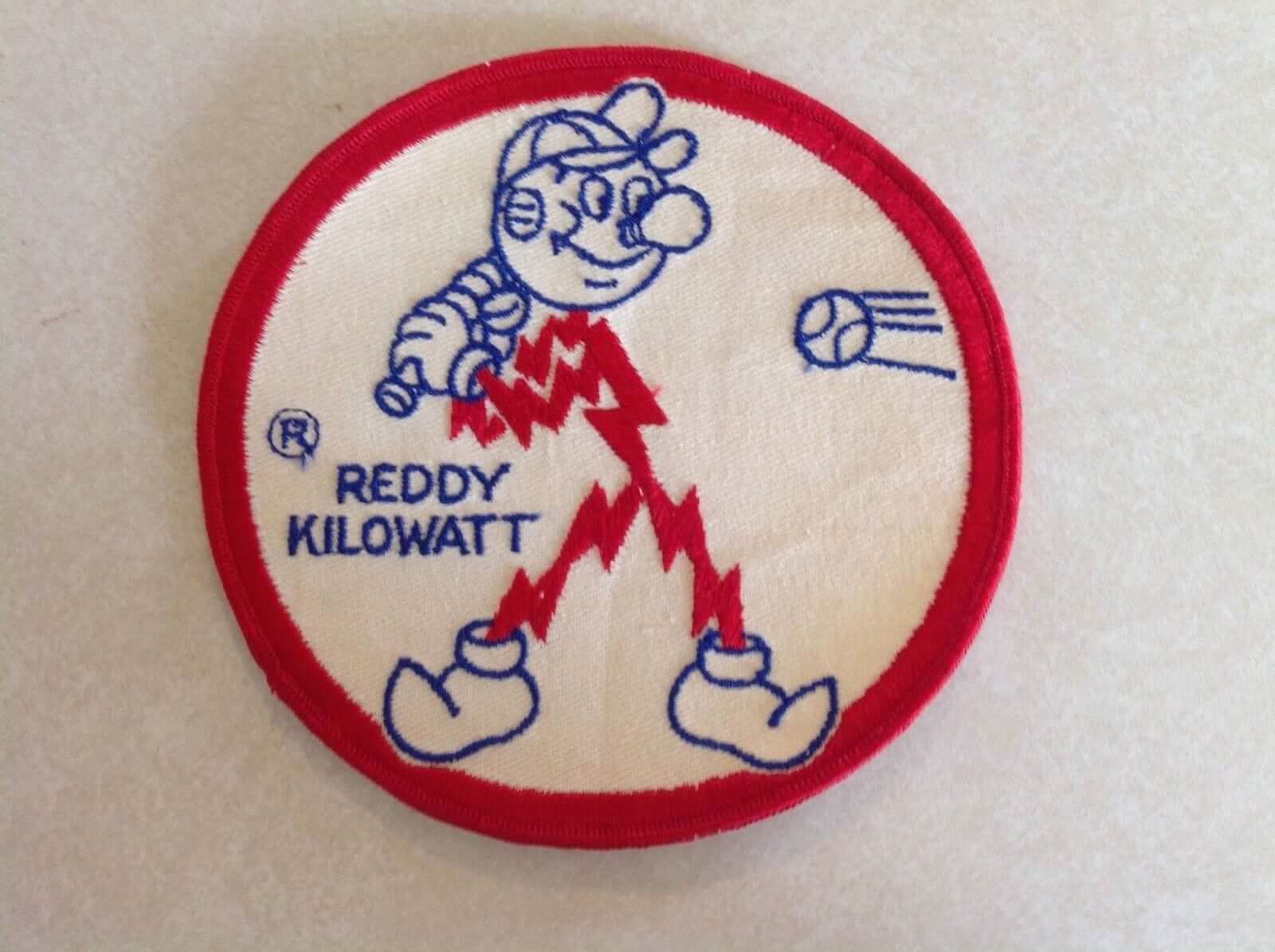
It’s not really clear what Reddy has to do with baseball. I guess he’d encourage teams to have a light-up scoreboard instead of the old hand-operated versions like the ones at Fenway and Wrigley. Maybe he’d also be in favor of electric-powered bullpen buggies..?
Anyway: I posted a link to the eBay listing on Twitter. That resulted in a bunch of fun responses, plus I did a bit of additional research of my own, all of which resulted in a nice little portfolio showing that Reddy was sports-ready!
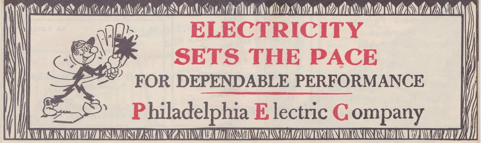
Let’s begin by sticking with baseball. This ad appeared in a Phillies scorecard in 1953 (click to enlarge):
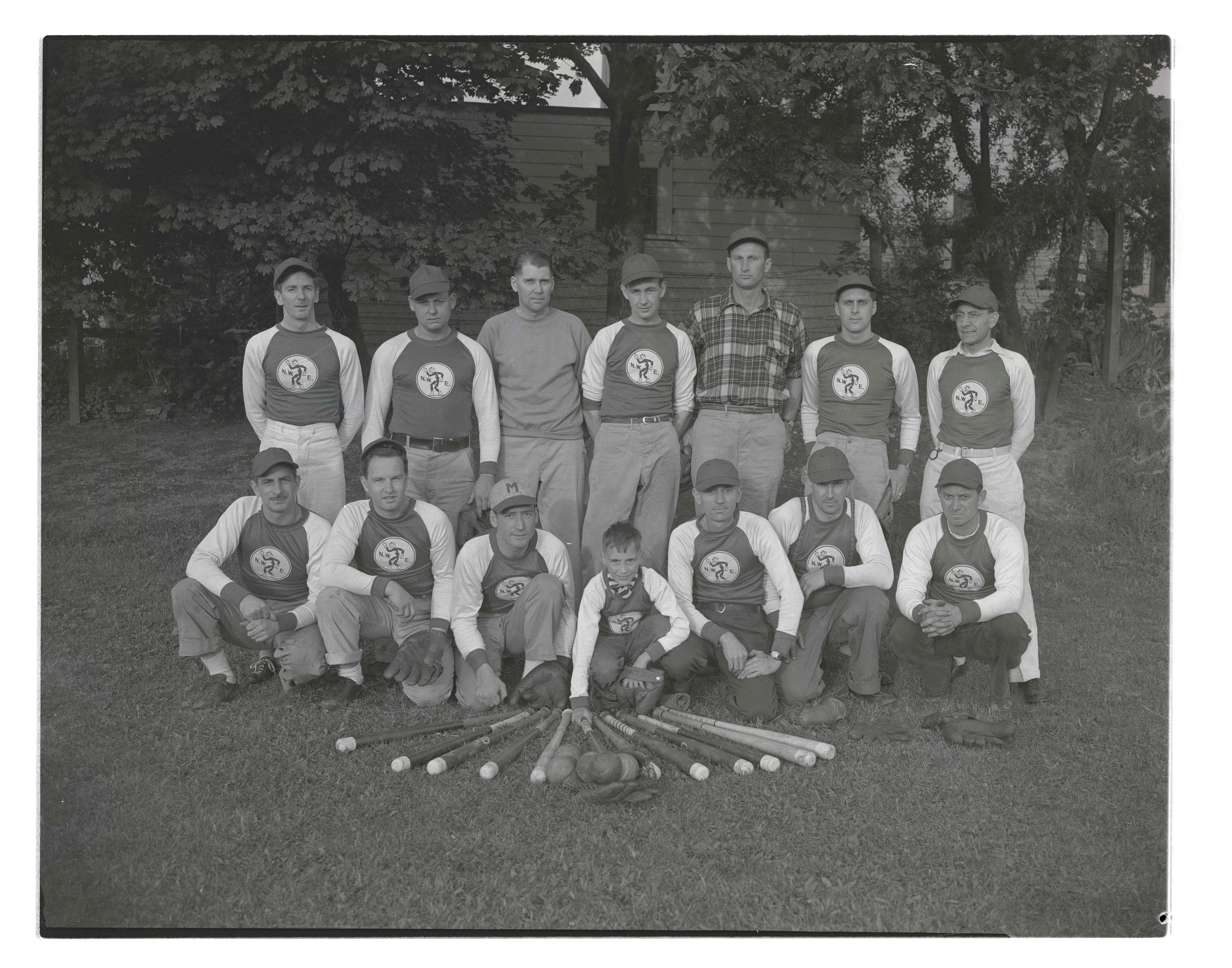
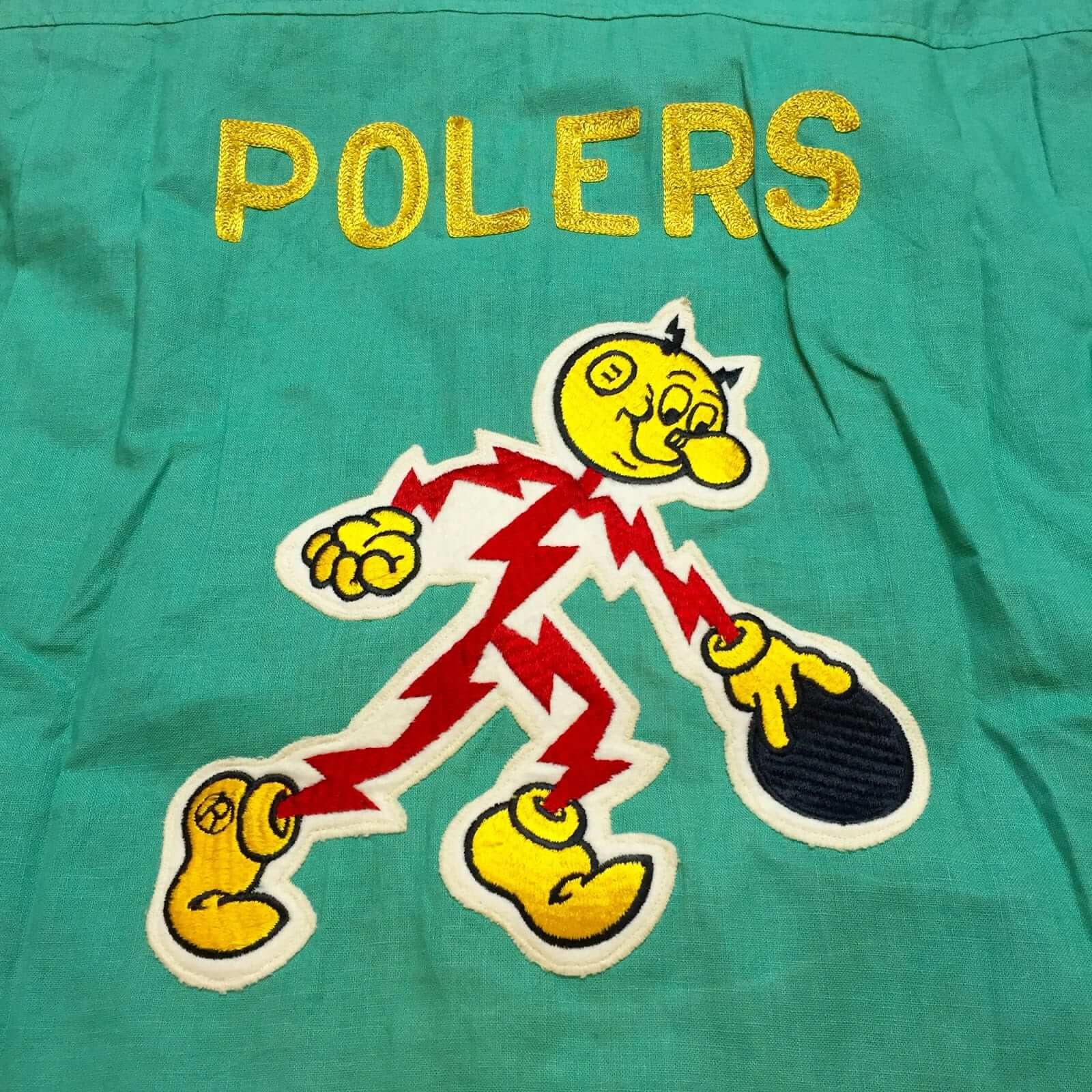
Reddy also appeared on the jerseys of this late-1930s Northwest Electric baseball team. It’s not clear whether the players worked for the NWE or if the company sponsored the team (click to enlarge):
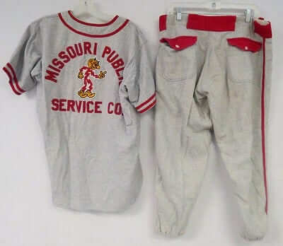
There’s also this baseball uniform, with Reddy featured on the back:
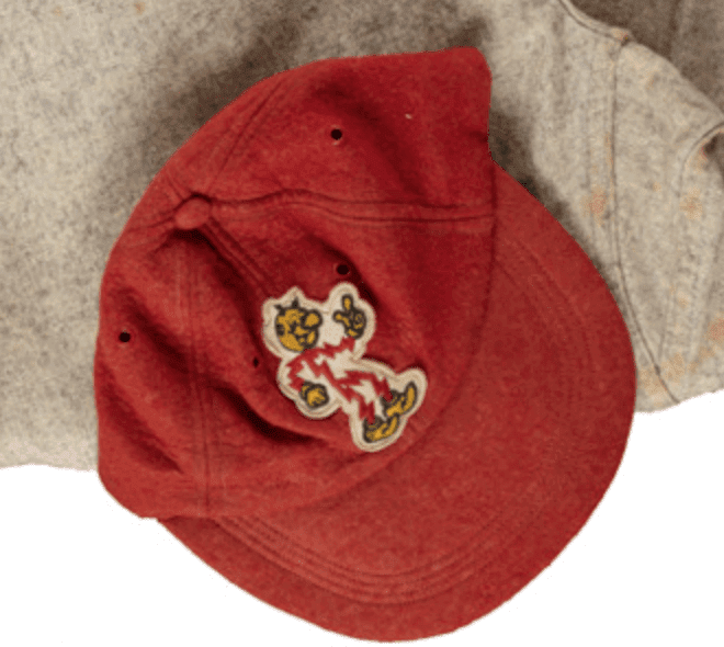
And then there’s this 1940s uniform, with Reddy appearing on the cap:
I also found several images of Reddy bowling. Since Reddy, like most cartoon characters, has only four fingers, he’s depicted with only one non-thumb finger inserted into the ball (click second photo to enlarge):
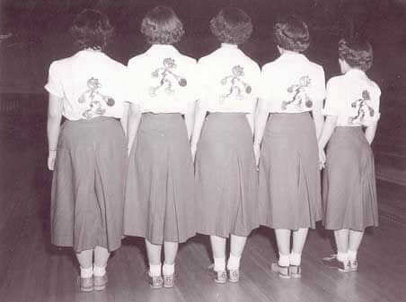
I wish I could get a bigger or higher-res version of this next shot — 1950 photo showing a women’s bowling team with Reddy on the back of their shirts. The caption on Pinterest describes it as “the Reddy Kilowatt Beginners Bowling League for Female Employees”:
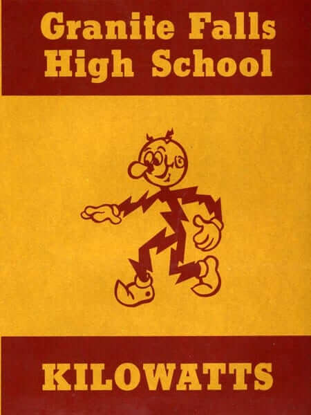
And get this: The sports teams at Granite Falls High School in Minnesota used to be called the Kilowatts! And of course they used Reddy as their mascot (additional photos and info here):
The team name was changed due to school consolidation. But the town’s amateur baseball team is still called the Kilowatts, although they don’t seem to use Reddy on their uniforms or in their graphics.
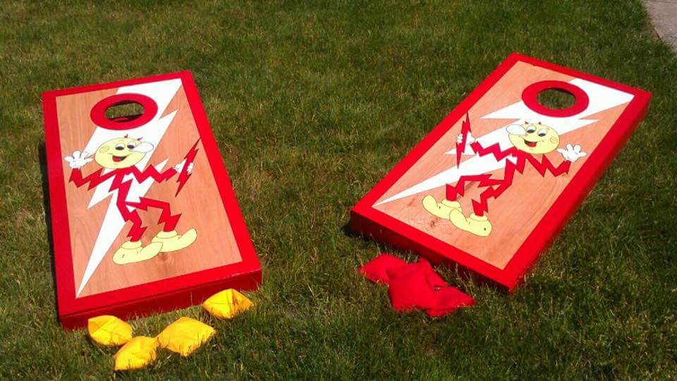
There’s also this Reddy Kilowatt cornhole set! Click to enlarge:
Finally, here’s a classic mid-century Reddy commercial. No sports component here, but still priceless:
(My thanks to David Kerr, Brad Koenig, @ChewChewTrain, and @Cdud1970 for their contributions to this section.)
Marlins update: According to Sirius sports radio guy Craig Mish, the new Marlins logo that’s been circulating this week (including here on Uni Watch yesterday) is just one option among several. Mish tweeted three designs that he says are currently under consideration in addition to the first one we saw.
So that makes a total of four possible logos. Here there are (click to enlarge; the one we had already seen yesterday is at top-left):
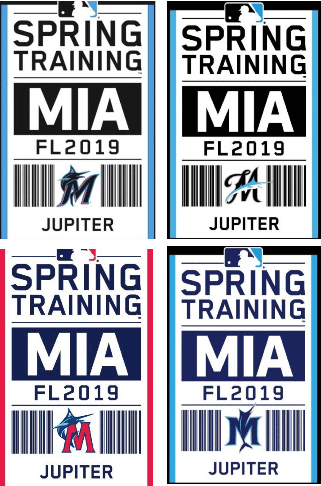
Can’t say I’m nuts about any of these, but I prefer all three of the ones Mish posted over the first one we’d seen. Hmmmmm.
A source tells me that the unveiling will be in mid-November, so we’ll have this resolved soon enough.
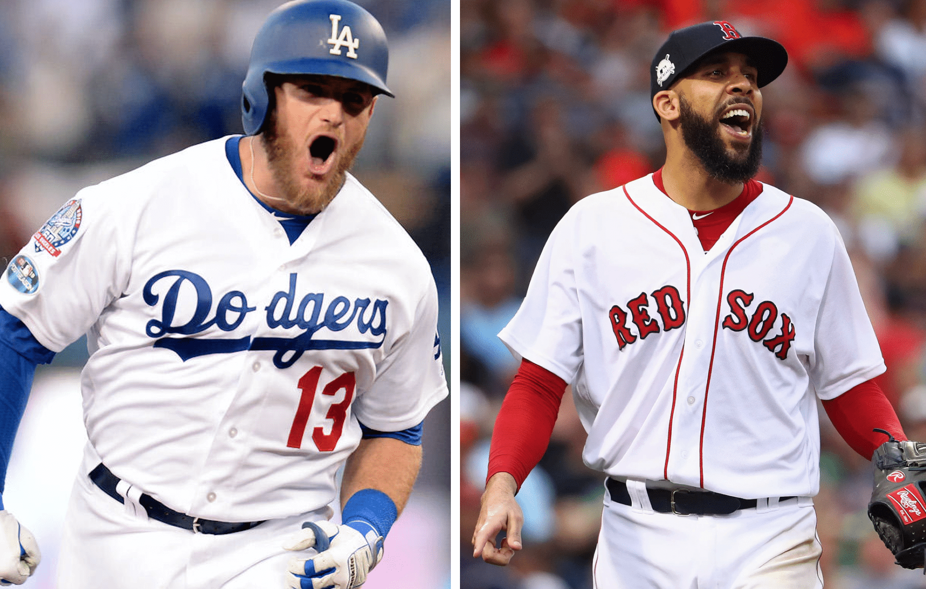
A classic-looking Fall Classic? With the Red Sox and Dodgers both one win away from the World Series, we could end up with the most traditional-looking Fall Classic in recent memory.
For starters, both teams have very old-school looks. Neither one even has an alternate cap! In addition, the one Friday game is scheduled to be in the National League city, so that presumably takes Boston’s red alternate jersey off the table. If the Sox stay away from their navy road alternate, the entire Series could be white vs. grey. (I view that as a plus, although I realize some of you probably feel differently.)
Add it all up and we’re on the precipice of what could be a very vintage-flavored Series — well, mostly.
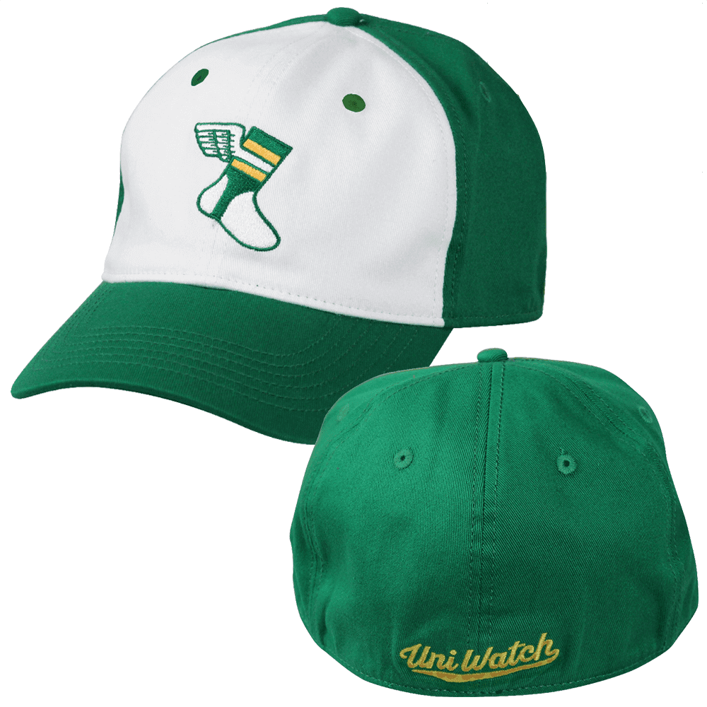
Price break reminder: In case you somehow missed the jillion other times I’ve mentioned it, we recently reduced the price of our flex-fit Uni Watch alternate cap from $29.99 to $24.99. I’m happy to report that this has resulted in a nice sales bump, but I’d like to see that bump get even bumpier. If you’d like to help in that regard, you can order your cap here.
While we’re at it: Our wool classic cap, available exclusively from Ebbets Field Flannels, is fully stocked in all fitted sizes (and the adjustable version, which is currently sold out, should be back in stock in another 10 days or so). Just the thing to ward off that autumn chill! It’s available here.
My thanks, as always, for your consideration of our products.
The Ticker
By Paul

’Skins Watch: A Maine high school is holding a contest to replace its Native American mascot while keeping its “Warriors” team name (from Kary Klismet). … An indigenous student athlete at McGill University is protesting the school’s “Redmen” team name. “The school insists that while native imagery has been used on occasion, the team was named purely for the color and nothing else,” says Noah Sidel.

Baseball News: Chief Wahoo isn’t the only thing the Indians are leaving behind next season. A little birdie tells me they’re going to stop using nameplates and switch to direct-sewn NOB lettering. Ditto for the Rays. I view this as a plus. … Here’s a humor piece on the origin stories of MLB team names (from James Gilbert).

NFL News: Disappointing news out of KC, where the Chiefs are apparently planning to go mono-red this Sunday night (from Taco Salazar). … The Falcons will wear their black throwbacks on Monday night against the Giants. … The 49ers will wear their white throwbacks at home against the Rams on Sunday, and holy shit are they gonna get slaughtered. Interestingly, the Rams will wear the Rash, so this game will be mono-white vs. mono-yellow.
College Football News: Navy’s uniform for the annual game against Army will be “Bill the Goat”-themed. Additional goat info here. Phil will have a detailed rundown in his annual Army/Navy preview. … Did alternate uniforms help boost Iowa and Iowa State to upset victories? This writer thinks so (from Kary Klismet). … Yesterday was apparently the 77th birthday of the penalty flag, which was first used in a college game in 1941 (from Adam Myers). … Did you know what Bucky Badger looks like from behind? Now you do, thanks to this 1980s sweatshirt that Matthew Blinco recently thrifted.

Hockey News: Pinktober uniforms for the Charlottetown Islanders, a junior team in the Quebec Major Junior Hockey League. … The Ducks will retire Paul Kariya’s No. 9 on Sunday. Kariya played for the Ducks from 1994 through 2003.

NBA News: The Trail Blazers are adding a memorial patch for owner Paul Allen, who died a few days ago. The patch will make its on-court debut tonight. … Never noticed this before: The Bulls’ “72” banner, which commemorates their record-setting 72-win 1995-96 season has weird numerals. They’re sort of crimped at the top (from Adam Foxman). … Thunder rookie Hamidou Diallo has signed an endorsement deal with Under Armour (from Josh Hinton). … New uni apparently in the works for the Texas Legends, who are the Mavs’ D-League affiliate (from Zak Buncik). … The Hornets debuted their new white throwbacks last night. … There was a delay in last night’s Clippers/Nuggets game when Clippers C Boban Marjanovic, who’s 7’3″, bent the rim on a dunk without jumping (from Mike Chamernik). … The Kings’ ad patch has a different background color this year.

College Hoops News: Reprinted from yesterday’s comments: New white and green uniforms for USF. … Apparently there was some sort of rumor or narrative that Kentucky players don’t like the checkerboard pattern on their uniforms, but that isn’t the case (from Josh Hinton). … New uniforms for Central Arkansas, Fairleigh Dickinson (home, road), Morehead State, Canisius, Cal State Bakersfield, Incarnate Word (home, road), New Mexico, Saint Francis, Sacramento State (home, road), LSU, North Texas, Kentucky, LIU-Brooklyn, UNC-Greensboro, and Stephen F. Austin, whee!

Grab Bag: Michigan State has told a Michigan high school to stop poaching the university’s Spartans logo. Good. … New logo for Animal Planet. … It had to happen eventually: Superman is going BFBS (from Kary Klismet). … Also from Kary: New logo for the rugby league team Melbourne Storm. … And yet another from Kary: The town of Plymouth, Mass., has chosen the four finalists for its new municipal logo. … Header photo in this Popular Mechanics article shows a home workshop with a Brannock Device on the pegboard! Nice (from Joe Werner). … American Airlines is suing the U.S. Copyright Office because the office refused to copyright the company’s logo on the grounds that it’s too plain. … Apparel company Freedom United Clothing is suing pop star Rihanna and Puma over their “FU” logo. … Authorities in Malaysia seized some food from a company that was using an invalid Halal logo. … The town of Paterson, N.J., is considering a new logo and slogan. For nearly 20 years now I’ve been going to Paterson to bowl at the very wonderful Paul’s Bar & Bowling, so I say they should just use some classic bowling-themed clip art for the logo. Problem solved! (From David Rakowski.)
Paul, in order to get health insurance, have you considered marrying your girlfriend and get on her company insurance plan?
1) You’re assuming that she’s on a company health plan. (She is not.)
2) Isn’t it a bit weird to tell me I should get married just so I can have decent health coverage?
You’re making a terrible argument for both marriage and the state of healthcare in this country by what you said.
Thank you, MJ. You said it better than I did.
Between opposition to universal health coverage and stuff like organized labor and living wages, it’s amazing the level of mediocrity many Americans not only tolerate but advocate for.
I mentioned this yesterday that my wife, who has no insurance through work and is 2 years younger, informed me I’ll need to work until I’m 67 so she can continue on my insurance. Insurance shouldn’t be through your employer. I’ve never been for a big government, but starting to think a Medicare for everyone makes sense.
The whole insurance through your employer thing started roughly 100 years ago, it was a way for employers to provide higher compensation to their workers which could not be taxed. In other words, pay your employee an extra $1,000 a year, which would be taxed, or spend $1,000 a year paying for their health insurance. Made a lot of sense from that perspective, win-win. And as a government employee I can still understand that, I make lower wages than I would in the private sector, but am compensated with a top notch healthcare plan.The problem is the cost of healthcare is so high now, very few jobs demand the salary equivalent that would give them decent wages AND company provided health insurance.
Employer-related health insurance took off in the early 40s when the feds implemented wage controls due to not wanting the cost of war materiel to increase. Then it was made much worse by the hmo act in the early 70s that started pushing more and more healthcare expenditures into the “insured” category. Car insurance and homeowners insurance don’t pay for routine maintenance for good reason.
The industry is so regulated and fragmented that it’s especially difficult to innovate. Overhyped putative innovation on the part of fraudsters (thanks Theranos!) just make existing players more entrenched.
Reddy looks best with the trademark (R) on his right shoe, due to the humorous implications.
Good point!
Great stuff today, Paul. Long live Reddy.
Reddy would look even better if his facial features resembled the three-prong outlet when that design came into use, even with the light bulb nose (‘.’)
Interesting stuff like Reddy Kilowatt is why I’ve been a Uni-Watch fan for all these years!
Thanks, Tom. Glad you liked today’s entry!
Hmm. None of the Marlins’ proposed logos are quite right. The bottom left logo is the best design, which a clear distinction between fish and M. But it has the worst colors. MLB doesn’t need another red/white/navy team, especially in a town like Miami. If they cold make the M teal, similar to the highlight color on the marlin itself, they would be on their way. Using orange (or pink) smartly and sparingly for trim would work as well.
The problem I have with all of these are they are clearly developed by Brandiose, looking minor league as heck, and have little connection to modern Miami. All of these look like logos you’d associate with a Keys fishing charter operation, something I’d expect from the Marlins carpetbagger owners. I’m not a fan of the current set’s color scheme, but the typography fits.
Miami is home to many lauded design firms, and it’s typical of this ownership to not look at their surrounds when making decisions.
Fair point. There’s no accounting for taste, and Brandiose is, for better or worse, the flavor of the month. It is derivative, much like HOK building every MLB ballpark along a certain theme and variation approach. But you would hope someone would poke their head out of a design room and wander Miami a little bit for inspiration.
If it was Brandiose they would’ve made the mascot a snarlin’ Marlin.
I like the one with red…the design, not the color choice. Whatever logo you pick, Miami, do it in teal. And no snarlin’.
I might like to see green and teal.
Or maroon and teal.
But I agree that the red “M” version is the best of the four. Which is not saying much as I also don’t really like any of them.
The bottom left is definitely the best looking one, change the red to orange or even salmon/pink hue and it works. So long as orange and light blue are the primaries, and navy is only an accent color. But of course I think I am echoing the thoughts of the vast majority when it comes to the Marlins; use bright colors like teal, aqua, orange, etc as the main colors. No need for another navy or black team that looks like so many other ballclubs. In fact, for Miami it makes a ton of sense for them to be some greenish shade and orange, being the colors of the city flag. Why is it that pro teams rarely seem to adopt colors or identity elements that the fans like? I mean, you want to both have a look that is well received and sell merchandise, listen to your customers!
I feel like once the 1st one got leaked and the response wan’t great, they decided to put out 3 other options to gauge the feedback. Look at how the first logo does not overlap the barcode, but the other three do. The first one also has a TM/® (hard to tell which) while the others do not.
Agreed – each one looks like a promising second draft in a process that needs at least two more drafts.
The original leak is the strongest design, but the colors are all wrong. The fish and the M need different body colors, and neither should be black. The all-black coloring is so bad that I wonder if maybe it’s a rendering error or a deliberate mask hiding the real colors of the design (such as a silver fish).
The “fancy script” M has many strenghts, and feels the closest to ready-for-prime-time to me. Excellent balance of black and bright blue; it’s a difficult color combo to use but it’s beautiful if you can get it right. And the dynamism of the fish is really striking. If Guy Harvey designed a sports logo, it would be this one. But the script M looks like an example of a very good jersey script that won’t quite work right as a cap logo.
The red M is pretty solid. But the last thing MLB (or even the NL East) needs is another blue-and-red team. And personally I don’t like when the letter M has a raised middle that’s flat on the bottom. If the middle of the M reaches down to the baseline, then fine, it can be flat. But if the middle of the M is floating above the baseline, I want to see a blade-like corner on the bottom.
The navy-and-royal M with the centered vertical fish is by far the worst of the lot. Uninspiring design with forced near-symmetry, and a color scheme already used in the state of Florida by a team best known for its blandly mediocre looks. If there were a passive voice to design like there is in writing, then the fish in this logo would be in the passive voice. It’s bad in all the ways that I think Derek Jeter’s decisions with the Marlins are bad, so this is the one I’d bet on if I had to put money on the line.
If I had to choose one as-is, I’d choose the fancy-script one. If I could change colors, I’d adopt either the original leak or the red M and completely redo the colors.
Why not use blue and green like the interior stadium colors? Unique to MLB. I kind of like the lower right design the best which doesn’t say much. The top left font is too odd. The bottom left is too plain. Top right too curly.
The first leak version for the Marlins is the best one. But I’m not sure I can get down with that pink/magenta though. Black/teal/silver man! But anything is better than their current identity package.
It looks like the Plymouth thing is actually just a logo for one neighborhood, West Plymouth, which I did not know was even a thing.
Unfortunately not the first time Superman’s gone BFBS…
link
The article actually references that suit, which was from when he was still recovering from his “fatal” battle with Doomsday. The guns and accessories were there because he wasn’t back at full power yet, and because it was the 90s.
Paul, not trying to make everyone feel old or anything, but I’d never heard of Reddy before.
Happy to have brought him to your attention, Jamie!
Hey, I’m 63, and I never had either. Probably have SEEN him at some point or other, I’m not sure, but never heard the name.
While I don’t really like ANY of the possible new Marlins logos….dare I say I like their current over these 4, I have to say the best of the bunch is the top right. The M reminds me a little of the Brewers M, but it still better than the other 3.
Paul, check the spelling of color (or colour) in the blurb about McGill Redmen..
That New Yorker “humor” piece about the origin stories of MLB team names was incredibly lame. What happened to the standards at that publication?
it seems like someone wanted to test their standup act, but was too ashamed to do it in front of actual people
I am a McGill alumnus. The story I heard is that “Redmen” is a tip of the cap to red headed Scotsmen like our founder, James McGill. That doesn’t disagree with the story in the Ticker, that Redmen comes from wearing red. At that rate, I would concur with the Gazette columnist we linked to. McGill has no need to change anything in their identity right now.
It feels like we’ve come full circle on the Navy uniforms and the Army/Navy helmet looks like it could be from the mid 90’s. We’re seeing that a lot it seems (looking at you NC State) and I don’t hate it.
Are we sure the BoSox wouldn’t wear red at home during the World Series? They wore red during both LDS games and once in the LCS.
Whatever happens with the Miami Marlins’ new look, I hope they keep orange. The original teal/black/silver was fine, but my association between the Marlins and the orange seats at Joe Robbie Stadium is so strong, that the Marlins picking up orange seemed correct. Every other choice just feels too dark and somber to me.
Why are the Marlins complicating this? They should use their original logo and make the necessary alterations from Florida to Miami and the Marlin curving around the M (instead of F).
The fans love the teal and it’s a unique color in the MLB. Similar to the Padres with brown, the teal is iconic to the Marlins, distinguishes them from the other teams, and is their true identity.
They even had that M as a batting practice cap years ago. All it would take would be rendering Miami in place of Florida for their road jerseys. So simple, yet as usual, these teams are clueless when it comes to good looking uniforms that fans like.
“…and holy shit are they gonna get slaughtered.”
I love when Paul does the ticker.
it was funny… and I saw at Lambeau Sunday where many fans were expecting the same thing – only to trail at halftime and need a small religious event (not quite a miracle) to win the game – and the packers were favored by 10
Sat, not saw, at Lambeau. Well, I saw while I sat, but that’s not what I meant write.
Has anybody pointed out before that the initial Marlins leak is the only one with a (R) registered mark? Maybe they’re not all under equal consideration.
Mono-yellow vs. mono-white will be a better looking game than last year’s mono-yellow vs. mono-black, that’s for sure!
Thanks for the Reddi Kilowatt lede and follow-up pictures/uniforms/stories. Made my day.
If the Marlins become a red team or a navy blue team I will want to murder someone. And that someone is probably Derek Jeter
Classic-looking WS in recent memory… does that mean no softball tops shenanigans? And how far back are you talking?
The Cards have participated in 3 since the turn of the millennium (’04 & ’13 vs. the Sox, ’06 vs. Detroit)
The overwhelming majority of pics I’m seeing while Googling of the Royals & Giants from their multiple appearances over the past decade shows white or grey shirts.
Fair point. My own “recent memory” may be more recent than others!
Still, it’s worth noting that the L.A. and Boston uniforms have been essentially unchanged for more than half a century now. That’s part of what I meant — that these teams have extremely traditional looks that have stood the test of time.
How do we guarantee the Red Sox don’t wear their red softball uniforms in the WS? ;-)
At the very latest you could back to the 2009 WS, with the Yankees and Phillies neither team had hideous softball tops, and the Phillies never wore their alternate cream uniform and caps. So you had white vs gray with the same caps in every game, as it should be.
Red Sox-Dodgers would also be played in two classic ballparks. Fenway is the oldest and Dodger Stadium the third oldest. That would also add to the classic feel of the series.
re: Melbourne Storm – not new unis, just a new logo for now.
Never heard of Reddy Kilowatt before today…I grew up with Louie the Lighting Bug:
link
*correction: Lightning
(need an edit feature, Paul) :)
Louie the Lightning Bug reminds me of a similar character from Disney’s The Princess and the Frog.
GREAT Reddy story today.
Reddy’s evil cousin is the mascot for an Indiana high school.
link
Are any of the Marlins logos really still under “consideration”. If they’re for 2019 wouldn’t the uni-industrial complex need to kick into gear before November?
well, Miami isn’t that popular of a team, so they don’t have to make as much . . .
Love the Reddy ballcap.
I don’t know about the trademark considerations, but is there any chance our friends at Ebbets Field might add that to their repertoire?
Lower left is the only Marlins logo that works for me.
Upper left and lower right are instantly rejected because the fish is the same color as the M, and from a distance both will melt together into an indistinguishable BLOB.
How do designers not SEE this?! I run into this all the time as a signmaker.
With the upper right one, the fish is obscuring too much of the M.
I’m not crazy about lower left, but it’s the best of the 4 and the only one not containing conflicting elements…
-Jet
Oh man I love the Marlins top-right one! Unique cursive M (kind of old school, kind of new feeling), prominent teal, and a fish-looking fish (not a shadow of a fish-like thing).
I’m also excited about the Falcons black throwbacks and the Niners mono-whites, both very clean looks.
The Reddy story was excellent!
I know this is a shot in the dark but does anyone have a list of baseball clubs that allow that night’s starting pitcher choose the uniforms the team will wear? I believe the cubs and rockies do this but i could be wrong.
Rockies do to an extent. They basically mandate that Mondays will be the purple jersey and allow some flexibility around that.
Cleveland has been doing it for a while.
link
is it me or does Reddy Kilowatt seems to be play with madgab (Ready or Not)? Shrug. that’s the first thing that came to mind when reading it.
Was teased a couple of days ago: now it’s official.
LSU to go alternate this Saturday: link
Is that a good look? Neaux, not at all.
Actually, was hoping for an Astros/Brewers series to match up the two teams that were made to change leagues.
Where did this jags logo and word mark from tonight’s The Good Place come from?
link
Never seen that before.
I bet the props department made a custom teal bag with a clip art jaguar, to circumvent licensing. Jianyu aka Jason Mendoza (that character) is from Jacksonville. Early in Season 1, he is wearing a black football jersey with teal sleeves and a gold #5. Once again, this clearly evokes Blake Bortles and the Jaguars, but it technically isn’t a Jaguars jersey.