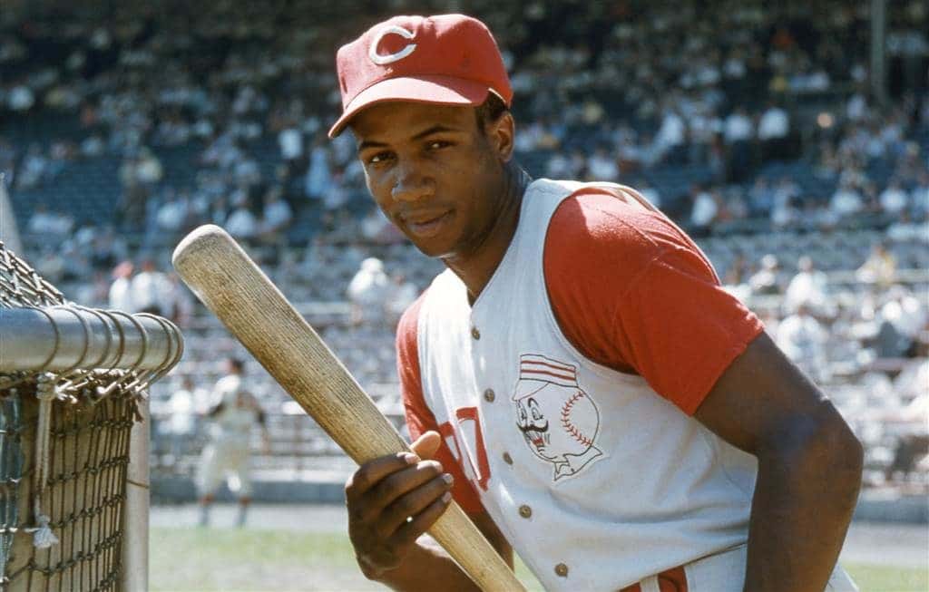
Click to enlarge
Frank Robinson died yesterday. You probably know that he was MLB’s first black manager, that he’s still the only player to have been named the MVP of both leagues, and that he was fourth on the all-time home run list when he retired and is still tenth on the list today. But you might not know that Robbie had a very uni-notable career — in part due to the teams he played for and the teammates he had, and in part because of his own idiosyncrasies.
For example:
1. He wore the Reds’ drop-down NOB
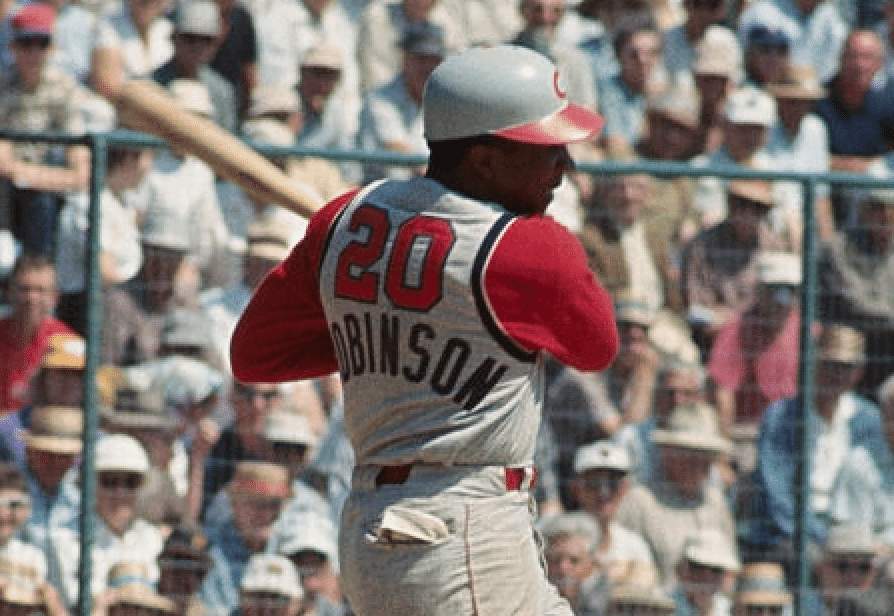
Probably no NOB in MLB history has looked as weird as Cincinnati’s below-the-number lettering from the early 1960s. They put the players’ names beneath the numbers because their vest jerseys didn’t offer enough space across the shoulders, and they made them arched because, well, NOBs were still a new thing and all the ones above the numbers were arched, so why not? A very strange look, especially with the relatively small, compressed numerals.
2. He wore a white batting helmet
That same photo we were just discussing shows Robbie in a white helmet. As we’ve discussed on Uni Watch before, that’s a very rare MLB phenomenon.
3. He wore FIOB
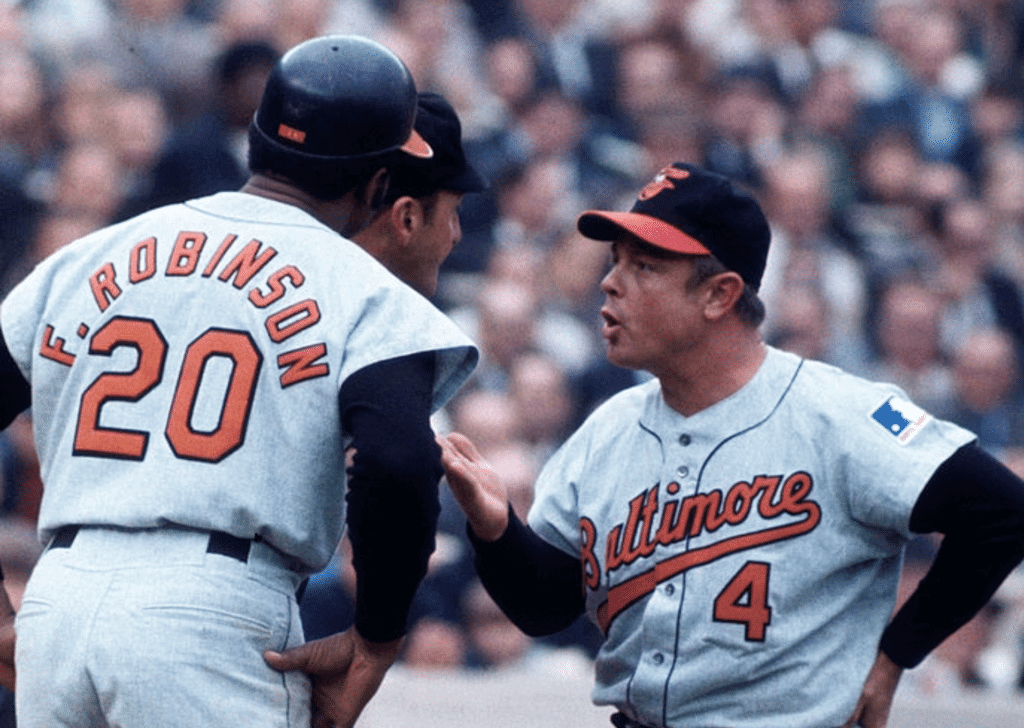
Robinson’s time with the Orioles overlapped with that of Brooks Robinson, so they both wore their first initials.
4. He wore VAL
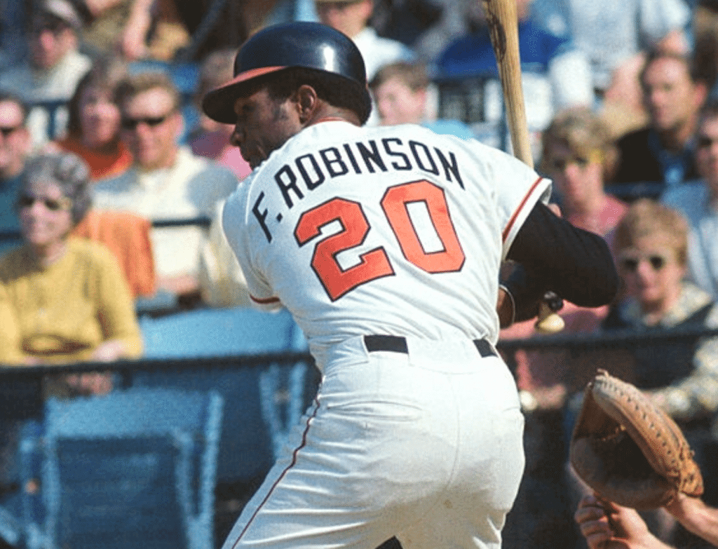
During part of Robinson’s tenure in Baltimore, the Orioles used vertically arched lettering on their NOBs. FIOB + VAL = Mmmmmmmmm.
5. He wore mono-orange and mono-red
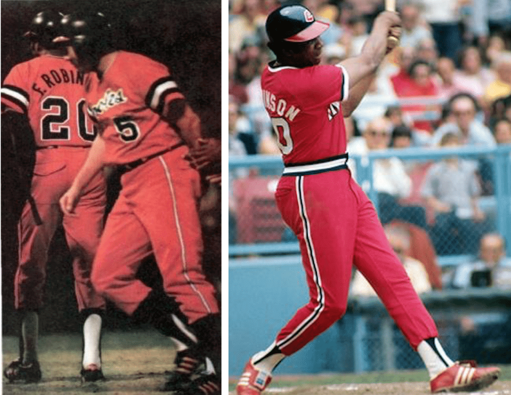
Robbie was with the O’s when they wore their experimental orange uniform in late 1971, and he was also with Cleveland during their blood-clot era. He’s not the only player with this distinction — Boog Powell also wore both of those unis — but it’s still pretty damn rare.
6. He wore vests for two different teams
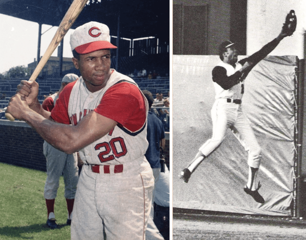
Everyone knows Robinson wore vests in Cincinnati, but it’s easy to forget that he also wore the Orioles’ vest a handful of times in 1968 and ’69. The O’s rarely used this jersey, and I couldn’t find a color photo of Robbie wearing it, but you can see good pics of lots of other Baltimore players wearing it here.
7. He was partially undressed during the World Series
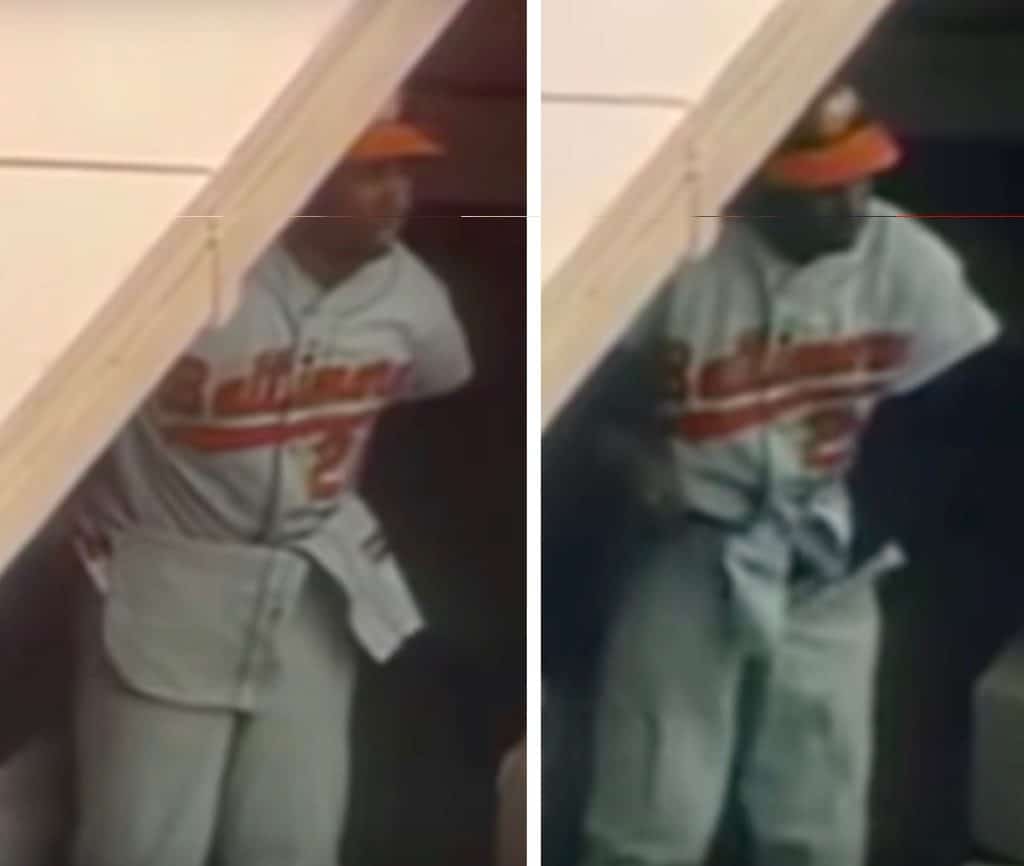
There was a bizarre sequence during the sixth inning of Game Five of the 1969 World Series, when Robinson was hit by a pitch but the plate ump ruled that the ball had hit his bat first, so it was a foul ball. While O’s skipper Earl Weaver came out to argue, Robinson went into the dugout and retreated back to the clubhouse, apparently to receive treatment on the spot where the ball had hit him, delaying the game for several minutes. When he came back to the dugout, he was still tucking his jersey into his unzipped pants — a unique World Series uni moment. (You can see the entire sequence, enlivened by the great Lindsay Nelson’s magnificent broadcasting, here.)
8. The whole stirrup-lengthening thing
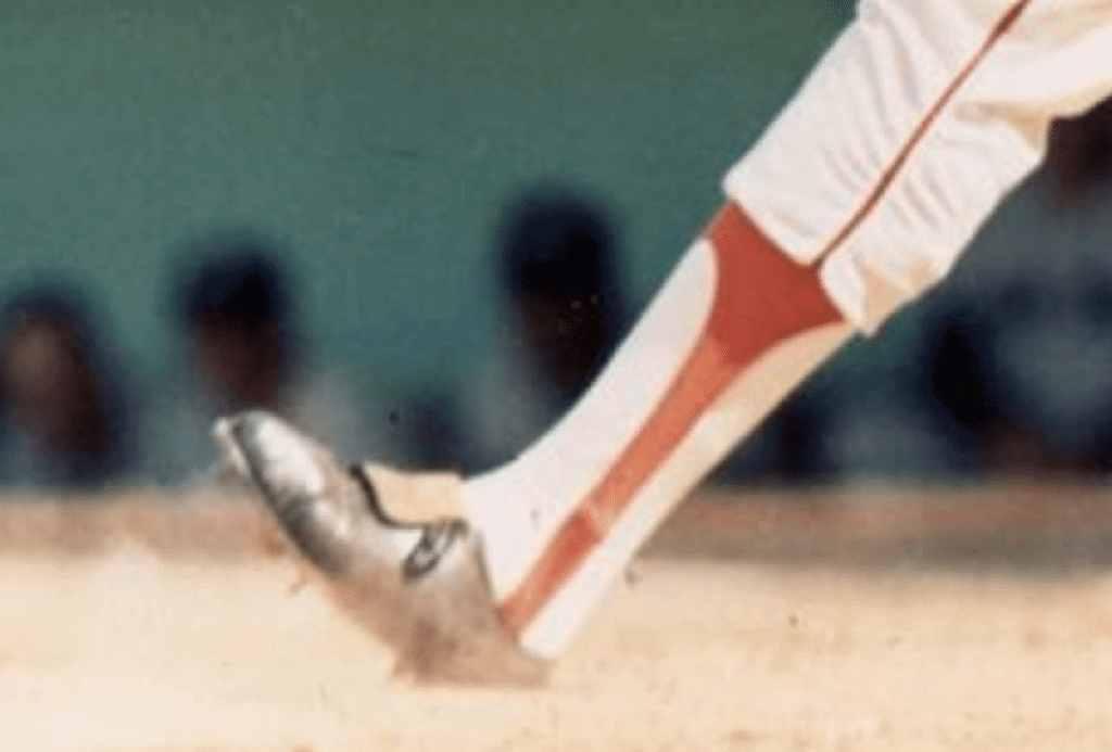
In Jim Bouton’s seminal 1970 book Ball Four, there’s this passage, which I’ve quoted many times over the years:
It has become the fashion — I don’t know how it started, possibly with Frank Robinson — to have long, long stirrups with a lot of white showing. The higher your stirrups, the cooler you are. Your legs look long and cool instead of dumpy and hot. The way to make your stirrups longest, or what are called high-cuts, is to slice the stirrup and sew in some extra material.
I first read that text in 1976, when I was 12 years old. It wasn’t until 40 years later that I learned the full extent of Robinson’s hosiery shenanigans. It turns out that Robbie’s stirrup modifications had been so controversial that they led the American League to impose a new rule regarding stirrup height in 1967 (which they pretty much stopped enforcing in 1968 and abandoned altogether in 1969). You can get the full scoop on that amazing story here.
Robinson appeared in lots of other uniforms — as a player (Dodgers, Angels), as a manager (Giants, Expos, Nationals), and as a coach (Brewers). But I want to circle back to his time with the Reds and show you one last photo that’s pretty special:
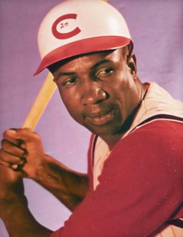
So much to like in that shot. Note the non-wishbone-C, and also the little handwritten “20” inside of it. The Cubs routinely did this in the 1960s and ’70s, but I wasn’t aware of the Reds having done it until yesterday. A nice little detail to learn about.
Finally: I don’t usually like to speculate about memorial patches when the body isn’t even cold yet, but Robinson is a special case. It seems fairly obvious that the Reds and Orioles will both wear a patch for him, and ditto the Indians (because he was the first black manager) and possibly ditto the Nationals (because he was the team’s inaugural manager and was also a bridge from franchise’s Montreal days). League-wide and MLB-wide patches notwithstanding, I believe that would set a record for the most teams memorializing the same person. Just one more distinction for a guy who had a lot of them. RIP, Robbie.
(My thanks to Jeff Ash and Steve Schapansky for their assistance in locating the 1969 World Series sequence, and to Phil for that final photo.)
Click to enlarge
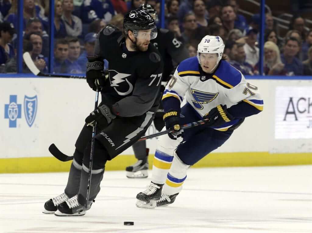
Black lightning: The Lightning unveiled and game-debuted their long-rumored alternate uniform last night. It’s not the worst thing ever, but seeing it next to the Blues’ classic look kinda puts things in perspective, no?
There’s an interview with the Adidas designer here.
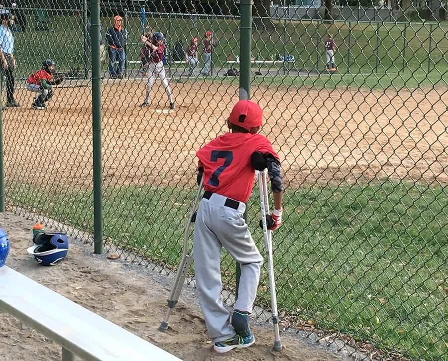
The DL is dead, long live the IL: ESPN’s Jeff Passan broke the news yesterday that MLB is changing the name of the disabled list to the “injured list.” The reasoning was spelled out in a memo that was distributed to MLB teams in December:
In recent years, the commissioner has received several inquiries [from advocacy groups for disabled people] regarding the name of the ‘Disabled List.’ The principal concern is that using the term ‘disabled’ for players who are injured supports the misconception that people with disabilities are injured and therefore are not able to participate or compete in sports. As a result, Major League Baseball has agreed to change the name ‘Disabled List’ to be the ‘Injured List’ at both the major and minor league levels.
I confess that this had never occurred to me, but I can see how it makes sense, especially since some disabled people play baseball. So sure, why not rename the list? Done and done.
What’s the history of the DL anyway? According to this Baseball Prospectus article:
“Disabled” or “injury” lists go all the way back to the early 1900s. Rosters held only 21 players, and several managers and National League clubs were upset at how the strict limit punished those unhealthy or unfortunate. … In response, the National League created the first official disabled list on July 12, 1915; it allowed players to be removed from the roster for a ten-day recuperation period. Even though they were not allowed to play, injured players could remain with the team as a “coacher.”
Interesting! I love learning about this type of stuff.
Click to enlarge
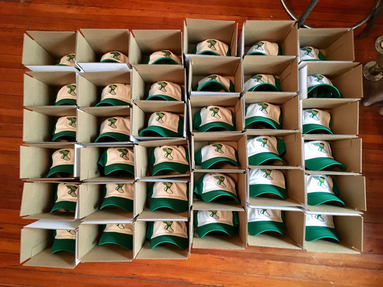
Cap update: Behold — three dozen flex-fit Uni Watch Alternate Caps! After taking that photo, I sealed up the boxes, addressed them to everyone who pre-ordered them a few weeks ago, and brought two dozen of them to the post office. The remaining dozen will ship out today.
I have ten five three two of these caps remaining. All are flex-fit size S/M. I will continue to sell them at the closeout price of $10.99 plus $5 for shipping (I was originally charging $4 but didn’t realize that postal rates have gone up). If you want one, please do one of the following:
1. Send me $15.99 via Venmo, using @Paul-Lukas-2 as the payee. (This is my preferred payment method, because there are no fees.)
2. Send me $15.99 via Zelle, using plukas64@gmail.com as the payee. (Again, no fees.)
3. Send me $15.99 with this Amazon Payments button (if you don’t see the button, refresh the page):
Whichever payment method you choose, please email me and give me your shipping address after making your payment.
Sorry, American customers only for this deal. Thanks!
(Doubleplusthanks to Ryan and Jon, whose very generous assistance helped make these cap shipments possible.)
Raffle results: The winner of the Chicago Fire jersey is Josh Broome. Congrats to him, and thanks to all who entered. We’ll have another raffle kicking off on Monday.
The Ticker
By Yianni Varonis

Baseball News: Looks like there’s a red versions of the Nats’ spring training cap (from @j_nelsn and William Yurasko) … From Phil: The Reading Fightin Phils will wear jerseys with the names of current and former military members on the back on July 2. After the game, the players will present the jerseys to the 25 military honorees or their families. … Newly acquired P Nathan Karns will wear No. 36 with the Orioles (from Andrew Cosentino). … The Dayton Dragons will celebrate their 20th season with an exhibition game between the current team and a team of alums still playing in the Reds’ farm system. This is what they’ll wear (from @SeanC227). … For one night, the Portland Sea Dogs will become the Maine Whoopie Pies, celebrating the state’s official treat (from Mike Tully and @trstnandrw). … The Hartford Yard Goats appear to have a number of different jerseys that will be worn next season, including a hockey-style uniform paying homage to the old Hartford Whalers (from @mikeDfromCT and Jeff Taylor). … UNC has a new set of uniforms for the upcoming season (from James Gilbert). … New charcoal uniforms for Virginia Tech (from Al Jones). … Long Beach State has several new uniform options this year (from @JJfiddler and Andy Garms). … DIII Kalamazoo College will wear throwback jerseys this season. … The Purdue Fort Wayne softball team has a new name, new colors, and a new set of uniforms (from Derrick Sloboda). … Check out the great uniforms worn by the 1947 Topeka Owls (from @WheatLeague). … Here’s more about what the latest corporate bank merger will mean for the name of the Braves’ ballpark (from Jake Patterson).

Football News: ESPN ran a graphic featuring former Ohio State QB Dwayne Haskins in the uniforms of prospective draft destinations (from Tyler Ford). … Based on a photograph inside an Indiana facility, it appears that the football team will wear a new road uniform featuring candy stripes on the sleeves (from Ryan Cotter). … Will the Texas Longhorns ever go BFBS? Not if AD Chris Del Conte has anything to say about it (from Chris Mycoskie).

Hockey News: The Stars wore “AF” decals on their helmets last night in memory of Arlene Forbes, the mother of video coach Kelly Forbes, who recently passed away (from Jake Patton). … In Wednesday’s lede, Paul asked for examples of players wearing jerseys from other sports during championship parades. Reader Mario Scibilia reminded us that former Detroit Pistons F Rasheed Wallace wore a Red Wings jersey after winning the 2004 NBA championship. … The Rangers are celebrating the 25th anniversary of their 1994 Stanley Cup championship. G Henrik Lundqvist will do his part by wearing this mask paying homage to former Rangers G Mike Richter, who manned the net that season (from Moe Khan and Al Kreit). … The Maple Leafs are suing rapper Snoop Dogg for copyright infringement because they claim that the name and logo of the cannabis he’s marketing is too similar to the team’s own name and logo. … Speaking of the Leafs: The team recently took the subway to an outdoor practice and got some pretty great photographs out of it (from Will Leslie and Wade Heidt). … Also from Wade: The Canucks will celebrate Lunar New Year and the year of the pig by wearing red warmup sweaters with a commemorative patch on Feb. 11. … The Western Hockey League’s Calgary Hitmen wore Calgary Cowboys throwbacks in recognition of the team that played in the World Hockey Association from 1975-1977. More information here on the Hitmen’s tribute to three former Calgary hockey teams (from multiple readers). … Today, Alabama will wear cancer-awareness sweaters that will then be auctioned-off for charity (from Griffin Smith). … Cross-listed from the baseball section: Minor league baseball’s Hartford Yard Goats appear to have a number of different jerseys that will be worn next season, including a hockey style uniform paying homage to the old Hartford Whalers (from @mikeDfromCT and Jeff Taylor).

NBA News: Odd look for two legacy teams last night as the Lakers wore yellow on the road while the Celtics wore green at the Garden (from @HitTheGlass [I watched part of this game at a bar and was struck by how the green-clad Celtics players blended in with the green-painted lane — PL]). … Cross-listed from the hockey section: In Wednesday’s lede, Paul asked for examples of players wearing jerseys from other sports during championship parades. Reader Mario Scibilia reminded us that former Pistons F Rasheed Wallace wore a Red Wings jersey after winning the 2004 NBA championship. … PG Retin Obasohan, of the D League’s Northern Arizona Suns, wears a black shoe with white laces and a white shoe with black laces to symbolize the importance of racial harmony (from Griffin Smith). … The D League’s South Bay Lakers will wear uniforms celebrating Lunar New Year (from Moe Khan). … With the NBA trade deadline having passed yesterday, there are now lots of players with new teams and jersey assignments: with the Bulls, SF Otto Porter Jr. will wear No. 22; with the Wizards, SF Wesley Johnson will wear No. 4, PF Bobby Portis will wear No. 5, and PF Jabari Parker will wear No. 12; with the Heat, PF Ryan Anderson will wear No. 31; with the Cavs, PF Marquese Chriss will wear No. 3 and G Brandon Knight will wear No. 20; with the Kings, G Alec Burks will wear No. 13, F Harrison Barnes will wear No. 40; with the Pistons, SG Svi Mykhailiuk will wear No. 19; with the Suns, G Tyler Johnson will wear No. 16; and with the Mavericks, SF Justin Jackson will wear No. 44 (from Etienne Catalan).

College Hoops News: In recognition of Black History Month, Arizona State will wear uniforms inspired by the Harlem Renaissance (from Erik Gamborg). … Last night, the North Carolina women hosted a blackout game vs. Duke and passed out to fans a bobblehead doll of HC Sylvia Hatchell (from James Gilbert). … Drake is wearing throwbacks to commemorate the 50th anniversary of its 1969 Final Four team (from Andrew Musgrove and David Hanson). … Here’s an article on college hoops hairstyles (from Marc Viquez).

Soccer News: English club Fulham has a new kit it will wear during the preseason in honor of the team’s 140th anniversary (from Ed Zelaski). … Nike is encouraging its client, Barcelona MF Frenkie de Jong, to wear his first name on the back of his shirt, instead of his surname, “from a merchandizing point of view” (from Josh Hinton). … New Mexico United, of the USL Championship, has unveiled its inaugural home kits. More information here (from Paul and multiple readers).

Grab Bag: Golf’s Players Championship has a new sterling-silver and 24k-gold trophy (from Michael Brighton). … Reader Graham Clayton sent a tidbit that 1970s-era Australian racecar driver Robyn Hamilton had to have a custom-made racing suit because existing suits didn’t fit her. … Air Force four-star Gen. Joseph Lengyel called himself out on social media for accidentally wearing his ribbon rack upside-down during the State of the Union address this week. … Here’s an interesting piece on how a Brooklyn-based costume designer manages to do his job on a tight budget (NYT link). … Gucci has removed a jumper from its line that had been heavily criticized for “resembling blackface” (from J. Max Weintraub). … Meanwhile, Adidas has responded to criticism by pulling an all-white sneaker that had been created for Black History Month. … The city of Lansing, Mich., has a new logo that has been met with mixed reactions from residents.
Chris Long wore an Allen Iverson throwback to the Eagles Super Bowl LII parade.
And that picture of UNC baseball (which is ridiculous, nobody needs 6 uniforms, especially when 2 of them resemble 2 of the others so as to be redundant) shows my dorm from freshman year! E’haus 4 life…
Here’s a link of Chris Long in the 76ers jersey.
The new Players Championship trophy is a joke.
Very un-Pro. More fitting for a muni club champ.
Looks like C3-PO playing golf. Terrible!!
Typo in Hockey section:
Also from Wade: The Canucks will celebrate Lunar New Year and the year of the pig by weearing…
Extra e in wearing.
Fixed.
Another uni-notable item about Frank Robinson: He was the judge of the Orioles Kangaroo Court and he would wear a mop as a wig when court was in session:
link
Oooh, that’s good!
Lightning fan here:
Those thirds are dumb. You can’t see the numbers well at all from the main camera shot on TV, even on a fairly big screen.
How hard is it to say, “Hey, is there enough contrast here?”
Numbers exist for player identification. If they don’t do that, there is no point.
And the broadcast last night was a two and a half hour commercial for the jersey. Proving again they are about absolutely nothing other than getting you to buy them.
Which, fine. Market a jersey for fans. But don’t put them on the ice.
I really wish they had gone with Deactivated List or something. There’s no way I can get used to saying and writing IL after all these years.
And, of course, baseball already has an IL where players who are no longer active in the majors can go — the International League.
“Cause hugging and safety is what the world is all about!”
“I’m Still Calling It The DL” t-shirts? Or maybe “I Miss The 15-Day DL”?
I AM handicapped, I’m psychotic.
Joe Piscopo, Johnny Dangerously. Great movie.
I’m calling “I’m stlll calling it the DL” the greatest thing ever.
Love those white batting helmets.
Re: Lightning vs “classic” Blues uniforms. I don’t know that I’d consider that Blues uniform classic. With the superfluous navy in there and extra bells and whistles, it is not a bad uniform, but far from the kind of classic uniforms the Blues could be wearing.
Classic for the Blues would be more like this:
link
Frank Robinson was also the last manager to wear a Montreal Expos uniform.
Yes indeed. Paul mentioned it by saying that Robinson was the inaugural Nationals manager and a bridge from the Expos era.
Calgary Hitmen again were close but not completely accurate with the throwbacks in this Corral series. The Cowboys had their logo as a shoulder patch too. White stripe on the pants.
link
Not sure why they didn’t wear the red helmets and red pant shells when they dressed as the Centennials last week instead of the black helmets and pants. Would have been truer to the actual Centennials in the 1970s if they had.
Southern Illinois teasing a new logo on February 28: link
I was a student there when the current logo was launched. That’s when you know you’re getting older.
“While O’s ump Earl Weaver came out to argue, ….”
Not sure if you *meant* to call Weaver an ump on purpose or not.
He certainly did his share of umpiring from the dugout!
Ha! Fixed.
Frank’s batting helmet in the drop-NOB pic sure looks gray to me, not white. Did the reds ever have gray batting lids?
It’s basically dirty white.
Totally forgot that Robinson also coached for the Brewers in 1984, so that’s another team’s uniform that he wore:
link
That’s OK. Lots of us who are Brewers fans forgot that, too. He was hired for the last couple of months of that season. The Brewers paid him $1 for the gig.
Literally!
link
San Francisco for Robby too (as a manager), an had his number 20 retired by three different teams (so far.)
I was just thinking about the number of teams that might wear a patch for him and if that would be a new record. Legitimate claims would be Reds, Orioles, Indians, Nationals.
I cannot stand when these networks photoshop players in jersey numbers that are retired. We’ve seen it happen at least twice this week with Tobias Harris and Dwayne Haskins. And in those instances especially; it’s not like Charles Barkley and John Elway are obscure number retirements.
Counterpoint:
I have no problem with it. Arguably, makes it easier for the artist to prove that it’s his artwork, and it can’t possibly be a real picture, for copyright or permissions reasons. It’s already a rush job to imagine a trades player in the new uniform, so why accidentally make fake news with a guess on a new number?
Why not simply depict the player so that the number isn’t shown (as they did with the Giants photo)?
From the ESPN image featuring Haskins…do they know something we don’t about the Giants? Going to see more of the throwbacks this year?
It’s their Rash alternate. A legit part of their wardrobe.
The Nathan Karns link is broken. Here you go!
link
Fixed.
Yeah, hate to think of memorial patches so fast, but I’d fully predict Robinson would set that record, and I can’t imagine who else would already have three. To my knowledge, only Nolan Ryan *also* has a retired number among three teams, and he’s still with us. But if you retire a number for a man as a team, you’re probably gonna have a memorial patch.
Can someone answer a cultural question about soccer for me?
Do team colors mean nothing when it comes to non-home kits? Man City’s color is that light blue, but they’ll have kits in purple. Man U are the Reds, but you seem them in salmon/pink or whatever it is they’re wearing this year. Bournemouth are the Cherries, but they have this weird teal kit. I know they’re supposed to clash with their opponents, but why all these garish colors and not just, say, white?
Is the badge the only thing that matters?
Soccer teams generally have traditional colors, and traditional colors for change kits. Man U often goes blue to change. Liverpool: white or yellow. But yeah, the point of change kits is to avoid clash (ie avoid matching).
Related: white *is* a color in Europe, while here in the US, white is the absence of color—a neutral slate. Hence why FC Barcelona will never ever ever ever wear white. Red and blue stripes standard, and pastel changes.
I’m interested in white being viewed as a color. If that’s the case, is there a European version of a “neutral” color?
I heard the other day Nike (I think) wanted to have Barcelona wear a white kit. It did not go over well.
it was meant to be a white shirt with a Red Cross, St. George’s Cross (the patron saint of Barcelona and part of the badge). But white on a Barça shirt is very much frowned upon; even the player numbers have been yellow in recent years.
Winter, generally, clubs always get three new kits per season. Home, away, and a third. The home kit always features the club’s main colors (sky blue for Man City, for example). The away is typically a club favorite design or color scheme that either has historical value or looks really good for retail sales. For example, my favorite English club, Man City, often have a darker color for away kits to contrast with any club where sky blue kits won’t be deemed acceptable by the referee. Navy and claret are popular design colors for the club. Some designs, such as the odd and frankly horrid Man United salmon design, are merely done for retail and fashion sales.
The third kits are produced entirely for retail sale and very rarely have any deep connection to the club or the history of the club. The kit maker (Adidas, Nike, etc.) choose similar design templates and bold color schemes and hope they sell a lot of kits.
The past five years or so, both Adidas and Nike have gotten very dull and unoriginal with kit designs, choosing to use standard (often boring) templates for clubs and adding little distinct details to the kits.
Thanks. I’m just trying to imagine what would happen if an American sports league other than MLS tried this (although the Jazz are close with their Moab/Zion/red/orange).
Say if the Celtics came out with a blue set. Or say the Chiefs wore green. I know we’ve had throwbacks in different colors (Jets, Packers, Eagles, etc.), but a just regular alternate?
Until recently, you wore your primary kit, home and away. If your kit color were too similar to your opponent, the visiting team would be forced to change. Thus, the term “clash kit”. By definition, it had to be far enough from your main kit to provide contrast against the opponent whose kit resembles yours. Rarely, you would need a third kit if the clash kit didn’t provide enough contrast (usually, one of the teams involved had stripes or hoops where 2 colors were codominant). With the advent of sales driving uniform design, more teams are wearing their “clash” kit, even when their main kit doesn’t look like the opposition’s main kit. European teams have lately adopted the American convention of “home and away” kits. Which is a step back IMO.
The third kits are produced entirely for retail sale and very rarely have any deep connection to the club or the history of the club.
Yeah, well said. Most teams don’t need more than two.
Some teams don’t even need more than one, so they instead wear their other kit(s) as often as possible (looking at you, Watford and Norwich).
It’s those pesky sides that have stripes, hopes, or quarters that justify third kits for some teams.
You have a white first, a dark second? Good luck playing Newcastle. So you get something like Spurs green thirds this year.
You wear blue at home and white on the road in the Championship? You’re going to need a third kit to avoid problems at QPR or Blackburn Rovers (when they are using bright blue, that is).
As a Broncos fsn, I must say that ithe mage of Dwayne Haskins wearing #7 on a Broncos uniform is a bit jarring, even if it is just a mock-up.
Okay, Braves, here’s your chance to get this right: go ahead and sell “priority advertising rights” to the stadium if you want, but just call it Braves Field.
Agree, but I’d also love it to be Hank Aaron Field. He has done so much for this organization even beyond his stellar contributions on the field.
We were trying to see if Robinson ever wore the blue Cleveland top from the 70s era?
Took me literally 3 seconds to find this:
link
10 more seconds:
link
Come on, man. At least *try* before asking.
It’s going to take me a while from saying “he’s on the DL” to “he’s on the IL.”
I don’t know if they will or not, especially since Willie McCovey died this past off season, but its possible the SF Giants may have some sort of memorial for Frank Robinson. He managed the Giants for 4 seasons, and while not wildly successful, he was reasonably popular & respected out here.
It should be noted that Frank Robinson was not only the first black manager in MLB, he was also the first black manager to get a second chance at managing in MLB. While not as historic as being first, it’s a very crucial milestone.
Lee
I like the change from “DL” to “IL” for the official reason, and also to begin removing my biggest announcing pet peeve. Announcers refer to injured players as “working to get healthy” and to players with history of injuries as having “health” problems. Usually a player with a groin injury, concussion or broken bone is still extraordinarily “healthy” by any method of assessment.
My hope is that by thinking of injured players as INJURED it will remove the misuse of the word “health”.
To add to Robbie legend. Only he and Nolan Ryan have had their number retired by 3 teams (Reds, Orioles, and Indians). If the Nats decide to do the same he would ve the only one with 4. Another first!
Perhaps he wasn’t there long enough, but the only WS championship Ryan won was with the team that hasn’t retired a number for him: the Mets.
Just because “it’s Nolan Ryan” doesn’t mean his number should automatically be retired by the Mets.
He was mediocre at best while in New York, that’s why he was traded. You sound like want a decree put in “if player X represented team Y then his number should be retired”. No.
Sick of numbers being retired, sick of instant nostalgia.
If he was so special, should have done it while he was alive…not now because he’s dead.
Typo in the DL to IL section. It says the “principal concern”. The principal is your PAL. Should be principle.
No, actually, “principal” is correct. You’re talking about the noun, but in this context it’s an adjective:
link..2907…0.0..0.170.561.1j3….2..0….1..gws-wiz…….0i71j0i67j0i131i20i263j0i131.gn6CUEWI2NI
Ok for the record, when a team does have black isn’t heir color scheme … it looks pretty damn good… and that’s how you do it, Tampa bay… I’m not saying the uni is perfect or unapproachable… but damnit, they went for it… here’s our all black get up… no bells or whistles with other clashing colors , just black on black on black… 2 thumbs up in circle formation for that one…. (bonus points if you remember what tv show that last line is from)
Black is in their color scheme*
I was watching the Blues broadcast of the Lightning game. The Blues announcers spent a solid couple minutes complaining about how hard the numbers were to read from the press box. They ended it with, “they’ll sell a lot of them though.”
Paul – Don’t forget Frank also wore hat pins with the Giants:
link
Oh, excellent! Good one!!
Re: Purdue Fort Wayne: Did anyone else get a small linguistic chuckle out of seeing “Mastodons” across the chest of a women’s softball jersey, knowing the root of that animal’s name?
link
Lansing’s new logo is ridiculous. It’s pretty sad when smokestacks are the most noteworthy thing in your city.
Check your link in the white batting helmet story that is for the white sox.
When I was a kid, I didn’t think anybody looked cooler in a uniform than the great Frank Robinson:
link
Caption is wrong: they’re in RFK Stadium in Washington DC prior to the 1969 All Star game. Memorial Stadium didn’t have a canopy roof.
Francis was a super player & a super guy, really motivated teammates!
Great player, but i never liked that he refused to sign autographs. Not for kids or ever.