
By Phil Hecken
Follow @PhilHecken
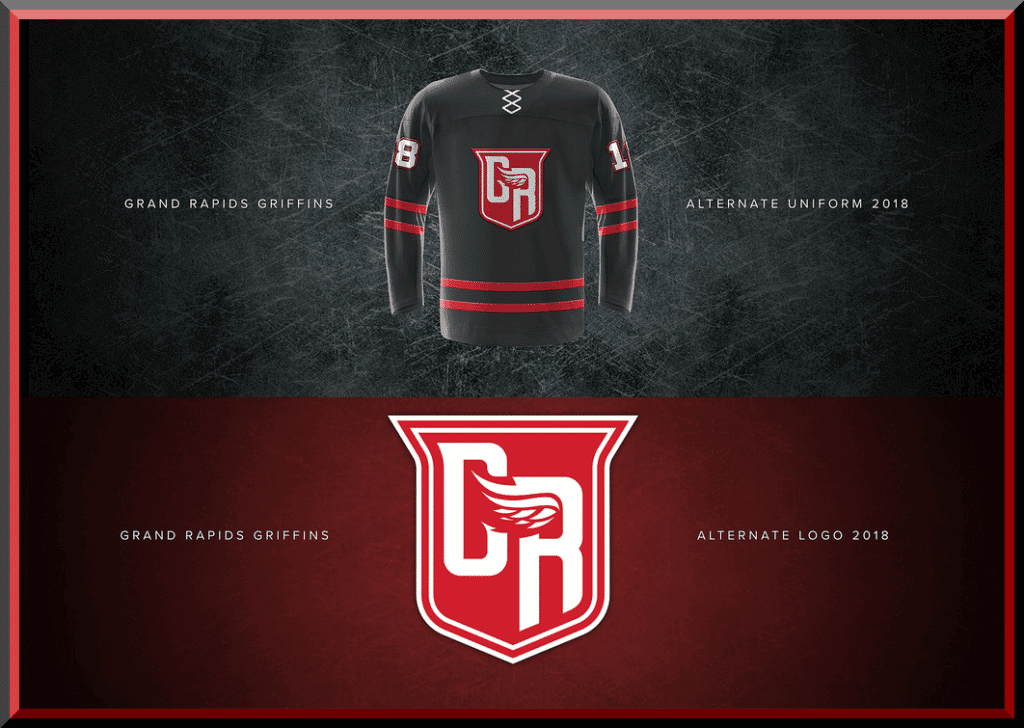
Readers will recall that during the month of August (when Paul takes his much-deserved sabbatical from the weekday duties) — and for the third consecutive year — I had the honor and pleasure of again hosting a design contest sponsored by the Grand Rapids Griffins, the AHL affiliate of the Red Wings. This year the winner of the 2018 contest was Matt Harvey, whose winning design was this:
As the Griffins did following the 2016 contest with winner Dan Kennedy, and last year’s winner, John Elbertson, Matt received a custom jersey based off of his design, and a special invitation to join with the team at the game where the fauxback jerseys were being worn.
The game had originally been scheduled for late December, but at the last minute (almost literally), the game where Matt’s winning design would be held was switched to January 19, 2019.
Take home one of these 🔥 specialty jerseys designed by @MattHarveySC, the winner of the jersey design contest hosted by @PhilHecken & @UniWatch, from the post-game jersey auction on Saturday!
You do not want to miss these >> https://t.co/iUL3ROrBmi pic.twitter.com/3Y8lWI3exu
— Grand Rapids Griffins (@griffinshockey) January 17, 2019
Unfortunately, due to the last minute scheduling change, Matt (unlike previous winners) wasn’t able to attend the game in person, which was disappointing for all involved. Late last year, I had interviewed Matt, and since then, I’ve run a few of his other uniform concepts on Uni Watch. Today, I following up with Matt about the contest and the Griffins treatment of his design, and also with photos of his jersey being worn on the ice.
The first step came with Matt’s design being adapted to an actual jersey. The initial photos capture the essence, but almost appeared to be anthracite in color (click on any images below to enlarge):


When Matt first received those pics, he told me, “Here is a sneak peak of the jerseys for the Grand Rapids Griffins that I designed. I was told that the jerseys look darker than what is on the image. The lighting in the room is very bright.”
Indeed, those original photos didn’t do the Griffins’ treatment justice. Later on, Matt sent me the following shots of his jersey design:

Here are some more looks:


You can see a few more photos here.
After seeing those, Matt told me, “I think it turned out quite nice and I’m happy with the the final design. I’ll break it down more and give you my full thoughts on the jersey once I see them on the ice.”
That time has now come.
We’ll start with a couple photos of Matt’s design in the flesh, as it were, worn on January 19th. Interspersed with the game action shots will be Matt’s thoughts (in italics):


What an honor it is to have a design come to life. I’ve always dreamed of having a design of mine come full circle, and this one is extra special because it’s in the realm of sports. I’ve been doing my own sports logos and uniform designs ever since I could draw and to see the hard work and determination pay off means the world to me and I’m truly honored to have done this design for the Grand Rapids Griffins.
After seeing the jersey in person and the images, I was amazed. The jersey looks absolutely amazing. It’s almost exact to the original concept that I had put together.

The uniform features a dark grey/charcoal base color with two red stripes that go across the front/back and sleeves of the uniforms. Each sleeve features the players number, with the players number on the back in white, followed by a thin black and thin red outline.

One change the team did make was make the collar black, which it does look nice. The original concept had the collar in the same base grey as the uniform. Besides the collar change, that was the only change they made to the uniform (if you don’t count adding the sponsors [advertiser — PH] logos on the front and back of the uniform.)

The best part of the uniform is the crest logo featured on the front of the uniform. The red shield logo which features a “G.R” initials logo and wings brings the uniform to life. The logo represents the city (Grand Rapids), the Griffins, and the affiliate team, the Detroit Red Wings, all in one logo and I couldn’t be happier with how it turned out.

The logo looks amazing from both close-up and far away. I spent many hours trying to get the logo too look right and be easily readable and recognizable. I also wanted the logo to feel strong and have a since of pride. After seeing the reactions from players, and fans on social media, I think I was able to achieve some success with the logo.

Overall, I’m very happy with how the uniform turned out. The pictures from the game looked great, and I thought the contrast of the uniform looked nice as well. Even though I wasn’t able to attend the game in person, from the pictures I did receive, they looked great on the ice, and I thought the uniform matchup against Milwaukee was nice as well. It looked like a nice turn out in the crown of people that came out to support the Griffins and see the jerseys, and that made me feel even more honored.

Well done Griffins. Good win in a good lookin’ uniform.
To all those who reached out to me with positive comments and congratulating me, I say thank you. It really means a lot.
Again, I’m very honored for the opportunity to have designed this uniform. I hope it’s not the last one I get to design, and I look forward to the next design challenge.
Thanks, Matt! Fantastic design, and great job by the Griffins in bringing it to life. There are a few more game action shots available here.
Well readers, how’d they do? Were any of you readers in attendance for this game? Please let Matt know your thoughts in the comments down below!

Nike Confirms MLB Deal
Yesterday, the news broke on the (possibly) worst kept secret in sports/uni news: Nike will officially take over as the official uniform supplier for MLB, with the deal to begin in 2020. Darren Rovell reported it early yesterday:
JUST IN: MLB & Nike have announced a 10-year deal that will make the swoosh the official uniform & footwear supplier of MLB beginning with the 2020 season. Fanatics has the exclusive to make the gear for fans. The on-field deal was originally Under Armour but company backed out. pic.twitter.com/BFOOJkJ6RT
— Darren Rovell (@darrenrovell) January 25, 2019
For the details, here’s a good article. It’s nothing we didn’t (really) already know: Nike will “design the apparel that players wear on the field — including jerseys, base layers and warmups” while Fanatics “will manufacture and distribute all of Nike’s MLB products sold at retail.”

Do you notice the alarming trend in the verbiage of the first sentence? Read it again.
Yep. “Nike Inc. will be the next jersey supplier…”
So, they’re not making the pants too? Of course they are, but in another nod to the increasing culture of making official gear which fans can purchase, the focus of on-field uniforms has really become secondary to the marketing of the “jersey.” That copy should most certainly read “Nike Inc. will be the next uniform supplier,” but “jersey” has now either become shorthand for “uniform” or, more likely, “jersey” (and jersey sales) is once again the driving force behind the announcement. I’m not sure if the wording used in the article came directly (or was reworded) from a Nike statement, but shame on the writer for using “jersey” instead of uniform.
But I digress. What does this mean going forward, in terms of how teams will look on the field in 2020 (and beyond)? Aside from new templates, teams will probably look very similar to the way they do today. Remember: while Nike will “design” the uniforms, they will still do so at the direction of the teams. Yes, we’ve seen their influence on the NFL (think Seahawks, Buccaneers, Vikings, Browns, etc.) and the NBA, and that’s not to discount how Nike will attempt to transform MLB. But they are still the manufacturer and MLB is still the client. Nike will make the uniforms the teams request.
Uniforms are likely to remain the same or relatively unchanged, at least at first. One difference we may see is logo placement: Majestic (the current uniform supplier) currently places the Majestic logo on the left sleeve and on the back belt loop of the pants. UA’s deal with MLB had been to move the logo from the sleeve to the chest. Nike’s deal probably includes this provision as well.

Padres Officially Bring Back the Brown
In case you missed it, perhaps the second worst-kept secret was revealed the other day: Yes, (FINALLY!) the San Diego Padres have listened to their fans and will be officially changing to brown and gold uniforms in 2020.
According to this article in the San Diego Tribune, “The Padres notified Major League Baseball of their intent to wear new uniforms starting in 2020, and the organization conducted focus groups testing brown uniforms on Wednesday and Thursday.”
Although there are no uniform mockups, the focus groups were shown a combination of three different home and road sets. Here’s how they’re described:

Hmmm. “Solid tan.” “Tan and brown.” Why am I having really bad flashbacks as I type this? I may have been one of the few who appreciated the Padres sartorial choices when they eschewed the road gray uniform back when they went with the all “sand” uni back in 2004. But that grew old quickly, and I hope they have learned from their past mistakes.
As part of my “What’s Your Sign(ature)” series, I explored the Padres back in 2016. If you read that, you’ll note the rich brown (and gold) history the team had from its inception up until 1991.
With regard to those “focus groups,” who preferred the brown and gold — those were conducted last summer; interestingly, the brown and gold was not preferred by a majority or participants, but those who did were apparently quite “passionate” about it:
Focus groups in June — featuring brown and gold, brown and orange, blue and white and blue, orange and white uniform choices — revealed no majority preference. However, the largest and most passionate minority was comprised of those who favored brown and gold.
While it’s impossible to tell what the focus groups were shown (for brown/gold/tan uniform choices), none of what is described sounds like it will be what we’d consider of the throwback or “fauxback” variety. Also of note: now that Nike is officially the MLB uni supplier for 2020, and these uniforms are scheduled to be worn beginning in the 2020 season…will these be “designed” in conjunction with Nike? (And even if they are, they may just have to “make” what the Padres demand.) Or, will the Padres and Nike kick off Nike’s reign of terror uniform supplying days the way the Seahawks did back when Nike got the NFL contract? I’d love to catch a glimpse of the sample prototypes the focus groups were shown.
Also, I smell a uni design contest coming soon…
More Gouache From Gene Sanny
Weekend readers will recall I’ve run a few sub-ledes featuring artwork by Gene Sanny, done using a Gouache technique, which basically means applying watercolor colors to an image and then removing (or erasing) them to create a new image. You can see this technique used on an earlier painting by Gene.
Gene’s back again, this time with a painting of an iconic Steelers quarterback you should be able to instantly identify. You should know who it is by the second image below (click on each to enlarge):


And voila, the finished product:

Beautiful, eh? Of course it is! Great stuff Gene — keep ’em coming!
The Ticker
By Anthony Matthew Emerson

Baseball News: We got a good ole-fashioned Uni Watch Mystery on our hands. Vincent Colon received this Mets weird/awesome Mets pullover for Christmas. It has a Champion makers mark, and my estimation puts it from the early to mid-90s, judging by the overall design. I’ve never seen anything like it. Anyone have anything similar? … Like Roy Halladay, Mike Mussina is going into the Hall of Fame sans cap logo, thus ending a Uni Watch debate. It is interesting that two of the four BBWAA-elected inductees are going in without cap logos. It’s also interesting that the other two only played for one team, thus negating (thanks to Paul, Mike Chamernik, Kary Klismet, Mike Engle and everyone else who sent this in). … Paywalled, but ESPN Insider’s Bradford Doolittle has a treatise against the corporatization of ballpark names (from Mike Chamernik). … UNC has new tri-color caps for this season, and they’re absolutely gorgeous (from James Gilbert). … New blue jerseys for FAU (from Jake Elman). … New unis for Missouri S&T (from Patrick Murphy). … Lindsay Resnick found this T-shirt in the Auburn bookstore, and found the script “Tigers” to be very similar to the Detroit Tigers’s script wordmark. … In light of yesterday’s lede about the WE>ME nameplates of McEachern High, Joseph Andersen remembered the Honolulu Little League team using the slogan themselves last summer on their way to the Little League World Series Championship.

NFL News: As Antonio Brown continues to try to depart the Steelers, he has now posted an images of himself photoshopped into a 49ers uni and hugging Jerry Rice on Instagram (from Mike Chamernik). … The Patriots have applied the Super Bowl LIII patches to their jerseys. … @PeskysPole noticed that the prop Chiefs helmet NFL Network has on set has the logo facing the wrong way; the arrowhead should be pointed towards the facemask. … The NFL is testing the new Prizm visor during tomorrow’s Pro Bowl (from @BigJ52).
College Football News: Also posted in the NBA section: Kevin Durant was given an old Nike Mach Speed-template Longhorns jersey by Texas, despite the team having dropped that template in 2017 in favor of the Vapor Untouchable template (from @CFB_design).
.

Hockey News: Penguins D Kris Letang is wearing a cap with his team’s old shade of gold in this photo (from Kevin D. Riley). … In 1997, the Sharks acquired G Ed Belfour from the Blackhawks, and had him thrust into net two nights later. He had no time to get Sharks-colored pads and mask and thus used his red-and-black set, and even wore Blackhawks pants for the game — note the red and white stripe on his pants (from Jerry Wolper). … Speaking of the Sharks, the 2019 NHL All-Star Game is in San Jose, and evidently the league and/or host committee is playing up the Silicon Valley angle, as the official pins for the game are designed to look like the world’s ugliest computer chip (from Eric C. Stroker). … And speaking of All-Star Games, the sweaters for the AHL All-Star Game have been revealed. I’ve definitely seen worse sweaters before, so I guess points for that. … The ECHL’s Jacksonville Icemen have unveiled the world’s best military appreciation uniform (from Nick Kamarich). … The QMJHL’s Charlottetown Islanders last night wore the unis of defunct AHL Prince Edward Island Senators, a team that lasted only three years. The sweaters were auctioned off for charity following the game (from John Muir).

NBA News: Good lord, the number font on the NBA All-Star Game unis is atrocious. … Cross-posted from the college football section: Kevin Durant was given an old Nike Mach Speed-template Longhorns jersey by Texas, despite the team having dropped that template in 2017 in favor of the Vapor Untouchable template (from @CFB_design). … Also posted in the College Hoops section: Roy Williams and LeBron James both wore the same sneakers the other day (from James Gilbert). … New Nets SF Mitch Creek will wear No. 55 (from Etienne Catalan).

College Hoops News: Pink-accented unis for Creighton in their game against Butler (from Chris Richardson). … Kentucky now wearing Paul Gordon-inspired shoes (from Josh Hinton). … Cross-posted from the NBA section: Roy Williams and LeBron James both wore the same sneakers the other day (from James Gilbert).

Soccer News: Adidas will once again use templates for their kit designs, which of course stymies the look of dozens of teams (from Josh Hinton). … Vancouver Whitecaps have revealed their 2019 home kit. Note that it includes a 1979 Champions patch, with the most over-the-top 70s font imaginable (from Wade Heidt). … FootyHeadlines has leaked Orlando City’s 2019 home kit (from Josh Hinton). … New kits for Colombian side Atlético Nacional (from Ed Żelaski). … Enough ads on the kit for Bolivian club The Strongest? That’s Caught Offside podcaster JJ Devaney in the photo (from Kyle Dawson).

Grab Bag: Someone has ranked the “biggest fashion faults” of the Australian Open (thanks, Phil). … Dale Earnhardt Jr.’s racing team will use the famous No. 8 car in the Xfinity Series (from Christopher Hickey). … Here’s an art project that’ll tickle many a Uni Watcher’s fancy: photographer Kevin Hong has been taking utterly breathtaking shots of vintage bowling alleys throughout the country. Highly recommended (from “esa“). … The iconic 30th Street Station board in Philadelphia will be removed over the weekend, as it is not compliant with disability regulations (from Blake Fox). … The logo for Senator Kamala Harris’s presidential campaign uses the same font as the logo for Late Night with Jimmy Fallon (from Brad Loliger). … Wells Fargo is getting a new logo to try to distance itself from scandals (from Christopher Hickey).
One Final Note…
Jimmer Vilk informs me that all the Vilkmas Winners will have their items shipped this week. So to the lucky five: keep an eye on your mail boxes!
Really nice concept for the Grand Rapids Griffins in that main logo, except I see is “CR” more than “GR”. But otherwise really nice job.
There was a difference in the sock striping for the PEI Senators throwbacks compared to the original.
The throwback last night featured 1 red stripe on the black socks. The Senators uniforms (both on the farm on PEI and in Ottawa) featured 2 thinner red stripes.
link
Nike has some cringe-worthy marketing nonsense about how the All Star font is “military inspired because it honors the state’s history of flight, just as the Wright brothers intended.” Granted, neither actually served in the military, but don’t tell Nike that. No, please do tell them.
I used to have a nearly identical pullover as Vincent Colon, but mine was the Chicago Cubs version. I remember getting it from the Champion Outlet store in Schenectady NY, back when they had bargain bins filled with a wild assortment of all different team clothing, usually having some kind of defect.
Even though I’ve always hated the Cubs, I bought it because of the great MLB logo patch on the left shoulder (reminiscent of the patch worn in the majors back in 1969) – and, besides, I remember it cost only $3.99. I kept it in my car trunk for years to use as an emergency backup if I ever needed something to wear if the weather became too chilly, and may have only worn it a handful of times.
I finally threw it out about four years ago, but only after removing the MLB patch from the left shoulder.
I liked the Grand Rapids concept well enough when I saw it in the contest, but I wasn’t wowed by it.
Seeing the finished product on the ice has changed my mind. It’s absolutely gorgeous! Well done! And congratulations!
I completely agree – Nice enough as a concept, but those are exceptionally crisp looking and absolutely popped on ice. This may be my favorite of the game-worn Uni-Watch design projects.
UNC baseball cap: Like any Expos fan, I’m a sucker for the pinwheel design.
Have to agree on the Exposesque design of these. And yet, when I go to UNC’s baseball team website/store, they appear nowhere. Interesting. Guess I’ll have to wait for the season to start.
I’ve always liked the Padres road tans
Same here. Wasn’t a big fan of the “SanDiegO” lettering but the tan was splendid.
And the only other problem was the blue headgear and trim. You pair that tan with brown lids and trim? C’est magnifique!
Error in NCAA section, Kentucky is wearing Paul GORDON shoes
Paul GEORGE you mean
Nike will only be making 2 of the 5 main parts (Hat, jersey, ,pants, socks,shoes) of the uniform. So technically the “uniform” is a mish-mash of suppliers.
Lovely painting by Gene Sanny, absolutely beautiful.
Just an FYI, Gouache is a type of paint that mixes watercolor with an opaque base – has nothing to do with erasing or removing color. They’re often used together with traditional watercolors (look at most of Edward Hopper’s work).
Thank you sir…. Yeah, you are correct, it’s a type of paint… I was probably breaking it down too simply in my email to the guys. The “lift-off” of paint is a gouache “technique”, that I’ve only seen achieved in it, and more recently oil paint.
Your work is absolutely stunning. I was gonna ask if you have ever done similar with oil. I’m useless when it comes to oils, yet I could picture a lift-off coming out wonderfully.
The Griffins jerseys look awesome! I’ve wanted to see a team try a variation of black for a long time, and it turned out really well.
Also, I believe Adam Cain was a co-winner in 2016?
I think the Griffins’ uniforms look spectacular — very rich and striking colors and a clean design! I do agree with the other comment that the “G” could have a bit more definition, as it’s very close to looking like a “C.” Otherwise, very nice.
I hope the Padres go 0-162 every season from here on out. Tragic!
Pffft. They’re going from my 5th favorite NL West team this year to my 1st favorite NL West team in 2020…when I hope they cap off their 162-0 season with their first World Series title.
So they’re Bringing Back The Brown, but they’ll be made by the Swooshketeers? The Lord giveth and the Lord taketh away…
Now if we could just get the Chicago AL team to Bring Back The White Socks, all will make sense in the world of MLB unis.
I’m pretty much super pumped that the return to brown for the Padres is a reality.
Kudos to the Bring Back the Brown Movement for their efforts. The dream is a real.
Let me know what I can do the help the Bring Back The White Socks movement. Always will to help a good cause.
Let me know what I can do the help the Bring Back The White Socks movement. Always will to help a good cause.
Did I ever tell you you’re my hero…’cause you are the wind beneath my wings…
Letang’s hat has no gold~ that’s the black/white All Star color scheme. Several players wore them during the skills competition last night.
Correct, Letang’s hat is the All Star black and white hat. There is not gold in it.
Invert the colors of the GR Uniform and I might like it. There’s way to much charcoal, grey and black in today’s uniforms.
In regards to the Chiefs helmet logo being backwards, that isn’t the NFL Network, it’s the set for the local Boston area Patriots show. Which is in Massachusetts. Not Los Angeles. Which is in California. Which are on opposite sides of the country.
It looks like CA instead of GR