By Phil Hecken
Follow @PhilHecken
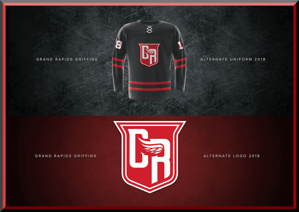
Back in August, I proudly hosted the third annual Grand Rapids Griffins (an AHL affiliate of the Detroit Red Wings) jersey design contest, and reader Matt Harvey (no, not that Matt Harvey) had the winning jersey design, as voted by you, the Uni Watch reader. It turns out that Matt is not only a participant and winner of the GRG contest, he’s a designer as well, and today we’ll get to see some of his additional work.
If you weren’t aware, Matt’s Griffin jersey contest entry topped 60 other contestants (you can see all this year’s entries here). After the contest was over, we agreed to follow up as Matt mentioned to me he had other work he’d done in the design field. Some of that can be seen here, and there’s more (much more) below. In fact, Matt has also redesigned the logos for all 30 NBA teams in addition to the work shown in the previous link. We’ll look at those following my interview with Matt. There’s a lot to get to today, so let’s just get right into it!
Uni Watch: Hey Matt — thanks for the interview — we’ll start with a couple of the standard UW questions and then go on to your design: How old are you and where do you live?
Matt Harvey: Hi Phil. Thank you for having me. This is truly an honor. A little bit about myself. I’m 30 years old and I reside in Ogden, UT. Born and raised.
UW: How long have you been reading Uni Watch? How did you “find” Uni Watch (from Paul’s ESPN column, been reading for years, via twitter, friend, etc?)
MH: I’ve been following UniWatch for quite some time now and I check the site daily. There is some great material there. I can’t recall how long I’ve been following the site for but I do remember discovering the site via Paul’s ESPN column.
UW: Have you ever entered a design contest before (Uni Watch or otherwise)? Was this your first foray into the Griffins Design Contest (which I’ve now been doing for 3 years)?
MH: I have entered many design contests as a designer and I’ve been honored to winning a few of them. I do love a great design challenge. It’s new and exciting for me. For Uni Watch, I’ve entered about every contest that has been posted over the past several years. I’ve been featured on the pages for the Minnesota Timberwolves, USA Baseball, San Diego/LA Chargers, and a few others that I can remember. As for the Griffins design contest, this was my third time entering the contest (Third time’s the charm). I still can’t believe that my design was chosen. It’s still hard to believe.
UW: I note your winning entry (congratulations again, by the way) was pretty simple. And I mean that in a good way. How did you come up with this design?
MH: Thank you. So, when coming up with the design I was thinking to myself “How can I think outside the box?, How can yours look different for everyone else?” I studied the uniforms that the Griffins had worn in the past. I looked for patterns, colors variations, different logos/icons, etc. and tried to do something that hadn’t quite been done before. If it had been used in the past, I tried to refresh and improve upon it. I came up with many different uniform designs and figured that many contestants would come up with similar designs. So, those ones I removed from my decision process. I continued to work on designs and figured that a simplified uniform was the correct decision to go towards
UW: Did you basically think “this is my design” right from the get-go, or did you go through a couple revisions and did you have any “other” designs you didn’t submit?
MH: I came up with about twelve different uniform designs. All of which used the “G.R.” logo I created in different color combinations. I had black, white, red, light grey, navy blue; All different types of uniform colors. I then narrowed it down to four choices. After doing a lot of thinking, studying, and visual research, I picked a design I felt was most promising, which ended up being the uniform that was chosen as the winner for the contest.
UW: Tell me how you came up with the logo: was it a riff on a current Griffins logo, completely original, or a combination?
MH: For me, the logo was the funnest part. It’s a completely original design, and one I’m very proud of. I started with some sketches, and quite a few different variations of the logo. I knew right when I started sketching what I wanted the logo to look like and resemble. The logo both combines Grand Rapids, Griffins, Detroit, and the Red Wings. All mixed in to one logo. The “G.R.” obviously representing the city of Grand Rapids. The wing resembles both the wings of a Griffin as well as the wings for the Detroit Red Wings (parent team.) I wanted the wing to be simple as well. I wanted the viewer to know it was a wing right when they saw it without it having much attention to detail. That was the most difficult part of the entire design. Too big of a wing, too long, too many feathers, etc. I felt that I got it just right but it wasn’t easy at all. The shield helps bring everything together. I’m very very pleased with how it came together and how it turned out.
UW: What did you think of the contest rules/voting, etc?
MH: First off, I want to congratulate all the contestants that entered. I thought there was a lot of very well designed uniforms. Many of which I thought that could have won. So, to all the entered, “Congrats.” As for the contest I thought it was run fairly. I was also thinking of ways that it could be improved. I want it be fair for all contestants. I want everyone to have the same amount of exposure, different ways to vote, etc. Overall though, I thought it was ran fairly.
UW: Once the Griffins selected you as their winner, what happened next? Have they been working with you to finalize the on-ice design? Do you know how close it will be to your actual submission?
MH: Yes. I was contacted by the Griffins shortly after the announcement was made. We have been in contact, but as for the final on-ice uniform, I haven’t heard an official word yet. I hope to hear back really soon though. I’m so very excited though.
UW: I note you have a couple other designs; you sent me a redesign of every NBA logo, which we’ll look at below, as well as some crazy graphics on the Utah Jazz’ 2016-17 season. What’s up with that? Can you explain that a bit to me.
MH: For the Utah Jazz Data project, that was one of the funnest projects I’ve ever been a part of. Two friends and former colleagues of mine, Jeff Smith and Drew Bingham, approached me with the idea and I was in right off the bat. It was very challenging to come up with new designs after each game, but after doing a lot of data visual research you looked forward for designing each game you were assigned. Some you can tell the winning team by how many dots are in the design, or how much more of a color is displayed, how much longer a line is compared to others. There were so many different ways to show the research that each game became more fun than the next. I had a lot of fun designing with these guys. They are both very talented designers and I really enjoyed working with them and I hope to do it again soon.
UW: Tell me a bit about the NBA logo project.
MH: So, every since I was little I’ve been doing logo designs. Growing up, I would ask people “Give me a city, sport, and animal” and I would come up with a logo and I’ve continued doing this. It’s a fun design challenge for me. So, a big challenge I gave myself was to try and redesign every NBA logo which isn’t easy at all. First off, design is much more than “making something look cool.” It needs to speak and attract. That’s a hard thing to learn and design for. I applied the same principle when design the logos for each team. For some logos I knew what I WANTED the logo to look like. For some others I knew what the logo NEEDED to look like.
That’s the hard line to find. For many others; they were pretty difficult to come up with so I did my best to design and have fun. My favorites: I’m biased with the Jazz! Others I really am proud of are: Grizzlies, Knicks, and Thunder.
UW: With all the new NBA unis (it seems we get a new set for some team each day), will you be reworking any of the logos in the future? I know this project was done a little while ago, so some of the descriptions are slightly dated.
MH: I’m in the process of updating some. I feel some need a few more tweaks. They will be uploaded soon.
UW: Awesome. OK — looking forward to following up with you after your contest-winning design is worn on the ice. You’ll be making the trip to Grand Rapids for this?
MH: Yes. Me and my wife will be headed out. We are so very excited.
UW: Anything else you’d like to say or add before we look at your NBA logos?
MH: I hope everyone really enjoy’s these designs. I’ve spent many, many hours trying to perfect these logos and i’m happy and honored to share them with you. If you have favorites, critiques, comments, etc. Let me know. You can contact me via Dribbble right on each project, or you can even shoot me a personal email.
Again, thanks Phil for having me. It’s been an honor.
UW: Thanks, Matt. OK, let’s take a look at your NBA logo concepts now!
Atlanta Hawks

Darker shade of red, and more fierce looking hawk to show the toughness and strength of the team.
Boston Celtics

The logo features a new irishman mascot and his pipe, and top-hat. The logo also features the same Celtics green and gold color scheme.
Brooklyn Nets

The logo features the famous Brooklyn Bridge, and a new stylized font of “Nets” about the bridge.
Charlotte Hornets

The logo features the honeycomb block/ letter “C” as the base background design for the mark. It also still features the hornet with a new version of a basketball stinger.
Chicago Bulls

The logo features a stronger facial feature of a bull, more prominent horns, and a more minimized facial feature.
Cleveland Cavaliers

This concept features a completely new design for the team: This concept features a shield and a large “C”, representing the city of Cleveland. The sash represents the sash used on uniforms of a traditional cavalier.
Dallas Mavericks

This concept features a an updated version of the teams original retro logo. The updated version now features an updated “M” for Mavericks, and updated cowboy, but features the classic basketball in the background from the original logo.
Denver Nuggets

With this concept, I tried combining three eras of the Nuggets into this design, as well as combining Colorado’s MLS Soccer team, Colorado Rapids, crest shape into the design well. This concept was one of my first attempts at trying to combine MLS and NBA logos together.
Detroit Pistons

With this concept, I tried combining different era’s of the Pistons logos into this design. I also tried combining a big car grill for the “Motor City” into the concept as well.
Golden State Warriors

With the Warriors moving to San Francisco soon, I wanted to incorporate a look that more fit San Francisco for the team’s move. The logo features the letters “S.F.” for the new city, a shield that represents “Warriors”, as well as the Golden Gate Bridge.
Houston Rockets

With this concept, I tried to combine different eras of the Rockets into this concept. I tried adding the teams Red and Yellow scheme back into the mix, as well as adding the rocket back into the design, which is featured in a few of the teams original and retro logos. I also incorporated the NASA space patch as the overall shape of the teams new design.
Indiana Pacers

The Pacers “P/zipping basketball” logo is iconic in the NBA. You know who it is when see the logo. With this concept, I wanted to still include that logo which I updated, but I also wanted to show the state of Indiana, which is such a strong Basketball state anyways. There is so much history in the State of Indiana, that I felt that it needed to be included in the logo.
Los Angeles Clippers

The Los Angeles Clippers need help…and they need it bad! The have what could be one of, if not, the worst logo in sports. The logo I have created is a new primary logo for the Clippers. It goes back to the original red, white, and blue, features “L.A”, as well as shows the anchor and chains, which pays homage to the name “Clippers” which they have yet to use in a logo since being in Los Angeles.
Los Angeles Lakers

It is very difficult to design a new logo for a franchise that is so historic. With that said, I tried to keep this logo simple, and as close to the “Lakers” homage as possible. The typeface “Lakers” comes from the original Minneapolis Lakers, the ball still used from the original Los Angeles Lakers logo. This logo also features the star, between the “L.A.” letters, to represent the city of Los Angeles.
Memphis Grizzlies

The Grizzlies have my favorite logo in all of the NBA (except for my Jazz of course) and maybe in all of sports. Its beautifully well done. With this concept, I had two favorites; one featuring the state of Tennessee and the bear, and the other being a screaming grizzly (Which I used for another project as well.) I couldn’t decide which to use so I used both in this concept. The colors from the famous “Memphis Blues” and all that surrounds the city of Memphis.
Miami Heat

The Miami Heat have what could be a perfect logo for their franchise. The logo is simple and makes complete sense. With the concept I came up with, I tried creating a design that had a soccer style/basketball feel to the design. A badge of honor that ties in the city of Miami along with the Miami Heat.
Milwaukee Bucks

The Milwaukee Bucks made an interesting statement with their new brand and identity a few years ago. Some of the design choices I thought were interesting. With my design proof, I wanted to correct some of the design decisions. I made the Buck look a little more fierce, and less like a reindeer look. I also added the state of Wisconsin in the background.
Minnesota Timberwolves

New logo concept for the Minnesota Timberwolves, for their teams rebrand for the 2017-2018 NBA Season. Logo compares the my new version plus the two previous Timberwolves official team logos.
New Orleans Pelicans

I have always been a big fan of the New Orleans team name change and logo package for the Pelicans. Very strong and solid look. With this look, I wanted to still keep the look and feel of the Pelicans and New Orleans, but focus more on the Pelicans, rather than on New Orleans.
New York Knicks

“Once a Knick. Always a Knick.” I wanted to keep the Knicks feel and look in this design concept. With this design I incorporated a basketball, the badge of the NYPD, the Empire State Building, and the blue and orange to really give it a Knicks Basketball feel. This is Knicks basketball!
Oklahoma City Thunder

For this concept, I wanted to tie the Oklahoma City Thunder to Oklahoma. I wanted to incorporate the state of Oklahoma, the meaning of “thunder’, history and colors of Oklahoma. “Thunder” & buffalo – Comes from the thundering herds that migrated through the state of Oklahoma. The colors are based off the Native American tribes colors that civilized the area of Oklahoma, and the also represent the tribes that still live in the community of Oklahoma, and the light blue pays close ties to color used in the state flag.
Orlando Magic

The Orlando Magic are one of the few teams in the NBA that have always had a great team brand and look. They have been able to stay consistent in their colors (black, blue, silver), and with their logos. They all have had slight upgrades, but have been able to stick to the look and feel that makes the Magic feel like Magic. I wanted to keep that same consistency with my concept.
Phoenix Suns

The Phoenix Suns are one of the few teams in the NBA that have always had a great team brand and look. The purple, orange, and black just scream “Phoenix Suns!” With my concept, I wanted to combine the teams Phoenix Bird/Sun logo, the state shape, and flag into the concept. Arizona loves their Suns, so this concept pays tribute to Suns fans all over the world, especially in Arizona.
Philadelphia 76ers

The Philadelphia are one of the few teams in the NBA that have always had a great team brand and look. They have been able to stay consistent in a look and feel that says “76ers” even when they went to the black, red, and gold look years ago. Last year they unveiled a new logo that was an updated version from their original logo. With my concept, I made a few years ago, this concept takes it one step further, showing the 13 stars along the bottom, as well as a different view of the basketball and a slight darker shade of red.
Portland TrailBlazers

The Portland TrailBlazers are one of the few teams in the NBA that have always had a great team brand and look. They have stayed true to their color scheme or Red, Black, and adding silver as of recent was a great addition. With this concept, I wanted to try tying Oregon, The Blazers, as well as Oregons MLS team, Portland Timbers, into this design. I think combination of NBA/MLS logos and team names would be interesting and I think the Blazers would be a great team that could pull off that combination if it ever happened.
Sacramento Kings

This season the Sacramento Kings went through a total rebrand for their team. New arena, new logos, uniforms, etc. Everything was a massive improvement from what they’ve had for years. With this concept, this was design I created for the Kings. A new version of the basketball and crown look. The star in the middle represents Sacramento, the capital of California.
San Antonio Spurs

The San Antonio Spurs are one of, if not the most, successful NBA franchise in the entire league. It’s hard to top the Spurs. With this concept, I wanted to stay true to look, feel, and history of the Spurs, with not doing something that was over the top. Go Spurs Go!
Toronto Raptors

The Toronto Raptors have one of the most loyal fan bases in all the NBA. With this logo concept, this one was made and dedicated to the fans, the city, and Canada. The shield representing the city of Toronto. The maple leaf is prominent in this concept. The Raptor footprint is placed on the shield symbolizing their footprint on the city, and how they’ve become a major part of the city of Toronto. This logo goes out to “We The North.”
Utah Jazz

My hometown Jazz! My favorite team in all of sports. This was the most difficult concept for me to do, because the Jazz “J-Note” logo may be one of the most iconic sports logos in history. With coming up with this concept, I tried to stay as close to the Utah Jazz feel as possible, yet give it a fresh new look and feel that still ties the Jazz colors, history, and feel into this concept. Jazz Nation forever! Go Jazz Go!
Washington Wizards

The Washington Wizards have gone through a lot of rebranding over the past several years. Last year, the team unveiled a new logo halfway through the year (round logo as seen) to better connect the team and history to the city of D.C. With that being said, the concept I have created is for the team; it connects the team to D.C. The three stars represent Maryland, Virginia, and D.C.
Great stuff, Matt! Thanks for sharing and thanks for the interview and Griffins update!


Kreindler’s Korner
I had the distinct pleasure of featuring the wonderful artwork of artist Graig Kriendler on two occasions over the summer and fall of 2017, and more recently, in August of 2018.
For those who don’t wish to click the links, Graig paints baseball heroes (and regular guys) from the past, and is an immense talent.
Occasionally, I will be featuring his work on Uni Watch.
Here’s today’s offering (click to enlarge):

Title: “Return of the King”
Subject: Babe Ruth, 1935
Medium: Oil on linen
Size: 16″ x 20″Twelve years after he had last been there, the aging slugger returned to the place he had known all too well. It was here that he hit his first home run in 1915. It was here that he changed the game of baseball with his Herculean blasts in 1920. It was here that he brought the once-moribund New York American Leaguers to their first pennants in 1921 and 1922.
It was also here that from right field he watched a young shortstop, Ray Chapman, get beaned by a Carl Mays fastball in 1920, ultimately leading to the popular Cleveland player’s death one day later. It was also here that he threw dirt in an umpire’s face and nearly caused a riot in the stands during a June game in 1922.
Yes, George Herman Ruth and the Polo Grounds had quite a history together. But on April 23, 1935, perhaps the oddest chapter of that tale was written. Now over 40 and well past his prime, the Babe strolled into the old hallow at Coogan’s Bluff as a member of the inept Boston Braves. As a National League player. No more did he have Harry Hooper and Stuffy McInnes, or Lou Gehrig and Bob Meusel surrounding him in the lineup. No longer did he have Carl Mays and ‘Bullet’ Joe Bush, or Herb Pennock and Urban Shocker defending his runs from the mound. No more would he contend for a World Series bid, and no longer could he hit 60 home runs.
But, despite his ‘shortcomings,’ he was still Babe Ruth. He was still loved by millions. And he had come back to where he made his legend.
47,009 fans filed into the Polo Grounds that cold Tuesday afternoon to make the 3:15 first pitch. It was the largest throng to ever see a National League inaugural up to that point. To say that they made their way to Harlem to view the most unusual spectacle that was to be the return of baseball’s biggest drawing card was fair.
Ruth went hitless that day and left the field after eight innings. Amidst the action on the field, the crowd and photographers were always focused on him, from the moment he arrived to take batting practice until he trotted back into the clubhouse about two hours later, under then sunny skies. Though eager to play the hero role, he was demoralized and unbalanced against the Giant attack.
But still, the crowd at the Polo Grounds left satisfied that day – they got to see that golden smile of the game’s biggest hero one more time.
Thanks, Graig! You can (and should!) follow Graig on Twitter.

A few years back, reader Alex Rocklein tracked the MLB Playoffs by uniform — you guys may recall this. Here’s what his 2010 Uni Tracking looked like. Alex also tracked the playoffs for Uni Watch last season as well. Here’s how the 2016 World Series looked, and here’s how the 2017 Playoffs shook out.
The playoffs and World Series are now over (congrats, Beantown — we’ll always remember you won the thing in your softball tops!), Alex is back one final time with the 2018 MLB Playoff Uni Tracking graphics, plus a few notes and observations of the whole post season tilt.
Here’s Alex:
World Series

Full Playoff Tracking

Record By Uniform

Notes & Observations
I switched over to this style of tracker a few years ago because I thought it was a better way to show the jerseys bigger and line up all the ongoing series with each other. I also thought it could make a nice poster once it was all filled out.
A few things to note:
• Red Sox twice wore their alternate homes and alternate roads in consecutive games after not doing it in the regular season (save Player’s Weekend)
• teams wore alternates 20 times (with 1 alternate-only game between the Astros and Indians), home whites 25 times, and road grays 21 times
• every series (even the Wild Card games) featured at least one game where a team wore an alternate
• the AL and NL each wore 12 different jerseys
• the Brewers seemed to be the most superstitious team after riding their home alts, to the specialty alts, to the home whites (until the Red Sox surprised us by going with the navy alts for 3 straight)
• this marked the 3rd consecutive season in which the winning team was wearing an alternate jersey
• the last team to wear an alternate jersey while losing the World Series was the Indians in 2016 (the Softball Top Series)
• the last 3 World Series appearances by the Indians (’16, ’97, ’95) saw them lose each of those while wearing their navy alternates (in fact, they got bounced by the Astros this year and the Yankees last year while wearing their navy tops)
Thanks, Alex — great stuff! Looking forward to your playoff tracking for 2019 already!!!
Your Semi-Annual Reminder…

Don’t forget to turn your clocks BACK one hour tonight. Daylight Saving Time comes to an end at 2:00 am. There’s good news and bad news. The good news is that we get an “extra” hour of sleep. The bad news is that the sun now sets an hour earlier than it did the day before (actually it’s more like an hour and 2 minutes, give or take). I know some of you, particularly in the western ends of the time zones, probably welcome the switch (yeah, I know, it’s dark when most of us wake up), but I hate it. Now it will be dark before I leave the office, and that’s even worse, to me. And it will be like that until February.
Anyway, don’t forget to adjust your clocks (if you still have clocks that actually need to be manually set, anyway) tonight. I’ll remind you again next spring to push them ahead again.
The Ticker
By Anthony Emerson

Baseball News: Yesterday, Sony announced that Bryce Harper will be the cover on next year’s edition of the MLB: The Show video game. As Harper is a free agent, and evidently wanting to avoid a Kyrie Irving/Brett Favre situation, Harper is depicted on the cover in an unbranded hoodie instead of a Nationals uni — or any other uni (from Zeke Perez Jr).

NFL News: The Steelers will wear their color rush jerseys during their Thursday Night game next week (from @redbuppy). … In this ESPN story, Raiders DE Frostee Rucker describes his team’s logo as a “skull,” when it most certainly is not a skull (excellent spot by Brent Kivell).
College/High School Football News: Kansas State has added a memorial decal for Samantha Scott, a K-State rower who recently passed away from a rare bacterial infection (from Josh Scott). … Either ESPN or the grounds crew messed up at last night’s game between Cornell and Penn (from John Muir). … CBS Sports has ranked what they consider to be the best alternate uniforms through week 9 (thanks, Phil). … Syracuse is going all white (from @walberglines). … Mississippi State is going with new, all grey unis (from AG Harris IV). … White-green-white for Baylor, whose helmets feature the throwback “Sailor Bear” logo (from @squatcheeontop and Blaise D’Sylva). … Maryland is going all black with Maryland flag-based helmets (from Josh Lake). … The following are all from Phil: Black-white-black for South Carolina against Ole Miss. … The Black Knights are in all black. … West Virginia is going blue-white-blue. … The following are all from Blaise D’Sylva: Ole Miss is wearing flag desecration helmets. … Mizzou has another new helmet this year, a white number with a gold logo. … Illinois has a new navy helmet. … Iowa has a flag desecration helmet. … Kansas actually had a really cool idea for their Salute to Service helmet: depicting the Jayhawk logo with a sheet metal motif, evoking nose art from WWII-era planes.

Hockey News: Oh my goodness, check out these gorgeous throwback pads by Kenesky. How awesome would it be to see an NHL goalie skate out in those?
.


NBA & College Hoops News: Lose track of all these City Edition unis? Interbasket.net has a rundown of every one that’s been formally released thus far (thanks, Phil). … Kansas State has added a memorial patch for Tex Winkler (from Tyler Dreiling). … UIC has a very extravagant new court (from Zach Malloy).

Soccer News: It’s November, and that means Remembrance Day is coming up in the UK, and some Premier League sides are already donning remembrance poppies for this weekend’s matches (from Josh Hinton). … The USL’s Pittsburgh Riverhounds have incorporated the Star of David into their logo, following the massacre at the Tree of Life Synagogue last week (from Josh Hinton). … The folks at Fokohaela have come out with a special Día de los Muertos shirt for Chivas de Guadalajara (thanks, Phil).

Grab Bag: Ohio University published a brief retrospective as to what their athletic uniforms looked like fifty years ago (from Jonathan Dies). … PGA golfer Bryson Dechembeau plans to leave the flagstick in the hole while putting. This will almost certainly backfire in a spectacular way (from Mike Chamernik).
Tex Winter
Tex Winter was one of the founders of the Triangle Offense, hence the triangle patch.
Matt Harvey’s Wizards logo has the genitalia thing going on.
His Clippers logo reminds me of a gingerbread man’s head.
Kenesky took great advantage of the new size restriction for chest and arm protectors as a way to get into NHL locker rooms. They designed a protector that blended some popular design features, but was compliant out of the box. They do very attractive work, especially Braden Holtby’s chest protector.
But I never liked blending white and “homage to standard brown” on vintage looking goalie pads. Pads used to be standard brown when they were real leather. Then once synthetic leather became mastered (more colors, more water resistant, and just as durable!), white was the color of “these are not your father’s goalie pads.” To me, mixing white and brown is like remaking Casablanca and inexplicably having the actors and costumes in color, but all the background sets and props in black and white. (But to continue the analogy, I like all-brown pads in modern materials. That’s like remaking Casablanca with awesome modern cameras, and deciding to turn it all black and white to evoke old times.)
The grounds crew did not mess up at Cornell. Midfield logos are oriented to face the grandstands and press box. Football stadiums at less prominent colleges, such as Ivy League schools, were not built to accommodate large television operations like ESPN–they should?
Cornell’s press box is on the West side of the field, which currently has no grandstands. So, the midfield logo faces the 20,000+ seats on the East side of the field.
link
I wouldn’t make any snap judgments regarding Bryson DeChambeau. Except for his display of poor sportsmanship at a tournament in Europe, his decisions seem to be working well.
That “Iowa” flag desecration helmet is actually Southern Mississippi
Yep, although Iowa has done the same thing in the past, and may do so this year.
CT – I was just going to type that very same comment! Southern Mississippi’s eagle head logo is not even close to the Hawkeye’s TigerHawk logo.
I really like the thought that went into Matt’s NBA concepts. The Celtics one though nicely illustrates a pet peeve of mine with modern logo design. The trends of left/right symmetry and thick keylines have their place, but they both tends to leave human faces deep in the uncanny valley. Human faces are not symmetrical, and the more symmetrical an actual human face is, the less beautiful other people tend to judge that face to be. Something as simple as turning up one side of the mouth would break the symmetry enough to make the leprechaun look like a mascot rather than an inhuman monster. It’s a nice illustration and would be a strong mark if not for the offputting weirdness of the symmetrical face. Which is a fault of many recent actual team logos that apply the symmetry/thick lines rubrics to their figures.
I hope Matt put watermarks on his logos. If he didn’t, last week’s featured “artist” might rip them off.
Matts design concepts are out of this world. His logo creations are totally Fresh Cool and Current. The lines are clean with great color variations that are well Structured and Bold. Any Team that chooses Matt to be their official Team Logo Designer is on point as the posibilities are endless. If you want it solid as can be its gotta be by Matt Harvey
That’s southern miss, not Iowa for the flag desecration helmet
Woops someone already said something haha
Only criticism is the pelicans logo. Sort of looks like the bird crapped a fleur de leis
Illinois is wearing white helmets today against Minnesota, not navy. The tweet linked to in the ticker is wrong.
Plus Illinois has had a navy helmet in their mix for several seasons now; it’s hardly new.
LoL – is the same site that wanted to charge for the content. What a joke – more errors than a 7th grade book report!
Only NBA redesign I didn’t like was Oklahoma City. Only reason for that is I have no like or love for that team, because of Clay Bennett.
So until Seattle is awarded another team (expansion please not relocation) I will root for the Warriors. Otherwise those are great designs for sure.
I do not understand the attempt to combine an MLS logo with an NBA one. I know they are concepts but still, keep the sports separate.